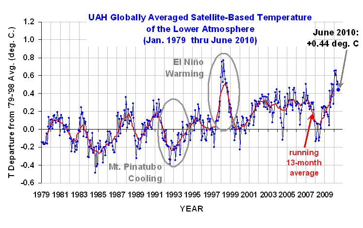
June 2010 UAH Global Temperature Update: +0.44 deg. C

July 1st, 2010 by Roy W. Spencer, Ph. D.


YR MON GLOBE NH SH TROPICS
2009 1 0.251 0.472 0.030 -0.068
2009 2 0.247 0.564 -0.071 -0.045
2009 3 0.191 0.324 0.058 -0.159
2009 4 0.162 0.316 0.008 0.012
2009 5 0.140 0.161 0.119 -0.059
2009 6 0.043 -0.017 0.103 0.110
2009 7 0.429 0.189 0.668 0.506
2009 8 0.242 0.235 0.248 0.406
2009 9 0.505 0.597 0.413 0.594
2009 10 0.362 0.332 0.393 0.383
2009 11 0.498 0.453 0.543 0.479
2009 12 0.284 0.358 0.211 0.506
2010 1 0.648 0.860 0.436 0.681
2010 2 0.603 0.720 0.486 0.791
2010 3 0.653 0.850 0.455 0.726
2010 4 0.501 0.799 0.203 0.633
2010 5 0.534 0.775 0.292 0.708
2010 6 0.436 0.552 0.321 0.475
UAH_LT_1979_thru_June_10

The global-average lower tropospheric temperature remains warm, +0.44 deg. C for June, 2010, but it appears the El Nino warmth is waning as a La Nina approaches.

For those keeping track of whether 2010 ends up being a record warm year, 1998 still leads with the daily average for 1 Jan to 30 June being +0.64 C in 1998 compared with +0.56 C for 2010. (John Christy says that the difference is not statistically significant.) As of 30 June 2010, there have been 181 days in the year. From our calibrated daily data, we find that 1998 was warmer than 2010 on 122 (two-thirds) of them.

As a reminder, four months ago we changed to Version 5.3 of our dataset, which accounts for the mismatch between the average seasonal cycle produced by the older MSU and the newer AMSU instruments. This affects the value of the individual monthly departures, but does not affect the year to year variations, and thus the overall trend remains the same as in Version 5.2. ALSO…we have added the NOAA-18 AMSU to the data processing in v5.3, which provides data since June of 2005. The local observation time of NOAA-18 (now close to 2 p.m., ascending node) is similar to that of NASA’s Aqua satellite (about 1:30 p.m.). The temperature anomalies listed above have changed somewhat as a result of adding NOAA-18.

[NOTE: These satellite measurements are not calibrated to surface thermometer data in any way, but instead use on-board redundant precision platinum resistance thermometers (PRTs) carried on the satellite radiometers. The PRT’s are individually calibrated in a laboratory before being installed in the instruments.]


23 Responses to “June 2010 UAH Global Temperature Update: +0.44 deg. C”

Toggle Trackbacks

  1. joni says:

    Dr Roy,

    As I asked recently, why have the averages been removed from the AMSU graphs? They were handy to track against the averages.

    Jon

  2. HR says:

    Hi Roy,

    Can you just clarify what you mean by “lower tropospheric”.
    I was trying to relate you’re figures in the table and graph with those over at discover.itsc.uah.edu. I couldn’t work out which channel your figures relate to. And while I’m on the subject why don’t you present the surface temperature anomalies in these monthly updates. Wouldn’t these be more readily comparable to the surface temperature record?

    Thanks

  3. Alexej Buergin says:

    Dr Spencer
    does it not annoy you to write deg. C instead of the correct °C? How about buying a keyboard that can do this: °äöüèéêà¢çñ$£ ?
    What we need, of course, is for somebody to sell a Keyboard according to the wishes of the user (including the software). I would appreciate more mathematical symbols.

  4. Andrew says:

    Alexej Buergin,

    Better yet, save money and forget the Celsius scale altogether and use Kelvins, which require no symbols-you don’t even need to use any conversion factors for anomalies sense a Kelvin degree is equivalent to a Celsius degree.

    ~Andrew

  5. Alexej Buergin says:

    Andrew
    you cannot make people say it will be “over 300 K” today. And it is covenient that water freezes at 0° and boils at 100°.
    But why can I have a personal photobook, but not a personal keyboard? The USA is so big it should be profitable to at least produce a speciality keyboard.
    (BTW: There is no Kelvin degree; the K lost the ° in 1967)

  6. harrywr2 says:

    Here you go..
    Optimus maximimus keyboard, 113 programmable keys, just $1599.
    http://www.thinkgeek.com/computing/keyboards-mice/9836/?cpg=froogle

    Or you can settle for a Microsoft of Logitec keyboard with 20 or 30 programmable keys for < $100.

    To get a degree's symbol with a windows keyboard with a numeric pad

    Hold down then type 0176 on the numeric pad then release °

  7. harrywr2 says:

    It appears the comment thing ate part of my last comment.

    To get a degree symbol
    Hold down the alt key, then type 0176 on the numeric keypad, then release the alt key.

  8. posted on WUWT but not answered:
    Harry Lu says:
    July 4, 2010 at 6:27 am
    Dr Spencer
    Why was the CHLT 1km removed from the discover page? (This showed a warming rate of 0.18C per year!)
    Why has CH05 been replaced with a shorter record CH05 aqua?
    Why has CH05 aqua data posted before July 1(?) been replaced with a modified set posted after July 10 (?)? Only small changes but there is no reference on the web site to changes being made.
    CH05 Aqua on 17th June had 6 February 29ths in the last 8 yearsplus some temperatures showing 20C differences from normal. On the 18th June this had been corrected. Why was this error not referenced on the home page.

    In the past other temperature indexes have been hauled over hot coals for having made such unannounced changes/corrections!

    The removed chLT plot
    [http://] img21.imageshack.us/img21/3427/amsre100617.png

    The differences in CH05
    [http://] img8.imageshack.us/img8/4640/amsuadjusments.png

    Just curious as I am sure there are valid explanations
    Thanks

    \harry

  9. D.W. MacKenzie says:

    Dr. Spencer,

    has anyone adjusted the data for the 1998 and 2010 temp peaks, given the strength of the El Nino’s, or given increased C02? I do not know how easy it is to make such adjustments, but if there are specific claims regarding how much C02 warming should have occurred during the past decade, the 2010 peak could be put into perspective.

    D

  10. HowardYoung says:

    Dr Spencer,
    Have just read The Great Global Warming Blunder. It was a breath of fresh air.
    Given your difficulties in getting media coverage could I suggest you send a copy of the book together with a synopsis to the editor of the ASTRALIAN newspaper. They have consistently given a balanced coverage of the global warming debate
    Keep up the good work
    Regards
    Howard Young

  11. pekke says:

    Dr.Spencer,

    Why are the AMSU-A Temperatures site lately showing allmost the same upward trend on all channels except AQUA and sea surface ?

    /pekke

  12. Laurent says:

    I post my question and remarks here – it is an old thread. If it gets ignored, I may repost it when a new thread on a similar topic will be opened.
    It is probably trivial, but I would be thankful for any explanation (or link to a good explanation).

    – How is the Earth Average Temperature calculated?

    Naively, I imagine it is for each station a (Tmin+Tmax)/2, then a “gridification” (so average of several stations if they are close, or interpolation if stations are missing) and then an average of the gridded data (no surface-weighted as grids are designed of equal surface, probably). For sattelites, it is probably an integrated average (not gridded).

    Now however Temperature is not an extensive physical property. I cannot compute the average temperature of two reactors whose content I intend to mix without correcting for the heat capacity, for instance, and weighting by the quantity (e.g. mass). In order for the procedure
    given above to be physically correct, we must consider that masses per volume unit and heat capacities are the same globally.

    But for instance, the heat capacity of air is dependant on the humidity. 2% of humidity (saturation at 25°C) increases Cp of air of 1.7%. This gets order of magnitude worse if the air is over-saturated (clouds/fog/rain) or close to saturation as evaporation enthalpies can play a role and dominate massively (about factor 1000). If I imagine a process by which the atmosphere over the tropical ocean (assumed saturated) cool but the atmosphere over land and polar oceans (deemed dry) warm, I could have a spurious warming signal while the energy remain constant.

    Worse: pressures on Earth vary from extremes of 109.4kPa to 87kPa. This is extreme and “normal” range is 97-104 mbar. This is a difference of 7%. As in a (perfect) gas the pressure and the temperature are inversely proportional we may naively assume a difference in temperature of 7% or (based on Kelvin of course) 20°C!
    To illustrate let’s imagine that half Earth is high pressure 104mbar and the other half is low pressure 97 mbar. IF I had a process that tendancially would warm in a decade the low pressure zone (+1°C) and cool the high pressure zones (-0.93°C), the simple average would show
    a warming trend (+0.035°C/decade) while actually the Energy in my system remained CONSTANT!

    Remember the signal we have is +0.8C since a century. This is in Kelvin (we want energy content) a deviation of 0.3%, or one full order of magnitude lower than the difference in ernergy due to pressure variations alone… and it is important, because the causes of real signal vs. spurious signal due to energy relocation might be quite different…

    Do you know if the average air temperature is calculated accordingly?

    If yes, do they complement it with measures of pressure (easy) and humidity (hard)? While this is technically feasible since 1979 and satellites, how was it done historically (I double hygrometry was manually measured at each whether station, see http://en.wikipedia.org/wiki/Hygrometer#Difficulty_of_accurate_humidity_measurement)?

    All-in-all, the correct metric for global warming would be “total energy of the Earth”. Perhaps beacuse it is slow to reach equilibrium, it makes sense to limit ourselves to the total energy of the atmosphere + a very thin layer of ocean/earth. But it is certainly highly debatable to take trends in atmospheric temperature in a system that is obviously not at equilibrium.

  13. Can anyone shed light on this for me please. UAH trend 1980-2010 is almost identical to HADsst2gl trend.
    http://woodfortrees.org/plot/hadsst2gl/from:1980/trend/offset:-0.104/plot/uah/from:1980/trend
    But we see tropospheric temps rise much more than sst’s when there is an ENSO event like in 1998 or 2009-10.
    So how can the Hadley SST trend be the same as the UAH tropospheric trend over the longer term? Or am I missing something obvious?

  14. Ray says:

    Apologies if this question has already been asked and answered. Why do you use a 13 month running average? Does this not introduce a seasonal bias, depending upon when it is run? I understand that the earth as a whole is warmer in the N.H. summer, according to NCDC that is. Also, is this a simple average or a smoothed weighted average as used by the UK Met. Office & IPCC?

  15. It turns out that what I was missing was Bob Tisdale’s excellent analysis of HADsstGL2 and it’s unusual splicing issue around 1998 in hs overview of ocean datasets.
    http://bobtisdale.blogspot.com/2010/07/overview-of-sea-surface-temperature.html
    Required reading.

  16. Chris Brown says:

    Ray,

    The graph is using anomaly data, rather than absolute temperatures. So the globe being warmer at certain times of year will not matter, what matters is if the globe is warmer than usual for that time of year.

    I’m not sure if there’s a seasonal signal in the anomaly data or not.

  17. Ray says:

    Chris,
    Thanks for the reply.
    I still don’t understand why a 13 month running average, rather than a 12 month one, since the former will always include 2 figures from the current month. If there is a seasonal bias in the anomalies, it would be reflected in the 13 month average.

  18. harrywr2 says:

    Ray,

    A 13 month average just presents a tidier picture. A lot easier to see the ‘natural variation’ cycles at work.

    Monthly plots merely show weather.

    Dr Spencer tried a 25 month average but the ‘record breaking we are all going to fry’ year of 1998 lots it’s spike and various folks complained.

    Personally, I liked the 25 month average. It showed a ‘gradual’ warming trend in a sea of natural variation, I.E. Climate rather then weather.

  19. Ray says:

    harrywr2,
    Thanks for the reply.
    Sorry to be persistent, but this still doesn’t explain why 13 and not 12. Does 13 give a “tidier” picture than 12?
    The advantage of a 12 month average is that it is a moving annual average, which cannot be said of a 13 month average.

  20. Chris Brown says:

    A 13 month average simply allows it to be centred on 1 particular month (month 7). A 12 month average would mean you have to put your data point in between months 6 and 7. That’s why it’s tidier and easier.

    You are right in that it if there is an annual signal in the data, it will show it, but it will be smoothed with the rest of the year so it won’t show up as a huge effect.

  21. Buzz Belleville says:

    Dr. Spencer — Thanks for your work on this topic, and thanks for the “Dummies’ Guide” to your skepticism. I’m not a scientist, but a professor who teaches the law as it relatess to climate change. Studying the science of climate change is, however, a passion of mine. A few things are still beyond my ability to grasp, but I’ve worked hard to understand most of it.

    I’ve read and enjoyed both your books. But I am firmly in the camp that AGW is a serious problem that demands some public policy prescriptions. I’ve read many of the leading skeptics, and I appreciate your (and Dr Lindzen’s) work primarily for two reasons — (1) you acknowledge things that simply have to be acknowledged as observational fact (i.e. the CO2 measurements are rock solid), which I think enhances your credibility, and (2) you try to contribute to the scientific discussion (unlike many on the skeptic side who just shout “conspiracy” and “cooked data,” and many on the AGW theory proponent side who just demonize industry and scream “denier”).

    What I’d really like to know from you is (a) what would it take to convince you that human CO2 emissions are now in control of the climate and are something to worry about, and (b) how long do we wait for your PDO (or Lindzen’s cloud) theory to change the trends. On the second point, the PDO obviously went negative in 2008, yet even by your satellite records 2009 and 2010 were and are anomolously warm. I understand your kettle on the teapot analogy (from your book), but how long before we can expect the PDO to cause cooling from its negative cycle? Relatedly, how come the clouds of Lindzen’s iris theory haven’t protected us from warming so far and how many years of warming will it take for that theory to be dropped (assuming it continues to warm at current rates).

    I know this sounds contrarian, and I don’t mean to be confrontational … it’s you site after all and you do not need to answer folks like me. But I teach the science of climate change during the first couple weeks of my law school class each year, and I do my best to present a balanced view. You and Lindzen are two whose views the students should be made aware of as they make their own determinations on the credibility of the science.

    One last question (sorry). Is there any empirical evidence to support either your view or Lindzen’s (i.e., can we compare current cloud cover to the past, or do we still not have the observational tools and methods to do that (I understand we can measure the atmospheric water vapor content, but I’m asking specifically about clouds)). Also, does your theory necessarily conflict with Lindzen’s? He says warming will cause more low level cloud cover, which will reflect incoming solar radiation. You say cloud cover resulting from the warm PDO may actually be the cause of the current warming trend. Is there a way to harmonize these two major premises?

    Many thanks.

Leave a Reply