YR MON GLOBE NH SH TROPICS
2009 1 0.251 0.472 0.030 -0.068
2009 2 0.247 0.565 -0.071 -0.045
2009 3 0.191 0.324 0.058 -0.159
2009 4 0.162 0.315 0.008 0.012
2009 5 0.139 0.161 0.118 -0.059
2009 6 0.041 -0.021 0.103 0.105
2009 7 0.429 0.190 0.668 0.506
2009 8 0.242 0.236 0.248 0.406
2009 9 0.505 0.597 0.413 0.594
2009 10 0.362 0.332 0.393 0.383
2009 11 0.498 0.453 0.543 0.479
2009 12 0.284 0.358 0.211 0.506
2010 1 0.648 0.860 0.436 0.681
2010 2 0.603 0.720 0.486 0.791
2010 3 0.653 0.850 0.455 0.726
2010 4 0.501 0.799 0.203 0.633
2010 5 0.534 0.775 0.292 0.708
2010 6 0.436 0.550 0.323 0.476
2010 7 0.489 0.635 0.342 0.420
2010 8 0.511 0.674 0.347 0.364
2010 9 0.603 0.555 0.650 0.285
2010 10 0.419 0.365 0.473 0.152
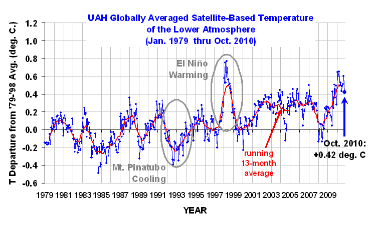
As the tropical tropospheric temperatures continue to cool, the global average is finally beginning to follow suit:+0.42 deg. C for October, 2010. This is the lowest monthly temperature anomaly we’ve seen in what has been a very warm year.
For those following the race for warmest year in the satellite tropospheric temperature record (which began in 1979), 2010 is still within striking distance of the record warm year of 1998. Here are the 1998 and 2010 averages for January 1st through October 31:
1998 +0.57
2010 +0.54
Note that the difference between the two is not statistically significant…just symbolically.
[NOTE: These satellite measurements are not calibrated to surface thermometer data in any way, but instead use on-board redundant precision platinum resistance thermometers (PRTs) carried on the satellite radiometers. The PRT’s are individually calibrated in a laboratory before being installed in the instruments.]
![]() |
Dr Spencer from those records The SH temperature for September, the 9th month, looks out of place. It jars in an otherwise sensible set of numbers.
Is it ok? Have you had another look at it? What is your explanation for it?
PS How does it compare with other temperature records?
@Richard: HadCRUT, the official IPCC global record do not come even close to 1998:
http://climexp.knmi.nl/data/ihadcrut3_gl_1998:2011a.png
Only satellite records, which are very sensitive to El Ninos and GISS/NOAA records, massaged to hide the decline show 2010 near to 1998.
Looking at 60N-60S SSTs heading down, more cooling is ahead.
HadCRUT is massaged to hide the warming. It infills the arctic using rest-of-world average therefore hiding the fact that the arctic has warmed faster than the rest of the world. Hence using HadCRUT as a global record is underestimating the warming.
cthulu:
There are almost no thermometers in 80N. GISS extrapolations are no better. They are just “guessing” the data. No such thermometer which could tell the average temperature of surface on 1200km radius has yet been invented. They even cover the oceans with land-data, how ridiculous is that.
HadCRUT agrees with RSS and UAH very well, which measure almost the whole arctic as well. Unlike GISS which shows still constantly rising temperatures, a record year in 2005 and 2010 (unlike UAH RSS and HadCRUT). Even DMI strongly disagree with GISS. GISS results are way off and they should not be used in any kind of scientific practise.
Hello,
Was there a typo in one of the numbers? For the September report on October 5, 1998 was given as 0.590 and 2010 was 0.553. In today’s report, with the latest anomaly of 0.42, the new 2010 number of 0.54 is totally reasonable. However why did the 1998 number drop to 0.57?
@Werner. Oct 1998 had an anomaly of 0.41, which caused the drop. I believe these reports are showing the anomalies through the same portion of the year, to ensure we’re comparing apples to apples. The overall anomaly for 1998 (if I calculated it right) was 0.52…it had a colder Nov and Dec to drop it even lower.
Cthulhu, get a life, or go and complain to Phil in person. HadCRUT is created by a prominent warmist group. Remember this? “If anything, I would like to see the climate change happen,so the science could be proved right, regardless of the consequences.”
I agree with Richard, in that I would appreciate an explanation of the “blip” in the September S.H. figure. Is this a feature of satellite measurements, (which seem to be more volatile), or some other factor?
Also, when the UAH figure is adjusted to the same time period as HadCRUT3, the October UAH figure is about 0.57c. Last month, it was 0.75c, compared to the HadCRUT3 figure of 0.39c, i.e. the UAH figure was 0.356c higher than HadCRUT3, which is the HIGHEST EVER difference between the adjusted UAH and HadCRUT3 figures. Clearly, one of these measures is incorrect and I suspect it may be HadCRUT3, since I am not sure if figures from China are up to date, but clearly the unusual September UAH SH figure may also be a factor. If the October HadCRUT3 figure remains 0.356c lower than the adjusted UAH anomaly, that points to an October HadCRUT3 figure of only 0.21c!
Werner, I think that the 1998 figure quoted is the cumulative figure to the end of October, not the entire year, so it changes every month.
Werner,
By the way, I have just received confirmation from the UK M.O. that their forecast of September 25th. 2009, that about half of the years 2011 to 2015 would be warmer than
1998, is still considered valid, and is being monitored.
Hello Roy!
You should check out:
http://www.wolframalpha.com/
There is weather calculator than can be used for any city, and it plots annual mean temperature with an OLS equation and shows trend value.
Thank you TroyCA and Ray! So with November of 1998 being 0.19, the race could be tight! (The Hadcrut3 data just gives the total for all of 1998 and I did not make the necessary mental adjustment here.) As for what the October Hadcrut3 will be, I will guess 0.34. This is based on the average Sea Surface on Dr. Spencer’s graph being roughly 0.2 below October 2009. And the “near surface layer” being roughly 0.1 higher. So if I count the sea at twice the value for land due to the larger area, I get a rough drop of 0.1 from the October 2009 value of 0.44 to 0.34.
Hello,
Dr. Spencer, or anyone else with the knowledge to answer, what would be some appropriate uncertainty estimates for these monthly figures? +/- .05°C, .02°C, .1°C?
BenjaminG
Is the climate correctly modelled using fractal mathematics?
If so, then long-range prediction of climate conditions is impossible, because you get a different outcome every time you feed the initial conditions into a fractalmodel.
Dr. Spencer,
Could you explain the history of the UAH satellite temperature readings from a decade or so ago that others discovered were being misinterpreted? Why were the erroneously low temperature readings not recognized sooner?
Also, why did the temperature anomaly of 0.72 degrees C in January 2010 disappear from every subsequent monthly chart in your data set? Was it a mistake? Was it changed when you recalibrated your system earlier this year?
Thanks for any insight.
Juraj V:
I’m not sure about source of the HadCRUT graph link you provided in your first post.
Here’s a graph from the Met Office Hadley Centre’s own website showing clearly that 2010 through September (in green) has been about as warm as 1998, according to their records.
http://hadobs.metoffice.com/hadcrut3/diagnostics/global/nh+sh/
@Ted:
I’m also confused about the origins of that graph Juraj posted. However, according to http://www.cru.uea.ac.uk/cru/data/temperature/hadcrut3gl.txt the anomaly for 1998 through September was 0.595, as opposed to 0.511 for 2010, so I would guess that the HadCRUT record is safe.
Ted,
Remember that on the M.O. graph, the green line for 2010
is only to September, i.e. it does not include the N.H. late autumn and early winter anomalies. Since global temperatures are biased towards the N.H. that means that the September figure is likely to be overstated, compared to the 1998 annual figure.
The figures to Sept. were 0.595c in 1998, compared to 0.511c in 2010 i.e. 2010 was 0.084c cooler than 1998 at the same point. The only doubt about this is whether the latest HadCRUT3 figures are up to date and will not be upwardly adjusted at the end of the year.
Hello Ted, Ray, and TroyCA,
Correct me if I am wrong, but according to the data set, the number for the whole year according to Hadcrut3 was 0.548. And the number up to September was 0.511. So clearly the 1998 number was higher. Yet the green line for 2010 up to September is clearly higher than the red line for 1998. The conclusion I reach from this is that the green line is the “upwardly adjusted” line and the “real” line, but only to the end of September for 2010. But as Ray says: “global temperatures are biased towards the N.H.” so I expect the “real” line to drop in the coming months. Up to this point, I was focused on the numbers, but I will watch that green line from now on so there are no nasty surprises!
Moments of inspiration have a nasty habit of coming after I press the submit button. So while “global temperatures are biased towards the N.H.”, that is totally irrelevant since we are just talking about anomalies anyway. As it just happened to turn out, the anomalies of the last 4 months of 1998 were cooler than the anomalies of the first 8. And the anomaly for September of 2010 was cooler than all previous months. So if I have it right this time, this is just a coincidence. However I still expect the anomalies for the last 3 months of 2010 to drop due to the present La Nina and low sunspots.
Werner,
The situation is complicated by the fact that the CRU annual anomaly is calculated differently to the M.O. annual anomaly. The CRU figure is the simple average of the monthly figures and the M.O. average isn’t. Something of an explanation of this is given here:
http://hadobs.metoffice.com/indicators/index.html
As a result, the M.O. average for 1998 was 0.517c, while the CRU figure is 0.548c. The red line on the graph is, I assume, based on 0.517c, not 0.548c. I don’t know how the green line is calculated, but since it appears to be above the 1998 red line, it doesn’t seem to be the simple average of Jan. to Sept., indeed that would not be comparing like with like. Comparing the average of the months Jan. to Sept. for both years is comparing like with like, and on that basis, there is no doubt that 1998 was warmer at that point. While the CRU annual anomaly for 1998 was higher than the M.O. annual anomaly, the excess for the period 1998-2000 was unusually high and recently the two figures have been very similar, (virtually identical in 2009), so it is possible for the M.O. annual figure for 2010 to be higher than 1998, while the CRU figure is lower, which will only add to the confusion.
While the figures involved are anomalies, they are anomalies v the annual global anomaly for 1961-90, which was 14c, NOT the individual monthly anomalies (as far as I understand it). As a result, there is normally a seasonal bias towards the N.H. summer (at least as far as 1961-90 is concerned, and a decline in the anomalies from September onwards and that is not, in my opinion, a coincidence.
Sorry, the last paragraph should read:
While the figures involved are anomalies, they are anomalies v the annual global AVERAGE for 1961-90, which was 14c, NOT the individual monthly AVERAGES (as far as I understand it). As a result, there is normally a seasonal bias towards the N.H. summer (at least as far as 1961-90 is concerned, and a decline in the anomalies from September onwards and that is not, in my opinion, a coincidence.
Having a look at the RSS records October comes at 0.29, September 0.595 and the SH for Sept is lower. Maybe the UAH temperatures need another look?
Here is the Link
ftp://ftp.ssmi.com/msu/monthly_time_series/rss_monthly_msu_amsu_channel_tlt_anomalies_land_and_ocean_v03_2.txt
Hello Ray,
I must say I cannot agree with you on: “As a result, there is normally a seasonal bias towards the N.H. summer”
A sentence from : http://earthobservatory.nasa.gov/GlobalMaps/view.php?d1=AMSRE_SSTAn_M
“These maps compare temperatures in a given month to the long-term average temperature of that month from 1985 through 1997.”
As well, see the anomalies from this site for 2010. In January it was 0.648 which was the fifth highest of all time for any month. It was also the warmest January on record. In June it was 0.436. I completely agree that globally, June was much warmer than January, but for the anomalies, any month can set a cold or warm record just as easily as any other. January, 2010, for example, is compared only to the previous 31 Januaries in the satellite data.
Hello Richard,
You say: “Having a look at the RSS records October comes at 0.29, September 0.595”
You seem to have made a typo here. It was 0.525. And with October being 0.293, the difference is 0.232. By contrast, the difference in the UAH data between September and October was 0.60 – 0.42 = 0.18. In my opinion, these differences of 0.052 are in the same ball park.
To me, the bigger concern is that RSS went DOWN from August to September from 0.583 to 0.525. But UAH went UP from 0.51 to 0.60. The combined difference here is 0.058 + 0.09 = 0.148.
However the UAH data clearly says what is SH and what is NH. But in the RSS data, which column is supposed to be the NH and which is the SH?
Werner yes that .595 was a typo. I’m not sure but I think in RSS the SH is -70.0/0.0 the last collumn and NH is 0.0/82.5 the second last collumn.
If that is correct then the RSS SH in September 0.518 compared to 0.650 of UAH
I wonder what the difference is due to. Does UAH go further south than RSS or something else? Still the difference should not be that much as the area between the higher latitudes is less than that between the lower latitudes.
PS another thing the global temperature in RSS seems to be a simple average of the NH and the SH anomalies. But the areas do not seen to be the same.
Werner,
I was referring to HadCRUT3 data, and if you average the monthly anomalies for 1961-1990, you will see that the months June to September (in particular July & August), are higher than the winter months. The actual figures are:
JAN -0.0305
FEB -0.030033333
MAR -0.0303
APR -0.0309
MAY -0.031133333
JUN -0.025633333
JUL -0.0192
AUG -0.0188
SEP -0.0236
OCT -0.0294
NOV -0.0298
DEC -0.032833333
Of course, these are averages and any individual year may
show different patterns. If NASA anomalies are relative to individual monthly norms, then it is true that each month is equally likely to set a high or low record, but that doesn’t seem to be the case for HadCRUT3, although I will try to look into this in more detail.
I have just calculated the average monthly HadCRUT3 anomalies (1961-90) separately for the NH and SH. The NH is as I had expected, i.e. generally highest anomalies between July and October, (highest August) but the SH shows a similar pattern, with September the highest on average and December the lowest. This has me slightly baffled and I am beginning to doubt what I said about bias to the NH. I think it is interesting that Sept. shows the highest average anomaly and it seems to tie in with this year’s high figures. However, I still think this points to a fall in anomalies during the next few months.
Actual figures:
NH
JAN -0.015633333
FEB -0.0206
MAR -0.016033333
APR -0.016366667
MAY -0.0194
JUN -0.014733333
JUL -0.004066667
AUG -0.0053
SEP -0.0183
OCT -0.015633333
NOV -0.0168
DEC -0.0166
SH
JAN -0.045466667
FEB -0.0394
MAR -0.044466667
APR -0.0456
MAY -0.042766667
JUN -0.0364
JUL -0.034433333
AUG -0.032166667
SEP -0.028766667
OCT -0.043333333
NOV -0.042766667
DEC -0.049166667
Hello Ray,
Now I am really confused! You say: “the monthly anomalies for 1961-1990….” I was under the impression that the average of these, BY DEFINITION, were expected to be 0.000 for every month. And all other anomalies were to be compared to this average. However even if this was not quite correct, your maximum difference was from 0.0188 to 0.0328 for a difference of 14/1000 of a degree. I do not think that this difference over a 30 year period is significant nor that it proves any bias. If you took any 10 year period, the differences would be larger and if you took a 70 year period, the differences would be smaller. It is something like flipping a coin 10 or 30 or 1000 times. The higher the number of flips, the closer you get to 50% for heads or tails. But with 30 flips for example, one could easily get 13 heads and 17 tails.
Hello Richard,
It certainly does look as if the areas for south and north are different. However this would only be important in cases where the value for -70.0 to -82.5 is very different than from 0.0 to -70.0.
As for the other numbers, the difference between 0.518 and 0.650 which is 0.132 does not concern me at all since they may be operating from different base years. However the differences between September and October for each set should be close, but not necessarily equal since they each process things slightly differently. For the differences between September and October, the difference in RSS is 0.518 – 0.264 or 0.254. The corresponding difference in UAH is 0.64 – 0.48 or 0.16. Now the difference between 0.16 and 0.254 is 0.094. Is 0.094 a cause for concern? I do not know.
Werner,
I don’t blame you for being confused. Like you, I had expected the mean anomaly for 1961-90 to be zero, and indeed I thought I had convinced myself that it was, some time ago. I have now calculated the Global, NH and SH average anomalies for 1901-2000 and each decade within that century.
I was surprised to find that globally, the bias towards summer in the average anomalies was GREATER over 1901-2000 than for 1961-90, ranging from -0.173 in March, to -0.104 in August. The same is true, although greater, for the NH, ranging from -0.173c in March, to -0.038c in August. In the case of the SH, the bias is not as pronounced, with a range from -0.195c in December, to -0.170c in August. So, for whatever reason, the average anomaly appears to be higher in August in both the NH and SH. By the way, if your suspicious about the Global and NH anomalies being -0.173c in March, I double checked that and it is correct. It’s only the case to 3 decimal places and it is due to the fact that the SH average anomaly is also about -0.173c for March. Even though August shows the highest average anomaly in the SH, for individual decades, it never has the highest anomaly, with February, July and November having 2 highs each. In the NH, August again shows the highest average anomaly, but it is the highest in only 1 decade, with 3 for October, and 2 for July and January. Something similar is true globally, with only 1 decade showing August as the highest anomaly, and 2 for October, November and January. It therefore seems that while there is a bias towards NH summer in the averages, for individual decades, higher anomalies are more likely in Autumn/Winter months.
This does leave me confused, and clearly a search of the M.O. website, and possibly an e-mail to them is required.
Thank you Ray.
Could it be that the M.O. is the one that is 0.000 for 1961 to 1990 instead of the Hadcrut3?
Werner,
Not entirely sure what you mean.
The HadCRUT3 dataset is a collaborative product of the M.O. Hadley Centre, and the C.R.U. The monthly figures available from the M.O. and C.R.U. are normally identical, but the annual figures are different due to different methods of calculation. I say normally, because the C.R.U. figures can often be updated later than the M.O. ones.
Dr. Spencer,
In the graph of the AMSU Channel 5 daily data, is the “average trace” based on the period of record (1979-2009) or the 20-year base period (1979-1998) against which the anomalies are computed? I have been trying to figure this out and I scrolled back to page 2 and there was a graphic that showed it to be the entire 31-year period of record but in the text it referred to it as a 20-year baseline average.
Thanks.
The October global and hemispheric anomalies are now available for HadCRUT3, GISS and NOAA, and while the UAH SH anomaly is down on last month, to 0.473c, after adjustment to 1961-90, this is equivalent to a HadCRUT3 SH anomaly of 0.61, whereas the actual HadCRUT3 SH anomaly was only 0.211c, and the adjusted figures for GISS and NOAA were 0.273c and 0.234c. Consequently the the UAH SH anomaly still looks anomalous, compared to the other three. I really like to know whether it is UAH which is correct, and the other three incorrect, or the other way around. Since after adjustment, the UAH NH anomaly is similar to HadCRUT3 and NOAA (although not GISS), this seems to have implications for the reliability of all of the global temperature anomaly figures.
Hello Ray,
I recently read something very interesting about the GISS data. Apparently, for some reason, their older numbers get adjusted downwards and this makes the later numbers higher by comparison and thereby proves global warming is happening. Could something similar have happened to the Hadcrut data? If that were the case, the numbers from 1961 to 1990 could have been 0.00 at one time, but later adjustments made the average negative for every month. Would it be possible to find a Hadcrut data set from 1990 to see if this adjustment happened? Or do they have another explanation why all those numbers are now negative?
Dr. Spencer,
Tried out your AMSU-A Temperature site.
The numbers it keeps returning are way off.
As an example: Sea surface tempare 462.56 F cooler than this day last year.
I there a bug in the program somewhere, is it K instead?
Thank you.