YR MON GLOBAL NH SH TROPICS
2010 01 0.542 0.675 0.410 0.635
2010 02 0.510 0.553 0.466 0.759
2010 03 0.554 0.665 0.443 0.721
2010 04 0.400 0.606 0.193 0.633
2010 05 0.454 0.642 0.265 0.706
2010 06 0.385 0.482 0.287 0.485
2010 07 0.419 0.558 0.280 0.370
2010 08 0.441 0.579 0.304 0.321
2010 09 0.477 0.410 0.545 0.237
2010 10 0.306 0.257 0.356 0.106
2010 11 0.273 0.372 0.173 -0.117
2010 12 0.181 0.217 0.145 -0.222
2011 01 -0.010 -0.055 0.036 -0.372
2011 02 -0.020 -0.042 0.002 -0.348
2011 03 -0.099 -0.073 -0.126 -0.345
La Nina Coolness Persists
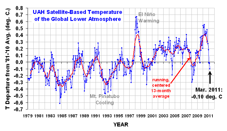
The global average lower tropospheric temperature anomaly for March 2011 fell to -0.10 deg. C, with cooling in both the Northern and Southern Hemispheric extratropics, while the tropics stayed about the same as last month. (I’m on the road in Virgina, so the temperature graph will not be updated until I return on Thursday.)
![]() |
Ah I have predicted -0,2… Neverthless, I still do think that this cooling trend will stop this month, followed by slight increase.
I was expecting -0.11c, based on a March AQUA CH5 figure of -0.23c, and the formula y = 1.0035x + 0.1168.
The formula for April looks like y = 0.7879x + 0.1164, so the UAH anomaly for April would be much smaller for a similar anomaly in the AQUA CH5 to that in March. For example, the current April AQUA CH5 anomaly of -0.243c is equivalent to a UAH anomaly of only -0.075c.
Still; the main thing going on appears to be the continued cool equatorial waters caused by the ongoing La Nina. Any news of whether La Nina is weakening?
Posted by, salvatore del prete (not verified)
First of all solar activity has been very strong up to year 2005, not year 1985, so that is the first false fact ,that is talked about in this article.
Secondly the writer of this article has left out many significant correlations between solar activity and items it effects on earth ,that in turn ,control earth’s climatic system.
HE NEEDS TO DO MUCH MORE HOMEWROK IN THIS AREA.
Thirdly, the lag times are greater then 10 years, and are more related to the solar magnetic cycle of 22 years, as far as temperature response.
Fourth , the CO2 man made global warming theory is a bunch of BS , and the global models they use to show this theory is correct, have been proven wrong ,on several fronts.
WHERE THE MODELS HAVE FAILED(I will mention some)
1. The models said the atmospheric circulation would be evolving into an ever increasing +AO ,the reality is the atmospheric circulation has been evolving into an ever increasing -AO.
2. DROUGHTS IN AUSTRALIA,reality is floods in Austrialia.
3. The equatorial lower troposheric hot spot,reality is there is no hotspot.
4. The constant increase in temp., reality is temp. has leveled off for the past 8 years or so.
5. More EL NINOS /WARM PDO,the reality is PDO is cold ,with more LA NINAS ,now ,and this will be the case going forward. AMO to follow soon.
What the above shows are the global warming models can’t forecast the atmospheric circulation correctly, and if you can’t do that ,you can’t forcast the climate correctly ,for the future.
MY THEORY FOR COOLING
1. Weak sun in general say (90%) of the time. Solar flux less then 100 most of the time,with spurts to 160 at times ,or even more. Sun ,with this kind of activity, sets things up.
2. The above leads to more geological activity,especially high lat. volcanic eruptions. Explosive index of 5 or more ,will have great impacts to earth’s climate,nevermind, the lesser eruptions ,which also have impacts.
3. 1 and 2 lead to a more -AO atmospheric circulation. The Key, value -1.5 or greater.
4. 1 leads to the likelyhood of a cold PDO/AMO ,aids in the cooling. Value -2.0 c or more.
5. 1 leads to a more +SOI oscillation ,aids in cooling. Water temp -1.0 c or greater.
6. 3 then leads to more arctic intrusions further south,and causes the polar regions to warm, in contrast to the lower latitudes. The key in my opinion is the warming of the polar latitudes,in contrast to say latitudes 40 to 70 degrees north latitude, which undergo more cooling due to the -AO ,and the positive feedbacks for cooling this atm. circulation will give the N.H. for cooling,due to an increase in cloud cover,snow cover and precip.
7. More clouds ,precip., and snow cover ,then increase earth’s albedo ,especially between lat. 40 to 70 north ,reinforcing the -AO circulation. A positive feedback for cooling.
8. l leads to less solar irradiance. Value .1 or more.
9. This opinion is depended upon how everything phases in, and not only how everything phases in, but to what degree of magnitude the items phase into a cold/warm mode ,along with the duration of time the phase in last. Not to mention the lag times that have to be applied. As one can see I gave some guideline parameters for the phase in, of what I feel will be needed to accomplish the cooling,which is very likely to happen this decade.
Milankovich cycles, can magnify the effects ,I mentioned above, and can lead to major glaciations ,when combined with periods of prolong solar activity. Whereas, the prolong period of lower solar activity alone ,can lead to a cooling, and perhaps abrupt temperature changes ,if thresholds should be met, due to the degree of magnitude and duration of time the items that control earth’s climatic system phase into. Still however, major glaciation for long periods of time ,probably need favorable Milankovich cycles, in addition.
Also, all that I talked about, can be shown to have a big effect in the N.H. of the globe, in contrast to the S.H. of the globe ,even though the same process is taking place. Reason being the drastic gegraphical difference between the N.H. and the S.H.
TIME WIL PROVE WHO IS RIGHT AND WHO IS WRONG, AND WE SHOULD KNOW BEFORE THIS DECADE IS OUT.
Monday 4th April 2011 – 10:20am
The above is something I wrote n the climate realist web-site. I am pleased with how the temperatures are reacting.
It is proving, beyond a shadow of a doubt, that C02 is a non player when it comes to earth’s climatic system.
This decade is going to be very interesting.
@John C: According to the Australian BoM, SSTs indicate a continued climb towards neutral conditions, however atmospheric conditions (SOI) remain strongly in La Nina territory.
To me, the SOI indicates strong trade winds. Added to that the newly emerging cold upwelling waters off the coast of Peru point to a renewing La Nina conditions.
The Nino 3.4 index usually swings in the months of January and/or July. We shall know by the middle of July whether Nino 3.4 will continue to rise towards an El Nino or swing back down to a La Nina. My money is on La Nina.
That drop in the tropics is astounding since last year (1C). The implications as to the ENERGY budget of the ocean-atmosphere system, which I feel is the real measuring stick here, not global temps ( warm moist air has much more energy than cold dry air, and a reduction of a smaller amount where air is warm and moist more than offsets a large rise in temp in cold dry air, if we are talking energy considerations which is what has to be quantified to solve this problem). This is like turning down the thermostat, and borders on alarming to me in that this could be even more of a “crash” than even I previously thought ( 2011 returns to near normal in the 30 year running mean)
The Bejing model is out with a vey cold look globally to the 850 and 500 mb levels evolving even more strongly later in the year, and given what I hold near and dear about the role of the tropics in the global climate, I can see why its seeing that!!!
I certainly dont support the idea of any nino coming on before 2012
I am with Joe Bastardi ,on what he has to say.
John Christensen says:
> Any news of whether La Nina is weakening?
John, ringside seat to La Nina/El Nino is here.
http://www.cpc.ncep.noaa.gov/products/analysis_monitoring/lanina/enso_evolution-status-fcsts-web.pdf
report updates every Monday with that link.
All you guys are missing the point which is that The IPCC science team has, as yet, not had the opportunity to adjust these temperatures to a standard that is expected from such an organisation.
Is there a reason for the delay or lag from the onset of El Nina and cooler surface temperatures to the drop in temp at this level of atmosphere?
Andy
Andy,
The “lag” has to do with energy transfers. As Joe Bastardi mentions in his comment above, temperature is just how we measure energy in one part of the system and you have to think of these differences (between surface water temperature and air temperature) in terms of where the energy is coming from and going to.
La Nina is defined as colder surface water temperature and the energy lost (at least some of it) goes into the atmosphere, in the first instance, thus raising the air temperature (or at least not letting it cool). Once the cooling levels off, the air temperatures drop because there is no little further energy transfer and maybe even less as the water warms during recovery from La Nina.
This is a horribly simplistic view – as you can imagine there are a lot more places for the energy to move to – but since the basic energy in/energy out varies only very slightly over time, these big changes in temperature can only be explained by energy transfers between parts of the climate system.
If the Arctic/Antarctic warm in constrast to the rest of the globe cooling, then the energy transported there is lost the majority of the year to space. Some have called this a heat pump to the poles. I like to think of it as having a window open upstairs while attempting to heat the house.
Hi Dr Spencer, I’ve tried to include your highly technical evidence clearly stated in a draft article compiling the facts on cloud cover forming from evaporated water after a slight warming, which then increases earth’s albedo (negative feedback), currently located at http://vixra.org/abs/1104.0013
I’m concerned that the key mechanism involved is not being communicated clearly together with the evidence. There is also some interesting humidity evidence from NOAA for the period 1948-2008 which indicates that the total vertical column integral of H2O vapour content (as opposed to condensed cloud water) in the atmosphere has fallen by the equivalent to the rise in CO2.
The climategate scandal arose because the tree ring proxy data failed after 1960 due to increasing mean cloud cover (which affects tree ring growth, which isn’t merely affected by air temperature), to Dr Phil Jones spliced that data up to 1960 to other data after 1960. Much of the 1960-80 data is surface temperature readings affected by local heat sources (growing cities, insustry), not CO2 heating effects.
After 1980, there’s a curious problem with all the satellite surface temperature data. Being unable to see temperatures under clouds, the satellite data implicitly excludes all negative freeback effects. Please let me know any comments you have if you get the time to look at my paper!
What is the baseline anomaly period?
I must i always had been a little leary of all of the hype going on around solar. After thinking about many programs and buy options we decided to take the plunge. We finished up getting solar without money down and now we immediatly started putting money aside the very first month is was installed. I must say that this benefits of solar seem to be real and I am happy we decide to proceed with it.
MikeN says:
“What is the baseline anomaly period?”
If you mean UAH, it was rebased to 1981 to 2010 at the beginning of this year.
Since this is the most recent base period of the other main sources of anomaly data, it will “appear” to show that the anomalies are lower than other sources.
Trina Flury says:
“I must say that this benefits of solar seem to be real and I am happy we decide to proceed with it.”
Do you mean personal financial benefits?
If so, isn’t that entirely due to heavy subsidies?
For about a week now, I have been unable to see any graph on the Discover AMSU-A Temperature Trends website:
http://discover.itsc.uah.edu/amsutemps/execute.csh?amsutemps
Is this just me, or is there a problem with the site?
I can still download the daily data and according to that,
the cumulative AQUA CH5 anomaly at April 5th., was -0.27c, which converts to a UAH of about -0.098c, based on past values, so it looks like the current anomaly is about the same as that for March.
In the last two days Ch5 has risen from 252.311 to 252.429 to 252.542 a rise of 0.231
The largest previous 2 day rise that I can find is 0.181 between 3 to 5 April 2005. There are several 2 day rises of between .16 and .181 so I wonder if that forms some natural limit to the amount of warming that can occur in 2 days. .231 seems a long way above .181 when there a several in the range .16 to .181.
A new record by a surprisingly large margin or is something going wrong?
(BTW Ray I can still see graphs.)
crandles says:
“In the last two days Ch5 has risen from 252.311 to 252.429 to 252.542 a rise of 0.231”
Yes, I had noticed that too.
While, the daily and cumulative anomalies remain negative, if this continues we may see some positive daily anomalies soon. Actually, I had expected the March UAH anomaly to be the low point for this year, and the April anomaly to be about zero.
Like you, what puzzles me is whether this is a genuine change in the pattern (if so, what is the cause?), or a measurement problem.
Strange about the graphs. I still can’t see them. I emailed the discover website and got a reply saying that they were working on getting the error corrected!
I thought it might be a problem with IE, so I tried Google Chrome and I get a message saying that the Java 6 plug-in is out of date, which seems strange, because I always seem to be downloading and installing new versions of Java.
Dr. Spencer,
After a discussion on the utility of back radiation, I proposed a climate puzzle to predict the Energy Budget in the year 2100 should CO2 doubling cause a 3C increase it temperature. After an embarrassing error that grew like a snowball, I revised the puzzle slightly and made major changes to my answer.
While I am sure there is nothing unique about my little theory, I am curious how badly I screwed up the logic of my final answer. If you care to, I would like your input, or anyone else’s for that matter. Here is the link.
http://ourhydrogeneconomy.blogspot.com/2011/04/how-did-i-screw-up-my-energy-budget.html
3 day rise of .311 is larger than previous 3 days rises; previous largest rises .264, .261, .251, .243, .242, …
ftp://ghrc.nsstc.nasa.gov/pub/data/msu/t2lt/tltmonamg.2011_5.4
compared to same file name with 2010 in name instead of 2011 seems to me to indicate last data received is a bit to steady. I am only guessing that this is a further indicator of a problem with the data.
The comment section is intended for comments related to the article, not to market your own work, however valid it may be. Put this stuff on your own blog or website, as it really has no place here.
Thanks
Sorry about that; my previous comment was related to the longer piece posted by Salvatore on April 5.
Is it purely a coincidence that the recent upward spike in sunspot number comes at a time when the lower troposphere spiked up? See: http://wattsupwiththat.com/2011/04/07/update-on-solar-cycle-24/#more-37522
John Christensen, this blog is about CLIMATE! Therefore anything written about the climate ,is valid for this site.
I have much to say, and if you don’t agree ,which I am sure you don’t, don’t read it!!
At least when I post ,I come up with a comprehensive argument why it is the sun ,that sets the tables, which controls the climate,rather then try to prove the global man made warming models being wrong, which has already been proven over and over again. A waste of time,because we have the answer to that question. It is now time to look at past history, and see what has happened then,and try to extrapolate that into what we have today, and then try to extrapolate what that mya mean going forward.That is what I have been trying to do, and I like what I have come up with.
What Dr. Spencer should be doing, is trying to put together a model that incorpotrates very low solar activity and high volcanic activity just to see what kind of results it would give for the atmospheric circulation and temperatures. That is my suggeastion to him.
It just simply unbelivable,how someone could object to someone else posting, his/her thoughts ,about climate,on a climate site. I mean,if I were posting about sports,or the economy or something else,I would see the point.
No, I wil keep positng my thoughts here,until,unless this is no longer a climatic website. That is what this site is all about, the climate. Give me a break.
Werner Brozek,
“Is it purely a coincidence that the recent upward spike in sunspot number comes at a time when the lower troposphere spiked up? ”
I believe that the “sunspot number” relates to the number of sunspot groups and individual spots on the sun, irrespective of size. In early March, there were relatively few groups of larger spots than there are now, but I believe that resulted in lower sunspot numbers. Also, by definition it counts only spots on the sun facing the Earth. In my opinion, it is only coincidence.
The GISS global temperature anomaly for March is +0.57c, which I estimate is equivalent to a UAH figure of about +0.21c after adjustment from the GISS base
period of 1951-80 to the UAH base period of 1981-2010. This means that the GISS global figure for March is approximately 0.31c higher than the UAH anomaly, over the same base period.
Most of the difference seems to be due to the GISS N.H. anomaly, which was +0.87c, which by my calculations is equivalent to a UAH figure of +0.49c, and
which is approximately 0.56c higher than the UAH N.H. anomaly. The difference between the GISS N.H. and S.H. anomalies, prior to adjustment, is approximately 0.6c, whereas the difference between the UAH N.H. and S.H. anomalies is only 0.053c.
I suppose that a response to these apparent differences between the UAH and GISS anomalies might be that it is trends which are important, rather than the
monthly values. However in the case of UAH, (and RSS), the temperature anomaly trend so far this year is downwards, whereas the GISS trend is upwards.
I don’t expect Dr. Spencer to comment on other anomaly sources, but I would be interested in any other possible explanations for the apparent differences between these anomaly figures.
Ray says:
April 14, 2011 at 8:36 AM
I don’t expect Dr. Spencer to comment on other anomaly sources, but I would be interested in any other possible explanations for the apparent differences between these anomaly figures
The Lower Troposphere temperature doesn’t correspond to surface temperature on a month to month basis.
harrywr2 says:
“The Lower Troposphere temperature doesn’t correspond to surface temperature on a month to month basis.”
As I pointed out, the trends over the last three months are in different directions.
Also, last year, UAH and RSS anomalies tended to be above GISS, while this year the opposite is the case. Is this normal during the transition from El Nino to La Nina?
I just hope that long before this decade is out, the man made global warming co2 myth, will be put to rest once and for all.
It is a travesty to have this theory destroy the field of climatalogy,which it has. I have respect for very few climatalogist, since most of them are either taken in ,or in on the man made global warming scam.
I wish I had substancial funds ,if I did ,I would probably be able to get more play with what I have to say about what they have to say,and my thinking. Money is where it is at for now, but in the end who will be right or wrong will rule the day.
Barry Bickmore – I had proposed to him many questions to give him an opportunity to defend his position on climate change, he never responded.
They are constantly manipulating data and ignoring any past history, that does not fit their agenda.
I am enjoying what I am doing ,because I have my own company and I don’t have any pressure from anyone ,other then what I put on myself, to try to promote my thoughts.
I will admit it is tough to get very far in this arena especially when one as myself, has the sun as the central conerstone of earth’s climatic system. Hard to believe that is a minority opinion, but then again, as I have said ,the field of climatalogy is in ruines.
“Ray says:
April 14, 2011 at 8:36 AM
I would be interested in any other possible explanations for the apparent differences between these anomaly figures.”
I do not trusts GISS. Here is why:
I have read that GISS is the only record that is accurate since it adequately considers what happens in the polar regions, unlike other data sets. I have done some “back of the envelope calculations” to see if this is a valid assumption. I challenge any GISS supporter to challenge my assumptions and/or calculations and show that I am way out to lunch. If you cannot do this, I will assume it is the GISS calculations that are out to lunch.
Here are my assumptions and/or calculations: (I will generally work to 2 significant digits.)
1. The surface area of Earth is 5.1 x 10^8 km squared.
2. The RSS data is only good to 82.5 degrees.
3. It is almost exclusively the northern Arctic that is presumably way warmer and not Antarctica. For example, we always read about the northern ice melting and not what the southern areas are gaining in ice.
4. The circumference of Earth is 40,000 km.
5. I will assume the area between 82.5 degrees and 90 degrees can be assumed to be a flat circle so spherical trigonometry is not needed.
6. The area of a circle is pi r squared.
7. The distance between 82.5 degrees and 90.0 degrees is 40,000 x 7.5/360 = 830 km
8. The area in the north polar region above 82.5 degrees is 2.2 x 10^6 km squared.
9. The ratio of the area between the whole earth and the north polar region above 82.5 degrees is 5.1 x 10^8 km squared/2.2 x 10^6 km squared = 230.
10. People wondered if the satellite record for 2010 would be higher than for 1998. Let us compare these two between RSS and GISS.
11. According to GISS, the difference in anomaly was 0.07 degrees C higher for 2010 versus 1998.
12. According to RSS, it was 0.04 degrees C higher for 1998 versus 2010.
13. The net difference between 1998 and 2010 between RSS and GISS is 0.11 degrees C.
14. If we are to assume the only difference between these is due to GISS accurately accounting for what happens above 82.5 degrees, then this area had to be 230 x 0.11 = 25 degrees warmer in 2010 than 1998.
15. If we assume the site at http://ocean.dmi.dk/arctic/meant80n.uk.php can be trusted for temperatures above 80 degrees north, we see very little difference between 1998 and 2010. The 2010 seems slightly warmer, but nothing remotely close to 25 degrees warmer as an average for the whole year.
Readers may disagree with some assumptions I used, but whatever issue anyone may have, does it affect the final conclusion about the lack of superiority of GISS data to any real extent?
I am not sure that Latitude is the only difference between the various measures, and if harrywr2 is correct, altitude is a factor as well. I appreciate that I am displaying my ignorance of how these anomalies are arrived at, and clearly more study is required on my behalf. One thing I do know is that all of the sources are “supposed” to be measures of “global temperature”, but it seems that we are not comparing “like with like”. When the UKMO published it’s conclusions about the 2010 global temperature, it was forced to rely upon GISS to “prove” that 2010 was warmer than 1998, not it’s own measure, HadCRUT3.
http://www.metoffice.gov.uk/news/releases/archive/2011/2010-global-temperature
Now that the main anomalies for March are published, I thought it would be interesting to compare them, (last month’s figure in brackets), in order of size, all adjusted to the HadCRUT3 base period of 1961-90:
GISS/NASA = 0.460c (0.330c)
NOAA/NCDC = 0.352c (0.266c)
HADCRUT3 = 0.318c (0.264c)
UAH = 0.153c (0.235c)
RSS = 0.121c (0.198c)
So, there is a difference of about 0.34c between the highest and lowest figures and UAH and RSS show a decrease in warming and the others an increase. These differences are even more pronounced in the N.H. anomaly figures while in the S.H., HadCRUT3 and NOAA show rises, while GISS and UAH show falls.
The result is a very confusing picture on temperature anomalies, from which it is difficult to draw conclusions.
Isn’t it time that we had a standard and reliable method of measuring global temperaturs?
“Ray says:
April 16, 2011 at 3:04 AM
I am not sure that Latitude is the only difference between the various measures, and if harrywr2 is correct, altitude is a factor as well.”
From the site you quote, Hadcrut3 has 2010 at 0.02 C cooler than 1998. Compare this to 0.07 degrees warmer for GISS. Both are land based sites. So using the area ratio of 230 to 1 indicates that the Arctic should be 230 x 0.09 = 20.7 degrees warmer. However in this case, the 230 figure from my earlier post is not totally valid. Hadcrut3 does not have data high up so it does not use any data. But GISS has very little data high up and extrapolates the missing rest. In the opinion of many people, the extrapolation of GISS is hugely in error. “Latitude” is one thing. But assuming missing data is something totally different again. Now as for altitude, there are genuine differences which may be very large over a very specific monthly time period but which should cancel out over a longer period. However while the RSS is also “global” I understand the satellites just cannot “see” north of 82.5 degrees north, so parts are missing.
By the way, from where are you seeing the March Hadcrut3 data? The site at the following still only shows to February:
http://www.cru.uea.ac.uk/cru/data/temperature/hadcrut3gl.txt
>Isn’t it time that we had a standard and reliable method of >measuring global temperaturs?
You talk about this like it is weighing an apple or
something. You want an average temperature of a PLANET!
And you want it everyday, with less than .3C variation!
I challenge you to even define a precise global temperature.
What does that mean?
I am sure the climate science community in the US would love to launch more satellites and stick weather stations all over the arctic. I suggest we write the Republicans in the house and ask them to add a few billion dollars to the budget for climate measurement.
But seriously, if each of the measures listed by Ray
have an error which is somewhat decorrelated, then taking
an average each month should give a more reliable number.
Of course there is no way of knowing if this is true, nor if the average will be closer to some “global average”. But
the fact that satellite measurements give the same decade scale trends as land based temperature goes a long way toward validating both. On shorter time scales, there is too much uncertainty to decide which is “better”. Take a ten year running average of all the data and you will see they all paint the same picture.
CatrunJ says:
“You talk about this like it is weighing an apple or
something. You want an average temperature of a PLANET!
And you want it everyday, with less than .3C variation!
I challenge you to even define a precise global temperature.
What does that mean?”
I didn’t start this discussion. It was the warmists who started and continue the comparison of annual and monthly figures, claiming that certain years and/or months are the warmest on record. All I am saying is that if it is ALLEGED that the planet is getting warmer, then we need a reliable method of measurement.
Also, if the monthly figures are so unreliable, why don’t they stop publishing them and ONLY publish 10 year means?
As far as decadal trends are concerned, the 10 year linear trends for HadCRUT3 and NOAA/GISS are currently NEGATIVE, while those for UAH and NCDC/NASA are currently POSITIVE, although it seems that UAH will also be negative by July.
Werner, just a quick reply on the source of HadCRUT3.
I will reply in more detail on your other comments later.
There are two sources of the HadCRUT3 data. One is the CRU site, which you were using, but the UKMO Hadley Centre also publish the figures, usually sooner. Those files can be found here:
http://www.metoffice.gov.uk/hadobs/hadcrut3/diagnostics/global/nh+sh/monthly
By the way, while the CRU and Hadley monthly figures are always the same, the annual figures are usually different.
This is due to the different methods used to calculate the annual averages. (see 1998 annual figure!)
CatrunJ says:
April 16, 2011 at 2:33 PM
I am sure the climate science community in the US would love to launch more satellites and stick weather stations all over the arctic.
The atmosphere holds so little heat it’s only interesting from an academic and research standpoint.
Ocean Heat Content is the number that matters.
Ray:
Your comments reveal that you don’t understand how to separate trend from variation. I didn’t say one should look at 10 year trends, I said ten year averages. The fact that the 10 year trends change so much should tell you that they are not a good indicator of long term warming (or lack of it).
The predicted warming is 0.1C to 0.2C per decade. The variations from El Nino and La Nina are regularly 0.5C over 18 months. Hence if you fit a line to a ten year chunk of data that starts during El Nino and ends in La Nina, it ain’t hard to get a negative slope. It is like starting a fit of daily temperatures at 3:00 p.m. and ending at 3:00 a.m. during spring time. You could certainly “show” that there is no warming happening (and hence conclude that summer isn’t coming).
To see the trend through the effects of Nino/Nina you need to either choose a time window large enough so that it is insensitive to start and stop time, or average the data over a time longer than the period of Nino/Nina (typically at least three years for a full cycle). The longer the average the easier it is to see long term trend. Or you could do proper signal analysis, or even use a more appropriate data fitting than a linear least squares fit.
Yearly averages are used by both sides of the debate for the wrong reason. How many millions of times have we heard that there has been no warming since 1998? I have asked Dr. Spencer why he doesn’t plot at least a 3 year average instead of 13 months on this site (no answer). I think one reason why is that 13 months is the longest period one can choose and still have the peak at 1998 higher than the following years.
If you are an AGW skeptic, you should be happy that all this data exists. Imagine if all the agencies did a sensible thing and decided that a meaningful measure of global temperature was a 10 year global average, and they announced this number once every ten years. We would have 4 data points in the satellite era and they would suggest (gasp!) global warming.
CJ
CatrunJ,
You said:
“But the fact that satellite measurements give the same decade scale trends as land based temperature goes a long way toward validating both.”
I pointed out that two measures show negative trends and two show positive trends. Actually RSS also shows a negative trend, so at the moment, it’s 2 land + 1 satellite negative, 1 land + 1 satellite positive, although they are all generally moving towards negative territory.
The rapid increases in the AQUA CH5 daily anomalies seem to have stopped but as yet, there is no sign of a return to the large negative anomalies seen at the start of the month.
As a result, the cumulative anomaly up to the 15th., is now about -0.1c, which I estimate is equilvalent to a UAH anomaly of about +0.04c.
Ray:
You didn’t read what I wrote.
“Decade scale trends” does not mean a linear
fit to monthly or daily averages over a ten
year period. It means a linear fit to ten year
averages. They are vastly different.
Pleased fit a line to a ten year moving average
of all the different temperature indexes and tell
us how much they differ. (Hint: they are all the same
sign)
I thought I explained why a linear fit to short
term averages over a decade is not an accurate measure
of long term trend. I guess you were too busy
looking at at daily temperature readings to think
about it.
catrunJ,
“Pleased fit a line to a ten year moving average
of all the different temperature indexes and tell
us how much they differ. (Hint: they are all the same
sign)”
I am not sure that calculating a linear trend of a ten
year moving average is a valid approach.
Ray,
“I am not sure that calculating a linear trend of a ten
year moving average is a valid approach.”
Why are you not sure? Because you don’t understand signal processing, perhaps?
You have no problem fitting lines to daily, or monthly averages and misinterpreting the results to be indicative
of long term trends. Why not longer averages? How
about 5 year averages?
If you aren’t sure, here is a practice problem:
take the function f(t) = 0.01*t + 0.6*sin(2*pi/3*t)
and sample it at some discrete values.
There can be no arguing that the linear trend is 0.01
for this function. Now pretend you don’t know that the
linear part is 0.01 and try to compute it by sampling
this function on intervals [T, T+10]. Your “trends” will
depend on what T is.
Here is matlab code to do it in case you are short on time.
for k = 0:200
c = k*0.05;
tc = [0:0.1:10]+c;
f = 0.01*tc + 0.6*sin(2*pi/3*(tc));
pf =polyfit(tc,f,1);
trend(k+1) = pf(1);
end
plot(trend); title(‘Linear trend’)
Now instead take a ten year moving
average of the function f(t) and fit a linear curve.
Which one is more valid? Are you sure?
This is beginners data analysis.
If you don’t understand it, you are hopeless.
This example is far easier than trying to find the trend in
global temperatures because
1. There is no error included in f(t) (although for fun you can add a random perturbation to each value).
2. The period and amplitude of the oscillation is fixed (unlike Nino/Nina which varies in both).
But this issue with finding a trend in noisy data is the same.
Estimating normal seasonal variability..
Has anyone measured or calculated the expected seasonal variations in temperature, i.e. that the globe should be cooling early in the calendar year, due to most landmass being in the N.H., and then slowly warming to peak around August?
I’m wondering since you would expect landmass to warm and cool much faster than the ocean, then this could be measured and potentially even refine the concept of a temperature anomaly.
John,
Yes, seasonal variation are included in the computation of the anomaly in the temperature indices. More important than what you mention is that the earth’s orbit is not a circle, but rather an ellipse, so the distance from the sun varies by over 3 million miles from perihelion to aphelion.
MM
I should probably correct myself here. I am not
a climate scientist, so sometimes I think I know
something that in fact I don’t. There is a seasonal
trend in the global temperature indices, and it is
indeed factored into the published indices as I wrote.
But . . .
The earth is closer to the sun during northern hemisphere
winter than summer, but the global average temperature
is actually warmer in N.H. summer. This is true because
of the issue John Christensen asked about. Since there
is a greater land mass in the N.H., the globe warms more
when the N.H. is pointing toward the sun even though
it is farther away.
So, my comment above about the eccentricity of the earth’s
orbit being more important than the distribution of land
mass, is off target.
Sorry, my training is in math and statistics not climate, so I am still learning. If only others would learn some math and stat . . .
CJ
What’s up Doc?
Sorry this is off topic, but I am an off topic kinda guy. I was playing around with the UAH and RSS data while trying to beat the Openoffice suite into submission, when I noticed the lower atmosphere trends extended to 2100 were remarkable stable for the tropics, global and even the USA 48 (~1.5 by 2100). By comparison the upper atmosphere trends are all over the map.
I have been toying with the Tropopause, because it has a touch more complex radiative balance issue than most layers, and wondered if there was a way to filter the MSU/AMSU data for a better break at the tropopause. That should result in a more stable upper temperature series. It doesn’t look like it would all that simple to do. It might be more informative if it is doable though.
Dallas
The cumulative AQUA CH5 anomaly remains at about -0.1c, as at April 23rd. This still points to a UAH anomaly of about + 0.04c, if the past relationship holds true, although there are signs that the anomaly may be entering a downward phase for the last few days of the month.
I’ve just noticed that the NOAA-15 near surface layer (ch04) and other channels are now showing data again, on the discover website, from April 20th.
http://discover.itsc.uah.edu/amsutemps/execute.csh?amsutemps
Vai di_n __u tin v_i c_nh nng c_a c ch_ di
30s.