On the Divergence Between the UAH and RSS Global Temperature Records

July 7th, 2011 by Roy W. Spencer, Ph. D.

…or, OMG! HAS UAH BEEN BOUGHT OFF BY GREENPEACE!?

Over the last ten years or so there has been a growing inconsistency between the UAH and Remote Sensing Systems versions of the global average lower tropospheric temperature anomalies. Since I sometimes get the question why there is this discrepancy, I decided it was time to address it.

If we look at the entire 30+ year record, we see that the UAH and RSS temperature variations look very similar, with a correlation coefficient of 0.963 and linear trends which are both about +0.14 deg. C per decade:
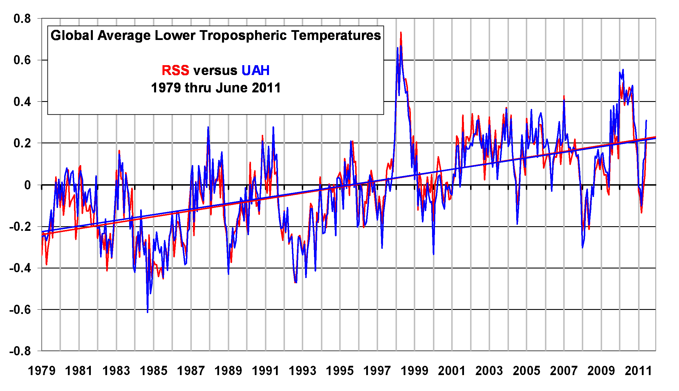

(In the above plot I have re-computed the RSS anomalies so they are relative to the 1981-2010 average annual cycle we use; this does not affect the trends…just makes it more of an apples-to-apples comparison).

But if we examine a time series of the DIFFERENCE between the two temperature records, we see some rather interesting structure:
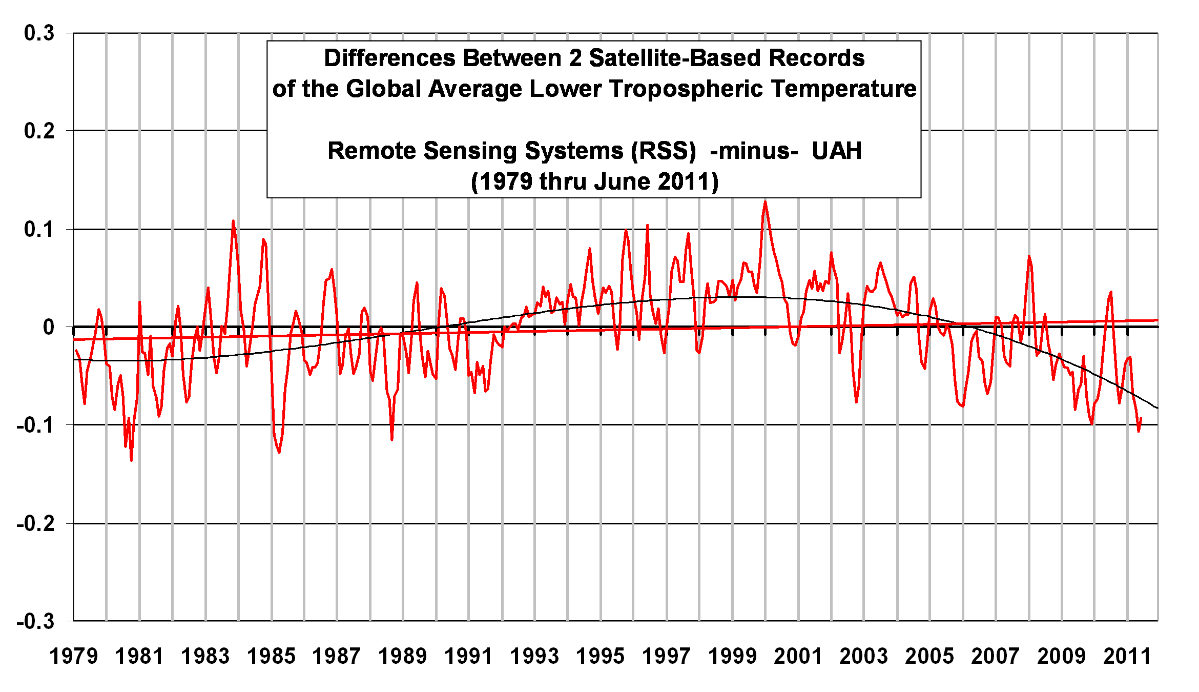

(Note: I have applied a 3-month smoother to the data to reduce noise).

As can be seen, in the last 10 years or so the RSS temperatures have been cooling relative to the UAH temperatures (or UAH warming relative to RSS…same thing). The discrepancy is pretty substantial…since 1998, the divergence is over 50% of the long-term temperature trends seen in both datasets.

WHY THE DIVERGENCE?

So, why the discrepancy? Well, if it was OUR (UAH) data that was cooling relative to RSS, people would accuse us of being bought off by Exxon-Mobil (I wish!…still waiting for that check..). At least that has been the history of this debate.

But now WE are the ones with “excess” warming. So where are the accusations that RSS is being bought off by Big Oil?

Hmmmm?

(It’s OK, we are used to the hypocrisy. 🙂 )

Anyway, my UAH cohort and boss John Christy, who does the detailed matching between satellites, is pretty convinced that the RSS data is undergoing spurious cooling because RSS is still using the old NOAA-15 satellite which has a decaying orbit, to which they are then applying a diurnal cycle drift correction based upon a climate model, which does not quite match reality. We have not used NOAA-15 for trend information in years…we use the NASA Aqua AMSU, since that satellite carries extra fuel to maintain a precise orbit.

Of course, this explanation is just our speculation at this point, and more work would need to be done to determine whether this is the case. The RSS folks are our friends, and we both are interested in building the best possible datasets.

But, until the discrepancy is resolved to everyone’s satisfaction, those of you who REALLY REALLY need the global temperature record to show as little warming as possible might want to consider jumping ship, and switch from the UAH to RSS dataset.

It’s OK, we’ve developed thick skin over the years. 🙂 You can always come home later.

Gee, I wonder if some of all that green money will start flowing our way now? I’m not going to hold my breath.


35 Responses to “On the Divergence Between the UAH and RSS Global Temperature Records”

Toggle Trackbacks

  1. DeNihilist says:

    Dr. Roy, you seem to be having way too much fun lately!

  2. Ulf says:

    Very funny!

    Good illustration to a hot topic. Cool.

  3. Tilo Reber says:

    Roy,

    Been a long time fan and I don’t think that I quite deserved the beating over the head. But it’s okay, I also have a thick skin and I’m not going to hold it against you.

    One of the reasons that I asked you the question was because I know of your blog. Do the RSS guys have a blog? If they do and you give me the link I will be happy to ask them the question as well. I also know that you had worked with the RSS guys to help them resolve a problem that they had a couple of years ago. So, you seemed to be a good starting point for this question. It occured to me that at some point you would get together and figure out what was going on, regardless of the cause.

    Now, that being said, I also noticed that the changes that your data showed for the last 17 months were not reflected in HadCrut3. I realize that they are not measuring quite the same thing, but the only reason that I previously had any confidence in HadCrut3 was because the slope of their data was not that far from that of the satellites. So I basically had three data sets telling me the same story. I knew that GISS was telling a different story, but it looked to me like the GISS difference was due to a faulty extrapolation from shore stations that were subject to warming from sea water when the ice retreated – and such warming could not be extrapolated across the arctic ice. Here is my take on the GISS problem.

    http://reallyrealclimate.blogspot.com/2010/01/giss-temperature-record-divergence.html

    I put up the comparative charts of what I was looking at and what caused me to ask the question in the first place, here:

    http://reallyrealclimate.blogspot.com/2011/07/rss-and-uah-divergence-charts.html

    Notice that the slope of HadCrut3 has hardly changed at all during that extra 17 month. The biggest change was in UAH. I was also interested in the fact that UAH had such a strong response to the last El Nino, but not that much of a response to the La Nina. Previously it had shown strong responses to both. The RSS response looks very similar to the UAH response for those last 2 ENSO events, but RSS should be offset from UAH by that .1C baseline change.

    I had heard about the use of station keeping for UAH, and that certainly seems like a good thing. But I assume that the RSS correction (should?) take care of that. I hope their correction is not so far off that it would cause that large a divergence in only 17 month.

    About the station keeping. Are you pulsing rocket engines on the satellite to accelerate it periodically. Is there a granularity to those pulses so that they slightly overshoot at first and then drag back to undershoot after some time period. I’m assuming that corrections are still being made to accomodate the granularity of those rocket pulses.

    By the way, I attended UAH for a while around 1970 to pick up some undergraduate hours while I was in the military at Redstone. Nice school!

    And, no, I definitely don’t think that you have gone over to the dark side. 😉

    • Tilo:
      I hope you don’t think I was beating up on you…I want to thank you for being one of the few who watch these details, and bring issues to our attention.

      I don’t think RSS has a blog to discuss these issues. John Christy has, from time-to-time, corresponded with RSS about the existence of the discrepancies between RSS and UAH.

      Regarding your comparisons of the satellite to the surface, you really should first adjust for the greater variability in the satellite data. There is a considerable amplification of warming or cooling with height, especially during El Nino and La Nina (but apparently not in the long-term trends…the missing “hot spot” issue).

      So you either need to renormalize the satellite to the surface standard deviation, or the surface to the satellite standard deviation, or divide both of them by their respective standard deviations. Otherwise, the surface and satellite will look like they are “diverging” every time there is a warming or cooling event.

  4. If UAH was brought off by greenpeace it is kind of pathetic. The observations still don’t come close to the models.

    Also, why doesn’t the RSS series show a peak during the 1998 El Nino year?

    It wasn’t on your blog, but thanks for the ‘cartoon world of global warming’.

  5. Jon says:

    Climate Noncomformist,

    The RSS series does show a peak during 1998. If you can’t distinguish the red from the blue in the graph, even when you open it in its own window, just go find a graph of RSS only. Or go to the web site where they make the RSS temperature anomaly data freely available – Google is your friend.

  6. Andrew says:

    I think John Christy has done quite a lot of solid work piecing the the satellite data together and checking it for accuracy, so I’m not jumping ship. It is worth noting that RSS’s recent spurious cooling is just ofsetting an earlier spurious warming in about 1992 which appears to be related to the merging of NOAA-11 and NOAA-12. This was noted in several publications, many by John and co-authors, but independent groups, too. The earliest reference of which I am aware is:

    Christy, J. R., W. B. Norris, R. W. Spencer, and J. J. Hnilo (2007), Tropospheric temperature change since 1979 from tropical radiosonde and satellite measurements, J. Geophys. Res., 112, D06102, doi:10.1029/2005JD006881.

  7. KevinK says:

    Dr.Spencer, with respect;

    Is the climate science community at all cognizant of the notion of a “noise floor”? This term is best described by considering how accurately you can measure the height of an object above a floor. No matter how good your measuring equipment is even the floor itself is moving (yes, even if it is a massive granite slab like in an optics lab) so you can only measure that height with a knowledge that is no smaller than this noise floor. In all engineering measurements we determine the noise floor of the measurement method/technique/technology. This is the limit/resolution/finesse of that particular measurement attempt. When we want dependable (aka you can take it to the bank) data we insist on a measurement noise floor that is at least 10 times smaller than what we attempt to measure. When we can cost effectively obtain it we prefer a measurement that is 100 or 1000 times better than what we
    are attempting to measure.

    Most of what we see from the climate science community is data presented in tenths of a degree (or sometimes even more unbelievably in HUNDREDTHS of a degree), yet we know that this is almost exactly equal to the noise floor of the climate scientist’s ability to measure temperature. How can we be sure that what you are presenting and others are calculating are not spurious signals from the noise floor of the temperature measurement technique?

    Just to present a layman’s analogy, this is somewhat similar to me going to an electronics store and buying an AC voltage meter. Then I measure the 120 volt AC electricity delivered to my house and subsequently complain to the power company that my 120 volts is varying by one 1/10 of a volt. It may indeed be varying, but it may also be that my voltage meter has a noise floor of several tenths of a volt.

    When the data presented by the climate science community approaches 1/2(or even better a few degrees) it might have more significance. Right now it all looks like measurement noise.

    Just something to consider.

    Cheers, Kevin

    • Kevin,
      These blog posts do not go into such technical details, although they do exist.

      Some of our earliest papers on global temperature monitoring gave precision estimates for monthly global averages, daily global averages, and corresponding signal-to-noise ratios. We got these by comparing years of statistics from different satellites flying at the same time but in different orbits. I forget the exact numbers, but yearly global anomalies have a precision of about 0.01 deg. C or so, daily is several hundredths of a degree, etc.

      The ABSOLUTE accuracy of the measurements is not nearly as good….probably no better than about 0.5 deg. C. But since each deep-layer measurement of the atmosphere includes individual air layers spanning tens of degrees, even small errors in the microwave absorption theory will translate into that much uncertainty.

      One way to look at it is that even though we are not exactly sure where the “floor” is, as long as the floor is always in the same location, it does not really matter for long-term temperature monitoring.

  8. Joel Upchurch says:

    This is interesting. I happened to do a graph last month of the UAH and RSS data with the HADCRU and GISS as 12 month moving averages.

    http://www.anupchurchchrestomathy.com/2011/06/comparing-giss-hadcru-rss-and-uah.html

    You can click on the graph to see it full size. My basic point was how similar all 4 data sets are when you project all of them out for a century. All of them agreed to 0.3 degrees per century, which as far as I’m concerned is identical.

    One thing I didn’t mention, is that in the post 2003 data, GISS seems to diverging from the other three indexes and showing warming that isn’t shown in HADCRU, RSS and UAH indexes.

  9. Baz says:

    I’m a layman myself, but surely if we apply a ‘noise floor’ to global temperatures then we cannot state anything! Have I got that right?

  10. Baz says:

    Actually, I hope I can use this forum to ask a question. Remember, I’m a layman, and I hope this isn’t a stupid question, but what happens to all the heat that comes out of our windows and doors, or from vehicle engines? I’ve heard of the Urban Island Heat Effect, so is that what it is? Surely there must be a huge amount of heat that comes from a town or city. What happens when all this heat energy comes up into the atmosphere?

    • Baz, the global effect of humanity’s heat production has been estimated before and it is very tiny when compared to, say, average solar input into the climate system. So, it is ignored.

      • Merrick says:

        Dr. Spencer – of course your simple answer is correct, but I think it might leave a false impression that the heat you’re talking about equates to what is normally thought of as UHI, which it isn’t. UHI is the impact that human development has on thew ability of the solar input to heat the surface (and therefore the surrounding atmosphere). That, I think you’d agree, is a well-established phenomenon.

        • Yes, you are correct, they are different phenomenona. But even the UHI effect is tiny when you are talking about it’s effect on the “true” global average temperature.

          Of course, if many of the thermometers happen to be located in locations where there is an increasing UHI effect over time, then a thermometer-based estimate of global warming WILL have a problem. But what I am talking about is how these human-caused effects influence the “true” global temperature state of the atmosphere.

          • John says:

            Roy, Joel Upchurch’s linked graph shows that while the satellite and land based records show broadly similar trends in temperature increases, the land based records start from a base that is 0.2 degrees higher than the base from which the satellite records begin. Ross McKittrick and Patrick Michaels published a paper showing that heat was measurably higher over urbanized areas than over other areas (using satellite data, I think). I therefore wonder if the higher starting point for the two non-satellite data sets might reflect urban heat island effect?

            [This is a reply to Roy’s 5:51 AM comment, but I was unable to make the comment there.]

  11. Lol, thanks for the laugh Dr Roy. When can we have the most recent SST anomalies?

  12. Carl Mears says:

    Hi Roy

    Like you and John, I am interested in understanding the differences between our datasets. But your explanation does not make much sense because our trends went DOWN between V3.2 and V3.3. The difference between 3.2 and 3.3 is that we added data from AQUA, MetopA, and NOAA18. If NOAA15 were the cause of the relative cooling, I would have expected the opposite to occur.

    To me, arguing about the differences in trends in GLOBAL averages between our TLT datasets is much ado about nothing
    and serves to obscure the true differences. There is much more discrepancy between TMT trends, and between TLT trends in the tropics.

    Carl
    Remote Sensing Systems

    • sky says:

      I agree that the discrepancies between RSS and UAH are far more stark in the tropics series than in the global one, with a range from -.501K in Nov 1980 to +.324K in Jul 2007, based on the old norms. The overall regressional trend thus is ~.96K per decade higher in the RSS results. What is your explanation for discrepancies of such magnitude when processing essentially the same raw data?

  13. charles nelson says:

    I would have to admit about knowing little about statistics other than ‘lies, damned lies and ——-‘.
    But I do know a thing or two about measuring temperature albeit in a practical hands on kind of way.

    When I hear anyone talking about Global Average Temperature, I point out (and have actually demonstrated) that using 1/10 degree increments it’s dead easy to measure three different temperatures at any time INSIDE YOUR FRIDGE…that’s with the door shut and the motor running.

  14. Dan Pangburn says:

    Temperature anomalies through Jan, 2011 from all five agencies now reporting are graphed in the pdf made public 3/10/11 at http://climaterealists.com/index.php?tid=145&linkbox=true
    The average for May, 2011 is the same as for Jan, 2011. UAH and RSS look to be nearly the same for April and May, 2011.

  15. Tilo Reber says:

    Roy,

    Thanks for the reply. I was aware that the satellites have an amplified effect to ENSO. My thought was that there had been both an El Nino and a La Nina since I had produced that old chart, and so the effect on the trend would have been neutralized. Of course that is a pretty rough measure on my part.

    In any case, I’m going to stop bothering you about this now. I know that you and John, as well as the RSS team, have the integrity to figure out the cause of the divergence, so I’m going to let you do it and I’m not going to worry about it anymore. Have a good day.

  16. jeff id says:

    A couple of years ago, I spent some time looking at the step difference in the middle of the RSS/UAH series at around 1992. I used surface station data to determine in this small range, which series was a better match. I found that UAH was more accurate in that step. John Christy emailed me a few studies on the topic including his work on radiosondes that found the same conclusion.

    Since UAH started using the station keeping satellite, I’ve been telling people that it is now the best trend analysis available for air temps. Hopefully, the system continues to be updated so the sat record stays accurate from here out.

  17. Bob Tisdale says:

    Roy: I haven’t read through all of the comments to see if this was raised by someone else. But there are also differences in latitudes covered by the two datasets. RSS excludes data south of 70S. Wouldn’t that account for part of the divergence, since the UAH TLT trend for the Antarctic is negative?

  18. Doug Proctor says:

    Nice piece of work that shows the “average” is not necessarily closer to truth than an “outlier”. (Substitute “consensus” for “average” if you wish.)

    A 0.1C difference is extremely important by the GISTemp/Hansen view, where 0.01C temperature values are considered enough to generate “warmest” year/month/day ever.

    If a satellite is in a decaying orbit, does the orbit become a smaller circle or an ellipse? Intuitive thinking from experience with revolving objects says it would be an ellipse, and perhaps one that has a big rotation of its axes. Is this the case and make correction more difficult?

    The satellite data is touted as being more pure than the ground station data in that the temperatures are not correlated to a surface station or two. But this says that the temperatures we see are, indeed, corrected signficantly. How much correction or manipulation is there in the satellite data, and how important are the assumptions or other data types in getting a “true” reading?

  19. Gary Hladik says:

    Dr. Spencer, if you really want “all that green money”, you’ll have to find a way for UAH temperature measurements to match the IPCC climate models. Merely exceeding RSS won’t cut it. 🙂

  20. Kramer says:

    A correlation coefficient of 0.963 seems close enough to me. How much closer would you want it to be?

  21. Ross says:

    With all the potential problems in precision from satellite sensors (are they maintained and checked for accuracy regularly?) and the seemingly obvious problems with precision from ground based measurements (the argument that the trend still shows up despite UHI effects doesn’t cut it with me) plus all the mathematical averaging done on the datasets to arrive at anomilies with precision to 2 or 3 decimal places leaves me gobsmacked.

    How can I, as an interested layperson, accept that all this precision is possible when I am regularly confronted with news stories that terrestrial base speed abd red light cameras are regularly failing to give reproducible results ? (yet our government/police are still fining motorists and accepting that less than a third will take the issue to court accept not proceeding with those that challenge)

    Why should I give any creedence to these datasets especially the ones relied on by the IPCC and especially when their strike rate appears to be zero ?

  22. Ye Olde Statistician says:

    Why do folks spring linear regression lines through data that are clearly not linear? Why not decompose them into principle components?

  23. Bob Tisdale says:

    Oops, I had my thinking cap on backwards in my earlier comment. Nevermind.

  24. Tenuc says:

    Is it possible that difference in the assumptions made for the RSS and UAH models used to convert the instrument measurements into temperature anomalies could be causing a divergence?

  25. sky says:

    Sorry for the typo. That should be ~.096K per decade.

  26. KevinK says:

    Dr. Spencer, with respect thank you for the reply;
    You wrote;

    “I forget the exact numbers, but yearly global anomalies have a precision of about 0.01 deg. C or so, daily is several hundredths of a degree, etc.”

    You also wrote;

    “The ABSOLUTE accuracy of the measurements is not nearly as good….probably no better than about 0.5 deg. C.”

    I believe that the climate science community has confused the real meaning of “accuracy” versus ”precision”.

    Let me present a layman’s analogy, I can indeed posses a very nice wooden yardstick with finely engraved increments that have a PRECISION (aka resolution) of 1/100 of an inch. I can also have an nice stable INVAR yardstick (a very stable (WRT temperature) metal) that only has engraved increments of 1/10 of an inch.

    As the temperature and humidity changes my wooden yardstick will indeed give me very precise measurements of distance that are in fact QUITE WRONG. My Invar yardstick will provide less precise measurements that are in fact MORE CORRECT.

    I am of the opinion that the climate science community only has the ability to measure absolute temperatures within about 0.5 degrees C (1 sigma). This is for the satellite measurements, the surface measurements are probably a more atrocious 1-3 degrees. Therefore any subsequent analysis/modeling/predictions are ALMOST USELESS……

    For the record, I am not opposed to the alleged study of the climate, but since I am paying for this (as a US taxpayer) I fully expect you guys to UPGRADE YOUR GAME………

    I know this is an old and probably tired subject, but in my opinion the climate science community has decided that the best model of the climate of the Earth is as a DC (direct current) circuit. Hence, the “radiative forcing” nonsense. I believe that an AC (alternating current) model that fully considers the speed of heat (aka frequency response or delay time) is a more appropriate model.

    Has the climate science community calculated the “speed of heat” that EM radiation arriving from the Sun (our only meaningful energy source) propagates through the entire Sun/Earth/Atmosphere/Universe system yet ?

    Cheers, Kevin.

  27. It is worth mentioning that this season is also the first time that Original Women louis Vuitton Sale|Authentic Women louis Vuitton Sale|Cheap Louis Vuitton Handbags Factory Outlet Online Sales has joined forces with Italian art and design studio Fornasetti to launch a new women’s collection with diverse styles. Piero, the founder of Fornasatti, is an important figure in Italian industrial design culture. He is best at creating hand-painted patterns inspired by “face” and decorating them on dinner plates. The classical patterns designed by Fornasetti have always been favored by art and design lovers.

Leave a Reply