July 2012 Hottest Ever in the U.S.? Hmmm….I Doubt It

August 8th, 2012 by Roy W. Spencer, Ph. D.

Using NCDC’s own data (USHCN, Version 2), and computing area averages for the last 100 years of Julys over the 48 contiguous states, here’s what I get for the daily High temps, Low temps, and daily Averages (click for large version):
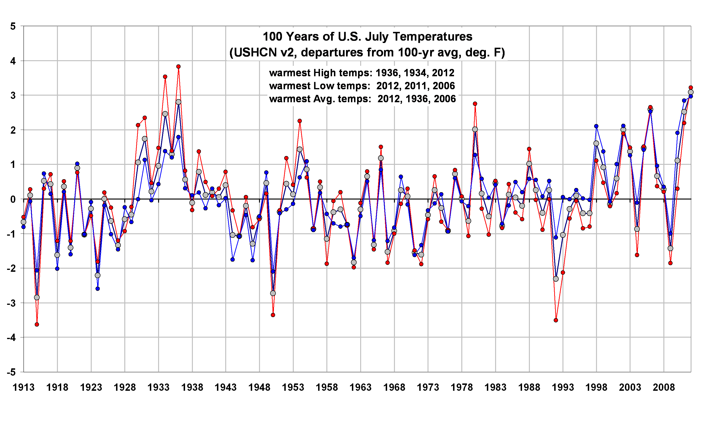
As far as daily HIGH temperatures go, 1936 was the clear winner. But because daily LOW temperatures have risen so much, the daily AVERAGE July temperature in 2012 barely edged out 1936.

Now, of course, we have that nagging issue of just how much urban heat island (UHI) effect remains in the data. The NCDC “homogenization” procedures are not really meant to handle long-term UHI warming, which has probably occurred at most of the 1218 stations used in the above plot.

Also, minimum temperatures are much more influenced by wind conditions and other factors near the surface…Max temperatures give a much better idea of how warm an air mass is over a deep layer.

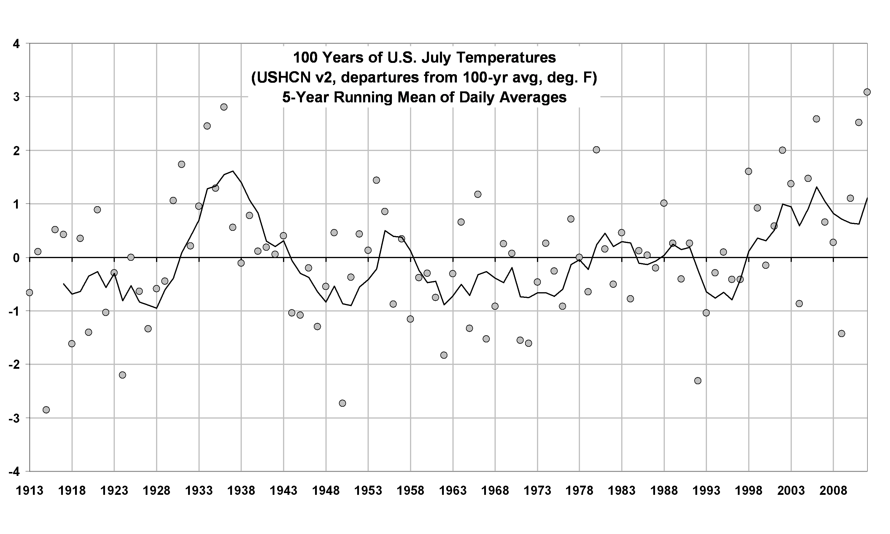
Also, I thought one month doesn’t make a climate trend? If we look at the 5-year running mean of the daily averages for July’s over the last 100 years, we see that while recent Julys have indeed been warm, it is questionable whether they rival the 1930s:
And if we do the same 5-year averaging on July maximum temperatures, the 1930s were obviously warmer:
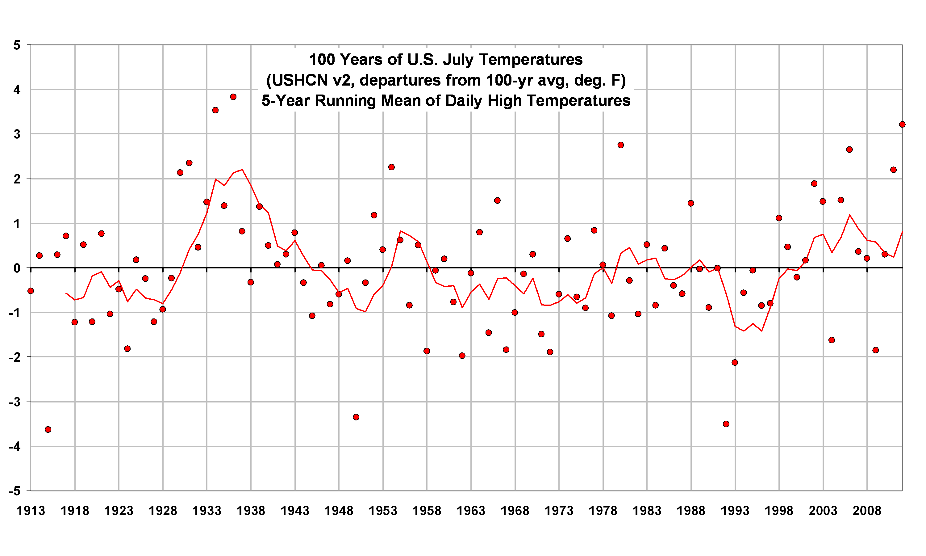
So, all things considered (including unresolved issues about urban heat island effects and other large corrections made to the USHCN data), I would say July was unusually warm. But the long-term integrity of the USHCN dataset depends upon so many uncertain factors, I would say it’s a stretch to to call July 2012 a “record”.


32 Responses to “July 2012 Hottest Ever in the U.S.? Hmmm….I Doubt It”

Toggle Trackbacks

  1. Great info. I appreciate it.

    I was wondering if it would be possible for you to post the most accurate graph of temperature data for the globe going back to the year 1000 AD- PRESENT.

    I would love to have something which you feel is as accurate as possible ,and which you have at least somekind of confidence in. Thanks.

  2. I agree, but I think, it is the global temperatures that matter, and not some region of the globe.

    That is what makes the report they came out with kind of not important. I mean if the United States had a record July temperature , and yet average global temperatures were only +.28 c above normal, that means there were many places that had a very cold July, or at least a July with below normal temperatures. I would tend to lean toward temperature extremes ,not global warming, in the context of the hot July, for the United States.

  3. Now that I look at the temperature graph I think I put to much emphasis on the PDO yesterday, and not enough on other factors. The temperature graph however, I was looking at ,was so much different, then other ones ,especially from the satellite data ,once that started.

    That is why caution has to be the word.

  4. jim2 says:

    Dr. Spencer –
    Obviously the UAH measurements include cities and developing areas.

    What % of the ~ 0.6 C increase do you attribute to the increase in urban/suburban land area over the sat period?

  5. oliv says:

    Maybe you could perform a 4th order polynomial fit ?

  6. steve. s says:

    Hello Dr Spencer.

    If I could go slightly off topic for a moment, I would like to know your opinions on Dessler’s recent paper –

    Observations of climate feedbacks over 2000-2010 and comparisons to climate models

    A. E. Dessler
    Dept. of Atmospheric Sciences, Texas A&M University, College Station, TX 979-862-1427

    Abstract
    Feedbacks in response to climate variations during the period 2000-2010 have been calculated using reanalysis meteorological fields and top-of-atmosphere flux measurements. Over this period, the climate was stabilized by a strongly negative temperature feedback (~ ?3 W/m2/K);

    climate variations were also amplified by a strong positive water vapor feedback (~ +1.2 W/m2/K) and smaller positive albedo and cloud feedbacks (~ +0.3 and +0.5 W/m2/K, respectively).

    These observations are compared to two climate model ensembles, one dominated by internal variability (the control ensemble) and the other dominated by long-term global warming (the A1B ensemble). The control ensemble produces global average feedbacks that agree within uncertainties with the observations, as well as producing similar spatial patterns. The most significant discrepancy was in the spatial pattern for the total (shortwave + longwave) cloud feedback. Feedbacks calculated from the A1B ensemble show a stronger negative temperature feedback (due to a stronger lapse-rate feedback), but that is cancelled by a stronger positive water vapor feedback. The feedbacks in the A1B ensemble tend to be more smoothly distributed in space, which is consistent with the differences between ENSO climate variations and long-term global warming. The sum of all of the feedbacks, sometimes referred to as the thermal damping rate, is ?1.15±0.88 W/m2/K in the observations, ?0.60±0.37 W/m2/K in the control ensemble. Within the control ensemble, models that more accurately simulate ENSO tend to produce thermal damping rates closer to the observations. The A1B ensemble average thermal damping rate is ?1.26±0.45 W/m2/K.

  7. josef says:

    I’ve been reading the work of Hansen et al
    http://www.pnas.org/content/early/2012/07/30/1205276109.full.pdf+html

    Perception of climate change
    James Hansena,1, Makiko Satoa, and Reto Ruedyb

    I think it’s a sort of trick what they do by comparing the 1951-1980 data, with the last decades, because they are comparing a relatively cold period with a relatively warm one.

  8. Tom Oyler says:

    Hello:

    Curious about the time of day that the high temperatures occurred.

    Tom Oyler
    Wichita, KS

  9. Tim says:

    My family moved to a small village on the edge of Sheffield in England in 1966, the population has swelled from 2K to 12K. The population of Sheffield has remained at about 550K since the 1950’s, but the population is now spread out over a much larger area. This must create large urban islands and this distorts temperature measurements. Any explanations for the snow in South Africa?

  10. bubbagyro says:

    Go to WUWT for a global snapshot for July. You can see that the US was one of the few hot spots because of the blocking high. Most of the globe was cold, including snow in S. Africa and AUstralia-New Zealand.

  11. OpusTheFowl says:

    “Most of the globe was cold, including snow in S. Africa and AUstralia-New Zealand.”

    What! It was cold in the southern hemisphere in July!!! Snow even!!!

    Run for the hills…

  12. bob paglee says:

    Is cherry-picking a single month to create the notion of a terrifying tempeature trend much different than cherry-picking tree-ring data to try for the same result?

  13. Cathy B says:

    Funny the appearance of a five year average on this site. If you plot the five year average of global UAH temperature that Dr. Spencer champions, then any statement about there being no warming since 1998 disappears. The last half decade of five year averages is clearly higher than any period before in the satellite era. A three year running average is even more entertaining since the last three years are the warmest ever. If you ever wondered why a 13 month average appears on all the UAH historical chart, just ask yourself how long the mega El Nino of 1998 lasted. Any longer average removes the idea that this period was the warmest we have seen.

  14. Greg Rummo says:

    In 2007 there were reports that the MaArtian polar ice caps were shrinking at high rates and had become smaller in comparison to previous images. With the coincidental “warmest July in 117 years” and the landing of NASA’s Curiosity on Mars, I am wondering if there has been any data coming back about the temperature on the Martian surface and whether Mars is also experiencing global warming. Certainly if it is, then the blame must placed on that NASA Rover spewing all those greenhouse gases into the Martian atmosphere. Isn’t every climatological perturbation on Earth the direct result of man’s presence? All kidding aside, it would be interesting to look into any climate data that arises from NASA’s latest Mars probe and if in fact a warming trend is noted, clearly the culprit is that big thermonuclear object that sits 93 million miles from us in space experiencing overactivity.

  15. barry says:

    “Is cherry-picking a single month to create the notion of a terrifying tempeature trend…”

    NCDC didn’t make a trend out of a months worth of data. Roy introduced that notion in his post, but it was not apropos of anything.

  16. barry says:

    Greg, we don’t need sparse info from distant planets to measure solar variation. We have instruments pointing directly at the sun to do that, as well as sun-spot watchers.

  17. Rob says:

    I’m confused why you are looking at trends when the news story is about the hottest July on record, not the hottest above average.

    A simple google to NOAA’s July statement (http://www.ncdc.noaa.gov/sotc/) states:

    “The average temperature for the contiguous U.S. during July was 77.6°F, 3.3°F above the 20th century average, marking the hottest July and the hottest month on record for the nation. The previous warmest July for the nation was July 1936 when the average U.S. temperature was 77.4°F.”

    So 2012 average temp = 77.6 F
    Previous record (1936) = 77.4 F.

    So 2012 is 0.2 F higher than all previous values. It is the highest recorded. So why do you doubt this trivial math issue?

    Will it be the hottest year on record – that’s an utterly different story. Is a trend going on – another story. But factually, ignoring removing some kind of average and showing differences, the absolute value of temp is warmer.

  18. An Inquirer says:

    I am not aware that NCDC “homogenization” procedures include an adjustment for UHI warming. GISS does include an adjustment for UHI warming — based on lights visible from satellite. For many analysts. GISS’s procedure is not totally convincing. On the other hand, I understand that NCDC — like HadCru — does not adjust for UHI, but NCDC does adjust for TOBS in its homogenization procedures. To be candid, I am not convinced that the TOBS adjustment is reliable. The total homogenization process adds about one degree to NCDC’s warming trend above observed temperatures. Therefore, it is not impressive to me to proclaim that 2012 July is .2 degree F higher than 1936 July when 2012 July gets a boost from TOBS and other adjustments AND does not get docked for UHI.

  19. NOAA’s and NASA’s Hansen’s recent papers show British Prime Minister Benjamin Disraelic new how to predict the future when he said “There are three kinds of lies: lies, damn lies, and statistics.”

  20. NLBwell says:

    Primarily, the cause of the hot July is a high pressure system sitting over the center of the United States. A major characteristic of this high pressure system is that it is a very dry weather system. With a dry system, maximum daily temperatures would be hotter and minimums not as relatively high. Also, if there is more humidity in the air, there will be thunderstoms earlier in the day – causing the max temperature to not read as high. All we can surmise from the hot July was that there was a dry air mass with flow from the (warm) South.

    Of course, it is a worrisome weather pattern if it continues. If moisture from the Gulf of Mexico is not transported Northward, the Midwest would be much like the Great Basin. However, none of this is relevant to any discussion on global warming one way or the other.

  21. “Cathy B says:
    August 10, 2012 at 1:37 AM
    A three year running average is even more entertaining since the last three years are the warmest ever.”

    That is an interesting observation! And while that is true for UAH, it is NOT true for RSS, Hadcrut3, hadsst2, nor GISS. See
    http://www.woodfortrees.org/plot/gistemp/from:1980/mean:36/plot/hadcrut3gl/from:1980/mean:36/plot/rss/from:1980/mean:36/plot/uah/from:1980/mean:36/plot/hadsst2gl/from:1980/mean:36

    Has UAH been too high over the last three years? On February 2, Dr. Spencer wrote: “Progress continues on Version 6 of our global temperature dataset. You can anticipate a little cooler anomalies than recently reported, maybe by a few hundredths of a degree, due to a small warming drift we have identified in one of the satellites carrying the AMSU instruments.”

  22. Tom Harris says:

    A quick question about your graph on the above Website. The actual comparison of all the temp plots shows them overlapping a lot – see http://climate4you.com/images/AllCompared%20GlobalMonthlyTempSince1979.gif. But yours are all apart from each other which makes the y axis readings wrong. Have you done this just to show the shape and trend of each temp record, so we should ignore the actual values on th Y axis when looking at your graph?

  23. “Tom Harris says:
    August 11, 2012 at 12:21 PM
    Have you done this just to show the shape and trend of each temp record, so we should ignore the actual values on the Y axis when looking at your graph?”

    I am assuming you mean my graph above as what you says perfectly applies. What was plotted is exactly what WFT gives when you ask for the plot as asked for with a mean of 36 months. Different groups use different base periods so the Y axis is not relevant in that sense. My only purpose in these graphs was to illustrate that UAH has the most recent 3 years as the warmest and all the other 4 groups have an earlier set of 3 years as being warmer than the most recent. I have offset things now so they start at the same place. See
    http://www.woodfortrees.org/plot/gistemp/from:1980/mean:36/offset:-0.15/plot/hadcrut3gl/from:1980/mean:36/offset:-0.05/plot/rss/from:1980/mean:36/offset:%200.07/plot/uah/from:1980/mean:36/offset:0.12/plot/hadsst2gl/from:1980/mean:36/offset:-0.01

    This raises an interesting question. Is UAH too warm at the end or are the others too warm earlier?

  24. Ranyl says:

    Considering that in 1936 there had been a period of droughts, leading to dry soils the exacerbate heat waves, and other human farming interventions that also played key roles in increasing the 1936 heat wave blocking event, it is surprising that record temepratures have been brocken now, considering the irrigation amounts and improved farmign practices.

    The dry land, has no moisture to cool it, and thus causes more intense and rapid warming, yet 2012 follows a wet year, with lots of evaporatiion cooling, aided and abetted by a large increase in irrigation and dams, adding to evaporative cooling further.

    Also the USA since 1940’s has been cooled by a large cloud of industrial cooling in the form of sulphates, etc, which has cooled and moistened the Eastern USA by at least 1-2C and although this has fallen recently, there is still some 30-40% of peak 1980’s emissions today. So basically the Eastern USA has been considerably cooled in the last 50-60years and still is being.

    Now also the 1936 drought and heat wave was exceptional, at climatic extreme so severe it threatened the whole world economy and people starved in America.

    Now despite the cooling and continued emissions, by 2010 the general warming influence started to be felt…since then there have been 14 straight months in the USA that have been in the top three warmest months. Now playing with a 100 sided dice and throwing a top three every go in fourteens tries, can happen by chance, about 1:33^14, whatever that is (the chance of having a top three hot month is 1/33 if 100 years of records taken).

    And then 2012 was the hottest July and March, both breaking extreme temperature records, all over the USA.

    As for snow it occurs in SA, and is a weather extreme they do happen, doesn’t mean the world is cooling, just like a heat wave doesn’t mean the world is warming, but lots of heat waves records occuring more often than cold events make it all a bit suspicious. And I presume you are aware of the results of a slowing jetstream due to decreased equatorial polar heat differential, that will lead to cold outbursts of polar air more equatorially and warm bursts of hot air more poleward. In March some places in Canadan that don’t normally ever get warm air outbursts eat temeprature records by 30C for the month!

    As for the scale of warming, well, it is clearly happening despite the tedium of claims of accounting errors that cause a false warming signal (this claims have all been well accounted for in the literature and it is sad seeing you resort to such none points), the world is warming very quickly, and 2010 was the hottest year so far, closely followed by 2005, 1998, and then all 2000’s in the top ten, and why 2000-2010 is so much warmer than the 1990’s. And considering the very strong world cooling La Nina, remarkedly low sunspots and continued cooling effects from Industrial SO2 from Asia and USA and Europe, as well a general massive increase in land cooling irrigation, it seems remarkable that 2011 made the top ten years, all things being due to natural variation.

    Dr. Spencer I used to practice medicine and sometimes I got the wrong the diagnosis, didn’t make me a bad doctor just one of those things, and at present the evidence that the earth is undergoing an extreme period of warming that is geoligical extreme is beyond reasonable doubt to any clear thinking mind. For a medical analogy the earth is having a major heart attack not angina.

    Clearly the mountain of evidence that is prsent for a general severe global warming event is not convincing you at present. When it does and it will, don’t chastise yourself just do everything you can to help out then, there is no one more enthusiastic for people to stop smoking than an ex-smoker. I look forward to reading for works when start treating the heart attack rather than still insisting that there this little wrong with the patient and there is something wrong with the ECG machin, despite the fact the patient is cold, clammy, has no blood pressure and is doubled up in agony!

  25. “Ranyl says:
    August 23, 2012 at 2:51 PM
    and 2010 was the hottest year so far…
    2011 made the top ten years…
    Clearly the mountain of evidence that is prsent for a general severe global warming event”

    What you are describing here only applies to GISS as far as I know. With UAH, 1998 was the warmest, although 2011 came in 9th. However with both RSS and Hadcrut3, the warmest year was 1998 and 2011 came in 12th. As for your “severe global warming event” RSS has a flat slope now for 15 years and 8 months. (Hadcrut3 and Hadsst2 are also over 15 years now with a flat slope.) What slope over what time would you consider severe? See:
    http://www.woodfortrees.org/plot/rss/from:1996.9/plot/rss/from:1996.9/trend

  26. Rany says:

    http://www.metoffice.gov.uk/news/releases/archive/2012/hadcrut-updates

    2005 and 2010 were the warmest years in Hadcrut see above.

    UAH 2010 was 0.41C compared to 0.42C, and note the anomally is from average to 2010, therefore why 0.42 seems so low compared to surface measurements etc.

    http://en.wikipedia.org/wiki/File:Radiosonde_Satellite_Surface_Temperature.svg

    See graph there been no cooling, or even a hint of a plateau, 1998 was a greater than 2-3SD extreme, so your arguement that it hasn’t warmed much sinc ethen entirely flawed. Imagine standign at a bar, and a stream of people walk past all at the average height 5’10”, and then suddenly one comes along at 6’7″, due to an El-Nino like factor influenceing it, and after that the stram fo people returns to normal, but then you notice that on average the stream gets taller (evryone is suddenly over 6ft) to the point that in 2005 and 2010, despite not ideal conditions for being tall, two other 6’7″ and in ideal short conditions (e.g. 2011), the passer by is still 6’4ish, now in that analogy only a fool would think tha tthe people weren’t get taller, yet that is what has happened with the temperature record and you still think were at 5’10”.

    Also do remember the historic (i.e. worst ever known), climate events, e.g. Amazon drought 2005, 2010, Texas drought 2011 (6’10” event), Missippi rain 2011, Pakistan rain, Thailand rain 2011, CHina drought, 2011, Arctic sea ice 2007-2012,and so and so on.

    And remember before you reach for the Arctic sea ice has been that low in the Holocene for false security please do remember that the peak Holocene NH insolation was considerably higher than now and there was no period that was summer ice free, so as that is now a certianity in the next 100years to be very conservative (even if all Co2 emissions stopped today). That is the Arcitc sea ice should be growing now not shrinking and very dramatically.

  27. Je ne suis pas vraiment un lecteur Internet pour tre honnte mais vos blogs vraiment sympa, continue comme a ! 에볼루션카지노 Je vais aller de l’avant et ajouter votre site vos favoris pour revenir l’avenir. advgamble.com

  28. One of the best reads ever. Thank you for sharing with us. business coaching Whangarei

  29. I really appreciate how this article was compose with full of insights and ideas! Thanks for sharing a wonderful article. Great work!
    https://emergencyplumberbondi.net.au/urgent-plumber-bondi/

  30. Thanks for sharing a wonderful information, I have gain more knowledge after reading this. Great work!
    https://emergencyplumberbondi.net.au/urgent-plumber-bondi/

  31. This is a very good post which I really enjoyed reading. It is not every day that I have the possibility to see something like this.
    https://blacktownelectrician.net.au/

Leave a Reply