Fun with summer statistics. Part I: USA

August 13th, 2012 by Roy W. Spencer, Ph. D.

guest post by John Christy, UAHuntsville, Alabama State Climatologist

Let me say two things up front. 1. The first 10 weeks of the summer of 2012 were brutally hot in some parts of the US. For these areas it was hotter than seen in many decades. 2. Extra greenhouse gases should warm the climate. We really don’t know how much, but the magnitude is more than zero, and likely well below the average climate model estimate.

Now to the issue at hand. The recent claims that July 2012 and Jan-Jul 2012 were the hottest ever in the conterminous US (USA48) are based on one specific way to look at the US temperature data. NOAA, who made the announcement, utilized the mean temperature or TMean (i.e. (TMax + TMin)/2) taken from station records after adjustments for a variety of discontinuities were applied. In other words, the average of the daily high and daily low temperatures is the metric of choice for these kinds of announcements.

Unfortunately, TMean is akin to averaging apples and oranges to come up with a rather uninformative fruit. TMax represents the temperature of a well-mixed lower tropospheric layer, especially in summer. TMin, on the other hand, is mostly a measurement in a shallow layer that is easily subjected to deceptive warming as humans develop the surface around the stations.

The problem here is that TMin can warm over time due to an increase in turbulent mixing (related to increasing local human development) which creates a vertical redistribution of atmospheric heat. This warming is not primarily due to the accumulation of heat which is the signature of the enhanced greenhouse effect. Since TMax represents a deeper layer of the troposphere, it serves as a better proxy (not perfect, but better) for measuring the accumulation of tropospheric heat, and thus the greenhouse effect. This is demonstrated theoretically and observationally in McNider et al. 2012. I think TMax is a much better way to depict the long-term temperature character of the climate.

With that as a introduction, the chart of TMax generated by Roy in this post, using the same USHCNv2 stations as NOAA, indicates July 2012 was very hot, coming in at third place behind the scorching summers of 1936 and 1934. This is an indication that the deeper atmosphere, where the greenhouse effect is more directly detected, was probably warmer in those two years than in 2012 over the US.

Another way to look at the now diminishing heat wave is to analyze stations with long records for the occurrence of daily extremes. For USA48 there are 970 USHCN stations with records at least 80 years long. In Fig. 1.1 is the number of record hot days set in each year by these 970 stations (gray). The 1930s dominate the establishment of daily TMax record highs (click for full-size):
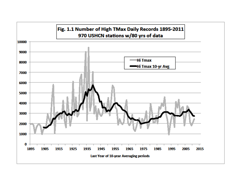
But for climatologists, the more interesting result is the average of the total number of records in ten-year periods to see the longer-term character. The smooth curve shows that 10-year periods in the 1930s generated about twice as many hot-day records as the most recent decades. Note too, that if you want to find a recent, unrepresentative, “quiet” period for extremes, the 1950s to 1970s will do (see Part 2 to be posted later).

Figure 1.2 below compares the ten-year averages between high TMax and high TMin records:
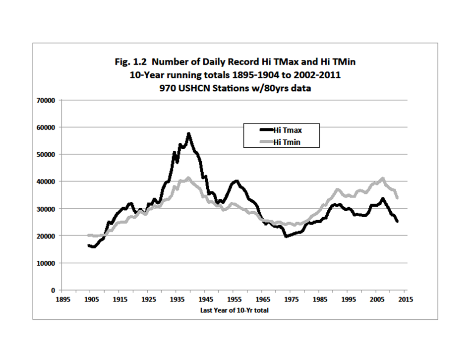
There has been a relatively steady rise in high TMin records (i.e. hot nights) which does not concur with TMax, and is further evidence that TMax and TMin are not measuring the same thing. They really are apples and oranges. As indicated above, TMin is a poor proxy for atmospheric heat content, and it inflicts this problem on the popular TMean temperature record which is then a poor proxy for greenhouse warming too.

Before I leave this plot, someone may ask, “But what about those thousands of daily records that we were told were broken this year?” Unfortunately, there is a lot of confusion about that. Records are announced by NOAA for stations with as little as 30 years of data, i.e. starting as late as 1981. As a result, any moderately hot day now will generate a lot of “record highs.” But, most of those records were produced by stations which were not operating during the heat waves of the teens, twenties, thirties and fifties. That is why the plots I’ve provided here tell a more complete climate story. As you can imagine, the results aren’t nearly so dramatic and no reporter wants to write a story that says the current heat wave was exceeded in the past by a lot. Readers and viewers would rather be told they are enduring a special time in history I think.

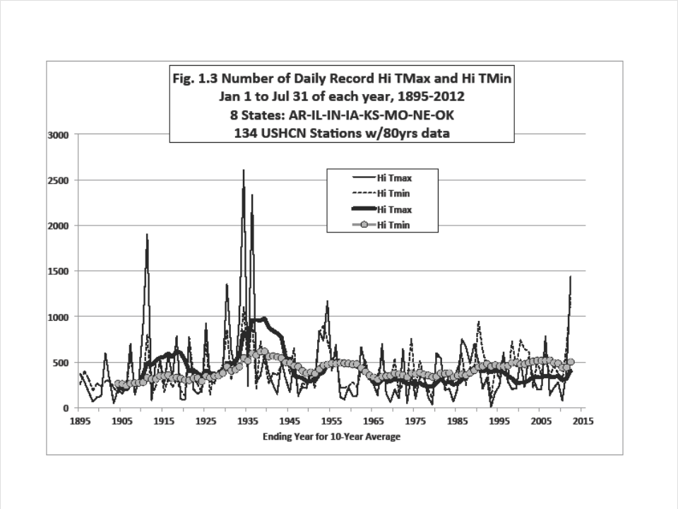
Because the central US was the focus of the recent heat, I generated the number of Jan-Jul record high daily TMaxs for eight states, AR, IL, IN, IA, KS, MO, NE and OK that includes 2012 (Fig. 1.3):

(Because a few stations were late, I multiplied the number in 2012 by 1.15 to assure their representation). For these states, there is no doubt that the first seven months of 2012 haven’t seen as many record hot days since the 1930s. In other words, for the vast majority of residents of the Central US, there were more days this year that were the “hottest ever” over their lifetimes. (Notice too, that the ten-year averages of TMax and TMin records mimic the national results – high TMin records are becoming more frequent while TMax records have been flat since the 1930s.)

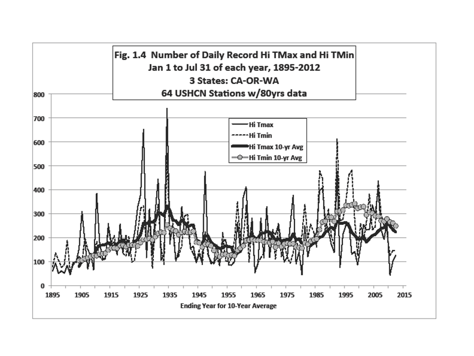
The same plot for the west coast states of CA, OR and WA (Fig. 1.4) shows that the last three years (Jan-Jul only) have seen a dearth of high temperature records:

However, even with these two very different climates, one feature is consistent – the continuously rising number of record hot nights relative to record hot days. This increase in hot nights is found everywhere we’ve looked. Unfortunately because many scientists and agencies use TMean (i.e. influenced by TMin) as a proxy for greenhouse-gas induced climate change, their results will be misleading in my view.

I keep mentioning that the deep atmospheric temperature is a better proxy for detecting the greenhouse effect than surface temperature. Taking the temperature of such a huge mass of air is a more direct and robust measurement of heat content. Our UAHuntsville tropospheric data for the USA48 show July 2012 was very hot (+0.90°C above the 1981-2010 average), behind 2006 (+0.98 °C) and 2002 (+1.00 °C) and just ahead of 2011 (+0.89 °C). The differences (i.e. all can be represented by +0.95 ±0.06) really can’t be considered definitive because of inherent error in the dataset. So, in just the last 34 Julys, there are 3 others very close to 2012, and at least one or two likely warmer.

Then, as is often the case, the weather pattern that produces a sweltering central US also causes colder temperatures elsewhere. In Alaska, for example, the last 12 months (-0.82 °C) have been near the coldest departures for any 12-month period of the 34 years of satellite data.

In the satellite data, the NH Land anomaly for July 2012 was +0.59 °C. Other hot Julys were 2010 +0.69, and 1998 at +0.67 °C. Globally (land and ocean), July 2012 was warm at +0.28 °C, being 5th warmest of the past 34 Julys. The warmest was July 1998 at +0.44 °C. (In Part 2, I’ll look at recent claims about Northern Hemisphere temperatures.)

So, what are we to make of all the claims about record US TMean temperatures? First, they do not represent the deep atmosphere where the enhanced greenhouse effect should be detected, so making claims about causes is unwise. Secondly, the number of hot-day extremes we’ve seen in the conterminous US has been exceeded in the past by quite a bit. Thirdly, the first 10 weeks of 2012’s summer was the hottest such period in many parts of the central US for residents born after the 1930’s. So, they are completely justified when they moan, “This is the hottest year I’ve ever seen.”

By the way, for any particular period, the hottest record has to occur sometime.

REFERENCE
McNider, R.T., G.J. Steeneveld, A.A.M. Holtslag, R.A. Pielke Sr., S. Mackaro, A. Pour-Biazar, J. Walters, U. Nair, and J.R. Christy, 2012: Response and sensitivity of the nocturnal boundary layer over land to added longwave radiative forcing. J. Geophys. Res., 117, D14106, doi:10.1029/2012JD017578.


29 Responses to “Fun with summer statistics. Part I: USA”

Toggle Trackbacks

  1. Don Young says:

    Of course, alarmists will counter that the rising low daily temps are a manifestation of extra carbon dioxide doing its greenhouse thing—not allowing the planet to cool off at night. Thanks for your take on the phenomenon.

  2. Eric Barnes says:

    I’ve had that thought as well Don. I wonder what’s at work?
    IMO, an interesting calculation would be to take calculate the mean, average, max, stddev, variance of the hourly differences (h vs. h-1) for all hourly stations for dr. roy’s 50 stations from the recent hourly analysis. My guess is that not only is cooling slowing, but also warming is slowing as well. Perhaps this has already been done?

  3. John says:

    Question: The monthly satellite data posted on this website includes a column labeled “USA48” which I assume pertains to the continental United States. How do 6-month averages of those satellite data relate to what is discussed here?

  4. Cathy B says:

    The logic here is really misguided. Comparing the
    number of records broken 90 years ago with the number
    broken today is irrelevant. In the 1930s, there was
    a much shorter temperature history, so it was easier
    to break records then.

    If the climate was not warming, and temperatures
    were pretty stable, it would become harder and harder
    to break temperature records. We would see a steady decline
    in record hot temps. Try this simple game. Get 100
    pennies and throw them in the air, then count the number of heads you see. If you keep a history, you will see that it is easy to set high and low records for a while, but soon it will become much rarer. The number of times you will have to play the game to break a high or low record will get increasingly long with every record broken. Oh, and high and low records will be broken with about equal frequency.

    With actual temperature records we have not seen a steady decline in high records, and high temperature records outpace low records by factors of 10 or more now. This is strong evidence that the odds have changed. If this happened in the penny game, you would know somebody was sneaking in loaded coins.

  5. Ronald says:

    From a book found in my father’s house by S. Petterssen published in 1940. “The diurnal Tmax over land is fairly representative, for it depends on the T. conditions in the air above the ground layer.” and “Difference in T.between two air masses near the ground is clearly shown at midday.” Is knowledge being lost in digital number crunching?

  6. Pieter says:

    One thing is that is very often ignored is that we are stil facing little warming bij nature. That is because we are in between ice ages.
    Simple fact: at the seaside of the Netherlands, near to Katwijk,
    there is a ruine of an old roman casttle build somewhere in the first century.
    But you must have diving equipment for seeing it.

    According to stories of elder peopled in there youth sometime at very low tide conditions a little bit was to be seen of the building.

  7. One has to be careful when one says extra greenhouse gases should warm the planet. I am not saying it has zero effect, but my guess is very ,very little effect.

    Man made CO2 accounts for 0.00113% of the total CO2 in the atmosphere. Secondly CO2 follows the temperature, does not lead it. Third additional CO2,one it attains a certain level of concentration has less and less of an effect on the temperature, due to the fact it is already absorbing very close (I say close not total saturation)to the saturation point those wavelengths(15microns example)at which it absorbs at. Fourth, OLR (out going longwave radiation) emissions from earth to space, have hardly changed.

    If I had to bet, my bet would be once the oceans show a definitive decline in temperature, that the CO2 concentration increases will slow down, if not level off, in response to this.

    I expect this will be the case as this decade proceeds, because the set up is in place for colder temperatures going forward, not warmer. I would go so far as to say that the probability of temperatures for the globe being warmer then they are today ,from this point on, is 0%.

    One last point I think it is meaningless to examine the trend in temperatures in the United Sates ,in relation to global warming or global cooling, since the United States makes up less then 10% of the total globe.

    In contrast,to study trends in the U.S.A temperature in responce to the UHI effect, is another matter, and from that angle ,much could be learned.

  8. Doug Sherman says:

    Cathy B.

    The flaw in your argument is that you are assuming that the sample size is sufficiently large and thus, the 100+ years of measurement is somehow meaningful. In fact, the sample size is quite small, considering that the total sample size is over millions years in even the most recent part of Earth’s history. Just because we didn’t measure it doesn’t mean it isn’t important. Your argument is valid for something like sports which have a recent origin but for a phenomenon like temperature that has spanned millions of years, the 100+ year record means nothing in your context.

  9. Andrew says:

    Cathy B-It is certainly true that the rate at which records are broken decreases with time, however that doesn’t really effect the conclusion at all.

    First of all, the number of records that are set every year goes down over time. This of course would mean that earlier years would have higher numbers of records set, a priori. However, even if one were to show a curve for number of records held in in a particular year, the recent years would not compare to the thirties. Moreover, even if one where to count that by giving all ties to the recent record, the thirties would still win, even with that handicap against them. I know this because I have seen this done. Rather than doing armchair statistical speculation, perhaps you would take the time to actually examine the data, do the things that I have just described, and see for yourself that, in fact, the effect you are describing is irrelevant.

  10. harrywr2 says:

    Cathy B says:
    August 13, 2012 at 10:10 PM
    “The logic here is really misguided. Comparing the
    number of records broken 90 years ago with the number
    broken today is irrelevant. In the 1930s, there was
    a much shorter temperature history, so it was easier
    to break records then”

    So exactly how many thermometers did we have out at the airport in the 1930’s?

    I’ll help

    http://www.centennialofflight.gov/essay/Government_Role/airports-growth/POL10.htm

    In 1926, all of the scheduled passenger airlines in the United States together used only 28 aircraft, and if they all were in the air at the same time, only 112 passengers would be flying. Today, a typical jumbo jet carries three times that number. In 2000, the 422 primary airports in the United States boarded nearly 683 million passengers.

    LaGuardia, was opened on December 2, 1939, with a paved 6,000-foot (1,820-meter) runway, the nation’s longest.

    The year 1959 was the first full year of U.S. commercial jet travel, and the first airport built specifically for the longer takeoff distances of jets was Washington Dulles outside of Washington, D.C., which opened in 1962. Its runways were about two miles (3.2 kilometers) long and 150 feet (46 meters) wide.

  11. Don B says:

    Dr. Christy, it might be useful to prepare a graph showing the difference between the max and min 10-year numbers of graph 1.2, illustrating the dramatic changes produced by UHI.

  12. Paul_K says:

    Cathy B,

    I agree. I think it is disingenuous to compare the number of records broken without taking into account the underlying statistical model.
    The “rebuttals” to your comment do not address the problem correctly.
    Suppose that at any given location the Tmax measured from year to year for any given day of the year can be described as Gaussian white noise. Then after 150 years of monitoring July 17th, say, you have 150 samples from a normal distribution for that day for that location. The likelihood of the 151st sample beating the previous high is small and decreases year-by-year. A fair comparison would need to compensate for the different probabilities of records occurring.

  13. John McReynolds says:

    Salvatore:
    “Man made CO2 accounts for 0.00113% of the total CO2 in the atmosphere. ”
    It isn’t exactly the measurable amount of oil/wood/coal we are burning, but the way we influence the re-uptake via deforestation and desertification. The oceans are mixing more than expected, so most of the current heat increase is going into the middle ocean. I think the polar ice proxy for heat retention is perhaps the most salient, and that is what scares me.

  14. Andrew says:

    Paul_K-By “the rebuttals” I assume you don’t include my comment which specifically addressed specific ways one can compensate for the effect Cathy is talking about.

    Please, be my guest and see if you can somehow get recent years to exceed the thirties in terms of extremes.

    BTW, are you the Paul_K that sometimes has insightful posts at lucia’s blog or number two that is a notorious incoherent troll that can’t be reasoned with?

  15. KR says:

    Given the fact that for any particular recording station the probability of a record decreases as 1/N, for N total records, it is entirely unsurprising that your observed number of high records decreases over time. Hence your examination of highs alone tells you nothing at all.

    A much more informative method is to normalize the influence of length of observation by looking at the ratio of record highs to record lows, as Meehl et al 2009 did (ftp://ftp.soest.hawaii.edu/coastal/Climate%20Articles/US%20temp%20range%20Meehl%202009.pdf), thus examining how temperature is changing.

    The ratios of record highs to lows for the last 60 years (taking stations with near contiguous records over that period, looking at records within that interval) show:

    1950’s 1.09:1
    1960’s 0.77:1
    1970’s 0.78:1
    1980’s 1.14:1
    1990’s 1.36:1
    2000’s 2.04:1

    This is a clear indication of far more record highs than record lows over the last few decades – when a stationary climate should show ratios of close to 1. And the ratio is accelerating.

    Looking at only record highs without normalizing for number of observations is a worthless exercise, leading to incorrect conclusions.

  16. Paul_K says:

    Andrew,
    I now understand that the plots shown by Dr Christy are not the number of records broken, but are actually the number of records held looking backwards from today. You are correct. I was wrong, as was Cathy B.

  17. Paul_K says:

    KR,
    You are making the same mistake as I did – and Cathy B did.
    It might have helped if Dr Christy had explained the data a little more clearly, but the truth is that we all get an “F” for our “observation and deduction” skills.
    If Dr Christy had plotted the number of records broken in any year, which is what I first thought and what you evidently still believe, then you correctly conclude that the likelihood of any record being broken should diminish proportionate to 1/N – assuming stationarity and independence in the timeseries.
    However, examination of the plots and comparison with the total number of sample series for each plot reveals fairly readily that this was NOT what the plots purport to show. The data in the plots are retrospectively adjusted to show only the year in which the latest record is held. If a record is broken in 1934, again in 1936 and again in 2006, then only the 2006 datapoint is retained and registered as a frequency count. There is only one record retained for each sample time series. Again assuming stationarity and independence, then the distribution of records HELD should be uniform across the time period considered, each with probability of 1/N. No reduction in probability should be expected.

  18. Paul_K says:

    KR,
    You seem to be misinterpreting the Meehl et al paper (“M209”).

    If you examine the actual observed data – Figs 1a, 2a and 2b – you will see that the number of record highs stays remarkably close to the expected 1/n decay line, while there is a marked fall-off in the number of record lows relative to expected values. Meehl himself writes:

    “From the results in Fig.1a we can also infer that the larger than expected values of the
    ratio seem to be due to less than expected record lows rather than more than expected record
    highs.”

    So it looks like the M2009 observations are completely consistent with Dr Christy’s observations and conclusions above; i.e. there is evidence of some upward drift in Tmin values – which is reducing the number of record low Tmin values and increasing the number of record high Tmin values – and which is largely responsible for the small increase in Tav values.

  19. Andrew says:

    The Meehl et al study is pretty ridiculous, since it looks only at the period since 1950. Moreover, a ratio obscures what is really going on. First, if the number of record lows drops off the face of the Earth, but record highs remain constant, the ratio shoots to infinity-it’s not surprising or scary when a ratio changes rapidly, and faster and faster- it probably means that the denominator is dominating the change. But because you take a ratio, it’s impossible to tell what’s really going on without taking the ratio apart and examining the components. Doing this seems to indicate that record lows are indeed rapidly decreasing and record highs slightly increasing. Hardly scary, frankly.

    Nevertheless, take a look at Doctor Christy’s recent Senate testimony:

    http://epw.senate.gov/public/index.cfm?FuseAction=Files.View&FileStore_id=66585975-a507-4d81-b750-def3ec74913d

    The ratio has been looked at, in this case over a longer period (figure 1.6) and this shows why looking since 1950 is highly misleading.

  20. Andrew says:

    “Doing this seems to indicate that record lows are indeed rapidly decreasing and record highs slightly increasing.”

    Should add, relative to expectations, but that doesn’t appear to be quite accurate for the Meehl study, at least (though it does appear to be true of Dr Christy’s data). In the Meehl study it looks like the highs are close to expectations (perhaps below even!) but the lows are well below the expected amount, which of course leads the ratio to explode but doesn’t indicate anything scary.

  21. diet says:

    Terrific! I have been looking for this information , thanks for posting.

  22. Anon says:

    Recent analysis of the science conducted at the University of Alabama in Huntsville:

    “One popular climate record that shows a slower atmospheric warming trend than other studies contains a data calibration problem, and when the problem is corrected the results fall in line with other records and climate models, according to a new University of Washington study. The finding is important because it helps confirm that models that simulate global warming agree with observations, said Stephen Po-Chedley, a UW graduate student in atmospheric sciences who wrote the paper with Qiang Fu, a UW professor of atmospheric sciences. They identified a problem with the satellite temperature record put together by the University of Alabama in Huntsville.”

    “Scientists already had noticed that there were issues with the way the Alabama researchers handled data from NOAA-9, one satellite that collected temperature data for a short time in the mid-1980s.”

    “They found that the Alabama research incorrectly factors in the changing temperature of the NOAA-9 satellite itself and devised a method to estimate the impact on the Alabama trend”

    Damning stuff.

    http://www.washington.edu/news/2012/05/07/new-research-brings-satellite-measurements-and-global-climate-models-closer/

  23. Martin Bacon says:

    Yes,I am agree the great changes are comes on this last 10 Year..

  24. Martin Bacon says:

    Dr. Christy,hanks for the great thought and positivity.. always nice 🙂

  25. Global warming is already leading to more violent storms and less predictable weather patterns. According to the Pew Center on Global Warming, since 1995, only two years have not had above average hurricane activity. The overall number of tropical storms has not increased, but there are more storms strong enough to be called hurricanes. We will probably continue to get bigger storms, which will do more damage to coastal areas.

  26. Thank you, Dr. Christy, for the wonderful insight and encouragement. always pleasant TM

  27. Marietta says:

    We can feel more that the temperature is higher than before.

  28. Lash Blog says:

    This increase in hot nights is found everywhere weve looked.

  29. Amber Brion says:

    In a guest post by John Christy, UAHuntsville, Alabama State Climatologist, the author argues that the recent claims that July 2012 and Jan-Jul 2012 were the hottest ever in the contiguous US are based on an average of the daily high and low temperatures (TMean), which is a flawed metric. The author claims that TMin is a poor proxy for atmospheric heat content and is easily subjected to deceptive warming due to increased local human development. The author suggests that TMax, which represents a deeper layer of the troposphere and is a better proxy for measuring the greenhouse effect, is a better way to depict the long-term temperature character of the climate. The author presents data showing that the number of record hot days set in the 1930s was twice as many as in the most recent decades, and there has been a steady rise in high TMin records, which is evidence that TMax and TMin are not measuring the same thing. https://www.flex.storage/

Leave a Reply