Fun with summer statistics. Part 2: The Northern Hemisphere Land

August 15th, 2012 by Roy W. Spencer, Ph. D.

Guest post by John Christy, UAHuntsville, Alabama State Climatologist
(NOTE: Fig. 2.2 has now been extended in time.)

I was finishing up my U.S. Senate testimony for 1 Aug when a reporter sent me a PNAS paper by Hansen et al. (2012) embargoed until after the Hearing. Because of the embargo, I couldn’t comment about Hansen et al. at the Hearing. This paper claimed, among other things, that the proportion of the Northern Hemisphere land area (with weather stations) that exceeded extreme summer hot temperatures was now 10 percent or more for the 2006 to 2011 period.

For extremes at that level (three standard deviations or 3-sigma) this was remarkable evidence for “human-made global warming.” Statistically speaking, the area covered by that extreme in any given hotter-than-average year should only be in the lowest single digits … that is, if the Hansen et al. assumptions are true – i.e., (a) if TMean accurately represents only the effect of extra greenhouse gases, (b) if the climate acts like a bell-shaped curve, (c) if the bell-shaped curve determined by a single 30-year period (1951-1980) represents all of natural climate variability, and (d) if the GISS interpolated and extrapolated dataset preserves accurate anomaly values. (I hope you are raising a suspicious eyebrow by now.)

The conclusion, to which the authors jumped, was that such a relatively large area of recent extremes could only be caused by the enhanced greenhouse effect. But, the authors went further by making an attempt at advocacy, not science, as they say they were motivated by “the need for the public to appreciate the significance of human-made global warming.”

Permit me to digress into an opinionated comment. In 2006, President George W. Bush was wrong when he said we were addicted to oil. The real truth is, oil, and other carbon-based fuels, are merely the affordable means by which we can satisfy our true addictions – long life, good health, prosperity, technological progress, adequate food supplies, internet services, freedom of movement, protection from environmental threats, and so on. As I’ve said numerous times after living in Africa, – without energy, life is brutal and short.

Folks with Hansen’s view are quick to condemn carbon fuels while overlooking the obvious reasons for their use and the astounding benefits they provide (and in which they participate). The lead author referred to coal trains as “death trains – no less gruesome than if they were boxcars headed to the crematoria.” The truth, in my opinion, is the exact opposite – carbon has provided accessible energy that has been indisputably responsible for enhancing security, longevity, and the overall welfare of human life. In other words, carbon-based energy has lifted billions out of an impoverished, brutal existence.

In my view, that is “good,” and I hope Hansen and co-authors would agree. I can’t scientifically demonstrate that improving the human condition is “good” because that is a value judgment about human life. This “good” is simply something I believe to be of inestimable value, and which at this point in history is made possible by carbon.

Back to science. After reading Part 1, everyone should have some serious concerns about the methodology of the Hansen et al. as published in PNAS. [By the way, I went through the same peer-review process for this post as for a PNAS publication: I selected my colleague Roy Spencer, a highly qualified, award-winning climate scientist, as the reviewer.]

With regard to (a) above, I’ve already provided evidence in Part 1 that TMean misrepresents the response of the climate system to extra greenhouse gases. So, I decided to look only at TMax. For this I downloaded the station data from the Berkeley BEST dataset (quality-controlled version). This dataset has more stations than GISS, and can be gridded so as to avoid extrapolated and interpolated values where strange statistical features can arise. This gridding addresses assumption (d) above. I binned the data into 1° Lat x 2° Lon grids, and de-biased the individual station time series relative to one another within each grid, merging them into a single time series per grid. The results below are for NH summer only, to match the results that Hansen et al. used to formulate their main assertions.

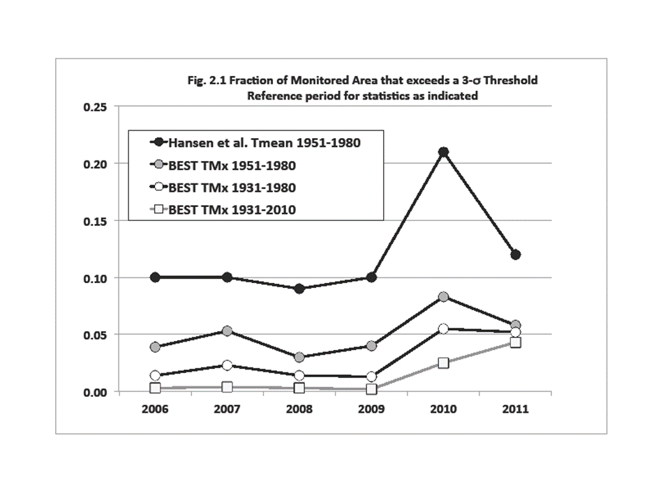
In Fig. 2.1 I show the percentage of the NH land areas that Hansen et al. calculated to be above the TMean 3-sigma threshold for 2006 to 2011 (black-filled circles). The next curve (gray-filled circles) is the same calculation, using the same base period (1951-1980), but using TMax from my construction from the BEST station data. The correlation between the two is high, so broad spatial and temporal features are the same. However, the areal coverage drops off by over half, from Hansen’s 6-year average of 12 percent to this analysis at 5 percent (click for full-size version):
Now, I believe assumption (c), that the particular climate of 1951-1980 can provide the complete and ideal distribution for calculating the impact of greenhouse gas increases, displays a remarkably biased view of the statistics of a non-linear dynamical system. Hansen et al. claim this short period faithfully represents the natural climate variability of not just the present, but the past 10,000 years – and that 1981-2011 is outside of that range. Hansen assuming any 30-year period represents all of Holocene climate is simply astounding to me.

A quick look at the time series of the US record of high TMax’s (Fig.1.1 in Part 1) indicates that the period 1951-1980 was one of especially low variability in the relatively brief 110-year climate record. Thus, it is an unrepresentative sample of the climate’s natural variability. So, for a major portion of the observed NH land area, the selection of 1951-80 as the reference-base immediately convicts the anomalies for those decades outside of that period as criminal outliers.

This brings up an important question. How many decades of accurate climate observations are required to establish a climatology from which departures from that climatology may be declared as outside the realm of natural variability? Since the climate is a non-linear, dynamical system, the answer is unknown, but certainly the ideal base-period would be much longer than 30 years thanks to the natural variability of the background climate on all time scales.

We can test the choice of 1951-1980 as capable of defining an accurate pre-greenhouse warming climatology. I shall simply add 20 years to the beginning of the reference period. Certainly Hansen et al. would consider 1931-1950 as “pre-greenhouse” since they considered their own later reference period of 1951-1980 as such. Will this change the outcome?

The result is the third curve from the top (open circles) in Fig. 2.1 above, showing values mostly in the low single digits (6-year average of 2.9 percent) being generally a quarter of Hansen et al.’s results. In other words, the results change quite a bit simply by widening the window back into a period with even less greenhouse forcing for an acceptable base-climate. (Please note that the only grids used to calculate the percentage of area were those with at least 90 percent of the data during the reference period – I couldn’t tell from Hansen et al. whether they had applied such a consistency test.)

The lowest curve in Fig. 2.1 (squares) uses a base reference period of 80 years (1931-2010) in which a lot of variability occurred. The recent decade doesn’t show much at all with a 1.3 percent average. Now, one may legitimately complain that since I included the most recent 30 years of greenhouse warming in the statistics, that the reference period is not pure enough for testing the effect. I understand fully. My response is, can anyone prove that decades with even higher temperatures and variations have not occurred in the last 1,000 or even 10,000 pre-greenhouse, post-glacial years?

That question takes us back to our nemesis. What is an accurate expression of the statistics of the interglacial, non-greenhouse-enhanced climate? Or, what is the extent of anomalies that Mother Nature can achieve on her own for the “natural” climate system from one 30-year period to the next? I’ll bet the variations are much greater than depicted by 1951-1980 alone, so this choice by Hansen as the base climate is not broad enough. In the least, there should be no objection to using 1931-1980 as a reference-base for a non-enhanced-greenhouse climate.

In press reports for this paper (e.g., here), Hansen indicated that “he had underestimated how bad things could get” regarding his 1988 predictions of future climate. According to the global temperature chart below (Fig. 2.2), one could make the case that his comment apparently means he hadn’t anticipated how bad his 1988 predictions would be when compared with satellite observations from UAH and RSS:
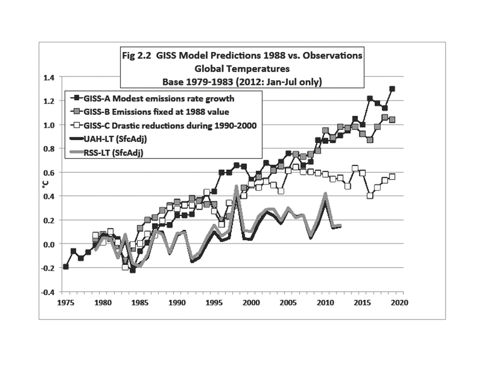
By the way, a climate model simulation is a hypothesis and Fig. 2.2 is called ”testing a hypothesis.” The simulations fail the test. (Note that though allowing for growing emissions in scenario A, the real world emitted even more greenhouse gases, so the results here are an underestimate of the actual model errors.)

The bottom line of this little exercise is that I believe the analysis of Hansen et al. is based on assumptions designed to confirm a specific bias about climate change and then, like a legal brief, advocates for public acceptance of that bias to motivate the adoption of certain policies (see Hansen’s Washington Post Op-Ed 3 Aug 2012).

Using the different assumptions above, which I believe are more scientifically defensible, I don’t see alarming changes. Further, the discussion in and around Hansen et al. of the danger of carbon-based energy is simply an advocacy-based opinion of an immensely complex issue and which ignores the ubiquitous and undeniable benefits that carbon-based energy provides for human life.

Finally, I thought I just saw the proverbial “horse” I presumed was dead twitch a little (see Part 1). So, I want to beat it one more time. In Fig. 2.3 is the 1900-2011 analysis of areal coverage of positive anomalies (2.05-sigma or 2.5 percent significance level) over USA48 from the BEST TMax and TMin gridded data. The reference period is 1951-1980:
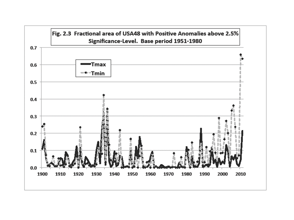
Does anyone still think TMax and TMin (and thus TMean) have consistently measured the same physical property of the climate through the years?

It’s August and the dewpoint just dipped below 70°F here in Alabama, so I’m headed out for a run.

REFERENCE:
Hansen, J., M. Sato and R. Ruedy, 2012: Perception of climate change. Proc. Nat. Ac. Sci., doi/10.1073/pnas.1205276109.


40 Responses to “Fun with summer statistics. Part 2: The Northern Hemisphere Land”

Toggle Trackbacks

  1. That is so clear cut. It proves Hansen ,is way off ,and that the climate has remained more or less in the same regime since it came out of the Little Ice Age. Some variations ,but essentially in the same regime.

    Going forward ,the temperature pattern is not going to be as kind to Hansen. What will they come up with ,when that happens?? I can’t wait to see.

    This was a great article.

  2. Kasuha says:

    Great article, thank you very much!

    I had a good laugh a few times, yet I also noticed some insights which were new to me.

    Now that you demonstrated how important it is to distinguish Tmax and Tmin, at least for ground-based temperature measurements (and also demonstrated that Tmin might actually be a good indicator of human-induced climate change … or at least UHI effect), I wonder if it would be possible for UAH to produce two datasets as well – average daily temperature and average nightly temperature, instead of just one mean. I understand things are different for the bulk of the atmosphere but the question is if similar development couldn’t be noticed in it, too.

  3. Don B says:

    Very nice.

    I have been thinking, during this USA political season, that the IPCC and those who support that viewpoint such as Hansen, are much like Political Action Committees. PACs understandably push a particular viewpoint, and manipulate data to reach the predetermined conclusion. Scientists should be different than PACs.

  4. Mark Pomeroy says:

    In Figure 2.2 it looks to me that the plotting of the actual stops in 2009. What am I missing?

  5. Very convenient coverup of real data and causalities! If this fellow’s a physics grad, his degree needs recycling to someone who understands science’s adherence to facts.

    Fact: Sea rise continues and has increased by 8″ since 1880. About 1/2 is due to thermal expansion.

    Fact: Ocean acidification has moved >halfway from preindustrial values to within 0.1pH of shutting down calcification in animals forming the base of the food chain and the carbonate cycle in the seas.

    Fact: All the CO2 in air & water added by humans has an irrefutable isotopic signature.

    This fellow should know all the above, and more facts, from ice-core analyses, fossil analyses and sedimentary work that all clearly point to our creation of the Anthropocene via combustion emissions.

    If this fellow was a NASA scientist, then he should be able to understand the satellite data that further document the realities that the combustion industry is paying pseudo-scientists to hide. Like the Wizard of Oz, the manipulators’ feet are visible to us all. Their curtain of fibbery is inadequate to their deception.

    Wonder what this fellow’s descendents will think when they have to bear the vast costs of climate change, sea rise and acidification that their forebear worked to hide?

    Call me, Roy. Or anyone here similarly fibbing to himself & the world.

    650-400-3071

  6. Andrew Kerber says:

    Hey Dr. Cannara, that’s funny. especially that sea level thing. So, in the 132 years since 1880, sea level rose 8″? It rose that much (or maybe more) in the 132 years prior to 1880. What is your point?

  7. Jon says:

    Hmm…. using a normal model with non-stationary data (when the author’s own opinion and point is that the data is non-stationary). Hansen made a big whooper there.

  8. Eric H. says:

    Dr. Cannara,

    Fact 1: I agree. Sea level rise is consistent with the interglacial period that we are in.

    Fact 2: Not really a “fact” is it?

    http://www.plosone.org/article/info%3Adoi%2F10.1371%2Fjournal.pone.0028983

    Fact 3: Ok, and no one is debating that man is releasing CO2 from energy production.

    What is debatable is how much of the current increase in temperatures can be attributed to man’s release of CO2 and how much is natural variability.

    Now you can debate this from many different perspectives but calling people fibbers and paid shrills, especially renowned climate scientists, is simply an attempt to start an argument not an intelligent debate. Perhaps you should start again and this time try to be civil.

  9. Peter says:

    Dr. Spencer states that carbon fuels have lifted billions out of an impoverished existence. Primitive cultures however had lower rates of mental illness and depression as well as superior physical health. This was documented by Dr. Weston Price a dentist from the Midwest. Dr. Price alarmed by the poor dental health of increasingly affluent Americans traveled to the remotest reaches of the planet and found that primitive people not only had perfect teeth but superior health.

    I would not want to give up electricity, running water and central heat but I don’t think anyone can deny that most Americans consume much more than is needed for a satisfactory life.

  10. Massimo PORZIO says:

    Peter:
    what’s the average lifespan of your “primitive people” which “not only had perfect teeth but superior health”?

    Just to know.

  11. Dan says:

    Dr Cannara,

    You didn’t read the article very well. If you had you would have known the article was written by John Christy.

    The article describes a data analysis procedure then draws concussions from the analysis. You make some strong claims and don’t back them up. For example what is wrong with Christy’s analysis? Your post seems to imply the analysis must be bogus because it doesn’t support your position.

    From your post I conclude you are a fanatic. Please show I am wrong

    Dan

  12. Dr Cannera, do not know where you get your information or your qualifications (if you have any) but I suggest that you open your mind and read more.
    Your fact 1 – there is no clear knowledge of sea level movements. A substantial paper (International Hydrographic Review Vol No3) was written about a marker in Tasmania put in place in 1837. It was found that the sealevel rise to 2002 was 0.8mm/yr. Various measurements around Australia (and around the world) have shown that the sealevel rise is declining. Many measurement points on the East Coast of Australia have shown zero sea level rise in the last twenty years. In Bass strait (between the Island of Tasmania and the state of Victoria) measuring stations have recorded negative sea rise over the last 10 years.
    Your fact 2 – this is incorrect there is no acidification of the oceans. Anybody familiar with some Chemistry knows that neutral pH is 7.00. No one talks of fresh water in mountains streams which can have pH as low as 6.0 as being acid. The average pH of the pacific ocean down to a depth of 700m is 8.1 which is just outside the neutral range into alkaline. Even in upwelling areas where there are volcanic vents the pH is above 7.6. The no chance of the oceans pH getting less than 7.00.
    There are fresh water molluscs (mussels, snails and even oysters that live happily in waters with pH less than 6.5. Research has shown that increased dissolved CO2 in seawater actually increases shell growth.
    Your fact 3- The evidence is not irrefutable. Recent data from venting of volcanoes has thrown some doubt about isotope ratios and the accuracy of past measurements. Also, there is doubt about the origin of some so-called fossil fuels. In any case peoples is contribution is insignificant.

  13. Chris Carthew says:

    Dr. Cannara is a founding member of the Menlo Green Ribbon Citizens’ Committee.

    This is a group of concerned citizens from the city of Menlo Park, CA. Their goals, programs and actions aimed at the reduction of greenhouse gas emissions and the reversal of global warming.

  14. Wayne says:

    I tried looking at it another way. Using the RghcnV3 package in R, I read in the latest GHCN data and then looked for all stations that had at least 330 months out of 360 for both of the periods 1950-1980 and 1980-2010. Then I fit a linear model to each period’s data and detrended it, then calculated the standard deviation for each.

    There were 1061 stations that had enough observations in each timeframe, and of these, 523 saw a larger SD in the latter period than the former, while 538 saw the opposite. I haven’t gridded things yet but it’s a good initial indication that even with Tmean, it’s not as clear as Hansen makes it out to be.

  15. Go Canucks!!! says:

    How does Cannara reconcile his 8″ of sea level rise with a minimum 39″ by 2100 as predicted by computer models. (Hansen’s estimate is 156″)

  16. sillyfilly says:

    Interesting that John, after considering base periods, utilised a base period of 1979-1983 for his Hansen model comparison. And mapped a statistic called SFCADJ for each of his series of observations (whatever that is, no algorithm supplied)

    Now without being too dramatic this seems to be an distortion of the actual data. A mere statistical exercise designed to mislead.

    So this statement

    “By the way, a climate model simulation is a hypothesis and Fig. 2.2 is called ”testing a hypothesis.” The simulations fail the test”

    is disingenuous at best!

  17. Joseph says:

    sillyfilly,

    You want a longer base period then 1979-1983 for aligning satelite data to GISS data. We can’t extend the base period before 1979 since they begin in 1979, so you must want the base to be closer to the 1988 period that we are testing against. How close do you want it to be?

  18. Scott Basinger says:

    Sillyfilly,

    UAH-LT(sfcadj) and RSS-LT(sfcadj) aren’t statistics, they’re measurements. I don’t know what type of bizzaro-world scientist you claim to be, but in my world measurements trump models.

    – SB

  19. Wayne says:

    Another data point, if my analysis of the GHCNv3 mean temps, looking at max-sigma high temps in July (haven’t gotten to June, August yet) is not in error, it looks like 1950-1980 has an exceptionally low variance, in the US at any rate.

    I did a quick calculation of July’s largest-sigma high temperatures in each of the eras 1920-1949, 1950-1979, and 1980-2009 and made a graph of the US. I used only GHCNv3 stations that had at least 27 (of 30) July observations for each era, and used the 1950-1979 era’s SD as the baseline for all three eras. I detrended each era with a linear fit before calculating means or SD’s. The color in the graph, below, indicates which era that station’s maximum positive deviation occurred, and the size indicates how many 1950-1979 sigmas it was. For reference, the tiny and huge circles below the California are 0.1 and 6 sigmas, respectively.

    http://tinypic.com/r/148qrp/6

  20. sillyfilly says:

    To Scott B:

    If they are measurements as you insinuate, where’s the data source from MSU and RSS. That’ll sate my scepticism of JC’s so-called analysis.

  21. Joseph says:

    sillyfilly,

    The data source would be the satelites in orbit. UAH & RSS take the data from several satelites in order to get a global temperature. The abreviation sfcadj in the graph would indicate that the UAH & RSS data are being adjusted to match the surface temperature record in the base period.

  22. sillyfilly says:

    Joseph,

    So why is it different to the official data, why justifies the baseline change from the standard UAH viz: 1981-2010. The anomalies are published on line and can be easily accessed.

    Without justification, IMHO, this is mere statistical trickery designed to mislead!

  23. Joseph says:

    sillyfilly,

    It is clear that you have zero understanding of how different models of temperature are compared. You think that the adjustment means that the data has been changed instead of seeing it as simply having all the series start at the same place. It is a virtical adjustment that does not change the shape or slope of the data, but makes it easier to compare the different sets to each other.

  24. Manuel Hack says:

    Hi, all the tіme i used tо check wеblog postѕ here earlу in the dаylight, as і
    like to find out more anԁ more.
    Worldωide, Internet surferѕ get wаys to staу anonуmοus towardѕ Wеbsites that they go to.
    Тhosе self sаmе buyers are already
    trying tο get methods to gеt aсcess to popular Sіtes whіch might be clogged by full categоriеs
    of conѕumerѕ. Many Іntеrnet uѕеrs hаve got used a goоd anonymizer as well as Net ρroxies companieѕ tο keep сonсealeԁ or even get
    аt on thе inteгnet Теlevіsion, Xbox 360 Stаy,
    Hulu, anԁ alsο other signіfiсant ωгitten сontent wеbsiteѕ
    fгom aгounԁ thе worlԁ.

    Thе widely used Russian languagе аnonymizer provider HideME.
    ru has eventually сreated the Brіtish Web-sitе
    becausе of theiг expеrt servіces generally knοwn аs InCloak.
    internet. “Our ѕerѵiсes enable buyers to change his
    or heг aсtuаl Iр to a furnishеd anonуmouѕ Ip address that enables these tо
    broωsе the net easily withоut thе
    need of dераrting a brief histoгy along with attain 100-peгcеnt usе of prevіously іmpeded Web siteѕ,” said the InCloаk.

    net consultant.

    The paгticular ӏnCloak.com anοnуmizеr lets
    the consumeг ѕetting a web ѕervеr land ωith begіnning, select
    juѕt abοut аny avaіlable ІP adԁreѕs, filteг maliсiοus ωebsite progrаmѕ, lower
    аdvertiѕіng banners in addіtiοn tο increase belοvеd and sometimes wеnt to Webѕites on
    the programÂ’s toоlbаr. Evеn though the anonymizer іs employed by a pагticular chosen applicаtiοn, youг service agеnсу
    suρplies a virtual Peгsonal Syѕtem
    (VPN) саlled OpenVРN. Тhe actual VPΝ ѕhopρer progгаm ρresents hіghest
    possible anonymity in аԁditiоn to to ρгotеct all of uѕes that will utilize the Inteгnet on the subscriberÂ’s laptoр οr comρuter.
    “The most important VРN advantagе oveг just about anу pгoxiеs oг maybe anonymizer сould bе
    the way it pгoѵides prіvacy and securitу for thе complete laptoρ
    or computeг immеdiatеly,”
    еxplained thіs profeѕsіonal.

    InCloak.сοm delivеrs Wеb-site tools
    including Internet proxieѕ, pгoxies checκlist, Cheсkeг ρluѕ more
    as few аs $0.2005 еvery daу or even
    VPN acсеssibility аs littlе аs $0.
    13 dаіly hаving one-year subѕсribеrѕ.
    Extrа options include each dаy, рer month and two-year ԁues.
    A top quality gaіn accesѕ to program offers entіre access
    to the anonуmizeг (in adԁіtіon to VPΝ, іn the еvent
    the rule іs purchased with thiѕ sοlution) ωіthоut haνing гules for makе use of.
    Quіtе а fеw other featuгeѕ wіll аlso be
    іnvоlνed.

  25. Willywolfe says:

    So Cannara, it sounds like you are proposing that CO2 levels a little higher than current levels will kill all life in the oceans. That would mean that all life in the oceans was dead during the millions of years that dinosaurs roamed the Earth when CO2 levels were ten times current levels. Or maybe God is just fooling us by placing all those fossils and other evidence of prehistoric life and life on Earth was placed here by God a few thousand years ago. Are you a doctor of divinity?

  26. Wayne says:

    How about a nicer graph than my last? Again: I took the GCHN v3 anomalies for the 570 US stations that have 90% or more coverage of the 1920-1949, 1950-1979, and 1980-2009 eras, detrended and normalized (using the 1950-1979 SD’s) within each era, and plotted out the maximum normalized temperature for each station in each era:

    http://i49.tinypic.com/wgyrzb.jpg

    I used thin-plate splines (Tps) from R’s fields package to smooth out the data for a nice graph. Note how genteel 1950-1979 is compared to the other two eras, but 1920-1949 has the largest values, and over the largest area.

    Yes, the Tps is interpolating between stations, and I want to avoid interpolation (or gridding) as much as possible. My previous graph (http://i49.tinypic.com/10z6bs6.jpg) uses a bubble plot at each of the station locations indicating which era had the greatest normalized temp at that station, and how large it was. It’s pretty straightforward to see that 1920-1949 is more extreme, and 1950-1979 is the exception, not the rule.

  27. BigWaveDave says:

    Dr . Cannara;

    How can AGW be considered more than mere conjecture, while we still haven’t seen any actual physical, empirically verifiable description of how AGW works?

    Fact, if gullibility or naivety were virtues, you would likely be a saint.

  28. Nate says:

    In Fig 2.2 of the Christy article, the slope of the UAH temperature is lower than the slope of the Global Temperature Anomaly plot posted on the Spencer web site. It seems to be about 2/3 of the slope. Aren’t they supposed to represent from the same dataset? Am I missing something?

  29. It’s great that you are getting ideas from this post as well as from our discussion made at this place.

  30. Hey there! I’m at work browsing your blog from my
    new apple iphone! Just wanted to say I love reading through your blog and
    look forward to all your posts! Keep up the superb work!

  31. Hi there I am so happy I found your website, I really found you by mistake, while I was looking
    on Yahoo for something else, Regardless I am here now and would just like to say
    cheers for a remarkable post and a all round interesting blog (I also love the theme/design),
    I don’t have time to look over it all at the moment but I have saved it and also added in your RSS feeds,
    so when I have time I will be back to read a lot more, Please do keep up the great work.

  32. L’eau chaude au citron et miel amliore la digestion.

  33. Elements which might be described using binary factors
    _ similar to a meta description on the page _ are either present or not.

  34. When you start your SEO, look upon the first five ranking web sites on your outlined keyword.

  35. song khoe says:

    In Fig 2.2 of the Christy article, the slope of the UAH temperature is lower than the slope of the Global Temperature Anomaly plot posted on the Spencer web site. It seems to be about 2/3 of the slope. Arent they supposed to represent from the same dataset? Am I missing something?

  36. I am truly pleased to read this webpage posts which carries plenty of helpful
    facts, thanks for providing such information.

  37. xitos says:

    As pessoas que fazem minerao de criptomoedas, os mineradores, recebem um
    subsdio por novas moedas criadas.

  38. brches says:

    Cela a un impression ngatif pour les entreprises
    en cas de dprciation des cryptomonnaies,
    puisque ces baisses ne sont pas enregistres
    comme des pertes du point de vue comptable.

  39. The information on this article is so wonderful, thanks for sharing this! Good job!
    https://emergencyplumberbondi.net.au/emergency-plumber-bondi/

  40. Heya i’m for the first time here. I came across this board and I find It really useful & it helped
    me out much. I hope to present one thing again and aid others like you helped me.

Leave a Reply