
 Home/Blog
It has been documented that global warming has been accompanied by a general greening of land areas in recent decades, especially those which are semi-arid. While some areas of greening might be attributable to increased rainfall, carbon dioxide fertilization and longer growing seasons are also involved.
The satellite studies have been based upon visible sensor data that measures greenness. Here�s the result of one recent study, which tried to just isolate the greening from CO2 fertilization (click image for full res version):
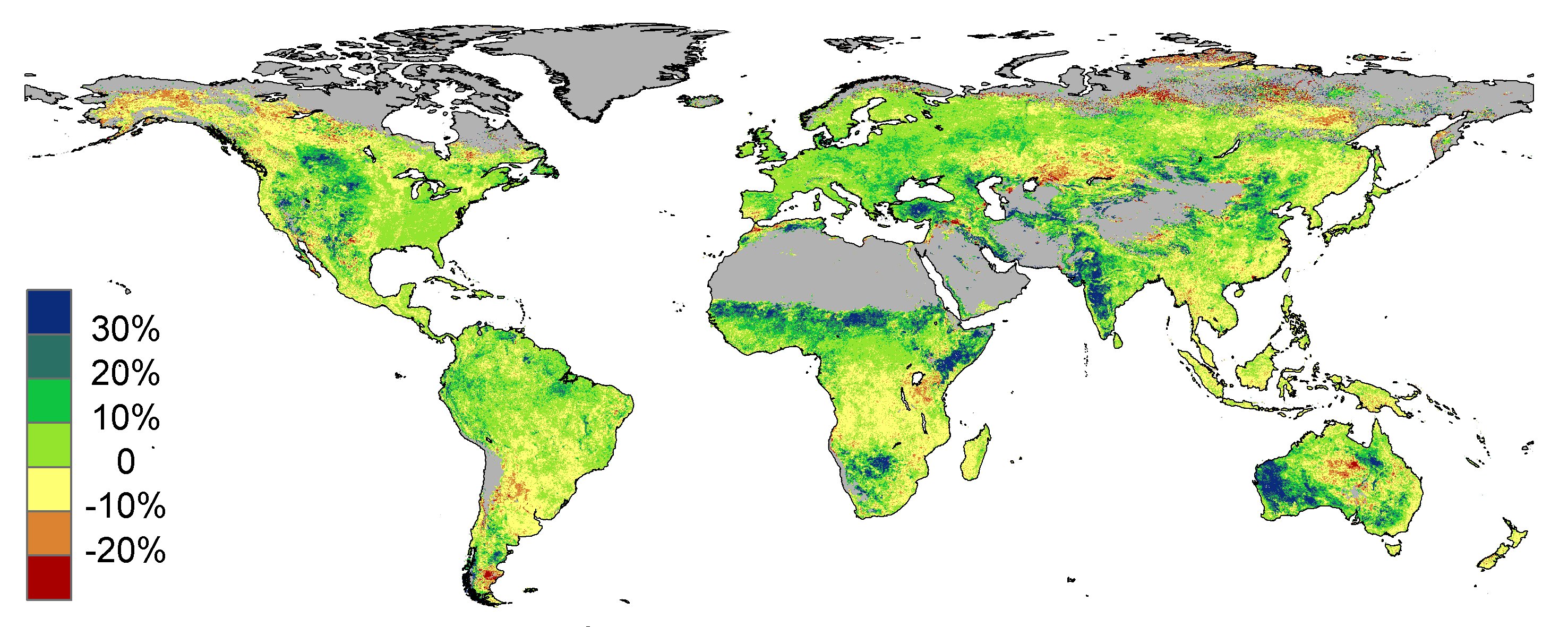
Estimated changes in vegetative cover due to CO2 fertilization between 1982 and 2010 (Donohue et al., 2013 GRL).
But we can also use passive microwave imager data, the best calibrated version of which is available since mid-1987 from the SSM/I and SSMIS series of instruments flying on the DMSP satellites. This gives us 26 years of microwave imager data to examine.
The simplest microwave vegetation index is just a difference between the vertically polarized and horizontally polarized channel brightness temperatures at 37 GHz. This polarization difference [V-H] can be thought of as primarily a measure of surface roughness. In heavily vegetated areas, such as Amazonia and the Congo Basin, the difference approaches zero, while sandy deserts and ice sheets are moderately polarized, as seen in the 26 year average of all Augusts (peak vegetation month in the Northern Hemisphere, click image for full-res version):
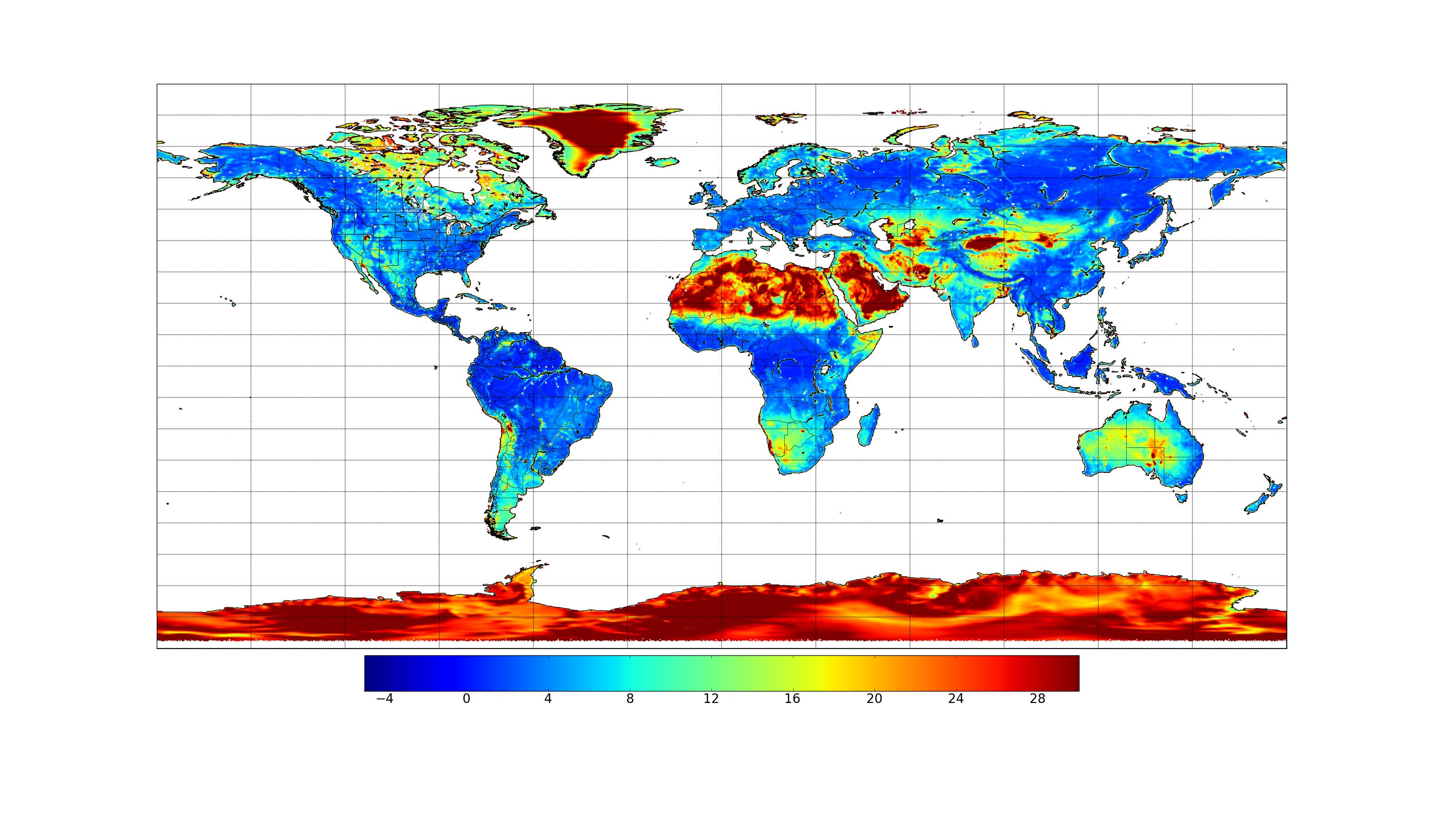
Average 37 GHz polarization difference (deg. C) for all Augusts between 1987 and 2013. Oceans and large water bodies have been made white.
We have zeroed out the ocean areas because the image gets too messy to interpret, although I will say it showed signatures consistent with the decrease in Arctic sea ice, and increase in Antarctic sea ice.
If we compute the land gridpoint trends across all 26 Augusts, the image looks like this (note the color scale does not match the published greenness trend image above, click image for full-res version):
![26-year trends in 37 GHz [V-H] (deg. C per year) for the period 1987-2013.](https://www.drroyspencer.com/wp-content/uploads/trend_big.jpg)
26-year trends in 37 GHz [V-H] (deg. C per year) for the period 1987-2013.
Note the strong signature of more vegetation in the Sahel and Kalahari Desert regions of Africa, similar to the Donohue et al. study. Significant increases are also suggested in India, Australia, and over the extreme northern reaches of North America and Asia. I have no explanation for the apparent increased roughness signature of the Greenland ice sheet (I’m pretty sure it’s not yet grassland, ha-ha).
There are also many, spotty areas of apparent decreases in vegetation cover (red). I have no idea what these correspond to, so I�m asking readers if they have knowledge of any of these areas (clicking on the above images will bring up the full-size versions). The red areas might also be regions of greater soil surface wetness…there is no way to know with this simple 2-channel approach.
I would be careful about interpreting coastal areas�.small geolocation errors in the satellite data combined with the huge [V-H] polarization differences between land and ocean, can cause spurious signals there.
Also, at this microwave frequency (37 GHz) a forest canopy isn�t going to look much different from dense grass. Think of the 37 GHz [V-H] measurement as an indication of how much soil surface (or highly polarized rivers) is visible through breaks in the vegetation�.it�s not really a measure of total biomass, unless the vegetation is quite sparse. So, deforestation in Amazonia isn’t necessarily going to show up if forest is replaced by crops, weeds, and shrubs. The nominal resolution of the microwave imagery above is 25 km, at best.
Again, the above microwave imagery is only for August. This was a LOT of full-resolution satellite data that Danny Braswell downloaded from NCDC, and it was not a trivial effort to do the calculations. We just thought that the public might be able to give us some idea if any of these signatures merit further investigation.


matter!
My brother recommended I might like this website.
He used to be totally right. This submit actually made my day.
You cann’t believe just how a lot time I had spent for this information! Thanks!