UAH v6 LT Global Temperatures with Annual Cycle

March 3rd, 2016 by Roy W. Spencer, Ph. D.

I sometimes get asked, why don’t we post absolute temperatures, rather than anomalies from the seasonal cycle, for our satellite data?

The answer, of course, is that the seasonal cycle is so large that it obscures the departures from normal. So, we (and other climate researchers) do departures from the seasonal norms. (If someone in Minneapolis exclaims, “Can you believe that 50 deg. temperature we had?”, it makes a big difference whether it occurred in January or July).

Since we were asked (once again) for the averages, and had to compute them from the gridpoint annual cycles we post here, I thought I’d list them:

UAH LT global average annual cycle

Mon. Kelvin
JAN 263.037
FEB 263.108
MAR 263.299
APR 263.721
MAY 264.324
JUN 264.966
JUL 265.288
AUG 265.108
SEP 264.471
OCT 263.786
NOV 263.273
DEC 263.072

And here is what the time series of monthly global LT temperatures look like with the annual cycle added in:

UAH-v6-LT-thru-feb-2016-with-anncyc

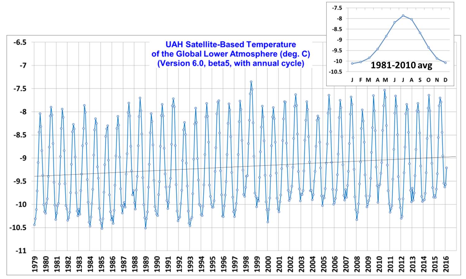
The annual cycle is shown in the inset, with peak temperatures in July, due to the Northern Hemisphere land mass responding so strongly to summer sunlight. The linear trend is +0.11 C/decade (it’s +0.12 C/decade with the annual cycle removed, which is how it should be done otherwise the annual cycle can be aliased into the trend calculation).


26 Responses to “UAH v6 LT Global Temperatures with Annual Cycle”

Toggle Trackbacks

  1. you can’t can’t compute any kind of climate sensitivity from the annual cycles in solar insolation and temperature response because of the huge asymmetry in the land-ocean distribution in the N vs S hemispheres. (Highest temperatures are actually when the TOA solar insolation reaching the Earth is weakest, because it’s mostly land that’s being illuminated, which has a much lower effective heat capacity than the ocean does).

    • Mike M. says:

      Ouch! I should have noticed that the sign was wrong. I’d unpost this, if I could.

  2. Mort Levine says:

    RSS has released a new version of their data set that fixes the long suspected cooling bias. Here is the abstract from their published paper.

    Temperature sounding microwave radiometers flown on polar-orbiting weather satellites
    provide a long-term, global-scale record of upper-atmosphere temperatures, beginning in late
    1978 and continuing to the present. The focus of this paper is the middle tropospheric
    measurements made by the Microwave Sounding Unit (MSU) channel 2, and the Advanced
    Microwave Sounding Unit (AMSU) channel 5. Previous versions of the RSS dataset have used a
    diurnal climatology derived from general circulation model output to remove the effects of
    drifting local measurement time. In this paper, we present evidence that this previous method is
    not sufficiently accurate, and present several alternative methods to optimize these adjustments
    using information from the satellite measurements themselves. These are used to construct a
    number of candidate climate data records using measurements from 15 MSU and AMSU
    satellites. The new methods result in improved agreement between measurements made by
    different satellites at the same time. We choose a method based on an optimized second
    harmonic adjustment to produce a new version of the RSS dataset, Version 4.0. The new dataset
    shows substantially increased global-scale warming relative to the previous version of the
    dataset, particularly after 1998. The new dataset shows more warming than most other middle
    tropospheric data records constructed from the same set of satellites. We also show that the new
    dataset is consistent with long-term changes in total column water vapor over the tropical oceans,
    lending support to its long-term accuracy.

  3. Greg Goodman says:

    Roy, I get a 403 when I click on the graph. I assume it was supposed to show na enlarged version.

    >>
    Forbidden

    You don’t have permission to access /wp-content/uploads/UAH-v6-LT-thru-feb-2016-with-anncyc.jpg on this server.

    Additionally, a 403 Forbidden error was encountered while trying to use an ErrorDocument to handle the request.
    >>

    I think what most people mean when asking for “absolute temperatures” is actual temperatures ( probably expecting celcius of fahrenheit ) though if they ask for “absolute temperatures” you are correct to provide them: in kelvin.

    It would be nice to see a properly low-pass filtered graph though of course we could not get all excited about whether such and such a month was hottest EVAH but that would probably be a good think anyway.

    Anomalies leave far too much sub-annual grek in the data. Some if it is inverted in years when the annual cycle is less than average. It is a really crude way of removing annual variability.

    a gaussian or a 12-9-7 month triple running mean would give a nice clean graph with NO annual or shorter variability.

    • I’ve asked the hosting company to do something about the problem. Work’s fine in my browser (Firefox). My usual monthly updates do include low-pass filtered results as well.

      • mpainter says:

        Roy, perhaps if you publicly identified your hosting company, they would feel better motivated to fix the problems.

  4. Greg Goodman says:

    “The linear trend is +0.11 C/decade (its +0.12 C/decade with the annual cycle removed, which is how it should be done otherwise the annual cycle can be aliased into the trend calculation).”

    If you do Jan-Jan or equivalent it should not make any difference. Subtracting the same climatology from an integral number of years will not change the trend. If it does when not using integral number of years, then nothing guarantees that the climatology is not introducing a bias.

    There will always be a bias depending on the interval over which a “trend” is calculated. That is why this obsession with trends in climatolgy is unhealthy and unscientific.

    If we banned the word “trend” we would get along a lot better.

    • mpainter says:

      Right again, Greg, but if you take away “trends” you cut the alarmists off at the knees. The whole of their science has been reduced to fabricating a rising temperature trend.

    • Slipstick says:

      Trends are unscientific? Please explain how you can extrapolate (i.e., make predictions from) a variable signal without first determining the signal’s trend.

  5. sky says:

    The global seasonal cycle serves as an important reminder of how miniscule the “climate signal” really is compared to what is experienced.

  6. Alick says:

    Dr. Spencer : “The answer, of course, is that the seasonal cycle is so large that it obscures the departures from normal.”

    Ain’t not one of you scientists, yet alone us yokels, on any side, that knows an average temperature, yet alone which one, is ‘normal’.

    Every point on your graph is made up of an “average”. To average them again in order to create some point on the graph that you can measure some departure from and treat that line as some ‘line of normalcy’ is ludicrous. It’s a moving baseline, dependent on what period in time you’re averaging, from which to display results, nothing more, something less.

    I would ditch the meaningless line from which you are trying to assign + and – values to and start the graph at 263.000 Kelvin. Missing some data from previous years? Try starting your graph at 262.000 Kelvin. Still missing some years of data? Try starting your graph at 261.000 Kelvin. I would be surprised if it doesn’t look the same as the graph of plotted points you have now.

    Of course, anyone can try manipulate and fool our visual perception by fiddling with the, origin location and the scales applied to the axes on any graph. However, where the data shows an upward trend or downward trend, should remain unaffected.

    Opologies if I’ve misunderstood.

    Alick.

    • the data were originally in Kelvin, I subtracted 273.15 to convert to absolute deg. C. Sorry for the confusion.

      • Alick says:

        Dr. Spencer, you’re sorry for the confusion? Subtracting 273.15 isn’t going to help clear that up, you should be subtracting your values FROM 273.15.

        Example: 273.150 – 263.357 = 9.793
        Where are the graphs showing values such as that?

        My school teacher would call this below “unfinished work”.

        Mon. Kelvin
        JAN 263.037
        FEB 263.108
        MAR 263.299
        APR 263.721
        MAY 264.324
        JUN 264.966
        JUL 265.288
        AUG 265.108
        SEP 264.471
        OCT 263.786
        NOV 263.273
        DEC 263.072

        Your display of UAH V6 Global Temperature data, is an example of “over-finished” work in an effort to add a meaning. The temperature departure from the ’81 to ’10 average is a meaningless figure that you are describing as “normal”. Ain’t seen no reasoning to suggest that any temperature average should be described as “normal”, which implies the meaning, “this is where we should be”.

        My school teacher also says you should be converting them’s numbers to fahrenheit values because most of us think how we might feel at 20 degrees Celsius is going to be different than we might feel at 68 degrees Fahrenheit. I think she is wrong on this.

        Alick.

        • Alick says:

          WELL DON’T I LOOK THE FOOL. My apologies Dr. Spencer. Kelvin and Celsius are the same scale just beginning at different points. Absolute celsius scale = Kelvin.

          We can say 273 absolute degrees celsius or
          we can say 273 degrees Kelvin they represent same scale with the starting point at zero, so I am surprised you did anything to convert data originally in Kelvin to absolute degrees celsius, as you suggest above, seeing it is the same thing.

          However, if you were to convert absolute degrees celsius (Kelvin) to celsius, you certainly would subtract 273 from whatever absolute value being converted. Rest assured I spanked my teacher for that mistake.

          Mon. Kelvin
          JAN 263.037
          FEB 263.108
          MAR 263.299
          APR 263.721
          MAY 264.324
          JUN 264.966
          JUL 265.288
          AUG 265.108
          SEP 264.471
          OCT 263.786
          NOV 263.273
          DEC 263.072

          So, if we take the month of January, 263.037 absolute degrees celsius (Kelvin) and convert it to celsius it would be 263.037 – 273.15 = -10.113 degrees Celsius

          FEB 263.108 – 273.15 = -10.042 degrees Celsius

          – 10.042 degrees Celsius = -10.042 * 9/5 + 32 = 13.9244 degrees Fahrenheit.

          Why there be no graphs of raw satellite data using that scale? Ain’t no reason the plotted graph shouldn’t have the same qualities as the way you are displaying UAH V6 Global Temperature data. I think that your display of data as a divergence from some average of total temperatures through the years being passed off as what is “normal”, is misleading.

          TOTALLY UNRELATED:
          If the core of the planet were to experience a period of cooling, were would that heat go? Maybe it’s like Las Vegas….what happens in the core stays in the core.

          • dave says:

            “where would that heat go?”

            Same as it does now – out into space, after being converted into radiation. Only, the various hypothetical processes inside the earth are very slow – a scale of millions of years is needed.

  7. Einstein says:

    Why use annual average RSS … I suspect the annual average min and the average annual max and the annual average mean behave very differently over the time periods of satellite measurements….

  8. Thank you for this great article. It’s always good to have a different POV. In this case real temperature. I wonder what is the vertical scale in the graphic.

  9. Jim F says:

    Roy,

    Thanks for posting the LT month absolute averages!

    Just to clarify, these are the baseline monthly absolute averages for a specific period that are used to calculate UAH 5.6 and 6.0 LT anomalies?

    Could you also post the MT absolutes (either as a comment or a new blog posting)?

    Thanks again.

  10. I looked at the CFSR global surface temperature data by month from UM CCI and it shows about 4C variation across the year. More details here:
    https://oz4caster.wordpress.com/2016/01/26/global-temperature-by-month-2015/

  11. Rick A says:

    Were yourself or Dr. Christy included in the peer review of this paper?

  12. Olof R says:

    Well, this discussion is about the trend during the alleged “pause” years or AMSU years, ie from 1997-2000 til now.
    The trends of UAH v6 TLT and RSS v3 TLT can’t exactly be validated/verified by satellites or radiosondes:
    http://postmyimage.com/img2/995_Tropospheretrends.png
    All other reanalysis and radiosonde datasets agree with those above. The new RSS TTT v4 have a trend roughly the same as UAH 5.6.

    Why should AMSU-5 on NOAA-15 be OK? Is it normal that the trend is 0.15 C/ decade lower than that of AMSU-4 (Mo 2009)?
    Is it normal that AMSU-5 on NOAA-15 drifts versus the other AMSU-5s and makes the joint Channel 5 trend much lower than that of a weighted average of nearby Channel 4 and 6?

    http://satelliteconferences.noaa.gov/2013/docs/Tuesday%20Poster%20Session%20Final%20Posters/T38_WenhuiWang.AMSUA%20Only%20Atmospheric%20Temperature%20Climate%20Data%20Records.NOAASatelliteMeeting2013.pdf

    (free poster, there is a paywalled paper with the same title)

  13. gallopingcamel says:

    @Roy W. Spencer, Ph.D,
    Mon. Kelvin
    JAN 263.037
    FEB 263.108
    MAR 263.299

    It is really daft to quote temperatures to 0.001 Kelvin if you don’t show the error range, the standard deviation, the rms error or whatever. I suspect that your standard deviation is greater than 0.05 Kelvin in which case you might want to drop at least one significant figure from your temperature averages.

    • I understand the concern. We do it this way so that if you compute your own monthly anomaly, there will be essentially no error due to rounding errors. If you round off the absolute values of the annual cycle based upon their absolute accuracy, and round off the anomalies based upon their estimate errors, if you recombine them you get very noisy results. Better to just report more digits, so that there are negligible errors due to rounding.

  14. dave says:

    Lately, I have been watching the 2-meter (nose height!) global temperature anomaly, produced every four hours by Dr Maue. I know – pointless and sad. However, one can usually anticipate the UAH number for the current month by seeing how this particular measure is evolving though time.

    One thing that is quite clear is how the signature of the El Nino is solely an affair of the Northern Hemisphere. It is a globe of two halves at present.

    Another remarkable point is just how variable the anomaly IS when compared to hypothesised trends of 0.12 C per DECADE for “average temperature”. This particular satellite-derived average moves that much every DAY.

    The first two weeks of February showed little change compared to the general level of January. Then, the Northern Hemisphere shot up 0.8 C in the last two weeks of February, which tallies with the big jump in the UAH and RSS figures for LT in February.

    The first nine days of March have shown a drop in the Northern Hemisphere of 0.4 C.

    It looks quite likely that this 2015-2016 El Nino, which is so similar in strength to 1997-1998, will show a similar spike.