2019 the Third Least-Chilly in the Satellite Temperature Record

December 6th, 2019 by Roy W. Spencer, Ph. D.
People’s Climate March in Denver, CO on April 29, 2017 (CNN).

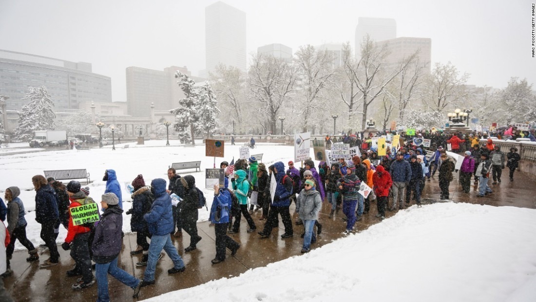
It’s that time of year again, when we are subjected to exaggerated climate claims such as in this Forbes article, 2019 Wraps Up The Hottest Decade In Recorded Human History. Given that the global average surface temperature is about 60 deg. F, and most of the climate protesters we see in the news are wearing more clothing than the average Key West bar patron, I would think that journalists striving for accuracy would use a more accurate term than “hottest”.

So, I am announcing that in our 41-year record of global satellite measurements of the lower atmosphere, 2019 will come in as 3rd least-chilly.

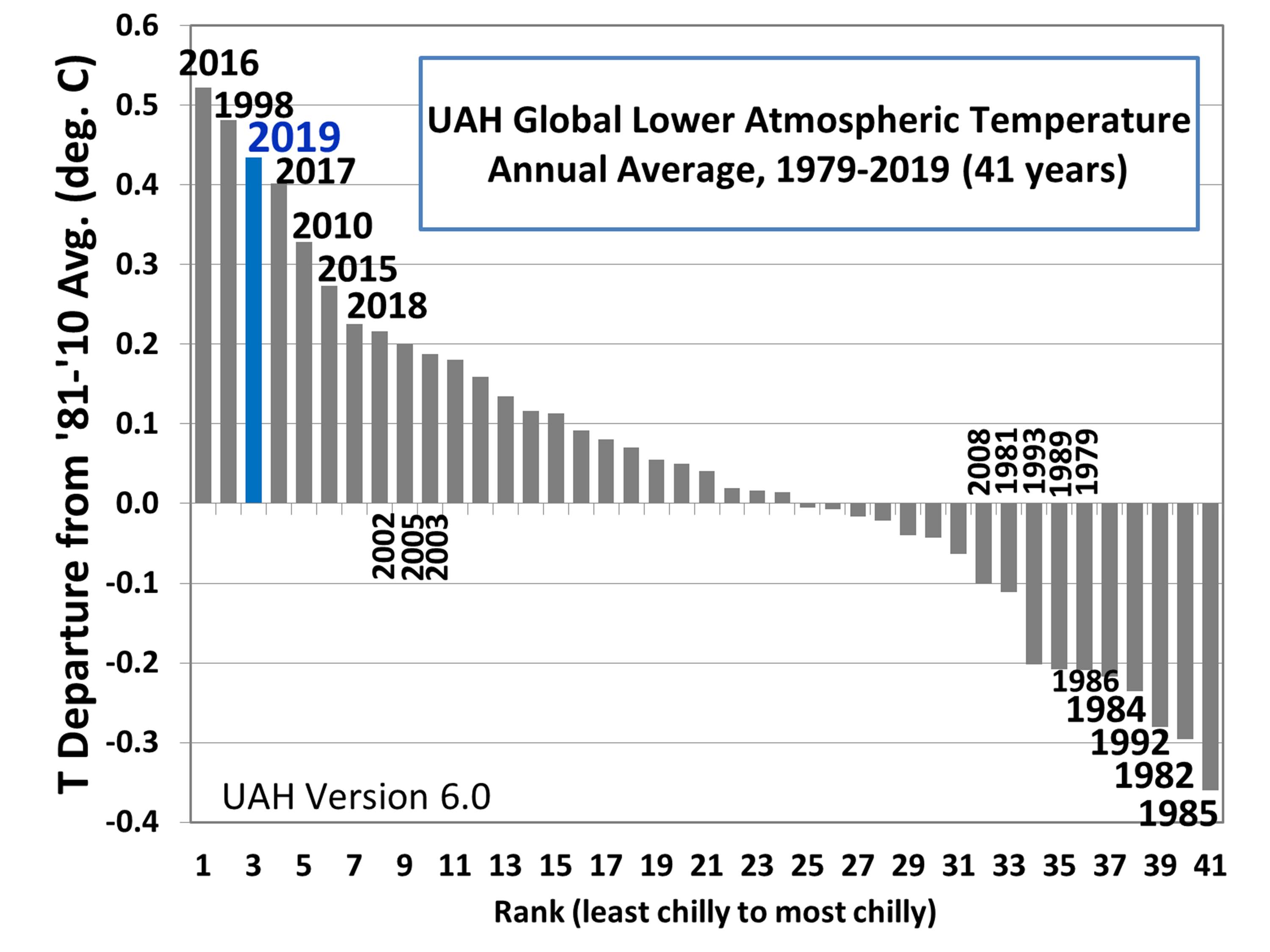
For the decade 2010-2019, the satellite temperatures averaged only 0.15 C higher than in the previous decade (2000-2009). That’s less than a third of a degree F, which no one would even notice over 10 years.

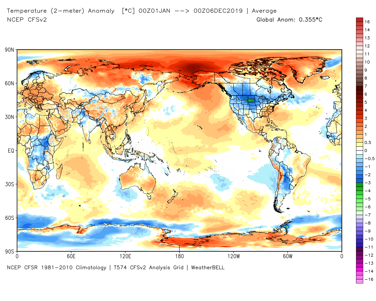
If you are wondering how your neck of the woods has fared this year, the latest year-to-date plot of 2019 temperature departures from the 30-year average (1981-2010) shows the usual pattern of above- and below-normal, with little visual indication that the global average for 2019 is now running 0.36 deg. C above normal.

Latest 2019 year-to-date average surface temperature departures from the 1981-2010 average from the NCEP CFSv2 global data assimilation system (graphic courtesy of Weatherbell.com).

The use of the term “hottest” to describe recent warming belies the fact that the rate of warming we have experienced in recent decades is minuscule compared to the several tens of degrees of temperature change most people experience throughout the year — and sometimes from one week to the next.

So, how are we supposed to react when the arithmetically-averaged temperature, across all extremes, goes up by only a small fraction of a degree in ten years? With horror? Outrage? Is the term “hottest” in a headline supposed to move us? Seriously?

Should we all get someone to fly across the Atlantic so they can transport us to Europe on a luxury yacht to help Save the Earth™ on our next European vacation?

The click-bait journalism typified by terms like “hottest”, “climate emergency”, and now “climate catastrophe” helps explain why the public is largely indifferent to the global warming issue, at least if we are asked to spend more than a few dollars to fix it.

This is why the alarmist narrative has moved on from temperature, and now focuses on wildfires, droughts, floods, hurricanes, snowstorms, and sea level rise. Yet, none of these have worsened in the last 100 years, with the exception of global sea level rise which has been occurring at a rate of about 1 inch per decade for as long as it has been monitored (since the 1850s, well before humans could be blamed).

And, just in case some new visitors to my blog are reading this, let me clarify that I am not a denier of human-caused climate change. I believe at least some of the warming we have experienced in the last 50 years has been due to increasing carbon dioxide. I just consider the fraction of warming attributable to humans to be uncertain, and probably largely benign.

This is fully consistent with the science, since the global energy imbalance necessary to explain recent warming (about 1 part in 250 of the natural energy flows in and out of the climate system) is much smaller than our knowledge of those flows, either from either theoretical first principles or from observations.

In other words, recent warming might well be mostly natural.

We just don’t know.


161 Responses to “2019 the Third Least-Chilly in the Satellite Temperature Record”

Toggle Trackbacks

  1. E. Swanson says:

    As you know, the RSS team excludes data from the Antarctic in their lower troposphere data. The reason is the well known influence of the high land elevations of the Antarctic on the data retrievals. RSS also excludes other areas of high mountains, such as the Himalayas and the Andes. What would your data look like if you also excluded the data from 70S to the South Pole, as RSS does?

    • Scott R says:

      Interestingly, in the arctic, they go 60 – 82.5 deg but the Antarctic they go 60-70. Therefore, their globe isn’t really a globe but a cherry pick in which the area of the globe with the strongest cooling trend over the past 40 years has been excluded from their “globe”.

      • MikeR says:

        Scott,

        I think you have been looking at too many Mercator projection maps of the earth.

        You do realise, I hope, that the surface area between -70 degrees to the south pole is just 3% of the total area of the earth. The temperature trend for the Antarctic region is close to zero. Consequently If you adjust RSS TLT down by 3% the temperature trend goes from 0.207 to 0.201 degrees per decade.

        Nothing to get too agitated about.

        • Scott R says:

          Mike R,

          I agree… the problems with the RSS are definitely not due to solely the missing south pole data, but it doesn’t help. As discussed in the previous conversation… use UAH for the 1980- present trend, RSS to get the month to month deltas.

          I would like to say to both you and bdgwx as I mentioned on several occasions with discussions with Bindidon, the Antarctic region severely lagged the rest of the world during the 1980-2016 trend even with the +AMO and super ENSO in 2016. Actually, the southern ocean had a negative trend during that time. Despite the fact that by % of the globe the area south of 70 degs makes up a small %, it is the coldest place on the earth and stores the majority of the ice on the planet. So what is going on in Antarctica has an oversized impact on the global climate.

          bdgwx… you may want to rethink that last comment you made. Adding additional no trend data will bring down the average.

          • bdgwx says:

            bdgwx you may want to rethink that last comment you made. Adding additional no trend data will bring down the average.

            Yeah. For sure. Assuming the 0.26C/decade and 0.01C/decade applies to higher than 82.5N and 70S respectively then the weighted contribution from these omitted regions is 0.04C/decade which would indeed pull the global trend down. Specifically it would pull it down from 0.207 to 0.195. Nice catch.

      • bdgwx says:

        UAH SoPol shows a trend of +0.01C/decade and NoPol shows a trend of +0.26C/decade. Maybe RSS’s exclusion is actually causing them to underestimate the warming by hair?

      • Forrest Frantz says:

        No worries about RSS. I just completed the most thorough study of all eight international global temperature time series. The results are ironic. The time series that have criticism for trying to hide cooling or exaggerate warming generated the highest statistics for showing that CO2’s associated aerosol and flora properties that cool the planet are stronger that CO2’s greenhouse gas property that warms the planet–a finding consistent across all the datasets.

  2. skeptikal says:

    Roy, just out of curiosity…. have you ever run the numbers to see how night-time warming compares to day-time warming?

    • rob Bradley says:

      And since most of the warming is during the coldest times of the year in the coldest regions, is there a surface temperature adjustment where the way-below-freezing warming is taken out to leave, for wont of a better term, causal warming.

      • Stephen W says:

        “And since most of the warming is during the coldest times of the year in the coldest regions”

        ..Except Antarctica.

        The UAH figures show a gradient of warming rate from the North Pole to the South Pole.
        Antarctica has the lowest warming rate, of zero.
        The coldest places just happen to be closest to the North Pole, which is warming the fastest.

  3. skeptikal says:

    “In other words, recent warming might well be mostly natural.”

    It looks like you’re shifting back towards your original position on this issue… or at least giving it more significant weighting.

  4. Nate says:

    “global sea level rise which has been occurring at a rate of about 1 inch per decade for as long as it has been monitored (since the 1850s, well before humans could be blamed).”

    Oh c’mon. What record shows that?

    Most records, like Church and White show acceleration over that period.

    Reconstructions of last 2 millenia show no century rises anywhere near the 20th.

    • Archie says:

      Look at tide gage records from around the world. Trends are linear. Tony Heller has exhaustively gone over this subject in many of his videos. Certainly Obama isn’t worried given his recent waterfront purchase in Martha’s Vineyard. LOL

    • Nate says:

      Looking at maps? Seriously?

      You think a 6 inch rise could be seen in a map?

    • arn says:

      Lol nate.
      Which rise in the 20th century??

      All man made buildings in the seas around the world look almost exactly the same at high tide as they did 100 years ago.
      The shape of confinents has not changed(except if its caused by erosion)
      a bit which would be a mandatory result of rising sea levels.

      All the harbours are still there and in use and all beach resorts
      and islands which were supposed to be flooded by 2018 (maledives)
      are not just alive and kicking but building new airports which will increase the downwards pressure on the island with addition millions of tons of concrete and asphalt.
      The only places with “visible” sea level rise are places like miami or sweden.
      Miami is sinking and Sweden is rising-thats the reason ,not sea levels.
      Otherwise Obama wouldn”t have paid 15 mio for a beach front property at sea
      level and beach front propertiy prices would be falling like rocks,
      instead they keep on rising and rising.

      There is a reaaon why we don”t have a “drowned island day”
      though the UN is busy to have a day for everything no matter how pathetic and especially their climate change BS.
      Island are not drowning-though we have tens of thousands of them
      and any drowned island
      with a significant size(let”s say football field+)
      would be instantly turned into greta martyr island by the media.

    • Nate says:

      Science by anecdote…??.

      Science from data Church an White 2011:


      We estimate the rise in global average sea level from satellite altimeter data for 19932009 and from coastal and island sea-level measurements from 1880 to 2009. For 19932009 and after correcting for glacial isostatic adjustment, the estimated rate of rise is 3.2 0.4 mm year−1…”

      “The linear trend from 1900 to 2009 is 1.7 0.2 mm year−1”

      • Archie says:

        “… Science by anecdote??. …”

        I realize that you don’t’ do data, but really, take a look at the tide gage records, some of which go back to the mid 19th Century. You obviously just want to argue dogma and not look at the real world.

      • Nate says:

        ‘I realize that you don’t’ do data, but really’

        Dude, false. I quoted from a paper that analyzed tide gage records.

        Simply ‘Looking at’ tide gage records is not good enough, given that land is uplifting or subsiding depending on where you look.

        • scott allen says:

          “given that the absolute global sea level rise is believed to be 1.7-1.8 millimeters/year”

          That quote is from NOAA tides & currents website. which takes into account the vertical land movement. it is located in the global trend comparison heading.

          in addition JASON 3 is only accurate to about 1 inch or 2.5 cm.

          • bdgwx says:

            Regarding JASON 3…is the 250mm accuracy for a single spot at a single time or for the global mean trend? I’m not very familiar with altimetry but a quick google search leads me to believe it is the former and that the MSL trend uncertainty is considerably less than 1mm/yr. Can you confirm?

          • bdgwx says:

            Typo…250mm should have been 25.0mm

        • Nate says:

          Over what period of time?

          • Archie says:

            Tide gage records show linear trends over decades, some back to 1850. Maybe you don’t realize that a linear tread, by definition, is unchanging in rate. Warmists tell us sea level rise is accelerating (non-linear). That’s verifiably FALSE. I don’t really care if you are convinced or not. As I said above, you’re arguing dogma at this point.

          • Nate says:

            Nope. The long term average trend last century was 1.7. But last 27 y 3.3.

            Sorry, the trend is clearly increasing.

          • Midas says:

            Archie

            The oldest tide gauge – Brest in France (1807-2018)

            Linear trend for first 100 years: -0.04 mm/yr
            Linear trend for last 100 years: +1.53 mm/yr
            Linear trend for last 50 years: +2.61 mm/yr

            Data beats mere assertions.

          • Midas says:

            Oldest tide gauge in the US – San Francisco (1854-2018)

            Linear trend for first 75 years: +0.50 mm/yr
            Linear trend for last 75 years: +2.02 mm/yr

          • Midas says:

            Oldest tide gauge in Scandinavia – Helsinki (1879-2018)

            Linear trend for first 70 years: -3.29 mm/yr
            Linear trend for last 70 years: -1.46 mm/yr

          • Midas says:

            Oldest gauge in Australia that isn’t full of missing data:
            Sydney (Fort Denison 2) – 1915-2018

            Linear trend for first 50 years: +0.81 mm/yr
            Linear trend for last 50 years: +1.35 mm/yr

          • Archie says:

            I tried posting replies with links but they didn’t post. So I guess I’ll leave it with me thinking I’m right and you thinking you’re right. Doesn’t really matter. I’ve lost any trust I had in the “science community” anyway given the fraud and personal agendas. Data is routinely manipulated and even when not, just ignored.

          • Nate says:

            Classy guys. When the data dont fit your beliefs: the data must be wrong and fraudulent.

          • Midas says:

            Archie,
            It don’t THINK I’m right. Unlike you, I have done an analysis – I KNOW I’m right. What is preventing you doing your analysis of the data? If the answer to that is you don’t know how to, that explains your proclivity for indoctrination.

      • MARK E. says:

        I doubt that conclusion. I have exhaustively looked at tidal gauge data across the world and have not observed any acceleration at any port. If you can, please point it out. Depending on how you average incomplete data sets, you could misinterpret that as acceleration.

  5. Nate says:

    “I just consider the fraction of warming attributable to humans to be uncertain, and probably largely benign.”

    With your meterologist hat on, I wonder how you can be so certain that the changes in weather patterns, brought about by even the low end ~1.5 C for a doubling of co2, will be benign?

    There is research showing tipping points for significant weather pattern changes at 1.5 C – 2C.

    • Rob JM says:

      Low end of CO2 doubling is <0.5 deg C, which is what an actual scientist would assume when you correctly apply the thermodynamic equilibrium law that states that a system at equilibrium resists any forcing.

      1.5 Deg C is arguably the high end of likely effect of CO2 doubling once you consider that 2/3rd of the satellite era warming can be directly attributed to reduction of cloud cover as revealed by the ERBE.

      There is no excuse for mainstream climate science to completely ignore the obvious natural driver of climate, other than the lack of money to be made if humans are not to blame.

    • Forrest Frantz says:

      When one looks at the fraction of warming attributable to humans and then tie that to CO2, is it incomplete to solely consider the greenhouse gas property of CO2, CO2(GHG)? CO2 has two global cooling properties, CO2(Green), from its affect on flora and its association with aerosols. The flora effect being the strongest.

      Look at it this way. CO2(Net) = CO2(GHG) forcing + CO2(Green) anti-forcing.

      When CO2(Green) is measured, it is found to anti-force at a level that is stronger than CO2(GHG) forcing. This is done through inference since in reality, we can only measure CO2(Net) cause-effects in our actual biosphere.

      Of note, if we were in a glacial maximum, then you would be correct about forcing, but the forcing number would need tuning for how much flora was left.

  6. steve case says:

    IPCC AR4 Chapter Ten Page 749 Temperature Extremes

    It is very likely that heat waves will be more intense, more frequent and longer lasting in a future warmer climate. Cold episodes are projected to decrease significantly in a future warmer climate.

    Almost everywhere, daily minimum temperatures are projected to increase faster than daily maximum temperatures, leading to a decrease in diurnal temperature range.

    Decreases in frost days are projected to occur almost everywhere in the middle and high latitudes, with a comparable increase in growing season length.

    So far they aren’t right about the heat waves.

    • Nate says:

      ‘intense, more frequent and longer lasting in a future warmer climate.’

      Is it the future already?

    • Midas says:

      Here in Australia they have been right about that.

      • Midas says:

        Indeed. And when the rains finally come Steve Case will say “looks like climate change is over”, completely ignoring the fact that these droughts are becoming more frequent, longer lasting, and more severe.

        • Rob JM says:

          Sorry but the paleo data shows up to 30 year droughts during the last millennium.
          It also shows floods in the Murray darling that were 4 times greater in volume than recorded.
          As for fires, the most fire prone state is Victoria, the coldest on the mainland.

          1851 fire occurred on a 47deg C day and burnt 5million hectares, 10 times the size of black Saturday.

          And El Nio that causes droughts has been shown to be suppressed in the warmer climate of the holocene optimum due to increased warm water surrounding the continent that somehow didnt kill the coral off.

        • Nate says:

          Rob, there are thousand year floods and thousand year droughts. If you look back 2 millenia, you shouldd see one or two.

          If we have them more often that, more than once in decades, eg Houston has had 3 500 y floods in 10 years, then something is wrong.

          Something has changed.

          • Joseph Zorzin says:

            Somewhere- can’t remember where- I read that the vast urban sprawl of Houston messed up the natural drainage system increasing the likelihood and extent of flooding. The city’s growth simply wasn’t planned to minimize negative impacts to the natural drainage. A common problem in many places- building in flood planes- then whining when it floods.

  7. Bev says:

    I would really like to be able to see a translation of the usual temperature anomaly graph to absolute temperatures, so that people can compare the current temperature range to time periods like the Medieval Warm Period and so on.

    These temperature anomalies mean nothing to the average public, they would look at something trending upward in horror, and with no ability to compare it realistically to the past.

    Many thanks.

  8. Aaron S says:

    What is impressive to me is that proxy data and historical records from mid and low latitudes would not even see this warming because it is at the high latitudes where there is much less data. So during Little Ice Age there could have been global warming but European cooling. Also none of this has triggered an isotopic response in glacial ice therefore we could not see such minor events. This is not significant climate change yet.

  9. Jeffrey R. says:

    In just a little over six years, 48% of our states experienced the first occurrence of their all time highest recorded temperature.

    It was not the last six year, there were no all time highs.

    In the last 24 years, only one state has experienced an all time high.

    From July 1930 to August 1936 24 states first experienced temperatures that are their all time highest recordings.

    Given trend of night time temperatures to rise, strongly influencing the daily averages that this is a cooler decade than the 1930’s.

    • bdgwx says:

      You think the global mean temperature from 1930-1939 was warmer than 2010-2019? Which dataset are you using to justify your position?

      • Midas says:

        He is not using a data “set”. He is using a data “point”.
        Apparently he believes that the one day of a decade that gives the record defines the climate for the remaining 3650 days in the decade.

    • Dr Roys Emergency Moderation Team says:

      bdgwx, Des, please stop trolling.

  10. Eben says:

    The recent decades of small warming is the result of cumulative effect of historically high past seven solar cycles , namely cycles 18 -24 , nothing to do with CO2
    Solar Variability and Climate – Joanna D. Haigh
    https://youtu.be/_1MPQYN6fnQ

    • Midas says:

      Would you please point out at what time in the video she made that precise statement – I am having trouble finding it.

      Joanna D. Haigh states:

      “If current levels of carbon dioxide emissions continued unabated, they would lead to a 5 C increase over pre-industrial climate by the end of the next century, and that achieving a zero temperature rise would require a complete cessation of carbon emissions.”

      She further states about Trump’s climate policy:

      “If Trump does what he said he’d do, and others follow suit, my gut feeling is that I’m scared. Very scared.”

      You really should do more research into your adopted idols.
      But thanks for providing evidence that the LIA was caused mainly by volcanoes, with only a minor influence from the Maunder minimum. I’m sure ren will be happy to hear that.

    • Dr Roys Emergency Moderation Team says:

      Des, please stop trolling.

  11. ren says:

    The low temperature in the stratosphere above the polar circle does not determine the strength of the polar vortex. The influx and distribution of ozone in high latitudes is decisive. The animation below shows that the influx of ozone to to Bering Sea led to the division of the polar vortex in the lower stratosphere over the Bering Sea.
    https://exp-studies.tor.ec.gc.ca/tmp/18390004900de20191205.gif
    https://earth.nullschool.net/#2019/12/07/0600Z/wind/isobaric/70hPa/orthographic=-10.87,94.02,296

  12. Don Easterbrook says:

    Roy,

    The most surprising thing about the figure of global temps is that the only really ‘hot’ areas are the Artic and Antarctic. This is in sharp contrast to satellite temps which show no warming since 1979 and the surface temps which show no warming at all since 1957. Were the Arctic and Antarctic temps really red ‘hot’ in 2019?

    • bdgwx says:

      UAH and RSS warming trends since 1979 are 0.13C/decade and 0.18C/decade respective. UW’s bias corrected UAH and RSS analysis for TMT is 0.14C/decade and 0.18C/decade respectively over the same period with RATPAC showing 0.18C at this same level. The BEST trend is 0.19C/decade at the surface since 1979. Other conventional surface station datasets and reanalysis are similar. Where are you getting that there has been no warming since 1979?

    • Midas says:

      Hey Don, what happened to the great cooling you predicted to begin in 2000? Given that your comment indicates your inability to read simple data sets, you will probably claim that it actually happened.

      Any more lies you care to share with us? I particularly liked the one about the IPCC predicting 1 degree of warming between 2000 and 2010. You would think you would at least make claims that are not so easy to debunk.

    • Dr Roys Emergency Moderation Team says:

      bdgwx, Des, please stop trolling.

  13. MikeR says:

    Roy,

    I don’t to be overly harsh to the hand that feeds us but you seem to be overly phlegmatic, to the point of smugness, when it comes to what you consider to be the small effects of climate change. Yes one can adapt in the first world by just turning the notch up on the air conditioner .

    Hoevrr but the environmental impacts have already been significant to say the least , some of course may have confounding factors other climate change but even the 1 degree C (since pre industrial times) increase seems to have caused some havoc.

    From ecological shifts on both land and in the ocean (I don’t have the time, space and energy to list them all) but if you have been reading both the scientific and popular literature you should be aware of them.

    I am both sure how many links are allowed here so I will just post one that might allow you to reevaluate your position, see –

    https://www.thelancet.com/journals/lancet/article/PIIS0140-6736(19)32596-6/fulltext

    You can read the full article or just the executive summary. The 212 references included may also keep you busy.

    Anyway with respect to the human contribution to this mess You are right, no-one knows the exact proportion. You say you are uncertain, other scientists seem less so but I expect you are wise enough to carry home and car insurance. Consequently I assume the precautionary principle is not foreign to you. For others who are not familiar here is a link.

    https://ib.bioninja.com.au/standard-level/topic-4-ecology/44-climate-change/precautionary-principle.html

    Overall I found your article to be disappointing. I never took you for a high living grasshopper but more of a diligent hard working ant.

    On that note here is some more light reading.

    http://agris.fao.org/agris-search/search.do?recordID=US201500082762

    and

    https://www.countrylife.co.uk/news/climate-change-causes-increase-of-grasshoppers-and-crickets-28479 .

    • John Boland says:

      Both the scientific and popular literature are currently caught in a pro-catastrophe funding feedback loop. If more funding was presented to Dr. Spencers side of things we would see quite the opposite. Money does not determine truth, but it goes a long way to obscure it. Stick to scientific principles and your eyes might be opened. As far as I can tell, that is exactly what Dr. Spencer is doing here.

    • E h? says:

      You do realise that insurance serves to enrich its promoters, rather than policy holders, I presume?

  14. Bri says:

    I just took apart another beehive that has frozen to death , we need to get this warming thing back on track. Do it for the Bee’s. ;~)

  15. ren says:

    Those physical phenomena distracting Earth from the instant emitting back to space are the Earths rotation around its axis and the Earths surface specific heat.
    https://www.cristos-vournas.com/

    • Dr Roys Emergency Moderation Team says:

      Another GHE debunker…

      • ren says:

        It is a Stefan-Boltzmann Law Triumph! And it is a Milankovitch Cycle coming back! And as for NASA, all these new discoveries were possible only due to NASA satellites planet temperatures precise measurements!
        “The calculations of solar radiation reflection are based on the smooth spherical shape for Φ=0,47. For albedo are based on the surface features. Φ=1 is for gaseous – no surface to reflect planets.”
        “N rotations/day is N rotations/24 hours. The faster – the higher is its average temperature. N and pc influence the way a solar irradiated blackbody surface interact with the S .”
        https://www.cristos-vournas.com/

      • Dr Roys Emergency Moderation Team says:

        Time for the GHE Defense Team to do their usual thing, I guess…

        • Rob JM says:

          Newsflash,
          Just because GHE is real does not demonstrate it is the sole reason to explain surface temp differences.
          It is not mutually exclusive to other theories such as atmospheric pressure thermalisation.

          From what I can determine GHE and all other surface to atmosphere energy transfers are 50% less efficient than direct surface to space emissions (ignoring earth curvature effects.)

          That is not enough to explain the difference.

      • bdgwx says:

        It looks like the guy accepts the GHE. He just doesn’t think its happening on Earth.

      • Dr Roys Emergency Moderation Team says:

        There we go…

  16. ren says:

    Very strong frost in the northeast of the US.
    https://files.tinypic.pl/i/00993/rcosfjk71fss.png

  17. ren says:

    Very low temperature in central Canada.

    • Midas says:

      Very high temperatures in Western Australia since mid-November, extreme for the first 6 days of December, returning to extreme in three days and staying extreme until at least the end of the week.

      • Rob JM says:

        Caused by cool surface waters off the NW coast of Australia due to the -ve IOD.
        Drought is caused by low moisture due to cold ocean, the opposite of global warming.
        Warming reduces droughts, as demonstrated by the mega droughts of glacial maximum that deposit dust in glaciers.

  18. Danyel Jee says:

    It’s always easy to measure a warming trend when starting during a cold period: https://youtu.be/zSDLRm3jhc8

    The Pacific ocean was warmer during almost the hole holocene minus the Little Ice Age:
    https://climateaudit.files.wordpress.com/2013/11/rosenthal-2013-figure-2c-annotated.png

    When looking at the anomaly maps, it’s obvious that the warming is coming from the oceans and the surface is rather cooling in places were temperatures are not moderated by them.

    I looked up the average temperatures of the past 30 years where i live, which is warmer thanks to the golf stream and those huge temperature changes correlates very well with the AMO.
    https://www.dropbox.com/s/5dz4zznf8d9lnmb/Lommersum-vs-Stammheim_1989-2018.jpg

    I just found another AMO-graphic and it seems, that most AMO- and PDO-graphs are fraudulent if this a more authentic one:
    http://wetter-observer.de/wp-content/uploads/2013/05/1453326927AMO-GlobalAnnualIndexSince1856-With11yearRunningAverage-590×350.gif

    Almost perfect correlation with the historic global temperatures before the NOAA/NASA-manipulation of the past.

    • Midas says:

      Here is the full Rosenthal 2013 paper:
      https://tinyurl.com/Rosenthal-2013

      (1) Why does your graph look different to the real thing?
      (2) Why did you fail to include on your version the fact that these are temperatures at a depth of 500 m?
      (3) Look at the graph (A) which gives actual SURFACE temperatures – the temperatures which actually affect the atmosphere. Note the spike at the extreme right.

      This is the kind of dishonesty we have come to expect from your crowd.

      • Midas says:

        The global graph is the red one by the way – in case you have the same unwillingness to read the fine print as your comrades.

      • Danyel Jee says:

        Isn’t it a bit odd when coming from an Ice-Age to have warmer deep ocean temperatures in the past than nowadays? And surface-temperatures change every year often over 1 C. They are driving the weather, but seems a bad indicator for long term climate. And why did the pacific swing back to a warming-trend long before industrial CO2-emissions?

      • Leynad says:

        Interesting link, but opposing your narrow look at SSTs, which usually can change a lot very quickly.

        “Observed increases in ocean heat content (OHC) and temperature are robust indicators of global warming during the past several decades. We used high-resolution proxy records from sediment cores to extend these observations in the Pacific 10,000 years beyond the instrumental record. We show that water masses linked to North Pacific and Antarctic intermediate waters were warmer by 2.1 T 0.4°C and 1.5 T 0.4°C, respectively, during the middle Holocene Thermal Maximum than over the past century. Both water masses were ~0.9°C warmer during the Medieval Warm period than during the Little Ice Age and ~0.65° warmer than in recent decades. Although documented changes in global surface temperatures during the Holocene and Common era are relatively small, the concomitant changes in OHC are large.”

        Isn’t it odd that oceans are cooling since millennia while coming out of an Ice Age. I guess the majority of people think it’s completely the opposite thanks to this Mann-made scientific fraud.

        • Ron says:

          One reason that oceans are cooling in mid-latitudes is seen in Surface temperature anomaly departures from the 1981-2010 average from the NCEP CFSv2 global data assimilation system chart for December 6, 2019. Warm anomaly in NE Pacific Ocean and cold anomaly near the Dateline are related to a stalled (May through November) cold front along 160W. Warming from the atmosphere shows up temporarily as an SST increase. Strong cold outbreak barely registers at the surface. It shows up permanently at or near the mixed layer depth.

  19. Bindidon says:

    Archie

    Your strange comment dated December 7, 2019 at 6:12 PM

    “Tide ga[u]ge records show linear trends over decades, some back to 1850. ”

    No they don’t need to.

    You are – typical for so many commenters – confounding
    – linear data behavior
    and
    – linear trend over data.

    You can always compute a linear estimate over data that shows non-linear behavior.

    Here is an example chosen by accident, the Fremantle gauge:
    111; -32.055833; 115.739444; FREMANTLE

    Here is its graph:

    https://drive.google.com/file/d/11GhSoX-5GEiJ2LSdWxwclI9oF0hLAbcI/view

    Do you see the thin, straight line? That’s your idea of how things look there. The reality is shown by the polynomial mean.

    *
    And while the linear trend for 1897-2018 is 1.72 mm/yr, the trend for 1993-2018 is… 4.93 mm/yr.

    Download the data, let Excel compute the trend, and you will have the same resultas.

    *
    The next example is hard work published in 2017, concerning PSMSL sea level measurement processing:

    Reassessment of 20th century global mean sea level rise

    Sönke Dangendorf, Marta Marcos, Guy Wöppelmann, Clinton P. Conrad, Thomas Frederikse, and Riccardo Riva

    https://www.pnas.org/content/114/23/5946

    Here is the Dangendorf data:

    https://tinyurl.com/yx6gqkgy

    and here is its representation, as above for a single gauge, together with
    – a linear estimate;
    – a polynomial showing its non-liearity:

    https://drive.google.com/file/d/16Tfsk2Ej9ctpAUiGVFIQmZg5H5Lpj24t/view

    And here are the trends for consecutive, 5 year distant periods:

    1903-2013: 1.34 ± 0.01
    1908-2013: 1.34 ± 0.01
    1913-2013: 1.35 ± 0.01
    1918-2013: 1.36 ± 0.01
    1923-2013: 1.36 ± 0.01
    1928-2013: 1.36 ± 0.01
    1933-2013: 1.34 ± 0.01
    1938-2013: 1.32 ± 0.01
    1943-2013: 1.33 ± 0.01
    1948-2013: 1.36 ± 0.01
    1953-2013: 1.45 ± 0.02
    1958-2013: 1.57 ± 0.02
    1963-2013: 1.71 ± 0.02
    1968-2013: 1.84 ± 0.02
    1973-2013: 1.98 ± 0.02
    1978-2013: 2.09 ± 0.02
    1983-2013: 2.25 ± 0.02
    1988-2013: 2.44 ± 0.02
    1993-2013: 2.56 ± 0.03

    Maybe you don’t realize that if the processed data was linear, all these periods would have the same trend.

    You wrote finally: “I don’t really care if you are convinced or not.
    As I said above, you’re arguing dogma at this point.”

    Back to you!

    • Archie says:

      Fair enough, you ding me for generalizing and calling it a linear trend. But what do you do? You just fit a slightly more complex curve to what is a very chaotic graph. Curve fitting is a good way to manipulate data into showing whatever you want to show. I get it, mathematical modeling is always an approximation. For what’s under discussion here, I’d argue that my “linear” fit is every bit as good as your “polynomial mean.” And your statement, “… The reality is shown by the polynomial mean. …” The polynomial curve is definitely NOT reality.

      I don’t have any issue with approximations such as this but when people want to radically change “life, the universe and everything,” based on it, more/better is required.

      The dogma I mentioned is that sea level is catastrophically rising and coastlines will be drowned. The predictions of the past are a joke so why would anyone think current predictions are somehow better. My generation grew up with stories like, “The Boy Who Cried Wolf.” There was a lot of wisdom in those children’s tales.

      BTW, I spent a fair part of my day moving snow. That’s the cold white stuff that wasn’t supposed to be around by now, according to so many “experts.”

  20. ren says:

    Very high levels of galactic radiation, that exceed 6800 counts in Oulu. This is such a level as in 2009 during the year of total silence on the Sun.
    https://cosmicrays.oulu.fi/webform/monitor.gif

  21. ren says:

    Dangerous wave of arctic air from central Canada falls in the Midwest.

  22. Snape says:

    Also for Archie,

    [It is important to note that coastal sea level rise is not uniform around the world, with one reason being that the land is not staying at the same elevation! In some places, the ground is sinking, due to pulling removal of subsurface water or oil, or some other natural process. For example, the land is rising today in locations that were covered by ice-age glaciers that pushed the land surface down. After they melted roughly 14,000 years ago, the land rebounded. That is happening here in the Northwest, particularly for the Olympic Peninsula.]

    https://cliffmass.blogspot.com/2017/12/the-paradox-of-sea-level-rise.html

    The comment by Dan McShane appears to school Cliffs last sentence, demonstrating even more what a complicated subject this is.

  23. Snape says:

    Thanks, Bin

    I hadnt seen the earlier comments (your work is always impressive!), in fact had not even heard of the acronym VLM.

    Cliff Mass is an excellent resource for learning about meteorology, not so much for other areas of science. OTOH, his comment section often includes input from local experts. The one by Dan McShane is a good example:

    http://stratumgroup.net/?page_id=182

  24. Snape says:

    This was his comment;

    [The negative relative sea level (RSL) change on the Olympic Peninsula is primarily from seismic strain on the Cascadia Fault as well as crustal under plating along the convergent margin. Nearly all the local glacial loading rebound took place shortly after the Puget and Juan de Fuca ice lobes retreated. Our local glacial isostatic adjustment (GIA) rebound was very rapid compared to other locations such as Hudson Bay where the coast is still rising or the lower Red River Valley on the US Canada border where land levels are still rising and are implicated on flooding on the Red River. GIA is a complicated factor that needs to be incorporated into sea-level rise evaluation both at a local level and global level. It is by no means a simple problem and is a subject of inquiry that is critical to global sea-level rise.

    Another factor that needs to be considered in evaluating sea level rise related to climate change is water stored in reservoirs. This volume has had a considerable dampening effect on the observed sea level increase during the era of large dam building. This is particularly true post 1950. Accounting for this factor will reduce sea level by 1.3 to 1.8 mm/year. If this correction is made there does appear to be an increase in rate of sea level rise starting in about 1950 over the previous rate increase that may be related to GIA and ice loss from the “little Ice Age” (See Figure 6 from Kemp and others, 2011)( http://www.pnas.org/content/108/27/11017.full).

    Sea level change is complicated stuff and reviewing sea level change should be done with caution.]

  25. Dan Frberg says:

    To Dr Roy Spencer.
    Can You write an article/comment om Dr Ronan Connolly and Dr Michael Connolly work. https://youtu.be/XfRBr7PEawY
    Best Regards Dan Sweden

    • Dr Roys Emergency Moderation Team says:

      Another GHE debunker…they’re coming in all the time these days, aren’t they?

      Anyone would think there was a paradigm shift occurring.

      I suppose people will have to wake up eventually.

      • captain droll says:

        Golly gosh! An Irish father and son duo have utterly discredited the IPCC findings. Apparently, nobody has corrected the temperature record to account for the urban heat island effect!
        What geniuses!

      • captain droll says:

        Golly gosh! This Irish father and son duo must be geniuses. Apparently nobody bothered to correct the temperature record to take account of the urban heat island effect!
        LOL

    • Dr Myki says:

      LOL.
      Yes, go on. Have a look at this Irish father and son duo. They apparently work out of a spare room in their house which they have decided to name “CERES”.
      They claim to have utterly destroyed IPCC findings because there has been no recent warming (!) – only an urban heat island effect. Golly gosh ! Why hasn’t anybody dealt with this before !
      They must be geniuses!

      • Dr Roys Emergency Moderation Team says:

        Obviously Dr Myki and captain droll are the same person.

        • Dr Myki says:

          Yes – captain droll is my other persona. He was created when I thought I was being blocked.
          And, as Roy has just pointed out, there have been recent problems with the site.
          Nevertheless, I will keep captain droll as a backup. He seems to have developed a peculiar sense of humour.

          • Dr Roys Emergency Moderation Team says:

            It’s OK, they will never criticize one of their own. You’ll be fine. If any skeptic were to do it, though, on this alarmist-dominated skeptic blog, there would be hell to pay.

    • Bindidon says:

      Dan Frberg

      “Can You write an article/comment om Dr Ronan Connolly and Dr Michael Connolly work.”

      The Connolly bros and their radiosonde ‘evaluation’ ? Good grief.

      I downloaded the complete IGRA radiosonde stuff (1,500 units) years ago, together with a very small subset out of it, called RATPAC B (85 units).

      While RATPAC B is highly homogenised and calibrated using the RICH/RAOBCORE software package developed at Wien’s University (Austria) by Leopold Haimberger & team, IGRA is more than raw, it is rough data with partly incredible deviations.

      It took years of hard work to get IGRA’s RATPAC B minisubset in a state making a comparison with satellite data meaningful.

      Here are two graphs comparing homogenised RATPAC and raw IGRA data for the whole Globe.

      1. UAH6.0 LT with RATPAB B at 500 hPa (best fit):
      https://drive.google.com/file/d/1a3p4ifwPEXJ8ZetEVZz64E10VrHjtE6p/view

      2. RATPAC B homogenised vs. RATPAC B raw vs. full IGRA set:
      https://drive.google.com/file/d/1R6UcAkDmFN_fuuEaqEPmKawDqVZmUC17/view

      You see, when comparing (1) and (2), the huge amount of work needed to obtain from the full IGRA data set
      – not only the necessary fit to a sat-based temperature data as provided by RATPAC B homogenised,
      but above all
      – a healthy, reliable basis for the credible substantiation of the hypothesis established by Connolly & Connolly.

      I downloaded their sheets, and didn’t see any tiniest hint on this problem.

      So what.

    • Nate says:

      “Anyone would think there was a paradigm shift occurring.”

      There is. We are on the cusp of becoming an Idiocracy.

      “Just like the Flat Earth hypothesis and the idea that the Moon landings were faked, the link between vaccinations and autism is completely unsupported by scientific evidence. But conspiracy theorists question the institutions that provide this evidence,

      and countering their beliefs with logical reasoning doesn’t seem to work.

      Instead, we need to look to psychologists and sociologists to help us understand why these theories exist, and whether they’re on the rise. This latter question is a particularly controversial one.”

      https://www.sciencefocus.com/the-human-body/the-rise-of-the-flat-earthers/

    • Dr Roys Emergency Moderation Team says:

      The GHEDT descends again (they’re such poor losers…)

      • Nate says:

        Even the Monty Python Black Knight has more sense of whose winning and whose losing than DREMT.

        Black Knight:

        “The Black Knight always triumphs! Have at you! Come on then.”
        Hopping on one leg towards King Arthur

        King Arthur chops his other leg off, leaving his limb-less body upright on the ground.

        Black Knight: “Alright, we’ll call it a draw.”

  26. DaveG says:

    Could you provide the yearly global temperature anomalies for the history of the UAH record, please? Or better yet, could you provide a link to the official UAH record of yearly global temperature anomalies? Thanks!

  27. Hank McCard says:

    Dr. Spencer,

    Earlier this year, I spent some time evaluating the v6.0 Satelitte data sets because I was curious about the extent that the ENSO events affected global temperature in the lower troposphere. I discovered that, indeed, the ENSO events appeared in all of the regional datasets.

    The correlation matrix for the 27 datasets is interesting and in most cases not very surprising.

    Also, the graphical display of the trends for the 27 datasets isn’t surprising with one exception, i.e., all of the 27 datasets display a positive slope from 1/1/1979 through 11/30/2019, except for the Globe (Land) dataset which displays a slope = -0.013/yr, whereas, all of the other datasets display a positive slope.

    Why do you think the slope of the Globe (Land) dataset is negative?

  28. Hank McCard says:

    Dr. Spencer,

    Earlier this year, I evaluated the UAH v6.0 Satelitte Datasets to understand how ENSO events affected temperature in the various regional areas. Indeed, I discovered that ENSO events affected all regions.

    The correlations matrix for the 27 region is interesting but not surprising. Also, the graphical display of the anomaly trends is interesting but not surprising, With one exception: The trendline for the Globe – Land is negative, i.e., -0.013/yr.

    Why do you think this negative slope is possible:

  29. Danyel Jee says:

    I don’t know why i can’t answer Midas directly, so i try it here, regarding this link: https://drive.google.com/file/d/1w3mCPXyp0jYITnqaxKARnwiuxQUREyEC/view

    “Observed increases in ocean heat content (OHC) and temperature are robust indicators of global warming during the past several decades. We used high-resolution proxy records from sediment cores to extend these observations in the Pacific 10,000 years beyond the instrumental record. We show that water masses linked to North Pacific and Antarctic intermediate waters were warmer by 2.1 T 0.4°C and 1.5 T 0.4°C, respectively, during the middle Holocene Thermal Maximum than over the past century. Both water masses were ~0.9°C warmer during the Medieval Warm period than during the Little Ice Age and ~0.65° warmer than in recent decades. Although documented changes in global surface temperatures during the Holocene and Common era are relatively small, the concomitant changes in OHC are large.”

    Isn’t it odd that oceans are cooling since millennia while coming out of an Ice Age? I guess the majority of people think it’s completely the opposite thanks to this Mann-made scientific fraud. Same results can be seen in ice-core-date (both Vostok and GISP2), dating tree stubs from retreating glaciers far above today’s tree-line and higher sea-levels in the holocene past. And in all cases the warming started with more or less lag after the end of the Little Ice Age and don’t correlate well with significant CO2-emissions. Doesn’t mean that CO2 does nothing, but so far the slow warming could be explained by natural variability.

  30. Nate says:

    ‘a paradigm shift occurring’

    Yep. We’re completing the transition to a post-factual world. The ‘Idiocracy’ is here.

    “Everybody can make up their own script and their own narrative. Truth as a concept gets obliterated because peoples investment in certain narratives is so deep that facts simply wont get in the way.

    Peter Wehner, Bush advisor

  31. ren says:

    To make matters worse, the combination of the frigid air, wind and other factors will result in AccuWeather RealFeel® Temperatures 10-30 degrees below zero across the northern Plains and Upper Midwest through Wednesday.

    People spending any length of time outdoors will need to make sure they are properly dressed for such frigid conditions.

    • pochas94 says:

      Don’t get me wrong. I do believe in the Greenhouse Effect. I concluded this after throwing water on the hot rocks in a sauna. But it’s all about water vapor and humidity, not trace gasses.

  32. Dr Myki says:

    Yes – captain droll is my other persona. He was created when I thought I was being blocked.
    And, as Roy has just pointed out, there have been recent problems with the site.
    Nevertheless, I will keep captain droll as a backup. He seems to have developed a peculiar sense of humour. However, for a good laugh, I still recommend the Connolly duo.

    • Dr Roys Emergency Moderation Team says:

      They can come across as quite comical, I agree. Doesn’t change anything about their research. The UHI thing is obviously not the main point being raised, now is it? Why do you people try such dishonest tactics?

      Oh…

      • Nate says:

        Puleez, dishonest tactics are your MO, DREMT.

        Lets see,

        Focusing on who said what, when while evading inconvenient facts.

        never answering relevant questions (eg Tim’s RHTE question)

        Twisting and distorting what people say.

        Straight up lying about what people have said.

  33. Dick Waggler says:

    Increasing global temps are a result of excessive dick cheese infiltration of the atmosphere.

  34. Dr Roys Emergency Moderation Team says:

    Such poor losers…

  35. Dave O. says:

    I live in South Dakota. We’re getting colder.

  36. Ron says:

    The data plot of 2019 surface temperature departures reveals ocean warming between Hawaii and Alaska. This is known as the 2019 Warm Blob. Alarmists blame AGW. Wrong, unless climate chaos is driven by CO2. The Mid-Pacific Ridge was replaced by a stalled cold front during the summer and fall. Cool northeast trade winds were replaced by sweltering south winds over Hawaii. Clear skies brought strong solar heating. More than 200 record daily high temperatures and matches were reported in the islands. NOAA reported ocean temperatures 3.5F higher than normal in September. A high frequency of cyclogenesis on the cold front pushed massive amounts of this warm Hawaiian water north to Alaska and the U.S. West Coast. Cyclogenesis and cold fronts have their origin at jet stream levels. Not so AGW.

    • Nate says:

      “Wrong, unless climate chaos is driven by CO2.”

      No but climate chaos can certainly be changed in a warming planet.

      EG jet stream wiggles, and associated weather, may change in a wrld with a much warmer Arctic.

      • Direction and speed of jet stream winds is determined by weight of the atmosphere above the jet stream level; not temperature below it.

        • Ron says:

          My thanks to bgdwx for pointing out that this statement is wrong. Jet stream wind speeds exceed geostrophic by the thermal wind, a vertical wind shear due to a horizonal temperature gradient beneath the jet stream level.

      • Ron says:

        If you mean by jet stream wiggles, positive vorticity centers (PVC) aka short wave troughs aka cold pockets, I haven’t seen any change since 1961. PVC’s trigger extratropical cyclogenesis and frontogenesis. A PVC becomes an upper level cyclone when the lapse rate steepens (e.g. long wave trough). Advection into the PVC generates a cold front. Advection out of the PVC generates upward vertical motion, low level convergence and a surface cyclone when moisture is present.
        Recent studies show that cyclone related weather has not worsened in the past century.

      • Nate says:

        Ron, a little too much jargon for me, not being a meterologist.

        Im referring to the long wavelength wiggles in the jet stream, the ones associated with weather fronts moving across the US.

        Some research has shown these may have larger amplitudes with a reduced temperature gradient between the mid lstitudes and the arctic.

        Dr Roy has agreed, in principle, changes in weather patterns could be driven by this warming pattern.

        • Svante says:

          “Evidence for a wavier jet stream in response to rapid Arctic warming”?
          https://tinyurl.com/w2bolgc

          • Ron says:

            Thank you for the link. The paper is typical of hundreds, maybe thousands, of similar papers funded by NSF, NOAA, NASA, etc., intended to promote AGW alarmism. It is a consequence of the time. In his State of the Union speech on February 14, 2014, the President said, “A changing climate means that weather-related disasters like droughts, wildfires, storms, floods are potentially going to be costlier and they’re going to be harsher.” Two days later, John Kerry said, “We should not allow a tiny minority of shoddy scientists and extreme ideologues to compete with scientific facts.” With that management guidance from the head shed, is it any wonder that the authors and NSF took advantage of assured funding? The paper’s premise is ludicrous. Its examples are tortuous. Its findings and conclusion are simply wrong. PVC’s are responsible for jet stream waviness e.g the 2019 Warm Blob. See also climatechangenot.com.

          • Svante says:

            There’s no consensus on that one yet.
            It’s just another risk we are taking.

          • Nate says:

            “, of similar papers funded by NSF, NOAA, NASA, etc., intended to promote AGW alarmism.”

            Before that I believed you were an insightful commenter.

            Guess not.

      • bdgwx says:

        Ron, the jet stream is the result of a horizontal temperature gradient within and below the layer of the wind. Refer to the geostrophic wind, thermal wind, hyposometric equations.

        • Ron says:

          Thank you. For two years I analyzed and prognosticated geostrophic winds at the surface and at five upper levels over the North Pacific Ocean. Later, I babysat the computer that did the job for the northern hemisphere. Then I authored the Naval Weather Service Computer Products Manual. Later, I was project manager for Dr. Tom Rosemond and Dr. Ed Barker, UCLA post-docs to modify the UCLA Arakawa GCM that became the Navy Operational Global Atmospheric Prediction System (NOGAPS). It was a dream after years of a barotropic model with advected 1000-500 mb. baroclinity. For the first time, we were able to predict cyclogenesis.
          In retirement now, I check the Geostationary satellite water vapor/cloud imagery and McIdas winds over the North Pacific Ocean every day. My analysis of the 2019 Warm Blob relied on these products. PVC’s and their influence on zonal to meridional flow is my thing now.

          • Ron says:

            My comment that the “… wavier jet stream in response to rapid Arctic warming” paper’s premise was ludicrous is not fair to the authors and to the distinguished scientists who believe it, without explanation. The paper alleges that Arctic warming is, “in response to rising greenhouse gas concentrations,” “in large part (the warming is) from near-surface heating”(AGW), “Disproportionate Arctic warming and sea-ice loss favor…a Northward migration of ridges in the upper level flow…” and “As the wave ampitude and/or frequency of amplified flow regimes increases, the incidence of blocking becomes more likely…”
            In fact, blocking highs are a primary source of Arctic heating. Blocks transport heat at upper levels from lower latitudes into the Arctic and in return, cold air to lower latitudes. They also warm and dry the entire air column down to and including the surface by subsidence. To allege that surface heating (AGW) is responsible for blocking is upside down science. (To be continued.)

          • Ron says:

            This is continued from my 2:32 pm post. From 1961 to 1963, I analyzed and tried to prog upper level winds over the North Pacific Ocean. I was amazed at how often blocking highs appeared primarily over Alaska and Siberia. We had no way to predict their formation. From 1964 to 1966 and from 1976 to 1978, I babysat a barotropic prediction model for the northern hemisphere. Again, I was amazed at how often blocks into the Arctic formed. The barotropic model could not predict their formation. Then we installed a primitive equation model and holey moley there they were. The PE model could predict cyclogenesis and blocking highs too. I assumed cyclogenesis and blocks were related and looked for the relationship in NASA Geostationary Satellite cloud imagery and McIdas winds. I found the source of blocks is PVC’s in the Polar Front and/or Arctic Front jet stream(s). An example of the process is included in my website, “climatechangenot.com.”
            The wavier jet stream paper’s conclusion that alleges Arctic warming due to “unabated greenhouse gas emissions, will contribute to an increasingly wavy character(and blocks) in the upper-level winds, and consequently, an increase in extreme weather events..” is suspect at best.

          • Ron says:

            One more sea story while Dr Roy is accomodating: In 1955, ’56 and ’57, I flew ice recce in support of ships resupplying the DEW Line. Sea ice amount in Foxe Basin was critical. We surveyed the Foxe during summer in “55 and “56. There was much open water. Radar navigation was easy. Islands are plentiful. In 1957, I got the first flight of the season in April. We departed Frobisher Bay, Baffin Island in the morning. The temperature was -40 F./C. I remember that fact vividly. Temperature in the airplane was the same as outside. We couldn’t turn on the heater until we were in the air. After take-off we immediately ran into ice needles everywhere. Sun glint made it impossible to see 2-feet ahead. We were on visual flight rules. I prayed that no one else was foolish enough to fly in this stuff. Out of the ice needles we saw the Foxe. There was no water anywhere. Sea ice was so thick that radar couldn’t detect the islands. Navigation was dead reckoning and prayer.
            Today average low temperature in April at Frobisher Bay is -18 C. Sea ice in the Foxe rarely exceeds 70%. I can confirm that the Arctic is warming. So what? This has happened every 120,000-years for the last 2-million years of this ice-age. If AGW contributes, bring it on.

          • Ron says:

            The wavier jet stream paper shows rapid Arctic warming after 1995. It shows the Arctic warming mostly at the surface and assumes therefore that AGW is responsible. Some time ago I saw an ocean temperature profile taken at the North Pole by a submarine. A thin layer of cold water lies over much warmer deep water. If this temperature/salinity structure is widespread, it would account for much sea-ice melt and the rapid Arctic warming found in the paper. A primary source of Arctic surface warming is surface cyclones on the Arctic front. The weird long wave trough and cold front that formed north of Hawaii from May through November 2019 was anchored by a cyclone on the Arctic front near 55N. As one cyclone began to dissipate another would form. Blocking highs also cause surface warming in the Arctic. AGW as the primary source of Arctic warming and associated extreme weather is suspect

          • Nate says:

            You discuss many interesting things, but then conclude “AGW as the primary source of Arctic warming and associated extreme weather is suspect”.

            Dont see how that follows.

            Circa 1980, Hansen and others predicted AGW and its Arctic amplification over next 4 decades remarkably accurately.

        • Ron says:

          bgdwx
          Thanks. See my mea culpa above. My website has examples of thermal wind jet streams throughout. I blew it.

        • bdgwx says:

          Don’t sweat it Ron. I blow it all the time. Probably far more times than you have.

        • Dr Roys Emergency Moderation Team says:

          Yep, every time you defend the Thickhouse Effect.

  37. Clovis Weisendanger says:

    Spokane, Wa., is the epicenter of global cooling.
    It began in the month of December, the temporal component of the vortex, but will spread like an icy cancer to other months and locations.

    Look, if you dare, at the berkeleywearthless trends for Spokane, current month. You will be a believer! Warmer as you head east away from Spokane to Montana. Further east to the Dakotas, Minnesota, Michigan – warmer still. Same idea all the way to Maine.

    The phenomenon is under investigation.

  38. MikeR says:

    Clovis you are joking of course. I have got to admit I did fall for your prank last month but it’s a case of once bitten twice shy.

  39. Clovis Weisendanger says:

    Fool! Are you not able to complete the task I assigned? It is menial work. If no, please ask your friend upthread, the idiot svante, to help. He has a peculiar talent for data retrieval – likely little else.

  40. MikeR says:

    I have been assigned a task? Please explain. I am always the last to know.

  41. Clovis Weisendanger says:

    Are we recently home from the bottle-o? Blind, I suppose? Allow me then to refresh what little is left of your memory:

    Look, if you dare, at the berkeleywearthless trends for Spokane, current month. You will be a believer! Warmer as you head east away from Spokane to Montana. Further east to the Dakotas, Minnesota, Michigan warmer still. The trends increase all the way to Maine.

  42. MikeR says:

    Ok, whatever you say.

  43. MikeR says:

    By the way Clovey, your prediction last month for freezing weather for Perth in early December was slightly off the mark.

    https://www.abc.net.au/news/2019-12-12/australia-could-see-hottest-day-on-record-as-heatwave-hits-perth/11795006 .

  44. Clovis Weisendanger says:

    Yes, that was an unfortunate error. Unfortunate for all concerned. It turns out the wave in question bypassed Oz and found its way to the South Pole, where I am certain you will agree it is very chilly. The bonding of kindred spirits, I suppose.
    The track fell through the 6% window where our projections have been found to fail. I was worried this might happen, and imagine you are feeling very pleased with yourself – at my expense.

    G day, mate. Not so lucky next time.

  45. michael Blazewicz says:

    “So, how are we supposed to react when the arithmetically-averaged temperature, across all extremes, goes up by only a small fraction of a degree in ten years? With horror? Outrage? Is the term hottest in a headline supposed to move us? Seriously?”…this statement shows a complete lack of understanding of the issue. It is the extremes that dictates what survives and what does not…this is how species flourish or perish.

    • MikeR says:

      Agreed, a bit of survival of the fittest never hurt anybody. I know Social Darwinism has got a bad rap lately but it is good for the gene pool.

      Of course we will evolve with a bit of time and similarly the natural world will. Polar bears will evolve to swim ever long distances and could could colonise the Antarctic (that should should throw a cat amongst the pigeons). Tropical disease will evolve to conquer new territories.

      This experiment that is underway should be marvellous to behold.

  46. Geoff Sherrington says:

    Roy,
    For 2 yewars now I have been trying for a figure from our Australian BOM. That figure, loosely, is how far apart two customary historic daily temperature observations need to be in order to be statistically different. Choose 1 or 2 sigma to suit. They have obfuscated for about 5 emails so far. Next email I am going to ask if daily data are too hard, how about monthly and then annual averages, then area-weighted gridded data for Australia.
    Do you have a similar pairwise comparison figure? Of course you do not have the equivalent of daily Tmax or Tmin at a fixed location, so any paired comparison that you have studied will be fine.
    Sooner or later someone might want to do more study on the cause of difference between your UAH data and near-surface data like BEST, GISS, etc. It would be handy to have a better feel than at present for statistical significance in such comparisons.
    I’m not asking about just stats on precision derived from raw counts, but also accuracy arising from instrumental factors, sampling geometry/time etc., so that a total uncertainty can be used.

    • Bindidon says:

      Geoff Sherrington

      “Sooner or later someone might want to do more study on the cause of difference between your UAH data and near-surface data like BEST, GISS, etc.”

      Huuuh! The difference isn’t only between UAH data and surface temperature processing!

      You have also to live with the fact that UAH considerably differs from
      – the revised RSS4.0 LT (which doesn’t differ from surface data),
      and from
      – the NOAA STAR processing of satellite readings (which has the same data for the mid troposphere as UAH gives for its lower part).

    • Midas says:

      It might help if you first asked a meaningful question. Your question makes you sound like someone who has read snippets from a book on statistics but has never actually done your own statistical analysis. After all, if you knew what you were talking about, you would just download the data and work it out for yourself in a few minutes.

  47. “I just consider the fraction of warming attributable to humans to be uncertain, and probably largely benign. … We just dont know.”

    Which is a contradiction. Not to mention which, the epistemology upon which science is based defines “knowledge” in such a way that we DO know, to the only extent that anything can ever be known: We have a testable causal model which explains what we see, predicts the changes that are observed and has never been falsified despite energetic attempts.

    Any notion of “know” which does not fit within these constraints is vacuous, except for analytical tautologies such as theorems.

  48. Forrest Frantz says:

    In science, nothing is proven. We simply gather empirical evidence to support theories.

    Empirical evidence does not come from models. Models make assumptions and express those assumptions. And climate models are a bit famous for having error terms that exceed 100% (if they predict at 2.5 degree decadal rise and the actual is 1.25, then the error is 100%).

    Just in case you want to be current with science, CO2 has a greenhouse gas property that forces climate (old news), a co-aerosol property that anti-forces climate, and an indirect flora property that also anti-forces climate. It is now known that every international real-time climate dataset says that the flora property anti-forces more than the greenhouse property forces. They all agree that the total effect of CO2 is to cool and green earth.

    CO2(GHG) forces. CO2(Green) anti-forces. The sum of those two properties, CO2(Net), anti-forces.

Leave a Reply