
 Home/Blog
Several lines of evidence suggest observed warming trends are not nearly as large as what you have been told.
It’s been almost eight years since I posted results on my analysis of the global Integrated Surface Database (ISD) temperature data. Despite finding evidence that urbanization effects on temperature measurements have not been removed from official land temperature datasets, I still refer people to the official products (e.g. from NOAA GHCN, HadCRUT, etc.). This is because I never published any results from my analysis.
But I’ve started thinking again about the question, Just how much warming has there been in recent decades (say, the last 50 years)? The climate models suggest that this should have been the period of most rapid warming, due to ever-increasing atmospheric CO2 combined with a reduction in aerosol pollution. Since those models are the basis for proposed changes in energy policy, it is important that the observations to which they are compared be trustworthy.
A Review of the Diagnosed Urban Heat Island Effect
The official datasets of land surface temperature are (we are told) already adjusted for Urban Heat Island (UHI) effects. But as far as I know, it has never been demonstrated that the spurious warming from urban effects have been removed. Making temperature trends be the same independent of urbanization does NOT mean urban warming effects have been removed. It could be that spurious warming has simply been spread around to the non-affected stations.
Back in 2010 I quantified the Urban Heat Island (UHI) effect, based upon the difference in absolute temperatures between closely-spaced neighboring stations having different population densities (PD). The ISD temperature data are not max/min (as in GHCN), but data taken hourly, with the longest-record stations reporting at just the 6-hourly synoptic times (00, 06, 12, 18 UTC). Because there were many more stations added to the global dataset in 1973, all of my analyses started then.
By using many station pairs from low to high population densities, I constructed the cumulative UHI effect as a function of population density. Here are the results from global data in the year 2000:
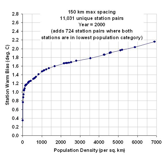
Fig. 1. Diagnosed average Urban Heat Island warming in 2000 from over 11,000 closely spaced station pairs having different population densities.
As can be seen, the largest warming effect with a change in population density occurs at the lowest population densities (not a new finding), with the most total warming at the highest population densities.
The Effect of Population Density on U.S. Station Temperature Trends
In 2012 I experimented with methods to removed the observed UHI effect in the raw ISD 6-hourly data using population density as a proxy. As you can see in the second of the two graphs below, the highest population density stations had ~0.25 C/decade warming trend, with a reduced warming trend as population density was reduced:
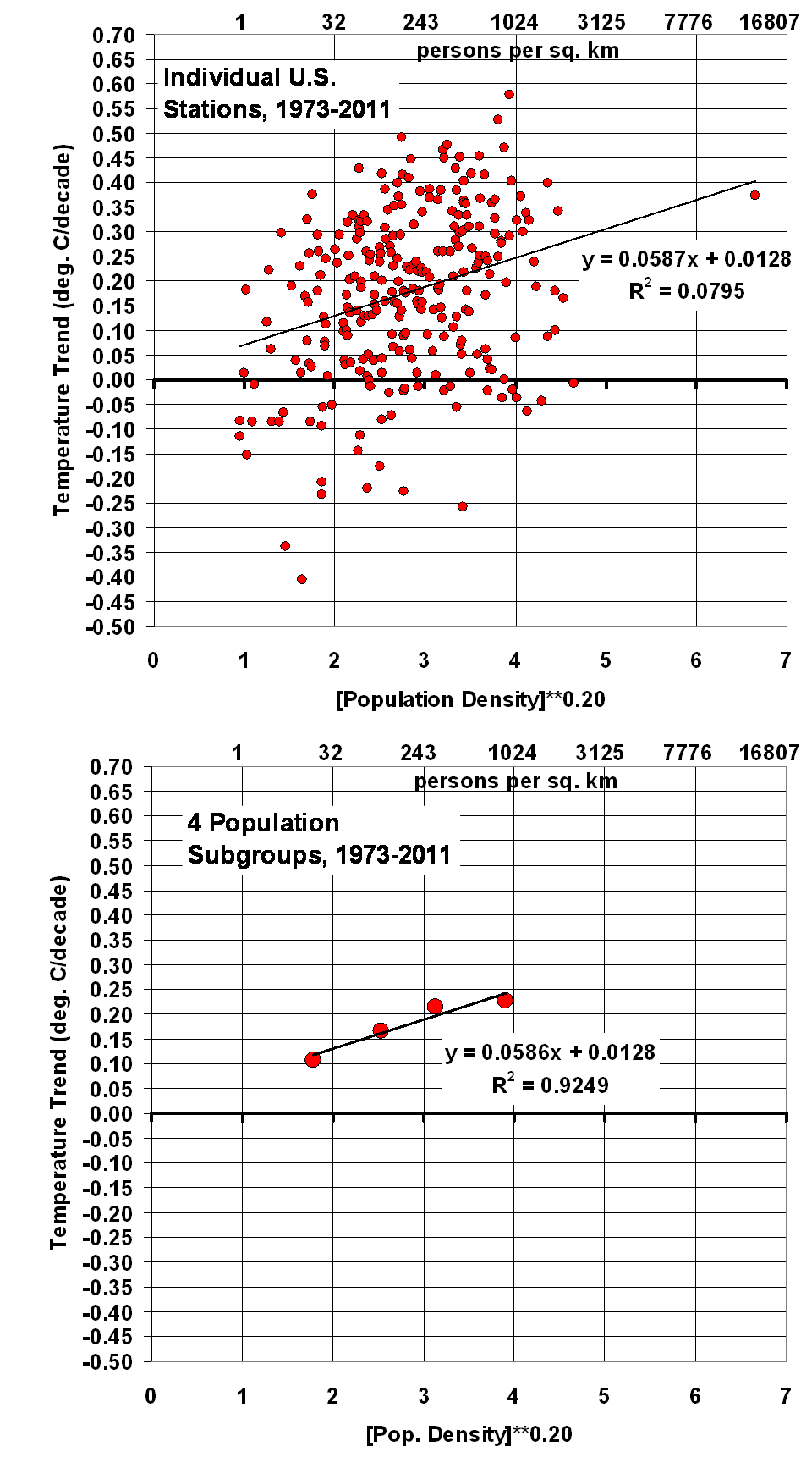
Fig. 2. U.S. surface temperature trends as a function of local population density at the station locations: top (raw), bottom (averages into 4 groups).
Significantly, extrapolating to zero population density would give essentially no warming in the United States during 1973-2011. As we shall see (below) official temperature datasets say this period had a substantial warming trend, consistent with the warming in the highest population density locations.
How can one explain this result other than, at least for the period 1973-2011, (1) spurious warming occurred at the higher population density stations, and (2) the evidence supports essentially no warming if there were no people (zero population density) to modify the microclimate around thermometer sites?
I am not claiming there has been no global warming (whatever the cause). I am claiming that there is evidence of spurious warming in thermometer data which must be removed.
Next, we will examine how well that effect has been removed.
How Does this Compare to the ‘Official’ Temperature Trends?
Since I performed these analyses almost 10 years ago, the ‘official’ temperature datasets have been adjusted several times. For the same period I analyzed 8-10 years years ago, look at how some of these datasets have increased the temperature trends (I used only CRUTem3 back then):
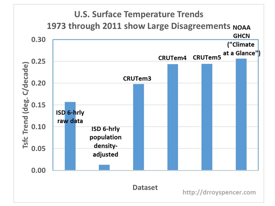
Fig. 3. U.S. surface temperature trend from different datasets.
The CRUTem3 data produce a trend reasonably close to the raw, unadjusted 6-hourly ISD-based data (the correlation of the two datasets’ monthly anomaly time series was 0.994). Note that the latest USHCN data in the above graph has the most warming, at +0.26 C/decade.
Note that this is about the same as the trend I get with the stations having the highest (rather than lowest) population density. Anthony Watts reported qualitatively similar results using different data back in 2015.
How in the world can the warming result from NOAA be reconciled with the (possible zero warming) results in Fig. 2? NOAA uses a complex homogenization procedure to make its adjustments, but it seems to me the the results in Fig. 2 suggest that their procedures might be causing spurious warming trends in the data. I am not the first to point this out; others have made the same claims over the years. I am simply showing additional quantitative evidence.
I don’t see how it can be a change in instrumentation, since both rural and urban stations changed over the decades from liquid-in-glass thermometers in Stevenson screens, to digital thermistors in small hygrothermometer enclosures, to the new automated ASOS measurement systems.
Conclusion
It seems to me that there remains considerable uncertainty in just how much the U.S. has warmed in recent decades, even among the established, official, ‘homogenized’ datasets. This has a direct impact on the “validation” of climate models relied upon by the new Biden Administration for establishing energy policy.
I would not be surprised if such problems exist in global land temperature datasets in addition to the U.S.
I’m not claiming I know how much it has (or hasn’t) warmed. Instead, I’m saying I am still very suspicious of existing official land temperature datasets.


These are truly fantastic ideas in about blogging.
You have touched some fastidious things here. Any way keep
up wrinting.
Howdy! I know this is kinda off topic but I’d figured
I’d ask. Would you be interested in exchanging links or maybe guest authoring a blog post or vice-versa?
My blog covers a lot of the same topics as yours
and I feel we could greatly benefit from each other.
If you happen to be interested feel free to send me
an email. I look forward to hearing from you! Excellent blog by the way!