
 Home/Blog
Ah, the 1960s. Even in 1966, before global warming was a thing, The Lovin’ Spoonful was singing about (among other things) the unusual heat of the inner city.
In fact, the heat caused by urban environments was discussed way back in 1833 (190 years ago!) by Luke Howard (The Climate of London) who was the first to document the urban heat island (UHI) effect.
Today, virtually anyone who routinely travels between cities and rural areas has observed the localized warmth that cities produce.
It is important to emphasize that the UHI effect, along with “record warm” temperatures, would exist even if there was no “global warming”. This is because cities have grown substantially in the last 100+ years, replacing the native landscape with high heat capacity surfaces like buildings, pavement, and sources of waste heat. This leads to UHI warmth of up to 10 deg. F or more, mostly at night.
Yet, we are routinely told through media reports that the latest record warmth recorded in some of our cities shows how serious the global warming problem has become. For example, as shown in this graphic from the Miami Herald, the summer of 2023 experienced some record warmth in cities across the South.
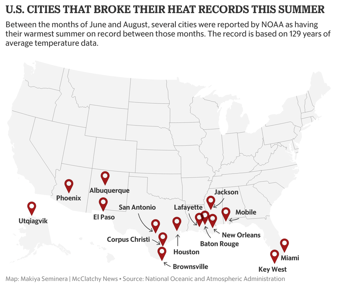
Of course, conflating the urban heat island with global warming is a necessary component of such reporting, as the news report dutifully adds,
“Prominent scientific institutions around the globe including the National Oceanic and Atmospheric Administration agree that the warming is caused mainly by human-caused greenhouse gas emissions, NASA said.”
See how that works? A city has record warmth, so it must be due to global warming caused by burning fossil fuels. To be fair, not all the blame is always placed at the feet of Climate Change. For example, this 2014 article specifically discussed the role of the urban heat island in Phoenix weather.
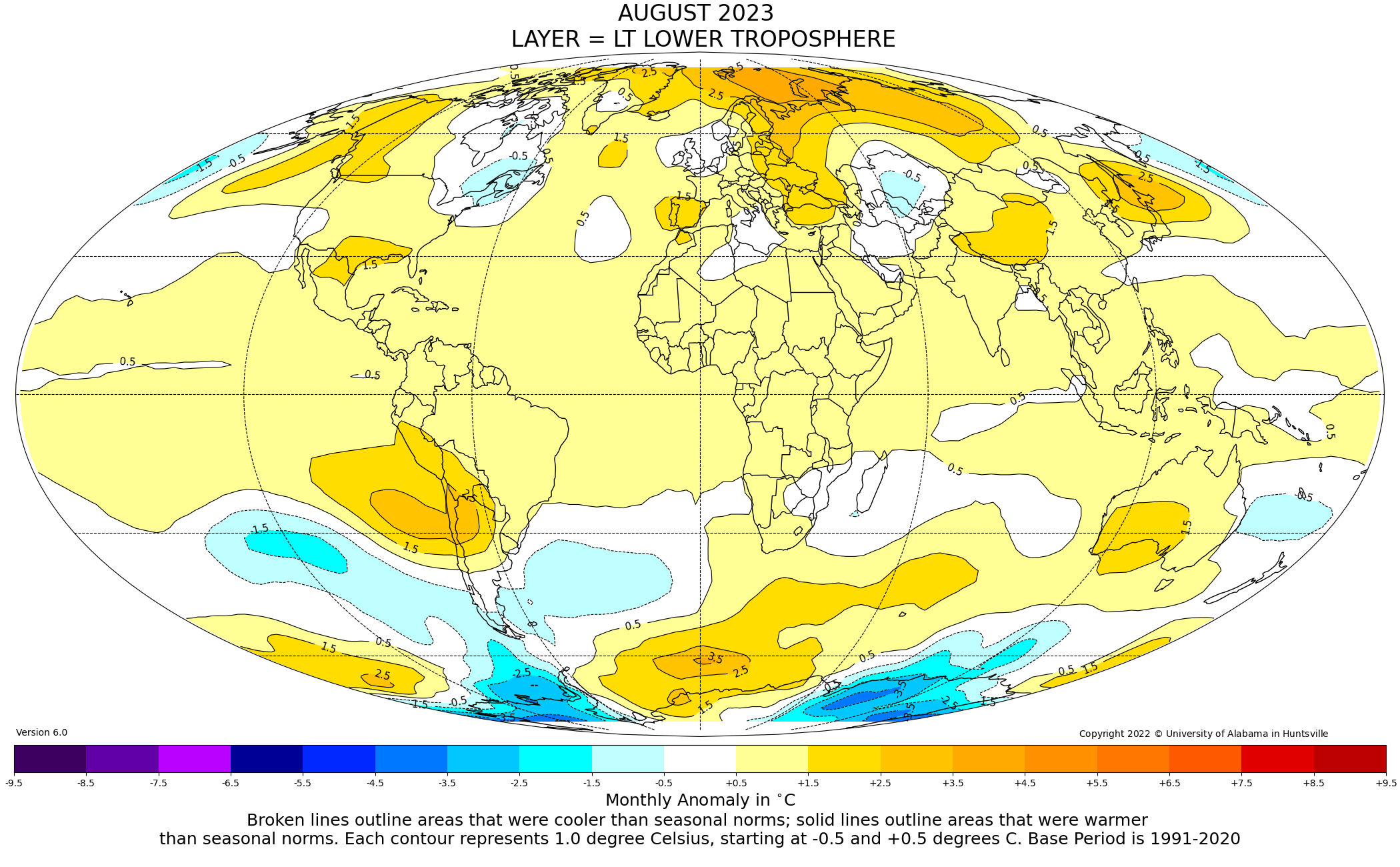
Now, it is true that the southern U.S. had an unusually hot summer. Even our (UAH) satellite-based temperature product for the lower atmosphere showed this warmth in August:
In my last blog post, I showed our urbanization-adjusted average summer temperatures (based upon NOAA homogenized GHCN surface air temperatures) across all available stations in the Lower 48 states, and the result was that summer of 2023 was the 13th warmest (see Fig. 3 here) since records began (but with very few stations) in 1895.
But what role does climate change have in these records at selected cities? Most of what we hear through the media comes from urban reporting stations, or at least airports serving major urban areas.
The Summer of 2023: Phoenix versus Surrounding Stations
If the record hot summer in Phoenix is due to global warming, then it should show up at weather stations surrounding Phoenix, right? As part of our research project where we are quantifying the average urban heat island effect and its growth over time as a function of population density, I looked at the official NOAA GHCN monthly surface temperature data at Phoenix Sky Harbor Airport (red curve in the following graph) versus at all rural stations (0 to 100 persons per sq. km) within 10 to 100 km of Phoenix (blue curve). I also applied a small urbanization adjustment correction at the rural (or nearly-rural) stations based upon their individual histories of population growth.
The result? The summer of 2023 was only the 11th warmest summer on record.
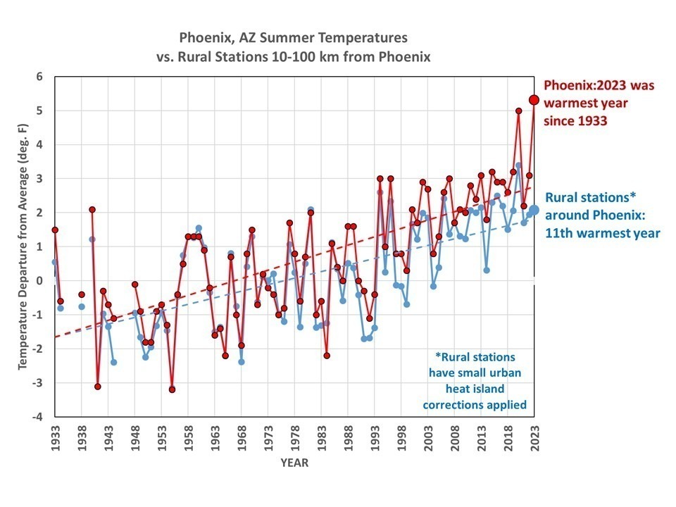
So, we see that the urban heat island effect was the dominant cause of the summer of 2023 being a record warm year in Phoenix. The “vote” from surrounding rural and nearly-rural stations was that it was only the 11th warmest year. As a side note, the difference between the red and blue curves indicate a jump in Phoenix Sky Harbor temperatures of about 0.7 deg. F around 1988. This could be due to a weather station move, but I have not investigated it.
“But”, you might protest, “even the rural stations still show a strong warming trend”. Well, that is partly because I have used only “homogenized” temperature data, which NOAA has already adjusted to some extent leading to all nearby station temperature trends being more or less equal to one another. I’m still trying to determine if I can use the “raw” data to make such comparisons, since there are other data adjustments made in NOAA’s homogenization of the data that I’m not privy to.
Another thing to notice is that media reports will repeat NOAA’s claim that these new high temperature records are based upon data extending back to 1895. In general, this is not true. Most of these station records don’t go back nearly that far. For the Phoenix Sky Harbor location, the data started in 1933. A few of the other “record hot cities” start dates I’ve looked at so far are Miami, FL (started in 1948), Houston, TX (1931), and Mobile, AL (1948).
The bottom line is that there are unsupportable conclusions being drawn about the supposed role of climate change in record high temperatures being reported at some cities. Cities are hotter than their rural surroundings, and increasingly so, with or without climate change.


> 100 km of Phoenix
Where would that be?
-Depending upon the year and month, there have been (as I recall) between 2 and 10 stations reporting within 100 km of Phoenix.
-Roy
My question is a geographic one, Roy.
Tempe, Glendale, Sun Lakes?
The Pheonix metropolitan area is itself 38K sq km. Add 100 km around that and you get quite a chunk of Arizona. And do that for all the cities and you get more than a few dots on a map.
In fact, one could argue that to speak of dots on a map is a misleading way to speak of these regions.
Dear Willard & Roy,
I think I may have posted this in the past but even so I can again. A *LOT* of info on temperature and precipitation can be found here:
https://wrcc.dri.edu/cgi-bin/cliMAIN.pl?az8795
I have played with these figures myself somewhat to try and find out if Arizona is getting dryer due to climate change. My conclusion is that it is not. Ditto with temperature. Large urban areas like greater Tucson and Phoenix have grown hotter but smaller cities like Flagstaff and Prescott not so much so. Even in those smaller cities there could still be some UHI effect.
I consider Tempe, Mesa, Glendale, Sun City, Chandler etc. to all be part of the greater Phoenix area. But cities like Show Low, Alpine, Kingman, Williams, etc. are well outside the Phoenix area.
By the way, Dr Spencer, stats at Phoenix do indeed go back to the 1890s – just not at the same station. I’m not sure how much that would distort the stats but it might some.
Well, well, well, Dr. Spencer. It appears to me that you might be getting to the bottom of the “climate change” crisis.
I lived in the Phoenix area myself from 1967 to 1980. I can state for a fact that it IS a lot hotter there today than it was 50-60 years ago especially at night. But as you have succinctly pointed out, the outlying areas have not grown much hotter if at all.
You know, I was reading a couple of online news articles today about forest fire recovery in Arizona’s White Mountains. They were pessimistic and tried to show how the forests are unlikely to ever fully recover as they once were due, of course, to “climate change”. This in nonsense. They are recovering in the exact same way as they always have. This takes time especially when you’re looking at nearly 100% mortality on some plots.
So, has the climate in Phoenix changed? Of course! Has the climate in the White Mountains changed at 7,000 feet? Although I cannot prove it, I’m gonna go out on a limb and say, “probably not”.
-Fred M. Cain,
Topeka, IN
lets face it. the entire longterm surface station network was built to tell nearby residents and businesses what the local temperature is. Virtually all these locations have experienced very large population growth over the past century and a half.
about the only places you don’t have that are some rural volunteer sites and/or some of the more recent established reference sites that carefully monitors nearby development over time.
and of course there are better ways to collect climate data. . .like satellites.
Satellites do not measure the temperature of the air at 2m above ground in the shade.
They also fail at measuring below clouds, although they can and do make educated guesses based on adjustments to their data in accordance to real on the ground temperature data.
Satellite data cannot be compared to thermometer data, but it can be compared to itself if it is self-consistent, as different Satellites with different equipment measure different values for the exact same region and time. Adjustments galore!
Keeping away from any polemic: here is, based on GHCN daily station data, a comparison of
– Phoenix, AZ
with
– 38 stations within a 2×2 degree rectangle around the city
– 11 stations farer outside, by excluding a suburb rectangle around the city.
All stations in Tucson were of course left out.
Finally, a last run included all stations within the 2×2 degree area.
In GHCN daily, there were lots of holes in the 1930s and 1940s; thus, the chart starts in 1951:
https://drive.google.com/file/d/1xjkBYG_eMxAzWue0wl3cVmaagRRDhaIZ/view
For the period 2010-2023:
https://drive.google.com/file/d/197bYew8KR5QEWESDuxs9KP1HslohKy1Q/view
As we can see, Phoenix has its own life before ~ 1979.
For 1979-2023, all four time series show nearly the same trend in C / decade:
– Phoenix: 0.24
– 2×2 degree rectangle around Phoenix: 0.26
– 2×2 degree rectangle without Phoenix’s suburbs: 0.26
– all stations in the 2×2 degree rectangle: 0.25
No wonder that for 1951-2023, the trend for Phoenix is a lot higher.
– Phoenix: 0.41
– 2×2 degree rectangle around Phoenix: 0.25
– 2×2 degree rectangle without Phoenix’s suburbs: 0.25
– all stations in the 2×2 degree rectangle: 0.26
*
GHCN daily is 100 % unadjusted, and I don’t use any homogenization in my anomaly constructions.
What lets me think that when using GHCN V4’s adjusted variant, which is based on homogenization, you hardly will succeed in quantify UHI because you can’t extract the homogenization effects out of time series based on this station set.
Even rural stations are affected to a greater or lesser degree by human activities.
For example, an inappropriately located temperature sensor near an airport runway, parking lot, air conditioned building, etc.
Prevailing winds will transport air heated in an urban environment outside the boundary of that locality, and the radiated heat will affect thermometers exposed to it. Yes, air can be heated, and make thermometers warmer, before it cools.
Another rural heat source can be water downstream of water cooled facilities – many power generating facilities (both combustion and nuclear), and many industrial facilities use river water for absorbing waste heat, to be released elsewhere.
Given the influence of chaos, the impacts can only be guessed at. Just more devil in the detail, so to speak. Interesting, though, at least to me.
This raised a bit of alarm for me:
“Im still trying to determine if I can use the raw data to make such comparisons, since there are other data adjustments made in NOAAs homogenization of the data that IM NOT PRIVY TO.”
Dr. Spencer and Dr. Christy are bona fide atmospheric scientists who have been studying the atmosphere for a long time. In fact, they’ve developed a data set that our very own government uses to track climate change with. What I don’t get is why are Spencer and Christy not privy to what NOAA does to our data? Does that make any sense?
This appears to me that NOAA is hiding something. Or, is this just the wingnut conspiracist in me coming out?
In July of 1986, the Phoenix City Council approved one of the most ambitious building projects in Sky Harbor’s history the design and construction of a giant new terminal building. Terminal 4 broke ground in October 1989 and opened in November 1990. At $248 million, Terminal 4 was the largest structural capital improvement project in Phoenix. Construction began on the terminal core and three concourses two for use by what was then America West Airlines and one for international arrivals but prior to completion, a route expansion by Southwest Airlines required that it too be located in Terminal 4. Two more concourses were added and the building opened in November 1990 with five concourses and 44 gates.
Might be part of the explanation of the .7 deg jump around 1988
I mention every few years that while UHI exists: “….It is important to emphasize that the UHI effect, along with record warm temperatures, would exist even if there was no global warming. This is because cities have grown substantially in the last 100+ years,…”
You also have to include irrigation cooling effect, the evaporation of a few millimeters of irrigation water requires the latent heat equal to a warming of an equal area of an atmosphere high column of air above it about 1 degree C.
Another way to look at this is urbanization causes manmade warming. Is urbanization a greater cause of warming than CO2 levels?
P.S. Love the Loving Spoonful reference.
How does your lower troposphere data for the lower 48 compare with NOAAs Climate Reference Network data, supposedly free of UHI?
Denis Rushworth
” … supposedly free of UHI? ”
According to some, nothing is free of UHI, even the lower troposphere is no longer anymore. Imagine.
*
Two years ago, I made an extensive evaluation of USCRN for different reasons (but did not update the CRN stuff since then.
Here is a comparison of UAH 6.0 “USA49” (CONUS+AK) to 125 of 137 active USCRN stations, for the period Jan 2005 – Jun 20212021:
https://drive.google.com/file/d/1KrHL5mxdU7BA98yCL0rBa1pzE2013fCA/view
The comparison starts in 2005 because in earlier activity years, USCRN’s distribution over a 2.5 degree grid was a bit too sparse.
Linear estimates in C / decade for the period 2005-2021
– UAH: 0.367 +- 0.09
– CRN: 0.370 +- 0.14
Linear estimates are certainly not the best method for such comparisons, but their difference is incredibly small considering that CRN covers about 125 grid cells, barely more than half of UAH.
*
NOAA has an own CRN time series, but in the recent years, their anomalies ramped up significantly, likely due to their controversial ‘Pairwise Homogenization Algorithm’.