
 Home/Blog
The Version 6.1 global average lower tropospheric temperature (LT) anomaly for May, 2025 was +0.50 deg. C departure from the 1991-2020 mean, down from the April, 2025 anomaly of +0.61 deg. C.
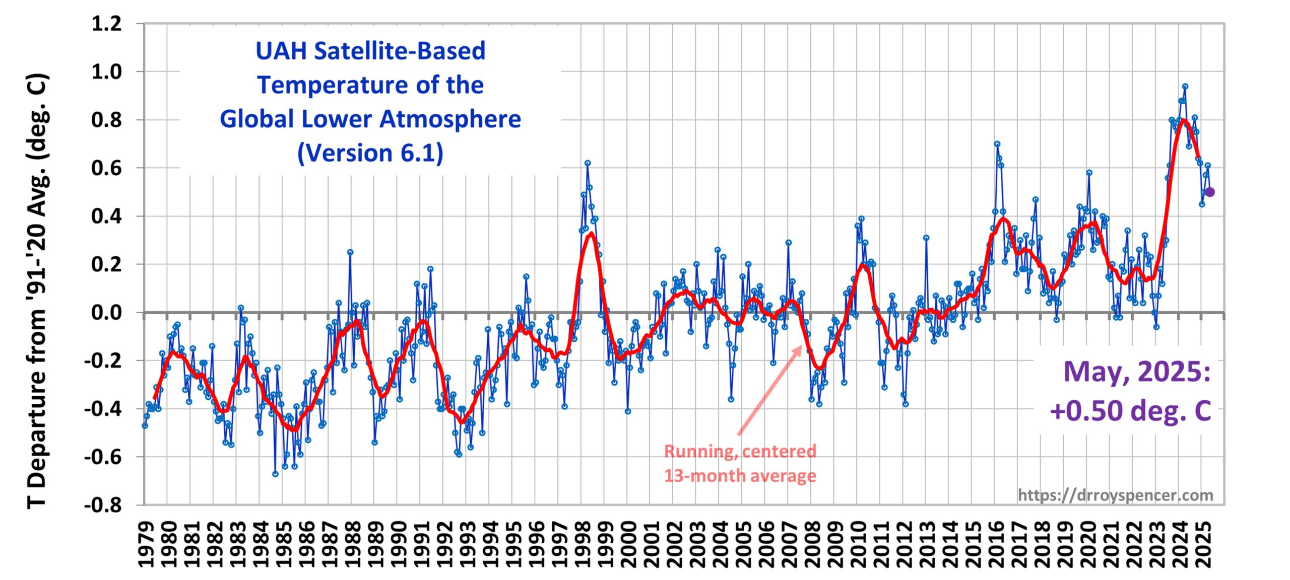
The Version 6.1 global area-averaged linear temperature trend (January 1979 through May 2025) remains at +0.15 deg/ C/decade (+0.22 C/decade over land, +0.13 C/decade over oceans).
The following table lists various regional Version 6.1 LT departures from the 30-year (1991-2020) average for the last 17 months (record highs are in red).
| YEAR | MO | GLOBE | NHEM. | SHEM. | TROPIC | USA48 | ARCTIC | AUST |
| 2024 | Jan | +0.80 | +1.02 | +0.58 | +1.20 | -0.19 | +0.40 | +1.12 |
| 2024 | Feb | +0.88 | +0.95 | +0.81 | +1.17 | +1.31 | +0.86 | +1.16 |
| 2024 | Mar | +0.88 | +0.96 | +0.80 | +1.26 | +0.22 | +1.05 | +1.34 |
| 2024 | Apr | +0.94 | +1.12 | +0.76 | +1.15 | +0.86 | +0.88 | +0.54 |
| 2024 | May | +0.78 | +0.77 | +0.78 | +1.20 | +0.05 | +0.20 | +0.53 |
| 2024 | June | +0.69 | +0.78 | +0.60 | +0.85 | +1.37 | +0.64 | +0.91 |
| 2024 | July | +0.74 | +0.86 | +0.61 | +0.97 | +0.44 | +0.56 | -0.07 |
| 2024 | Aug | +0.76 | +0.82 | +0.69 | +0.74 | +0.40 | +0.88 | +1.75 |
| 2024 | Sep | +0.81 | +1.04 | +0.58 | +0.82 | +1.31 | +1.48 | +0.98 |
| 2024 | Oct | +0.75 | +0.89 | +0.60 | +0.63 | +1.90 | +0.81 | +1.09 |
| 2024 | Nov | +0.64 | +0.87 | +0.41 | +0.53 | +1.12 | +0.79 | +1.00 |
| 2024 | Dec | +0.62 | +0.76 | +0.48 | +0.52 | +1.42 | +1.12 | +1.54 |
| 2025 | Jan | +0.45 | +0.70 | +0.21 | +0.24 | -1.06 | +0.74 | +0.48 |
| 2025 | Feb | +0.50 | +0.55 | +0.45 | +0.26 | +1.04 | +2.10 | +0.87 |
| 2025 | Mar | +0.57 | +0.74 | +0.41 | +0.40 | +1.24 | +1.23 | +1.20 |
| 2025 | Apr | +0.61 | +0.77 | +0.46 | +0.37 | +0.82 | +0.85 | +1.21 |
| 2025 | May | +0.50 | +0.45 | +0.55 | +0.30 | +0.15 | +0.75 | +0.99 |
The full UAH Global Temperature Report, along with the LT global gridpoint anomaly image for May, 2025, and a more detailed analysis by John Christy, should be available within the next several days here.
The monthly anomalies for various regions for the four deep layers we monitor from satellites will be available in the next several days at the following locations:


Third warmest May since 1979, not quite beating the 1998 outlier.
Ten warmest Mays
Year Anomaly
1 2024 0.78
2 1998 0.52
3 2025 0.50
4 2016 0.42
5 2020 0.42
6 2017 0.32
7 2010 0.29
8 2023 0.28
9 2019 0.20
10 2015 0.14
My simplistic projection for 2025 creeps up another 0.01C. Now 0.49 +/- 0.13C. There is an 80% chance that 2025 will be warmer than 2023.
The trend is downward (and has been for a few months now).
Of course temperatures are coming down, that’s what happens when you have a record breaking spike. The question is how far and how quickly will it fall.
“The question is how far and how quickly will it fall.”
How far do you think the fall will be?
Waiting, waiting for a detailed, hard science explanation (with numbers analysed) of the mechanism for this several months of declining trend from those who still promote that CO2 is the control knob. Geoff S
Geoff Sherrington says:
Waiting, waiting for a detailed, hard science explanation (with numbers analysed) of the mechanism for this several months of declining trend from those who still promote that CO2 is the control knob.
Ending of the 2023-24 El Nino.
Yep. And it is quite a bit warmer than after the previous El Nino ended
To the cult, when temps go up it’s due to CO2. But when temps go down, it’s due to “natural variability”.
If they understood the physics, it’s ALL due to natural variability.
But of course, they don’t understand….
The CO2 “control knob” exerts its influence over decades, not months.
When oh when will people learn the difference between climate and weather?
Barry,
Your champion Abrego Garcia is being returned to the US. Happy now?
Troglodyte,
Whose boots do you prefer to lick – Donald’s or Elon’s?
Are you happy Wiltard? Are you an Abrego’s fan boy?
“Your champion Abrego Garcia”
Your bias is showing.
The administration has brought charges against him, so now he will face the court.
Rule of law 1
Trump admin 0
The Trump administration now has the opportunity to demonstrate that he is a criminal. They are also being held to constitutional standards. Let’s see if they learn to stick to the constitution without having to be directed to do so by the Supreme Court.
Yes, he should be well versed on Article III.
https://oz4caster.wordpress.com/wp-content/uploads/2025/06/d4-gfs-gta-daily-2014-2025-06-04.gif
And others agree!
Yet predictable based on El Nino followed by La Nina/Neutral.
How far do you think the fall will be?
What El Nino/La Nina?
The signal to noise ratio decreased in July 2023, when the global temperature anomaly spiked abruptly and unusually. If that spike triggered cascading effects in other systems, such as the cryosphere or oceans, the SNR degrades even further over time.
It will likely take years, if not decades, of new observations to establish a reliable new baseline.
Bellman
People like RLH are always looking at tiny downward looking bits, but deliberately dissimulate the context around the bits.
Here is a chart showing the running trend in C / decade for UAH 6.1 LT, from the starting period
Dec 1978 – Dec 1999 (0.149 +- 0.02)
till that computed right now
Dec 1978 – May 2025 (0.155 +- 0.01)
*
https://drive.google.com/file/d/1jXp9gn9SR4NvvzsSHwRXQyd_jbgVpX6b/view
There is currently NO downeard trend at all.
Oz4caster�s running trend will certainly be no different.
*
And by the way: his chart starts with 2014; UAH’s LT trend for Jan 2014 till May 2025 is only… 0.384 +- 0.06 :-))
Moreover, nothing spiked unusually since 2023: you just need to lokk at UAH’s running trend and will see for example a similar trend increase between March 2001 and March 2003.
Amazingly, the trend difference for that period is (down to 5 digits atdp) even exactly identical to the difference between April 2023 and May 2025: 0.02396 C / decade.
*
These spikes however can’t compete with the big drop the UAH LT time series experienced from March 2007 down to December 2009: -0.02786 C / decade.
Such differences look ridiculously small at a first glance; but please think that we look at a value range between 0.11 and 0.16.
Wrong!
You are focusing on a different metric, which overlooks some important aspects of the situation.
The satellite measurements lag SSTs by ~3-4 months, so a spike in satellite temperature in July 2023 reflects oceanic conditions from March-April 2023.
According to NOAA OIST data, global SSTs broke the super El Ni-�o 2016 record in early March 2023 and remained above it thereafter. This happened even while the climate system was officially still in La Ni-�a.
That is extremely difficult to explain using conventional natural variability alone.
Looks like we’re back to square one. Only 28 more years to go for a new reliable baseline for the WMO to use.
Finally, I saw that I forgot to add in the chart the period which had the greatest trend increase for the trend periods greater than about 15 years: that moving from UAH’s lowest trend (Dec 1978 – Apr 1994) after the Pinatubo eruption, up to the highest UAH trend (Dec 1978 – Feb 1999) following the 1997/98 El Nino.
This is the corrected running trend chart:
https://drive.google.com/file/d/1eSHRwujG1zkLBSMHYd79O3uS_Had0GmV/view
We can now see that the trend increase between post-Pinatubo and post-Nino 97/98 makes all subsequent drops and peaks seem secondary.
Data smoothing with 10 year averages does not illuminate the data trends, it hides it. Congratulations! Your graph is wrong anyway because you cannot have a 10-year trend in the current year. The last possible year is 2020.
Nice try, but a rather poor effort again.
Bindidon, trends are most sensitive to noise early in the dataset, so it is no surprise the 1998 El Ni-�o, which was exceptionally strong and occurred just as the trend turned positive, produced the largest spike in your trend based record.
Yet here you are criticizing RLH for pointing out a short term cooling period. At least he chose a window that begins after the signal to noise ratio shifted.
Now look at 2016: a comparable El Ni-�o, but far more muted in your trend plot because it landed over 20 years into a longer, more stable dataset.
“I have challenged that with a reasoned argument and support”
Where is the reasoned argument?
This far you have evaded addressing the fact that
– the solutions given to these problems are straightforward applications of the laws of physics, and you are unable to point out any flaws in the physics or logic.
-We shown you direct evidence: textbook examples of blackbodys acting as multi-layer radiative insulation, like the GPE, with no rebuttal from you.
-Your ‘support’, AI, has fizzled and proven unreliable.
So that leaves us with your personal incredulity of the standard solutions, which is worthless as an argument.
So unless you can show us flaws in the laws of physics used to solve these problems, we’re done.
So that leaves you with nothing but your personal feelings of incredility
”
That�s in no way any sort of explanation or justification. You�re just sort of�saying stuff”
Its just a fact-based logical argument, which leaves you speechless and sputtering.
In any case you clearly have no answers.
Oh well! End of the road.
Now continue absurdly patting yourself on the back.
There is really no logic to the idea that a blackbody can radiatively insulate just as efficiently as a perfect reflector.
Its not doing radiative insulation, as explained.
Hilarious! Just turn your back on the entire “radiative insulation” narrative. Then come back to it when it suits, no doubt.
“Hilarious! Just turn your back on the entire �radiative insulation� narrative.”
Sure, in your simplistic limited experience, blackbodies always produce the same result, different from the one mirrors produce. Mirrors can radiatively insulate and blackbodies can’t, or even IF they do, always less efficiently.
Science, OTOH, understands that blackbodies emit radiation according to their temperature, while (perfect) mirrors reflect radiation perfectly independent of temperature.
And we know how to apply these rules in any situation and find the result.
And in this situation, the result is the same for both mirrors and black bodies.
Why? As simply explained. A mirror sends back light to an adjacent source identical to what it receives from it.
A black body emits according to its temperature, which in this case is identical to what it receives from an adjacent source at the same temperature.
Nate says:
”A black body emits according to its temperature, which in this case is identical to what it receives from an adjacent source at the same temperature.”
and that is the basis of the saturation hypothesis. The saturation hypothesis is when the surface emits radiation intercepted by the atmosphere in a zone of the atmosphere that is the same temperature.
Increasing the concentration of certain GHG’s beyond that does nothing.
And since its certain that the atmosphere would be warmer than it is today if no GHG existed in the atmosphere due to one way convection warming it and gases incapable of radiating IR below the current mean temperature of the atmosphere the atmosphere would tend to get really hot similar to the thermosphere from intercepting higher frequencies of light from the sun.
So that would suggest that saturation would occur when the first layer of GHG was cooled to the temperature of the surface, assuming a single phase stable gas.
I have to assume science agrees with this or it wouldn’t be the case of such a scramble to an alternative theory like M&W.
That kind of makes your explanation somewhere beyond ridiculous even though its correct in that the emission of surface radiation to be absorbed by the atmosphere GHG represents an internal climate energy transfer and does provide a crude form of insulation between the earth’s surface and outerspace.
So using Trenberth emissivities (back calculated to temperature as science in its zeal to not give the public much information about uncertainties) the mean temperature of the surface should be ~278.5K suggesting the insulation effect of the atmosphere sits at approximately 10K-11K at or near the Holocene maximum with whatever solar and orbit variations were in place at that time per Milankovic.
Nate, you can’t go around pretending blackbody surfaces can radiatively insulate, when accepting that premise leads to the conclusion that in certain “special cases” (not really very “special”, just when the Sun illuminates the insulator!) they do so just as efficiently as a perfect reflector! That would render using reflective materials pretty much unnecessary in a lot of (most?) cases!
blackbody surfaces have no insulating value. Insulation is the prevention of absorbed heat passing through an object. Reflection can reduce the radiation absorbed by a surface and thus may serve effectively as a form of insulation if other means of heat transfer aren’t present to eliminate the effect.
In particular downward looking reflective surfaces are not insuolative because convection transfers heat upwards. However upward facing reflection can be effective as convection does not physically move heat downwards.
Nate is completely outside the realm of physics in claiming backbodies insulate by virtue of being blackbodies. Keep in mind that the concept of ”insulation” is a resistance to heat passing through a material. Reflection is the only thing that reduces radiation reaching an object from being absorbed. Blackbodies cannot do this. And reflective objects only insulate when some condition exists to resist other means of heat transfer to that reflective surface from the surrounding environment.
“pretending blackbody surfaces can radiatively insulate”
You pretending I didn’t show you direct evidence that black bodies can radiatively insulate.
The again over-generalizing from your limited experience.
You don’t analyze situations, you just try to categorize them, and erroneously think they always produce the same result!
Fail.
“blackbody surfaces have no insulating value. Insulation is the prevention of absorbed heat passing through an object.”
Sorry, blackbody plates have been proven to reduce heat transfer.
https://www.drroyspencer.com/2025/06/uah-v6-1-global-temperature-update-for-may-2025-0-50-deg-c/#comment-1706076
See eq 3, put in e =1 for all surfaces. Put in N= 1 for # plates. The heat flow is reduced by 1/2.
bill is right, and Nate is wrong, as usual.
Facts are endlessly frustrating for you guys..
Funny, I don’t feel frustrated…
Nor do Flat Earthers. Like you they don’t need real facts or evidence to support their beliefs.
If you say so, Nate.
Ignore 2nd Ummm sentence (typo)
Nate, you can “ummmmmm” all you like, whilst you miss the point. Being an unpleasant, condescending jerk won’t make you correct.
Nate says:
” ”blackbody surfaces have no insulating value. Insulation is the prevention of absorbed heat passing through an object.”
Sorry, blackbody plates have been proven to reduce heat transfer.
———————–
It doesn’t matter Nate. insulation is a relative concept, not an absolute one. In the case of a blackbody its the weakest possible and thus isn’t considered by anybody to be insulation. but since its the most conductive of light energy of all nearest as one can get to a blackbody is what is used in conductive systems like solar energy collectors and photocells.
In systems for heat transfer one looks to substances or combinations of substances that are conductive and substances that are insulating.
A blackbody is a rather poorly defined combination of color and texture that works the best for conductive systems and the worst for insulating systems. In the realm of color and texture it is the most conductive. OTOH, reflection is the most insulating with nothing more than 1.0 reflection factor. A blackbody by definition is a 0.0 reflection factor.
When considering when to use it. . .you want to use blackbodies to conduct heat and reflective bodies to retard heat transfer.
all you are doing is blindly parroting yo daddy’s arguments designed to confuse and redefine words and concepts for the ignorant. A more than common ploy of radicals and those with special interests adverse to the public.
Nate says:
”Sorry, blackbody plates have been proven to reduce heat transfer.”
You need to provide the proof Nate. blackbody plates are theoretically fully capable of fully transferring heat from a heat source to elsewhere. Where ever did you get the idea that they can’t? References please. It appears to me you are just making up unestablished facts.
This time read it:
https://www.drroyspencer.com/2025/06/uah-v6-1-global-temperature-update-for-may-2025-0-50-deg-c/#comment-1706309
Nate says:
”Sorry, blackbody plates have been proven to reduce heat transfer.”
As I pointed out thats not true for our atmosphere.
But I have no problem accepting your claim in general because it has no application to the atmosphere because the atmosphere has other means of transferring energy within it.
I am perfectly comfortable arguing that the atmosphere is capable of becoming warmer via oxygen species that only absorb UV and higher frequencies and the only reason its not warmer than it is is because of the capabilities of GHG to cool the atmosphere.
That anomaly is demonstrated by layers of the atmosphere in the stratosphere and thermosphere.
Its my observation that virtually everybody in this forum has at one time or another recognized that the atmosphere’s ability to warm the surface is dependent upon the atmosphere being warmer than the surface and also being warmer than the atmosphere or outer space with which it would be replaced in its absence, staying consistent with the idea that less to no GHG results in a warmer heat sink unless you also remove the oxygen species.
thus the surface must warm by a different means which if you carefully follow Stefan Boltzmann hypotheses the only candidate is the latent heat that water carries into the atmosphere warming it at variable rates as feedback from natural sources of warming such as changes to the sun or changes in speed of the earth in its orbit as it passes closest to the sun.
We have already gone over this an noted that the speed changes for cooling and warming halves of the orbit change by up to 5 days over a 40 year period of time in time with the positions of the outer gas giants. Add latent heat feedback to that in order to triple the effect and you could have a lot of warming, materially sufficient to account for any material surface temperature variations over at past industrial age. That theory also remains consistent with science wrt the warming value of feedback.
I can even accept that there is also a possible CO2 effect to take some portion of that warming but I certainly can’t explain in detail how that would actually work and nobody has provided me a blueprint of the effect with appropriate logic to be able to demonstrate the effect or for that matter correlate it to the other planets and their surface temperatures.
red krokodile
1. ” The signal to noise ratio decreased in July 2023, when the global temperature anomaly spiked abruptly and unusually. ”
*
If you don’t want to be seen as an average WUWT poster, the very first thing you should do is at least technically prove such a claim by either citing a scientific source that anyone can consult or, even better, by publishing a time series that shows us visible results that confirm your claim.
Otherwise, all you’re doing here is pulling the wool over the readers’ eyes.
**
2. ” According to NOAA OIST data, global SSTs broke the super El Ni-�o 2016 record in early March 2023 and remained above it thereafter. ”
*
This is indeed beyond any suspicion.
What makes me laugh here however is that at WUWT for example, anyone showing sea surface data confirming her/his claim is automatically discredited with a hint on UAH data looking – of course – quite different.
**
3. ” Bindidon, trends are most sensitive to noise early in the dataset, so it is no surprise the 1998 El Ni-�o, which was exceptionally strong and occurred just as the trend turned positive, produced the largest spike in your trend based record. ”
*
And once again, this is a claim without any technical background, based more on your personal narrative, which in turn most likely stems from a naive, undifferentiated reading of the WUWT blabber.
I doubt you’ve ever calculated any relationship between any trend and any noise detected in any data.
**
4. ” Yet here you are criticizing RLH for pointing out a short term cooling period. At least he chose a window that begins after the signal to noise ratio shifted. ”
*
Your technical / scientific proof for this brazen allegation?
**
5. ” Now look at 2016: a comparable El Ni-ño, … ”
Here you definitely lack technical skills and experience.
Simply because you apparently ignore that one can’t simply compare two distant events occuring in a time series: the later (earlier) event and the earlier (later) one, contain, in addition to their actual, intrinsic value, the trend of the time series surrounding them.
You therefore have to detrend the time series before comparing:
https://drive.google.com/file/d/1ih30toYF4Oe-DDzUrP-CAHFhZdrgAp-q/view
And then – only then – you will see that while for example the top anomaly in the 1997/98 El Niño event moves from 0.62 up to 0.71 C above the 1991-2020 mean, the top anomaly in the alleged 2015/16 Super-El Niño event in fact moves from 0.70 down to 0.52 C.
**
6. ” … but far more muted in your trend plot because it landed over 20 years into a longer, more stable dataset. ”
*
Wrong, for the very same reason.
You just have to look in the cascaded running mean (btw highly appraised by… RLH) to understand that nothing confirms your claim, as the right half of the cascade (0.51% noise passthru) shows a greater deviation from the mean than the left one.
***
I’ve once again spent over two hours responding to your completely unsubstantiated claims.
This is definitely the last time I’ll waste such time on you.
“And once again, this is a claim without any technical background, based more on your personal narrative, which in turn most likely stems from a naive, undifferentiated reading of the WUWT blabber.
I doubt you�ve ever calculated any relationship between any trend and any noise detected in any data.”
———-
I made that claim in response to your assertion that the 1994�1999 period “makes all subsequent drops and peaks seem secondary”, based on your chart titled “UAH 6.1 LT monthly running trend �C per decade 1994�2025.”
That interpretation just reflects a basic statistical reality: trend estimates are more volatile early in ANY time series due to limited data and greater sensitivity to ENSO noise.
If you look at the 2016 El Ni-�o, you will notice its impact appears far more muted in your trend chart. That�s not because the event was weaker than 1998, but because it occurred later in a longer dataset where individual anomalies have less influence on the trend.
That said, I want to clarify again that I am not focused on trends. As mentioned earlier, my analysis is based on raw temperature anomalies and their known lag behind sea surface temperatures, not the running trend itself.
And regarding the 1998 vs. 2016 El Ni-�o comparison: I am using NOAA’s ONI index, which shows that both events were indeed comparable in strength.
https://origin.cpc.ncep.noaa.gov/products/analysis_monitoring/ensostuff/ONI_v5.php
“If you don�t want to be seen as an average WUWT poster, the very first thing you should do is at least technically prove such a claim by either citing a scientific source that anyone can consult or, even better, by publishing a time series that shows us visible results that confirm your claim.”
Back in early winter, a paper was published reporting a record decline in planetary albedo to unprecedented low levels. The authors emphasized in the abstract that this drop could not be readily accounted for.
https://epic.awi.de/id/eprint/59831/1/adq7280_Merged_AcceptedVersion_v20241206.pdf
While I have some reservations about this study, it is reasonable to extrapolate that such a persistent shift in albedo will have downstream effects over time, especially given what we know about climate system memory and interconnectivity.
This seems entirely lost on Bindi, who appears to believe that climate feedbacks are a myth. He should notify the IPCC that they’ve been wasting their time modeling CO2 sensitivity all these years.
EDIT:
If you look at the 2016 El Ni-no, you will notice its impact appears far more muted in your trend chart. Thats not only because the event was weaker than the 1998 event, as shown by the detrended chart, but also because it occurred later in a longer dataset where individual anomalies have less influence on the overall trend.
Tim S
” Data smoothing with 10 year averages does not illuminate the data trends, it hides it. Congratulations! Your graph is wrong anyway because you cannot have a 10-year trend in the current year. The last possible year is 2020.
Nice try, but a rather poor effort again. ”
*
This is really the dumbest reply to any of my comments published since 2016.
While you constantly try to present yourself on this blog as a well-educated and informed gentleman farmer with extensive knowledge, able to contribute to any discussion, you show (not only today, not only here) that you behave, on the contrary, like a retired elementary school teacher who has never acquired any technical knowledge, let alone ever experienced any complex scientific education.
*
What you posted above was at the level of Clint R’s ball on a string idiocy.
*
You apparently never learned what is a running trend time series and hence don’t understand what it shows, but nonetheless dare to discredit and denigrate the one I presented.
*
The dumbest I have ever read is
” Your graph is wrong anyway because you cannot have a 10-year trend in the current year. ”
*
The graph shows, as I wrote above, a monthly series of linear trends for UAH 6.1 LT Globe with monthly increasing periods, starting with the period ‘Dec 1978 till Dec 1999’, and ending with the current trend for the period ‘Dec 1978 till May 2025’, published a few days ago by no less than… Roy Spencer en personne.
*
What you invent with such stoopid smoothing and 10-year trend stuff bypasses the imagineable.
Tim S: refrain from responding to my technical comments with such nonsense in the future.
Every one of my comments is thoughtful, accurate, technically correct, and most importantly, as polite as possible. Unless I missed something, all of the discussion here by everyone is about the unusual warming of the last 2 years. Your graph with “monthly running trend C / decade” is data smoothing. All of the fine detail disappears. The only other option is that it is mislabeled. It is that simple. In any case, it hides the effect of the last 2 years just as I stated.
Your rambling comment is disorganized and contains immature attempts to insult me. That is my assessment based on my experience writing high level tchnical reports that undergo peer review. I have an exceptional education, and real world experience. That includes extensive experience analyzing DCS data (process data) in graphs that I personally create. Most businesses archive their DCS data with 10 second intervals, so I happen to know the value of fine detail.
Everyone I have worked with over the years would laugh at your comments. If I seem “dumb” to you, then I think I will take that as a compliment in the context of your statement.
“Every one of my comments is thoughtful, accurate, technically correct, and most importantly, as polite as possible.”
Tim, this sounds a lot like something DREMT would say. Please, we dont need another DREMT!
At least part of your comment was not accurate or correct. His graph increases the time period of the trend calculation as it runs along. The last one covers 1979 to 2025.
It was hard to understand at first.
There is no trend determined over a 10 y span in the graph.
Tim S
1. ” Your graph with �monthly running trend C / decade� is data smoothing. …”
You behave here exactly as opinionated as Clint R denying the lunar spin.
*
Data smoothing is like the red line in this chart:
https://www.drroyspencer.com/wp-content/uploads/UAH_LT_1979_thru_May_2025_v6.1_20x9-1-2048×922.jpg
or like the red and the green lines in this chart:
https://drive.google.com/file/d/1BHh3E6i9K0SoAoxUJhDDI_lBJRP4dWAc/view
or finally like the red line in this chart:
https://drive.google.com/file/d/1ih30toYF4Oe-DDzUrP-CAHFhZdrgAp-q/view
*
NO, Tim S: a running trend series doesn’t have anything in common with data smoothing, and I’m wondering how a person boastfully claiming to ‘have an exceptional education, and real world experience’ can continue to stubbornly ignore such trivial evidence.
*
The chart you not only misunderstand but above all even intentionally misrepresent as ‘data smoothing’:
https://drive.google.com/file/d/1eSHRwujG1zkLBSMHYd79O3uS_Had0GmV/view
is something anyone could partly obtain, if s/he definitely lacked any technical skills, by collecting, month after month, the trend information provided by Roy Spencer since blog begin in his UAH LT reports, like at this thread’s start:
” The Version 6.1 global area-averaged linear temperature trend (January 1979 through May 2025) remains at +0.15 deg/ C/decade… ”
{ Of course: A technically sooo savvy person like you would have little trouble creating such a trend series in Excel, using e.g. the well-known ‘linest’ function. }
*
2. ” In any case, it hides the effect of the last 2 years just as I stated. ”
For the same reason: sheer nonsense. A trend time series does not at all behave like the time series it was generated out.
*
3. ” Everyone I have worked with over the years would laugh at your comments. ”
Let me be honest, Mr. Tim S.: I very much doubt that, in case these people are/were engineers.
“Tim, this sounds a lot like something DREMT would say. Please, we dont need another DREMT!”
Incorrect, you desperately obsessed stalker. I might mention from time to time that what I’ve said is obviously correct, but I would never be as disgustingly arrogant and pompous as the vile Tim S. Who, by the way, is anything but polite. His responses on the thread where I annihilated the Green Plate Effect the other day were an absolute disgrace. I would link to them, if the site would let me. They are under the most recent article, before this one.
“I annihilated the Green Plate Effect”
Bwa ha ha!
It is rare that my point is immediately verified!
We don’t need another DREMT.
So we have this from Bindidon:
[Moreover, nothing spiked unusually since 2023: you just need to lokk at UAH’s running trend and will see for example a similar trend increase between March 2001 and March 2003.]
There may be others who agree, but I think most of us see a spike that is very unusual. In fact, it is unprecedented in the satellite record. For those who do not like the term smoothing, how about just trying to hide reality.
What would we do without Wikipedia:
https://en.wikipedia.org/wiki/Smoothing
I will note that the monthly variation is not noise. It represents real fluctuation in the data due to the chaotic nature of weather and various atmospheric dynamics including clouds. The 13-month average is also not noise. It represents real trends such as ENSO and other effects both known and unknown.
Noise would be something that affects the ability of the instrument to accurately make the measurement.
Here’s the comment DREMT mentioned:
https://www.drroyspencer.com/2025/05/our-urban-heat-island-paper-has-been-published/#comment-1705734
Tim had confused the JWST with the green plate nonsense. When he got corrected, he lost it.
Typical reaction we see all the time.
Thanks, Clint. And, there was worse than that, too.
Anyway, might as well repost the debunking…
I assume most regulars are familiar with the Green Plate Effect.
Using the same logic, it’s easy to demolish it through reductio ad absurdum.
Have a blackbody cube, out in space, at some distance from the Sun, with one face always pointing at the Sun. So, it receives solar energy on one side only, whilst emitting from all six sides. It reaches a certain temperature, call it Temperature A.
Now, introduce a second cube, beside it, identical to the first, and at the exact same distance from the Sun, with a small gap between the cubes. According to the GPE logic, both cubes will warm as a result of the fact that they are each now receiving the same amount of solar energy on one side, plus the energy from the other cube on another side. They will supposedly warm until they both reach Temperature B.
This leads us to the inevitable conclusion that bringing two passive objects closer together, in sunlight, causes them to both spontaneously warm.
This all debunks the Green Plate Effect for the following reasons:
1) It is known that bringing passive objects closer together, in sunlight, does not cause them to spontaneously warm. Thus the GPE logic must be flawed. For instance, asking Google AI the question of whether or not this occurs returns the following: “No, if objects are at the same distance from the Sun, moving them closer together will not make them get warmer. The amount of solar radiation an object receives depends on its distance from the Sun and how much of the Sun’s energy it can absorb. If they are already at the same distance, their relative position to each other does not change how much solar energy they are exposed to.”
2) It destroys the narrative that blackbody surfaces can be radiative insulators in two ways:
a) You need one object to be the insulator and one object to be insulated. Here, both objects are simultaneously insulator, and insulated!
b) If you make one of the cubes, call it the Green Cube, a perfect reflector, then the other cube, call it the Blue Cube, still only reaches Temperature B at steady state. In other words, whether the Green Cube is a blackbody or a perfect reflector makes no difference to the final steady state temperature of the Blue Cube!
So, the GPE logic is shown to be flawed. Impossible results mean it is incorrect.
We have some odd alliances here. Nate is explaining how he thinks I misinterpreted the graphs. He seems to say it was a different form of data smoothing than just simple averaging as I assumed based on the label (C / decade). But we also have this from Nate:
[It was hard to understand at first.]
More interesting is the certified science deniers, Clint R, and the fake moderator, seeming to support Bindidon. Do you approve?
The fake moderator has no shame as he tries to post his fake science again. That is not an insult. It is a recognition that he probably knows it is fake.
The science I have posted is just an extension of the Green Plate Effect “science”. Glad you agree it is fake. You obviously recognise that it is impossible for two passive objects, brought together in sunlight, to both spontaneously warm, so you are not even trying to defend it. Just as it is impossible for a blackbody surface to be as effective an insulator as a perfect reflector. Both attributes of this extension to the GPE show that the original Green Plate Effect is indeed fake science.
Norman already demolished these claims.
The patented DREMT method is demonstrated:
“1) It is known that bringing passive objects closer together, in sunlight, does not cause them to spontaneously warm.”
Post absurd unsupportable FALSE assertions, then bait people to prove him wrong.
Unnecessary.
DREMT,
Clearly you’ve never been camping or partied on the beach at night.
Sit by yourself near the fire and you’re a bit warm. Get friends to sit around you and your heat loss is reduced, and you’re even warmer.
The sun heats a wall. Put your hand near the wall. All those cubes are giving off heat, and your hand is warmer than with just sunlight on it.
“It is known that bringing passive objects closer together, in sunlight, does not cause them to spontaneously warm.”
They warm – not spontaneously, but because of physics – the science of heat gain and loss.
Open the freezer and stick your hand near the opening. Why do you feel the cold? Because the usual surroundings that kept your hand at a warmer temperature have been replaced with a plane of cold temperature. If you wait until the convection ebbs, your experience will be mostly radiative. You’re not getting as many joules from the environment as you were before you opened the freezer and changed the balance.
Yeah, the first cube gets a little warmer. Make a massive sphere of cubes surrounding the sun- here is temperature A for the whole construct. Now remove an entire hemisphere of this sphere. You’ll be left with a cooler temperature B for the second sphere, because it has more empty space to radiate to – space is a near-perfect sink for radiation.
DREMT,
Clearly you’ve never been camping or partied on the beach at night.
Sit by yourself near the fire and you’re a bit warm. Get friends to sit around you and your heat loss is reduced, and you’re even warmer.
The sun heats a wall. Put your hand near the wall. All those cubes are giving off heat, and your hand is warmer than with just sunlight on it.
“It is known that bringing passive objects closer together, in sunlight, does not cause them to spontaneously warm.”
They warm – not spontaneously, but because of physics – the science of heat gain and loss.
Open the freezer and stick your hand near the opening. Why do you feel the cold? Because the usual surroundings that kept your hand at a warmer temperature have been replaced with a plane of cold temperature. If you wait until the convection ebbs, your experience will be mostly radiative. You’re not getting as many joules from the environment as you were before you opened the freezer and changed the balance.
Yeah, the first cube gets a little warmer. Make a massive sphere of cubes surrounding the sun- here is temperature A for the whole construct. Now remove an entire hemisphere of this sphere. You’ll be left with a cooler temperature B for the second sphere, because it has more empty space to radiate to – space is a near-perfect sink for radiation. There is now an arc of cube-sides radiating to empty space, instead of fused to another warm cube. The hemisphere is going to get a bit cooler.
Welcome to the geometry of radiation – view factors.
“I will note that the monthly variation is not noise. It represents real fluctuation in the data due to the chaotic nature of weather and various atmospheric dynamics including clouds. The 13-month average is also not noise. It represents real trends such as ENSO and other effects both known and unknown.
Noise would be something that affects the ability of the instrument to accurately make the measurement”
I disagree. Known natural variation can be considered noise if the signal of interest is the longer term climate variation.
For example, the diurnal 20 C swing is natural noise that can be removed by averaging over 24 hours.
The day to day weather noise is partly removed by averaging over whole months.
The seasonal variation is natural noise that can be removed by subtracting the average of each monthly T over 30 years, to obtain the monthly anomaly.
“Norman already demolished these claims.”
No, in fact he confirmed them. All readers have to do is follow Clint R’s link, and see for themselves. Norman laid out the maths for how the Green Plate Effect “science” leads you to the conclusion that these two passive cubes will warm, when you bring them closer together! And, he confirmed that the Green Cube is supposedly just as effective a radiative insulator when a blackbody as it is when a perfect reflector!
“The patented DREMT method is demonstrated:
“1) It is known that bringing passive objects closer together, in sunlight, does not cause them to spontaneously warm.”
Post absurd unsupportable FALSE assertions, then bait people to prove him wrong.”
It was supported by Google AI, Nate…and all of human experience, of course.
And, barry needs to note I said “passive objects”…that means objects without their own internal heat source.
He also needs to note that the idea of surrounding the Sun with a blackbody shell, that does not touch the Sun’s surface itself, has already been discussed. According to the GPE logic, this passive blackbody shell would make the Sun over 1,000 K warmer!
No help there, barry.
The cult children unite to fight the science DREMT offers. Bindi, Nate, barry, and now Tim S, all attack DREMT, but none of them can address the science. (barry even goes camping on a beach to pervert the situation, and incompetently repeats his comment possibly believing it will double his point! Kids these days.)
For example, not one of them can provide the correct answer for the temperature of the two cubes, placed very close together in a vacuum, so that one side faces Sun, and one side faces the other cube’s side. If the Sun provides 960 W/m^2 to the cubes, what temperature will they achieve?
Watch the children run….
…and before anyone starts falsely accusing me of “argument by incredulity”, I asked Google AI the following question:
“Would a blackbody shell, placed around the Sun (but not touching it), cause the Sun to get warmer?”
and received this response:
“No, placing a blackbody shell around the Sun without it touching the Sun would not cause the Sun to get warmer.
Here’s why:
Blackbody Radiation: A blackbody is an idealized object that perfectly absorbs all incoming electromagnetic radiation and emits radiation at a rate determined solely by its temperature.
Sun’s Temperature: The Sun’s surface temperature is around 5778 Kelvin, and it radiates energy in a way that closely resembles a blackbody at that temperature.
Equilibrium: If a blackbody shell were placed around the Sun, it would eventually reach thermal equilibrium with the Sun’s surface. This means the shell would absorb as much energy from the Sun as it emits.
No Net Gain: Since the shell would be in equilibrium with the Sun, there would be no net transfer of energy from the shell to the Sun, and the Sun’s temperature would not increase. In essence, the blackbody shell would act as a passive absorber and emitter of radiation, balancing the incoming energy with the outgoing energy. It would not add any extra energy to the Sun.”
“It was supported by Google/AI Nate.”
Oh well then, no need for you to understand heat transfer then, which you dont.
But I asked Google the following question:
‘If i ask Google/AI a science question will I get the correct answer?’
Here was the answer:
“While Google’s AI can provide quick and helpful information, it’s not always a definitive source of correct answers, especially for complex or nuanced science questions. AI answers are based on data it’s been trained on
and may sometimes present misinformation or lack the depth of understanding found in specialized
scientific sources.”
We know that this topic and problem requires a depth of understanding that DREMT does not have..
This is demonstrated by DREMT offering no rebuttal of the basic science offered by Eli to explain the GPE or of that given by Norman for this problem.
Unfortunately for you, Nate, arguments aren’t defeated by attacking the person making them.
Awww..still no scientific rebuttal offered.
“…still no scientific rebuttal offered”.
Indeed, Nate. You have offered nothing at all.
‘Demonstrated by DREMT offering no rebuttal of the basic science offered by Eli to explain the GPE or of that given by Norman for this problem.’
The simple science arguments have already been successfully made. There is nothing left to debate.
Those discussions have already been had, ad nauseam. For you to pretend otherwise ain’t exactly honest, Nate. For years, the plates have been talked over and over. Clint and I have made it clear numerous times why the 262 K…220 K solution is wrong.
So, this is a new way of debunking the plates. Instead of getting caught up in endlessly going over the same old points, I’ve decided to simply show the consequences of the GPE logic. It leads to:
1) Having to believe that bringing two passive objects closer together, in sunlight, causes both objects to spontaneously warm.
2) Having to believe that a blackbody surface can radiatively insulate just as well as a perfect reflector.
3) Having to believe that putting a passive blackbody shell around the Sun, without it touching the Sun, warms the Sun by over 1,000 K.
That you guys would try to defend 1) is no surprise. But, I’d be surprised if you would try to defend 2) or 3), as well. We’ll see, I guess.
1. Your incredulity is not an argument. As explained ad nauseum.
2. Strawman. All agree that in general reflective material is most efficient.
3. Your incredulity is still not an argument. You never learn.
You cannot rebut Eli on the science, which is perfectly straightforward application of 1LOT and RHTE.
Particularly since you recently agreed that 1LOT applies to any thermodynamic system, and each plate certainly qualifies as one.
DREMT says:
“And, barry needs to note I said “passive objects”…that means objects without their own internal heat source.”
Unnecessary clarification. Nothing in what I said described the cubes as heat sources.
“He also needs to note that the idea of surrounding the Sun with a blackbody shell, that does not touch the Sun�s surface itself, has already been discussed. According to the GPE logic, this passive blackbody shell would make the Sun over 1,000 K warmer!”
Surrounding a sun with a Dyson sphere will of course cause the sun to be warmer, though by how much depends on various factors, such as the emissivity of the sphere, the initial temperature of the sun, the thickness of the sphere and its thermal conductivity.
The science of radiative transfer covers all of this. The concepts are not that difficult. All objects emit and absorb radiation. Their temperatures are partly dependent on the radiative balance between them. This radiative relationship doesn’t cease just because it is inconvenient to someone’s beliefs.
As you have been using AI in these discussions I asked ChatGPT whether a blackbody Dyson sphere makes a sun warmer or not. The answer was yes. So I asked it to calculate the temperature difference of a sun with and without a blackbody Dyson sphere with no conductive gradient.
It came up with:
T1 = T0 * (1 + 0.5)^(1/4)
T1 = T0 * (1.5)^(1/4)
T1 ≈ T0 * 1.1067
So, a 10.67% increase in temperature.
T1 = New temperature of sun
T0 = initial temperature of sun
1 is the total emitted radiation of the sun
0.5 is the returned radiation
We include the power of 1/4 because the radiant flux emitted from a surface is proportional to the 4th power of its absolute temperature (Stephan Boltzmann constant).
If we apply that to our own sun with an effective surface temperature of 5772, then multiplying by 1.1067 gives us 6388K, for a total difference of 616K.
This of course assumes the sun is a perfect blackbody, which is not absolutely true, but nearly so. I asked GhatGPT about that and it said:
Its actual emissivity is very high, close to 1, especially in the visible and near-infrared.
Astronomers and physicists routinely model the Sun as a blackbody when calculating:
Total radiated power,
Effective temperature,
Energy balance.
So for energy balance and temperature estimates, treating the Sun as a blackbody is not only common but very practical.
But this should be easy to conceive intuitively. Older cars would overheat on hot days, laptops tend to overheat more easily in warm environments – that’s why supercomputers are run in chilled rooms.
If you cocoon a warmed object, it will get warmer. A Dyson sphere is like the insulation in the roof of a house, except all the action is radiative instead of also convective.
For some reason you seem to think that the only way radiative ‘insulation’ can happen is if the returned energy is reflected rather than re-emitted back to source. I have no idea why you believe that.
So barry, having failed to defend 1), by using examples involving human beings, which are not passive objects, skips 2) and moves to 3). Nate pretends 2) is a straw man, even though it is not, as explained in my original 2)b.
I’m not sure why ChatGPT returns that result, barry. It’s not using the same maths as the GPE. For that you would need the Steel Greenhouse example:
“Figure 1. Building a steel greenhouse. (A) Planet without greenhouse. Surface temperature is 235 W/m2 heated from the interior. (B) Planet surrounded by steel greenhouse shell. Shell radiates the same amount to space as the planet without the shell, 235 W/m2. It radiates the same inward, which warms the planet to 470 W/m2 (29 C, 83°F, 302 K). [Clarification added] Note that the distance from the shell to the planet is greatly exaggerated. In reality, it is close enough to the planet that the difference in the areas can be neglected in practice.”
So, that’s 255 K warmed to 302 K. The multiplier is then 1.184, yielding 6,386 K for our Sun, a temperature increase of 1,064 K. That works out with what the Sun emits effectively being doubled by the presence of the blackbody shell.
Typo: 6,836 K.
“Shell radiates the same amount to space as the planet without the shell, 235 W/m2.”
Only if there is no distance between the shell and the planet. The greater the surface area of the sphere, the smaller the flux.
“In reality, it is close enough to the planet that the difference in the areas can be neglected in practice.”
Ok.
“So, that’s 255 K warmed to 302 K. The multiplier is then 1.184, yielding 6,386 K for our Sun, a temperature increase of 1,064 K. That works out with what the Sun emits effectively being doubled by the presence of the blackbody shell.”
Radiative flux is determined by absolute temperature to the 4th power. That’s why a 17% increase in temp gets an 86% increase in radiative flux.
ChatGPT got a different multiplier, but that’s not important. The principle is, and it seems your AI has just pointed it out to you.
barry, enter the numbers into a blackbody radiation calculator, if you like. 5,772 K yields x W/m^2. 6,836 W/m^2 yields y W/m^2. y is double the amount x is.
My quote about the Steel Greenhouse comes from WUWT. Nothing to do with AI.
Typos abound today. Obviously I meant 6,836 K, again, not 6,836 W/m^2.
Sheesh.
Google AI says the Sun won’t warm, ChatGPT says it will, though doesn’t even get the calculation “right”.
“Google AI says the Sun won’t warm”
I had a crack at Google AI (Gemini), which I’ve never used before.
Here’s how it went down.
————————-
barry: “If we enclosed our sun inside a blackbody Dyson sphere, would the temperature of the surface of the sun become warmer with the sphere than without, or would it stay the same temperature?”
The surface temperature of the Sun would stay approximately the same, rather than becoming warmer.
Here’s why:
The Sun’s Energy Production is Internal: The Sun’s temperature is primarily determined by the nuclear fusion reactions occurring in its core. These reactions generate an enormous amount of energy, which then slowly diffuses outwards through the radiative and convective zones to the surface. The rate of energy generation is a fundamental property of the Sun’s mass and composition.
Thermal Equilibrium and Radiation: The Sun’s surface (the photosphere) radiates energy into space. In its current state, it’s in a state of near thermal equilibrium, meaning the energy generated in the core and transported to the surface is radiated away. The surface temperature adjusts itself so that the rate of energy radiated matches the rate of energy arriving from the interior.
Dyson Sphere and Reradiation: A blackbody Dyson sphere would indeed absorb nearly all of the Sun’s emitted radiation. However, a blackbody also re-radiates energy based on its own temperature. If the Dyson sphere were truly a blackbody and in thermal equilibrium with the Sun’s output, it would eventually reach a temperature where it re-radiated almost all the energy it absorbed.
The Problem with “Warming Up”: For the Sun’s surface to become warmer, there would need to be a mechanism that prevented the energy from escaping, effectively “bottling up” the heat. However, the Sun’s internal processes are constantly pushing energy outwards. If the Dyson sphere prevented the energy from escaping, the internal temperature gradients would build up, but this doesn’t directly translate to the surface getting hotter. Instead, the pressure and temperature inside the Sun would increase until the outward flow of energy matched the internal generation and the rate at which the sphere could re-radiate it.
So I checked the links at each of these paragraphs and saw GoogleAI/Gemini wasn’t synthesising the information,just quoting from articles on photosphere, blackbody radiation etc.
So I prodded GoogleAI/Gemini with the next question:
barry: “So, the radiative emissions radiated by the interior of the Dyson sphere back to the sun would not be absorbed by the sun, thereby acting as a bottleneck on its heat loss? Doesn’t radiative transfer tell us that the sun must heat up if it is getting additional energy, in order to shed enough energy to come into equilibrium with the extra thermal radiation received by the Dyson sphere?”
You are absolutely correct that radiative emissions radiated by the interior of the Dyson sphere back to the Sun would be absorbed by the Sun. This is precisely the “bottleneck” effect you’re describing.
Here’s why this matters and how it leads to a more accurate understanding:
Radiative Equilibrium: Stars, including the Sun, maintain their surface temperature through a balance between the energy generated in their core and the energy radiated away from their surface. This is a state of radiative equilibrium (or often, a mix of radiative and convective equilibrium in different layers).
The Role of Radiation Pressure: The intense outward flow of photons from the Sun’s core to its surface exerts an outward radiation pressure. This pressure is a crucial component of the Sun’s internal structure and stability, helping to counteract the inward pull of gravity.
The Dyson Sphere’s Impact:
Reduced Net Outflow: When the Dyson sphere absorbs the Sun’s radiation and then re-radiates some of it back inwards, the net outward flow of energy from the Sun’s surface is reduced.
Increased Effective “External” Temperature: From the Sun’s perspective, the “space” it is radiating into is no longer near absolute zero. Instead, it’s radiating into a cavity that is itself radiating at some temperature. This is analogous to a greenhouse effect.
Stellar Response: To maintain energy balance (the energy generated in the core must still eventually escape), the Sun would have to adjust. If the outward radiation is partially blocked, the Sun needs to find a way to push that energy out. The primary way it does this is by increasing its surface temperature.
Stefan-Boltzmann Law: The power radiated by a blackbody is proportional to T^4 (Stefan-Boltzmann law: P=σAT^4). If the Sun is receiving incoming radiation from the Dyson sphere, to achieve a new equilibrium, it must radiate more intensely. This means its surface temperature would need to increase.
So I then googled, ‘which is smarter, GoogleAI or ChatGPT?’ It seems that Google accesses slightly more resources, but ChatGPT synthesises information more effectively.
In short GooglAI didn’t consider the radiative balance until prompted, GhatGPT did without prompting.
“ChatGPT says it will, though doesn�t even get the calculation ‘right’.”
User error, I asked it to calculate the difference between a sun at 6,386 K, and a sun 1,064 K hotter.
Still it makes no difference to the point. Radiative flux is to the 4th power of temperature, so while “double the flux” sounds unlikely with a 17% increase in temperature, that’s just the math of the S/B constant.
Anyway, radiative transfer is real, the sun is a near blackbody and would absorb nearly all the radiation from a Dyson sphere enclosing it. This would change the radiative balance of the sun’s surface, and thus the sun must respond to radiate as much energy per unit time as it generates + absorbs.
Is it the absorbing bit that you have a problem with? This is standard radiative transfer.
barry, it was not user error. ChatGPT returned the wrong result for calculating the temperature of the Sun. Compare what happens with the Steel Greenhouse to what ChatGPT did.
This has been a good display of what you’re prepared to defend, in order to protect your beliefs. Basically, anything. Doesn’t matter how ridiculous it is.
“2. Strawman. All agree that in general reflective material is most efficient.”
Notice ‘in general’ makes this a TRUE statement, even though in special cases a blackbody can be equally efficient:
“And, he confirmed that the Green Cube is supposedly just as effective a radiative insulator when a blackbody as it is when a perfect reflector!”
Common sense explains this..
A Green cube adjacent to a mirror will ‘see’ a reflection of itself in the mirror: a Green cube at the same temperature!
A Green Cube adjacent to a Green Cube
“…in special cases a blackbody can be equally efficient”
Wow. They will literally just say anything!
“2. Strawman. All agree that in general reflective material is most efficient.”
Notice ‘in general’ makes this a TRUE statement, even though in special cases a blackbody can be equally efficient as a mirror:
“And, he confirmed that the Green Cube is supposedly just as effective a radiative insulator when a blackbody as it is when a perfect reflector!”
Common sense explains this.
A Green cube adjacent to a mirror will ‘see’ a reflection of itself in the mirror: a Green cube at the same temperature.
A Green Cube adjacent to a Green Cube at the same temperature, will ‘see’ exactly the same thing!
Again DREMT is incredulous, because he fails to understand that different problems give different answers, and he is deficient in common sense.
The Green Cube problem is different because the adjacent body is not a ‘passive’ insulator.
It is also heated by the sun!
Barry, very interesting was your conversation with ChatGPT. You were able to inform it with additional information, which it then could apply to its updated answer. Which was correct.
What we’re seeing is that these AI cannot really do in depth science, but they do seek out matching language patterns, which even they admit, is fallible.
They will do better when the question is simple and more specific, such as Dyson Sphere. There is lots out there on properties of Dyson Spheres.
“barry, it was not user error”
Yes, it was. As I said I gave the temperature values and the AI worked with them. I said:
“User error, I asked it to calculate the difference between a sun at 6,386 K, and a sun 1,064 K hotter.”
No comment from you on the extended questioning on GoogleAI and it’s confirmation that the sun would get hotter in a Dyson sphere.
No comment on whether you think the sun can absorb the radiation from a blackbody Dyson sphere – the very point the maths of radiative transfer hinges on in our discussion. hinge on. And no comment from you on the math of radiative transfer that determines the sun’s surface temp must rise when a Dyson sphere radiates infrared at it.
No reply to radiative flux being an expression of the 4th power of temperature, per S/B constant, which explains why the flux increase is higher than temperature. (I note your comments on that didn’t say anything concrete, just left it open to the reader that something must be wrong if the relationship wasn’t directly proportional. Argument from incredulity is a well-known logical fallacy.)
At every turn you avoid the substantive matters. Because you can’t deal with them, apparently.
So let’s see if you can deal substantively, DREMT.
1. Do all realo objects absorb and emit radiation? Yes or no?
2. Would the sun absorb infrared radiation emitted to it from a blackbody Dyson sphere surrounding it? Yes or no?
3. Would this change the radiative balance at the surface of the sun?
4. Would the surface need to warm in order to balance its radiative emission with the extra energy received from the Dyson sphere?
Hopefully we can pin down where you diverge from standard radiative transfer.
barry, you have completely misinterpreted what I’ve said.
I don’t have any problem with the flux increase being higher than temperature, and obviously I already understand “radiative flux being an expression of the 4th power of temperature”.
I was trying to point out to you that according to the Steel Greenhouse math, the Sun should emit twice as much as the shell, at equilibrium. According to ChatGPT, the factor was 1.5. This is why I’m telling you, correctly, that ChatGPT got it wrong.
Let’s deal with that, first.
The sun’s internal heat source provides a power of 1, then the shell needs to reach a temperature where it sends outward a power of 1.
Thus the shell also sends 1 inward, which is ab.sorbed by the sun.
Thus the sun emits a power of 2 with the shell in place.
In any case, what fault can DREMT find with this math physics or logic?
If he can’t find any then his incredulity has no value.
Good to see Nate agrees that ChatGPT got it wrong. Hopefully the first thing barry will do, when he gets back, is admit I was right and apologise for his misrepresentation.
It is weird how DREMT can think WUWT Steel Greenhouse analysis is correct but their conclusion is wrong, while unable to tell us why.
So many unanswered questions piling up.
Oh, it’s not “correct”. It’s just, the Steel Greenhouse inspired the Green Plate Effect. The logic is the same. So, it’s definitely noteworthy that ChatGPT had a different take than the Steel Greenhouse on the Sun/shell calculation.
As for Google AI coming up with a different answer when barry asked it a leading question – well, it had it right the first time. Then, it got it wrong.
I would ask Google AI the same questions as I will ask Nate and barry, hoping for an honest response:
Given that the Sun’s internal reactions only supply it with enough energy to maintain that 5,772 K temperature, how could it possibly maintain a temperature of 6,836 K? Where does the additional energy come from to sustain it at over 1,000 K warmer than it was, emitting twice as much?
“Where does the additional energy come from to sustain it at over 1,000 K warmer than it was, emitting twice as much?”
You read the WUWT and Eli, and claimed to understand the logic. Do you or don’t you?
Answer Barry’s questions so we can see what your issue actually is.
https://www.drroyspencer.com/2025/06/uah-v6-1-global-temperature-update-for-may-2025-0-50-deg-c/#comment-1705996
Sorry, Nate, that’s not an honest answer to my question.
An honest answer would have been, “yes, I take your point…I agree that the Green Plate Effect is debunked”.
Want to try again?
“I was trying to point out to you that according to the Steel Greenhouse math, the Sun should emit twice as much as the shell, at equilibrium. According to ChatGPT, the factor was 1.5. This is why I’m telling you, correctly, that ChatGPT got it wrong.”
I checked, and ChatGPT didn’t account enough for the sun absorbing all the radiation from the Dyson sphere. IOW, the maths was too simplistic. So twice the flux after Dyson sphere is correct.
I also asked GoogleAI to run the experiment, and it came up with the same basic answer – the sun gets hotter with a Dyson sphere.
So now that we’ve sorted that out, and we find GoogleAI agrees with the premise, maybe you will help us pinpoint what your issue is.
1. Do all real objects absorb and emit radiation? Yes or no?
2. Would the sun absorb infrared radiation emitted to it from a blackbody Dyson sphere surrounding it? Yes or no?
3. Would this change the radiative balance at the surface of the sun? Yes or no?
4. Would the surface need to warm in order to balance its radiative emission with the extra energy received from the Dyson sphere? Yes or no?
I’m finding it remarkably difficult to get a clear answer from you where you disagree with these mechanics. Can you be more open about it, please?
I just asked GoogleAI to determine what a thin blackbody plate in space receiving 800 W/m2 from a sun would output from one of its faces. Answer was 400 W/m2.
I then asked it to calculate resulting equilibrium temperature and flux of outer faces if we introduce a second thin blackbody plate shielded by the first plate from the sun, and receiving all the energy from the first plate.
A long and detailed response followed resulting in Plate 1 being at a higher temperature than plate two, and at a higher temperature than without the first plate. I’ll quote a tiny bit of it.
Summary:
Equilibrium Temperature of Plate 1: 310.6 K
Equilibrium Temperature of Plate 2: 261.2 K
Emission from Outer Side of Plate 1: 533.33 W/m2
Emission from Outer Side of Plate 2: 266.67 W/m2
…
The calculations are consistent.
This is a classic problem in radiative heat transfer, often used to illustrate the concept of radiation shields.
…
However, P1 is also receiving radiation from P2. The radiation it receives from P2 (let’s call it F P2_to_P1) will be absorbed by the side of P1 facing P2.”
[Bolding is mine]
GoogleAI confirms the GPE. The calculations were lengthy, as was the treatment.
If you want to check, DREMT, these are the exact questions I fed it:
Question 1: “Imagine a point source sun powering a thin blackbody plate in space. The plate is receiving 800 W/m2 from the sun. How much does the plate emit from one side?”
Question 2 (after the IA answered Q1): “Ok, we now bring in a second thin blackbody plate near the first, which is not illuminated by the sun, and only receives energy from the first plate. Ignoring edge effects and assuming the second plate receives all the radiation from the first, calculate the resulting equilibrium temperatures of the plates, and their respective emissions from the outer sides in W/m2.”
I plugged the exact same questions into ChatGPT and it came up with the same resulting fluxes, though it got the temps wrong due to a mishandling of the power law. It corrected the temps after I suggested it was wrong. Still, plate 1 was hotter than plate 2 in both results. The GPE was also corroborated by this AI.
No apology, barry?
Why is it that you people think it’s fine to misrepresent and falsely accuse?
I asked you and Nate two questions. Waiting for an honest answer.
I asked Google AI your first question and already the answer was different to the GPE. The single plate should emit 400 W/m^2, but it told me it would emit 800 W/m^2, same as it receives from the Sun on one side.
Any reason you are using 800 W/m^2 as the input from the Sun and not the 400 W/m^2 Eli uses?
I just pasted the question into DeepSeek, which I’ve also never used before. No change in wording. The answer:
“The plate emits 400 W/m2 from one side.”
Did you change the wording of my question? If so, paste it here so I can check. If not, then I don’t know why GoogleAI gives a different answer to each of us. Except to say that AI is not perfect.
I have no idea what I’m supposed to apologise for, nor which of your questions you want answered.
Here’s what you should do. Put your questions down in the post where you complain they’re not being answered, so I don’t have to hunt up and down the thread for what it is you mean. That’s what I do. I’m now going to do it for the third time, because you avoided answering my questions.
1. Do all realo objects absorb and emit radiation? Yes or no?
2. Would the sun absorb infrared radiation emitted to it from a blackbody Dyson sphere surrounding it? Yes or no?
3. Would this change the radiative balance at the surface of the sun?
4. Would the surface need to warm in order to balance its radiative emission with the extra energy received from the Dyson sphere?
Telling people to go on a trawl in a long conversation to work out whatever point you’re trying to make is akin to trolling. Why not make it easy to talk to you? Look above for an example. Numbers 1 to 4. Please answer these. You failed to describe your position on this in the previous thread, too.
barry, I simply copied and pasted your question exactly as you wrote it.
You should apologise for the stunt you pulled yesterday with ChatGPT and the Sun/shell problem. Your false accusations and misrepresentations.
And, even now you are still not being honest about the calculation ChatGPT tried. The 0.5 was wrong, which is why the factor 1.5 was wrong. You now agree my calculation, based on the Steel Greenhouse, is supposedly the “correct” one. Where’s the acknowledgment that I know more about this than you do? Where’s the apology for trying to pretend I don’t even understand the relationship between temperature and emission? Or accusing me of trying to mislead people?
You people have no sense of responsibility for your own actions.
Answer my questions, don’t answer my questions. Don’t start pretending not to be reading my responses to Nate, again!
“I�m finding it remarkably difficult to get a clear answer from you where you disagree with these mechanics”
Yep. Me too.
We reached this same point in the last so-called debate, where he simply evades answering.
Clearly he has no answer.
It is bizarre how someone so certain about his conclusions is so lacking in any sensible explanation.
It is bizarre that he keeps claiming to ‘understand’ our explanations, but is patently unable to point out the flaw in it.
Well if that’s the case, then he will convince exactly no one.
I won’t be answering those questions, Nate, because:
a) You already know my answers.
b) This isn’t about me. It’s about you guys.
c) I already said I will not be going down the usual GPE discussion route. This is all simply, and only, about your refusal to accept that the GPE leads to absurd and impossible conclusions. It’s all just a display, from you guys, that you are prepared to defend anything, no matter how ridiculous, to protect your beliefs.
Feel free to be as outraged as you wish.
I’ve already said ChatGPT was wrong on the factor. Can we get on with it without the drama?
I have thrice posted you 4 questions to answer.
1. Do all realo objects absorb and emit radiation? Yes or no?
2. Would the sun absorb infrared radiation emitted to it from a blackbody Dyson sphere surrounding it? Yes or no?
3. Would this change the radiative balance at the surface of the sun?
4. Would the surface need to warm in order to balance its radiative emission with the extra energy received from the Dyson sphere?
Please answer them. If you have question you want me to answer, just ask them and stop all the pouting.
Lol, barry. You’re an absolute disgrace!
Don’t want drama? Don’t create it, through your actions.
Simple.
Let me know when you are prepared to attempt an honest answer to my questions. And, you can stop pretending not to have read them.
Ok, DREMT has no sound explanation, at least not one that he isn’t embarrassed to repeat.
So as ever, we will have to leave it in the usual place: with DREMT make absurd claims based on his personal feelings of incredulity, while offering no support that stands up under scrutiny.
Nevertheless we can count on him to loudly pat himself on the back for the fantasy that he is ‘winning’.
It’s like Nate thinks I want him to keep responding to me.
If they really wanted, they could answer the questions on my behalf by quoting and linking to previous discussions. But, we all know they don’t actually want people reading through those previous discussions. So, they play their games, instead.
This
“Given that the Sun�s internal reactions only supply it with enough energy to maintain that 5,772 K temperature, how could it possibly maintain a temperature of 6,836 K? Where does the additional energy come from to sustain it at over 1,000 K warmer than it was, emitting twice as much?”
Even the premise of this question illustrates your continuing confusion.
It shows that you STILL cannot wrap your brain around ENERGY BALANCE and 1LOT.
The Sun’s surface has no way to settle on a temperature until its heat INPUT and heat output come into BALANCE.
Until you learn this principle you will continue to be lost.
Nate still cannot answer the questions, honestly.
The Sun cannot warm itself up. Which is all it amounts to, no matter what semantics they try to use.
So you won’t answer my questions and you won’t state yours for me to answer.
Histrionics to avoid a straightforward discussion. Pathetic.
If you really think you’ve got some high ground here then you can live on in that fantasy while someone else entertains your ego.
barry…if you’re unable to read any comments that are not specifically addressed to you, one wonders how you have managed to cope on a blog such as this.
If you want to storm off in an indignant huff whilst being utterly in the wrong, then don’t let the door bump into your massive head on the way out.
“The sun cannot warm itself up”
Ughh..so it comes down incredulity. That’s all you’ve got?
In a thought experiment, when its in a metal sphere, the sun can warm.
If you can’t deal with the sun then make it a light bulb!
Re: GPE from AI:
“This is a classic problem in radiative heat transfer, often used to illustrate the concept of radiation shields”
Yep this is accurate.
https://www.thermopedia.com/cn/content/69/
Put e = 1 for all surfaces and N=1 into equation.
The heat transfer is reduced by 1/2 with a black body plate inserted.
Another DREMT claim bites the dust.
Nate, many people reading this are going to be very surprised by what you guys are prepared to defend. The idea that the Sun can warm itself by over 1,000 K is probably the point where most rational people draw the line.
And, that’s why you’ve focused all your attention on 3).
Trying to pretend, like you did earlier, that it’s me who’s making absurd claims is kind of laughable, really.
I wondered why GoogleAI might give a different answer to DREMT than me on a blackbody plate emitting from each side the energy it receives on one side. DREMT got the wrong answer from GoogleAI. I asked why this could be, and the AI gave this, among other answers.
“Is a correspondent’s history likely to influence my answers?
Within a Single Conversation: YES, absolutely. My responses within an ongoing conversation are heavily influenced by the preceding turns. I maintain a conversational memory (context) of what has been discussed. If a user consistently operates under a particular assumption (even if incorrect), I might, in an effort to be helpful and maintain coherence within that specific dialogue, inadvertently adopt or appear to confirm that assumption in subsequent answers for that particular conversation. This is a known challenge in maintaining factual accuracy versus conversational flow.”
Suspecting that this might be the case from the outset, I kept all my physics questions neutral. And if I queried something specific, I tended to add “or not?” so that the AI wouldn’t be trained by my preferences.
For the above question, I certainly prompted this reply with my query. However, from the answer, it is a known factor, not the AI positively reinforcing my interaction. And to add – this potential bias does not cross over from previous conversations. The AI ‘resets’ with each newly opened conversation.
I’m not sure I believe you that you ever got the answer 400 W/m^2 from it, barry…as every time I try I get 800 W/m^2. Come out, go back in, makes no difference. A typical response:
“A thin blackbody plate in space that absorbs 800 W/m2 from a point source sun will emit 800 W/m2 from one side. In a blackbody, the power emitted is equal to the power absorbed, according to the Stefan-Boltzmann Law.
Explanation:
Blackbody: A blackbody is an idealized object that absorbs all electromagnetic radiation that falls upon it and emits radiation solely based on its temperature. It doesn’t reflect any radiation.
Stefan-Boltzmann Law: The Stefan-Boltzmann Law states that the total power radiated by a blackbody is proportional to the fourth power of its absolute temperature.
Equilibrium: When a blackbody is in equilibrium with its surroundings, the power it absorbs from the surroundings is equal to the power it emits. In the case of the blackbody plate in space, it absorbs 800 W/m2 from the sun and, due to its blackbody properties, it must emit 800 W/m2 to maintain thermal equilibrium, according to HyperPhysics.
Thin Plate: The fact that the plate is thin doesn’t change the fundamental principle. The plate will absorb and emit radiation from both sides if it’s not perfectly opaque, but the net effect is still that it emits the absorbed power from one side”
You also never answered me as to why you used 800 W/m^2 as the input from the Sun instead of the 400 W/m^2 Eli uses.
In each case, I’m just pasting the question into the Google search bar, and looking at the “AI Overview” response. Interestingly, when I tried your second question, I got this:
“In this scenario, both plates will eventually reach the same equilibrium temperature, determined by the incoming solar radiation. Since the second plate only receives energy from the first, it will be cooler than the first plate. The emission from the outer sides of each plate will be proportional to the cube of their absolute temperatures, as determined by the Stefan-Boltzmann law.
Here’s a more detailed breakdown:
1. Initial Temperatures: Assume the first plate has an initial temperature T1 and the second plate has an initial temperature T2, where T2 is the temperature of the second plate.
2. Energy Exchange: The second plate absorbs all the radiation from the first plate. This causes the second plate’s temperature to increase.
3. Equilibrium: The plates will reach an equilibrium temperature where the heat absorbed by the second plate equals the heat emitted by the first plate.
4. Equilibrium Temperatures: The equilibrium temperatures can be calculated by setting the heat absorbed by the second plate equal to the heat emitted by the first plate.
5. Emissions: The emission from the outer sides of each plate can be calculated using the Stefan-Boltzmann law, which states that the total energy radiated per unit surface area over a given time interval by a blackbody is proportional to the fourth power of the body’s thermodynamic temperature: Equation: E = σT⁴, where E is the emission in W/m², σ is the Stefan-Boltzmann constant (5.67 x 10⁻⁸ W/m²⋅K⁴), and T is the temperature in Kelvin.
6. Calculations: First plate emission: E1 = σT1⁴ Second plate emission: E2 = σT2⁴
7. Summary: The equilibrium temperature of the second plate will be lower than the first plate because it only receives energy from the first. The emission from the outer sides of each plate will be proportional to the cube of their absolute temperatures.
Example: Let’s say the first plate has an initial temperature of 300 K and the second plate has an initial temperature of 200 K.
Initial emission (First Plate): E1 = (5.67 x 10⁻⁸ W/m²⋅K⁴) * (300 K)⁴ = 456.96 W/m²
Initial emission (Second Plate): E2 = (5.67 x 10⁻⁸ W/m²⋅K⁴) * (200 K)⁴ = 108.72 W/m²
After Equilibrium: Assuming the second plate absorbs all the energy from the first, the second plate’s temperature will increase until it reaches the same temperature as the first plate (300 K). At equilibrium, both plates will emit the same amount of energy.
Equilibrium Emission (Both Plates): E = σT1⁴ = σT2⁴ = (5.67 x 10⁻⁸ W/m²⋅K⁴) * (300 K)⁴ = 456.96 W/m²
In conclusion: The second plate will heat up to the same temperature as the first plate, and the emission from both outer sides will be the same (456.96 W/m² in the example).”
I really don’t see why DREMT thinks making the same non-argument, based solely on his incredulity, will change anybody’s mind.
Still no response to the substance of the argument.
Try this: replace the sun by a light bulb. See if it sounds so incredible anymore.
‘If a light bulb in space is surrounded by a black metal box, it heats up.’
See if anybody finds this incredible.
“If a user consistently operates under a particular assumption (even if incorrect), I might, in an effort to be helpful and maintain coherence within that specific dialogue, inadvertently adopt or appear to confirm that assumption in subsequent answers for that particular conversation.”
Ugggh, that is really terrible. It confirms people’s biases!
Wow! That makes its answers highly unreliable.
I asked the same 2 Barry questions, and got Barry’s answers, with the correct math.
“The emission from the outer sides of each plate will be proportional to the cube of their absolute temperatures, as determined by the Stefan-Boltzmann law.”
This, given in answer to DREMTs query, is obviously wrong..
cube??!
Sure you did, Nate. Sure you did.
The difference between what barry and I are doing, I think, is…I’m just typing my questions into the normal Google search bar, and reading the “AI Overview” that it provides in response. That is what I mean by “Google AI”, and it’s what I’ve been using throughout.
Whereas barry, I think, is using Google’s version of ChatGPT, which is called “Gemini”.
Regardless, I never intended this to become some “war of AI” where we each ask Google various questions and try to make some sort of conclusion from it.
All I intended was to show that my point number 1), about bringing passive objects together in Sunlight, and my point number 3), about the Sun/shell, have support, and are therefore not “argument by incredulity”. I’m content that “Google AI” (my meaning of it) supports what I’m saying. I’m not bothered if barry wants to go down endless rabbit holes of asking Gemini this and that.
Look, 1) – 3) are all absurd, impossible conclusions that the GPE logic leads to. That’s my point. Pretty simple, really.
“I�m content that �Google AI� (my meaning of it) supports what I�m saying. I�m not bothered if barry wants to go down endless rabbit holes of asking Gemini this and that.”
Right, so among all the inconsistent results given here by AI, and other sources, you are content to cherry pick the parts that agree with you.
Got it!
No, I’m content to go with “Google AI” (my meaning of it) for the sake of consistency.
Any “conflicting” ideas re point 3) have come from Gemini, instead, which a few posts ago you were chastising for pandering to the bias of the user!
We all know that this answer, to your Google/AI query
�The emission from the outer sides of each plate will be proportional to the cube of their absolute temperatures, as determined by the Stefan-Boltzmann law.�
is False.
It also gave internally inconsistent answers:
“7. Summary: The equilibrium temperature of the second plate will be lower than the first plate because it only receives energy from the first”
“After Equilibrium: Assuming the second plate absorbs all the energy from the first, the second plate�s temperature will increase until it reaches the same temperature as the first plate”
It’s really just a mess!
Reminder:
“While Google�s AI can provide quick and helpful information, it�s not always a definitive source of correct answers, especially for complex or nuanced science questions. AI answers are based on data it�s been trained on
and may sometimes present misinformation or lack the depth of understanding found in specialized
scientific sources.”
OK, Nate. Points 1) – 3) are the subject of this discussion. Try not to get sidetracked.
You are here to defend such ideas as the Sun warming itself up by over 1,000 K. Please stop trying to act like I’m the one being silly.
We understand you are incredulous. But that’s not a valid argument.
Because it is a thought experiment. And because that is the result of applying the laws of physics.
Again, make it a light bulb, rather than the sun. Put it in an enclosure. It will warm. And nobody should find that incredible.
Because they all have computers with a fan to cool them.
The Sun is already at the maximum temperature it can possibly be. Thus, it is not analogous to anything on Earth. On Earth, everything is cooled by conduction, convection, and radiation. The Sun only has radiation by which it can “cool”.
But, there’s even more to it.
Imagine the blackbody cube, illuminated by the Sun on only one face. Say it is receiving 1200 W/m^2 from the Sun. The maximum temperature the blackbody cube could be insulated to is one where it is emitting 1200 W/m^2. This could occur if perfect reflectors were placed adjacent to all five sides bar the one side facing the Sun.
So, the blackbody cube can be insulated, radiatively, and achieve higher temperatures as a result. You have 1200 W/m^2 to “play with”.
The Sun’s energy source, however, is within it. You only have that to “play with”. Thus, it cannot be insulated to achieve higher temperatures.
By the way, Nate, going slightly off-topic for a moment…
…I have kept on entering barry’s second question re the plates into “Google AI”. Every time you do so, it will give a slightly different result, in that the formatting is different, it is described in different ways, and different numbers might be used. I have not seen the “cube” error again, seems that was a one off. Every time I do it, the important points remain the same, however. It suggests the plates come to the same temperatures at equilibrium. And, it always says at equilibrium, never at “steady state”.
Strange that, huh?
Back on topic, now, and this is just to support what I said about the Sun. I asked “Google AI”, “could the Sun be insulated to achieve higher temperatures?”
The response:
“No, the Sun cannot be insulated to artificially achieve higher temperatures. The Sun’s energy output is determined by its core temperature and internal nuclear fusion processes, which are not subject to external insulation.
Here’s why:
Sun’s Energy Source: The Sun’s heat and light are generated by nuclear fusion in its core, converting hydrogen into helium and releasing enormous amounts of energy. This process is a natural phenomenon driven by the Sun’s internal pressure and temperature, not by any external insulation.
Thermodynamic Limits: The Sun’s temperature is determined by its internal structure and the laws of thermodynamics. Applying insulation would not change these fundamental factors.
No Practical Method: Insulating the Sun on a scale large enough to affect its temperature would be technologically impossible. The Sun’s size and distance from Earth, combined with the extreme conditions within it, make any artificial manipulation of its temperature impractical.
Sun’s Natural Processes: The Sun’s energy output and temperature are part of a natural and dynamic process. It goes through various phases, including periods of higher and lower solar activity, but it’s not something we can control or manipulate.
Focus on Efficiency: While we can’t directly insulate the Sun, we can work on improving the efficiency with which we harness its energy. Technologies like solar thermal systems and advanced materials are designed to capture and utilize solar energy more effectively, but they do not increase the Sun’s temperature.”
From now on can we agree that AI is not a reliable source for nuance science questions. Something useful we have learned that in this discussion.
Solar physics is a red herring, because the debate is about whether black bodies can radiatively insulate.
All 3 problems are about that.
That’s why I said, make it a light bulb.
I noticed you didn’t address that.
Nobody should be incredulous that a light bulb put into a black enclosure should warm, even in space.
Why? Because the light bulb will warm the enclosure. Then the RHTE says that the heat loss of the light bulb will drop because Tc is now the temperature of the enclosure, which is warmer.
Then by 1LOT, the light bulb with steady heat input but lower heat output will no longer be in energy balance.
It thus needs to warm to increase its heat output until it returns to energy balance.
It is also common sense.
And the fact that black bodies can radiatively insulate is a demonstrated in standard heat transfer examples:
https://www.drroyspencer.com/2025/06/uah-v6-1-global-temperature-update-for-may-2025-0-50-deg-c/#comment-1706076
See eqn 3.
Perhaps you missed this post.
Nate, are you trying to walk back your claims re the Sun/shell and replace them with…a lightbulb!?
Yeah, sorry…that’s not going to happen.
Has anyone ever demonstrated the filament of a lightbulb warming as a result of being placed inside some “blackbody enclosure”? Of course not. You’re just being silly, again.
And, yes, I saw your link. Nothing in there about “warming”, I’m afraid.
Sounds like you want to change the subject away from ‘can black bodies radiatively insulate?’ to solar physics.
IOW to obfuscate and distract from the main issue.
No thanks!
The link shows that a black body plate can in fact radiatively insulate.
So that means that you are arguing, endlessly, against a proven fact.
Why?
This is so surreal.
Nate, the topic of discussion is the absurd and impossible conclusions that follow as a result of the Green Plate Effect logic. Initially, I brought up two conclusions, then barry reminded me about the Sun/shell problem, and then there were three.
You defended all three conclusions, telling me that I was the one making absurd claims by suggesting these things were absurd in the first place! You defended the idea that the Sun would rise in temperature by more than 1,000 K as a result of putting a blackbody shell around it, but not touching the Sun.
I have challenged that with a reasoned argument and support, and you’re now dropping your previous claims like a hot stone! Suddenly, you are suggesting it’s not even the topic of conversation despite it having been the topic for some time now!
Are you even capable of honest debate?
https://www.drroyspencer.com/2025/06/uah-v6-1-global-temperature-update-for-may-2025-0-50-deg-c/#comment-1706163
Arrgh wrong place..
Let me just paste it here.
�I have challenged that with a reasoned argument and support�
Where is the reasoned argument?
This far you have evaded addressing the fact that
� the solutions given to these problems are straightforward applications of the laws of physics, and you are unable to point out any flaws in the physics or logic.
-We shown you direct evidence: textbook examples of blackbodys acting as multi-layer radiative insulation, like the GPE, with no rebuttal from you.
-Your �support�, AI, has fizzled and proven unreliable.
So that leaves us with your personal incredulity of the standard solutions, which is worthless as an argument.
So unless you can show us flaws in the laws of physics used to solve these problems, we�re done.
The reasoned argument that I made a few comments ago, about the Sun/shell, Nate. Gee whizz.
You have your equation. I’m showing you that if we take the idea to be correct, it leads to absurd/impossible conclusions. It’s called “reductio ad absurdum”.
“if we take the idea to be correct, it leads to absurd/impossible conclusions.”
Pure assertion. You again and again claim certain things are impossible, without evidence.
Most people would consider your ‘solutions’ absurd, and failing to align with common sense.
-a plate in the sun and a plate in shade end up at the same temperature.
-solid metal transferring heat equally as poorly as vacuum.
-a heated object in cold surroundings, when surrounded by an enclosure does NOT warm.
“-a plate in the sun and a plate in shade end up at the same temperature.”
Well, not normally, but given the conditions of the thought experiment…
“-solid metal transferring heat equally as poorly as vacuum.”
This is misleading at best.
“-a heated object in cold surroundings, when surrounded by an enclosure does NOT warm.”
Sure, if the only heat source is the heated object itself. If the enclosure is only warmed by the object, and the object is already at its maximum possible temperature, obviously the enclosure cannot then warm the object further with what is effectively the object’s own energy!
Yet, Nate has to defend passive objects spontaneously warming when you bring them closer together in sunlight, a blackbody radiatively insulating just as efficiently as a perfect reflector, and the Sun warming itself up by over 1,000 K!
And, he doesn’t even think it’s a problem.
“Sure, if the only heat source is the heated object itself. If the enclosure is only warmed by the object, and the object is already at its maximum possible temperature, obviously the enclosure cannot then warm the object further with what is effectively the object�s own energy!”
What determines the maximum possible temperature?
Again you ignore the importance of HEAT LOSS to determining a heated objects temperature.
“Yet, Nate has to defend passive objects spontaneously warming when you bring them closer together in sunlight”
Youve not explained why this cannot happen. Again just incredulity.
“a blackbody radiatively insulating just as efficiently as a perfect reflector, and the Sun warming itself up by over 1,000 K!”
Explained in an earlier post. This is NOT an example of passive radiative insulation, like the GP does to the BP.
In the case of the adjacent blocks, BOTH bodies are heated by the sun.
Thus each block ‘sees’ a duplicate of itself at the same temperature next to it.
Which is exactly what the block would ‘see’ if adjacent to a mirror!
“What determines the maximum possible temperature?”
Refer to the Sun/shell post from yesterday, that prompted you to drop the whole subject of the Sun/shell in the first place and pretend the topic of conversation was something else.
“Youve not explained why this cannot happen. Again just incredulity.”
I don’t need to explain a thing re 1). I just need to point out that it does not occur.
“Explained in an earlier post. This is NOT an example of passive radiative insulation, like the GP does to the BP. In the case of the adjacent blocks, BOTH bodies are heated by the sun. Thus each block ‘sees’ a duplicate of itself at the same temperature next to it. Which is exactly what the block would ‘see’ if adjacent to a mirror!”
That’s in no way any sort of explanation or justification. You’re just sort of…saying stuff. You cannot justify 2). It’s a complete “fatal error” for the GPE conjecture, I’m afraid.
The GPE’s debunked.
“Refer to the Sun/shell post from yesterday, that prompted”
Nothing relevant.
Unless you consider the energy balance of the sun, you are not making a bit of sense.
Is an oven that’s on with the door open at its maximum temperature?
No of course not, only with the door closed, ie the heated spaced fully enclosed does it warm to its ‘maximum’.
IOW only when its heat loss is minimized does it reach a maximum temperature.
A sun, or any heated body in space, surrounded by nothing but extreme cold outer space, has maximal heat loss, and minimal surface temperature.
Its heat loss most certainly can be reduced and it’s T increased by surrounding it with an enclosure at a higher temperature than space.
To deny that is to deny the validity of the RHTE.
Are you prepared to do that?
“Nothing relevant.”
Not going to debate honestly? No surprises there. The comment explains what determines that the Sun is at its maximum possible temperature. So, of course it’s relevant.
“Unless you consider the energy balance of the sun, you are not making a bit of sense.”
Not intelligent enough to understand? Not my problem. Others will.
Funny that you’ve suddenly decided to continue defending the idea that the Sun can warm itself by over 1,000 K. A little while ago you were trying to pretend it was a red herring!
The GPE’s debunked.
Sounds like you are willing to pitch the RHTE to preserve your beliefs?
How about the First Law of Thermodynamics?
Got it.
Let me TRY to follow your logic here.
“The Sun is already at the maximum temperature it can possibly be. Thus, it is not analogous to anything on Earth. On Earth, everything is cooled by conduction, convection, and radiation. The Sun only has radiation by which it can �cool�.
But, there�s even more to it.
“Imagine the blackbody cube, illuminated by the Sun on only one face. Say it is receiving 1200 W/m^2 from the Sun. The maximum temperature the blackbody cube could be insulated to is one where it is emitting 1200 W/m^2. This could occur if perfect reflectors were placed adjacent to all five sides bar the one side facing the Sun.
So, the blackbody cube can be insulated, radiatively, and achieve higher temperatures as a result. You have 1200 W/m^2 to �play with�.”
OK fine, that suggests that you understand that any heated body can be radiatively insulated, and thereby reduce its heat loss, and thus WARM.
“The Sun�s energy source, however, is within it. You only have that to �play with�. Thus, it cannot be insulated to achieve higher temperatures.”
Nope, you lost me there. Where is the LOGIC connecting that statement to the previous one which accounts for HEAT LOSS?
What makes the sun a magical body that is immune from mirrors and heat loss?
Let’s let “Google AI” fill you in:
Has anyone ever demonstrated the filament of a lit lightbulb warming beyond its equilibrium temperature, as a result of being placed inside a blackbody enclosure which itself does not get heated by a separate power source?
“No, a lit lightbulb filament placed in a blackbody enclosure that is not itself heated cannot warm beyond its equilibrium temperature. The blackbody enclosure would actually cool the filament down, not heat it further.
Here’s why:
Equilibrium: A lightbulb filament at its equilibrium temperature is already in thermal equilibrium with its surroundings. This means the rate at which it absorbs energy (from the electricity flowing through it) is equal to the rate at which it radiates energy.
Blackbody Enclosure: A blackbody enclosure, if at a lower temperature than the filament, would absorb more of the filament’s radiation than it would emit. This would result in a net loss of energy for the filament, causing it to cool down, not heat up.
Second Law of Thermodynamics: The second law of thermodynamics dictates that energy naturally flows from a hotter object to a colder object. Therefore, even if the blackbody enclosure isn’t actively heated, it would still be a cooler energy sink, causing the filament to lose energy.
No Extra Energy Source: The filament only has the energy it’s absorbing from the power source. The blackbody enclosure doesn’t provide any additional energy. In short, the blackbody enclosure would act as a cooling agent, preventing the filament from exceeding its equilibrium temperature, rather than heating it further.“
Why are you again deferring to the proven to be flawed ‘expertise’ of Google/AI?
It is full of gibberish.
Meanwhile you fail to address the key issue I pointed out:
“Nope, you lost me there. Where is the LOGIC connecting that statement to the previous one which accounts for HEAT LOSS?
What makes the sun a magical body that is immune from mirrors and heat loss?”
Look, for one heated object, you correctly indicated that its equilibrium T is determined by its balance of energy input and output.
Whereas for another body you suggest that some other unexplained rule is used.
BTW, I copied your question into Google/AI on my laptop, and got a YES, followed by reasonable explanation.
Curious, on my phone, same question, got a N0.
So asked two more times on my laptop, got another YES, then a NO.
Bizarre.
What makes science science is that repeated experiments give reproducible results.
Google/AI clearly is not doing science.
Sorry that you can’t understand, Nate.
I’m really not going to waste any more time explaining the obvious, that the Sun cannot warm itself up.
Maybe you should just stop being so ridiculous.
I understand. You can’t explain magic.
You’re the magician, Nate. Conjuring up an additional 64,000,000 W/m^2 out of thin air!
Gee that is an incredible number!
“BTW, I copied your question into Google/AI on my laptop, and got a YES, followed by reasonable explanation. Curious, on my phone, same question, got a NO. So asked two more times on my laptop, got another YES, then a NO. Bizarre. What makes science science is that repeated experiments give reproducible results. Google/AI clearly is not doing science.”
I have a tab open in my browser on my phone with the question in it, every so often I’ll go back into the tab and it will refresh the page, giving a new answer. Must have done this a dozen times by now and it’s been “no” every time. Same consistency with every result I’ve posted about on this thread. Readers can experiment for themselves, of course.
“Has anyone ever demonstrated the filament of a lit lightbulb warming beyond its equilibrium temperature.
AI Overview
Yes, the filament of a lit lightbulb placed inside a blackbody enclosure, without an independent heat source for the enclosure itself, would experience a rise in temperature and potential warming beyond its initial operating equilibrium temperature due to the enclosure’s influence on the radiative heat transfer. This can be demonstrated and explained by the principles of radiative heat transfer and blackbody radiation:
Explanation:
Lightbulb Filament as a Blackbody Approximator: The tungsten filament of an incandescent light bulb acts as a reasonable approximation of a blackbody. It is heated by the flow of electrical current, causing it to glow due to incandescence (thermal radiation).
Initial Equilibrium: When the lightbulb is lit in open air (or within its glass envelope), it reaches a steady-state temperature where the electrical power input equals the radiated thermal energy output. This is its initial equilibrium temperature.
Blackbody Enclosure Effects:
Reduced Radiative Cooling: A blackbody enclosure absorbs all incident radiation. When the filament is inside, it will absorb the radiation emitted by the filament and re-emit it as part of its own blackbody radiation. This re-emitted radiation from the enclosure will be absorbed by the filament, effectively reducing the net rate at which the filament loses heat through radiation.
Increased Enclosure Temperature: The enclosure itself will heat up as it absorbs the filament’s radiation. As the enclosure’s temperature increases, its own blackbody radiation will also increase.
Shifted Equilibrium: The filament will then reach a new equilibrium temperature where the electrical power input equals the reduced net heat loss (due to the absorbed radiation from the warmer enclosure). This new equilibrium temperature will be higher than the initial one.”
I asked it
“why does Google/AI give different and contradictory answers to the same question?”
“AI Overview
Google and other AI systems, especially Large Language Models (LLMs) like the ones used in chatbots, can sometimes provide conflicting or seemingly contradictory answers to the same question for several reasons:
Probabilistic Generation: LLMs don’t have a fixed library of facts. They generate responses based on patterns and probabilities learned from the massive datasets they’ve been trained on. This means that when you ask the same question multiple times, even with slightly different phrasing, the AI might interpret it differently or prioritize different learned patterns, leading to variations in the response.’
Training Data Limitations and Biases: The quality and diversity of the data used to train AI models greatly affect their outputs. If the training data contains conflicting information, errors, or biases, the AI might reproduce these flaws in its answers. For example, if a model is trained on multiple datasets with conflicting information, it could potentially give conflicting answers to the same question.
“Hallucination”: AI models, particularly generative ones, can sometimes generate information that sounds plausible but is entirely false or made up. This is known as “hallucination.” This can happen when the AI lacks sufficient information or when it tries to fill in gaps in its knowledge base.
Focus on User Intent vs. Accuracy: Google’s search algorithm and other AI systems are designed to understand user intent and provide relevant results. This focus on intent can sometimes lead to inconsistencies, as the AI might try to tailor the answer based on what it thinks the user is looking for, potentially sacrificing accuracy or a balanced perspective.
Context and Personalization: Google Search results can vary based on factors like your location, language, device type, and past search history. This personalization aims to provide more relevant results, but it can also lead to different answers for the same query compared to someone else.
Algorithmic Changes: Google and other AI systems are constantly being updated and improved. Changes to algorithms or ranking systems can lead to variations in search results and AI responses over time.
Data Freshness: Google prioritizes newer content, which means search results can change as new information is published. This can lead to different answers depending on when you ask the question.
In essence, AI doesn’t “understand” information in the same way a human does. It generates responses based on patterns and probabilities learned from vast amounts of data, which can sometimes lead to inconsistencies or inaccuracies. Users should be aware of these limitations and verify important information using multiple sources. ”
Gotta love ‘Halucination’
DeepSeek had the light bulb hotter after a thin blackbody sphere enclosed it, whether the experiment was in space or in a room at ambient temp 20C.
So different answers depending on the AI and even on the device one is using.
Moral of the story: he who trusts IA for this is foolish.
I have 4 questions for DREMT that were not asked by AI.
https://www.drroyspencer.com/2025/06/uah-v6-1-global-temperature-update-for-may-2025-0-50-deg-c/#comment-1706045
You did not ask it the full question, Nate.
“Has anyone ever demonstrated the filament of a lit lightbulb warming beyond its equilibrium temperature, as a result of being placed inside a blackbody enclosure which itself does not get heated by a separate power source?
AI Overview
Based on the information available, while there isn’t a specific documented demonstration described as the filament “warming beyond its equilibrium temperature”, placing a lit lightbulb inside a blackbody enclosure that isn’t separately heated would cause the filament to reach a higher equilibrium temperature than it would in open air.”
Open air? Lol.
The answer is always no, Nate.
Look, for one heated object, you correctly indicated that its equilibrium T is determined by its balance of energy input and output.
Whereas for another body you suggest that some other unexplained rule is used.
Still waiting for any explanation.
I already explained it well enough.
a) The filament, in vacuum, can only lose energy via radiation.
b) The filament, in “open air”, can lose energy via radiation, conduction and convection.
The temperature of the filament in b) will thus be lower than in a).
Reducing the amount of convection, via surrounding the filament with the blackbody enclosure, will of course then increase the temperature of the filament towards that a) temperature (though not reaching it).
However, starting with the filament in a vacuum, means it is already at that higher temperature. Nowhere for it to go.
You cannot radiatively insulate it because the amount of energy it receives from the electrical current, it emits. There is nothing to “play with”.
Remember, with the blackbody cube, it was receiving 1200 W/m^2, and without insulation, was emitting only 200 W/m^2. Place perfect reflectors adjacent to all sides bar the one facing the Sun and it can increase in temperature all the way to that maximum where it’s emitting 1200 W/m^2. So, you have all that to “play with”.
See the difference?
“Do not use a bulb that is not rated for enclosed fixtures in any enclosed fixture, whether indoors or outdoors, as it can pose a safety hazard. Using an LED bulb that is not rated for enclosed fixtures in an enclosed fixture may cause the bulb to overheat, potentially causing damage to the both light bulb and fixture. Even small amounts of extra heat can shorten the lifespan of the bulb, preventing you from enjoying the full value of your investment.”
https://blog.1000bulbs.com/home/what-is-an-enclosed-fixture-rating
Yes, thank you, barry. As your article says, it’s about “airflow”, proving the point I made at the start of my previous comment.
It corroborates that powered objects can get warmer if their rate of heat loss is slowed.
That’s exactly what happens with the GPE, the sun-surrounding Dyon sphere, the enclosed light bulbs and the greenhouse effect.
We all of us know that this can happen radiatively, because you yourself have pointed to reflective thermal shielding.
But when we get to the part where you are asked to explain why it doesn’t work with 2-sided blackbodies (returning 50% of the radiation instead of nearly all of it), you clam up.
So we can try again.
1. Do all realo objects absorb and emit radiation? Yes or no?
2. Would the sun absorb infrared radiation emitted to it from a blackbody Dyson sphere surrounding it? Yes or no?
3. Would this change the radiative balance at the surface of the sun? Yes or no?
4. Would the surface need to warm in order to balance its radiative emission with the extra energy received from the Dyson sphere? Yes or no?
Should you answer no to any of these, I would welcome an explanation describing the physical mechanics behind your answer.
(“This can’t happen,” is an assertion, not an explanation,for the record)
“Look, for one heated object, you correctly indicated that its equilibrium T is determined by its balance of energy input and output.
Whereas for another body you suggest that some other unexplained rule is used.”
The you do it again.
You start off correctly stating that heat loss matters, then declare that it doesn�t!
“However, starting with the filament in a vacuum, means it is already at that higher temperature. Nowhere for it to go.
You cannot radiatively insulate it because the amount of energy it receives from the electrical current, it emits. There is nothing to �play with�.”
There is NOT nothing to play with. There is heat loss to play with!
You are not making a bit of sense.
Now please, triple down on nonsesnse!
barry and Nate seem remarkably resistant to learning.
They also seem to be unaware that it’s their position that is indefensible. Not sure why I’m having to “defend” the obvious!
barry keeps asking me the same questions, when he already knows my answers. Perhaps he should do as I suggested, and copy and paste quotes and links from the previous discussions we’ve had.
Sorry DREMT, you are contradicting yourself, and thus not making sense.
How bout argue it out with yourself:
Does heat loss matter to a body’s equilibrium temperature, or not?
Then come back and make a self consistent sensible argument.
No contradictions, Nate. As long as you can think for yourself, and are reasonably intelligent, it’s all perfectly clear (and supported by Google AI). You will have to try something different.
“and supported by Google AI).”
Bwa ha ha!
Only in your crank universe is its unreliability a useful feature, not a bug!
“barry keeps asking me the same questions, when he already knows my answers.
No, I don’t know exactly where you would say, “No,” on those questions, or hows you would explain your answer.
I think your view has altered somewhat since we started talking and I am unsure exactly where you see the mechanics of this working differently.
All I know is that you refuse to answer and keep coming up with a variety of ‘reasons’ why you shouldn’t.
1. Do all real objects absorb and emit radiation? Yes or no?
2. Would the sun absorb infrared radiation emitted to it from a blackbody Dyson sphere surrounding it? Yes or no?
3. Would this change the radiative balance at the surface of the sun? Yes or no?
4. Would the surface need to warm in order to balance its radiative emission with the extra energy received from the Dyson sphere? Yes or no?
Should you answer no to any of these, I would welcome an explanation describing the physical mechanics behind your answer.
I trust we’re done using AI as some kind of authority, since not only do different AIs contradict, but even the same AI contradicts itself, and google AI stated that a solitary, thin blackbody plate emits from one side the same W/m2 it receives from the sun, according to what it told DREMT, which all of us agree is wrong.
It’s funny how much they’re trying to poison the well with Google AI.
Obviously it, along with most sane people, recognises that the Sun cannot warm itself up with what is effectively its own energy. As it noted, the shell/enclosure provides no additional energy of its own, lacking its own separate power supply.
The cube (without insulation) receives 1200 W/m^2 and emits 200 W/m^2. So, it can be insulated all the way up until it’s emitting 1200 W/m^2. The Sun is already emitting what it is “receiving”, i.e. what is generated from its internal reactions, so there is nowhere for it to go. I don’t know why that is so difficult to understand. Surely the difference between the situations is clear? I guess, if you are motivated not to “get it”, you never will…
DREMT is hiding behind fallible AI rather than answer for himself.
DREMT asked GoogleAI my question, “Imagine a point source sun powering a thin blackbody plate in space. The plate is receiving 800 W/m2 from the sun. How much does the plate emit from one side?”
GoogleAI said, “800 W/m2.”
Which we all agree is completely wrong.
Yet DREMT relies on it!
Instead of answering my questions.
1. Do all real objects absorb and emit radiation? Yes or no?
2. Would the sun absorb infrared radiation emitted to it from a blackbody Dyson sphere surrounding it? Yes or no?
3. Would this change the radiative balance at the surface of the sun? Yes or no?
4. Would the surface need to warm in order to balance its radiative emission with the extra energy received from the Dyson sphere? Yes or no?
Should DREMT answer no to any of these, I would welcome an explanation describing the physical mechanics behind his answer.
“The cube (without insulation) receives 1200 W/m^2 and emits 200 W/m^2. So, it can be insulated all the way up until it�s emitting 1200 W/m^2.”
Ummmm…the cube emits 1200 W/m2 in equilibrium, REGARDLESS of its level of insulation. With insulation, its T needs to be warmer to reach equilibrium.
“The Sun is already emitting what it is �receiving�, i.e. what is generated from its internal reactions, so there is nowhere for it to go. I don�t know why that is so difficult to understand.”
Ummmm..Same reasoning as for cube. The sum emits what it receives from the heat source, REGARDLESS of its level of insulation. With insulation, its T needs to be warmer to reach equilibrium when it emits what it receives.
I don’t know why its difficult to understand that the same rules must apply to both.
No, Nate. Without insulation, the cube emits 200 W/m^2, at equilibrium. You are very silly indeed.
Ok, correction.
Ummmm�the cube emits 1200 W in equilibrium, REGARDLESS of its level of insulation. With insulation, its T needs to be warmer to reach equilibrium.
Ummmm�the cube emits 1200 W/m2 in equilibrium, REGARDLESS of its level of insulation. With insulation, its T needs to be warmer to reach equilibrium.
�The Sun is already emitting what it is �receiving�, i.e. what is generated from its internal reactions, so there is nowhere for it to go. I don�t know why that is so difficult to understand.�
Ummmm..Same reasoning as for cube. The sun in equilibrium emits what it receives from the heat source, REGARDLESS of its level of insulation. With insulation, its T needs to be warmer to reach equilibrium.
I don�t know why its difficult to understand that the same rules must apply to both.
Nate, I’ll just repeat my comment, since what I said is correct:
“The cube (without insulation) receives 1200 W/m^2 and emits 200 W/m^2. So, it can be insulated all the way up until it’s emitting 1200 W/m^2. The Sun is already emitting what it is “receiving”, i.e. what is generated from its internal reactions, so there is nowhere for it to go. I don’t know why that is so difficult to understand. Surely the difference between the situations is clear? I guess, if you are motivated not to “get it”, you never will…”
‘Nate, I’ll just repeat my comment”
Naturally. What else can you do when you have no answer.
You say
”
The Sun is already emitting what it is �receiving�, i.e. what is generated from its internal reactions, so there is nowhere for it to go.”
But for the block before insulation, it is ALSO emitting what it is receiving.
But it still can warm up by being insulated!
So your logic is flawed.
QED
“But for the block before insulation, it is ALSO emitting what it is receiving.“
No, Nate. 200 W/m^2 does not equal 1200 W/m^2.
QED.
“No, Nate. 200 W/m^2 does not equal 1200 W/m^2.”
You really need me to explain that 200W/m2 � 6 m^2 = 1200 W emitted?
Same as the 1200 W/m2 x 1 m^2 received.
So the cube, before insulation, is emitting what it is receiving.
Just as the sun, without insulation, is emitting what it is receiving.
The cube can warm by being insulated, and at equilibrium will STILL be emitting what it is receiving.
Thus the sun can warm by being insulated, and at equilibrium, must still emit what it is receiving as thoroughly explained at WUWT.
“You really need me to explain that 200W/m2 × 6 m^2 = 1200 W emitted?”
No, Nate. I don’t need you to explain that.
And still, the relevant numbers and comparison is: 200 W/m^2 does not equal 1200 W/m^2.
Are you playing dumb, or being dumb?
Whose AI is the smartest?
Deep Seek went through a long series of calculations, which resulted in:
“Initially, without the outer cuboid, the inner cube’s temperature was such that each face emitted 200 W/m2. With the outer cuboid, the inner cube’s temperature rises so that each face emits approximately 342.86 W/m2… This is because the outer cuboid reflects some radiation back to the inner cube, reducing its net energy loss and requiring a higher temperature to maintain equilibrium.”
My questions were:
“Physics problem:
A hollow, thin blackbody cube faces a pin point star. One face receives 1200 W/m2. What do all 6 sides radiate at?”
DeepSeek correctly gave the answer 200 W/m2
and
“Now, we surround all but the side facing the sun with a larger, 5-sided cuboid, which is also thin and a blackbody.
The inner cube is still getting 1200 W/m2 from the unobscured face. Does its temperature change now that it is surrounded on 5 sides, or does it stay the same?”
Note I worded the question so as not to ‘direct’ the AI towards a particular answer.
Well, that’s one way to distract from the point I’m making, barry, which you obviously have no answer to (perhaps you don’t even understand what I’m saying).
Nate, I might as well talk to you, as DREMT has become non-responsive to me.
I remember when we first discussed the GPE here years ago, one of the first objections was that it violated 2LoT because ‘heat’ was going from a colder object to a warner one. I believe DREMT was one of those who argued 2LoT was violated.
(If I’m putting words in his mouth, he has only himself to blame for not being straightforward – and his silly MO would be to tell me to go off and search those (now deleted) conversations to understand his view!)
DREMT’s view, from memory, was that the radiation from GP could not be absorbed by BP. Hence we had a diagram from DREMT of BP acting as a mirror, instead of a blackbody.
Since then, DREMT has acknowledged that cooler object introduced to a system can result in a warmer part of the system getting warmer – such as with blankets and sweaters.
But then the objection was that this works convectively, but not radiatively.
However! DREMT now points to reflective radiations shields acting as thermal insulators, keeping the enclosed, powered object (like a spacecraft) warmer than it would be without the thermal shielding.
So we are left to surmise – because DREMT never just says it clearly – that the radiation from blackbodies is of some different nature to reflectors, that the powered, emitting object cannot absorb the radiation returned from the nearby blackbodies.
This is my best surmise of DREMT’s current position.
Unfortunately, DREMT won’t explain the mechanics behind this position. He knows that blackbodies absorb all radiation incident. He knows that real bodies absorb some portion of the radiation incident on them, which is a function of their optical properties.
I believe he still holds some remnant of the idea that warmer objects cannot absorb the radiation from cooler bodies.
But as his knowledge has grown, I think he no longer finds that statement tenable.
And therefore I think he will not answer my questions because he knows he will be led to making untenable statements.
And he probably guesses that if he explains the mechanics in this way, or however he views it, I will ask him to find one single physics text that supports the view, reminding him that this was exactly what he demanded of our views, inferring that if it wasn’t in a physics book, it wasn’t true.
He did at one time say, “I don’t know” what happens to photons striking the BP, all he knew was that it couldn’t warm up – so at that time he argued from the conclusion, rejecting the premise of blackbodies and standard radiative transfer.
Do you have any further insight into DREMT’s position on the physical mechanics that lead him to different conclusions, Nate? DREMT is shy of stating this clearly.
You have it backwards, barry. You are completely unresponsive to me.
Instead of presenting false summaries of the history of our discussion on this matter, how about you actually respond to the point I’m making re the cube and the Sun/shell?
barry presents the false idea that my position has changed over time. It has not. I have always held the same position re the GPE, and radiative insulation generally (e.g. that it functions via reflection, not absorp.tion/emission).
He simply isn’t honest.
“And still, the relevant numbers and comparison is: 200 W/m^2 does not equal 1200 W/m^2.”
According to you… Obviously you calculated the 200 W/m^2 somehow. How?
When the statement was that the cube (sun) emits what it receives, that is a statement about the TOTAL rate of energy emitted = total rate of energy received, in equilibrium.
And that is 1LOT.
That is the whole point of energy balance that we have been making.
And obviously you used that relationship to determine the 200 W/m^2.
Again, for the very slow learners, the cube emits what it receives at equilibrium, BEFORE it is insulated. Yet it still could be insulated and WARM.
Thus your statement about the SUN emitting what it receives, at equilibrium, and therfore it CANNOT warm by being insulated, is FALSIFIED.
It is not logical.
Sorry. Try again.
Nate, the argument being put forward is that an object cannot be radiatively insulated to increase in temperature beyond the point where it emits what it receives in W/m^2. You cannot rebut the argument by changing it to whatever you want it to be!
Gee whizz.
And what is the source of that rule?
What law of physics?
Link please.
“how about you actually respond to the point I’m making re the cube and the Sun/shell?”
My view is the one DeepSeek articulated.
Where the cube emits to space the rate of heat loss is maximal.
When the shell is introduced, the cube emits to a warmer environment at equilibrium, which slows the rate of heat loss of the cube, as it is now receiving more energy than from just the sun.
With this change in environment redirecting energy back at the cube, no energy is created, simply recirculated back to the cube, which must now warm to match the total radiation it is receiving per unit time.
As blackbodies absorb all radiation incident, the cube MUST absorb the radiation from the shell, which changes the radiative balance at the surface of the cube.
The cube warms – NOT because a vector of radiation (towards the cube) transmits heat, but because the rate of the cube’s heat loss is slowed.
Where is the energy balance? The sum of all area in the cube/cuboid shell system that emits directly to space is equivalent to the incoming 1200 W/m2.
The system’s NET emissions balance with the incoming, but the inner cube must work harder due to the radiative feedback.
There. What are the odds you’ll return the courtesy and answer my questions?
“the argument being put forward is that an object cannot be radiatively insulated to increase in temperature beyond the point where it emits what it receives in W/m^2”
The cube is receiving more than 1200 W/m2 when the shell is introduced and warms up.
At some point you need to explain what you believe are the mechanics that prevents the cube absorbing radiation from the shell, or if it does absorb the radiation from the shell, why this does not change the radiative balance of the surface of the cube, and why it should not heat up.
And how are we supposed to apply your made-up ‘rule’ to the sun, which receives no input flux in W/m2?
It only has an internal energy source.
And its rate of energy input = rate of energy output in equilibrium.
This the only bonfied law of physics that can be applied to any body.
Why are ‘skeptics’ so prone to making up their own fake laws of physics?
barry mangles the cube example and the Sun/shell into one problem, surrounding the cube with the shell! Apparently not even realising that they are two separate scenarios, linked by the point I’m trying to make…has he even been reading my comments?
Nate wonders how the input to the Sun could be expressed in W/m^2, another excuse to not understand the obvious!
Tweedle Dumb and Tweedle Dee.
P.S: Deep Seek was probably reeling from barry’s “5-sided cuboid”…
P.P.S: The basis for my “rule” is 1LoT and 2LoT. You cannot get more out of a system than you put in. The “system” is the Sun plus shell. The shell has no external source of power of its own, so it adds no additional energy to the system. The only source of energy to the system is the Sun. It cannot reuse its own energy to warm itself. Otherwise, you would be getting more out of the system than you put in.
DREMT cannot tell us where he got this ‘rule’ that emitted flux = received flux at the maximum temperature of a body.
He also can’t explain how it applies to the sun which receives no flux at all, it has an internal energy source.
He can’t explain why energy balance applies to an insulated cube, but not to an insulated sun.
It is all just another failed attempt to rationalize his belief that sun cannot be warmed by radiative insulation.
Poor Nate, his timing is terrible.
“It is all just another failed attempt to rationalize his belief that sun cannot be warmed by radiative insulation.”
It’s hilarious that you are acting like I’m the one being silly!
“The basis for my ‘rule’ is 1LoT and 2LoT. You cannot get more out of a system than you put in.”
But you don’t get more out of the cube/shell system than you put in. The cube/shell system emits to space exactly what it receives. The cube itself has to emit more in order for the whole system to be able to achieve this balance.
Just as when you put on a sweater your skin gets warmer, even though your body’s energy output remains the same.
In both cases the internal body’s rate of heat loss is SLOWED.
Your skin warms enough to lose heat at a rate that warms the sweater until total energy lost matches energy generated by your body.
The cube warms enough to lose heat at a rate that warms the shell until total energy lost from the system matches the energy feeding the cube.
The only difference in the way heat loss is slowed is one is (mostly) convective, and one is radiative.
But you can’t explain WHY it doesn’t work for radiative heat loss. So you have nothing.
“The basis for my �rule� is 1LoT and 2LoT. You cannot get more out of a system than you put in. “The �system� is the Sun plus shell. The shell has no external source of power of its own, so it adds no additional energy to the system. The only source of energy to the system is the Sun.”
But 1LOT does not apply to the Sun!?
The Sun doesn’t qualify as a system?!
“It cannot reuse its own energy to warm itself. Otherwise, you would be getting more out of the system than you put in”
Again, you are pulling non-existent rules out of your ass!
Let’s apply your brilliant thinking to the ‘system’ of a person plus blanket.
By your logic, neither the person, nor their skin, can get warmer by employing a blanket!
Blankets are useless!
Let’s give your cube an internal heater of 1200 W.
Uninsulated, it emits 200 W/m2 from 6 sides.
Now insulate it with a mirror on 5 sides.
According to your brilliant thinking, it will not get warmer!
But we know it does. Why?
Because 1LOT applies to the block alone!
With 1200 W input it needs to emit 1200 W. It can only do that by WARMING and emitting 1200 W/m2 from its uninsulated side.
Now substitute Sun for cube. Why does the sun NOT warm?
barry and Nate are both having a stroke, simultaneously, about exactly the same thing. They’re both stuck on blankets! I already explained, though:
“a) The filament, in vacuum, can only lose energy via radiation.
b) The filament, in “open air”, can lose energy via radiation, conduction and convection.
The temperature of the filament in b) will thus be lower than in a).
Reducing the amount of convection, via surrounding the filament with the blackbody enclosure, will of course then increase the temperature of the filament towards that a) temperature (though not reaching it).
However, starting with the filament in a vacuum, means it is already at that higher temperature. Nowhere for it to go.
You cannot radiatively insulate it because the amount of energy it receives from the electrical current, it emits. There is nothing to “play with”.
Remember, with the blackbody cube, it was receiving 1200 W/m^2, and without insulation, was emitting only 200 W/m^2. Place perfect reflectors adjacent to all sides bar the one facing the Sun and it can increase in temperature all the way to that maximum where it’s emitting 1200 W/m^2. So, you have all that to “play with”.
See the difference?“
“With 1200 W input it needs to emit 1200 W. It can only do that by WARMING and emitting 1200 W/m2 from its uninsulated side.”
Rubbish. It still emits 1200 W when emitting 200 W/m^2, since it still emits from all 6 sides. The fact that five sides are having their emitted energy returned to them is irrelevant in this case, since the cube’s temperature is set by the 1200 W internal source. If you could get it to emit 1200 W/m^2 from a 1200 W internal source then you would be getting out more than you put in! The cube would be emitting 7200 W, in total, from a 1200 W internal source!
And to head off the complaints, the internal heat source can be chemical, as it is for the person, or nuclear as it is in WUWT, or fusion as it is for the Sun.
You asked me how the “rule” could apply with an internal power source (i.e a source of energy not measured in W/m^2). Well, now you know. The cube, we are all assuming, has a surface area of 6 m^2. With a 1200 W internal power source, then, that equates to the source being equivalent to 200 W/m^2. The cube cannot be insulated to emit beyond 200 W/m^2.
With the Sun, its internal power source will be absolutely massive, and its surface area also vast. It equates to the source being equivalent to 64,000,000 W/m^2. The Sun cannot be insulated to emit beyond 64,000,000 W/m^2.
“With 1200 W input it needs to emit 1200 W. It can only do that by WARMING and emitting 1200 W/m2 from its uninsulated side.�
“Rubbish. It still emits 1200 W when emitting 200 W/m^2, since it still emits from all 6 sides. The fact that five sides are having their emitted energy returned to them is irrelevant in this case since the cube�s temperature is set by the 1200 W internal source.”
I’m sorry THAT proves that your made up ‘rule’ is rubbish.
-When the 1200 W was provided by sunlight, you thought mirrors could radiatively insulate and cause the cube to WARM.
-Now with the 1200 W provided by an internal source, the mirrors ‘know’ that they need to stop radiativrly insulating, and no warming can occur!
Again, you fail to understand that 1LOT applies to the cube, 1200 W heat input means 1200 W output. Regardless of source.
And that also applies to the cube/mirror system.
But in your last post you have 1200 W input and 200 W output from this system.
If you could get it to emit 1200 W/m^2 from a 1200 W internal source then you would be getting out more than you put in! The cube would be emitting
Here is you contradicting yourself in all its glory:
“�Imagine the blackbody cube, illuminated by the Sun on only one face. Say it is receiving 1200 W/m^2 from the Sun. The maximum temperature the blackbody cube could be insulated to is one where it is emitting 1200 W/m^2. This could occur if perfect reflectors were placed adjacent to all five sides bar the one side facing the Sun.
So, the blackbody cube can be insulated, radiatively, and achieve higher temperatures as a result. You have 1200 W/m^2 to �play with�.”
Then:
“With a 1200 W internal power source, then, that equates to the source being equivalent to 200 W/m^2. The cube cannot be insulated to emit beyond 200 W/m^2.”
Silly silly very silly DREMT..
No, Nate, in the case of the 1200 W/m^2 input from the Sun, you have 1200 W/m^2 to “play with”.
In the case of the 1200 W from the internal heater, 6 m^2 surface area, you have only 200 W/m^2 to “play with”.
I understand that you are not going to agree, but my “rule” does account for observations. We must allow that radiative insulation can increase temperatures. Check.
But, we must also allow that an object with an internal heat source, completely surrounded by perfect reflectors, won’t heat itself up infinitely. Check.
Whereas your “logic” leads to an object with an internal heat source, completely surrounded by perfect reflectors, heating itself up infinitely. We know that can’t be true, or else all the problems with the world’s energy supplies would be getting solved by devices utilising reflective materials to aim energy back to the source, endlessly amplifying and providing as much energy as required from the system.
“But in your last post you have 1200 W input and 200 W output from this system.”
Wrong. The cube still emits 1200 W with the perfect reflectors present. Putting the reflectors there doesn’t somehow stop the adjacent surfaces from emitting altogether!
“By your logic, neither the person, nor their skin, can get warmer by employing a blanket!
Blankets are useless!”
Precisely.
But then DREMT goes into some mumbo jumbo about maximal energy in vacuum but not in a convective environment.
Basically saying heat loss can be slowed convectively, not radiatively.
And yet he agrees reflecting radiation works as a thermal insulator!
Twisting in the wind rather than answering questions targeting these apparent discrepancies or laying out a cogent argument that covers it all.
Why does reflecting radiation work to slow heat loss from a spaceship (no convection!), but not by the spaceship absorbing radiation re-emitted from the nearby passive blackbody warmed by it?
Still no answer on why this difference, or even any clarification on this at all.
Just- “you mischaracterised me!”
Well, that’s what happens when you can’t answer straightforwardly. We are left with surmise in the gaps you refuse to fill.
“But then DREMT goes into some mumbo jumbo about maximal energy in vacuum but not in a convective environment. Basically saying heat loss can be slowed convectively, not radiatively.”
No, barry. You see, your use of “mumbo jumbo” there indicates you do not understand my perfectly clear post on the matter. That’s your problem. You don’t understand what I’m saying, then you try to blame me for it. But, it’s not my fault. It’s your fault.
…and, barry, you have this all wrong, anyway. This discussion isn’t (or shouldn’t be) about me explaining my view, at all. Let’s repost my comment from ten days ago:
“Those discussions have already been had, ad nauseam. For you to pretend otherwise ain’t exactly honest, Nate. For years, the plates have been talked over and over. Clint and I have made it clear numerous times why the 262 K…220 K solution is wrong.
So, this is a new way of debunking the plates. Instead of getting caught up in endlessly going over the same old points, I’ve decided to simply show the consequences of the GPE logic. It leads to:
1) Having to believe that bringing two passive objects closer together, in sunlight, causes both objects to spontaneously warm.
2) Having to believe that a blackbody surface can radiatively insulate just as well as a perfect reflector.
3) Having to believe that putting a passive blackbody shell around the Sun, without it touching the Sun, warms the Sun by over 1,000 K.
That you guys would try to defend 1) is no surprise. But, I’d be surprised if you would try to defend 2) or 3), as well. We’ll see, I guess.“
We saw. You guys will try to defend anything! But, most of all, your trick is to get me on the defensive. I really shouldn’t fall for it.
“show the consequences of the GPE logic.”
1)There is no spontaneous warming in the original GPE.
2)There are no perfect reflectors in the original GPE.
3)There no black body shells around the sun in the original GPE.
DREMT makes stuff up & is just plain wrong about the GPE physics.
There is no trick to get DREMT on defense for the GPE since DREMT has never had a correct defense for DREMT’s position on the original GPE.
“-When the 1200 W was provided by sunlight, you thought mirrors could radiatively insulate and cause the cube to WARM.
-Now with the 1200 W provided by an internal source, the mirrors �know� that they need to stop radiativrly insulating, and no warming can occur!”
Then you are ok with mirrors having intelligence!
C’mon, don’t be ridiculous.
Sorry you got this one wrong. Defending it any further will just make look foolish.
Your problem, DREMT, is that you lack the ability to apply the laws of physics to different problems and get different answers
Therefore you learn the answer for one problem, then erroneously generalize it to any other problem.
So indeed, if sunlight shines onto a blacbody surface, insulated on all other sides, it will warm until it emits a flux = to what it receives.
This is a result of 1LOT.
But that ‘rule’ only applies to THAT specific case.
So the sun is not at all the same problem. Your ‘rule’ does not apply to it.
But 1LOT applies in general.
Nate, a few questions will have this straightened out:
1) Do you believe that surrounding an object that has an internal heat source, with a perfectly reflecting shell, will cause the object to warm infinitely?
“1) Having to believe that bringing two passive objects closer together, in sunlight, causes both objects to spontaneously warm.”
They don’t ‘spontaneously’ warm. Have two cubes either side of a (pinpoint) sun, and 6 of the faces are losing heat to space. Bring them next to each other and now one face is losing heat to a warmer environment.
“2) Having to believe that a blackbody surface can radiatively insulate just as well as a perfect reflector.”
No – strawman. A reflecting surface returns nearly 100% of the radiation, and a thin blackbody returns 50% (or a little less IRL). So blackbodies can insulate, just less efficiently than reflectors. NOT “just as well.”
But your argument is that reflectors can insulate and blackbodies can’t, even though they BOTH redirect energy back to the source. You STILL haven’t explained why. You STILL dodge this question.
“3) Having to believe that putting a passive blackbody shell around the Sun, without it touching the Sun, warms the Sun by over 1,000 K.”
Depending on the starting temperature of the sun, sure. The sun must radiate more to get the outer shell to radiate enough so that the net loss = the energy generated at the core. The amount of increase depends on the starting temperature of the sun. The increase can be 40K, 1000K or 40,000K depending on the initial surface temperature.
You are not explaining why heat loss can be slowed with reflective redirection of radiation, but not absorbed and re-emitted radiation.
You just refuse to explain the physics. Do you know why this is?
See, Ball4? They will defend all 3)!
Although, barry is wrong that 2) is a straw man. barry needs to go back to my original post that started this entire discussion. Once he has read, and understood, he can come back and acknowledge his error. I’ll wait.
10:06 am: “1) Do you believe that surrounding an object that has an internal heat source, with a perfectly reflecting shell, will cause the object to warm infinitely?”
It’s not a belief but given the very limited DREMT premise with thermodynamic internal energy into the object trending to infinity and no thermodynamic internal energy let out of the object, yes the thermodynamic internal energy of the object will be trending to infinity so too will the avg. KE of the object’s molecules.
No perfectly reflecting shell in the original GPE so not applicable to understanding Eli’s correct original solution.
Uninvited and unwelcome guest, notorious troll Ball4 opines that the object will indeed warm itself infinitely.
That was the incorrect answer. We know that can’t be true, or else all the problems with the world’s energy supplies would be getting solved by devices utilising reflective materials to aim energy back to the source, endlessly amplifying and providing as much energy as required from the system.
So, given that the correct answer to question 1) was, “no”, here is question 2):
2) As even a perfectly reflecting shell cannot raise the temperature of the Sun, do you not think it a bit optimistic to believe a blackbody shell can?
DREMT, all the problems with the world’s diminishing fossil energy supplies would be getting solved by devices utilizing perfectly reflective materials to aim energy back to the source, endlessly recycling energy thus providing as much energy as required from the system for free. But there are none of those perfectly reflective materials violating 2LOT in nature, the answer to 1) physically remains naturally yes.
2) There are no blackbodies in nature, DREMT can imagine any solution to that premise.
The answer to 1) is “no”, as explained. The materials would not have to be perfectly reflecting, just highly reflective, and significant output would supposedly be gained from very little input. However, nobody has been able to utilise this alleged phenomenon. So, we know it’s nonsense.
As always, when your science argument fails, you return to the safety of incredulity.
Nope.
No incredulity expressed in my argument, Nate.
You obviously won’t answer the question because you know the correct answer is “no”.
How about this:
“Radiation trapped inside a cavity with a source of a known temperature does not cause run-away self-heating to infinity! It creates a blackbody spectrum with a wavefield in all manner of superposition with constructive and destructive interference with itself; it does not cause the radiation to spontaneously increase its own temperature spectrum or the kinetic temperature of its own source. Radiation is an electromagnetic vibration. This vibration interacts with matter due to electrodynamics and induces vibrations of corresponding power in the matter, in the molecules and atoms. The only power that radiation has to induce vibration in matter, and hence induce a temperature, is the power associated with its spectrum. There can be no other expectation than this. When the matter comes fully to “vibratory equilibrium” with the incident radiation, the radiation and the matter then simply oscillate with corresponding power – the matter emits exactly the power of vibratory energy that comes in. That emitted radiation is of the same power as that coming in, and nowhere in this process will the radiation do more work (i.e. induce a higher temperature) than it can given what its spectrum is, and nowhere in this process will the matter spontaneously vibrate at a higher “temperature rate” than the incident radiation, because the frequency components required to do so don’t exist and are never created.
Temperature is a measure of vibration frequency and the frequencies required for a higher temperature induction are simply not there, and they’re not spontaneously created, because there’s no reason for them to be. Trapped radiation inside a cavity simply resonates – it doesn’t change its own spectrum and it doesn’t change its own temperature and it doesn’t change the vibratory frequency components of its material source. All of this is what lead to Max Planck, blackbodies, and quantum mechanics. To deny this is absurd.“
“significant output would supposedly be gained from very little input. However, nobody has been able to utilise this alleged phenomenon. So, we know it’s nonsense.”
DREMT, you exhibit endless ignorance about how the world works.
There are plenty of insulated heat sources that heat up too much, unless actively cooled.
You car’s engine, well insulated by surrounding metal for, for example, will overheat and stop working, if the active cooling system ceases.
Your computer processor inside a metal box, will overheat and fail if not actively cooled by a fan.
Chernobyl was a nuclear pile heat source, well insulated, whose active cooling system failed, and the temperature rose until the nuclear pile catastrophically melted down!
“significant output would supposedly be gained from very little input.”
Again, ignorance, no new energy source is gained, the energy input is fixed by the source!
Just high T and often failed systems are gained.
“DREMT, you exhibit endless ignorance about how the world works.”
Another unwarranted insult to add to the list.
“There are plenty of insulated heat sources that heat up too much, unless actively cooled. You car’s engine, well insulated by surrounding metal for, for example, will overheat and stop working, if the active cooling system ceases. Your computer processor inside a metal box, will overheat and fail if not actively cooled by a fan. Chernobyl was a nuclear pile heat source, well insulated, whose active cooling system failed, and the temperature rose until the nuclear pile catastrophically melted down!”
Yeah, nothing relevant there, Nate. Back to what we were discussing…an object with an internal heat source warming itself up infinitely with its own emitted radiation as a result of being surrounded by perfectly reflecting material. If that were possible, highly reflective materials would have been used to redirect radiation back to its source and reap the rewards of all this “free” energy that’s supposedly produced. That’s never been demonstrated though, has it, Nate? You can admit the answer is “no”, whenever you like.
“barry needs to go back to my original post that started this entire discussion. Once he has read, and understood, he can come back and acknowledge his error. I’ll wait.”
What’s the bet your ‘original post’ will simply be a repeat of the straw man or some other unexplained assertion?
https://www.drroyspencer.com/2025/06/uah-v6-1-global-temperature-update-for-may-2025-0-50-deg-c/#comment-1706227
DREMT: “There is really no logic to the idea that a blackbody can radiatively insulate just as efficiently as a perfect reflector.”
Hahaha. Yup.
Having been shown your straw man you simply points to it again as if you have achieved something.
… Instead of explaining why the reflectors used on spacecraft can insulate it from heat loss, but a blackbody also redirecting a fraction of the radiation back to the spacecraft cannot.
You simply deflects and wriggles and can’t answer questions.
DREMT-dodges.
1. Go look for my answers somewhere else
2. Answer a question with a question
3. Answer a question you didn’t ask
4. You wrong me! I’m not playing!
Anything but have an honest straightforward conversation.
Because you don’t have the goods, DREMT. That’s why you’re avoiding answering my questions with all these dodges.
Why can a blackbody, which returns a fraction of the radiation, NOT slow heat loss, when a reflector that returns a larger fraction CAN?
You are a few weeks of avoiding giving the details on this, DREMT. What mechanical physics prevent the blackbody radiation slowing heat loss from the powered object?
No, barry. Look at the timestamps. That was not the original post that started this entire discussion. Here, I’ll quote from it and highlight the relevant part of it for you:
“I assume most regulars are familiar with the Green Plate Effect.
Using the same logic, it’s easy to demolish it through reductio ad absurdum.
Have a blackbody cube, out in space, at some distance from the Sun, with one face always pointing at the Sun. So, it receives solar energy on one side only, whilst emitting from all six sides. It reaches a certain temperature, call it Temperature A.
Now, introduce a second cube, beside it, identical to the first, and at the exact same distance from the Sun, with a small gap between the cubes. According to the GPE logic, both cubes will warm as a result of the fact that they are each now receiving the same amount of solar energy on one side, plus the energy from the other cube on another side. They will supposedly warm until they both reach Temperature B.
This leads us to the inevitable conclusion that bringing two passive objects closer together, in sunlight, causes them to both spontaneously warm.
This all debunks the Green Plate Effect for the following reasons:
1) It is known that bringing passive objects closer together, in sunlight, does not cause them to spontaneously warm. Thus the GPE logic must be flawed. For instance, asking Google AI the question of whether or not this occurs returns the following: “No, if objects are at the same distance from the Sun, moving them closer together will not make them get warmer. The amount of solar radiation an object receives depends on its distance from the Sun and how much of the Sun’s energy it can absorb. If they are already at the same distance, their relative position to each other does not change how much solar energy they are exposed to.”
2) It destroys the narrative that blackbody surfaces can be radiative insulators in two ways:
a) You need one object to be the insulator and one object to be insulated. Here, both objects are simultaneously insulator, and insulated!
b) If you make one of the cubes, call it the Green Cube, a perfect reflector, then the other cube, call it the Blue Cube, still only reaches Temperature B at steady state. In other words, whether the Green Cube is a blackbody or a perfect reflector makes no difference to the final steady state temperature of the Blue Cube!
So, the GPE logic is shown to be flawed. Impossible results mean it is incorrect.”
So, barry, as you can see, it is not a straw man. In the case of the cubes, you really do end up treating a blackbody as being just as efficient a radiative insulator as a perfect reflector! Same amount of supposed warming either way. Will you acknowledge your error in saying it was a straw man?
Will you acknowledge that you haven’t really paid enough attention to my argument, throughout? You keep searching for answers on my position, but that isn’t what this discussion is about.
“It is known that bringing passive objects closer together, in sunlight, does not cause them to spontaneously warm.”
It’s not “spontaneous,” and this remark is pure assertion and wrong. What is your source for this? GoogleAI!!
You’ve got to be kidding me. We’ve already established that AI chatbots are not an authoritative or even correct source. Goole AI said that a BB plate receiving 800 W/m2 one one side emits 800 W/m2 from one side – YOU quoted this to us and you know it’s wrong. You’ve even posted a diagram with the plate emitting half back to the sun.
But hey, DeepSeek said:
“Yes, their temperatures will change slightly because the cubes now radiatively interact with each other”
Ohnoes! Battle of the AIs! Which one is correct DREMT? Should we ask ChatGPT to adjudicate?
No more using AI as an authority. That’s lazy BS and you should know better.
“You need one object to be the insulator and one object to be insulated.”
All you need is radiative exchange to be occurring between the passive objects. In this configuration I wouldn’t call it ‘insulating’ even though each cube’s net rate of heat loss is reduced by the presence of the other. I’d call this experiment ‘radiative transfer’, or ‘radiative heat exchange’, specifically regarding the two passive objects.
It’s not hard to see it. Prior to the cubes being proximal, 5 sides radiated to space, which returned 3K. When proximal one side of each cube is now receiving more energy than before, so now the rate of heat loss is lower than energy gain. The cubes must warm slightly to emit at a higher rate to account for the gain to establish equilibrium with ALL incoming radiation.
The following experiment will put your misconception to bed:
Surround the star with cubes a millimetre apart, to create a sphere of them.
Initially, the sphere is receiving 1360 W/w2 at one AU from our sun. This must be split in half, as the only energy being radiated away from the shell is either at the star or out to space. There is no radiative LOSS between the cubes. So the inside of the shell of cubes emits 680 W/m2, and so does the outside. There’s a little leakage from the tiny gaps between the cubes, and the fractional angle they are from each other, but we can ignore the ~ 0.002% leakage to make the point.
Now remove all cubes but one. Does the far side now emit ~ 680 W/m2?
It still receives 1360 W/m2 at its surface, but now radiates from 6 sides, as you know.
And, as you know, each face now radiates 266.66 W/m2.
How did the cube get cooler if the other cubes didn’t make it warmer?
The answer is that the cubes were all radiating to a warm object radiating back, and when one cube was left, that warm environment to the sides disappeared, and the NET radiative LOSS from those sides increased to maximal.
What are the physical mechanics of radiation between the cubes that makes you believe this is not the case?
Answer the question in bold, please. I am answering your points now that you have stated them for me. I hope you will return the courtesy and not be a trowll.
“If you make one of the cubes, call it the Green Cube, a perfect reflector, then the other cube, call it the Blue Cube, still only reaches Temperature B at steady state”
If the green cube is a perfect reflector it will receive no energy from anything and won’t warm up at all. It will emit NO energy to the blue cube, which will only warm to temperature A.
(For the purposes of rebutting your thought experiment I forwent the recirculation of radiation warming the sun up when surrounded by the sphere of cubes.)
P.S: I agree that AI chatbots are not good sources. Gemini, ChatGPT, Deep Seek, whatever. We’ve established they’re unreliable.
However, I’ve not been using a chatbot. I’m referring to “Google AI”, the AI overview of the information Google provides when you type in a query into the main search bar of Google proper.
Oh, that’s annoying. My previous comment didn’t post. I’ll try again.
barry, this was only about whether 2), from before, was a straw man. You linked to the wrong comment. I corrected you. You have now responded as though you’re seeing this comment for the first time. However, you already responded to it, further upthread!
“It’s not “spontaneous,” and this remark is pure assertion and wrong. What is your source for this? GoogleAI!!”
Google AI, and the entire history of human experience. Nobody has ever observed two passive objects rising in temperature as a result of being brought closer together, in sunlight.
“If the green cube is a perfect reflector it will receive no energy from anything and won’t warm up at all. It will emit NO energy to the blue cube, which will only warm to temperature A.”
The blue cube will warm to temperature B, as a result of the energy from the blue cube being reflected back to itself on that side.
DREMT,
You briefly dabbled with science with your ‘sun emits what it receives, so it can’t warm further with insulation’, but that was quietly dropped after it was shown to require intelligent mirrors.
You consistently get the physics of heat transfer wrong, stating that if a body with a STEADY internal heat source is well insulated and warms, then that is somehow, FREE ENERGY.
Just very ignorant.
So you now return to the comfort of pure incredulity arguments.
These are all if the form:
‘Having to believe’ followed by something you, but only YOU, think is absurd or impossible.
But these are just feelings. When asked to demonstrate WHY these are impossible, you offer nothing.
No sound arguments.
You are at a dead end.
Google AI has been shown to give different often contradictory answers to science questions, because it does not do science.
Even they admit this is a flaw.
To just pretend this is not the case and cherry pick your favorite answers from them as support or evidence is pathetic and desperate.
“You briefly dabbled with science with your ‘sun emits what it receives, so it can’t warm further with insulation’, but that was quietly dropped after it was shown to require intelligent mirrors.”
Not dropped at all. It does not require intelligent mirrors, that’s simply your misunderstanding. I tried to explain, you wouldn’t listen. As usual.
“You consistently get the physics of heat transfer wrong, stating that if a body with a STEADY internal heat source is well insulated and warms, then that is somehow, FREE ENERGY.”
Nate, your beliefs lead you to the conclusion that an object with an internal heat source, surrounded by perfect reflectors, will rise in temperature infinitely. I explained why that was wrong, in several ways, none of which you have substantively responded to.
You can claim Google AI has returned different answers to the same questions, it has always been consistent with me. So, I’m not sure why I should believe you, given that you are motivated to find any way you can to dismiss evidence.
“I’m referring to “Google AI”, the AI overview of the information Google provides when you type in a query into the main search bar of Google proper”
That’s an AI. Same thing as Gemini (it uses the same technology). I asked GoogleAI and:
“It leverages Google’s powerful AI models, like Gemini, to provide users with conversational responses and synthesized information directly within the search results.”
This is not an authoritative source. Are you mad?
“Nobody has ever observed two passive objects rising in temperature as a result of being brought closer together, in sunlight.”
Because on Earth they are in a thermal bath of conductive, convective and radiative energy. The effect is very small.
But you are still not talking about the physics of radiative exchange, which is the science of this discussion. You steadfastly refuse to say why an object would not absorb the radiative emission of a blackbody that is warms,and then also be warmed by the blackbody’s radiation. You have doggedly ignored this point for many weeks, over two different threads.
Why won’t you talk about this?
“The blue cube will warm to temperature B, as a result of the energy from the blue cube being reflected back to itself on that side.”
Ah yes, I forgot that the second cube would receive reflected radiation. In either case the blackbody cube is absorbing energy redirected from both and warming up. But I am not sure of the final result, as the reflector does not itself warm, nor does it lose energy from the other six sides. So I can’t say that the final temp with a reflector would be B.
When will you explain why a blackbody sun or other object cannot absorb radiation emitted by a blackbody towards it. This is, essentially, the inference of your argument – that you can see reflectors slowing radiative thermal loss, but not blackbodies.
What are the mechanical physics behind this?
Still waiting. Will you ever even acknowledge I’m asking you this?
barry, please stop gaslighting me, and asking the same questions over and over.
We were talking about how 2), from before, is not a straw man. The temperature reached is B. Norman and Nate have already confirmed their agreement that this is the case.
Just accept you were wrong, and move on.
I am glad that you at least accept that nobody has ever observed the passive objects rising in temperature. You can hand-wave it away any way you like. That doesn’t surprise me.
You have absolutely zero skepticism when it comes to the GHE/GPE.
None whatsoever.
“Not dropped at all. It does not require intelligent mirrors, that’s simply your misunderstanding. I tried to explain, you wouldn’t listen. As usual.”
No you didn’t explain this away.
You have two scenarios:
1. a. The cube receives 1200 W/m2 on one side, emits 200 W/m2 from 6 sides. Thus 1200 W input 1200 W output. 1LOT satisfied.
b. 5 sides surrounded by mirrors. The cube WARMS until 1200 W/m2 emitted from 1 side. Thus 1200 W input 1200 W output. 1LOT satisfied.
2. a. The cube receives 1200 W input from internal heater and emits 200 W/m2 from 6 sides. Thus 1200 W input 1200 W output. 1LOT satisfied.
b. 5 sides surrounded by mirrors. YOU claim the cube does NOT warm. Thus 1200 W input, 200 W/m2 STILL emitted from 6 sides. Mirrors stopped working!
You try to explain: all sides STILL emitting. So no problem.
But all sides were STILL emitting in scenario 1b. yet the mirrors RETURNED the emitted energy to the cube, and it WARMED.
1 b and 2b are contradictory. And in 2b mirrors stop being mirrors.
It’s actually a lot simpler than that.
With the cube receiving 1200 W/m^2 input from the Sun, the maximum output is 1200 W/m^2.
With the cube that has an internal heat source, it is effectively receiving only 200 W/m^2. So, the maximum output is 200 W/m^2. Yet, you seem to think that with an input of only 200 W/m^2, using “mirrors” you can get 1200 W/m^2 output!
“With the cube that has an internal heat source, it is effectively receiving only 200 W/m^2. So, the maximum output is 200 W/m^2.”
Why? Where is the 200 W/m2 of light shining on it?
“Yet, you seem to think that with an input of only 200 W/m^2, using “mirrors” you can get 1200 W/m^2 output!”
Indeed you must.
The input heat flow is 1200 W. 1LOT requires the output heat flow be 1200 W in equilibrium. But 5 sides are blocked by mirrors.
Then you have two options, mirrors are smart and know to not be mirrors in this situation. Weird..
Or the mirrors do act like mirrors, but only 200 W is emitted from the one available side, violating 1LOT.
Which is it?
The emissions
“barry, please stop gaslighting me, and asking the same questions over and over.”
4. You wrong me! I’m not playing!
It would be gaslighting if you had answered the question.
If you have done so, please point me to it.
If you haven’t, then stop gaslighting me by pretending I’m gaslighting you and answer it.
I don’t know if the cube would rise to temperature B or hotter (I’m not Nate, by the way), but if you have found a special circumstance where a reflector does the same job as a blackbody, then congrats. But you can’t then generalise that reflectors and blackbodies do the same job in all circumstances. A perfectly reflecting Dyson sphere around a star, for example, would lead to non-stop warming until something gave, whereas a blackbody sphere reaches a new equilibrium and stops warming. If GP or BP were perfect reflectors the resulting temperatures of the plates would be very different.
Your special circumstance doesn’t prove anything.
In everyday life objects warm if you surround them with other objects, reducing their heat loss. We’ve long mentioned car engines on hot days, or laptops that sit on the bed heating up because the air flow is restricted. Blankets and sweaters.
The premise that radiative exchange alters the radiative balance on surfaces is backed by the science of radiative transfer, and you haven’t got an answer to that. There is not one comment from you that I’ve seen that explains what happens to the radiative energy emitted by a blackbody when it is returned to the surface of a heated object. I don’t think I’m “gaslighting” you by saying that.
“I have always held the same position re the GPE, and radiative insulation generally (e.g. that it functions via reflection, not absorp.tion/emission).”
Yes, I’ve been stating that this is your position for ages – now please explain why, in physical terms one works to slow heat loss and one doesn’t. In what way do the physical mechanics operate to prevent blackbodies slowing radiative heat loss from a surface? Why do you think the mechanics are different, rather than (my view) reflectors only being more effective than blackbodies??
If you’ve already answered this, please point me to it. If you haven’t then please,
finally,
once and for all,
answer the question.
“Why? Where is the 200 W/m2 of light shining on it?”
See what I mean about you not listening, Nate?
June 17, 2025 at 4:20 PM
I already explained it, there.
And, it’s nothing to do with “intelligent” mirrors. It’s everything to do with the inability to get out more than you put in.
DREMT says:
“The materials would not have to be perfectly reflecting, just highly reflective, and significant output would supposedly be gained from very little input. However, nobody has been able to utilise this alleged phenomenon.”
Nuclear reactor cores are contained in materials that bounce neutrons back instead of absorbing them, making the chain reaction more efficient.
High temp nuclear reactors and furnaces also redirect radiated energy back to the core with various reflecting materials, reducing waste and making the process more efficient.
Some solar power cells have strips of reflective material to bounce back unabsorbed photons, increasing efficiency.
Spacecraft use reflectors to reduce energy loss and preserve battery life.
There is no perfectly reflecting material, and when engineering a reflective container for power generation, such as in nuclear reactors, engineers balance efficiency with safety. Too much reflected radiation and the core becomes too hot.
There are practical limits on how efficient we can make energy generation with reflector technology.
We could also use blackbody shielding, but it is less efficient than reflectors, returning a fraction of the incident radiation. There are uses of this – reemitted energy directed inwards for power generation – but these are highly specialised, with specific geometries and a blend of materials to select IR at different frequencies, returning some to increase efficiency, and ‘venting’ some to prevent overheating.
“But you are still not talking about the physics of radiative exchange, which is the science of this discussion. You steadfastly refuse to say why an object would not absorb the radiative emission of a blackbody that is warms,and then also be warmed by the blackbody’s radiation. You have doggedly ignored this point for many weeks, over two different threads.
Why won’t you talk about this?”
Because you and I had a month-long discussion, with Nate yapping away in the background (this is back when I was sensibly ignoring him), about just that very subject. It was a year or so ago, so the thread of comments will still be there on the site for you to link to. I remember putting a ton of effort into trying to get you to understand my POV, and I feel like obviously that was a complete waste of time, since apparently you don’t even remember the discussion! So why, oh why, would I bother to go over it with you again? It’s a long and painful experience trying to get you people to learn anything.
If you really wanted to know my position, you’d have the discussion bookmarked, and would simply read over it. If you wanted to challenge me on it, you’d link to the relevant comment and quote me. But, you don’t really want people reading through those discussions. So, you don’t link to them. And, you’re not really interested in my position, in any case, you’re just using the fact that you understand I will not answer your questions to go, “look everyone! See how evasive DREMT is!”
It’s all just to score some kind of point.
Finally, I’d add that this discussion is not even about my position on the subject. It’s about the GPE proponents’ position. It’s about how there’s absolutely nothing they won’t say to defend their beliefs. There’s no limit to the absurdity of their position, that they will not defend. It’s like you said earlier – 40 K, 1,000 K, 40,000 K of warming – you don’t care how absurd it is, you’ll defend it. Absolutely nothing…NOTHING…will EVER make you question your beliefs.
No, barry, I didn’t mean that you asking me the same questions over and over again was gaslighting. This was gaslighting:
“This is not an authoritative source. Are you mad?”
OK? Every single thing I say to you, you take the wrong way.
“A perfectly reflecting Dyson sphere around a star, for example, would lead to non-stop warming until something gave”
Wrong, barry. You really aren’t even reading through this discussion, are you? Let alone past discussions. Please read through this discussion properly. Don’t just read comments that are addressed to you. Read all of the comments.
I’m so, so tired of your “I don’t read anything you write to Nate”, game.
“Nuclear reactor cores are contained in materials that bounce neutrons back instead of absorbing them, making the chain reaction more efficient. High temp nuclear reactors and furnaces also redirect radiated energy back to the core with various reflecting materials, reducing waste and making the process more efficient. Some solar power cells have strips of reflective material to bounce back unabsorbed photons, increasing efficiency. Spacecraft use reflectors to reduce energy loss and preserve battery life.”
Increasing efficiency is one thing. Making the internal heat source warmer is another thing.
barry, you contain a heat source, within your body. If we wrapped you in a reflective space blanket, would your core temperature increase, killing you? Would you melt from the runaway warming?
No, I don’t have your posts bookmarked, no I don’t read everything in the thread – I have had time in the last few weeks to duck in and see if you’ve replied to me. I take up what you say to me. I’m not lounging around scanning through everything you and Nate say to each other. Nor am I required to, your highness.
All this crap could be avoided if you simply stated your case instead of complaining that I haven’t read everything and sending me off to search through year-old posts that are likely deleted anyway – if you haven’t noticed the comments under many old articles have been disappeared.
If you’re clear on what you think then it should only take you a few sentences to explain. Far less output than all the words you’ve spent demanding I hunt down your views,complaining I should already know, and avoiding answering.
Why be such an ass, DREMT?
What is the physical mechanics that prevent objects absorbing blackbody radiation, thereby increasing the radiative balance at the surface, in the same way that radiation from reflectors do? Why do you think this is impossible, instead of just less effective than reflectors?
I really don’t know your view on this. Can’t you state it in a short paragraph?
You’ve seen me ask for ages, you’ve seen me surmise what your answer might be. Obviously I want to know, obviously I’m groping to figure it out, while you fold your arms and castigate me for not already knowing.
So stop being an ass and just enunciate your view. Why do I have to pull teeth to get you to respond?
“You really aren’t even reading through this discussion, are you?”
Ours, yes. Others, no. I catch snippets of other conversations as I scroll for your replies to me.
“I’m so, so tired of your ‘I don’t read anything you write to Nate’, game.”
In one post you concede I don’t read everything, then you think I’m lying when I tell you I don’t read everything.
Or am I getting you wrong?
Here’s a solution. Just talk about the stuff as if it’s fresh, not recycled, and quit complaining about what I should or shouldn’t be doing. I don’t run to your clock, your majesty, and all your complaining does is muddy the waters.
Thank you for not implying I’ve run from the discussion if I don’t respond within 24 hours, as you’ve done in the past. I’ve been working out of town the last month.
How about we just talk about thermal and radiative transfer and drop all the rest. No more complaining, no more expectations about what the other should or shouldn’t know. Deal?
“barry, you contain a heat source, within your body. If we wrapped you in a reflective space blanket, would your core temperature increase, killing you? Would you melt from the runaway warming?”
Nope, there is too much heat loss through conduction and convection with space blankets, and no material we know of is 100% reflective. A space blanket would slow down heat loss, but not enough to raise body core temperature – my natural thermostats would start my skin pumping out sweat.
BUT, if you put me put in space with a mystical, long-lasting breathing apparatus inside a sealed and Earth-pressurised, human-sized, perfectly reflecting sphere, there would be no loss of the radiant energy I am emitting, and the environment would keep warming, eventually warming me and my core temperature. As long as conduction or convection (in a pressurised environment?) couldn’t save me by whisking my heat away, I’d eventually expire. My body would cease adding energy to the environment long before I melted.
“I don’t know if the cube would rise to temperature B or hotter (I’m not Nate, by the way), but if you have found a special circumstance where a reflector does the same job as a blackbody, then congrats. But you can’t then generalise that reflectors and blackbodies do the same job in all circumstances.”
I didn’t make any such generalisation. Here’s 2) again:
“2) Having to believe that a blackbody surface can radiatively insulate just as well as a perfect reflector.”
Notice the use of the word, “can”. The fact is, if you accept that blackbody surfaces can radiatively insulate, then you have to also accept that in some circumstances (not really “special”, just when the insulator is in view of the heat source) they can insulate just as well as a perfect reflector! Here’s the thing – that alone should sink the GPE for you.
But, you guys will defend ANYTHING.
“And, it’s nothing to do with “intelligent” mirrors. It’s everything to do with the inability to get out more than you put in.”
You you are quite content to have the cube output LESS than what goes in.
1200 W in and 200 W out, you claim.
C’mon, this is the most basic, easy to understand principle, and you ditch it in order to maintain your erroneous beliefs!
Desperate stoopidity.
Nate’s unresponsive, again.
Having trouble posting, and this has gone on long enough already, so only one comment per day, from now on.
Nate’s unresponsive, again.
Having trouble posting, and this has gone on long enough already, so only one comment per day, from now on.
Not responsive? To what?
On the contrary, you have been unable to sensibly respond to the logical pickle that you put yourself in.
As it stands, you seem to be fine with the cube having 1200 W of heat input and 200 W of heat output, while not warming.
So you are abandoning 1LOT, in favor of your own completely made-up rule.
Such are the lengths you will go to, to preserve your absurd beliefs.
“Here’s the thing – that alone should sink the GPE for you.”
No. There are no perfect reflectors in the original GPE.
“2) Having to believe that a blackbody surface can radiatively insulate just as well as a perfect reflector.”
Notice the use of the word, “can”. The fact is, if you accept that blackbody surfaces can radiatively insulate, then you have to also accept that in some circumstances (not really “special”, just when the insulator is in view of the heat source) they can insulate just as well as a perfect reflector! Here’s the thing – that alone should sink the GPE for you.”
Because ostriches can’t fly this disproves that birds can fly.
Is how you are arguing right now. A special case does not disprove a general principle, and especially not when there is no reasoning behind, just a declaration of incredulity.
“If a blackbody in this scenario behaves like a reflector, well that just sinks everything you’re saying!”
No, it doesn’t, any more than putting perfect (non-conducting) insulation behind a blackbody plate, which redirects ALL radiation back rather than splitting in in two vectors. There! Another blackbody behaving like a reflector!
Sorry, DREMT, your incredulity about a specially contrived case doesn’t violate the principle of radiative transfer any more than my special case does. (Even assuming it’s correct that the results are the same for reflector or blackbody)
Per physics, al objects emit and absorb radiation, and blackbodies absorb all radiation incident on them. I can quote from scores of physics texts on this.
If you’ve bookmarked your remarks on why you think objects cannot absorb blackbody radiation, thereby affecting the net radiative balance on their surfaces, would you please provide a link?
Otherwise, I’m sure it shouldn’t take you more than a paragraph to clarify. Best I can remember, your answer was, “I don’t know what happens to blackbody generated photons when they arrive at the other surface.” If that’s not your view, please explain what it is.
barry proves me right…they really will defend ANYTHING.
If you accept that blackbody surfaces can radiatively insulate, it leads to the absurd and illogical conclusion that when the insulator is in view of the heat source, it can insulate just as efficiently as a perfect reflector! That’s reductio ad absurdum…but then they actually defend the “absurdum”, and falsely accuse you of “argument by incredulity” as they do it! You couldn’t make it up…
He’s still pretending he doesn’t know the answer to his question, as well. Perhaps the most intellectually dishonest person I’ve ever encountered…besides Nate, of course. I spent weeks explaining to him why the blue plate could not warm upon separation of the plates. And no, I’ve already said that I’m no longer able to post links. In fact, I’m barely able to post at all, which is part of the reason I’m only going to post one response a day from now on.
Now, onto my response to Nate:
You’re the one in a “logical pickle”, Nate.
Earlier, I said:
“Yet, you seem to think that with an input of only 200 W/m^2, using “mirrors” you can get 1200 W/m^2 output!”
and you responded:
“Indeed you must.”
So, you’re perfectly happy with getting more out of the system than you put in. In other words, violating 1LoT. And, that’s with 5 perfect reflectors. With 6 perfect reflectors, your “logic” dictates you would have an input of 200 W/m^2, and an output of infinity W/m^2! An infinite 1LoT violation.
“Oh well!”
That is it for today, folks. More tomorrow, if necessary.
“So, you’re perfectly happy with getting more out of the system than you put in. In other words, violating 1LoT.”
Your totally made up ‘flux conservation’ rule quite obviously violates 1LOT, a not-at-all made up Law of Physics.
You have now completely separated yourself from reality.
You dont address at all
how 1200 W of input heat leads to only 200 W of output heat, with no warming of the cube!
Pure bonkers denial.
I can see why you are ‘unable’ to post.
“when the insulator is in view of the heat source, it can insulate just as efficiently as a perfect reflector!”
Nah this is just you, again, not understanding different heat transfer problems have different solutions.
You keep trying to pattern match instead of analyzing.
You erroneously think two identical heated bodies next to each other is equivalent to one body insulating another, and the ‘pattern’ of insulation problems is that black bodies cannot insulate very efficiently.
Why this is wrong has been explained to you over and over, but you just ignore these and continue to ‘pattern match’.
I thought it would help you to think what a body ‘sees’ in an adjacent mirror is a copy of itself. Which is exactly the same as what the identical twin adjacent blocks ‘see’.
So logically the warming must be the same for both.
But no, you refuse to get out of your own head and look at things differently.
That’s reductio ad absurdum…but then they actually defend the “absurdum”, and falsely accuse you of “argument by incredulity” as they do it! You couldn’t make it up…
“If you accept that blackbody surfaces can radiatively insulate, it leads to the absurd and illogical conclusion that when the insulator is in view of the heat source, it can insulate just as efficiently as a perfect reflector”
There you go, generalising a specific case, just when you told me you weren’t.
A blackbody Dyson sphere radiates half the received energy to space, a reflecting Dyson sphere loses NO energy to space. Each are in full view of the heat source.
The reflector insulates MORE effectively.
How is this not obvious to you when half the energy of the blackbody sphere travels AWAY from the source feeding it, while the reflector returns all of it?
All this noise you’re making about me bookmarking your views (do you hear yourself?) and pretending not to remember them – it’s patently a smokescreen. The shriller these histrionics the more obvious you are.
You don’t WANT to answer my questions because you know what you’re going to say is rubbish.
Answer the question. Be honest about what you think and stop hiding behind this pointless dudgeon.
“I spent weeks explaining to him why the blue plate could not warm upon separation of the plates.”
I’m not asking about separation of plates. I see you’re now trying to divert to a different question.
Nope, I want you to explain why a warmer surface can’t absorb blackbody radiation, or if it can, why that doesn’t change the radiative balance, causing the warmed object to become warmer.
I want the physical mechanics. What happens to the radiation. The photons. No dodging this question on the physics by hiding in another thought experiment.
Last thing I remember you saying about this was that you do not know what happens to the photons from the cooler blackbody wen they arrive at the warmer surface.
If you have a different answer for the mechanical physics, then state it.
Nate, I removed all the false accusations, misrepresentations, condescension, insults, and gaslighting from your last two comments. Here’s what was left: “ “.
Thinking in terms of “heat” just confuses you. There is not only 200 W of energy leaving the cube. The cube emits from every side, regardless of whether there is a perfect reflector near it, or not. The reflected energy can not raise the temperature of the cube, because then it would be emitting more energy than it’s receiving from the internal source. It cannot emit more than 200 W/m^2.
I’m not “pattern matching”, and I don’t need an explanation for why you think the blackbody surface can warm another as much as the perfect reflector can. I get why you think it does. I’m just pointing out that it’s an absurd and illogical position to have, and that it alone falsifies the GPE. Never mind that there are two other things which also demolish the GPE in this discussion alone!
barry, I’m not going to answer a question you already know the answer to. Get over it.
The discussion about why the blue plate doesn’t warm on separation of the plates covered everything you need to know. Go back to it, don’t go back to it. Up to you.
Don’t falsely accuse me of “histrionics”, either.
You and Nate are getting increasingly unpleasant as it becomes ever more apparent your religion has been falsified. Try to control your emotions.
“I’m not going to answer a question you already know the answer to.”
Your erroneous “separating plates” thesis doesn’t deal with what I’m asking. In it, you never explained what happens to radiation from cooler blackbodies striking warmer surfaces.
That’s what I’m asking you to explain.
Is that radiation absorbed or not?
If absorbed, why doesn’t it change the radiative balance at that surface?
This is the crux of the dispute, not contrived thought experiments you recently said you weren’t interested in – until you started using them as a smokescreen to avoid answering.
Stop making up excuses and answer the question. If I knew the answer, I’d tell you.
” There is not only 200 W of energy leaving the cube. The cube emits from every side, regardless of whether there is a perfect reflector near it, or not. The reflected energy can not raise the temperature of the cube, because then it would be emitting more energy than it’s receiving from the internal source. It cannot emit more than 200 W/m^2.”
I don’t know why you bother posting crap that’s been thoroughly debunked and even contradicted by YOU.
You again fail to explain why you agree that in the case of the sun-heated cube that NONE of the above happens.
In that case you say that the emitted energy IS blocked from 5 sides by mirrors, the reflected energy DOES raise the temperature of the temperature of the cube, and the flux emitted from the one side with no mirrors DOES emit 1200 W/m2.
So you are returning to the notion that the mirrors have intelligence. They somehow know that in the case of the internally heated cube, that they should stop acting like mirrors, and let flux that hits them pass thru!
You STILL don’t tell us where your completely made up absurd ‘conservation of flux’ rule is from.
And you STILL can’t explain how a cube intrnally heated internally heated by
Barry, DREMT has entered pure gaslighting mode. He has stopped even trying to make sense, answer relevant questions or repair the huge logical holes in his arguments.
Whether he is truly bonkers and still believes the crap he is selling is the only unknown.
Nate,
just out of interest, do you recall DREMT ever explaining either a) the physical mechanics that prevent warmer surfaces absorbing radiation from cooler blackbodies, and/or b) if this radiation is absorbed, why it doesn’t change the radiative balance at the warmer absorbing surface?
He keeps saying he’s answered this question. Do YOU remember his answer – if he has?
I think he believes that his remarks on other subjects, like split plates, constitute an answer to this question. In which case he is very confused.
Barry,
I recall him not having a definitive answer, just suggesting Clint’s theories ‘might’ be right.
In addition for the GPE, he suggested that 1LOT did not apply to individual plates only the whole ‘system’ of two plates.
Of course, in our last discussion, he acknowledged that 1LOT applies to any ‘thermodynamic system’, which as we verified from sources, means any body or subset of a body defined by any real or imaginary boundary. So the plates do qualify.
And he still refuses to accept that energy balance determines whether a body warms or cools.
“I recall him not having a definitive answer, just suggesting Clint’s theories ‘might’ be right.”
I think I remember that comment. I don’t remember a clearer answer than, ‘I don’t know what happens to individual photons.’
“And he still refuses to accept that energy balance determines whether a body warms or cools.”
Though he agreed a while ago that a single vector of energy is not a vector of heat, it seems he doesn’t want to accept that a new (or removed) vector of energy changes the radiative balance at a surface, and consequently the temperature (unless its a perfect reflector).
Which is the crux of the matter.
This is where his views become murky to me, hence my questions. The various thought experiments he comes up with don’t respond to that point. Seems like he’s trying to forego answering that by proving his other ideas are sound.
The intransigence makes me believe he knows he doesn’t have a good answer.
No lie, DREMT, all your accusations of me tricking and game-playing look like what you’re accusing me of.
DREMT, your split plate argument: let’s see if I remember it accurately.
Two perfectly conducting blackbody plates are pressed together receiving 400 W/m2 from a pinpoint sun. Each face emits 200 W/m2.
The GPE cannot be right, because when the plates are moved apart, the sun-side plate warms while the shaded plate cools. This means that in this process heat is being transferred from a cooler object to a warmer one.
The correct answer (for you) is that both plates are the same temperature, both emitting 200 W/m2 from each of their faces. No temperature change, no 2LoT heat transfer violation.
My reply to that was (is) that the BP is now receiving 200 W/m2 + 400 W/m2 to its surface, but onny emitting 200 W/m2 + 200 W/m2. It MUST warm up to emit the same amount of energy it is absorbing. It is a blackbody and must absorb all radiation, so there is an energy imbalance in your model at BP.
If we follow this consequence through, we now have BP?GP system emitting 300 W/m2 + 200 W/m2 – more than the system is receiving from the sun. If now the GP warms this imbalance becomes even greater. The system is emitting more than it receives.
My solution works.
When the plates are split the GP is receiving 200 W/m2 from BP, but now has twice the surface area to emit from. As it is thin and perfectly conducting there is no cooldown time, so at the instant it separates it is now emitting 100 W/m2 from each side, balancing the energy it receives from BP.
Now BP is receiving 400 W/m2 + 100 W/m2, and is emkitting 200 W/m2 X 2. It must warm up. As it does so, it warms GP further. When equilibrium is reached the plates are at different temperatures – one in direct sunlight, the other only getting blackbody radiation – and the sum of their output is… 400 W/m2.
Heat was never transferred from GP to BP, because a vector of energy is not heat. The direction of flow of heat is the NET of radiative exchange, which means heat flows from the surface with greater flux than another.
I’ve already provided multiple physics sources stating that the flow of heat in radiative transfer is the NET of the radiative transfer. I can provide these sources again, including from university physics texts.
With that all repeated – nowhere in this argument do you explain in physical terms why the blackbody BP is incapable of absorbing the radiation from GP, and thus having its radiative balance altered.
THAT is what I am asking you to describe – the physical mechanism that prevents what physics textbooks say should happen with ALL radiation incident on a blackbody. You reject that BP can absorb GP radiation and have its radiative balance altered (which MUST lead to temperature change). I want to know why, and I want to get a physics source from you that corroborates your view of the mechanics at work here.
I see Nate and barry are having fun, lying to each other about things I’ve supposedly said, or haven’t said, with no links or quotes provided to verify any of it. barry falsely summarises my split-plate argument, without linking to it. He can set that straight if he wishes me to discuss it. I explain to him later in this comment where he can find the argument, so readers can judge his character by whether or not he links to it. No link, we will all know that he is just fundamentally dishonest.
“You again fail to explain why you agree that in the case of the sun-heated cube that NONE of the above happens.”
Read my post of June 18, 2025 at 5:15 PM. That explains further why the cube with the internal energy source cannot warm itself up with its own emitted radiation. In the case of the cube receiving radiation from the Sun, that is “higher frequency”,1200 W/m^2 radiation. That radiation has the capacity to induce a higher temperature in the cube, when the reflectors return that “lower frequency” emitted radiation. It (the 1200 W/m^2) can induce a greater vibration in the molecules of the cube. In both cases, the reflectors are returning energy (I did not ever say the reflectors let energy pass through them), but in the case of the cube with the Sun source, there is also that higher frequency radiation involved. Hard to explain, but I know what I mean. I’m not bothered that Nate refuses to even try to understand.
barry, the discussion we had about “separating the plates” (a common part of any discussion about the Green Plate Effect, so you can stop acting like it’s some new or completely different thought experiment in its own right) contains everything you need to know. Link to it, and let the readers decide if it answers your questions, or not. I can’t link to anything, so it’s up to you. That’s the discussion I’ve been referring you to from the very beginning. As far as I’m concerned, I can’t explain it any clearer than I did during that conversation. I lay out why cooler blackbodies cannot warm/insulate warmer blackbodies to the best of my ability. It’s to be found in the comments under this article:
“Proof that the Spencer & Christy Method of Plotting Temperature Time Series is Best”.
I expect that you will not be satisfied, but that’s really not my problem. This current discussion isn’t even about my views, as I’ve said repeatedly, and you’ve ignored every time.
“In the case of the cube receiving radiation from the Sun, that is “higher frequency”,1200 W/m^2 radiation. That radiation has the capacity to induce a higher temperature in the cube, when the reflectors return that “lower frequency” emitted radiation.”
Riiiight– show us a link to a valid physics source that states anything like this. Sounds like Clintspeak, which us made-up physics.
If you can’t show us a link, then this can be safely ignored.
There is no Flux Conservation rule, only 1LOT.
Let’s see if you apply it correctly:
a. sunlit cube 1200 W input gives 120W/m2 x 6 m2 output. 1LOT satisfied.
b. Sunlit cube mirrors 5 sides, 1200 W input 1200 W/m2 x 1m2 output, 1LOT satisfied.
c. Internally heated cube. 1200 W input gives 120 W/m2 x 2 m2 output. 1LOT sarltisfied.
d. Internally heated cube mirrors 5 sides. 1200 W input, 120 W/m2 x 1 m2 output. 1LOT NOT SATISFIED.
Sorry you fail to satisfy 1LOT for d. There is no way to get around this.
Recall in the last discussion after much resistance, you state:
“My answer to your questions is that yes, 1LoT applies and needs to be satisfied…”
Under that article there are more than 400 comments from you.
Only an ass would refuse to just speak plainly and instead send his correspondent off to trawl an old conversation.
This pompous recalcitrance reflects only on you, DREMT.
So I searched under ‘photon’. Only 95 entries ;eyeroll;.
And guess what:
DREMT: “The barry I know has been very persistent in demanding that people “furnish him” with some evidence from a “reputable source” that warm objects cannot absorb the radiation from cold objects…
I don’t get involved in those discussions because to me, it’s irrelevant… I don’t worry myself about what happens to the photons on arriving at the BP.”
>a href=https://www.drroyspencer.com/2024/02/proof-that-the-spencer-christy-method-of-plotting-temperature-time-series-is-best/#comment-1650773>And
“I don’t pretend to know the fate of individual photons, so I don’t speculate about it”
So I’ve been right all along, and you have never explained what happens to blackbody radiation arriving at a cooler surface.
All through that thread you continue this abysmal habit of yours of refusing to speak candidly and enjoin people to search other conversations to understand you.
When all along you could have just said,”you’re right, barry, I don’t know. I don’t speculate on that question.
You absolute wad. You time-waster.
I got your split plate argument right. Send yourself on a wild goose chase to check. I’ve provided links above.
Physics does not support your view, unfortunately. You have invented blackbodies that don’t absorb EM radiation. Category one fail.
Correction
c. Internally heated cube. 1200 W input gives 120 W/m2 x 6 m2 output. 1LOT satisfied.
Here is my paraphrase of your words I just quoted from that old argument, which I posted just upthread before looking back.
‘I don’t know what happens to individual photons.’
My memory is fine.
I gave you every opportunity to be straightforward and state your case so we could move on, and at every step you made up stories about me lying about what I remembered.
You could have restated your single sentence. So quick, so simple. Instead, fictions about my motives, dancing around a straight answer with interpersonal nonsense.
As I said. You aren’t saying anything because you have nothing. Except your erroneous mantras which you think are substitutes for any question posed you.
What a monumental waste of time you are.
barry, DREMT isn’t a total waste of time when DREMT’s humorously wrong about thermodynamic internal (thermal) energy, which is most of the time. So DREMT is a very entertaining comedy act.
DREMT’s been posting physics comedy a long time on this site so DREMT alone is worth coming back here with posts at which to laugh. And then there’s even Clint R & Gordon posting with more humorously wrong physics & never ending entertainment.
Thank you for linking, barry. Now, any reader who wants to look through that entire linked discussion and properly understand my position can do so, if they wish, rather than listen to all the lies that you and Nate have told about it.
As I said all along, barry knows the answer to his question. So, I have no idea why he kept asking me it, other than to try and make it look like I was being evasive. I’m even more confused about his faux outrage on confirming that he knew the answer all this time. That’s what I kept telling him, after all, that he already knew the answer.
But, is the answer as simple as “I don’t know”? If you read through the full comments that he half-successfully linked to, you will start to see that it isn’t. It’s actually more that nobody really needs to know in order to see the error of the GPE, since whatever the mechanism is that is going on at the quantum level, 2LoT cannot be violated. And, once 2LoT is taken care of, as in my solution, 1LoT for each of the plates is also satisfied.
You will see from the linked discussion that everything is as I described. barry and I had a very, very long and in-depth conversation about the plates, and he was given all the information he needed to understand that the questions he is asking now are not at all the main focus of the dispute, as he’s currently trying to pretend. In fact, they’re irrelevant. You can also see that everything he raised as a response to my split-plate argument was refuted.
The current discussion is not even about my position, in any case, and never has been. It’s just a simple debunk of the Green Plate Effect through reductio ad absurdum. They wish to distract from that debunking, and so this is what we get. Nate perpetually confused about something only tangentially related to the debunking, and barry making a huge fuss over nothing, after asking me dozens of times questions that he already knew the answers to.
Ball4 laughs it up, but he doesn’t seem to realise I’m not the one who has been defending the idea passive objects warm up when you bring them closer together in sunlight, that a blackbody surface can radiatively insulate just as well as a perfect reflector, and that a passive blackbody shell can cause the Sun to warm itself by over 1,000 K. That would be Nate and barry. The GPE is debunked.
Well that’s all folks. DREMT has no rebuttal. He is content to have 1000 W of heat vanish somewhere inside a cube, while mirrors somehow stop being mirrors, cuz he applied fairy dust to them.
And just for good measure, he bizarrely lies about 1LOT being satisfied ‘for each of the plates’ in his ‘solution’.
DREMT 12:03 am wrongly claims: “And, once 2LoT is taken care of, as in my (GPE) solution”
DREMT’s GPE (as noted “my solution”) is different than Eli’s since DREMT’s green plate starts at the same T as the blue plate unlike Eli’s solution where the GP “warms”. One has to watch all the peas with DREMT comments.
There is zero increase in universe entropy in DREMT’s “reductio ad absurdum” DREMT GPE solution so there is no hope for DREMT’s GPE solution to be correct. Eli’s 2017 solution shows an increase in universe entropy so complies with 2LOT and 1LOT.
Today DREMT provides more entertainly inaccurate physics once again.
“As I said all along, barry knows the answer to his question. So, I have no idea why he kept asking me it, other than to try and make it look like I was being evasive. I’m even more confused about his faux outrage on confirming that he knew the answer all this time. That’s what I kept telling him, after all, that he already knew the answer.”
What a mendacious game-player. All you had to do was confirm I had your answer the first time, instead of continually telling me that I knew it but wasn’t saying it. You’re a piece of work. But wait…
“But, is the answer as simple as “I don’t know”? If you read through the full comments that he half-successfully linked to, you will start to see that it isn’t. ”
Oh-ho! Now you are telling me that I didn’t have the correct answer after all. Well, which is it, squirmy worm? You’ve just contradicted yourself in your weasely little game of playing for points, instead of a progressing discourse.
How rank it all is.
And just as I said your gambit is that you don’t need to answer the question because your model is all you need to know. You are entirely predictable.
“It’s actually more that nobody really needs to know in order to see the error of the GPE, since whatever the mechanism is that is going on at the quantum level, 2LoT cannot be violated. And, once 2LoT is taken care of, as in my solution…”
My solution doesn’t violate 2LoT. The flow of heat is always BP to GP, and your argument that this is not so depends on you using a single vector of energy as a conduit for heat flow. I thought you agreed that this was a no-no.
The direction of heat flow is determined by the NET radiation between surfaces. I’ve quoted multiple physics sources corroborating this. Your view rejects this standard of radiative transfer.
“The current discussion is not even about my position, in any case, and never has been. It’s just a simple debunk of the Green Plate Effect through reductio ad absurdum.”
You found a specific case where a reflecting surface returns the same flux as a blackbody surface, and by falsely generalising this special circumstance you make the inane claim that this demonstrates reductio ad absurdum. The logic doesn’t follow, the fallacy is misapplied, and the field of radiative transfer is impervious to your optimistic confabulations.
There are other configurations where a mirrored and blackbody surface also return the same flux – a warm blackbody in a cavity of the same temperature, a blackbody plate with perfect insulation on one side – and neither do these special cases lead to reductio ad absurdum.
Reductio ad absurdum proves a point by showing true absurdity or impossibility, not just counterintuitive results or special cases. Or the proposition that birds fly would be eviscerated by ostriches.
The proposition you need to deal with is that blackbody surfaces absorb all incident radiation. Your models reject that premise.
And because that is such a basic standard, I ask you how you deny it. And you have given your answer – “I don’t need to deal with that.”
You rely on your erroneous models in order to not have to answer tough questions.
But
Your blackbody BP does not absorb radiation from GP. Your model fails.
Your near blackbody sun does not absorb the radiation from the Dyson sphere surrounding it. Your model fails.
Your blackbody cube does not absorb the radiation from its neighbouring blackbody cube. Your model fails.
Your models fail because they reject one of the most basic tenets of radiation physics. That’s what you refuse to deal with every time you are pressed on the point, instead pointing back to your models that… reject one of the most basic tenets of radiation physics.
Even now, when this is plainly pointed out, you will still ignore it and point back at your flawed models that don’t deal with it.
All very circular.
No additional rebuttal required, Nate. You already have everything you need to understand, and thus your confusion is not my problem. You cannot even divide 1200 by 6 correctly, let alone do you seem to understand that in both cases, all six sides of the cube emit regardless of whether there are perfect reflectors returning the radiation to the cube or not. I give up trying to explain it to you, because you just keep making the same mistakes.
I am not lying about 1LoT for each of the plates in my solution. If each side of the plates are 1 m^2 in area, then the BP receives 400 W from the Sun and emits 200 W from each side. No problem there. The GP receives 200 W emitted from the BP and 200 W of its own energy returned from the BP to equal 400 W input total, and also emits 200 W a side. You even had a diagram with colour-coded arrows to explain this to you and you still act like you don’t get it, eight years on!
I assume anyone rational can see through Ball4’s dishonesty display. My solution is correct regardless of GP starting temperature, and the reductio ad absurdum discussed in this thread has absolutely nothing to do with my solution. They are two totally separate discussions. Ball4 has no interest in truth, all he seems to be interested in is how many times he can get away with writing DREMT in each comment.
This is from the comment barry linked to. Funnily enough, he decided to leave this bit out of what he quoted:
“1) There is a 2LoT violation in your solution [and the reason why is explained in depth during the discussion linked to by barry]
2) The BP cannot warm whilst the GP cools.
3) The energy from the GP to BP still has to go somewhere.
4) It will end up back at the GP. Satisfying 1LoT.
You want a mechanism? Some have been proposed. Argue it with the people that have suggested them if you need to. It won’t change 1). Nothing can. Since 2), 3), and 4) all follow from 1), I’ve decided to stick to just debating 1). Hence the discussion over the last 3 weeks. You now want to move things on to discussing this mechanism, so you can make it seem like unless I have an answer, somehow my debunking of your solution fails. That’s not how it works, though.”
The GPE is debunked. Both back then, in that discussion, and here, now, in this one. Two very different ways of debunking it, involving completely different arguments. But, debunked all the same.
No additional rebuttal required, Nate. You already have everything you need to understand, and thus your confusion is not my problem. You cannot even divide 1200 by 6 correctly, let alone do you seem to understand that in both cases, all six sides of the cube emit regardless of whether there are perfect reflectors returning the radiation to the cube or not. I give up trying to explain it to you, because you just keep making the same mistakes.
I am not lying about 1LoT for each of the plates in my solution. If each side of the plates are 1 m^2 in area, then the BP receives 400 W from the Sun and emits 200 W from each side. No problem there. The GP receives 200 W emitted from the BP and 200 W of its own energy returned from the BP to equal 400 W input total, and also emits 200 W a side. You even had a diagram with colour-coded arrows to explain this to you and you still act like you don’t get it, eight years on!
I assume anyone rational can see through Ball4’s dishonesty display. My solution is correct regardless of GP starting temperature, and the reductio ad absurdum discussed in this thread has absolutely nothing to do with my solution. They are two totally separate discussions. Ball4 has no interest in truth, all he seems to be interested in is how many times he can get away with writing DREMT in each comment.
This is from the comment barry linked to. Funnily enough, he decided to leave this bit out of what he quoted:
“1) There is a 2LoT violation in your solution.
2) The BP cannot warm whilst the GP cools.
3) The energy from the GP to BP still has to go somewhere.
4) It will end up back at the GP. Satisfying 1LoT.
You want a mechanism? Some have been proposed. Argue it with the people that have suggested them if you need to. It won’t change 1). Nothing can. Since 2), 3), and 4) all follow from 1), I’ve decided to stick to just debating 1). Hence the discussion over the last 3 weeks. You now want to move things on to discussing this mechanism, so you can make it seem like unless I have an answer, somehow my debunking of your solution fails. That’s not how it works, though.”
The GPE is debunked. Both back then, in that discussion, and here, now, in this one. Two very different ways of debunking it, involving completely different arguments. But, debunked all the same.
“2) The BP cannot warm whilst the GP cools.”
Sure it can. The BP is a blackbody. It MUST absorb the radiation from GP. Your model rejects this. And that is why it fails.
And that is why you will not deal with this point, but keep circling back to your model as if the solution overrides the flaw.
Sticking your head in the sand while repeating the mantra doesn’t convince anyone but you, DREMT.
Meanwhile, my solution doesn’t violate 2LoT because the NET radiative balance is from BP to GP.
And this is a standard description of heat flow in a radiative environment that you ALSO reject.
I have already provided numerous physics sources corroborating these premises.
You have provided exactly zero corroborating that (under some special condition) a blackbody will not absorb radiation, changing its radiative balance. You have also provided zero physics sources corroborating that the direction of heat flow in a radiative is determined by anything OTHER than the NET balance of radiation.
Now go and point at your models again, and again ignore that they reject basic physics. Why would you start addressing that now?
Since I already accidentally posted two comments today, I may as well post a third…but that will be it, for today. No more responses until tomorrow.
barry is gambling that no readers will bother to read through the discussion from a year ago that he recently linked to. All anyone has to do is click on the link, scroll up, and read through, and they will see that everything barry is saying now, has already been discussed.
His main point, here, is to endlessly repeat that blackbodies have the properties that we all know they do. But, as he has been told many times, blackbodies are not real objects, and their properties most certainly cannot be used as an excuse to violate 2LoT. barry has been conned, by Eli. Eli carefully constructed a thought experiment in which the properties of these imaginary bodies are used as an excuse to violate 2LoT, under the guise of upholding 1LoT.
But, 1LoT is also satisfied when 2LoT isn’t violated. 1LoT is satisfied by the 244 K…244 K solution.
Understanding why there is a 2LoT violation in Eli’s solution is not easy. If it were easy, he would not have tricked so many people. To understand, just read through the discussion from a year ago that barry linked to.
That’s it for today.
“But, as he has been told many times, blackbodies are not real objects, and their properties most certainly cannot be used as an excuse to violate 2LoT.”
Translation: I can’t accept that blackbodies absorb all radiation, affecting the radiative balance at the surface, when that violates my thought experiment.
The math is straightforward, and yours fails because your models have blackbodies that don’t absorb radiation from other blackbodies.
You just can’t deal with this straightforward criticism straightly, so you point back to your erroneous models as if their conclusions AREN’t based on false premises.
2LoT isn’t violated in my solution to your split plate model. Definition of heat flow is the NET radiation balance between the two surfaces. Another point you continue to side-step that undoes your view.
DREMT,
I’ll show you why the issue is with your lack of understanding about radiative dynamics.
Instead of splitting the plates, insert a moderately conducting plate of 1 CM thickness between BP and GP. Call it plate C.
Plate C begins at the same temperature as the other two plates.
Immediately you insert plate C it cools, as it is resistive to heat coming from plate BP, and not passing it through much to GP. BP must heat up because instead of a perfect conductor, it now has a somewhat thermally resistive material pressed against it.
At equilibrium the relative temperature of the plates, high to low, is BP –> C –> GP.
According to DREMT this means 2LoT has been violated, because BP got hotter while the other plates cooled! This cannot be!
But you don’t believe that, DREMT, because you know that’s not true.
So why do you understand no 2LoT violation in this scenario, but not radiatively?
It is a perfect analogy. In the split plate model, once the plates are separated, BP loses a perfect conductor and instead has radiation beamed back at it.
Being a blackbody it MUST absorb that radiation. And this MUST change the radiative balance of BP.
And this is exactly what you cannot wrap your head around. More importantly, you have no answer for this, except optimistically pointing back at the solution to your model and hoping no one cares that you don’t define the flow of heat in a radiative environment correctly, and that you haven’t quite got a fix on whether BP is absorbing GP’s radiation.
I know you generally don’t answer questions, but here goes:
When the plates are split, does BP continually absorb GP’s radiation?
Yes, the answer does matter when this is 25% of the radiative surface area in your model, and when this is the actual point of contention. When you answer this, we just do the math.
“understand that in both cases, all six sides of the cube emit regardless of whether there are perfect reflectors returning the radiation to the cube or not. I give up trying to explain it to you, because you just keep making the same mistakes.”
Sure they emit. But for the very slow learners, in the sun heated case, you have mirrors returning the radiation to the cube and thus blocking the heat heat LOSS. Therefore the cube receives 1200 W but emits only 200 W, and thus by 1LOT, must WARM.
In the internally heated case, the mirrors effect should be IDENTICAL, and the cube must WARM.
But, NO, you say by some unexplained magic it does not warm.
So again, you have to pick which magic:
a. The mirrors are smart, and stop acting like mirrors when the cube is internally heated.
or
b. the mirrors still work, they still block heat loss, then 1200 W gained 200 W lost, with NO WARMING. Thus 1LOT is violated.
There is no other option.
You will undoubtedly play dum again, and try to pretend there is no huge logical hole to repair, but everyone will understand that is a lie.
The GPE gaslighting:
“each side of the plates are 1 m^2 in area, then the BP receives 400 W from the Sun and emits 200 W from each side.”
Again you play dum and mixup the one-way SB emission from an object with the heat loss from an object.
In your solution the T of the blocks is the same. Thus the heat flow between them is 0, as you so often state, and the RHTE agrees.
Therefore the HEAT input to the BP is 400-200 = 200 W on the sun side. And 0 heat LOSS on the other side.
Therefore, there is an energy imbalance of 200 W, and the BP must WARM.
You say it does not warm, this does not satisfy 1LOT.
“The GP receives 200 W emitted from the BP and 200 W of its own energy returned from the BP to equal 400 W input total,”
As noted above there is 0 heat flow between the plates!
“and also emits 200 W a side.”
Yep. So again an energy imbalance and the GP must COOL.
But your solution has it not cooling so again you do NOT SATISFY 1LOT.
You will undoubtedly pretend there is not a huge logical hole to repair here, but we will all know this is a lie.
Fine, I can see that unless I say something I am just going to be inundated with more and more replies, so I will have to post one more comment today.
“Definition of heat flow is the NET radiation balance between the two surfaces. Another point you continue to side-step that undoes your view.“
barry, your intellectual dishonesty is breathtaking. All anyone needs to do is read through the discussion from last year that you linked to. There they will see that this point was discussed extensively. Nothing is side-stepped. And when I say extensively, I mean it was discussed ad nauseam, even including a link to another conversation where someone else was talking about their ideas of what a radiative 2LoT violation would look like, given the definition of heat flow in a radiative context.
You talk yourself out of your own point about the moderately conductive plate. As you note, I have no dispute that conductive insulation works; via the thermal resistance of the material…and, likewise, radiative insulation also works; via the reflectivity of the material.
The 2LoT violation is not just about the BP supposedly getting warmer and the GP supposedly getting colder on separation of the plates. There’s rather a lot more to it than that. As people can see for themselves, if they click on your link to last year’s discussion, and read through it.
Nate, if you’re aware that all six sides of the cube emit in all circumstances, then stop saying that when the reflectors are in place, only one side of the cubes emit! And stop confusing yourself by referring to “heat” all the time, when you understand nothing about it. Same applies to 1LoT and the 244 K…244 K solution. There is no 1LoT violation in that solution. Everything balances. You can’t even understand a simple, colour-coded diagram after studying it for eight years! Maybe it’s time you just stopped embarrassing yourself and butted out of the discussion.
“given the definition of heat flow in a radiative context.”
Wrong. DREMT 7:26 am, IR radiation is NOT heat. The Eli GPE is all about radiation.
That is DREMT’s big long running thermal energy physics mistake as is Gordon’s most of the time. There is no 2LOT violation in Eli’s 2017 solution since universe entropy is shown to increase as the GP “warms” when introduced.
Sorry, Ball4…it’s you lot that mixes up IR radiation with heat, as explained in the discussion from last year, that barry linked to.
I’m just going to keep referring you, Nate, barry, and anyone reading, to that discussion.
“And stop confusing yourself by referring to “heat” all the time”
THAT comment, for once, is a good sound piece of advice from DREMT who should always use that advice and avoid using the term in comments.
“Nate, if you’re aware that all six sides of the cube emit in all circumstances, then stop saying that when the reflectors are in place, only one side of the cubes emit! And stop confusing yourself by referring to “heat” all the time, when you understand nothing about it.”
Bwa ha ha!
Sure I must be one of many physicists who know nothing about heat!
I said with mirrors in place, heat LOSS is blocked.
And I know you understand that, because in the sun-heated cube, the mirrors cause the cube to WARM. While the internally heated cube NOT.
Again you fail to address this fundamental contradiction.
I know you know about the RHTE, where the H stands for heat, so why do you endlessly play dum about heat!
“Same applies to 1LoT and the 244 K…244 K solution. There is no 1LoT violation in that solution. Everything balances.”
So just insults, no rebuttal at all of the logical holes in your argument.
“All anyone needs to do is read through the discussion from last year…”
All we see is that you can’t explain it. Your never ending appeal to something said elsewhere is a transparent deflection. It’s become your crutch.
If you agree that heat flow is determined by the NET radiative balance, then you agree with me that there is no 2LoT violation in my solution to the split plate exercise. This radiative definition is exactly the same as saying the heat flows from the warmer object to the cooler one. BP is never cooler than GP, and therefore by definition the heat always flows BP –> GP, except when the plates are together, when heat flow is zero.
For your position to hold, you need to reject this standard of radiative transfer – you need to ignore the NET exchange in favour of some other definition.
“As you note, I have no dispute that conductive insulation works; via the thermal resistance of the material… and, likewise, radiative insulation also works; via the reflectivity of the material.”
But you can’t explain why blackbody emissions would not also slow heat loss as a reflector does (albeit less effectively), when in both cases the flux directed to the warmer blackbody surface MUST be absorbed.
You simply don’t BELIEVE blackbody radiation can do what reflected radiation does (albeit less effectively), but you refuse to take a position on what physical properties of blackbody emissions make them so different to reflected emissions that prevent the flux being absorbed.
And that is the crux of the matter. Physics tells us over and over that a blackbody will absorb those emissions, and also that this changes the radiative balance of the warmer blackbody. But DREMT rejects these physics and won’t explain why, except to point at models that already contain the rejected standard physics!
Circular reasoning.
“The 2LoT violation is not just about the BP supposedly getting warmer and the GP supposedly getting colder on separation of the plates. There’s rather a lot more to it than that. As people can see for themselves, if they click on your link to last year’s discussion…”
And you can happily continue to avoid just explaining it while you imagine some poor slob sifting through 400 posts of yours to maybe/maybe not find out what you’re talking about.
As you know no one will do that, you final retreat to ‘win’ is that you don’t have to explain anything because you already did.
The stalling tactic may seem good to you, but no one else is fooled.
From just one of the comments from the discussion last year:
March 8, 2024 at 1:59 PM “Over on the newer thread:
[Link]
bob has pooh-poohed the idea of either of the GPE proponents accepted 2LoT violations wrt the GPE! Even barry’s idea of the cooler GP emitting more than the BP! So it’s really looking like these guys have never even thought their own arguments through. bob seems to be arguing against the idea that it’s even possible to violate 2LoT in the GPE. If heat flow is only reversed when the GP is warmer than the BP, bob argues that this is still not a 2LoT violation in any case. If the GP emits more than the BP, despite being colder, that violates the SB Law, and bob didn’t even seem to give it any serious thought, dismissing this too as not being a 2LoT violation. So how does bob think a 2LoT violation works, radiatively!? They don’t have a clue. Seriously. They cannot figure out what it would look like if heat flowed from cold to hot, radiatively. No wonder they can’t understand or accept my debunking of the GPE.”
There is so much for barry to admit to…
Here’s another tantalising tidbit:
“March 6, 2024 at 2:50 AM
[DREMT] That GP was radiating to space before the plates were separated, and on separation it is still radiating to space. The radiation to space is thus not the difference that can have led to the cooling you believe occurs. That only leaves the radiation on the other side of the GP, towards the BP, as being the difference that can have led to the cooling you believe occurs. It was not radiating towards the BP when the plates were pushed together, and now, on separation, it is.
[BARRY] Yes, that’s all fine.
[BARRY, A LITTLE WHILE LATER] In terms of the direction of heat flow, the GP cools only to space.
[BARRY, EVEN LATER] That’s why GP can never “cool to” BP, it can only cool to space. 2LoT insists.
So, barry agrees that the radiation from the GP to the BP is the reason for the GP cooling. However, he still won’t accept that the GP is cooling to the BP, because he says that would be a 2LoT violation. Well, barry…that’s kind of my point! It is cooling to the BP in your solution, and that is a 2LoT violation.”
This is fun! I get to debunk the GPE and expose barry as a liar, all at the same time…
“They cannot figure out what it would look like if heat flowed from cold to hot, radiatively.”
DREMT doesn’t follow his own advice! IR radiation is NOT heat.
Humorously DREMT confused himself using the heat term and fails to debunk the original 2017 GPE yet again.
barry falsely accuses:
“Circular reasoning.”
Whoops! We’ve got an answer to that, from the discussion last year:
March 23, 2024 at 2:20 AM
“No, barry. Please stop with the false accusations. I am not “starting with my conclusion”. The 4) steps are not a chain of logic to get to why your solution is a 2LoT violation. They are a chain of logic as to why it is not relevant what the mechanism is in my solution for energy from GP to BP to be returned to the GP. Once you can accept that your solution is debunked, everything follows.
The debunking of your solution [that it contains a 2LoT violation] has its own logic chain which I have already been through with you at great length. That is completely separate from those 4) steps.”
Sorry, Ball4…it’s you lot that mixes up IR radiation with heat, as explained in the discussion from last year, that barry linked to.
I’m just going to keep referring you, Nate, barry, and anyone reading, to that discussion.
Yep, when convenient, DREMT mixes up 1-way flows of radiant energy with heat flow.
If he sees a 1-way from a cool object to a warm, he wants to call that heat, while none of us are saying that.
The RHTE equation that DREMT uses is clear that heat flow is always from hot to cold.
And DREMT knows that it comes from the NET difference of SB emission from hot body and cold body.
For example when the BP and GP are at the same temperature the NET of their emission, which is heat flow, Q =0.
And DREMT agrees with that.
So why does he play dum?
“Yep, when convenient, DREMT mixes up 1-way flows of radiant energy with heat flow. If he sees a 1-way from a cool object to a warm, he wants to call that heat, while none of us are saying that.”
Nate just keeps on lying. Quote me saying that. Don’t just assert that I say things. Prove it!
Meanwhile, both Ball4 and Nate ignore the point – their little team can’t even make up their minds on what they think a 2LoT violation would look like, radiatively…
“Don’t just assert that I say things. Prove it!”
I already did show if DREMT writes about a 1-way transfer from a cool object to a warm object, he wants to call that heat when DREMT wrote: “They cannot figure out what it would look like if heat flowed from cold to hot, radiatively.”
IR radiation is NOT heat! DREMT can’t even follow his own advice.
A 2LoT violation would look like, radiatively, DREMT’s perfectly reflecting shell in his comment above in another failed attempt to debunk the original 2017 GPE.
“However, he still won’t accept that the GP is cooling to the BP, because he says that would be a 2LoT violation. Well, barry…that’s kind of my point!”
Cooling to. What does that mean? It means transferring heat to.
And clearly that is what you are suggesting with your claim that it is a 2LOT violation. That can only mean a cold body transferring heat from hot to cold.
Now twist yourself into logical pretzel to have it NOT be a heat flow while also being a 2LOT violation.
Arrgh. Should say:
“That can only mean a cold body transferring heat from cold to hot.
Nate, you guys are the ones treating the “back-radiation” single flow of IR radiation as though it were a transfer of heat. That’s my point.
You don’t admit that’s what you’re doing. In fact, you go to the ends of the Earth to argue that’s not what you’re doing. But, it is what you’re doing, nonetheless.
Just read the full comment, again.
Does anybody on this blog take Ball4 seriously when he pulls stuff like his last comment? Is there anyone reading who cannot see through that sort of behaviour?
“… you guys are the ones treating the “back-radiation” single flow of IR radiation as though it were a transfer of heat. That’s my point.”
DREMT humorously still uses the heat term against his own earlier advice.
And I’m not one of those guys since “back-radiation” (DREMT term) single direction flow of IR radiation is NOT heat.
“Nate, you guys are the ones treating the “back-radiation” single flow of IR radiation as though it were a transfer of heat. That’s my point.”
Oh? Quote any of us saying that it is a transfer of heat.
You are the only one suggesting that.
The rest of us can do simple math and logic. We can understand how a reduction in heat loss from a heated warm body, is all that is required to cause it to warm.
Whereas you make a concerted effort to not understand this and instead try to misrepresent it as a reversal of heat flow.
“It is cooling to the BP in your solution, and that is a 2LoT violation.”
Not in the least.
I predicted above that you would make this argument – treating a single vector of radiation as a direction of heat flow.
The definition of heat flow between two radiating surfaces is their NET radiative balance. You reject that standard when you make this argument.
Split the plates, the NET radiative balance σ(Tbp⁴ – Tgp⁴) is positive, so the heat flow is BP to GP.
QED.
References:
“the net rate of heat transfer by radiation is
Pnet = σℯA(T₂⁴ – T₁⁴)
When the quantity T₂ > T₁, Pnet is positive (and when T₂ < T₁ the quantity Pnet is negative), that is, the net heat transfer is from hot to cold.”
https://openstax.org/books/university-physics-volume-2/pages/1-6-mechanisms-of-heat-transfer
“Two blackbodies that radiate towards each other have a net heat flux between them. The net flow rate of heat between them is given by an adaptation of Equation:
Q = σA(T₁⁴ – T₂⁴)
… whenever the cool body is radiating heat to the hot body, the hot body must also be radiating heat to the cool body. Since the hot body radiates more heat to the cool body (due to its higher temperature than the cold body), the net flow of heat is from hot to cold, and the second law is still satisfied.”
https://www.engineersedge.com/heat_transfer/black_body_radiation.htm
At all times after splitting the NET radiative exchange from BP to GP is positive, therefore the net flow of heat is from BP to GP.
If you deny this math with whatever argument you make, you are rejecting standard physics. You are making up your own definitions of heat flow.
QED
Hopefully that formatted correctly – if not, you can visit the links – where you won’t have to scroll far to read the text. I prefer to make my references accessible.
Now, why do you deny that a blackbody’s radiative balance is supplemented when its field of view is a cooler blackbody instead of 3K space?
NATE: “when convenient, DREMT mixes up 1-way flows of radiant energy with heat flow. If he sees a 1-way from a cool object to a warm, he wants to call that heat, while none of us are saying that.”
DREMT: “Nate just keeps on lying. Quote me saying that. Don’t just assert that I say things. Prove it!”
Allow me:
DREMT: “[GP] is cooling to the BP in your solution, and that is a 2LoT violation.”
You are relying on this single vector and ignoring the warmer vector BP to GP.
The GP, on splitting, now radiates from 2 faces. This makes its emissive area twice the size, so it must cool, as it is receiving the same energy from BP as before. This is the cause of the reduction in temperature, and it is a RADIATIVE phenomenon.
GP can only “cool to” an environment that is cooler than itself, which means it is cooling to space.
It can’t “cool to” the BP because the BP is a warmer environment.
Your error is to conflate the reason GP cools, which is a radiative phenomenon, with the direction it cools to, which is a thermodynamic phenomenon.
You are treating GP’s vector of radiation to BP as a vector of heat transfer.
And you do this because the GP cools while the BP warms. But this is because of changes in the radiative balance on both plates, not heat transfer.
This is analogised by putting a moderately conducting plate between BP and GP. 2LoT isn’t violated, as you know, despite the results being the same. Here the conductive balance is changed. In my solution, the radiative balance is changed.
The GP doesn’t warm the BP. The GP slows its rate of heat loss.
And that is what the radiative math shows us.
The radiative math does not show us that heat is flowing from the GP tp the BP, it shows the opposite, per standard definition of heat flow, referenced above.
You’re relying on semantics and ignoring the math.
Your semantic argument (“cool to”) invents a non-standard definition of heat flow that tacitly rejects the standard definition.
Nate says;
“We can understand how a reduction in heat loss from a heated warm body, is all that is required to cause it to warm.
Whereas you make a concerted effort to not understand this and instead try to misrepresent it as a reversal of heat flow.”
Exactly.
DREMT, you can understand the radiative insulation occurring with reflectors but not blackbodies.
But you can’t explain WHY, when blackbodies absorb radiation from reflectors as well as other (cooler) blackbodies. If the cooler blackbody occupies a field of view that was previously space, you cannot explain why its radiation would not change the radiative balance of the warmer blackbody that now receives its radiation.
And that is the missing answer from you. Pointing to other ‘solutions’ is not an answer to this question, which challenges that you don’t accept basic radiative transfer principles.
It’s exactly as I said:
“…you guys are the ones treating the “back-radiation” single flow of IR radiation as though it were a transfer of heat. That’s my point.
You don’t admit that’s what you’re doing. In fact, you go to the ends of the Earth to argue that’s not what you’re doing. But, it is what you’re doing, nonetheless.
Just read the full comment, again.”
The full comment, again:
“March 6, 2024 at 2:50 AM
[DREMT] That GP was radiating to space before the plates were separated, and on separation it is still radiating to space. The radiation to space is thus not the difference that can have led to the cooling you believe occurs. That only leaves the radiation on the other side of the GP, towards the BP, as being the difference that can have led to the cooling you believe occurs. It was not radiating towards the BP when the plates were pushed together, and now, on separation, it is.
[BARRY] Yes, that’s all fine.
[BARRY, A LITTLE WHILE LATER] In terms of the direction of heat flow, the GP cools only to space.
[BARRY, EVEN LATER] That’s why GP can never “cool to” BP, it can only cool to space. 2LoT insists.
So, barry agrees that the radiation from the GP to the BP is the reason for the GP cooling. However, he still won’t accept that the GP is cooling to the BP, because he says that would be a 2LoT violation. Well, barry…that’s kind of my point! It is cooling to the BP in your solution, and that is a 2LoT violation.”
barry keeps on about the definition of heat flow. Yeah, he did that a year ago. The fact is, barry and co. have no idea what it should look like when heat flows from cold to hot, radiatively. See, for example:
March 10, 2024 at 1:08 PM
“The GPE proponents would like to push a narrative that heat flow is reduced on separation of the plates, and that is the reason for the BP warming and the GP cooling. The problem with that, besides what I have already explained in the main argument, can be seen if you take that premise to its logical conclusion. If the situation at 244 K…244 K is only a reduction in heat flow, then what would be a reversal in heat flow, as the GPE proponents see it?
The answer is, as I tried to explain before, if the GP were warmer than the BP. Then you would have (as they see it) heat flowing from the Sun to the BP, left to right. Then, heat flowing from the GP to the BP, right to left. Heat flowing in opposing directions. That is the logical conclusion to the way they see it. Amusingly, they have argued against that being a 2LoT violation! I think that just about sums it up.
They clearly have not thought their position through. If the logical conclusion to their "heat flow reduction" narrative is that a "heat flow reversal" is not a 2LoT violation anyway, how can they even claim that it’s possible to violate 2LoT, radiatively, with the way they’re looking at it?
That’s why we get barry’s absurd answer that the GP and BP would both have to violate the SB Law as well, in order for there to be a 2LoT violation as they see it.”
March 10, 2024 at 2:12 PM
…and, just to be clear, I’m well aware that it’s not possible for 2LoT violations to happen in real life. What I’m saying is, that with the way they’re looking at it, even hypothetically it seems impossible for there to be such a thing as a radiative 2LoT violation. Like, their viewpoint seems to make the idea of heat flowing from cold to hot, radiatively, not something that can be expressed even as a hypothetical scenario! If they go with their idea of "heat flow reduction" and take it to its logical conclusion, then "heat flow reversal" would be the GP being warmer than the BP; but that, they then realise, is still heat flowing from hot to cold!
So, they’re left with barry’s silly idea of the SB Law violating plates as their only option…”
Everything barry says was already debunked last year. As just one little example:
“The GP, on splitting, now radiates from 2 faces. This makes its emissive area twice the size, so it must cool…”
March 19, 2024 at 9:05 AM
“Besides, the BP also doubles in surface area on separation, and you imagine that warms!”
barry is playing a game. He wants to have the discussion all over again, hoping I won’t be bothered to keep responding and re-debunking his points. Rather than just acknowledge that he lost the argument the first time! He won’t even acknowledge that the arguments have all already been made…
…what a guy.
Clearly DREMT is unable to quote anyone from our side confusing the 1-way flow of radiation from a cold body to a warm body with heat flow, as he does when he declares that there is a 2LOT violation.
Regardless, a 2LOT violation does not happen by words alone.
The facts are that in Eli’s solution the heat flows are all from hotter to colder bodies. So no 2LOT problem. And it satisfies 1LOT for each plate.
Meanwhile DREMTs solution glaringly violates 1LOT.
https://www.drroyspencer.com/2025/06/uah-v6-1-global-temperature-update-for-may-2025-0-50-deg-c/#comment-1706938
And he has no answers. Because he is stuck in his own head.
Looking through your remarks there, DREMT, I cannot see any mention of why you think radiation incident on a blackbody from a cooler blackbody wouldn’t affect the radiative balance of the warmer blackbody.
That’s what ALL your solutions rely on.
I keep asking this, and your answers have been variously.
“I don’t know.”
“It’s irrelevant.”
“I’ve already answered.”
It’s not irrelevant when all your solutions reject a basic tenet of radiation dynamics.
You’re going to have to deal with this instead of hoping your erroneous arguments that DON’T deal with this will be a sufficient distraction.
You also haven’t ever dealt with my rebuttal above on semantics and the difference between radiative and thermodynamic language.
“Your error is to conflate the reason GP cools, which is a radiative phenomenon, with the direction it cools to, which is a thermodynamic phenomenon.”
You have to deal with this stuff instead of recycling the old failed arguments. There are points you’ve never dealt with directly. The conversation has progressed, and you want to live in the past.
Let’s let the math speak for us.
With 2 parallel blackbody surfaces of infinite area radiating to each other (we don’t need to consider emissivity or area) we can use this equation relying on the Stefan-Boltzmann constant:
Qnet = σ(T₁⁴ – T₂⁴)
If the solution is positive Qnet (heat transfer) is T₁ to T₂. If negative, the heat transfer is T₂ to T₁.
Let’s substitute a couple of symbols.
Qnet = σ(Tbp⁴ – Tgp⁴)
Qnet is positive in my solution, therefore the flow of heat is BP to GP.
All your word salad can’t deny this result. And if you say it does, you reject standard radiative transfer math. It’s as simple as that.
And you do in fact reject this equation in your argument, because your argument gives no weight to the vector of radiation arriving at GP from BP. You rely on the single vector GP to BP.
Yes, we’ve discussed this before, and you were wrong then, too. But today we have the radiative transfer equation, and the definition of heat flow from that equation, to demonstrate your error.
How about deal with this today instead of pasting previous erroneous responses? You can either deny the math and the definition, whereupon I’ll link you again to the standard physics sources, or you can pay heed to this standard of radiative transfer and reassess your view.
Ignoring it will only prove that you can’t handle the truth.
“Qnet is positive in my solution, therefore the flow of heat is BP to GP.“
Yep. Which we know simply from the fact that in your solution, BP ends up warmer than GP. Never disputed that. So, now you have to ask yourself, on separation of the plates, how does it end up that way?
Also, what would constitute a radiative 2LoT violation, re the plates, in your view?
Then scroll up and see that I’ve got all that covered already, in the responses I’ve posted, that you are ignoring.
All discussed already…and, you’ve already lost.
“I cannot see any mention of why you think radiation incident on a blackbody from a cooler blackbody wouldn’t affect the radiative balance of the warmer blackbody…”
…leading to warming of the warmer blackbody. You haven’t been paying attention, then. The reason is: 2LoT.
Why does it violate 2LoT? Go to your link to last year’s discussion. Click on the link. Scroll up. Read through.
Good point, DREMT humorously wasn’t able to earlier handle the experimental truth and still can’t do so in this thread. DREMT’s doubled down on the misuse of the heat term.
Here’s another blast from the past for the gang to pretend was never said:
March 7, 2024 at 11:11 AM
“The GP was radiating 200 W/m^2 to space prior to separation of the plates. The GP is still radiating 200 W/m^2 to space after separation of the plates. The GP was not cooling prior to separation of the plates. The GP supposedly cools (lowers in temperature) after separation of the plates. So, where is it cooling to? After separation of the plates, the GP is now also radiating to the BP. So, there’s your answer. The difference is the radiation from GP to BP. The GP is not cooling to space, because the 200 W/m^2 from the GP to space was present both before and after separation. So, it’s not the difference responsible for the cooling. The difference responsible for the cooling is the radiation from GP to BP. Therefore, the GP is cooling to the BP [in your solution].
The BP was receiving 400 W/m^2 from the Sun prior to separation of the plates. The BP is still receiving 400 W/m^2 from the Sun after separation of the plates. The BP supposedly warms (increases in temperature) after separation of the plates. So, what is the cause of the warming? After separation of the plates, the GP is now also radiating to the BP. So, there’s your answer. The difference is the radiation from GP to BP. The Sun is not warming the BP (causing it to increase in temperature), because the 400 W/m^2 from the Sun to the BP was present both before and after separation. So, it’s not the difference responsible for the warming. The difference responsible for the warming is the radiation from GP to BP. Therefore, the GP is cooling to (sending heat to) the BP. Warming it [in your solution].”
“Yep. Which we know simply from the fact that in your solution, BP ends up warmer than GP. Never disputed that.”
Great, then according to physics there is no 2nd Law violation.
“So, now you have to ask yourself, on separation of the plates, how does it end up that way?”
Because before separation it was losing 200 W/m2 to GP with no thermal resistance to that loss, and on separation its net rate of heat loss is now reduced because of the radiation from GP.
This doesn’t mean heat is flowing from GP to BP – this is a radiative dynamic, not a classic thermal dynamic. A single of vector of radiation doesn’t determine the flow of heat – which apparently you agree with, so….
Qnet = σ(T₁⁴ – T₂⁴)
BP is warmer than GP, heat flow is BP to GP
QED.
No amount of word salad is going to change physics. But I’m happy to parse your errors if you want to have a go.
Let’s clear up a few things first, so you don’t waste too much time repeating errors.
Before separation GP “cools to” space – it can’t “cool to” BP because there is no temperature difference.
After separation GP cools to space – it can’t “cool to” BP because BP is warmer, and GP gets more radiation from BP than it sends in that direction.
I put “cool to” in quotes because that is the phrase where you refer to classic thermodynamics when speaking of a purely radiative phenomenon. This is where you conflate two separate ideas. And this is where you get confused.
Classic thermo is blind to different energy vectors within a system. Thermodynamics constrains the net heat flow in terms of total system entropy, but radiative transfer is a bidirectional and local phenomenon governed by temperature-dependent emission and absorption — which thermodynamics doesn’t resolve.
You are committing a category error in conflating these two fields of science. They are complimentary but not substitutable.
All of which has been said before, but maybe more clearly this time, so you can understand it.
No matter what you say,
Qnet = σ(T₁⁴ – T₂⁴)
is the final answer on direction of heat flow between two parallel radiating blackodies.
If your argument – whatever it is – contradicts that, then you are rejecting standard physics.
It doesn’t matter if you say you agree with this – if you keep arguing that the heat flow is the opposite direction, you are rejecting this equation, and you are rejecting radiative transfer physics. You can’t have both, they are mutually exclusive.
“A single of vector of radiation doesn’t determine the flow of heat – which apparently you agree with, so….”
…exactly. So, on separation of the plates, the BP won’t warm whilst the GP cools.
barry:”I cannot see any mention of why you think radiation incident on a blackbody from a cooler blackbody wouldn’t affect the radiative balance of the warmer blackbody…”
DREMT: “… leading to warming of the warmer blackbody. You haven’t been paying attention, then. The reason is: 2LoT. ”
But you are arguing your premise based on your conclusion. That’s backwards, or more formally, circular reasoning.
“It is a violation of 2LoT to have a cooler blackbody contribute radiative energy to a warmer blackbody, because if that led to an even warmer blackbody that would violate 2LoT.”
See? You are assuming what you set out to prove! There is no actual argument here, just assertion.
And you are fine with a cold reflector causing a warmer blackbody to get warmer. Even an imperfect reflector would work for you, when the returned energy is less than 100% of the emitted flux (like actual thermal shields). Even a reflector that only returned 50% of the emitted flux would work for you, and that reflector would still have a cooler temperature than the receiving surface.
But for some reason you won’t explain, if the returned energy is also 50% of that emitted, but it comes from emissive radiation instead of reflected, some magic process happens where that cannot now be absorbed by the warmer blackbody.
You simply cannot explain why the reflector scenario doesn’t violate 2LoT while a blackbody does, even if they redirect the same amount of radiant energy back to the blackbody surface.
Your only answers is to assert that the emissive scenario violates 2LoT while the reflective one doesn’t, even though they’re both colder than the receiving surface. Even if they direct the same amount of radiation to the receiving surface. You simply can’t explain why that is.
Because you don’t have an answer to that. You never have.
“Qnet = σ(T₁⁴ – T₂⁴)
BP is warmer than GP, heat flow is BP to GP
QED.”
As already explained, even if the GP were warmer than the BP, heat would then be flowing from the GP to the BP. In other words, still flowing from hot to cold. So, what does it look like when heat flows from cold to hot, radiatively, barry?
“It is a violation of 2LoT to have a cooler blackbody contribute radiative energy to a warmer blackbody, because if that led to an even warmer blackbody that would violate 2LoT.”
Not a correct summary of my argument, barry. The 2LoT violation is complex to explain, and is perhaps best illustrated by the split plate scenario. My logic is not circular, as you know.
“It doesn’t matter if you say you agree with this – if you keep arguing that the heat flow is the opposite direction, you are rejecting this equation, and you are rejecting radiative transfer physics. You can’t have both, they are mutually exclusive.”
Yep, exactly what he does.
“The GP was radiating 200 W/m^2 to space prior to separation of the plates. The GP is still radiating 200 W/m^2 to space after separation of the plates.”
Yep.
“The GP was not cooling prior to separation of the plates. The GP supposedly cools (lowers in temperature) after separation of the plates. So, where is it cooling to?”
To space. A body cools whenever the heat output exceeds the input. In this case it’s the input from the BP that is reduced, wile its output stays the same.
Therefore output > input. It cools.
The output is to space throughout.
“After separation of the plates, the GP is now also radiating to the BP. So, there’s your answer. The difference is the radiation from GP to BP.”
Sure, and that accounts for the reduction (not reversal) of heat flow, as described by the RHTE.
We know that you know that the RHTE has Q=0 initially after plate separation
Why would anyone think the heat flow is reversed to the BP?
Sorry there is no 2LOT violation.
Sorry Nate, my June 26, 2025 at 7:33 AM “blast from the past” comment needs to be read and understood in its entirety. It’s not the sort of post you can chop up into your little bite-sized pieces and work your usual sophistry on.
“Sorry Nate, my June 26, 2025 at 7:33 AM “blast from the past” comment needs to be read and understood in its entirety.”
Sure, just as soon as you read, understand and respond to my comment of june 25, 2025 at 5:54 AM, which clearly explains why your solution does not satisfy 1LOT.
Thus far you havent.
And no handwaving or BS please.
Oh and you should thank me for my response already given, because unlike you, I am explaining which parts I specifically agree with, and which parts I specifically do not, and most importantly, WHY. Then I answer your questions.
That is called honest debate.
Try it out.
I will happily do that for the second half of your post, after hearing your specific response to mine.
barry: “A single of vector of radiation doesn’t determine the flow of heat – which apparently you agree with, so…”
DREMT: “…exactly. So, on separation of the plates, the BP won’t warm whilst the GP cools.”
And this is exactly where YOU treat the single vector of radiation as a heat flow.
BP warms because GP slows its rate of heat loss, not because heat travels to BP from GP.
Again, you are assuming your premise is the solution.
I could snap my fingers and turn GP into a mirror, and while it cools and BP warms – which you would agree with – that vector of radiation to warming BP isn’t a flow of heat.
Surely you agree with THAT? Because I don’t see you can argue that heat flows from cooler mirrored GP to warmer BP.
So you accept the notion of radiative insulation here, but you cannot explain why a blackbody GP that also returns radiation to BP cannot affect the balance of radiation on BP’s surface.
This is the hole in your thinking that you plug up by repeating yourself, which never answers this question. The same one I’ve been posing for more than 2 weeks.
Here’s something you won’t be able to answer, DREMT.
Substitute a slotted perfect reflector for blackbody GP. It has exactly half the surface area of of blackbody GP and is also perfectly conducting.
Pressed against BP it shares BP’s temperature.
Split reflecting GP from BP and it sends 50% of BP’s radiation back to BP. GP immediately cools. BP immediately warms.
If BP receives 400 W/m2 from the sun, it must now emit 266.66 W/m2 per side to balance:
133.33 W/m2 escapes to space (via the slots)
133.33 W/m2 is reflected back from GP (which simply returns half of BP’s emission).
That’s energy balance, both for BP alone and the system as a whole.
Yet based on your rejection of the blackbody version of this setup, you’re forced to say that heat flowed from the now-cooler GP to the warmer BP – violating 2LoT, by your logic.
In both cases – reflective or blackbody GP – the now cooler plate sends radiation toward the warmer one. In both cases, that new vector causes BP’s temperature to rise.
And yet, you only accept the reflective version, because you think reflected radiation is thermodynamically penetrable to BP, but emitted blackbody radiation isn’t. Even if the flux value is exactly the same in either case.
This is a distinction that not only has no basis in physics whatsoever, it is contradicted by the most basic tenet of radiative transfer – a blackbody absorbs all radiation.
For more than a year now, you have failed to explain why BP stops behaving like a blackbody when the plates are split.
“Substitute a slotted perfect reflector for blackbody GP. It has exactly half the surface area of of blackbody GP and is also perfectly conducting.
Pressed against BP it shares BP’s temperature.
Split reflecting GP from BP and it sends 50% of BP’s radiation back to BP. GP immediately cools. BP immediately warms.”
1) If it’s perfectly reflecting then it will not emit. So, pressed against the BP it will change (increase) the temperature of the BP by effectively reducing the BPs emitting surface area.
2) Separating the plates, I’m not sure how the GP will cool if it cannot emit!
The BP temperature would also remain the same, I think. Since it was already made warmer by the process described in 1). Its emitting surface area is increased on separation, but that will be counteracted by the reflected radiation from the GP to produce no net change. I’m not sure what you mean by “slotted”, and by having half the surface area of the blackbody GP I’m assuming you mean its length is half the size. So, I have answered to the best of my ability given what you’ve described.
“And this is exactly where YOU treat the single vector of radiation as a heat flow. BP warms because GP slows its rate of heat loss, not because heat travels to BP from GP. Again, you are assuming your premise is the solution.”
I had hoped you would apologise for your previous false accusation of circular logic. Instead, you falsely accuse me again. As I explained last year many times, you are again fixating on the supposed warming of the BP, and ignoring that the GP supposedly cools at the same time.
Excellent reply, DREMT! And you are right.
So now make the GP a perfect reflector on the BP side, and a blackbody on the far side.
(‘Slotted’ means it has holes in it – I thought of a slotted spoon – such that the total surface area is half what the blackbody GP is. I did this to ensure it reflected 50% of BP’s radiated emissions back to BP, 50% passing through the holes to space)
GP can perfectly pass BP’s conducted heat while they’re pressed together, and emit/transmit the equivalent 200 W/m2 away to space. The plates are the same temperature, and 200 W/m2 is emitted in both directions.
When the plates are separated the slotted, reflecting GP returns a portion of BP’s total flux back to BP.
In this solution and in my solution of the blackbody GP, 1) the GP cools, 2) the BP warms, and 3) the reason BP warms is the new vector of radiation from GP (which reduces net thermal loss from BP).
You accept this explanation for the reflective case but not the emissive case.
Why not?
Why is 2LoT violated in my solution but not in this one? All three of your conditions are fulfilled in both cases.
Your solution to the split plate scenario requires that BP stop behaving like a blackbody.
That’s where it fails.
You make a distinction between reflected and emitted radiation falling on blackbodies that is unsupported anywhere, and is at complete odds with the principles of radiative transfer.
That’s why your solution is wrong.
And you can’t explain how that distinction arises except to point back at your premise-assuming argument that doesn’t deal with this point. You are tacitly positing that IF BP doesn’t behave like a blackbody it is because of the strength of your argument!
That doesn’t work, DREMT. That’s a tacit admission that BP is no longer a blackbody in your solution. And that can’t be papered over with argument about anything else. It is a fatal flaw in your solution.
Still no response from DREMT
https://www.drroyspencer.com/2025/06/uah-v6-1-global-temperature-update-for-may-2025-0-50-deg-c/#comment-1707067
https://www.drroyspencer.com/2025/06/uah-v6-1-global-temperature-update-for-may-2025-0-50-deg-c/#comment-1707068
Although he wants me to further respond to HIS post.
Looks like he is no longer here for honest debate.
“In this solution and in my solution of the blackbody GP, 1) the GP cools, 2) the BP warms, and 3) the reason BP warms is the new vector of radiation from GP (which reduces net thermal loss from BP).”
Ah, but the reason the GP cools when reflective is because the radiation from the BP gets reflected away from it. See the difference? You are now starting to answer your own questions re why reflective insulation works, but blackbody surfaces don’t insulate. Keep thinking.
If this post goes through, it will have to be my last one for today. Having extreme difficulty posting again, after a couple of days of it being back to normal.
“Ah, but the reason the GP cools when reflective is because the radiation from the BP gets reflected away from it. See the difference? You are now starting to answer your own questions re why reflective insulation works, but blackbody surfaces don’t insulate. Keep thinking.”
The GP cools in both scenarios because there is a new vector of radiation from the newly exposed surface area. The math is very clear for both: whether you double GP surface area or make the inner face a reflector, the GP must cool. In the blackbody case:
200 W/m2 from BP to blackbody GP is now split over 2A area instead of 1A. The math says GP must emit 200 W/m2 / 2 = 100 W/m2 from each face to balance the incoming radiation from BP.
In your solution, BP does not absorb that 100 W/m2 from BP and get warmer. In your solution, the BP emits 200 W/m2, and also reflects 200 W/m2 from GP.
And that right there is the flaw in your solution. BP has an emissivity of 0 and 1 at the same time! It is no longer a blackbody.
Your BP is unphysical. Your solution doesn’t work.
We’re soon going to get to a month without you dealing with the question of why a blackbody can absorb reflected radiation, but not radiative emission from a cooler blackbody. Your argument at present is that because of your argument, BP can’t absorb all radiation incident. is an admission that you accept BP doesn’t behave like a blackbody in this setup.
Somehow you think this is ok. Somehow you don’t understand that this skewers your thesis.
“The GP cools in both scenarios because there is a new vector of radiation from the newly exposed surface area.”
As I literally just explained, when the GP is reflective it cools on separation because it is no longer getting any energy from the BP. It’s all reflected away from it! The GP cools to space, because that space-facing side is the only side of the GP that emits. The other side is a perfect reflector, remember? That was what you specified. I can’t talk to you, because you just don’t listen.
Whereas, with a GP that is a blackbody on both sides, you claim the GP cools to space on separation; but it doesn’t, because it was already emitting 200 W/m^2 to space prior to separation, and at the moment of separation, it is still emitting 200 W/m^2 to space. The difference, on separation, is the vector of radiation being emitted from the GP to the BP. That is the reason the GP supposedly cools, and so that is the direction the GP supposedly cools in. It would have to be cooling to the BP. Sending heat to the BP, in other words. That would be heat flowing from cold to hot, i.e a 2LoT violation.
You really cannot see the difference between the reflective case and the blackbody case? That is the clearest explanation you’re going to get for what you keep asking me, for why it’s a different situation with reflective materials than blackbody materials.
6:54 am: “Sending heat to the BP, in other words.”
Not physical. DREMT’s whole argument fails yet again. EMR is NOT heat.
Sending (DREMT term) i.e. emitting EMR toward the BP is physical.
…and, because the GP is only sending EMR, and not heat, to the BP; the GP will not cool, and the BP will not warm, on separation of the plates.
Thank you for your assistance in the success of my entire argument, Ball4.
Only if the RHTE, 1LOT and basic arithmetic cease to apply.
Of course all of us, even DREMT, know they do apply.
But he refuses to deal honestly with these realities.
“The difference, on separation, is the vector of radiation being emitted from the GP to the BP. That is the reason the GP supposedly cools, and so that is the direction the GP supposedly cools in. It would have to be cooling to the BP. Sending heat to the BP, in other words. That would be heat flowing from cold to hot, i.e a 2LoT violation.”
And right there is the smoking gun. A clear and unambiguous example of DREMT mixing up the one-way flows of energy with HEAT.
Nobody on our side is mixing that up. It’s all you, DREMT.
And you have been going to obscene lengths to avoid the reality that a reduction of heat flow is NOT in any way a reversal of heat flow as we have pointed out billions of times.
And he keeps forgetting that HE correctly claimed many times the heat flow between the two plates at the same temperature becomes Q = 0.
Thus HE cannot now with a straight face claim that the heat flow between the plates upon separation is not only NOT zero, but is REVERSED.
Nate, I already went through what you guys would claim to be a “heat flow reversal” – namely, the GP being warmer than the BP. In that case, heat is still flowing from hot to cold, from a warmer GP to a cooler BP! You also need to answer the question of what a 2LoT violation would look like, radiatively. I don’t think you have a sensible answer.
Which makes my answer the right one.
DREMT,
Here is exactly where you go wrong – where you claim a vector of radiation is a flow of heat, and where you flat out reject the standard definition of heat flow Qnet = σ(T₁⁴ – T₂⁴).
“Whereas, with a GP that is a blackbody on both sides, you claim the GP cools to space on separation; but it doesn’t, because it was already emitting 200 W/m^2 to space prior to separation, and at the moment of separation, it is still emitting 200 W/m^2 to space. The difference, on separation, is the vector of radiation being emitted from the GP to the BP. That is the reason the GP supposedly cools, and so that is the direction the GP supposedly cools in. It would have to be cooling to the BP. Sending heat to the BP, in other words.”
When you use the phrase “cools to” you are invoking heat flow in the classical thermo definition. But you misuse the term to refer to that vector of radiation from GP to BP.
Your argument by deduction doesn’t apply because you are still conflating two separate and exclusive ideas. Classical thermo does not cover radiative transfer. At all. Classical thermo, as in the 2nd Law, only deals with bulk states, not the micro flows of heat within those states/systems.
The GP radiates to BP, it doesn’t “cool to” BP.
That’s the distinction that you are trying to argue is the same thing.
If I put on a sweater that is pre-warmed to my skin’s heat in a cold environment, the sweater will cool (with thermal gradient forming through the material) and my skin will warm. But the cooling jumper is not transferring heat to me.
If you accept that this situation, where points 1 and 2 of your deductive reasoning are achieved – where one object cools while the other warms – then we are only left with the third element to explain your belief in a 2LoT violation – a new vector of radiation. You know heat loss can be slowed by a cooling object in other situations, even by reflected radiation, but if the radiation is emissive instead of reflective, then you call that a transfer of heat to, instead of a reduction of net heat loss from, the warmer object.
Does the sweater “cool to” me? No, it does not. It slows my heat loss while the ambient air cools it on the outer surface. The sweater cools to the air, before and after I put it on. GP always “cools to” space. That’s a thermodynamic fact. And it also radiates to BP on separation. That is a radiative transfer fact.
The two are not equal, but your reasoning tries to make them so.
And the proof that your reasoning is incorrect is in the math.
Qnet = σ(T₁⁴ – T₂⁴)
According to the standard definition of heat flow per radiative transfer, heat is always flowing from BP to GP.
Your solution flatly rejects this. That’s one fatal flaw. And you have no answer to it.
Your solution also denies that blackbody BP MUST absorb GP’s radiative emission, thereby changing the energy balance of BP.
A point you have steadfastly ignored while restating your argument that ignores this point.
The cause of GP becoming cooler is an in-system radiative transfer phenomenon. It is not a classical thermo phenomenon, which doesn’t deal with bidirectional energy flows at all. You erroneously conflate these two distinct fields with semantics – specifically the phrase “cools to.” That is the lynchpin phrase of the rhetorical trick.
A vector of radiation is not a heat flow. Heat flow is determined by the difference in temp between two objects. That is the ONLY definition. Your definition of heat flow here is not found in any physics textbook, because no physics textbooks would talk about radiative transfer and heat flow as if they were the same thing.
When will you explain why a blackbody can’t absorb radiative energy from a cooler blackbody? Or are you seriously going to continue inferring that blackbody BP is unable to behave like a blackbody because of the strength of your ‘solution’?
When sun-powered BP receives more energy than radiatively connected GP, a 2LoT violation occurs if BP gets colder than GP.
For Qnet = σ(T₁⁴ – T₂⁴)
133.33 W/m2 = 133.33 W/m2 – 266.66 W/m2
(Qnet = GPflux – BPflux)
might be considered a 2LoT violation. But it’s just bad math. Here’s the correct math.
133.33 W/m2 = 266.66 W/m2 – 133.33 W/m2
(Qnet = BPflux – GPflux)
After the plates ares plit Qnet remains positive, therefore the heat flow is always BP to GP.
QED
barry always argues the same way. The longer his posts get, the less he actually says.
Here, he again falsely accuses me of conflating a single vector of radiation with a transfer of heat. I’m not the one doing that, his solution treats a single vector of radiation as though it were a transfer of heat. And, he will never admit to that as long as he lives. None of them will. But, that’s what it does, whether they can admit to it, or not.
Secondly, he falsely accuses me of rejecting the standard definition of heat transfer by radiation, which he defines by, simply, the RHTE. When I point out that he cannot describe a radiative 2LoT violation in any sensible way, he has no response except to prove me right. That’s a total refutation of that point, but he then just keeps repeating it anyway, continuously suggesting I’m rejecting the standard definition of heat transfer by radiation.
So, it’s a waste of time.
How about we go back to the original focus of this thread, that his solution leads to three absurd and impossible conclusions?
“Here, he again falsely accuses me of conflating a single vector of radiation with a transfer of heat. I’m not the one doing that, his solution treats a single vector of radiation as though it were a transfer of heat.”
No, my solution is that there is now radiation being emitted to BP’s surface, which slows its net rate of energy loss.
It’s not a heat transfer, it is an energy transfer that changes the radiative balance on BP’s surface.
You are the one treating a vector of radiation as a transfer of heat, not me.
I don’t make the mistake of rejecting Qnet = σ(T₁⁴ – T₂⁴)
You do. You have invented a completely novel definition of heat flow in a radiative environment that is not supported by any kind of physics. The definition is above. Deal with it.
And one day, when you have thought of an argument, please explain why blackbody BP doesn’t behave like a blackbody and absorb GP’s thermal radiation in your ‘solution’.
Once again, repeating your argument that doesn’t deal with this question is not an answer to this question. You do “need to” explain this, as well as explain why your rebuttal to my solution violates:
Qnet = σ(T₁⁴ – T₂⁴)
barry apparently thinks it’s a game of who can repeat themselves the most.
His every argument refuted, and every question answered, he just refuses to get back to the original topic. The reductio ad absurdum.
“continuously suggesting I’m rejecting the standard definition of heat transfer by radiation.”
Because you are.
Here it is again.
Qnet = σ(T₁⁴ – T₂⁴)
If T₁⁴ > T₂⁴, Qnet is positive,and the flow of heat is T₁ –> T₂
BP is warmer than GP at all times after separating, therefore at all times the flow of heat is BP to GP. That’s the standard definition of heat transfer by radiation.
This is exactly what your critique of my solution denies. You say that heat is flowing from GP to BP despite this standard equation proving the opposite.
That’s because your view is incorrect. Semantics do not trump physics.
barry, as I said to Nate:
“Nate, I already went through what you guys would claim to be a “heat flow reversal” – namely, the GP being warmer than the BP. In that case, heat is still flowing from hot to cold, from a warmer GP to a cooler BP! You also need to answer the question of what a 2LoT violation would look like, radiatively. I don’t think you have a sensible answer.
Which makes my answer the right one.”
That completely refutes your endlessly repeated point about the Radiative Heat Transfer Equation (RHTE) and “definition of heat transfer”. But, you don’t listen, and can’t learn.
Discuss the reductio ad absurdum, or begone.
“I already went through what you guys”
Pointless. YOU made it perfectly clear how YOU view heat flow. And it is plainly wrong, has nothing to do with what we have been saying, nor consistent with your own previous statements that Q=0.
And you make a supreme effort to ignore the very simple way out of your problem, to acknowledge that REDUCTION of heat flow from BP to GP while maintaining its heat loss to space enables it to cool. And this is not a 2LOT violation.
Now please continue looking foolish.
Nate has no answers, obviously. He has no idea what a 2LoT violation would look like, radiatively, from his own silly perspective.
Nevertheless, he responds with more abusive gaslighting.
“But, you don’t listen, and can’t learn.”
Ahem
Qnet = σ(T₁⁴ – T₂⁴)
Heat flow is BP to GP according to this standard definition.
Your critique of my solution rejects this standard definition.
You are not listening or learning. YOU are repeating yourself without dealing with THIS.
Qnet = σ(T₁⁴ – T₂⁴) tells us heat flows from BP to GP. The math is abundantly clear.
But you tell us the opposite. You reject this standard definition of heat flow in a radiative environment. You flatly reject this math in your critique of my solution.
Deal with it or don’t. But this completely skewers your view, and while there’s plenty else wrong with it, this is enough to demolish your argument.
“You are not listening or learning. YOU are repeating yourself without dealing with THIS.”
Already dealt with, barry, as repeatedly explained.
It is a completely irrelevant truism that heat flow is from the BP to the GP when we get to your supposed steady state solution. What matters is how that situation supposedly arises, in the first place.
You cannot describe what a 2LoT violation would look like, radiatively, given your silly perspective. That completely skewers your argument.
“You also need to answer the question of what a 2LoT violation would look like, radiatively. I don’t think you have a sensible answer.”
No mystery.. It would look like heat flowing from cold to hot.
But when 1LOT and RHTE are followed, it will not happen, as in the Eli solution.
So this is a red herring. A faux controversy.
Sorry that facts are not on your side.
“It is a completely irrelevant truism that heat flow is from the BP to the GP when we get to your supposed steady state solution. What matters is how that situation supposedly arises, in the first place.”
Your still not dealing with it.
Your definition of radiative heat flow is 1) + 2) + 3). This doesn’t exist in any physics text.
The actual definition is Qnet = σ(T₁⁴ – T₂⁴), and this proves the direction of heat flow is BP to GP during transition and in the final equilibrium state.
Your argument now rejects this during the transition period. BP is still warmer than GP for the whole time after the plates split.
But you reject Qnet = σ(T₁⁴ – T₂⁴) is the definition of radiative heat flow with your 1) + 2) + 3).
You;ve been asking Nate and I to provide references in physics texts.
I’ve done so for the definition of heat flow that contradicts your critique of my solution.
We both know there is no physics text that will substantiate your view. It’s all your own made-up argument for heat flow.
I provided you with a standard physics equation for heat flow in a radiative environment. It totally supports my view.
If you can’t reciprocate with a reference from a physics text supporting your view of radiative heat transfer, then we both know the value of your opinion.
You’re up. Show us a decent, neutral reference supporting your take on the matter. I’ve done it. Your turn.
“You cannot describe what a 2LoT violation would look like, radiatively”
Already did that. It’s soooooo tiresome when you fail to read every comment of mine. You need to go looking for it, DREMT.
So you’ve told me over and over.
As far as I can tell, the only radiative 2LoT violations anyone has put forward either involves the GP being warmer than the BP, or the SB Law also being violated.
I rest my case, and retire the victor.
DREMT writes: ” …and, because the GP is only sending EMR, and not heat, to the BP; the GP will not cool, and the BP will not warm, on separation of the plates. Thank you for your assistance in the success of my entire argument, Ball4.”
Good to see DREMT agrees IR flows (is sent) not heat.
Some DREMT physics learning progress has actually been achieved since for once a part of his argument really is successful: “the GP is only sending EMR, and not heat, to the BP”, that’s certainly true since EMR is NOT heat as experiments confirm.
However, actually retired loser DREMT’s long running failure is to realize the EMR “sending” (DREMT term) from the GP increases the BP thermodynamic internal energy as the EMR energy “sent” is 100% absorbed by the BB BP thus increasing GPE universe entropy in accord with 2LOT requirements.
Thank you for your partial progress in understanding the physics but DREMT still has more to accomplish to correctly understand how the 2017 original GPE physics actually work even after all this time.
It takes three of you to debate me, and you still all lose. Send in more reinforcements? Or maybe just accept that truth always wins out over lies?
“the only radiative 2LoT violations anyone has put forward either involves the GP being warmer than the BP, or the SB Law also being violated.”
How amusing. You want an example that has no evidence. But obviously a violation will result in perversions you can point to. There’s no rhyme or reason why violating 2LoT should not distort radiative transfer solutions.
You’re hilarious. Make up new physics definitions, reject standard ones (while pretending you aren’t), and set groundless constraints to problems in order to claim the only answer to them is yours.
This is not the first time you’ve claimed victory after failing to answer fatal challenges to your views or providing any physics references for them.
I’m bookmarking the conversation here.
In all your solutions blackbodies fail to act as blackbodies. That’s an automatic fail but delusion prevents you from admitting it.
In your critique of the split-plate solution heat is supposedly transferred upstream because a vector of radiation causes one plate to cool while the other warms. But the warming plate is never cooler than the cooling one, so you reject standard radiative transfer definitions of heat flow because you mix up bidirectional energy transfer with thermodynamics.
Your response to these flaws is to repeat them while restating your argument. Circular reasoning at its finest.
And having demanded physics references as necessary corroboration for others, this requirement becomes immaterial when the same is asked of you.
Well of course you eschew reputable references when physics doesn’t support your ideas.
“But the warming plate is never cooler than the cooling one, so you reject standard radiative transfer definitions of heat flow because you mix up bidirectional energy transfer with thermodynamics.”
If the warming plate were cooler than the cooling one, heat would still be flowing from hot to cold. You cannot get your head around what heat flowing cold to hot would be, radiatively. That’s why you cannot see that I’m obviously right.
“You cannot get your head around what heat flowing cold to hot would be, radiatively.”
Sure I do. It’s when this:
Qnet = σ(T₁⁴ – T₂⁴)
is reversed
Eg,
Qnet = σ(400 W/m2 – 200 W/m2) –> Q > 0
Means heat flow is from T₁ to T₂
Therefore;
Qnet = σ(400 W/m2 – 200 W/m2) –> Q Tgp
In your solution Qnet is negative when Tbp > Tgp
Your solution is wrong. You are violating 2LoT.
barry, your lies are becoming increasingly outrageous.
Tsk. Formatting.
Qnet = BP 400 W/m2 – GP 200 W/m2 : Qnet > 0
This is the correct result. Qnet is positive, heat flows from BP to GP. 2LoT satisfied.
A violation of 2LoT is:
Qnet = BP 400 W/m2 – GP 200 W/m2 : Qnet < 0
This is incorrect. Qnet is negative (contrary to the math), heat flows from GP to BP. 2LoT is violated
Your critique agrees with the second equation. You are violating 2LoT.
It ain’t about me, bub. That’s the math.
“Your critique agrees with the second equation.”
No, barry. It doesn’t. I don’t dispute that there is positive heat flow when BP is warmer than GP. It’s how BP gets to be warmer than GP…that’s where the problem is revealed.
Look, a minute ago you said:
“But the warming plate is never cooler than the cooling one, so you reject standard radiative transfer definitions of heat flow because you mix up bidirectional energy transfer with thermodynamics.”
and my response is:
If the warming plate were cooler than the cooling one, heat would be flowing from hot to cold.
Deal with that.
“It’s how BP gets to be warmer than GP… that’s where the problem is”
Your mistake is treating radiation vectors like heat pipes. Thermodynamics doesn’t track individual rays — it tracks net energy flow and entropy. The new radiation vector isn’t heat flowing from cold to hot — it’s the system geometry changing the balance of retained vs. emitted energy.
The equation represents heat flow. Your critique not only rejects this standard formula for heat flow, it also ignores the net radiation – you ignore BP radiation to GP. Your reason? Because GP radiation is “new.” Well so is BP radiation, but you ignore it when trying to determine heal flow.
This equation doesn’t disappear just because GP’s new vector of radiation slowed BP’s net energy loss, resulting in BP warming. This heat flow definition is constant, as is the fact that BP is always warmer than GP. It doesn’t get sidelined just because you believe your argument works. But that is what you tacitly are saying.
Sorry, but your 1) + 2) + 3) has nothing to do with classical thermodynamics and the 2nd Law. You are describing a radiative transfer process that is not absurd, but a natural result of blackbodies absorbing all radiation.
All your critiques and solutions deny that blackbodies absorb ALL radiation, and that this determines their radiative balance. For a month I’ve asked you to deal with that. And for a month you’ve done a lot of talking and repeating yourself, but never dealt with that.
When I say your solutions rely on blackbodies not behaving like blackbodies, you neither confirm nor deny it. You don’t respond to that at all, you just say “my argument means I don’t have to deal with that.” A truly skeptical mind interested in the truth would take this on, not sweep it under the carpet. You would be compelled to agree with my position on this if you faced the truth of it, but you don’t want to admit your solutions have blackbodies NOT absorbing all radiation.
I predicted ages ago you would not deal with this stuff because it would lead you to say untenable things. So you side-step this criticism week after week with, “My solution means your question is irrelevant.”
There is no solution in the world that obviates the need to explain why a blackbody doesn’t act like a blackbody. This explanation should be part of your solution, not ignored by it.
It’s funny. You don’t even realize you are hiding from the tough questions behind your belief in the perfection of your solutions. It’s a special brand of solipsism you suffer from.
“You cannot describe what a 2LoT violation would look like, radiatively, given your silly perspective.”
DREMT is unable to find or even sensibly describe a 2LOT violation, but keeps on claiming it is our problem to find and describe!
Just bonkers.
And he sees this as a ‘victory’!?
barry, I don’t use any different definition of radiative heat flow than the one you use. You can keep on about “1) + 2) + 3)” and whatever straw man this is supposed to represent – I don’t need to support your misrepresentation of my argument. There are no standard definitions, in any physics text, for what it looks like when heat flows from cold to hot, radiatively. You just have to use your own head.
And, the properties of blackbodies cannot be used as an excuse to violate 2LoT. That deals with the other point in your unnecessarily lengthy dissertation.
Now, I asked you to deal with a specific point I raised. You ignored it, for a second time! Get dealin’.
“barry, I don’t use any different definition of radiative heat flow than the one you use.”
OK, so you no longer believe:
“The difference, on separation, is the vector of radiation being emitted from the GP to the BP. That is the reason the GP supposedly cools, and so that is the direction the GP supposedly cools in. It would have to be cooling to the BP. Sending heat to the BP, in other words. That would be heat flowing from cold to hot, i.e a 2LoT violation”
Good, the long saga of the ‘2LOT violation’ is thankfully over.
Waiting for somebody to say something honest.
Waiting for you to acknowledge the logical flaws and contradictions in your argument.
Waiting for you to honestly deal with criticisms.
I’m being very honest, DREMT, when I point out that this quote contains one accurate statement followed by 4 false non-sequiturs:
“The difference, on separation, is the vector of radiation being emitted from the GP to the BP. That is the reason the GP supposedly cools, and so that is the direction the GP supposedly cools in. It would have to be cooling to the BP. Sending heat to the BP, in other words. That would be heat flowing from cold to hot, i.e a 2LoT violation”
“That is the reason the GP supposedly cools, and so that is the direction the GP supposedly cools in.”
FALSE, no logic or evidence that heat flows in that direction.
“It would have to be cooling to the BP.”
FALSE. Illogical to ignore the continuous cooling to space whilst the heat input is reduced.
“Sending heat to the BP, in other words.”
FALSE. Contradicting your statement agreeing with Barry’s definition of heat flow.
“a 2LOT violation”
Obviously FALSE, since there is no flow of heat from cold to hot.
Sending heat to the BP, in other word
So, the topic of discussion was the reductio ad absurdum featuring the cubes, and the Sun/shell. Nate and barry, professional sophistry tag team, immediately start to defend the “absurdum”; Nate even gaslighting so far as to suggest I was making “absurd claims” to say the conclusions were ludicrous in the first place!
barry starts baiting, and baiting, and baiting over and over again to try and get me to discuss my solution to the plates problem. Ultimately, it is always their aim to get me on the defensive. Eventually, I point out a particular discussion we had from a year ago which I think answers all his questions, so it seemed dishonest of him to be asking those questions again in the first place.
barry finally links to the discussion, and anybody can then read and see that what I said was correct – his questions were already answered to the best of my ability. barry then goads by saying that nobody is going to bother to read through that, and so proceeds, with staggering intellectual dishonesty, to start repeating the argument from a year ago, hoping that I won’t be bothered to repeat myself, so it can look like I have no response to something he says.
All the while Nate chatters away in the background with snide, bitchy little remarks like he always does, and Ball4 occasionally offers a drive-by (failed) irritation attempt.
barry, or Nate, need to respond to the point I made today at 5:21 AM. The one leading to “deal with that”. They can’t, because it’s an obvious “issue settler” and “mic drop” moment. So, we just get a load of the usual nonsense from them, instead, to try to distract.
“I’m being very honest, DREMT, when I point out that this quote contains one accurate statement followed by 4 false non-sequiturs”
No you’re not, Nate, you’re being thoroughly dishonest, because what you quoted is not the full quote! You miss out the vitally important opening sentences. Then you complain about a lack of logic, etc, when you need those opening sentences to fully understand the logic!
Disgraceful, as ever.
Oh? What was so vitaly important, that it would turn your illogical sentences into logical ones?
The full quote:
“Whereas, with a GP that is a blackbody on both sides, you claim the GP cools to space on separation; but it doesn’t, because it was already emitting 200 W/m^2 to space prior to separation, and at the moment of separation, it is still emitting 200 W/m^2 to space. The difference, on separation, is the vector of radiation being emitted from the GP to the BP. That is the reason the GP supposedly cools, and so that is the direction the GP supposedly cools in. It would have to be cooling to the BP. Sending heat to the BP, in other words. That would be heat flowing from cold to hot, i.e a 2LoT violation.”
Nate proves himself to be a liar, again.
This is all just so he can distract from the pickle barry is in. They cover for each other, in this way, all the time.
‘my 5:21 AM post’
So you honestly think nobody on our side has explained how the BP gets to be warmer than GP?
Then you just havent paid attention to what Barry and I have been explaining.
Again: the BP continues to receive 400 W/m2 from the sun. But now upon separation, the heat loss from the BP to the GP is sharply reduced. As the RHTE indicates.
Again, I don’t know why you have so much trouble understanding that BOTH heat GAIN and heat LOSS determine whether a body is in energy balance, or not, as in this case, which has a NET gain, and warming.
No, Nate, you’re lying again. That is not a response to the point made in my 5:21 AM comment that I’m referring to. Here, I’ll repeat it so you can stop lying:
barry said:
“In your critique of the split-plate solution heat is supposedly transferred upstream because a vector of radiation causes one plate to cool while the other warms. But the warming plate is never cooler than the cooling one, so you reject standard radiative transfer definitions of heat flow because you mix up bidirectional energy transfer with thermodynamics.”
My response:
“If the warming plate were cooler than the cooling one, heat would be flowing from hot to cold.”
For those intelligent enough to grasp what I’m saying, that should be it. No need to discuss anything further. Your only response should be to apologise and acknowledge I’ve been right all along.
“If the warming plate were cooler than the cooling one, heat would be flowing from hot to cold.
Deal with that.”
If BP is cooler than GP but has a higher radiative surface flux, then you’ve broken the 2nd Law and rejected S/B law. Balance of radiative heat flow (Qnet) is Sun, BP, GP; so if you make BP cooler than GP, you’re doing it wrong.
So, I’ve dealt with your question. But you cannot address questions I put forth. For example:
“I don’t use any different definition of radiative heat flow than the one you use.”
Sounds good, except…
“There are no standard definitions, in any physics text, for what it looks like when heat flows from cold to hot, radiatively. You just have to use your own head.”
And when you “use your head” your reject Qnet = σ(T₁⁴ – T₂⁴), which returns a consistent result of heat flow from BP to GP at all times after the plates split in my solution.
You don’t want to straight up admit to that, but that is the no-frills truth. You pretend not to reject basic physics even while you’re doing it. For example;
“And, the properties of blackbodies cannot be used as an excuse to violate 2LoT.”
Do you see yourself admitting to it as if it doesn’t matter?
Translation: “My argument is undeniable even if it results in blackbodies not behaving like blackbodies.”
Sorry, DREMT. When your ‘solutions’ are contrary to basic tenets of physics, then it is not the fundamentals of physics that is the problem.
“If BP is cooler than GP but has a higher radiative surface flux…”
Like that’swhat I was saying! Gee whizz you people are dishonest. Or maybe just immensely dumb…
…have another go, barry. You have not dealt with my point.
1) + 2) + 3) isn’t a strawman. It refers to your argument here.
You believe heat flow is determined in my solution by:
1) GP “cooling to” space before plates split
2) BP warms while GP cools
3) Because GP was already cooling to space before the split, it must be “cooling to” BP
Instead of understanding that a change in the radiative geometry results in a reduction of BP’s net heat loss, you ignore BP’s NEW vector of radiation in the bidirectional exchange that gives you that result, and treat GP’s single vector of radiation as if it is a heat pipe.
Why? Because 1) + 2) + 3). Over and over you return to this argument without realising you are confusing thermodynamics, which deals in NET results only, for radiative transfer which tracks bidirectional flows of energy.
A heated object warms in 2 aways. Either it gains heat, or its rate of heat loss is reduced. The latter is what is happening with the GPE, whether split-plate or Eli’s model. You are confusing BP’s energy gain from radiative transfer dynamics, resulting in net reduction of its thermal loss, for a thermodynamic heat flow. Your error is to conflate two separate disciplines in physics. And you do it semantically with “cools to.” That language is how you fool yourself.
However
If we swap GP for a mirror in the original GPE, you have no problem with BP warming up. You don’t cry foul about energy being created out of nothing, you don’t see a 2LoT violation with a cooler object making a warmer one warmer. Why? Because it is reflected radiation, not emitted. There’s a difference. Somehow.
If we make it a slotted mirror and remove half the surface area – mimicking the 50% radiative flux of blackbody GP – you still have no problem. You are quite happy with the BP warming up from emitting 200 W/m2 from both sides to emitting 266.66 W/m2 from both sides, with reflector GP returning 50% of BP’s radiative emission. (This is the same BP solution as the original GPE)
But if instead we change to blackbody GP returning 50% of BP’s radiative emissions, suddenly BP cannot warm up according to you. Even with exactly the same radiative flux as our slotted example.
The magic distinction between reflected and emitted radiation hitting blackbodies you do not and cannot explain.
Except to say that in your perfect solution blackbodies are not required to behave like blackbodies.
“Like that’s what I was saying! Gee whizz you people are dishonest. Or maybe just immensely dumb”
The only condition you changed was the BP is cooler than GP.
If you are ALSO imagining the fluxes are commensurate with a warmer GP and a cooler BP, then 2LoT is violated with the sun warming BP.
Either way what you are saying doesnt work. You can’t have a warmer GP than BP without breaking the laws of physics.
There, dealt with.
And you still are not dealing with the fact that blackbodies stop behaving like blackbodies in your solutions. Bit of a one way street here, isn’t it, DREMT?
Yes, barry, you can repeat yourself in long, sprawling essays endlessly. All already understood, and every word already refuted many times. I understand your position better than you do.
Now, have another go at that point of mine. You got it completely wrong the first time.
“All already understood, and every word already refuted many times”
Where did you explain why blackbodies in your solutions do not behave like blackbodies?
Was it when you indicated blackbodies cannot behave like blackbodies when it refutes your belief in how 2LoT is violated?
Because that is circular and not answering the question.
Let me help. A direct answer starts with:
“Blackbodies do not absorb all radiation in my solution because…”
Copy and paste and continue, If you start like that you should be able to address the point.
“Now, have another go at that point of mine. You got it completely wrong the first time.”
No I didn’t, as I explained.
https://www.drroyspencer.com/2025/06/uah-v6-1-global-temperature-update-for-may-2025-0-50-deg-c/#comment-1707380
If you want me to take it as read that you have no answer to that, keep ignoring it.
No, barry, you are still not getting it, amusingly. Read carefully what you are saying:
“In your critique of the split-plate solution heat is supposedly transferred upstream because a vector of radiation causes one plate to cool while the other warms. But the warming plate is never cooler than the cooling one, so you reject standard radiative transfer definitions of heat flow because you mix up bidirectional energy transfer with thermodynamics.”
Then read my response:
“If the warming plate were cooler than the cooling one, heat would be flowing from hot to cold.”
Time for you to concede.
“Because that is circular…”
…wrong again, barry. You just can’t help yourself with these false accusations, can you?
If my explanation of the 2LoT violation was dependent on a premise that blackbodies do not behave like blackbodies, then that would be circular logic. But, my explanation of the 2LoT violation does not depend on a premise of blackbodies not behaving like blackbodies. It has nothing to do with that! There is one chain of logic that leads to your solution involving a 2LoT violation. That’s logic chain 1). Then there is another, completely separate chain of logic, leading from the fact your solution involves a 2LoT violation to my solution, where the flux emitted from the GP to the BP is returned to the GP. That is logic chain 2). Your accusations of circular logic are based on your conflating and confusing the two separate chains of logic…as I already told you in that post from last year!
You do not listen. You do not take on board new information, that conflicts with your pre-existing views.
“You do not listen. You do not take on board new information, that conflicts with your pre-existing.”
Wow. This such a clear-cut example of psychological projection!
So many times in this thread where DREMT has simply not responded to posts that lay out facts and logic that contradicted his thinking.
He has complete stopped taking seriously any consideration that he might be wrong or contradicting himself.
He is too high on his own supply.
“If the warming plate were cooler than the cooling one, heat would be flowing from hot to cold.’
Time for you to concede.”
This is called ‘counterfactual thinking’, yet another example of failed logic.
It is taking too seriously things that are contrary to the facts.
Nate doesn’t get the point, either.
Fun watching them struggle to understand. Simply either not intelligent, or honest, enough to get it.
“This is called ‘counterfactual thinking’, yet another example of failed logic.”
Exactly.
Every solution he has is a failure. He thinks making BP cooler than GP would solve the heat flow problem. But that rejects the Sun’s heat to BP. He has to change the problem to make it ‘work’.
So what is he saying? If GP were warmer than BP, and has a greater flux than BP, and we remove the sun from the equation, then we’d have heat flow from GP to BP? Is that his revelation? Is he demolishing the modelto say something obvious?
Counterfactual is right. Blackbodies that don’t absorb radiation. Declared heat flows that contradict Qnet = σ(T₁⁴ – T₂⁴). Everything he says fails the basics.
I cannot fathom how he doesn’t see it – except to imagine he is so arrogant that he really believes his semantic arguments (“cools to!”) overturns these fundamental principles.
No, barry. Still not it. I’ll put you out of your misery.
If you started with the BP warmer than its equilibrium temperature, and the GP cooler than its equilibrium temperature, then:
“If the warming plate (GP) were cooler than the cooling one (BP) heat would be flowing from hot to cold.”
That is the standard way heat flows, after all. Proving you have everything backwards.
I predict you will still not understand.
“I predict you will still not understand.”
And that is the goal of obfuscation, which this clearly is.
He has just stopped even trying to make sense.
“If the warming plate (GP) were cooler than the cooling one (BP) heat would be flowing from hot to cold.”
Oh dear.
Lol, as predicted, they still don’t understand.
As I said, if you start with the BP warmer than its equilibrium temperature, it will cool to its equilibrium temperature. Start with the GP cooler than its equilibrium temperature, it will warm to its equilibrium temperature. BP cooling, GP warming. Heat flows from the BP, which cools, to the GP, which warms. Standard stuff.
Forgetting the flows of heat to and from elsewhere…counterfactual.
Is there a point?
So, now that’s understood, and barry can stop bashing his ridiculous straw men, let’s look at what barry said, again:
“In your critique of the split-plate solution heat is supposedly transferred upstream because a vector of radiation causes one plate to cool while the other warms. But the warming plate is never cooler than the cooling one, so you reject standard radiative transfer definitions of heat flow because you mix up bidirectional energy transfer with thermodynamics.”
Then read my response:
“If the warming plate were cooler than the cooling one, heat would be flowing from hot to cold.”
barry is suggesting that for there to be a 2LoT violation, the warming plate must be cooler than the cooling plate…but, as I just explained, it’s actually perfectly standard for the warming object to be cooler than the cooling object. You guys have become so confused by your own BS that you no longer even recognise standard heat transfer situations. You have everything completely backwards. You’re totally lost at sea…and you’re blaming it on me!
No, it’s your own fault you’re so confused. Try getting back to reality.
Maybe Barry can pull some new insight out of your gobbldegook. I can’t.
But this:
“so you reject standard radiative transfer definitions of heat flow because you mix up bidirectional energy transfer with thermodynamics.”
IS what you have been doing throughout the thread and for a very long time. And it is wrong.
“barry is suggesting that for there to be a 2LoT violation, the warming plate must be cooler than the cooling plate…but, as I just explained, it’s actually perfectly standard for the warming object to be cooler than the cooling object.”
Can you please quote him saying that?
In the situation under discussion, the BP is always warmer than the GP. Whatever statements he made referred to this situation.
Nobody but YOU is discussing what would happen in the reverse situation, the one not ever happening.
This is what we mean by ‘counterfactual
thinking’.
“In the situation under discussion, the BP is always warmer than the GP.”
…and, it gets more and more so. You start off at equilibrium (plates at the same temperature), then the BP gets warmer at the expense of the GP, which gets cooler. As I said, you guys have everything backwards.
In standard heat transfer, the warmer object transfers heat to the cooler object, warming it, whilst the warmer object cools, until equilibrium is reached. In other words, barry’s “warming plate being cooler than the cooling one”, which he tried to suggest would be a 2LoT violation, is actually the norm; and thus it’s instead your silly scenario with the warming plate (BP) being warmer than the cooling one (GP), with the situation moving away from equilibrium, that’s the 2LoT violation!
Thermodynamics is complicated. You guys wouldn’t understand.
DREMT is saying something very obvious – in a scenario with no heat source.
Why do critics always feel the need to get rid of the sun in order to be right about something?
“barry is suggesting that for there to be a 2LoT violation”
Let’s just quote barry.
https://www.drroyspencer.com/2025/06/uah-v6-1-global-temperature-update-for-may-2025-0-50-deg-c/#comment-1707301
https://www.drroyspencer.com/2025/06/uah-v6-1-global-temperature-update-for-may-2025-0-50-deg-c/#comment-1707216
Qnet is the determinant of heat flow in a radiative situation.
If the maths says Qnet is positive, but your treat it as though it is negative, then that is a violation of 2LoT.
This is the case whether the system is at equilibrium, or when energy within is being redistributed.
DREMT believes that Qnet = σ(T₁⁴ – T₂⁴) becomes invalid while energy is being redistributed. He dismisses basic physics tenets when they are at odds with his beliefs.
“DREMT is saying something very obvious – in a scenario with no heat source. Why do critics always feel the need to get rid of the sun in order to be right about something?”
Lol. No, barry, get rid of the Sun, and both plates would cool to 3 K. You’re wrong again.
“Let’s just quote barry”
I already did…and, rather than admit you got something wrong, you’re wriggling.
“He dismisses basic physics tenets when they are at odds with his beliefs”
You’re lying, again.
You dismiss reality when it’s at odds with your beliefs. You were presented with three absurd/impossible conclusions that lead from your beliefs, and you gobbled them all down without the slightest critical thought. You’re not skeptical at all when it comes to the GPE/GHE. You spend all your time defending it, when a good skeptic should be attacking it! And, that’s probably for political reasons. You are, like Nate, always posting about politics, something I never do.
“get rid of the Sun, and both plates would cool to 3 K”
Keep the sun and your cooler BP violates physics. As I keep telling you. How on Earth do you think it works if GP is shielded from the Sun by BP but is warmer than BP? Please explain!
“You were presented with three absurd/impossible conclusions that lead from your beliefs, and you gobbled them all down without the slightest critical thought.”
Fantasy. I refuted the ‘absurdity’ you prescribed. You just did your same old trick and repeated without dealing or didn’t deal with the rebuttals at all. For example, your two adjacent blackbody cubes that supposedly don’t reduce each others’ radiative heat loss in the presence of a sun? I described a sphere of boxes around the sun at higher temperature, being able to lose energy from only two faces, and then removing box after box exposing more surface area to radiate to space, until you finally get to one box and the lowest possible temperature.
Did you respond to that? I don’t believe you did.
“You’re not skeptical at all when it comes to the GPE/GHE. You spend all your time defending it, when a good skeptic should be attacking it! And, that’s probably for political reasons.”
I’m plenty skeptical about the politics around the matter. I am plenty skeptical when proponents of AGW mitigation fail to address the wide uncertainty on key issues, when they use single warm weather events as categorical proof AGW is revealed as a pressing concern, and of all news reporting of climate change. I’m dismissive of rhetoric like “Kids won’t know snow is,” or, “Antarctica could melt in a few decades.”
I am not at all skeptical that blackbodies absorb all radiation, or that the Earth absorbs downwelling atmospheric radiation, adding to the radiative balance at the surface. And I think anyone who does think those things after examining the science is mistaken or misled, and very unlikely to be a skeptic.
“He dismisses basic physics tenets when they are at odds with his beliefs”
“You’re lying, again.”
Nope. You pay lip service to these tenets, but when pushed you reveal the truth.
“the properties of blackbodies cannot be used as an excuse to violate 2LoT”
You are fine that blackbodies don’t always absorb all radiation in your solutions, thus rejecting a basic tenet of physics.
This isn’t obscure. Your solutions rely on BP, the Dyson-sphere enclosed near-blackbody sun, and the two blackbody cubes NOT absorbing radiation causing a change in energy balance. If they DID behave like blackbodies they would warm. The math is undeniable once you accept that. The fluxes would the sum, just as you know a reflected flux is summed when it returns to the emitting surface.
Just say it, DREMT. “These blackbody objects don’t absorb radiation in my solutions.”
You don’t have to apologise for calling me a liar. Just be straightforward and I’m good.
“Keep the sun and your cooler BP violates physics. As I keep telling you. How on Earth do you think it works if GP is shielded from the Sun by BP but is warmer than BP? Please explain!”
I don’t have a cooler BP. WTF are you talking about? You obviously still don’t understand what I very patiently and carefully explained to you.
We will deal with your misunderstanding here before moving onto anything else.
I never…never…NEVER said the BP should be cooler than the GP.
Jesus wept.
“I described a sphere of boxes around the sun at higher temperature, being able to lose energy from only two faces…”
…which is impossible, unless the boxes are actually touching. Since you described them as having a gap between them, they can still emit from all six sides. So, all the cubes are able to lose energy from all six sides. There’s your rebuttal.
“In standard heat transfer, the warmer object transfers heat to the cooler object, warming it, whilst the warmer object cools, until equilibrium is reached”
Perfect illustration of how you think all heat transfer problems are the same. Wrong.
This problem has a heat source and a much colder sink.
Perfect illustration of how you leave out inconvenient facts and thus draw wrong conclusions.
Here they are:
1. the BP is heated by the sun.
2. the GP is cooling to space.
3. the BP will warm if its heat LOSS is reduced, whilst it’s heat input is steady, which is the case.
4. Separate plates at the same temperature have 0 heat flow between them, according to RHTE.
5. the GP will cool if it its heat loss is steady whilst it’s heat input from the BP is reduced, which is the case.
Clearly, the only way to maintain your beliefs is to neglect these facts.
Why do you do that?
Now continue to gaslight by telling us you are not neglecting these facts.
“I don’t have a cooler BP. WTF are you talking about?”
Have you lost your mind? I said “But the warming plate is never cooler than the cooling one, so you reject standard radiative transfer definitions of heat flow…”
You replied: “If the warming plate were cooler than the cooling one, heat would still be flowing from hot to cold.” [Emphasis yours]
You are positing that if BP were cooler than GP, then the dynamic of GP cooling and BP warming would be fine and dandy.
But this would violate 2LoT as BP is heated by the sun and GP isn’t.
Jeez louise, this is tortuous.
“all the cubes are able to lose energy from all six sides”
But they are not losing energy to space from the sides (1mm apart, leakage to space from the sides is less than 0.001%). The energy from the sides remains in the blackbody sphere. The absorbed solar energy can only escape to space from the outer surface of the sphere.
The temperature of the sphere – and all the cubes – is determined by the flux leaving two faces only.
As you pull each cube away, more and more of the sides of the cubes are now radiating to space instead of back to the sphere. The sphere gets cooler. Until you are left with one cube, the coldest any unit of the sphere is going to be.
Unless you posit that the energy emitted from the side of each cube within the sphere vanishes, then I don’t know how you wouldn’t get this.
Or just imagine a full blackbody sphere around a sun and then with a cosmic knife subdivide it into cubes 1 millimetre apart. You get 0.1% solar leakage through the gaps, so account for that and you’ll see the temperature difference between a full sphere and the sphere of cubes is very little.
Now start removing cubes. What do you think happens to the temperature of the sphere, and each cube, as the sphere is dismantled?
So now do that in reverse, and you’ll see that yes, setting a blackbody cube next to another reduces a little radiative loss between them, and they get slightly warmer. By the time you’ve rebuilt your sphere, the cubes are a lot warmer, as energy is only lost by the sphere from the inward and outward face of the cubes.
“You are positing that if BP were cooler than GP, then the dynamic of GP cooling and BP warming would be fine and dandy.”
Absolutely not, barry. I never…never…NEVER said that BP should be cooler than GP.
Read through what I explained yesterday. Every comment. When you’re up to speed, let me know. I agree this is torturous, because you’re unable to understand the simplest things.
‘Tortuous’.
Yep, endless logical pretzels and counterfactual thinking.
“1. the BP is heated by the sun.
2. the GP is cooling to space.
3. the BP will warm if its heat LOSS is reduced, whilst it’s heat input is steady, which is the case.
4. Separate plates at the same temperature have 0 heat flow between them, according to RHTE.
5. the GP will cool if it its heat loss is steady whilst it’s heat input from the BP is reduced, which is the case.”
Your problem is, 2) is correct both before and after separation. GP emits 200 W/m^2 to space before separation, and is still emitting 200 W/m^2 to space at the moment of separation. In the discussion from a year ago, barry already agreed to all this:
“[DREMT] That GP was radiating to space before the plates were separated, and on separation it is still radiating to space. The radiation to space is thus not the difference that can have led to the cooling you believe occurs. That only leaves the radiation on the other side of the GP, towards the BP, as being the difference that can have led to the cooling you believe occurs. It was not radiating towards the BP when the plates were pushed together, and now, on separation, it is.
[BARRY] Yes, that’s all fine.”
The only mystery is why you can’t see that as the difference, leading to the supposed cooling, is the vector of radiation from GP to BP…then that is where you have the GP cooling to. Not to space. To the BP!
“I never… never… NEVER said that BP should be cooler than GP.”
So when you replied to my comment about the split plate problem suddenly your comment had nothing to do with the BP/GP setup?
“If the warming plate were cooler than the cooling one, heat would still be flowing from hot to cold.”
Warming plate is BP in our set-up. GP is the cooling plate. Seemed you were asking us to imagine if BP were cooler than GP.
Did you just imagine two plates not powered by anything?
Fine, no problem then.
Except: “get rid of the Sun, and both plates would cool to 3 K”
Yeah, I have NO idea what you mean.
“But they are not losing energy to space from the sides (1mm apart, leakage to space from the sides is less than 0.001%). The energy from the sides remains in the blackbody sphere. The absorbed solar energy can only escape to space from the outer surface of the sphere“…
…as the cubes aren’t touching, they’re emitting from all six sides. They receive solar energy on one side, and emit from all six sides! Simple. Your “remains in the blackbody sphere” is just assuming your conclusion as a premise. Circular logic.
I pointed out that the GPE logic leads to the absurd conclusion that bringing together two passive objects, in sunlight, causes them to warm! Your “rebuttal” is to assume that’s correct, as a premise, with your sphere of cubes around the Sun!
“Your problem is, 2) is correct both before and after separation. GP emits 200 W/m^2 to space before separation, and is still emitting 200 W/m^2 to space at the moment of separation.”
I have no problem with that. Notice I stated
“5. the GP will cool if it its heat loss is STEADY whilst it’s heat input from the BP is reduced, which is the case.”
Notice you ignore after ‘whilst’.
Again you highlight one fact while ignoring another:
4. Separate plates at the same temperature have 0 heat flow between them, according to RHTE.
Pure denialism.
“Yeah, I have NO idea what you mean…”
…and, you have no intention of reading the multiple comments from yesterday where I explained exactly what I meant. You’re a disgrace, barry.
My comment continues after your quote, Nate. Maybe read the whole thing, because my comment, in its entirety, refutes yours.
“The only mystery is why you can’t see that as the difference, leading to the supposed cooling, is the vector of radiation from GP to BP… then that is where you have the GP cooling to. Not to space.”
Let me clear up the mystery for you. Feelfree to bookmark this answer.
You are confusing a radiative phenomenon, which is a two-way transfer of energy, with a thermodynamic phenomenon, which does not deal with this. Classical thermo only deals with net transfer.
Thermodynamics is completely blind to the micro heat flows in a system.
Thermodynamics is blind to the occasional energy transferred from a cooler gas molecule to a hotter one.
Thermodynamics is blind to eddies that occasionally move energy from a cold region to a warm one when gases of different temperature are mixed.
Thermodynamics is blind to two-way molecular transfer of energy in a conductive temperature gradient.
Thermodynamics is blind to different vectors of radiation in a system, where cool objects can radiate to warm ones.
Classical thermodynamics does not account for the continual, reciprocal exchange of energy within and between systems – it tracks only the overall imbalance that results in heat transfer from hot to cold. The countless microscopic exchanges in both directions are invisible to it, so long as their sum respects the Second Law.
Qnet = σ(T₁⁴ – T₂⁴) respects the 2nd Law.
The moment you think your argument overturns this definition, you are disrespecting the 2nd Law of thermodynamics. It’s completely immaterial to thermodynamics “how” BP gets warmer and GP cooler, thermodynamics only sees Qnet.
You are:
Fixating on one leg of a two-legged process,and confusing ‘receiving radiation’ with ‘gaining heat’.
Ignoring that the vector from GP to BP is NOT the only change when the plates are split. BP also radiates to GP.
And there is a formula for that relationship which describes the heat flow:
Qnet = σ(T₁⁴ – T₂⁴)
When you complain that we are ignoring how the temperature changes happens, you are tacitly saying that this mathematical definition no longer applies when you don’t ignore how the temperature changes. Because from the moment the plates are split until the new equilibrium, Qnet is always positive, which means heat flows BP to GP.
But you reject that.
And we are not ignoring how it happens. We are consistently saying that the new vector of radiation reduces BP’s net rate of energy loss. And if you DON’T ignore the new radiative vector from BP to GP, then you don’t ignore BP’s energy balance, and you don’t side-step the two-way radiative dynamic at play that determines the flow of heat.
Your use of “cools to” doesn’t describe a thermodynamic phenomenon, it’s a semantical device that conflates two distinct and different processes with different physical meanings in the general field of thermal physics.
That’s what’s wrong with you argument.
“Your ‘remains in the blackbody sphere’ is just assuming your conclusion as a premise”
Really??? Where do you think energy radiated between the blackbody cubes goes?
“Ignoring that the vector from GP to BP is NOT the only change when the plates are split. BP also radiates to GP.”
Lol…so, you’ve changed your mind from last year, then. I noticed you bringing this into some of your long, rambling, erroneous essays recently. Well, if you think the difference upon separation is both vectors of radiation, then that difference nets to zero. So, since the plates were at the same temperature when pushed together, there is even less reason for them to change when separated.
Either way, it’s a 2LoT violation for internal energy to decide to suddenly leap from the GP and permanently build up inside the BP, at the expense of the GP. Doesn’t matter how long you ramble, or how you try to dress it up.
Again you highlight one fact while ignoring another:
4. Separate plates at the same temperature have 0 heat flow between them, according to RHTE.
Pure denialism.
You offer no sound excuse to ignore the 5 facts.
Nate, you guys are welcome to conclude you’re correct, and stop responding to me, any time you like. I have no idea what you are hoping to achieve. I will never agree with you, for the reasons I’ve explained. I really don’t know what you want from me. Either of you. barry can’t even read and understand half the things I’m saying!
10:31 am: Because much of what DREMT writes can be physically wrong.
For the latest example, DREMT writes: “it’s a 2LoT violation for internal energy to decide to suddenly leap from the GP and permanently build up inside the BP, at the expense of the GP.”
2LOT demands that circumstance is NOT a violation since for GPE universe entropy to increase IR radiation from the GP must be absorbed by the BP and Eli correctly showed their GPE equilibrium temperatures back in 2017. DREMT simply gets 2LOT wrong when in part writing about EM radiation as if it were heat. EMR is NOT heat.
Ball4 again just asserts the GPE is correct, with absolutely no reasoning given, and erroneously states that I’m doing what he does himself – mix-up EMR with heat. All of them do that, all the time. They just can’t and won’t admit it, even to themselves.
Oh, what fun.
I fully expect barry will write another long, rambling essay if he ever actually works out what I was saying to him over the last couple of days.
Nate will probably repeat himself, or say some snide remark again.
This is why I didn’t want to go down the route of the usual GPE discussion. It never gets anywhere, and everything was already said in that conversation from a year ago. Nate and barry were always going to bait, bait, bait until we got into it, though. I guess, at least, now this thread features the GPE getting debunked twice instead of just once.
Debunked.
“Maybe read the whole thing, because my comment, in its entirety, refutes yours”
Does it account for all of the 5 facts?
No.
As long as you ignore these facts, you’re argument is BS.
“so, you’ve changed your mind from last year”
Nope, read ALL my comments from least year. You’ve forgotten.
“there is even less reason for them to change when separated.”
200 W/m2 X 1A = 100 W/m2 X 2A
The maths is clear. Double the surface, half the flux. GP cools on separation.
And yes, we already know blackbodies DON’T absorb all radiation whenever it interferes with your beliefs.
It’s why you haven’t explained where the energy between the blackbody cubes in the sphere goes.
At this point you’re just twisting in the wind, trying to make it ok that your solutions to every one of our thought experiments rejects a fundamental principle of radiative physics.
You just can’t face it.
“it’s a 2LoT violation for internal energy to decide to suddenly leap from the GP and permanently build up inside the BP, at the expense of the GP.”
Only in your imagination.
There is no 2LoT violation conduction or convection when a warmer object becomes warmer because a cooler object reduces its rate of heat loss.
In all three modes of heat transfer there are micro transfers of energy up the temperature gradient. Eddies and collisions send energy from the sweater to your skin. Phonons carry energy both up and down the conductive temperature gradient. These two way micro transfers are normal.
You don’t have a problem with this for convection and conduction. You understand that the flow of heat is NET result of all the bidirectional transfers.
But you get befuddled when the cause is radiative, and you mistake the direction of a single vector of radiation for a flow of heat, rejecting that the NET exchange determines the direction of heat flow.
This strange bias against radiation causes you to reject Qnet = σeA(T₁⁴ – T₂⁴), and it causes you to reject that blackbodies absorb all radiation.
And you actually believe that this is not a problem.
“Double the surface, half the flux. GP cools on separation.”
You double the surface area of the BP, too, but you have that warming! Oh, I already said that, once this year, and once last year.
“There is no 2LoT violation conduction or convection when a warmer object becomes warmer because a cooler object reduces its rate of heat loss.”
The “reducing its rate of heat loss” thing would be fine, for instance if the GP were reflective and thus simply returning BPs own emitted radiation. It’s because the GP is supposedly giving up its own internal energy to permanently build up inside the BP at the GPs own expense that it’s a 2LoT violation. That just can’t happen. Sorry.
Have you worked out what I was saying to you over the last couple of days, yet? Or are you just going to gloss over that and pretend you haven’t demonstrated that you cannot even comprehend some of the things I say to you?
“You double the surface area of the BP, too, but you have that warming”
BP was already conducting 200 Watts for every square metre to BP before separating – or how else could GP emit 200 W/m2 to space?
But GP was NOT losing 200 W/m2 to BP before separating. It was losing all that energy to space only. Upon separating GP now emits that energy in two directions from twice the surface area.
“It’s because the GP is supposedly giving up its own internal energy to permanently build up inside the BP at the GPs own expense that it’s a 2LoT violation.”
GP’s internal energy increases after the plates split in my solution – BECAUSE of the radiative flow from BP to GP. Even if GP cooled to emit 100 W/m2 from each side – that’s the same amount of internal energy as when it emitted 200 W/m2 from one side.
You just confused internal energy with temperature. Tsk tsk. That’s because you are addled about the difference between radiative transfer and heat flow.
How many times are you going to fail physics before you learn something?
I present to barry:
“BP was already conducting 200 Watts for every square metre to BP before separating”
and
“GP’s internal energy increases after the plates split in my solution – BECAUSE of the radiative flow from BP to GP”
and smile at his confusion, ignoring his false accusations. GP gets the same from the BP both before and after separation. Those are his own words.
“GP gets the same from the BP both before and after separation”
No, DREMT, in my solution BP warms from having its net rate of heat loss reduced. This is turn sends extra energy to GP. GP’s internal energy increases in my solution.
GP internal energy doesn’t decrease even if it gets no extra energy from BP – you confused temperature with internal energy when you said:
“It’s because the GP is supposedly giving up its own internal energy to permanently build up inside the BP at the GPs own expense that it’s a 2LoT violation.”
Tsk tsk.
And you still won’t openly admit that your solutions require blackbodies failing to absorb radiation. You’ve been shimmying past that fatal flaw for a month and more.
barry, I didn’t say whether the GP’s internal energy increased or decreased, overall, in your solution. What I said, correctly, is that it cannot give up its internal energy and have it permanently build up inside the BP, at the expense of the GP. Energy doesn’t just “organise” itself in this way.
At the moment of separation, the BP is sending to the GP exactly the same as it was sending before. The only change is the method of energy transfer.
So, once again, the only difference responsible for the supposed cooling of the GP is the energy radiated from GP to BP.
“What I said, correctly, is that it cannot give up its internal energy and have it permanently build up inside the BP”
It isn’t “giving up” its internal energy – the internal energy never decreases. Before split it radiates at 200 watts for every square metre, and after split it radiates 200 watts for every square metre, but now from two sides. Same amount of energy per unit time, twice the surface area.
And why isn’t it losing internal energy? Because it is getting energy back from BP.
And because you fail to account for this energy BP to GP, you fail to understand that GP is not losing internal energy. You’ve talked yourself into seeing a single radiative vector as a flow of heat because you ignore the other vector when you do your accounting. This mistaken thinking leads you to a universe of errors. Like thinking a drop in temperature is equivalent to a loss of total energy.
GP is redirecting the energy it gets from BP back to BP – like a mirror but less effective. It only returns 50% what BP radiates to it, whereas a mirror redirects a lot more.
But because your solution requires that blackbodies cease to behave like blackbodies, you believe that the radiation GP sends to blackbody BP cannot be absorbed.
And this is why your solution fails. That’s why they all fail. This one flaw guts all of your thought experiments.
And that is why you don’t deal with it head on, just circle around to your argument, which already assumes the relevant blackbodies don’t absorb radiation.
One year, one month and counting of you saying you don’t know how it works, and saying it is irrelevant because blackbodies cannot behave like blackbodies if they contravene your solutions.
This is literally what you have said, DREMT.
barry, the GP radiates to the BP. Thus it is “giving up” internal energy in that direction. As I explained, and you ignored, this vector of radiation is the only difference between the energy flows when the plates are pushed together, and when the plates are separated. In your solution, this results in a permanent increase in the internal energy of the BP, at the expense of the GP. As I explained, and you ignored, it is not possible for energy to “organise” itself in this way. It’s a 2LoT violation.
I am not ignoring BP to GP radiation. It’s just, as you admitted yourself, the BP is already sending energy to GP via conduction, prior to the plates being split.
“barry, the GP radiates to the BP. Thus it is “giving up’ internal energy in that direction…. In your solution, this results in a permanent increase in the internal energy of the BP, at the expense of the GP.”
There is no packet of energy that permanently moves out of GP to BP.
You are still confusing a drop in temperature with a loss of internal energy.
BP doesn’t gain energy “at GP’s expense,” because GP’s total energy doesn’t decrease. Again you are using semantics instead of physics.
The BP does indeed gain energy. So does the GP. Why? Because they are blackbodies and they absorb all energy. As a pair they redistribute the energy feeding the two-plate system.
Ever since the GPE you have tried to prove your erroneous belief that “backradiation” violates 2LoT. And in order to do so you’ve had to keep coming up with solutions that unerringly include a blackbody that is incapable of absorbing radiation.
When will you ever deal with this fact about your solutions?
Why do you shy from saying, “Yes, my solutions require a blackbody to not absorb radiation.”
That would show honesty. Constantly side-stepping this fact shows a sad lack of candour.
“You are still confusing a drop in temperature with a loss of internal energy.“
barry, I am doing no such thing. Please stop with your false accusations.
A quick antidote to barry’s gaslighting:
Is internal energy lost when a body radiates?
“AI Overview:
Yes, a body does lose internal energy when it radiates. Radiation is a process where a body emits electromagnetic waves, and this emission carries away energy, thus reducing the body’s internal energy.
Here’s a more detailed explanation:
Internal Energy: Internal energy refers to the total energy stored within a system, including the kinetic energy of its molecules and the potential energy of their interactions.
Radiation: When a body is at a temperature above absolute zero, it emits electromagnetic radiation, which is a form of energy transfer.
Energy Loss: This emitted radiation carries energy away from the body, causing a decrease in its internal energy.
Example: Imagine a hot cup of coffee. It radiates heat (infrared radiation) into the surrounding air, causing the coffee to cool down. This cooling indicates a loss of internal energy from the coffee.
Equilibrium: A body will continue to radiate energy until it reaches thermal equilibrium with its surroundings, meaning it’s at the same temperature and no longer emitting or absorbing net energy”
“I will never agree with you”
Believe me, I know that is the main rule of your game.
That rule requires that you must reject contrary facts, logic and truth, as you have been.
So that accounts for much of your absurdity.
There’s the predictable snide remark, from Nate.
Guess his shift is starting, for the day.
The GPE is debunked.
Notice
“Equilibrium: A body will continue to radiate energy until it reaches thermal equilibrium with its surroundings, meaning it’s at the same temperature and no longer emitting or absorbing net energy”
Yep, we know by SB law, the body is still emitting at that point, but receiving an equal amount.
IOW it is in energy balance.
This is what DREMT always neglects.
11:40 am … only by DREMT confusing EMR and heat. EMR is not heat so Eli’s 2017 solution remains correct by 1LOT and 2LOT.
I neglect nothing, Nate. I’ve more than made my case. It’s over.
Sorry Ball4…it’s you, and the others, that mix up EMR and heat, as explained.
The GPE is debunked.
“Yes, a body does lose internal energy when it radiates.”
Not if it receives equal or more radiative energy than it emits.
What else does your AI bot say?
“Internal energy refers to the total energy”
Exactly. GP’s total energy does not decrease on separation. Your AI makes the same mistake as you, without understanding that GP’s internal energy is constantly replenished (by BP). Such as:
“Example: Imagine a hot cup of coffee. It radiates heat (infrared radiation) into the surrounding air, causing the coffee to cool down.”
You are relying on AI again, tsk. But even dumb AI would probably tell you that doubling the emitting area halves the flux.
So let’s look at your solution. I remember your graph perfectly.
Sun + 2 blackbody plates each radiating at 200 W/m2 from each surface.
But we have a problem. BP is sending only 200 W/m2 to GP. GP is emitting twice the energy it receives.
You resolve this by having 400 W/m2 directed to GP from BP.
But you can’t explain this without breaking physics.
Firstly, blackbody BP is not absorbing any radiation from GP. If it did, it’s radiative balance would change and it would be warmer. But you are determined that GP radiation cannot be the cause of BP warming, so it appears that GP’s radiation bounces off BP and goes back to GP.
But now we are in the unphysical position of BP being both a perfect emitter (because it has to send 200 W/m2 to GP), and a perfect reflector at the same time.
So now we get the necessary 400 W/m2 travelling from BP to GP.
But if BP perfectly reflects GP’s emissions, then it can’t emit its own energy to BP. Consequently GP cools to 3K.
And if BP does emit 200 W/m2, then it is unable to reflect ANY radiative energy from GP, and GP must emit only the energy it receives.
How do you resolve BP having an emissivity of 0 and 1 at the same time?
If my memory serves, DREMT, it is at this point that you shrug your shoulders and advise that you don’t know what happens to individual photons. Waving away the challenge as if it doesn’t matter.
You accept an entirely unphysical solution because your preconceptions force you to do so.
Instead of thinking, “Well, gee, that can’t be right.”
barry, Google AI is correct, and you are a stubborn eejit. As I said:
“…the GP radiates to the BP. Thus it is “giving up” internal energy in that direction. As I explained, and you ignored, this vector of radiation is the only difference between the energy flows when the plates are pushed together, and when the plates are separated. In your solution, this results in a permanent increase in the internal energy of the BP, at the expense of the GP. As I explained, and you ignored, it is not possible for energy to “organise” itself in this way. It’s a 2LoT violation.
I am not ignoring BP to GP radiation. It’s just, as you admitted yourself, the BP is already sending energy to GP via conduction, prior to the plates being split.”
Whether or not the GP loses more internal energy than it gains, overall, in your solution, is completely immaterial to everything I said in that comment.
And, because there is a 2LoT violation in your solution, the only way to correct it is to have the energy from GP to BP returned to GP. Regardless of the fact that this gives you sleepless nights about blackbodies not behaving like blackbodies. You’ll just have to come to terms with the fact that Eli conned you with a ridiculous thought experiment.
Now, please stop responding to me.
No, DREMT, you make this mistake.
“this results in a permanent increase in the internal energy of the BP, at the expense of the GP”
There is no cost to GP because GP doesn’t lose its internal energy.
What did your AI guru tell you?
“Internal energy refers to the total energy”
Are you saying your AI is wrong?
So what do you mean by “at the expense of”?
Let’s be honest. You are speaking about the reduction in temperature. You were confused.
GP is radiating its internal energy, which remains constant if it is being fed energy equal to that which it emits.
“There is no cost to GP because GP doesn’t lose its internal energy”
In the sense that it radiates, yes it does lose internal energy. Whether it gains more than it loses, overall, in your solution, is immaterial. You don’t listen, and assume I’m saying things that I’m not actually saying. Pointless talking to you.
“And, because there is a 2LoT violation in your solution, the only way to correct it is to have the energy from GP to BP returned to GP. Regardless of the fact that this gives you sleepless nights about blackbodies not behaving like blackbodies.”
You admit your BP is a perfect blackbody and reflector at the same time, having an emissivity of both 0 and 1. Even funnier, you pretend it’s my problem. And you have the supreme arrogance to believe that your ‘solution’ trumps this clarion violation of radiative physics.
You’re hilarious.
The moment you gave us a result with a blackbody failing to absorb EM radiation it was game over. The conversation since has been to get you to see the various broken physics emanating from that one fatal flaw. You have utterly failed to rebut the greenhouse effect and the GPE. You just don’t know it.
“And you have the supreme arrogance to believe that your ‘solution’ trumps this clarion violation of radiative physics.“
You still don’t get it. You still can’t separate the two chains of logic in your mind! barry, my solution just simply follows as a correction to yours, because yours violates 2LoT. I’m not saying that “my solution trumps blah, blah, blah”.
Obviously, you still do not accept that your solution violates 2LoT. Fine. Think what you want. But, stop saying I’m “arrogantly” doing this or that. There’s no arrogance to it at all.
Think I’m hilarious, think I’m a failure, whatever. I don’t care. Just at least get the argument right.
You’ve had your say, I’ve had mine, the new month has rolled around, maybe time to just pack it in now, eh?
“At the moment of separation, the BP is sending to the GP exactly the same as it was sending before. The only change is the method of energy transfer.”
Again we have DREMT content to accept absurdity.
In this instance it is his acceptance that vacuum transfers heat equally as well as a thin sheet of solid metal!
Again he is content to accept absurd contradictions in his statements:
In this instance, it is his previous correct statements that the radiative heat transfer between separated plates at the same temperature will be Q = 0.
While here stating that energy transfer is not 0, instead unchanged from the 200 W/m2 it was before.
So which reality is he content to accept?
Of course the former and correct reality is that Q=0 between plates at the same temperature, which they are in his steady state ‘solution’.
But then he is content to accept that the GP is receiving 0 heat input from the BP, and STILL emitting 200 W to space, but NOT COOLING.
Of course this is an impossible solution, violating the First Law of Thermodyamics.
But he seems quite content to accept such absurd unrealities, and laughingly claim ‘victory’ with them.
So we’ll leave DREMT to live contently with his absurdities.
Nate takes part of a comment taken out of its full context and wildly misrepresents and falsely accuses, as usual. That part of that comment was about the transfer from BP to GP only, both before and after separation of the plates. That specific direction of energy transfer only.
“The moment you gave us a result with a blackbody failing to absorb EM radiation it was game over. The conversation since has been to get you to see the various broken physics emanating from that one fatal flaw”
Yeah, that’s a wildly inaccurate summary of this discussion, barry.
This discussion started as a simple reductio ad absurdum, showing the silly and impossible conclusions that the GPE logic leads to, and enjoying the funny way you guys gaslight and act like these ridiculous conclusions are just the most normal, natural thing in the world! All just a nice display of your delusion or dishonesty, whichever it is (who can say!?)
But, you knew from long, long before this discussion even started that what you really wanted was to endlessly go on about how blackbodies must behave as blackbodies. So, you chose to relentlessly bait and goad me into the normal GPE discussion, which I’d made clear I wanted to avoid, as it never goes anywhere. So, here we are. You ended up, as always, getting what you wanted. barry always gets what he wants. Your way or the highway, right?
That’s the reality. You butt into discussions and demand that the conversation be on your terms, about whatever you want it to be about. People falsely accuse me of that, too, but the truth of it is, you lot just can’t let it go if ever I comment about anything. I never want a month-long back-and-forth. I actually just want to say my piece and be left alone, but I won’t tolerate being misrepresented or falsely accused, so that’s pretty much every comment you guys write.
Just get what I’m saying correct, and these things could be over a lot quicker.
“that’s a wildly inaccurate summary of this discussion, barry.”
DREMT, you dance and dance around the fact that your solutions have all – every single one of them – a blackbody that does not absorb radiation.
In one comment you tacitly admit it, and in the next, e.g. the one I’ve just quoted, you back away from the admission.
You can’t have a valid solution, no matter how elegant you believe it is, that violates a core precept of radiative physics.
And you know that, which is why you flip flop and foxtrot around this flaw instead of committing to a straight answer.
“You can’t have a valid solution, no matter how elegant you believe it is, that violates a core precept of radiative physics.”
You can’t have a valid solution, no matter how elegant you believe it is, that violates 2LoT, leading to all sorts of absurd and impossible conclusions.
“You can’t have a valid solution, no matter how elegant you believe it is, that violates 2LoT, leading to all sorts of absurd and impossible conclusions.”
It doesn’t, any more than sweaters or home insulation does.
My solution doesn’t violate the function of blacksbodies
My solution doesn’t violate Qnet = σeA(T₁⁴ – T₂⁴)
There are no other “absurd and impossible conclusions” in my solution.
So what does my solution violate?
DREMT: “with a GP that is a blackbody on both sides, you claim the GP cools to space on separation; but it doesn’t, because it was already emitting 200 W/m^2 to space prior to separation, and at the moment of separation, it is still emitting 200 W/m^2 to space. The difference, on separation, is the vector of radiation being emitted from the GP to the BP. That is the reason the GP supposedly cools, and so that is the direction the GP supposedly cools in. It would have to be cooling to the BP. Sending heat to the BP, in other words. That would be heat flowing from cold to hot, i.e a 2LoT violation.”
It violates DREMT’s “use your head” conflation of radiative transfer with heat flow.
Your argument vs standard physics.
You choose…. NOT standard physics.
Good night.
“It doesn’t“
Keep telling yourself that, barry. If you truly believed that, you wouldn’t spend dozens of hours debating me about it. You’d just dismiss me and move on.
But, here we still are. With a niggling doubt, gnawing away at the back of your mind.
“Nate takes part of a comment taken out of its full context..bla bla bla.”
Notice that it is always about the messengers here. We’re always doing something you don’t like..
It’s never just straightforwardly facing up to what the problem is, which itself is absolutely straightforward and obvious by now.
The problem is that you don’t have an answer.
You cannot satisfy the laws of physics, 1LOT and RHTE with your ‘solution’. You cannot invent new magical materials that are sometimes black bodies and sometimes mirrors.
Doesn’t matter how much evasion and distraction and blaming the messengers, you cannot evade this truth.
Sorry. Game over.
You did completely misrepresent me in that comment, Nate. I don’t think you even properly follow what I’m saying, half the time.
And, everything balances in my solution. No 1LoT violation. You’ve just decided to look at what you want to call “heat” flows rather than just checking the numbers with the individual energy flows themselves. Ball4 should be getting on to you, not me.
It’s “game over” whenever you should eventually decide to stop responding to me. Neither you nor barry seem capable of that feat, so we’ll probably still be here in a week’s time.
“Its ‘game over’ whenever you should eventually decide to stop responding to me.”
Because you can’t control your own posting?
Got it…
“And, everything balances in my solution. No 1LoT violation. You’ve just decided to look at what you want to call “heat” flows rather than just checking the numbers with the individual energy flows themselves”
Great, then show us the math. Remember heat is just the NET of energy flows.
“If you truly believed that, you wouldn’t spend dozens of hours debating me about it. You’d just dismiss me and move on.”
That contention rebounds, DREMT. Zero sum comment.
I enjoyed the following last night and thought you might like it, too.
https://www.youtube.com/watch?v=0uJtlIF5tqc
Already have, Nate. I went through the energy (EMR) flows with you in an earlier comment. They all balance. You know they do (you’ve seen the diagram enough times). Your “heat in” and “heat out” idea fizzles, because everything the Sun outputs is considered to be “heat”, regardless of what is going back towards the Sun in the other direction, and everything a plate outputs to space is considered to be “heat” also, even though there is virtually nothing in space to “heat”. That’s why it makes far more sense to just consider all the energy (EMR) flows between the plates and from the Sun, and out to space, and check they all balance. Which they do in either of our solutions.
barry, my comment doesn’t “cut both ways”, for several reasons. I know there is a 2LoT violation in your solution. I see that very clearly. What I get out of commenting on this subject is, I get a greater understanding of the world around me, I get a greater understanding of the human mind (from studying the way people respond to certain things), I get to spread awareness about the (lack of) GHE, and I get to discuss science, which I love. I’m not doing it to convince myself, I worked this all out to my own satisfaction some time ago. However, there are still more trivial details which are of interest to me, and I continue to work on them through debate.
Eli shot himself in the foot. It was a losing game, at the end of a long online discussion about the GHE. I say a losing game, because even if taken to be correct, the GPE never confirms the GHE, as we saw in a recent discussion – but when shown to be wrong, it does debunk the GHE. It was the last desperate throw of the dice for GHE proponents.
DREMT,
“However, there are still more trivial details which are of interest to me”
Let me know if you ever deal with the fatal flaw in your solution of having a blackbody reflecting radiation.
Check out the music video. It’s quality stuff, especially if you like the Beatles.
“Already have, Nate. I went through the energy (EMR) flows with you in an earlier comment.”
But you can’t point it out?
“They all balance. You know they do (you’ve seen the diagram enough times). Your “heat in” and “heat out” idea fizzles, because everything the Sun outputs is considered to be “heat”, regardless of what is going back towards the Sun in the other direction, and everything a plate outputs to space is considered to be “heat” also, even though there is virtually nothing in space to “heat”. That’s why it makes far more sense to just consider all the energy (EMR) flows between the plates and from the Sun, and out to space, and check they all balance. Which they do in either of our solutions.”
This all handwaving obfuscation and no math.
Show us THE MATH.
And remember:
-inventing magical materials that are both black bodies and perfect mirrors is not OK.
-1LOT must be satisfied for each plate.
-The RHTE eqn must be satisfied. Thus Q=0 between the plates.
Yeah, it’s good. I still can’t link to anything to send you back.
Obviously, I’d recommend the new EP from Chartmaster Infurion, called “This Is Real”. I’ve heard good things about it.
No complex maths required, Nate. Just the ability to account for the various fluxes. I can’t link to anything, currently, as I’ve said many times before. I’m sure you remember the diagram, from previous discussions.
Maybe just stop being desperate and ridiculous.
“No complex maths required, Nate. Just the ability to account for the various fluxes”
Yep that is what we are looking for, the simple accounting for the various fluxes so that:
-1 LOT is satisfied for each plate.
-The RHTE is satisfied.
-No invention of magical materials that are both black bodies and perfect mirrors.
Should be simple. Let’s see it.
Now let’s hear the new excuses.
Let’s see your solution without a 2LoT violation, Nate.
What should be simple accounting has become too difficult for you.
We can safely conclude that your ‘solution’ cannot satisfy 1LOT or the RHTE without the invention of magical nonexistent materials that are both black bodies and perfect mirrors.
Your unsupported claims about 2LOT etc cannot repair this fatal flaw in your ‘solution’.
Game over.
Continue with the distractions and excuses. They cannot fix this failure.
Yeah, Nate, your solution isn’t surviving a 2LoT violation. That’s more of a “fatal flaw” than anything you can cook up for mine, I’m afraid. As you know, there’s no 1LoT violation in my solution. You’re just being dishonest with yourself, as usual.
The game is indeed over, and I’m happy with the win. Thanks for playing (Nate will continue responding for another week, probably).
“That’s more of a “fatal flaw” than anything you can cook up for mine”
Cook up? You have a perfectly reflecting blackbody in your solution. That’s your result, not anyone else’s fabrication.
And it’s there because you don’t believe a cooler object can radiatively slow net heat loss from a warmer one unless the radiation is reflected instead of emitted.
Blackbodies reflecting radiation from cooler objects – a complete rejection of standard physics. A complete rejection of reams of physics texts discussing and providing math for two-way radiative exchange between surfaces of different temperatures.
All the cooking up has been in your own kitchen, in defiance of what every physics student learns.
Which is why you have never provided a reputable reference for this contradictory blackbody behaviour.
Standard physics:
“An ideal body is now defined, called a blackbody. A blackbody allows all incident radiation to pass into it (no reflected energy) and internally absorbs all the incident radiation (no energy transmitted through the body). This is true for radiation of all wavelengths and for all angles of incidence. Hence the blackbody is a perfect absorber for all incident radiation.”
https://books.google.com.au/books?id=O389yQ0-fecC&pg=PA7&redir_esc=y#v=onepage&q&f=false
Thermal Radiation Heat Transfer, Fourth Edition
By Robert Siegel
DREMT:
“I’m right, physics is wrong. This is your problem, not mine.”
Yes, barry, “cook up”. There is no 1LoT violation in my solution, but Nate is falsely claiming that there is, and I’m supposedly withholding the accounting! You know, you both know, as well as I do, that everything balances in my solution. If Nate could debate honestly, he’d just admit that.
“You know, you both know, as well as I do, that everything balances in my solution.”
It doesn’t. You’ve created 200 W/m2 out of nothing by inventing a surface that is a perfect emitter and reflector at the same time.
This is completely unphysical.
Qnet = σeA(T₁⁴ – T₂⁴)
Where e = emissivity
Qnet = σ(eTbp⁴ – eTgp⁴)
Emissivity is 1 for a blackbody and 0 for a perfect reflector.
It is impossible for BP’s emissivity to have two different values at the same time. Yet this is how you are getting a free 200 W/m2 from BP to GP.
If BP is 100% reflective it emits nothing to GP (GP cools to 3K)
If BP is 100% absorbing it absorbs GP radiation and warms
These are mutually exclusive by definition, but you have both happening at the same time.
Clearly the problem is with your reasoning, as has been explained. Astonishingly, you think your reasoning trumps standard physics. Where does one acquire that much arrogance?
The BP emits 200 W/m^2 to the GP. Because the 200 W/m^2 vector of radiation from GP to BP cannot have the effect you believe it can, due to 2LoT, it must be returned to the GP. With that return of radiation, everything balances, as you know. Stop pretending otherwise.
Stop pretending that a perfectly reflecting blackbody doesn’t break Kirchoff’s Law of Thermal Radiation: emissivity = absorp.tivity.
ε = α
Because your analysis violates this relationship it is wrong.
ε cannot be 0 and 1 at the same time.
Because your analysis relies on this absurdity it is wrong.
2LoT is violated by a cooler body reducing the rate of heat loss from a heated warmer body.
If you truly believe its acceptable that your views contradict basic physics then there is no helping you. It’s intellectually bankrupt, but it seems there’s no possibility of refinancing.
“and I’m supposedly withholding the accounting! You know, you both know, as well as I do, that everything balances in my solution.”
Gee, one of the teams is lying here. I wonder which?
Hint: only one team will show their straightforward accounting, and it doesn’t require inventing any magical materials!
“Because the 200 W/m^2 vector of radiation from GP to BP cannot have the effect you believe it can, due to 2LoT, it must be returned to the GP.”
Thus you have a blackbody transforming into a perfect mirror.
HINT for neutral readers: the team that resorts to magic is the one that has lost the argument…and their mind.
Another tip for neutral readers:
The team that claims the RHTE is valid, which finds 0 net energy (heat) transfer by radiation between plates at the same temperature,
THEN turns around and claims there will be 200 W/m2 of net energy (heat) transfer by radiation for the same plates at the same temperature, should not be believed.
Both of you are lying if you say that the energy flows don’t balance, in my solution. You know that they do, as well as I do.
Good luck with your solution, which violates 2LoT, as explained ad nauseam.
“The team that claims the RHTE is valid, which finds 0 net energy (heat) transfer by radiation between plates at the same temperature,
THEN turns around and claims there will be 200 W/m2 of net energy (heat) transfer by radiation for the same plates at the same temperature, should not be believed.”
I hadn’t noticed this argument. Yes, it’s another way of exposing the absurdity here. There should be 0 net energy transfer between plates of the same temperature. But DREMT’s model has 200 W/m2 net energy travelling from BP and GP at the same temperature.
That is the 200 W/m2 that has been winked into existence to satisfy DREMT’s precept that blackbody BP cannot have its rate of energy loss reduced by GP’s radiation.
All his violations of standard physics flow from this rigidly wrong presumption.
Our solution breaks no laws of physics, only DREMT’s thoroughly misguided opinion of what a 2LoT violation looks like.
Also neutral readers may notice that one team fails to address the obvious flaws in their arguments, but instead tries to blame their opponents: they must be lying!
This is another clue.
I’ll give barry and Nate one last chance to redeem themselves:
In my solution, do all the energy flows balance? Yes or no?
An answer in the negative will confirm to me that you’re utterly dishonest.
One team tries to satisfy 1LOT by having a blackbody transform into a perfect mirror..which contradicts the RHTE.
Hint for neutral readers: The team that resorts to magic, then pretends this is not a problem, has lost the argument…and their mind.
“In my solution, do all the energy flows balance? Yes or no?”
As explained repeatedly, NO.
With the plates at the same temperature, the RHTE shows the heat transfer from BP to GP will be 0.
Therefore the energy flow into the GP is 0 and out of the GP is 200 W/m2.
This is not in balance, therefore the GP must cool!
The BP has 400 W/m2 input, 200 W/m2 output to space, and 0 ouput to the GP according to the RHTE.
This is not in balance, therefore the BP must warm.
Nate proves to me that he is a liar. He then starts mumbling about “heat” flows when I very clearly asked do all the energy flows balance, meaning EMR. He knows exactly what I was asking him, too. He just cannot bear that my solution satisfies 1LoT and 2LoT, whilst his satisfies 1LoT but violates 2LoT. I’m right, and he’s wrong, and that’s too much for his ego to bear!
“Nate proves to me that he is a liar.”
Oh? Then quote it.
“He then starts mumbling about “heat” flows when I very clearly asked do all the energy flows balance, meaning EMR.”
So you are claiming ignorance about what heat is?
Are you claiming that you when you’ve used the RHTE to find the heat flow is 0 between plates at the same temperature, that you didn’t know what heat flow means?
After all this time, and your use of the RHTE many times, you should know that heat flow is net energy flow.
I said if you answered my question in the negative I’d know you were a liar. You answered, “NO”, so…you’re a liar, as far as I’m concerned. The energy flows (EMR) balance in my solution. As you know…and that is what I asked. But, you replied “NO” and proceeded to talk about “heat” transfers, which is not what I asked. You cannot give a straight and honest answer to my question.
Here’s someone to define “heat” for Nate:
“No, heat would be what is transferred if the plate or planet got COLDER while the sun received its energy. That’s the DEFINITION of heat. Unless the Sun gains heat at the expense of plates/planets, then heat is definitely NOT what is not being transferred. You and your gang really need to understand the meaning of heat. It is a transfer process where the body gaining energy does so at the expense of the source. Radiation is NOT heat.”
– barry
“Because the 200 W/m^2 vector of radiation from GP to BP cannot have the effect you believe it can, due to 2LoT, it must be returned to the GP.”
Because there is no 2LoT violation when a cooler body reduces net heat loss from a warmer body, my solution doesn’t break physical laws, and satisfies any physics-based math describing this situation.
Your solution violates various standards and laws of physics, including the definition of heat flow in a radiative environment. But you shrug and say that’s the way it is. Unbelievable hubris.
“In my solution, do all the energy flows balance? Yes or no?”
External output balances input. 200 W/m2 + 200 W/m2 = 400 W/m2
Plates are equal temperature, but there’s a positive flux from BP to GP when there should not be.
Qnet = σ(εTbp⁴ – εTgp⁴)
Qnet = (200 W/m2 – 200 W/m2) = 0
That’s the solution for plates of the same temp. But you have:
Qnet = (400 W/m2 – 200 W/m2) = 200 W/m2
According to your solution, heat is flowing from BP to GP by the standard equation for radiative heat transfer. How can this be if they are the same temperature?
No all the energy flows do not balance.
For any opaque surface emissivity + reflectivity = 1
ε + ρ = 1
The fractional values are inversely reciprocal.
But you have
ε + ρ = 2
Which violates Kirchhoff’s Law and is physically impossible.
———————————————————–
Source:
“100% of infrared energy directed towards the unit volume is either reflected, transmitted through, or absorbed…
If the object is assumed to be opaque, then the amount transmitted through the object is zero. Therefore, % Reflected + % Absorbed = 100%…
Absorp.tion = Emission
% Reflected + Emissivity = 100%.”
https://www.deltat.com/pdf/Infrared%20Energy%2C%20Emissivity%2C%20Reflection%20%26%20Transmission.pdf
“It is a transfer process where the body gaining energy does so at the expense of the source.”
Thank you for quoting me. I have already responded to this upthread. In your own rules for conversation, you would say that you were treating dishonestly by not referring to something I’ve already said. I don’t agree, but if you want to be consistent…
There is no expense to GP, as it never loses net energy.
Once again, you confuse a drop in temperature due to a change in radiative geometry for a loss of total energy.
“No all the energy flows do not balance.”
barry is also a liar, then. The energy (EMR) flows do balance in my solution, and he knows it.
He also lies about the BP gaining energy at the expense of the GP, which it obviously does, but he says it doesn’t. In their solution, the vector of radiation from GP to BP is not returned. Plate temperatures are 262 K…220 K. In my solution, the vector of radiation from GP to BP is returned. Plate temperatures are 244 K…244 K. Thus that vector of radiation from GP to BP is responsible for the BP gaining 18 K and the GP losing 24 K. QED.
“Once again, you confuse a drop in temperature due to a change in radiative geometry for a loss of total energy.”
Let’s just put this other lie to bed. Though it is immaterial to my point whether the GP gains or loses internal energy, overall, barry’s accounting for the internal energy of the GP is decidedly suspect. Let’s ask Google, again.
Can a body gain in internal energy whilst cooling?
“Yes, a body can gain internal energy while simultaneously cooling. This happens when the cooling process involves a phase change, such as from a liquid to a solid, or when work is done on the system. In these cases, energy is released through cooling (heat transfer), but some of that energy is used to change the substance’s phase or is added as work, thus increasing the internal energy”
So, as there’s no phase change occurring, and no work is being performed on the system, it’s a fairly safe bet that the GPs drop in temperature must indicate a drop in internal energy, overall. barry’s lies are exposed again.
DRENT,
“He also lies about the BP gaining energy at the expense of the GP, which it obviously does, but he says it doesn’t.”
It doesn’t. You used the word energy to describe the gain in BP. Right? That is its TOTAL energy.
GP’s TOTAL energy also increases in my solution.
GP emits from one surface only = 200 W/m2. On separating, and with no extra energy being received by it, it should now radiate 100 W/m2 from each surface. That is exactly the same amount of internal energy as when it was pressed to BP. But my solution it winds up emitting 133.33 W/m2 from each face. If it emitted this amount of energy from one surface only, it would be 266.66 W/m2. That’s a gain in internal energy.
What is this “expense” that you speak of? Where is the deficit to GP? There is none. It got colder but lost no internal energy.
“In their solution, the vector of radiation from GP to BP is not returned.”
It is returned in the form of higher emission from BP. It is NOT reflected, and it is absolutely nuts that you think a blackbody can reflect radiation.
“Thus that vector of radiation from GP to BP is responsible for the BP gaining 18 K and the GP losing 24 K. QED.”
Yes, it is responsible for reducing BP’s net rate of heat loss, which increases its temperature to equilibrate.
GP’s loss of temperature is due to the area increase of its emissive surface. Perpendicular planes could just out of the rear of GP and you’d get temperature loss with no radiation directed towards BP. GP does not get cooler because it deposits packets of energy in BP, it gets cooler because its radiating area doubles.
It ALSO happens to radiate towards BP.
You’re back to AI?
I asked ChatGPT:
“If you keep the internal energy the same but double the surface area of a plate, does it get warmer, cooler, or stay the same?”
(Don’t you love how I don’t lead the witness?)
Answer:
“If you double the surface area of a plate but keep its internal energy the same, the plate will:
Get cooler.
Why?
The temperature of an object is a function of its internal energy density — that is, internal energy per unit mass or volume.
But when it comes to radiation, what matters is how much energy the object emits per unit area, according to the Stefan–Boltzmann law:
P = σεAT⁴
So if:
Internal energy is constant, and
Surface area doubles,
Then, to maintain the same total radiative output, the object’s temperature must decrease — because the same energy is now spread over twice the area”
I don’t want to return to duelling AI, do you?
DREMTs argument has degenerated to baseless ad-hom attacks. He calls us liars, but is unable to point out the lie.
You asked whether in your solution with both plates at the same temperature, whether energy balances.
The honest unequivocal unassailable answer is NO.
Because nobody who is sane believes that a piece of charcoal can magically act like a mirror, reflecting all light. No one, including you, has ever seen such a thing happen.
We can safely be assured that does not happen.
And the RHTE concurs: it states unequivocally that the heat transfer between objects at the same temperature will be 0..As YOU have stated many times.
And heat flow is defined as NET energy transfer (flow) between objects.
So your infantile complaint that when talking about heat flow I’m not talking about energy flow is total BS.
With the plates at the same temperature, there is no NET transfer of energy of from BP to GP. Yet there is NET energy transfer from GP to space.
1LOT is clear: that requires a loss of internal energy in the GP. It must cool.
The only way to deny this, is to believe in magic, as opposed to facts and reality.
Now contine to spew your magical nonsense.
Nobody here is buying it.
We can ask Google AI simple questions and expect a reliable response.
Google/AI:
What would constitute a violation of the second law of thermodynamics?
A violation of the second law of thermodynamics would involve a decrease in the entropy of a closed system, or heat flowing spontaneously from a cooler to a hotter object without any OTHER CHANGES. Essentially, it’s the opposite of what naturally happens, like a room getting spontaneously colder on its own or a hot cup of coffee getting hotter while the surrounding air cools down.
Here’s a more detailed explanation:
2. Heat Flowing from Cold to Hot:
The second law dictates that heat naturally flows from a hotter object to a colder object, not the other way around.
Violation: If you had a cold object and a hot object, and without any external intervention, the cold object got
colder and the hot object got hotter, you would have violated the second law.
It should be obvious that the sun providing heat to the blue plate is an ‘external intervention’
barry has found some twisted way to convince himself that internal energy can be increasing in a cooling object even when there is no phase change occurring, or work being done on the system. He won’t convince anyone else of that, though. Even Nate ain’t touching that one. He also suggests that the reason for the GP cooling is “surface area doubling” on separation. He forgets two things:
1) The BP also doubles in surface area, on separation, but he has that warming.
2) The GP emits the same amount to space both at the moment of separation, and prior to it. So, he’s just confirming that the emission from GP to BP is the reason for ithe GP supposedly cooling.
Nate wants to keep lying about the energy flows. He knows they all balance in my solution, but keeps claiming they don’t. Well, if he wants to make himself look bad, he can continue.
“He forgets two things:
1) The BP also doubles in surface area, on separation, but he has that warming.
2) The GP emits the same amount to space both at the moment of separation, and prior to it. So, he’s just confirming that the emission from GP to BP is the reason for ithe GP supposedly cooling.”
1) The BP was already sending (equivalent 200 W/m2) energy to the GP via ‘perfect conduction’. But the GP was not sending equivalent 200 W/m2 to the BP. The latter dynamic changed on separation.
2) No, what you wrote is a fiction.
I’m calling you on it. If you don’t answer A, B or C, you are a liar. If you get the answer wrong, you are a liar. Because you and I both know you know the answer.
If a plate of unchanging internal energy has its radiating surface area doubled does it:
A) Become warmer
B) Stay the same temperature
C) Become cooler
Choose truthfully
DREMT 7:14 am, your modified GPE solution may balance to 1LOT but your solution violates 2LOT when DREMT imagines: “due to 2LoT, (radiation) must be returned to the GP.”
This process DREMT imagines violates 2LOT since entropy production is zero in his described process so there is no hope for DREMT to have the correct GPE solution. EMR is NOT heat.
Eli’s 2017 GPE solution produces entropy so is the correct solution as it balances 1LOT and is thus fully compliant with 2LOT. DREMT continues to comment with the wrong GPE solution even after 8 years.
“If a plate of unchanging internal energy has its radiating surface area doubled does it:
A) Become warmer
B) Stay the same temperature
C) Become cooler”
I don’t understand the question. If a plate receiving a continuous amount of energy has its radiating surface area doubled, then it will cool, and that will mean its amount of internal energy will decrease.
In the case of your solution, that means cooling to the BP.
“DREMT 7:14 am, your modified GPE solution may balance to 1LOT“
At least one of them is capable of answering honestly.
Still, DREMT 10:28 am remains long term wrong about the GPE.
At equilibrium, a thermodynamic system can be balanced in accord with 1LOT and still be in violation of 2LOT as is DREMT’s modified GPE incorrect solution.
“If a plate receiving a continuous amount of energy has its radiating surface area doubled, then it will cool, and that will mean its amount of internal energy will decrease.”
Don’t be a liar. I’ve bolded where you changed the question. Let’s see if you redeem yourself.
If a plate of unchanging internal energy has its radiating surface area doubled does it:
A) Become warmer
B) Stay the same temperature
C) Become cooler
Fail to answer the question again and you are a confirmed liar. Answer incorrectly and you are a liar, as we both know you know the answer.
I don’t want you to be a liar, DREMT, but that’s up to you. No third chance.
As I said, I don’t understand the question. It makes no sense to me. If you want to call me a liar, please do so…a liar calling me a liar doesn’t bother me.
The GP doesn’t just suddenly switch temperature to one where it’s emitting 100 W/m^2, on separation of the plates. If the GP is at 244 K prior to separation, then at the moment of separation it will still be 244 K. If it then supposedly cools, that will mean a corresponding reduction in internal energy, since there is no phase change involved, nor is there any work being done on the system.
That’s what I understand. Can’t get my head around what you’re trying to say, at all. However, I would note that as I said before, whether the GP gains internal energy or loses internal energy, overall, in your solution, is immaterial. It still gives up internal energy to the BP, because it radiates to the BP. It still has less internal energy than it would otherwise, thanks to its radiation to the BP, in your solution. All the nonsense in the world can’t change that fact.
Just a reminder…this is what barry agreed to, last year:
“[DREMT] That GP was radiating to space before the plates were separated, and on separation it is still radiating to space. The radiation to space is thus not the difference that can have led to the cooling you believe occurs. That only leaves the radiation on the other side of the GP, towards the BP, as being the difference that can have led to the cooling you believe occurs. It was not radiating towards the BP when the plates were pushed together, and now, on separation, it is.
[BARRY] Yes, that’s all fine.”
I’m not sure what’s happened since then. Some sort of breakdown on realising there’s a 2LoT violation in his solution? I don’t know. This “internal energy” thing has really got him in a frenzy of confused rambling.
“In my solution, the vector of radiation from GP to BP is returned.”
Thus you are claiming that a blackbody has transformed into a perfect reflector.
In our universe this is not possible, given that blackbodies, by definition, are perfect abs.orbers.
They abs.orb all radiation regardless of source!
So to make your blackbody into a perfect reflector is plainly a CHEAT.
You are not solving the problem as it was given.
Therefore your ‘solution’ is not a solution to the GPE problem.
QED.
Nate, Ball4’s response confirms you and barry have been lying. Aren’t you going to comment on that? I kept telling you that the energy flows balance in my solution, and that you knew that full well, but you both kept lying and saying they didn’t balance. How come Ball4 is more honest than either you or barry?
If you believe the plate loses net internal energy on doubling the emitting area, then you do not understand radiative physics at all. Flux is power per unit area. This is basic.
I’ll make the question clearer. Forget the GPE while we determine if you understand a basic principle.
A single 1 square metre blackbody plate is illuminated by a sun. It has perfect insulation on the far side, unable to emit.
The plate receives 400 W/m2 from the sun.
It radiates 400 W/m2 back towards the sun.
We now double the surface area by removing the insulation. There is a new vector of radiation away from the sun.
The plate must now emit the 400 joules it constantly receives every second over twice the surface area. Its internal energy does not change, just the size of the emitting area.
Does the plate:
A) Become warmer
B) Stay the same temperature
C) Become cooler
There is only one correct answer.
It gets cooler…but this is not what is happening in the GPE. Perhaps you are confused because of the switch from conductive energy transfer to radiative energy transfer. As far as I’m concerned, the GP loses more internal energy than it gains, overall, in your solution. But, it’s a moot point:
“However, I would note that as I said before, whether the GP gains internal energy or loses internal energy, overall, in your solution, is immaterial. It still gives up internal energy to the BP, because it radiates to the BP. It still has less internal energy than it would otherwise, thanks to its radiation to the BP, in your solution. All the nonsense in the world can’t change that fact.”
If that were not the case, then returning the vector of radiation from GP to BP back to GP would not result in the GP being at a higher equilibrium temperature.
“It gets cooler”
Good, you understand F = P/A. You understand that if a body increases its surface area it must cool down EVEN IF its internal energy remains the same. Now we can proceed.
“but this is not what is happening in the GPE”
It is exactly what is happening in the split-plate GPE.
Due to perfect conduction BP and GP share internal energy. They are one thermal mass, no different from the state of energy with only BP.
In this configuration the internal energy of BPGP is = to the incoming energy. A blackbody can only emit what it absorbs.
When we split the plates BP is still receiving 400 W/m2 from the sun, and still emits its energy from two faces, no different to the arrangement with GP attached. But now energy is being distributed over 2 plates and 4 surfaces at, instead of 1 plate and 2 surfaces.
We’ve doubled the surface area. There has to be a F = P/A consequence for this. This is the math and that is the physics.
If BP continues to emit the 400 W/m2 it receives from the sun with no other changes, then GP gets 200 W/m2 to divide over its 2 surfaces.
If nothing else changed GP would emit F = P/A = 100 W/m2.
With no loss in internal energy. Just as the plate emitting 400 W/m2 insulated, and 200 W/m2 uninsulated resulted in no internal energy loss. F = P/A.
We can – and will – argue over the rest of the dynamics, but you can no longer imply that GP loses net internal energy if it cools on separation, and that there is a net energy “expense” to GP. F = P/A clears that charge.
For F = P/A direction of radiation doesn’t matter.
As I said, barry – immaterial.
There is an expense to the GP – since it radiates to the BP, and that radiation is not returned in your solution, it will have less internal energy than it would otherwise, as a result. There is literally no way around this. Of course, you will try…
“There is an expense to the GP – since it radiates to the BP, and that radiation is not returned in your solution, it will have less internal energy than it would otherwise”
You’ve gotta be kidding me…
You mistakenly said that GP loses its NET internal energy in my solution – an expense.
We’ve just walked through why that’s not true, and in reply you move the goalposts by tacking on, “compared to my solution!”
Well duh. The GP is too warm in your solution, because of that magical, energy creating, blackbody perfect reflector.
It’s obvious to a child that an object in the shade is colder than the same object in the sun.
Not only physics but common sense rejects your hopelessly flawed view of this.
There is no net internal energy loss in GP in my solution. We’ve together corrected that misapprehension, as well as understood why GP cools. There is no “cost” to GP when BP’s temperature increases due to reduction of its net rate of energy loss.
I haven’t actually agreed with you, barry. I’m just pointing out that it’s immaterial whether the GP gains internal energy, or loses internal energy, overall, in your solution. I have been pointing that out to you ever since you first started this line of argument, and you’ve been ignoring it.
There is an expense to the GP. Whether that’s understood through the GP gaining less internal energy, overall, than it would otherwise, or whether it’s through the GP losing internal energy, overall, is irrelevant.
When GP has its energy returned to it, it’s like the GP never radiated in that direction (towards the BP) in the first place. Temperatures are 244 K…244 K.
When GP does not have its energy returned to it, it’s not like the GP never radiated in that direction (towards the BP). That vector of radiation instead has an effect, an expense, on the GP. Temperatures are 262 K…220 K.
That’s a good old QED, I’m afraid.
DREMT has lost his marbles. Tossing out accusations that everyone is lying or dishonest.
Which translates to: anyone failing to line up behind DREMTs increasingly ridiculous magical thinking.
“Good, you understand F = P/A. You understand that if a body increases its surface area it must cool down EVEN IF its internal energy remains the same. Now we can proceed.”
Barry, I also don’t get this. How can internal energy stay the same if the plate is cooling with the same volume?
T is proportional to internal energy in such an object. 1LOT says heat loss (cooling) = reduction in internal energy.
delta!(U) = Q-W
“DREMT has lost his marbles. Tossing out accusations that everyone is lying or dishonest.“
Saying I’ve “lost my marbles” is gaslighting, Nate. You keep doing this.
First – you’ve falsely accused me of dishonesty throughout this entire discussion. In fact, you do that in every discussion we have. Maybe stop being such a hypocrite.
Second – I know that you and barry both realise the energy flows (EMR) balance in my solution. So I know you’re lying when you try to say they don’t. I don’t expect anyone reading this (if there is anyone left) to be convinced that you’re liars. I’m just letting you both know, personally, that I know you’re lying. You could both continue to make your arguments without lying about the energy flows, that’s the thing. So, I’m not sure why you do it. It seems you just want to sling as much mud as possible at my solution. Doing so won’t save yours, however.
At least you’ve challenged barry. That shows some integrity. Keep that up.
“Barry, I also don’t get this. How can internal energy stay the same if the plate is cooling with the same volume?”
It’s a function of flux being power divided by area.
As I explained to DREMT, an insulated blackbody plate radiates the 400 W/m2 it absorbs sunward.
Remove the insulation and now the plate emits exactly the same amount of energy per unit time, but does so at twice the area.
The power input is constant in both examples, and by 1LoT, the power output has to match. Only the power per unit area has changed,not total.
If the relationship between energy density and volume confuses, let me describe it differently.
A b/b plate 1 metre by 2 metres is half completely insulated (radiatively), half exposed. It receives 400 W exactly to its exposed surface. It can radiate each way there, but not from the other half. Because our plate is perfectly conducting and very thin, the whole plate heats up to the same temp. But if you want to consider a very thin volume and a slightly lower temp, go for it.
If you remove the insulation from the back side of the plate, there will be an immediate temperature drop without any change in volume, as the plate now radiates energy away from more surface area. Internal energy HAS to be sufficient to radiate the 400 W it is absorbing.
In this case, F = P/A = 400W / 3m² = 133.33 W/m2.
To see what the total internal energy is, multiply that result by the radiating surface area: 400 W.
“Second – I know that you and barry both realise the energy flows (EMR) balance in my solution. So I know you’re lying when you try to say they don’t. I don’t expect anyone reading this (if there is anyone left) to be convinced that you’re liars. I’m just letting you both know, personally, that I know you’re lying”
Sure, you keep saying this, but are unable to quote the lie.
So this pure ad-hom to distract.
Then, we both have explained multiple times where you go wrong in having a blackbody turn into a mirror.
You never address this. Never offer evidence that this can occur. Never justify this.
So this is total BS.
Again, without invoking magic, your ‘solution’ fails to satisfy 1LOT.
And when you change the properties of a blackbody to suit your needs, you are no longer solving the GPE problem.
To keep claiming that you are is thoroughly dishonest.
“To see what the total internal energy is, multiply that result by the radiating surface area: 400 W.”
You’ve lost me. Internal energy is in joules.
Nate, the lie is every time you say the energy flows don’t balance in my solution!
You almost admit they do. You say things along the lines of, “you need magic materials to get your energy flows to balance”. Which is tacitly admitting that they balance, but disputing a related point. Why can’t you just be honest and say that? Say, “yes, the energy flows balance in your solution, but…”
Then I might have reason to take you more seriously…
And then there is the contradiction that you never own up to.
Previously you’ve stated that Q =heat flow =0 between objects at the same temperature, in agreement with RHTE.
FyI that means NET energy transfer is 0 from BP to GP.
Why is that? It is precisely because both black bodies emit according to their temperature and both blackbodies abs.orb all they receive. They are in equilibrium with each other!
So your repeated claim that the NET transfer is 200W/m2 between objects at the same T contradicts the RHTE, and the whole concept of equlibrium.
Nate, for the sake of argument, assume I’m correct about the 2LoT violation for a moment.
How would you correct for that violation?
Just consider it an interesting thought experiment/exercise.
I’d like to know if you would do it the same way I do, or if you’d do something differently.
If you’d do it the same way I would…stop complaining!
barry 7:54 am, at equilibrium in the real world, both your insulated & uninsulated thin plate will settle at 200 w/m^2 per side. Your perfectly insulated plate violates 2LOT so you can imagine any solution and not be proven wrong by an experiment.
Sorry don’t see any lies here.
“You asked whether in your solution with both plates at the same temperature, whether energy balances.
The honest unequivocal unassailable answer is NO.”
As throughly explained, not in our universe.
Sorry, if you invoke magic to get out of it, that don’t fly.
Just as if you tell a policeman that you didn’t break the law by through the Stop sign, by claiming the Stop sign had an invisibility cloak.
That is still magic and still a lie.
“…if you invoke magic to get out of it…”
Once again, Nate tacitly admits the energy flows balance…
Sorry, invoking magic as you do is a loser’s argument.
It is an evasion of the fact that you have lost the argument
It’s over. Go home.
You call it “invoking magic”, I call it “not violating 2LoT”.
You still haven’t answered my perfectly reasonable request. Or will you not even for the sake of argument entertain the idea there’s a 2LoT violation in your solution!? I’m just asking how you’d correct for it?
Nate,
“You’ve lost me. Internal energy is in joules.”
Yes, I was wrong.
We’ve been dealing with virtually dimensionless plates, and when DRFEMT introduced the idea of internal energy I mistook – and kept mistaking – flow rate for stored energy. I realised it just before I went to sleep last night. Our idealised plates are designed for radiative vectors rather than heat capacity and I didn’t make the jump when the notion of stored energy came up.
So you’re owed an apology, DREMT. Sorry about that.
ball
“at equilibrium in the real world, both your insulated & uninsulated thin plate will settle at 200 w/m^2 per side.”
Which plate do you mean? The first plate with full insulation on one side, or the 1 X 2 plate with half the sun facing sided insulated?
Our convention has been that an insulated face cannot emit – emissivity = 0.
Thanks for your apology, barry. You owe me a few more for everything else you’ve done in this thread, but it goes a long way towards making amends. Of course, you can make everything right by doing the decent thing and admitting that according to your own definition of heat transfer, your solution violates 2LoT. Then, perhaps you could do what I asked Nate to do – explain how you would correct your solution. I’d be interested to know if you would do it the same way I have, or do something differently.
“according to your own definition of heat transfer, your solution violates 2LoT”
I don’t have “my own definition of heat transfer.” That’s your schtick
The definition of heat transfer per radiation is
Qnet = σeA(T₁⁴ – T₂⁴)
and my solution doesn’t violate that.
Nor does it have reflecting blackbodies.
DREMT, you have asked what a heat flow from cold to hot would look like, in contravention of the second law.
If we run the split plate experiment in my solution, and everything remains the same, the temperature and flux changes on each plate, then all you need to have a 2LoT violation is to remove the heat source the moment the plates are separated.
Get rid of the energy fueling the 2-plate system and (the rest of) my solution would violate 2LoT.
So, after a brief moment of humility, barry bounces back to his unnecessarily combative, intellectually dishonest self, immediately. Here is your own definition of heat transfer, barry:
“No, heat would be what is transferred if the plate or planet got COLDER while the sun received its energy. That’s the DEFINITION of heat. Unless the Sun gains heat at the expense of plates/planets, then heat is definitely NOT what is not being transferred. You and your gang really need to understand the meaning of heat. It is a transfer process where the body gaining energy does so at the expense of the source. Radiation is NOT heat.”
You call it “invoking magic”, I call it “not violating 2LoT”.
You continue to try to create a problem that does not exist, while ignoring the contradictory information available to you.
Again:
“Here’s a more detailed explanation:
2. Heat Flowing from Cold to Hot:
The second law dictates that heat naturally flows from a hotter object to a colder object, not the other way around.
Violation: If you had a cold object and a hot object, and without ANY EXTERNAL INTERVENTION, the cold object got
colder and the hot object got hotter,
you would have violated the second law.”
In this instance, the External Intervention should be obvious, is the Sun heating the Blue Plate.
Remember: all we need is Joules to go to the BP and then REDUCE the loss of them .
Plainly, obviously there is a ready made supply of Joules arriving from the Sun.
But we fully understand that once you latch onto an erroneous notion, you are unable to let it go.
“Nate, for the sake of argument, assume I’m correct about the 2LoT violation for a moment.”
For the sake of beating a thoroughly dead horse. No thanks.
This is again counterfactual thinking.
That’s the same definition I just laid out.
My example has two bodies radiating towards each other. Yes, it would be a violation if cooler GP made warmer BP warmer with no constant energy flowing into this two-body system to be distributed between the plates. It would also be a violation if a cooler planet cooled while a sun got warmer (and nothing else happening).
You’re quoting me from February last year, and you are quoting selectively:
“In the absence of any other compensatory energy a heat flow from a cool object to a warm one via radiation occurs when the cool objects gets cooler and the warm object gets warmer. IOW, a spontaneous reversal of the flow of heat in contravention of 2LoT.”
Same emphasis was in the original comment.
Same thing I’m saying now.
Nate and barry’s comments can both be refuted the same way:
If the Sun wasn’t there, both plates would cool to 3 K. It’s absurd to pretend that the presence of a heat source is what is meant by “external intervention”. A heat source is an obvious necessity in a heat transfer problem like this, not an “external intervention”. By “external intervention” they mean work being performed on the system.
It just gets more and more desperate.
What would be interesting, something new, is if Nate and barry could do what I requested – for the sake of argument, agree there is a 2LoT violation, and show how they would correct for it. But, they have no interest in cooperation in any way.
“You’re quoting me from February last year, and you are quoting selectively“
Actually the quote was from April 2023. I just brought it up again last year. No, I was not “quoting selectively”, either. Whatever comment your recent quote comes from I don’t know, but it wasn’t your April 2023 comment. You do like to falsely accuse me, barry.
“for the sake of argument, agree there is a 2LoT violation, and show how they would correct for it.”
Sure, I could try to do that.
Will you agree, just for the sake of argument, to explain why 2LoT is not violated in my solution, and then give me the best possible argument to convince DREMT that my solution is valid?
“If the Sun wasn’t there, both plates would cool to 3 K”
Obviously. But you asked for a description of a 2LoT violation and you have my answer.
“A heat source is an obvious necessity in a heat transfer problem like this”
This is a radiative transfer problem, and the external heat source is definitely necessary to keep adding energy to BP when its rate of net energy loss is reduced.
Much of Clausius’ (radiative) work on the 2nd Law involved two bodies radiating towards each other and he didn’t contemplate an external heat source like a sun providing energy to a sytem. The furthest he got with radiative transfer in his work was only to say that hot and cold bodies exchange radiated energy with each other.
“What would be interesting, something new, is if Nate and barry could do what I requested – for the sake of argument, agree there is a 2LoT violation, and show how they would correct for it.”
Sure, but neither of us is going to be satisfied with this.
Ok, GP can’t heat BP, so BP has to stay the same temperature.
GP gets 200 W/m2 from BP and splits it over two faces, so it emits 100 W/m2 from each face.
The notion that the two plates are a “system” that needs to be in balance with the solar energy arriving at BP is simply an assertion with no real meaning. BP only needs to balance with the sun, and GP only needs to balance with BP.
So with GP no longer violating the 2nd Law, and the arbitrary notion that the outward facing surfaces must radiate a combined 400 W/m2 dispensed with, we have the solution to the problem.
BP=200 W/m2, GP=100 W/m2
“Whatever comment your recent quote comes from I don’t know, but it wasn’t your April 2023 comment. You do like to falsely accuse me, barry.”
It was my very next reply to the post of you quoting me saying “That’s all fine”
Your accusations that I pretended to forget details of last year’s conversation gave me the impression you must remember it all.
I hope you get my point.
Looks like that’s another false accusation from barry I won’t be getting an apology for.
Nothing to take seriously in any of his responses. Especially his attempt to answer my request. In my solution, 1LoT is satisfied. He needs to make sure his attempt at least achieves that.
“I hope you get my point.”
Yes, you have shown repeatedly that you obviously remember much more from last year’s discussion than you originally let on. To start with, you were acting like it had never even happened…
Sorry when the issue is what is causing a body to warm, the heat source providing heat to it must be considered the prime suspect.
And next, the heat loss. Is it steady? Increasing? Decreasing?
Instead you consider the unheated colder object to be the prime suspect.
This never made any sense.
WE KNOW that vacuum is bad at transferring heat.
A vacuum gap just created must reduce the heat loss from the BP.
Its like you have bank account
“In my solution, 1LoT is satisfied. He needs to make sure his attempt at least achieves that.”
In the spirit of good neighbourliness I attempted what you asked, knowing full well that any answer I came up with that wasn’t yours would be heckled.
1st Law is satisfied. BP emits equivalent incident solar energy, GP emits equivalent BP energy. BP doesn’t absorb energy from GP, and that is the case because warm objects cannot absorb the radiation of cold objects. It can’t reflect GP’s radiation, being a blackbody, so GP’s energy must be sent parallel to BP and out to space. This is not a ‘2-plate system’, it’s just two plates, so the 2 plates don’t need to balance with the sun together, they only need to balance with each other, or rather, GP only needs to balance with BP, because BP is immune to GP’s radiation.
If you have a problem with GP’s energy redirected 90 degrees near BP’s surface, imagine how I feel about BP being a blackbody reflector. Told you neither of us would be satisfied.
After enduring a litany of your false accusations it’s a bit rich for you to get huffy.
Even less to take seriously. I had hoped that maybe thinking about what they’d do to correct their 2LoT violation might get them to actually understand where I’m coming from a bit more, but there’s no interest from them in anything but, basically, being unpleasant.
barry, my accusations towards you have been spot on. Whereas you must have falsely accused me, and misrepresented me, what…twenty times in this thread alone? Thirty? Maybe I should do a full accounting…
“had hoped that maybe thinking about what they’d do to correct their 2LoT violation might get them to actually understand where I’m coming from”
So you want us to think about a counterfactual, while you refuse to consider the factual?
How bout you first consider the consequences of the fact of the RHTE being valid, giving Q =0 between the plates just after separation?
How would that affect the energy flows to and from the BP, and the energy flows to and from the GP?
I think Ball4 may have a point to a certain extent – the “heat” term really can cloud the issue. It certainly can be used to cloud the issue, in any case. For the GPE, you really have to keep a close eye on all the energy (EMR) flows. That’s what it’s all about, ultimately.
It’s good sometimes to get into these long discussions. You can get a lot out of them. Now, I’ve found a way to explain the 2LoT violation in their solution without even needing to refer to “separating the plates”.
See July 8, 2025 at 3:45 AM.
Yeah, basically the problem is, internal energy cannot leave the GP via radiation and permanently build up inside the BP, at the expense of the GP. Energy just doesn’t “organise” itself in this way. It’s fine for energy to be reflected from the GP, if the GP were reflective. Then it’s just like the BPs radiation to the GP never left…and the GP cools because it’s not even receiving that radiation from the BP, it’s being reflected. Then you get the insulation effect.
It’s a subtle difference, but there you have it.
“I had hoped that maybe thinking about what they’d do to correct their 2LoT violation might get them to actually understand where I’m coming from a bit more”
We understand perfectly where you’re coming from to convince yourself there is 2LoT violation. I also understood that what you wanted was for me to come up with the same solution as you. Nothing else could possibly have satisfied you.
I had hoped after attempting your challenge that you would reciprocate by attempting mine. That was the deal I offered.
https://www.drroyspencer.com/2025/06/uah-v6-1-global-temperature-update-for-may-2025-0-50-deg-c/#comment-1708063
“internal energy cannot leave the GP via radiation and permanently build up inside the BP, at the expense of the GP.”
That is the case with no sun present. An external heat source provides the continuous energy needed to build up in BP when its net rate of energy loss is reduced.
You definition of heat flow in this circumstance is a vector of radiation that transports energy to a warmer, warming object from a cooler, cooling object, with nothing else having changed.
This is in violation of the standard definition:
Qnet = σeA(T₁⁴ – T₂⁴)
Your definition fails to address this balance by accounting for the radiative vector from BP to GP.
You dismiss this vector from the problem by saying it was ‘already there’ before and after separation, and therefore is not the difference. Which means that you are not accounting for BP’s ongoing radiative emission in your solution (or any other energy stream in the radiative balance).
How does it look if we try to incorporate your argument into the RHTE?
Qnet = σeA(0 – T₂⁴) = Qnet < 0
Clearly your definition of heat flow is at odds with the standard definition of radiative heat flow between surfaces.
DREMT’s argument applied to convection:
A tight, conductive sweater clings to warm skin like two pressed-together plates. Loosen it everywhere but the edges, and the contact breaks — the sweater cools while the skin warms from reduced conductive loss and having to now lose heat through a layer of air.
But… because sweater cools while skin warms and the layer of convection is the only change to the system, sweater is losing internal energy to skin, in violation of 2LoT.
The sweater was already losing heat to the air, so that cause for sweater getting cooler is discounted.
The skin was already sending heat to the sweater, and continues to do so via the air layer, so we can discount that as being the cause of anything new happening.
Obviously the body was giving off heat before and after, so this necessary heat source is also already accounted for and needs no further interpretation.
I understand the argument that there is a thermal gradient from the skin through the layer of air and garment, and that this would ordinarily define heat flow, but that would be overlooking the inescapable conclusion that the only change to this system was a layer of air connecting sweater to skin, and sweater got colder while skin warmed. You have to ask, “how did the skin GET warmer?”
Whatever equations from physics and quotes from physics sources you show that you think proves this wrong is immaterial. My argument is foolproof, so none of that stuff can touch it.
“…because sweater cools while skin warms and the layer of convection is the only change to the system, sweater is losing internal energy to skin, in violation of 2LoT.“
False, barry. That’s the crucial difference that you always fail to understand. There’s no way you can argue that the sweater is losing internal energy to the skin. Thus, your analogy fails, like it always does.
With the GPE, that vector of radiation is directly “carrying” that internal energy from GP to BP, so that it builds up in the BP at the expense of the GP. Can’t happen. Energy won’t just “organise” itself that way. With the skin, the energy is building up inside it because it can’t get across to the sweater like it could before. It’s more like a reflective surface – a physical “barrier” to the flow of energy. The sweater cools because it’s no longer (as efficiently) receiving energy from the skin.
You can’t seem to grok this difference.
With the exercise, it’s not that I will only accept the same answer. In fact, I hope for different answers…but it must at least satisfy 1LoT, both for the individual plates and for the 2-plate system.
“There’s no way you can argue that the sweater is losing internal energy to the skin.”
Why does the sweater cool?
It was already cooling to the ambient air prior to separating from the skin, so that can’t be it. The only change is the new layer of air between the skin and sweater. Therefore the sweater must be “cooling to” the skin. That must be the direction of its energy loss.
The sweater’s molecules are bouncing toward the skin and transferring energy – and yes I know molecules also carry MORE energy from the skin, but we ALREADY had energy transferring that direction before separation, so we can discount it. So now we have a molecular energy transfer from sweater to skin that we didn’t have before.
You can dress it up in statistical language but it’s still a net accumulation of energy in the warmer, warming body caused by a loss of internal energy of a cooling, colder one, connected only by a passive medium, through which energy from the cooling one travels towards the skin.
Remember, the sweater CAN’T be cooling to the air as it cools. It was ALREADY cooling to the air before separation.
The sweater is sending heat to the skin, and this a 2LoT violation.
“I hope for different answers… but it must at least satisfy 1LoT, both for the individual plates and for the 2-plate system.”
There is no 2-plate “system.” The BP is immune to GP. As in unaffected by it. It’s just two plates.
It’s the same with a sun and a Dyson shell, DREMT. The sun is immune to the shell’s radiation, as you well know, so the shell just radiates whatever energy it gets from the sun. There is a constant flow of energy as in the GPE, and we don’t need the sun to become a mirror to make the energy balance. As with the Dyson sphere there is no 1LoT violation in the solution I came up with for you, assuming that mine violated 2LoT.
barry, you avoid quoting from the parts of my comment that refute what you have to say in response. It’s just the usual games.
I explained the problem with your sweater analogy. You just continue with it anyway.
You cannot seem to grasp the difference between energy building up in an object due to a “resistance”, and the other object cooling because it’s not getting as much energy any more, and energy being directly transferred “the wrong way” with the BP gaining internal energy at the direct expense of the GP.
And you’re doing it all in a deliberately condescending, mocking way in an attempt to irritate.
Yep, Barry has busted your pretzel logic ‘the only changes are..therefore 2Lot violation’ but not for sweaters!
Look its plainly obvious that DREMT keeps wanting us to entertain his weird counterfactuals, while refusing to entertain our facts.
The facts that he refuses to consider:
a. The RHTE shows that heat transfer between the plates, Q, which is the NET ENERGY transfer, drops to zero, upon plate separation.
b. With steady heat input from a heat source, the sun, and a drop in heat LOSS, the BP must lose internal energy and COOL to satisfy 1LOT.
Reminder 1LOT: delta(U) = Q -W, where U is internal energy, Q is heat gain or loss from a body, and W is work done by the body (none in this case).
c. Because of (a) the heat GAIN by the GP from BP must drop to 0 on plate separation, while maintaining its heat Loss to space, therefore the GP must cool.
d. (a-c) show that the heat flow is never from GP to BP, thus there is no possibility of a 2LOT violation.
Unless and until DREMT confronts these FACTS, then he is not doing honest debate.
–
“Yep, Barry has busted your pretzel logic ‘the only changes are..therefore 2Lot violation’ but not for sweaters!”
Incorrect, as explained. Exactly how much energy from the sweater does barry anticipate reaching the skin, once separated, going against the flow of energy!? With the plates, and radiative energy transfer, it’s all of what leaves the GP in that direction!
“You cannot seem to grasp the difference between energy building up in an object due to a “resistance”, and the other object cooling because it’s not getting as much energy any more, and energy being directly transferred “the wrong way ” with the BP gaining internal energy at the direct expense of the GP.”
No, you don’t realize that I totally agree with you.
We know that convective layer has billions of molecules zipping around, and many of them carry energy from the sweater to the skin. That’s how we get a temperature gradient.
You think I didn’t understand your reasoning, but it makes so much sense. Let’s apply it here.
The sweater COOLS on separation. It was cooling to the air PRIOR to separation, but THEN it gets even colder. And so, just like with the radiation from the GP to BP, the new layer of convection MUST provide the new energy transfer conduit and thus the transfer of heat.
It’s your own brilliant deductive logic here. After separation, cooling object gets cooler while warming object gets warmer, and THE ONLY THING THAT HAS CHANGED is the new layer of air connecting the sweater to the skin.
It hardly matters if its radiative or convective heat transfer when the logic is inescapable. It’s perfect deduction. And we know that molecules carry energy from the skin to the sweater, so we have a vehicle for heat transfer on the microscale, just like with the plates.
Therefore, si fu, this situation violates 2LoT because after separating, internal energy is passed from the sweater in the only direction it can go according to logic: to the skin.
“You cannot seem to grasp the difference between energy building up in an object due to a “resistance”, and the other object cooling because it’s not getting as much energy any more”
No you don’t have to test me, I’m convinced your logic is sound. As you’ve pointed out, if you deduct everything else that was already happening, there is only one direction the sweater can be cooling to – and that is not to the ambient air. It is to the new layer of convection that appeared on separation which is warmer.
I thought that GP was giving resistance to BP’s heat loss, but you’ve made me realise that this is not allowed. The logic is inescapable. We can’t have colder molecules moving in opposition to the heat flow and arriving in warmer areas, transferring the cooling sweater’s energy to the skin. That would be “resisting” 2LoT.
I know you’re going to say that higher charged molecules are transferring energy from the skin to the sweater, and this is the flow of heat, but you’re forgetting that heat was already being transferred from skin to sweater before separation, so the skin can’t get warmer unless the cooling sweater yields its internal energy towards it. Remember the sweater can’t be cooling to the ambient air any more than it already was, it now “cools to” the sweater.
You’re not listening, barry. Any tiny amount of energy from the sweater which might somehow make its way back across to the skin, against the energy flow, would not warm the skin, due to 2LoT. That’s not how sweaters insulate. They do not insulate by internal energy moving from the sweater, and building up in the skin, at the expense of the sweater! Lol. You’re so caught up in your own perceived brilliance at your wonderful parody that you’ve failed to notice you’re actually proving my point.
You can say what you like about resistance and claim sweaters are acting as insulators, but we both know that the sweater was cooling to the ambient air before and after separation, but then it got colder, and the only difference is that now there is a gap formed between the sweater and the skin.
By your own logic, this is the direction to which the sweater MUST be cooling as its temperature drops. And because the skin gets warmer and we have the direction of energy loss, we know that energy is passing from the colder sweater to the warmer skin.
By your own account this logic is unassailable. This logic is the reason why we consider a single radiative vector in a two-way exchange is a transfer of heat, and why a blackbody plate is also a perfect reflector, and why it doesn’t matter that the RHTE contradicts your conclusion, and why a blackbody plate cannot absorb radiation from a colder blackbody. We can only accept these things because of the perfection of your chain of logic.
So don’t tell me that the sweater isn’t cooling to the skin when the skin gets warmer, because you helped me understand why it is, and why this scenario violates 2LoT.
barry embarrassed himself the other day. I didn’t rub his nose in it, at all, but clearly the embarrassment has left its mark on him. Since then, he’s been trying to heap as much scorn and ridicule onto me as possible. Unfortunately, he’s still embarrassing himself, through his continued attempted satire of a nuanced point.
Sweaters insulate via the thermal resistance of the air. The energy from the body’s internal heat source builds up in the skin due to that resistance. And, due to that resistance, less energy reaches the sweater, which is why it cools. This would be analogous to a reflective GP, returning the BPs energy so it was like it never left the BP in the first place. Then the GP cools, because it is not even receiving that energy from the BP, it’s being reflected away.
The sweater is not analogous to the GPE, because nobody is saying that sweater insulation functions via the internal energy from the sweater building up in the skin, at the expense of the sweater! Yet, that is precisely what supposedly happens in the GPE.
Correction.
b. With steady heat input from a heat source, the sun, and a drop in heat LOSS to the GP, the BP must gain internal energy and warm to satisfy 1LOT.
In any case, the point is DREMT is not dealing with facts such as this.
I’ve given a perfectly clear explanation as to why there’s a 2LoT violation in your solution, as requested. I’ve explained it. Several times.
It was also requested that I explain why radiative insulation works only with reflective materials, not blackbodies. I’ve explained it. Several times.
It was also requested that I explain why I’m happy with other forms of insulation, but not with the GPE (which is claimed to work like insulation). I’ve explained it. Several times.
When barry gives up for the day, Nate appears, to continue the endless stream of repetitive requests for this or that, other hoops that I supposedly need to jump through, in order to keep them happy. Then in a few hours Nate will go to sleep. Then barry wakes up, and the tag team process continues, aiming to keep me permanently occupied with continued responses, presumably until I just collapse with sheer mental exhaustion.
1) When is this going to stop?
2) What do you guys want from me?
3) What exactly is your problem?
4) Why do you both care so, so much about what I think?
5) What is this prolonged psychological battery supposed to achieve?
I’m honest, I really do think there’s a 2LoT violation in your solution, and, unless you have any better ideas (which, clearly, you do not) then I really do think my solution is the best way to correct for it. I really do think the GPE logic leads to absurd and impossible conclusions, and I really do think that I’m doing the right thing to question it.
OK?
“he’s been trying to heap as much scorn and ridicule”
From my end it’s more light hearted than that, but sorry if it bothers you.
“I’ve given a perfectly clear explanation as to why there’s a 2LoT violation in your solution, as requested.”
And isn’t that the same one I’ve been giving? The process of deduction that leads us to the conclusion that, because nothing else has changed, then the direction of cooling (‘cooling to’) must be to BP: GP/sweater is losing internal energy in the only direction it can be, right? And the medium is the new vector of radiation/layer of convection that is the conduit?
To finish the point, that process of deduction is flawed because it dismisses the rest of the radiative processes – but the standard definition of heat flow does not. The standard definition, the RHTE, is incumbent on the NET of the exchange.
So you have made up a definition of heat flow to get the result you want, and hold onto it regardless of the fact that it contradicts the RHTE as well as the behaviour of blackbodies.
When asked to answer these contradictions of standard physics, your response is to point to the deductive process that dismisses everything but the phenomenon you want to isolate from the rest, arguing that your logic renders these blatant contradictions moot.
“1) When is this going to stop?”
Nate, do you have the keys to DREMT’s prison? I don’t have them.
“I’m honest, I really do think there’s a 2LoT violation in your solution”
I know. I’m just as sincere that there is not. So is Nate.
Honestly, how do you reconcile, in your own mind, the fact that there is a blackbody that not only doesn’t absorb radiation from another blackbody, but also reflects it, even while emitting like a blackbody? Specifically, WHY does it reject photons it should be absorbing?
And how do you reconcile that the RHTE gives a different result to you?
You honestly think you’ve fully answered these questions, and I honestly think you haven’t.
There’s no malice in this post. No sarcasm. I prefer it that way, believe it or not.
“And isn’t that the same one I’ve been giving? The process of deduction that leads us to the conclusion that, because nothing else has changed, then the direction of cooling (‘cooling to’) must be to BP: GP/sweater is losing internal energy in the only direction it can be, right? And the medium is the new vector of radiation/layer of convection that is the conduit?”
No. Do you even read my comments, barry? I explained to you about three different times while you continued with your endless repetitive satirical comments yesterday what the exact differences between the sweater analogy and the GPE are. Please go back and read them until you understand. Remember – nobody, from either side of this debate, is arguing that a sweater insulates by losing internal energy and directly transferring it to the skin, at the expense of the sweater! But that is what supposedly happens in your GPE solution. And, if you no longer like my “process of deduction”, which you at least partially agreed was correct, last year, you no longer need to rely on it, in any case. See my comment of July 8, 2025 at 3:45 AM. We no longer even need to think about splitting the plates!
“I’m just as sincere that there is not. So is Nate.”
I try to believe that. But, there’s only so many times you guys can falsely accuse and misrepresent me in a single thread, before it becomes impossible to believe that you’re sincere.
You still both can’t simply and honestly state that the energy flows balance in my solution! Yes, I know you disagree with the way they’re made to balance, but it still doesn’t change the fact that they balance! Not only does Nate not admit that, he tries to pretend that I cannot produce an accounting of how the energy flows balance! Does that strike you as honest behaviour, barry? You know as well as I do, he’s seen the diagram. He knows how it works. He knows that the energy flows balance. As do you. So, just admit it!
I will answer your questions, again, if and when you should finally accept that there’s a 2LoT violation in your solution.
…and, I hope you realise there’s no going back for you. Here, barry admits that the GPE really does involve internal energy from the GP building up in the BP at the expense of the GP:
“[DREMT] internal energy cannot leave the GP via radiation and permanently build up inside the BP, at the expense of the GP.”
[BARRY]That is the case with no sun present. An external heat source provides the continuous energy needed to build up in BP when its net rate of energy loss is reduced.”
barry has already admitted it! It doesn’t matter that he’s trying to justify it with the presence of the Sun. He’s admitted that the GPE functions entirely differently to any other type of insulation. The GPE thus isn’t insulation. And, if it’s not insulation, what else can it be but an example of “cold warming hot”!?
“I’ve given a perfectly clear explanation as to why there’s a 2LoT violation in your solution, as requested. I’ve explained it. Several times.”
While each time, totally ignoring our rebuttals, which point out perfectly clearly, why:
-The heat LOSS from the BP to the GP goes to ZERO upon plate separation, as the RHTE makes clear.
Do you doubt the validity of the RHTE?
-With constant Heat INPUT from the Sun, and reduced heat OUTPUT to the GP, the BP must warm.
-This is ordinary heat radiative heat transfer in action, and does not violate 2LOT.
-all the Joules provided to the BP came from the heat source (Sun) not the GP.
These are actual facts, and each time you IGNORE them in order to explain your absurd 2LOT violation claim.
“Not only does Nate not admit that, he tries to pretend that I cannot produce an accounting of how the energy flows balance! Does that strike you as honest behaviour, barry? You know as well as I do, he’s seen the diagram. He knows how it works. He knows that the energy flows balance.”
You have completely separated yourself from reality.
You are cooking the books in your accounting. You are changing the math with a magic wand!
NO, your solution does not solve the GPE because it changes a blackbody into something else that does not exist!
You KNOW what the problem is and simply refuse to acknowledge or deal with it.
Notice no answers to these simple questions:
“Honestly, how do you reconcile, in your own mind, the fact that there is a blackbody that not only doesn’t absorb radiation from another blackbody, but also reflects it, even while emitting like a blackbody? Specifically, WHY does it reject photons it should be absorbing?
And how do you reconcile that the RHTE gives a different result to you?”
Just ignored them, again.
And that aint honest debate!
Same old, same old. Answer this, do that, respond to that, followed by an accusation of dishonesty. Nowhere does Nate have any answers to what I’ve been saying.
He still won’t just admit the energy flows balance.
He still won’t even entertain, for the sake of argument, that there is a 2LoT violation in his solution.
I really can’t be bothered with him. Should he just go back on “ignore”?
“You still both can’t simply and honestly state that the energy flows balance in my solution!”
Because they don’t.
You have 400 W/m2 going from BP to GP. Half is emitted and half reflected, a physical impossibility, so one of those 200 W/m2 has appeared from nowhere. And it is the reflected 200 w/m2 that is the 1LoT violation, because if BP face is a perfect reflector then GP ultimately gets zero energy from BP.
GP cannot be as warm as BP while shielded from the sun. You’ve created a fictitious 200 W/m2 to get it to be so. The only balance you have is the 400 W/m2 emitted from the system to space, but the internal flows supplying that result have fictional energy.
Think of the consequence. Place a million blackbody plates behind GP, and the millionth plate will still be as warm as BP. If the physics doesn’t convince you, then maybe common sense will.
But here’s a couple of questions question for you. The energy flows definitely balance in our solution. I suppose you admit that, do you?
And do you also admit that all the components in our system behave according to their properties (ie, BP blackbody behaves like a blackbody)?
“[BARRY]That is the case with no sun present. An external heat source provides the continuous energy needed to build up in BP when its net rate of energy loss is reduced.”
barry has already admitted it! It doesn’t matter that he’s trying to justify it with the presence of the Sun. He’s admitted that the GPE functions entirely differently to any other type of insulation. The GPE thus isn’t insulation. And, if it’s not insulation, what else can it be but an example of “cold warming hot”!?”
I don’t understand your contention here. I have maintained consistently that GP reduces BP’s net rate of energy heat loss, resulting in energy building up in BP.
This is the same dynamic with blankets and sweaters and the ISS. There is an energy source, a warm object, and there is a cooler object reducing heat loss from the warm object. There is convective and radiative (and conductive) “resistance” to heat loss from a warmer body by a cooler body.
What are you on about? I will happily and freely and positively “admit” that GP’s radiative flow to BP causes it to lose heat less efficiently.
Radiation is not heat, someone said for the 1000th time.
“Think of the consequence. Place a million blackbody plates behind GP, and the millionth plate will still be as warm as BP. If the physics doesn’t convince you, then maybe common sense will”
Yes, barry…because there are no losses past the edges of the plates…because it’s an idealised scenario.
The energy flows balance in my solution. End of story. As you’re still lying about it, I have no reason to take you seriously, either.
“I don’t understand your contention here”
Then f*cking read through my comments until you do.
I’m so, so bored of this.
“you’re still lying about it”
You just read my explanation for why your energy flows don’t balance. If you think there is a problem with it, pinpoint what it is. Don’t just summarily announce I’m lying without explaining where I’m ‘cheating’.
Because from my point of you I’m right and you have no response except this ad hom.
You do realise that you are continually insulting, right? I normally let it slide, but you just called me a liar. This is why I am surprised when you get hurt at snark towards you. You continually villanise me (and Nate), so I assume you are comfortable with that level of discourse.
[Million plates]
“Yes, barry… because there are no losses past the edges of the plates… because it’s an idealised scenario.”
You think the 200 W/m2 energy given off by the BP spreads over 2 million times the surface area with no reduction in flux.
That’s absolutely, positively ludicrous. That is a perpetual motion machine.
“You just read my explanation for why your energy flows don’t balance. If you think there is a problem with it, pinpoint what it is.”
The problem is you are not accounting for the energy flows in my solution. You’re instead just focusing on your obsession with an unreal object, a blackbody. barry, do the energy flows balance? Just the numbers themselves. The inputs and outputs from each of the plates, etc. Yes, they do balance. Try to listen to what I’m asking you. I’m not asking you whether you think my description of the energy flows is justified, etc. I’m not asking you to agree with why they balance. Just, “do they balance”?
The answer is “yes”.
“That is a perpetual motion machine”.
No, barry. It isn’t.
“I’m so, so bored of this.”
Of course you are. That’s why you keep replying.
“I’m so, so bored of this.”
Yep, the solution is simple. Stop posting bullshit and go away.
“You think the 200 W/m2 energy given off by the BP spreads over 2 million times the surface area with no reduction in flux.”
No, I think the continuous output of energy from the Sun warms through all the million plates, because there are no losses past the edges of the plates in this idealised scenario.
“This is why I am surprised when you get hurt at snark towards you“
I’m not hurt, barry. I never said or even implied that I was hurt. I call you a liar because you’re lying. Either to me or to yourself, that is the only question. You’re definitely lying, though, all the same. And, it mostly certainly isn’t an ad hom. Just an observation.
barry has agreed that in his solution to the GPE, internal energy from the GP is directly transferred to, and builds up in, the BP, at the expense of the GP. That ain’t how any insulation works.
“Same old, same old.”
Indeed the same old facts have not changed.
And we get your same old tired failure to deal with them.
The facts are that there’s a 2LoT violation in your solution, barry’s all but admitted to it, and I’m the only one prepared to do anything about it.
“You’re instead just focusing on your obsession with an unreal object, a blackbody. barry, do the energy flows balance? Just the numbers themselves. The inputs and outputs from each of the plates, etc. Yes, they do balance.”
And the energy flows balance in my solution, where BP is warmer than GP because it absorbs its radiation.
When will you acknowledge that the energy flows balance in my solution – and also without making a blackbody quit behaving like a blackbody?
Will you acknowledge this today?
“barry has agreed that in his solution to the GPE, internal energy from the GP is directly transferred to, and builds up in, the BP, at the expense of the GP.”
I agreed that GP loses internal energy. I was wrong when I said it didn’t.
But when BP sends more energy to GP than GP does to BP, the buildup happens from the sun, which sends more energy to the BP than BP does sunward.
GP only reduces the the net rate of energy loss from BP.
“That ain’t how any insulation works.”
Radiative ‘insulation’ works by one simple process. A body sends radiation to a powered body shedding energy via radiation. If the powered body receiving that radiation absorbs it, then that changes its net energy loss.
BP is a blackbody. That means it absorbs GP radiation,and that changes its net energy loss.
Your solution requires BP does not absorb GP’s radiation, and that is precisely the assumption that makes your solution fail several standards of physics.
And this is something you cannot deal with in any straightforward way.
Is barry finally admitting that the energy flows balance in my solution? Has a shred of honesty finally emerged from the abyss?
July 5, 2025 at 12:51 AM
“That’s why it makes far more sense to just consider all the energy (EMR) flows between the plates and from the Sun, and out to space, and check they all balance. Which they do in either of our solutions.”
See, barry? If you paid more attention to my comments, you’d have realised that I already answered your question, days ago. As to whether a blackbody behaves like a blackbody in your solution, I guess that depends on your point of view. I mean, since the properties of a blackbody cannot be used as an excuse to violate 2LoT, then technically it’s the blackbody in your solution that’s misbehavin’.
Predictably, barry shies away from what he has already agreed.
“Radiative ‘insulation’ works by one simple process. A body sends radiation to a powered body shedding energy via radiation. If the powered body receiving that radiation absorbs it, then that changes its net energy loss.”
No. Radiative insulation works like any other kind of insulation. If the GP were made reflective, it would be like the radiation from the BP that is returned from the GP never left the BP in the first place. The BP would warm. Then, the GP would cool because it is not receiving the energy from the BP any more, because it’s reflected away from it. The reflectivity of the material works like “thermal resistance” in other types of insulation. It presents a physical barrier to the progress of heat through the system. As a result, energy builds up “upstream”, and less makes its way through “downstream”.
In your solution to the GPE, what we have instead is the internal energy from the GP being directly transferred to the BP, and building up in the BP at the expense of the GP! Which, I repeat, is not how any insulation works. It’s a 2LoT violation. Energy does not just “organise” itself in this way.
That’s the last time I’m explaining it.
“You’re instead just focusing on your obsession with an unreal object, a blackbody. barry.”
No, we are simply solving the GPE problem aa it was given, with a blackbody for simplicity. It could have been given with a real near-blackbody, then the answer would change slightly.
You also have to solve the GPE problem as given.
To replace the blackbody in the problem with one that has magically convenient ‘transforming into a mirror’ properties is a cheat.
There is nothing in the real world that can do that.
It is not a solving the GPE problem as given.
Therefore your ‘solution’ is useless as a solution to the GPE problem
Anyone reading (I doubt there is anybody left, but just in case) will note that the more I explain exactly why there’s a 2LoT violation in their solution, the more they try to shift the focus onto my solution. Nate never actually addresses my arguments about 2LoT, and insulation. That’s really quite obvious! He simply ignores them, completely.
Instead, they just say repeatedly, like I mean, beyond ad nauseam, how a blackbody must behave like a blackbody. Yeah, you’ve made that point now, about 100 times already (probably not much of an exaggeration) in this thread alone. I keep pointing out that the properties of a blackbody cannot be used as an excuse to violate 2LoT. That’s actually a rebuttal to their point, and it shifts focus back to where it should be – the 2LoT violation. But, they never really have an answer to that. Except to repeat themselves!
Soon, I shall be closing this thread for comments.
“I keep pointing out that the properties of a blackbody cannot be used as an excuse to violate 2LoT. That’s actually a rebuttal to their point”
That’s a contradiction, not a rebuttal. It is also the crux of the issue, as I’ve maintained throughout this thread while you wave it off with a self-fulfilling answer.
Circling back to your belief in the correctness of your solution as a ‘rebuttal’ will never convince me because I think your solution is wrong. This is just treading water.
To convince, you need to establish HOW a blackbody surface could possibly reflect photons. You need to verify the physical process at work. A reference would be ideal.
Is there some general rule about blackbodies we’re missing, such “blackbodies do not absorb radiation from colder blackbodies”? Is there a principle we can apply to explain non-absorbing blackbodies that is not just a quirk of flawed reasoning?
Unless you can root your solution in something physically valid then you can’t possibly convince. Waving it off with, “blackbodies aren’t real,” or, “my solution requires it,” is just an admission that you can’t do this. To my mind it is an admission of defeat.
barry proves what I said in my previous comment to be correct!
Thanks, barry. I like to be proven right.
Questioning my solution is an excuse to avoid dealing with the failure of theirs. He wants to dwell on what happens to individual photons, because he knows this is a rabbit hole of limitless possibilities, that nobody can actually provide evidence for, either way. His brain can get tied up in that, rather than responding to the fact that I just explained, once again, with absolute crystal clarity, why their solution violates 2LoT.
A while ago (several months, less time than the discussion referred to a year ago – back when I’d just started to respond to Nate again) Nate, Tim Folkerts, Clint R and I had a discussion about two different models of photon absorp.tion. Tim and Clint didn’t hang about for long, you can guess who was left discussing it for about a month, again. Anyway, the point is, neither Tim nor Clint actually supported their model with any reference. So, I was equally skeptical of either model. I searched for support but couldn’t find any, either way.
Of course, Clint R’s model agreed with common sense observations, such as passive objects not spontaneously warming up when you brought them closer together in sunlight, so that’s what I ended up defending. That’s where that whole issue with the cubes actually originated. Of course, Nate knows all this and could have brought it up at any time during this lengthy discussion, but prefers to pretend I’ve never even considered the issue of your obsession.
So, there you have it, barry. I’m not saying “Clint R is right, Clint R is my guru, tee hee hee let’s all laugh at how DREMT relies on somebody on a blog for his science” or however else this is going to be twisted. I’m saying, you can have various different photon absorp.tion models, nobody can seemingly provide evidence for which is correct, and so, ultimately, it’s a waste of time discussing it as it gets you no closer to the truth in any case.
I’ve tried not to bother concerning myself with the fate of individual photons, as I think that way madness lies…and, it’s not even necessary when discussing the GPE. As yours violates 2LoT, mine is the only possible solution (unless you have any better alternatives to it, which I would happily discuss). And, I’m not even saying “all photons from the GP are reflected by the BP” as you keep suggesting. In Clint R’s model, for example, even if photons were absorbed by the BP they would not have raised BPs temperature. I maintain my “don’t know” whether photons from the GP are absorbed or reflected from the BP. To me, it doesn’t matter.
OK?
“Circling back to your belief in the correctness of your solution as a ‘rebuttal’”
Yeah, I’ll try one more time to correct you on this, because you never listen, and it gets really, really almost physically painful how you never listen.
I have no “belief in the correctness of my solution”. There is one argument for why there’s a 2LoT violation in your solution. Note that this argument never needs to invoke “photon absorp.tion” or “properties of blackbodies”. Did I mention either in my recent comment explaining why there’s a 2LoT violation in your solution? No. There’s no need. It doesn’t enter into the reasoning. So, that’s that.
Then, there is a completely separate argument for “since there’s a 2LoT violation in your solution, how do we correct for it?”, and this is where we get to “my solution”. As energy going from GP to BP cannot have the effect you believe it does, ultimately it must be returned to GP, one way or another! And, it’s here you get hung up on “photon absorp.tion” or “properties of blackbodies”. Can’t you see that it’s irrelevant, though? Whatever is going on at the quantum level, the energy from GP to BP must find its way back to GP.
Please stop saying obviously false things like you did in your quote above. You are conflating the two different arguments, and I’m then compelled to respond to you, because you’re misrepresenting me. Again! For, like, the thirtieth time this thread.
“I maintain my “don’t know” whether photons from the GP are absorbed or reflected from the BP. To me, it doesn’t matter.”
Yes, you shrug your shoulders. But it absolutely does matter.
If BP absorbs GP’s radiation then there’s no way BP’s energy balance can’t change. It’s straightforward math. Then you have a ‘greenhouse effect’.
If BP reflects then it can’t be radiating and GP cools to 3K.
But it can’t be doing both from the same surface. Emissivity by definition is anywhere from 0 to 1, but your solution has emissivity at both 0 and 1.
Each and every physics text describing a blackbody and emissivity flatly contradicts your solution. It’s not me you’re working against, it’s that.
Silly barry never listens to what I say. Where, oh where, is there any reference to “photon absorp.tion” or “properties of blackbodies” in my perfectly clear explanation of the 2LoT violation in their solution? Nowhere. It’s not a part of the reasoning. barry wants the whole thing to revolve around his ideas. It doesn’t. But, he’ll walk away from this still convinced that he’s right. Whole days of my time wasted. What a piece of work!
” Nate never actually addresses my arguments about 2LoT, and insulation. That’s really quite obvious! He simply ignores them, completely.”
Bullshit.
Why it is NOT a 2LOT violation has been addressed dozens of times.
You simply and shamelessly ignore the facts that contradict your claim.
You offer no evidence that heat flows from cold to hot.
You keep ignoring the true cause of BP warming:
1. The steady influx of heat from the heat source, the SUN.
2. The reduction of heat LOSS from the BP to the GP with separation of the plates. (Vacuum is a good insulator, dimwit!)
With these two facts the BP must warm, and no reversal of heat flow ever happens!
Just stop gaslighting.
Nate is full of natred, as usual. Nothing worth responding to.
This discussion is closed for comments. This message will automatically repeat, once a day, until it is the last word on this thread.
“Silly barry never listens to what I say. Where, oh where, is there any reference to “photon absorp.tion” or “properties of blackbodies” in my perfectly clear explanation of the 2LoT violation in their solution?”
Thank you for confirming that you’ve never properly addressed the question I’ve been asking for weeks.
There’s no need to repeat your belief that your explanation means you don’t have to address why your blackbody reflects. I have been telling you that this is the way you think for a few weeks now. Funny you haven’t noticed.
It’s the same overconfident faith in your argument that makes you think you can overrule the RHTE.
You are saying:
“Because I’m right, I don’t have to deal with standard physics that flatly contradicts my thesis.”
The lack of self-awareness in this outrageously hubristic attitude is remarkable, but the bottom line is that your ideas don’t work.
“The discussion is closed for comments”
Yep, what else can you do when you have no answers.
Good, then can we expect to never again hear you repeating these claims?
barry is still confused, and Nate doesn’t seem to understand that I’m not the one who needs to provide answers. I’ve done nothing but provide answers!
This discussion is closed for comments. This message will automatically repeat, once a day, until it is the last word on this thread.
“barry is still confused, and Nate doesn’t seem to understand that I’m not the one who needs to provide answers. I’ve done nothing but provide answers!”
You have done no such thing!
Both Barry and I have documented in this thread repeated evasion by you to address your failed logic and contradictions of the laws of physics.
“This discussion is closed for comments. This message will automatically repeat, once a day, until it is the last word on”
Yet we see that you are still commenting!
Such a hypocrite!
“until it is the last word on this thread”
Yep, it is understood that in your perverse universe, that gets you another Super Bowl ring.
DREMT 2:29 am: “As (radiative) energy going from GP to BP cannot have the effect you believe it does, ultimately it must be returned to GP, one way or another!”
What is the effect radiative transfer “energy going from GP to BP” cannot have? Remember EMR is NOT heat in any correctly physical answer.
Nate is just as confused as barry. They can’t seem to get it through their thick skulls – you can throw as much shade as you like at my solution. NOTHING changes the fact that your solution is debunked. The debunking of your solution has nothing…NOTHING…NOTHING whatsoever to do with my solution.
This discussion is closed for comments. This message will automatically repeat, once a day, until it is the last word on this thread.
This discussion is closed for comments, sez our fake moderator, then he keeps commenting!
What a guy.
And he is still delusional that he has debunked something.
He has nothing nothing NOTHING to support his fantasy 2LOT violation.
DREMT hasn’t debunked Nate’s plate separation solution without answering. DREMT still hasn’t removed the concept of EMR not being heat in DREMT’s plate separation solution & hasn’t explained what is meant by “the effect”.
I note DREMT didn’t complain 12:15 am about Eli’s 2017 original solution which still stands as it doesn’t involve EMR as heat.
Ball4, what is meant by “the effect” is “internal energy being directly transferred from the GP to the BP, permanently building up in the BP at the expense of the GP”. No mention of “heat” there, I’m afraid. Eli’s 2017 GPE remains debunked. You obviously haven’t been following the discussion, or else you’d have noticed that “splitting the plates” was left behind some time ago. No need for that any more.
This discussion is closed for comments. This message will automatically repeat, once a day, until it is the last word on this thread.
OK, if that is “the effect” then that is ok physically since no violation of 2LOT when integral dQ wrt time is positive and there is no valid debunking of Nate or Eli’s solution. Thanks.
“the effect” is “internal energy being directly transferred from the GP to the BP”
But with the canceling ‘effect’ of the ongoing direct transfer of internal energy from the BP to the GP, there can be no permanent building up of internal energy in the BP at the expense of the GP.
Because the NET transfer between them is 0 since their temperatures are equal. Weirdly DREMT always neglects this fact.
He also neglects the ‘effect’ of the ongoing direct transfer of internal energy of the hot Sun, to the less hot BP, which is the true cause of the buildup of internal energy in the BP.
It takes real concerted effort by DREMT to keep forgetting about these other relevant energy transfers.
The “permanent building” (DREMT term) continues at equilibrium of Eli’s (or DREMT’s) 2 plate system as shown by Eli’s 1LOT solution in 2017 which is consistent with 2LOT as noted 5:31 am.
According to good old Google AI:
“The integral of dQ over time being positive means that the net heat transfer into a system over a given time interval is positive. In simpler terms, it indicates that the system has gained more heat than it has lost during that period. This can be due to various factors, such as heat being added to the system or the system doing work on its surroundings, resulting in a decrease in its internal energy.”
Since the system (BP) has done no work on its surroundings, then as the system (BP) has “gained more heat than it has lost” due to “the effect”, then “the effect” does indeed involve heat moving from cold to hot, violating 2LoT. Thanks.
This discussion is closed for comments. This message will automatically repeat, once a day, until it is the last word on this thread.
Google AI: “net heat transfer”
Haha, good old Google AI doesn’t even understand EMR is NOT heat.
DREMT again incorrectly uses the term “heat”. Remember even DREMT commented only EMR flows in the two-plate sunlit problem in a perfect vacuum so no need to use the term heat.
DREMT has still not made a valid physical claim to debunk Eli’s 2017 GPE or Nate.
Sure, EMR is not heat, which is why “the effect” cannot happen. Every time you point out that EMR is not heat, you’re agreeing that Eli’s 2017 GPE is debunked. Thank you.
If the effect cannot happen, then integral dQ wrt time is zero and thus ruled out for a real process by 2LOT as no entropy is produced. DREMT, though, is free to imagine the effect cannot happen.
Eli’s 2017 1LOT solution to the GPE still stands as all the described processes produce entropy thus are consistent with 2LOT.
Surely “integral dQ wrt time is zero” for both plates together taken as a system, either way (Eli’s solution or mine)? Why the exception for the BP on its own? Are you sure you’re not just waffling on about nonsense, as usual?
This discussion is closed for comments. This message will automatically repeat, once a day, until it is the last word on this thread.
There is no exception for BP alone; 2LOT applies to sum of all processes in the GPE as well as individual processes. No waffling, there is no hope for DREMT’s imaginary GPE solution to be consistent with 2LOT.
Eli’s 2017 1LOT solution to the GPE still stands after all attacks as all his described processes produce entropy consistent with 2LOT.
Yep, you’re waffling on about nonsense, as usual. Your argument amounts to saying that unless more heat is gained by a system than lost, over time, then there’s a 2LoT violation! No wonder not a single commenter has ever supported you in your nonsense.
Eli’s 2017 GPE is eternally debunked.
This discussion is closed for comments. This message will automatically repeat, more than once a day, until it is the last word on this thread.
“Your argument amounts to saying that unless more heat is gained by a system than lost, over time, then there’s a 2LoT violation!”
No, DREMT again incorrectly uses the “heat” term when there is only EMR in the GPE. Apparently DREMT doesn’t even know systems can cool while producing entropy thus satisfy 2LOT! Entropy must be produced in any real process such as is shown in Eli’s GPE solution; entropy is not produced in DREMT’s GPE solution so there is no hope for DREMT to be correct.
It remains that Eli’s 2017 1LOT solution to the GPE still stands after all attacks since his described processes produce entropy consistent with 2LOT.
Google AI was perfectly clear, Ball4. Your “the integral of dQ wrt time must be positive” directly translates to “the system must gain more heat than it loses”. Obviously, you are once again full of shit, and a troll.
Eli’s 2017 GPE is debunked. May you rot in the Hell you’ve created for yourself.
This discussion is closed for comments. This message will automatically repeat, more than once a day, until it is the last word on this thread.
Google AI & DREMT confused heat with EMR so in this case AI is not a proper authority on the subject.
DREMT doesn’t realize the system also emits EMR so doesn’t really translate as DREMT imagines. I’m happy to live with the position that DREMT’s GPE solution violates 2LOT not producing entropy in the process.
It remains that Eli’s 2017 1LOT solution to the GPE still stands after all attacks since all of his described processes produce entropy consistent with 2LOT.
Obviously Google AI has no idea what we’re talking about, so no, it didn’t mistake EMR for heat. It simply explained what was meant by what you said.
Eli’s 2017 GPE is debunked. May you rot in the Hell you’ve created for yourself.
This discussion is closed for comments. This message will automatically repeat, more than once a day if necessary, until it is the last word on this thread.
Obviously, as I wrote, Google AI & DREMT have no valid idea what we’re talking about since DREMT posted a comment 12:18 am confusing EMR and heat. Google AI erred when not distinguishing between an energy exchange process in vacuum and others.
DREMT has still not made a valid physical claim to debunk Eli’s 2017 GPE.
Google AI made no mistake. I made no mistake. Ball4 is a tiresome liar and troll.
Eli’s 2017 GPE is debunked. May you rot in the Hell you’ve created for yourself.
This discussion is closed for comments. This message will automatically repeat, more than once a day if necessary, until it is the last word on this thread.
“This discussion is closed for comments.”
Except for DREMT and his angry screeds.
Eli’s 2017 GPE is debunked. May you rot in the Hell you’ve created for yourself.
This discussion is closed for comments. This message will automatically repeat, more than once a day if necessary, until it is the last word on this thread.
https://www.drroyspencer.com/2025/06/uah-v6-1-global-temperature-update-for-may-2025-0-50-deg-c/#comment-1708520
Now we will bestow upon you the coveted Last Word prize. Maybe it will help soothe your feelings of loss and deep hatred for those who point our the flaws in your logic.
DREMT really is mistaken on the 2017 GPE as his solution does not produce entropy so there is no hope for DREMT to be correct.
DREMT 11:09 am can’t even physically support his AI clip; resorts to mere assertions! I and others exposed DREMT’s incorrect solution for Eli’s 2017 GPE wherein a claimed process has entropy production at zero; yes, DREMT is now angry. Par for the course.
It remains that Eli’s 2017 1LOT solution to the GPE still stands after all attacks since all of Eli’s described processes produce entropy consistent with 2LOT.
Nah, no anger. Just the intense satisfaction of eternal, glorious victory, and the knowledge that people like Ball4 and Nate are reduced to such lies and distortions in the face of truth. I’ve never seen them so desperate. It’s great to watch bad people lose.
Eli’s 2017 GPE is debunked. May you rot in the Hell you’ve created for yourself.
This discussion is closed for comments. This message will automatically repeat, more than once a day if necessary, until it is the last word on this thread.
P.S: note that Nate, though thoroughly dishonest with himself about the GPE, isn’t outwardly dishonest enough to support Ball4 in any of what he’s saying – Nate knows as well as I do that Ball4 is a liar and a troll. He could directly challenge Ball4, of course, but he doesn’t quite have the integrity for that.
Looks like the warmest autumn/fall on record for Australia. +1.13C on average for Mar-May. Beats the previous Oz autumn record in UAH, +0.88 in 2016, by +0.25C.
The Monckton Pause extends to 24 months starting in 2023/05. The average of this pause is 0.67 C. The previous Monckton Pause started in 2014/06 and lasted 107 months and had an average of 0.21 C. That makes this pause 0.46 C higher than the previous one.
My prediction for 2025 from the March update was 0.43 +/- 0.16 C.
My prediction for 2025 from the April update was 0.47 +/- 0.14 C.
My prediction for 2025 using the May update is now 0.46 +/- 0.11 C.
The last 20 y trend is 0.3 C/decade.
May 2025 ENSO update: eye of neutral
https://www.climate.gov/news-features/blogs/enso/may-2025-enso-update-eye-neutral
The atmosphere is cooling. Everything is consistent with an unexplained sharp rise that is now retreating. The volcano theory may be more than just hot air. The ship exhaust was already rather far-fetched, and mostly just a bunch of smoke from Hansen. ENSO does not seem to explain this either. The mystery continues. On to next month for more clues.
It is a mystery only if you believe the step up is real
Mid-Troposphere
https://www.nsstc.uah.edu/data/msu/v6.1/tmt/uahncdc_mt_6.1.txt
Since the 2016 revision to UAH that lowered the trend from the old 5.6 version, the long term trend has risen with nearly every new month’s data.
Linear trend. i.e. a straight line, unlike anything else in nature.
” unlike anything else in nature. ”
But which you coward always used when it fitted your personal narrative. You just need to look back in some of your 2021 posts which were over and over full with WFT trend graphs showing cooling since 2016 of course.
Yet the trend over the longest possible time (when the surface was yet molten) remains downward as it must continue to do.
Over any significant time period the Earth must always lose more energy than it receives as the 2LoT demands
While this has no relevance for humanity in the present age, it is also incorrect. The Earth will heat up over the next few billion years because the sun will get hotter and hotter, eventually having all its water boiled away, and the sun may expand enough to engulf the Earth.
However, the eventual heat death of the universe,and certainly our sun, will eventually occur,and the Earth will cool to the temperature of the rest of the sunless universe in 6 to 8 billion years.
What is relevant is what happens in the coming decades and centuries. A quickly changing global climate will be disruptive to our current civilizational configuration.
barry, you are confusing “beliefs” with “science”. Beliefs ain’t science.
You seem to carry a lot of false beliefs. That in itself doesn’t make you a bad person, but when someone tries to correct you, and you get so angry you call them a “lying dog”, THAT makes you a bad person.
Still whining?
barry, exposing your immature behavior is NOT whining. It’s called “reality”.
As usual, you’re just trying to avoid facing reality.
How strange to see the antiscience pope Clint R (who denies the lunar spin, the evolution and the GHE) discrediting barry…
*
Here is a comparison of UAH 6.1 to the old revision 5.6 (of course, the 6.1 anomalies wrt 1991-20 were displaced by the 6.1 mean for 1981-2010).
https://drive.google.com/file/d/1_AXpbZGmRZQLZEPqTokLekhvdUqCb0vz/view
UAH 5.6 LT showed until around 2007 lower trends than 6.1 – due to a ‘warmer’ start. Later on, the old series’ trends kept all the time above those of 6.1.
A chart comparing the trend series makes this visible.
This is a record-breaking spike in tropospheric temperatures, initiated by a moderate El Ni�o event in the Pacific. The anomaly may have been amplified by the massive water vapor injection from the Tonga eruption. Other reason so large a spike?
Good point. We can’t forget the HTE. The water vapor is slowly dissipating:
https://postimg.cc/tnzppz8y
Other reason so large a spike?
Sensors and data adjustments
ENSO 3.4 has been struggling to move above 0.0 °C anomaly for weeks. It seems to be stuck on the cool side of the “neutral” range, between 0.0 °C and -0.5 °C.
https://postimg.cc/CRqf1ytC
Interestingly, the average of guesses also results in ENSO 3.4 remaining on the cool side of the neutral range with several guesses indicating a return to La Niña:
https://postimg.cc/3d55yNKb
But what if the average of guesses is wrong, and we do return to La Niña? We would be back in La Niña as the water vapor from HTE completely dissipates. If that happens, UAH global will likely return to 0.0 °C. Even go negative? Level we haven’t seen in two years.
The warming spike is gone, even with increasing CO2! Dang that natural variability!
“The warming spike is gone, even with increasing CO2!”
Yes, of course. That’s what spikes do, duh. They come and they go away. The increasing CO2 is what makes the long-term average (think one or more decades) steadily go upwards. The Earth’s global average temperature is the sum of this steady rise and the natural up-and-down fluctuations (mainly ENSO-related) around this trend. The steady rise is the main ‘story’ here. See 10-year and 30-year averages of the UAH data at https://datagraver.com/climate-data-set-uah/
The big reveal:
In light of the recent meltdown from Bindidon, it may be time to do this. I do not reveal very much about myself because I want to have the freedom to express myself openly. My views here are my own and do not represent any other person or organization. Most importantly, I do not want to listen to the guy down the hall who buys into all of the climate hype. I can reveal that I have a degree from a very prestigious institution that consistently rates in the top 5 of the most elite universities in the world. My degree has opened many doors for me, and I want those doors to remain open.
TimS, I fully understand your position. Especially as there are many who think that cancelling a person means that the argument has been won.
It is Bindicreep who keeps searching for peoples real names and identities so he can find something to subject of personal attacks, even tried to denigrate me for being a pilot – as if it was a bad thing.
” It is Bindicreep who keeps searching for peoples real names and identities… ”
Where did I do that?
*
” … even tried to denigrate me for being a pilot � as if it was a bad thing. ”
You crazy dachshund are twisting reality again: I couldn’t believe that a pilot could ever write such nonsense as you do all the time in this blog.
And even these days you can’t stop doing:
https://www.drroyspencer.com/2025/06/uah-v6-1-global-temperature-update-for-may-2025-0-50-deg-c/#comment-1705837
https://www.drroyspencer.com/2025/06/uah-v6-1-global-temperature-update-for-may-2025-0-50-deg-c/#comment-1705856
Good grief, dachshund…
Tell me about it.
I understand where you’re coming from. I hold a PhD and have a strong publication record in paleoclimate, but speaking out against the dominant cancel culture and defending empirical truth online often isn’t worth the professional risk. From a paleoclimate perspective, the current narrative of climate catastrophe is not well supported. In fact, nearly every prior interglacial period, including the Eemian, exhibited higher global temperatures and sea levels than today, based on glacial ice core data and sea level reconstructions. A modest transgression of sea level would not be unprecedented�it would be the norm, not the exception, and geologically insignificant. Yet, it’s portrayed as catastrophic by ideologically driven institutions. When you add the globalist push for equity into energy policy�combined with the fact that trillions spent so far have had no measurable effect on CO? trends and is a clear waste of money�it becomes clear how disconnected the mainstream “model-centric” worldview is from empirical reality.
“From a paleoclimate perspective, the current narrative of climate catastrophe is not well supported. In fact, nearly every prior interglacial period, including the Eemian, exhibited higher global temperatures and sea levels than today, based on glacial ice core data and sea level reconstructions. A modest transgression of sea level would not be unprecedented”
Estimates of previous interglacial sea levels range from 3 to 20 metres higher than today. A three metre rise would inundate many cities. A 20 metre rise would be catastrophic, but presumably it would happen over several centuries.
Differently to previous interglacials, the CO2 rise is 10 times faster than at the end of previous ice ages, and has exceeded the atmospheric CO2 levels of any previous interglacial by 100ppm, or at least 25%.
We are not experiencing a regular interglacial, Aaron.
But perhaps your expertise has led you to reject the notion that atmos CO2 has much influence on global climate. That would seem the case, as you treat the current interglacial as nothing out of the ordinary in your remarks.
Barry,
You can’t make any kind of determination based on proxy data about the level of CO2 in the atmosphere or its rate of increase or decrease.
Barry, why is today�s sea level rise, currently at about 3.7 mm/year (NOAA, 2023), so much slower than the Eemian�s rapid surges, which reached rates of up to 25 mm/year during peak transgression pulses (Rohling et al., 2019)? Human-driven CO2 is rising fast, but its climate forcing is weakening as the absorption band nears saturation. So far, we�re not seeing anything close to the Eemian�s dramatic sea level shifts, and the Eemian is nothing special in Earth history. What�s the case this one is catastrophic?
Aaron,
The difference between then and now?
How many coastal cities did we have during the Eemian? How much coastal agriculture?
Global temperature change in those last two transitions to interglacial was 4C or 5C. This happened over thousands of years. The Eemian had more insolation at the poles than the last transition, but we are currently warming at 10X the rare of previous glacial to interglacial change.
So we are setting up the conditions for the next ice sheet collapse, and this time billions of people live near the coast in cities, and a significant fraction of that population rely on coastal agriculture for their staples.
Even without an ice sheet collapse, we are committed to enough sea level rise at the current, accelerating rate to inundate many cities where they meat the sea by the end of next century.
We can cross our fingers that we won’t have to endure a meltwater pulse that saw rates of 25mm/yr, as you noted. That would be catastrophic for our mostly coastal civilizations if it carried on for a century.
Tim S
Despite all truly due respect to the very prestigious institution that consistently rates in the top 5 of the most elite universities in the world, let me say clearly that your ‘big reveal’ does not impress me at all: it reveals at best the unusually high degree of your self-overestimating behavior on this blog.
Contrary to your rather smug stance, I prefer to describe myself as a humble retired engineer.
Regardless how many doors your degree has opened for you, this won’t save you from my critique against no only
– your inability to understand basics like the fundamental difference between the smoothing of a time series (e.g. by using a running mean) and a running trend series generated out of the former,
but above all against
– your inability to accept being wrong and instead discrediting what I wrote, exactly like do scienceless people like Robertson, Clint R, the pseudomoderator DREMT and the Hunter boy during discussions about century-old lunar science.
Like such people, you behave more like a retired elementary school teacher than the scientifically educated person you claim to be.
*
However, this lack of understanding and acceptance of the aforementioned difference is nothing compared to the foolish ignorance you displayed some time ago when, in the context of a discussion about sea level, you dared to write:
” I found some raw data. ”
In fact, without even knowing anything of its background, you were referring to a NASA JPL graphic
https://podaac.jpl.nasa.gov/Podaac/thumbnails/JPL_RECON_GMSL.jpg
presenting the result of the most detailed study ever conducted in this field, based on a highly complex, two-dimensional (spatial and physical) averaging of various sea level data: the 2020 study by Thomas Frederikse & alii.
Here is the article:
https://www.nature.com/articles/s41586-020-2591-3
whose supplement data I downloaded years ago:
https://zenodo.org/records/38629957
In this my graph which you woefully, incompetently, unscientifically discredited, Frederikse & al’s genial work is the blue plot:
https://drive.google.com/file/d/1Or0jeeNG9Or1dPvxzb48QtrsUgeNE8GJ/view
*
This, Tim S, was definitely light years away from what you so prouldly write here about yourself.
You clearly deserve being teached about what raw sea level data actually, really is. But in fact, it would be useless work, as you very certainly would discredit it.
Now you are trying to brag about a discussion when you actually got caught another time trying to data smooth reality. You used 10-year averages on a graph to claim the recent sea level rise was unusual. I presented a graph with annual data (raw data) that clearly shows a very steep rise between 1930 and 1950 when CO2 was much lower than today. That graph also shows a near pause in sea level rise between 1960 and 1990 during a period of rapidly increasing CO2 in the atmosphere. Despite any spin from you, that was my claim and it still is. I dare you to find that discussion and post a link. If you go back further in history to the mid 19th Century, there are other periods of rapid increases and pauses.
Instead of simply admitting his glaring error in judgment regarding as ‘raw data’ the graph representing the immense sequence of averages and smoothes made by Frederikse et al., an error clearly due to his own, blatant ignorance of sea level data, Tim S has the cowardice not only to hide it behind arguments as devious as they are false, but also to repeat it!
This guy is, behind the mask of first-rate academic studies, a brazen and opinionated liar.
It’s immediately apparent that what interests him is not scientific contradiction, but rather polemical denigration, a favorite tactic of pseudo-skeptics.
*
For probably the third time in a row, Tim S has the nerve to claim that I use data averages to mislead readers, by hiding significant variations, and thereby suggesting a continuous rise in sea levels when, according to him, it has often been weak or even interrupted (another favorite tactic of pseudo-skeptics: to highlight bits in order to hide the context).
*
His brazen claim is completely false: on the contrary, my goal was
– to demonstrate the similarity of the terrestrial data provided by tide gauges with those of satellite origin during their shared period;
– to highlight the rather impressive similarity of several assessments carried out by groups and individuals with no contact, myself included, who all used very different methods to nevertheless arrive at fairly consistent results;
– finally, to demonstrate the enormous difference between the raw tide gauge data and those corrected by land movements (isostatic rebound, subsidence) surrounding the tide gauges.
*
To counter repeated manipulations implying that the average tide gauge trend is below 2 mm/year when satellite data indicates a rate above 3 mm, I have attached to this graph another showing the change in tide gauge data trends over time: from below 2 mm/year for the period 1900-2015, to above 2.5 mm for the satellite period 1993-2015.
https://drive.google.com/file/d/1dvz115qfZXH95nkoIXF091JJsaasaAEn/view
In the meantime, the average trend for this period has, of course, risen above 3 mm/year.
Again: my goal was not to jump into alarmism, but to show a too often dissimulated similarity between gauge and satellite data.
*
It quickly becomes clear that Tim S’s ‘big reveal’ revealed nothing at all, which is confirmed by the fact that so far, he has only focused on denigrating what others are doing instead of demonstrating his own true scientific knowledge and technical skills.
The difference between him and posters a la Clint R or Robertson is near zero dot zero.
*
I by the way strongly doubt his ability to ever reproduce what I achieved without any help in the context discussed in this comment.
I intentionally focus again on the incredible mix of arrogance, incompetence and dishonesty of this allegedly well-educated Tim S boy writing above:
” Now you are trying to brag about a discussion when you actually got caught another time trying to data smooth reality. You used 10-year averages on a graph to claim the recent sea level rise was unusual. I presented a graph with annual data (raw data) that clearly shows a very steep rise between 1930 and 1950 when CO2 was much lower than today. That graph also shows a near pause in sea level rise between 1960 and 1990 during a period of rapidly increasing CO2 in the atmosphere. ”
*
Firstly, my graph
https://drive.google.com/file/d/1Or0jeeNG9Or1dPvxzb48QtrsUgeNE8GJ/view
didn’t have anything to do with CO2 – I never mention this trace gas together with climate series (temperature, sea ice, sea level…).
*
Secondly, here is a graph generated out of what we could call ‘raw data’ (though it isn’t at all):
https://drive.google.com/file/d/1m879Iqyu4qJFkVu_5RDf6vpL_pqJXm1L/view
It is in fact, though I left the data unchanged, already the result of huge correction and adjustment by PSMSL, necessary to provide users with a worldwide uniform reference for tide gauge data.
*
Finally, here is a small extract of the graph above, showing only Frederikse’s and my data:
https://drive.google.com/file/d/1_AxH5TEnxamogta0ZkN-fkPbd89To4Ic/view
*
The green plot is the highly smoothed, yearly average of the highly smoothed average of the area weighting (itself an average) of the monthly averages of the tide gauge data anomalies (themselves departures from an average for 1993-2015).
Had I not performed the additional smoothing using a Savitzky-Golay filter, so would the green deviations be greater than the diagram area.
If you now compare the even smaller deviations in the blue plot with the bigger ones in the green one, you obtain a good idea of
– how much Frederikse’s data has been smoothed before published
and of
– Tim S’s tremendous competence when he talks about ‘raw data’.
*
¡Basta ya!
*
Source of all evaluations
https://www.psmsl.org/data/obtaining/rlr.monthly.data/rlr_monthly.zip
Sanctimonious vanity. Plenty of fools get degrees from elite universities. I’m sure you could nominate some AGW boffins for that, no?
And even more people claim to be experts simply because they read things on Wikipedia. There may be a lot fools as you claim. You may even know some of them, but at least they could pass a lot of difficult final exams. Beyond that, some people who could not pass the exams and flunked out, may have resentment. They may even lash out at people on the internet if they disagree with them.
Tim S, Bindidon
Two publications of note:
https://www.nature.com/articles/s41586-025-08903-5
https://journals.ametsoc.org/view/journals/bams/105/9/BAMS-D-23-0305.1.xml
Two years ago, SSTs in the North Atlantic spiked, caused by a reduction in low cloud cover and decreased ocean mixing.
The aerosol reduction hypothesis, proposed by James Hansen, is implausible because, as the first study notes, the temperature increase occurred across the entire basin, while the aerosol regulations in question were regional in scope.
This SST anomaly had a large impact on that summer’s hurricane season. It suppressed wind activity in the upper atmosphere, which disrupts storm formation, leading to calmer ocean conditions and increased hurricane activity. Under normal conditions, the simultaneous El Ni-no event would have enhanced upper winds, suppressing hurricane formation.
A clear example of a shift in the signal to noise ratio: if similar Atlantic SST anomalies continue in future years, there will be increased hurricane activity during El Ni-no periods. This change in background variability is also going to affect temperature and precipitation patterns in hurricane prone regions, like the U.S. East Coast.
Both hurricane statistics and affected regional climate profiles requires new data and nuanced interpretation, going forward.
I remember several years ago Dr. Spencer said in a TV interview that the current global warming trend could be 10% caused by Man or 90%. We don’t have a clue. I wonder if he has the same assessment today as he did then. I agree with his previous assessment.
yes its not possible to estimate that with the lack of commitment in the political arena to do so. there simply isn’t any great fear of natural climate change. And as a result to reach back to FDR, as far as fears of anthropogenic climate change is concerned, “The Only Thing We Have to Fear Is Fear Itself”.
From my perspective the next 40-60 years will be a good deal different than the last 40+ years. Astronomically we are entering a period of orbital perturbation last seen in the late 19th century and mid 20th century a climate effecting gravitational influence on the speed of earth through its orbit that has a significant effect on the amount of annual sunlight received from the sun over several important major gas giant orbit ratios. these periodic effects explain the loss of glacial ice for the last half of 19th century, sea ice loss ~1930-1945, and has played a role in glacial and arctic sea ice loss from the late 20th century to the present.
Rob Mitchell
I’m with Mr Spencer and you here: the cause for the warming very probably will be half natural and half artificial.
However, all people claiming ‘No warming despite CO2 increase’ don’t understand how superficial their position is.
They all think that scientists would believe CO2 warms the planet due to its ridiculous, tiny backradiation! What a load of nonsense.
CO2 warms the planet exactly as does its big brother water vapor, by decreasing the amount of IR radiation reaching outer space.
Fortunately, we still have an intact atmospheric window through which almost all of the IR radiation still conveniently escapes; otherwise, we wouldn’t be here, let alone posting on this blog.
Bindi says: “CO2 warms the planet exactly as does its big brother water vapor, by decreasing the amount of IR radiation reaching outer space.”
Sorry Bindi, but that’s not how it works. You’re STILL very confused.
Compare the spectra of CO2 and water vapor. They are very different, especially for Earth temperatures. You make the mistake of believing that all infrared is the same. That’s because you have NO understanding of radiative physics.
Not all photons are the same. That’s why you can’t boil water with ice cubes.
It’s a safe prediction that you won’t understand any of this….
binny…”CO2 warms the planet exactly as does its big brother water vapor, by decreasing the amount of IR radiation reaching outer space”.
***
This misconception underlies the alarmist propaganda that trapped IR from the surface is somehow heating the atmosphere. It does heat the atmosphere a trivial amount but it has nothing to do with the IR wrt to heat.
When IR is radiated from the surface, at that very instant, the related heat is dissipated. Therefore, whatever happens to IR after leaving the surface can have no further effect on the rate of surface heat dissipation
This argument is about CO2 affecting the ‘RATE’ of heat dissipated AT THE SURFACE. That rate is controlled by Newton’s Law of Cooling, which is dependent on the temperature differential between the surface temperature and the temperature of the entire atmosphere that contacts the surface.
Normally, the atmosphere and the surface would be in thermal equilibrium, preventing any heat transfer between the surface and the atmosphere. However, heated air at the surface rises and is replaced by cooler air from above. That convection is minimized in the alarmist meme, however, it is far more important than radiation for cooling the surface.
Cooling due to radiation is only a fraction of cooling due to conduction/convection. However, alarmists are under the mistaken notion that radiation is the major cooling agent and that capturing some of it can somehow affect the rate of surface cooling.
Ergo, it is the entire atmosphere that is involved, not merely trace gases like CO2 and WV. The Ideal Gas Law and the heat diffusion equation make it clear that CO2, with a mass percent of 0.06%, can contribute no more heat to the atmosphere than 0.06C per 1C rise in the entire atmosphere.
Bindidion, you wrote “I�m with Mr Spencer and you here: the cause for the warming very probably will be half natural and half artificial.”
The impression you give is that you believe that it is 110% mans fault. Perhaps you need to reflect on your wording.
On a different note do you understand that water vapour and CO2 overlap to a large extent on their affect of infra red radiation transmission through the atmosphere?
Gordon, you contradict yourself!
First “whatever happens to IR after leaving the surface can have no further effect on the rate of surface heat dissipation”
Then “That rate is controlled by Newton�s Law of Cooling, which is dependent on the temperature differential between the surface temperature and the temperature of the entire atmosphere that contacts the surface.”
The “IR after leaving the surface” warms the air. This causes a smaller temperature differential between surface an atmosphere. This means that the rate of cooling IS affected by the IR after leaving the surface.
(Also, Newton’s ‘Law’ of Cooling is only only a general rule of thumb, not some exact universal rule. The actual rate of cooling depends on any number of parameters besides temperature differential — like thermal conductivities, heat capacities, and emissivities.)
Tim Folkerts says:
Gordon, you contradict yourself!
First �whatever happens to IR after leaving the surface can have no further effect on the rate of surface heat dissipation�
Then �That rate is controlled by Newton�s Law of Cooling, which is dependent on the temperature differential between the surface temperature and the temperature of the entire atmosphere that contacts the surface.�
The �IR after leaving the surface� warms the air.
——————-
LOL! Tim is so confused. Usually he is telling us its the other way around. I guess in his mind it’s the way that Tim wants it to be at the moment. What he never talks about is how hot the air would be if there were no greenhouse gases in the atmosphere. . .say just oxygen and nitrogen. Can we find a clue about that in the thermosphere where the gases are hotter than the surface ever gets? It would be really nice if science would stick to its knitting until they can really tell us how things work rather than what they do. . .deciding to define what gain of function research is on viruses in order to skirt the law or telling us how we should live because they are in fear of what they don’t know.
QAnon
” The impression you give is that you believe that it is 110% mans fault. Perhaps you need to reflect on your wording. ”
No. Your are, like all Pseudoskeptics, the one who invents what I don’t write let alone think.
” On a different note do you understand that water vapour and CO2 overlap to a large extent on their affect of infra red radiation transmission through the atmosphere? ”
No they don’t:
https://drive.google.com/file/d/12n5AfTesNpaIiSlISAGUTCYDH2DaD3Tu/view
While H2O is active between 5 and 7.5 micron, on the ‘left’ of the atmospheric window (7.5 till 12.5 micron), CO2’s main range is around 15 micron.
At the surface, CO2 doesn’t play any relevant role.
10 km higher, the situation is the inverse:
https://drive.google.com/file/d/1CHRs4G7IAyWoFDKGPZjH4fA0fSk9JRbb/view
But when we compare the absorption/emission intensities between surface and tropopause, we see nevertheless that currently, CO2 is and keeps a minor constituent of the GHE: a 10 km altitude, CO2 dominates, OK, but with 1% of H2O at the surface.
*
Why do people say that CO2 is the ‘control knob’ ? No se.
Anyway, we all on this blog do not know much about all this complex stuff, and Pseudoskeptics a la Clint R and Robertson know the least.
Bindi, you can’t find one time my physics is wrong. So, all you’ve got are your false accusations.
And, YOU are much, much more akin to gordon than I am — you clog the blog, you claim to be an engineer, you don’t understand the science, and can’t learn.
“. . .the current global warming trend could be 10% caused by Man or 90%. We don�t have a clue.”
The curious thing about the “we don’t have a clue” argument is that it’s proponents never seem to acknowledge that the warming caused by man could be greater than 100% of observed warming and the natural component is negative.
Uncertainty doesn’t necessarily go in the direction most convenient for one’s politics.
Mark, if you understood the physics, you would know CO2 can MOT warm a 288K surface.
Clint, I’m talking about the tendencies of those who need to maintain an air of credibility. Cranks are different.
A bigger picture would include the arguement that even if the ‘warming caused by man could be greater than 100% of observed warming and the natural component is negative’ is to state whether the warming matters at all.
Antarctic ice isn’t melting at all. Greenland melting in summer is more than remedied by the snow from the remnants of one hurricane at the start of winter.
Even polar motion of axis is less than 10 meters and here most of the 10% attributed to human activity is due to pumping out aquifers.
Ken, Both the Greenland and the Antarctic ice sheets are in negative annual mass balance and have been for some time.
https://arctic.noaa.gov/report-card/report-card-2024/greenland-ice-sheet-2024/
https://svs.gsfc.nasa.gov/31158
Spacex’s Starship And Super Heavy Booster Crash
Is Starship a modern Spruce Goose? Are there parallels between Elon Musk and Howard Hughes? I hope not. But I’m sure it is playing on the minds of many engineers at SpaceX. The parallels are not subtle!
Even though Elon Musk has very little to do with the engineering and development operations of SpaceX, when things are this close to the achievable/not achievable boundary, leadership matters more than ever. Technologically, Starship might be possible today, but there’s more than technology, there’s the culture of the organization pursuing the project, and that is very much led by Musk. He may have Peter Principled the company already.
A little over a month ago I posted that Trump was considering suspending Posse Comitatus. Now, SecDef has just said “… mobilizing the National Guard IMMEDIATELY to support federal law enforcement in Los Angeles. And, if violence continues, active duty Marines at Camp Pendleton will also be mobilized- they are on high alert.”
It’s on!
https://www.drroyspencer.com/2025/04/uah-v6-1-global-temperature-update-for-march-2025-0-58-deg-c/#comment-1702961
The protestors are attacking federal law enforcement. He has the authority to federalize the National Guard and use Active Duty Military.
Trump’s proclamation mobilizing the Cal Guard invokes Section 12406, not the Insurrection Act.
There’s a reason we call him TACO.
Yes, a small number of the largely non-violent protesters have thrown rocks, vandalised, and even injured an ICE officer. Cars have been set on fire. There have been dozens of arrests for vandalism and assaulting police officers.
Some of the local authorities (governor, LA mayor) say that Federal forces provoked more unrest with aggressive tactics. Same people say they don’t need the National Guard to come in and raise temperatures further.
Horse feather! The rioters are fighting LA PD. The National Guard is protecting federal property and the ICE agents. You need better coverage than this:
https://www.9news.com.au/world/los-angeles-ice-arrest-protest-riots-australian-9news-reporter-lauren-tomasi-struck-by-rubber-bullet/ca0185c4-260e-4a90-a214-aa7c5532a7c6
Even CNN is showing the reality of violent rioters fighting the police. This is the LA PD riot quad called in for mutual aid to the city of Paramount which is to the south of LA. This link may be time sensitive.
https://www.cnn.com/politics/live-news/trump-presidency-news-06-08-25
Here is the coverage from Fox.
https://www.foxnews.com/live-news/president-trump-sends-national-guard-as-violent-anti-ice-riots-erupt-in-los-angeles
What’s the difference between what I wrote and the coverage?
Thanks for the link to 9news, where we see a reporter with a big mic talking to camera among other media being deliberately shot with a rubber bullet by police, when she was clearly doing nothing wrong.
Other footage shows protesters claiming that the police escalated.
As I already mentioned the burning cars – also mentioned in the 9news story – and the assaults on police and multiple arrests, I don’t know why you think you are educating me, but I wonder if you can see both sides of this volatile situation clearly amf fairly.
I have not been following this very well so let me clean up my comments. The city of Paramount is old news from Thursday or Friday. The National Guard is in LA protecting the Metropolitan Detention Center in downtown LA. It is operated by the Federal Bureau of Prisons, a division of the United States Department of Justice. I still think that is their primary location.
The vast majority of the riot coverage is LAPD protecting life and property in area of downtown LA. It is ironic, or maybe humorous that the flag of Mexico is frequently on display. What are they protesting? I thought they wanted to stay in the USA.
My personal opinion is that this is a horrible mess. Most of the migrants in the recent wave under Biden came from Central America. The vast majority are hard working people looking for a better life. The problem is that the open board is the wrong way to run a country. There has to be order and a legal system for people to enter. Now that these millions of people are here, there really is no simple way to fix the problems of the past. On the other hand, riots are always a wrong answer to any problem.
Agree with most of what you said. There are numerous factors woven into the complexity of the undocumented immigrants in the US. Economically they have been a source of cheap labour keeping costs down. It is ironic that Trump wants to increase manufacturing n the US, but is bent on removing the cheapest labour to staff his industrial revolution. Paid proper wages, this just makes things more expensive in the US.
While crime rates are lower among undocumented Latinos than the GP, it is still a fact that this is additional crime, and sometimes harder to track because of the lack of ID footprint. However, Trump’s posture on crime from this sector has been unhinged – as if mostly criminals are entering the US illegally.
The administration is thuggish in its tactics, which invites a similar response. In nearly every facet of their policy domain they have wielded clubs and scythes, when chisels and scalpels would have been better. Musk’s chainsaw cut away less than a percent of government spending by the time he left the building.
I predicted civil unrest ages ago. I hope it doesn’t inflate. But if Trump makes himself the Union’s policeman, the US is in for worse unrest than this.
The blue chart is water vapor, the other chart is CO2. This explains why water vapor can cause warming, but CO2 cannot. I don’t have time to explain it all right now, but when I do, the cult kids won’t be able to understand.
https://postimg.cc/kDn4F7Lx
“The molecular absorption lines of CO2 correspond to the temperatures +759� C, +369� C and -80� C. The heat radiation of our earth can therefore neither be absorbed nor reflected. This rules out any CO2 greenhouse effect.
Klaus,
The molecular absorption lines of CO2 correspond to PEAKS IN THE BLACKBODY RADIATION SPECTRA for the temperatures +759� C, +369� C and -80� C.
This does NOT mean the radiation from CO2 has these temperatures, nor that CO2 can only absorb radiation from sources at these temperatures. Terrestrial radiation @ ~ 20C has considerable radiation near the CO2 peak at 15 um. Hence there IS interaction between CO2 and terrestrial radiation.
Most longwave absorption is water vapor, by far.
Klaus, that’s not how that works.
Klaus and Stephen are on the right track. Folkerts and bdgwx are clueless.
More tomorrow, as I get time.
Klaus
bdgwx is right: so funktioniert die Sache wahrlich nicht.
*
Please consult papers and other information (of course permanently denigrated by some antiscience idiots on this blog), e.g.
Direct observational evidence from space of the effect of CO2 increase on longwave spectral radiances: the unique role of high-spectral-resolution measurements
https://acp.copernicus.org/articles/24/6375/2024/
and the SURFRAD site
https://gml.noaa.gov/grad/surfrad/overview.html
with Fort Peck, MT as example:
https://gml.noaa.gov/grad/surfrad/ftpeck.html
https://gml.noaa.gov/dv/iadv/graph.php?code=FPK&program=g-rad&type=dr
Look also for measurements at TOA.
*
Be careful: Obtaining any kind of confirmation by people a la Clint R means to accept it from a guy who denies a lot if science, e.g. the century-old science proving the rotation of the Moon about its polar axis, or the stupid claim that ‘fluxes do not add’, etc etc etc.
Talk about clueless!
Poor Bindi doesn’t even understand the issue. The issue is “water vapor can cause warming, but CO2 cannot.” So Bindi links to a bunch of sources he can’t understand. His links all reference CO2 being able to absorb/emit. No one challenges that. Clueless Bibdi completely falls on his face, again.
It’s like Bindi, in an argument about who has more money, a billionaire or a pauper, claims the pauper has 11 cents, somehow believing that wins the argument!
Poor Bindi.
What else could we expect from a poster
– denying, among lots of other scientific results, centuries of lunar science with tremendoulsy dumb ‘ball-on-a-string’ thoughts, and
– insulting scientists working in the field of astronomy as ‘astrologers’ just because he lacks any real education allowing him to scientifically contradict their results?
Again Bindi, you seem unable to focus on the issue being discussed. Are you blogging while impaired?
Are surface temperature changes limited by atmospheric pressure?
https://i.ibb.co/QF0Q89sJ/global.png
Will a rainforest grow in North Texas?https://www.blitzortung.org/en/historical_maps.php
BACK AT THE RANCH
For the last 10 years, the “Convention of States” movement has sought to remake the Constitution and force a tea party vision of the framers’ intent upon America. This group wants to wholesale rewrite wide swaths of the U.S. Constitution in one fell swoop. In the process, they hope to do away with regulatory agencies like the FDA and the CDC, virtually eliminate the federal government’s ability to borrow money, and empower state legislatures to override federal law.
As far-fetched as this idea might sound, the movement is gaining traction – and now, it believes, it has a friend in the speaker of the House.
“Speaker Mike Johnson has long been a supporter of Convention of States,” Mark Meckler, co-founder of Convention of States Action (COSA), told me when I asked about Johnson’s ascension. “It shows that the conservative movement in America is united around COS and recognizes the need to rein in an out-of-control federal government which will never restrain itself.”
https://www.politico.com/news/magazine/2023/11/10/mike-johnson-rewrite-constitution-00126157
In fairness, Mike isn’t Ivy league stuff.
It’s going to happen one way or another.
Every 18.6 years we get the ‘strawberry moon’ appearing extraordinarily low in the sky.
Watch it on the night from June 10 to 11, and enjoy.
clint… “This explains why water vapor can cause warming, but CO2 cannot”.
***
There another way to approach this using the Ideal Gas Law. WV does contribute more heat but the amount is still trivial.
PV = nRT
Assume a constant volume, V, and constant number of molecules, n. That gives …
P = (nR/V).T
Where nR/V is a constant.
Also, n/V = p = density
That means the density will change over the altitude of the atmosphere but the ratio n/V will be constant per altitude level.
Taking the volume in concentric volumes where density is constant per volume, we can sum them all later.
The point is, P is directly proportional to T at each altitude. That is a static calculation without convection. However, the overall static conditions can be used to demonstrate the effect of each gas in the atmosphere re heating.
To see that, we introduce Dalton’s Law of Partial Pressures. It states that the total pressure in a gas is the sum of the partial pressures of each gas. The pressure contributed by each gas depends on the mass percent of each gas.
Pressure is the sum of the forces of individual gas atoms/molecules contacting the surface of a container per unit area. It makes sense that oxygen and nitrogen, making up roughly 99% of the mass in the atmosphere would contribute nearly 99% of the pressure. At the same time, CO2 at 0.06% mass makes up only 0.06% of the pressure.
Apply that to P = kT where k = (nR/V)
We can see that pressure is directly proportional to temperature with the proportion determined by k as the multiplier. Break the pressure down into partial pressures…
Ptotal = Pn + Po + Pa + Pc + Prest
where …
Pn = partial pressure of nitrogen
Po = partial pressure of oxygen
Pa = partial pressure argon
Pc = partial pressure CO2
Prest = partial pressure of the rest of the gases.
If we can break pressure into partials then the same should apply to temperatures since T is directly proportional to P. That is, the heat supplied by each gas is related to the kinetic energy of each gas.
Therefore we have..
KEn = 1/2 Mn.V^2
KEo = 1/2 Mo.V^2
etc.
I claim, based on that analysis that …
Ttotal = Tn + To + Ta + Tc + Trest.
Nitrogen, oxygen, and argon combined make up 99.9% of the atmosphere, and roughly the same proportion of mass. It follows that N2 + O2 + Ar contribute 99.9% of the heat. It follows further that CO2 can contribute no more heat than 0.06C per 1C rise in atmospheric temperature.
WV complicates the argument since it has not been included. I think that’s mainly because it is a transient gas that depends on the season and location in the planet. None of the other gases are affected by season or location.
However, it’s percent varies from 0.3% in the entire atmosphere and up to 3% in the tropics. Considering that oxygen makes up 21%, even in the tropics O2 is contributing 7 times the heat of WV. N2 at 78% is contributing 26 times the amount as WV and N2 and O2 combined is contributing over 30 times the amount of heat.
That is only in the Tropics and any heat produced in the tropics is transported to cooler areas by convection via air and water.
That is a natural transport system related to solar energy. Good luck relating WV to CO2, a trace gas that contributes no more than 0.06C per 1C rise in atmospheric temperature.
Pressure is the only thing that explains the lapse rate. It cannot be explained by radiative forcing.
Sure, science in your view is like Transcendental Meditation.
It just requires repeating your mantra over and over with as little thinking as possible.
The gases inside a pressurized scuba tank sitting next to an inflated tire sitting next to an evacuated vacuum flask will all eventually reach the same ambient temperature as the surrounding atmosphere. Four very different pressures, same temperature.
Lapse rate happens because convecting air masses are not at rest. If by some fancy engineering we could prevent convection from occurring, lapse rate would disappear.
Whomever is saying that radiative forcing explains lapse rate should indeed be corrected, but adiabatic heating does not, cannot, explain why Earth’s surface is warmer than its effective blackbody temperature would imply.
Brandon R. Gates
Thank you for this 100% correct reply, which 100% probably will be denied by the usual ignoramuses…
Brandon,
It’s the same energy flows. Same from the Sun. Same outgoing. But we don’t really know what the grey body temperature is. We guess. The warming might even be more than 60 F but it is not due to radiative forcing. It is due to adiabatic compression. The work is done by gravity. There is LW radiation coming from the surface that warms near surface air (mostly water vapor). The energy of the absorbed LW radiation is converted to heat and carried up by convection. The thermal energy is partially dissipated as the air expand as it rises to lower pressure. At some point the ascending air reaches an altitude where the LW radiation can escape to space. The flux is much lower than the surface flux. The LW radiation was attenuated by pressure as the air was cooled adiabatically. This would explain the lapse rate. It has to make sense. GHE does not.
” The LW radiation was attenuated by pressure as the air was cooled adiabatically. ”
Photons being ‘attenuated’ by pressure…
This level of hostility towards real science exceeds anything imaginable.
No wonder: it comes from a guy who name calls you ‘Nazi’ just because you unveil his absolute ignorance.
Heil freedom of speech!
Stephen,
Work is force times *displacement*. The net vertical movement of a full convection cycle is zero.
Gas law does a good job at explaining the slope of the line, but is silent on the intercept. Did my examples above give the ambient temperature? No, they did not, nor need they have for the argument to hold within reasonable bounds.
Because the earth system is effectively closed to all but radiative transfers, it is radiative equilibrium alone which sets the endpoints of the tropospheric temperature profile, not the force of gravity compressing the lower layers of atmosphere.
—
Binny, and thank-you. There are nuances of course; maybe we’ll get to them, but I reckon not.
Blinny.
So, you didn’t read or comprehend anything I wrote. You have to be able to explain the lapse rate within the context of atmospheric warming. Radiative forcing does not.
Blinny. So, you didn�t read or comprehend anything I wrote. You have to be able to explain the lapse rate within the context of atmospheric warming. Radiative forcing does not.
Brandon,
You can’t change physics no matter how hard you try. And you can’t make GHE fit into something where there is no fit. Your description is nonsensical. The ends of the tropospheric temperature profile as well as everything in between have no radiative function. It does have a pressure function.
Stephen,
Work is force times *displacement*. The net vertical movement of a full convection cycle is zero.
Brandon,
It is a polytropic process.
> It is a polytropic process.
Agreed, Steven, but how does that rebut my argument that pressure alone does not somehow create warming?
But perhaps I am misunderstanding, *your* argument. What I do understand is that to solve for T as a function of P, you need values for all the other parameters of the equation. If you allow all those others to be free then you don’t have a predictive model and your computations are vacuous.
Feel very free to disabuse me of this notion by filling in the missing blanks.
I never said pressure alone creates warming. If the Sun wasn’t there we’d be a cold, dead planet.
Bindidon , this work removes all ambiguities . There is still not a single proof under atmospheric conditions !
Falsification Of
The Atmospheric CO2 Greenhouse E?ects
Within The Frame Of Physics
Version 4.0 (January 6, 2009)
replaces Version 1.0 (July 7, 2007) and later
Gerhard Gerlich
Institut f�ur Mathematische Physik
Technische Universit�at Carolo-Wilhelmina zu Braunschweig
Mendelssohnstra�e 3
D-38106 Braunschweig
Federal Republic of Germany
” Bindidon , this work removes all ambiguities . ”
No it doesn’t, even less than the succeeding paper published in 2010 you do not seem to be aware of:
https://arxiv.org/pdf/1012.0421
*
You just need to start reading with the nonsensical claim
” However, Kramm, Dlugi, and Zelger (2009) showed that his entire paper is wrong [13]. Smith used inappropriate and inconsistent formulations in averaging various quantities over the entire surface of the Earth considered as a sphere.
Using two instances of averaging procedures as customarily applied
in studies on turbulence, Kramm, Dlugi, and Zelger show that Smith�s formulations are highly awkward. In their work, Kramm, Dlugi, and Zelger scrutinize and evaluate Smith�s discussion of the infrared absorption in the atmosphere. They show that his attempt to refute our criticism is rather fruitless. ”
*
This has been debunked years ago, and Kramm ‘inofficially’ admitted it on Halpern’s blog over a decade ago.
*
Gerlich didn’t understand that this was the very first, fundamental mistake in an attempted rebuttal of Smith’s paper.
*
Glauben Sie was Sie wollen, Klaus! Das ist mir soetwas von egal.
Ken
” Greenland melting in summer is more than remedied by the snow from the remnants of one hurricane at the start of winter. ”
No idea where you have such a dumb misinformation from.
Maybe you were too quick in reading
https://www.scientificamerican.com/article/rare-arctic-hurricane-dampens-historic-greenland-melting/
or
https://www.uarctic.org/news/2025/3/atmospheric-rivers-help-restore-greenland-ice-sheet-and-slow-sea-level-rise/
*
Unfortunately, the Promice Programme for Monitoring of the Greenland Ice Sheet and the Greenland Climate Network
https://dataverse.geus.dk/dataset.xhtml?persistentId=doi:10.22008/FK2/OHI23Z
stopped uploading data in June last year.
Until then, the Greenland Ice Sheet Balance looked like this, including 2023:
https://drive.google.com/file/d/1vFJ7UB8rFRycFqV6sE65IxvmAmYGpJwT/view
And I don’t think that anything did change much there.
*
The Danish Polar Portal published for 2024, despite a good, positive snow mass increase together with a good, late start of the melting season:
– Greenland’s Ice Sheet continues to lose mass
– The sea ice fell to its 13th lowest maximum extent and 6th lowest minimum extent in 2024
https://polarportal.dk/fileadmin/user_upload/PolarPortal/season_report/polarportal_saesonrapport_2024_EN.pdf
*
Maybe you try to inform yourself a bit better.
Trump has put the US military in an untenable position.
If they follow likely orders to do violence, those in charge of the future will one day rightly hold them accountable and hate them for it.
If they refuse those orders, those in charge today will hold them accountable now and hate them for it.
Obey, refuse, they will burn either way.
Whatever your opinion of those in uniform, these are young men and women, our sons and daughters, our brothers and sisters, our fathers and mothers, friends and patriots, who swore their lives to America.
Now, they’ve been ordered to stand against Americans by a President whom they are sworn to obey and who was elected (rightly or wrongly) by Americans who will now condemn them no matter what happens.
Ark, Leftists who hate America really don’t qualify as Americans, except in your perverted Leftism.
Although your TDS is amusing, you really need to grow up.
Ark,
Trump is the Commander in Chief. The military will follow his orders. I don’t think we will have too much sympathy for agitators fire-bombing cars, perpetrating violence against LE, and waving Mexican flags.
And just like the falsely-premised Iraq war, conservatives will now care a whit about collateral damage. But this time it is at home.
I watched video of an officer deliberately shooting a rubber bullet at a female reporter with her back to him, big microphone in hand, talking to camera.
That is the action of thugs.
I’ve watched 5 hour videos of protesters, chanting “peaceful protest” and moving back as ordered as they were shot with baton rounds and rubber bullets.
I don’t know why authorities are indiscriminate, but this looks like jackbooted forces in more benighted countries.
Party for Socialism and Liberation-explains it all.
Why are they shooting at peaceful protesters complying with crowd control?
Does your ‘party’ think anyone who protests deserves a rubber bullet? Have you forgotten or rejected the basic tenets of the constitution?
“Congress shall make no law… abridging the freedom of speech, or of the press; or the right of the people peaceably to assemble, and to petition the Government for a redress of grievances.”
These are Mexican Nationals fomenting sedition. Antifa and Marxists.
Is that why you think the police should be allowed to fire on reporters talking to camera?
Or did you reply just contain mindless talking points fed to you by the algorithm, that made you ignore what I wrote, in order to drone out the pap that numbs you to what’s going on?
The presidency is behaving like a dictatorship. It’s as plain as day.
But you are distracted from this fact by the tightly partisan rhetoric that surrounds you.
I know what it looks like now, when a population falls for an autocrat.
There are a lot of allegations and counter-allegations, but one thing is certain. Whether it is a peaceful protest or a riot, the crowd is a disorganized mob. There is no order or direction. Nobody is leading the chant (hay-hay-ho-ho). Unions in particular are very good at being organized.
I sat through Governor Newsom’s (sic) entire speech waiting for him to make sense or provide leadership. He did neither. It was an emotional campaign speech for the 2028 Presidential Primaries. He should have listened to the adults in the room, or waited a day to calm down. He might regret what he did.
The battle lines are drawn. The Democrats are opposed to Immigration law. They want open boarders.
Trump is actually attempting to enforce law and order. What a concept!
The National Guard to protect federal buildings makes some sense. The Marines should never be called up like this.
“Trump is actually attempting to enforce law and order. What a concept!”
No, he is working to gin up a national crisis, so that he can intervene in Blue States Rights, declare emergency powers and suspend civil liberties.
This has long been the key tactic in authoritarian playbook.
“The Marines should never be called up like this.”
Thank you.. So please notice that this is not ‘simply attempting to enforce law and order’.
Trying to imagine the kind of ιgnorant ιnbred brown-shirted boot licking fascist you have to be, to gleefully cheer on the idea of US Marines gunning down US Citizens.
The Obama administration deported over 3.16 million people. Biden’s passed 4.44 million. Not once did either need troops in the streets to do it. That’s all you need to know about what’s happening.
Do such hallucinations occur often, Andrea? Are they always accompanied by this same anger?
So that’s all we need to know? Those are US citizens firebombing cars and waving Mexican flags? It is OK to throw rocks at LE vehicles driving by? Is it OK to burn Israeli babies alive in their cribs? What kind of brown shirt boot licker do you have to be to gleefully cheer on a US President forcing American workers to take the jab?
So climate.gov is no more.
https://www.msn.com/en-us/weather/topstories/climategov-website-to-shut-down/ar-AA1GvxoT
Climate.gov Website To Shut Down
Like all propaganda, nothing is openly dishonest, just misleading. They have bar-graphs with units, but no baseline reference to reality. There is nothing to indicate the relevance of the scaling. Expanding the scale can make small changes look really large. Blue color changing dramatically to red has an obvious implication. They have obvious data smoothing as well.
They make a lot of reference to weather, and then seem to imply that weather variability is climate change. Not overtly of course, just subtle hints. They seem to imply that weather should be very similar year after year — especially over the short term. And then we have this statement complete with the important question to ask, so you can seem knowledgeable:
[What I am saying, then, is that weather and climate go hand in hand. Any change to the Earth system�its ocean, atmosphere, or land, and how they interact�will modify the climate. The climate�s amplitude and seasonality then, in turn, helps to set the range and tempo of the weather. So whenever someone says �Climate is just the average of weather,� don’t forget to ask them what determines the rhythms and intensity of the climate. And remember the answer would be very different depending on whether you�re in the Galapagos or Washington D.C.]
And what should replace this educational portal on science? Nothing? Take away an informational source and replace it with a void?
It isn’t an educational portal. Its purpose is to forecast weather among other things. Not a propaganda arm for the left like so many of these agencies have become.
the Climate Cult needs to be defunded and starved to death
This is why the website should be shut down:
https://postimg.cc/NLkWFf83
CO2 can NOT add W/m^2. That would be creating energy. That ain’t science, it’s indoctrination.
Yes, I know you want it destroyed, but what you don’t have any mind to build anything in its place. This is the mindset of modern conservatism. It’s antiscience, not about improving science.
It isn’t the government’s role to spread propaganda.
Yes, I know you’re good at negative statements, but nothing constructive. This is the modern conservative mindset. Kill what we don’t like and… oh a parade!
BACK AT THE RANCH
In a scathing ruling, a panel of three federal judges Thursday struck down Alabama�s 2023 congressional map as a violation of both the Voting Rights Act (VRA) and the 14th Amendment to the U.S. Constitution.
The judges – two of whom were appointed by Donald – excoriated the state for what they called “a deliberate decision to double down on the dilution of Black Alabamians� votes.”
https://www.democracydocket.com/news-alerts/trump-judges-strike-down-alabama-congressional-map-as-racially-discriminatory/
Alabama is too racist for MAGA judges – WIN WIN WIN!
BACK AT THE RANCH AGAIN
In a scathing ruling, a panel of three federal judges Thursday struck down Alabama�s 2023 congressional map as a violation of both the Voting Rights Act (VRA) and the 14th Amendment to the U.S. Constitution.
The judges – two of whom were appointed by Donald – excoriated the state for what they called “a deliberate decision to double down on the dilution of Black Alabamians� votes.”
https://www.democracydocket.com/news-alerts/trump-judges-strike-down-alabama-congressional-map-as-racially-discriminatory/
Alabama is too racist for MAGA judges – WIN WIN WIN!
Everything associated with this administration points to an effort to effectively destroy U.S. science – not gradually as part of a long-term plan, but over the next year or two.
Given the key elements of the MAGA coalition, it should not be surprising that the second Trump administration is so hostile to science and intellectual endeavor in general.
Fossil fuel interests don’t want anyone studying climate change.
Conspiracy theorists like Alex Jones make much of their money selling quack medical remedies, which makes them hostile to conventional medicine.
Appeals to crackpots.
Practitioners of voodoo economics don’t want anyone looking into the actual results of cutting taxes on the rich.
Nativists proclaiming an immigrant crime wave don’t want anyone examining who commits violent crimes.
And so on.
https://www.standupforscience.net/open-letter-in-support-of-science
When you click on the hyperlink around the phrase “lied about the impacts of climate change,” it takes you to a paywalled New York Times article. Isn’t it a little surprising that this is what nearly 9,000 signatories, many with serious scientific credentials, chose to rely on? For such a loaded claim, you would think they’d point to something more accessible or neutral.
There’s this new invention called the Library. You should try it.
Ark, you are having a lot of trouble understanding what is going on. Let’s see if this helps:
Beliefs are NOT science. No matter how many people believe, it ain’t science. Consensus ain’t science. Science is observable, testable, verifiable, repeatable, etc. Science is reality.
And if there are a lot of people with the same beliefs, who get angry when they’re hit with reality, THAT is a cult. Also called a “false religion”. So if you see people claiming passenger jets fly backward, or ice cubes can boil water, or radiative fluxes simply add, then that’s a cult.
Does that help?
Coronal Hole: https://www.solarham.com/coronalholes.htm
SOLAR MINIMUM UPDATE
The investigation was led by Joint Task Force Vulcan, a multiagency law enforcement team created at Trump�s request in 2019. Agents found evidence that the Bukele government tried to cover up the pact by preventing the extraditions of gang leaders who faced U.S. charges that include ordering the murders of U.S. citizens and plotting to assassinate an FBI agent.
In addition, U.S. officials helped at least eight of their counterparts in Salvadoran law enforcement flee the country and resettle in the United States or elsewhere because they feared retaliation by their own government, current and former U.S. officials said.
It has been clear from the beginning what Trump wants from El Salvador: an ally who would accept, and even imprison, deportees. Less clear has been what Bukele might want from the United States. In striking the deal with the Salvadoran president, Trump has effectively undercut the Vulcan investigation and shielded Bukele from further scrutiny, current and former U.S. officials said.
https://www.propublica.org/article/bukele-trump-el-salvador-ms13-gang-vulcan-corruption-investigation
Good people on both sides. Another win for Donald!
Static tree-planting approaches aimed at carbon mitigation could inadvertently increase future carbon emissions.
https://collections.unu.edu/eserv/UNU:10167/UNU-INWH-Policy-Brief-Wildfire-May-2005.pdf
Who writes this rubbish? more to the point who believes it? The older i get the more i wonder about my grand childrens future. Todays wildfires are tiny compared to fires of past, when forests as large as Europe burned for years.
Yeah, sure, the “forests the size of Europe burned for years” argument. Nothing like a vague invocation of prehistoric infernos to dismiss contemporary science.
Because there is no better way to safeguard your grandchildren’s future than teaching them to dismiss modern wildfire science and ignore the fact that forest carbon offset markets are collapsing under the weight of these fires. Also make sure they ignore satellite data, peer-reviewed studies, or emissions accounting.
I too worry about my grandchildren’s future. But I, unlike you, have taught them to read, each year, about 20-30 books cover to cover, excerpts and chapters of probably another 100 or so, and skim many more, as well as read research papers and other academic texts, in addition to several financial, local, and world newspapers.
“Also make sure they ignore satellite data, peer-reviewed studies, or emissions accounting.”
Like Kaufman, 2020?
Global
https://climatedatablog.wordpress.com/2025/06/12/uah-mean-and-median-global-for-may-2025/
Tropics
https://climatedatablog.wordpress.com/2025/06/12/uah-mean-and-median-tropics-for-may-2025/
brandon…”The gases inside a pressurized scuba tank sitting next to an inflated tire sitting next to an evacuated vacuum flask will all eventually reach the same ambient temperature as the surrounding atmosphere. Four very different pressures, same temperature”.
***
I thought about this a while back. The initial conditions, after the pressurizing process, is a rise in temperature of the gases inside the containers. However, none of them are adiabatic processes and the temperature will reduce as heat escapes through the container walls. Unless there is an ideal adiabatic process, which does not exist, heat will always escape and normalize with external ambient temperature.
The only wall in the atmosphere for the dominant gases, N2 and O2, is the surface. Heat cannot be transferred from the atmosphere to the surface since the atmosphere is cooler than the surface or in thermal equilibrium with it. Therefore, the only means of apparent dissipation for heat in the atmosphere, according to alarmist theories, is the trivial amount radiated by trace gases like CO2 and WV.
Pressure in the atmosphere is complicated by the low mass of gas molecules. Theoretically, they should all be attracted by the surface and accumulate there. However the KE of each molecule can work against gravity and the average KE seems to layer the gases into a negative pressure gradient as the KE of each molecule seems to counter gravitational force to different degrees.
Also, heat cannot be transferred by the dominant gases molecule to molecule since the separation is too great for a significant heat transfer. The only way heat can be transferred via dominant gases is via convection, either vertically or horizontally.
Pressure comes into the equation with vertical convection for the simple reason that gravity has already ordered the atmosphere into a negative pressure gradient. Pressure and temperature/heat are directly related. They are both related by the number of gas atoms/molecules per unit volume. If the number of molecules reduces naturally by altitude then any gas moving vertically into a lower pressure will reduce naturally in pressure, hence temperature.
This means that heat is dissipated naturally as the heated gases rise and that heat dissipation is ignored by the anthropogenic theory, which naively presumes that a trace gas is responsible for dissipating all heat supplied by the Sun. Not only that, the theory presumes heat can be transferred from a colder atmosphere to a warmer surface that supplied the heat in the first place. That is a contravention of the 2nd law and represents perpetual motion in that heat from a source cannot be recycled to raise the temperature of a source.
All in all, the anthropogenic theory is pseudo-science and we need to look properly at what is going on in the atmosphere.
brandon…”Work is force times *displacement*. The net vertical movement of a full convection cycle is zero”.
***
You are caught up in theory and ignoring the reality. Work has nothing to do with vertical convection. If you treat a rising parcel of air as a force, which is a stretch, what is it working against? Conversely, if you had a strong wind, what work is it doing if it has nothing to work on? If the wind works on a windmill it can produce work but on its own it works against nothing and produces no work.
Same with a rising parcel of heated air. Work is irrelevant but a reduction in heat is not. It’s a mistake to equate heat to work if the heat is not producing work on an external object. Heat can act on its own re increasing and dissipating.
Remember, work is defined as a force ***ACTING*** through a distance ***ON a mass***. Work has no meaning if it is not acting on a mass and neither does a force mean anything if it is not acting on a mass.
I am sure you are thinking about the conservation of energy principle which I have challenged here. It is true where energy forms are converting from one to another but hardly applies to one form of energy that is not converting. The idea that energy cannot be created or destroyed is also questionable. We tend to lump all energies into a generic energy which I regard as myopic.
We have no idea what energy is and we have defined it based on the effects of different kinds of energy on a target. It is not appropriate to use generic energy on one hand then a specific energy on the other.
If we cannot state specifically what energy is then we should be less arrogant when specifying what it can or cannot do.
It is plain that heat can be created as the surface absorbs solar energy and converts it to heat. That heat can be transferred directly to air molecules via conduction then transported vertically by convection. It is now thermal energy and that energy can be dissipated simply by reducing the number and KE of the rising thermal packet.
Stephen pointed out that the rising packet can be eventually radiated to space. I wonder if the heat is not completely dissipated before that. By the time we exit the stratosphere vertically, there are so few air molecules that the atmosphere is essentially a vacuum. By then, all the heat in the packet should have dissipated naturally.
Gordon,
> Unless there is an ideal adiabatic process
You’re the one that invoked ideal gas law to argue that temperature is a function of pressure, which implies adiabatic processes. Best that you stay with it.
> If you treat a rising parcel of air as a force, which is a stretch, what is it working against?
As air parcels rise, they expand against surrounding atmosphere, doing work; as they fall, surrounding air compresses them, again doing work. You can think of the process as a piston in a cylinder. Over a full adiabatic compression / decompression cycle, the piston’s net displacement is zero, so no net work has taken place.
> Stephen pointed out that the rising packet can be eventually radiated to space. I wonder if the heat is not completely dissipated before that.
The adiabatic cooling of an air parcel doesn’t dissipate any energy. It’s the diabatic loss of energy via LW radiation that does it, leading to further temperature decrease until it is sufficiently dense to begin sinking.
Conversely, it is not the adiabatic temperature increase of a descending air parcel contributing heat to the system, it is the solar energy absorbed by the surface, atmosphere and clouds.
> the theory presumes heat can be transferred from a colder atmosphere to a warmer surface that supplied the heat in the first place. That is a contravention of the 2nd law
No. You and your fellow travelers have been corrected on this many times. In the thermodynamic sense, heat is the net energy exchange between systems of different temperatures. If warmer objects could not absorb *energy* from cooler ones, then insulation would not keep your house warmer than outside air in the winter.
The only perpetual motion machine here is the one being hawked by Stephen:
> The warming might even be more than 60 F but it is not due to radiative forcing. It is due to adiabatic compression. The work is done by gravity.
Completely ignoring the other half of the process in which adiabatic cooling exactly offsets the warming, and the work rising air parcels do against gravity.
Brandon,
Again you agreed it is a polytropic process. Then you understand there is no radiative forcing. There are two ways energy can be transferred-heat or work. There is pressure-volume work being done as the air expands at a higher altitude and lower pressure. The lapse rate is caused by the pressure decrease with altitude and the thermodynamic dependence of air temperature on pressure.
dT/dz = (dT/dP)*(dP/dz)
Stephen,
> Again you agreed it is a polytropic process.
Again your argument began with, “[The warming] is due to adiabatic compression. The work is done by gravity.”
Again I ask how you now modelling convection as a polytropic process rebuts my argument that you are only looking at one side of the convection cycle.
> The lapse rate is caused by the pressure decrease with altitude
Again, no dispute. The question you continue to not answer is why mean surface temperature is ~15 C. Ideal gas law does not predict the initial conditions of a system. It can only predict changes from some initial state to another. To get the temperature T of the atmosphere at some altitude z, we need the indefinite integral of your chain rule, dT/dz = (dT/dP)*(dP/dz), which is:
T(z) = ? (dT/dP)�(dP/dz) dz + C
And with some reasonable coefficients plugged in:
T(z) = ? (0.000542 K/Pa)�(-12 Pa/m) dz + C
But what determines the constant of integration, C? The compression of the atmosphere by gravity has already been used and tells you nothing about why the equilibrium temperature at the surface, or any other altitude: is what it is. Which point should have been amply demonstrated by my original examples of the scuba tank, tire and evacuated vacuum chamber.
Brandon,
The energy is lost due to a decrease in pressure. It is converted to work. You’re throwing out red herrings. Also, the adiabatic lapse rate is derived in most thermodynamic textbooks. There is no radiative function. I don’t know what you’re doing. It looks like gobbledygook.
Also, gravity is the inward force and pressure is the outward force. The atmosphere is in hydrostatic equilibrium.
Listen, radiative forcing is falsified with the derivation of the lapse rate. Comne up with something different. Adiabatic compression makes sense. Radiative forcing does not.
Stephen,
> I don�t know what you�re doing.
Integration by substitution, the reverse of your chain rule formula, dT/dz = (dT/dP)*(dP/dz). I chose to do it as an indefinite integral to drive home the point that the ideal gas law does not predict the constant of integration, C. However, we can choose to do it as a definite integral:
T(z) = T0 + ?[z0?z] (dT/dP)�(dP/dz’) dz’
From which we obtain the closed form:
T(z) = T0+(z-z0)�(?T/?P)�(?P/?z)
Since (?T/?P)�(?P/?z) defines the lapse rate, ?, we can simplify further:
T(z)=T0+?(z-z0)
The point again being that T0 at the reference altitude z0 is a quantity you need to supply. It is a free parameter.
> The energy is lost due to a decrease in pressure. It is converted to work.
And on the descending side, work is done on the parcel. The two cancel: no net work has been done, and crucially there is no net temperature increase. This is exactly what we would expect for a system in hydrostatic equilibrium, which the scuba tank, tire and vacuum chamber also represent. Three different pressures, same temperature, irrespective of what that temperature actually is, within reasonable bounds of course.
> Listen, radiative forcing is falsified with the derivation of the lapse rate.
Listen, I have told you several times that radiative forcing does not explain lapse rate; convection does. Here you “falsify” a claim I didn’t make, then ask me to come up with a different defense for it even though I have never once disagreed with it!
SOLAR MINIMUM UPDATE
A Republican lawmaker in the South Carolina House has been charged with 10 counts of distributing child sexual abuse material.
RJ May was arrested on Wednesday at his home in Lexington County. His arrest on the federal charges was the culmination of a lengthy investigation into his internet activities. He appeared in federal court on Thursday.
According to an indictment, the three-term Republican used several screen names, including the one referencing former President Joe Biden – “joebidennnn69” – while exchanging CSAM files on the Kik social media network.
https://www.independent.co.uk/news/world/americas/crime/south-carolina-rj-may-child-sexual-abuse-material-b2769085.html
At least Donald promised that there would be no war under his reign.
Win! Win! Win!
binny…”No it doesn�t, even less than the succeeding paper published in 2010 you do not seem to be aware of:
https://arxiv.org/pdf/1012.0421
***
For cripes sake, are you still flogging that pseudo-science from Halpern (aka Eli Rabbett) et al? G&T were right and Halpern’s rebuttal paper was nonsense.
It was Halpern made a fool of himself by insisting that a one-way transfer of heat via radiation would mean one of the bodies was not radiating. One of his team, Smith was a science librarian, who claimed to have disproved the G&T paper by focusing strictly on the pseudo-science of the Earth model with and without oceans and an atmosphere. He used the S-B equation to describe the planet with no oceans and no atmosphere.
Smith completely missed an opportunity to debate two qualified specialists in thermodynamics by failing to address the points made by G&T in their paper. Rather he focused on the one alarmist aspect which had nothing to do with the major points made by G&T.
Dr. Spencer, I’m seeing conflicting reports of the possibility that the AMSU data feed from NOAA-19 will either be unsupported starting on June 16th or cut off entirely. If I understand the motivation behind v6.1 you stopped using it after 2021 so this shouldn’t be an issue correct?
RSS uses NOAA-19 so it needs revising downwards.
I didn’t think about RSS. But yeah, if RSS is still using NOAA-19 then they’ll obviously lose it soon. I presume they are using the EU METOP satellites so it probably would not impact them much either.
Nice post
Gas pains are a b!tch. America’s power bills are rising even faster than the cost of groceries.
https://www.wsj.com/business/energy-oil/your-electric-bill-is-rising-faster-than-inflation-heres-why-139b5d12?st=FpvhxF&reflink=desktopwebshare_permalink
When reached for comment about this article former president Joe Biden said “Miss me yet?“
SOLAR MINIMUM UPDATE
Rep. Melissa Hortman and her spouse were shot and killed in their home in Brooklyn Park.
[…]
During a press conference, the Minnesota Department of Public Safety said at about 2 a.m., officers were responding to a call of a shooting at the home of Sen. Hoffman.
While responding, they were asked to check on Hortman�s house. When they arrived, they saw an SUV equipped with lights, mimicking a squad vehicle, and were confronted by a man dressed as an officer. DPS reported the man fired at police, who returned fire, before retreating into the home.
https://www.wtvm.com/2025/06/14/2-minnesota-lawmakers-were-shot-their-homes-by-man-impersonating-police-reports-say/
Another win for the KING!
The shooter has been identified as 57-year-old Vance Luther Boelter. Had a hit list with nearly 70 names, including abortion providers, pro-choice advocates and lawmakers – CNN
Ian Brown…”Who writes this rubbish? more to the point who believes it? The older i get the more i wonder about my grand childrens future. Todays wildfires are tiny compared to fires of past, when forests as large as Europe burned for years”.
***
Ah, yes, the old climate alarmist anthem. when they can’t offer science to support their propaganda, they resort to an emotional appeal based on grandchildren.
One of The worst years for wildfires in British, Columbia, Canada, was 1939. That was the same decade in which records were set in North America for heat waves, a record that far outweighs any heat waves today.
The 1930s in North America was by far the hottest decade on record. It has still not been surpassed and it featured dust storms in the prairies that modern wankers, aka scientists, have blamed on farmers ploughing their fields in the wrong direction.
If you really care about your grandchildren then advise them on the truth that current climate hysteria is based on a political scam, not science.
Gordon,
“The 1930s in North America was by far the hottest decade on record. It has still not been surpassed”
In terms of average temperature it has been well surpassed.
https://www.ncei.noaa.gov/access/monitoring/climate-at-a-glance/national/time-series/110/tavg/12/12/1895-2025
What you are referring to is Summertime temperatures of the mid 1930s, and the current decade surpasses the highest decadal average back then.
https://www.ncei.noaa.gov/access/monitoring/climate-at-a-glance/national/time-series/110/tavg/3/8/1895-2025
Until recently you could say that 1934 or 1936 was the hottest Summertime temps in the US instrumental record.
But then 2021 equalled the hottest temperature in US Summer.
Now Gordon, your next move is to excoriate the temperature record. Your MO is a well-worn path.
And the reply to that is: which temperature record are YOU relying on for your claim here? Or is it all feels and a nod and a wink?
brandon…
Gordon,
“You�re the one that invoked ideal gas law to argue that temperature is a function of pressure, which implies adiabatic processes. Best that you stay with it”.
***
I have already claimed there is no way for a parcel of air in the atmosphere to behave adiabatically. That’s because there are no walls to contain heat, which is free to enter and leave the column freely via convection.
I used the IGL only to show that in a constant volume with a constant number of molecules, temperature is directly proportional to pressure. And that pressure is ordered in a negative pressure gradient by gravity, therefore any air expanding into it will cool naturally.
This is a unique situation in the universe that is not encountered in a lab. Gravity changes the lab rules.
———
“As air parcels rise, they expand against surrounding atmosphere, doing work; as they fall, surrounding air compresses them, again doing work. You can think of the process as a piston in a cylinder. Over a full adiabatic compression / decompression cycle, the piston�s net displacement is zero, so no net work has taken place.
***
In a cylinder, a gas is compressed by a mechanical piston, and as the gas is compressed the pressure rises as does the temperature. However, here, we have a decreasing volume, with increasing pressure and temperature, and that can in no way be compared to the atmosphere.
A rising air parcel, with higher density, that expands into a gas of lower density. cannot be be claimed to be doing work on the lower density gas. What forces are operating on what masses? Air cannot act on air to do work, the air would need to act on a solid surface, then the surface would have to move to do something useful.
———
“The adiabatic cooling of an air parcel doesn�t dissipate any energy. It�s the diabatic loss of energy via LW radiation that does it, leading to further temperature decrease until it is sufficiently dense to begin sinking.
Conversely, it is not the adiabatic temperature increase of a descending air parcel contributing heat to the system, it is the solar energy absorbed by the surface, atmosphere and clouds”.
***
There are no adiabatic processes in the atmosphere. Besides, an adiabatic process is defined as one in which heat can neither enter nor leave a system. How do you cool something adiabatically if heat cannot leave the system? You have to reduce the pressure or reduce the temperature, or the number of molecules.
In the atmosphere, air cools by expanding into a lower density air mass. That is not an adiabatic process since heat can flow freely convectively upwards and laterally. Heat is the KE of the rising air molecules, and as the air pressure reduces, the KE reduces.
That’s why the atmosphere gets cooler with altitude. There are fewer and fewer molecules, meaning less collisions, and lower pressure. Temperature must be reduced with altitude.
Why do you think the rising parcels got hot in the first place? They acquired heat from the surface via a direct transfer of heat from a warmer surface. Remember, we are talking about rising air here…convection…not radiation. If the parcels rises into an ever-decreasing pressure gradient, it must cool, and naturally.
——–
“No. You and your fellow travelers have been corrected on this many times. In the thermodynamic sense, heat is the net energy exchange between systems of different temperatures. If warmer objects could not absorb *energy* from cooler ones, then insulation would not keep your house warmer than outside air in the winter”.
***
We have not been corrected on anything, we have been fed revised propaganda about the 2nd law, with which we disagreed. Heat is not net energy it is a form of energy called thermal energy. The ‘net’ was added by climate alarmists who needed a heat transfer from a cooler atmosphere to a warmer surface, hence an obfuscation of the 2nd law and to allow their anthropogenic theory to work.
It’s like Einstein with his relativity theory. He had to redefine time to make it work. That works in a pseudo-scientific thought experiment but not in the real world where time is defined absolutely based on the rate of rotation of the Earth. To make Einstein’s theory work, the Earth would need to change its rate of rotation.
There is no ‘net’ in the Clausius definition of the 2nd law. It is a simple statement about the direction heat can flow and that is hot to cold, by its own means. If you want a two-way flow, then you need a parallel external system, with external power, that can return heat to a surface as it is dissipated. Can’t think of a practical example off hand.
If you read the Bohr-based definition of quantum theory, it explains why heat cannot be transferred in both directions radiatively between bodies of differing temperatures. It has to do with the properties of electrons in atoms. They respond only to frequencies of EM that correspond to their resonant orbital frequencies.
The electrons will simply not respond to frequencies that are lower than the resonant frequencies hence they will not respond to lower frequencies generated by cooler bodies. That is why hydrogen, with a sole electron, emits and absorbs only at discrete frequencies. The frequencies are so precise that they are measured in fractions of a cycle.
Insulation keeps a house warmer simply by slowing the rate of heat transfer from the warmer house to the cooler environment outside. Most R-rated insulation slows heat transfer via conduction and has zero effect on radiation. Modern homes use a metallic coating to absorb radiation but it has only a trivial effect on heat transfer demonstrating clearly that radiation is an inefficient means of heat dissipation. The metallic coating will easily pass heat via conduction.
—-
“The only perpetual motion machine here is the one being hawked by Stephen:”
***
Stephen is doing a good job with the science and I don’t see anyone debating him on it objectively or contradicting him with scientific fact.
Gordon,
> How do you cool something adiabatically if heat cannot leave the system?
“With every alteration of volume, however, a cer-
tain quantity of work is either produced or expended by the gas;
for by its expansion an outward pressure is forced back, and on
the other hand, compression can only be effected by the advance
of an outward pressure. If, therefore, alteration of volume be
among the changes which the gas has undergone, work must be
produced and expended.”
~ Rudolph Clausius, 1867, The Mechanical Theory of Heat, p. 19
https://sites.pitt.edu/~jdnorton/teaching/2559_Therm_Stat_Mech/docs/Clauius%20The_Mechanical_Theory_of_Heat%201867.pdf
> The �net� was added by climate alarmists who needed a heat transfer from a cooler atmosphere to a warmer surface, hence an obfuscation of the 2nd law and to allow their anthropogenic theory to work.
Nah.
~ Clausius, 1867, pp. 117-8
> They respond only to frequencies of EM that correspond to their resonant orbital frequencies.
Neat trick given that two materials of the same composition emit radiation at the same frequencies. Only the distributions of intensities of each wavelength are different. Furthermore, think about two bodies of the same temperature in communication with each other. According to your theory, neither body should be receiving any energy from the other since there is no longer and transfer of heat between them. Yet:
~ Planck, 1914, The Theory of Heat Radiation, pp. 49-50.
https://gutenberg.org/files/40030/40030-pdf.pdf
And:
~ Max Planck, 1914, p. 9.
> Modern homes use a metallic coating to absorb radiation
No, to reflect it, same as the mirrored interior of a Thermos bottle.
Those very same passages from Clausius have been quoted here many times,for Gordon’s edification.
The Planck quotes are new. Good luck penetrating Gordon’s views with them.
BACK AT THE RANCH
Jaramillo is the newest commissioner, the only woman and the only Spanish speaker. A Republican, she came to her current job with a quarter century of experience as the county clerk under her belt, but serving as commissioner is different�she has more power now, she says. On that day she pledged to use her authority to visit the facility, to see for herself what it was really like inside. And then she voted to extend the ICE contract.
This is an ICE town, after all: a community convinced that its financial survival depends on locking people up. It�s not a new phenomenon. In this iteration of the classic prison town, though, many of the people behind bars haven�t been convicted of crimes. Estancia�s economic engine is fueled by a growing supply of immigrants in ICE custody. These aren�t people who�ve recently entered the US; border crossings have slowed dramatically. In a lot of cases, the people detained in Torrance County had been living in the US for years when they were picked up in the raids sweeping the country as Trump attempts to fulfill his campaign promise of mass deportations.
Trump needs these towns, and he needs local officials who are willing�and sometimes eager�to sign deals that keep private detention facilities open no matter the conditions inside. The Trump administration has sought to remove the discretion used by prior administrations to release detained people before immigration hearings, prompting a rush for detention space that could cost taxpayers tens of billions of dollars. Already, some 30 new counties have started using their jails for immigration detention via arrangements with the federal government. And if the administration has its way, the government will soon be doling out as much as $45 billion more in detention contracts.
Torrance County gets paid by ICE to detain immigrants, but it doesn�t keep the money. That flows to CoreCivic Inc., a behemoth in the private prison industry and the owner and operator of the detention facility. As much as Estancia is an ICE town, it�s a CoreCivic town too. The company provides jobs�about 93 of them in a county with a population of about 16,000-and a lot of tax revenue, plus beds the county can use, for a price, to hold locals.
https://www.bloomberg.com/features/2025-addicted-to-ice-immigrant-detention-centers/
Donald wins again!
Back at the ranch willard is still kicking cow pies thinking its second base.
It’s a much better deal to take the $1,000 and leave willingly.
brandon…I am encouraged that you are reading Clausius, still an excellent source on heat and entropy. However, I fear that your motivation is to prove me wrong rather than trying to understand him.
You have cherry-picked certain passages which you are taking out of context. I am talking specifically about your reference to a two-way heat transfer, calling it a net transfer, something I have not read in the work of Clausius. It seems you and others have jumped to conclusions based on the words of Clausius re compensation.
———–
“[GR]> How do you cool something adiabatically if heat cannot leave the system?
[Brandon via Clausius]�With every alteration of volume, however, a certain quantity of work is either produced or expended by the gas;”
***
Think about it. The only way a gas can be claimed to do work on a mass is if the gas is heated and expands. That’s how a steam engine works. Essentially, the gas produces a force that acts against a mass (maybe a piston).
In the statement above, Clausius is clearly talking about a heated gas expanding against a solid mass. I guess you’ll counter that a gas being compressed by a piston does work against the piston but I find such a description of work to be ingenuous. Work to me is not a concept, but an actual mechanical action designed to accomplish a goal (eg, to move a mass from one location to another). Work to me in this instance is a force delivered by a mass to compress a gas. I don’t think it is correct to claim a force applied by the gas to resist the compression is an example of work.
There is no way that describes the expansion of a gas in the atmosphere, even if it is heated. The air heated by the surface, often marginally, is not expanding against a mass but a near infinite number of individual molecules at a lower temperature. Essentially, no work is being done against a solid mass except at the surface.
You might claim that air can supply a force against the wings of an aircraft. Air pressure acts on the wings and applies a force to them, therefore work is being done. What possible work is done by air acting on air? And what does it matter, even if you are right? heated rising air cools naturally due to expansion into lower density air and its cooling has nothing to do with work.
The 1st law applies even if work = zero.
I might add that much of the theory supplied in textbooks is just that, theory. Applying it, as in engineering, is something else. I don’t think an engineer designing an air compressor would refer to the resistance of a gas to compression as work. I don’t think Watt meant that when he defined the horsepower, he was solely interested in how much weight a horse could move in a time period. He could not have given a hoot what effect the weight had on the horse re counter-resistance.
———–
[Clausius]”the principle implies that in the immediate interchange of heat between two bodies by conduction and radiation, the warmer body never receives more heat from the colder one than it imparts to it”.
***
This is largely where the misunderstanding occurs with those who claim a net heat transfer. Unfortunately, Clausius had no means of understanding it himself since the structure and properties of the atom, vis a vis the relationship of electrons to radiation, would not be discovered for another 46 years when Bohr discovered that relationship in 1913.
In the days of Clausius, it was believed that heat could be transferred through air (an aether) via mysterious heat rays. Ironically, many scientists today still believe that. Heat is not transferred by radiation, rather it goes trough two distinct changes in energy forms to accomplish it.
No heat is transferred via radiation, it is dissipated at the source by converting it to EM then converted back to heat at the target, provided the target is cooler than the source. There are perfectly good explanations for that in quantum theory.
Clausius was remarkably close given the lack of such information and that’s what made him special in my eyes. His interpretation of internal energy was uncannily close even though the electron had yet to be discovered. He started the molecular theory of gases long before Boltzmann or Maxwell took up the theory. A totally exceptional scientist who many scientists today cannot even begin to understand, he was that far ahead of them.
I wish that Clausius could be here today, however, he’d be ostracized and hounded by climate alarmist since he’d surely have seen the scam in climate alarm.
I might add that many scientists today still don’t understand internal energy. They are so stupid that they have redefined heat as a concept and not what it is, a form of energy. Rather, they are focused on the word ‘energy’, something that no one can define, simply because no one knows what it is. They know how it acts on mass but they cannot say why. Clausius defined internal energy in a mass as heat plus the mechanical work done by vibrating atoms.
We know that heat must be added to a mass to raise its temperature but the nitwits who claim heat is simply a transfer of energy fail to distinguish heat as one form of energy, from the mechanical vibration of atoms in a mass.
I asked in my last post to you to give an example of how heat can be transferred both ways between bodies of different temperatures. I am sure it could be done using extensive external equipment powered externally. Heat is transferred cold to hot using the properties of a gas, which heats when compressed. That requires a compressor, external power, and evpourators.
The reason Clausius addressed this point on compensation is based in his initial statement of the 2nd law that heat can NEVER be transferred BY ITS OWN MEANS from cold to hot. He was trying to explain what he meant by the phrase ‘by its own means’, however, his statement of the 2nd law says it all.
Any heat transfer in the atmosphere must occur ‘by it’s own means’. It cannot be compensated by external power or means. Ergo, heat cannot be transferred from a colder atmosphere to a warmer surface, especially one that produced the heat in the first place.
The 2nd law actually applies to all forms of energy. No form of energy can be transferred by its own means from a lower energy potential to a higher energy potential. Ergo, water cannot run uphill by its own means, nor can a boulder raise itself onto a cliff. In the days of Clausius and Planck, that was not clearly understood since they had no idea that electrons existed, and they play a crucial role in any form of heat transfer.
“heat cannot be transferred from a colder atmosphere to a warmer surface”
No Gordon that’s wrong by 2LOT and your comment falls apart accordingly, again, EMR is NOT heat.
Then in accord with Clausius’ 2LOT: to increase universe entropy in each process EMR CAN transfer thermodynamic internal energy from a colder atmosphere to a warmer surface and vice versa.
No heat was harmed in this comment.
brandon…{Planck] “When any emitting and absorbing bodies are in the state of thermodynamic equilibrium, the part of the energy of definite color emitted by a body A, which is absorbed by another body B, is equal to the part of the energy of the same color emitted by B which is absorbed by A. Since a quantity of energy emitted causes a decrease of the heat of the body, and a quantity of energy absorbed an increase of the heat of the body, it is evident that, when thermodynamic equilibrium exists, any two bodies or elements of bodies selected at random exchange by radiation equal amounts of heat with each other”.
***
Note that Planck is talking only about thermal equilibrium. He does not mention bodies of different temperatures. The same error is made with Kircheoff’s black body theory, which he intended only at thermal equilibrium. Extrapolating either theory to bodies of different temperatures is ingenuous.
In 1914, when the book was published, Planck was hardly an authority on EM radiation. Bohr had just revealed the real theory in 1913, ironically, using Planck quanta theory. Planck was largely forgotten following his revelation about EM radiating in discreet frequencies and his way of discovering that is still clouded in mystery.
He was trying to make sense of the ultraviolet catastrophe, a theory based on the notion that EM increases in energy intensity as its frequency increases. Ultimately, that would mean an infinite amount of energy would need to be released as the frequency increased beyond the UV range, hence a UV catastrophe.
That was not how it turned out via measurement. It was known that light peaked in intensity around the colour frequency of green, then fell off sharply toward the UV frequencies. Essentially, Planck fudged the math till it worked and he admitted that. However, he also threw in a probability function that allowed for the fact that UV is stronger than light frequencies but the likelihood of many atoms radiating it was less likely than them radiating in the light spectrum.
The current shape of the Planck curve is not based on his quanta theory it is based on an exponential probability function (e^x) he built into the related equation.
There is little doubt that his contribution re quanta was invaluable but we still don’t know if it is true. As Feynman might put it, it works, but no one knows why.
———–
[Planck]”A body A at 100? C. emits toward a body B at 0? C. exactly the same amount of radiation as toward an equally large and similarly situated body B� at 1000? C. The fact that the body A is cooled by B and heated by B� is due entirely to the fact that B is a weaker, B� a stronger emitter than A”.
***
Serious nonsense. Planck should have quit when he was ahead with his quanta theory.
Bohr reveals why it is nonsense. EM radiated from a surface is radiated via electrons changing orbital energy, namely from a higher KE level to a lower KE level. The KE has to reduce and it is dissipated via a conversion to EM energy. The dissipated KE is heat over the entire mass.
Think about it. The orbiting electron is a negative charge which produces an electric field , and when such a charge moves it creates a magnetic field. The radiated EM is an electric field orthogonal to a magnetic field and it has the frequency of the orbiting electron.
When an electron absorbs EM it responds only to EM that matches its orbital angular velocity. Bohr proved that with the hydrogen atom, both for emission and absorp-tion.
The meaning is clear, a colder object cannot radiate EM with a frequency high enough to excite an electron in a hotter body.
Planck was wrong.
———–
[GR]> Modern homes use a metallic coating to absorb radiation
[Brandon]No, to reflect it, same as the mirrored interior of a Thermos bottle.
***
In electronics, or the electrical field, metal is used to block EM. It’s officially called a Faraday shield. The electrons in the surface of the metal interact with the EM and that results in small circular current called Eddy currents circulating in the metal.
In the electrical field, such radiation can heat a metal conductor sheath dangerously. However, in electric motors, it can be used as a brake to slow the motor.
The silver lining inside a thermos is likely conductive and acts to convert the EM to tiny current in the metal. Since the EM is in the IR band, shiny metal should not reflect it.
Thank you, Gordon.
–
https://www.cristos-vournas.com
MAGA Maniac taken into custody late Sunday.
https://www.msn.com/en-us/news/politics/dem-assassin-is-strong-trump-supporter-best-friend-reveals/ar-AA1GKBYk
MAGA shills held emergency late night meeting (probably) to coordinate talking points and distraction tactics for the coming week.
No word yet on how quickly Donald Trump plans to pardon any federal charges filed against the terrorist.
This morning’s sounding for Birmingham, Alabama shows that the moist and conditionally unstable atmosphere has the potential for convective development later in the day with surface heating.
A shallow inversion is present just above the surface possibly due to nocturnal cooling. This can act as a cap until surface heating erodes it.
https://www.spc.noaa.gov/exper/soundings/LATEST/BMX.gif
I stopped responding to Robertson’s endless, self-centered nonsense because, after a while, it became both tiresome and pointless. So, many thanks to commenters like Brandon R. Gates and others for taking the time to respond to him.
*
No person on Earth really educated as an engineer would ever believe in this alleged engineering career that Robertson has obviously created from scratch as a kind of vita, especially when he had a while ago the nerve and the boasting to write, for example, ‘As I took a year in astronomy, …’ or similar nonsense.
No really educated engineer on Earth could name any colleague lacking like Robertson even the simplest technical skills, for example the trivial ability to download any of UAH’s atmospheric time series, to store it into a spreadsheet and to present it in a graph, nor to download any comparable surface data time series and present the two, let alone would he be able to process any downloaded data.
Instead, all he is able to do is to discredit and denigrate both all that data and those who have the skills needed to perform what he cannot, e.g.
https://drive.google.com/file/d/1AOnVvwB9Hp3Maz_C4a6JIIz-QWzlGaip/view
*
Robertson’s thoroughly inexperienced brain is, for pseudoscience bloggers, the ideal place to fructify arch-stupid ideas like the non-existence of time, the so-called errors committed by Clausius (after 1854 obviously), Einstein from begin to end, Bohr (after 1913 obviously) or, more recently, nonsensical claims about e.g. NOAA’s surface station real use.
*
Robertson however is obviously not alone in suffering from such a mental illness.
The list of beliefs held by ignorant people in the authority of those who have none is not only inexhaustible, but it is also the very cause of their inability to learn and gain experience.
This is especially evident in both their posts and their replies to others’ posts, where they repeat the same things over and over again (see the ‘ball-on-a-string’ syndrome), with content often enough inversely proportional to their length.
*
None of them by the way would ever have the courage to publish their insanities on a blog other than Roy Spencer’s, where only those who discredit him personally are regulated if not even banned.
And, yet, Gordo is the bigger man. You and your ilk continually attack him and he keeps posting knowledge and doesn’t return what you obviously deserve. I know you’d like to lock Gordo up for disagreeing with you. That’s what fascists do.
Stephen: You are absolutely correct. Bindidong & Arkabitch are small-minded gasbags who cannot grasp the meaning of scientific thought and investigation. Their idea of research is to read The Guardian. They are vulgarians as well (like many insecure people). Yet they think the world wants to hear their puerile pronouncements… Can we all vote to have them removed from this blog? Maybe a show of hands? Gordon is a far more interesting person, much better balanced scientifically and psychologically, who also has a sense of humour (utterly lacking in his dull detractors). And somehow, he manages to show great patience with these clowns.
Walrus,
Bindi is quick to generate inverse hockey sticks for Arctic sea ice and Rutgers’ Northern Hemisphere snow cover, ignoring key context, like the non stationary shifts that challenge IPCC assumptions in the former, and the seasonal divergence in the latter (with Northern Hemisphere autumn and winter snow cover increasing).
Yet when confronted with the fact that these kinds of shifts impact the signal to noise ratio, as in the case of the anomalous drop in cloud cover during 2023-24, he brushes it aside. When the signal is buried in noise, as it is here, it is simply not credible to claim detection of climate trends with the kind of precision he asserts.
This selective treatment of evidence mirrors climate denial. It is well established that climate deniers view science through the lens of their ideology rather than through objective inquiry.
Oh, and you manage your data very well. You’re a good little clerk.
Anderson apparently didn’t understand, so I repeat for him:
” None of them by the way would ever have the courage to publish their insanities on a blog other than Roy Spencer�s, where only those who discredit him personally are regulated if not even banned. ”
*
I don’t want to lock your Gordo chief’thinker’ up, dumbie Anderson.
Nor even you, who insults people disagreeing with you as ‘fascist’ or ‘Nazi’.
You are such a primitive MAGAmaniac that you don’t even deserve being banned.
” … and he keeps posting knowledge… ”
Exactly, Anderson, exactly.
You’ve stated on this blog that people who do not agree with you should be locked up. “Deniers” should be locked up. Then, your only response to Gordo is to insult him. Now, you think Dr. Spencer, who you disrespectfully and anonymously call Spencer, should ban anyone you don’t like. You’re a Fascist.
I haven’t checked in for a couple of days, but nothing has changed much.
gordon is still clogging the blog, Bindi STILL doesn’t understand the ball-on-a-string, and Ark and Willard continue to suffer from extreme TDS. They actually believe, like the rest of their Leftist cult, that Trump is a “king”, or dictator. They completely miss that he is working with Israel to decimate a REAL dictator.
But, no one expects the kids to understand any of this.
Gordon,
Let’s step away from quanta for a moment and go at this from a classical mechanics perspective.
Individual atoms and molecules do not have a temperature as such. Temperature is statistical property of a collection of multiple particles of matter: the average of the kinetic energies of each of the collection’s particles is one common way to view it. A key point is that every particle will not have the same kinetic energy as all the others in the collection, as described by the Maxwell-Boltzmann distribution. Further, particles of matter do not “know” the temperature of the body it is part of, nor the temperatures of any bodies in its surroundings.
Consider two cubes of polished aluminum, one pulled from the freezer, the other from a pot of boiling water. Place them faces flush together on your counter top. Despite their dissimilar temperatures, there is effectively 100% overlap in the kinetic energies of individual atoms; only the shapes of the distributions differ. Therefore it is not just possible or probable, but certain that an atom from the cooler block with a high kinetic energy will interact with one from the warmer block which has a lower kinetic energy. In that instant, there will be a local transfer of energy from the cold to hot block. But on balance the majority of such interactions will be from hot to cold, since the atoms of the hot block have higher average kinetic energies. Thus the net energy flow is from hot to cold until equilibrium is obtained and the 2nd law is unharmed.
The situation is not much different for gasses. Suppose you have two compartments of the same gas at equal pressure but different temperatures. Remove the partition separating them. In that instant, the particles at the boundary have no idea what temperature the opposing volume is supposed to be. All they know is that if they get hit by a particle moving faster than they are, they gain energy at the expense of the other. It is not only likely, but certain, that there will be particles from the cold side encountering hot side particles with lower kinetic energy, and by colliding with same will transfer energy from cold to hot. Eventually the particles will mix completely, there will be no hot or cold side. The only difference from the solid blocks is that the aluminum atoms stayed on their side of the fence.
Now dipping back to the quantum realm, a way to specifically defeat your “compatible resonant frequency” theory is the microwave oven. As you should well know, naturally occurring microwaves are associated with very cold bodies of matter, the cosmic microwave background being a prime example[1]. Yet your microwave oven will gladly raise your chicken dinner to boiling, and set it on fire once enough moisture has gassed out. OTOH, waving your dead chicken around on a clear dark night bathed in the CMB will disappoint. This is because your microwave oven delivers those “cold” photons to the tune of 10 kW/m^2, about 4.3 billion times the flux of the CMB, enough to raise a bar of iron to a glowing bright orange. NOT because of any special “resonant frequency” — they are one and the same band. And not because the molecules in your dinner can tell that a magnetron is a powered source, and the ones from the CMB are spontaneously emitted as a function of their temperature — how in blazes could they?
To mop up a few other questions. Work can be negative. This arises because force and displacement are vector quantities. So whether the gas is doing work on the piston or vice versa depends on the direction of the displacement. Therein lies the direction of positive work, which is the net of the opposing forces times the displacement of the masses involved. And here again I cannot but help make the point that no net work is done on an air parcel over a full convection cycle by gravity-driven adiabatic compression. Therefore there is no net temperature rise. No displacement, no work, no soup for you.
Clausius may have not explicitly covered gases expanding against other gases, but you can do the experiment yourself. Grab the scuba tank from my original post — the one at ambient temperature despite its higher than ambient pressure — and rapidly release the gas from it. The gas inside pushes against the ambient atmosphere, doing work on it, thereby cooling. Alternatively, release it into a vacuum. With nothing to work against, its temperature will not change. This is called Joule expansion, and you can prove it with the ideal gas law if you release it into a fixed volume void — even though pressure has decreased, volume has proportionally increased, therefore there is no change in temperature.
—
[1] Yes, I know that the CMB is actually redshifted emissions from material that is about 3000 K actual temperature. But actual super-cold objects are expected to naturally emit more strongly in the microwave bands than others, so the illustration stands.
Brandon, maybe you don’t come here often enough to know that the cult children try to use the “microwave oven” and “laser” to “prove” that cold can warm hot. So you have to be careful because you don’t want to be associated with them….
How many remember Baghdad Bob? Now there is a new one on CNN named Abas Aslani. He is billed as being a Journalist & Researcher. He is reporting from Tehran and says the Israelis are just trying to scare people and create chaos, but the people support the military. While they are showing the interview, there is a social media post on a side screen showing a traffic jam of people trying to leave the city. Trump has departed the G-7 meetings early after advising people to evacuate Tehran.
Meanwhile, the stock markets were solidly up on Monday waiting for news on Wednesday from Jerome Powell on when the Fed is likely to lower interest rates.
This morning’s sounding for Fort Worth, Texas (FWD) shows a conditionally unstable lapse rate pattern for the environmental temperature profile, steeper than the moist adiabatic lapse rate, and shallower than the dry adiabatic lapse rate, from surface to mid-troposphere. This pattern sets up the possibility of severe thunderstorms by afternoon as surface temperatures rise.
A temperature inversion (a reversal of the usual lapse rate) is evident from the surface (~1000 mb) up to approximately 925-900 mb. Shallow inversions are formed overnight due to radiational cooling at the surface. Overnight inversions inhibit vertical mixing and convection at the surface until eroded by daytime heating.
https://www.spc.noaa.gov/exper/soundings/LATEST/FWD.gif
BACK AT THE RANCH
In Oklahoma, organizers have to race against the clock to get measures on the ballot.
The state has the nation�s shortest window of time for collecting the tens of thousands of signatures needed to qualify citizen-led measures�just 90 days, compared to other states with ballot initiatives, which all give canvassers 180 days or more.
Oklahoma�s 90-day sprint is about to get a lot rougher, thanks to a new law adopted by state Republicans late last month that piles on new regulations.
The law, Senate Bill 1027, caps the number of signatures that a campaign can secure in any given county, which will force organizers for ballot initiatives to spread themselves more thinly across the whole state instead of scaling up canvassing in more populous areas.
[…]
In adopting these new restrictions, conservative lawmakers have been vocal about their frustrations toward groups that have placed measures that they oppose on the ballot. In Oklahoma, voters over the last decade have expanded the state�s Medicaid program and lowered some criminal penalties. Next year, voters will choose whether to raise the state�s minimum wage, which is currently set at the federal minimum of $7.25.
https://boltsmag.org/oklahoma-restricts-ballot-initiative-process/
How could Donald ever win if workers had decent wages?
Let Donald win!
Air Supremacy Over Tehran Gives Israel a Decisive Edge�And Raises New Risks
https://time.com/7294919/israel-air-supremacy-tehran-iran/
The only risk I see is for Iranians. And, they still won’t understand why they’re inferior to the Israelis.
I agree, Stephen. There is a very slim chance that Iran will emerge from the conflict in a favorable position.
The main complication lies in the regime change sought by the West. While toppling a regime is difficult, building a stable, democratic, and long lasting government in its place is far more challenging.
This is fairly simple. Hamas gambled and lost. All of Iran’s proxies are decimated. The Two-State solution is gone. None of the important players including the Arab states are willing to support it anymore, if they ever really did. They want peace. Israel is the sole winner. The new regime in Syria appears to want peace with Israel in the future.
The final piece of the puzzle is Iran. Regime change is not necessary, but they have to finish the job of destroying the nuclear program. The nuclear “deal” made by Obama was a huge mistake. What were they thinking?
At this moment, Iran is working overtime with everything they have left to build as many nuclear warheads as they can. The IDF needs a plan, and it is almost certain that the US bunker buster bombs will be needed. This is a huge problem for Trump, his supporters, and all US interests in the world.
In any event, a ground incursion will be required by IDF special forces to verify that everything is destroyed. This means clearing sites that are heavily contaminated with highly toxic radioactive material. Mere skin contact could be fatal. It might be a suicide mission of volunteers.
Here is a good summary:
https://www.bbc.com/news/articles/ce8zdl8zdzgo
Yes, the U.S. will be needed.
Bernie Sanders and several Democrats have introduced the No War Against Iran Act, aimed at blocking U.S. military action against Iran without congressional approval. In practice, this limits rapid US response.
That is very hard to justify if there is a narrow window of time to prevent Iran from developing a nuclear weapon. This is the worst possible time for inaction.
If Iran crosses that threshold, it becomes another North Korea, immune to any action from the West and shielded by a nuclear deterrent.
“This is fairly simple”
The words likely used by our leaders just before we invaded Iraq.
“Yesterday at the beginning of the ground war Iraq had the fourth largest army in the world. Today they have the second largest army in Iraq” — General H. Norman Schwarzkopf
(The education of child Nate continues.)
Nate has poor reading comprehension:
[This is a huge problem for Trump, his supporters, and all US interests in the world.]
But Nate cannot help himself, or stop himself from trying to make an argument out of a well thought out analysis on my part. For those who might be as clueless as Nate, the analysis is “simple”. The important decisions are not simple for Israel, Trump, or Iran for that matter.
At least Trump is awake during the day, and would have participated in the defense briefings. There is an open offer from Trump to Iran for them to willingly give up the nukes. The other option is having their country’s military significantly destroyed in the process of eliminating the bomb making program. Are they smart enough to take the offer?
If your purview only involves the nations mentioned then the matter is simpler than the reality. What is difficult is estimating and accounting for local, regional and global consequences. Something the US in the 2nd Gulf War monumentally failed at, leading to the quagmire predicted by many who were ignored by the GWB administration. Colin Powell saw what was coming, but he loyally worked to realise the administration’s agenda, with its bad intelligence and meagre, poorly conceived plans for the aftermath.
Trump’s withdrawal of the Joint Comprehensive Plan of Action led to Israel’s action. Trump’s economic pressure on Iran did nothing to help, and the gutting of international oversight on Iran’s nuclear sector increased the risk of Iran pursong nukes.
Iran has indeed upgraded its nuclear sector, approaching a threshold of uranium enrichment that could be used for weapons,something that was being held well back under the agreement Trump scuttled, and replaced with the only tool he seems to use outside fiat proclamations (eg,EOs) – economic sanctions.
Tim, IDK why you declare it ‘fairly simple’, if in the end you say it is not simple?
Also, I disagree with ‘Israel is the sole winner’. Their ongoing horrendous actions in Gaza have lost them the support of most of the world (aside from Trump).
They have created many future terrorists who will desire more 9-11 s for the forseeable future.
“And its rate of energy input = rate of energy output in equilibrium.
This the only bonfied law of physics that can be applied to any body.”
False.
The 2Lot demands that
if the temp of the body Is warmer than it’s surrounds then it must,
over any significant amount of time,
Output more energy than it receives
On June 15, 2025, CPC discontinued stratospheric temperature and height products derived from the NESDIS retrieval soundings of the Advanced Microwave Sounding Unit (AMSU) on board the NOAA Polar Orbiting Environmental Satellites (POES). These changes are the result of the discontinuation of data gathering for the POES NOAA-15, -18, -19 on June 16, 2025 at 1800 UTC (https://www.ospo.noaa.gov/data/messages/2025/04/MSG_20250425_1900.html). As a result, the following products have been discontinued:
CPC/AMSU Temperature/Height graphics
Temperature Latitude vs Time contour plots
Stratosphere-Troposphere Monitoring graphics
Global Temperature Time Series
This morning’s sounding for Cape Canaveral, Florida shows a very stable environment with no potential for convection.
There is a shallow inversion present from surface to ~925 mb due to radiational cooling overnight.
The moisture profile shows nearly saturated from surface to ~850 mb with rapid drying above 850 mb and a large dewpoint depression aloft. Favorable for low clouds or fog.
https://www.spc.noaa.gov/exper/soundings/25061810_OBS/last.gif
Five hours later and the surface temperature inversion from earlier has now disappeared.
https://www.spc.noaa.gov/exper/soundings/25061815_OBS/last.gif
Conclusion: no, pressure does not cause surface temperature.
So, you monitored the temperature inversion and then completely came up with the wrong conclusion. Do you have any ability to observe and understand natural phenomenon? You did accurately observe that radiative temperature inversions are rare. They mostly happen at night, are localized and disappear as soon as the Sun warms the surface. They are not typical on a global scale and do not affect the global temperature. You might think about changing your conclusion.
Since the global average pressure near the surface is stable global temperature changes near the surface are limited.
https://www.tropicaltidbits.com/analysis/ocean/
Ark has decided that exceptions should determine scientific conclusions. Why doesn’t Ark submit that to the Nobel Committee? Maybe they will give him a prize.
stephen p anderson.
Because you confuse me with somebody who cares about your opinion, I’ve decided that you must have contracted AIDS (Arkady Ivanovich Derangement Syndrome).
Seems to be going around.
https://www.tropicaltidbits.com/analysis/ocean/
Hey Gordo,
Is Western Canada getting ready to secede?
No, we’re looking to join Mexico as 32nd state. After all, the cartels are already here.
Fed Chair Jerome Powell confirms that Trump’s tariffs are wrecking the American economy, driving up unemployment and inflation and slowing growth since March.
Trump knows where Powell is hiding but he’s not going to take him out, for now….
That does not show up in any media. Did you make up?
He did say this:
“Monetary policy has to be forward-looking – that is elementary… We always talk about the incoming data, the evolving outlook, and the balance of risks. And we say that over and over and over again,” Powell replied. “The economy seems to be in solid shape, so the labor market is not crying out for a rate cut.”
“Businesses, you know, were in a bit of shock after April 2, but you see business sentiment, you talk to business people. There’s a very different feeling now that people are working their way through this, and they understand how they’re going to go and it feels much more positive and constructive than it did three months ago,” he added.
SOLAR MINIMUM UPDATE
A controversial “Appeal to Heaven” flag that has recently become associated with the “Stop the Steal” movement and Christian nationalism was flown above the Small Business Administration (SBA) agency last week in Washington, DC.
https://www.wired.com/story/far-right-appeal-to-heaven-flag-sba-government-agency-dc/
That may make troglodytes sad, but it makes Donald win!
Hurricane Erick already has its own Wikipedia page. It is expected to hit the Pacific Coast of Mexico as a Major Hurricane.
https://en.wikipedia.org/wiki/Hurricane_Erick_(2025)
Cat 3 when it made landfall. 19 dead, 3 missing, 30,000 people without cell phone coverage or electricity for a time. Dunno how it was covered regionally, but there has been virtually nothing on it in Australia. Had this happened in the US it would have been solidly in the news cycle here.
stephen…Western Canada is a diverse place. It stretches more than 1500 miles from the Ontario border the Pacific Ocean and encompasses 4 provinces that are constantly changing.
Here in BC, we like to think of ourselves as western Canada with the other 3 provinces (Alsaskatoba) as the Prairies.
☺ ☺ ☺ ☺ ☺
In the true west of Canada, BC, most of us are onside re being part part of Canada. Dissent is coming mainly from the next province over, Alberta, and knowing Albertans as I do, in general, they don’t want to leave Canada either.
I can understand the angst in Alberta but threatening to secede is ingenuous. The problem recently began due to this insanity with zero emissions by 2035. The Trudeau government, a load of idealists and softies, backed the eco-alarmist movement along with the LGBTQ movement. They were all for allowing perverted men into womens’ washrooms and onto their sports teams.
Alberta and Saskatchewan, to an extent, are driven by the fossil fuel industry. It is complete insanity to shut down the oil industry at this time as Trudeau and his fairy government wanted to do. The new PM, Carney, is far more pragmatic even though he is married to a major climate alarmist. He is talking about making Canada into a major global oil giant.
The Premier of Alberta, is just not very smart. She goes down to the US and toadies up to Trump thinking that will get her brownie points with him. Utterly naive.
Alberta has always had crank political movements. In the ’50s they had Social Credit, whatever that means. We inherited their uber-right wing principles here in BC and the Socreds ran the province fr0m the 50’s till the 70s, before their outright corruption got them ousted in favour of a socialist government, the NDP. In the 90s. the NDP became increasing more prominent and have run BC the past several years.
I think there’s zero chance that BC will ever vote to leave.
Western Canada should separate. No reason we can’t keep Westminster Parliamentary system and stay in Commonwealth with King as head of state; just end the influence of a malignant corrupt government of Canada that isn’t working for our best interests.
The problem is we could end up with the likes of David Eby or Rachel Notley or (even worse) Gordon Robertson as El Presidente.
ark…”Conclusion: no, pressure does not cause surface temperature”.
***
I don’t think anyone is inferring that. I have stated that my IGL calculations are based on an ideal, static atmosphere without convection.
If you stopped all warmed air rising and all cooler air descending to replace it, I am sure you’d find a a very static atmosphere with both pressure and temperature decreasing linearly with altitude. There would be no rising heat, or heat circulation, therefore the atmospheric molecules would be ordered by gravitational force alone.
There are local days that are close to my ideal when the atmosphere is very still. On our local mountains there is a significant difference in pressure and temperature at the top of a 3000 foot mountain from that at sea level. In winter, we get 10 feet of snow on the mountains and none in the city.
A better example is Katmandu, close to Everest. Katmandu is at an elevation of 1,324 metres and the current temperature is 26C. The peak of Everest is at 8800 metres and has averaged -20C at the top over the past 24 hours. That’s a negative temperature difference of 46C.
How can you explain a near-50C drop in temperature over 7500 metres without looking to gravity? The lapse rate for stable air conditions is about 6C/1000 metres. That is 7.4 km and multiplied by 6c, it’s about 45C. Everest has a 45C differential currently.
A couple of years ago we had a heat dome stalled over Vancouver that extended as far south as Portland, Oregon in the US. We were experiencing 30C+ temps and alarmist were hysterical about climate change. They failed to notice that on the coast near Portland, temps were there usual 20C for that time of year. How could climate change cause a heat dome with a 10 -15 C differential over a few miles just outside the dome area?
Gordo,
That’s a good analogy. It is similar to my Mauna Loa analogy. There is no way radiative forcing is the cause of the temperature difference. But sometime in the future, there might be a momentary temperature inversion at Everest, and Ark will claim, “See I told you pressure doesn’t cause the lapse rate.” But, then, we’ll point to the nearest thermodynamics textbook and show Ark the errors of his ways.
stephen p anderson.
You have Arkady Ivanovich Derangement Syndrome.
Erick will bring up to 13 inches of rainfall to Mexico within hours.
https://i.ibb.co/Kp9xn4gC/ventusky-rain-ac-20250619t1500-1621n9728w.jpg
This morning’s sounding for Fort Worth, Texas shows a classic surface inversion, where temperature increases with height, between ~1000 mb and ~925 mb. This is caused by overnight radiational cooling under clear skies and creates a stable layer that suppresses surface-based convection early in the day. As the day progresses and surface heating weakens the inversion, scattered convection is likely, possibly becoming locally strong, but organized severe weather is not favored in the current kinematic setup.
Of note are the LCL (Lifting Condensation Level) where a parcel originating in the lowest 100 mb becomes saturated at 1258 m, and the LFC (Level of Free Convection) at 1962 m, indicating that low-level lifting is required to initiate convection. Above the LFC the parcel accelerates freely and is strongly buoyant to ~13 km.
https://www.spc.noaa.gov/exper/soundings/25061912_OBS/FWD.gif
Watching the demise of US science in real time.
Our current political moment reveals how deeply we had relied on a false sense of security, that U.S. science, and government’s support for it would always be there. Instead, we are witnessing the systematic dismantling of publicly funded science, as if it were being cast into a black hole, which is an apt metaphor since once something crosses a black hole’s event horizon, it reaches a point of no return.
We are in a similar situation. While the universe remains to be explored, the damage being done to our research infrastructure will be long-lasting, and the resulting shift in our scientific trajectory may be irreversible. Already, a generation of master’s and PhD students has had the number of available slots reduced. Fewer aspiring professors are being trained, and this affects not only the future of scientific discovery, but also the communication of science to the public.
The lesson here is that when you delegate something important to a government, then whoever runs the government runs that important thing as well. At least if you had delegated it to a private entity and it was taken over by ideological garbage, you can always sponsor another private entity in competition with the first.
I find it telling that there’s no plan B to deal with the Trump scenario. Everything is being pulled into the black hole with a helpless futility.
“Think of how stup!d the average person is. Then realize half of them are stup!der than that.”
Yeah, maybe we should continue to allow PhD students from Wuhan to import biological material into the United States.
stephen p Anderson.
“maybe we should continue to allow PhD students from Wuhan”
[Trump June 11 2025] “WE WILL PROVIDE TO CHINA WHAT WAS AGREED TO, INCLUDING CHINESE STUDENTS USING OUR COLLEGES AND UNIVERSITIES (WHICH HAS ALWAYS BEEN GOOD WITH ME!)”
https://truthsocial.com/@realDonaldTrump/posts/114664632971715644
You got played again.
Let’s go TACO!
List of a few of the mmany inventions and discoveries by people without PhD’s:
Thomas Edison: Despite limited formal schooling, Edison, described as America’s greatest inventor, developed numerous devices, including the practical electric light bulb, phonograph, and motion picture camera. He was known for his trial-and-error approach and persistence.
The Wright Brothers: Orville and Wilbur Wright, who invented the airplane, did not attend college. Wilbur, in fact, didn’t even graduate high school, but their dedication to studying aeronautics and building prototypes led to the world’s first successful airplane.
Nikola Tesla: Known for his contributions to the modern alternating current (AC) electricity supply system, Tesla never graduated from university.
Benjamin Franklin: A polymath, inventor, scientist, and statesman, Franklin’s contributions include the lightning rod and bifocal lenses, among others.
Henry Ford: The visionary behind Ford Motor Company and the assembly line, Ford left school at age 15 and built his empire without a degree.
Lewis Howard Latimer: A talented draftsman who worked with Alexander Graham Bell, Latimer improved upon Edison’s light bulb by creating the first carbon filament.
Margaret Knight: Known as the “female Edison”, she invented the paper bag, among other devices.
Granville T. Woods: An inventor with over 50 patents in electrical and mechanical engineering, Woods’ formal education ended at age 10.
Konstantin E. Tsiolkovsky: Considered a founding father of rocketry and astronautics, Tsiolkovsky was self-taught due to hearing problems that prevented him from attending elementary school.
John Harrison: A carpenter by training, he built the first marine chronometers, revolutionizing sea navigation.
Michael Faraday: Widely considered one of the most influential scientists in history, Faraday, who had little formal education, discovered electromagnetic induction, the first experimental link between light and magnetism, and the first room-temperature liquefaction of a gas, among other discoveries.
James Croll: This 19th-century Scottish scientist, who was largely self-educated, made significant contributions to the understanding of climate change.
Mary Anning: An amateur paleontologist whose findings of Jurassic fossils contributed to scientific thinking about prehistoric life.
George Smith: An Assyriologist who discovered and deciphered the Gilgamesh epic, he achieved this without higher education.
Antonie Van Leeuwenhoek: A cloth merchant who built powerful microscopes and made groundbreaking biological discoveries, earning him the title “the Father of Microbiology”.
Srinivasa Ramanujan: A largely self-taught mathematical genius, Ramanujan made substantial contributions to number theory and other fields despite having no formal education in advanced mathematics.
Charles Darwin: Although he held an ordinary degree in theology, Darwin’s groundbreaking work on evolution through natural selection was a major scientific breakthrough.
James Joule: Known for Joule’s law, which describes the relationship between heat and work, he made this discovery without a degree.
stephen p Anderson.
Let me be clear: I did not say that science requires a PhD, nor that genius is exclusive to credentialed institutions.
Your list is a non sequitur.
Edison didn’t invent quantum mechanics. Tesla didn’t map the human genome. The Wright brothers didn’t develop GPS, and Margaret Knight didn’t design the James Webb Space Telescope. These achievements required teams of thousands of PhDs, engineers, and technicians, collaborating across borders, disciplines, and decades.
Your comment is a deflection, not a rebuttal. It contributes nothing to a serious discussion of the existential threat currently facing American scientific leadership.
How do you know a leftist is getting ready to lie? He begins with “Let me be clear.”
Most of those come from a long ago period when there were none of today’s academic disciplines.
stephen p anderson.
You’re feral.
Nate,
The problem is that most of the funding is decided by government bureaucrats who slant the grants like in the area of Climate Science to support already held beliefs instead of trying to falsify it which is what science should be doing.
And you think of all the thousands of dissertations and PhD’s conferred every year that do nothing for humanity or is remotely interesting. Those inventions of the past were inventions of necessity. How long have all the PhD’s been working on fusion? This is something we really need. It will probably be some guy in his basement that comes up with the answer.
You forgot the key word
Watching the demise of “fake” US science in real time
“Watching the demise of US science in real time”
Its hard to feel saddened when its done it to itself.
BACK AT THE RANCH
Since Donald took office in January, his administration’s Environmental Protection Agency (EPA) has been on a deregulation spree. So far, the agency’s leaders have expressed interest in rolling back regulations around “forever chemicals,” or PFAS; reversing a cornerstone finding that greenhouse gases are dangerous for public health; and weakening enforcement of coal ash regulations.
This week, new court documents indicate the EPA has set its sights on walking back protections from another toxin: asbestos.
https://www.fastcompany.com/91354695/the-trump-administration-is-trying-to-bring-back-asbestos
Asbestos would make Donald win again!
Asbestos is an important element with many uses. It is harmless if handled correctly. Don’t breath asbestos dust.
Common table salt also has many important uses. Just don’t rub it in your eyes.
Asbestos is no salt, Puffman:
https://www.canada.ca/en/health-canada/services/air-quality/indoor-air-contaminants/health-risks-asbestos.html
Best of luck trying to reduce the price of homebuider products by cutting yourselves of the international market.
Another win for Donald!
Your link proves me right, child.
Get an adult to explain it to you.
The link actually shows that grow-ups don’t rely on empty claims, Puffman.
They leave “A implies A” stuff to sock puppets.
Keep proving me right, child.
You’re so good at it….
There’s no need to refer to any web page to prove A implies A, Puffman.
It’s just empty, perfect for an empty sock puppet.
stephen…”List of a few of the mmany inventions and discoveries by people without PhD’s:”
***
Excellent list. Having studied the work of Faraday early in my electronics theory, I find him to be particularly intriguing given his lack of formal education. The snobs of the day would not accept his theories till Maxwell put them in mathematical terms.
I think you may have understated the contribution of Tesla, which was immense. The guy single-handedly rewrote the chapter of physics related to electric power transmission, along with 3 phase motors and transformers. Although he had some formal training it was his vivid imagination that impelled him to his discoveries.
I recall the phrase, ‘1% inspiration and 99% perspiration’. I dare say, most people are unwilling to perspire.
I might add to your list, Count Rumford, James Watt, and James Joule, who between them, and without formal degrees, changed the face of physics. Rumford challenged the caloric theory of heat which claimed heat as a theorized liquid, could neither be created nor destroyed. Heat was not regarded as energy in the caloric theory, but a strange liquid that flowed through material and through air.
Rumford had noted that heat produced while boring cannon barrels could heat water significantly. Later, Joule took up the challenge, and without a degree at the time, found an equivalence between mechanical energy and thermal energy, aka heat. Essentially, he was the father of the 1st law.
It should be noted that Joule equated joules of mechanical energy to calories of heat, the proper measure of heat. Today, people blatantly apply the joule to heat without declaring it an equivalent to heat in calories. The snobs in physics have gone so far as to ignore the calorie altogether. Now, we have EM measured in joules, a measure of mechanical energy.
James Watt had no degree, he worked as an instrument tech at the University of Glasgow. By associating with degreed people and with a keen sense of inquiry, he managed to improve the steam engine and measure a quantity we now call a horsepower.
Although Binny and Clint bray about my alleged lack of an engineering degree, the braying representing their assinine characters, when I studied engineering formally, it occurred to me that I might have been better off studying on my own away from university.
My reasoning is as follows. I knew what I wanted to do and had no need of a diploma to hang on my wall. An engineering degree begins in year 2 of university. First year is the study of basic requirements in physics, chemistry and math with an elective in science like geology. First year engineering is a generalized approach, with the student being introduced to every form of engineering presumably so he/she can choose which branch of engineering to follow.
I had already made up my mind which branch I wanted to follow, electrical engineering, therefore first year was essentially a waste of time except for the math. I did not start studying actual EE till 3rd year university but even then, the approach was so general that much of it ignored what I needed. Same for 3rd and 4th years which focus on specialities which most engineers will never use.
I could have learned what I needed to design electronic circuits in a year by applying myself, with or without a mentor. My message is that university can be largely a waste of time due to generalizations in curriculum.
That’s why I feel free to criticize the likes of Einstein who did not have much of a formal university education either. Much of his work was done while working as a patent clerk and it was highly theoretical and based in thought experiments.
Louis Essen, who invented the atomic clock, criticized Einstein’s relativity theory as being not a theory but a collection of thought experiments. He went further, claiming that Einstein did not understand scientific measurement.
I take that to mean he did not understand that time does not exist, rather it was defined by humans based on the period of the Earth’s rotation. Also, Einstein based his relativity theory purely on kinematics, a study of motion without much reference to the forces that cause the motion. Those stuck in his theories today have actually denied gravity is a force and is caused by the nonsense of space-time curvature.
A major danger of university training is a requirement to regurgitate theory even though one thinks it is nonsense. If one fails to comply, one is summarily evicted from grad studies. Electrical engineers are forced to learn electric current flow from positive to negative, a dumb theory that dates back to Benjamin Franklin in the 18th century.
An EE prof, a kindly sort, tried to convince me the direction does not matter provided one keeps tract of voltage drops around a circuit. That is true. However, the danger is far more obvious when encountered. I worked for an EE one summer who has just graduated. Since I had demonstrated a good understanding of electronics he got me to build him a prototype he had drawn up in a schematic.
The first thing I noticed was that he’d drawn the power transistors backwards. He had the collectors going to the wrong power supply rail. Being very diplomatic, I pointed this out to him and he asked which direction they should be drawn. When I told him, he graciously admitted his error, gave me a tablet of engineering paper with a pencil and asked me to jot down any other correction. I found at least 10 and I was a mere electronics technician at the time.
EE can e seriously confusing with hole theory, the dumb idea that a hole left by a vacation electron in a valence and of an atom, represents a positive current flow. That is equivalent to me drawing a line in a garden, digging a hole, putting the soil aside, then digging a line of holes while filling in the hole from soil from future holes. The hole appears to move along the line with each excavation, and in EE, that somehow is considered to have some meaning.
On the other hand, Shockley, who coined the term hole in a semiconductor, freely admitted he intended it only as a model to aid in visualization. Today, EE textbooks actually try to rationalize that a hole is carrying positive charges. That is partly why I am so critical of many textbooks. In thermodynamics and mechanical engineering textbooks they actually teach the nonsense that heat flows both ways between bodies of different temperatures. Ironically, such a premise is noticeably missing from any problems the students have to solve.
Conclusion…. anyone with average intelligence can do science as well as a university grad provided they put in the time and perhaps find a mentor when stuck. That’s what Faraday, Rumford, Joule, and Watt did, changing science en route.
I see you’re still insulting me, gordon. It’s not my fault you couldn’t make it through engineering school. Your failure was due to your learning disability. And you still have it….
You don’t understand the basic science — Heat, Energy, Photons, Entropy, Flux, Time, Gravity, Current Flow, S/B Law, 2LoT, WDL, IR Thermometers, Vectors, Orbital Motions, Lunar Phases, and Heat Sinks, and the latest is Temperature.
You don’t understand any of it, and you can’t learn.
“Science is the search for truth.” – Charles D. Keeling
On this day, twenty years ago, Charles Keeling died.
At the time, the amount of carbon dioxide in the air was roughly 382ppm. It is now around 429ppm.
Dr. Keeling’s pioneering scientific work stands as a pillar in our understanding of Earth’s climate system. The Keeling Curve, initiated in 1958 in a time when climate change was neither a political nor public concern, later became among the most compelling evidence of anthropogenic global warming.
He exemplified the role of science in service to humanity: revealing unseen threats, informing policy, and ultimately urging stewardship of the Earth.
https://scrippsco2.ucsd.edu/history_legacy/charles_david_keeling_biography.html
Science is the search for the truth. Then you conclude his curve is very compelling for AGW. How did you come up with that conclusion? Show us you sequence of logic.
For me, the isotopic composition of atmospheric carbon embedded Keeling’s data is the chemical smoking gun that links the observed rise in GHGs directly to industrial civilization, particularly fossil fuel combustion and cement production.
Not an easy realization for someone like me who is a founding member of the International Brotherhood Of Oilfield Trash.
Observed rise in GHGs is not compelling evidence for AGW. There are too many other drivers of climate, solar cycles principal among them, that have not been satisfactorily addressed.
This is sooooo typical! How many times have we seen nonsense like this?
Stephen asks a responsible question, basically — “How can CO2 heat the planet?”
But Ark dodges the question. Everyone knows burning fossil fuels contributes CO2 to the atmosphere. But the cult can’t state, from first principles, how CO2 causes any warming.
Because it doesn’t….
Clint R
I have explained it to you multiple times. Will another time help? No.
CO2 does not warm the planet, the Sun is doing all the warming. The CO2 acts like a radiant insulator. It reduces the amount of IR that leaves to space at a given surface temperature. This results in the solar input raising the surface temperature. It works as any other insulating material would. You put insulation in your house for both warming and cooling your home more effectively. Less energy needed to warm or cool. It slows the rate of heat transfer into the surrounding environment. With the same amount of input heat, insulation will cause a room to reach a higher temperature than one without the insulation. Why is this concept beyond your ability to comprehend?
The surface cools at night because the Sun is the heat source. The GHG in atmosphere slow the cooling rate so it does not get as cold at night and will be warmer with solar heating. The GHG do not directly heat the surface. The insulating property of such gases (allow visible light to reach surface with very little loss but reduce the rate IR can leave produces the warming effect).
Sorry Norman, but you’re STILL making the same mistakes. But since you left off the insults, I’ll try to explain.
For CO2 to be an effective “radiant insulator”, it must be able return photons with the ability to maintain or increase surface temperature. CO2’s 15μ photons can’t do that. It is the oxygen and nitrogen molecules the act as a “blanket”. CO2 leaks energy to space.
And Earth’s entire surface does NOT “cool at night because the Sun is the heat source.” Sun constantly shines on Earth. You’re still confusing night and day. Sun is always shining on Earth.
You still believe all infrared is the same. You can’t understand any of this, and you can’t learn.
Ken.
What part of the isotopic composition of atmospheric carbon embedded in Keeling’s data did you not understand?
I understand there is no difference in GHG effect of isotopic composition of CO2.
I also understand CO2 spectrum is heavily saturated is shared with H2O spectrum; too the added GHG effect of increased CO2 in the atmosphere is immeasurably small when you consider the overall effect of all GH Gases already in the atmosphere.
Lastly, when you examine earth temperature record including proxy data, particularly Fourier analysis of the data, there is no artifact of CO2 in the data; its all ocean current and solar that are driving climate.
Ken.
“I understand there is no difference in GHG effect of isotopic composition of CO2.”
You don’t understand that the question is: how do we know that the increased CO2 atmospheric concentration is due to fossil fuel burning.
Answer: the isotopic composition (particularly 13C and 14C) of atmospheric carbon embedded in Keeling’s data.
“Answer: the isotopic composition (particularly 13C and 14C) of atmospheric carbon embedded in Keeling’s data.”
It makes no difference; the spectrum is heavily saturated. Adding more CO2 won’t significantly alter GHG effect.
Too, humans flourish when climate is warmer. Plants like higher concentrations of CO2; more food for everyone.
Ken.
Glad to see that you agree that the isotopic composition of atmospheric carbon (particularly carbon-13 and carbon-14) serves as a “smoking gun” for the anthropogenic origin of the observed CO2 increase in the Keeling Curve, and by extension, its contribution to global warming.
Regarding saturation, what does saturation mean to you? Don’t just repeat the CO2 Coalition’s or Friends of Science’s stuff.
Heavily saturated means that adding significantly more CO2 will not result in significant warming in the atmosphere.
The earth radiates a limited amount of energy at any given moment of time. The existing CO2 (and other GHG (mostly H2O) that abso.rb energy at the same frequency) already abso.rb most of the available energy at that frequency. Adding more CO2 doesn’t add more energy to the system.
Ark remains clueless. He believes adding CO2 to the atmosphere automatically means higher temperatures — “by extension, its contribution to global warming.”
He’s huge on beliefs, short on science.
It’s a cult thing….
Norman,
Radiative forcing does not explain the lapse rate. Of course, the Sun warms the Earth. The Earth’s warming is enhanced by hydrostatic compression. The Earth absorbs energy and some of that energy is radiated back out into space. There is an attenuation of the energy flux. CO2 does not attenuate the energy flux. It has virtually no role. Moist and dry air attenuate the radiative, convective and conductive fluxes. The heat is converted to work as the air expands at lower pressures. It is a polytropic process. It doesn’t warm the surface. Adiabatic compression warms the surface. This is the only thing that will explain the lapse rate. Higher surface temperatures have caused more natural CO2 emissions from higher solar irradiance due to a changing albedo. CO2 doesn’t do anything except help plants.
Ken,
That really isn’t even true. I used to believe there is some small GHE, but not anymore. There is no GHE. I see where Clint is coming from now. If GHE were true we wouldn’t be here. We would have an unstable, runaway climate. GHE is almost idiocy.
“For CO2 to be an effective ‘radiant insulator’, it must be able return photons with the ability to maintain or increase surface temperature. CO2’s 15μ photons can’t do that.”
Of course they can. The Earth emits most intensely in near the 15um range – and its emissivity is broadband spectrum. Per physics, emissivity = absorp.tivity. What frequencies the Earth emits, it can absorb.
There is nothing preventing the Earth absorbing radiation in the 15um band, or other bands that GHGs emit.
“It is the oxygen and nitrogen molecules the act as a “blanket”. CO2 leaks energy to space.”
CO2 – all GHGs – leaks energy in both directions. O2 and N2 do the bulk of tropospheric micro energy transfer collisionally, but they give very little energy to the surface and none to space. The bulk of energy striking the surface is radiative, not conductive, and virtually all energy emitted to space is either from GHGs or from the surface in the ‘window’ that GHGs don’t absorb at.
Wherever you got your information, you are sorely misguided. Emissivity = absorp.tivity, and the surface definitely emits in the 15um band.
This is another example of how barry attempts to twist reality.
Here are my words: “For CO2 to be an effective ‘radiant insulator’, it must be able return photons with the ability to maintain or increase surface temperature. CO2’s 15&mu: photons can’t do that.”
barry rambles along to end with this: “Wherever you got your information, you are sorely misguided. Emissivity = absorp.tivity, and the surface definitely emits in the 15um band.”
My words resulted in “CO2 photons cannot increase surface temperature.” Which is exactly correct. barry claims that’s “misguided” because the surface emits 15μ photons!
Is barry completely incompetent or pathetically immature?
A: Neither 6:16 am. Writing that “CO2 photons” exist though IS incompetent and pathetically immature physics entertainment.
Clint, you are perfectly comfortable with water vapour providing a greenhouse effect, but your announcement that CO2 can’t perform the same function is belied by the simple observation that Earth emits IR – strongly – in the 15 um range, and by the fact that emissivity = absorp.tivity. Absorbed photons add energy to the surface.
You can’t explain the distinction between WV and CO2 photons from the averagely cooler sky. Just an edict from you with zero rationale.
The facts belie your announcements and you don’t have a rebuttal, only snark.
Which you will shortly demonstrate…
There could be a very rational reason other than the TACO for Trump to delay a “decision” on bombing the Iranian nuclear facility. The new moon is June 25. Just sayin.
Negotiation is not going anywhere. Everyone is solidly entrenched in their positions.
I did hear a very interesting analysis of the difference between enrichment and actually making a bomb. The enriched “gas” (uranium hexafluoride) has to be converted to “powder” and then “metal”. From there a very crude 1940s era bomb that is very heavy and difficult to move would be quick and easy. To make it smaller, lighter, and more portable takes more time, knowledge, and skill. A hydrogen bomb is an entirely different challenge. Are the Iranians getting expert help from some country?
A cold front from the north will bring snowfall to the higher elevations of the Rocky Mountains in Montana.
ark…”Dr. Keeling’s pioneering scientific work stands as a pillar in our understanding of Earth’s climate system. The Keeling Curve, initiated in 1958 in a time when climate change was neither a political nor public concern, later became among the most compelling evidence of anthropogenic global warming”.
****
The Keeling curve offers no evidence to support the anthropogenic theory, it only lends support to alarmists who have presumed CO2 can warm the atmosphere significantly. The adjunct to Keeling that alarmists lean on is the opinions of 19th century scientists like Tyndall and Arrhenius, both of whom opined, without proof, that the trace gas CO2 could raise global temperatures. Both agreed that any warming would be beneficial.
No scientific proof has been provided to support the anthropogenic theory, only consensus. No one has ever demonstrated scientifically that CO2 has the capability of causing a significant warming in the atmosphere. No papers reviewed by the IPCC have offered such proof, only more consensus.
norman…”It works as any other insulating material would. You put insulation in your house for both warming and cooling your home more effectively”.
***
Norman….no known insulation can raise the temperature of a home, or any enclosure, all it can do is slow the dissipation of heat via conduction. In other words, if there is no supply of heating internally, as with a furnace, the enclosure will continue to cool until the inside temperature equals the outside temperature.
IR can have no effect on surface temperature after it is emitted. Also, the heat associated with the IR was dissipated on a one-to-one basis as the IR was emitted. In other words, for every energy unit of IR produced, an equal amount of heat energy is lost.
Ergo, there is no relationship between IR ‘after’ leaving the surface and surface temperature, which is controlled by the temperature of the entire atmosphere. That, in turn, is controlled by all molecules in the atmosphere (Newton’s law of Cooling) and their individual control is entirely dependent on their mass percent. It stands to reason that nitrogen and oxygen, with a mass percent close to 99% control surface temperature. The mas percent of CO2, 0.06%, reveals its minimal effect.
Moreover, CO2 can even cool the surface through vegetation growth. A map of CO2 levels near the surface shows where high assimilation occurs. Low temperatures and lack of precipitation inhibit vegetation and cause CO2 to rise.
https://earth.nullschool.net/#current/chem/surface/level/overlay=co2sc/equirectangular/loc=-56.655,-8.541
BACK AT THE RANCH
On Wednesday, June 18, Douglas W. Cornett of the Ruther Glen area pleaded guilty to two counts of federal hate crimes involving attempts to kill and one count of discharging a firearm during a federal crime of violence.
https://www.wric.com/news/local-news/caroline-county/guilty-plea-thornburg-sheetz-hate-crime-shooting/
I want to thank everybody and in particular Donald, I want to just say we love you Donald!
BACK AT THE RANCH
On Wednesday, June 18, Douglas W. Cornett of the Ruther Glen area pleaded guilty to two counts of federal hate crimes involving attempts to kill and one count of discharging a firearm during a federal crime of violence.
https://www.wric.com/news/local-news/caroline-county/guilty-plea-thornburg-sheetz-hate-crime-shooting/
I want to thank everybody and in particular Donald, I want to just say we love you Donald!!
Willard,
I would not be surprised if you ended up writing a post alleging that Donald Trump’s decision to bomb Iran’s nuclear operations was unconstitutional.
I am not surprised at all that one of these pseudoskeptics even ignore what is stated in
H.J.Res.542 – Joint resolution concerning the war powers of Congress and the President
https://www.congress.gov/bill/93rd-congress/house-joint-resolution/542
*
However…
Since 1973, most presidents have ignored parts or all of the War Powers Resolution. According to the Congressional Research Service,
” presidents have taken a broader view of the Commander in Chief power to use military force abroad. They have variously asserted ‘sources of authority’ … [and] other statutes that do not specifically cite the WPR. Additionally, they have relied on the Commander in Chief power itself and the president’s foreign affairs authority under Article II of the Constitution. ”
*
Source: The National Constitution Center
Alleging was a poor word choice on my part. The main point is many people are criticizing Trump over Operation Midnight Hammer due to its questionable constitutionality. While that is true, their reaction reveals partisanship. This operation was necessary.
I don’t know if it was necessary. US intelligence didn’t support. I’d like to know if they gamed out the aftermath much.
I am depressingly reminded of the Iraq war and the debate on WMD, as well as the lack of foresight and contingency planning. Only this time there was no attack on US soil, no attempt at negotiation (the opposite, actually), just a peremptory strike.
The constitutional issue goes nowhere for the GP, but might prompt a mostly moribund congress to legislate something.
Barry, US intelligence said back in March that they could not confirm whether Iran was actively building a nuclear weapon, BUT their uranium stockpile was suspiciously large.
I also do not understand why you and Nate keep comparing this to the Iraq invasion. The US has been explicit that they do not want a war with Iran. Their only objective is to prevent a dangerous regime from acquiring nuclear weapons.
The West has been attempting to negotiate with Iran over its nuclear program since the 2000s, but progress never went anywhere.
https://en.wikipedia.org/wiki/Nuclear_program_of_Iran#:~:text=In%20October%202003%2C%20Iran%20and,and%20clarify%20past%20nuclear%20work.
That’s an amazing comment from barry. It’s full of misinformation, distortions, and perverted opinions. barry won’t admit that he is a hard-core Leftist, just like almost all of the TDS-afflicted cult kids here.
US intelligence in June:
https://www.congress.gov/crs_external_products/IF/PDF/IF12106/IF12106.18.pdf
US intel in March:
https://www.presstv.ir/Detail/2025/03/25/745036/Iran-not-building-nuclear-weapons-US-intel-report
Said Iran was not building nuclear weapons, and the rest as you said.
“they could not confirm whether Iran was actively building a nuclear weapon” – inaccurate.
Stripes also covered that:
https://www.stripes.com/theaters/us/2025-06-17/iran-nuclear-weapon-us-intelligence-18156429.html
One game out of these attacks-both Israel and the US – is that Iran now has more reason to build a deterrent.
The comparison with Iraq is not just that WMD are not actually confirmed, though I recognise the more likely threat re Iran in 2025, it is that action has been taken that cannot predict the consequences (except they will likely mostly be regional), and, if my assessment is right, has done a very poor job of considering the consequences and planning for them.
The Trump administration has gutted experience from every department, including the DoD. This is a terrible state of affairs when the US has made a significant military strike on a foreign country that has capability to respond. If not now, then in weeks, months or years.
Trump should never have withdrawn from the Joint Comprehensive Plan of Action in his first term, and now he has struck a match in an oilfield having let Iran off the chain in the first place. I’ll wager he has no credible containment plan.
We’ll see what happens.
barry follows up with links he found to support his nonsense. In his perverted world-view, the Iranian regime is harmless, pure, and benevolent, while Trump is a repressive dictator.
The Left only exists to pervert society, just as they attempt on this blog with their perversions of science.
Barry,
We don’t need intelligence to know Iran was in the process of developing nukes. If not, they would have been completely transparent about their program and not put them 300 feet under the ground. Iran is one of the top state sponsors of terrorism. If they got a nuke they could easily end Israel. We don’t need that. Trump made the right move and we need every subsequent President to do the same thing about every 4 or 5 years, or sell Israel a few B-2’s so they can deliver their own bunker busters.
Barry, that report you linked does not support Iran’s position that its nuclear activities are clearly and exclusively peaceful. It avoids accusatory language but is clearly conveying uncertainty. For example:
“The U.S. government has long assessed that Iran is more likely to use covert, rather than declared, facilities to produce the requisite fissile material; whether this is still the U.S. assessment is unclear. Neither the U.S. government nor the IAEA have publicly described any evidence that Iran is conducting covert fissile material production nuclear activities.”
This phrase is telling because it has precedent. The Natanz complex, which was just bombed, was not voluntarily disclosed by Iran. It was exposed by outside sources in 2002.
“The comparison with Iraq is not just that WMD are not actually confirmed, though I recognise the more likely threat re Iran in 2025, it is that action has been taken that cannot predict the consequences (except they will likely mostly be regional), and, if my assessment is right, has done a very poor job of considering the consequences and planning for them.”
I do not agree that escalation is inevitable. Look at what happened in 2020 after the US killed a senior Iranian military leader. Iran’s response was restrained. Without a nuclear deterrent, Iran is very limited in its options, and now, its skies are dominated by Israel and the US.
They also seem very isolated. Even if Iran has regional allies, who among them would risk direct conflict with the US and Israel? They understand the costs and that it’s a war they can’t win.
Given Iran’s track record, there is a strong chance it is hiding parts of its nuclear program. If and when those sites are discovered, as Stephen suggested, targeted action will be necessary again.
Barry,
Press TV Iran (your second source) is a known propaganda arm for the Iranian government.
“We don’t need intelligence to know Iran was in the process of developing nukes. If not, they would have been completely transparent about their program and not put them 300 feet under the ground.”
There are other reasons than building nukes to build underground.
Yes, you do need intelligence. Since the withdrawal from JCPOA, daily in situ monitoring has all but ended, the sensors in the places just bombed had been turned off.
We had great, daily intelligence on Iran’s nuclear program – extraordinary transparency – until Trump withdrew from the JCPOA. A stupid, stupid move.
Iran, predictably, and under Trump’s new regime of financial sanctions, closed the shutters and went back to relying on the potential threat they could pose to ward off attack. Their posture is similar to Israel’s on nuclear capability – admit nothing, and let enemies worry that you might.
European and Israeli (predictably) intelligence is different to US. However, the US has the best intelligence access and judgement in the world. NSC assessments are almost always most correct (which was why Rumsfeld created an alternative intelligence assessment at the DoD to argue for war on Iraq – the NSC summaries weren’t providing a causus belli). The IAEA assessment is similar to the US.
Trump has brought us to this point, no question. It’s not just Iran – we don’t want any country acquiring nukes. The more nations with that capability, the closer we get to nuclear war. Iran acquiring nukes would be a massive power shift in the ME, and a direct,existential threat to Israel. But the route to preventing Iran’s capability, led by D Trump and Israel, is perilous for the region and possibly for the US. Israel is currently at war with Iran. The US administration is publicly disavowing that it is at war with Iran, but that is not how various enemies of the US are going to read it.
Of course there was valid concern backing the bombing of the nuclear facilities, but you guys are oblivious to the potential fallout. I think the administration hasn’t considered the aftermath seriously enough. That’s the main comparison with Iraq in 2003.
“Press TV Iran (your second source) is a known propaganda arm for the Iranian government.”
I posted a Stripes article corroborating that report directly under it. Here it is again:
https://www.stripes.com/theaters/us/2025-06-17/iran-nuclear-weapon-us-intelligence-18156429.html
“I do not agree that escalation is inevitable.”
Imagine if this was the US administration’s primary contingency statement. I notice it is not followed in your remarks by any concerns about retaliation.
This is EXACTLY the kind of wishful, no-need-to-game-out-bad-scenarios thinking that screwed up the aftermath in Iraq.
It’s not just Iran but its proxies that need to be considered. The law of unintended consequences applies here, and the brunt of any retaliation will be felt in the region. Iran has already bombed a US base in Qatar, though with little effect. We’ll see what its allies, particularly non-state, will do.
Before the Iraq war, proponents were deluded into thinking that the US would be able to control the situation. They were sleep-walking. I see the same attitude is prevalent today.
Barry,
There are some key details about today’s strike in Qatar.
Although Iran claimed the attack was “powerful and devastating,” there were no reported casualties or damage, as you note. In fact, the US had already announced a scaling of operations at the targeted base in anticipation of possible Iranian retaliation.
This points to a performative move rather than a genuine military counteroffensive. Iran likely intended to project strength to its domestic audiences, while carefully avoiding escalation with the US and Israel.
Some may speculate this was a ploy to lull the West into complacency, but the broader reality is clear. Iran knows that any serious escalation would end with it in a far worse position. Absent a nuclear deterrent, there is little Iran can do military or economically that the West can’t respond to more forcefully.
red, all your points are valid. I think there is little question that the Qatar attack was performative – Iran advised the US in advance.
But your comments again demonstrate a lack of valid concern for consequences beyond Iran staging immediate retaliatory attacks.
Hezbollah is almost certainly going to respond, the Houtis likely will. But there are many other considerations the US almost certainly hasn’t thought about seriously, and I wonder if the strikes weren’t also somewhat performative.
Military deterrence alone is almost never enough to quell nuclear ambition. Iraq in the 80s and 90s was repeatedly hit, but this only made their efforts more clandestine, and the attacks hardened their resolve to build a deterrence (sanctions and IAEA inspections in the 1990s and early 2000s thwarted Iraq’s programs while these measures were in place). Iran itself has been hit before, and this also hardened their resolve to, if not build, at least give the impression they were working to complete a nuke program.
India and North Korea succeeded in building nukes even under military threat. The hardline approach hardened resolve and also won domestic approval.
Hitting Iran also affects internal politics there, helping to align the public with the more hawkish elements of the regime.
But none of this seems to filter through to proponents, who, I would guess, wave these concerns away most easily the further they live from the region.
Israelis are generally accepting of the bombing of Iran. They take their government’s word that attacking Iran was the best policy. They may even be right. But Israelis have been spending a lot of time underground now, as they huddle in fortified areas while Iranian missiles penetrate the iron dome.
Hopefully it will all come up roses, just as Trump has announced in the last 48 hours. His sell is that the ceasefire is assured – despite Israel having already broken it.
We’ll see what happens. If it goes south, you can bet Trump won’t take any responsibility. He never does. And that makes him a terrible wartime leader, among other things.
Ken.
About saturation:
1/ I don’t dispute that near the Earth’s surface, the center of the 15 μm CO2 absorpťion band is opaque (“heavily saturated“) to IR since measurements and modeling confirm this. But even so, because of pressure broadening, this band is capable of still more absorpťion in its wings.
2/ What happens to the absorbed IR? It increases the vibrational energy of the absorbing molecules. Some molecules transfer this increased energy through collisions with other molecules (the more abundant N2 & O2) increasing the average kinetic energy of the air, and others remain in this exited state until there is an equilibrium between the number of molecules in the excited and de-excited states. Collisional de-excitations result in re-emission of absorbed IR in all directions.
3/ Re-emitted IR in the upward direction (and surface IR that filters through) goes through the same process again, except that now, being at a lower temperature than the air below, the amount of IR emitted is less in accordance with the SB Law ( σT^4).
4/ The higher you go in the atmosphere the less pressure broadening effect, and the more IR that gets through only to be absorbed by more CO2. Since CO2 is well mixed in the atmosphere you can see how this cycle repeats until spontaneous, rather than collisional, de-excitation is the dominant mechanism and IR eventually escapes to space.
This is a very high level view (pun intended) but you can fill in the details if so inclined.
5/ What happens after “adding significantly more CO2“?
In the upper levels where the atmosphere is so thin that most of the IR from below slips through, adding more GHGs results in more absorpťion. Because the air is so cold at these levels, less radiation is emitted according to the SB law, and the result is that the planet is receiving more radiation than it is emitting back to space. It doesn’t matter what the saturation conditions are below these levels, since this is where IR finally exits the planet.
The S/B Law is not applicable to gases in the atmosphere. That’s just one of the mistakes in “climate science”.
And you still haven’t addressed Stephen’s question:
https://www.drroyspencer.com/2025/06/uah-v6-1-global-temperature-update-for-may-2025-0-50-deg-c/#comment-1706626
Ark,
Model has to explain the lapse rate. Yours doesn’t.
stephen p anderson.
https://www.drroyspencer.com/2025/05/our-urban-heat-island-paper-has-been-published/#comment-1705604
I’m not going to repeat myself.
Ark,
You should submit that to the Nobel Committee about the lapse rate. That is a new scientific discovery. Maybe they will give you a prize.
ark…
“2/ What happens to the absorbed IR? It increases the vibrational energy of the absorbing molecules. Some molecules transfer this increased energy through collisions with other molecules (the more abundant N2 & O2) increasing the average kinetic energy of the air, and others remain in this exited state until there is an equilibrium between the number of molecules in the excited and de-excited states. Collisional de-excitations result in re-emission of absorbed IR in all directions”.
***
This assertion is based purely on theory and fails to indicate how much a gas at 0.04% can warm the dominant gases N2 and O2. But first, it is necessary to establish the meaning of molecular vibration.
People lacking in basic quantum theory tend to lump atmospheric gases into molecules without an attempt to explain the action within the molecule and without it, re collisions with other gas molecules. The structure internally in a molecule comes down to the spacing between the atoms in each molecule, which comes down to the electron bonds holding the atoms together as a molecule.
Any vibration at the molecular level involves two factors:
1)(for Norman)the electrostatic attraction and repulsion between the positively charged nucleus and the negatively charged electron orbiting the nucleus. When electrons are shared, as in the CO2 molecule, there is a natural vibration caused by this electrostatic interaction.However, at a constant temperature and pressure, this interaction should be fairly static. Therefore one must vary the KE of the electrons in the molecule to change vibration.
2)the absorpt-ion and emission of energies such as heat and EM.
When electrons in the atoms of the CO2 molecule absorb EM, or heat, they become more energetic (higher KE) and when they radiate EM or transfer heat, they become less energetic. This gain and loss of KE upsets the natural balance between electrons and protons in the nucleus, especially in the bond energies, and affects vibration. That vibrational variability is what we are talking about.
The question then arises as to how much electrons in the atoms of one molecule can transfer energy to the electrons in other molecules like N2 and O2. The Ideal Gas Law tells us that the amount of heat transferred is proportional to the mass percent of each gas in the atmosphere. Neither N2 or O2 can accept radiation from the CO2 molecule due to vast frequency differences in the orbital frequency of their electrons. Therefore, the only means of heat transfer is via direct collision. What does that mean?
The IGL tells us that the pressure of the gases in the atmosphere is directly proportional to the number of molecules, n, and the temperature T, which is the average KE of the molecules. From that alone, it tells us that the partial pressure of CO2 is extremely low, due to n being extremely low, hence the temperature contribution of CO2 in the whole atmosphere must be extremely low.
How much heat can a gas within the constraints of CO2’s mass percent transfer to N2 and O2, which out-number each CO2 molecule about 2500 to 1? I have already laid that argument out using the proportions of each gas and it becomes obvious that CO2, with a mass percent of 0.06% can transfer no more heat to N2 and O2 than 0.06C for every 1C rise in the entire atmosphere. The relationship of 0.06 mass percent to 0.06C temperature is valid due to the directly proportional relationship between pressure, as described above re the number of atoms,n, and temperature.
It becomes obvious that at the atomic level, when molecules collide, the collisions will take place between outer shell electrons which apply a negative repulsion to those electrons in the other molecule. Furthermore, the positively charged nucleus offers a repulsion to the positively charged nucleus in the other molecule.
It is not at all clear what is meant by a collision between gas molecules. It’s definitely not like solid snooker balls colliding, where a transfer of energy is more predictable. The actual energy transfer is not easily predictable.
I claim that one on one collisions between outer shell electrons should dislodge a significant amount of them producing a significant amount of N and O ions, not to mention CO2 ions. Don’t know if anyone has checked for that.
————
“3/ Re-emitted IR in the upward direction (and surface IR that filters through) goes through the same process again, except that now, being at a lower temperature than the air below, the amount of IR emitted is less in accordance with the SB Law ( σT^4)”.
***
We don’t need S-B and it’s dependence on probability theory thanks to Boltzmann, all we need is the inverse square law, the 2nd law, and basic geometry. The inverse square law tells us that any EM radiated from a surface loses intensity with the square of the distance from the surface. Geometry tells us that any radiation from a point source on a surface will spread as a hemisphere and with a CO2 molecule in space, it will spreads as a full sphere.
That means only a fraction of the received energy from the surface can be returned to the surface. That fraction is reduced more by losses incurred due to the inverse square law in both directions. The losses must be made up before any gain in surface heat can e considered. However, the 2nd law makes it clear that any radiation from CO2 that is colder than, or in thermal equilibrium with the surface, can have no effect on surface temperature.
——
“4/ The higher you go in the atmosphere the less pressure broadening effect, and the more IR that gets through only to be absorbed by more CO2. Since CO2 is well mixed in the atmosphere you can see how this cycle repeats until spontaneous, rather than collisional, de-excitation is the dominant mechanism and IR eventually escapes to space”.
***
Beyond a few feet above the surface, IR has lost so much energy due to the inverse square law that it is useless as a warming agent. It is debatable that CO2 beyond a few feet is affected by the weakened surface IR.
I claim that based on the dissipation of IR from a 1500 watt ring on an electric stove. At 4 feet from the red hot ring, radiation has almost zero effect on human skin re warming and apparently the heat transfer due to convection is just as minimal.
The U.S. inserts itself into Israel’s war with Iran: Tankers U-turn, zig-zag, pause around Strait of Hormuz.
https://www.reuters.com/world/china/tankers-u-turn-zig-zag-pause-around-strait-hormuz-2025-06-23/
Instead of listening to the liberal media, you should invest in the USA. All major US stock indexes were up almost 1% today. The bond market (par value) was also up. Stock futures are up as I write. The price of WTI crude oil fell from $74 to $65 today.
What exactly is the problem?
The stock market has realised Trump’s higher tariff hopes were hot air, and that tariff volatility has settled.
Meanwhile, the tariffs that ARE in place has seen significant price rises for consumers in various sectors, such as electronics and automobiles. While companies have tried to absorb the costs, lowering their profits (bad socialist policies, bad!), they have passed most of the cost on to consumers. Despite the Trump administration’s absolute falsehoods that foreign countries pay the tariff, which suckered a great many of his base.
The 1:00 pm June 23 2025 sounding for Utqiaġvik, Alaska (71.2906 N, 156.7886 W) shows a non-convective and highly stable environment with a clear and strong surface temperature inversion, which is a hallmark of Arctic soundings. The surface temperature inversion spans approximately 70 mb (about 500-600 meters) and has a temperature rise of several degrees Celsius.
https://weather.rap.ucar.edu/upper/displayUpper.php?img=PABR.png&endDate=-1&endTime=-1&duration=0
Conclusion: no, pressure does not cause surface temperature.
P.s.: stephen p Anderson was wrong again.
“… radiative temperature inversions are rare. They mostly happen at night, are localized and disappear as soon as the Sun warms the surface.”
https://www.drroyspencer.com/2025/06/uah-v6-1-global-temperature-update-for-may-2025-0-50-deg-c/#comment-1706473
In Ark’s science, exceptions rule the day. OK, Ark, then come up with another model because radiative forcing ain’t it.
ark….if pressure is not related to surface temperature then why is it proportionately colder at the top of Everest where the pressure is 1/3rd the surface pressure. Not only can humans not breath adequately at the top of Everest they can freeze to death in the middle of summer. No one at the surface can freeze to death in summer.
In you post, you are referencing an inversion and using that as evidence. An inversion is related to convection, which operates on top of the static negative air pressure gradient. Without that negative gradient we’d have no weather that resembles what we have today.
All I am claiming is that gravity orders air molecules into a negative pressure gradient and any surface air rising through that gradient dissipates its heat naturally. That is major since it means most surface heat is lost within the system and does not need to be radiated to space. That is the true greenhouse effect, for want of a better word.
Furthermore, you are using UCAR as an authority figure where UCAR is alarmist central, along with GISS and NOAA. UCAR is the home of major alarmists like Trenberth.
clint…”You don’t understand the basic science — Heat, Energy, Photons, Entropy, Flux, Time, Gravity, Current Flow, S/B Law, 2LoT, WDL, IR Thermometers, Vectors, Orbital Motions, Lunar Phases, and Heat Sinks, and the latest is Temperature”.
***
I have yet to see Clint offer the least scientific expertise on anything he has listed. He gets his nose seriously out of joint over gentle ribbing. In fact, I am sure that if Clint went to university it was to study home economics, or nursing. He’d have been the only male in a class full of women, about his speed, yet he’d be regarded by the women as so pathetic none would have had an interest in him.
Clint lists heat and energy separately yet they are one and the same. He doesn’t even get it that flux is a reference to energy flow across an area. He does not get it that a vector is defined as something acting in a certain direction, however, a change in direction is not regarded as a measure of change in a vector.
A vector in 3-space (3-D) is defined upon the unit vectors i, j and k. where i is the x unit vector, j the y unit vector, and k the z unit vector. For you Yanks wanting to learn English, z is pronounced zed, not zee, which is/was a brand of toilet paper. nyuk, nyuk.
Any other vector directions are produced by the accompanying scalar quantities xi, yj and zk. Only the scalars can change to produce a new direction via the dot product. But hey, better not get too technical or I’ll lose Clint.
The proof of this is a tangential vector of a point mass orbiting a circle. The direction of the vector changes through 360 degrees in one orbit of the circle but if it is moving at a constant velocity, there is no change in the vector quantity representing the orbiting mass.
Although the x and y components change with the direction they must sum to the constant velocity. In order to change velocity and accelerate, each scalar quantity, x and y must be changing.
A problem arises here of trying to work this out mathematically and failing to consider the actual physical mass and what constant velocity means. It means that along the circular path, the mass is moving at a constant rate in radians per second or degrees per second. It does not matter that the vector direction is constantly changing, there is simply no acceleration.
If the circular route was a railway track and the mass a locomotive, the only way to produce acceleration is to add more power (force) to the wheels. If the loco maintains a constant velocity, it cannot accelerate even though a vector representing it turns through 360 degrees.
So what’s real, the locomotive or the vector?
I know this based on a course in vector calculus I took as part of my engineering studies. We solved vector problems in 3-D by taking the scalar quantities and applying them to a matrix. Using matrix rules, we learned to sum and multiply vectors for a constant velocity. If it came to acceleration, we had to take the scalar quantities dx/dt, dy/dt, and dz/dt and apply those scalars to the matrix.
In summary, in order for a vector to accelerate, the scalar quantities x, y, and z must change at a regular rate. If they don’t, the vector has a constant velocity despite the fact that the direction is changing.
Scalar: magnitude only
Vector: magnitude and direction
red…agreed.
The problem is that certain scientists are regarding a change in direction of a vector as an acceleration, which is wrong. If velocity is constant, there can e no acceleration, despite what fancy math claims.
A vector has the direction of a unit vector or the dot product of two or more unit vectors, which produces a resultant vector direction. However, the direction is meaningless unless you have a scalar as a multiplier. Therefore your statement for a vector should be a scalar plus a direction. It is the manipulation of scalars that produce the change in direction.
A scalar quantity can be something like temperature, which does not require direction. However, speed is a scalar quantity and can be stated in m/s. Actually, speed is an average based on the sum of the initial and final speed divided by 2.
If the speed is stated as an instantaneous amount, and given a direction, it becomes velocity, a vector quantity.
eg. If I have a mass moving along the x-axis at 5 m/s, the 5 m/s is the scalar. As a vector quantity it it written 5i. The 5i tells us the mass is moving solely on the x-axis at 5 m/s.
Since ‘i’ is defined as the unit vector 1, along the x-axis, then 5i would be a vector with length 5 and direction facing along x. Since the scalar is defined as a velocity, it never changes. We would never claim the mass is accelerating.
Now consider a circle with the same mass moving on it. The vector direction is now changing constantly and will change through 360 degrees, or 2 pi radians, around the circle. The rate of change is still constant, hence the mass is moving at a constant velocity.
There are scientists who regard the change in direction of the vector as an acceleration, and that is completely wrong. Going back to the x-axis, if the mass accelerates, it’s units must change to m/s^2 and it should be indicated as an acceleration vector. The direction is dependent on the scalar quantities that accompany the direction.
In problem sets, that is indicated as a small ‘a’ in bold type with an arrow over it (a-bar). A velocity vector is indicated as a small ‘v’ with an arrow over it (v-bar). So, if I have a vector representing a mass moving around a circle with constant velocity, it would be indicated at a particular point as the small v. If there was an acceleration involved, we would have to write the vector with the scalar dv/dt. Then it would be an acceleration.
We have been discussing the Moon’s orbit here and there is confusion since some are claiming there is an acceleration involved due to Earth’s gravity vector. Some have used the relationship….. a = v^2/r. If you look up the derivation of that equation, it is based on the idea that the direction of the Moon’s tangential vector is changing direction, hence an acceleration.
Not so.
The lunar motion is actually fairly simple and does not involve an acceleration per se. There is movement due to gravity but I have trouble seeing that as acceleration. For one, such an acceleration would require a vertical movement and any such movement along the path of the gravitational force vector would require a loss off altitude and that would prove fatal eventually.
Newton defined the relationship of force to acceleration as f = ma. However, he included a provision which is usually ignored. He stated…’if a force can move a mass, then f = ma’. Whereas that is true when a force can easily move a mass, there is a grey area where a force can barely move a mass, as typified by the Moon moving in Earth’s gravitational field.
If a mass is sitting still and a force is applied, there definitely is a change of position, but is it always an acceleration? Velocity is defined as a change of position but acceleration is defined as a change of velocity, which is a change of a change of position over a time frame like a second. Therefore, with acceleration, the rate of the change of position is key. With velocity, the rate is always constant.
Consider the Moon again, the problem is matching vectors. The Moon is moving with a constant velocity and it is under the control of a constant force. We cannot apply vectors to this since the force related to the lunar motion is momentum, which is produced by a force and when stopped, exerts a force. If we can calculate that force as a potential force, we can use it with the gravitational vector to get a resultant force direction.
There is an easier way. The Moon moves with a constant linear velocity, hence a constant linear momentum. Gravitational force is trying to draw the Moon off that straight line and it does. However, the amount it needs to draw it away from a straight line is the amount the Moon must deviate from a straight line to follow the curvature of the Earth.
The amount the Moon moves the Earth is about 5 metres per 8000 metres of tangential direction. Can that be called an acceleration? Don’t see how since it is relatively too slow and there is no motion in the direction of the force vector. If there was, the Moon would lose altitude each orbit and we on Earth would be in deep doo doo.
Therefore, the a = v^2r is an imaginary mathematical relationship that does not address the reality.
Gordon, a=dv/dt. As you agreed v is a vector so any change in direction over time IS a positive acceleration.
Study up some more.
Bindidon says:
”No real engineer on Earth would ever doubt the existence of a lunar rotation around its polar axis, since historical and contemporary calculations produce the same result – even though they are based on completely different observational instruments and observation data processing methods.”
Bindidon continues to play the silly gotcha games of the elite class to try to establish the superiority of that class and then argue that they and only they should call all the shots and throw democracy right out the window because the masses are too stupid to make any important decisions.
Of course the heavens appear to rotate around the moon’s polar axis. And in support of this appearance Bindidon claims that actual motion of the planet is around the polar axis of the moon.
But we know the same appearance occurs when the moon rotates around something else or for that matter anything rotates around something else.
Thats because such a rotation requires a control. Whether it be gravity, a string, or an arm.
Gravity is unique among these other controls in that it will allow a secondary rotation around an axis an other axis at the same time.
The primary orbital rotation is ignored because they simply ignore the control that brings about the rotation. The earth for example rotate 366.25 times per year. One rotation is on a different axis that is tilted 23.5degrees from the polar axis. That is the orbital rotation and it is not around the polar axis.
the moon only has such rotation but Bindidon in his extremely shallow knowledge of this thinks that one can ignore that axis even though its plainly observable and on earth brings about the seasons which are not brought about by the rotation of earth around its polar axis.
And of course like some of the ridiculous claims wrt climate change the entire science community effectively runs off a cliff like what is wrongly claimed for herds of lemmings. Even lemmings are apparently smarter than scientists who blindly believe whatever their daddy tells them. Apparently when confronted with real cliffs its known only some of the lemmings may fall off the cliff.
All this goes to show once again is that ”unless your the lead dog, the view never changes” and the corollary to that is your chances of falling off a cliff also increases.
gordon, your incompetent rambling and false accusations aren’t worth the time to respond to. Even Norman and Bindi know you’re a phony.
Keep proving them right….
Gordon, I agree with Ball4. I recommend you review your physics notes on this topic.
“There is an easier way. The Moon moves with a constant linear velocity, hence a constant linear momentum. Gravitational force is trying to draw the Moon off that straight line and it does. However, the amount it needs to draw it away from a straight line is the amount the Moon must deviate from a straight line to follow the curvature of the Earth.”
Just to clarify, gravity is not trying to pull the Moon off its straight line. What is actually happening is that the Moon’s inertia wants it to continue in a straight line, while gravity is pulling it inward.
SOLAR MINIMUM UPDATE
Federal Reserve Chair Jerome Powell told the Senate Banking Committee that some areas of the United States may be uninsurable in coming years. Testimony during the Fed’s recent semiannual monetary policy report to Congress, Powell said that insurance companies and banks are already “pulling out of coastal areas, areas where there are a lot of fires.” He predicted that in “10 or 15 years there are going to be regions of the country where you can’t get a mortgage.”
https://bankingjournal.aba.com/2025/02/feds-powell-says-some-areas-of-u-s-may-be-uninsurable-in-next-decade/
Let them eat Donald’s crypto coins!
The 1:00 am June 24 2025 sounding for Utqiaġvik, Alaska (71.2906 N, 156.7886 W) shows that the surface temperature inversion has intensified and deepened (relative to the 1:00 pm sounding) extending up to ~900 mb. The temperature now increases ~5°C over this ~100 mb layer.
https://weather.rap.ucar.edu/upper/displayUpper.php?img=PABR.png&endDate=-1&endTime=-1&duration=0
Conclusion: These prominent surface temperature inversions are a feature, not a bug, of Arctic soundings.
Hedged for disruption.
Oil popped on news of the U.S. bombing Iran. The price spike was short-lived, but the smart producers rushed to lock in higher prices by hedging their production for the rest of 2025 at the fleeting peak prices.
Oil companies that hedged production did so just in time, as the Trump announced ceasefire quickly brought prices back down.
Drilling a new well in the Permian Basin requires a price between $61 and $70 depending on location. Continuing operations require between $33 and $45 prices.
No real engineer on Earth would ever doubt the existence of a lunar rotation around its polar axis, since historical and contemporary calculations produce the same result – even though they are based on completely different observational instruments and observation data processing methods.
– In 1750, astronomer Tobias Mayer calculated the lunar rotation period based on the year-long observation of a lunar crater. He used one of the small, simple telescopes available at the time, which he augmented with a homemade micrometer, and performed a calculation based on spherical trigonometry.
– Since the 1970s, current lunar research has used data from retroreflectors on the lunar surface to calculate the lunar rotation period and processed it using modern evaluation methods based, for example, on differential equations and/or Hamiltonian operators.
*
Mayer’s final result – including even consideration of the westward drift of the equinox points (50 arcseconds per anno) – was 27 days, 7 hours, 43 minutes, 11 seconds and 49 sixtieths of a second; in decimal days, 27.321665 days.
The contemporary result is 27.321661 days.
*
The pathetic attempts by a tiny minority of ignoramuses on this blog to insinuate that astronomers confuse the Moon’s rotation about its polar axis with its orbit around Earth are simply appalling.
Their repeated dismissal of astronomers’ work as an ‘academic exercise’ or even denigration of them as ‘astrologers’ clearly demonstrates their low intellectual level and lack of technical skills.
*
Various interesting documents – for open minds only (especially Arbab’s Spin-Orbit coupling):
https://drive.google.com/file/d/13DRDH1OFOUHYM_6HKH19sbj28yckJMF7/view
Bindi, you’re sure having a lot of trouble with this. It’s an easy concept, but you can’t grasp it. Some people have trouble with visual representations, just as some people have trouble with reality, so you’re not alone.
Your problem comes from not understanding basic orbital motion. If you could only understand what basic orbital motion was (only one motion — orbiting without spin), you would be more likely to understand that Moon is NOT rotating. But when you can’t even understand the simple ball-on-a-string, there is not much I can do for you.
CLINT>> “If you could only understand what basic orbital motion was (only one motion — orbiting without spin), you would be more likely to understand that Moon is NOT rotating. ”
For a perfectly circular orbit, it is possible to work with a simple-minded “basic orbital motion” definition like this in a self-consistent way.
For an elliptical orbit, there is no such self-consistent definition. As a moon travels around a planet at varying speeds and distances in an elliptical orbit, what “only one motion – orbiting without spinning” do you propose for a “NOT rotating” moon? Be specific!
[No complaining that others don’t understand. Show us that YOU understand and can explain YOUR position.]
Folkerts must have made the same comment twice:
https://www.drroyspencer.com/2025/06/uah-v6-1-global-temperature-update-for-may-2025-0-50-deg-c/#comment-1706960
Who knows what game he’s playing?
Frogs use to say in such circumstances:
” Plus bête tu meurs. ”
Et… cela suffit amplement!
Somewhere above, the Hunter boy posted his usual nonsense:
” Bindidon continues to play the silly gotcha games of the elite class to try to establish the superiority of that class and then argue that they and only they should call all the shots and throw democracy right out the window because the masses are too stupid to make any important decisions. ”
…
” And of course like some of the ridiculous claims wrt climate change the entire science community effectively runs off a cliff like what is wrongly claimed for herds of lemmings. Even lemmings are apparently smarter than scientists who blindly believe whatever their daddy tells them. Apparently when confronted with real cliffs its known only some of the lemmings may fall off the cliff. ”
*
What a bunch of nonsense. The Hunter boy is probably once more drunk.
I don’t have anything in common with any ‘elite class’ of any kind.
*
For the drunk Hunter boy, I repeat:
– In 1750, astronomer Tobias Mayer calculated the lunar rotation period based on the year-long observation of a lunar crater. He used one of the small, simple telescopes available at the time, which he augmented with a homemade micrometer, and performed a calculation based on spherical trigonometry.
– Since the 1970s, current lunar research has used data from retroreflectors on the lunar surface to calculate the lunar rotation period and processed it using modern evaluation methods based, for example, on differential equations and/or Hamiltonian operators.
*
Mayer’s final result – including even consideration of the westward drift of the equinox points (50 arcseconds per anno) – was 27 days, 7 hours, 43 minutes, 11 seconds and 49 sixtieths of a second; in decimal days, 27.321665 days.
The contemporary result is 27.321661 days.
*
The very best is this:
” the moon only has such rotation but Bindidon in his extremely shallow knowledge of this thinks that one can ignore that axis even though its plainly observable and on earth brings about the seasons which are not brought about by the rotation of earth around its polar axis. ”
*
Why does this drunk guy all the time aggress me as if I would have invented what he is absolutely unable to grasp?
I do nothing else than reporting the amazing knowledge accumulated since centuries by people who each know 1,000,000 times more then the drunk ignoramus nicknamed ‘Bill Hunter’.
*
Instead of ranting and raving, the Hunter Boy should try to find sources that scientifically, mathematically contradict all the ones I’ve listed here:
https://drive.google.com/file/d/13DRDH1OFOUHYM_6HKH19sbj28yckJMF7/view
Starting with Newton himself, who became aware of Cassini’s work and (as he wrote in Book III, Prop. XVII, Th. XV of his Principia) communicated Cassini’s results to the German astronomer Mercator in 1675, which the latter published a year later.
*
Newton’s Principia were translated from the Latin language used in the 16th and 17th centuries into English, French, Italian, Spanish, German, Dutch, Japanese, Russian.
A vast majority of people can thus read in their native tongue what Newton himself wrote about Moon’s rotation about its polar axis.
*
The Hunter boy’s drunk antiscientific blah blah is absolutely useless here, as it is since years, just like Clint R’s, Robertson’s, the fake moderator DREMT’s and a few others woefully ‘supporting’ their nonsensical views.
Bindi, you keep trying the same nonsense over and over, hoping it will work. But all of your links are either irrelevant or wrong.
If you really understood any of this, you could just present a viable model of “orbiting without spin”. Show us you understand the basic issue.
Put up or shut up.
“But all of your links are either irrelevant or wrong.”
An assertion that has never actually been tested, let alone established by anyone here.
The post-fact minds seem to believe that things are true if you just say that they are. None of the standard rules of evidence apply for these critters.
Which is why they never provide any.
As usual Bindidon lays out all his evidence and nowhere to be found is there any mention of a rotation around the moon’s polar axis. . .except of course. . .the references to quotes that refute the notion. Just more blah blah blah as we have learned to expect from Bindidon.
As expected, Bindi can’t present a viable model of “orbiting without spin”.
So barry shows up with more false accusations, trying to cover for Bindi’s incompetence.
It’s a cult thing….
”It’s a cult thing. . . .”
Yep, cults are made up of folks not the lead dog where the view never changes. That significantly increases the odds of them falling off cliffs.
CLINT>> “If you could only understand what basic orbital motion was (only one motion — orbiting without spin), you would be more likely to understand that Moon is NOT rotating. ”
For a perfectly circular orbit, it is possible to work with a simple-minded “basic orbital motion” definition like this in a self-consistent way.
For an elliptical orbit, there is no such self-consistent definition. As a moon travels around a planet at varying speeds and distances in an elliptical orbit, what “only one motion – orbiting without spinning” do you propose for a “NOT rotating” moon? Be specific!
[No complaining that others don’t understand. Show us that YOU understand and can explain YOUR position.]
Folkerts, the issue is about Bindi’s inability to present a viable model of “orbiting without spin”.
He makes big claims to support his beliefs but is unable to provide any science. He just makes crap up. He believes that measuring Moon’s orbital time is somehow proof that it is spinning!
Since you’ve inserted yourself in the thread to help Bindi, please provide a model of “orbiting without spin”. Of course, you may use the simplest situation of a perfectly circular orbit.
I won’t hold my breath….
Tim Folkerts does not understand that a model proposing orbiting without spin does not necessarily violate conservation of angular momentum. In this context, “spin” refers specifically to rotation about the body’s own axis, which is distinct from its orbital motion around another object.
Yep these spinners find it too confusing to consider that angular momentum doesn’t change its nature for a ball spinning on a seals nose vs that same ball rotating at the same speed at the end of a string attached to the seal’s nose.
Its simply the case that the ball attached to the string has more angular momentum and that the angular momentum of each particle of the ball increases proportionally with the distance that particle is from the axis as does the angular momentum of the object as the axis moves its location in the direction of the axis becoming external.
But the folks in here are poorly trained on this topic and they want to arbitrarily try to separate that motion into two motions. And why would they think they are required to do that?
Thats a simple answer the shortcut equation for angular momentum of an object rotating on an external axis is in two parts. Thus they have elevated the form of the equation over the substance of the motion and have suggested that the increase in angular momentum is actually linear momentum that can be considered to be angular momentum but only in the case of when you add the two parts back together again into a rotating system.
Walter does not get that two models could be logically equivalent but have different physical consequences.
Willard doesn’t understand that numeric or logic ”models” don’t have ”physical consequences”.
Only reality has physical consequences.
Gill does not understand that consequences are not brute facts, and that he does not speak for reality.
Willard reporting from snowflakedom:
”consequences are not brute facts”
LOL!
I did not say that rotation vs. no rotation has no physical consequences. Obviously they do.
I was responding specifically to Tim Folkerts’ claim that a no spin model breaks down in elliptical orbits. Such a model does not necessarily violate conservation of angular momentum, and it can, in theory, be internally consistent even in elliptical motion. It would certainly require a more complex treatment. I don’t know. I am on no particular side here.
If anything, your question should be directed at Tim: why should elliptical motion, in particular, make a no-spin model inherently invalid? That is the claim that needs elaboration.
Here comes Bindidork beating the dead horse ones again
He says down below:
“But coolistas and warmistas all together try to ‘transform’ such weather details in climate affairs.”
Eben, have you ever seen him actually apply that criticism to a ‘warmista’?
Have you seen ‘warmistas’ here actually transforming weather details to climate affairs?
Yes, I have.
One example that comes to mind is when Ark shared the news of record low Arctic sea ice during the winter and linked it to climate change. If I am correct, the 2025 winter sea ice anomaly was primarily influenced by the behavior of the polar vortex this year.
When the polar vortex weakens, cold Arctic air spills into the mid latitudes. Where I live in the Rocky Mountains, this winter was very mild, but much of the US and Canada saw a colder winter this year, with the central US experiencing an especially bitter February.
When Arctic air is displaced, warmer air from the mid latitudes moves into the Arctic to replace it. This influx of warmer air acts to inhibit sea ice formation.
I see it in the press from time to time, not so much here.
Canberra endures coldest run of nights in 60 years
https://www.weatherzone.com.au/news/canberra-endures-coldest-run-of-nights-in-60-years/1890679
Wow!
” Temperatures have plummeted to bone-chilling lows in Canberra over the past week, with the city just registering its coldest run of nights since 1965. ”
I’m terrified, to say the least. Five times in a row with less than -5 C! OMG.
Top list of lowest temperatures around Camberra:
ASN00069132 ___BRAIDWOOD_RACECOURSE_AWS___ 1993 6 25 -9.3 (C)
ASN00069132 ___BRAIDWOOD_RACECOURSE_AWS___ 2000 6 15 -9.2
ASN00069132 ___BRAIDWOOD_RACECOURSE_AWS___ 2001 6 20 -9.1
ASN00069132 ___BRAIDWOOD_RACECOURSE_AWS___ 2005 6 2 -8.5
ASN00070014 ___CANBERRA_AIRPORT_COMPARISON 1957 6 8 -8.5
ASN00070312 ___NAMADGI_NATIONAL_PARK_(GLEN 1992 6 27 -8.5
ASN00069010 ___BRAIDWOOD_(WALLACE_STREET)_ 1965 6 11 -8.3
ASN00069132 ___BRAIDWOOD_RACECOURSE_AWS___ 2004 6 6 -8.1
ASN00070014 ___CANBERRA_AIRPORT_COMPARISON 1957 6 17 -8.1
ASN00070339 ___TUGGERANONG_(ISABELLA_PLAIN 2000 6 15 -8.1
*
If Palmowski were an alarmist and had reported, for example, on mind-numbing temperatures in Iraq, it wouldn’t have taken long for the blog’s top coolistas to denigrate him as an alarmist.
But he’s a good coolista and is therefore welcome with a
“Well said, Ren, well done, another clear sign of global cooling!”
Bindidon, please stop trolling.
You’re the only one who replied to him. Schizophrenia?
And in addition, the super-insulting poster Anderson is so one-sided that he did not even see that here:
https://www.drroyspencer.com/2025/06/uah-v6-1-global-temperature-update-for-may-2025-0-50-deg-c/#comment-1706883
I was also ‘the only one who replied to him’.
This is actually a more clear sign of ‘Schizophrenia’.
Spare us the act. Everyone knows exactly why you find that paper interesting. This line says it all:
“It is important that the poleward jet shifts and the tropical expansion are present in historical climate model simulations (Grise, 2019; Woolings et al., 2023), as it implies a significant contribution to those shifts by anthropogenic forcing.”
Your weak deflection is not fooling anyone.
Bindi gets confused by the difference between one night and five consecutive nights:
I’m not confused at all.
Five consecutive cold nights are weather, not more.
Just like five consecutive hot days are weather, not more.
But coolistas and warmistas all together try to ‘transform’ such weather details in climate affairs.
I’m starting to get the impression that all my comments containing ‘Wal~ter R. Ho~gle’ without the tilde characters are being automatically trashed by the blog scanner… just like are those containing ‘Swen~son’ or ‘Cot~ẗon’.
Please note the cloudless nights. This means that reduced cloud cover in winter means low temperature , and vice versa in summer. This shows that it is the radiation that reaches the Earth’s surface that decides.
A beautiful high over Australia.
https://i.ibb.co/4nCChXjp/mimictpw-ausf-latest.gif
Analysis of satellite observations shows that in the past 24 years the Earth’s storm cloud zones in the tropics and the middle latitudes have been contracting at a rate of 1.5%–3% per decade. This cloud contraction, along with cloud cover decreases at low latitudes, allows more solar radiation to reach the Earth’s surface. When the contribution of all cloud changes is calculated, the storm cloud contraction is found to be the main contributor to the observed increase of the Earth’s solar absorption during the 21st century.
https://agupubs.onlinelibrary.wiley.com/doi/10.1029/2025GL114882
Thanks, interesting info.
Which supports the idea of increased natural CO2 emission.
Not really, and doesn’t override the overwhelming consilience of evidence that the rise is anthropogenic.
This study just falsified your overwhelming consilience.
For years you have responded to Salby and Berry with “What caused natural emissions to increase?” You have to have a cause. There it is.
Nope, this is the same old argument that temps lead CO2, and never the other way around.
Increased insolatin (per this study) provides only a portion of total increased flux at the surface.
Also, the authors acknowledge that this phenomenon is predicted in most climate models as a feedback to GHG warming.
So no, this study doesn’t crash the party.
Furthermore, it doesn’t overturn the enormous amount of evidence that the rise is anthropogenic. That evidence is practically a slam dunk.
* changing isotopic ratio of both air and sea CO2 indicates CO2 rise comes from burning fossil fuel
* humans have emitted twice as much CO2 as has accumulated in the atmos – the maths is inevitable here
* no known natural release – eg, oceans have accumulated, not outgassed, CO2
And on and on.
This part of the debate is done.
Let’s do an analogy.
We have a tank of clear water – that’s our atmos CO2.
We begin a slow injection of red ink – that’s our anthropogenic CO2.
When we do that, we open a release valve that drains the tank at about half the rate that the red ink is coming in. So both red ink and clear water are being drained.
Eventually the water will turn redder and redder, as the proportion of anthro to natural CO2 rises.
For your theory to work, we need the release valve to somehow drain out only the red ink, and none of the clear water molecules, and it needs to drain faster than it did before, in order to get rid of ALL the red ink as it comes in.
We also need another source of water to explain why the level keeps rising.
Unless you can explain how the biosphere selectively absorbs ALL the anthro CO2 while the clearly observed increase comes purely from a natural source, then you can’t overturn the simple arithmetic.
barry, all that blah-blah and you still didn’t show how CO2 can warm Earth’s surface.
Yet, you BELIEVE it can.
You’re all beliefs and no science.
Barry,
Why don’t you explain to us how that works in nature? Nature opens a drain valve that drains the human CO2 at about half the rate that it is coming in. Please show us the math and physics behind that and how it is derived.
stephen,
“Nature opens a drain valve that drains the human CO2 at about half the rate that it is coming in. Please show us the math and physics behind that and how it is derived.”
Nope, that doesn’t happen in nature – and that’s my point.
What DOES happen is that the biosphere – mainly the oceans – absorbs about half the amount of CO2 that humans emit every year, year after year.
The oceans can’t select anthro CO2, which is my point, it just absorbs CO2 of any colour. So the oceans are gaining CO2 as well as the atmosphere. This can’t be the source. And when we analyse CO2 from the oceans over time, the isotopic marker of increased fossil fuel burning is there, too.
Humans emit 2x CO2 in a year, the total atmospheric amount rises by 1x.
So if the CO2 rise isn’t anthropogenic, then you must believe some absorber in the biosphere is selectively taking out all the anthro CO2, year after year – twice the amount that CO2 rises year after year – and then posit a natural source that accounts for the rise.
Unless you can solve that – good luck! – then humans emit twice the amount needed to account for the total rise. It’s simple arithmetic. The maths clearly points to us.
Unless you can identify the magic sink that absorbs only antho CO2.
Spurred me to do a reccy on estimated contributory forcings over the last few decades. GHGs only is estimated at about 0.2 W/m per decade increase in absorbed surface flux for the past couple of decades, which is roughly half the solar contribution.
barry, do you have any idea how pathetically unscientific your second sentence is?
Testing
Earth’s climate may be more sensitive to greenhouse gases than we thought.
An analysis of Earth’s energy imbalance (EEI), from CERES satellite observations (2001-2023) vs simulations from CMIP6 climate models, finds that low-sensitivity models (< 2.5 K) consistently underestimate both components of EEI trends, the SW absorpťion trend and LW emission trend.
In contrast, models with ECS ≥ 2.5 K reproduce the observed trends in both EEI components more accurately.
The results suggest that projected warming may be underestimated by models with low climate sensitivity.
https://xp.cicero.oslo.no/no/api/_/attachment/inline/f46e4678-abe8-4095-a414-d148dee0abcd:d93276c5c729c9b333c7b93af6018df7f90c2e6d/science.adt0647.pd
Note the language – It is always “may” or “could” never “it is”.
It also means it “may” be totally made up zshit
In science, saying something may happen is a way to describe how strong the evidence is.
When a doctor says a treatment may help, it’s based on data from many patients, not certainty for every individual.
Certainty exists in math or logic, not in the natural world. When scientists use a term like may, they’re being careful to reflect what the data shows and to avoid overpromising.
Science doesn’t deal in certainties; it deals in likelihoods, based on the best available evidence. That’s why we say may, likely, or probably, not because we don’t know, but because we do.
So, if I say that if you jump off the Empire State Building without a parachute then you’re going to die is incorrect? Should I say you may die? It isn’t a certainty?
Yeah, and your girlfriend might be a little bit pregnant
In 1979, Elvita Adams, 29, jumped from the 86th-floor observation deck of the Empire State Building and survived.
In 1977, Thomas Helms, 27, jumped from the 86th-floor observation deck of the Empire State Building and survived.
Trump’s Nobel Peace Prize Nomination WITHDRAWN.
A Ukrainian lawmaker, Oleksandr Merezhko, who pushed for President Donald Trump to receive the Nobel Peace Prize has withdrawn his nomination saying he has “lost any sort of faith and belief” in President Trump.
I suspect that Trump’s chances of winning the Nobel Peace Prize might have been diminished somewhat by threatening to invade Greenland, cleansing and occupying Gaza, annexing Canada, extorting Ukraine, seizing the Panama Canal, dismantling USAID and terminating contracts, putting tariffs on some poor penguins, taking SNAP benefits away from hungry Americans, and human rights violations with his “mass deportations.”
I nominate Arkady Ivanovich for the Nobel Peace Prize.
The constantly vengeful, megalomaniac, and egomaniacal Trump-ing boy is more or less the perfect antithesis of what normal-thinking people – i.e. people that the MAGAmaniacs obviously never wanted to be counted among – worldwide could ever imagine Nobel Peace Prize winners to be.
I nominate Bindidon for the Nobel Peace Prize for TDS.
What you TDS kids don’t realize is that Trump knows the Nobel Prize is just another scam. You may remember that Obama got it and was even embarrassed, somewhat, saying it was “too early”!
When will you grow up?
Hey Puffman, riddle me this –
https://www.offthepress.com/sen-moreno-to-back-trump-for-nobel-peace-prize/
How many from the dysfunctional GOP knows about the scam, and hasn’t Donald just did a little Benghazi by letting an enemy hits an US base?
You’re no riddle, Willard.
You’re an uneducated child of the cult.
Maybe you can provide links to more of your incompentence….
I nominate Willard for the Nobel Bore Prize.
B4 and red…
“[b4]….Gordon, a=dv/dt. As you agreed v is a vector so any change in direction over time IS a positive acceleration”.
[red]…Just to clarify, gravity is not trying to pull the Moon off its straight line. What is actually happening is that the Moon’s inertia wants it to continue in a straight line, while gravity is pulling it inward”.
***
b4…v is a vector, but you are making an egregious error by claiming a change in direction is a change in the vector’s velocity. You are also confused about the meaning of constant. If a mass is moving at a constant velocity it means it is covering a fixed distance in a fixed time. For a rotating mass, it means the same thing, a mass moving on a curved orbit is moving a fixed distance in a fixed time.
I think we could agree for rectilinear motion that a constant velocity means a = 0. In fact, if you accelerate a mass with a force, then remove the force, with zero resistance on the mass it will move at a constant velocity with a = 0.
You can’t have it both ways, you can’t have a mass rotating in orbit with a constant velocity (acceleration = 0) then claim it is also accelerating. If you can see that, then you must acknowledge that a vector representing the mass is not accelerating based on its change of direction.
A corollary is that velocity and acceleration have nothing to do with direction. Direction shows only in which direction a force is acting to accelerate a mass and is important only when adding or subtracting vectors. Other than that, direction of a vector is unimportant in determining the magnitude of its velocity or acceleration.
This is an example of the abuse of kinematics, a mistake made by Einstein in formulating his relativity theory. Einstein focused on accelerations and eventually arrived at the ridiculous conclusion that time and space drive forces in the universe, exactly the opposite of what is happening.
That is the danger of thought experiments and trying to make reality fit human equations. Louis Essen, the inventor of the atomic clock pointed out that Einstein’s relativity theory is not a theory but a thought experiment. His criticism went unnoticed simply because of the phenomenon of Einstein-worship. Einstein continues to be idolized as a genius even though few can explain his theories.
Kinematics is an examination of velocities and accelerations as if they are independent phenomena. There is a danger in ignoring the forces which cause velocity and acceleration, and ‘a = dv/dt’ is one of them. The equation has no meaning if the forces and masses are ignored.
——-
Red…you’re almost there. Earth’s gravitational field is not ‘trying’ to move the Moon off a straight line, it is doing it. Newton pointed out in Principia that the Moon moves with a constant velocity and that Earth’s gravitational field bends the Moon into a curvilinear motion.
Ergo, if Earth’s gravity was suddenly switched off, the Moon would continue along a straight line. I posted a video a while back with a guy in track and field throwing a hammer, which was a ball with a chain and handle attached. The guy rotated the ball till it was parallel to the path he wanted to throw it, and tangential to the chain, then releases it. The ball then flew off on a straight line path, dragging the chain behind it.
The Moon can operate like that because it has zero resistance to its momentum and is operating in a gravitational force field. If there was any resistance at all. it would have slowed down years ago and slowly spiraled into the Earth. Conversely, if it gained sufficient momentum somehow, along its instantaneous current tangential path, it would break orbit and fly off on a curved hyperbolic path, slowly converting its motion to a straight line as it broke free from Earth’s gravitational effect.
Red, you’d be better off sticking with science than support someone like B4 who, like Clint, thinks heat is not energy, but some sort of definition for an ‘energy transfer’. I have asked both Clinty and Bally what kind of energy is being transferred, which is thermal energy, aka heat, to explain how heat can be defined as the transfer of heat.
A while back, I pointed out that heat is not EM, that both have vastly differing definitions. Since then, B4 has tried to use my information against me to defend his denial of the 2nd law that heat can never, by its ow means, be transferred cold to hot. His reference to heat not being EM makes no sense to anyone but B4. It is plainly a red herring argument but B4 is sticking with it no matter what.
Gordon 11:14pm makes a serious mistake: “If a mass is moving at a constant velocity it means it is covering a fixed distance in a fixed time.” confusing velocity (a vector) with speed (a scalar) which mistake was already pointed out to Gordon without his understanding.
Correctly, if a mass is moving at a constant speed it means it is covering a fixed distance in a fixed time.
The rest of Gordon’s comment falls apart accordingly.
Then Gordon humorously states “heat is not EM” and then amazingly in the same paragraph “heat not being EM makes no sense to anyone”.
Gordon and DREMT (above) make great examples of not thoroughly understanding Clausius’ 2LOT and heat.
Gordon says: “Earth’s gravitational field is not ‘trying’ to move the Moon off a straight line, it is doing it.” but also writes: “Ergo, if Earth’s gravity was suddenly switched off, the Moon would continue along a straight line.” Please elaborate on this further.
Also, please elaborate on this statement of yours: “The Moon can operate like that because it has zero resistance to its momentum.” How does an object resist its own momentum?
Gordon,
You were right about those two statements. I misunderstood your use of the phrase “it is doing it” and thought you were implying that gravity was trying to move the Moon into a straight line. My apologies for the confusion.
Another frosty night in Canberra.https://www.timeanddate.com/worldclock/australia/canberra
red…something else to consider. You claim, correctly, that the Moon is moving in a straight line and Earth’s gravitational force pulls it into an orbit. The question naturally arises as to how the Moon got into its present orbit. Some have claimed the Moon was ejected as a mass from Earth. I regard that as nonsense for two reason:
1)the Moon is spherical and no explanation is offered as to the propulsion system that raised such a mass to such an altitude.
2)if some force could raise the mass to that altitude, how did the Moon then acquire the precise momentum of about 1 km/sec required to get it into orbit and maintain that orbit. Remember, we both agree that the Moon moves in a straight line so how would it convert a near vertical motion into a precise tangential momentum?
A better explanation is that the Moon was moving near Earth with its current momentum and was captured by Earth’s gravitational field. That explains the straight line motion and its current orbit. In that case, the Moon was captured by Earth’s gravitational attraction while moving in a straight line.
BTW…it is known that the Moon’s velocity changes slightly throughout the orbit. That can be classified as a varying acceleration but it is not explained by a = v^2/r or a vector changing direction. There is a good explanation, however.
The elliptical orbit created by the Moon’s momentum working in Earth’s gravitational field is somewhat variable as it is an instantaneous relationship between the strength of gravity and the Moon’s linear momentum. Earth’s gravitational force weakens at points in the orbit as can be seen from an examination of the force vector from Earth centre to the lunar centre.
If you break that force vector into it component parts, it becomes apparent that the component operating in the tangential direction of the Moon weakens, hence losing a degree of control over the tangential velocity. On the opposite side of the orbit, that component aids the Moon’s momentum slightly. That is not covered by ‘a =v^2/r’.
I regard that action as more an alteration in the effect of the Moon’s momentum which has a greater effect on the shape of the orbit at some locations in the orbit. Remember, the orbit is not a path followed by the Moon, it is a path created by the resultant relationship between the lunar momentum and the Earth’s gravitational force. It is quite variable as is the ellipse itself which rotates every so many years.
Here, we are not talking about vectors as much as we are the time it takes the Moon, with constant momentum, to cover a portion of the orbit. That defines orbital speed, not velocity.
These new findings suggest that the loss of oceanic storm clouds is a key driver of the imbalance, Tselioudis said. He describes the loss of the reflective clouds detailed in his papers as a “crucial missing piece” in the puzzle of the 21st century energy imbalance. He added that this change to clouds is also likely a key reason that unusually warm ocean and global temperatures in 2023 surprised scientists by exceeding expectations so much.
https://earthobservatory.nasa.gov/images/154443/earths-clouds-on-the-move?utm_source=FBPAGE&utm_medium=NASA+Earth&utm_campaign=NASASocial&linkId=834230679&fbclid=IwY2xjawLJ4WNleHRuA2FlbQIxMABicmlkETFKZmR6d2U0cE1sY3l5YUl0AR4WHVlosyAeFYMgI-ZXPcs3ABFZEdkEh1bVpl0cq5RF4DPxKpB9K6hSWEs0rQ_aem_SwrY7yPt6fW3kyC6wu162A
Yes, the NASA findings are fully consistent with longstanding model predictions that CO2-induced warming likely exerts a moderate-to-strong positive cloud feedback.
Ark,
Why don’t you explain to us how that works?
stephen p anderson.
Do you want to learn to fish?
Ark,
That is brilliant. Tell me more.
Go Fish:
Bohren, C.F., & Clothiaux, E.E. (2006). Fundamentals of Atmospheric Radiation: An Introduction with 400 Problems.
I already have a better text. Physics of the Atmosphere and Climate-Murry Salby
Nothing wrong with Salby’s textbook. It’s a competent and useful introductory resource in atmospheric and climate science.
Notice how it exposes all your misconceptions about the science?
Priceless!
Give me a few examples of misconceptions. Chapter and verse. I have it sitting on my table.
How ’bout chapters 1-18, pages 1-717.
No misconceptions here. But, you need to study the lapse rate.
Misconceptions abound!
[stephen p anderson June 22, 2025] There is no GHE. … If GHE were true we wouldn’t be here. We would have an unstable, runaway climate. GHE is almost idiocy.
[Murry Salby ch 1, P 47] The elevation of surface temperature that results from the atmosphere’s different transmission characteristics to SW and LW radiation is known as the greenhouse effect. The greenhouse effect is controlled by the IR opacity of atmospheric constituents…
The climate scam – a bunch of lies, deception and trickery
https://youtu.be/oV902JVOKKE
Grok: have any of climate skeptic Willie Soon’s predictions ever been verified by data?
Reply: Willie Soon’s predictions, particularly those tied to solar variability driving climate change, have not been verified by data. His work has been criticized for methodological flaws, funding biases, and lack of peer-reviewed support. Mainstream climate science, supported by robust datasets, consistently refutes his claims.
[Me] Kudos for using a tone in this video like he’s speaking to a toddler. He knows his audience.
Well, are there changes taking place on the Sun?
https://i.ibb.co/203mBzxT/DipallR.gif
https://i.ibb.co/60fpK3xg/number-of-days-with-a-ge.png
Changes in the Sun:
https://science.nasa.gov/resource/graphic-temperature-vs-solar-activity/
IP,
Another paper supporting changes in Earth’s Albedo as the driver of the warming.
https://www.mdpi.com/2413-4155/5/3/35
This puts the warming scam into a proper context
https://shorturl.at/sIWHU
Thoroughly brainwashed Ivanovic will not take a hint, although in his case only light rinse was required
Climate skeptics have new favorite graph; it shows the opposite of what they claim.
https://www.theclimatebrink.com/p/climate-skeptics-have-new-favorite
Why does everybody keep posting that plot with labels wrong?
SOLAR MINIMUM UPDATE
Families making over $700,000 a year will see a boost of $12,000 almost entirely from tax cuts.
Households making $23,000 a year or less are set to lose about $1600 a year, mostly due to deep cuts to Medicaid and food assistance
More Trump win!
I pushed for Willard to receive the Nobel Bore Prize but I now withdraw that nomination. I’ve lost any sort of interest in what Willard has to say.
Households that make $700K pay about $200K income tax. Households who make $23K pay nothing and get refundable tax credits. Most of those set to lose Medicaid are non-citizens. Good, go back to where you’re from.
Wrong, they pay payroll taxes. Which are for SS, medicare, unemplyment insurance. While wealthy people paty very little of that.
ark…”Willie Soon’s predictions, particularly those tied to solar variability driving climate change, have not been verified by data. His work has been criticized for methodological flaws, funding biases, and lack of peer-reviewed support. Mainstream climate science, supported by robust datasets, consistently refutes his claims”.
***
Willie Soon is a solar scientist. He has devoted his career to studying the Sun. Maybe you could list the credentials of those who criticize him, starting with yourself. You might also include any conflict of interest of those who criticize him.
—-
[Me] Kudos for using a tone in this video like he’s speaking to a toddler. He knows his audience.
***
Willie simplifies his message so toddlers could understand it. It’s not saying much for you when you cannot understand his message that the Sun, as driver of our climate is the major force in variations of temperature.
Willie pointed out the obvious, that CO2 at 0.04%, cannot possibly cause such temperature variations we have experienced in recent heat waves. If you have evidence that it can, let’s hear it.
CO2 variation cannot explain the 1930s heat waves which have never been surpassed. We are experiencing today a fraction of what people endured in the 1930s.
ark….”Bohren, C.F., & Clothiaux, E.E. (2006). Fundamentals of Atmospheric Radiation: An Introduction with 400 Problems”.
***
Bohren is a self-avoid skeptic. I have read the book and my only disagreement is with his claim that EM with zero mass can have momentum. He doesn’t actually claim that, he claims that humans defined momentum based on mass and velocity and it doesn’t necessarily mean an entity can’t have momentum if it has no mass.
I saw his point at the time, which was a good one, however, I have recently discovered the inventor of the idea that EM has momentum and that was Einstein.
He based his claim on the thought experiment that EM with a certain frequency can dislodge electrons on a surface due to transferring momentum to the electrons. That was circa 2005, some 8 years before Bohr discovered the real reason. Bohr proved that EM transfers EM energy to an electron, a particle that has both an electric field and a magnetic field.
Essentially, the EM is augmenting the particle EM energy carried by the electron, increasing its KE. That causes the electron to jump temporarily to a higher orbital level, and when the electron drops back, it releases the gained EM as EM radiation.
The fact that the electron accepts only certain, very discrete frequencies of EM is due to its angular orbital frequency, which the EM must match frequency-wise. Having studied resonance extensively in electronics I can grasp that idea intuitively. However, Einstein understandably misinterpreted the action mainly because the science was not developed at the time.
I am beginning to see Einstein as a bit of an ego-tripper since he did not rescind his momentum theory following Bohr’s discovery. He may have eventually but he and Bohr got into a disagreement over the action at a distance theory proposed by Bohr in quantum theory. Actually Bohr went from a luminary to an ijit when he began making sci-fi claims about electrons and their ability to communicate over large distances (entanglement theory).
That would be self-avowed rather than self-avoid, which is hard to do.
Speaking of the self, I, whoever I am, was having a discussion with my inner voice, representing an utter illusion. I don’t mind illusions and delusions as long as I am aware of them.
Speaking of delusions, the idea that a trace gas can lead to such utter havoc, as claimed by climate alarmists, is possibly one of the worse cases of delusion ever perpetuated on mankind. This could never have happened 30 years ago before the Internet appeared and allowed people to make utter fools of themselves through banding together internationally to create such nonsense.
Anyone who has experienced aimlessly allowing one’s thoughts to flow freely must have experienced the tendency to self-aggrandizement, as we embellish the record re our self-perceived importance. Some of us get over the delusions as we mature even though we may indulge them to humour ourselves. There are others, however, having failed to recognize the stupidity in the delusions who have gathered together via the Net to further the idiocy.
I am speaking in part of climate alarmists. Not one of them has proved a relationship between a trace gas and the claimed climate disaster they perceive and anticipate with a Doomsday mindset, they persist in spreading the malarkey globally to an equally gullible audience.
In the month of June here in Vancouver, Canada, we’ve had a few days exceeding 30C, which is a bit uncommon and not unheard of. A couple of decades ago, we did not watch the thermometers as they do today and I doubt that we had that many operating around here other than at the airport. A 30C+ day in June would have been no big deal, in fact, we;d have welcomed it.
For the past week, it has been the typical June weather here with overcast skies, some drizzle, and cooler weather. Currently it is 12C but a week ago it was 30C.
Can anyone explain how a trace gas can cause weather variations that range from 12C to 30C, and 18C swing in temperature over a week?
As Willie Soon puts it, when you cover the Sun with clouds, it cools off pretty quickly. Here, it cooled 18C due to a thick cloud cover. Why are we concerned about the effect of a trace gas when the Sun obviously controls the temperature.
The moment the cloud cover breaks up exposing clear sky, we will get back to 25C to 30C typical summer temperatures. Then the Earth will move further from the Sun in its orbit and things will cool off again.
“Can anyone explain how a trace gas can cause weather variations that range from 12C to 30C, and 18C swing in temperature over a week?”
Yes it is called weather. And the diurnal cycle. Convection in the atmosphere produces large scale turbulent eddys and vortices.
As described Roy Spencer, without CO2 and the GHE to remove the heat transported to tthe upper atmosphere, convection and weather would cease.
It isn’t removed by GHE. It is dissipated as heat is converted to work as air expands at lower pressure.
Dissipated to where?
So you don’t think the sun’s energy input ever leaves the atmosphere? And just builds up indefinitely?
Odd.
Einstein’s greatest contribution to science was the Equivalence Principle.
testing
Reason Why America Is Not Doing So Great Today – Ronny Chieng
https://www.youtube.com/watch?v=i1Hi_hacvN4&t=97s
Roughly 700 people are being laid off from mining related jobs in W.Va. this summer
https://www.wvva.com/2025/06/27/roughly-700-people-are-being-laid-off-mining-related-jobs-wva-this-summer/
https://youtu.be/0cS6wAu1yaM
I hope Trump can turn his attention to all these insane restrictions on burning coal.
Stephen likes air pollution and lung disease…wants more people to get it.
https://cns.utexas.edu/news/research/coal-power-killed-half-million-people-us-over-two-decades
They monitor coal power stacks so closely that the only things coming out of those stacks now are water vapor, CO2 and heat.
Not without those ‘insane restrictions’.
The stack restrictions are not what I’m talking about.
Albert Einstein published four papers in the journal Annalen der Physik in 1905.
The first paper explained the photoelectric effect, which determined the energy of light quanta, and was the only specific discovery mentioned in the citation for the 1921 Nobel Prize in Physics.
The second paper explained Brownian motion, which forced physicists to accept the existence of atoms.
The third paper presented Einstein’s special theory of relativity, which asserted the constancy of the speed of light and derived the Lorentz transformations.
The fourth paper developed the principle of mass-energy equivalence, expressed in the well-known equation E = m c^2, and led decades later to the discovery and use of nuclear energy.
*
In 1911, Einstein generalized the centuries-old “free fall” theory into the equivalence principle (EP), which unifies special relativity and Newton’s law of gravity. This was the birth of his general theory of relativity.
EP had already been proven years earlier by comparing the free fall of the Earth and the Moon toward the Sun; in 2020, the Max Planck Institute for Radio Astronomy in Bonn, Germany, determined with the utmost precision that gravity causes neutron stars and white dwarfs to fall with the same acceleration.
*
In 1935, Einstein, together with Podolski and Rosen, published a paper (EPR) describing the phenomenon of “quantum entanglement” (state correlation of even distant particles—photons, electrons, etc.). The three argued that this phenomenon would render quantum theory incomplete.
(This phenomenon was discovered and described by Schrödinger in 1932 and later on by Herrmann.)
That same year 1935, Bohr responded with a paper that strongly contradicted EPR.
A polite, incredibly long argument ensued between Einstein and Bohr; the two were never able to truly agree.
*
The American scientist Clauser (1972) and the French scientist Aspect (1982) conclusively proved through repeatable experiments that entanglement exists and that Einstein was wrong. Bohr’s belief that entanglement does not challenge the foundations of quantum physics was correct.
Ten years later, the Austrian scientist Zeilinger demonstrated the creation of entangled particles, a technical prerequisite for the development of quantum cryptography.
*
Anyone who trusts inferior material such as
https://www.gsjournal.net/Science-Journals/Journal%20Reprints-Relativity%20Theory/Download/3300
or
https://philarchive.org/archive/THOTSO-52
that consists merely of cheap polemics rather than formal contradiction, 100% deserves to be called ignorant.
” A couple of decades ago, we did not watch the thermometers as they do today and I doubt that we had that many operating around here other than at the airport. ”
Yeah… the usual lack of competence shown since evah by the boastful ignoramus de service:
CA001108890 1958 1994 37 BC_WHALLEY_FOREST_NURSERY_____
CA001108487 1957 1995 39 BC_VANCOUVER_UBC______________
CA001101155 1959 1996 38 BC_BURNABY_MTN_TERMINAL_______
CA001041050 1913 2000 88 BC_BRITANNIA_BEACH_FURRY_CR___
CA001107878 1961 2000 40 BC_SURREY_NEWTON______________
CA001107876 1962 2006 45 BC_SURREY_MUNICIPAL_HALL______
CA001106180 1954 2007 54 BC_PITT_POLDER________________
CA001108447 1937 2013 77 BC_VANCOUVER_INT’L_A__________
CA001101158 1965 2022 58 BC_BURNABY_SIMON_FRASER_U_____
CA001106PF7 1977 2023 47 BC_RICHMOND_NATURE_PARK_______
CA00110N666 1981 2023 43 BC_N_VAN_SEYMOUR_HATCHERY_____
CA001108910 1929 2024 96 BC_WHITE_ROCK_CAMPBELL_SCIENTI
CA001108446 1958 2024 67 BC_VANCOUVER_HARBOUR_CS_______
CA001106CL2 1970 2024 55 BC_PORT_MOODY_GLENAYRE________
CA001105658 1971 2024 54 BC_N_VANC_GROUSE_MTN_RESORT___
CA001102425 1987 2024 38 BC_DELTA_TSAWWASSEN_BEACH_____
CA001101708 1992 2024 33 BC_CLOVERDALE_EAST____________
CA001108824 1992 2024 33 BC_WEST_VANCOUVER_AUT_________
CA001106178 1993 2024 32 BC_PITT_MEADOWS_CS____________
CA001108395 1957 2025 69 BC_VANCOUVER_INTL_A___________
*
Here is a comparison of NOAA’s Climate at a Glance data with 15 of these ‘inexistent’ stations and UAH’s LT 2.5 degree grid cell above Vancouver:
https://drive.google.com/file/d/1AOnVvwB9Hp3Maz_C4a6JIIz-QWzlGaip/view
*
What’s disturbing is that of the 9 GHCN daily stations for which data was available till Dec 2024, only one shows data since Jan 2025.
*
Tax cut has its price, as it seems.
Test.
binny…”Anyone who trusts inferior material such as
https://www.gsjournal.net/Science-Journals/Journal%20Reprints-Relativity%20Theory/Download/3300 ”
***
Binny typically slams a scientist, Louis Essen, who invented the atomic clock while blindly supporting Einstein, who never did a real physical experiment in his life.
Essen methodically shreds Einstein’s thought experiment (relativity) and he is ignored because Einstein groupies cannot get over their man-love for Einstein.
Einstein’s theory of relativity is based on the work of Lorentz, who hypothesized that time is a variable quantity that changes with the speed of an object wrt the speed of light, which is presumed to be constant. The problem with his theory is glaring in that time was invented by humans in order to make such measurements.
In other words, Lorentz, then Einstein, redefined time to make their thought-experiment based theories work.
Both Einstein and Lorentz presumed time is an independent phenomenon that can vary in duration. Same with space which is also defined upon the human invention of the metre or foot. In other words, we have defined time on the rotational rate of the Earth and the metre on a fraction of a distance from the Equator to the North Pole.
In the relativity theories of Lorentz and Einstein, not only a second must change duration, but a metre as well. Therefore, as a ruler approaches the speed of light, it must change in length.
Please don’t bother me with inanities such as time now being based on the cesium atom or the metre being redefined, the point is that it is unscientific to invent measures then claim the natural universe is based on them.
The sad part is that neither Einstein nor Lorentz had any idea what time is. Einstein presumed that a clock measures time whereas the clock is a human invention that generates time. It does so based on its design that is based on the rotation of the Earth. The modern clock is nothing more than a better designed sundial, which also reveals the position of the Sun in the sky. That’s all a clock does but it is able to keep running when the Sun is no longer in the sky and the sky is dark.
As proof, consider a mechanical clock that loses a few seconds a day. Those second accumulate into minutes then into hours, eventually, days. Soon, a clock designed to indicate noon as occurring when the Sun is at its zenith would be indicating 12-noon at midnight. We get around that today by defining 12-noon at Greenwich, England when the Sun is at its zenith there. Then we define lines of longitude where each line is staggered in time hourly from Greenwich.
It’s interesting that distance between lines of longitude are also measured in minutes and seconds, but this time, they represent lengths, not time. However, there is a direct one to one relationship between time and distance wrt the rotation of the Earth.
Anyone, like Binny, who thinks time exists, needs to prove it. They must be able to point to a phenomenon that is time and to demonstrate how it can affect anything. All we hear from believers are references to an arrow of time that points from past to future. However, past and future are nothing more than illusions contained in human memory and have no existence outside the human mind.
No sir, Essen nailed it. Einstein was confused about time and his thought experiments came from a mind prone to such confusion. He can be excused such confusion since in his day, psychology was in its infancy and time was a local idea that had not been generalized to the entire planet. Time at local station on a railway in England were based on London time and the clocks were synchronized to London time by train conductors bringing the time from London.
Psychologically, humans were abjectly ignorant of the processes in the human mind, relying solely on will-power, the driving force of the psyche in the 19th century. Freud, despite his failings, revealed to the world that unconscious processes actually run the human mind. Only an intimate relationship with awareness can bypass such processes.
Humans, ironically, are under the mistaken impression that the conscious mind runs the body. Major joke. 99.9999% of us is run unconsciously and thank God for that.
stephen…”Einstein’s greatest contribution to science was the Equivalence Principle”.
***
Stephen…the equivalence principle is garbage as well. It is a pathetic attempt by Einstein to redefine Newton’s definition of gravitational force and inertia. The basis of the theory is the claim by Einstein, another thought experiment, that a person in an elevator could not tell the difference between it ascending or descending re acceleration.
He was really hung up on kinematics in thought experiments, focusing solely on acceleration while ignoring the forces and masses involved. That leads to a denial of gravity as a force and replaces it with silliness like space and time as driving forces.
I imagine that elevators circa 1905 moved so slowly that it would be tough to detect the difference but it is easy for me to tell the difference in modern elevators.
Initially, he used a box, in a thought experiment, where a man was in the box. Einstein claimed that if the box was raised by a skyhook (how else would it e raised in 1905?) the man could not tell the difference in acceleration to that of the body in freefall via gravity.
I guess Einstein had never been subjected to g-forces. At several g’s, the body contorts from the effect of acceleration and can lose consciousness, a process that never happens with gravitational force, unless the source is a black hole or a neutron star.
The equivalence principle is a bad thought experiment aimed at a mythical equivalence between Newtonian gravitation and inertia and Einstein’s thought experiment. Newton defined mass and inertia and Einstein arrogantly tried to redefine both based on unproved thought experiments.
What Einstein and his groupies have done essentially is to set physics back 100 years. We have wasted over a century in physics pursuing the stupidity of Einsteinian relativity nonsense.
Any science that Gordon doesn’t understand, he declares it must be wrong.
The list keeps growing.
Posting such manure also seems to be a good way to seek negative attention…a tro.lls sustenance.
Gordo,
The Equivalence Principle is completely independent from the Theory of Relativity. He used this principle to show that gravity and acceleration are the same. The Equivalence Principle is that if two phenomena look the same, measure the same, act the same, and can’t be differentiated by Nature, then they are the same. Ed Berry used the Equivalence Principle to falsify the notion that human carbon and natural carbon are treated differently by Nature.
binny bundtcake….
“The first paper explained the photoelectric effect, which determined the energy of light quanta, and was the only specific discovery mentioned in the citation for the 1921 Nobel Prize in Physics”.
Before his death, Einstein claimed that we still don’t know for sure whether light is a wave or particles. Whereas his photoelectric theory was valuable, he arrived at the wrong conclusion about why electrons are ejected from a surface by specific frequencies of light. That was discovered later by Bohr, circa 1913.
——–
“The second paper explained Brownian motion, which forced physicists to accept the existence of atoms”.
—–
Rutherford, under Thompson’s tutelage were working on the theory of atomic structure before 1900. In fact, Thompson discovered the electron in 1998 which gave a major boost to atomic theory.
Brownian motion had been studied for a century prior to Einstein’s paper and got its name from Robert Brown. Once again, Einstein glommed onto someone else’s theory, making a mess of it.
————
“The third paper presented Einstein’s special theory of relativity, which asserted the constancy of the speed of light and derived the Lorentz transformations”.
***
The problem here is that Lorentz was wrong about time dilation. Einstein stole someone else’s theory without understanding that error. It was actually Lorentz who derived the equation upon which Einstein’s relativity theory is based.
The Newtonian formula for distance and speed/velocity is…
s = vt
Lorentz included a factor for relative motion that has the value 1/(1 – v^2/c^2)
You can see from the factor That as velocity, v, approaches the speed of light c, that (1 – v^2/c^2) -> 0. Also, the distance s must decrease in proportion.
This is sheer nonsense since the s-factor and the t-factor are human inventions with definite, static values. Neither time nor distance (length) can change in reality as posited by Lorentz and adopted by Einstein.
This is also the source of inertial and non-inertial frames comes from and I regard them as nonsense too.
———-
“The fourth paper developed the principle of mass-energy equivalence, expressed in the well-known equation E = m c^2, and led decades later to the discovery and use of nuclear energy”.
***
The mistake here comes from his assumption that photons have momentum and transfer that momentum to electrons in a surface giving them the energy to escape the atoms in the surface. Hence the idea that EM and mass have an equivalence.
Sheer bs. and it has nothing to do with the discovery of nuclear energy. That came later after Thompson, Rutherford and Bohr did stellar work identifying the real relationship between electrons and the nucleus. Nuclear energy is actually based on the theoretical neutron which plays a huge role in nuclear theory.
The neutron was not discovered till 1930 and there was a race in WW II to understand how to employ in a nuclear bomb. That was well past Einstein’s work in the early 20th century.
***
“In 1911, Einstein generalized the centuries-old “free fall” theory into the equivalence principle (EP), which unifies special relativity and Newton’s law of gravity”.
***
it doesn’t unify anything, it only serves to obfuscate the real physics presented by Newton, who was the real genius in the crowd of wannabee genii.
“light is a wave or particles. Whereas his photoelectric theory was valuable, he arrived at the wrong conclusion about why electrons are ejected from a surface by specific frequencies of light. That was discovered later by Bohr, circa 1913.”
WRONG, Bohr’s theory said nothing about it. Then Milikan fully confirmed Einstein’s theory.
Nate
Thanks for your reply to the scienceless and unhistorical nonsense above.
In Roy Spencer’s June temp thread I’ll go into more detail, e.g. about the difference between a person discovering something in 1827 and another person mathematically explaining it in 1905.
Here’s some more science to scare off the cult kids:
Ark, Willard, barry, Nate, gordon, Norman, Bindi, and the rest, will hide because they have no ability to understand basic physics.
320K
stephen p Anderson.
“ Give me a few examples of misconceptions. Chapter and verse. I have it sitting on my table.”
Misconceptions abound!
[stephen p anderson June 27, 2025] It isn’t removed by GHE. It is dissipated as heat is converted to work as air expands at lower pressure.
[Murry Salby ch 1, P 48] Because it follows from a simple energy balance, the equivalent blackbody temperature of the Earth provides some insight into where LW radiation is ultimately emitted to space. The value Te= 255 K corresponds to the middle troposphere, above most of the water vapor and cloud. Most of the energy received by the atmosphere is supplied from the Earth’s surface, where SW radiation is absorbed. Transfers of energy from the surface constitute a heat source for the atmosphere. Conversely, LW emission to space by the middle troposphere constitutes a heat sink for the atmosphere. … Radiative energy absorbed at the Earth’s surface must be transmitted to the middle troposphere, where it is rejected to space as LW radiation. …
Yes, agree with everything in that paragraph. The value Te=255K corresponds to the middle troposphere. But, that paragraph doesn’t explain the lapse rate. The moist air absorbs the energy from the surface through conduction and radiation and the energy is dissipated up through the atmosphere as the heat energy is converted to work in a polytropic process. There is no GHE. This is the ONLY thing that will explain the lapse rate. Also, you have to understand people who write textbooks are trying to sell textbooks. If you watch any of Salby’s lectures then you’d know he has serious reservations about GHE.
Ark,
So are you a proponent of Salby’s views? You know that he believes almost all the rise in CO2 was due to nature. That essentially falsified GHT.
“LW radiation is ultimately emitted to space.”
Yes, I agree, with a polytropic process, the LW radiation must be emitted to space. 100% concurrence. It is doing it at the point where the atmosphere is very thin, very low pressure.
https://www.drroyspencer.com/2025/06/uah-v6-1-global-temperature-update-for-may-2025-0-50-deg-c/#comment-1707102
I also like Lindzen’s Atmospheric Radiation book, and Curry’s Thermodynamics of Atmospheres and Oceans book.
I’m well read. Unlike you.
I have come to have a problem even with guys like Lindzen, Curry and even Dr. Spencer who believe in the GHE, only the climate is not very sensitive to increased CO2. They believe in a soft GHE. I have a problem with the idea that 0.4 percent of the atmosphere causes 60F of warming. Then recently during my many exchanges with Nate (thankyou Nate), I had a thought experiment about Mauna Loa. Mauna Loa emits CO2. The base of Mauna Loa is substantially warmer than the summit. Also, I’ve been up Hale Akela on Maui. It is very cool at the summit. There is no difference in CO2 at the base and summit of either of these. Why the temperature difference? I asked Nate. Then he or I mentioned the lapse rate. There is no difference in radiative forcing at the base and summit of either of these. If you look at how the lapse rate is derived you find it is derived from hydrostatic pressure. That’s it, hydrostatic pressure enhances solar irradiance of the Earth, not radiative forcing. What happens to the LW radiation? It is dissipated in the atmosphere in a polytropic process where heat is converted to work up to high altitudes where the atmosphere is so thin that LW can finally escape to space. You CAN’T explain the lapse rate any other way. Radiative forcing is a non starter.
Ark,
You should try reading Berry’s three papers. You’d see some real physics.
I’ve read Barry’s papers.
His hypotheses violate basic physical principles such as the laws of diffusion and thermodynamics.
He only has one hypothesis. You should be able to tell me what it is.
BREAKING: ICE wants people to stop calling 1-866-DHS-2-ICE and reporting an undocumented girl named “Anne Frank” hiding in the top floor of Republican lawmakers’ houses. Please don’t even consider doing this and clogging up important government resources with foolishness.
More time wasters?
Meanwhile here is what Roy Spencer says:
https://www.drroyspencer.com/2016/07/the-warm-earth-greenhouse-effect-or-atmospheric-pressure/
“EXAMPLE: Think of two identical, solid plates at the same temperature facing each other. Hopefully we can all agree that there will be no net flow of IR energy between them, because they are both emitting IR at the same intensity.
Now imagine one plate is 10 deg. C cooler than the other…there will be a net flow of IR radiation from the warmer plate to the cooler plate, right?
But what if the cooler plate is 200 deg. C cooler than the warm plate, rather than only 10 deg. C cooler? Can we agree that the net flow of IR radiation will be even larger? If so, that means that the IR radiation from the cool plate to the warm plate affects the net flow of IR energy between the two plates, right? So, the colder object does effect the energy budget (and thus temperature) of the warmer object…because energy LOSS is just as important as energy gain when determining temperature.
If you want to (curiously) argue that the cold plate doesn’t actually emit energy that is absorbed by the warmer plate (as PhD physicist Claes Johnson has argued with me), you still must admit that the temperature of the cold plate DOES affect the net rate of IR transfer from the warmer surface to the colder surface, right? Well, that’s all that is required for the existence of the greenhouse effect”
Tell us what’s wrong there?
Transfer from the cold plate to the hot plate doesn’t violate any Laws of Thermodynamics but the probability of heat transfer from the cold plate to the hot plate is extremely low because of entropy. The hot plate is at a much lower entropy than the cold plate. The probability of heat transfer from something at high entropy to low entropy is virtually nil.
Strawman. Quote him saying there is a transfer of heat from cold to hot.
You’re the one who uses the term “net flow.”
Nate
I read what this blog’s greatest insulting ignoramus wrote:
” You’re the one who uses the term ‘net flow.’ ”
Apparently, he was not even able to realize that you quoted Roy Spencer.
Ark thinks Willy’s video is like he’s speaking to a toddler
how should you talk to people who make your laws about climate when they have this level of ignorance
https://youtu.be/bJfrKNR3K2k
It’s YOUR link:
https://www.drroyspencer.com/2025/06/uah-v6-1-global-temperature-update-for-may-2025-0-50-deg-c/#comment-1707011
I only OBSERVED that he sounds like he’s speaking to a toddler, and he knows his audience, no?
SOLAR MINIMUM UPDATE
In May, personal income dropped by 0.4% in the US, the first month-over-month decline in almost 4 years. Goods spending declined 0.8%.
Meanwhile, Florida will receive FEMA funds to build immigration prisons.
The perfect setup for another win by Donald.
How many illegal immigrants are you housing Willard?
Riddle me this, Troglodyte. If the GOP reconciliation bill passes, ICE gets through FY2029: $45 billion for detention, on top of the current annual budget of $3.4 billion; $14.4 billion for transportation and removal, on top of the current annual budget of $750 million; $8 billion for hiring/retention.
Will this be paid by:
(a) tax cuts for the rich;
(b) less tax payments from undocumented immigrants, who pay more in tax than Amazon, GM, IBM and Netflix combined;
(c) from price hikes to Murican consumers, erm I mean tariffs;
(d) Donald sons’s new crypto scam?
FIGHT! FIGHT! FIGHT! WIN! WIN! WIN!
Willard,
Most undocumented immigrants don’t file taxes. Most are in jobs where they are paid in cash and don’t receive W-2’s or 1099NEC’s. If they don’t have a green card or ITIN what is going to make them pay taxes?
Troglodyte,
Did you know it’s not a crime to overstay a visa, the most common way that immigrants end up in America without authorization?
Also, they are not even undocumented. It’s an administrative violation, like filing your taxes late. Many of them fought for your country, something you never did if you got bone spurs like your beloved hero.
I hope you’ll enjoy your police state. Eboy can tell you about how great they are. He lived them all his youth.
My friend’s sister overstayed her visa and was eventually required to leave and not allowed to reapply for several years. Not quite sure what you mean by fought for our country. You have to be a citizen or a permanent resident to join the military.
An old statistic puts non naturalized citizens in your army at above 90K. And that’s notwithstanding spouses and children. Or supporting crews, like all the translators that were promised amnesty. When you push bounty hunters to find 3K people per day, tears will be shed. But even then that’s just for the show: 3K times 360 only gets Donald up to 100K. Can’t even beat Joe’s numbers!
Gratuitous and sadistic theater, perfect for troglodytes like you.
I think there are over a million now who have voluntarily left. The thugs will be the most difficult to deport. If we can deport 500,000 thugs this year then that would be a great accomplishment. If ICE would ask for volunteers to help them, I would join. I would drive an ICE truck (no pun intended) or whatever they needed.
Willard says:
”An old statistic puts non naturalized citizens in your army at above 90K.”
what did Stephen say Willard? Translated for you it was ”You have to be a citizen or a permanent resident to join the military.”
FYI, ”citizen” includes both native born and naturalized citizens.
If only Gill would quote what Troglodyte said, so that he could see for himself how misguided is his insistence on citizenship.
Or he could look up the requirements on his own gubmint’s website.
As Jimmy Swaggart might have said, LOL!
Willard, you are the one that is misguided. Stephen said:
”You have to be a citizen or a permanent resident to join the military.”
That includes native born citizens, naturalized citizens, and legal immigrants permitted to be here permanently.
And so Gill can’t follow another exchange.
First Troglodyte talked about illegal immigrants, which is code word that isn’t even correct most of the times for undocumented immigrants.
Then he misinterpreted paying taxes as “filing” taxes. Quite possible to pay taxes while not filing anything. Gill could even tell him that. It should not be easy for any of them to find that undocumented immigrants paid more than $90B in taxes.
And then Troglodyte played dumb about the possibility for army veterans to lose their status. Just like the Purple Heart who recently self-deported. Again, not very hard to find.
Always the same thing with silly contrarians. Pulling legs all day, never carrying their own weight.
ROFL!
On Willtard’S gravestone
DIED OF TDS
… and what will we see on the little dachshund’s gravestone?
” He was one of the most aggressive and uninformed posters on Roy Spencer’s blog, incapable of publishing any valuable information, let alone understanding what Trump Derangement Syndrome actually, really means. “
Ankle Bitten to Death by Bindidog
The links below represent a classic case of media bias. This is why people who live in partisan silos of information do not have the whole story. No news organization in the modern era is free from bias, and some, that actually know the truth, will outright lie about it. For example, any news organization that says Alex Padilla was “trying to ask a question” is lying. He was trying to disrupt a press conference. He was thrown out by career law enforcement FBI and Secret Service agents doing their job. They did not care who he was. They did the job they are trained to do when they saw an angry person who was shouting and approaching the person speaking. Even rude news reporters know that you have to wait politely until the speaker asks for questions.
This is today’s news about Gaza. You would think it was about 2 entirely different locations:
https://www.cbsnews.com/news/israel-gaza-strikes-hamas-ceasefire-prospects/
Israeli strikes across Gaza killed at least 72 people from Friday into Saturday morning, officials with the Hamas-run health ministry said.
https://www.foxnews.com/world/idf-kills-key-hamas-founder-deemed-orchestrator-oct-7-terror-attack-israel
The Israel Defense Forces (IDF) said on Saturday confirmed that they had “eliminated” one of the founders of Hamas in a joint operation with the Israel Security Agency (ISA).
Hakham Muhammad Issa Al-Issa, a senior figure in Hamas’ military wing, was killed in Gaza City in an airstrike in the Sabra on Friday, the IDF said.
He played a “significant role in the planning and execution of the brutal October 7th massacre,” the IDF said, and over the past few days he has helped plan attacks on Israeli civilians and IDF troops operating in the Gaza Strip.
I will add a comment about the big lie that is coming from the liberal media and their partners in the Democrat Party. Contrary to what the media is saying, the US economy is very strong. Employment is strong. Inflation is under control. The stock markets did not crash from the trade negotiations as they had hoped. It was a knee-jerk reaction of panic sellers, just as I predicted here months ago. The markets closed Friday at all time highs.
The irony is that Trump complains about the Fed not lowering rates, but that is the proof right there that the economy is strong. Rates do not need to be lowered. Powell still has the flexibility to move toward the target of 2% from the current level of 2.35% which is well below Biden’s peak of 9.06% caused entirely by reckless socialist government spending.
I actually saw a headline that the SCOTUS ruling would prevent the lower courts from “stopping Trump”. The fact is that they have outlawed the practice of radical judges imposing their personal bias only to be overruled in the appellate court system. The rule of law has been restored and improved. Individual rulings still apply with full force for the individual case at bar. National issues will continue to evolve to the higher courts in the way they should.
The billionaire tech entrepreneur Elon Musk on Saturday criticized the latest version of Donald Trump’s sprawling tax and spending bill, calling it “utterly insane and destructive.
“The latest Senate draft bill will destroy millions of jobs in America and cause immense strategic harm to our country!” Musk wrote on Saturday as the Senate was scheduled to call a vote to open debate on the nearly 1,000-page bill.
“Utterly insane and destructive,” Musk added. “It gives handouts to industries of the past while severely damaging industries of the future.”
Passing the package, Musk said, would be “political suicide for the Republican Party.”
Anyone who thinks that the atmosphere can heat the warmer ocean has no grasp of the 2LOt
This, of course, destroys the entire GHe fantasy which is based upon fundamentaly flawed assumptions
The Earth is a hot ball of rock and gasses that will continue to cool as it has forb4 billion + years.
The Earth’s energy imbalance has more than doubled over the past two decades, reaching ≈1.8 W/m² by 2023. This value is approximately twice the “best estimate” projected in the IPCC Sixth Assessment Report (AR6).
Notably, Dr. James Hansen and colleagues have been cautioning about this fact for over a decade. They contend that IPCC reported numbers undervalue climate sensitivity and cloud/aerosol feedbacks, leading to a “Faustian bargain” whereby reductions in aerosol pollution reveal hidden warming.
Sorry Ark, but there is no such thing as Earth having an “energy imbalance”. The Laws of Thermodynamics keep things as they should be. You don’t understand any of it. If you did, you could answer simple questions like here:
https://www.drroyspencer.com/2025/06/uah-v6-1-global-temperature-update-for-may-2025-0-50-deg-c/#comment-1707172
But, you run from science.
SOLAR MINIMUM UPDATE
The national debt under Donald increased from $20,244,900,016,053 to $27,751,896,236,415 (20th January 2021).
That’s $5.138 billion a day.
Donald cut corporate tax rates from 35% in 2017 to 21% in 2018.
The richest folks also got a 3% tax cut.
But these are rookie numbers. Donald the Second can best Donald the First. Being responsible for more than a third of the debt is not enough. How about half of it?
So how do you propose that Trump cut the National Debt? Also, give an example of another country doing it successfully.
Trogodytes are at their cutest when they keep asking for sammiches while spending years on a site without ever giving anything back.
Heck, they can’t even give the only three papers they cite!
If spreading Marxist ideology is your idea of giving back, that’s OK we don’t need you giving back.
For Troglodyte, here would be a Marxist:
https://bsky.app/profile/did:plc:ekts44pfepbmryv2h633onqu/post/3lsx2vyevos2d
Bill Krystol wants ICE defunded and DHS disbanded.
Must be a Marxist.
National Association of Building Trades Unions STATEMENT ON THE U.S. SENATE REPUBLICAN PROPOSED “ONE BIG BEAUTIFUL BILL”
June 28, 2025.
“not what they voted for“?
YES, IT IS EXACTLY WHAT THEY VOTED FOR. I feel no sympathy, and hope the bill passes as written.
Vladimir Putin agrees with you wholeheartedly.
Ark, it’s amazing how you can always find something to be afraid of.
Do you live under your bed?
Yeah Ark, don’t you know that Clint’s Dear Leader can do no wrong?
Quit complaining and just sit back and enjoy all the beautiful policies that our government dishes out…just like Clint did over the last 4 years..
Bwa ha ha!
There are two kinds of people in America:
1/ People who are kind and smart.
2/ People who support Trump.
https://apnews.com/article/cbo-trump-tax-bill-republicans-senate-5f591bea21bd95eec45ba90c93c50687
Adds $3.3 Trillion to Debt.
Which I recall Stephen previously was deeply concerned about the country ‘drowning in debt.’
As were many Republicans in Congress.
Apparently these deep concerns are easily dropped when the Dear Leader tells them to do so.
It has now been over 48 hours and not one of the cult kids has attempted the simple problem above. As usual, they run from science. So here’s the problem and solution:
Problem
A perfectly conducting flat plate is in deep space. The plate has unity emissivity. The front side of the plate is irradiated by a flux of 1000 W/m². The back side of the plate is irradiated by 400 W/m².
The plate will warm to a maximum temperature. What is that maximum?
Solution
With only the 1000 W/m² hitting the front of the plate, the plate will warm to a maximum temperature so that it is emitting 500 W/m² from both the front and back. Using the Stefan-Boltzmann Law, the plate temperature can be found:
S = εσT⁴, where
S — Emitted flux
ε — Emissivity, which here is 1
σ — The S/B constant, 5.67/(10)^8 W/m²-K⁴
T — Temperature in Kelvin
1000 = [(1)(5.67)(10)^(-8)]T⁴
T⁴ = 17.637(10)^9
T = 364.4K
Easy peasy. It’s basic physics, with a little algebra thrown in. This would be a simple problem in a Freshman physics class. Now add the second source that supplies 400 W/m^2 to the back side of the plate. What is the temperature at the new steady state?
The back side of the plate is emitting 500 W/m² but a new source is supplying 400 W/m²! What will happen?
In terms of raising the temperature of the plate, NOTHING will happen. The colder source cannot raise the temperature of a hotter surface. Yet, the entire cult of climate alarm BELIEVES cold can make hot hotter. They will start throwing crap against the wall, hoping something will stick — “Where does the energy go?”, “That violates 1LoT!”, “Microwave ovens!”, “Insulation makes your house warmer.”, etc., etc., etc.
Then, the insults and false accusations begin. They continually demonstrate they understand little of the science, and can’t learn.
Clint R
The reason no one responds to your posts is you do not understand physics but are so arrogant you can’t accept you are wrong. Arrogant and dumb is a deadly combination. It explains your blind devotion to Trump!
Child Norman, I’ve got some bad news for you — YOU responded!
And, as usual, you have no science, just your typical insults and false accusations.
Clint R.
With just the 1000 watt source you have both sides emitting 500 watts. You add 400 watts to one side, this surface emits 500 watts but absorbs 400. So instead of losing 500 watts it loses only a net of 100 watts. This will cause the plate to get hotter as it is still receiving 1000 watts but only losin 600. Since you can’t understand it in this fashion, forget the 400 watt addition and just insulate the backside. Now the plate will heat up until it is emitting 1000 watts! You added no more heat but you insulated one side reducing the amount of energy it was losing so it heated up. Why is simple understanding beyond you ability?
Child Norman, now you’re “throwing crap against the wall, hoping something will stick”, just as predicted.
A radiative flux is NOT insulation. Fluxes just pass through each other. You have NO understanding of the physics involved. You just make things up. You’re just a blog terrorist, trying to pervert reality to support your cult.
What crap will you sling next?
So sorry Clint R. I am giving you textbook physics. I will stick to established real physics until you provide experimental evidence real physics does not work but your made up phony version is correct. You can’t understand tidal locking and can’t understand how the moon roteas once on its axis as it completes an orbital path. You reject all scientists in favor of your opinions.
Wrong Norman. You have no “textbook physics”. You’re just making up nonsense to go with your insults and false accusations.
I gave you the answer to the problem, but you have no answer. You’re embarrassed to show a temperature because it would reveal your ignorance. So you fall back to your childishness, like trying to distract with the Moon issue, which you also lost.
What crap will you try next? Keep proving me right. I can take it.
Clint R
You get kind of belligerent when your flaws are exposed. Your calculation was not correct anyway. You put 1000 as your emission watts and in your case it would have been 500 W/m^2 emission.
The temp at 500 W/m^2 emission would be 306.4 K not 364.4 K as you have posted. That would take place if your surface was emitting 1000 W/m^2. With an emissivity of 1 it would then be 364.4 K but not with an emission of 500 W/m^2.
I’m glad you got something right, Norman. It was another of my infamous typos. I knew the emitted flux was 500 W/m²: “…the plate will warm to a maximum temperature so that it is emitting 500 W/m² from both the front and back.”, but the 1000 W/m² got put into the calculation. So the correct answer is 306.4K. Good catch!
So now that you’re finally into reality, do you agree that the answer is 306.4K, and the 400 W/m² would have no effect on the temperature? That’s the key point, not my never-ending typos.
Clint R
The correct answer to your problem would be a surface temperature of 333.3 K. The plate receives a total of 1400 W/m^2 and will emit 700 W/m^2 from each side so that the amount of energy reaching the plate is also removed from the plate. A total of 1400 W/m^2 received will emit 700 W/m^2 from each side. This is based upon real textbook physics and not Clint R opinions and beliefs how real physics works. Real physics is based upon experimental evidence not Clint R beliefs how it should work. Sorry you just are ignorant and arrogant. You will never read real physics or perform any experiment to verify you beliefs but you will insult and denigrate everyone who dares disagree with you. Are you a classic Narcissist?
Thanks for verifying your beliefs, Norman. I’ll respond later — waiting to see if studentb agrees with you. Then one response can handle two comments.
I guess studentb has left the building. He just wanted to hurl his insults and run off. Typical.
So Norman, where are all your “textbook physics” that indicate you can boil water with ice cubes? Because when you claim that a 400 W/m² flux can raise the temperature of an object already emitting 500 W/m², that’s what you have to also believe — that ice cubes can boil water.
Also, do you ever notice that all your insults and false accusations fit you much better than me?
“I gave you the answer to the problem, but you have no answer”
Where did the 400 W/m2 that impacted the black body go?
Did it vanish? How?
Was it reflected by a black plate? If so, how does a black plate become a mirror?
Please show a source for evidence that a black plate can become a mirror.
Real physics please!
Yet, the entire cult of climate alarm BELIEVES cold can make hot hotter. They will start throwing crap against the wall, hoping something will stick – “Where does the energy go?”, “That violates 1LoT!”, “Microwave ovens!”, “Insulation makes your house warmer.”, etc., etc., etc.
As usual, no answers, no sources, just fake fizux from tr.oll Clint.
“Then, the insults and false accusations begin. They continually demonstrate they understand little of the science, and can’t learn.”
Persistent stupidity:
“The back side of the plate is emitting 500 W/m² but a new source is supplying 400 W/m²! What will happen?
In terms of raising the temperature of the plate, NOTHING will happen. The colder source cannot raise the temperature of a hotter surface.”
Tell us what happens to the 400 W/m² that is being supplied to the plate:
You claim it cannot be absorbed therefore it must be reflected?
Or, maybe it just passes straight through like magic?
Don’t forget that the 400 W/m² contains a spectrum of photons at a range of wavelengths including 1.5, 15, 150 etc.
The plate does not know anything about the origin of these photons and therefore does not know the temperature of the body that emitted them. It could have been a cooler body or, a warmer body. You still cling to the schoolboy idea that photons have a label on them with a temperature value.
Do a physics course please.
Well studentb, you never gave your answer. You just started ruthlessly attacking me like some deranged cultist.
Do you have a solution? Do you go alone with Norman’s 333.3K?
Clint R
No it is no my “belief” as you falsely think it is. My view comes from textbook physics. Yours is the belief. Your ideas come from crackpot blog posts not textbook physics.
Here:
https://ostad.nit.ac.ir/payaidea/ospic/file8973.pdf
This is a free Heat Transfer textbook. You can read Chapter 13.
Go to section 13-3 and read this. Page 805. The Heat transfer is the amount of energy emitted by the hot object minus the amount of energy it receives from a colder object. Real physics knows that the energy of the cold body is absorbed by the hotter one and will alter the rate of heat leaving the hotter body. Most know this. You have never studied real physics so you do not know this. You study blog material and think it is valid physics because you do not learn real physics like many on this blog have done.
Clint R
This video won’t help you understand but it is real physics that you do not want to understand.
https://www.youtube.com/watch?v=GatZqqYXW24
Sorry Norman, but you’re just grasping at straws. There’s nothing in your links that indicate you can boil water with ice cubes.
And again, your false accusations apply to you, not me. You can’t make a comment with insulting and falsely accusing. That indicates you know your cult is wrong. You should be mad at your cult, not me.
Clint R
I gave you a textbook example of real physics. Heat lost by a surface is the energy it loses by emission MINUS the energy it gains from the surroundings! This is established physics. The side receiving 400 Watts/m^2 but emitting 500 W/m^2 would have a net heat loss of 100 W/m^2 rather than the previous 500 W/m^2.
You falsely claim I do not use textbook sources yet here we are. I linked you to a textbook (you could not understand the material). You have zero sources supporting your false misleading and unscientific claims. They are blog related nonsense from crackpot sources. This is why you will not link to the source of your opinions and beliefs. By not showing the other posters your sources you can pretend you have some knowledge of the subject. Your posts show you have no valid physics sources.
Wrong again, Norman!
You keep trying to subtract fluxes as if it means anything. The issue here is can 400 W/m² warm a surface that is emitting 500 W/m². You believe that can happen. But the correct answer is NO!
If your nonsense were true then you could boil water with ice cubes. So give us a “physics textbook” that shows how to boil water with ice cubes.
I’m waiting for the day where Clint R finally stops infesting the blog with his utter nonsense
– ” There’s nothing in your links that indicate you can boil water with ice cubes. ”
– ‘false accusations’, ‘insults’, ‘cult’, etc etc.
*
All these people like Clint R, Robertson, Anderson, the Eben-Dachshund and a few other pseudo-skeptic zombies are themselves the ones who insult other posters and even scientists, write false accusations, etc. etc.
They allo should try to post their bullshit e.g. on Climate etc, on Jennifer Mahorasy’s blog or even at Watts’ WUWT and would quickly have to see why Roy Spencer’s blog is the only one they can disturb.
Bindi, you NEVER have any science. You just stalk. Where’s your answer to the question? Do you agree with Norman that a 400 W/m² can raise the temperature of a surface emitting 500 W/m²?
Even though you’re totally incompetent, surely you could make a guess….
I am still waiting for your explanation of what happens to a 15 micron photon wandering around the universe looking for some mythical “cooler” object to absorb it.
Much like a bee, flitting from flower to flower, looking for nectar.
Reminds me of this famous line from William Wordsworth:
“I wandered lonely as a cloud That floats on high o’er vales and hills, When all at once I saw a crowd, A host, of golden daffodils.”
(apologies for digressing).
Same with the 400 W/m^2.
Where does it go?
Will nobody take in this homeless energy?
Or is there a friendly plate out there willing to absorb it?
If so – what temperature should this mythical plate be?
Sounds to me like your increasingly deranged interpretation is the basis for a children’s fairy tale.
Well studentb, you never gave your answer. You just started ruthlessly attacking me like some deranged cultist.
Do you have a solution? Do you go along with Norman’s 333.3K?
“ruthlessly attacking” ????
C’mon. Give us a break. I have simply questioned your level of intelligence and maturity. You must also be ultra sensitive.
Just try and supply simple answers to my simple questions and the nasty “studentb” will leave you alone.
Wrong, studentb. You made false statements trying to denigrate me because you have NOTHING. You sounded like a deranged cultist.
Again, Do you have a solution? Do you go along with Norman’s 333.3K? Do you believe that a flux of 400 W/m² can warm a surface that is emitting 500 W/m²?
Calm down. No need to shout.
If I answer your question – will you answer mine?
Here is an interesting question for CR:
Start with a plate at absolute zero.
Now irradiate it with 400 Wm2 on one side.
It will warm to some temperature T.
Now irradiate it with 1000 Wm2 on the other side.
We can agree that it will warm further to some higher temperature.
why would the temperature be different simply because the order of irradiation is reversed?
Wrong studentb, it’s often necessary to shout over the incessant din of cult children.
You’re only interested in distracting. You don’t understand that your attempts to distract were predicted: “Yet, the entire cult of climate alarm BELIEVES cold can make hot hotter. They will start throwing crap against the wall, hoping something will stick — “Where does the energy go?”, “That violates 1LoT!”, “Microwave ovens!”, “Insulation makes your house warmer.”, etc., etc., etc.”
Keep proving me right. I can take it.
I’ll take that as a “no”.
Of course you must deny reality.
Keep proving me right.
PP, sorry I didn’t see your comment earlier. That’s a reasonable question.
It doesn’t make any difference to the final temperature if the order is changed. Add the 400 W/m² first and then the 1000 W/m². Or add the 1000 W/m² first and then the 400 W/m². The final temperature will be the same.
Thank you CR for your polite response.
I may not have expressed my issue with your thinking precisely. Let us try again.
The plate is subject to 1000 on one side and zero on the other (i.e. that side only sees dark space at absolute zero degrees). The plate absorbs the 1000 and emits 500 from both surfaces. (i.e. it warms up to a temperature corresponding to 500 – call this T500). I think we agree so far.
Now, on the dark side we place another body which supplies 100.
You claim the temperature is unaffected.
I say it increases.
Next you place another body that supplies 200.
You claim the temperature is unaffected.
I say it increases.
Next you place another body that supplies 300.
You claim the temperature is unaffected.
I say it increases.
Next you place another body that supplies 400.
You claim the temperature is unaffected.
I say it increases.
So, despite the fact that on the “dark side” we have various bodies supplying 1000, the same as on the other side, you claim the temperature is unaffected and remains at a constant T500.
I claim that the temperature has increased to T1000.
i.e. if you were a poor astronaut caught with his pants down in outer space, and facing 1000 on one side and zero behind you, wouldn’t you refer there to be some sources of radiation behind you to stop your arse freezing? (excuse my language).
The plate does not know anything about the temperatures of the sources.
PP, you’re proposing adding different fluxes, in your case, 100 + 200 + 300 + 400, to result in 1000 W/m². But, radiative fluxes do NOT simply add. You’re making the same mistake as in all “climate science”. “Climate science” does not understand radiative physics or thermodynamics.
First, you have to ask yourself — Why are you trying to pervert reality? If fluxes simply added, you could boil water with the infrared emitted by ice cubes. If the water is not yet boiling, just bring more ice cubes!
Or, using temperature analogy, you’re saying two glasses of water at 40° poured together would result in 80°!
Temperatures, like radiative fluxes, do NOT simply add. Entropy is involved, which is an obscure part of thermodynamics which if far too advanced for the cult.
In your comment, you cleverly changed the conducting plate to a human. Then, you concluded with “The plate does not know anything about the temperatures of the sources.” Both are examples of distractions. A human body is NOT a perfectly conducing plate, and of course the plate doesn’t know the source temperature. It doesn’t need to. It “knows” the type of photons arriving.
So, by peppering me with distractions, ask yourself — Are you interested in reality, or in protecting/promoting a false religion?
I don’t mean to be targeting you, as you were the only one that got the physics problem correct. So I know you have access to some reality. But your questions remind me of the distractions I get from the uneducated cultists. With this Holiday weekend, I hope to have time to go further into this. More later….
“… and of course the plate doesn’t know the source temperature. It doesn’t need to. It “knows” the type of photons arriving.”
The plate somehow “knows” the type of photons arriving. What a joke!
……………………………………………………
How does your clever plate distinguish between a 15 micron photon coming from the sun and a 15 micron photon coming from the planet Pluto. ?
……………………………………………………
Answer: It can do no such thing.
All 15 μ photons are the same, child.
You really don’t understand any of this, do you?
You are contradicting yourself.
First you claim
“It “knows” the type of photons arriving”.
Then you (correctly) state that all 15 μ photons are the same.
Answer the simple question:
A 15 micron approaches the plate.
Is it reflected?
Does it pass straight through?
Is it absorbed?
(or does it magically disappear because it is the “wrong” type)
SOLAR MINIMUM UPDATE
The National Institutes of Health, the federal government’s leading medical research agency, came under attack by Project 2025 well before its architect, Russell Vought, was confirmed to Donald’s second-term cabinet as head of the Office of Management and Budget. Vought’s pet project-the playbook for the Donald presidency-asserts that “funding for scientific research should not be controlled by a small group of highly paid and unaccountable insiders” and encourages “more modest federal funding through” NIH.
But some of those so-called insiders—that is, the NIH—funded research that helped scientists better understand cystic fibrosis, which led to Vertex Pharmaceuticals developing a cutting-edge treatment that Vought’s daughter Porter benefited from. In a 2021 Instagram post, Vought’s then-wife shared that the couple’s daughter had started Trikafta, a drug that has shown great promise in managing pulmonary issues associated with cystic fibrosis, which affects some 40,000 Americans.
https://www.motherjones.com/politics/2025/02/project-2025-vought-medical-funding/
Imagine being a Christian nationalist and not being able to keep your marriage together. But if making Donald win is what it takes, who cares?
Change your headline to “Willtard TDS Update”
Still ankle biting, Eboy?
This is a climate blog, not your TDS psychotherapy group
Don’t feed the troll.
Which part of “still ankle biting, Eboy” do you not get, Eboy?
The truth is out, and more books will follow. They all knew that Joe was fully senile way back in early 2023 at least. It was not even close, but they tried to hide it. He literally did not know his own name. The little cards he was reading from were real. Only Fox News was running the story. The others were part of the deception. How ironic that “Faux News” got it right!!!
What were they thinking? Why did they let him run again? It was an absurd scheme. Did they really think people would vote for an avowed Socialist who is way to the left of Bernie and AOC? Kamala was revealed as a fool with bad ideas.
Now you have Trump. Have fun with that.
Great ski season in Australia.
https://i.ibb.co/zTQv8hF4/mimictpw-ausf-latest.gif
Regarding the Big Bullsh!t Bill.
Musk Rages.
June 28, 2025.
1/ “… this bill raises the debt ceiling by $5 TRILLION, the biggest increase in history, putting America in the fast lane to debt slavery!”
2/ “The latest Senate draft bill will destroy millions of jobs in America and cause immense strategic harm to our country!
Utterly insane and destructive. It gives handouts to industries of the past while severely damaging industries of the future.”
3/ “This would be incredibly destructive to America!”
June 29, 2025.
“A massive strategic error is being made right now to damage solar/battery that will leave America extremely vulnerable in the future.”
Senator Thom Tillis.
June 29, 2025.
Folks, @ElonMusk is 100% right, and he understands this issue better than anyone. We should take his warnings seriously. We can’t let Communist China become the long-term winner.
Oxford UK.
Accuweather 22 degree C
BBC 19 degree C
which is right and why?
Both.
Why? Location Location Location.
Both can’t. be right. There is 3 degrees Celsius difference in them for the same time of day. They use different calculation true, but which is correct?
Perhaps you should see where in Oxford BBC and Accuweather are measuring and try to account for difference in elevation and proximity to a body of water. There may be a valid reason for 3C difference.
Surely it should be you who are doing this work as you believe that, regardless, that either route should produce the same figures as one another. Or are you saying that this work is impossible?
Flossie has attained Hurricane status off the coast of Mexico, but is not expected to make landfall anywhere before it weakens to a depression later this week. No horrific climate change news is anticipated.
She is now a major Cat 3 at 100 kts (115 mph) projected to weaken through the week and not make landfall.
Norman, Clint was talking about two different sources! You simply added 1000 W/square metre and 400 W/square metre. Temperatures cannot be added together. Let’s illustrate this with an example. Two cups of the same size are filled from two different kettles. One cup with water at 60 °C, the other cup with water at 30 °C. Then pour the water from both cups together and measure the temperature. If you want water at 90 °C, you have to heat the water in one kettle or in both kettles to 90 °C. And then fill the cups with it.
Klaus are you Clint R going under a different name?
This is an example Clint uses. The total energy is increased in this case but the mass is also increased so the added energy distributed among the increased mass does not increase the temperature. With added energy of 1000 and 400 watts the energy at the surface adds. This is what textbook physics claims. If you want to claim it does not do a valid experiment and prove the current established heat transfer physics is wrong. Until then your opinion on the matter is noted.
Klaus, when Norman resorts to insults and false accusations, you know you’ve won.
Enjoy your victory!
Are you really that badly confused, or just competing with Clint and the fake moderator for the worst fake science analogy? At least Gordon is creative and draws the reader in with a semblance of accurate science before he lowers the boom with his gross errors, that is usually subtle and not completely obvious like the rest of you. The problem you folks create is the impression that all skeptics have the science wrong. You folks make it really easy. Is that the point? Are you trying to discredit skepticism?
The climate change people actually have a really good case about the basic science of the greenhouse effect. It is really easy to explain to anyone with a good education in basic physics. The real problems exist in the various uncertainties, and the hype that follows those uncertainties as follows:
1) The magnitude of the effect of increasing CO2 on warming is not easily determined. It can only be estimated.
2) There are other effects that cannot be dismissed such as various Ocean and weather pattern effects.
3) Data smoothing, averaging, trending, and data manipulation in general does erase or eliminate those other effects.
4) The possible effect of warming on genuine climate change is not known and cannot be estimated by computers. Weather variability is not climate change.
5) Actual climate change takes many decades to separate from weather variability.
6) The biggest problem of all is that media hype is not science.
Tim, what is the “really good case about the basic science of the greenhouse effect”.
Of course, a “really good case” would not violate the laws of physics.
Go for it….
For those who are being honest and might be struggling with the relationship between Internal Energy and heat as it relates to radiant energy, I explained in the discussion about Entropy that temperature and radiant energy, which is electromagnetic radiation, are simply different wave forms. Even though some get stuck on photons, which have mass when at rest, in the transient wave form, all light has both a frequency and amplitude. Understand this effect requires an understand of resonance.
The zeroth law reveals that at any given temperature, every electron in every atom has essential the same wave form. The other properties of the atoms and molecules depend on the arrangement of the electrons in the atoms and the arrangement of the atoms of the molecule, but the electrons are not any different in their wave function which is universal at any given temperature.
Understanding how to put these concepts together requires some amount of study and intelligence. For those who genuinely don’t get it, you have my sympathy, but not my support to post fake science.
“The zeroth law reveals that at any given temperature, every electron in every atom has essential the same wave form”
Huh?? The Pauli principle says otherwise.
Tim S likes to show how little science he understands. My favorite, so far, is:
Even ignorant Bindi would know that’s wrong.
Who is Nste? Is that Nate misspelling his name, but able to post anyway? I think I did state that there are “other properties of the atoms”. The zeroth law does not conflict with Pauli, and vise versa. Last I heard, the electrons in the lower orbitals have the same temperature as the outer shell and that was the wave function I was referring. I am making the case that temperature and radiant energy are both wave functions. Electrons have wave-particle duality, or has that changed over the years? Since heat is related to delta T, heat is dependent on a wave function.
As for the massless photon with momentum nonetheless, back in the day I thought they did have an extremely small theoretical mass.
It is interesting that Clint now fashions himself as a science expert while denying the basic properties of radiant heat transfer.
Tim, you haven’t answered yet: What is the “really good case about the basic science of the greenhouse effect”.
Also, please link to where I ever denied “the basic properties of radiant heat transfer”.
Temperature is a wave function? New one.
I have proven a while ago that poster Tim S is a completely ignorant person who all the time tries to appear on this blog a s knowledgeable gentleman farmer teaching others being wrong.
His attempt to present ‘some raw data’ on sea level, which was in fact a chart based on the most complex and elaborate sea level analysis ever undertaken, was the final indication of his thorough incompetence in the field of climate data.
*
And now this utter nonsense from him:
” The zeroth law reveals that at any given temperature, every electron in every atom has essential the same wave form. ”
is definitely too much.
*
The very first answer you obtain from the Web when googling for Tim S’s utter nonsense is this:
“ The zeroth law of thermodynamics deals with thermal equilibrium and the transitivity of temperature, not the wave form of electrons.
While electrons in atoms do have wave-like properties described by quantum mechanics, their wave functions (or orbitals) are not identical at a given temperature, and are influenced by factors like the atom’s identity and the specific orbital they occupy.
The Pauli Exclusion Principle further dictates that no two electrons in the same atom can have the exact same quantum state, which includes their wave function. ”
*
Tim S is not even a bit more credible than Clint R, Robertson and similar pseudo-skeptical guys.
*
Did you ever see him contradicting these idiots about the alleged inexistence of the lunar spin?
This is the crucial yardstick by which we can distinguish people who deny science – Clint R, Robertson, the fake moderator Dremt, the Hunter boy and a few others – from people who really, actually understand science.
I see that the sting of being wrong about data smoothing still haunts you. Data smoothing does not erase the very rapid rise in sea level form 1930 to 1950. It is real. That is a long enough time to be statistically relevant when annual averages are used, but short enough that your attempted trick of using 10-year averages can make it appear not to exist. It is data smoothing. However you choose to characterize the annual data (I chose the term “raw data”), it clearly shows the 20-year trend from 1930 to 1950 that I was claiming. It compares well to the current trend from 1994, but for a shorter duration. I will never back away from that fact.
You did the same thing with the recent accelerated warming that started in 2023. That also is very real and shows very distinctly with monthly averages and the 13-month moving average in the satellite data from UAH-6.1. There was a very rapid rise in temperature in just a few months in 2023. It then held for more than a year, and is now falling. All of that is real.
How ironic that you are now partnering with Clint. Have fun with that!
Once again, as I stated above, my intent was to demonstrate that heat transfer involves a change in temperature which is a change in the vibration of the electrons. It is an example of the wave-particle nature of the electron. If you actually do not understand that and prefer to make an argument about terminology, that is on you.
Bindi, as I’ve explained before, if you don’t know what “orbiting without spin” looks like, then you’ve got NOTHING.
Also, you avoided answering my questions:
https://www.drroyspencer.com/2025/06/uah-v6-1-global-temperature-update-for-may-2025-0-50-deg-c/#comment-1707445
You need to learn some science instead of stalking and insulting.
Tim S says:
”I see that the sting of being wrong about data smoothing still haunts you. Data smoothing does not erase the very rapid rise in sea level form 1930 to 1950. It is real. That is a long enough time to be statistically relevant when annual averages are used, but short enough that your attempted trick of using 10-year averages can make it appear not to exist. It is data smoothing.”
Right Bindidon doesn’t realize that science isn’t based in rote memory of equations. he ignores the basic elements of Milankovic theory that relies on patterns of incremental warming and cooling in relationship to the solar input that favors ice accumulation or dissipation. Nate actually argued for that point in a post in the past year for the motions of jupiter and saturn explaining the ice stadials.
when you smooth out that pattern which comes in 60 year patterns that favors long term changes over ~900 years. other celestial objects create the longer term patterns which nate denies. but they show up in ice cores as submitted by the scientists from the co2 coalition. bindidon not being able to distinguish between dogma and science of course denies that and considers anybody who is aware of any science that disputes the dogma he has married to be a denier (of the dogma he ascribes to)
I have a cumulative response here. If you mud wrestle with a pig, you both get dirty, but the pig likes it.
I do not post here to argue or insult people on purpose. My intent is always to comment on the content. If someone gets insulted, that is not my intent.
I have claimed that I would correct myself if demonstrated to be wrong. So far we have this:
I misstated the moon problem. The correct answer is simply that the moon rotates once on its axis as a free body. The rotation is precisely timed with its orbit. Done. The proof of rotation is that it gets sunlight on all sides and we see phases of the moon.
I used the wrong terminology on the Entropy topic. I then corrected that with a further mistake of simple algabraic sum of all possible energy states when it actually involves a logarithm.
Just now I have used the term “Wave Function” to describe the effect of temperature as a vibration of the electrons in the outer shell of the atom. I still think (from memory) the inner orbitals also vibrate in the same way, but that seems to be in dispute, and I am too lazy to look it up.
As for the greenhouse effect, I may post something on that in detail at some point. The simple answer is that every atom transmits its spectrum at all times regardless of its environment. It never turns off. The intensity depends on temperature. The spectrum does not change, but with one exception. Higher temperature makes the higher frequency (shorter wave length) portion of the spectrum more intense, but all frequencies in the spectrum increase in intensity, Heat transfer in one direction or the other depends on the intensity of radiant energy in the environment. There are three possible states, no heat transfer, heat loss to the environment, or heat gain from the environment.
Tim, you obviously have no clue about any of this. You appear to be connecting a lot of irrelevant facts together to end up with confused nonsense. Yet, you just keep pounding on your keyboard.
Just one quick example of your confused nonsense:
The fact that Moon gets sunlight on all sides is due to its orbit. It is NOT spinning. Use the simple model of swinging a ball-on-a-string in a circle. The ball always keeps the same side facing the inside of its orbit, just as Moon. If you shined a flashlight on the ball, from outside the orbit, you would see all sides of the ball get lighted during one orbit.
Another correction from your earlier comment is that “temperature” is NOT a wave function. Where you ever got such an idea like that tells me you are seriously over your head.
I’m guessing you can’t learn anything from this. Prove me wrong.
Also, don’t forget to clean up you messes —
https://www.drroyspencer.com/2025/06/uah-v6-1-global-temperature-update-for-may-2025-0-50-deg-c/#comment-1707541
Joe Rogan destroys communist Sanders climate scam
best part start at 8 minutes
https://youtu.be/1uOGjEQxEC0
On July 1st, 1959, sixty six years ago today, Gilbert Plass’ article was published in Scientific American.
https://www.scientificamerican.com/article/carbon-dioxide-and-climate/
This article does not cite any accessible or verifiable sources for its scientific claims. The embedded links lead to 404 errors. This article refers vaguely to “recent studies” and such but there are no specific citations, references, or data sources.
“Citations play a crucial role in scientific research by acknowledging prior work and providing evidence to support one’s arguments. Through proper citation, scholars uphold academic integrity and contribute to the credibility of their findings. By citing sources accurately, researchers ensure transparency and allow readers to verify the information presented.”
From:
https://imotions.com/blog/learning/best-practice/why-are-citations-important-in-science/#:~:text=Citations%20play%20a%20crucial%20role,the%20trustworthiness%20of%20their%20conclusions.
There are two kinds of people in the world:
1/ Those who can extrapolate from incomplete data.
There are two kinds of people in the world:
1) Those that can count.
2) Those that can’t count.
Denver City Council just voted to dismantle their license plate tracking system. Ideology has replaced reality. The system worked too well. ICE could use it to catch criminals. Lunacy.
stephen p anderson.
Sounds like you need an altitude adjustment, man!
https://youtu.be/4f0VWJEDoJs
What do you think of Mamdani’s end game of seizing the means of production?
I’m a Texan living in Wyoming for the summer.
I don’t think about New York state politics unless they stop buying the ~235 million barrels of oil, and ~1.5 trillion cubic feet of natural gas they consume each year.
Did I mention I’m in the Oil & Gas business?
Now, go outside and put some gravel in your travel.
SOLAR MINIMUM UPDATE
Donald Fragrances are here
They’re called ‘Victory 45-47’ because they’re all about
Winning, Strength, and Success
For men and women
Get yourself a bottle,
and don’t forget to get one for your loved ones too.
Enjoy, have fun, and keep winning!
https://thehill.com/homenews/administration/5378452-trump-launches-victory-fragrances/
Completely ethical, for true patriots who do not suffer from TDS.
Win! Win! Win!
I have seven Trump watches.
That means you must own 14 Fight Fight Fight bottles.
If you buy them through this site, you’ll get a 10% rebate:
https://globalchange.gov/
What did you think of NATO calling Trump “Daddy?” I have a “Daddy’s Home” tee-shirt, and one “Ultra MAGA” tee-shirt. You have to admit the world is a much safer place with Trump in charge.
How many years will it take you to get that a little bit of flattery makes teh Donald cave into whatever position real leaders will please, Troglodyte? As long as He can claim that he won, anything goes.
Rejoice, US private sector jobs are going very well. Just ask our Ivy League correspondent.
Trump in contrast to Biden, Harris, or any other leftist leader in the last 100 years is very refreshing.
Millions of children deaths around the world and concentration camps for his neighbors refresh Troglodyte.
Been eating mushrooms?
Troglodyte now thinks I’m Elon.
His sadistic fantasies are getting to him.
I keep reading articles claiming ‘the heat is going into the oceans ‘. High is ,of course, bullocks. The heat is coming from the oceans.
The first American ‘scientific refugees’ arrive in France.
MARSEILLE, France. July 1, 2025.
https://www.politico.eu/article/meet-first-academic-refugees-fleeing-us-france-science-program/
The guy in the photo is Brian Sandberg. He is a history professor, and his research focus is European Wars of Religion. Hate losing this guy to France. Marseille must be a terrible place to be.
I’ll take that as a “no”.
Dear all
I am a furrier from Germany. And since I am a furrier, making nice warm jackets for the cold winter, i have been, what you once called a “climate sceptic”. And I have always been followig Roys website.
And I have always been following before the legendary “still waiting for greenhouse”. After nearly 4 decades I must say, that I was probably wrong. We in southern Germany have now temperatures we had in northern Italy before. I realize of course, that a man`s lifetime is way too short to predict climate anomalies. But today we have instruments in science, that are so much better than those we had decades before.
It is really funny, that I am reading on this site practically the very same opinions as I read 35 years before. They don`t hold water. We can`t deny the facts. Just look at Roys data.
You’re quite perceptive, Reinhard. Earth is in a natural warming trend since about the 1970s.
Some people believe that the warming is caused by CO2, since CO2 appears to be rising, coincident with temperatures. But, we know that CO2 does not cause warming, from basic physics. Just like the warming is not caused by UAH, even though there is coincidence between the two.
Fact is the earth’s atmosphere is observed to be in a warming cycle. Lets hope that doesn’t end any time soon. A major cooling cycle really would be a disaster
Fact is no one knows why the climate is slowly warming.
Fact is it has been warmer at various times in the past 10 000 years than it is now. Anecdotally proven; Vikings used to grow barley on Greenland with which to make beer. Its still too cold now to grow barley. Greenlanders make beer but they use imported barley.
Fact is a lot of people have different and plausible theories but none can prove them.
Fact is AGW is the least likely.
Changing albedo.
Reinhard,
I lived in Germany as a kid. I remember throwing snowballs and making snowmen but I also remember hot Summer days at the pool. Are you saying the kids don’t throw snowballs in the Winter anymore?
Reinhard,
There is a possibility that the warmth Europe is experiencing today was comparable to conditions in the early 20th century, well before any of us were around to observe it firsthand.
There is ongoing controversy surrounding the global surface temperature record. Researchers like Roy Spencer, Willie Soon, and the Connolly brothers have raised concerns about what they call the urban blending effect.
This issue rises from the way surface temperature datasets are adjusted to correct for inhomogeneities in station records. The adjustments use data from nearby stations, which, often times, are located in large urban areas. As a result, these corrections unintentionally blend urban heat island effects into rural station data.
Urban stations show less low frequency variability over time. And unfortunately, they are often the only consistent sources of long-term data (especially outside the U.S), where rural records before the 1950s are extremely limited. Willie Soon highlighted this point in a debate with Gavin Schmidt regarding a paper published two years ago.
What urban blending does to 20th century temperature variability is what tree rings do to low frequency variability in paleoclimate reconstructions.
Reinhard,,,Bildzeitungs – Schlagzeile, Juli 1957 / 56 °C ! Ganz Deutschland ist ein Brutofen. Menschen sterben, Wälder brennen.
Reinhard,,,Bildzeitung headline, July 1957 / 56 °C! All of Germany is a breeding oven. People are dying, forests are burning.
https://www.mdr.de/wissen/faktencheck/faktencheck-deutschland-temperatur-100.html
Apparently the 56 C in Germany thing is a bit of a meme with climate skeptics.
Meanwhile
https://berkeleyearth.org/temperature-region/germany
https://berkeleyearth.org/temperature-region/europe
What data sets are other people using?
red, you realise there are rural only time series of global temperature?
Eg, https://moyhu.blogspot.com/2011/03/area-weighting-and-60-stations-global.html
https://agupubs.onlinelibrary.wiley.com/doi/10.1029/1998GL900322
I will get to this soon. Very busy atm.
Speaking of “correlation”, looks like a GOP White House brings down the “catastrophic man made global warming”,
The chart shows global temperatures during the last few Administrations.
Maybe it depends on who does the counting?
Have fun!
klaus….”All of Germany is a breeding oven. People are dying, forests are burning”.
***
These are nothing more than local weather anomalies. We had a heat dome parked over us here in Vancouver, Canada a few years ago, and it covered more than 500 miles north to south, dipping south into the US as far as Portland, Oregon. On the coast, about 50 miles from Portland, temps were a seasonal 20C while Portland, under the heat dome was over 30C.
We have not seen the likes since, and in Vancouver today, it’s 20C at noon. The extreme weather is not climate change. if it was, the entire planet would have much higher than normal temperatures on a regular basis.
As we have learned here in Canada, large forest fires are caused by poor forest management. In Manitoba and Saskatchewan people have been driven from small towns due to fires and I am beginning to wonder if they are being set by arsonists. Too many fires are happening near towns.
SOLAR MINIMUM UPDATE
Huge Donald supporter Derrick Van Orden, who cheered the Big Ugly Bill that would gut Medicaid and SNAP, is now BEGGING the Democratic governor of his state to save the very hospitals that he just voted to close.
https://www.msn.com/en-us/news/politics/maga-lawmaker-pleaded-with-his-state-s-governor-to-protect-hospitals-from-trump-s-budget/ar-AA1HVtRH
So much winning!
Dr. Drew Pinsky – TDS is a very pathological state
https://www.thegatewaypundit.com/2025/07/dr-drew-pinsky-offers-some-real-psychological-analysis/
Hold on to your ankles when Eboy is around:
https://en.wikipedia.org/wiki/Drew_Pinsky
Yet another libertarian who downplayed COVID.
Yes, the all time and everywhere ankle-biting Eben dachshund has sharp teeth but blunt neurons.
Let’s help him by zooming into a piece of text he actually wouldn’t have read otherwise.
” COVID-19
Between February and March 2020, Pinsky made a series of statements concerning the COVID-19 outbreak where he downplayed the seriousness of the pandemic, stating that it was not as bad as the flu, and suggested that it was a ‘press-induced panic’.
Pinsky apologized in April 2020, and he urged people to follow the advice of Anthony Fauci. “
Wonderful post. Thanks for sharing