
 Home/Blog
Summary
An improved method for merging weather station temperature data leads to revised temperature trends for the period 1900-2023 for the 6 largest southern provinces of Canada, compared to those I previously posted here and here. The general conclusions remain the same, but the details change somewhat. Because of the improved methodology, this post supersedes those posts. The main conclusions for the period 1900-2023 are:
- Southern Canada daily high summer temperatures [Tmax] have warmed at only 1/3 the rate of daily low temperatures [Tmin]: +0.06 and +0.18 C/decade, respectively;
- Averaged across southern Canada, 2021 and 1961 are the two hottest summers for daily high temperatures;
- Even though 2021 is the hottest for Tmax, none of the individual 6 provinces has 2021 as record warmest; and
- Tmax and Tmin trends are surprisingly uniform across those 6 provinces.
The “New” Methodology
In recent months I’ve spent a lot of time investigating various methods for combining different weather station records for the purpose of quantifying long-term temperature changes. One of the things I discovered is that, if there are few stations in a given year, doing a homogenization process such as the Menne and Williams (2009) Pairwise Homogenization Algorithm (PHA, used by NOAA and the BEST dataset providers) can lead to a random walk behavior as errors in the method in a single year will then propagate through all later years. This is probably not a problem in the U.S. since there are so many stations, but in other parts of the world it could be an issue. So, I think it is worthwhile to use an alternative methodology involving different assumptions.
After my previous posting of the aforementioned analyses of Canadian temperature trends, a few people (including John Christy) correctly pointed out that my straight averaging of all available stations in a province (or U.S. state) isn’t the best way to come up with a long term time series of temperatures. This is because as stations come and go over the years, they might be in different areas with different average weather. Of course, I already knew this, but ignored that nuance for the time being. But when I implemented a method that removes inter-station biases, I discovered that it did make some difference (as expected).
So, I implemented the merging procedure that John and I have used for many years with our UAH satellite temperature dataset, which is to remove relative station (or satellite) biases during overlap periods of time. This takes out any inter-station differences due to geographic location, altitude, urban heat island effects, poor siting of thermometers, equipment differences, etc. What isn’t accounted for is any spurious station temperature trend effects, say due to increasing urbanization, a sensor location or equipment change at that station, etc. So, for this initial version of the method I am assuming those changes average out over time. Of course, UHI effects would not average out over time since they almost always operate in one direction (spurious warming).
One issue is how to start the merging of stations together. I concluded that it is best to start with the stations with the longest periods of record, then add in the other stations, in ranked decreasing order of length-of-record, after removing each station’s offset (bias) relative to the average of all previously merged stations. As an example, the Alberta data merging (results shown later) involves a total of 950 separate stations, with varying lengths of record. The longest operating Alberta station was 111 out of 124 possible years (1900-2023). Half of the Alberta stations had periods of record of 15 years or less. The shortest period of record included was 2 years, because that is the minimum necessary to remove an average inter-station bias as well as have any time-variation information.
Results
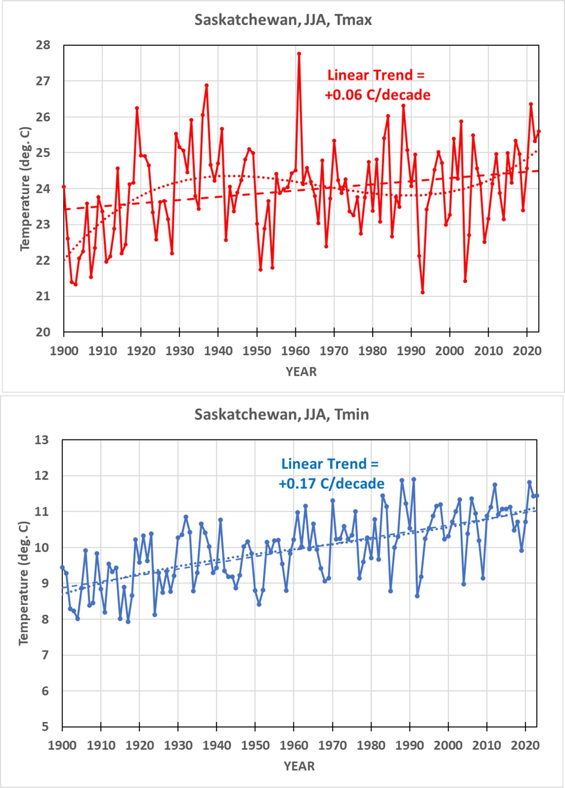
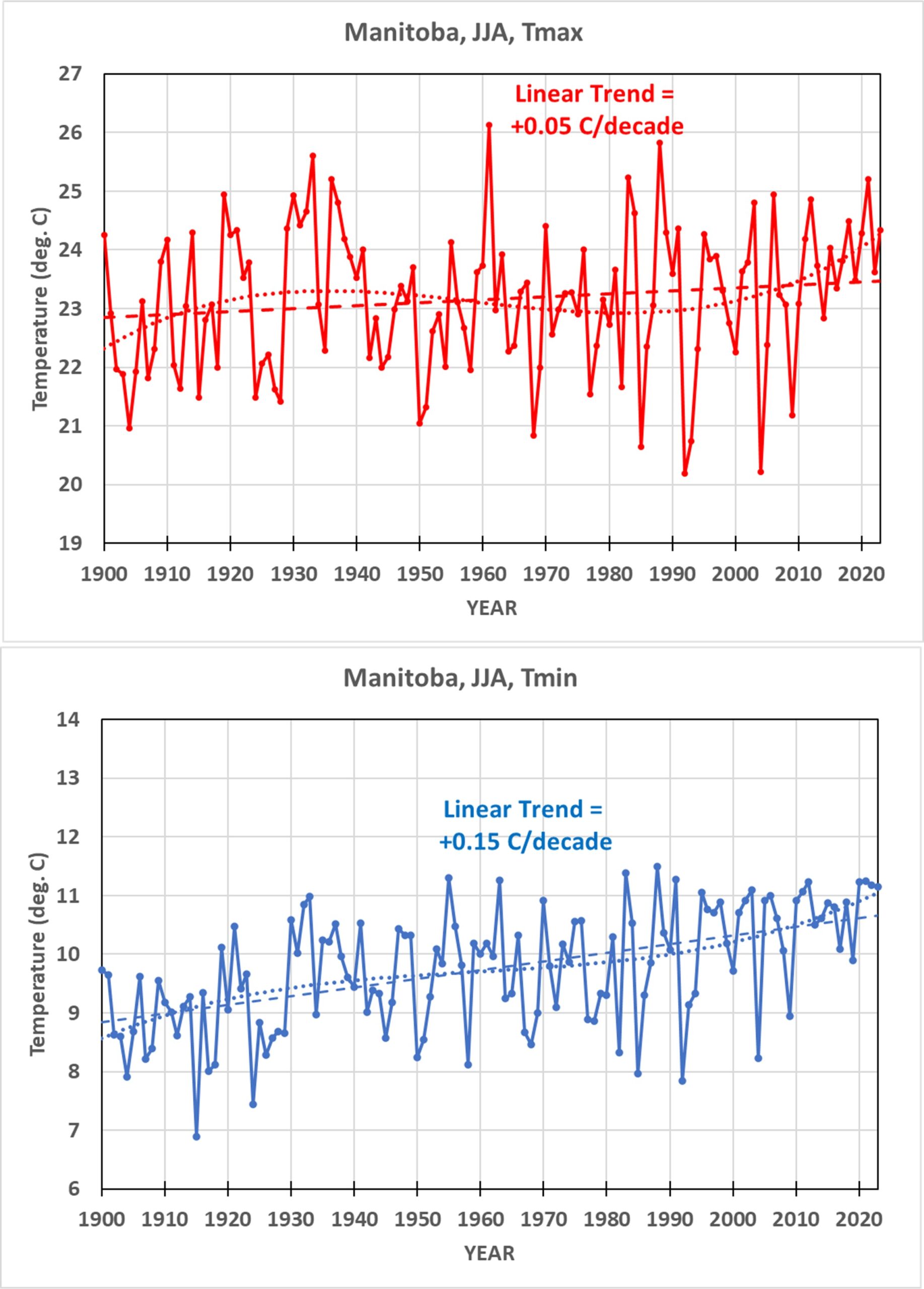
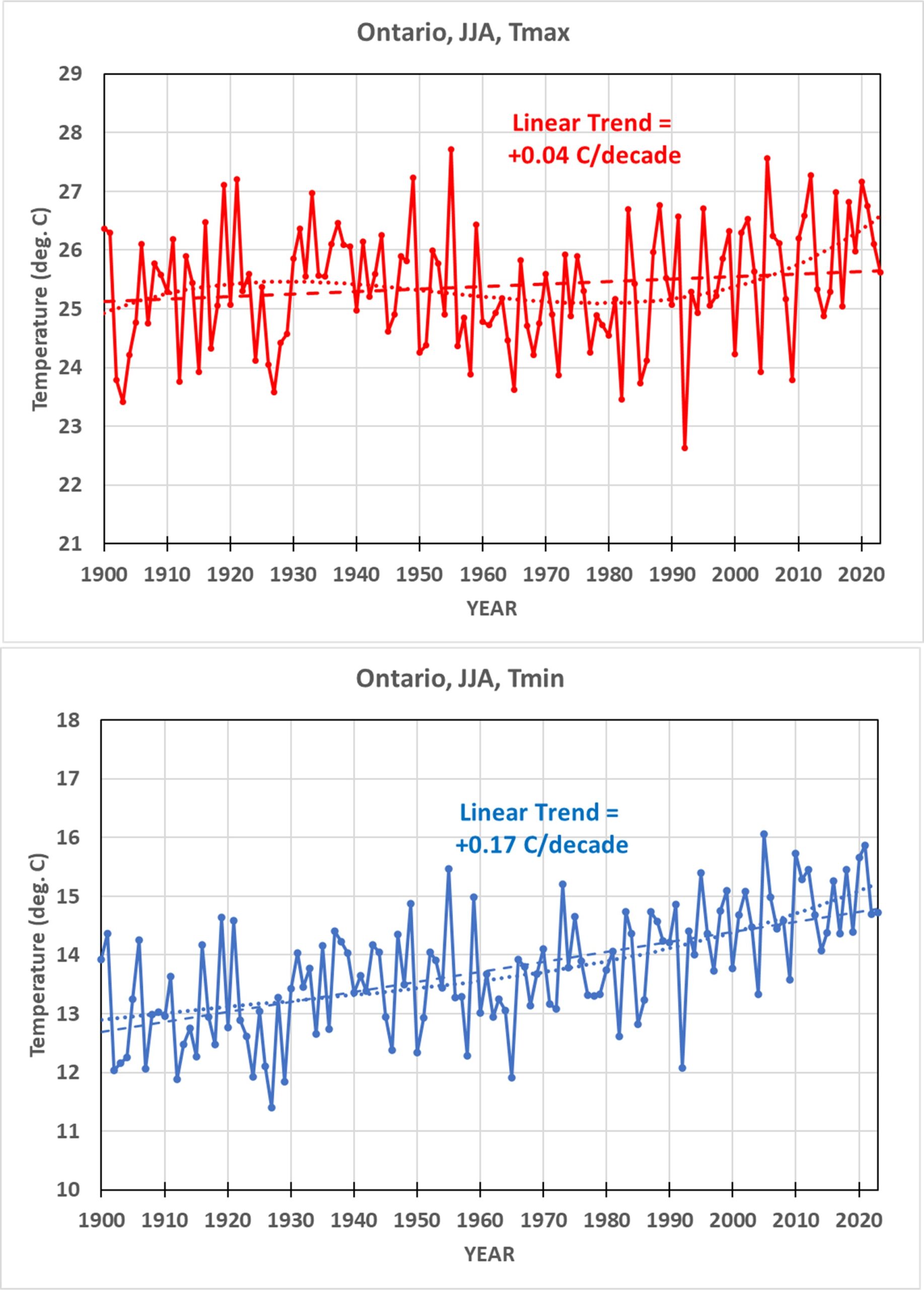
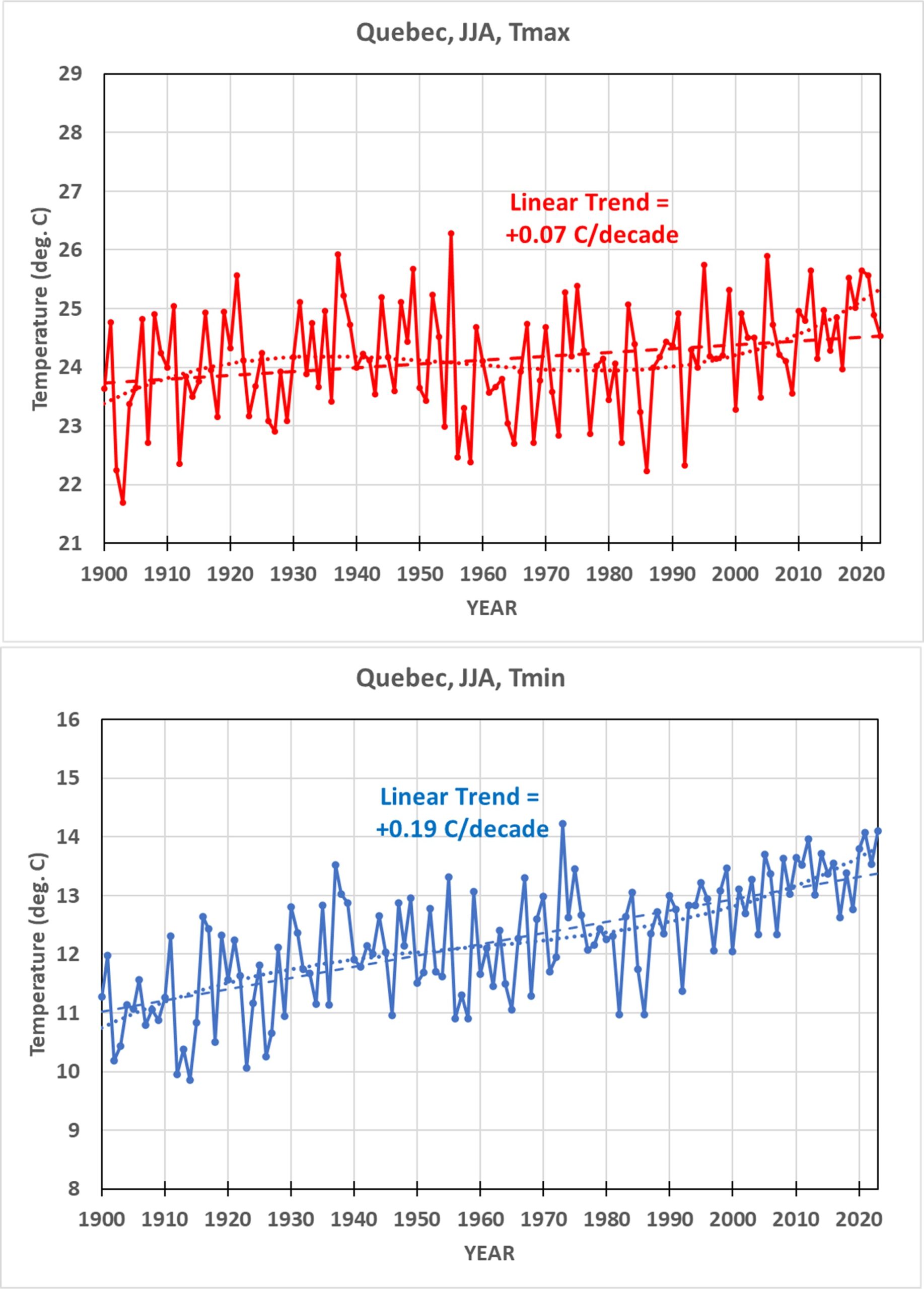
The following figure shows the daily high (Tmax) and low (Tmin) summer (June-July-August) temperature trends, 1900-2023, for the 6 provinces from which I analyzed data. The other provinces have very few stations by comparison to these six.
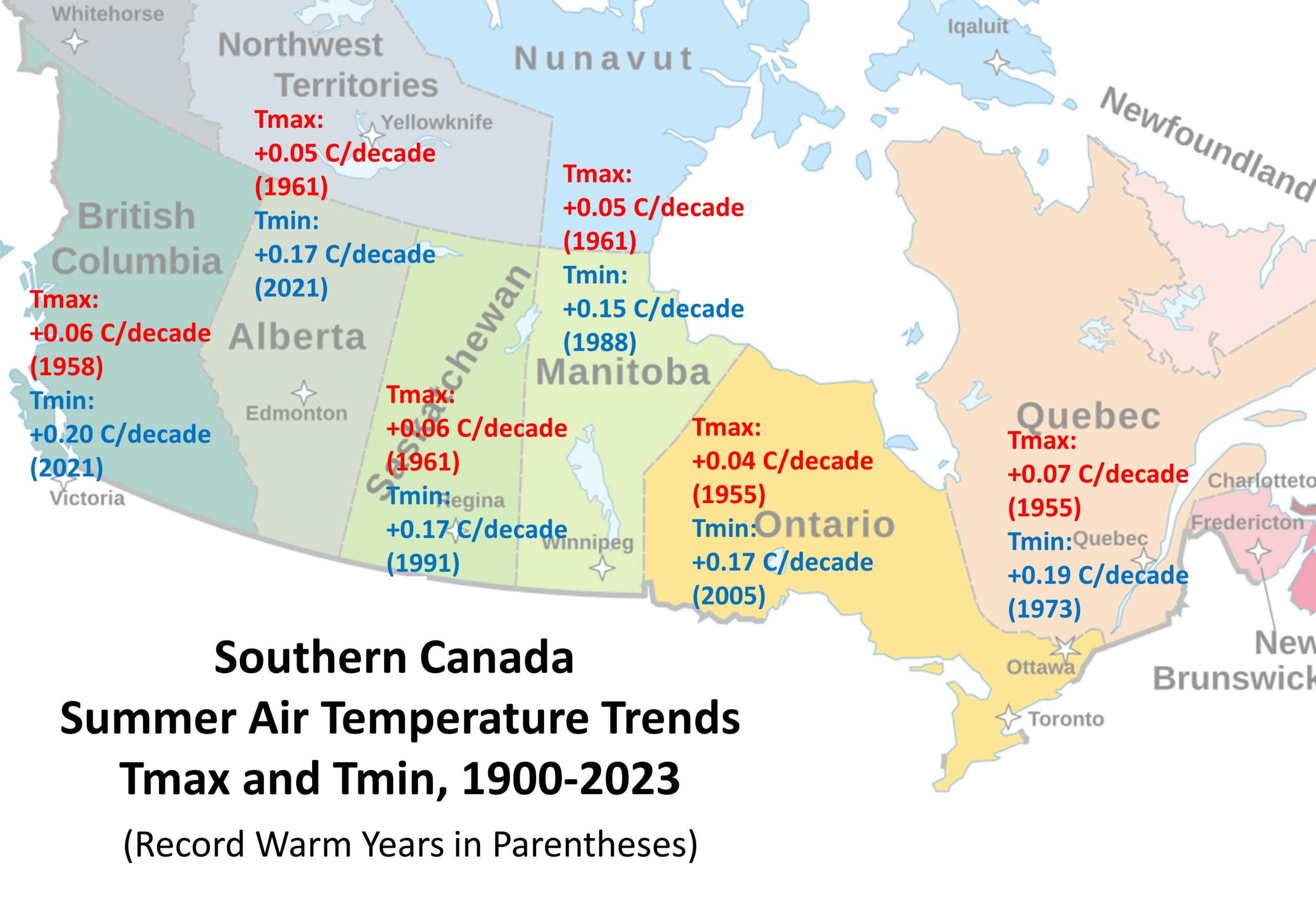
There is a surprising (at least to me) level of consistency in the trends across the provinces. The Tmax trends average only 1/3 the Tmin trends, so summer nights are warming much faster than summer days. Again, urban heat island efects have not been removed, so it remains unknown how much of this difference is due to UHI effects, which are much more pronounced in Tmin than in Tmax.
The next figure shows the yearly time series averaged across those 6 provinces. I’ve included the linear trend as well as a 3rd order polynomial fit to the data, the latter to reveal the warmth during the Dust Bowl years of the 1930s.
Interestingly, even though none of the individual provinces had 2021 (the year of the epic late-June heat wave in western Canada) as the record warmest summer, the average across the 6 provinces did have 2021 as record warmest, barely edging out 1961:
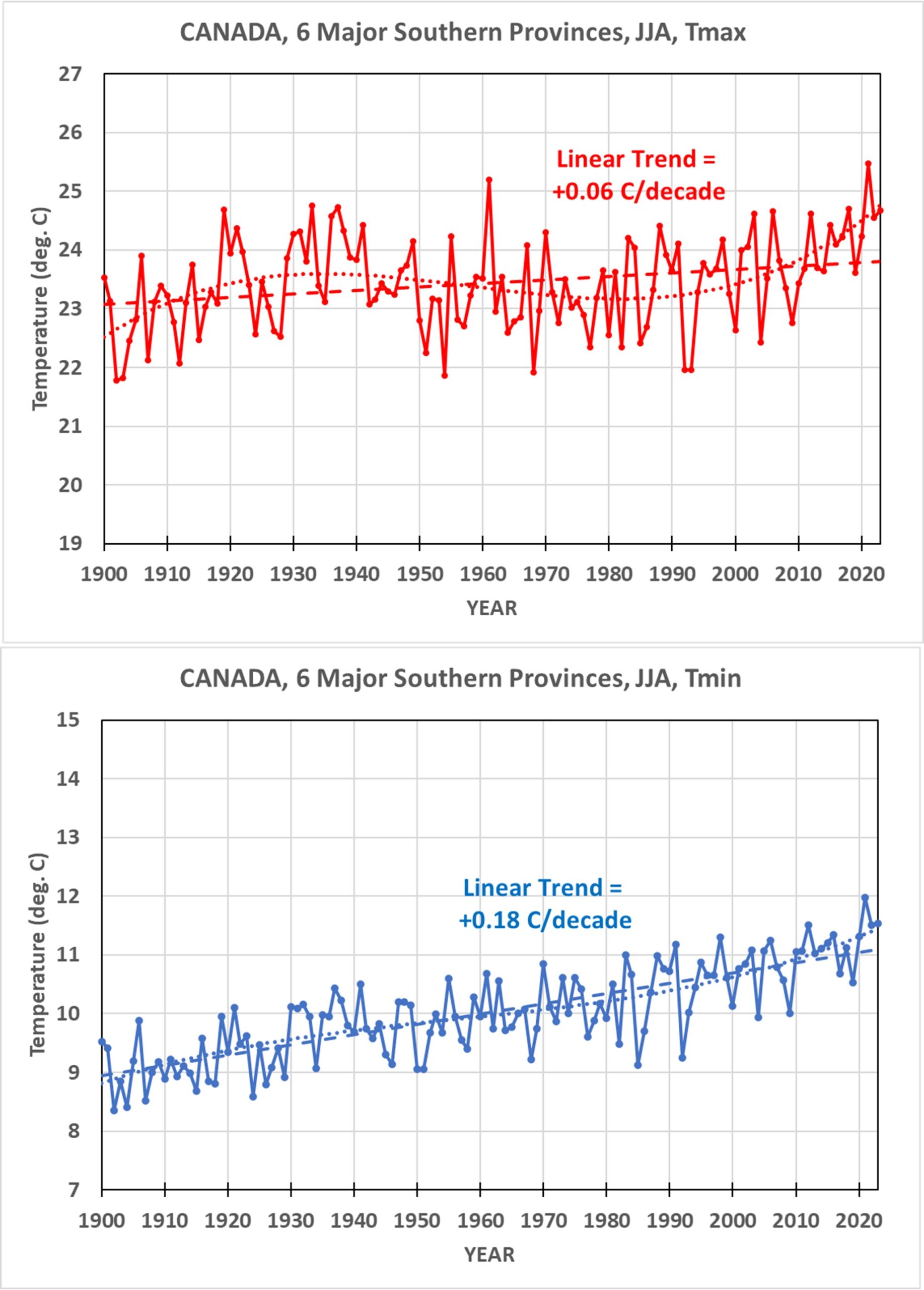
Note that the Dust Bowl years of the 1930s shows up much more in the Tmax than Tmin data, probably due to lower humidity air. The cool summers of 1992-93 after the major eruption of Mt. Pinatubo also show up clearly.
Individual Province Time Series
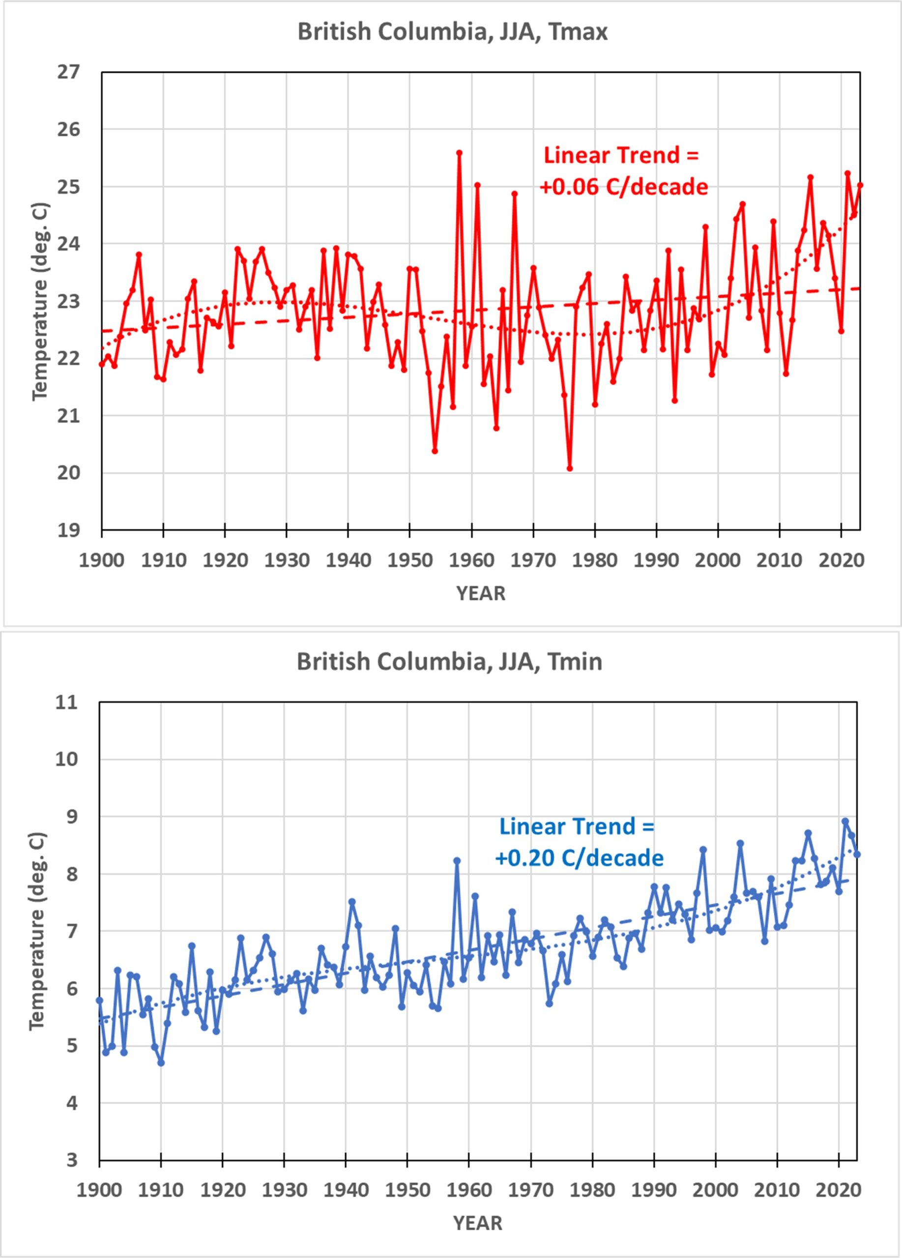
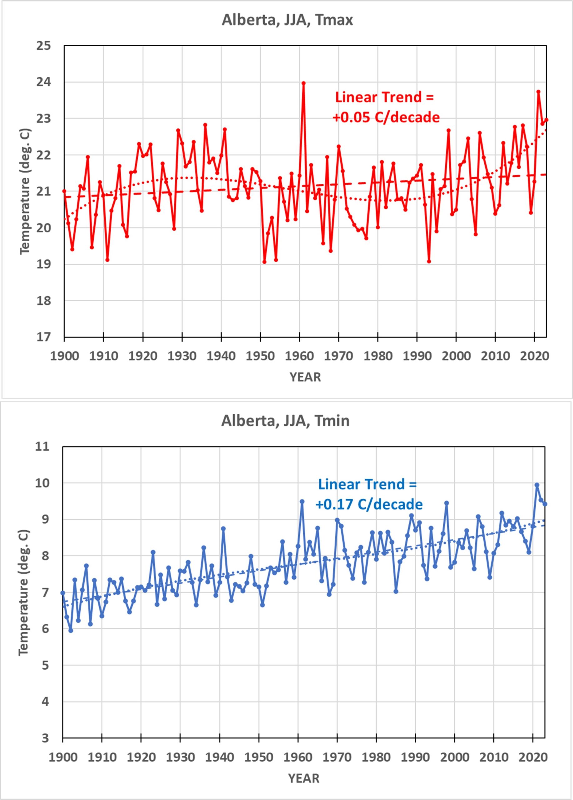
Following are the 6 individual province time series of yearly summer Tmax and Tmin; all temperature scales span 8 deg. C of range for ease of comparison. I present these without comment, except to point out that the warmest BC year was 1958, not the epic heat wave year of 2021, the effects of which were maximized in this province. My next step after this is to apply the same methodology to the 48 contiguous U.S. states (CONUS), and compare to NOAA’s homogenized trends for those states.


Sorry for being a bit off topic here, but I did a little reanalysis of the interannual 2.4W/m2 dOLR/dTs slope shown in Chung et al 2010.
https://greenhousedefect.com/fileadmin/user_upload/weird.png
Apart from some possibly undetectable doubled data points, the data reproduction should be very accurate. Simple OLS gives a slope of 2.58, not 2.4! Inverted OLS gives 3.65. TLS, which is arguably most appropriate here, gives 3.55.
The chart contains two outliers, one -1.65K and one +1.15K. The actual spread in Ts (on a monthly basis) was just about 0.7K(!) over that period. The large variance in Ts is thus only an artefact due to clear sky sampling. If we remove these two outliers TLS yields 4.73!!!
The feedbacks are negative, and it was right in front of us, all the time..
I do not understand data mining 3 summer months out of 12 months of the year. One theory about CO2 emissions warming is that it will cause more warming in the six colder months of the year.And less warming in the 6th warmest months of the year.
Comparing the six coldest months with the six warmest months would make sense.
The other theory is that CO2 emissions will cause more Tmin warming and less Tmax warming. Perhaps the three summer months are evidence of that. 12 months per year of Tmax versus Tmin data would be better.
Read up on seasonality in time series. One way allow for this is to look only at periods that are similar.
You could equally satisfy that condition by focusing on the winter season.
” You could equally satisfy that condition by focusing on the winter season. ”
Exactly, dlhvrsz. And spring or fall might tell a lot as well…
Like here (however wrongly but intentionally based on absolute data):
https://drive.google.com/file/d/1Swt4dpI5pbj8wYaVA7VQkmaYxXfn28JF/view
Thanks for this update.
I’d be interested in how these results compare with other parts of the world. Looking at parts of Europe, for instance, it seems summer maximum temperatures are warming somewhat faster than minimums.
It’s a bit difficult to draw global inferences with a sizable share of Canada still omitted.
Not really. Most of the population of Canada is found in a thin strip along the Canada – US border and that’s where most thermometers are found. If you factored in the rest of Canada’s land mass, extending to the Arctic Ocean, the average would be much lower.
The heat wave of 2021 affected only a small portion of British Columbia yet the sustained extreme temperatures would affect the overall average. BTW…NOAA claimed the heat wave was due to ENSO, not climate change. Same with flooding in November of a recent year, NOAA pointing out it was due to La Nina.
If Canadian temperature evolution is being compared with Europe (as Bellman suggested), and the European dataset includes high latitude regions such as northern Scandinavia or Russia, then Northern Canada should be included for consistency.
Furthermore, Arctic warming in Canada is not isolated. It affects large scale circulation, including the jet stream, which in turn influences extreme weather in southern Canada.
And once the analysis is explicitly framed as relevant to national energy policy (as stated in the Dec. 5th post), the implied domain extends beyond southern Canada to the country as a whole, not just the population dense provinces.
The study below evaluates climate vulnerability in the far Canadian North and focuses on TMIN variability, which is physically appropriate when considering the mechanics of ice consolidation.
https://www.researchgate.net/publication/227338088_Travelling_and_hunting_in_a_changing_Arctic_Assessing_Inuit_vulnerability_to_sea_ice_change_in_Igloolik_Nunavut
Consistent with local observations, the study found that cloudier, warmer autumns were inhibiting ice formation by 1) suppressing radiative cooling at night (reflected in reduced TMIN variability) and 2) allowing early snowfall to insulate thin ice layers. Together, these processes delay freeze-up and produce thinner, more spatially inconsistent ice surfaces.
For Inuit hunters in Igloolik, these conditions translate into increased danger and physical strain during autumn travel (as navigating unstable and even ice demands constant probing to detect concealed thin areas). These conditions also change the distribution of ringed seal breathing holes, making seals more difficult to locate and reducing hunting success, which in turn threatens Inuit food security.
It stands in stark contrast to the common skeptic narrative that increased nighttime temperatures in a cold Arctic climate are inherently beneficial.
And importantly all of this fieldwork was conducted in 2004, meaning the conditions documented were already problematic before the more rapid Arctic warming that unfolded from the late 2000s onward.
The new procedure seems similar to that of Hansen:
https://wep.fi/pic/1987_Hansen_Lebedeff.pdf page 13.349. He uses it within grid cells. It is by construction a local technique, and I don’t know how it would fare over all Canada. But it is certainly a move in the right direction.
roy….”After my previous posting of the aforementioned analyses of Canadian temperature trends, a few people (including John Christy) correctly pointed out that my straight averaging of all available stations in a province (or U.S. state) isn’t the best way to come up with a long term time series of temperatures”.
***
As much as I admire and respect John Christy, I think he is missing an important point, how does someone living in those areas experience the temperatures? I am fully aware of the subjective nature of human experience but I am not experiencing anything in the Vancouver area I would call worrisome. That becomes especially true in our winters which are still cold and drizzly. One might call the winter miserable but I am an eternal optimist.
I have lived in Vancouver most of my life and I am interested only in my experience of the climate. Whereas the view of John may appeal to mathematicians, your initial analysis better meets my experience.
In fact, that’s my view of the entire UAH series. It shows a steady linear trend of 0.14C/decade but the actual data is far from a linear trend. The IPCC acknowledged a 15 year flat trend from 1998 – 2012 and your data extends that flat trend to 15 years before the 2016 EN undid it. Even at that, another 6 year flat trend followed albeit at a warmer average.
I regard your series as a sequence of burps, where sudden warming rises arose at specific years. You disagreed that a sudden 0.2C warming occurred following the 1998 EN but it’s right there in your data and it was followed by a lengthy flat trend.
There was a swing of about 0.2 C from the pre ’98 EN to the post ’98 EN. Then it was flat till about 2015 when another major EN hit. Following the 2016 EN there was another abrupt change of about 0.2C
Remember, there was a 0.2C warming in 1977 which many scientists wanted to ignore. We now recognize it as the Pacific Decadal Oscillation. There is far too much going on out there that we don’t understand. If such an unexplained sudden warming could occur in 1977, why could something similar not occur post 1998 or post 2016?
Then there was the 2024 rise related to Hunga Tonga. We don’t know where that will settle out.
I am claiming that the 0.4C warming since 1998 occurred in two stages related to ENs. I think we need to understand why since the AGW warming theory, which should be fairly linear, makes no sense.
“Even at that, another 6 year flat trend followed albeit at a warmer average.”
A 6 year interval is far too short to define a meaningful climate trend. At that timescale, ENSO noise dominates the signal. Describing such a period as “flat but at a warmer average” is just acknowledging a higher baseline followed by short term variability, which is fully consistent with forced warming.
dlhvrsz
” It’s a bit difficult to draw global inferences with a sizable share of Canada still omitted. ”
I’d have expected somewhat similar compared to other countries, but…
Here are two comparisons of Canada based on GHCN daily stations’ anomaly averages of
– Canadian Arctic
– Canadian Extraarctic
– Canada as a whole.
TMIN
https://drive.google.com/file/d/1LLKLYsfaWRI0PTVqTOJtxBRfiz_U5gO4/view
TMAX
https://drive.google.com/file/d/1PWMcEv9z5tB4IltdQVz6r8_Y5yvEtMtl/view
*
In particular, when examining the TMAX anomalies, it becomes clear that the data generation from all stations remains close to the extra-Arctic region.
Generating the time series with area weighting based on a 2.5-degree grid did not yield any significantly different results.
*
Finally, here is a comparison of GHCN daily TMEAN data to UAH 6.1 LT over Canada (excluding Ellesmere and associated islands with less than 20 surface stations):
https://drive.google.com/file/d/1xGx3cfta1SfksmAwdGTb88QZGSEYoyNZ/view
*
It is astonishing, by the way, to consider the detail similarity of two means based on 100% different data and processed with 100% different algorithms (this is a 400x magnification of the image above, output in Encapsulated PostScript):
https://drive.google.com/file/d/1aF_0I3Q1sMQYEX3-bLxQj6EyabxZ6mDD/view
Ok, OK, I know I’m talking about weather (one day) and not climate, but we just hit an all-time minimum low for December 14 – 0F in Cincinnati. Our temperature records go back to the 1870s, thanks to the famous Cleveland Abbe. BTW, our local NWS station has a great local climate site. Warming does not seem to show up in any of the December records.
Daily records are meaningless.
Here is my latest evaluation of all available and usable GHCN daily station data, compared
– since 1900, to NOAA’s Climate at a Glance land-only evaluation of GHCN V4
https://drive.google.com/file/d/1PFwGIYQnLUfoqVnRDDVCJmrCfENSNwNz/view
– and since 1979, to NOAA’s CaaG and UAH 6.1 LT (land-only too, of course)
https://drive.google.com/file/d/1JoERyM9EeWR1-Xwl4SeH8DNkQ8uPDyxI/view
*
Yes yes, NOAA’s data shows a much higher trend than mine, but to boastfully blather a la Robertson that ‘NOAA’s data is fudged’: that’s simply trivial and irrelevant denigration, you have to technically prove such a claim.
Clive Best formulated intelligent critique to NOAA’s ‘Pairwise Homogenisation Algorithm’.
*
Land-only trends in C/decade from various years till now…
1900
NOAA 0.14
Bin 0.09
1950
NOAA 0.25
Bin 0.20
1980
NOAA 0.35
Bin 0.26
UAH 0.22
2000
NOAA 0.42
Bin 0.32
UAH 0.31
2010
NOAA 0.52
UAH LT 0.51
Bin 0.44
*
For those interested in technical details…
Out of the ~ 130,000 GHCN daily stations, ~ 40,000 record(ed) temperatures. Out of these, ~ 26,000 contributed to the evaluation.
In 1900, 2400 were used, located on 400 grid cells of 2.5 degree; in 2004, 15,000 in 1900 cells; in 2025, 12,000 in 1800 cells.
As a comparison, UAH records O2 emissions identified with 66 * 144 = 9,504 cells, out of which ~ 30% are land.
*
Sources
GHCN daily
https://www1.ncdc.noaa.gov/pub/data/ghcn/daily/
NOAA Climate at a Glance
https://www.ncei.noaa.gov/access/monitoring/climate-at-a-glance/global/time-series/globe/land/tavg/1/0/1900-2025
UAH 6.1 LT
https://www.nsstc.uah.edu/data/msu/v6.1/tlt/uahncdc_lt_6.1.txt
(data column 2)
I forgot to mention that the ~ 26,000 stations used to generate the global GHCN daily time series were located in 187 of the 219 countries mentioned in the file
https://www1.ncdc.noaa.gov/pub/data/ghcn/daily/ghcnd-countries.txt
Strange things happen, don’t they?
I just had a look at historical data for all GHCN daily stations located in OH Cincinnati:
USC00331550 39.1169 -84.6961 152.4 OH CINCINNATI-FERNBANK
USC00331566 39.1333 -84.4167 235.0 OH CINCINNATI AULT PARK
USC00331568 39.2167 -84.4833 161.8 OH CINCINNATI HARTWELL
USC00331569 39.1500 -84.4167 182.9 OH CINCINNATI OAKLEY
USC00331570 39.1000 -84.5500 267.9 OH CINCINNATI PRICE HILL
USC00331573 39.0667 -84.3333 246.9 OH CINCINNATI CHERRY GROV
USC00331574 39.2000 -84.6167 271.0 OH CINCINNATI WHITE OAK
USC00332766 39.1167 -84.7000 153.0 OH CINCINNATI FERNBANK
USW00003871 39.1000 -84.5167 193.9 OH CINCINNATI WSO CITY
USW00013841 39.4206 -83.8214 356.6 OH CINCINNATI
USW00093812 39.1061 -84.4161 144.8 OH CINCINNATI MUNI AP LUNKEN F
USW00093890 39.1500 -84.5167 231.6 OH CINCINNATI ABBE WSMO
*
Lowest temperatures around Dec 14, absent
-USW00093890 OH_CINCINNATI_ABBE_WSMO_______ 1917 12 11 -25.0 (C)
-USW00093890 OH_CINCINNATI_ABBE_WSMO_______ 1917 12 10 -22.2
-USW00093890 OH_CINCINNATI_ABBE_WSMO_______ 1917 12 15 -21.7
-USC00331550 OH_CINCINNATI-FERNBANK________ 1977 12 11 -20.6
-USC00331550 OH_CINCINNATI-FERNBANK________ 1977 12 12 -20.6
-USW00013841 OH_CINCINNATI_________________ 1958 12 10 -20.6
I thought 0 F would mean -17.8 C, but maybe I’m wrong.
If I’m right this will be lower this month.
https://oz4caster.wordpress.com/cfsr/
Bindi – I have absolutely no clue what your point is.
No wonder, Hagedorn boy.
I myself have no idea of what you might have a clue about anything discussed here. Good grief…
Think, it may be an experience.
Thomas,
Blinny doesn’t have a point. Don’t try to find one. Here is the post from NWS:
[10:31 AM] Here is a statement with low temperatures observed this morning, December 14. We hit an even 0° at the NWS office in Wilmington.
At the Cincinnati Northern Kentucky Int Apt, the low of 0° ties the record for the day, previously set in 1901.
Link to low temperatures: https://mesonet.agron.iastate.edu/wx/afos/p.php…
Thanks, Stephen. I’ll add Bindi to the short list of people on here who I will ignore. I will continue to follow the NWS in Wilmington. BWS (Bindi Weather Service) doesn’t seem to make much sense.
Meanwhile, I am still searching for balanced defenses of the notion that AGW is an existential threat. I recently ordered (and quickly returned) a book commissioned and published by the AMS. It was a lot of polemic persuasion with a little science thrown in. I was pretty shocked at the misrepresentations and distortions I found. Berkeley Earth seems like a reasonable source, so that is where I am headed next. Starting to read what they have published on AGW.
Troglodyte,
Binny’s point is that Thomas is full of it, which is why he never really offers anything to support his rants. A more general point would be that contrarians in general have no leg to stand on anymore:
https://www.theguardian.com/world/2025/dec/16/artic-record-heat-shrunken-sea-ice-report
They will still persist, no doubt. But time is running short, and they need to indoctrinate a younger generation of troglodytes. Which will be hard if it becomes a boys’ club, e.g.:
https://www.thecrimson.com/article/2025/12/8/john-adams-society-women/
Troglodytes may still have the means to control the gubmint, but it won’t be because they’re in majority.
Hope this helps.
The elevator speech on why climate change is/will be a problem comes in two oarts. The first is a video from the NASA science visualization studio which shows that while the median land temperature anomalies have shifted only about 1.5 C hotter, the probability of extremes 5C and above have multiplies by 5 or more, and by implication 10 C and above extremes are orders of magnitude hight. Cold extremes have decrease by the same amount.
https://svs.gsfc.nasa.gov/5452/
The second is a paper by MacDougall et al showing that at the zero emission limit, while CO2 concentrations decrease within 100 yrs by 100 ppm the temperature anomaly stays constant for centuries.
https://oro.open.ac.uk/70869/1/2020_MacDougall_ZEC_biogeosciences.pdf
Willard,
How do you type and suck on your thumb at the same time?
Of course does ‘Blinny’ have a point which the two pseudoskeptic geniuses of course didn’t understand, exactly as the other genius Robertson similarly didn’t a year ago, when trying to invent terrible cooling out of a harsh single drop somewhere in the Canada BC province, where temperatures felt down for exactly ONE DAY to a level like a century ago.
*
The point is that daily lows don’t have any meaning, just like daily highs don’t as well.
That’s the reason why the allegedly ‘blind’ Bindidon showed how really lowest tewmperatures ever recorded in Cincinnati looked like.
*
I repeat the sequence with an addendum:
1. USW00093890 OH_CINCINNATI_ABBE_WSMO_______ 1917 12 11 -25.0
2. USC00331550 OH_CINCINNATI-FERNBANK________ 1989 12 18 -22.2
3. USW00093812 OH_CINCINNATI_MUNI_AP_LUNKEN_F 1989 12 17 -22.2
4. USW00093890 OH_CINCINNATI_ABBE_WSMO_______ 1917 12 10 -22.2
5. USC00331550 OH_CINCINNATI-FERNBANK________ 1989 12 16 -21.7
…
30. USW00093890 OH_CINCINNATI_ABBE_WSMO_______ 1963 12 19 -18.9
31. USC00331568 OH_CINCINNATI_HARTWELL________ 1958 12 10 -18.3
32. USC00331568 OH_CINCINNATI_HARTWELL________ 1958 12 15 -18.3
33. USC00331570 OH_CINCINNATI_PRICE_HILL______ 1960 12 13 -18.3
34. USW00013841 OH_CINCINNATI_________________ 2025 12 14 -18.3
*
Maybe the geniuses understand now what I meant?
What’s so bad about -17.8 °C (according to the GHCN daily report from December 14th, even -18.3 °F, so -1 °F, oh dear!), when you compare it to ALL the measurements from December 10th to 19th in a sorted list of all available measurements for Cincinnati?
*
Not surprisingly at all, the “Coolistas” and the “Warmistas” behave exactly the same – only with the opposite sign…
” BWS (Bindi Weather Service) doesn’t seem to make much sense. ”
Hagedorn boy, you are simply ignorant of facts.
NOAA’s GHCN daily is in the US the worldwide central database for all weather raw data info (temperature, rainfall, snow, wind etc).
They have in the US nearly 20,000 weather stations, and their external data matches what the countries concerned deliver to them, e.g. Germany.
Feel free to ignore it. Your bad, not mine.
*
Strangely, you write in the very same post:
” Berkeley Earth seems like a reasonable source, so that is where I am headed next. Starting to read what they have published on AGW. ”
Interesting – and fair enough – approach when you read how incredibly discrediting, denigrating and lying incompetent people like Robertson write on this blog about Berkeley Earth since many years.
*
How long then will you consider them a ‘reasonable source’, when you read e.g.
https://berkeleyearth.org/september-2025-temperature-update/
https://berkeleyearth.org/introducing-the-berkeley-earth-high-resolution-dataset/
We will see!
*
Their original paper
https://www.scitechnol.com/berkeley-earth-temperature-averaging-process-IpUG.php?article_id=582
has now been unfortunately put behind paywall.
Dr Spencer,
If you have the time, would you be able to elaborate on your comment here:
“doing a homogenization process such as the Menne and Williams (2009) Pairwise Homogenization Algorithm (PHA, used by NOAA and the BEST dataset providers) can lead to a random walk behavior as errors in the method in a single year will then propagate through all later years.”
In Australia, our BoM also relies on PHA for data “correction”. Except that the sparsity of weather stations means that some pairs are located hundreds, or even more than one thousand kilometres apart. A number of individuals have highlighted the problems that this algorithm can cause:
https://www.bomwatch.com.au/data-homogenisation/methods-case-study-parafield-south-australia-2/
However, your finding of “random walk behaviour” is something that I have never seen discussed on any other forum.
Wildly off topic, but that is not unusual on this blog.
A movie recommendation for y’all: “Willard” a 1971 American horror film that was so successful that it spawn a sequel and a remake 30 years later. It is about a social misfit named Willard, whose only friends are a couple rats and their friends. Great entertainment! I’m going to watch again.
Bellman on December 9, 2025 at 8:50 AM
You wrote:
” I’d be interested in how these results compare with other parts of the world. Looking at parts of Europe, for instance, it seems summer maximum temperatures are warming somewhat faster than minimums. ”
Canada and Europe really don’t differ by much when performing a seasonal split on their TMIn vs. TMAX anomaly time series.
Canada was shown on December 13, 2025 at 11:48 AM.
*
I did a split today for the Globe as a whole on the base of new land-only TMIN and TMAX time series:
https://drive.google.com/file/d/10ClBs4s45r7OEzNC_Unau4Zueuk6F42B/view
Here are their seasonal splits (the seasons must be displaced when generated in anomaly form).
TMIN
https://drive.google.com/file/d/1i56bmrHpS3etCzydS7fs5KqpcbJEqn2R/view
TMAX
https://drive.google.com/file/d/1u54r7ekWww8wGGKpRyAL4n3oDGgU1Fcy/view
*
The difference between JJA and the rest has disappeared, to say the least.
On Dec 13 I forgot to post links to the seasonal splits for Canada (Extra-Arctic):
TMIN
https://drive.google.com/file/d/1agv6so6ACzspXkF7nwhwuaccpRHS1ENe/view
TMAX
https://drive.google.com/file/d/18gggxSV7Xitf_rtg6o4TKE5CI3COPjOB/view
The difference to the Globe as a whole could not be better illustrated.
” BWS (Bindi Weather Service) doesn’t seem to make much sense. ”
It’s always easy to discredit what one dislikes, but less easy to technically contradict it.
*
The raw data source
http://www1.ncdc.noaa.gov/pub/data/ghcn/daily/
is above suspicion, especially when one compares its data with its foreign sources (Canada, Europe, Germany, etc).
“In 2022, a group of scientists at the U.S. National Oceanic and Atmospheric Administration (NOAA) headed by Cheng-Zhi Zou, published a study with with a new approach to NOAA’s satellite microwave sounder data so that it virtually matched the UAH Global Temperature record, corroborating the UAH analysis.”
“Now Zou’s analysis agrees with the UAH series very closely—in fact it has a slightly smaller warming trend. In addition, this temperature record has been corroborated by the massive temperature data record developed with atmospheric balloon temperature records from around the globe.”
Some speak, others do…
https://www.star.nesdis.noaa.gov/data/mscat/MSU_AMSU_v5.0/Monthly_Atmospheric_Layer_Mean_Temperature/Global_Mean_Anomaly_Time_Series/
*
https://drive.google.com/file/d/1GvZ8GktXb-7EaZrNPK9HaW4flZEIztWP/view
https://wattsupwiththat.com/uah-version-6/
“UAH Global Temperature:
November ’25 | 0.43°C (0.77°F)
Satellite UAH Version 6.1 (data updated by 3rd of the month)”
The very best in WUWT’s head post is:
” This global temperature record from 1979 shows a modest and unalarming 0.16° Celsius rise per decade (0.28⁰ Fahrenheit rise per decade) that is not accelerating as of 7/1/25. ”
Since its introduction in 2015 as the successor to UAH 5.6, UAH 6 has actually shown a modest and unalarming increase of a mere 45% (from 0.11 to 0.16 °C / decade).
You missed out the bit you quoted.
actually shown a modest and unalarming increase i.e. not statistically important.
The IPCC, climate alarm central, has acknowledged in 2013, that no warming occurred over the 15 years period from 1998 – 2012. The UAH record extends that lack of warming to 18 years, till 2015.
When I put this to Barry, an alarmist, in the past, he replied that 15 year hiatus was not significant. However, alarmists have claimed this era as one of alarming warming, even though there was no warming.
The silly error margin provided by the IPCC suggested there may even have been a slight cooling over the 15 years. I’ll settle for a 15 year flat trend but I see it quite differently. When you have a significant increase in CO2 emissions and no related warming, that says a lot.
The only warming since 1998 has come in unexplained spurts that could just as easily be described as natural variability. In fact, that scenario is more likely. The first such spurt came in 1977 when the global average increased by a mysterious 0.2C. At the time, many scientists simply wanted to eradicated the warming from the record as an error.
Thankfully, same minds prevailed and the 0.2C warming spurt was blamed on the Pacific Decadal Oscillation. At the time, it was called the Great Pacific Climate shift but in the 1990s, it was named the PDO by Steven Hare, working with colleagues Nathan Mantua, Yuan Zhang, Robert Francis, and Mike Wallace at the University of Washington. Around the same time, the Atlantic Multidecadal oscillation was identified.
That means, until the year 2000, virtually nothing was known about these major oceanic oscillations and how they affect the global average. Tsonis et al did research into such interactions and concluded that the planet warmed when the oscillations worked in phase and cooled when out of phase. That is seriously important since it suggest global warming/cooling works over decades and would not be apparent to most.
I claim a similar blip of about 0.2C following the 1998 El Nino extreme. Although I call it an extreme, I mean that wrt to past gradual warming over decades. However, it is plain to me that when the statistical smoke had clear following the 1998 EN, the average had risen by about 0.2C.
The same happened following the 2010 N which has a sightly lesser effect than the 1998 EN. The average returned to the baseline briefly following 2010, then started to take off in 2014, culminating in the 2016 EN extreme. Once again, the average rose some 0.3C for nearly 6 years, before the Hunga Tonga extreme struck. It should be apparent to anyone willing to set aside the math, and look at the graph, that any warming has following relative EN extremes.
Of course, ENSO does not act alone, it is driven by the PDO and most likely affected by the AMO and other oscillations.
Roy disagreed with my assessment but I think he may be looking at it through statistical eyes rather than eyeballing the actual running average trend. On Roy’s graph for November 2025 one can ‘see’ a slight trend on the red running average curve from 1979 to 1997, just before the ’98 EN, and the data is on a relative cooling cycle just as the EN strikes. It should have cooled more based on previous years but the EN drove the data suddenly to around 0.3C above the baseline.
The data should have returned to where it was before the EN, but it dropped back to the same spot it was before the EN then took off again, settling for the next 14 or 15 years around the baseline. I claim that warming as a sudden, unexplained warming.
The graph now shows the data for the new 30 year baseline, from 1991 – 2020, and that has dropped the global average by some 0.2C alone. On the old baseline, the warming blip I am claiming was more pronounced wrt the baseline.
John Christy commented in the past that the 1998 EN drove the global average above the baseline for the first time in the UAH record. Based on the record from 1979 – 1997, it should not have done that, following the EN, it should have returned to where it was below the baseline.
It is apparent to me that the EN had a major influence on the trend, just as did the 2016 EN and the Hunga Tonga eruption of the early 2020 decade. If you look at the graph carefully, it becomes apparent that at least 0.5C of the warming since 1979 was due to oceanic oscillations and had nothing to do with anthropogenic warming.
Living in the UK, I didn’t find it exceptionally warm.
What I did notice was that from April to June we had very little cloud. My Solar panels were performing way above normal standards. It was Sunny but not exceptionally warm for most of this period. In July the jet stream which dictates the UZk weather shifted to bring in cloud and rain. These tend not to be very warm days but warmer nights. Since September we have only had a handful of sunny days.
I remember the 1970s. Those years were much warmer.
I think the records are due to poor methodology. Much of the UK data is from poor sites. Upton 25 percent are based on computer models rather than physical data points and as Dr Spencer points out elsewhere a lot of the other sites are. Subject to urbanisation and are no longer showing comparable measurements to the past data.
Mark Wapples
” I remember the 1970s. Those years were much warmer. ”
You tell us that for the nth time… and for the n+1st time I reply in the same way.
For me too, local temperature feeling seems far away from what I read – and what I incidentally can compute using own software.
But I know since decades that my personal feeling is just a mirage, even if in the 1970s the harsh winters in northern Germoney were compensated by wonderfully warm springs which disappeared long time ago – probably as a consequence of the warmer winters.
*
Here is, poor sites or not, a graph showing lowest and highest temperature anomalies for UK + Ireland since 1900 looks like this:
https://drive.google.com/file/d/1TvGdx5awonQGDvZ-E-qTIAO2z_NiFpol/view
*
As you can see, your so pretty warm 1970s coincide at a less local level with a serious decline which started in 1963 with the lowest anomaly since 1919 (absolute temperatures look similar).
When computing the lifetime trends for all UK+Eire stations, I see that by miracle, nearly all stations whose lifetime lied wihtin the period 1950-1975 show a negative trend… what pretty good explains that the graph above looks… as it looks :–)
*
Thus I ask: are the UK sites poor only when they show currently more warming than you feel – or are they poor also when they conversely showed more cooling in the past than you ‘remember’?
That’s the question, Mark Wapples!