After years of dabbling in this issue, John Christy and I have finally submitted a paper to Journal of Applied Meteorology and Climatology entitled, “Urban Heat Island Effects in U.S. Summer Surface Temperature Data, 1880-2015“.
I feel pretty good about what we’ve done using the GHCN data. We demonstrate that, not only do the homogenized (“adjusted”) dataset not correct for the effect of the urban heat island (UHI) on temperature trends, the adjusted data appear to have even stronger UHI signatures than in the raw (unadjusted) data. This is true of both trends at stations (where there are nearby rural and non-rural stations… you can’t blindly average all of the stations in the U.S.), and it’s true of the spatial differences between closely-space stations in the same months and years.
The bottom line is that an estimated 22% of the U.S. warming trend, 1895 to 2023, is due to localized UHI effects.
And the effect is much larger in urban locations. Out of 4 categories of urbanization based upon population density (0.1 to 10, 10-100, 100-1,000, and >1,000 persons per sq. km), the top 2 categories show the UHI temperature trend to be 57% of the reported homogenized GHCN temperature trend. So, as one might expect, a large part of urban (and even suburban) warming since 1895 is due to UHI effects. This impacts how we should be discussing recent “record hot” temperatures at cities. Some of those would likely not be records if UHI effects were taken into account.
Yet, those are the temperatures a majority of the population experiences. My point is, such increasing warmth cannot be wholly blamed on climate change.
One of the things I struggled with was how to deal with stations having sporadic records. I’ve always wondered if one could use year-over-year changes instead of the usual annual-cycle-an-anomaly calculations, and it turns out you can, and with extremely high accuracy. (John Christy says he did it many years ago for a sparse African temperature dataset). This greatly simplifies data processing, and you can use all stations that have at least 2 years of data.
Now to see if the peer review process deep-sixes the paper. I’m optimistic.
I’m not a statistician, and I am hoping someone out there can tell me where I’m wrong in the assertion represented by the above title. Or, if you know someone expert in statistics, please forward this post to them.
In regression analysis we use statistics to estimate the strength of the relationship between two variables, say X and Y.
Standard least-squares linear regression estimates the strength of the relationship (regression slope “m”) in the equation:
Y = mX + b, where b is the Y-intercept.
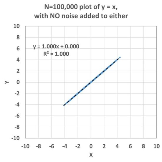
In the simplest case of Y = X, we can put in a set of normally distributed random numbers for X in Excel, and the relationship looks like this:
Now, in the real world, our measurements are typically noisy, with a variety of errors in measurement, or variations not due, directly or indirectly, to correlated behavior between X and Y. Importantly, standard least squares regression estimation assumes all of these errors are in Y, and not in X. This issue is seldom addressed by people doing regression analysis.
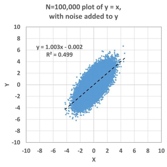
If we next add an error component to the Y variations, we get this:
In this case, a fairly accurate regression coefficient is obtained (1.003 vs. the true value of 1.000), and if you do many simulations with different noise seeds, you will find the diagnosed slope averages out to 1.000.
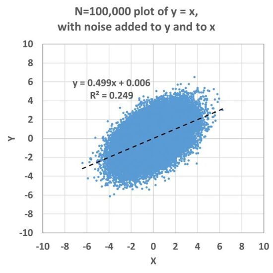
But, if there is also noise in the X variable, a low bias in the regression coefficient appears, and this is called “regression attenuation” or “regression dilution”:
This becomes a problem in practical applications because it means that the strength of a relationship diagnosed through regression will be underestimated to the extent that there are errors (or noise) in the X variable. This issue has been described (and “errors in variables” methods for treatment have been advanced) most widely in the medical literature, say in quantifying the relationship between human sodium levels and high blood pressure or heart disease. But the problem will exist in any field of research to the extent that the X measurements are noisy.
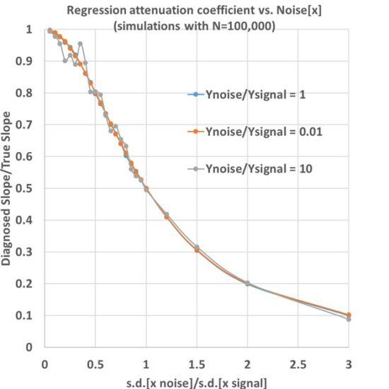
One can vary the relative amounts of noise in X and in Y to see just how much the regression slope is reduced. When this is done, the following relationship emerges, where the vertical axis is the regression attenuation coefficient (the ratio of the diagnosed slope to the true slope) and the horizontal axis is how much relative noise is in the X variations:
What you see here is that if you know how much of the X variations are due to noise/errors, then you know how much of a low bias you have in the diagnosed regression coefficient. For example, if noise in X is 20% the size of the signals in X, the underestimate of the regression coefficient is only 4%. But if the noise is the same size as the signal, then the regression slope is underestimated by about 50%.
Noise in Y Doesn’t Matter
But what the 3 different colored curves show is that for Y noise levels ranging from 1% of the Y signal, to 10 times the Y signal (a factor of 1,000 range in the Y noise), there is no effect on the regression slope (except to make its estimate more noisy when the Y noise is very large).
There is a commonly used technique for estimating the regression slope called Deming regression, and it assumes a known ratio between noise in Y versus noise in X. But I don’t see how the noise in Y has any impact on regression attenuation. All one needs is an estimate of the relative amount of noise in X, and then the regression attenuation follows the above curve(s).
Anyway, I hope someone can point out errors in what I have described, and why Deming regression should be used even though my analysis suggests regression attenuation has no dependence on errors in Y.
Why Am I Asking?
This impacts our analysis of the urban heat island (UHI) where we have hundreds of thousands of station pairs where we are relating their temperature difference to their difference in population density. At very low population densities, the correlation coefficients become very small (less than 0.1, so R2 less than 0.01), yet the regression coefficients are quite large, and — apparently — virtually unaffected by attenuation, because virtually all of the noise is in the temperature differences (Y) and not the population difference data (X).
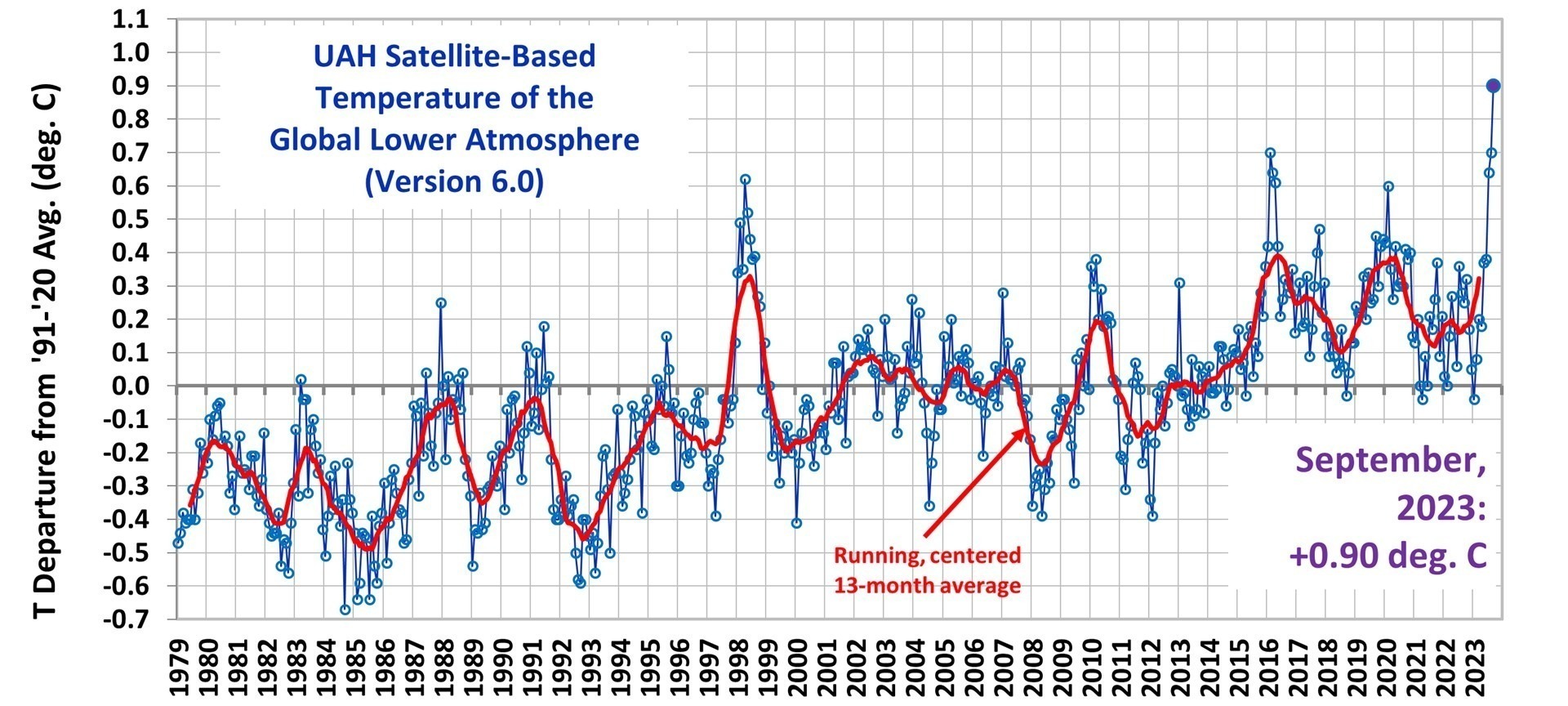
With the approaching El Nino superimposed upon a long-term warming trend, many high temperature records were established in September, 2023.
(Now updated with the usual tabular values).
The Version 6 global average lower tropospheric temperature (LT) anomaly for September, 2023 was +0.90 deg. C departure from the 1991-2020 mean. This is above the August 2023 anomaly of +0.70 deg. C, and establishes a new monthly high temperature record since satellite temperature monitoring began in December, 1978.
The linear warming trend since January, 1979 still stands at +0.14 C/decade (+0.12 C/decade over the global-averaged oceans, and +0.19 C/decade over global-averaged land).
Regional High Temperature Records for September, 2023
From our global gridpoint dataset generated every month, there are 27 regional averages we routinely monitor. So many of these regions saw record high temperature anomaly values (departures from seasonal norms) in September, 2023 that it’s easier to just list all of the regions and show how September ranked out of the 538 month satellite record:
Globe: #1
Global land: #1
Global ocean: #1
N. Hemisphere: #2
N. Hemisphere land: #1
N. Hemisphere ocean: #4
S. Hemisphere: #1
S. Hemisphere land: #1
S. Hemisphere ocean: #1
Tropics: #6
Tropical land: #2
Tropical ocean: #8
N. Extratropics: #2
N. Extratropical land: #1
N. Extratropical ocean: #4
S. Extratropics: #1
S. Extratropical land: #1
S. Extratropical ocean: #1
Arctic: #11
Arctic land: 7th
Arctic ocean: 65th
Antarctic: 15th
Antarctic land: 26th
Antarctic ocean: 14th
USA48: 144th
USA49: 148th
Australia: 12th
Various regional LT departures from the 30-year (1991-2020) average for the last 21 months are:
YEAR
MO
GLOBE
NHEM.
SHEM.
TROPIC
USA48
ARCTIC
AUST
2022
Jan
+0.03
+0.07
-0.00
-0.23
-0.12
+0.68
+0.10
2022
Feb
-0.00
+0.01
-0.01
-0.24
-0.04
-0.30
-0.49
2022
Mar
+0.15
+0.28
+0.03
-0.07
+0.23
+0.74
+0.03
2022
Apr
+0.27
+0.35
+0.18
-0.04
-0.25
+0.45
+0.61
2022
May
+0.18
+0.25
+0.10
+0.01
+0.60
+0.23
+0.20
2022
Jun
+0.06
+0.08
+0.05
-0.36
+0.47
+0.33
+0.11
2022
Jul
+0.36
+0.37
+0.35
+0.13
+0.84
+0.56
+0.65
2022
Aug
+0.28
+0.32
+0.24
-0.03
+0.60
+0.51
-0.00
2022
Sep
+0.25
+0.43
+0.06
+0.03
+0.88
+0.69
-0.28
2022
Oct
+0.32
+0.43
+0.21
+0.05
+0.16
+0.94
+0.04
2022
Nov
+0.17
+0.21
+0.13
-0.16
-0.51
+0.51
-0.56
2022
Dec
+0.05
+0.13
-0.03
-0.35
-0.21
+0.80
-0.38
2023
Jan
-0.04
+0.05
-0.14
-0.38
+0.12
-0.12
-0.50
2023
Feb
+0.09
+0.17
0.00
-0.11
+0.68
-0.24
-0.11
2023
Mar
+0.20
+0.24
+0.16
-0.13
-1.44
+0.17
+0.40
2023
Apr
+0.18
+0.11
+0.25
-0.03
-0.38
+0.53
+0.21
2023
May
+0.37
+0.30
+0.44
+0.39
+0.57
+0.66
-0.09
2023
June
+0.38
+0.47
+0.29
+0.55
-0.35
+0.45
+0.06
2023
July
+0.64
+0.73
+0.56
+0.87
+0.53
+0.91
+1.44
2023
Aug
+0.70
+0.88
+0.51
+0.86
+0.94
+1.54
+1.25
2023
Sep
+0.90
+0.94
+0.86
+0.93
+0.40
+1.13
+1.17
The full UAH Global Temperature Report, along with the LT global gridpoint anomaly image for September, 2023 and a more detailed analysis by John Christy, should be available within the next several days here.
If we assume ALL *observed* warming of the deep oceans and land since 1970 has been due to humans, we get an effective climate sensitivity to a doubling of atmospheric CO2 of around 1.9 deg. C. This is considerably lower than the official *theoretical* model-based IPCC range of 2.5 to 4.0 deg. C. Here’s the Phys.org news blurb from this morning.
Ah, the 1960s. Even in 1966, before global warming was a thing, The Lovin’ Spoonful was singing about (among other things) the unusual heat of the inner city.
In fact, the heat caused by urban environments was discussed way back in 1833 (190 years ago!) by Luke Howard (The Climate of London) who was the first to document the urban heat island (UHI) effect.
Today, virtually anyone who routinely travels between cities and rural areas has observed the localized warmth that cities produce.
It is important to emphasize that the UHI effect, along with “record warm” temperatures, would exist even if there was no “global warming”. This is because cities have grown substantially in the last 100+ years, replacing the native landscape with high heat capacity surfaces like buildings, pavement, and sources of waste heat. This leads to UHI warmth of up to 10 deg. F or more, mostly at night.
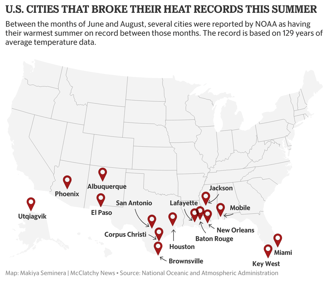
Yet, we are routinely told through media reports that the latest record warmth recorded in some of our cities shows how serious the global warming problem has become. For example, as shown in this graphic from the Miami Herald, the summer of 2023 experienced some record warmth in cities across the South.
Of course, conflating the urban heat island with global warming is a necessary component of such reporting, as the news report dutifully adds,
“Prominent scientific institutions around the globe including the National Oceanic and Atmospheric Administration agree that the warming is caused mainly by human-caused greenhouse gas emissions, NASA said.”
See how that works? A city has record warmth, so it must be due to global warming caused by burning fossil fuels. To be fair, not all the blame is always placed at the feet of Climate Change. For example, this 2014 article specifically discussed the role of the urban heat island in Phoenix weather.
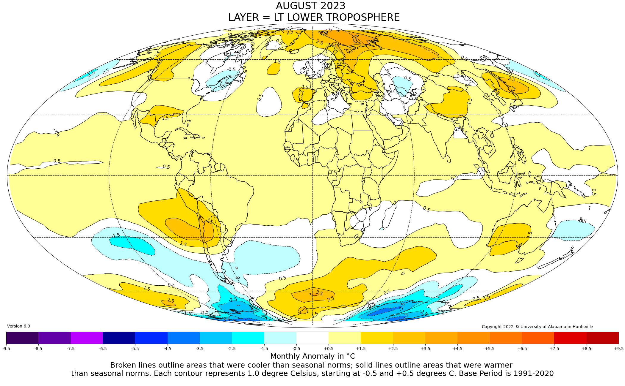
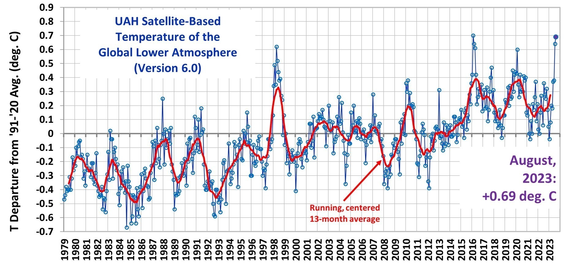
Now, it is true that the southern U.S. had an unusually hot summer. Even our (UAH) satellite-based temperature product for the lower atmosphere showed this warmth in August:
In my last blog post, I showed our urbanization-adjusted average summer temperatures (based upon NOAA homogenized GHCN surface air temperatures) across all available stations in the Lower 48 states, and the result was that summer of 2023 was the 13th warmest (see Fig. 3 here) since records began (but with very few stations) in 1895.
But what role does climate change have in these records at selected cities? Most of what we hear through the media comes from urban reporting stations, or at least airports serving major urban areas.
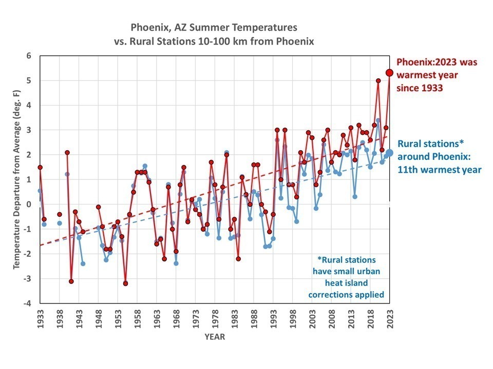
The Summer of 2023: Phoenix versus Surrounding Stations
If the record hot summer in Phoenix is due to global warming, then it should show up at weather stations surrounding Phoenix, right? As part of our research project where we are quantifying the average urban heat island effect and its growth over time as a function of population density, I looked at the official NOAA GHCN monthly surface temperature data at Phoenix Sky Harbor Airport (red curve in the following graph) versus at all rural stations (0 to 100 persons per sq. km) within 10 to 100 km of Phoenix (blue curve). I also applied a small urbanization adjustment correction at the rural (or nearly-rural) stations based upon their individual histories of population growth.
The result? The summer of 2023 was only the 11th warmest summer on record.
So, we see that the urban heat island effect was the dominant cause of the summer of 2023 being a record warm year in Phoenix. The “vote” from surrounding rural and nearly-rural stations was that it was only the 11th warmest year. As a side note, the difference between the red and blue curves indicate a jump in Phoenix Sky Harbor temperatures of about 0.7 deg. F around 1988. This could be due to a weather station move, but I have not investigated it.
“But”, you might protest, “even the rural stations still show a strong warming trend”. Well, that is partly because I have used only “homogenized” temperature data, which NOAA has already adjusted to some extent leading to all nearby station temperature trends being more or less equal to one another. I’m still trying to determine if I can use the “raw” data to make such comparisons, since there are other data adjustments made in NOAA’s homogenization of the data that I’m not privy to.
Another thing to notice is that media reports will repeat NOAA’s claim that these new high temperature records are based upon data extending back to 1895. In general, this is not true. Most of these station records don’t go back nearly that far. For the Phoenix Sky Harbor location, the data started in 1933. A few of the other “record hot cities” start dates I’ve looked at so far are Miami, FL (started in 1948), Houston, TX (1931), and Mobile, AL (1948).
The bottom line is that there are unsupportable conclusions being drawn about the supposed role of climate change in record high temperatures being reported at some cities. Cities are hotter than their rural surroundings, and increasingly so, with or without climate change.
We are now getting close to finalizing our methodology for computing the urban heat island (UHI) effect as a function of population density, and will be submitting our first paper for publication in the next few weeks. I’ve settled on using the CONUS (Lower 48) U.S. region as a demonstration since that is where the most dense network of weather stations is. We are using NOAA’s V4 of the GHCN monthly dataset.
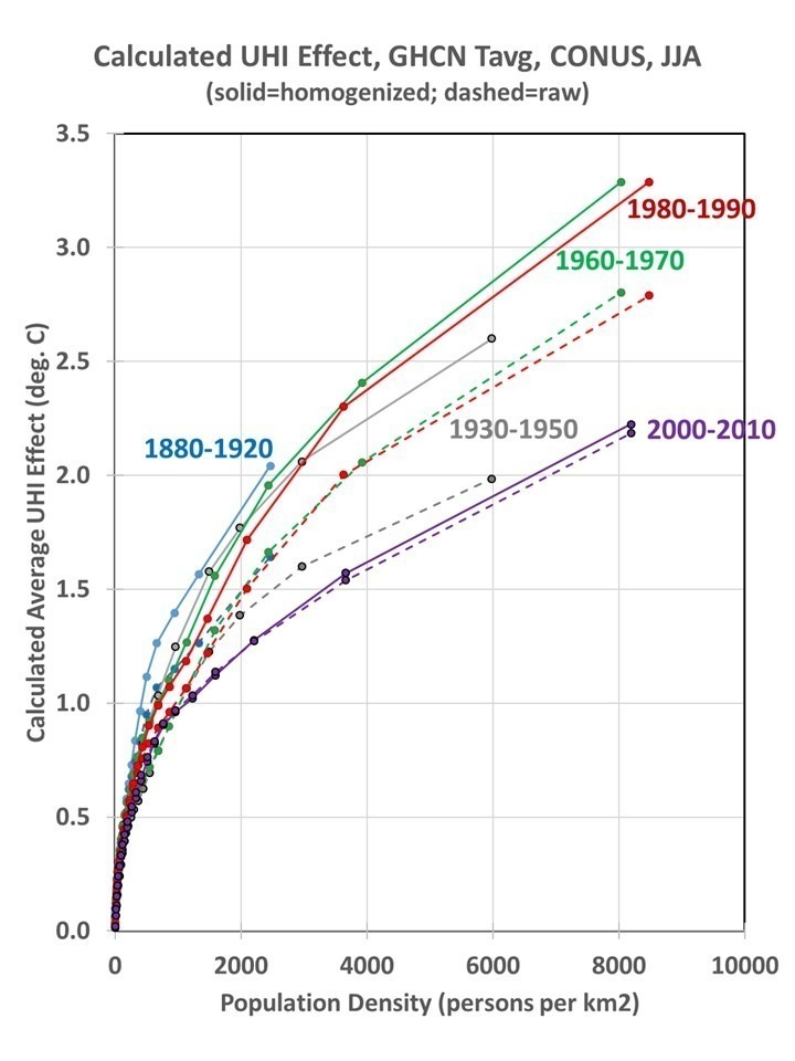
I’ve previously described the methodology, where I use many thousands of closely-spaced station pairs to compute how temperature between stations change with population density at 10×10 km resolution. This is done for 22 classes of 2-station average population density, and the resulting cumulative UHI curves are shown in Fig. 1.
Fig. 1. Cumulative urban heat island effect in different multidecadal periods for the contiguous U.S. (CONUS), June/July/August, for GHCN monthly average ([Tmax+Tmin/2]) temperatures calculated from regression of station-pair differences in temperature vs. population density in 22 classes of 2-station average population density. The number of station pairs used to compute these relationships ranges from 210,000 during 1880-1920 to 480,000 during 2000-2010.
It is interesting that the spatial (inter-station temperature difference) UHI effect is always stronger in the homogenized GHCN data than in the raw version of those data in Fig. 1. The very fact that there is a strong urban warming signal in the homogenized data necessitates that there must be a UHI impact on trends in those data. This is because the urban stations have grown substantially in the last 130 years. A recent paper by Katata et al. demonstrates that the homogenization technique used by NOAA does not actually correct urban station trends to look like rural station trends. It does breakpoint analysis which ends up adjusting some stations to look like their neighbors, whether urban or rural. To the extend that spurious warming from UHI is gradual through time, it “looks like” global warming and will not be removed through NOAA’s homogenization procedure. And since all classes of station (rural to urban) have undergone average population growth in the last 130 years, one cannot even assume that rural temperature trends are unaffected by UHI (see Fig. 2).
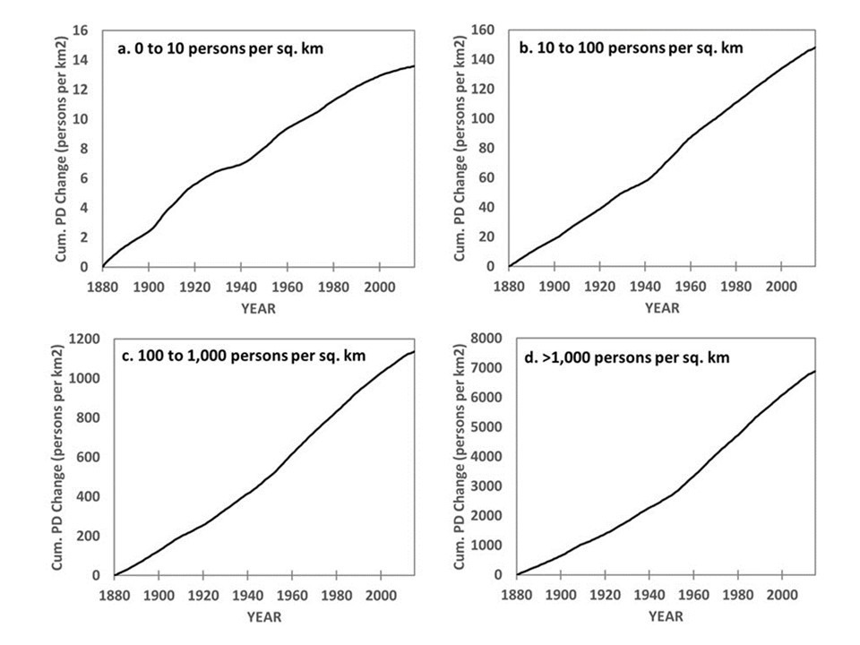
Fig. 2. Cumulative growth in population density (PD) 1880-2015 at temperature monitoring stations in four classes of initial station urbanization, calculated by summing the average year-on-year increases in HYDE3.2 dataset population density at individual GHCN stations having at least two years of record in the 20°N to 80°N latitude band, for initial station PD of a 0 to 10, b 10 to 100, c 100 to 1,000, and d greater than 1,000 persons per sq. km initial station population density.
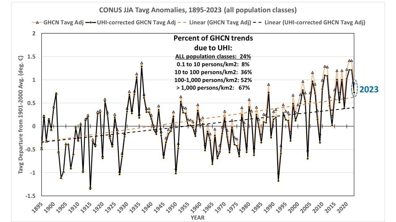
The regression estimates of change in temperature with population density (dT/dPD) used to construct the curves in Fig. 1 were used at each individual station in the U.S. and applied to the history of population density between 1895 and 2023. This produces a UHI estimate for each station over time. If I compute the area-average GHCN yearly summertime temperature anomalies and subtract out the UHI effect, I get a UHI-corrected estimate of how temperatures have changed without the UHI effect (Fig. 3).
Fig. 3. Lower-48 (CONUS) summertime U.S. temperature variations, 1895-2023, computed from GHCN “adj” (homogenized) data, versus those data adjusted for the urban heat island warming estimated from population density data.
The data in Fig. 3 are from my 1 deg latitude/longitude binning of station data, and then area-averaged. This method of area averaging for CONUS produces results extremely close to those produced at the NCDC “Climate at a Glance” website (correlation = 0.996), which uses a high resolution (5 km) grid averaged to the 344 U.S. climate divisions then averaged to the 48 states then area averaged to provide a CONUS estimate.
UHI Warming at Suburban/Urban Stations is Large
The UHI influence averaged across all stations is modest: 24% of the trend, 1895-2023. This is because the U.S. thermometer network used in Version 4 of GHCN is dominated by rural stations.
But for the average “suburban” (100-1,000 persons per sq. km) station, UHI is 52% of the calculated temperature trend, and 67% of the urban station trend (>1,000 persons per sq. km). This means warming has been exaggerated by at least a factor of 2 (100%).
This also means that media reports of record high temperatures in cities must be considered suspect, since essentially all those cities have grown substantially over the last 100+ years, and so has their urban heat island.
The Version 6 global average lower tropospheric temperature (LT) anomaly for August 2023 was +0.69 deg. C departure from the 1991-2020 mean. This is a little above the July 2023 anomaly of +0.64 deg. C.
The linear warming trend since January, 1979 now stands at +0.14 C/decade (+0.12 C/decade over the global-averaged oceans, and +0.19 C/decade over global-averaged land).
Various regional LT departures from the 30-year (1991-2020) average for the last 20 months are:
YEAR
MO
GLOBE
NHEM.
SHEM.
TROPIC
USA48
ARCTIC
AUST
2022
Jan
+0.03
+0.06
-0.00
-0.23
-0.12
+0.68
+0.10
2022
Feb
-0.00
+0.01
-0.01
-0.24
-0.04
-0.30
-0.50
2022
Mar
+0.15
+0.28
+0.03
-0.07
+0.22
+0.74
+0.02
2022
Apr
+0.27
+0.35
+0.18
-0.04
-0.25
+0.45
+0.61
2022
May
+0.17
+0.25
+0.10
+0.01
+0.60
+0.23
+0.20
2022
Jun
+0.06
+0.08
+0.05
-0.36
+0.46
+0.33
+0.11
2022
Jul
+0.36
+0.37
+0.35
+0.13
+0.84
+0.56
+0.65
2022
Aug
+0.28
+0.32
+0.24
-0.03
+0.60
+0.50
-0.00
2022
Sep
+0.24
+0.43
+0.06
+0.03
+0.88
+0.69
-0.28
2022
Oct
+0.32
+0.43
+0.21
+0.04
+0.16
+0.93
+0.04
2022
Nov
+0.17
+0.21
+0.13
-0.16
-0.51
+0.51
-0.56
2022
Dec
+0.05
+0.13
-0.03
-0.35
-0.21
+0.80
-0.38
2023
Jan
-0.04
+0.05
-0.14
-0.38
+0.12
-0.12
-0.50
2023
Feb
+0.08
+0.17
0.00
-0.11
+0.68
-0.24
-0.12
2023
Mar
+0.20
+0.24
+0.16
-0.13
-1.44
+0.17
+0.40
2023
Apr
+0.18
+0.11
+0.25
-0.03
-0.38
+0.53
+0.21
2023
May
+0.37
+0.30
+0.44
+0.39
+0.57
+0.66
-0.09
2023
June
+0.38
+0.47
+0.29
+0.55
-0.35
+0.45
+0.06
2023
July
+0.64
+0.73
+0.56
+0.87
+0.53
+0.91
+1.43
2023
Aug
+0.69
+0.88
+0.51
+0.86
+0.94
+1.54
+1.25
The full UAH Global Temperature Report, along with the LT global gridpoint anomaly image for August, 2023 and a more detailed analysis by John Christy, should be available within the next several days here.
Martha Stewart with her “iceberg” cocktail and the chunk of ice it presumably came from. (Martha Stewart/Instagram)
Martha Stewart, the American home-and-hospitality retail businesswoman, television personality and writer, has been on a cruise around Greenland, where she had a chunk of ice (presumably calved from the Greenland ice sheet) brought aboard to provide ice for adult beverages.
Cue the climate alarmists, who considered such an action to be tone deaf regarding the seriousness of the climate crisis.
What, you might ask, does fishing a chunk of ice out of the ocean next to the Greenland ice cap have to do with the “climate crisis”?
Well, in some people’s minds (I know because I’ve met a few of them), ice calving off of the Greenland ice sheet is due to global warming.
Wrong.
The Antarctic and Greenland ice sheets are locations which are so cold for so much of the year, with enough snowfall, that come summer not all of the snowfall melts. This leads to a net accumulation of ice over the centuries and millennia. That’s what causes a “glacier” to form.
As the ice sheet deepens over the centuries, gravity starts to make the ice flow downhill, like very thick molasses. It then breaks off when it reaches the coast, floating away, and melting.
Everything I described above has nothing to do with global warming. Most scientists believe it has been going on for millions of years.
So, along comes Martha Stewart, at 82 years old just trying to enjoy life, and she gets global backlash for plucking a chunk of ice out of the ocean to cool her drink down.
What are they teaching kids in school these days???
One of the most fundamental requirements of any physics-based model of climate change is that it must conserve mass and energy. This is partly why I (along with Danny Braswell and John Christy) have been using simple 1-dimensional climate models that have simplified calculations and where conservation is not a problem.
Changes in the global energy budget associated with increasing atmospheric CO2 are small, roughly 1% of the average radiative energy fluxes in and out of the climate system. So, you would think that climate models are sufficiently carefully constructed so that, without any global radiative energy imbalance imposed on them (no “external forcing”), that they would not produce any temperature change.
It turns out, this isn’t true.
Back in 2014 our 1D model paper showed evidence that CMIP3 models don’t conserve energy, as evidenced by the wide range of deep-ocean warming (and even cooling) that occurred in those models despite the imposed positive energy imbalance the models were forced with to mimic the effects of increasing atmospheric CO2.
Now, I just stumbled upon a paper from 2021 (Irving et al., A Mass and Energy Conservation Analysis of Drift in the CMIP6 Ensemble) which describes significant problems in the latest (CMIP5 and CMIP6) models regarding not only energy conservation in the ocean but also at the top-of-atmosphere (TOA, thus affecting global warming rates) and even the water vapor budget of the atmosphere (which represents the largest component of the global greenhouse effect).
These represent potentially serious problems when it comes to our reliance on climate models to guide energy policy. It boggles my mind that conservation of mass and energy were not requirements of all models before their results were released decades ago.
One possible source of problems are the model “numerics”… the mathematical formulas (often “finite-difference” formulas) used to compute changes in all quantities between gridpoints in the horizontal, levels in the vertical, and from one time step to the next. Miniscule errors in these calculations can accumulate over time, especially if physically impossible negative mass values are set to zero, causing “leakage” of mass. We don’t worry about such things in weather forecast models that are run for only days or weeks. But climate models are run for decades or hundreds of years of model time, and tiny errors (if they don’t average out to zero) can accumulate over time.
The 2021 paper describes one of the CMIP6 models where one of the surface energy flux calculations was found to have missing terms (essentially, a programming error). When that was found and corrected, the spurious ocean temperature drift was removed. The authors suggest that, given the number of models (over 30 now) and number of model processes being involved, it would take a huge effort to track down and correct these model deficiencies.
I will close with some quotes from the 2021 J. of Climate paper in question.
“Our analysis suggests that when it comes to globally integrated OHC (ocean heat content), there has been little improvement from CMIP5 to CMIP6 (fewer outliers, but a similar ensemble median magnitude). This indicates that model drift still represents a nonnegligible fraction of historical forced trends in global, depth-integrated quantities…”
“We find that drift in OHC is typically much smaller than in time-integrated netTOA, indicating a leakage of energy in the simulated climate system. Most of this energy leakage occurs somewhere between the TOA and ocean surface and has improved (i.e., it has a reduced ensemble median magnitude) from CMIP5 to CMIP6 due to reduced drift in time-integrated netTOA. To put these drifts and leaks into perspective, the time-integrated netTOA and systemwide energy leakage approaches or exceeds the estimated current planetary imbalance for a number of models.“
“While drift in the global mass of atmospheric water vapor is negligible relative to estimated current trends, the drift in time-integrated moisture flux into the atmosphere (i.e., evaporation minus precipitation) and the consequent nonclosure of the atmospheric moisture budget is relatively large (and worse for CMIP6), approaching/exceeding the magnitude of current trends for many models.”
This is to remind folks about commenting controls here that might very well impact YOU…
I have quite a few banned terms that will get your comment ignored. These are meant to minimize bullying, although your use of such terms might not involve bullying at all.
Comments posted with an unrecognized name or email address will go to moderation, and depending upon how busy I am, I might not get to it for days. This means if you fat-finger either your name or your e-mail address (or, like me, accidentally include my middle name), the comment goes to moderation. Yes, I just had to approve my own comment.

 Home/Blog