Virginia O’Hanlon, a real girl, wrote a real letter, to Dr. Roy.
Dear Dr. Roy:
I am 8 years old. Some of my little friends say there is no Climate Crisis. My Papa says, “If you see it in Dr. Roy’s climate blog, it is so.”
“Please tell me the truth. Is there a Climate Crisis?“
Virginia, your little friends are wrong. They have been affected by the skepticism of a skeptical age. They do not believe except they see. They think that nothing can be which is not comprehensible by their little minds. All minds, Virginia, whether they be men’s or women’s or children’s or ze’s or transgender’s, are little. In this great universe of ours humans are mere insects, ants, in their intellect, as compared with the boundless world about him/her/they/them, as measured by the intelligence capable of grasping the whole truth and knowledge.
Yes, Virginia, there is a Climate Crisis. It exists as certainly as taxation and death and congressional favors and subsidies exist, and you know that they abound and give to some people’s life its highest riches! Alas! How dreary would be the world if there were no Climate Crisis! It would be as dreary as if there were no poor people. There would be no special favors, no bird-chopping windmills, no Teslas to give wealthy people a reason to exist! We should have no enjoyment, except in sense and sight. The eternal light with which affluence fills the world would be extinguished.
Not believe in the Climate Crisis! You might as well not believe in fairies! You might get your papa to hire persons to watch all the private jets on Earth Day to catch Al Gore, but even if they did not see Al Gore, what would that prove? Nobody sees Al Gore, but that is no sign that there is no Al Gore. The most real things in the world are those that neither conservatives nor Trumpers can see. Did you ever see Greta Thunberg dancing on the lawn? Of course not, but that’s no proof that she was not there. Nobody can conceive or imagine all the wonders there are unseen and unseeable in the world.
You tear apart the baby’s rattle and see what makes the noise inside, but there is a veil covering the unseen world which not the strongest man/woman/person, nor even the united strength of all the strongest men/women/persons that ever lived, could tear apart. Only faith, fancy, poetry, love, romance can push aside that curtain and view and picture the supernal beauty and glory beyond mere reality!
Is it all real? Ah, Virginia, in all this world there is nothing else real and abiding.
No Climate Crisis! Thank Gaia It lives and It lives forever! A thousand years from now, Virginia, nay 10 times 10 thousand years from now, It will continue to put fear into your heart!
It has been a while since I have posted progress on our DOE-funded research into the Urban Heat Island (UHI) effect in the GHCN station temperatures used to monitor land-based global warming. It should be remembered that everything I post on this subject is (as is usually the case) a work in progress.
What I am addressing is the existence of localized long-term warming associated with population increases which are over-and-above the large-scale warming due to humanity’s greenhouse gas emissions or nature. These urban-influenced changes are very localized, and yet they influence large-scale area averages and make the land areas look like they are warming faster than they really are. The problem is pervasive because virtually all thermometer locations are where people live, and since the 1800s even most rural locations have experienced population growth.
The bottom line is that there are UHI-based trend (warming) effects in the GHCN station temperatures; the only question is, how much have they affected reported temperature trends? Most previously published research on the subject has suggested the effects are small (Hausfather et al., 2013; Wickham et al., 2013; Hansen et al., 2010; Parker, 2010; Jones et al., 2008; Parker, 2006; Peterson & Owen, 2005; Peterson, 2003; Peterson et al., 1999; Gallo et al., 1999; Karl et al., 1988). As a result, you will find most who defend the “climate crisis” narrative will refer to one or more of those studies as showing the “science is settled”, and that GHCN-based land warming estimates are largely free of UHI warming effects.
I have argued that those studies involved methodologies that were not very good. Identifying the UHI effect is difficult. I’ve come up with a novel way of quantifying the average UHI effect, even at stations that would be considered “rural” with presumably no UHI effect. We have a paper in review in Nature Scientific Reports describing the methodology (my blog description of the methodology is here), but I have no idea what chance it has of being published.
I will get right to the results as they stand today. What I show below are for the all-station average of GHCN stations; they are NOT area averages, which are what is needed for climate monitoring. They just show how much the average GHCN station is influenced by spurious UHI warming. The stations cover the latitude bands from 20N to 80N, but are dominated by U.S. stations (about 80% of the total) due to the huge numbers of stations we have in this country.
The plots are for 4 classes of initial GHCN station population density (the first year those stations started operating) during the warm season (May/June/July), and give the cumulative year-on-year temperature increase averaged across all stations in each of the four initial station population classes. The adjusted (homogenized) GHCN station temperature changes are in green, and my calculated UHI effect is in red.
For the “wilderness to very rural” class (upper-left panel), the UHI effect on temperature trends turns out to be quite small, contrary to what I have recently argued. Since many of these low-population stations are at high northern latitudes, this would suggest that the UHI effects on the large warming trends reported there are small.
But as we progress to higher population stations, we find that UHI warming effect becomes larger. In the highest population density class (“suburban to urban”, lower-right panel) my calculation of UHI warming is virtually the entire GHCN-reported warming signal since 1880, but only a small part of the reported warming since 1980.
If these results stand, what will they mean for reported land warming trends?
I’m guessing that the UHI effect on area-average trends since 1980 (the period of most rapid temperature rise) will turn out to be relatively small. But before 1980 it looks like the UHI effect on GHCN temperatures could be substantial. This would change the nature of the global warming narrative, with little land-based warming for the first 100 years starting in 1880.
What could change these results? First, I do not account for increases in the UHI effect due to per-capita increases in infrastructure and energy use (buildings, vehicles, parking lots, electricity use and resulting waste heat). I assume the UHI effect is only a function of population density (partly because we have global gridpoint data on population extending back into the 1800s). Thus, my UHI warming estimates might be a little low for stations where population stopped growing but spurious sources of heat continued to increase, such as in Vienna, Austria (R. Bohm, Climatic Change, 1998).
In any event, I feel like I am finally converging on useful results. One aspect of this is that the record high temperatures now being reported in major population centers in the southwest U.S. and southern Europe need to be revisited based upon the very large urban heat island temperature increases seen in the lower-right panel of the above plot at suburban-to-urban stations.
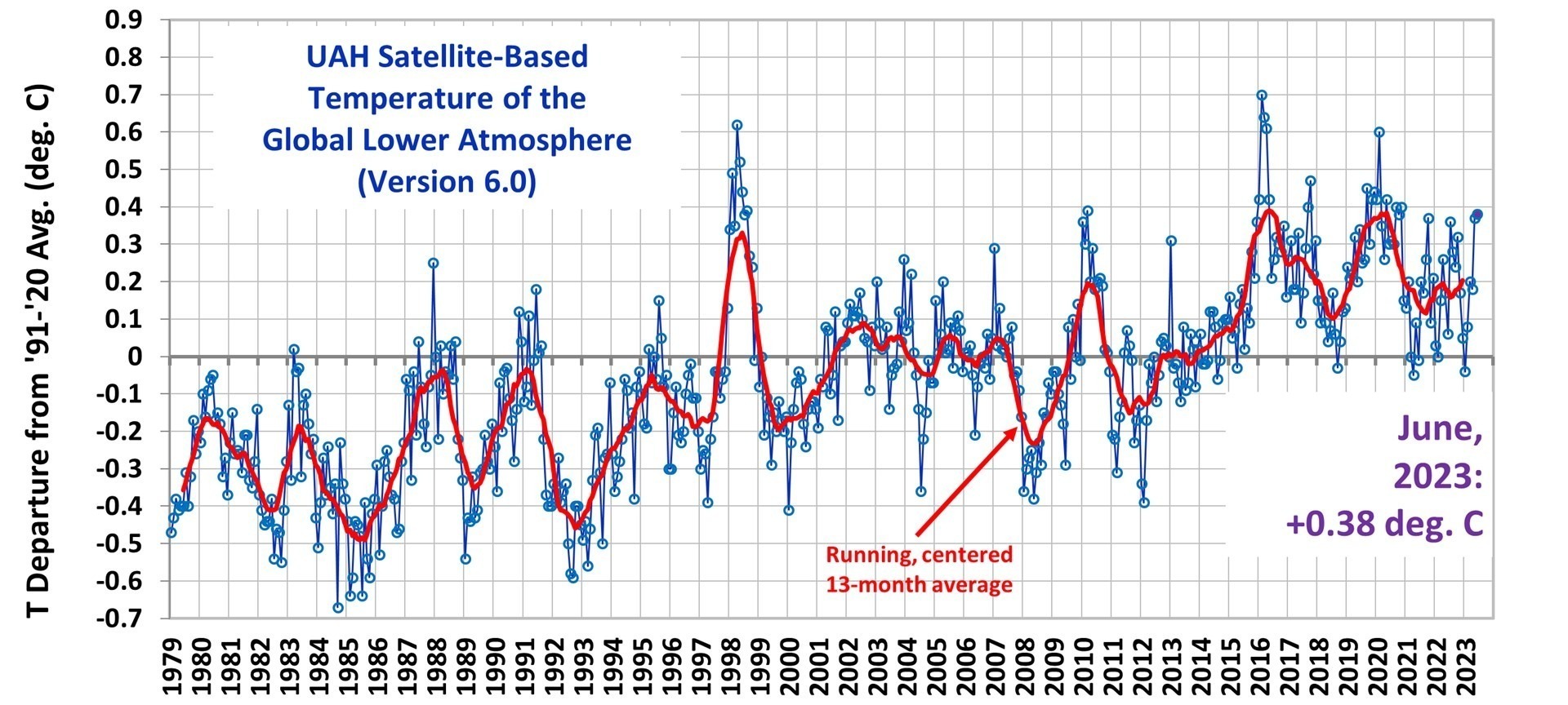
The Version 6 global average lower tropospheric temperature (LT) anomaly for June 2023 was +0.38 deg. C departure from the 1991-2020 mean. This is statistically unchanged from the May 2023 anomaly of +0.37 deg. C.
The linear warming trend since January, 1979 remains at +0.13 C/decade (+0.12 C/decade over the global-averaged oceans, and +0.18 C/decade over global-averaged land).
Various regional LT departures from the 30-year (1991-2020) average for the last 18 months are:
YEAR
MO
GLOBE
NHEM.
SHEM.
TROPIC
USA48
ARCTIC
AUST
2022
Jan
+0.03
+0.06
-0.00
-0.23
-0.12
+0.68
+0.10
2022
Feb
-0.00
+0.01
-0.01
-0.24
-0.04
-0.30
-0.50
2022
Mar
+0.15
+0.28
+0.03
-0.07
+0.22
+0.74
+0.02
2022
Apr
+0.27
+0.35
+0.18
-0.04
-0.25
+0.45
+0.61
2022
May
+0.17
+0.25
+0.10
+0.01
+0.60
+0.23
+0.20
2022
Jun
+0.06
+0.08
+0.05
-0.36
+0.46
+0.33
+0.11
2022
Jul
+0.36
+0.37
+0.35
+0.13
+0.84
+0.56
+0.65
2022
Aug
+0.28
+0.32
+0.24
-0.03
+0.60
+0.50
-0.00
2022
Sep
+0.24
+0.43
+0.06
+0.03
+0.88
+0.69
-0.28
2022
Oct
+0.32
+0.43
+0.21
+0.04
+0.16
+0.93
+0.04
2022
Nov
+0.17
+0.21
+0.13
-0.16
-0.51
+0.51
-0.56
2022
Dec
+0.05
+0.13
-0.03
-0.35
-0.21
+0.80
-0.38
2023
Jan
-0.04
+0.05
-0.14
-0.38
+0.12
-0.12
-0.50
2023
Feb
+0.08
+0.17
0.00
-0.11
+0.68
-0.24
-0.12
2023
Mar
+0.20
+0.24
+0.16
-0.13
-1.44
+0.17
+0.40
2023
Apr
+0.18
+0.11
+0.25
-0.03
-0.38
+0.53
+0.21
2023
May
+0.37
+0.30
+0.44
+0.39
+0.57
+0.66
-0.09
2023
June
+0.38
+0.47
+0.29
+0.55
-0.36
+0.45
+0.06
The full UAH Global Temperature Report, along with the LT global gridpoint anomaly image for June, 2023 should be available within the next several days here.
The global and regional monthly anomalies for the various atmospheric layers we monitor should be available in the next few days at the following locations:
For the last decade I’ve been providing long-range U.S. Corn Belt forecasts to a company that monitors and forecasts global grain production and market forces. My continuing theme has been, “don’t believe gloom and doom forecasts for the future of the U.S. Corn Belt”.
The climate models relied upon by the United Nations Intergovernmental Panel on Climate Change (IPCC) are known to overestimate warming compared to observations. Depending upon the region (global? U.S.?), temperature metric (surface? deep ocean? lower atmosphere?) and time period (last 150 years? last 50 years?) the average model over-estimate of warming can be either large or small.
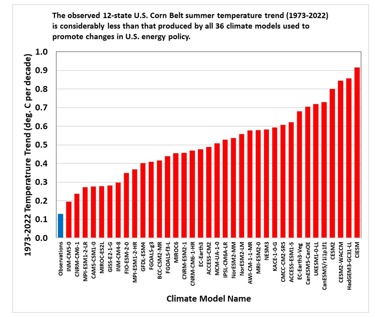
But nowhere is it more dramatic than in the U.S. Corn Belt during the growing season (June, July, August).
The following plot shows the 50-year area-averaged temperature trend during 1973-2022 for the 12-state corn belt as observed with the official NOAA homogenized surface temperature product (blue bar) versus the same metric from 36 CMIP6 climate models (red bars, SSP245 emissions scenario, output here).
This kind of sanity check is needed because efforts to change U.S. energy policy are based upon climate model predictions, which are often wildly out of line with observed history. This is why environmentalists emphasize models (which can show dramatic change) over actual observations (which are usually unremarkable).
The paper starts out summarizing the supposed importance of their work, which is worth quoting in its entirety (bold emphasis added):
“Differences between tropospheric and lower stratospheric temperature trends have long been recognized as a “fingerprint” of human effects on climate. This fingerprint, however, neglected information from the mid to upper stratosphere, 25 to 50 km above the Earth’s surface. Including this information improves the detectability of a human fingerprint by a factor of five. Enhanced detectability occurs because the mid to upper stratosphere has a large cooling signal from human-caused CO2 increases, small noise levels of natural internal variability, and differing signal and noise patterns. Extending fingerprinting to the upper stratosphere with long temperature records and improved climate models means that it is now virtually impossible for natural causes to explain satellite-measured trends in the thermal structure of the Earth’s atmosphere.“
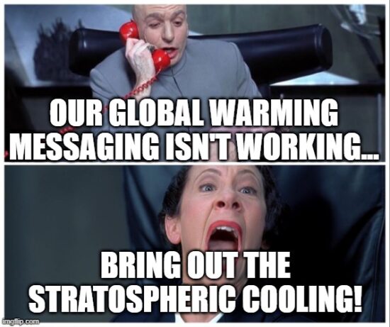
The authors are taking advantage of the public’s lack of knowledge concerning the temperature effect of increasing CO2 in the atmosphere, making it sound like stratospheric cooling is part of the fingerprint of global warming.
It isn’t. Cooling is not warming.
The researchers’ first mistake is to claim they are reporting something new. They aren’t. Observed stratospheric cooling, even in the middle and upper stratosphere, has been reported on for many years (e.g. here). Lower stratospheric cooling has been evident in our Lower Stratosphere (LS) temperature product for over 30 years (first published here). Dr. Richard Lindzen tells me he had references to stratospheric cooling in his 1964 PhD dissertation. So why haven’t we heard about this before in the news? Because it has virtually nothing to do with the subject of global warming and associated climate change.
So, why mention stratospheric cooling in the context of climate change?
Climate researchers have been searching for “human fingerprints” of climate change for decades, something measurable that cannot be reasonably explained by natural variations in the climate system.
I will agree with the authors that stratospheric cooling (especially in the mid- to upper-stratosphere) is probably the best evidence we have of a human fingerprint on global temperatures, at least up where there is very little air, where no one lives, and where there are no observable resulting impacts on weather down here where life exists. Water vapor remains an uncertainty here, because more water vapor would also cause cooling, and our understanding of natural variations in stratospheric water vapor is quite poor. But for the sake of argument, I will give the authors the benefit of the doubt and agree that most of the observed cooling is probably due to increasing CO2, which in turn is likely mostly due to burning of fossil fuels.
Infrared radiative cooling by water vapor and carbon dioxide has long been known to be the primary way the stratosphere (and even higher altitudes) lose heat energy (gained from sunlight absorption by ozone) to outer space. This cooling mechanism is part of the so-called greenhouse effect: greenhouse gases warm the lower altitudes of planetary atmospheres, and cool the higher altitudes. In fact, without the greenhouse effect, weather as we know it would not exist. The greenhouse effect is energetically analogous to adding insulation to a heated house in winter: for a given rate of energy input, the inside of the house becomes warmer, and the outside of the house becomes colder.
The stratospheric cooling effects of CO2 and water vapor was first described theoretically by Manabe and Strickler (1964). Adding more CO2 to the atmosphere enhances upper atmospheric cooling, lowering temperatures. The temperature effect up there is large, several degrees C, meaning it is easier to measure with current satellite methods, as the authors of the new study correctly point out.
But what then happens in the troposphere (where we live) in response to more CO2 is vastly more complex. Theoretically, adding more CO2 should warm the lower troposphere radiatively. This warming then gets mixed throughout the depth of the troposphere from convective overturning (basically, “weather”).
But just how much tropospheric warming will be caused by increasing CO2?
After 30 years and billions of dollars expended on the effort in research centers around the world, the latest crop of climate models (CMIP6) now disagree on the expected amount of tropospheric warming more than ever before. This is mostly because of the insufficiently understood effects of water, especially the response of clouds (the climate system’s sunshade) and precipitation processes (which limit the most abundant greenhouse gas, water vapor) to warming.
I consider it irresponsible to conflate stratospheric cooling with the global warming issue. Yes, strong cooling in the upper stratosphere is likely a fingerprint of increasing atmospheric CO2 (putatively due to fossil fuel burning), but for a variety of reasons, that is not reason to believe climate models in their predictions of tropospheric (and thus surface) warming trends. That is a very different matter, and the models themselves demonstrate they are not yet up to the task, now disagreeing with each other by a factor of three or more.
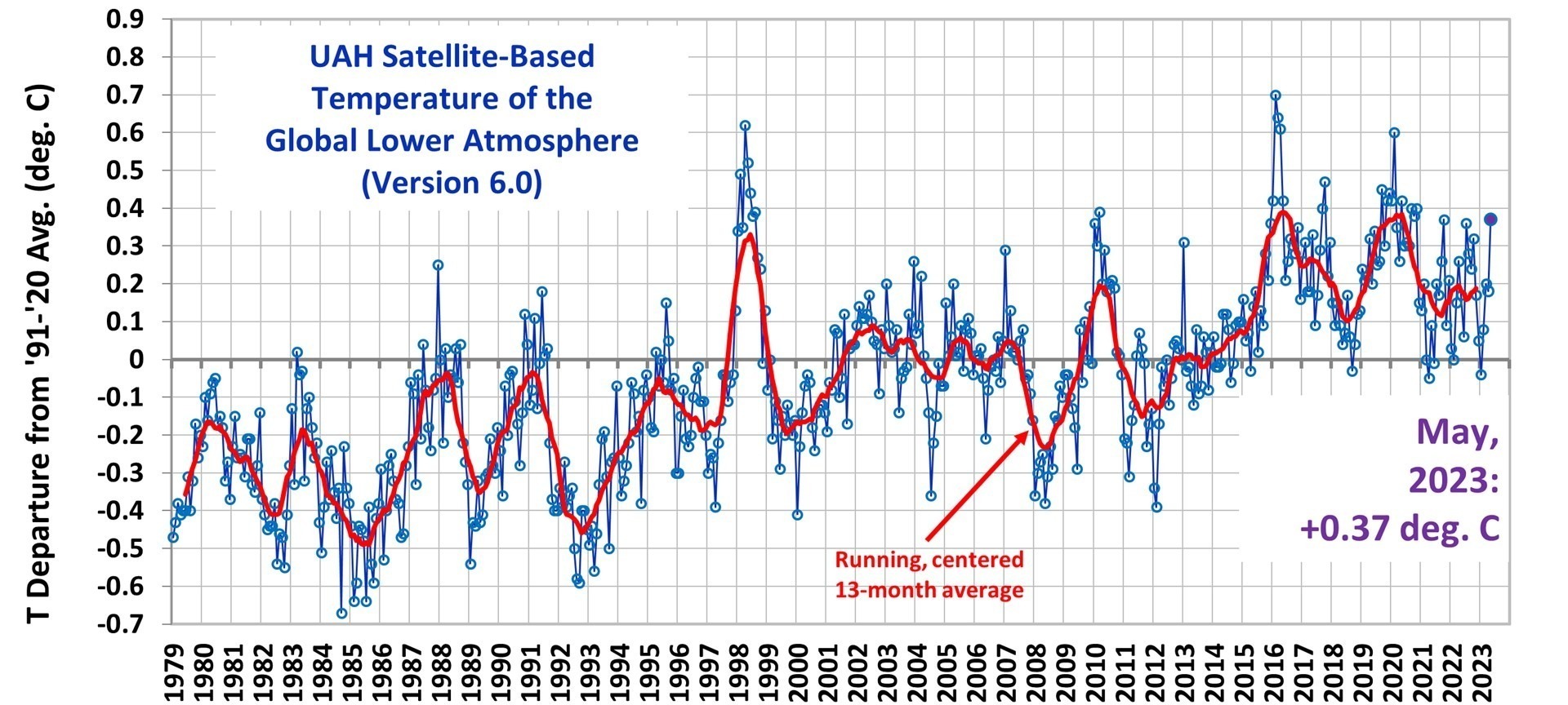
The Version 6 global average lower tropospheric temperature (LT) anomaly for May 2023 was +0.37 deg. C departure from the 1991-2020 mean. This is up from the April 2023 anomaly of +0.18 deg. C.
The linear warming trend since January, 1979 remains at +0.13 C/decade (+0.11 C/decade over the global-averaged oceans, and +0.18 C/decade over global-averaged land).
Various regional LT departures from the 30-year (1991-2020) average for the last 17 months are:
YEAR
MO
GLOBE
NHEM.
SHEM.
TROPIC
USA48
ARCTIC
AUST
2022
Jan
+0.03
+0.06
-0.00
-0.23
-0.12
+0.68
+0.10
2022
Feb
-0.00
+0.01
-0.01
-0.24
-0.04
-0.30
-0.50
2022
Mar
+0.15
+0.28
+0.03
-0.07
+0.22
+0.74
+0.02
2022
Apr
+0.27
+0.35
+0.18
-0.04
-0.25
+0.45
+0.61
2022
May
+0.17
+0.25
+0.10
+0.01
+0.60
+0.23
+0.20
2022
Jun
+0.06
+0.08
+0.05
-0.36
+0.46
+0.33
+0.11
2022
Jul
+0.36
+0.37
+0.35
+0.13
+0.84
+0.56
+0.65
2022
Aug
+0.28
+0.32
+0.24
-0.03
+0.60
+0.50
-0.00
2022
Sep
+0.24
+0.43
+0.06
+0.03
+0.88
+0.69
-0.28
2022
Oct
+0.32
+0.43
+0.21
+0.04
+0.16
+0.93
+0.04
2022
Nov
+0.17
+0.21
+0.13
-0.16
-0.51
+0.51
-0.56
2022
Dec
+0.05
+0.13
-0.03
-0.35
-0.21
+0.80
-0.38
2023
Jan
-0.04
+0.05
-0.14
-0.38
+0.12
-0.12
-0.50
2023
Feb
+0.08
+0.17
0.00
-0.11
+0.68
-0.24
-0.12
2023
Mar
+0.20
+0.24
+0.16
-0.13
-1.44
+0.17
+0.40
2023
Apr
+0.18
+0.11
+0.25
-0.03
-0.38
+0.53
+0.21
2023
May
+0.37
+0.30
+0.44
+0.39
+0.57
+0.66
-0.09
The full UAH Global Temperature Report, along with the LT global gridpoint anomaly image for May, 2023 should be available within the next several days here.
The global and regional monthly anomalies for the various atmospheric layers we monitor should be available in the next few days at the following locations:
We hear that a new El Nino forming in the Pacific Ocean is likely to push global-average temperatures to new record highs in 2023.
Setting aside the fact that we have no idea if current temperatures are warmer than during the Medieval Warm Period of ~1,000 years ago, I have to ask…
So what?
Doing something about global warming depends a lot on how much we are asked to pay to fix it. If it was cheap and practical, we would have already transitioned to renewable energy sources.
It also depends upon just how much global warming we have experienced, and whether it is enough to be concerned with. For the global oceans, the climate models enlisted to scare us in a steady stream of alarmist news reports over-predict ocean warming by a factor of 2. In America’s heartland during the summer, the discrepancy is a factor of 6(!). So, clearly, public concern is being inflated by factually incorrect information.
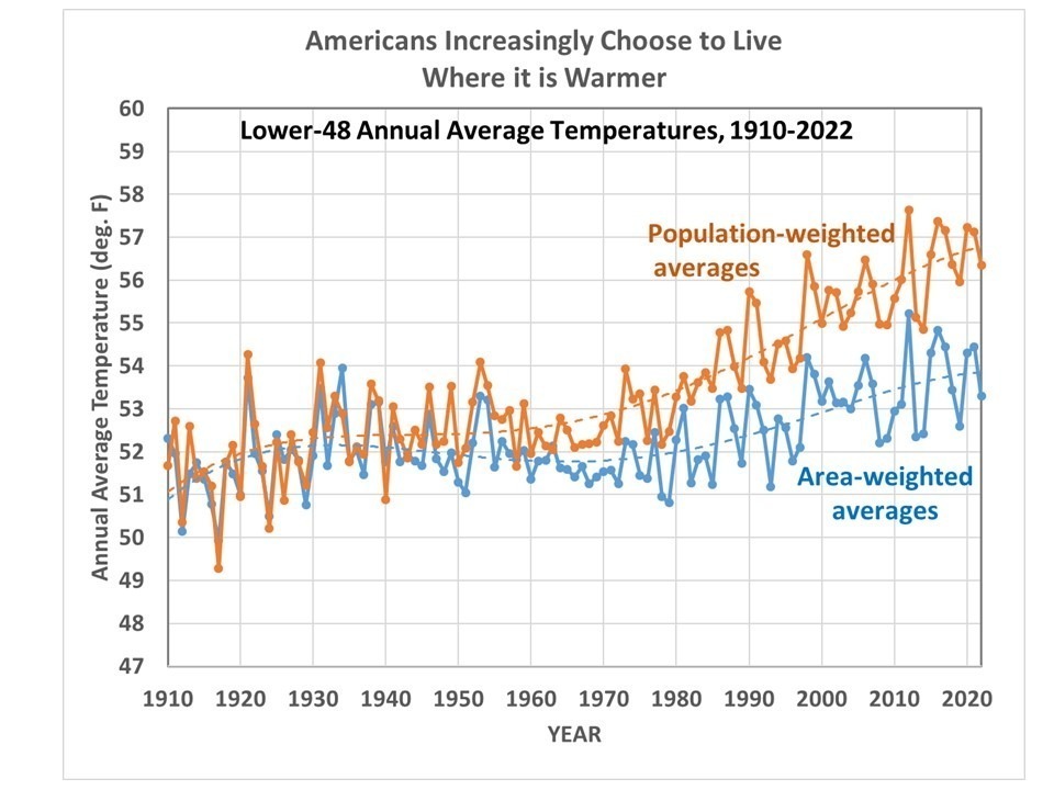
What Temperature do Americans Choose?
When it comes to life in these United States, roughly 50% of U.S. residents have at least a moderate worry about climate change and global warming. As mentioned above, I believe this is largely due to their response to what is reported by the news media, which is routinely exaggerated.
An interesting question that the late Dr. Pat Michaels asked about 25 years ago is, what temperature do Americans choose to live with? We have a large country with a wide range of climates, from frigid winters to tropical year-round, so there is considerable choice of what climate we decide to live in.
Dr. Michaels pointed out (most recently in 2013) that over the years, Americans tend to migrate to warmer climates. Some of us might claim to be concerned about global warming, but we increasingly choose to live where it’s warmer. I’ve updated those calculations to 2022, and the results are the same:
The blue curve is the usual area-averaged temperatures for the Lower 48, while the orange curve is the state population-weighted average. While the area average temperatures have warmed modestly over the last century, the temperatures where people choose to live have increased by twice that amount. (The possibility that Urban Heat Island effects have spuriously warmed these NOAA-reported temperatures is part of a research project we have been involved in).
Some might claim that the migration to states with warmer temperatures has more to do with economic opportunity than with temperature. But who creates economic opportunity? People. And where do people choose to live? Where the weather is warmer.
There’s a reason why people are flocking to Texas and Florida, and not to the Dakotas or Maine. Ultimately, it’s due to the climate. So, while some of us like to think we are Saving the Earth by buying a Tesla, our migration habits are telling a different story.
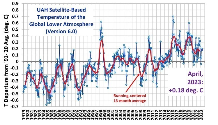
The Version 6 global average lower tropospheric temperature (LT) anomaly for April 2023 was +0.18 deg. C departure from the 1991-2020 mean. This is down slightly from the March 2023 anomaly of +0.20 deg. C.
The linear warming trend since January, 1979 remains at +0.13 C/decade (+0.11 C/decade over the global-averaged oceans, and +0.18 C/decade over global-averaged land).
Various regional LT departures from the 30-year (1991-2020) average for the last 16 months are:
YEAR
MO
GLOBE
NHEM.
SHEM.
TROPIC
USA48
ARCTIC
AUST
2022
Jan
+0.03
+0.06
-0.00
-0.23
-0.13
+0.68
+0.10
2022
Feb
-0.00
+0.01
-0.01
-0.24
-0.04
-0.30
-0.50
2022
Mar
+0.15
+0.27
+0.03
-0.07
+0.22
+0.74
+0.02
2022
Apr
+0.26
+0.35
+0.18
-0.04
-0.26
+0.45
+0.61
2022
May
+0.17
+0.25
+0.10
+0.01
+0.59
+0.23
+0.20
2022
Jun
+0.06
+0.08
+0.05
-0.36
+0.46
+0.33
+0.11
2022
Jul
+0.36
+0.37
+0.35
+0.13
+0.84
+0.55
+0.65
2022
Aug
+0.28
+0.31
+0.24
-0.03
+0.60
+0.50
-0.00
2022
Sep
+0.24
+0.43
+0.06
+0.03
+0.88
+0.69
-0.28
2022
Oct
+0.32
+0.43
+0.21
+0.04
+0.16
+0.93
+0.04
2022
Nov
+0.17
+0.21
+0.13
-0.16
-0.51
+0.51
-0.56
2022
Dec
+0.05
+0.13
-0.03
-0.35
-0.21
+0.80
-0.38
2023
Jan
-0.04
+0.05
-0.14
-0.38
+0.12
-0.12
-0.50
2023
Feb
+0.08
+0.17
0.00
-0.11
+0.68
-0.24
-0.12
2023
Mar
+0.20
+0.23
+0.16
-0.14
-1.44
+0.17
+0.40
2023
Apr
+0.18
+0.11
+0.25
-0.03
-0.38
+0.53
+0.21
The full UAH Global Temperature Report, along with the LT global gridpoint anomaly image for April, 2023 should be available within the next several days here.
The global and regional monthly anomalies for the various atmospheric layers we monitor should be available in the next few days at the following locations:
In my last post (Part IV) I showed how urbanization (as measured by population density) affects GHCN monthly-average Tmax and Tmin near-surface air temperatures during the warm season in the Northern Hemisphere. We are utilizing a technique that recognizes rural thermometer sites can experience large spurious warming with very small increases in population density, as has been known for over 50 years.
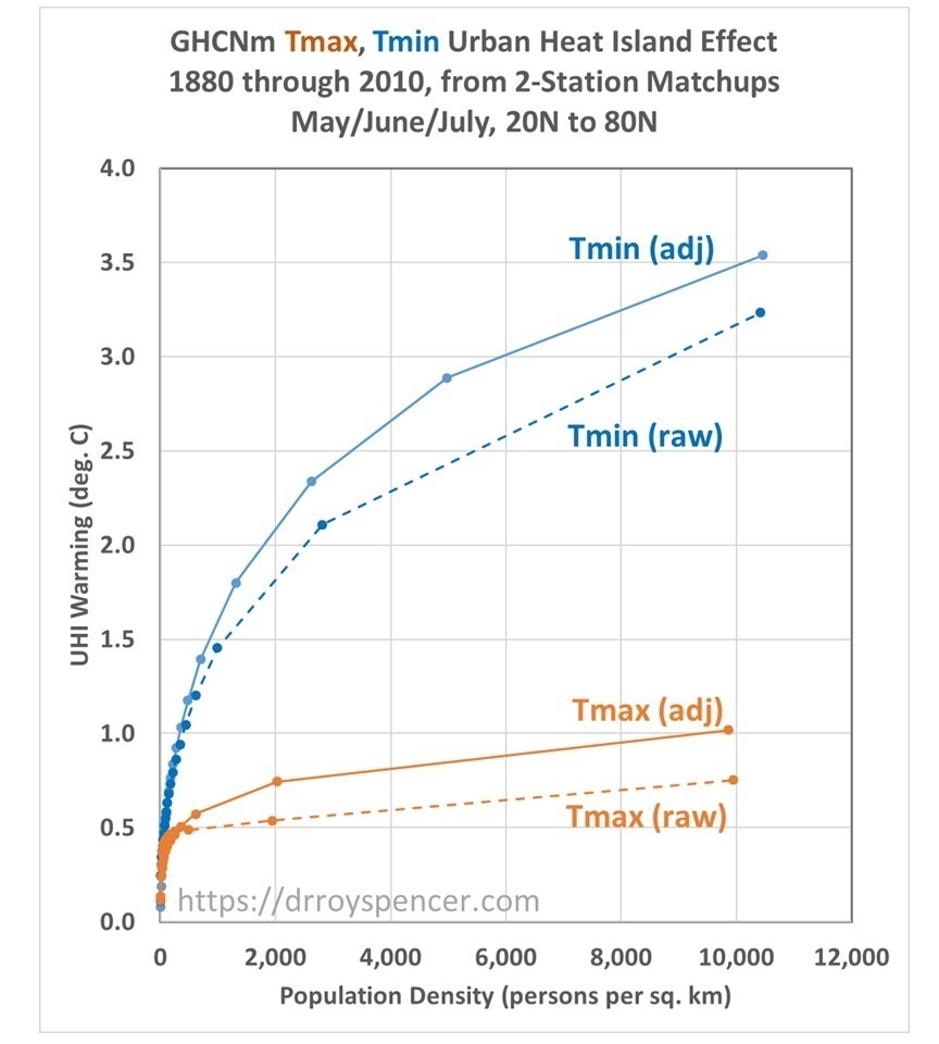
The urban heat island (UHI) effects on Tmin averaged 3.5 times as large as on Tmax, an unsurprising result and qualitatively consistent with previous studies. Also, I showed that the homogenization procedure NOAA uses to adjust the Tmax and Tmin temperatures caused greater UHI effects compared to raw (unadjusted) data, a result I cannot explain.
Again I will emphasize that these UHI warming results are based upon spatial comparisons between neighboring stations, and do not say anything quantitative about how much urbanization effects have spuriously warmed long-term temperature trends over land. That is indeed the goal of our study, but we have not reached that point in the analysis yet.
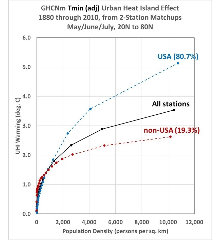
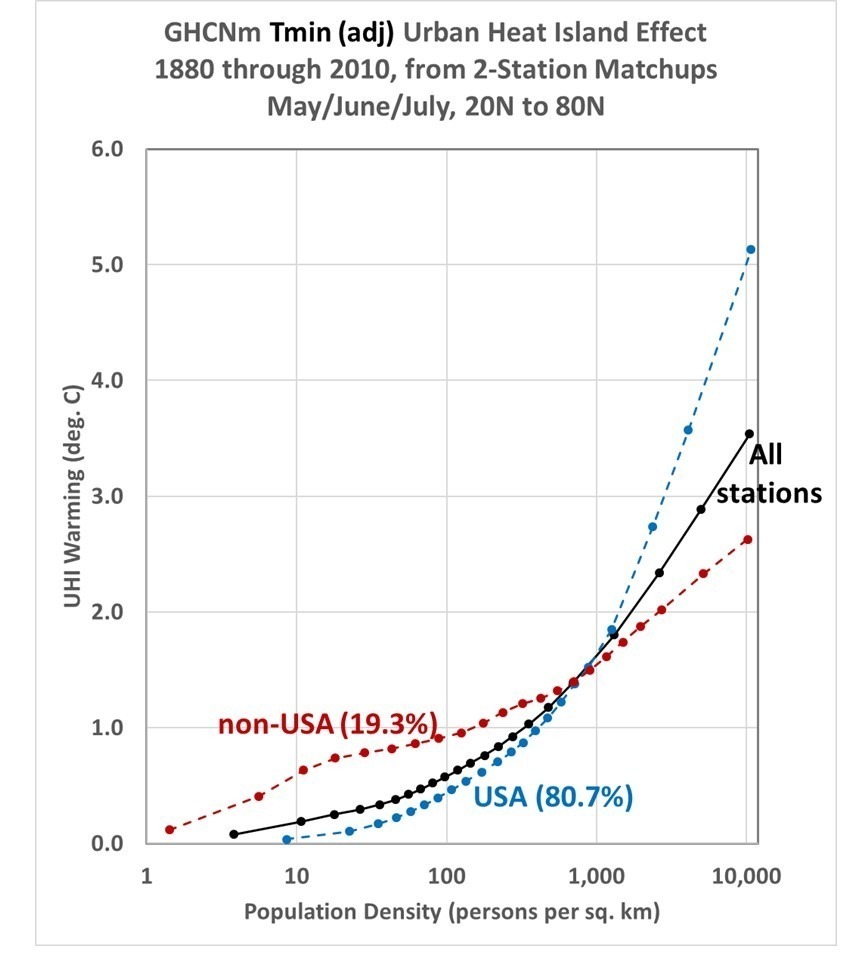
Here in Part V of my series on UHI I just want to show the difference between U.S. and non-U.S. stations, in this cased for adjusted (homogenized) Tmin data. This is shown in the following two plots, which are the same except the second plot has a logarithmic scale in population density.
The non-U.S. stations have a more rapid rise in UHI warming at very low population densities than the U.S. stations do, but less rapid warming at high population densities. Possible reasons for this include country differences in thermometer siting and differences in waste heat generation. I’m sure you can think of other possible reasons.
As can be seen most (over 80%) of the GHCN 2-station matchups come from the U.S. Other countries have considerably fewer 2-station matchups, for example Canada (7.8% of the Northern Hemisphere total), Japan (4.7%), Turkey (2.8%), South Korea (1.3%), and China (1.1%). These low totals are not necessarily due to a lack of stations, but to a lack of station pairs within 150 km and 300 m elevation of each other needed for my current method of analysis.
This is part 4 of my series on quantifying Urban Heat Island (UHI) effects on surface air temperatures as reported in the monthly GHCN datasets produced by NOAA.
In previous posts I showed results based upon monthly-average Tavg, which is the average of of daily maximum (Tmax) and minimum (Tmin) temperatures. Since late 2019, NOAA produces monthly average datasets for only Tavg, but since there are large differences in the UHI effects between Tmin and Tmax (urban warming is much larger at night than during the day, thus affecting Tmin more), John Christy wanted me to compute results for the older Tmax and Tmin datasets archived by NOAA.
As I have discussed previously, our computations of UHI are, I believe, rather novel since we do not classify stations as urban or rural. That is how most researchers have approached the problem. But as I have mentioned before, UHI warming occurs much more rapidly at very low population densities (PD) than it does at high population densities for the same population increase. As a result, a small population increase at a rural station can produce the same spurious warming as a large population increase at an urban station. This means that previous published results showing little difference between rural and urban trends did not actually demonstrate that homogenization methods actually remove UHI effects from temperature trends.
Instead of classifying stations as either rural or urban, we use regression to compute the slope of temperature-vs-population density in many sub-intervals of 2-station pair average population density, from near-zero PD to very high PD values. Then we integrate these regression slopes through the full range of population densities.
Since NOAA’s GHCN Tmax and Tmin dataset (v3) does not have nearly as many stations as their newer (v4) Tavg dataset, I have combined the 2-station matchups for May, June, and July rather than showing results for an individual month. I have used all matchups every ten years from 1880, 1890, 1900,… 2010 that are within 150 km and 300 m elevation of each other. All land stations from 20N to 80N latitude are included. I have computed results for both the unadjusted data as well as the adjusted (homogenized) data.
The results (below) show that the total UHI effect in summer for highly-populated stations averages 3.5 times as large in Tmin as it does in Tmax. Each curve is based upon approximately 300,000 monthly 2-station matchups.
The nonlinearity of the relationship is, as other investigators have found, very strong.
Note that the UHI effect shows up more strongly in the adjusted GHCN data than in the unadjusted data. I cannot explain this. It is not because of the weeding out of bad temperature data, because that only affects regression coefficients if noise is reduced in the independent variable (2-station population density differences), and not in the dependent variable (2-station temperature differences). The 2-station PD differences do not change between the raw and adjusted GHCN data.
As I have mentioned before, the above results do not tell us the extent to which GHCN temperature trends have been affected by urbanization effects. SPOILER ALERT: My preliminary work on this suggests UHI effects are rather large between 1880 and 1980 or so, then become quite small compared to observed temperature trends. But it must be remembered that here we are using population density as a proxy for UHI, which is not necessarily optimum. It is possible for UHI effects to increase as prosperity increases for a population density that remains the same.

 Home/Blog
:quality(70)/arc-anglerfish-arc2-prod-tronc.s3.amazonaws.com/public/H2EEN5AA27KWT263WRDBEOZRLM.jpg)