Home/Blog
New Record High Temperatures and a Weird Month
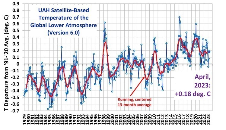
July 2023 was an unusual month, with sudden warmth and a few record or near-record high temperatures.
Since the satellite record began in 1979, July 2023 was:
- warmest July on record (global average)
- warmest absolute temperature (since July is climatologically the warmest month)
- tied with March 2016 for the 2nd warmest monthly anomaly (departure from normal for any month)
- warmest Southern Hemisphere land anomaly
- warmest July for tropical land (by a wide margin, +1.03 deg. C vs. +0.44 deg. C in 2017)
These results suggest something peculiar is going on. It’s too early for the developing El Nino in the Pacific to have much effect on the tropospheric temperature record. The Hunga Tonga sub-surface ocean volcano eruption and its “unprecedented” production of extra stratospheric water vapor could be to blame. There might be other record high temperatures regionally in the satellite data, but I don’t have time right now to investigate that.
Now, back to our regularly scheduled programming…
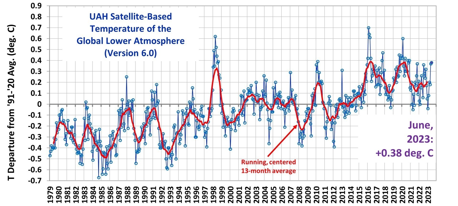
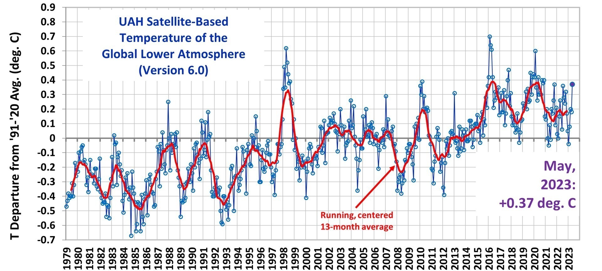
The Version 6 global average lower tropospheric temperature (LT) anomaly for July 2023 was +0.64 deg. C departure from the 1991-2020 mean. This is well above the June 2023 anomaly of +0.38 deg. C.
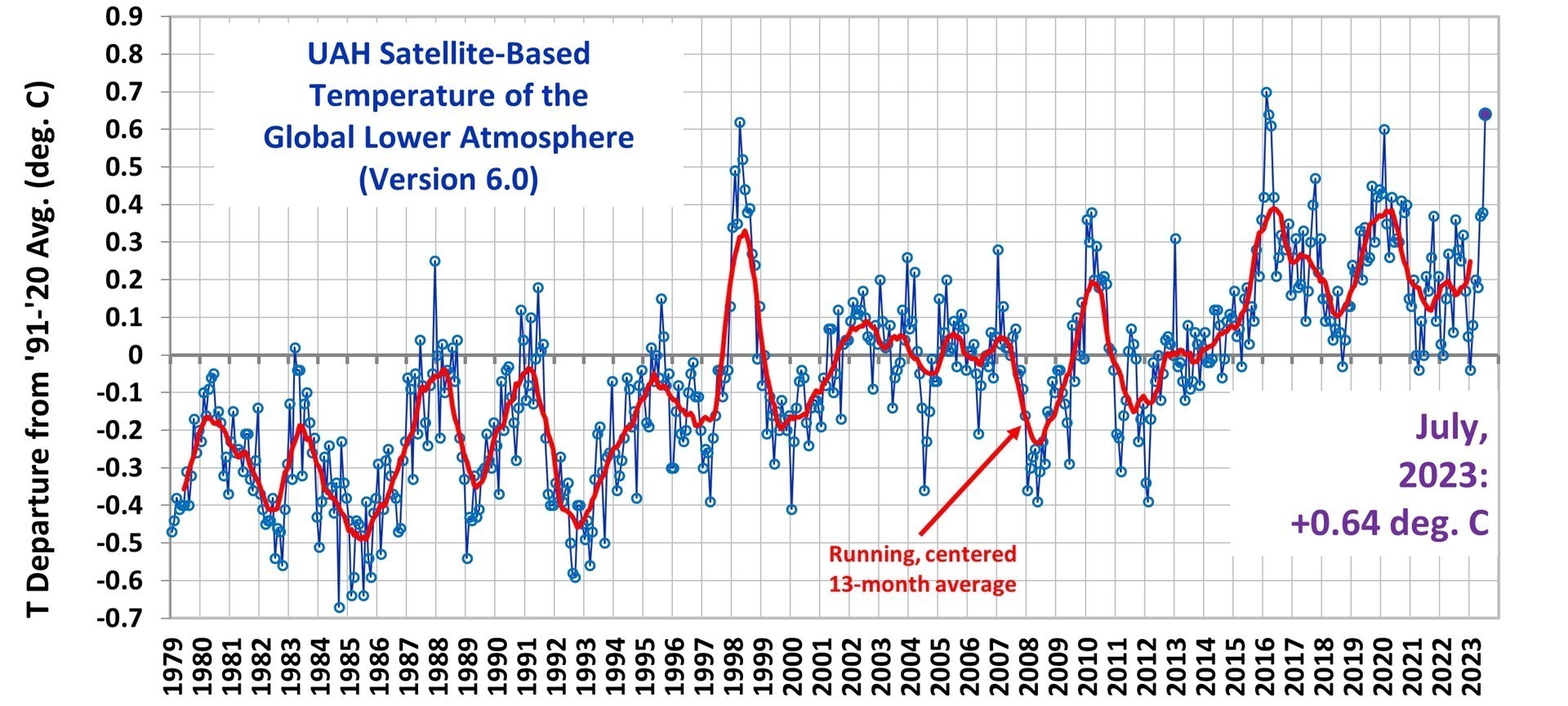
The linear warming trend since January, 1979 now stands at +0.14 C/decade (+0.12 C/decade over the global-averaged oceans, and +0.18 C/decade over global-averaged land).
Various regional LT departures from the 30-year (1991-2020) average for the last 19 months are:
| YEAR | MO | GLOBE | NHEM. | SHEM. | TROPIC | USA48 | ARCTIC | AUST |
| 2022 | Jan | +0.03 | +0.06 | -0.00 | -0.23 | -0.12 | +0.68 | +0.10 |
| 2022 | Feb | -0.00 | +0.01 | -0.01 | -0.24 | -0.04 | -0.30 | -0.50 |
| 2022 | Mar | +0.15 | +0.28 | +0.03 | -0.07 | +0.22 | +0.74 | +0.02 |
| 2022 | Apr | +0.27 | +0.35 | +0.18 | -0.04 | -0.25 | +0.45 | +0.61 |
| 2022 | May | +0.17 | +0.25 | +0.10 | +0.01 | +0.60 | +0.23 | +0.20 |
| 2022 | Jun | +0.06 | +0.08 | +0.05 | -0.36 | +0.46 | +0.33 | +0.11 |
| 2022 | Jul | +0.36 | +0.37 | +0.35 | +0.13 | +0.84 | +0.56 | +0.65 |
| 2022 | Aug | +0.28 | +0.32 | +0.24 | -0.03 | +0.60 | +0.50 | -0.00 |
| 2022 | Sep | +0.24 | +0.43 | +0.06 | +0.03 | +0.88 | +0.69 | -0.28 |
| 2022 | Oct | +0.32 | +0.43 | +0.21 | +0.04 | +0.16 | +0.93 | +0.04 |
| 2022 | Nov | +0.17 | +0.21 | +0.13 | -0.16 | -0.51 | +0.51 | -0.56 |
| 2022 | Dec | +0.05 | +0.13 | -0.03 | -0.35 | -0.21 | +0.80 | -0.38 |
| 2023 | Jan | -0.04 | +0.05 | -0.14 | -0.38 | +0.12 | -0.12 | -0.50 |
| 2023 | Feb | +0.08 | +0.17 | 0.00 | -0.11 | +0.68 | -0.24 | -0.12 |
| 2023 | Mar | +0.20 | +0.24 | +0.16 | -0.13 | -1.44 | +0.17 | +0.40 |
| 2023 | Apr | +0.18 | +0.11 | +0.25 | -0.03 | -0.38 | +0.53 | +0.21 |
| 2023 | May | +0.37 | +0.30 | +0.44 | +0.39 | +0.57 | +0.66 | -0.09 |
| 2023 | June | +0.38 | +0.47 | +0.29 | +0.55 | -0.35 | +0.45 | +0.06 |
| 2023 | July | +0.64 | +0.73 | +0.56 | +0.87 | +0.53 | +0.91 | +1.43 |
The full UAH Global Temperature Report, along with the LT global gridpoint anomaly image for July, 2023 and a more detailed analysis by John Christy of the unusual July conditions, should be available within the next several days here.
The global and regional monthly anomalies for the various atmospheric layers we monitor should be available in the next few days at the following locations:
Lower Troposphere:
http://vortex.nsstc.uah.edu/data/msu/v6.0/tlt/uahncdc_lt_6.0.txt
Mid-Troposphere:
http://vortex.nsstc.uah.edu/data/msu/v6.0/tmt/uahncdc_mt_6.0.txt
Tropopause:
http://vortex.nsstc.uah.edu/data/msu/v6.0/ttp/uahncdc_tp_6.0.txt
Lower Stratosphere:
http://vortex.nsstc.uah.edu/data/msu/v6.0/tls/uahncdc_ls_6.0.txt†
:quality(70)/arc-anglerfish-arc2-prod-tronc.s3.amazonaws.com/public/H2EEN5AA27KWT263WRDBEOZRLM.jpg)