Home/Blog
Some commenters on my previous blog post, Net Zero CO2 Emissions: A Damaging and Totally Unnecessary Goal, were dubious of my claim that nature will continue to remove CO2 from the atmosphere at about the same rate even if anthropogenic emissions decrease…or even if they were suddenly eliminated.
Rather than appeal to the simple CO2 budget model I created for that blog post, let’s look at the published data from the 123 (!) authors the IPCC relies upon to provide their best estimate of CO2 flows in and out of the atmosphere, the Global Carbon Project team. I created the following chart from their data spreadsheet available here. Updated yearly, the 2023 report shows that their best estimate of the net removal of CO2 from the atmosphere by land and ocean processes has increased along with the rise in atmospheric CO2. This plot is from their yearly estimates, 1850-2022.
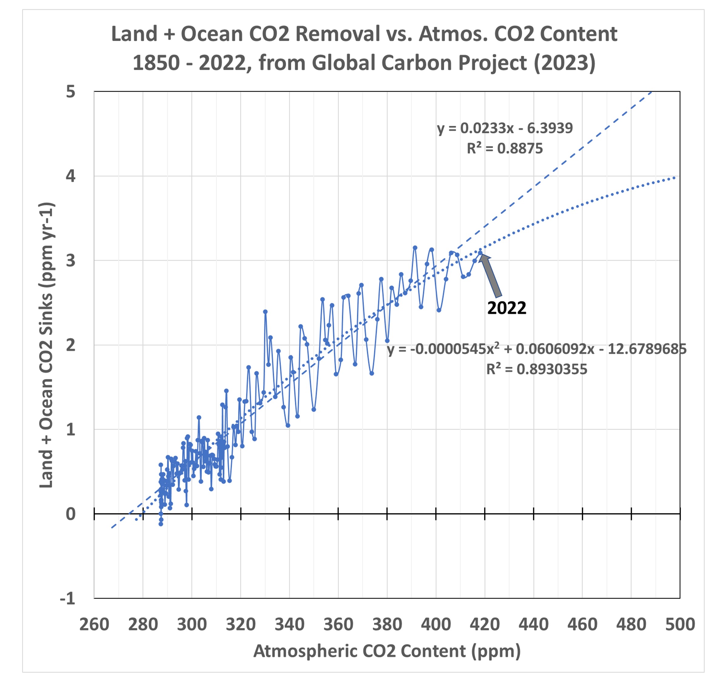
The two regression line fits to the data are important, because they imply what will happen in the future as CO2 in the atmosphere continues to rise. In the case of the nonlinear fit, which has a slightly better fit to the data (R2 = 89.3% vs. 88.8%) the carbon cycle is becoming somewhat less able to remove excess CO2 from the atmosphere. This is what carbon cycle modelers expect to happen, and there is some weak evidence that is beginning to occur. So, let’s conservatively assume that nonlinear rate of removal (a gradual decrease in nature’s ability to sequester excess atmospheric CO2) will exist in the coming decades as a function of atmospheric CO2 content.
A Modest CO2 Reduction Scenario
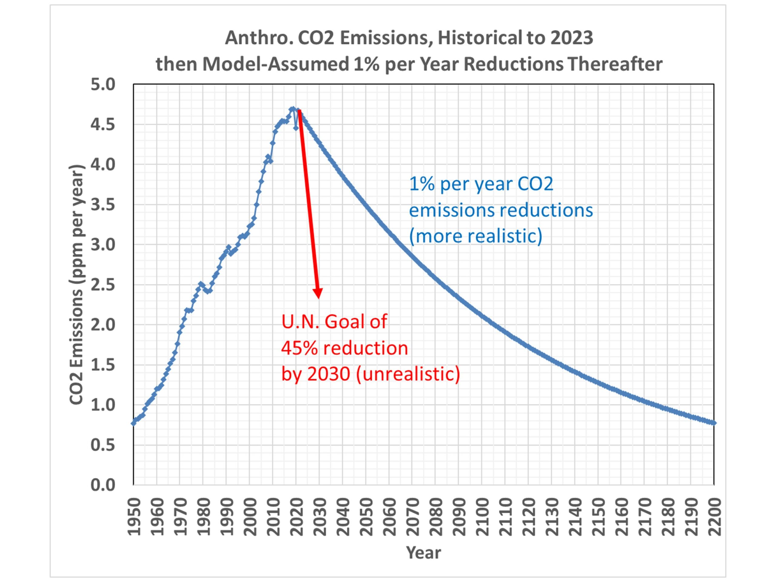
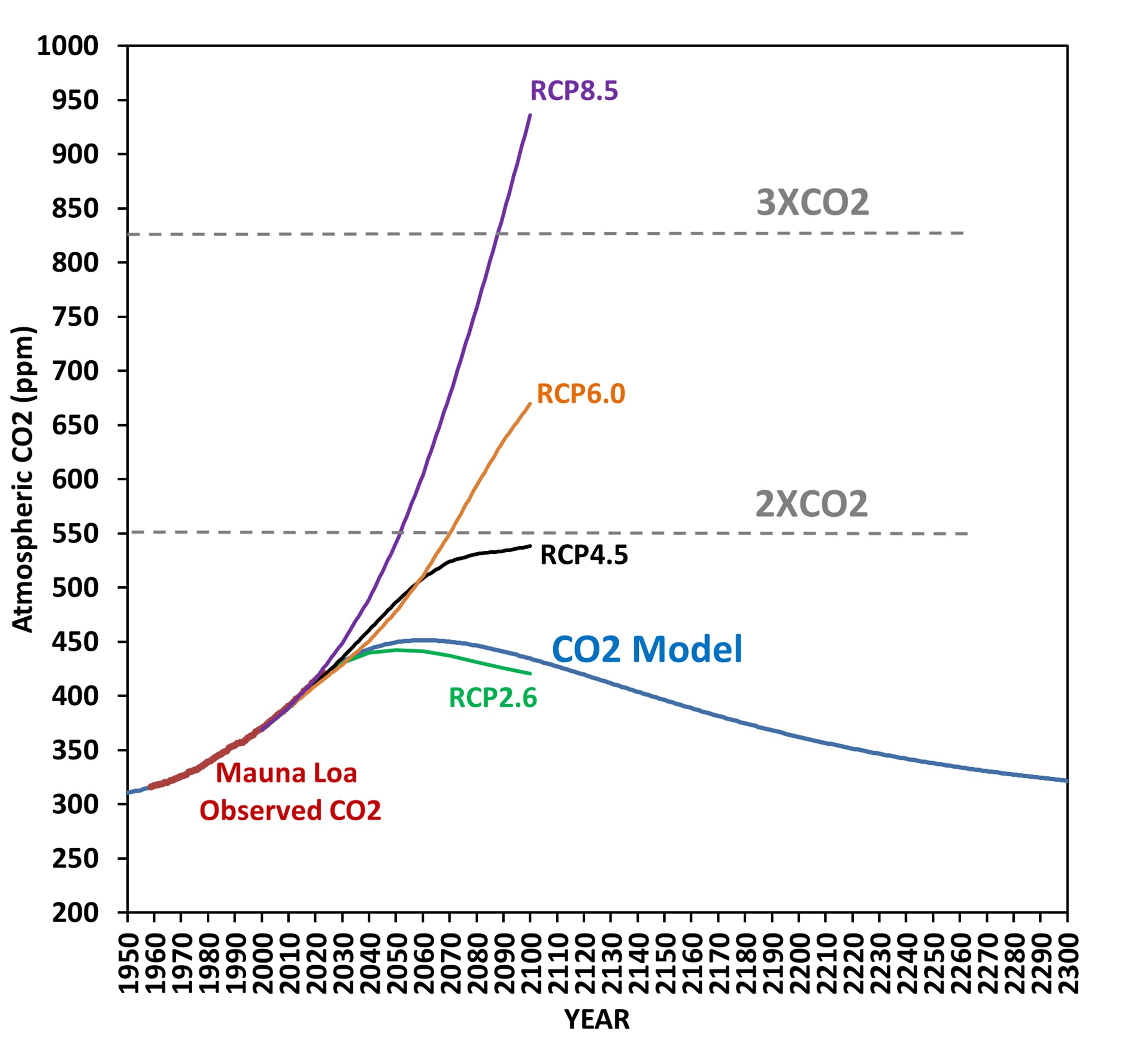
Now, let’s assume a 1% per year cut in emissions (both fossil fuel burning and deforestation) in each year starting in 2024. That 1% per year cut is nowhere near the Net Zero goal of eliminating CO2 emissions by 2050 or 2060, which at this point seems delusional since humanity remains so dependent upon fossil fuels. The resulting future trajectory of atmospheric CO2 looks like this:
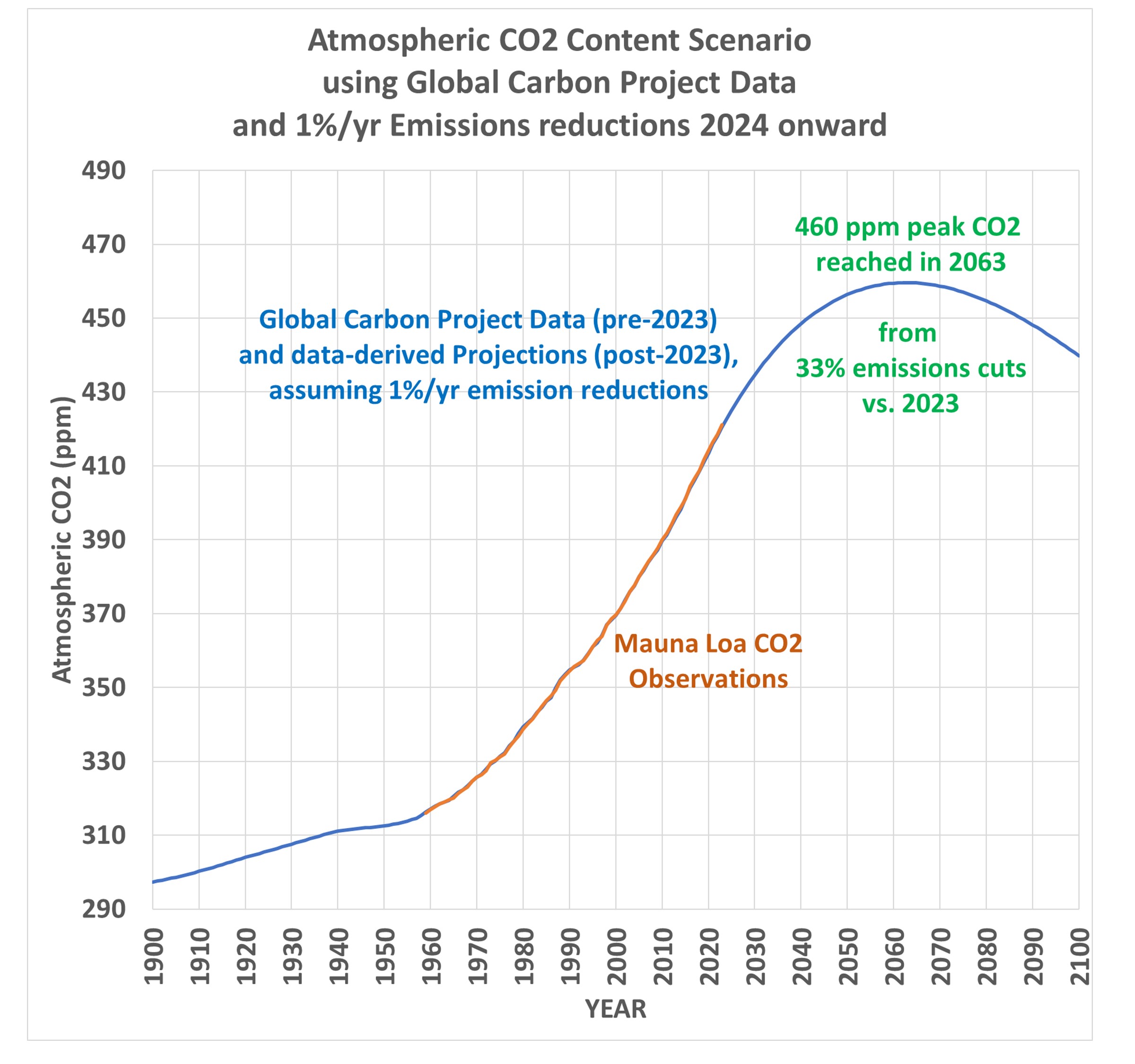
This shows that rather modest cuts in global CO2 emissions (33% by 2063) would cause CO2 concentrations to stabilize in about 40 years, with a peak CO2 value of 460 ppm. This is only 2/3 of the way to “2XCO2” (a doubling of estimated pre-Industrial CO2 levels).
How Much Global Warming Would be Caused Under This Scenario?
Assuming all of the atmospheric CO2 rise is due to human activities, and further assuming all climate warming is due to that CO2 rise, the resulting eventual equilibrium warming (delayed by the time it takes for mixing to warm the deep oceans) would be about 1.2 deg.C assuming the observations-based Effective Climate Sensitivity (EffCS) value of 1.9 deg. C we published last year (Spencer & Christy, 2023). Using the Lewis and Curry (2018) value around 1.6-1.7 deg. C would result in even less future warming.
And that’s if no further cuts in emissions are made beyond the 33% cuts vs. 2023 emissions. If the 1% per year cuts continue past the 2060s, as is shown in the 2nd graph above, the CO2 content of the atmosphere would then decline, and future warming would not be in response to 460 ppm, which was reached only briefly in the early 2060s. It would be a still lower value than 1.2 deg. C. Note these are below the 1.5 deg. C maximum warming target of the 2015 Paris Agreement, which is the basis for Net Zero policies.
Net Zero is Based Upon a Faulty View of Nature
Net Zero assumes that human CO2 emissions must stop to halt the rise in atmospheric CO2. This is false. The first plot above shows that nature removes atmospheric CO2 at a rate based upon the CO2 content of the atmosphere, and as long as that remains elevated, nature continues to remove CO2 at a rapid rate. Satellite-observed “global greening” is evidence of that over land. Over the ocean, sea water absorbs CO2 from the atmosphere in proportion to the difference in CO2 partial pressures between the atmosphere and ocean, that is, the higher the atmospheric CO2 content is, the faster the ocean absorbs CO2.
Neither land nor ocean “knows” how much CO2 we emit in any given year. They only “know” how much CO2 is in the atmosphere.
All that is needed to stop the rise of atmospheric CO2 is for yearly anthropogenic emissions to be reduced to the point where they match the yearly removal rate by nature. The Global Carbon Project data suggest that reduction is about 33% below 2023 emissions. And that is based upon the conservative assumption that future CO2 removal will follow the nonlinear curve in the first plot, above, rather than the linear relationship.
Finally, the 1.5 deg. C maximum warming goal of the 2015 Paris Agreement would be easily met under the scenario proposed here, a 1% per year cut in global net emissions (fossil fuel burning plus land use changes), with a total 33% reduction in emissions vs. 2023 by the early 2060s.
I continue to be perplexed why Net Zero is a goal, because it is not based upon the science. I can only assume that the scientific community’s silence on the subject is because politically driven energy policy goals are driving the science, rather than vice versa.