This is the first of what I hope will be monthly surface temperature updates for the contiguous U.S., based upon 280 International Surface Hourly (ISH) stations which have reasonably complete temperature records since 1973.
Following up on my previous post showing that ISH station warming trends during 1973-2011 were a function of population density, I have quantified the average temperature trend increase with population density (2000 population data) over the U.S, then applied a linear trend correction to each of the stations based upon that relationship.
A few of the findings:
1) Essentially all of the +0.20 deg. C/decade average warming trend over the U.S. in the last 40 years computed from the CRUTem3 dataset (which the IPCC relies upon for its official global warming pronouncements) evaporates after population adjustment (no claim is made for countries other than the U.S.)
2) Even without any adjustments, the ISH data have a 20% lower warming trend than the CRUTem3 data, a curious result since the CRUTem3 dataset is supposedly adjusted for urban heat island effects.
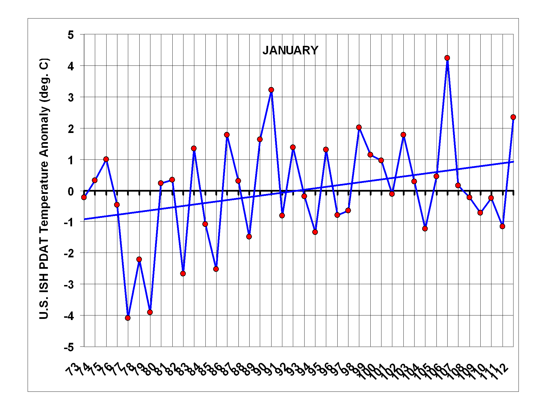
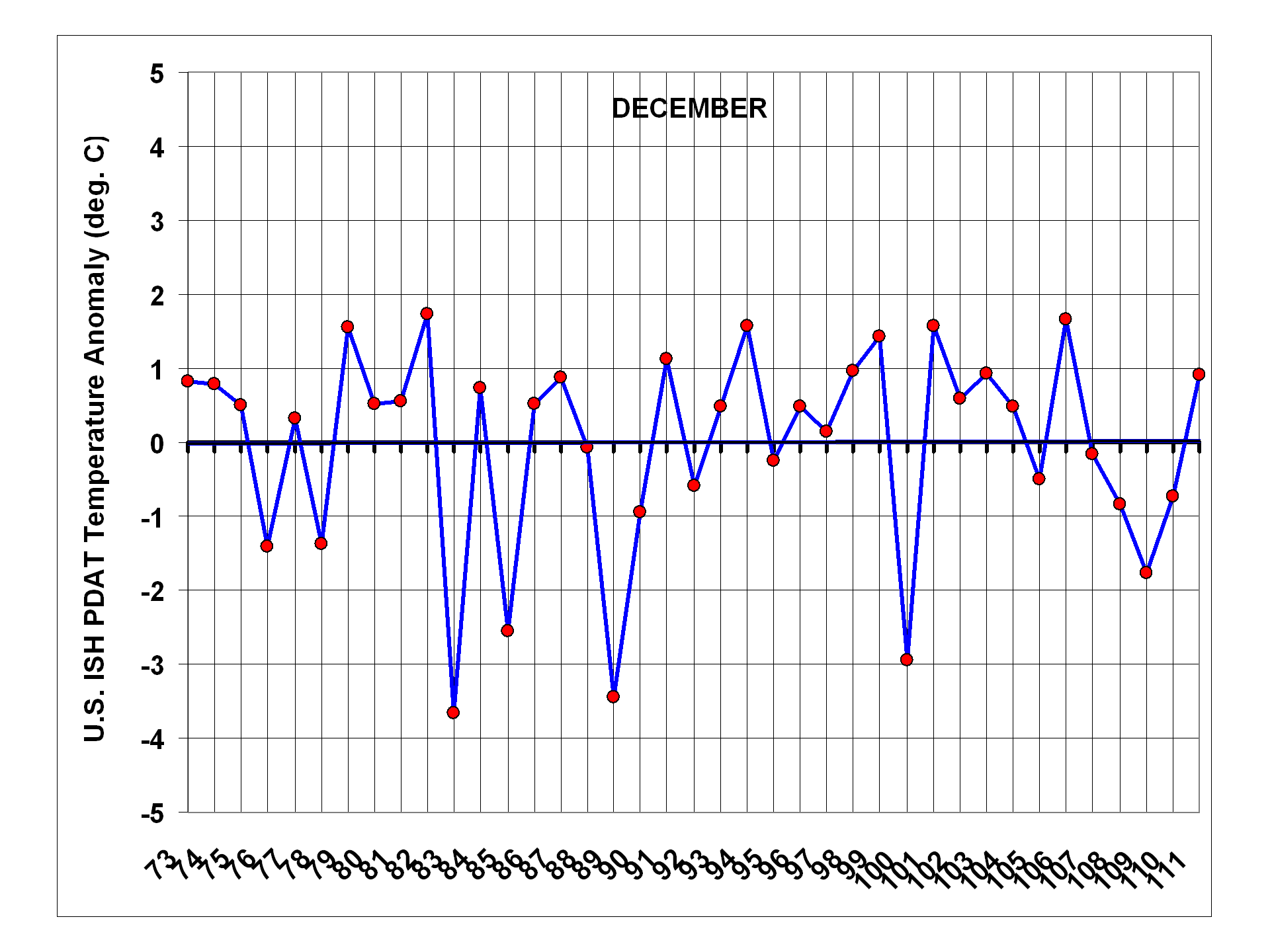
3) The only calendar month with obvious long-term warming is January, due to unusually cold U.S. winters during the 1970s.
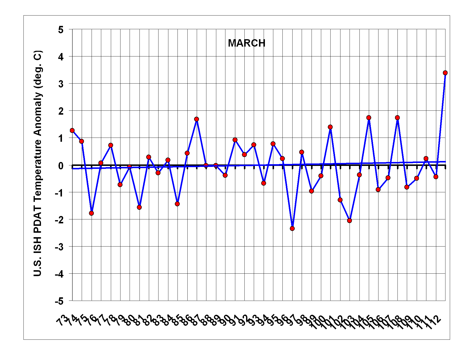
4) Last month (March, 2012) is the second warmest monthly temperature anomaly in the 40 year record, and easily the warmest March, even after population adjustment.
For the time being, I’ve decided to post the results for comment rather than attempt to get the work published, which would be a much bigger effort. My hope is that the new dataset will stimulate debate in the climate research community over the existence of residual urban heat island (UHI) effects causing a spurious warming component in commonly used temperature datasets.
Unadjusted ISH Temperature Data vs. CRUTem3 Over the U.S.
As discussed in my previous post, the raw data come from the International Surface Hourly (ISH) database which is continuously updated at NCDC. I average the 4 synoptic reporting times (00, 06, 12, and 18 UTC) together to get a daily average temperature for each station. These are the most often reported times of day in the record, and using them alone maximizes the number of stations available for analysis while at the same time providing (what I believe to be) a more physically meaningful “daily” average than maximum and minimum temperatures do.
At least 80% of the daily data must be present to compute an average for a month from each station, and at least 90% of the months during 1973-present must also be available, as well as ALL calendar months from 1973 and 2011. Nominally 280 stations in the U.S. meet this requirement, a number which does not change substantially throughout the 40 year record.
When monthly anomalies (relative to 1973-2011) are computed in 5 deg. lat/lon grids covering the contiguous U.S. from both the CRUTem3 dataset and from the unadjusted data from 280 stations, here are the resulting monthly variations during 1973 through March, 2012 for ISH and through January 2012 for CRUTem3 (all images can be clicked to see the large, detailed versions):
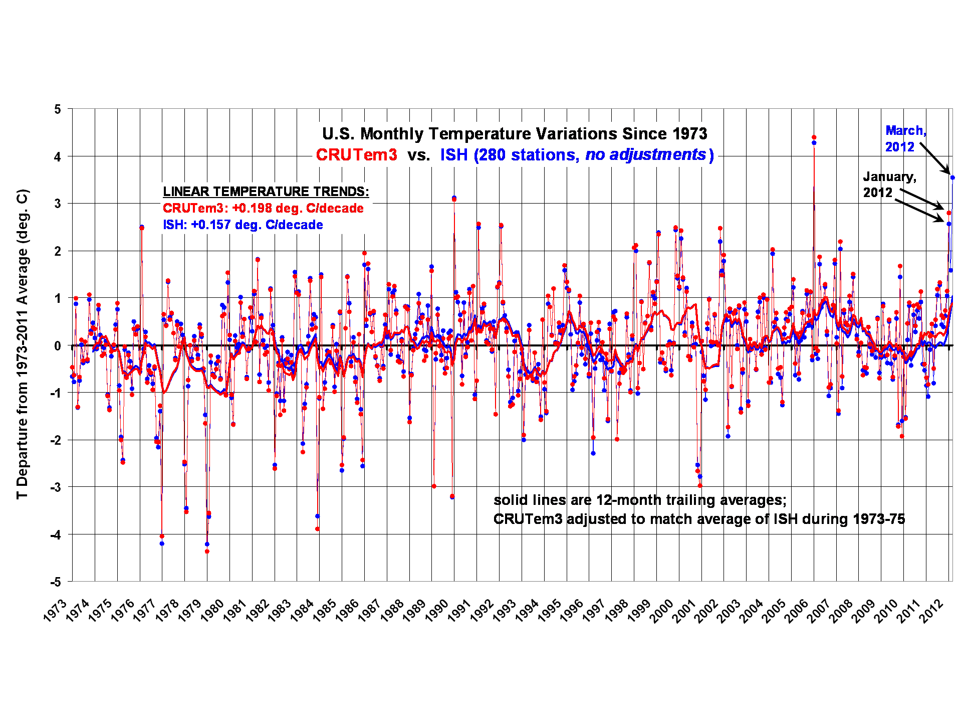
The monthly correlation between the two time series in the above plot is 0.994. Curiously, even without any adjustments to the ISH data, the resulting ISH linear warming trend (+0.157 deg. C/decade) is about 20% lower than the CRUTem3 trend (+0.198 deg. C/decade).
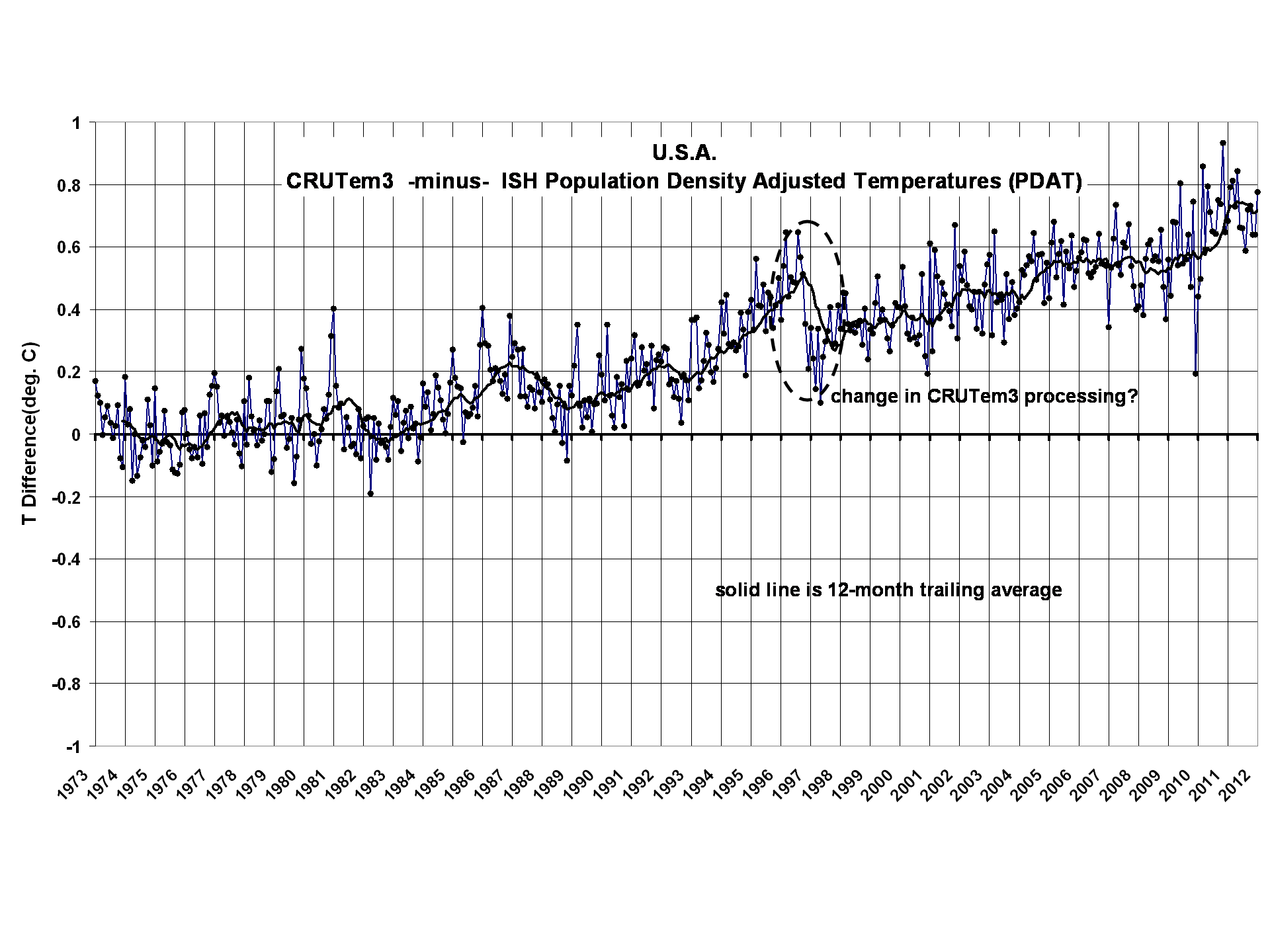
If we difference the two time series, we get this (click for full res version):
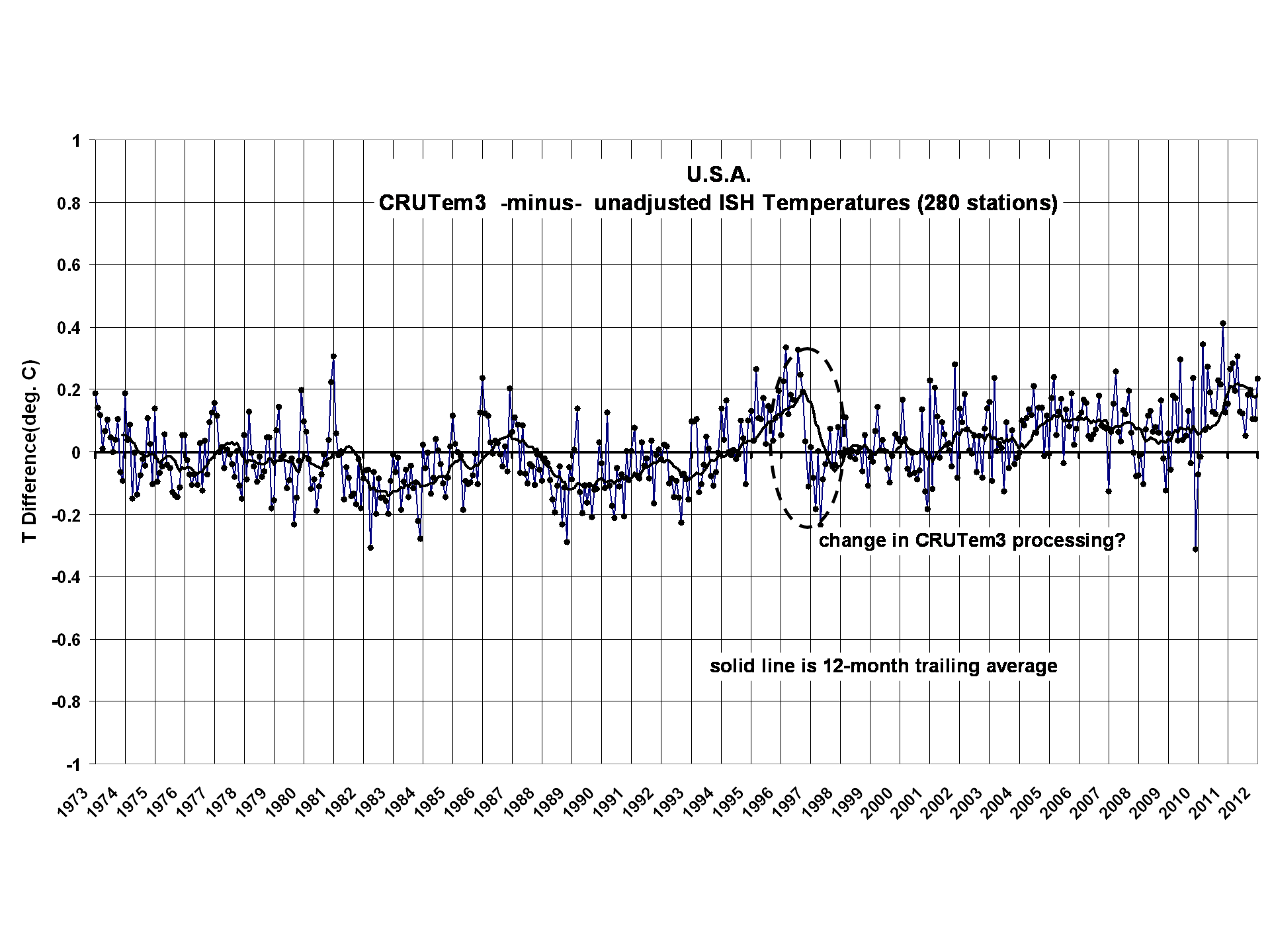
There are a couple things to note. First, we see that the excess warming in CRUTem3 versus unadjusted ISH data is growing with time.
Secondly, there is some evidence of artifacts which are likely from the CRUTem3 dataset, such as a sudden downward adjustment starting about November, 1996. My understanding is that the CRUTem3 dataset has a station distribution which changes over time. Also, I believe there are adjustments made to the data from individual stations. In the ISH dataset, however, we have 280 stations with essentially complete data from beginning to end of the record, with no adjustments; it is difficult to see how such a jump could have arisen from the ISH data.
The Population Density Adjustment
Linear temperature trends computed from each of the 280 stations reveal a dependence on population density. Just as has been found in previous studies based upon spatial temperature patterns (cities being warmer than the surrounding countryside), we find that the warming trend with time increases rapidly with population at low population densities, then levels off at high population densities.
This nonlinear relationship is found here to go as population density (PD) raised to the 0.2. power (warming ~ PD0.2). The following plot shows the results for all stations individually, as well as for averages in 4 population subgroups (click for full res version):
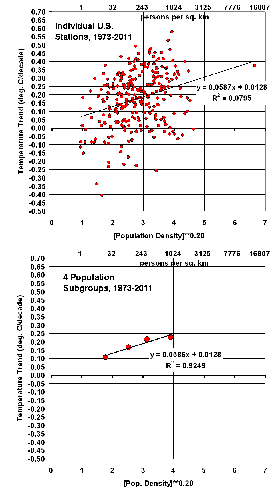
As seen in the above pair of plots, essentially the same regression coefficient is computed whether I use all stations individually, or average them into 4 population subgroups. The standard error of the regression coefficient is +/- 20%, which should give some idea of the statistical uncertainty in the population-based adjustments to the temperature data shown below.
Significantly, I will assume that this average relationship between temperature trend and population density is entirely due to the urban heat island effect, and remove it from each station. Of course, not all stations would have a UHI effect, but others will have a strong effect. The above plots’ regression lines show the average relationship across all stations, which I simply remove from all stations. This avoids qualitative decisions about individual stations’ histories, which would be difficult to reproduce by other investigators, and keeps the methodology simple.
Since (as we will see) this adjustment removes most of the warming trend in the U.S. since 1973, it will be the most criticized. It will be claimed that the warming trends are indeed real, and that it must be by coincidence that the most populated regions of the country have also warmed the most.
But that claim has no independent evidence, other than the thermometer data. It has no more support than my claim that the warming dependence on population is spurious, due to the UHI effect.
In fact, I think it has less support. We know based upon many published studies that the UHI effect is real, at least in spatial terms (cities average warmer than the surrounding countryside). The above plots show a similar effect on temperature trends, with a nonlinear functional dependence approximately like that seen in the spatial dependence found by other investigators. That this effect would be fortuitous seems to stretch credulity.
Results with Population Density Adjustment
The regression coefficient from the above plot was used to make a linear temperature trend adjustment to the ISH temperatures, starting with zero adjustment in January 1973. The resulting plot, analogous to the very first one above, for U.S. temperature variations since 1973 is shown next (click for full res. version):
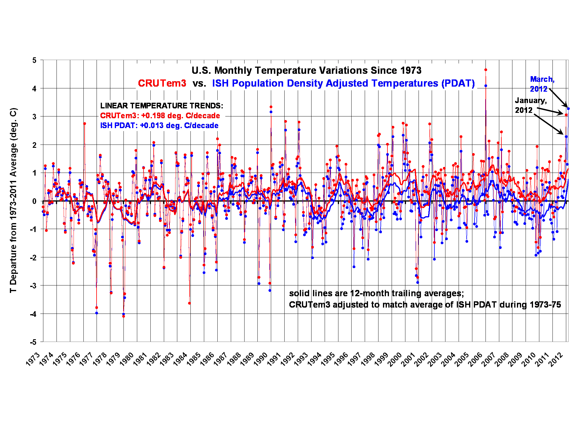
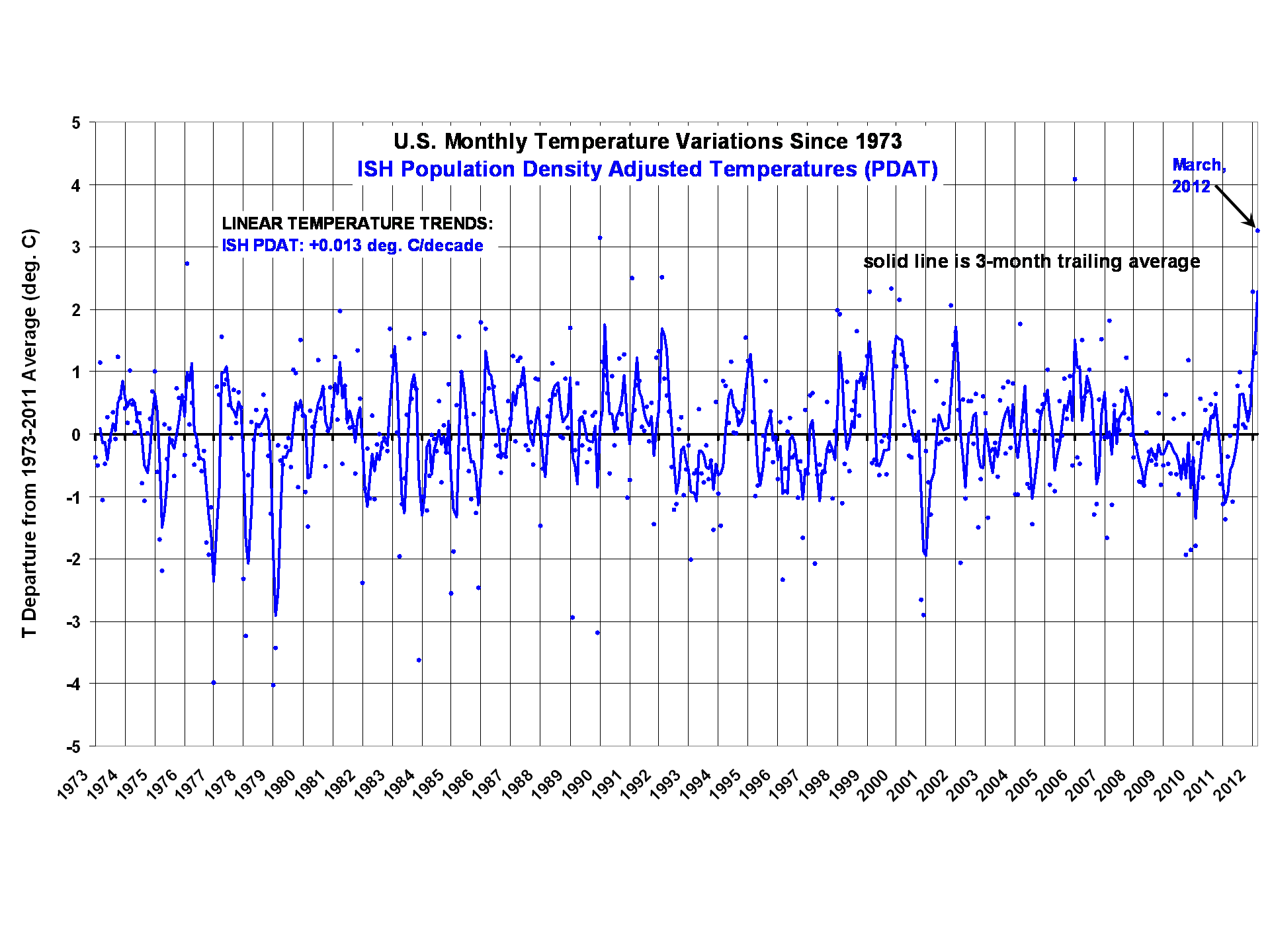
Significant, the population adjustment erases essentially all of the U.S. warming over the last 40 years. Nevertheless, last month (March, 2012) is seen to be the 2nd warmest month in the 40 year record, and (as we will see) easily the warmest March.
The corresponding difference plot between the two datasets shows what I am interpreting to be considerable spurious warming in the CRUTem3 dataset:
U.S Temperature Variations, 1973-2012, by Calendar Month
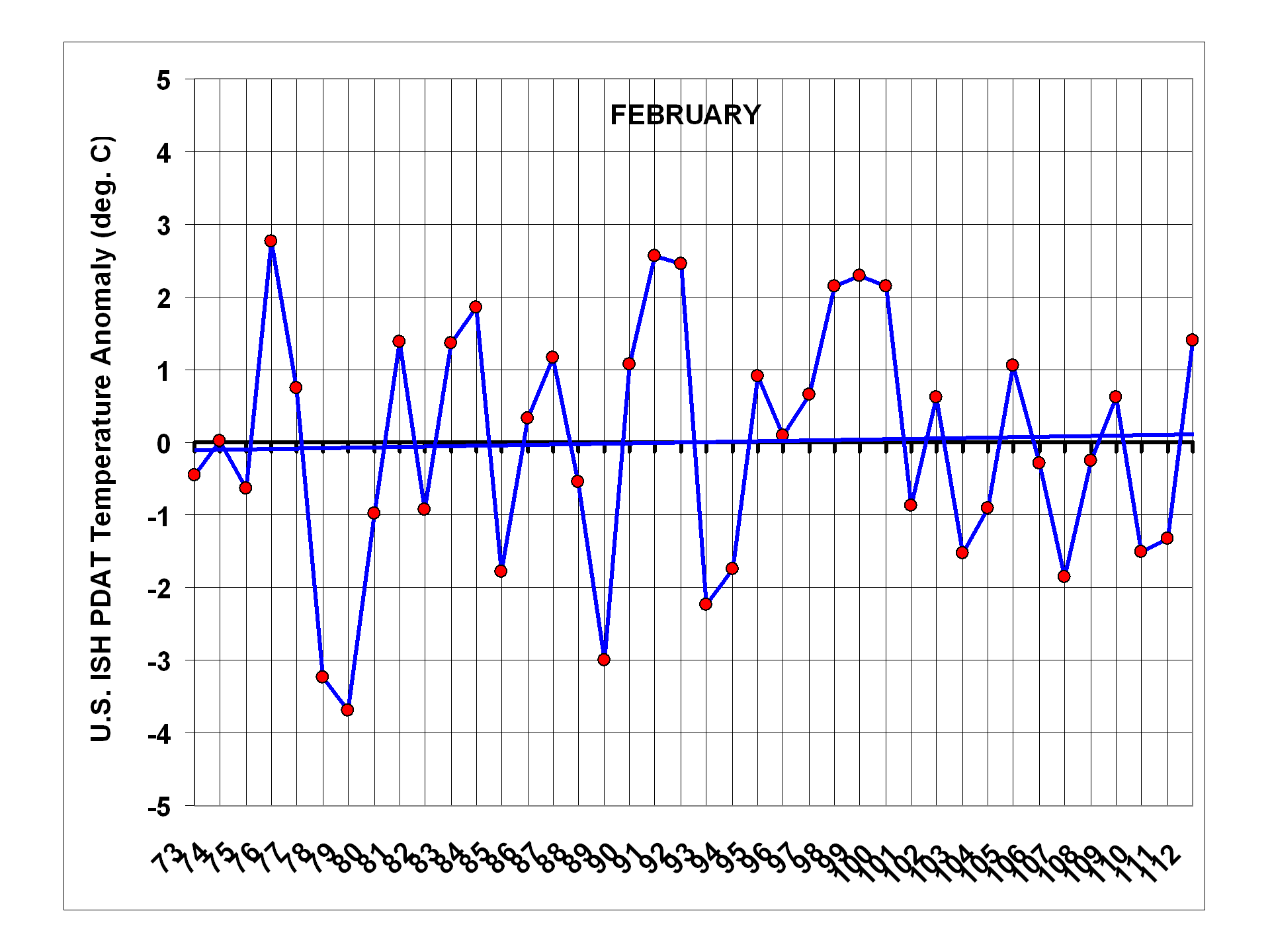
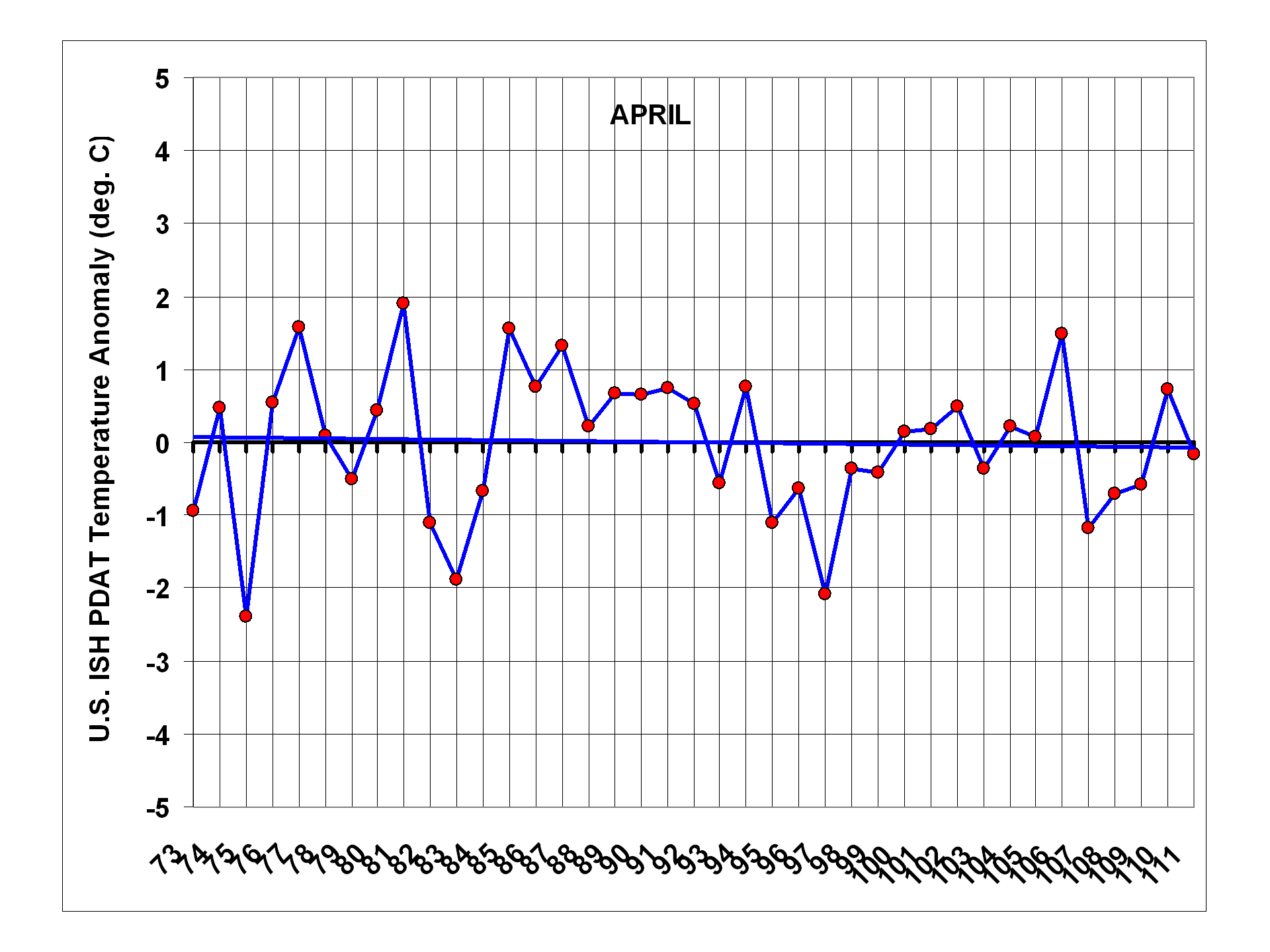
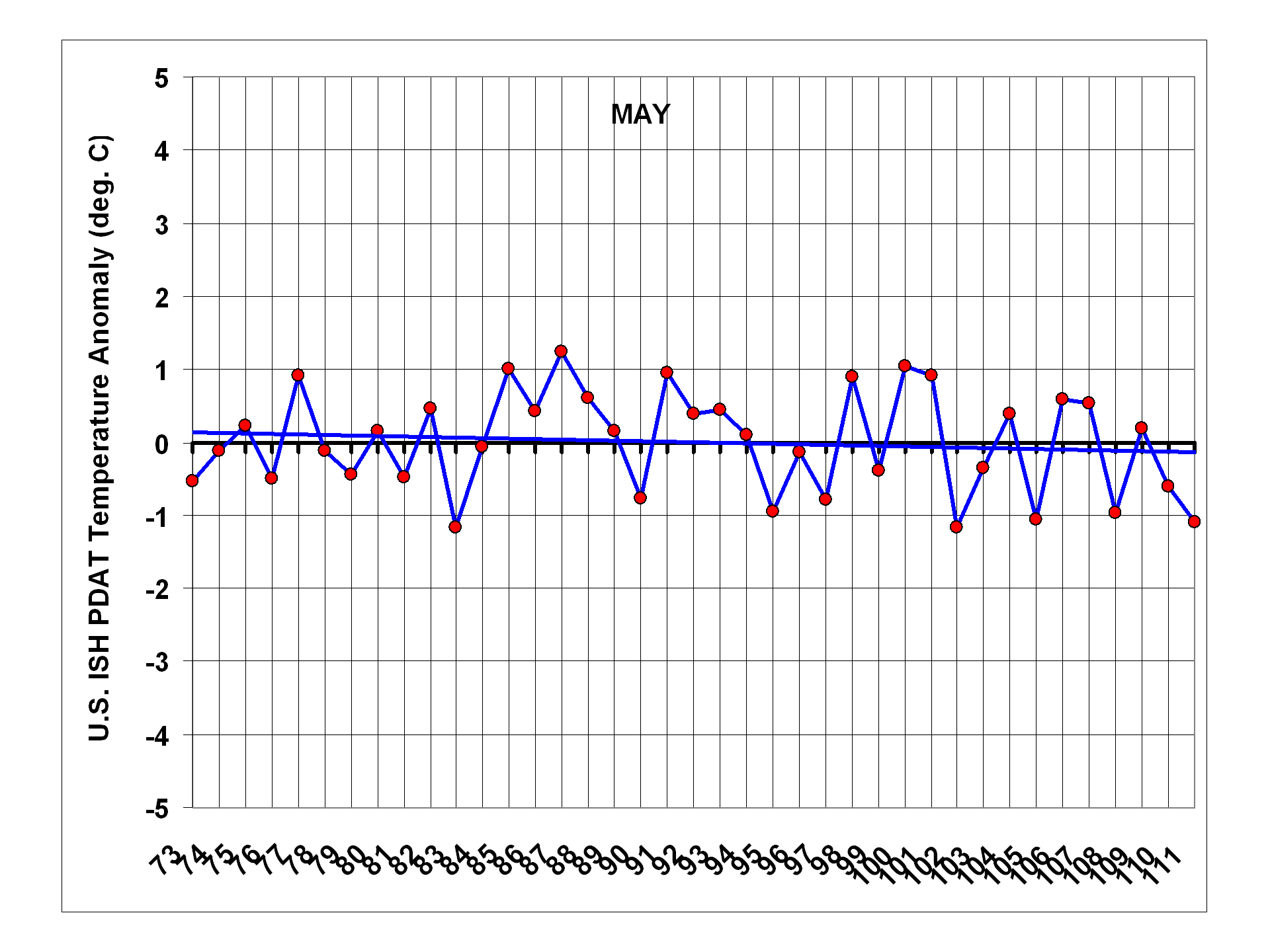
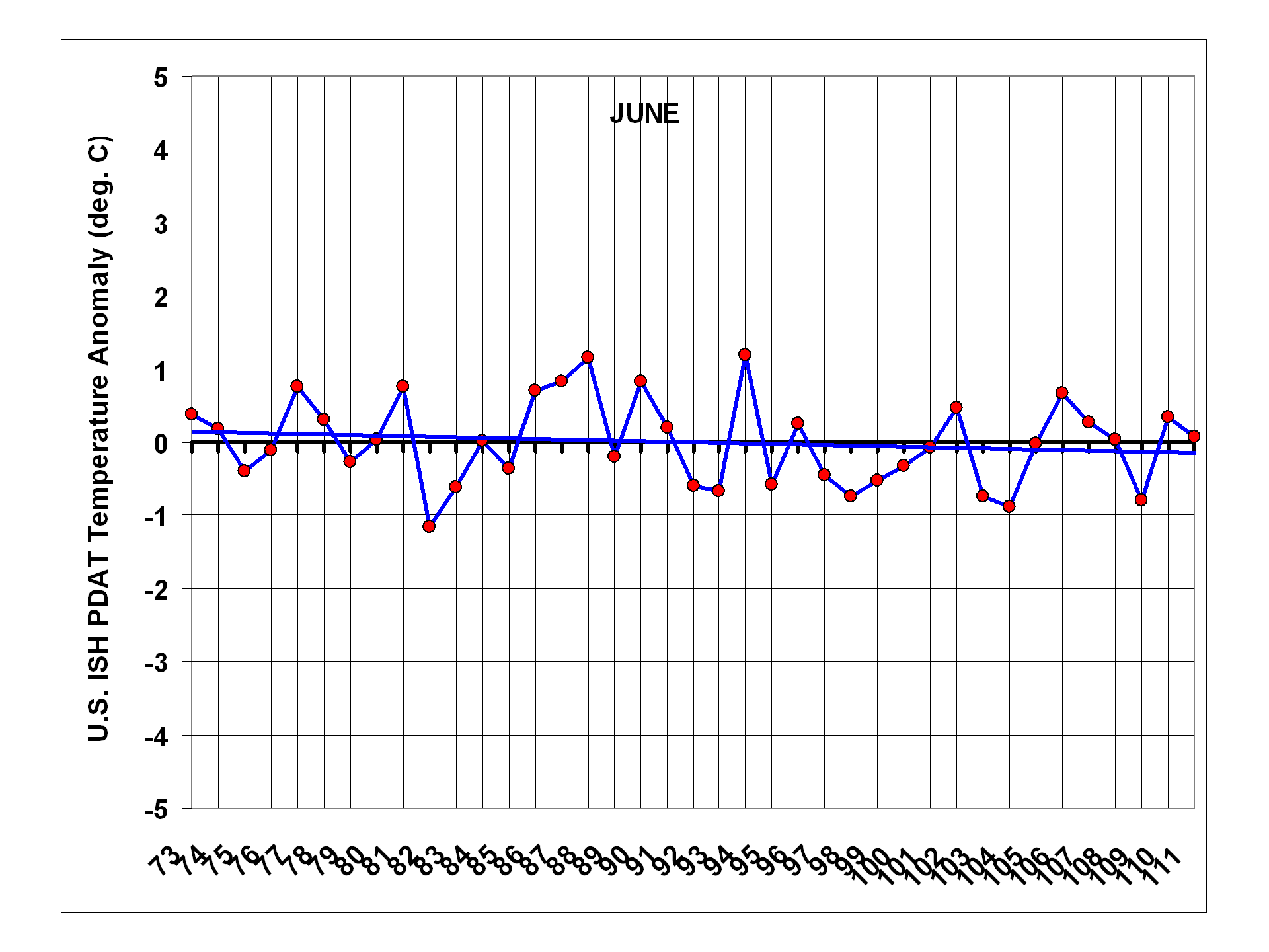
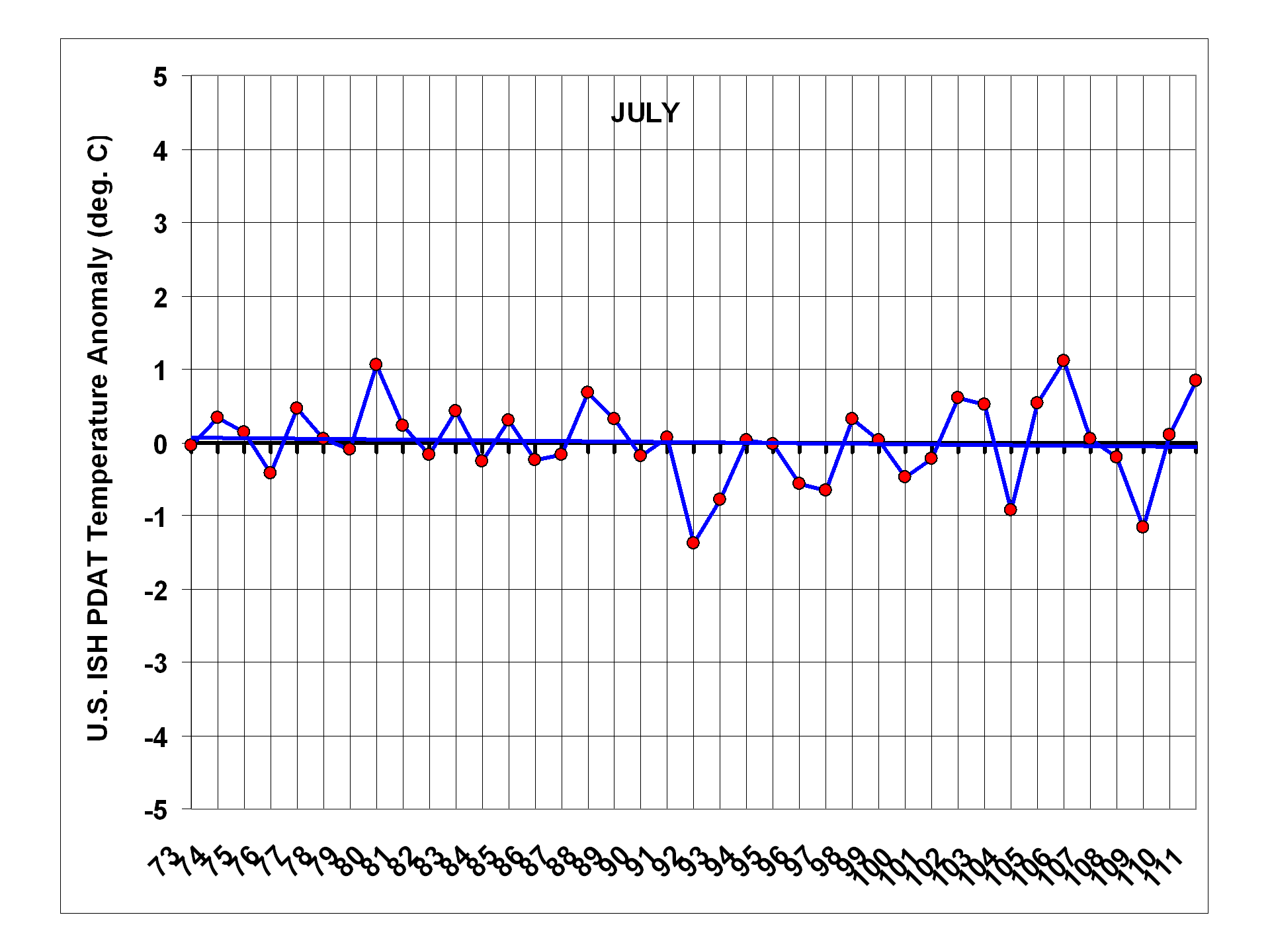
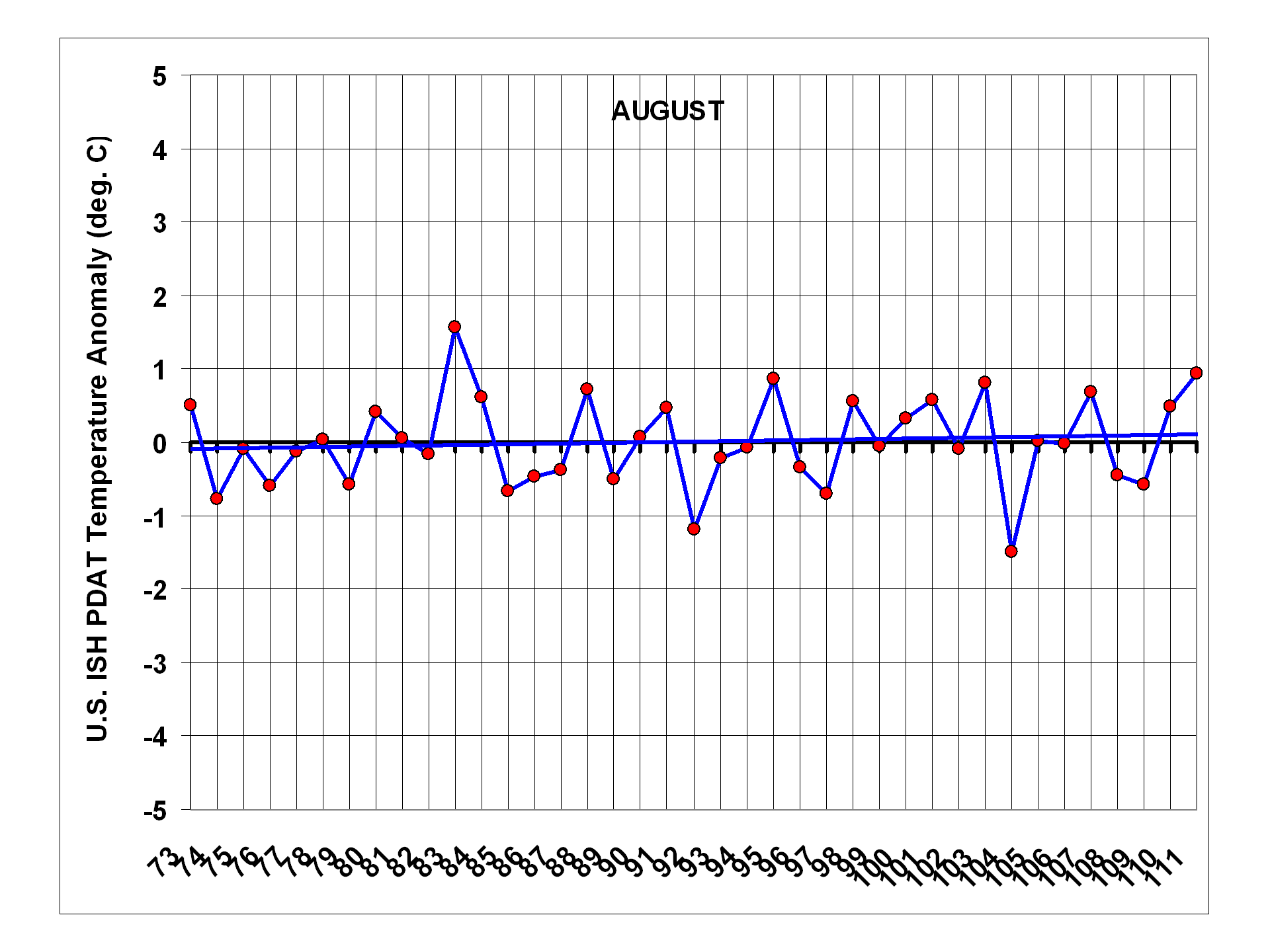
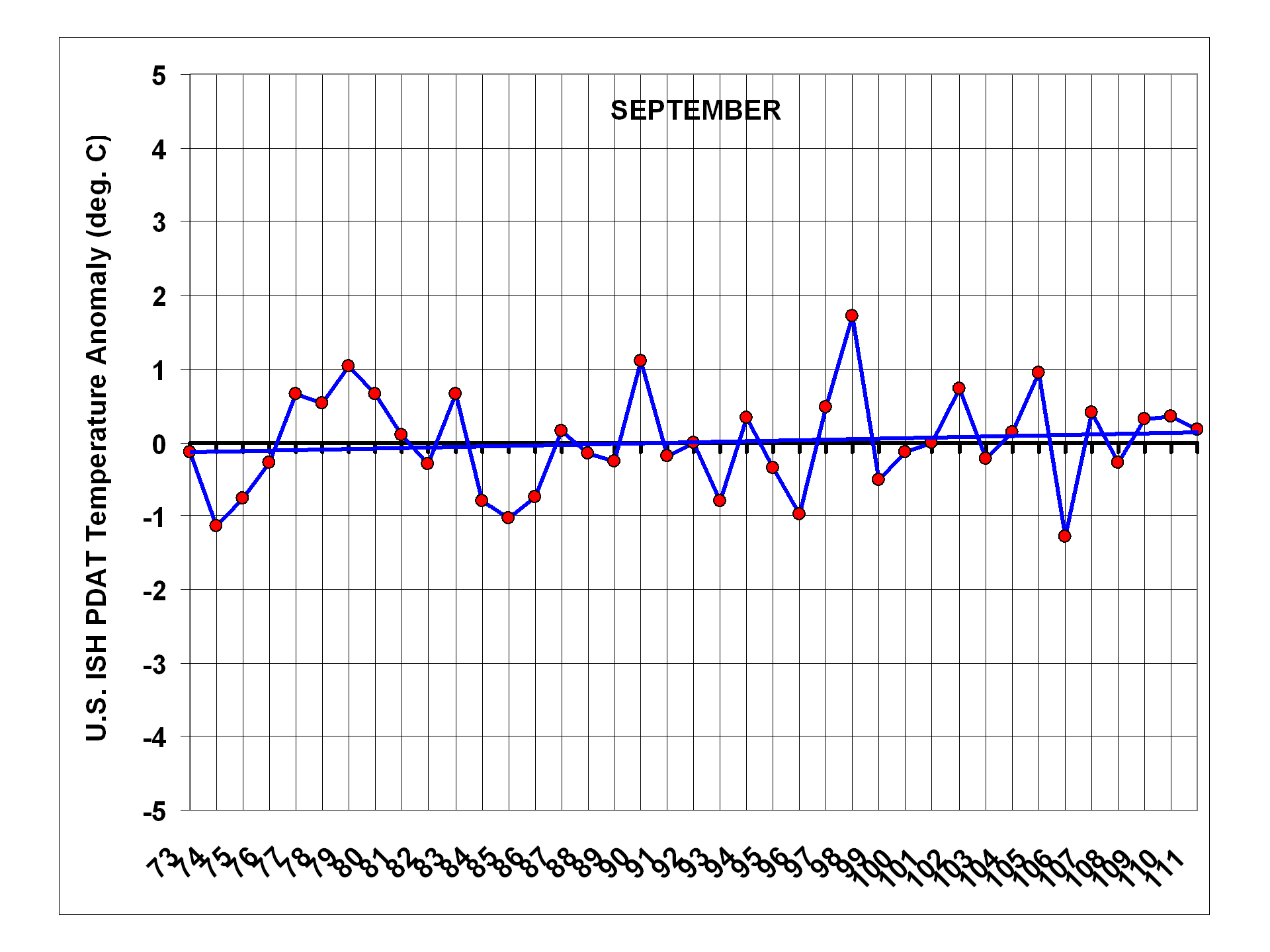
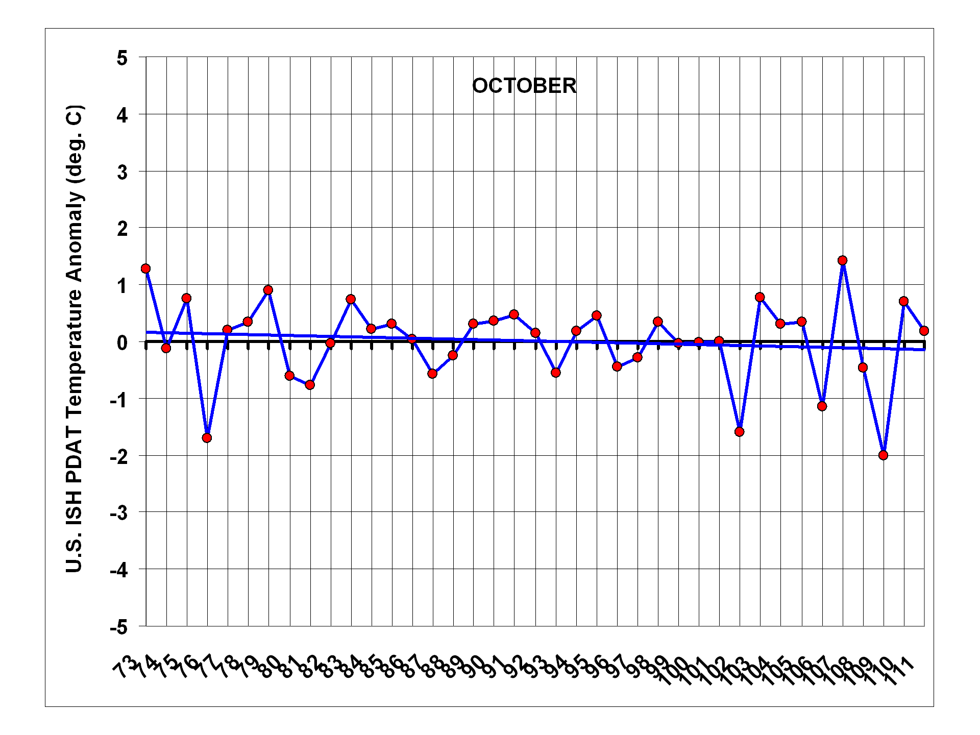
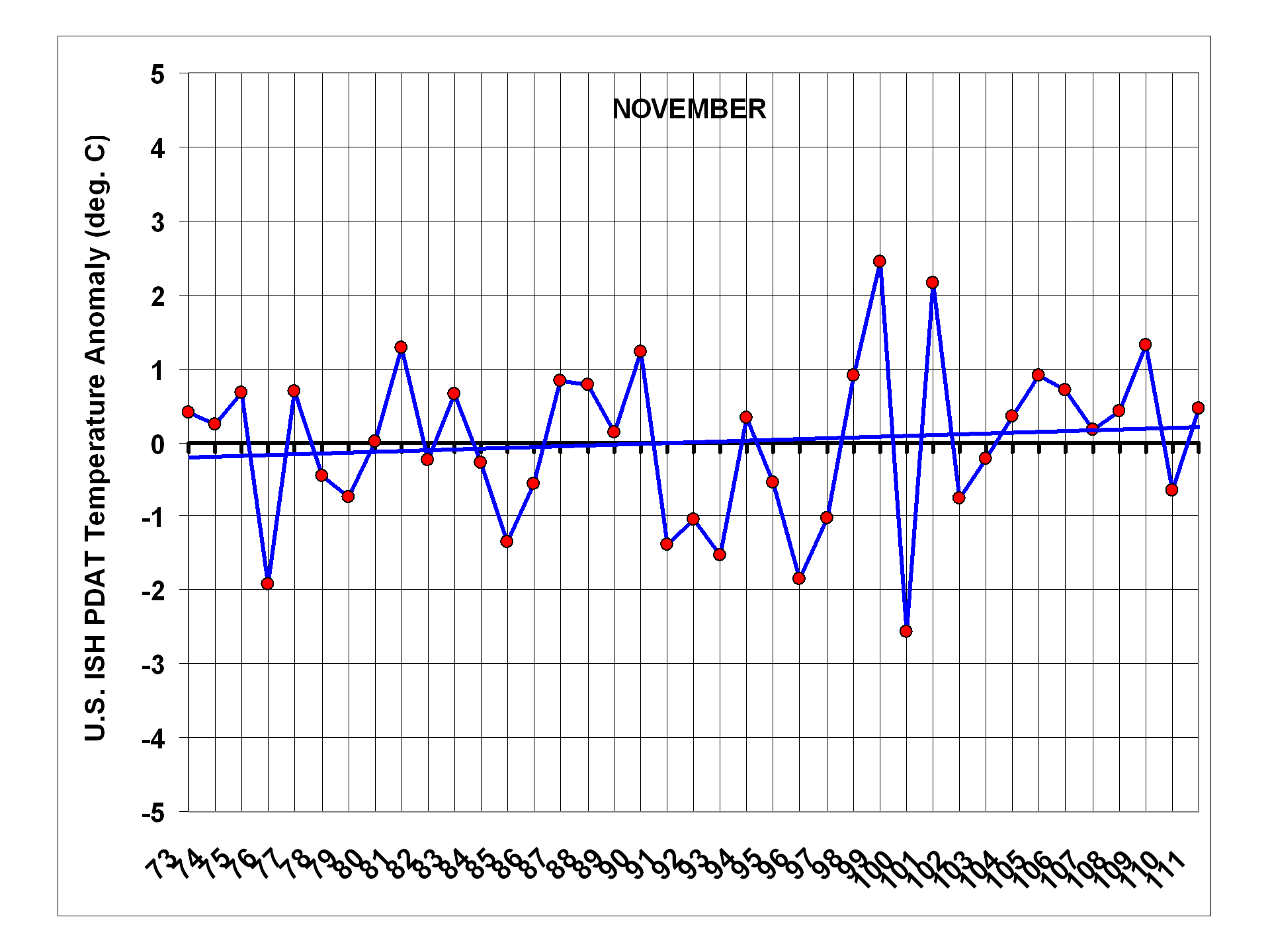
When we examine the seasonal dependence of U.S. temperature changes over the last 40 years, we find that the only month with significant warming is January, and even that is only because there were so many cold Januaries in the late 1970s and early 1980s. The other months are essentially flat. Plots for individual months are shown next, and note that the January, February, and March plots end in 2012, while the others end in 2011 (click for full res. versions):
Conclusions
I am quite surprised that, even without any adjustments, the ISH data show 20% less U.S. warming than the CRUTem3 data over the 1973-2011 period. Since the CRUTem3 data are supposedly adjusted for urban heat island (UHI) effects, this seems quite curious, to say the least.
When the ISH temperature data are corrected for the average warming bias — shown here to be a function of population density — it essentially erases 40 years of U.S. warming: from +0.20 deg C/decade in the IPCC-blessed CRUTem3 dataset, to +0.01 deg. C/decade. For those interested in statistical uncertainties, the standard error in the regression coefficient I used would amount to about +/-20% uncertainty in the reduction in the warming trend.
The warmth of March, 2012 is indeed anomalous, at least in the context of the last 40 years. But as the plot for all March’s (above) shows, one month does not a warming trend make. 🙂
UPDATE #1: The Recent Warm Winter
Regarding the recent winter, if we plot trailing 3-month averages of the population-adjusted temperatures, we see that January through March of this year (2012) was the warmest 3 month period of the 40-year record. Of course, the warmest 3 months must occur at some point in the record, and since there is no long-term trend in the data, I would wager that it is a temporary blip, rather than a sudden shift into a new climate regime:
UPDATE #2: Why the Discrepancy with UAH LT Temperatures?
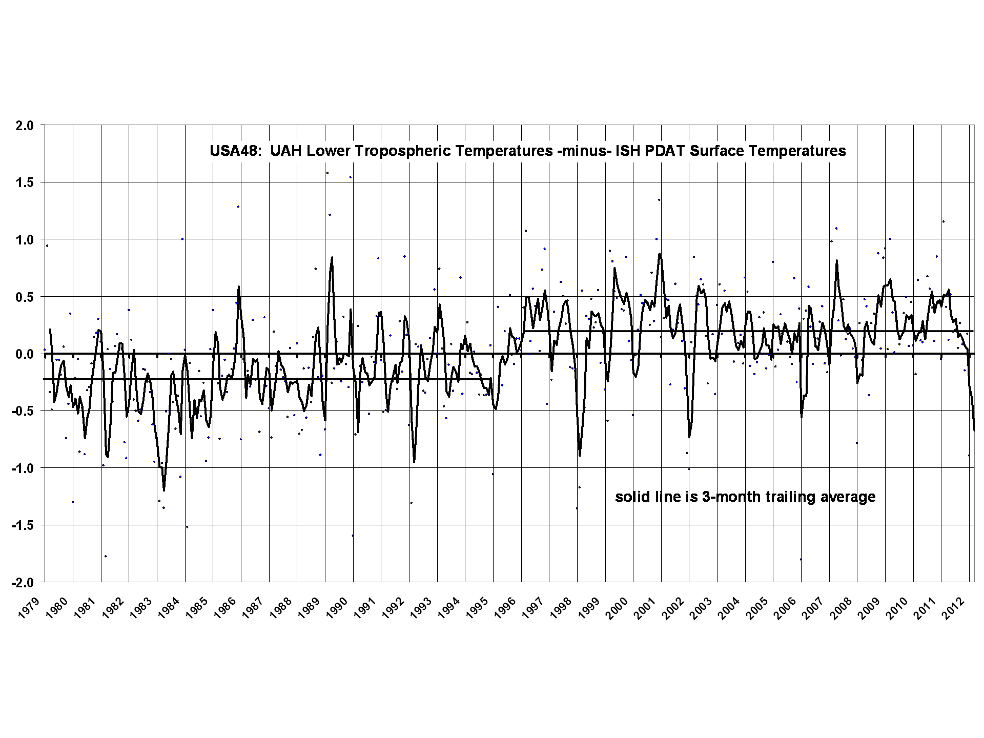
It has been pointed out that our UAH LT (tropospheric temperature) product has a warming trend for 1979-2011 of about +0.20 deg. C, so why the difference with my near-zero surface temperature trend (which is near-zero whether you start in 1973, or 1979)?
The monthly correlation between the two datasets is 0.87, so there is reasonably good agreement on that time scale, but a time series plot of their difference suggests some sort of step jump in 1995:
 .
.
The direction of the change would be either spurious warming in UAH LT or spurious cooling in the ISH PDAT surface temperature data. The plot really doesn’t look like the CRUTem3 -minus- ISH PDAT plot (reproduced below), so I don’t have a ready explanation for it:

Now, 1995 happens to be when the NOAA-11 satellite was replaced by NOAA-14, and those two satellites had to be intercalibrated with NOAA-12, which was going through its own diurnal drift. So, there might be a diurnal drift issue here that has not been sufficiently accounted for. Maybe our new (but unfinished) diurnal adjustement strategy for Version 6 of the UAH dataset will shed light on this.
Of course, it is always possible that a weather regime change around that time led to a change in the tropospheric temperature lapse rate, but that is pure speculation on my part.

 Home/Blog


