Having just returned from another New Orleans meeting – this time, a NASA A-Train satellite constellation symposium — I thought I would check the latest sea surface temperatures from our AMSR-E instrument.
The following image shows data updated through yesterday (October 27). Needless to say, there is no end in sight to the cooling. (Click on image for the full-size version).
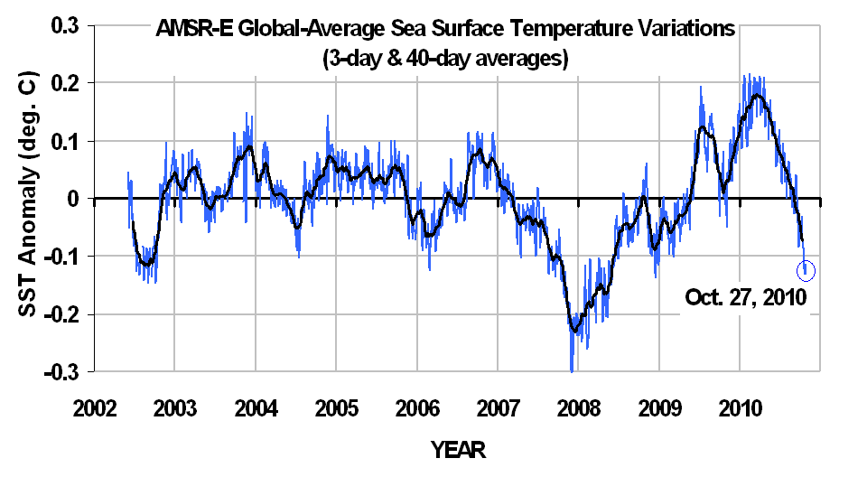
Since these SST measurements are mostly unaffected by cloud cover like the traditional infrared measurements are, I consider this to be the most accurate high-time resolution SST record available…albeit only since mid-2002, when the Aqua satellite was launched.
I won’t make any predictions about whether SSTs will go as low as the 2007-08 La Nina event. I’ll leave that to others.
![]() |
Thanks for the update. At this rate it may be down 5 K before the end of the decade, unless of course it changes direction at some point. In any case I’m fetching my cardy, b’rrrr.
I predicted over 12 months ago that SST would be at 2007/8 low point level by February. I still stand by it. I was able to accurately call this by studying the similarity in the phasing of El Nino and La Nina with the solar cycles at the end of the C19th, when a similar fall in solar activity from a high point was witnessed.
The recent long drawn out raised SST’s following the 2010 El Nino will be matched by long drawn out lowered SST’s following the current La Nina. The ocean is in big bounce mode because large amounts of decades long trapped energy is making it’s way to the surface in stratified layers.
I expect the roller coaster to continue for several years.
Will the precipitous lows rejuvenate the fur trade in Canada? If this keeps up, polar bear hides will become popular in Russia and China for sure.
So what is the lower troposphere temperatures doing at this point – since in September it had not changed much even with the drop in ocean temps then.
Martin C, if you check Channel 5 it looks as if it may break down through the average. The last time it did this was in Dec 09.
Dr Spencer, there is some talk over at Lucia’s blog as to what timeframe this “average” refers to. Can you clarify?
The time period for the averages, maximums, and minimums is 1979 through 2009.
Christopher Game asking Dr Spencer a practical question about his sea surface temperatures.
Dear Dr Spencer,
Would you be very kind and answer some questions for me? (or direct me to an answer)
I suppose that your satellite measurement of the sea surface temperature will use a formula such as:
Su = appemiss × ? × Ts^4
where Su denotes the upward emitted radiation from the sea surface into the atmosphere,
and appemiss denotes an apparent effective emissivity of the sea surface (I suppose it will lie
somewhere in the range 0.9 < appemiss < 1.),
and ? denotes the Stefan-Boltzmann constant,
and Ts denotes the temperature of the sea surface.
Please, is this supposition right? If it is not right, please would you tell me what is right instead.
If so, please, what is the value of appemiss that you find best? And please would you give me or direct me to your reasons for finding it best?
Yours sincerely,
Christopher Game
Roy,
There is an error in your SST graphs in that your latest blog has an SST coordinate one tenth that in your 5 October blog graph. Which one is correct?
Terry Croft
Roy, surely the October 5th graph is labelled x10, so I don’t think there is an error, although I don’t understand why the scales are different, and the averages appear to be over different periods, which is at the least confusing.
Sorry, the above reply was really intended for Terry Croft.
If I read that graph right, sea surface temperatures are currently higher than they were in 2008, one of the ten warmest years on record.
What cooling are you talking about? The beginning of 2010 is warmer than at any time since 2002. How could you possibly say “the cooling continues”?
Any chance you could explain why the graph seems to show the opposite of what you are claiming it shows?
He’s not talking about global cooling and new ice age or something… He means that the cooling of the oceans due to the La Nina and the negative PDO and so on continues. It doesn’t need to have a huge brain to understand, unless you’re trying to find something negative to say!!!
@Karmakaze “If I read that graph right, sea surface temperatures are currently higher than they were in 2008, one of the ten warmest years on record.”
1. You do not read the graph right. Sea surface temperatures are currently higher than THE LOWEST they were in 2008.
2. The graph is about SST’s and when you talk about the “warmest years on record” you are switching to Air Temperatures.
3. Depends on what record you are talking about. In the 31 year Satellite temperature records (in my opinion the only reliable world temperature records), 2008 was the 5th coolest out of 31
Karmakaze “What cooling are you talking about? The beginning of 2010 is warmer than at any time since 2002. How could you possibly say “the cooling continues”?”
Possibly Dr Spencer is talking about the cooling of the SST’s, because thats what he is talking about.
Karmakaze “Any chance you could explain why the graph seems to show the opposite of what you are claiming it shows?”
Not a chance of doing that. That would be lying. And why would you want anyone to lie?
The current trend (since 2005) of the effective sea surface temperature (ESST) should be declining at about one degree C per century which appears to be consistent with this observation.
An engineering analysis produced a simple equation, with inputs of only this ESST (cyclic) trend, sunspot number and carbon dioxide level, which calculates the average global temperature trends since 1895 with 88% accuracy. See the equation, an eye-opening graph of the results and the details of how they are derived in the pdfs at http://climaterealists.com/index.php?tid=145&linkbox=true (see especially the pdfs made public on 4/10/10 and 6/27/10). The future average global temperature trend that this equation calculates is down.
Check out this comment on Roy’s Election Comments post:
http://www.drroyspencer.com/2010/11/global-warming-elitism-tomorrows-election-and-the-future/#comment-4232
It references Boettger, et al (Quaternary International 207 [2009] 137–144), and indicates that transitions out of interglacials are wild, with massive temperature and sea level swings, accompanied by storms capable of violent one-shot coastline reshaping.
Canute’s lesson is about to be re-taught.
Dr Spencer
The temperatures on the graph seem to reflect the ENSO index quite closely. Could it be that the La Nina conditions explain the current cooler sea surface temperatures, and that the total ocean heat content hasn’t gone down because it hasn’t cooled at depth?
When you say “Needless to say, there is no end in sight to the cooling” do you mean this is the start of a long term cooling trend? Or more specifically, are you saying that this cooling trend will continue through the next El Nino event?
A lot of people seem to think that these SST data mean global warming has stopped. Do you agree with this interpretation?
The initial show of the new series, broadcast on Saturday, featured a kissogram, a naked Physician along with a “sexed up” Tardis.Throughout the unique 65-minute episode, The Eleventh Hour, in which Doctor Who had 20 minutes to save Earth from aliens known as the Atraxi, his new companion, Amy Pond, was revealed as a kissogram dressed in a skimpy policeman’s outfit, complete with mini-skirt and handcuffs. In one scene, Amy, played by the actress Karen Gillan, told the Dr that her kissogram repertoire also included nuns and nurses’ outfits. Come across out more at Sci Fi Fan.
I came in late on this thread but this is well worth pointing out.
The 2007-2008 La Niña event was, according to the UAH chart of atmospheric temperatures over land and ocean temperatures (The big picture is important, not just the “Ocean Surface Temperatures”), the Warmest La Niña in the past 30 years of records.
Furthermore, the starting point of the AMSR-E chart is arbitrarily picked at the year 2002. Why?
Because there is no “bottom falling out of global temperatures?’ 2010 was almost as hot as 1998 WITHOUT a super El Niño and greater than average solar activity!
All one has to do to observe the veracity of Global Warming is to ‘eyeball’ the entire (30 years.) UAH temperature chart put out by Dr. Spencer and available on this site.
Gratitude for the update. If it continues down this manner, it might be down 5 K by the end of the decade, unless of course it changes track. I’m getting my cardy nevertheless, brrrr.