Since NOAA encourages the use the USHCN station network as the official U.S. climate record, I have analyzed the average [(Tmax+Tmin)/2] USHCN version 2 dataset in the same way I analyzed the CRUTem3 and International Surface Hourly (ISH) data.
The main conclusions are:
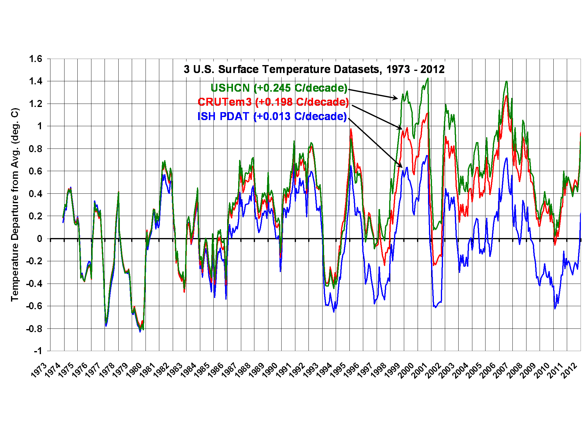
1) The linear warming trend during 1973-2012 is greatest in USHCN (+0.245 C/decade), followed by CRUTem3 (+0.198 C/decade), then my ISH population density adjusted temperatures (PDAT) as a distant third (+0.013 C/decade)
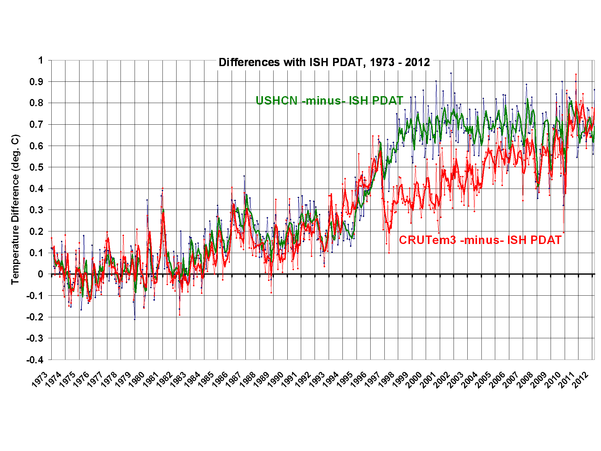
2) Virtually all of the USHCN warming since 1973 appears to be the result of adjustments NOAA has made to the data, mainly in the 1995-97 timeframe.
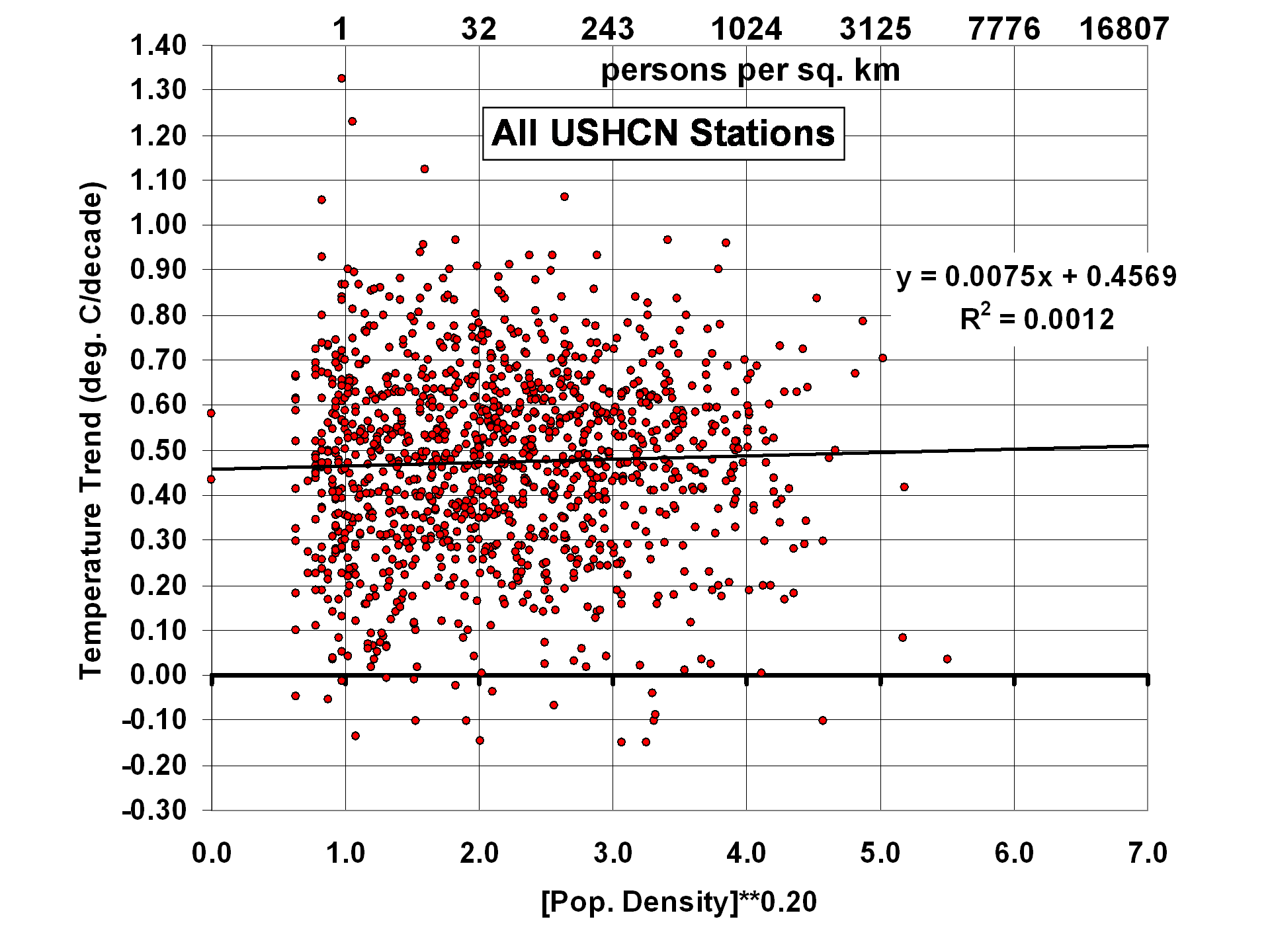
3) While there seems to be some residual Urban Heat Island (UHI) effect in the U.S. Midwest, and even some spurious cooling with population density in the Southwest, for all of the 1,200 USHCN stations together there is little correlation between station temperature trends and population density.
4) Despite homogeneity adjustments in the USHCN record to increase agreement between neighboring stations, USHCN trends are actually noisier than what I get using 4x per day ISH temperatures and a simple UHI correction.
The following plot shows 12-month trailing average anomalies for the three different datasets (USHCN, CRUTem3, and ISH PDAT)�note the large differences in computed linear warming trends (click on plots for high res versions):
The next plot shows the differences between my ISH PDAT dataset and the other 2 datasets. I would be interested to hear opinions from others who have analyzed these data which of the adjustments NOAA performs could have caused the large relative warming in the USHCN data during 1995-97:
From reading the USHCN Version 2 description here, it appears there are really only 2 adjustments made in the USHCN Version 2 data which can substantially impact temperature trends: 1) time of observation (TOB) adjustments, and 2) station change point adjustments based upon rather elaborate statistical intercomparisons between neighboring stations. The 2nd of these is supposed to identify and adjust for changes in instrumentation type, instrument relocation, and UHI effects in the data.
We also see in the above plot that the adjustments made in the CRUTem3 and USHCN datasets are quite different after about 1996, although they converge to about the same answer toward the end of the record.
UHI Effects in the USHCN Station Trends
Just as I did for the ISH PDAT data, I correlated USHCN station temperature trends with station location population density. For all ~1,200 stations together, we see little evidence of residual UHI effects:
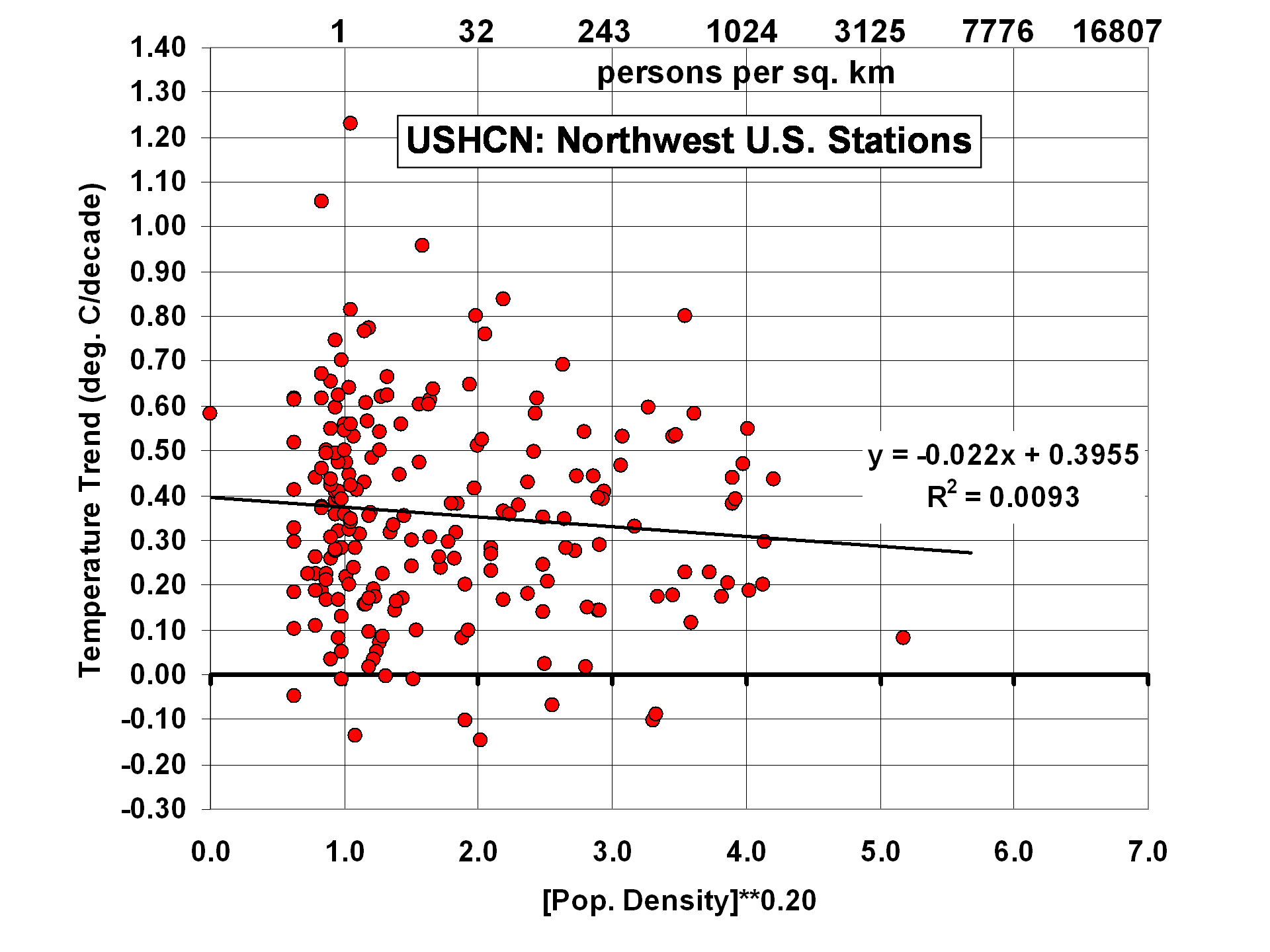
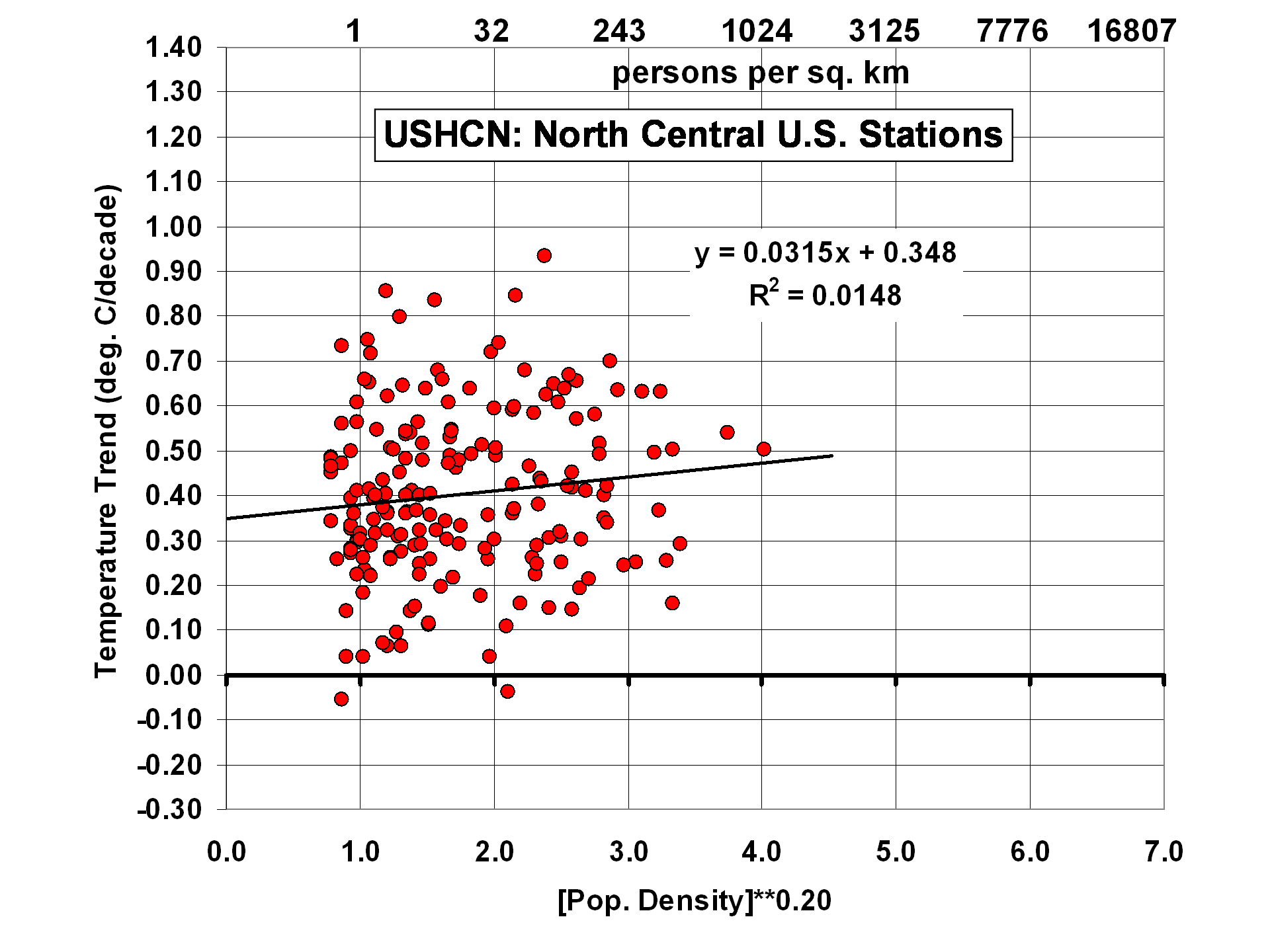
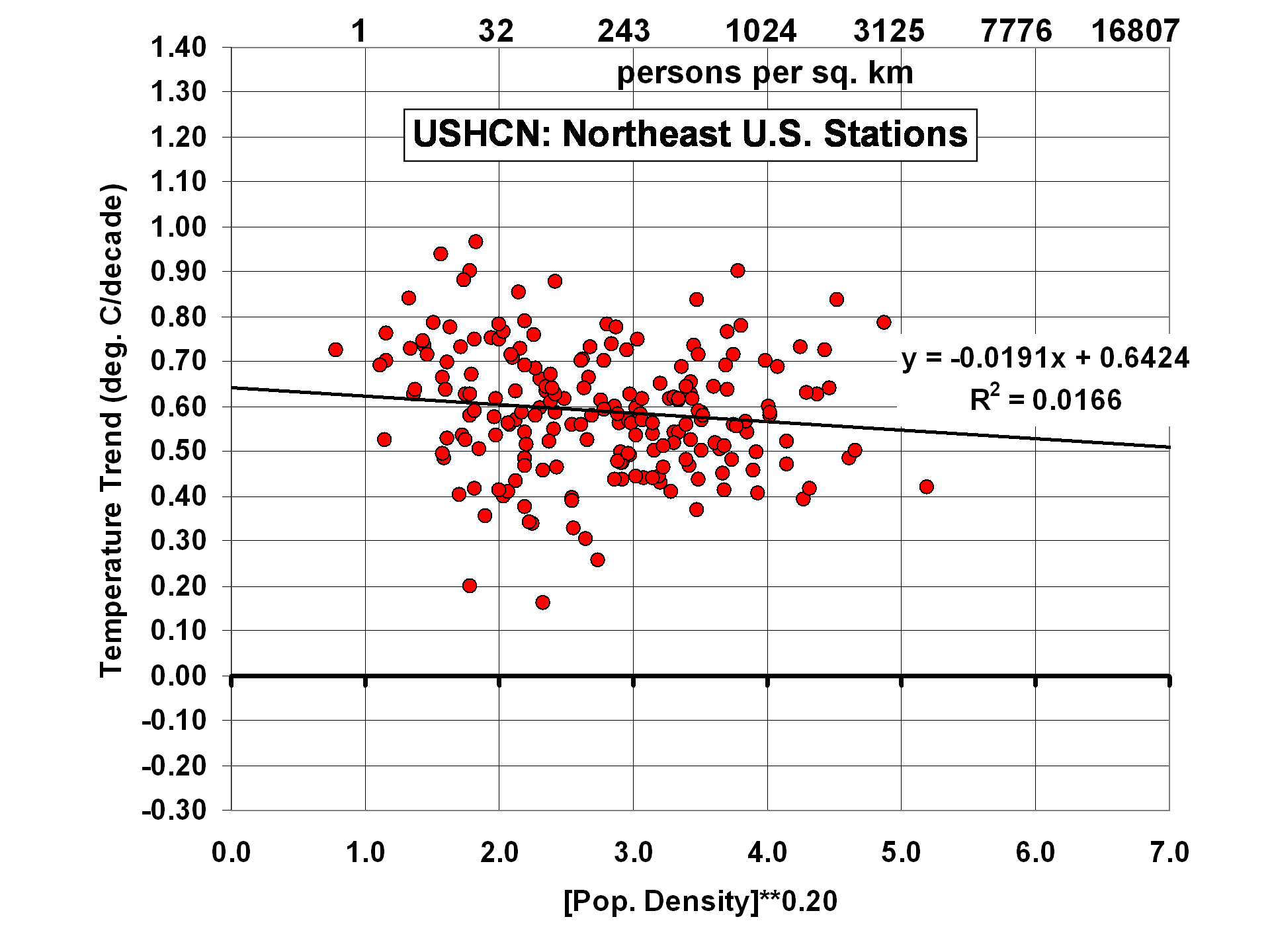
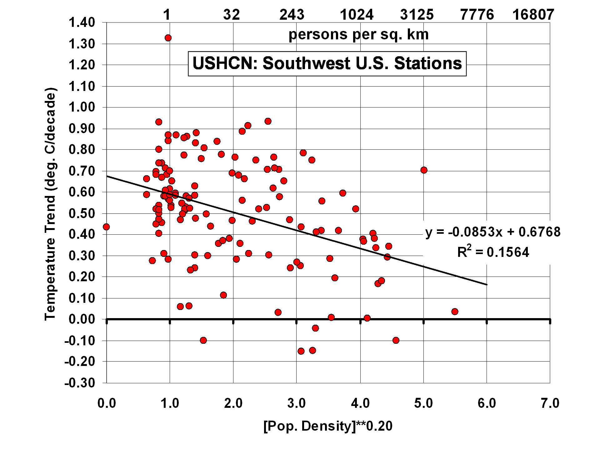
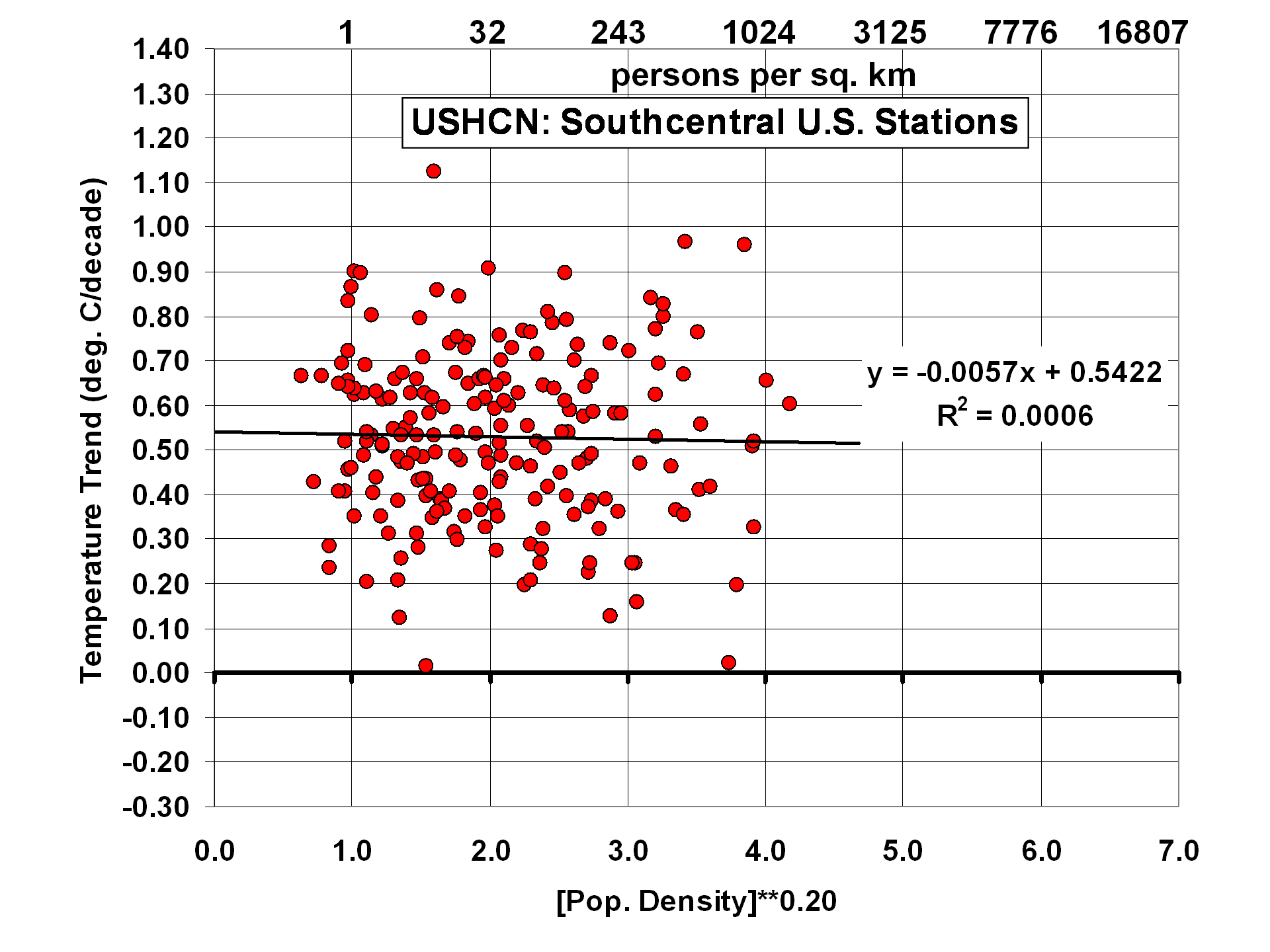
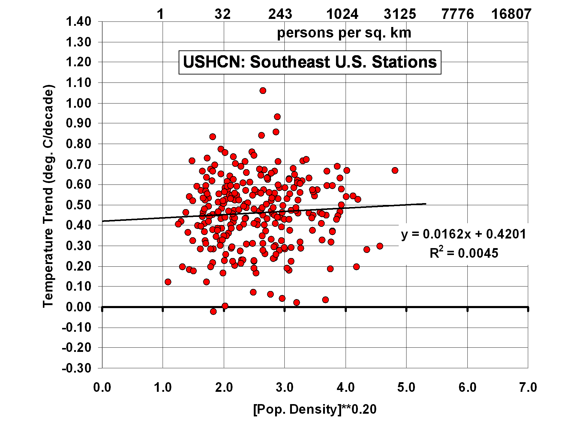
The results change somewhat, though, when the U.S. is divided into 6 subregions:
Of the 6 subregions, the 2 with the strongest residual effects are 1) the North-Central U.S., with a tendency for higher population stations to warm the most, and 2) the Southwest U.S., with a rather strong cooling effect with increasing population density. As I have previously noted, this could be the effect of people planting vegetation in a region which is naturally arid. One would think this effect would have been picked up by the USHCN homogenization procedure, but apparently not.
Trend Agreement Between Station Pairs
This is where I got quite a surprise. Since the USHCN data have gone through homogeneity adjustments with comparisons to neighboring stations, I fully expected the USHCN trends from neighboring stations to agree better than station trends from my population-adjusted ISH data.
I compared all station pairs within 200 km of each other to get an estimate of their level of agreement in temperature trends. The following 2 plots show the geographic distribution of the ~280 stations in my ISH dataset, and the ~1200 stations in the USHCN dataset:
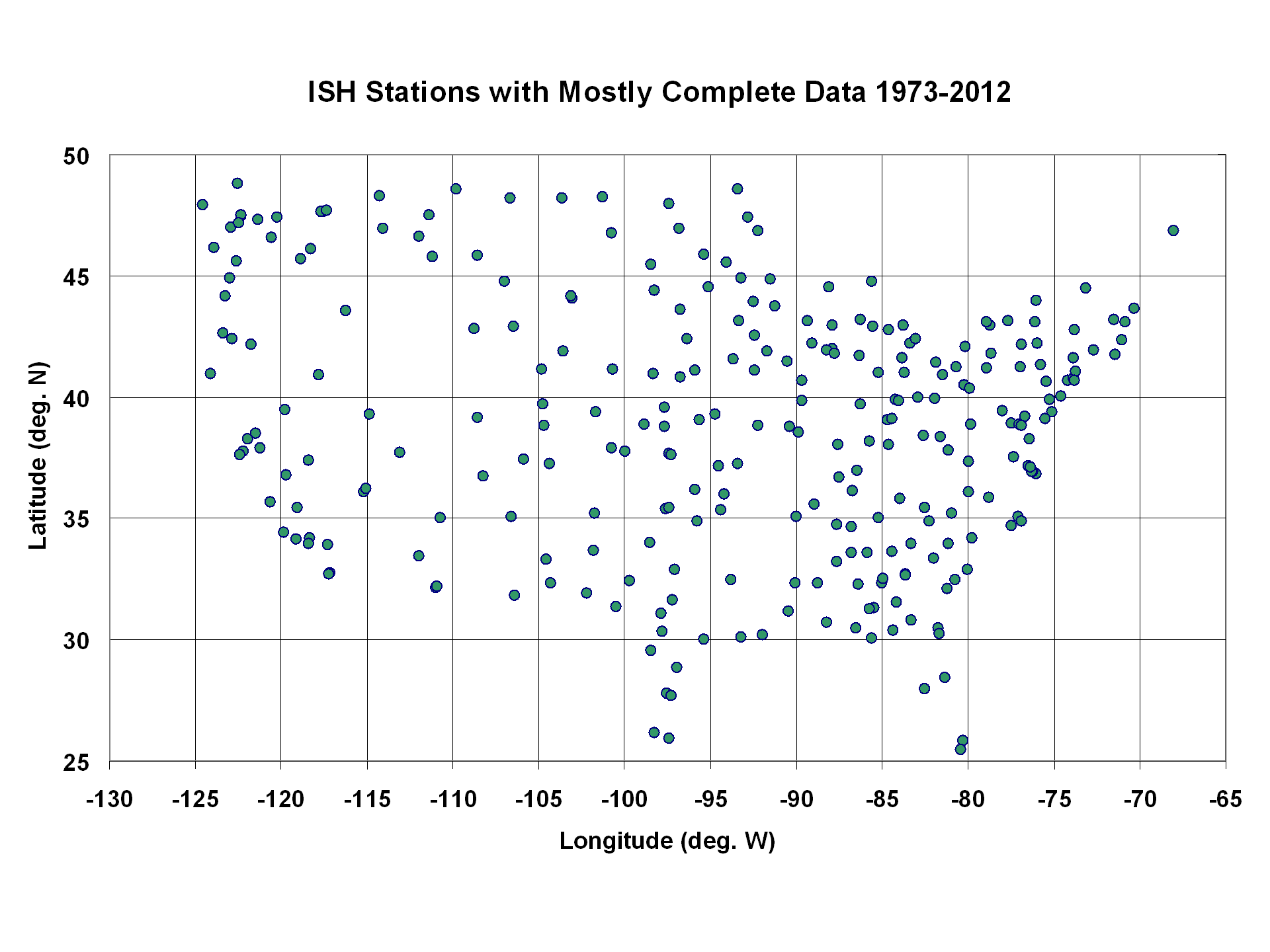
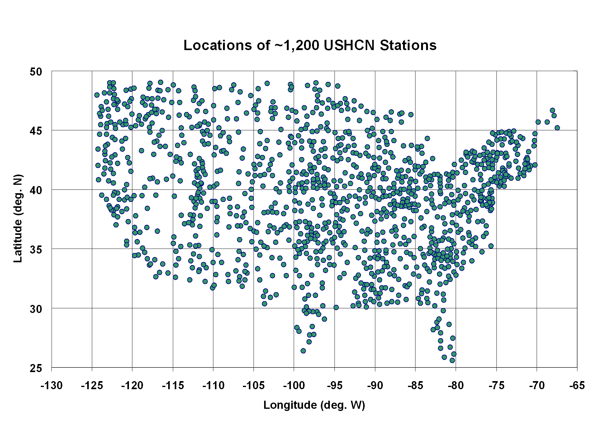
I took all station pairs within 200 km of each other in each of these datasets, and computed the average absolute difference in temperature trends for the 1973-2012 period across all pairs. The average station separation in the USHCN and ISH PDAT datasets were nearly identical: 133.2 km for the ISH dataset (643 pairs), and 132.4 km for the USHCN dataset (12,453 pairs).
But the ISH trend pairs had about 15% better agreement (avg. absolute trend difference of 0.143 C/decade) than did the USHCN trend pairs (avg. absolute trend difference of 0.167 C/decade).
Given the amount of work NOAA has put into the USHCN dataset to increase the agreement between neighboring stations, I don�t have an explanation for this result. I have to wonder whether their adjustment procedures added more spurious effects than they removed, at least as far as their impact on temperature trends goes.
And I must admit that those adjustments constituting virtually all of the warming signal in the last 40 years is disconcerting. When �global warming� only shows up after the data are adjusted, one can understand why so many people are suspicious of the adjustments.

 Home/Blog


The effect that such radiation has on the rate of cooling of the warmer target depends on both the temperature of the source and the number of frequency bands within that radiation which can resonate.
We also see in the above plot that the adjustments made in the CRUTem3 and USHCN datasets are quite different after about 1996, although they converge to about the same answer toward the end of the record. Mold removal company near me
If a weather station in a field suddenly has a 6 lane highway built next to it with a gas station, diner and large parking lot, this may be more important than population density.