It looks like the Gold Standard (USHCN) for U.S. temperature monitoring is spuriously warmer than the Platinum Standard (USCRN)
After Anthony Watts pointed out that the record warm July announced by NOAA based upon the “gold standard” USHCN station network was about 2 deg. F warmer than a straight average of the 114 core US Climate Reference Network (USCRN) stations, I thought I’d take a look at these newer USCRN stations (which I will call the “Platinum Standard” in temperature measurement) and see how they compare to nearest-neighbor USHCN stations.
USCRN Stations in Google Earth
First, I examined the siting of the core set of 114 stations in Google Earth. Most of them are actually visible in GE imagery, as seen in this example from Kentucky (click for full-size image):
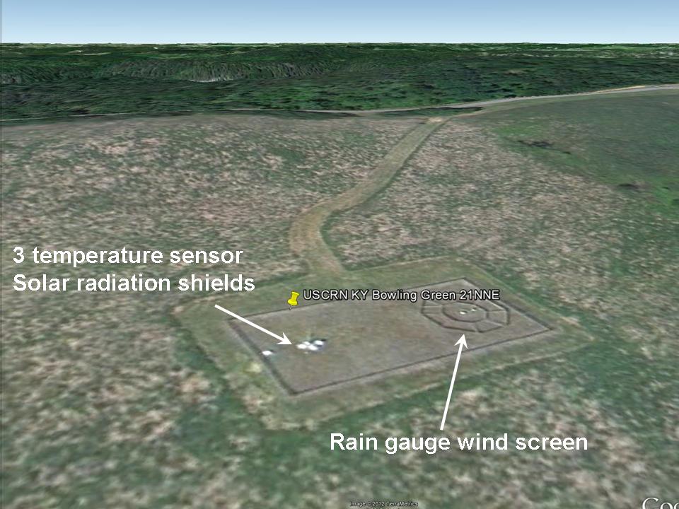
The most identifiable features of the USCRN sites are the three white solar radiation shields over the 3 temperature sensors, and the circular wind shield placed around the precipitation gauge.
While most of the CRN sites are indeed rural, some of them are what I would call “nearly rural”, and a few will probably have limited urban heat island (UHI) effects due to their proximity to buildings and pavement, such as this one next to a 300 meter-diameter paved surface near Palestine, TX which NASA uses as a research balloon launch site:
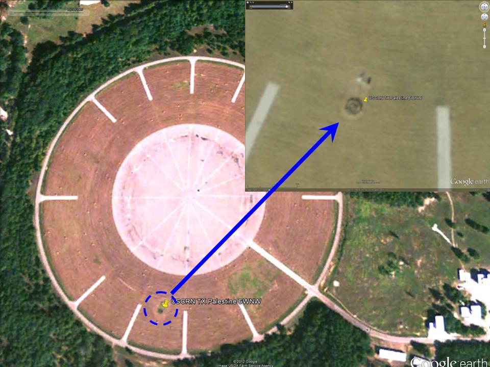
The larger image (from October) suggests that the ground cover surrounding the paved area is kept free of vegetation, probably by spraying, except right around the weather sensors themselves.
A few station locations have 2 USCRN sites located relatively close to each other, presumably to check calibration. A particularly interesting pair of sites is near Stillwater, OK, where one site is a few hundred meters from residential Stillwater, while the paired site is about 2.4 km farther out of town:
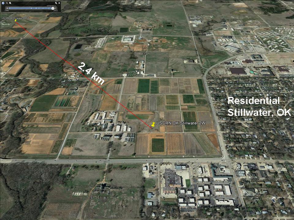
Whether by design or not, this pair of sites should allow evaluation of UHI effects from small towns. Since the temperature sensors (Platinum Resistance Thermometers, or PRTs) are so accurate and stable, they can be used to establish fairly tiny temperature differences between the few CRN neighboring station pairs which have been installed in the U.S.
From my visual examination of these 114 USCRN sites in Google Earth, the “most visited” site is one in rural South Dakota, which apparently is quite popular with cattle, probably looking for food:

Just 1 km to the southwest is this even more popular spot with the locals:
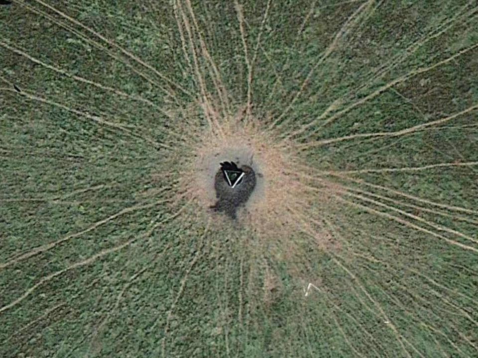
Hopefully, this USCRN site will not experience any BHI (Bovine Heat Island) effects from localized methane emissions, which we are told is a powerful source of greenhouse warming.
Elevation Effects
One important thing I noticed in my visual survey of the 114 USCRN sites is the tendency for them to be placed at higher elevations compared to the nearby USHCN sites. This is a little unfortunate since temperature decreases with height by roughly 5 deg. C per km, which is 0.5 deg. C per 100 meters, an effect which cannot be ignored when comparing the USCRN and USHCN sites. Since I could not find a good source of elevation data for the USCRN sites, I used elevations from Google Earth.
USCRN and USHCN Station Comparisons
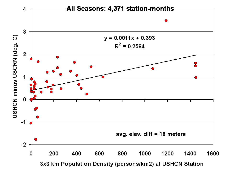
As a first cut at the analysis, I compared all available monthly average temperatures for HCN-CRN station pairs where the stations were no more than 30 km apart in distance and 100 m in elevation. This greatly reduces the number of USCRN stations from nominally 114 to only 42, which were matched up with a total of 46 USHCN stations.
The results for all seasons combined shows that the USHCN stations are definitely warmer than their “platinum standard” counterparts:
The discrepancy is somewhat greater during the warm season, as indicated by the results for just June-July-August:
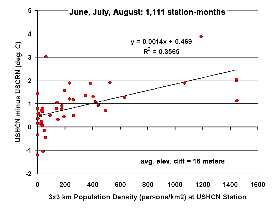
Regarding that Stillwater, OK USCRN station pair, the site closest to the Stillwater residential area averaged 0.6 deg. C warmer year-round (0.5 deg. C warmer in summer) than the more rural site 2 km farther out of town. This supports the view that substantial UHI effects can arise even from small towns.
The largest UHI effects in the above plots are from USHCN Santa Barbara, CA, with close to 4 deg. C warming compared to the nearby USCRN station. Both stations are located about the same distance (a few hundred meters) from the Pacific Ocean.
What Does this Mean for U.S Temperature Records?
I would say these preliminary results, if they pan out, indicate we should be increasingly distrustful of using the current NOAA USHCN data for long-term trends as supporting evidence for global warming, or for the reporting of new high temperature records. As the last 2 plots above suggest:
1) even at “zero” population density (rural siting), the USHCN temperatures are on average warmer than their Climate Reference Network counterparts, by close to 0.5 deg. C in summer.
2) across all USHCN stations, from rural to urban, they average 0.9 deg. C warmer than USCRN (which approaches Anthony Watt’s 2 deg. F estimate for July 2012).
This evidence suggests that much of the reported U.S. warming in the last 100+ years could be spurious, assuming that thermometer measurements made around 1880-1900 were largely free of spurious warming effects. This is a serious issue that NOAA needs to address in an open and transparent manner.
The good news is that the NOAA U.S. Climate Reference Network is a valuable new tool which will greatly help to better understand, and possibly correct for, UHI effects in the U.S. temperature record. It is to their credit that the program, now providing up to 10 years of data, was created.

 Home/Blog


