The Magical Mystery Climate Index – What does it show?

November 25th, 2013 by Roy W. Spencer, Ph. D.

I’ve been having discussions with a physicist-friend about how to analyze time series data: what kinds of smoothing or filtering should be used, etc. The blogosphere is filled with discussions of various climate datasets and what people think they “see” in them.

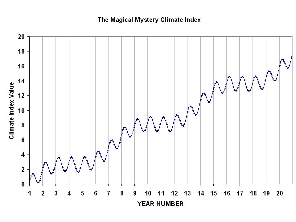
Time series analysis is nothing new, and has a rich history. But it is easy to be fooled by data. So, as a learning exercise, I would like readers to examine the following 20-year plot of monthly data…I’ll call it the Magical Mystery Climate Index. I would like you to tell me what you see.
magical-mystery-climate-index

For those so inclined to do some data analysis, here are the data in an Excel spreadsheet: Magical-mystery-climate-index

I suppose what I am asking is this: What modes of variability do you see in the data? I happen to know the answer, because I’m the one who defined those modes of variability. I just want to see what other people come up with. I’ll post the real answer when I stop getting new ideas from readers.


46 Responses to “The Magical Mystery Climate Index – What does it show?”

Toggle Trackbacks

  1. Eric Barnes says:

    2 sine waves 1 with 0 trend an 1 year period and another with a linear trend and ~7 year period.

  2. Thanks for the riddle, Dr. Spencer.
    I see a decadal ramp modulated by a yearly sine wave.

  3. TomL says:

    A linear trend with two sine waves, one with a one-year period and another with an 8-9 year period superimposed.

    Or, the “linear” trend could be a cyclic trend with a period >> the length of the record.

  4. Hot Potato says:

    To play the smoothing game properly, we must not only say what mode of variability we see, but what these modes predict as future values. Alright, I predict at Year 25 the Climate Index Value tops out at 20 and begins its descent to zero in approximately the same manner and variability of its incline creating a typical bell curve. In otherwords, when expanding the range of years, the linear decadal ramp could look very much like the one-year sine wave trend. Fractals viewed through a greatly obscured lens (smoothing and filtering).

  5. TomL says:

    Or, there is a very high frequency component that has been aliased by the 1 month sample interval.

  6. RichardLH says:

    Linear trend, with added 1 year, 7 years and 13.5 years sine waves I believe.

    Were you looking for the magnitudes as well?

  7. Cat J says:

    Your mystery function is

    mystery(t) = 16/20*t+ a*sin(2*pi*3*t/20)+b*sin(2*pi*20*t/20)

    Where t is off by one because you start with year 1 instead of zero. a and b could be 0.9, but I am too lazy to confirm.

    For the non-mathy types, this is a linear trend with two oscillating modes added to it. The “pauses” in the increase are caused by the oscillation with the longer period.

    Cat J

  8. RickA says:

    What fun!

    I see annual variability, with a peak in about Feb. and a trough in about August each year.

    I see three year flat sections, with a ramp upwards to the next flat section.

    My guess is the data is your Natural Gas bill.

    It peaks in winter, and is smallest in the summer.

    Rate increases happen every few years, and are constant for a number of years.

    So that would fit the data.

    Just a guess.

    • Hot Potato says:

      That’s a good guess. What also fits (but not the pants) is Al Gore’s waistline increase for the past twenty years. Think of all the methane he’s released from both orifices due to his decadent lifestyle not to mention all the fossil fuel he’s burned to maintain his status as smug windbag. Which is fine, except he wants to deprive all the little people of the same opportunity and instead tax them for his privileged consumption.

  9. lemiere jacques says:

    i think it is too simple so there must be a trick there so it could something like the sum of sin waves with little difference in frequency, well the point is you have several ways to describe such a curves…

  10. James says:

    It is whatever Michael Mann wants it to be!

  11. Go Canucks!! says:

    It a step chart with a positive linear trend.

  12. Scott Scarborough says:

    Without reading what anyone else said, I say 4 step inputs overlayed with a sinusoid.

  13. Scott Scarborough says:

    After reading the other comments, it looks more likely that it is the addition of 3 sinusoids. One with a period of ~1year, one with a period of ~6 years, and one with a period of > 60 years.

  14. MikeF says:

    A linear trend, with three superimposed sinusoids. The periods are 1 year, 6 years, and a weak one at 7.5 years.

  15. Hot Potato says:

    It’s yet another algorithm, or algorithms, that will shape our lives…..especially if Mann has any say in it.

    http://www.youtube.com/watch?v=TDaFwnOiKVE&feature=player_embedded#!

  16. don penman says:

    The way I see it is that it alternates between rises and pauses but it never goes down other than in the periodic oscilations so that it ends higher than it starts.

  17. darrylb says:

    Since the variable is some climate index value

    1)There appears to be a consistent annual flux in the value

    2)There is a consistent periodic “beat” of a net positive forcing followed by a pause of equal length of time (3-4 yrs)

    a) This could be the result of the positive forcing occurring periodically or

    b) It could be the result of a consistent positive force and a second negative force which occurs periodically to dampen or ‘neutralize’ the positive force.

    The fact is we really do not know whether a) or b) is true or if in fact there are other unknown forces. We only know the sum of all forces.

  18. darrylb says:

    to modify my last statement, we only know the cumulative effect of the sum of all forces

  19. Luis Salas says:

    There is a linear trend over a period of 12 months and another 78 months.

    The exact function is:

    f(m)=-0,07+0,07*m+SENO(2*PI*m/12)+SENO(2*PI*m/78)

    where m is the number of months.

  20. Cat J says:

    OK, I decided to procrastinate more. To 8 digits,
    your mystery climate index is the sum of a linear piece with slope 16.8/20, and two sine waves with frequency 2*pi and 4*pi/13 (plus an offset of 0.07).

    Or

    mystery(t)=-0.07+16.8/20*t+sin(2*pi*t)+sin(4*pi/13*t)

    where t runs from 1/12 to 20.

    This gives a max error of 5e-9, which is the limit
    of accuracy of your data.

    CJ

  21. Christopher Game says:

    I would say one would not want to filter this plot. It looks as if it comes from some regular generator; by regular I just mean ‘not noisy’. The question of filtering would arise if the data looked, as the uninformed eye could see, noisy. The uninformed eye does not know what is noise and what is signal, so it will not know what sort of filtering is suitable, if any.

    Filtering data is an information-discarding operation. A suitable filter is one which discards just precisely and only irrelevant information. The uninformed eye doesn’t know what is relevant.

    I assume that the purpose here is to induce some natural scientific truth by adding the data to what is already regarded as known natural scientific truth. Natural scientific truth is of course always and only known as more or less probable, based on explicitly stated empirical data and some presupposed theoretical background, perhaps such as that space-time has Minkowski geometry. There is no escaping some theoretical presuppositions, but they should be as unassuming as one’s ingenuity can manage.

    One wants to find a mathematical description of the data that has a useful physical meaning. There is no escaping the desire for usefulness, nor the requirement that the meaning be physical; these are not mathematical criteria, they are practical and judgemental.

    The hard part is to frame a hypothetical mathematical formula that describes the data accurately and has a useful physical meaning. I look to Planck’s discovery of his law as a paradigm. By hook and by crook, he tried every desperate trick he could lay his hands on. Even the dreaded statistical theory of the troublesome Boltzmann. The breaking new data, found by the manufacture of better black body sources and radiative measuring methods. The several empirical formulas that each fitted only part of the data. And his deep theoretical understanding of classical thermodynamics and physics. This is scientific induction. This use of the word induction refers to far more than just to going from a given list of particular truths to a prescribed general truth.

    There is no general algorithm for scientific induction.

    I think that E.T. Jaynes (Probability Theory. The Logic of Science, Cambridge, 2003, edited by G. Larry Bretthorst) has much that is very valuable to say about scientific induction. His plan is in general to frame a bundle of mathematical hypotheses, or ‘models’ to describe the data, and to compare them pairwise, trying to find the best. He gives good reasons why pairwise comparison is good. The fundamental reason behind this is not made quite clear by Jaynes, but I think it is to be found in the classic Information Theory and Statistics by Solomon Kullback, originally published by Wiley in 1959: information-based comparisons only work well for pairwise comparisons.

    One fits one’s model to the data by estimating the best fitting model parameters, and says how much better it fits the data than does its nearest competitor, assuming explicitly specified background theory and facts.

    One doesn’t find the best model parameters by filtering the data, one finds them directly by estimating them from the raw data, relying on one’s ingenuity in producing candidate models. One may also estimate parameters for uninteresting aspects of the data, and use those estimates to remove the information that carries those now precisely specified uninteresting aspects, keeping in the processed data, for further analysis, all other information, including noise the origin of which is still unknown.

    After one has found one’s best model with its best estimated parameters, one can see what is signal and what is noise, and then one is in a position to filter the data, to make it easier on the eye. But the filtering did not contribute to the estimation of the model parameters. Statistical tests are in general invalidated by prior filtering. Filtering is only to make the already induced result easier to see with the uninformed eye.

  22. O Dahlsveen says:

    There seems to be more measurements on the upward curve than there is on the downward one. Smoothed out? – Or is it time I changed my glasses?

  23. O Dahlsveen says:

    Reading through the other comments I see you have got a winner – Well done to Luis!

  24. Scott Scarborough says:

    What is SENO()?

  25. Everseeker says:

    And The American name is

    Sin()

  26. Vilnius says:

    I am very sorry for being one month late and off-topic here, but in a previous thread (titled “Oceanic cloud decrease since 1987 explains 1/3 of ocean heating”), Dr Spencer and Christopher Game refer to a paper of Miskolczi 2010 and a Table 3 in it, and the comments in that thread are closed.

    That paper is based on computer simulations – namely, on clear-sky radiative transfer calculations on average (clear + cloudy) atmospheric profiles. This means tracking the paths of long-wave photons downwards and upwards, up to 60 km in the stratosphere, as if there were no clouds in the air at all. When there are clouds in the air (about in the half of the cases), they block the way of the long-wave photons completely. So his method is meaningless, its results are useless. The author knows it, as he is who supplies the cloudy input data into the clear-sky program. He uses NOAA average atmospheric profile, but as NOAA weather balloon observations do not indicate cloudiness, the cloudy cases are not sorted out. He tells the reader nothing about his nonsense; on the contrary, he lets you and every non-expert of the field (and probably most of the readers of the not-peer-reviewed journal Energy and Environment are not-RT-experts) to think his method is fair. Which is a very troubling behavior. He should clarify this before going any further on his theory, or his case is closed.

  27. Pretty! This was an incredibly wonderful post. Thanks for providing this information…

  28. Great line up. We will be linking to this great article on our site. Keep up the good writing.

  29. Nice article, it provides many informative and helpful information. Thanks for sharing this. Looking for more updates in future!
    https://ringwoodelectrician.com.au/residential-electrician-ringwood-east/

Leave a Reply