
 Home/Blog
About a year ago, Finnish climate researcher Antti Lipponen posted a new way to visualize global warming, an animation he called the “temperature circle”. It displays the GISS land temperature data as colored bars for each country in the world radiating from a circle. As the temperature in a country goes up, the colored bar changes from a blue bar to a red bar, and gets longer…and wider:
I didn’t pay much attention to the ‘temperature circle’ at the time as it seemed rather gimmicky. But yesterday I was asked on social media about it, and I watched it again. The video has about 163,000 views on Twitter and 175,000 views on Youtube, and its impact on people’s perception is evidenced by some of the recent Youtube comments:
“Excellent presentation of a large mass of data. But the denialists will invent reasons to ignore it.”
“We’re toast.”
“This is among the scariest presentations I have ever seen. Yes, I have kids.”
After thinking about the animation for a minute, it quickly became apparent why warming displayed this way looks so dramatic… and is so misleading. The best way to describe the issue is with an example.
Assume all the countries in the world were 2 deg. C below normal, and then at some later time all of them warmed to 2 deg. C above normal. Here’s the way the ‘temperature circle’ plotting technique would display them (ignore the displayed year and ‘real’ data, just focus on the blue and red segments I have superimposed):
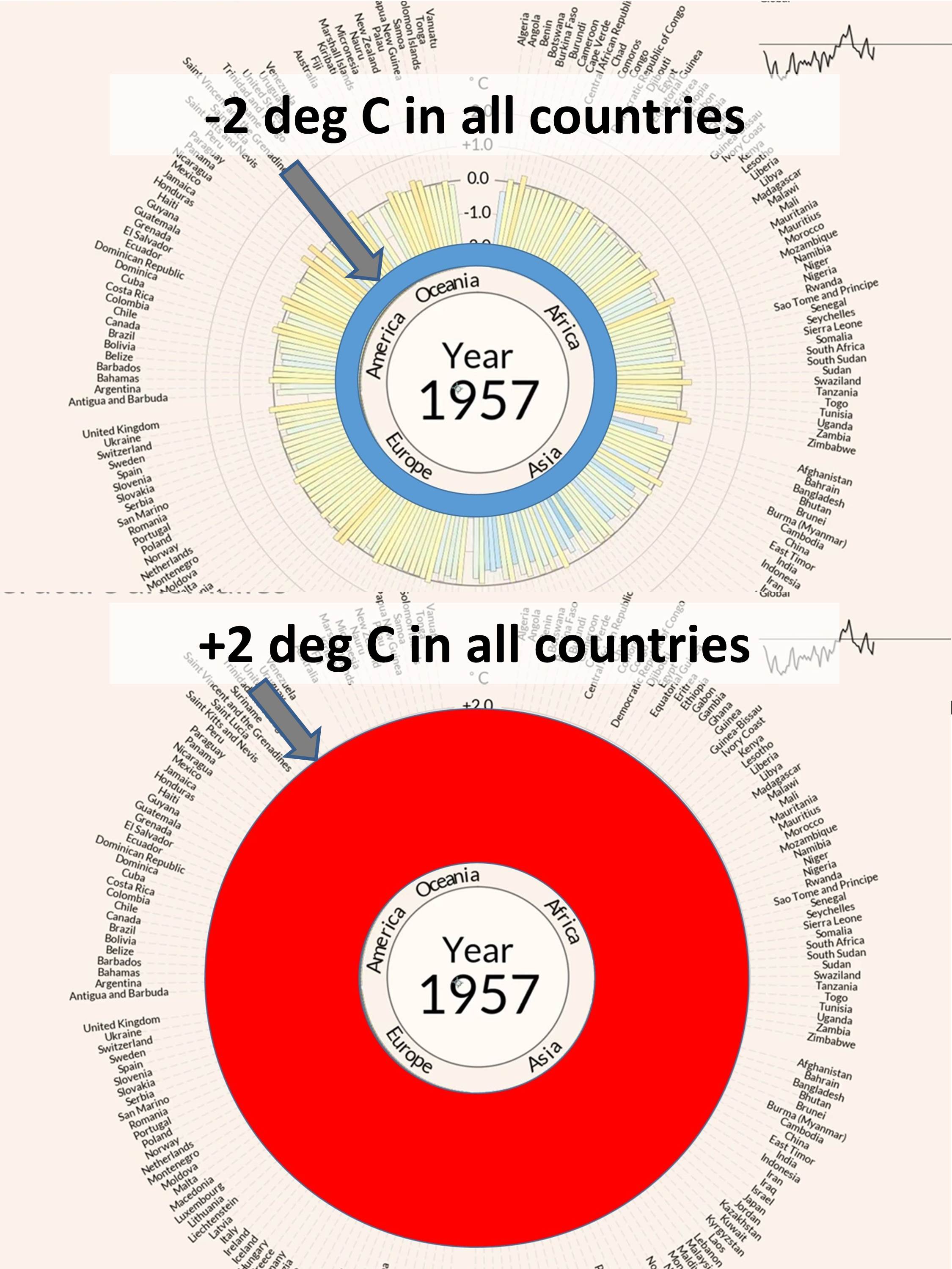
Fig. 1. The “temperature circle” animation exaggerates the perception of warming by non-linearly increasing the area of a colored annulus, even if warming progresses linearly.
Note that the coldest temperatures will have the smallest area covered by blue, and the warmest temperatures will have the largest area covered by red, even though the absolute sizes of -2 deg and +2 deg departures from average are the same.
I consider this very deceptive.
What this display technique does is cause a linear rate of warming to appear like it is non-linearly increasing, or accelerating. The perceived warming goes as the square of the actual temperature increase.
In fact, even if warming was slowly decelerating, it would still look like it was accelerating.
If this was a graphics artist playing around with data in various kinds of display software, I might be able to excuse it as artistic license.
But the fact that a climate researcher would do this is, well, surprising to say the least.


It’s called interglacial, and it is one of the cicles on the earth. They had to stop panicking the people. Googlee it. Is there enough information online.
Just one thing, it should be cooling down now, not heating up. So what will happen when the natural cycle of heating up will begin?