2018 was 6th Warmest Year Globally of Last 40 Years
The Version 6.0 global average lower tropospheric temperature (LT) anomaly for December, 2018 was +0.25 deg. C, down a little from +0.28 deg. C in November:

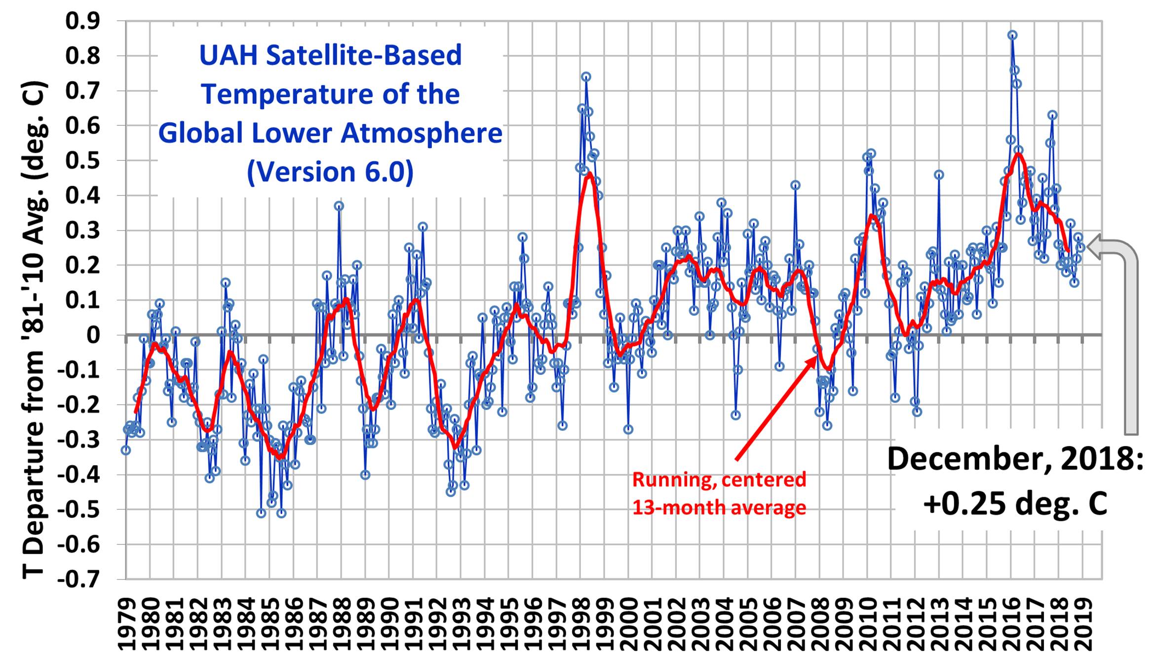
Global area-averaged lower tropospheric temperature anomalies (departures from 30-year calendar monthly means, 1981-2010). The 13-month centered average is meant to give an indication of the lower frequency variations in the data; the choice of 13 months is somewhat arbitrary… an odd number of months allows centered plotting on months with no time lag between the two plotted time series. The inclusion of two of the same calendar months on the ends of the 13 month averaging period causes no issues with interpretation because the seasonal temperature cycle has been removed, and so has the distinction between calendar months.
Various regional LT departures from the 30-year (1981-2010) average for the last 24 months are:
YEAR MO GLOBE NHEM. SHEM. TROPIC USA48 ARCTIC AUST
2017 01 +0.33 +0.32 +0.35 +0.11 +0.28 +0.95 +1.22
2017 02 +0.39 +0.58 +0.20 +0.08 +2.16 +1.33 +0.22
2017 03 +0.23 +0.37 +0.10 +0.06 +1.22 +1.24 +0.98
2017 04 +0.28 +0.29 +0.27 +0.22 +0.90 +0.23 +0.40
2017 05 +0.45 +0.40 +0.50 +0.42 +0.11 +0.21 +0.06
2017 06 +0.22 +0.34 +0.10 +0.40 +0.51 +0.10 +0.34
2017 07 +0.29 +0.31 +0.28 +0.51 +0.61 -0.27 +1.03
2017 08 +0.41 +0.41 +0.42 +0.47 -0.54 +0.49 +0.78
2017 09 +0.55 +0.52 +0.58 +0.54 +0.30 +1.06 +0.60
2017 10 +0.64 +0.67 +0.60 +0.48 +1.22 +0.83 +0.86
2017 11 +0.36 +0.34 +0.39 +0.27 +1.36 +0.68 -0.12
2017 12 +0.42 +0.50 +0.33 +0.26 +0.45 +1.37 +0.36
2018 01 +0.26 +0.46 +0.06 -0.11 +0.59 +1.36 +0.43
2018 02 +0.20 +0.25 +0.16 +0.04 +0.92 +1.19 +0.18
2018 03 +0.25 +0.40 +0.10 +0.07 -0.32 -0.33 +0.60
2018 04 +0.21 +0.32 +0.11 -0.12 -0.00 +1.02 +0.69
2018 05 +0.18 +0.41 -0.05 +0.03 +1.93 +0.18 -0.39
2018 06 +0.21 +0.38 +0.04 +0.12 +1.20 +0.83 -0.55
2018 07 +0.32 +0.43 +0.22 +0.29 +0.51 +0.29 +1.37
2018 08 +0.19 +0.22 +0.17 +0.13 +0.07 +0.09 +0.26
2018 09 +0.15 +0.15 +0.14 +0.24 +0.88 +0.21 +0.19
2018 10 +0.22 +0.31 +0.13 +0.34 +0.25 +1.11 +0.39
2018 11 +0.28 +0.27 +0.30 +0.50 -1.13 +0.69 +0.53
2018 12 +0.25 +0.32 +0.19 +0.32 +0.20 +0.65 +1.19
The 2018 globally averaged temperature anomaly, adjusted for the number of days in each month, is +0.23 deg. C, making 2018 the 6th warmest year in the now-40 year satellite record of global lower tropospheric temperature variations.
The linear temperature trend of the global average lower tropospheric temperature anomalies from January 1979 through December 2018 remains at +0.13 C/decade.
The UAH LT global anomaly image for December, 2018 should be available in the next few days here.
The new Version 6 files should also be updated at that time, and are located here:
Lower Troposphere: http://vortex.nsstc.uah.edu/data/msu/v6.0/tlt/uahncdc_lt_6.0.txt
Mid-Troposphere: http://vortex.nsstc.uah.edu/data/msu/v6.0/tmt/uahncdc_mt_6.0.txt
Tropopause: http://vortex.nsstc.uah.edu/data/msu/v6.0/ttp/uahncdc_tp_6.0.txt
Lower Stratosphere: http://vortex.nsstc.uah.edu/data/msu/v6.0/tls/uahncdc_ls_6.0.txt
.5 degree C warming across 40 years. Not hugely shocking but not nothin.
Especially when you consider there was cooling for the previous 40 years of .2 -.5 C according to many papers written in the 1970s.
The cooling in earlier period may have been related to the sulfate emissions from the rapid increase in coal use without scrubbers before the 1970’s. Back then, before the OPEC/Arab Oil Embargo of 1973, the US electrical system was expanding at a 7% a year growth rate, i.e., a doubling time of 10 years. Those emissions were reduced after the passage of the Clean Air Act in the US and other efforts to combat acid rain in Europe. In more recent decades, the World has seen another surge in sulfate and other aerosol emissions from developing countries, primarily China and India, causing deadly smog events and a large area of aerosol buildup called the Asian Brown Cloud, which can be seen from satellites.
Of course, some folks around here only want to look at part of the situation, ignoring such other impacts which may be causing temporary cooling. If China and India clean up their air quality, I would expect to see some catch up warming as a result.
There are lots of sulfate emissions today with no evidence they are reducing the temperature. It is unlikely they reach the altitudes necessary to have a large effect on the global temperature. This was likely true in the past as well.
RM, Sulfates on climate have two mechanisms to effect climate. The effect of volcanic eruptions are local and the sulfate must reach high altitudes to achieve longer time scale, wider area impacts. The impact of the so-called “human volcano” exhibit a rather short residence time, due to rain out. However, those sulfates are the result of continuous emissions over large areas, thus there is no need for the sulfate (and carbon black, etc) to achieve high altitude for there to be an impact. The Wiki article on the Asian Brown Cloud give several references, most rather out of date, which may provide the evidence you claim to be lacking. HERE’s a more recent article from SCIENCE.
wait. so using the 1970’s as the baseline for what our temperature SHOULD be, with all that smog, makes any sense at all?
Assuming some cooling pre-1970 resulted from increased sulfate emissions, did sulfate emissions reduce after 1970 and if so how much warming did that reduction contribute to?
Especially when you consider there was cooling for the previous 40 years of .2 -.5 C according to many papers written in the 1970s.
The data was confined to land temps in the US and Europe.
Those papers were written before global data sets were gathered, and the cooling in those regions was not matched in other parts of the world.
Global land+sea temps for 1940-1970:
Had.CRU4: -0.021 (+/- 0.052) C/decade
NOAA: -0.038 (+/- 0.062) C/decade
GISS: -0.031 (+/- 0.054) C/decade
BEST: -0.013 (+/- 0.046) C/decade
Pointing to highly adjusted data does not help your case. The point is still correct. Notice that your values differ by a factor of 3. This tells us the raw data is being changed.
Add to that we don’t have good data for the Arctic back in that time period. Much of the warming today is in the Arctic. Chances are we had the same warming back in the 1930s-1950s but it is missing from the data which makes it look like less cooling.
The cooling was obvious to the scientists back then. The attempts to dismiss it today are laughable and show a real anti-science mentality.
The data they available in the 70s was not global. It was almost entirely land stations in North America and the US. The data for those regions still show significant cooling in the most recent data sets data sets, but the rest of the world does not have the same profile. It is not adjustments, but additional data from the rest of the world that reduce the cooling for the period.
Assuming you agree that regions covering less than 9% of the global surface is insufficient, which data set do you prefer for a global record covering the period you are interested in?
Almost is not all. There was data from all over the world. You are justifying your denial.
However, I am in agreement that looking at NH land areas leads to larger swings in temperature. This is part of the problem today. Once again, SH SSTs show very little warming. Especially over the last couple of decades. What happened to the “global” part of global warming?
Please link to the paper detailing the data. I believe we’ll find that more than 95% of data came from the US and Europe.
Time to look at sources. I think you’re misrepresenting the situation, whether you’re aware of that or not.
SH SSTs show warming 0f 0.09 C/decade over the whole record, and 0.09 C/decade for the last 20 years (Dec 1998 – Nov 2018). UAH data.
Global warming refers to the global average. Some places have warmed faster than others, and a couple of small regions have cooled over the last few decades. No one ever said that warming would be uniform. Fallacy: straw man.
Australia has long records of weather data. Australia is about the same size as USA without Alaska. Averaging OZ and US should give close to and average of the world. Australia also has a long record of measurement in the Antarctic with is more important than the Arctic because of the greater extent of ice. One could add in the measurements of Australian stations in the Antarctic and US/Canadian stations in the Arctic. That should be representative of the world.
By the way I have trouble believe the large range of anomalies in the above satellite data for Australia and USA. In my experience living in Qld (and prior years in Sydney and Melbourne)that the anomaly for Aust. was unlikely to have been over +1.00 in Dec. In fact many places had record rain which should reduce temperatures. At my place the rainfall at 213 mm was above average of 170mm.
cementafriend
You mix here (typically for many commenters) :
– surface vs. lower troposphere (about 5 km altitude);
– local vs. global in Australia.
Australia might have had on its surface records averages for the last 40 years differing from what was measured in the LT at the same time.
And Sydney/Melbourne, Darwin and Perth might have had different temperature profiles.
Cementafriend, in the 1970s hardly any of the Australian data had been collated for a long term climate record. The Global Historical Climate Network was first collated and published in 1992. Prior to that the long-term records available for climate monitoring were mainly from Europe and the US. That is the main reason why older data sets have a different profile to more recent data sets with global coverage.
Averaging OZ and US should give close to and average of the world.
At less than 10% of the global surface (land and sea)? I don’t see why, but even if it did provide a fairly good average, the combined temperature evolution for those countries will still look different from the global average. This is what gets skeptics excited, thinking that there is skulduggery, when it is only that long term regional temperature evolution (warming) is not uniform around the globe.
In my experience living in Qld (and prior years in Sydney and Melbourne)that the anomaly for Aust. was unlikely to have been over +1.00 in Dec.
How would you ‘experience’ the December temp in Sydney and Melbourne if you weren’t there this December?
In fact many places had record rain which should reduce temperatures.
We’ve had thunderstorms in Sydney, as well as a heatwave. I was doing an outdoor job and we had to lay the workers off due to the heat (39C). My ‘experience’ tells me that it was a particularly hot summer. But my experience was limited to Bondi and Baulkham Hills.
Also, the lower troposphere is not the same as the surface, and doesn’t follow temps in lockstep.
It’s a common misapprehension that under global warming temps everywhere should evolve in lockstep (and with monotonous warming).
Richard M,
I’m still curious about this claim.
Especially when you consider there was cooling for the previous 40 years of 0.2 – 0.5 C according to many papers written in the 1970s.
I went looking for such papers but didn’t have any luck corroborating your view here.
This paper from 1975 claims a ‘global’ temperature record.
https://blogs.ei.columbia.edu//wp-content/uploads/2009/10/broeckerglobalwarming75.pdf
But the cooling period seems to be at most 0.2C, which is not far off the modern records for the same period.
Do you have any other references?
Richard M. we don’t have satellite data pre-1979, so we cans’t say what it would have shown. If you want to use surface data, you can get that from at least 1880 to present from various datasets. They all show about 0.075 C warming per decade since then. That is over 1 C of warming including the 30 years of between 1945 and 1975n when the global temperature dropped by about 0.2C
The CDAS/CFSR preliminary monthly average global mean surface temperature for December 2018 based on daily CDAS averages was 13.046C, which is the lowest December average since December 2014 at 12.893C. The December 2018 global mean surface temperature anomaly referenced to 1981-2010 was 0.325C compared to 0.246C for November 2018. The 2018 annual average global mean surface temperature was 14.710C which is the lowest since 14.560C in 2014. The 2018 global mean surface temperature anomaly referenced to 1981-2010 was 0.266C compared to 0.380C for 2017 and was the lowest since 0.115C in 2014. Monthly trends graphs here:
https://oz4caster.wordpress.com/monthly-trends/
Thank you for adding a third decimal to the mix.
Would it not be possible to add a few decimals more? Say 4 or 5? The request is genuine. As things stand, we have seen the following “[the] linear temperature trend… remains at +0.13 C/decade” for long enough.
Martha
Most people processing big amounts of data know that the less precision you use for complex computations, the less accuracy your result will have at the end.
Not everybody has time enough to produce public output with less digits a.t.d.p. than s/he internally needs.
Thank you again for the quick release and interesting data!
Would you like to comment on the fact that the December anomali at + 0.25 is not higher than this year’s January anomaly at 0.26, despite the change in ENSO in this period, from a weak Nina to a potensial Nino? Could it be related to the drop in solar Activity in general and/or the short term change related to the 11-year cyclus?
Best regards O.Klemsdal, Oslo, Norway
there is a considerable time lag between ENSO changes and tropospheric temperature changes, up to a few months. Also, 1 month is such a short time period that tropical intraseasonal oscillations can have considerable influence on month-to-month tropospheric temperature changes.
Thank you for the sobering comments..
It will be interesting to se if a rise is indeed coming the next 2-3 months, however, especially when considering how warm for instance the Metoffice (UK) have their forecast for 2019 (i.e. close to the 2016 record high)
” The Met Office global temperature forecast suggests that 2019 will be close to record warmth due to climate change and the added effect of El Niño-related warming in the Pacific.
The Met Office forecasts the global average temperature for 2019 to be between 0.98 °C and 1.22 °C, with a central estimate of 1.10 °C, above the pre-industrial average period from 1850–1900. Since 1850, 2016 is the warmest year on record with a central estimate of 1.15 °C above the same baseline.”
https://www.metoffice.gov.uk/news/releases/2018/2019-global-temperature-forecast
There is nothing to indicate that there is any El Nio reporting this winter. The Pacific has become cooler in this area during last fall.
Frank Marella Olsen
Sandnes,
Norway
It is seeming less and less likely, yes, but it cannot be ruled out.
Frank Marella Olsen / Des
Typical norvegian name, isn’t it? Reminds me ‘Trond Espen Seim’ and the like.
But sorry: the El Nino will for me not be ruled out before I see the yellow dominating over the red in the graph below:
http://ds.data.jma.go.jp/tcc/tcc/products/elnino/elmonout.html#fig2
The Japanese Met Agency has imho the best ENSO forecasting.
A very good point. The El Nino conditions started in September so one would think they should have started to have some effect in December. There’s usually a 3 month lag.
Add to that the fact we now see a warmer Arctic every winter due to sea ice loss and I was expecting to see the anomaly go up by a couple of tenths. The fact we didn’t must mean there is something else holding down the temperature. Could be the solar minimum as you posited.
If this is true then that would indicate we could see much lower anomalies by late Spring.
Thanks for the comment. Yes I think January will be very interesting, in terms of whether the cooling trend since the last ‘monster-nino’ will be reversed or not.
El Nino conditions did not start in September. Until November at least conditions were ENSO neutral.
http://www.cpc.ncep.noaa.gov/products/analysis_monitoring/enso_advisory/ensodisc.shtml
Enso conditions are still neutral and the temperature is sinking.
So sorry guys, it seems there will be no El Niño this Winter:
http://www.cpc.ncep.noaa.gov/products/analysis_monitoring/lanina/enso_evolution-status-fcsts-web.pdf
Frank,
Enso conditions are still neutral and the temperature is sinking.
So sorry guys, it seems there will be no El Nino this Winter
From the link you posted (I check it, too), first page:
El Nino is expected to form and continue through the Northern Hemisphere winter 2018-19 (about 90% chance) and through spring (about 60% chance).
Barry:
These statements comes once a month, and that statement is from the beginning of December. when they still expected the temperature to rise. The last 4 weeks the temperature has declined. New statement is expected on thursday the 10th January. Let us see what they say than….
I think you’re jumping the gun calling el Nino off. The primary metric (NINO3.4 SSTs) is above average for the week ending 31st Dec (0.7C). Though the temps have declined, temps go up and down in the period leading up to and during a full el Nino. It’s rarely a monotonic (weekly) warming.
Other factors are not lined up to promise lasting el Nino conditions (to make a full-blown el Nino). We’ll have to wait and see.
The Ocean temperature continues to decline:
http://www.cpc.ncep.noaa.gov/products/analysis_monitoring/lanina/enso_evolution-status-fcsts-web.pdf
Thursday is it due for the monthly predictions.
NINO3.4 – the basis of this institutes ENSO metric – is exactly the same as the last update: 0.7C.
Is there any/much difference between this and the Dec 31 update? Doesn’t look like it.
Are you hoping an el Nino won’t materialize? That what it looks like.
I don’t care about that. Only about accuracy.
I saved this version to the wayback machine. Dec 31 wasn’t captured.
Tsk, the archive is down due to the gov shutdown.
Barry.
Im not hoping an el Nino won’t materialize, Im predicting it wont materialize. That is two different matters. I like to predict meteorological/climatic events, and I like being right in my predictions, as it seems I will now.
Down to 65 % chance of formation of an El Niño this spring:
http://origin.cpc.ncep.noaa.gov/products/analysis_monitoring/enso_advisory/ensodisc.pdf
How do you read a reduced chance, but still 65% likely, as likely not?
“I like being right in my predictions”
Don’t we all.
These are interesting weather comments. But I can’t help thinking you are implying that these things are tied to global climate change.
That will be measured on multidecadal scales, not the inevitable interannual ups and downs. When we get a global record coldest year, that might be interesting as a short-term phenomenon with respect to global climate change.
Different pattern coming off the big El Nino compared to previous similar events.
It has been suggested this is due to the lack of Bjerknes feedback. If true then things should get back to “normal” eventually.
40 calendar years of data. Another milestone is reached. Hopefully the funding continues. Best wishes to Messrs Spencer and Christie.
barry, I think John spells it “Christy”.
I’ve been trying to correlate Arctic temps to the polar vortex. Currently, the polar vortex appears unorganized and unable to form, yet the Arctic is warm.
I may have to revise my revised theory, again….
This might shed some light on it:
http://iopscience.iop.org/article/10.1088/1748-9326/10/1/014005/pdf
“These results suggest that as the Arctic continues to warm faster than elsewhere in response to rising greenhouse-gas concentrations, the frequency of extreme weather events caused by persistent jet-stream patterns will increase.”
So, what happens if the Arctic warming was just a response to the +AMO and it has already reached peak warming? What happens if the Arctic starts to gain sea ice and cool when the AMO goes negative?
If peer reviewed climate science continues to ignore all factors that can affect the climate then it is worthless and papers which are published can be only be viewed as worthless too. Sorry.
The AMO is an oscillation so it has no long term impact.
It is quantified in fig. 10 here:
https://tinyurl.com/y7c37cyh
This matches the Berkeley Earth instrumental estimate of +/- 0.17 C.
I thought we should be in for a pause by now, it’s a bit alarming that 2016 set a new record, perhaps feedbacks are catching up?
Richard M
You have been contradicted so many times concerning your pretended correlation between temperature and AMO behavior:
https://drive.google.com/file/d/1Dhd4B6NecCKi_JE1veaPLkMktFrgRiDn/view
Zoom into the graph, and you see that AMO started decreasing years ago while temperatures at surface and in the troposphere kept rising.
You see it in the monthly data itself, but polynomials extracted out of them tell us much more.
Don’t tell me about any lag: you were after all the person who months agpo felt the need to give Roy Spencer (!) a hint to an immediate correlation between AMO and his own UAH data.
Svante, read your quote again. You know it is pseudoscience when they start with such nonsense.
Learn some physics.
Off topic, but I have a question for you.
You’re listed in https://en.wikipedia.org/wiki/List_of_scientists_who_disagree_with_the_scientific_consensus_on_global_warming under “Scientists arguing that global warming is primarily caused by natural processes”. Someone who thinks they are defending you has recently complained about that (https://en.wikipedia.org/wiki/Talk:List_of_scientists_who_disagree_with_the_scientific_consensus_on_global_warming#Umm,_isn't_it_long,_long_past_time,_to_replace_this_incredibly_outdated,_29_YEARS_old,_%22Climate_Change_Attribution%22_chart?).
If you’re happy being so listed, then all is well. The listing is on the basis of your 2008 testimony “I predict that in the coming years, there will be a growing realization among the global warming research community that most of the climate change we have observed is natural, and that mankind’s role is relatively minor”.
If you’re not happy being so listed, then pointing to something you’re written that explicitly or implicitly revises those words would be useful.
In the ensuing 10 years, I now would probably say my “best guess” is that more than half of warming since the 1950s was human-caused (consistent with the IPCC AR5). From a practical viewpoint, though, this means the Lewis & Curry observation-based energy budget estimate of 1.5-1.7 deg. C equilibrium climate sensitivity (which assumes ALL of the warming in the last 100+ years being human-caused) is lowered to about 1 deg. C. This reduces the AGW problem to a level most Americans would hardly get concerned over… if Chuck Todd allowed them to be made aware of it.
“This reduces the AGW problem . . .”
If you wright it like this you are handing it to the alarmists.
There are many who disagree with the claims warming is a problem to begging with .
Alarmists imagine the warming to date has already been a disaster. And of course it’s not true and it has not been a problem- if anything, a benefit. Less extreme weather, better better seasons, and more CO2 improve crop yields. And global greening.
What wrong to date is trillions of dollars wasted and not even getting the desired result of lower CO2, and policies one could argue it’s increased CO2 emission with less benefit to the world.
Or by increasing costs has lend to more pollution created by the communist China who emit more CO2 per energy created and waste money oppressing it’s people and the world.
Oh boy … someone has language difficulties.
Thanks for the reply. I’ll note it over at wiki, though I’m doubtful that a comment in a blog posting will suffice; rules for “reliable sources” can be strange.
Wikipedia has proven its biases time and again. It is not a trustworthy source, so good luck with correcting their errors of bias.
Lewis guignard
“Wikipedia has proven its biases time and again. It is not a trustworthy source, so good luck with correcting their errors of bias.”
You could be right, but… why then do ‘skeptic’s so often rely on this source whenever it fits to their narrative?
The best example, Lewis, is… the S-B equation!
Bias is inevitable in any human endeavor.
Factual errors are a different thing and Wikipedia is pretty rigorous about minimizing those by broadly requiring citation. Citation by itself does not ensure objective truth, but it’s a filter against pure bullshit.
“In the ensuing 10 years, I now would probably say my best guess is that more than half of warming since the 1950s was human-caused (consistent with the IPCC AR5).”
My best guess is that in 10 years from now, you’ll probably revert to your original stance.
We are truly honored to have William Connolley (aka “Stoat”) trolling this site.
Our resident troll (David Appell) is puny compared to the mighty Stoat.
The “Stoat” managed to subvert truth, honesty, science and much more by editing climate science pages in Wikipedia. Dr. Roy’s adherents probably know all about his non-science (nonsense) but there may be a few who have not heard about it:
https://www.conservapedia.com/William_M._Connolley
Happy New Year to all Dr. Roy’s faithful and our trolls. God loves us and the trolls as well.
Hahaha …. “Conservapedia” …. what a joke!
@gallopingcamel is correct.
Instead of chastising his citation, do some research. Bill Connelly single-handedly lowered the credibility of wikipedia by turning it into an Orwellian thought control exercise.
https://climatesanity.wordpress.com/2009/12/20/william-connelley-thoughtcop/
https://wattsupwiththat.com/2010/10/14/willia-connolley-now-climate-topic-banned-at-wikipedia/
https://www.cbsnews.com/news/wikipropaganda-on-global-warming/
More “proofs” by blog … hahaha
I have to say year 2018 was a good year if one is forecasting a cooler climate moving forward.
I will take it especially since this makes 3 years in a row of declining global temperatures. I think 2019 will be number 4.
Right now watching overall ocean sea surface temperatures which are essentially in a range from +.08c -+.42c and right now in the middle of that range. I think they will fall in response to very low solar moving forward. It is when not if.
Geological activity on a significant scale has picked up by at least 20%, while overall global snow coverage has been on balance slightly above normal. Cloud coverage data I do not have anything recent on.
Atmospheric circulation more or less neutral as far as zonal versus meridional.
All and all given the fact that the solar criteria I have called for, for cooling, (which is 10+ years of sub solar activity in general post 2005 followed by a period of time of very low average solar parameters in general post 2017), the global temperature response is favorable thus far.
Global temperatures are now on the decline for the past 3 years.
The weakening geo magnetic field if one believes in the galactic cosmic ray ,climate connection (which I strongly do)is another key metric to monitor.
Let us see if year 2019 makes 4 cooler years in a row.
2018 was the year – the IT year – that you predicted UAH global temps would hit the baseline.
You were wrong. Again.
It’s incredible that you think 2 years that are cooler than the strong el Nino year they followed is a meaningful signal.
Sal, you have engaged in wishful thinking for a decade, not science. Or you would have accepted your many failures to correctly predict and changed your mind.
I agree the recent two years don’t tell us a lot. However, the most recent 20 years are meaningful. The key to understanding the climate is by watching the SH SSTs. They have least amount of climate noise. They are affected by ENSO but less so by the Arctic changes.
http://www.woodfortrees.org/plot/hadsst3sh/from:1997/to:2018.66/plot/hadsst3sh/from:1997/to:2014/trend/plot/hadsst3sh/from:2014/to:2016.2/trend/plot/hadsst3sh/from:2016/to:2018.66/trend
Here we can see the recent cooling has returned us to where we were prior to the 2014-16 El Nino. We should see warming the next few months with the current El Nino and then probably right back to the current baseline.
Hard to see any climate change in this data.
Here’s the full trend:
http://www.woodfortrees.org/plot/hadsst3sh/from:1997/to:2018/plot/hadsst3sh/from:1997/to:2018/trend
Better still:
http://www.woodfortrees.org/plot/hadsst3sh/from:1880/to:2018.66/plot/hadsst3sh/from:1880/to:2018.66/trend
In regards to your 2nd plot. Interesting, the steepness of the trend from approx 1910 to 1945 easily appears to be much greater than the trend from 1965 to present. That’s a bit in the face of the fact that the rise of CO2 really takes off after mid 20th Century.
The relationship is not linear, it’s ln(CO2) so the earlier small increase has more impact. That’s the bold black line in my favorite graph here:
http://berkeleyearth.org/volcanoes/
Doesn’t jibe, because the earlier increase in concentration was much lower. Not just exponentially lower, but lower than that, and exponential is the dividing line between constant and decreasing/increasing trend.
I don’t understand that. Perhaps you can point out the fault in the full paper:
https://tinyurl.com/y7lb6zpn
Sulfates = Fudge Factor
Sulfates, easily calibrated by the volcanic effect on the temperature record. See end of page 4.
Circular reasoning – there are no measurements of sulfates from the era.
Why can you not read, it’s in ref. 21.
Oh, great, another proxy that cannot be validated.
Don’t you see how this is all an exercise in confirmation bias?
Svante, it works like this.
You have a model for something. It’s superficially plausible. It might have happened that way, and a case can always be made for it.
But, it isn’t assured. It’s just a possibility. Suppose it has probability p1 of being right.
Now, you’ve got other models. Plausible models. They might be right, and they might not. Assign them probabilities p2, p3, etc…
Now, tie it all together. The whole edifice stands on all the modeling assumptions being right. The probability of that, assuming independence, is p1*p2*p3…
In our minds, all of these assumptions fitting together seems to lend credibility to our conception. But, in fact, their fitting together is by construction. There is no added assurance from it. Our intuition fools us, because in fact, the credibility is going down geometrically with each link in the chain.
Say you have 10 modeling assumptions upon which all your results hinge, and they’re all 75% likely of being correct. The likelihood of all of them being right is 0.75^10 = about one in twenty. Not good odds.
We talk ourselves into these things, but without confirming evidence, our conceptions could be way off, and typically are. Because the space of possibilities is large, and we can only consider a small portion of them, and in fact, do not even typically know all of them.
They got sulfates from ice cores. They matched the temperature curve that they had established first. It’s not rocket science, just evidence that volcanoes affect temperature.
Forget about volcanoes if you like, their influence is short term. The important thing is the match with CO2.
I know you think increasing temperature drives more CO2 out of chimneys, so no need to tell me that again.
It’s just a model. There is no match with CO2 except in the most superficial sense, after much massaging. You could do as well with postal rates.
Richard M,
However, the most recent 20 years are meaningful
Why? What is the scientific basis for this statement?
Here we can see the recent cooling has returned us to where we were prior to the 2014-16 El Nino.
In your graph you deliberately omit the last few months, which bounce back up after a dip.
Here is the graph with the last few months included, and the overall trend.
http://www.woodfortrees.org/plot/hadsst3sh/from:1997/plot/hadsst3sh/from:1997/to:2014/trend/plot/hadsst3sh/from:2014/to:2016.2/trend/plot/hadsst3sh/from:2016/trend/plot/hadsst3sh/from:1997/trend
Why would you leave out the last few months?
Overall trend is 0.05 C/decade.
BARRY- the trend was down. I was correct.
You continue to believe that what you are seeing is climate change. Maybe one day you will learn the difference between climate and ocean cycles.
Everybody here knows that the next few years following a powerful el Nino year will be cooler than it. You get no credit for predicting the inevitable drop after el Nino, and your ‘theory’ gets no substance from doing that either.
David Dilley said 5 years ago that the end of 2019, beginning of 2020 is the time that significant cooling will become apparent.
My Mum said this was going to be a wet summer.
In 2008 David Dilley said cooling had begun.
“Global temperatures have cooled during the past 12 months. During 2008 and 2009 the first stage of global cooling will cool the world’s temperatures to those observed during the years from the 1940s through the 1970s. By the year 2023 global climate will become similar to the colder temperatures experienced during the 1800s.”
https://jennifermarohasy.com/2008/08/david-dilley-predicts-global-cooling-now/
2008 was the coldest year of the last 11, rather the opposite of his prediction.
His prediction/s is based on – wait for it – global temperature being driven by lunar cycles.
Love it! Barry, you’ve been relying on the 2016 El Nino to support your claims of continued warming for several years now. He who lives by El Nino, dies by El Nino. Welcome to the other side of the peak.
Barry, youve been relying on the 2016 El Nino to support your claims of continued warming for several years now
You do not accurately represent my thoughts or comments at all. Bit of a habit you’ve got there.
Now that natural climatic factors are in a cooling mode as opposed to a warming mode we shall see how real or not real AGW is. Thus far not looking good.
That is not looking good for AGW.
On a related topic, I notice that the last update for RSS v3.3 was to October 2018, timestamped November 2, 2018. RSS v4.0 is up-to-date, with December 2018 data posted January 1, 2019. Kiss RSS v3.3 good-bye.
Walter Dnes
Yes you are right.
But from UAH v5.6 we had to separate much earlier:
https://tinyurl.com/y92yznkq
ENSO 3.4 back under +0.5
https://www.tropicaltidbits.com/analysis/ocean/nino34.png
I have a basic question. Assuming a consistent, human-caused Earthly warming trend of +1 degree °F every 40 years, if my average January high/low in year 2020 is 45/25 °F, does that mean the average high/low will be ~47/27 °F in the year 2100?
The average hi/low could possibly change while the mean goes up by 2C over the period. Climate change on a global scale is supposed to change weather patterns at regional scale.
AGW is supposed to impact lows more than highs, so you should have something more like 45/29 or 46/28.
Globally, the diurnal range is supposed to decrease under AGW. When argus said, “my” average January hi/lo, I assumed they were speaking about local (not global) averages. Effects from warming are not expected to be uniform around the globe, including changes in average diurnal range.
I notice a strong correlation between the highest temperature anomalies recorded and where 90% of the world’s population lives, i.e. NH > TROPICS > SH. Given the solar insolation of a well-mixed atmosphere is highest in the tropical regions, one could argue that the tropics should be consistently the most frequently warm region on the planet. It’s not. How much weighting can then be ascribed to “human causes” of infrastructure, development, temperature siting issues, etc. rather than just our carbon dioxide emissions?
One has to be careful about over interpreting combined sea and land regions as sea surface temperatures rise slower than land because of the ocean’s thermal capacity. The SH has a higher percentage of sea to land than the tropics and the NH. If you look at land-only temperature anomalies, SH is somewhat higher than Tropics.
In a warming world, regardless of cause, we’d expect greater temperature rise moving toward the poles because the radiative imbalance starts out lower at high latitudes. That is, in the tropics more energy is entering the global system than is leaving while at high latitudes the reverse is true.
http://geography.name/net-radiation-latitude-and-the-energy-balance/
The northern hemisphere is 40% land and 60% water.
The southern hemisphere is 20% land and 80% water.
There is insufficient reason to believe the northern hemisphere oceans have an outweighed impact on overall hemispheric temperatures. Besides, we don’t live on the oceans do we? The only temperature record that matters is the land-based ones.
In a GHG-warming world we’d also expect there to be a tropospheric hotspot over the tropics. There isn’t one. So what else are we going to pin the current warming on? I vote for natural variation of the most complex system ever studied, and humans f–king with the natural world through land use changes.
If we as a species are really concerned with maintaining modern society AND reducing our impact on the global environment, both climatologically and ecologically, then there’s no other solution but to reduce our human population drastically. Others have said a billion people is about all the planet can handle. Replacement birth rates around 2.1 is sufficient for keeping us in check and allowing the planet to “heal”. Any talk to the contrary, unless it’s about viable fusion and/or small-scale thorium MSR’s, is pointless.
Seems odd to suggest that we know what is best for the planet… Fact is that times have been warmer than many places are now – and it was not due to the feared CO2 increases out of our industrial age….. fact is that there has also been higher CO2 levels.
I would counter that it is not the number of humans at all…. it a mixture of many things including human pollutants but none of us here really know, nor understand exactly how the earth counters imbalance….
Seems odd to suggest that we know what is best for the planet…
And who did that?
And who did that?
Previous poster – “….reducing our impact on the global environment, both climatologically and ecologically, then theres no other solution but to reduce our human population drastically.”
You interpreted that comment quite differently to me. “Reducing our impact” doesn’t seem to logically lead my mind to “we know what is best for the planet.”
You seemed to miss what was stated, re-quoted – and now I’ll re-quote it. Just looking at the pure sentence structure and leaving all inferences out of it – one can easily tell that an action is being stated that
…”then theres no other solution but to reduce our human population drastically.”
Again – such an odd thing to state, pure silliness actually. I actually get a kick out of it now and maybe that was all that was meant by it anyway.
Actually, I think your best case is with this phrase:
Others have said a billion people is about all the planet can handle.
But I put that down to colloquial delivery, and it’s actually about what can sustain the human population.
This is what I see as the authors intent:
If we as a species are really concerned with maintaining modern society AND reducing our impact on the global environment, both climatologically and ecologically….
“Best for the planet” is a bit of a stretch for me after that. I think it’s about what’s best for ecological diversity and health WRT maintaining the human population.
But hey, maybe this humanoid worships Gaia.
So now you seem to agree with me….albeit you are taking a little liberty with the original posters words and adding yours but still. I don’t think that anything definitive can be made on just how much human population is optimal…sure there are ‘guesses’ but guess what… there will be more people living on the earth next decade and maybe we could use a little more CO2 to help feed our ag.
It appears that the “others” claiming the earths support for only a billion have been way wrong for quite some time.
The warmest is in the Arctic.
https://pics.tinypic.pl/i/00977/de4gqy3g6lk8.png
Sorry. The warmest is in Australia.
The temperature in the Pacific and the Atlantic is not growing.
https://www.tropicaltidbits.com/analysis/ocean/cdas-sflux_ssta7diff_global_1.png
On January 5, a small polar vortex will separate in the stratosphere over eastern Canada.
https://files.tinypic.pl/i/00977/wo7h0m3vdx4c.png
Between Greenland and Scandinavia stationary high will be created.
Is the strength of the solar field decreases?
http://wso.stanford.edu/gifs/Polar.gif
No, cooling was front the AMO & PDO phases. AMO and PDO were both cool together and at low points in the 1970’s and Both were at high points at a peak in 2016.
I wish Dr Spencer could put together global WV/PWAT anomaly maps of global, 60N-60S, 60N-70N, 60S-70S ,70N-90N, 70S-90S and 80N-90N & 80S-90S and over lay them over the temps for same areas.
Thanks Roy.
Be of good cheer. And,
Happy New Year.
In central Washington State, we are just about at 32, a little snow on the ground, low sun in a pretty sky.
Song birds (finches, junkos) and quail are enjoying the day and eating Black-Oil sunflower seeds.
.
❶①❶①❶①❶①
❶①❶①❶①❶①
❶①❶①❶①❶①
❶①❶①❶①❶①
.
Temperature anomalies don’t kill people, absolute temperatures kill people.
Sign my petition, to ban absolute temperatures !!!
We are better off, without them.
My latest article, shows just how evil absolute temperatures really are. They are not quite as evil as CO2, but CO2 has been quietly increasing absolute temperatures, while everybody has been busy looking at temperature anomalies.
.
Global warming temperature distributions. (I know that this is a boring title, but the article is incredibly exciting !!!)
========================================
Where else can you see 10.0 and 15.0 degrees Celsius of global warming?
Using a single number to represent global warming, like 1.5 or 2.0 degrees Celsius of global warming, makes it hard to see how bad the problem really is. Is 2.0 degrees Celsius of global warming a major change from what we have now, or is it a minor change?
Using temperature anomalies to represent global warming, removes (or ignores) what is “normal” for temperatures. “Normal”, becomes a single temperature anomaly, 0.0 degrees Celsius. Does 0.0 degrees Celsius, really represent the “normal” temperature distribution of the Earth.
What is the solution to this problem? The answer is to look at temperature distributions, rather than single numbers. Temperature distributions make global warming multi-dimensional, rather than a one-dimensional number. Temperature distributions show how the temperature varies with latitude, elevation, proximity to the ocean, size of the landmass, UHI (urban heat island effect), and many other factors.
Comparing the “normal” temperature distribution, to a “global warming” temperature distribution, makes it easier to judge the size of the problem. Are “alarmists” trying to turn a molehill into a mountain? Or are “deniers” trying to turn a mountain into a molehill?
This article will show you the temperature distributions for a range of global warming “amounts”. People with weak hearts should not look at the more extreme amounts of global warming. Seeing 10.0 or 15.0 degrees Celsius of global warming on a graph, may be too much for those with a vivid imagination.
This article offers a choice of global warming simulations.
1) with NO polar amplification
2) WITH polar amplification
https://agree-to-disagree.com/gw-temperature-distributions-1
According to Javier, the problem with the LIA was not that it was cooler by less than 1C. The problem was that the slightly cooler temps caused erratic weather. A greater temperature differential between the poles and the tropics increases wind speeds which in turn makes for a more erratic winter time. (more cold snaps being likely) So just using temps as a guideline for climate change is a little bit misleading. Really enjoyed your comment, Sheldon, keep up the good work. (aaay!)…
Sheldon Walker
“Temperature distributions show how the temperature varies with latitude, elevation, proximity to the ocean, size of the landmass, UHI (urban heat island effect), and many other factors.”
Most (pseudo-)skeptics still think that such effects (especially UHI) have a major influence on global temperature time series.
This is simply wrong. These people all think in terms of absolute temperature averages.
The original BerkeleyEarth.org report, found that:
“The urban heat island effect is locally large and real, but does not contribute significantly to the average land temperature rise. Thats because the urban regions of the Earth amount to less than 1% of the land area.”
Note the phrase, “LOCALLY LARGE AND REAL”.
If you are in an urban area, then the urban heat island effect can raise your absolute temperature SIGNIFICANTLY.
But because less than 1% of the land area is urban, it doesn’t affect the GLOBAL AVERAGE by much.
As I said, above:
“Temperature anomalies dont kill people, absolute temperatures kill people.”
Sheldon Walker
“As I said, above:
Temperature anomalies dont kill people, absolute temperatures kill people.”
No.
People are killed by
– thirst, hunger;
– major diseases and lack of medical support;
– lack of clean water;
– earthquakes, volcanic eruptions, tsunamis;
– drugs, murderers, paramilitary commandos;
– warriors of any kind, be it political, religious or whatsoever.
Feel free to add items to the list, and please stop telling about temperatures killing people.
Bindidon,
Are you saying that “heat waves” don’t kill people?
Why are you worried about global warming, then?
FMD – another idiot who thinks climate change is all about heat waves.
Meanwhile, El Nino moves away in time.
https://www.tropicaltidbits.com/analysis/ocean/nino12.png
For Gordon:
“In United States politics, a government shutdown occurs when Congress fails to pass, or the President refuses to sign, appropriations legislation funding federal government operations and agencies. In this case, the current interpretation of the Antideficiency Act REQUIRES that the federal government begin a ‘shutdown’ of the affected activities involving the furlough of non-essential personnel and curtailment of agency activities and services.”
NOAA was REQUIRED to be shut down. Enough of your idiotic conspiracy theories.
Yeah, I tried to access data from one of the NOAA pages and got this.
https://governmentshutdown.noaa.gov/?trend=true&trend_base=10&firsttrendyear=&lasttrendyear=
“The website you are trying to access is not available at this time due to a lapse in appropriation.
NOAA.gov and specific NOAA websites necessary to protect lives and property are operational and will be maintained during this partial closure of the U.S. Government.”
More info here:
https://www.noaa.gov/
Let us hope that the furloughed workers don’t get paid for the work they did not do.
In past shutdowns everyone got paid whether they worked or not. In the private sector you have to work to get paid. In government that rule does not apply but it should.
Yeah – let’s hope Trump doesn’t get paid when he’s out at the golf course or getting peed on by a Russian hooker.
Really?
You hope he DOES get paid while performing those activities???
gallopingcamel
So how would you like to be on the receiving end of your comment?
You are a low paid Government employee but working then the government shuts down and you lost pay but you still have mortgage to pay and food to buy. I am not so sure you would agree with yourself if you were in their place.
Norman, obviously you are not aware of the facts:
1) GOV employees are NOT “low paid”.
2) In a GOV shutdown, only the “non-essential” are sent home. “Non-essential” would just be the ones that have meaningless jobs, like typists and those that have time to play on the Internet all day.
(I see you are sill avoiding any discussion of science.)
“… and curtailment of agency activities and services”
One more relevant point:
3) Furloughed employees have ALWAYS been paid for the time they did not work. For them, GOV shutdowns just mean more vacation days.
@Norman:
“So how would you like to be on the receiving end of your comment?”
That is the way it has been for my entire life. Furthermore the same goes for almost everyone who does not work for the government.
My guess is that you are a government employee who has never held a real job. Please tell me I am wrong.
In the private sector you get paid leave, which you can elect to take. When your boss lays you off because the company is temporarily bankrupt, then you get another job. If she wants to keep you on for when the company is solvent, she may pay you rather than spend money recruiting and training a whole bunch of new people.
Des
NOAA of course had to shutdown its external activities.
But the background servers were not:
2018-12-30 16:25:07.000000000 +0100 AYM00089865.dly
As you can see above in the listing of one of my UNIX directories containing GHCN daily station data files, their ftp server was perfectly working on 2018, Dec 30.
A further proof of how ignorant, pretentious and mentally sick some commenters can be…
It will be a bitter winter in the USA.
https://www.tropicaltidbits.com/sat/satlooper.php?region=us&product=wv-mid
…. “and you just keep growing older” ….
December was very warm in the north.
https://www.nsstc.uah.edu/climate/2018/december2018/201812_map.png
ren
Yes, that’s the difference between weather and climate, as you can see here:
https://www.nsstc.uah.edu/climate/2018/december2018/Trend_to_201812.PNG
Where is Arctic sea ice NOW?
https://files.tinypic.pl/i/00977/g0nk7f8i7gek.png
Are you claiming that is an exceptionally high cover for this time of the year?
As at the beginning of winter, it is sufficient.
“Sufficient”??? What does that even mean? Sufficient for what??
Look at El Nino . What El NINO?
Meanwhile the global temperature trend is down but the AGW hoax lives on for now.
What does the presence or otherwise of El Nino have to do with CLIMATE?
Nothing . I just point it out to show the models have no clue for a few months in to the future let alone years.
If El Nio has nothing to do with climate, then why are you promoting the cooling from the 2016 El Nino as a long term cooling trend?
I
It is the other side that uses ENSO and every other natural climatic variation to promote vAND EVERY OTHER NATURALCLIMATIC V
Something is wrong with the site it is sending things when I am typing.
One last time.
It is the AGW side that has hi jacked all natural climatic variation to promote their theory.
I have always maintained it is overall oceanic sea surface temperatures that matter as far as the climate is concerned not ENSO which is transient.
Then do not say it has been cooling since 2016, when this was the year of a very strong el Nino. In doing this you are doing exactly what you complain about the ‘AGW side’.
Don’t use a powerful el Nino year as a start year for some claim.
And this trick is exactly what ‘skeptics’ did for years when they used 1998 (massive el Nino year) as a start point for global temp trends. Is alarmists are guilty of relying on transient weather effects to promote a message, ‘skeptics’ certainly are. And you keep right on doing it every time you say ‘cooling for the last 2 years’.
Facts are ugly things. The passing of the 2016 blip has left us right back where we started. Since AGW posits relentless warming in the face of continuing increase in CO2 concentration, if you are not moving forward, you are moving backward. AGW is in big trouble.
The passing of the 2016 blip has left us right back where we started.
A statement devoid of any meaningful content. 1880 is generally the start of the instrumental record, and 1979 the start of the tropospheric record. But you mean neither of those, do you?
Since AGW posits relentless warming in the face of continuing increase in CO2 concentration
Your fallacy: straw man.
“Something is wrong with the site it is sending things when I am typing.”
Because of course it must be the site and not you or your computer.
So you claim we use variation to hide averages, while Gordon claims we use averages to hide variation. Which is it?
See what the stratospheric polar vortex currently looks like at a pressure level of 10 hPa.
https://earth.nullschool.net/?fbclid=IwAR3AxTqHo_WT6BViWvaXVQTq4WlHIoMqewC_00P4mUw6xohoLICfPMG95JQ#2019/01/03/1500Z/wind/isobaric/10hPa/orthographic=-31.29,77.63,407
Yeah – nice picture. Now tell me what you believe it shows.
The new year starts with a significant pattern change and a strong Arctic cold airmass outbreak across the eastern half of Europe, including east-central Europe, Balkan peninsula, parts of Mediterranean and black Sea / Turkey region. After Jan 3rd, a few very cold days are expected over these areas with temperatures locally more than 10 C below normal.
The current temperature (C) in California.
https://files.tinypic.pl/i/00977/a95wshe5i1v6.png
ren
Feel free to compare
https://tinyurl.com/ybkogvj8
with
https://tinyurl.com/ydab6lw4
and to draw your conclusions.
Mine is: In California, it is a bit cold, but around Berlin, Germany it is much too warm actually, like it was last year.
On the one hand, I appreciate it because I do not like ice, let alone snow; but on the other hand, this heat bothers me sometimes because my little finger tells me it might be the precursor of a hard cooling.
A cooling of a level that even Salvatore cannot wish to all of us!
ren,
Your proof that this is in any way unusual please …
Except that Trump doesnt get paid, he donates his salary as president to various government activities – and those Hillary-paid-for, Russian-supplied dossier stories remain unverified after two years of intensive effort. Nice try, but you should stick to science, not political fantasies.
You’d be WRONG Taylor. Some of the dossier has been corroborated but none of it has been proven false. Your simplified statement is the ‘political fantasy’.
The temperature increases in the lower stratosphere.
http://ds.data.jma.go.jp/tcc/tcc/products/clisys/STRAT/gif/pole30_nh.gif?fbclid=IwAR1loya_Iauv8Gg0VdAJP2fwLoCwF_ZIkTnw5Ug2bO_mQQ1pxgdWcAHW2I4
It tells me that Greenland is once again adding billions of tons of ice mass.
I agree.
David DeVuono
“It tells me that Greenland is once again adding billions of tons of ice mass.”
Can you tell us what is this ‘it’ in your sentence?
David DeVuono
From the Danish Meteorology Institute, we can see where you Gt of ice certainly are not:
https://www.dmi.dk/uploads/tx_dmidatastore/webservice/b/m/s/d/e/accumulatedsmb.png
What you see is Greenland’s Ice Surface Mass Balance, where it is visible that 2018/19 actually is at the 2011/12 level, below 2017/18 and the mean for 1981-2010.
Thus I allow me to propose that you wait a bit before trumpeting, say till May this year.
What appears strange to me when looking at this UAH trend graph for the 40 years now behind us
https://www.nsstc.uah.edu/climate/2018/december2018/Trend_to_201812.PNG
is
– the unexpected, nearly longitude-complete band in the usually cool Southern Hemisphere around 0-45S, with anomalies between 0.15 and 0.25 C / decade;
and
– the even much less expected LT cooling above West-Antarctica and the Peninsula, and conversely similarly less expected warming of Antarctica at 75S-30E below South Africa.
The rest, above all the warming above 60N, or the cool spot in the Northern Atlantic ocean around 45N: that’s all business as usual.
The UAH LT appeared to be flawed in an analysis I published back in 2003. At the time, Spencer and Christy admitted that the high altitude regions of the East Antarctic ice sheet were affecting the LT. Also, one must remember that the Ozone Hole was found at the beginning of the 1980’s and grew larger after, a fact that would also impact the LT because ozone is another greenhouse gas.
Perhaps as the result of my findings, RSS chose to exclude data poleward of 70S from their later work. I think that was a reasonable choice, given the obvious problems with the LT data. I suspect that the same problem(s) would also appear in the newest version 6 analysis.
E. Swanson
I read your interesting paper last year. But my comment did not refer to what you discuss above.
I thought there would have been a big difference in 60S-82.5S between the trend graph for this year compared with that for 1978-2016. I was wrong:
https://www.nsstc.uah.edu/climate/2016/december/DEC1978_DEC2016_trend_LT.png
Could also be correlated with pickle consumption…..
God bless the pickles!
What about the fact that averages of intensive properties, like temperature, can have no physical meaning?
What is the pint of a meaningless response to a meaningless claim?
Intensive properties
‘An intensive property is a physical quantity whose value does not depend on the amount of the substance for which it is measured.
For example, the temperature of a system in thermal equilibrium is the same as the temperature of any part of it.’
Many ‘skeptic’s tried to discredit temperature averaging. No idea why they did.
This is completely ridiculous, and begins with asking you back
– why the average of two separated rooms, the one at 20 C, the other at 30 C, is 25 C, what soon gets confirmed when the rooms are connected again by opening a door;
why temperature averaging works so pretty good on meteorology websites like the one I use everyday.
Because, it doesn’t tell you the energy balance. It only places bounds on it. If your two rooms have different heat capacities, the ending temperature will not be 25C.
Seems like a fairly mundane philosophical question rather than a salient point. Averages are utilised in a plethora of ways in everyday and political life for planning for the future. You want intensive property? How about a human life? Yet – population dynamics: a core statistic in government planning.
“is– the unexpected,” ???
Unexpected by who ? who and when made the prediction this would not happen ? Who is the one wrong about what the climate should do according to him ? Was it an alarmist or was a skeptic. You have a reference to it ?
Who do I ask for my money back ?
Test is on let us see how much there is to AGW in the face of natural factors now in an overall cooling mode.
How about you just wait in silence instead of making basically the same comment multiple times each month.
How to NOT find a slowdown – Part 1.
===================================
The slowdown/pause/hiatus, would probably be only a dim memory, if Alarmists didn’t keep digging up the imaginary corpse, in order to show that it really is dead.
The website called “The Conversation”, recently featured an article called “Global warming ‘hiatus’ is the climate change myth that refuses to die”, by Stephan Lewandowsky and Kevin Cowtan.
It was dated “December 20, 2018”, and the web address is:
https://theconversation.com/global-warming-hiatus-is-the-climate-change-myth-that-refuses-to-die-108524
Both of the authors have also recently co-authored 2 scientific papers, with a large number of other well-known Alarmists (they now write scientific papers in “gangs”, to show how tough they are). The 2 scientific papers claim to “demonstrate convincingly that the slowdown/pause/hiatus wasn’t a real phenomenon”.
It is rare to find a “scientific” article, which features so much “woolly-headed” thinking. And so much misdirection.
It starts badly. Just reading the first 2 paragraphs made me annoyed. They used the word “denier” in the first sentence, and the phrase “science-denying” in the second paragraph.
When did the word “denier”, become a scientific term? What do these arrogant Alarmist jerks, think they are doing. I took a deep breath, and continued reading the article.
The third paragraph really made me sit up, and take notice.
They repeated a common Alarmist lie, about the slowdown, which I talked about in a recent article.
They said, “But, more importantly, these claims use the same kind of misdirection as was used a few years ago about a supposed “pause” in warming lasting from roughly 1998 to 2013.”
They talk about “deniers using misdirection”, and then THEY misdirect people to a false weak slowdown (1998 to 2013). This is part of an Alarmist myth, which claims that the recent slowdown only exists because of the 1998 super El Nino.
In my article, I said:
– The strongest slowdown (the one with the lowest warming rate), went from 2002 to 2012. It had a warming rate of +0.14 degrees Celsius per century. Because it went from 2002 to 2012, it had nothing to do with the 1998 super El Nino.
– The average warming rate from 1970 to 2018, is about +1.8 degrees Celsius per century. So the slowdown from 2002 to 2012, had a warming rate that was less than 8% of the average warming rate.
– If the average warming rate was a car travelling at 100 km/h, then the slowdown was a car that was travelling at less the 8 km/h. Doesn’t that sound like a slowdown?
– The strongest slowdown WHICH INCLUDED THE YEAR 1998 (the one with the lowest warming rate), went from 1998 to 2013. It had a warming rate of +0.96 degrees Celsius per century.
[this is the slowdown interval that Lewandowsky and Cowtan used]
– So the false Alarmist slowdown (1998 to 2013), had a warming rate which was 6.9 times greater than the warming rate of the real slowdown (2002 to 2012).
-If the real slowdown (2002 to 2012) was a car that was traveling at 100 km/h, then the false Alarmist slowdown (1998 to 2013), would be a car that was traveling at 690 km/h.
Perhaps this is one of the reasons why Alarmists don’t believe that there was a slowdown. They are not even looking at the real slowdown.
====================
Lewandowsky and Cowtan seem to be under the impression that, because “the past two years were two of the three hottest on record”, that there could NOT have been a slowdown. Have they never noticed, that when a person takes their foot off the accelerator in a car, the car keeps moving forward (but at a slower rate, i.e. a slowdown)? So the car is still setting records, becoming further from where it started, even though it has slowed down.
This “everyday” observation (about a person taking their foot off the accelerator of a car), appears to be too complicated for them to grasp. Perhaps they are chauffeur driven, everywhere.
====================
Lewandowsky and Cowtan say, “In a nutshell, if you select data based on them being unusual in the first place, then any statistical tests that seemingly confirm their unusual nature give the wrong answer.”
There is a well-known saying, “If it looks like a duck, and walks like a duck, and quacks like a duck, then it probably IS a duck”.
We could rephrase that as, “If it looks like a slowdown, and the warming rate is lower than normal, and the statistical test says that it COULD be a slowdown, then it probably IS a slowdown”.
But Lewandowsky and Cowtan want you to believe that, “If it looks like a slowdown, and the warming rate is lower than normal, and the statistical test says that it COULD be a slowdown, then it DEFINITELY IS NOT A SLOWDOWN”.
Lewandowsky and Cowtan don’t want skeptics to look for slowdowns in places that look like slowdowns. They want skeptics to only look for slowdowns in places that DON’T look like slowdowns.
I would like to suggest that skeptics start looking for slowdowns, on the moon. There isn’t much chance of finding one, but if you do find one, it is almost certainly real.
====================
(continued in “How to NOT find a slowdown – Part 2”)
Seems you have posted this before. Are you looking for attention?
Funny to see you complain about the use of denier after using alarmist in your opening sentence. Oh but thats different you will say
Bobdesbond,
I tried to use a “respectful” name for Alarmists, for 6 months.
They never stopped calling me a Denier.
So now I show them as much respect, as they show me.
What’s sauce for the goose, is sauce for the gander.
And what was this respectful name?
I used “Warmist”. This was the least offensive name that I could find.
A “Warmist” is a person who believes that global warming is a significant problem for humans, and the natural world.
Any name can be turned into an insult. And there will always be people who object, no matter what name I used.
I am happy for people to tell me what name they would like me to call them.
It is best if people can choose their own name.
But Alarmists refused to use the name the I use for myself. I am a skeptic.
Honestly, I don’t care what name you use, and you should be the same. I was only pointing out your hypocrisy.
Sheldon, is this what you mean?
“I had higher standards but my correspondents taught me to lower them.”
Barry,
I do have high standards, about everything.
Especially about telling the truth.
I would prefer to be on friendly terms with people. Even people that I disagree with.
If I can’t be on friendly terms with a person, then I will still try to be respectful to that person.
If they are respectful to me.
But I am constantly being insulted, and disappointed.
Calling somebody a “Denier”, and implying that they are a “science denier”, is highly insulting. It shows that the name caller, is an ignorant moron. They resort to name calling, because they don’t have any scientific arguments, to support their beliefs. They are mindless bullies.
Alarmists have been calling me a “Denier”, for over 10 years now.
They refuse to address the issues that I bring up (like the slowdown). Presumably, because they CAN’T address the issues that I (and other people) bring up, in a reasonable way.
I don’t mind people disagreeing with me. I enjoy a vigorous debate. But for this to work, everybody has to “play by the rules”, and be “reasonable”.
Alarmists do not “play by the rules”, and they are not “reasonable”.
So I choose to lower my standards, over this one issue, and give them a taste, of their own medicine.
I am willing to stop calling them “Alarmists”, if they stop calling me (and other people), “Deniers”.
I would rather not have to use the term, “alarmists”.
They refuse to address the issues that I bring up (like the slowdown).
I have witnessed these conversations, and people directly discuss the matter with you, and you usually change the subject. You also spend some time discussing the state of the conversation.
I think the ‘slowdown’ is largely a result of being selective with data, and a lack of understanding about trends and statistical significance.
Many have asked you, I will do so again – have you considered including statistical significance in your plots? It is a standard of rigorous science, but does not seem to feature at all in your own work.
The subject is now the so-called slowdown and statistical significance. That’s what I hope you will address.
barry,
are you the “barry”, who on “February 19, 2018 at 1:31 pm”, in a thread on Tamino’s website called “Consequences”, said to me:
Wee bit of context. Im not a scientist. Im not even good at math. But my reading comprehension is excellent. So Ive read. And read and read and read. Much of it from the scientific literature, discovering where there is general agreement, and where there is uncertainty and disagreement.
You spell your name with a small “b”, like the barry on Tamino’s website. So I am guessing that you are the same person.
You admit that you are “not even good at math”, but you presume to lecture me on statistics.
====================
I am not an “expert” in statistics, but I do have some experience. As part of a Bachelor of Commerce degree, majoring in Finance and Economics, I did the following papers:
Stage 2 – Introduction to Econometrics ……….. (grade for paper = A+)
Stage 2 – Mathematics for Commerce …………… (grade for paper = A+)
Stage 3 – Applied Econometrics ………………. (grade for paper = A+)
Stage 3 – Optimisation in Operations Research …. (grade for paper = A+)
In case you are not familiar with the term “econometrics”, it is the economics version of statistics.
I was also awarded the following scholarships and prizes:
The Senior Prize in Economics
The Senior Prize in Accounting and Finance
The Stock Exchange Prize
and 2 Scholarships in Finance, from private companies
====================
You might think that I am being boastful, because of my university marks. I am actually a modest person, but I want you to be aware, that I am not stupid.
I will repeat again, I am not an “expert” in statistics. I am well aware of my limitations.
====================
You said:
I have witnessed these conversations, and people directly discuss the matter with you, and you usually change the subject. You also spend some time discussing the state of the conversation.
Barry, you should remember that you are viewing those conversations, through the eyes of an Alarmist. I don’t expect you to be sympathetic to my views. And you also need to remember, that I was (all on my own), debating global warming with more than 10 hostile Alarmists.
====================
When I say that I am not an “expert” in statistics, I should add, that I know enough to get myself into trouble.
Temperature data is very noisy. It is hard to find a statistically significant warming trend, with a 10 year period. Does that mean that global warming is not happening?
If you can’t find a statistically significant warming trend, with a 10 year period, why would you expect to find a statistically significant slowdown, with a 10 year period?
In fact, the lack of a statistically significant warming trend, is evidence that there may be a slowdown. The slowdown is the null hypothesis, which is accepted if the alternative hypothesis cannot be accepted.
But I forgot, Alarmists never specify a null hypothesis. They feel that they don’t need one, because they “KNOW” that global warming is happening.
Barry, in my opinion, it is a waste of time including statistical significance in my plots. I have done it, quite a while ago. The problem is that most people, and that includes most Alarmists, don’t actually understand what statistical significance means. I am willing to debate the meaning of statistical significance with you, if you would like to.
The null hypothesis is, essentially, no change.
A null hypothesis can include no change in rate
H0 = no change
H1 = no change in rate
Let’s look at terms. Starting with ‘slowdown’.
Slow down from what? From warming. So let’s make that warming our null, and see if there was a rate change. With respect to statistical significance.
For our prior warming, we should select a long-enough period for statistical significance, so that we have concrete values to work with – yes, those values themselves are estimates, but without mathematical constraint our reckonings will lack rigour.
The period from 1975 is commonly described as the most recent warming period. Many analyses find a break point there, sometimes a few years earlier, sometimes a few years later.
We could use any data, but I’ll choose Had.CRU. Let’s set up our prior warming trend. And we’ll put a value on the statistical significance. This will be the 95% confidence interval around the mean trend.
1975 – 1997 (incl):
0.174 (+/- 0.077) C/decade
To 95% CI the trend per decade in Celsius is anywhere between
0.097 0.251
A statistically significant change would have no overlap in values. Here is the trend from 1998 to 2012 (incl):
0.052 (+/- 0.140) C/decade
-0.088 0.192
The two periods have overlapping confidence intervals, so the change in trend is not statistically significant.
The fact that the latter period itself is not statistically significant does not mean that therefore there is no trend. Failing to disprove the null hypothesis does not therefore prove the null. It can only disprove (or indicate disproof of) the posit that there has been change.
Thinking that the null is proved by failing to disprove it is a class 1 error in statistics.
Temperature data is very noisy. It is hard to find a statistically significant warming trend, with a 10 year period. Does that mean that global warming is not happening?
It means that you can get little useful information from 10 years worth of such noisy data. And positing much from such a short period is foolhardy.
Is there evidence of a slowdown in the temperature record? Yes, I think there is.
1900 – 1939: 0.054 0.134
1940 – 1970: -0.073 0.031
1971 – 2018: 0.149 0.203
First period is statistically significant warming. Second period is not statistically significant, but there is no overlap with 95% CI, so the trend ranges are distinct. Statistically significant warming resumes in the third period, and again there is no overlap in the 95% CI.
I would say that there is a statistically significant slowdown from warming in the period 1940-1970. I’d even call it a statistically significant ‘pause’.
This conclusion meets some standard criteria in statistical analysis. These criteria are not met in determining a ‘slowdown’ or ‘pause’ for more recent periods.
I see that the site has omitted some symbols. I’ll repeat those bits:
1975 1997 (incl):
0.174 (+/- 0.077) C/decade
To 95% CI the trend per decade in Celsius is anywhere between
0.097 and 0.251
A statistically significant change would have no overlap in values. Here is the trend from 1998 to 2012 (incl):
0.052 (+/- 0.140) C/decade
-0.088 to 0.192
C/decade
[No statistically distinct change]
—————————————————————-
Is there evidence of a slowdown in the temperature record? Yes, I think there is. Here are the 95% CIs for the trends:
1900 1939: 0.054 to 0.134 C/decade
1940 1970: -0.073 to 0.031 C/decade
1971 2018: 0.149 to 0.203 C/decade
First period is statistically significant warming. Second period is not statistically significant, but there is no overlap with 95% CI, so the trend ranges are distinct. Statistically significant warming resumes in the third period, and again there is no overlap in the 95% CI.
I would say that there is a statistically significant slowdown from warming in the period 1940-1970. Id even call it a statistically significant pause.
This conclusion meets some standard criteria in statistical analysis. These criteria are not met in determining a slowdown or pause for more recent periods.
Barry,
I am genuinely impressed by the standard of your argument. I wish that all Alarmists were that clear, and precise.
I agree with most of what you say.
Let us assume that your calculations are correct. They look reasonable, to me.
I will repeat your results here (I have changed the layout slightly).
.
.
.
1975 to 1997 (incl): – a period of 23 years
===========================================
Warming rate = +0.174 (+/- 0.077) C/decade
The 95% CI for the trend (in C/decade) is [+0.097 to +0.251]
.
.
.
1998 to 2012 (incl): – a period of 15 years
===========================================
Warming rate = +0.052 (+/- 0.140) C/decade
The 95% CI for the trend (in C/decade) is [-0.088 to +0.192]
.
.
.
Using the standard definition of statistical significance, the 2 calculated warming rates would be statistically significantly different, if there was no overlap in their 95% confidence intervals.
But there IS overlap in their 95% confidence intervals.
So we conclude that, using the standard definition of statistical significance, that these 2 warming rates are NOT significantly different.
====================
Barry, let me repeat, your analysis is excellent. But I will now tell you something that I am not happy with. Note that if I am not happy with something, that doesn’t mean that it is definitely wrong. Sometimes I make mistakes. You can always get the opinion of somebody else, to try and work out what is correct.
My biggest concern, is that the interval that you used for the recent slowdown (1998 to 2012), is totally incorrect.
You should read my article called “Was the Slowdown caused by 1998?”
https://agree-to-disagree.com/was-the-slowdown-caused-by-1998
In this article, I said:
– The strongest slowdown (the one with the lowest warming rate), went from 2002 to 2012. It had a warming rate of +0.14 degrees Celsius per century. Because it went from 2002 to 2012, it had nothing to do with the 1998 super El Nino.
– The average warming rate from 1970 to 2018, is about +1.8 degrees Celsius per century. So the slowdown from 2002 to 2012, had a warming rate that was less than 8% of the average warming rate.
– If the average warming rate was a car travelling at 100 km/h, then the slowdown was a car that was travelling at less the 8 km/h. Doesn’t that sound like a slowdown?
– The strongest slowdown WHICH INCLUDED THE YEAR 1998 (the one with the lowest warming rate), went from 1998 to 2013. It had a warming rate of +0.96 degrees Celsius per century.
– So the false Alarmist slowdown (1998 to 2013), had a warming rate which was 6.9 times greater than the warming rate of the real slowdown (2002 to 2012).
-If the real slowdown (2002 to 2012) was a car that was traveling at 100 km/h, then the false Alarmist slowdown (1998 to 2013), would be a car that was traveling at 690 km/h.
Perhaps this is one of the reasons why Alarmists don’t believe that there was a slowdown. They are not even looking at the real slowdown.
====================
I should make it clear, that my analysis was done using the GISTEMP Global Land and Ocean Temperature Index (LOTI).
I don’t know how you feel about what I have just said. I think that your analysis technique is excellent. But I think that you have used the wrong date range, for the recent slowdown.
You are using a date range with a warming rate that is approximately +0.98 degrees Celsius per century (this value is out of my article using GISTEMP, that I mentioned earlier).
But the real slowdown (2002 to 2012) has a warming rate of +0.14 degrees Celsius per century (again, this value is out of my article using GISTEMP, that I mentioned earlier).
Your slowdown period has a warming rate which is 7 times larger than the real slowdown period.
If the real slowdown was a car going 100 km/h, then your slowdown would be a car going 700 km/h.
I suggest that you read my article, “Was the Slowdown caused by 1998?”, and see if my analysis seems correct, to you.
Are you prepared to repeat your analysis, but using the real slowdown date range?
Certainly.
And I’ll use GISS data. For the results, it doesn’t mater which data set is used.
I’m assuming you mean Jan 2002 to Dec 2012. To keep the estimates continuous, I’ll start with 1975 again and make the prior warming trend (from which a ‘slowdown’ is said to have occurred) 1975 to 2001.
1975 to 2001: 0.164 (+/- 0.074) C/decade
2002 to 2012: 0.012 (+/- 0.211) C/decade
Comparing the 95% CI…
1975 to 2001: 0.09 to 0.238 C/decade
2002 to 2012: -0.199 to 0.223 C/decade
The confidence interval values overlap. Also, the confidence intervals overlap the mean trend estimates.
There is no statistically distinct change from the prior rate for the period 2002 to 2012.
But this is expected when the uncertainty is so large. That’s the problem with using such a short time period.
For any comparison of decadal trends post 1975, the uncertainties will always overlap. It’s not possible to find a statistically significant change in decadal trends within that time period.
[BTW, I note I got a slightly different trend to you: you got 0.014 C/decade for the period of interest, compared to my 0.012. I got the results using an autoregressive moving average model [ARMA (1,1)]. I think maybe you plotted Jan 2002 to Dec 2011, as I can’t get the same result as you for the 2002 to Dec 2012 period using other models (including OLS). In any case, the choice of end year or model would not change the above conclusions at all]
Barry,
you said, “Im assuming you mean Jan 2002 to Dec 2012.”.
I am sorry, but I don’t mean that.
When I use a year without a month specified, then it means January.
So when I say 2002 to 2012, it means Jan 2002 to Jan 2012.
This is a 10-year interval, which you can calculate as 2012 – 2002.
If you use Dec 2012, then it is not a 10-year interval.
Barry,
Your results seem to show that the warming rate of the slowdown period, is NOT statistically significantly different from the warming rate of the prior period (using the standard definition of statistical significance).
Your estimate of the slowdown period (2002 to 2012) warming rate is +0.012 (+/- 0.211) C/decade
This gives a 95% confidence interval of [-0.199 to +0.223] C/decade
====================
So the 95% confidence interval for the slowdown warming rate, includes zero. The slowdown warming rate is NOT statistically significant.
Also, the slowdown warming rate is much closer to zero, than it is to the prior warming rate
– it is 0.012 away from zero, but (0.164 – 0.012) = 0.152 away from the prior warming rate
– so it is 12.7 times further away from the prior warming rate, than it is away from zero
The possible error in the slowdown warming rate (0.211), is (0.211 / 0.012) = 17.6 times bigger than the estimate of the slowdown warming rate.
These are NOT results than conclusively prove that there wasn’t a slowdown.
The lack of a statistically significant difference between the slowdown warming rate, and the prior warming rate, is seriously weakened by the following facts:
– the slowdown warming rate is not statistically significant
– the slowdown warming rate is much closer to zero, than it is to the prior warming rate
– the error in the estimate of the slowdown warming rate, is 17.6 times bigger than the estimate
My conclusion is:
– that your analysis does NOT prove that there was no slowdown
– that your analysis does NOT prove that there was a slowdown
====================
Since the question cannot be answered “beyond reasonable doubt”, it must be judged on “the balance of probabilities”.
The question cannot be answered “beyond reasonable doubt”, because there is too much temperature noise.
The estimated slowdown warming rate is +0.012 C/decade
The estimated prior warming rate is +0.164 C/decade
The prior warming rate is (0.164 / 0.012) = 13.7 times the slowdown warming rate.
In other words, the slowdown warming rate is (0.012 * 100 / 0.164) = 7.3% of the prior warming rate.
Verdict: Guilty as charged – there WAS a slowdown
In your charts at your website, it says ‘Final year of date range”, and the 0.14 figure is in the 2012 column. So that’s why I made the assumption.
10 years is Jan 2002 to Dec 2011 (incl). This is what I later thought you had calculated on, and it seems I was correct, or close to.
“I think maybe you plotted Jan 2002 to Dec 2011”
(Jan 2002 to Jan 2012 [incl] is 10 years and one month. I understand the convention of the end point being one unit further than that used in the estimate, but just wasn’t sure if you were applying that convention]
These differences make none to my point. There is no statistically significant change in trend.
My conclusion is:
– that your analysis does NOT prove that there was no slowdown
– that your analysis does NOT prove that there was a slowdown
I completely agree. My intention was to test an assertion.
Namely, that there was a slowdown.
That is not verified. There was no statistically significant change in trend.
Reliance on differences in the mean trend rather ignores the point. Nothing categorically can be said about whether or not there was a slowdown because the uncertainty in the trends is too large to do so. This is a statistically valid conclusion.
Verdict: Guilty as charged – there WAS a slowdown
That is not a statistically valid conclusion. You were on safer ground speaking in probabilities rather than absolutes.
I’ve previously ginned up some graphs to visualize the 95% CI using 1998 as the break point. First graph is the trend from 1975 to 1998 with rough 2 sigma bars either side of the mean trend extending to the future, second graph includes the resulting temperature evolution.
I recommend opening them in two adjacent tabs and clicking one to the other for the full effect (I’d make a blink chart if I knew how).
https://tinyurl.com/ycs6553x
https://tinyurl.com/y8zfj4vs
I’ll now do the same using 1975 to Dec 2001 trend as the null and with extended CI, and show temp evolution to 2012 in order to visualize what I did with your choices. I’ll also use GISS in line with what you have posted.
https://tinyurl.com/y9cnpg75
https://tinyurl.com/y7bhth2e
The temps post 2001 seem to hover around the mean trend line (1975 to 2002), and certainly within the extended confidence envelope. Visually, it doesn’t look like there is a slowdown.
There are more tests that could be done, but they are beyond my abilities. A thorough breakpoint analysis apparently yields no statistically significant change in trend at any time after 1980.
What other ways could we test the slowdown hypothesis beyond noting that the mean trends are different by a certain percentage?
Barry,
I only have time for a short post.
You said, “In your charts at your website, it says Final year of date range, and the 0.14 figure is in the 2012 column. So thats why I made the assumption.”
The assumption that you made was reasonable, but it is not how I work.
I always go from January to January. The reason, is that it is more logical (in my opinion), and it makes the maths easier.
Jan to Jan (same year) = 1 reading = a period of 0 months
Jan to Feb = 2 readings = a period of 1 months
Jan to Mar = 3 readings = a period of 2 months
Jan to Apr = 4 readings = a period of 3 months
Jan to May = 5 readings = a period of 4 months
Jan to Jun = 6 readings = a period of 5 months
Jan to Jul = 7 readings = a period of 6 months
Jan to Aug = 8 readings = a period of 7 months
Jan to Sep = 9 readings = a period of 8 months
Jan to Oct = 10 readings = a period of 9 months
Jan to Nov = 11 readings = a period of 10 months
Jan to Dec = 12 readings = a period of 11 months
Jan to Jan (+1 year) = 13 readings = a period of 12 months = 1 year
You need 2 consecutive months temperature readings, to work out the warming rate for a 1 month period.
It is a little counter-intuitive, but you need 13 months temperature readings, to work out the warming rate for a 1 year period.
In general, you need (12 * N) + 1 temperature readings, to work out the warming rate for an N year period.
Think about it.
If you work out rates using Jan to Dec, then you lose a month when you “add” years together.
e.g.
Jan 2001 to Dec 2001
Jan 2002 to Dec 2002
add them together to get Jan 2001 to Dec 2002
but what happened to the change from Dec 2001 to Jan 2002
You lost it !!!
The temperature data we’re working with is monthly, and each month is an average of all the days in the month.
So, Jan 2002 to Dec 2011 is
January 1 2002 to December 31 2011.
No months are lost, no days are lost.
If you are doing Jan 1 2002 to Jan 31 2012, then you are covering 10 years + one month.
Which, for a linear trend, is an odd thing to do as a standard practice.
For the purposes of my general point here, the exact length of period makes no difference. I look forward to your remarks regarding.
Barry,
I agree with you, that the exact length of the period, makes no difference to the statistical analysis.
====================
Assume that the warming rate is a constant 0.1 degrees Celsius per MONTH.
This is the same as 1.2 degrees Celsius per YEAR.
Year Month Temperature
2001 Jan 14.0
2001 Feb 14.1
2001 Mar 14.2
2001 Apr 14.3
2001 May 14.4
2001 Jun 14.5
2001 Jul 14.6
2001 Aug 14.7
2001 Sep 14.8
2001 Oct 14.9
2001 Nov 15.0
2001 Dec 15.1
2002 Jan 15.2
If you work out the average monthly warming rate from Jan to Dec, you get
(15.1 – 14.0) / 12 = 0.0917 degrees Celsius per month
If you work out the average monthly warming rate from Jan 2001 to Jan 2002, you get
(15.2 – 14.0) / 12 = 0.1000 degrees Celsius per month
The second answer is correct. It matches the warming rate that I generated the temperature data with.
As well as not being a statistically significant change in the rate of warming, such ‘slowdowns’ appear regularly even when the longer term trend is clearly warming.
Here are two other 10-year trends post 1975 from GISS data.
https://tinyurl.com/yc7mrznk
The first is a shallower trend than 2001-2012. The second is a cooling trend.
Even though there is a clear warming trend throughout the period in which they lie.
I could also select to display 10-year warming trends much higher than the long-term rate. Are these all meant to be speed-ups, and all the shallower trends slow-downs?
Because no 10-year trend with this data achieves statistical significance;
Because no 10-year trend is statistically distinct from any other;
Because these speed-ups and slowdowns are largely a product of variability;
10-year trends of these data have little meaning with respect to statistical analysis. They are far more reflective of the noise than any underlying signal.
About 10 years ago I was wondering what would be a long enough period to capture a climate trend (as opposed to a linear slope more reflecting variability, or weather). This was probably the first thing I found on the net, and I think it still holds up well.
http://moregrumbinescience.blogspot.com/2009/01/results-on-deciding-trends.html
I’d guess that periodicity for detecting global climate trends in the tropospheric temp records would be slightly longer, as the variability is a bit greater than the surface records.
Hi Barry,
your woodfortrees graph is very clear.
How long did it take you to find those other 2 trends?
I have never claimed that there were no other slowdowns.
In fact, I published a graph which clearly shows the recent slowdown, and the 2 other ones that you have just highlighted. Have a look at this article:
https://agree-to-disagree.com/how-to-look-for-slowdowns
You can see the slowdowns as light and dark blue areas, on the contour map on the left.
The contour map on the right shows them as yellow areas. The yellow areas are where the warming rate is less than or equal to +1.0 degrees Celsius per century.
For the recent slowdown, you can find trends of up to 14 years, which meet this criteria.
The 2 trends that you have just highlighted, don’t include trends which are as long as the recent slowdown.
You can see the “chaotic” pattern of these slowdowns. Including a variety of smaller ones.
I have said many times, that I believe that these slowdowns are caused by ocean cycles, like the PDO and AMO.
The fact that the slowdowns occur regularly (but chaotically), supports this idea.
I have been trying to tell Alarmists about the recent slowdown, and the repeating pattern of slowdowns, for over 3 years. They refuse to believe me, even when I show them graphical evidence. They often refuse to even look at my graphs. They seem to think that if they don’t look at it, then it isn’t true.
====================
I believe that slowdowns and speedups, are a normal part of our climate. I am happy to accept that speedups happen to.
====================
Barry, you really should get over your hangup about statistical significance. It is a fact that temperature data is noisy, and normal statistic tests are useless with trends which are not long.
You can still deduce a lot, without statistical tests.
For example, with the regression analysis that you did:
the slowdown warming rate was much, much closer to zero, than it was to the prior warming rate.
– it was 0.012 away from zero
– but it was 0.152 away from the prior warming rate
– so it was 12.7 times further away from the prior warming rate, than it was away from zero
By a simple probability argument (with no assumptions about distributions or statistical significance), there is a far, far greater probability that the slowdown warming rate was zero, rather than being the same as the prior warming rate.
If you can’t see that Barry, then there is not much hope for you.
How long did it take you to find those other 2 trends?
A few minutes and 2 trial and errors with the first one to get the lowest slope over 10 years.
I think that all this up and down is noise, and not reflective of an underlying trend, or of a change in that underlying trend. The slopes are unstable in 10-year periods, going this way and that at each iteration. There’s not much to be gleaned from it other than the ‘noise’ (weather) has a strong effect on the angle of the slopes for this periodicity.
I have been trying to tell Alarmists about the recent slowdown, and the repeating pattern of slowdowns, for over 3 years.
I think the reason you are not getting traction is that you are inferring a climate signal, when they see it as weather. As in:
https://tinyurl.com/ya65jlqc
Or you could plot some speed-ups:
https://tinyurl.com/y8ljm7qq
Is this really telling us more than the data is variable?
I don’t think so. Some of these enhanced up/down periods overlap. How does that work when they are in opposition? Those that are temporally continuous can have a large, non-physical jump. Look again at the first 2 on this graph.
https://tinyurl.com/yc7mrznk
Two temporally consecutive slopes that have a combined cooling effect (first trend is 0.13 C/century, second trend is -0.3 C/century), and yet the second slope starts 0.2C higher than the first and never trends down sufficiently to reach the values of the first slope.
If we gave these two slopes meaning in the way you appear to be doing, we would say that global climate increased by 0.012 C over the first decade, and then dropped by 0.03 in the subsequent decade. From that description we would expect to see cooler temps at the end of the period than at the beginning. But they are warmer. That large break at the point one slope ends and the other begins is very strong evidence that these slopes do not reflect underlying trends, only short-term phenomena.
And I think where you run afoul of ‘alarmists’ is in describing or implying that these short slopes are climate signals.
I have said many times, that I believe that these slowdowns are caused by ocean cycles, like the PDO and AMO.
The fact that the slowdowns occur regularly (but chaotically), supports this idea.
AMO and PDO are multidecadal oscillations. I think the pattern you are seeing is better tied to ENSO. And there are other factors that we know nothing of that affect a monthly or annual global average temperature.
For the recent slowdown, you can find trends of up to 14 years, which meet this criteria.
The 2 trends that you have just highlighted, don’t include trends which are as long as the recent slowdown.
Hitherto you’ve argued that it was the magnitude of difference between decadal trends that constituted a ‘slowdown’. Now you seem to be arguing that it is duration that matters. I agree. But 14 (or 15 or 18) years still does not get us out of the no-statistical-change-in-trend issue.
With both arguments, there is no rigorous analysis. You are saying either “it’s big” (the change), and “it’s longest” (the duration), and you have put numbers to that: but you haven’t tested the validity of what are essentially qualitative arguments with a few numbers thrown in.
That’s why I asked you early on about statistical significance. That is a basic test that brings rigour to hypotheses. It looks to me like you are arguing from assertion. You say the numbers are meaningful, but you don’t demonstrate that statistically.
I hope you will understand that I can’t accept a response that argues against applying rigour and statistical significance with this:
Barry, you really should get over your hangup about statistical significance. It is a fact that temperature data is noisy, and normal statistic tests are useless with trends which are not long.
You thereafter repeat the numbers you think are significant. Using percentages or ratios to compare slopes can easily mislead. Eg,
The first 10-year slope is 0.001 C/decade
The subsequent 10-year slope is 0.000001 C/decade
The second slope is 1000 times smaller than the first, and therefore represents a massive change.
The shorter the time period, the more whacky the results can be. We can get results of 20 C/century if we use stupidly short time periods.
Which begs the question – how long do we need to truly get a global climate signal above the noise?
I invite you to read the following and comment. This is done by using the data themselves to discover when trends stabilize above the noise.
http://moregrumbinescience.blogspot.com/2009/01/results-on-deciding-trends.html
I hope you won’t go any further making personal comments about “hang-ups” and having “no hope for you.” This kind of commentary is precisely what would invite any reasonable person to forego being polite. I aim to do better. You’ve already told me you have high standards. I don’t wish to discuss this side matter any further, and won’t.
Barry,
I am going to write an article, about the regression analysis that we have been discussing.
If you want me to, I will acknowledge the excellent work that you put into it.
But I won’t use your name, unless you want me to.
Please let me know if you are willing to let me use your name, or if you would rather be anonymous.
Barry,
are summer and winter temperatures statistically significant?
They happen every year, so they are NOT unusual (outside of the 95% criteria).
Even though they are NOT statistically significant, normal summer and winter temperatures can kill people.
How do you explain that?
Barry,
you seem to have the wrong impression about my views on the recent slowdown.
I have said many times:
There was a slowdown. It was not enormously long. It was temporary. It is now over. The fact that it existed, didnt prove that global warming isnt happening.
I have also said:
We wouldnt have this problem, if Alarmists werent so pig-headed.
A simple admission that there was a small, temporary slowdown, that doesnt have any significant long-term implications for global warming, would end the debate.
But no. Alarmists will never admit that they were wrong.
====================
Are my views unreasonable?
I am going to write an article, about the regression analysis that we have been discussing.
If you want me to, I will acknowledge the excellent work that you put into it.
But I won’t use your name, unless you want me to.
Fine by me if you cite me.
are summer and winter temperatures statistically significant?
The question is a bit ambiguous.
They happen every year, so they are NOT unusual (outside of the 95% criteria).
I don’t know how you are defining ‘unusual’.
The consistency of Summer being warmer than Winter for just about any location in the world is 100%. Yes, the difference is certainly statistically significant when long-term data are analysed.
Even though they are NOT statistically significant, normal summer and winter temperatures can kill people.
How do you explain that?
You are conflating many different issues. It would take too long to tease them all apart.
you seem to have the wrong impression about my views on the recent slowdown.
I have said many times:
There was a slowdown. It was not enormously long. It was temporary. It is now over. The fact that it existed, didn’t prove that global warming isn’t happening.
I think I can articulate the crux of the issue.
The notion of a ‘slowdown’ or ‘pause’ has a long and often acrimonious history, and the definition of what the slowdown means is at the heart of it, as well as what it portends.
Anyone would agree that, ignoring uncertainty, the mean slope (linear regression) of the period 2002 – 2012 is shallower than any longer period prior to it.
Thus far, no problem.
But I’ve never seen anyone – not you either – stop there and go no further.
This result (or a’slowdown’ or ‘pause’ of other periods, such as from 1998), is unremarkable by itself.
People describe it as a pause in the warming of the global ‘climate’. I think this is untenable, for reasons I’ve already laid out. This is where resistance arises.
People describe it as refuting global circulation models. This, too, goes beyond the simple notion of the mean slope for the period being shallow.
The problem is that people over-interpret this artefact of variability in the data.
I’ve given my views on the validity or not of a slowdown.
I could run a linear regression for 12 months of data resulting in a trend of 30 C/century, and I would say that this has as much meaningfulness regarding any underlying global climate signal as a 10 year linear regression.
I have also said:
We wouldnt have this problem, if Alarmists werent so pig-headed.
Maybe so. But you’re talking to me, not them.
A simple admission that there was a small, temporary slowdown, that doesnt have any significant long-term implications for global warming, would end the debate.
But no. Alarmists will never admit that they were wrong.
I think everyone would agree that the mean slope, minus uncertainty is the result of linear regression for the period of your interest. If that’s all you said about it, I reckon you would not get nearly as much resistance.
Are my views unreasonable?
Define, very explicitly, using precise language, what ‘slowdown’ means.
If it goes beyond “the mean slope is shallower than the preceding mean slope,” then I think you are over-interpreting.
Pot, kettle, black.
One can be never be forgiven for a wry, politically incorrect smile these days, but what the heck, the temptation for levity was irresistible.
Given the penchant of many of an alarmist disposition to dismiss those they deem as inappropriately credentialed having the audacity to challenge the climatism narrative of apparently settled politics, it is reassuring to observe their fallibility when they inflict a theatrical polemic from Professors Lewandowsky and Cowtan over at The Con on the rest of us.
Come come, a psychologist and a crystallographer respectively … what could possibly go wrong?
It seems you have posted this before. Are you looking for attention?
Funny to see you complain about the use of “denier” after using “alarmist” in your opening sentence. “Oh but that’s different” you will say …
not supposed to be here.
Bob,
“How about you just wait in silence instead of making basically the same comment multiple times each month”
How bout you not be a douchebag?
I would have thought that the person who has repeated the same comments every few days for the past 9 years would be the “douchebag”.
Anyway … I now know what age bracket I’m dealing with here, given your choice of that word.
For any and everyone with the knowledge or interest to try to discuss, I have a question about the usefulness of OLS least-square regression in generating a linear temperature trend line.
On the one hand, its clear that the warming trend, as analyzed with least-squares, over the last 21 years (0.076C per decade) is a lot slower than the entire trend since the start of the satellite record 40 years ago (0.128 C per decade); and the trend will continue to flatten out as we get further away from the 2015-16 El Nino, unless theres significant warming going forward:
http://woodfortrees.org/plot/uah6/trend/plot/uah6/last:252/trend
On the other hand, look at what happens to the slope of the entire 40-year record when it is simply divided into two separate segments:
http://woodfortrees.org/plot/uah6/trend/plot/uah6/from:1978/to:1998/trend/plot/uah6/from:1998/to:2019/trend
Can anyone explain why the slopes of both segments are significantly less than the slope of the original 40-year-long least-squares line, when together they should represent the same data as that line? What does this tell us about the usefulness of making conclusions based on OLS least-square regression techniques?
Appreciate any insights on this.
The reason for your suprise is your choice for starting/ending the subperiods, and the absence of the data from which the trends were derived out:
http://woodfortrees.org/plot/uah6/trend/plot/uah6/from:1978/to:1999/trend/plot/uah6/from:1999/to:2019/trend/plot/uah6/mean:12
Can anyone explain why the slopes of both segments are significantly less than the slope of the original 40-year-long least-squares line, when together they should represent the same data as that line?
The more data you use, the less difference between trend lines. It’s a statistical fact, especially when there is an observable trend.
Using shorter periods means that the variability will have proportionally more say on the slope than any underlying trend.
If you want to understand this further, take an online course in the discipline, or google for linear trends, their strengths and limitations.
For your 2nd chart, consider the break point you selected, and figure out if that year, or one nearby, was significant in some way.
When you choose to break the data like that,you need to examine the choice, and what the variability is doing that might impact it. There are a host of tests, and no one here (certainly not I) could educate you on how and what to test for to give more insight.
Wish there was a simple answer, but the level of response that would satisfy you in non-trivial, I reckon.
Thanks for trying to elucidate. I understand that analyzing a shorter time period will increase the effect of short-term variability; what is disconcerting is that the trends from shorter time periods which together make up the whole record, do not actually add up to the trend from the whole record, when analyzed using least-squares regression.
I guess part of the problem is that the slope of a least-square trend line depends a lot more on the data close to the beginning and end of the time series than on the data close to the middle. So as a result, it can be a misleading form of analysis. Is there a better one?
One could say that a least-squares regression is superior to deriving a trend by simply taking the start and end points and drawing a line between them, but at least that method (or variations where you for example use averages of the first and last twelve months rather than just single points) wouldnt produce segments whose trends dont add up to the trend in the series as a whole. So, least-squares seems to be more sophisticated than simply connecting the dots, but it seems to introduce significant drawbacks that the more primitive method isnt hampered by.
Theres no ideological axe to grind in these observations, so they probably wont interest most readers and commenters. (Also, its already two days since the actual blog post.)
Nobody tells you that you shall rely ad vitam aeternam on linear, OLS based estimates.
You may use other estimates (running means, etc). But WFT does not provide for them as do e.g. Excel or similar spreadsheet tools:
https://drive.google.com/file/d/1D5dPWA1rV3wqZGJNbb8Mw7QxZSQG0eR2/view
WFT does do some basic smoothing, such as centred averaging.
http://www.woodfortrees.org/plot/gistemp/from:1900/mean:12/plot/gistemp/from:1900/mean:120/plot/gistemp/from:1900/mean:360
what is disconcerting is that the trends from shorter time periods which together make up the whole record, do not actually add up to the trend from the whole record, when analyzed using least-squares regression.
I have no idea why you think they should. These short-term trends, as you acknowledge, are more a product of the variability than any underlying trend. There is no reason why they should reflect the overall trend, combined or separately.
Both trend lines end on a very strong el Nino – this results in each of them having a warmer trend than the overall linear trend. It’s a result of short-term variation.
One thing you might note is that the two line segments you have are not joined – there’s a vertical break (of 0.06C). This sudden jump is unphysical. It’s simply an artefact of the statistical choices (and is suggestive about the meaningfulness of ‘the pause’).
In the second graph there are really three segments in the “linearized data model”, the two segments pictured and a segment connecting the endpoint of the first with the start of the second. That is, there is a step function at 1998 which is a segment with infinite slope and infinitesimal duration.
Without this third segment the linearized data model is unphysical because the temperature of a mass can not be discontinuous. With the third segment the model is still unphysical because the temperature of a mass can not change instantaneous. The conclusion is that this isn’t a very good model of the system behavior.
There is a technique called “change point analysis” which essentially looks for a data segmentation such that the endpoints of OLS representations of successive segments meet at the “change points”. The physical interpretation of such a model is that the rate of change (rate of warming in this case) of the data series under analysis meaningfully changed at those points.
See for instance: http://iopscience.iop.org/article/10.1088/1748-9326/10/8/084002
Good comment, Mark.
Hi Eli Mi,
you said,
Can anyone explain why the slopes of both segments are significantly less than the slope of the original 40-year-long least-squares line, when together they should represent the same data as that line? What does this tell us about the usefulness of making conclusions based on OLS least-square regression techniques?
====================
You said,
I guess part of the problem is that the slope of a least-square trend line depends a lot more on the data close to the beginning and end of the time series than on the data close to the middle. So as a result, it can be a misleading form of analysis. Is there a better one?
====================
That is correct.
The regression line for 1980 to 1998, is most sensitive to the points around 1980 and 1998.
The regression line for 1990 to 2019, is most sensitive to the points around 1990 and 2019.
The regression line for 1980 to 2019, is most sensitive to the points around 1980 and 2019.
So the different regression lines are sensitive to the points in different places.
The set of points “A”, gives a regression line “Line-1”, with slope “X”.
The set of points “B”, gives a regression line “Line-2”, with slope “Y”.
The set of points “A+B”, gives a regression line “Line-3”, with slope “Z”.
Slope “Z” does not necessarily = (slope “X” + slope “Y”) / 2
====================
I have spent the last 2 to 3 years developing and improving, a type of graph, which answers your question.
I call it a “Global Warming Contour Map”.
If you are willing to spend a little bit of time, learning how a global warming contour map works, then you will be able to understand this type of issue.
First, have a look at the following linear regressions.
Start Date End Date Warming Rate (degrees Celsius per century)
The whole range
1980 2019 1.28
Breaking at 1998
1980 1998 0.93
1998 2019 0.75
Breaking at 1999
1980 1999 1.66
1999 2019 1.36
The warming rate changes by a large amount, when the break year changes from 1998 to 1998.
====================
Is there a better form of analysis?
Yes, there is. But to develop one, you have to be prepared to put up with 2 to 3 years of scorn and ridicule, from people who think that you are crazy. And, they will hate you, when your new method of analysis doesn’t show what they want to see.
Think carefully before starting this journey. I started on this journey 2 to 3 years ago. I have developed a method to analyse a date range, and all smaller date ranges, and produce a graph which shows how much warming was happening, and when.
Alarmists hate me, and refuse to believe my graph. A well known Alarmist has even lied, and written an article that claims that my method shows false positives (for slowdowns). His work is totally wrong, but Alarmists tend to believe him.
I am making you a graph, to answer your question. It will take me 1 or 2 days.
If you come back here, and check for my answer, in 1 or 2 days, then you can see if I am telling the truth.
If you would like to read about how global warming contour maps work, before I show you the graph which will answer your question, have a look at this article:
https://agree-to-disagree.com/robot-train-contour-maps
Eli Mi,
I have created a web page which answers the question that you asked.
It was a bit of a rush getting everything together, but I think that I have given a detailed explanation.
The answer that I have given, includes an easy to read explanation, but also has very detailed graphs, to help explain things.
The graphs are a special type of graph, called a “Global Warming Contour Map”.
I have included instructions on how contour maps work.
I am happy to answer any questions that you have.
https://agree-to-disagree.com/split-date-ranges
From Rutgers Snow Lab
Snow cover in Millions of sq kilometers
NH extent
Fall of 2018 was the 6th most in 50 years of measurements
Winter was near mid point, being about 25th in 50 years of measurements
Spring was about 17th most of 50 years.
More interesting is that spring had been declining since 1997 but in 2017 and 2018 has increased substantially. Hopefully these two are anomalies.
Happy New Year
More interesting is that spring had been declining since 1997 but in 2017 and 2018 has increased substantially.
You are a weather watcher?
Do you expect to see an increase trend and warming as a result of what? Are you saying the minuscule impact of CO2 is going to cause this grand warming? I just dont understand that kind of data analysis.
Who are you talking to?
How to NOT find a slowdown – Part 2.
===================================
(continued from “How to NOT find a slowdown – Part 1”)
====================
I am amazed at how Lewandowsky and Cowtan don’t seem to be able to understand simple logic. They give an example, “If someone claims the world hasn’t warmed since 1998 or 2016, ask them why those specific years – why not 1997 or 2014?”
If somebody got run over by a truck in 1998, would you ask them, “Why 1998, why didn’t you get run over by a truck in 1997 or 1999?” If something happens in a particular year, or over a particular interval, then that is a fact. There is little point in questioning why it didn’t happen at a different time.
The reason that Lewandowsky and Cowtan ask, “Why those specific years – why not 1997 or 2014?”, is because they CAN’T PROVE that there wasn’t a slowdown since 1998, and they want to misdirect people, with a stupid question.
====================
Lewandowsky and Cowtan are concerned that skeptics will cherry-pick intervals which “look like” a slowdown, but are not really a slowdown.
I developed a method to analyse date ranges, for slowdowns and speedups, which does NOT cherry-pick date ranges. It does this, by giving equal weight to EVERY possible date range. So when I analyse 1970 to 2018, I calculate about 150,000 linear regressions (one for every possible date range). Then I look at which date ranges have a low warming rate. To make it easier, I colour code all of the results from the 150,000 linear regressions, and plot them on a single graph. I call this graph, a “Global Warming Contour Map”.
If I find that 2002 to 2012 has a low warming rate, then that means that it had a low warming rate, compared to the thousands and thousands of other date ranges that I checked. Every date range has an equal chance of being a slowdown or a speedup, based on its warming rate. The warming rate is an objective measurement, based on a temperature series.
But wait. I don’t stop there. I check every temperature series that I can find. This includes GISTEMP, NOAA, UAH, RSS, BEST, CLIMDIV, RATPAC (weather ballon data), etc.
But wait. I don’t stop there. I check every type of measurement that I can find. Land and Ocean. Land only. Ocean only. Lower troposphere. Upper troposphere, Stratosphere.
But wait. I don’t stop there. I check every region that I can find. Northern hemisphere. Southern hemisphere. Tropical. Extratropical. Polar.
But wait. I don’t stop there. I check every latitude that I can find. 90N to 48N. 48N to 30N. 30N to 14N. 14N to Equator. Equator to 14S. 14S to 30S. 30S to 48S. 48S to 90S
When I say that there was a slowdown, that means that I have found evidence of a slowdown, in most of the major temperature series, types of measurements, regions, and latitudes.
I have made literally hundreds of global warming contour maps, for nearly every type of global warming data, that you can imagine. Each one, based on about 150,000 linear regressions.
I have probably done more linear regressions, than any other person in the world. I may have even done more linear regressions, than everybody in the world, put together.
And all of those linear regressions, tell me that there was a slowdown, sometime after the year 2001. It was strongest from 2002 to 2012. You can measure it in different ways, and get slightly different results. But there is overwhelming evidence for the slowdown.
I didn’t cherry-pick 2002 to 2012. This interval leapt out of my computer screen, slapped me on the face, and yelled, “I am a slowdown, stop ignoring me !!!”
Alarmists, are the real “Deniers”. They ignore the evidence that they can’t explain away. They insult the people who try to show the truth. They lie, when other methods don’t work.
It is time for Alarmists to admit the truth. There was a slowdown. It was not enormously long. It was temporary. It is now over. The fact that it existed, didn’t prove that global warming isn’t happening.
My personal belief, is that the slowdown was caused by ocean cycles, like the PDO and AMO. There are climate scientists, who believe the same thing. We need to acknowledge the slowdown, so that we can learn more about climate. Lying about the slowdown, won’t solve global warming. Understanding the slowdown, might help us to understand global warming.
If anybody would like to learn more about my method, and “Global Warming Contour Maps”, then there are lots of them, on my website. I wrote a special article, called “Robot-Train contour maps”, which explains how contour maps work, using simple “train trips”, as an analogy for global warming.
Here is a small selection of articles about slowdowns, and “global warming contour maps”.
In case you are wondering:
– No, I am not obsessed with slowdowns.
– I didn’t choose slowdowns, they chose me.
– Being the “proud father” of “global warming contour maps”, I am always happy to answer questions, and show you pictures, of my clever baby.
[ this article shows how “global warming contour maps” work ]
agree-to-disagree.com/robot-train-contour-maps
[ this article shows why Alarmist thinking on slowdowns, in one-dimensional ]
agree-to-disagree.com/alarmist-thinking-on-the-slowdown
[ this article investigates the Alarmist myth, that the slowdown was caused by the 1998 super El Nino ]
agree-to-disagree.com/was-the-slowdown-caused-by-1998
[ this article shows why the slowdown is so special (No, no, no, no, no! It only LOOKS special. It isn’t really special.) ]
agree-to-disagree.com/how-special-was-the-recent-slowdown
[ A guide to the CORRECT way to look for slowdowns. Please try to stay quiet. Slowdown scare easily, and then they run away and hide. ]
agree-to-disagree.com/how-to-look-for-slowdowns
[ this article investigates warming in the USA, using NOAA’s new ClimDiv temperature series ]
agree-to-disagree.com/usa-warming
[ this article investigates regional warming, by dividing the earth into 8 equal sized areas, by latitude ]
agree-to-disagree.com/new-regional-warming
[ this weather balloon article has global warming contour maps with very nice colours ]
agree-to-disagree.com/weather-balloon-data-ratpac
[ this article uses global warming contour maps to compare GISTEMP and UAH ]
agree-to-disagree.com/gistemp-and-uah
Trend and fluctuations:
https://tinyurl.com/ycw4ydbo
Svante: according to your graph when the temperature anomaly dropped more than 1 degree in couple of years what could be the mechanism for that in the presence of ever increasing atmospheric CO2?
Do you honestly believe that before we started adding CO2 to the atmosphere, that global temperatures didn’t vary like this?
Remember – the annual trend is only +0.013C.
Ocean circulation mainly esalil.
https://img.huffingtonpost.com/asset/5a6c16b31d000027006acf47.png?ops=scalefit_720_noupscale
svante…”Trend and fluctuations:”
I used to regard you as a decent person but you are revealing yourself to be as much a scumbag as the rest of the alarmists without that crappo graph.
Why do you get excited about a pause of a decade or two?
They mean nothing in the context of global warming.
sheldon…”I am amazed at how Lewandowsky and Cowtan dont seem to be able to understand simple logic. They give an example, If someone claims the world hasnt warmed since 1998 or 2016, ask them why those specific years – why not 1997 or 2014?”
Sheldon…there is a simple response to that. It was the IPCC who suggested the period 1998 – 2012 in their AR5 report. They claimed that period showed no significant warming.
Furthermore, according to a UAH report, there was no ‘true’ warming till after the late 1997 El Nino. By true warming, UAH meant the global average had not risen consistently above the UAH 1980 – 2010 average till the El Nino occurred. The trend from 1979 – 1997 was in a negative anomaly region and below the average.
This ranting about specific dates is ingenuous. In a way, I think people offering that premise are just plain stupid. On the other hand, some are likely being obtuse, knowing full well there has been no average warming since 1998 and requiring some kind of obfuscation to mask their awareness.
It’s akin to acting dumb, only they are not acting.
sheldon…”I am amazed at how Lewandowsky and Cowtan don’t seem to be able to understand simple logic. They give an example, “If someone claims the world hasn’t warmed since 1998 or 2016, ask them why those specific years – why not 1997 or 2014?””
Sheldon…there is a simple response to that. It was the IPCC who suggested the period 1998 – 2012 in their AR5 report. They claimed that period showed no significant warming.
Furthermore, according to a UAH report, there was no ‘true’ warming till after the late 1997 El Nino. By true warming, UAH meant the global average had not risen consistently above the UAH 1980 – 2010 average till the El Nino occurred. The trend from 1979 – 1997 was in a negative anomaly region and below the average.
Looks reassuringly very much like business as usual. No readily identified emergent AGW signal above the noise, and definitively no CAGW, something that becomes even more obvious when viewed from 1920 rather than 1979.
‘Holocene records up to 8000 years before present, from several ice cores were examined. The differences in temperatures between all records which are approximately a century apart were determined, after any trends in the data had been removed. The differences were close to normally distributed. The average standard deviation of temperature was 0.98 0.27C.’
Lloyd PJ, (2015)
Would you please show your calculations which show there is “no readily identified emergent AGW signal above the noise”. Make sure you take your averages over a long enough period to actually eliminate the noise.
He said “after any trends in the data had been removed”.
I was referring to his first paragraph.
Yeah, he didn’t understand what he was quoting.
bob…”Would you please show your calculations which show there is no readily identified emergent AGW signal above the noise.”
Noise, as applied in physics, is a reference to an unwanted signal. Obviously you climate alarmists regard any temperature data that disproves AGW, as unwanted, hence noise.
No mate … I used “noise” only because your idiot friend used the term. It is not a term I would have otherwise used. Why don’t you attack your mate on this issue instead?
As I mentioned, business as usual, empirical obs. appearing to lie well within the centennial average standard deviation of temperature 0.98C±0.27C. And not a hockey schtick in sight.
https://notalotofpeopleknowthat.files.wordpress.com/2012/08/cet-means_htm_m1e2281f3.jpg
I feel the need to re-ask a question that was avoided above:
Salvatore claimed climate scientists use variation to hide averages.
Gordon claims climate scientists use averages to hide variation.
Which is it?
bob…”Gordon claims climate scientists use averages to hide variation”.
More alarmist bs.
I said specifically, that certain outfits like NOAA and GISS cheat by altering data to fit a theory.
If you are referring to Mann’s ‘trick’, he clipped off offending proxy data and spliced in real data to hide declining proxy temperatures that would have invalidated his claim of unprecedented warming.
The fact that you find such chicanery to be valid science speaks volumes of your understanding of science and how real science is applied by climate scientists with integrity, like those at UAH.
So you switch to a different claim of yours to hide this claim.
Overall oceanic sea surface temperatures seem to be falling but this happened before in the late summer and early fall only to have them shoot up so I am going to wait and see.
If they keep going down I will start to get more excited about the possibility that this time they are really going to a lower range.
Right now however they are still locked in the same range.
Instead of creaming yourself over WEATHER, how about answering my question above.
Weather is the day to day changes climate is when a trend sets in which could be as short as 6 months or as long as decades.
Climate is defined as statistical weather information that describes the variation of weather at a given place for a specified interval. Weather is the day-to-day state of the atmosphere, and its short-term (minutes to weeks) variation. Time period. Measured over a long period.
Please link to this definition of climate that omits “average” yet includes “variation”. Make sure the definition is provided by someone who is qualified to do so (ie. not a blog entry).
OR … did you make that “definition” up?
I gave you the answer if you do not like it post something to support your false claim.
You gave me YOUR fabricated “definition”.
“Climate is the probability density function of weather.”
https://tamino.wordpress.com/2019/01/02/what-is-climate-really/
I was hoping not to get a blog definition, but it is more or less the correct one.
However it doesn’t mention seasonal variability. At a crude level, you need a PDF for each month of the year.
It also doesn’t mention that there is something between weather and climate that doesn’t really have a name. A single year is too long for its average to be considered weather and too short for it to be considered climate.
A PDF has an associated ‘expected value’, which for those uneducated in stats like Salvatore, is the average.
barry…”Climate is the probability density function of weather.”
Climate is not math. I know yu’d like it to be so you could plug it into Rxcel and calculate it, but you can’t.
Climate is weather, albeit an average of weather, and it consists of far more than a simple average of temperature and rainfall. Climate describes conditions in certain areas, including flora and fauna, vegetation, etc., that cannot be measured.
That’s why Tamino is a twit.
Flora and fauna is NOT climate. It is DEPENDENT ON regional climate.
If you’d read the link you’d see that the ‘twit’ makes the same point as you do.
I posted it because it is about more than just averages.
Read it – it’ll take you 5 minutes, not 50.
barry,
Here’s William M. Briggs (who BTW happens to have a Ph.D. in statistics) discussing you and the stupidity of your dear old “precautionary principle” as a basis for action:
https://www.youtube.com/watch?v=w8CH50L7lPg
Enjoy!
I’m not watching a 50 minute video. Why don’t you condense the argument?
Perhaps you could note the time stamp where he specifically discuses me. I’d be surprised to think I caught the interest of such an esteemed person.
barry…”Im not watching a 50 minute video. Why dont you condense the argument?
Perhaps you could note the time stamp where he specifically discuses me. Id be surprised to think I caught the interest of such an esteemed person”.
Could not not watch just a few minutes, or skip through it, to see where he is going with his topic? He talks a lot about theories and what it takes to prove or disprove them, then gets onto belief systems.
Interesting stuff.
BTW…he covered you under astrologers.
I gave it 5 minutes. Straw men and red herrings. Pure propaganda.
You don’t need to watch the entire thing, barry. The first 5-6 minutes suffice. That’s where he deconstructs your ridiculous type of argumentation. What he talks about, including his opponent’s line of ‘reasoning’, is more or less an EXACT replica of our recent exchange on the “precautionary principle” on a different comment section. That’s why I found it so funny. Your kind are all the same – totally commited, totally blind.
“Straw men and red herrings. Pure propaganda.” Hahaha! barry, you’re projecting again …
His argument riffed off the phrase ‘absence of evidence’. The straw man appeared the moment he mentioned a potential alien invasion, equating the entirety of research on atmospheric physics and climate over the last 170 years to fantastical speculation devoid of any evidentiary basis.
Kristian…”Heres William M. Briggs….”
Kristian…any idea who they were referring to near the end of the video? Sounded like Bob Giggenbach or something to that effect.
Kristian says:January 5, 2019 at 1:48 PM
…
https://www.youtube.com/watch?v=w8CH50L7lPg
Enjoy!
That was great – Watched the whole thing – Thanks for posting (-:
test
The current polar vortex pattern in the central stratosphere.
https://images.tinypic.pl/i/00977/iwjbjc8wcbps.png
Solar output also increased for that earlier period.
https://tinyurl.com/y84xdo6a
The usual nonsense will never stop
“By true warming, UAH meant the global average had not risen consistently above the UAH 1980 – 2010 average till the El Nino occurred. The trend from 1979 – 1997 was in a negative anomaly region and below the average.”
We just need to have a look at UAH’s official data to see the trend before the 1997/98 El Nino:
https://www.nsstc.uah.edu/climate/2018/december2018/tlt_201812_bar.png
I don’t have the trend per decade at hand for dec 1978 / dec 1997, but it looks anyway like this:
http://www.woodfortrees.org/graph/uah6/to:1998/trend/plot/uah6/mean:12/plot/uah6/trend
This trend of course is lower than the 40 year trend! It is not a reason to persistently ignore it.
*
Two remarks
1. Some people will never understand that “a negative anomaly region and below the average” has nothing to do with the trend for that region.
2. Some people will never understand that
– you cannot reduce ENSO to El Nino; there are also the La Ninas resulting in cooling;
– you must take huge eruptions as a cooling factors into consideration too.
Thus it is nonsense to pretend that there was no warming in the lower troposphere during the period 1978-1997.
But I know: this nonsense will, like lots of others, be pretended here again and again and again.
*
One of these others is ‘The Moon does not rotate around its axis’.
Even Sir Isaac Newton knew that it does (he wrote that in a letter to Mercator in 1675). And Cassini, Mayer, Lagrange, Laplace: they all knew that too.
They all detected and computed Moon’s libration and came all to the same conclusion: that the libration can only be explained by a rotation of the Moon, whose period must be the same as the Moon’s revolution around Earth.
I’ll comment in a few days about that, by showing Laplace’s work concerning the Moon, a work which was even more impressive than that of Lagrange.
You are right, that is some hard-boiled nonsense, Bindidon.
“By true warming, UAH meant the global average had not risen consistently above the UAH 1980 – 2010 average till the El Nino occurred. The trend from 1979 – 1997 was in a negative anomaly region and below the average”
The 1980 – 2010 average is the UAH baseline. A (linear) trend is mathematically derived to plot a line across the data where there is the least distance between every anomaly point and the line.
I don’t have the trend per decade at hand for dec 1978 / dec 1997, but it looks anyway like this:
At woodfortrees you can click on ‘Raw Data’ under the chart and find the trend (per year).
http://www.woodfortrees.org/plot/uah6/to:1998/trend/plot/uah6/mean:12/plot/uah6/trend
This is an ordinary least squares trend, and the result for Dec 1978 to Dec 1997 is 0.09 C/decade.
Yes I know that, and it is in the UAH data anyway. But at 2:30 AM you want to have the trend immediately at hand, and not to recreate an Excel spreadsheet you can’t access at the moment!
Btw, Pierre-Simon de la Place (named Laplace after 1789) had found how to obtain OLS-based estimates long before Gauss did.
The fact that you are so focused on libration shows you have already missed the point. Libration is a complete red herring. It’s all far more fundamental than that. Have a read through from here, follow the links (particularly to ftop_t’s comments), use the online tool, open your mind, and enjoy.
http://www.drroyspencer.com/2018/12/giving-credit-to-willis-eschenbach/#comment-336429
Pseudoskeptic Nr 3
Before, manifestly due to a typical lack of knowledge in both Science and History of Science, you participate in Tesla’s and his ardent worshipers’ discrediting of giants like Cassini, Newton, Mayer, Lagrange and Laplace, I propose that you concentrate, for example, on a tiny detail in Laplace’s work instead:
https://en.wikipedia.org/wiki/Pierre-Simon_Laplace#Tidal_dynamics
Do you really think that, when comparing just that little bit of Laplace’s geniality with Tesla’s incredibly superficial pamphlet:
https://teslauniverse.com/nikola-tesla/articles/moons-rotation
I really would consider Moon’s libration as a red herring?
*
A propos, Pseudoskeptic Nr 3: Did you know that Tobias Mayer used his observations of Moon’s librations to develop a model for the computation of Earth’s longitude tables with such an unprecedented accuracy that his widow received 3,000 from the British Crown after he died?
{ Nota bene: the husband would have obtained 20,000. But a woman was not worth so much at that time, n’est-ce pas? }
*
Nikola Tesla manifestly never read Laplace’s Theory of the Moon, though so pretty goo translated by Nathaniel Bowditch.
Did you, Pseudoskeptic Nr 3?
Since you completely ignored my comment, and any of the comments linked to (why are you going on about Tesla so much?), I’ll just repeat it:
The fact that you are so focused on libration shows you have already missed the point. Libration is a complete red herring. It’s all far more fundamental than that. Have a read through from here, follow the links (particularly to ftop_t’s comments), use the online tool, open your mind, and enjoy.
http://www.drroyspencer.com/2018/12/giving-credit-to-willis-eschenbach/#comment-336429
That is your problem. You should have given a link to
http://www.drroyspencer.com/2018/12/giving-credit-to-willis-eschenbach/#comment-336934
instead.
“That is your problem”
Nah, yours.
And what I saw there perfectly fitted to my experience with people like you.
1. ftop_f shows a tool but uses only its rotation feature
2. Nate shows that ftop_f avoids adding translation to the context
3. Pseudoskeptic Nr 3 starts insulting Nate.
Thanks. Pseudoskeptic business as usual.
Btw: I’m not at all interested in such toys.
My request to you: try to
– understand Laplace’s differential equations concerning Moon’s inequalities;
– find the flaws you think they must contain, leading to your brilliant falsification of Moon’s rotation;
– publish your results for example at Climate Etc or similar, if you think an Astronomy Journal wouldn’t anyway.
Nate was mistaken as regards the merry-go-round, specifically. My quarrels with Nate have nothing to do with any points made re the moon.
Yes, the “Spinner” view is that the moon translates and rotates on its own axis, as Nate demonstrated using the tool. Two motions.
The “Non-Spinner” view is that the moon rotates about the Earth-moon barycenter. One motion. “Axial rotation” is then defined as separate and independent of this motion. And flop_t demonstrated that, using the same online tool (this is the part you want to pretend didn’t happen).
These are the fundamentals of the debate. It really is that simple. You are still off with your red herrings.
‘The Non-Spinner view is that the moon rotates about the Earth-moon barycenter. One motion.’
Does the Moon have a North Pole? A South Pole?
It turns out the Moon does have Poles, and everyone thinks there’s water at them.
https://en.wikipedia.org/wiki/Moon
How do we find its Poles? How is a pole defined anyway?
If the Moon is doing ‘One Motion’ then somehow that motion, orbiting, will have to determine where the Lunar poles are.
For Earth: Wiki
‘The North Pole, also known as the Geographic North Pole or Terrestrial North Pole, is (subject to the caveats explained below) defined as the point in the Northern Hemisphere where the Earth’s axis of rotation meets its surface.’
So the Lunar Poles must be where the Moon’s axis of rotation meets it surface, if it even has an ‘axis of rotation’
Well it turns out that the Moon’s poles are tilted at 6.7 degrees to the orbital axis.
Apparently the Moon has an axis of rotation with an axial tilt of 6.7 degrees.
‘In astronomy, axial tilt, also known as obliquity, is the angle between an object’s rotational axis and its orbital axis, or, equivalently, the angle between its equatorial plane and orbital plane.[1] It differs from orbital inclination.’
‘One motion’, orbiting, cannot account for all of this.
Not playing.
= “my ‘one motion’ model cannot explain these facts.”
= I’ll need something from you that I haven’t seen discussed before. Something new. You might have a problem though as there isn’t much on the moon issue I haven’t seen discussed. Thanks for thinking of me though.
‘The Non-Spinner view’ is that the Moon does not rotate about its own axis.
Without rotation about an axis, there is no way an axis can even be defined.
There can be no North and South Poles. Yet they are there, tilted at 6.7 degrees.
“Lunar north pole
From Wikipedia, the free encyclopedia
The lunar north pole is the point in the Northern Hemisphere of the Moon where the lunar axis of rotation meets its surface.”
Facts are annoying. If they contradict your model, then your model is wrong.
Since they (“the powers that be”) think the moon rotates on its axis, it’s not surprising they think there is an axis, and thus, poles. The “axial tilt” is just another interesting feature of the lunar orbit.
As I said, try to find something new, and convincing, if you can.
So. Now you are going to have to deny an established fact, that the Moon has poles, in order to preserve your beliefs?
You’ve lost the argument. Go home.
Nate, if the argument was over because of the moon’s “poles”, then it would have been over years ago. You aren’t the first to bring it up. Sorry to break that to you!
Flat earthers also have to deny facts to keep their argument going way past its expiration date.
There are several planned missions to send spacecraft to the Poles. If they don’t exist those missions are a big waste of money.
Unless you can provide new information showing that the Moon does not have 6.7 degree tilted Poles, then your ‘one motion’ model is proven wrong.
You’re done.
What do you think they are going to find there, Nate. A big sign saying “I am a pole”?
They think the moon has poles because they think the moon rotates on its axis, not the other way round.
There is nothing to explain or defend. Hence why this has never stopped the argument before.
But you seem especially delusional on this, so carry on thinking the argument is settled, if you wish.
‘What do you think they are going to find there, Nate. A big sign saying ‘I am a pole’?’
Yeah, that’s how Amundsen knew he had found the South Pole, right?
No, doofus, they will look at the sun and stars and see, as Amundsen did, that they stay at the same height above the horizon all ‘day’ as they move in circles around the Pole.
‘They THINK the moon has poles…’
You don’t get to pick and choose basic astronomical facts that work for your model, and reject those that don’t.
That would be cheating.
We KNOW the Moon has poles.
Just as we KNOW the Earth has poles, everyone except Flat Earthers.
Calm down, Nate. It will be OK.
You’re bad at reading people’s emotions, don’t even try.
Yes, science will march on without you, and the Moon will keep on spinning..
OK Nate. Always a pleasure to talk to a fan.
DREMT busted again, go get granddads race horse.
Ah, another fan.
Fun fact: “Fan” is short for “fanatic”.
Yeah, we’re fans-sort of like people slowing down to look as they pass a car wreck.
The lunar poles (and equator) are defined based on accepting that the moon rotates on its own axis. So to argue that the lunar poles, and equator, prove that the moon is rotating on its own axis is as nonsensical as arguing “the moon rotates on its own axis because the moon rotates on its own axis”.
You want to believe that the “axial tilt” proves the movement of the moon must consist of two motions. False. Consider a long, thin, cylinder, attached to a string, rotating around a central point at which the other end of the string is attached. The cylinder is “upright”, i.e. standing exactly perpendicular to the string as it moves. You would deduce, if you believed that the cylinder’s movement was comprised of two motions, that the cylinder itself has an axis of rotation, and that the north and south “poles”, at either end of this axis, would be at the top and bottom of the cylinder. Yet, if you thought the cylinder’s movement was comprised of just one motion, you would not consider it to have “poles”, as it would not be “rotating on its own axis”, instead just “orbiting” the central point. No axis, no “poles”.
Now imagine the cylinder is tilted slightly off from perpendicular to the string, all the while it rotates around the central point. If you believe the cylinder’s movement is comprised of two motions, you now think the axis of rotation of the cylinder, and thus the “poles&rdquo, are inclined to the orbit plane. If you thought the cylinder’s movement was comprised of just one motion, you would still not think it has “poles”, and you would still have no reason to believe its movement consists of more than one motion. You would just see it as moving around the central point, in one motion, only inclined to the orbit plane while it does so.
When you change to a new different example you introduce all sorts routes for confusion. Perhaps thats what you want, to keep the argument alive.
A cylinder has a built in axis, unlike a sphere. Make it a sphere.
Is the cylinders axis always pointing to the spot on the ceiling?
Is one side of the cylinder always facing the center?
Go back to the Moon, because it is ding exactly what the Moon is doing.
Not sure what it is…perhaps it’s because I said “not playing”. It’s got him all excited. He seems to think this issue settles the debate, despite this not even being the first time it’s been discussed at this blog. But whatever it is, this thread is another good example of why I should always remember to try not to engage with Nate.
I am happy with my elaboration on why it’s an irrelevant point, and it wasn’t really for Nate’s benefit anyway. Obviously he is going to pretend not to understand. There’s quite a few here who know what he’s like. It’s just there for anyone interested.
If you don’t want feedback, don’t post. Its that simple.
“You want to believe that the axial tilt proves the movement of the moon must consist of two motions. False.”
This is not intended for me? Sure looks like it.
This is where the poles are when the moon is on opposite sides of Earth
http://en.es-static.us/upl/2014/06/libration-inlatitude.png
Looking straight up from either pole you would see a point among the stars that never moves, like Polaris from Earth.
At all other points on the Moon the stars will move.
This is how we know the Moon has poles that are on the axis of rotation.
There is just no other way to explain it.
Bindidon: What I saw was DREMT insulting Nate…
Nate: You’ve lost the argument, go home. You’re a flat Earther. You’re done. Doofus. You’re a flat Earther. You’re terrible at reading people’s emotions. Science will march on without you. You’re a car wreck. You’re deliberately trying to confuse the issue. Don’t post.
DREMT: I don’t see much point in talking to Nate…
Nate: Just friendly feedback! What’s your problem?
DREMT: OK Nate.
Nate: This is not intended for me? Sure looks like it.
DREMT: No, like I said, not really. I know there is no point talking to you. Again, I am happy with my elaboration on why it’s an irrelevant point. There is no need for you to keep repeating yourself again and again and again. No doubt you will respond to me again after this. Then again, and again, and again…
…typical Nate.
As usual, you lose an argument, you act like a child.
😂
DREMT,
With your example, and ‘You want to believe that the axial tilt proves the movement of the moon must consist of two motions. False.’
you are very clearly responding to me and my argument.
Then when I give you a response to your response to me, you act as if it wasnt intended for me and you flip out.
Not making any sense, DREMT.
Nate. The last time you tried to drag me into a discussion, you flat out called me an asshole. Every time it’s the same thing. You’re desperate to talk to me, but once you finally bait me into a discussion, you will do nothing but insult me. Every time, you act like you want a civilized conversation, and then immediately proceed to do the opposite. You are a very bizarre person.
You can’t just accept that you have made your arguments, I have made mine, and we disagree.
It’s not that difficult to understand, Nate. I reply to you, but it isn’t for your benefit. As in, I know beforehand that you are not going to go, “oh I see what you mean, I apologize for all the insults, and stand corrected”. You will do what you always do. But I write the reply anyway, for the benefit of any other readers. I have not “flipped out”, remotely. I have simply summarized your behavior as I see it.
DREMT,
You focus way too much on people’s posting behavior, and perceived motives, etc, when you should just deal with the argument being discussed.
Yes occasionally I call you a name when I thought it was deserved, but certainly you have done the same to me, and to others here, such as when you called David some horrible things. Get over it.
Lets face it, when you post, you think people should just bow down and accept your wisdom without questioning it.
Sorry, that is not how this forum works.
Nate, you do (and are) everything you criticize in others.
binny….”The usual nonsense will never stop
By true warming, UAH meant the global average had not risen consistently above the UAH 1980 – 2010 average till the El Nino occurred. The trend from 1979 – 1997 was in a negative anomaly region and below the average.”
This is an example of why you are an idiot. We can now include Barry in the idiot category since he agrees with you.
https://www.nsstc.uah.edu/climate/2011/November/Nov2011GTR.pdf
“While Earths climate has warmed in the last 33 years, the climb has been irregular. There was little or no warming for the first 19 years of satellite data. Clear net warming did not occur until the El Nio Pacific Ocean warming event of the century in late 1997. Since that upward jump, there has been little or no additional warming”.
******
“Christy and other UAHuntsville scientists have calculated the cooling effect caused by the eruptions of Mexicos El Chichon volcano in 1982 and the Mt. Pinatubo volcano in the Philippines in 1991. When that cooling is subtracted, the long-term warming effect is reduced to 0.09 C (0.16 F) per decade, well below computer model estimates of how much global warming should have occurred”.
Robertsons fingerprint. insult, incompetence, ignorance
“This is an example of why you are an idiot. We can now include Barry in the idiot category since he agrees with you.”
Feel free to call us idiots!
But be at least courageous, Robertson, and ask Roy Spencer in an email the exact linear trend he actually would compute out of his own (global) data for Dec 1978-Dec 1997 (without extracting volcanic or even ENSO influences, of course):
His answer should be something like that of e.g. Libre Office Calc:
0.093 ± 0.020 C / decade
That, not less not more, is what barry wrote above, and it is correct, Robertson.
Try to learn instead of pretending and insulting, Robertson!
binny…”I dont have the trend per decade at hand for dec 1978 / dec 1997, but it looks anyway like this:
http://www.woodfortrees.org/graph/uah6/to:1998/trend/plot/uah6/mean:12/plot/uah6/trend”
*********
You lying German twit. The trend is clearly shown on Roy’s graph right on this blog page. If you had an ounce of understanding of how to interpret graphs you could visualize the trend by looking at the red running average.
Why don’t you reduce the x-axis to 1/4″ then the trend will appear to be nearly vertical?
Does a trend visualized through the red running average curve at the link below look anything like your fudged w4t rendition?
http://www.drroyspencer.com/wp-content/uploads/UAH_LT_1979_thru_December_2018_v6.jpg
Robertson’s fingerprint. insult, incompetence, ignorance
“You lying German twit.”
I live since quite a long time in Germany, but my heart tells you:
Vive la France!
And to be honest: the german word ‘Trottel’ fits so pretty much better to you…
*
Once more, you did not understand even a bit of what I wrote.
As I explained to you recently, this is due to the fact that like a spanish toro in thre corrida, you race on the red muleta without thinking during even one femtosecond before.
Paul Clark, WFT’s conceptor, is right in equally despising both pseudoskeptics like you and alarmists like Dr. Appell.
He is responsible for the layout of his own web site, and that he chosed a small window for plotting graphs imho is a pity, but it is his choice, and you have to respect his decisions like I do.
*
“Does a trend visualized through the red running average curve at the link below look anything like your fudged w4t rendition?”
Of course, even if you are unable to see it!
Here, Robertson: I spent some idle time for you:
https://drive.google.com/file/d/14GdbMVMPHh3gyJeWeY7wjB8BFwG5qemf/view
This exactly the same picture as that of WFT, and as that of Roy Spencer. But on WFT’s variant, you see better the difference between the red and the blue trend…
*
‘Twit’, ‘idiot’, ‘dumbass’: that is your language, Robertson. It’s all you are able to do…
Try to learn instead of pretending and insulting, Robertson!
binny….” Some people will never understand that a negative anomaly region and below the average has nothing to do with the trend for that region”.
Then I guess NOAA will never understand either. They define negative anomalies as temperatures cooler than the baseline. Since trends are based on the anomalies, how else would you create a trend using anomalies?
We all know that trends based on anomalies are not the same as trends based on absolute temperatures. However, we are discussing trends based on anomalies here.
John Christy has addressed that in the past, explaining how temperatures prior to 1997 affect the overall trend if the trend line is pivoted on 1997.
Robertson
I repeat what you deliberately ignore and therefore can’t grasp:
Some people will never understand that a negative anomaly region and below the average has nothing to do with the trend for that region.
Thus, Robertson, though most UAH anomalies prior Jan 1998 were below the baseline, their TREND for Dec 1978 – Dec 1997 was, as barry has shown:
0.09 C / decade, i.e. 70% of the trend ofr Dec 1978 – Dec 2018 (0.13).
Final point.
You can reply with whichever nonsense: that won’t change anything to the level of your ignorance.
Astonishing that after all the years posting about such things, Gordon has no idea that ‘negative anomalies’ are completely immaterial to gleaning a trend.
A trend derived from all negative anomalies would be exactly the same if you shifted the baseline downward making all those anomalies positive. As long as the relative values of the anomalies remain constant to each other, the slope would be exactly the same.
It’s just incredible that Gordon doesn’t understand this, and speaks as if anomalies below the baseline by themselves say anything about trend. For a rookie, an ordinary mistake. For a veteran of this board and a self-avowed signal processor, this is galactic stupidity.
And Bindidon isn’t lying about the trend is lower trop temps from Dec 1978 to Dec 1997 – that is derived purely and solely from the UAH data in the most basic linear trend there is (ordinary least squares). Here is the result.
http://www.woodfortrees.org/plot/uah6/to:1998/trend/plot/uah6/mean:12/plot/uah6/trend
Click on Raw Data at the bottom of the chart, and the next page will give you the trend per year, which is 0.0093, which is
0.093 C/decade
Thanks barry for so pretty emphasising Robertson’s ignorance persisting over the years, as if his ability to learn had come to end.
Btw, thanks also for insisting on Paul Clark’s raw data, which indeed contains the trend info. I never had seen that in earlier times.
I love to learn.
AGW DOES NOT, HAS NOT, WILL NEVER EXIST.
Each day that goes by shows this to be ever so true. Three years of cooling and counting.
As I said now that the natural climatic factors have turned toward cooling recently. Look at the global temperature trend and watch what happens moving forward.
All the warming last century was due to natural variation and that is easily seen when viewed against the historical climatic record.
Perhaps one day you will post a new idea.
Allow me to have some minor doubt…
Some people study half a Bible’s page during their whole life, and at a Saudi-Arabian university, a joung woman is busy since years with exactly one PhD job: to collect proofs for… a flat Earth.
Yes, he certainly expresses his belief with religious fervour.
Even Roy’s comments from a year or two ago suggests he regards Salvatore as an annoying mosquito.
Why if I think I am correct would I post something different. Until
proven wrong which does not happen unless global temperatures go up(which currently they are not) , my confidence will be on the increase.
Please share your method for checking for a trend of 0.001C per month against monthly averages with a detrended standard deviation of 0.179C.
Or a trend of 0.013C per year against annual averages with a detrended standard deviation of 0.141C.
Or for that matter, a trend of 0.063C per 5 years against 5-year averages with a detrended standard deviation of 0.060C.
Or … do you even have a clue what I’m asking?
The Arctic in winter can not be warm.
https://climatereanalyzer.org/wx/DailySummary/#sst
Sorry.
https://images.tinypic.pl/i/00977/sq5dazf0thi6.png
Low pressure over northern Australia. Wind from the east. None El Nino.
https://files.tinypic.pl/i/00977/sx3jmlagy43z.png
Feb 25 2016:
https://tinyurl.com/Australia-Air-Pressure-25-2-16
Multiple low pressure systems over northern Australia.
I guess there was no El Nino then also?
Latest Southern Oscillation Index values
https://pics.tinypic.pl/i/00977/vki0g96y6stn.png
Indeed. And I agree that the odds are tilting against an El Nino at the moment. But you are in the habit of making grand 100% predictions, about 50% of which have ended up being correct. You seem to have a strong desire to prove that you are the most knowledgeable person on the planet regarding weather, while at the same time making ridiculous statements like “the stratosphere is almost at the surface”. Remember – 6-12 months ago you were predicting we had already begun a La Nina that we wouldn’t exit for a few years.
bob…”Indeed. And I agree that the odds are tilting against an El Nino at the moment. But you are in the habit of making grand 100% predictions, about 50% of which have ended up being correct. ”
I have yet to see ren make a prediction. He is simply the messenger, supply valuable information for those who care to look.
I think you are sore at him because he supplies info that contradicts your religion.
Gordon
“I have yet to see ren make a prediction.</em"
From January 2018:
Jan 1
"The polar vortex will cal down to the US more Arctic air."
Jan 2
"On Saturday, Boston will challenge its lowest maximum temperature ever recorded for the date"
Jan 3
"The next wave of the Arctic air will reach the Great Lakes at night."
Jan 4
"The Great Lakes will freeze at an accelerated pace."
Jan 5
"Low will move in the direction of the Labrador Sea."
Jan 5
"Soon La Nińa will cut off the inflow of water vapor from the tropics to the north of the Atlantic."
Jan 6
"High pressure will remain in the east of the US. There will be a lot of snowfall in Greenland."
Jan 6
"The jet stream will fall far to the south."
Jan 8
"In the following days, high pressure over Scandinavia will strengthen. "
Jan 9
"The power of the jet stream will increase."
Jan 12
"In a dozen or so hours the entire east of the US will freeze."
Jan 14
"The next year, North America will again have a severe winter"
Jan 17
"The warm and very humid air from the Pacific will now break into western Canada. The frost will weaken, but snowfall will increase."
Jan 19
"The next tropical storm will hit North Australia."
Jan 20
"Low that will form in the central US will bring heavy snowfall on its northern and western sides."
Jan 22
"In North America low that which brings snow on the west side, it will move towards the Great Lakes."
Jan 25
"High pressure in the center will pull arctic air, and low in the east means snow."
Jan 31
"On the second of February the frost will reach the Gulf of Mexico."
So which is it? Are you unobservant? Are you a liar? Or do you not understand the meaning of the word "will"?
Latest Southern Oscillation Index values
https://pics.tinypic.pl/i/00977/vki0g96y6stn.png
Sorry.
https://www.tropicaltidbits.com/analysis/ocean/global.png
I just love it when their models are wrong and this is only going to get worse if solar stays very low.
They still do not get it which is the sun and earth’s geo magnetic field drive the climate and as long as that is not incorporated in their absurd models as the dominant climate force when this item(magnetic fields) moves to extreme values their models are not going to even going to be able to predict the next season much less the climate.
Ren looks at things objectively and reports what is, not what one wants.
With a strong unrepresentative bias towards cold areas.
ren makes large numbers of predictions,many of which turn out to be wrong. ren certainly doesn’t just report what is, and gets even those things wrong with uncommon frequency.
The shutdown is very selective: while you may download any GHCN data by using UNIX’s ftp, this tool has no access to Klaus Wolter’s MEI table (concerning ENSO data): the request is redirected to
https://www.esrl.noaa.gov/psd/enso/mei/table.html
exactly as is the same interactive request using the browser.
Ooops! I meant of course:
https://governmentshutdown.noaa.gov/
The models can not even forecast the next season let alone the climate because they do not incorporate magnetic fields which is the dominant climate driver when in extreme modes.
Climate models are not designed to predict weather in particular seasons. They are designed only to predict the TREND.
The weakening of the polar vortex will bring to Europe the great blizzards from the north.
ren
You manifestly don’t know what you are talking about.
In Accuweather’s forecasts I have learned to trust; much much more than in yours which mostly are completely wrong because based on your own, rather superficial thoughts.
*
1. Oslo, NO
https://www.accuweather.com/en/no/oslo/254946/january-weather/254946
2. Stockholm, SE
https://www.accuweather.com/en/se/stockholm/314929/january-weather/314929
3. Helsinki, FI
https://www.accuweather.com/en/fi/helsinki/133328/january-weather/133328
4. Moscow, RU
https://www.accuweather.com/en/ru/moscow/294021/january-weather/294021
Don’t forget to have a look at February in all places… the forecasts show incredible warmth there for the year’s usually coldest month.
NOAA warned us at the end of August already about an extremely mild winter in Europe.
I’m sorry, but it’s funny. See temperatures in Greece and Italy.
See low in the north.
https://earth.nullschool.net/#2019/01/08/1800Z/wind/surface/level/overlay=mean_sea_level_pressure/orthographic=-335.08,54.07,679/loc=16.941,55.033
See the wind direction in the south of Europe.
https://earth.nullschool.net/#2019/01/09/1200Z/wind/isobaric/850hPa/overlay=mean_sea_level_pressure/orthographic=-342.22,49.15,1029
bob…”In Accuweathers forecasts I have learned to trust;”
Could not access your accuweather link because my adblocker is on. They won’t give me access because they rely on their ads to fund the site.
They are funded in part by government agencies, Green energy concerns, radar detectors, and their own store.
I’ll stick with ren’s forecasts, I know they are clean.
The Myers brothers who own Accuweather are climate change deniers who support Trump. Trump appointed one of them as head of NOAA. How is it you are always so far from the truth?
Thanks Des for the intelligent reply.
Ever notice how Gordon goes walkabout whenever he is caught out?
Visible active low that which is heading to Central Europe. Meanwhile, in central Poland the temperature has dropped to -18 C.
https://pics.tinypic.pl/i/00977/9vaoxh862ht4.png
Wrong:
https://www.wetteronline.de/wetter/polen
Even at night, Zakopane (near the Tatra, as you perfectly know) is not lower than -15 C, and that only for the incoming night!
Nobody should trust in your information.
Here again Robertson shows how ignorant he is, even about simplest matters.
I have more ad and tracking blockers than you ever could imagine.
*
And don’t forget to look at Des’ answer to your usual pseudoskeptic nonsense.
Robertson complaining about a site whose owners are fans of his Trumping chéri…
Ha ha ha! C’est vraiment trop fort, on a peine à y croire.
The Atlantic is cool now.
https://images.tinypic.pl/i/00977/lg7zd8b2ihre.png
“The Atlantic is cool now.”
*
You mean of course small parts of it.
Sea Surface Temperature Anomalies, Ice and Snow Cover / Daily
https://weather.gc.ca/saisons/image_e.html?id=daily&[email protected]@sd_000&bc=sea
Why do you hide the rest of what CMC presents? Simply because it wouldn’t fit to what you want to tell.
Despite some warm bulbs, the SST cooling in the SH (Pacific, Indian and Circumpolar oceans) is much more apparent.
binny…”The Atlantic is cool now.
*
You mean of course small parts of it.”
****
yes…just like global warming in the Arctic, where hot spots move around month to month. In winter, in some areas, they get a brief respite from -50C as it warms to -45C.
South tropical Atlantic is also cool.
https://www.tropicaltidbits.com/analysis/ocean/satlssta.png
Yes, and Global Tropics oceans are even cooler:
https://www.tropicaltidbits.com/analysis/ocean/mdrglob.png
Finally, heavy rainfall in California.
https://images.tinypic.pl/i/00977/3bvd4u57qhj3.png
Salvatore
Still waiting for your answer to this question:
http://www.drroyspencer.com/2019/01/uah-global-temperature-update-for-december-2018-0-25-deg-c/#comment-337053
As usual, ren
“I’m sorry, but it’s funny. See temperatures in Greece and Italy.”
*
You are completely wrong with your pseudoforecasts based on nothing real.
1. Greece
https://www.wetteronline.de/wetter/griechenland
1a. Northern Greece
https://www.accuweather.com/en/gr/thessaloniki/186405/january-weather/186405
2. Italy
https://www.wetteronline.de/wetter/italien
2a. Northern Italy
https://www.accuweather.com/en/it/bolzano/216356/january-weather/216356
How can you be so arrogant to compare your little eye-balling with the work of professionals?
The funniest is that other pseudoskeptics prefer to rely on your nonsense!
Wonderful.
Great snowstorms will take place in Austria, Italy and the Balkans.
https://files.tinypic.pl/i/00977/w5cv6vp60vxt.png
Great snowstorms will take place in Austria, Italy and the Balkans.
https://files.tinypic.pl/i/00977/w5cv6vp60vxt.png
Jetstream forecast at 500 hPa.
https://earth.nullschool.net/#2019/01/08/1800Z/wind/isobaric/500hPa/overlay=temp/orthographic=-331.67,58.42,591
Sorry.
2019/01/10
https://earth.nullschool.net/#2019/01/10/1800Z/wind/isobaric/500hPa/overlay=temp/orthographic=-331.67,58.42,591
Solar activity will now be at a minimum level.
https://services.swpc.noaa.gov/images/solar-cycle-planetary-a-index.gif
The temperature of the ocean surface is falling in the tropics.
https://www.tropicaltidbits.com/analysis/ocean/cdas-sflux_ssta_global_1.png
https://www.tropicaltidbits.com/analysis/ocean/global.png
At least seven people have died in the Alps during a weekend of heavy snow, with skiers facing a high avalanche risk in Austria, Germany and Italy.
More heavy snow is expected in the coming days – as much as 120cm (4ft) of fresh snow in Austria by Thursday.
https://www.bbc.com/news/world-europe-46780856
Looking to be some wet weather over the coming week in Leura in the Blue Mountains.
A cool front is approaching.
https://pics.tinypic.pl/i/00977/1zxinixua1dg.png
It’s cold in my apartment.
Bavaria will be paralyzed by blizzards at night.
Do you mean this here:
https://www.wetteronline.de/?pid=p_city_local&sid=Pictogram&diagram=true&fcdatstr=20190108&daytime=night&iid=BAY
It seems you become less and less serious.
-14 C at the Zugspitze (2900 m) on Jan 8 means pretty mild weather.
Snowstorm in Poland, Bavaria, Austria and the Czech Republic. The temperature will drop when low will moves over Poland.
French Polynesia is getting thunderstorms and a high of about 28C.
A quick google search reveals an average of about 100 people die in the Alpine region each year.
You can see how the jetstream with the low is moving to the south of Europe.
https://images.tinypic.pl/i/00977/i8p2hyn59i29.png
https://scontent-frt3-2.xx.fbcdn.net/v/t1.0-9/49864116_967579840114629_504178428396699648_n.jpg?_nc_cat=101&_nc_ht=scontent-frt3-2.xx&oh=d6f390a2c46fe90ed18f0c014da913e7&oe=5CC19D03
And please explain with sources how unusual an event this is over say the past 50 years.
How much snow was there in the Alps during the previous winter? Now it will be similar.
Remember that low is over Denmark now. The wind will from north.
So yiu can’t answer my question.
.
❶①❶①❶①❶①❶①❶①❶①❶①❶①❶①❶
❶①❶①
❶①❶① . . . A global warming paradox . . .
❶①❶①
❶①❶①❶①❶①❶①❶①❶①❶①❶①❶①❶
.
Part-1
======
Imagine that you have a “big” date range, which has a warming rate of “B” degrees Celsius per century.
You decide to split the big date range at a year somewhere near the middle of the big date range, to give 2 smaller date ranges.
It important to realise, that joining the 2 smaller date ranges together, produces the original big date range.
There is no overlap between the 2 smaller date ranges, and there is no gap between the 2 smaller date ranges. One smaller date range stops, where the other smaller date range starts.
The 2 smaller date ranges have warming rates of “S1” and “S2”.
What is the relationship between “B” (the warming rate of the big date range), and “S1” and “S2” (the warming rates of the 2 smaller date ranges).
Do “S1” and “S2” have to be near “B”?
Does “B” have to be near to the average of “S1” and “S2”?
PART-2
======
Have a look at these 2 graphs:
http://woodfortrees.org/plot/uah6/trend/plot/uah6/from:1978/to:1998/trend/plot/uah6/from:1998/to:2019/trend/plot/uah6/mean:12
http://woodfortrees.org/plot/uah6/trend/plot/uah6/from:1978/to:1999/trend/plot/uah6/from:1999/to:2019/trend/plot/uah6/mean:12
Can you explain what is happening in these 2 graphs?
This example uses UAH global lower troposphere temperature anomalies.
The big date range is 1980 to 2018.
In the first graph, the 2 smaller date ranges are 1980 to 1998, and 1998 to 2018. Both of the smaller date ranges, have warming rates which are considerably lower than the warming rate of the big date range.
In the second graph, the 2 smaller date ranges are 1980 to 1999, and 1999 to 2018. Both of the smaller date ranges, have warming rates which are higher than the warming rate of the big date range.
How can this be? There is only 1 year difference, in where the big date range was split. But the warming rates of the 2 smaller date ranges, do opposite things in the 2 graphs.
Part-3
======
Try to work out the reason, for these apparently contradictory results.
If you want some help, or you want to check your answer, then read this article:
https://agree-to-disagree.com/split-date-ranges
It’s a very simple answer. The slopes are based on data with a certain variability, such that with short-term ‘trends’, the variability can have a major influence on the slopes.
The year that makes the big difference is the el Nino year of 1998, a temporary weather phenomenon that caused a very large spike in the data.
The changes in the slopes are mostly to do with this one year.
Sheldon Walker
“Have a look at these 2 graphs:
http://woodfortrees.org/plot/uah6/trend/plot/uah6/from:1978/to:1998/trend/plot/uah6/from:1998/to:2019/trend/plot/uah6/mean:12
http://woodfortrees.org/plot/uah6/trend/plot/uah6/from:1978/to:1999/trend/plot/uah6/from:1999/to:2019/trend/plot/uah6/mean:12
Can you explain what is happening in these 2 graphs?”
The answer hardly could be complicated!
In the first graph
– the S1 plot
– -begins with a few La Ninas and contains two major eruption phases, and
– -ends with the greatest El Nino signal of the last 100 years;
– the S2 plot
— begins also with La Nina, and
— ends with the third highest El Nino followed by a weaker period.
Thus, S1 and S2 both have a high estimate, even higher than the average of the entire period.
In the second graph,
– the S1 plot
— begins with a few La Ninas and contains two major eruptions, and
– -ends before the greatest El Nino signal of the last 100 years;
– the S2 plot
— begins with he greatest El Nino signal of the last 100 years, and
— ends with the third highest El Nino followed by a weaker period.
Thus, S1 and S2 this time both have a low estimate, even lower than the average of the entire period, because S1 now lacks ending with a high, and S2 conversely has to start with it.
Where is the problem?
Btw, the situation in fact is a bit more complicated, because the first eruption phase with St Helens and El Chichon – 1980 resp. 1982 – completely annulated the effect of the second highest El Nino of 1982/83.
Without these eruptions, the first 20 years would have shown a higher trend: the El Nino in 1982/83 would have generated a warming spike in the lower troposphere similar to that of 1997/98, as it has had the same power.
And without the Pinatubo eruption (1991), the trend would have been somewhat higher.
The SST anomaly is based on a 1971-2000 NOAA climatology.
https://climatereanalyzer.org/wx_frames/gfs/ds/gfs_world-ced_sstanom_1-day.png
Eastern Australia is no longer threatened by drought.
https://files.tinypic.pl/i/00977/w2ke2a6zpa62.png
Apparently you believe a draught ends with one day of rain.
Do you have something to say?
http://tropic.ssec.wisc.edu/real-time/mtpw2/product.php?color_type=tpw_nrl_colors&prod=ausf×pan=24hrs&anim=html5
So you try to challenge my statement that you are looking at only one day by linking to a 24 hour animation. Priceless!
The current pattern of the polar vortex in the middle stratosphere indicates the influx of Arctic air to Europe.
https://images.tinypic.pl/i/00977/cccd3f7fxfl3.png
Your map suggests that the Arctic is warmer than the rest of the planet. Nice one!
Deutscher Wetterdienst – Regionale Wetterberatung München
In der Nacht zum Mittwoch setzt mit Schwerpunkt im Osten wieder starker Schneefall ein. Stürmischer Wind aus Nordwest führt zu neuen, umfangreichen Verfrachtungen. Skitouren und Variantenabfahrten abseits gesicherter Skipisten erfordern weiterhin Vorsicht und gutes lawinenkundliches Beurteilungsvermögen.
https://www.lawinenwarndienst-bayern.de/res/start_winter.php
Avalanche warnings issued across Alps region after deadly weekend
https://www.euronews.com/2019/01/07/avalanche-warnings-issued-across-alps-region-after-deadly-weekend
How does this counter what I observed about your map?
Small chances for El Nino this month.
https://pics.tinypic.pl/i/00977/ihpwyffqun6h.png
Who cares whether of not there is an El Nino this months, Ren Man?
Any chance you might stop using this as your selective WEATHER service and return to climate?
Some marshmallow for ren, s/he needs it!
https://i.f1g.fr/media/figaro/1500x/2019/01/07/XVMa6602d3c-135f-11e9-aaae-c83fe80d860c-805×453.jpg
Szczyrk, southern Poland… sure a centennial winter, hu?
Der West- bis Nordwestwind weht in der Nacht in Gipfellagen mit mittleren Geschwindigkeiten zwischen 40 und 60 km/h. Am Tag dreht er auf Nordwest bis Nord und liegt meist zwischen 20 und 40 km/h.
Please write in English, so the vast majority understands that you talk about very mild weather. Stormy weather means here 90-120 km/h.
Weather report for the German Alpine Space
issued on Tuesday, 08.01.2019, 14:30
With initially strong north-westerly wind and a slight drop in temperature, large snow growth
Bavaria lies below the western flank of a low whose center is shifting from the Baltic Sea to the Czech Republic. It brings from northwest air of arctic origin, which accumulates on the Alps.
What about you, ren, asking a dozen of native Bavarians about how they interpret what you are writing here?
That is all business as usual, the only difference actually being that the snow is a bit wetter.
Small chances for El Nino this month.
https://www.tropicaltidbits.com/analysis/ocean/nino34.png
https://www.tropicaltidbits.com/analysis/ocean/global.png
The northern Alps are buried in thick fresh snow, literally meters in some places. The situation is critical in many areas, with extreme avalanche danger. Indeed, a number of fatalities related to avalanches have already been reported. Further episodes of intense snowfall are expected in the second half of week and likely to persist into next week. We take a closer look.
As the synoptic pattern persists, it sustains the meridional flow of Arctic maritime airmass from the north towards the south. Persistent stau-effect snowfall is ongoing. Expect it to persist through Wednesday and Thursday. A pause is expected on Friday and Saturday, with some places not receiving any snow and others experiencing somewhat more moderate snowfall.
http://www.severe-weather.eu/recent-events/no-end-to-the-heavy-snowfall-in-sight-in-austria-and-switzerland-update-on-the-extreme-snowfall-across-the-northern-alps/?fbclid=IwAR0O0WKXJn1sWVEi1i5Vho3kCHCzY5VtXCgSreAOjVGoinD0uxB2co7ktlA
Southeastern Europe remains on track for a blast of snowfall in the next 24-48 hours. Montenegro, Albania, Greece and FYR Macedonia are in for locally very intense snowfall. Up to 30-60 cm of snow is expected at higher elevations, locally up to 100 cm.
The end of warming in the east of the US.
https://files.tinypic.pl/i/00977/2osjnphfu5s3.png
Really?
https://climatereanalyzer.org/wx_frames/gfs/ds/gfs_world-ced_t2_1-day.png
versus
https://climatereanalyzer.org/wx_frames/gfs/ds/gfs_world-ced_t2anom_1-day.png
tells different things…
And now look at their forecast, take 5 days as period:
https://climatereanalyzer.org/wx/fcst_outlook/
I think you probably would be wise when waiting for February.
Meanwhile in the Alps… Photo: Sieglinde Hutter
https://pbs.twimg.com/media/Dwc5Wk-UYAEQJoy.jpg
Meanwhile in the Alps… Photo: Sieglinde Hutter
https://pbs.twimg.com/media/Dwc5Wk-UYAEQJoy.jpg
Snow in the Alps!! Will wonders never cease?
At night there will be a strong frost attack in the northeast of the US.
https://images.tinypic.pl/i/00977/ctkm7934pk31.png
Record low in New York, -51 C, 1979.
The record high in New York, +41 C,1936.
You seem to love traces of warmth in the past!
Glad to help:
USC00043603 CA GREENLAND RCH 1913 7 10 56.7 (*)
USC00043603 CA GREENLAND RCH 1913 7 13 55.0
USC00043603 CA GREENLAND RCH 1913 7 12 54.4
USC00043603 CA GREENLAND RCH 1960 7 18 53.9
USC00043603 CA GREENLAND RCH 1913 7 09 53.9
(*) World’s homologated record high evah…
No no. It’s just my contribution to pointless claims. Yours is also quite ok.
Low reach very far to the north in Atlantic.
https://files.tinypic.pl/i/00977/dtoixzk9ti6s.png
The temperature in eastern Poland fell below -15 C.
Yes, also quite pointless.
ren
It’s quite a normal winter for Eastern Poland, and I guess you know that:
https://www.wetteronline.de/wetter/polen
*
Surprisingly, I didn’t hear our weather reporter ren write here about the centennial drought North Eastern Germany experienced last year…
Maize mostly didn’t bypass there a height of 1.1 meter instead of the usual 2. I have seen that. It was harvested in August instead of usually… October.
And in some places the temperatres went over 10 C above average.
It is not the end of snowfall in Bavaria.
https://files.tinypic.pl/i/00977/12q7aqg15bbm.png
https://scontent-frx5-1.xx.fbcdn.net/v/t1.0-9/49666805_2429559777267109_7573133275451883520_n.jpg?_nc_cat=100&_nc_ht=scontent-frx5-1.xx&oh=50450f978a2d00395bffcb3a3dbf751c&oe=5CB6DAC2
Another wave of snowfall will reach Germany at night.
https://files.tinypic.pl/i/00977/k7ndx2lqvunh.png
It turns out that there is a close relationship between global temperature and the Earth’s magnetic dipole.
The graph below shows why the temperature on Earth will not increase, ignoring the years of El Niño.
Global temperature changes are visible after 10 years from changes in the strength of the geomagnetic field.
http://www.vukcevic.co.uk/GMF-CT4.gif
The Earth’s magnetic field protects us from galactic radiation, which increases during periods of low solar activity. Galactic radiation strongly ionizes the lower stratosphere.
http://sol.spacenvironment.net/nairas/Dose_Rates.html
Global sea surface temperature is extremely stable (only grows during El Niño).
https://climatereanalyzer.org/wx_frames/gfs/ds/gfs_world-ced_sstanom_1-day.png
.
❶①❶①❶①❶①❶①❶①❶①❶①❶①❶①❶
❶①❶①
❶①❶① . . . The Comb of Death . . .
❶①❶①
❶①❶①❶①❶①❶①❶①❶①❶①❶①❶①❶
.
What, you may be wondering, is the “Comb of Death”?
In simple terms, it is a graph that looks like a comb.
But, what has it got to do with Death?
Well, “The Comb of Life” didn’t sound very exciting. But “Death” is a certain winner.
And it is showing “global warming”. That causes a lot of deaths.
Or it will in the future, if the “Comb of Death” is correct.
The “Comb of Death” displays temperature ranges, for more than 24,000 locations on the Earth.
And I am talking about REAL, ACTUAL, ABSOLUTE temperatures. Not those weak, pale, temperature anomaly things. But real, actual, absolute temperatures. The sort that REAL men use (and REAL women too).
====================
The Oil companies offered me a lot of money to “forget” about the “Comb of Death” with +3.0 degrees Celsius of global warming. But I am an artist, and they didn’t offer me enough money.
Because people are not making enough effort to reduce their carbon footprints, the IPCC has asked me to show you a “Comb of Death” based on +3.0 degrees Celsius of global warming.
They expect that this “Comb of Death” will make Alarmists scream in fear, and will make Skeptics repent their evil ways. A word of warning, this last “Comb of Death” is not for the faint-hearted.
https://agree-to-disagree.com/the-comb-of-death
All those weird characters … the evidence of a cut and paste job.
Bavaria, get ready for the snow!
https://pics.tinypic.pl/i/00977/pefn0coptoq2.png
Heavy snowfall approaches the northern Alps.
Another major snowstorm is ahead for the northern Alps, especially across northern and western Austria, southern Germany and east-central Switzerland. With already an extreme amount of snow in many regions (locally 300-500 cm based on the latest reports), an additional 100-120 cm (locally even more) of fresh snow is expected through Tuesday morning, Jan 15th. Life-threatening situation with major snow avalanche threat will worsen once the snowfall intensifies this weekend.
Ren, do you think it’s caused by high temperatures?
We both know the most intense snowfalls occur around 0 C.
Lows from the Atlantic fall over Germany and will continue to be so. This is due to the circulation that will soon bring northern Europe to Central Europe.
https://www.netweather.tv/charts-and-data/jetstream
Sorry.
This is due to circulation, which over Central Europe will soon bring frost from the north.
The next fronts will reach the Alps.
https://pics.tinypic.pl/i/00977/8czs8qb2flem.png
Today evening I watched German, Austrian and Swiss TV news, concerning snowfall in the Alpine region.
All told the same stuff: the problem actually is not that there would be so much snow falling (there has been much heavier snowfall even in the recent past), but that the snow is this year incredibly wet and therefore of unprecedented weight.
The roof breakdown danger is so high that even even lots of soldiers had to rush for help.
It’s only half the snow in the northern Alps this winter.
https://images.tinypic.pl/i/00977/50wxne6657qh.png
After few days of heavy snow fall in January 2019 a huge avalanche is coming down of the mountains far into the valley and going straight over the car.
January 2019 Davos Switzerland
https://youtu.be/aLU6JqlVffc
https://en.wikipedia.org/wiki/List_of_avalanches_by_death_toll
You will have to excuse my ignorance in this matter as I am just a lawyer (i did take statistics and physics but just barely).
My question is, NOAA, ARGO and others now use electronic thermometers, prior to that they used mercury and prior to that alcohol. They switched from alcohol to mercury due to accuracy issues and then switched from mercury to electronic for economic reason. NOAA claims an accuracy of electronic thermometer to a .1 +/-. which means an electronic thermometer can read 50 degree but the true temperature could be as high as 50.1 or as low as 49.9.
No one can accurately determine which way (reading high or low or accurately) a thermometer will read unless it is continuously retested, which raises another set of questions, like at what point do you correct the data from the last know “true “reading.
But back to my original question. How does anyone claim a greater accuracy in temperature readings then the gauges read, ie. if you thermometer only reads to .1 degrees how does anyone claim that the temperature changed a .01 degrees (and yes I get averages, mean and medium).
I only question this as we just litigated a case in which a steel company had claimed their I-beams were measured to with in 1/16th (+-) of an inch, however all of the beams supplied were short by 1/16 this lead to compounding issues in the construction.
when researching I came across this article which lead to the above question>
https://www.thestar.com/news/insight/2016/01/16/when-us-air-force-discovered-the-flaw-of-averages.html
scott allen says:
“How does anyone claim a greater accuracy in temperature readings then the gauges read, ie. if you thermometer only reads to .1 degrees how does anyone claim that the temperature changed a .01 degrees (and yes I get averages, mean and medium).”
It’s the law of large numbers:
https://tinyurl.com/mpn7b3r
The forecast of the stratospheric polar vortex indicates the inflow of Arctic air to Europe.
https://pics.tinypic.pl/i/00977/2c3ukb4r9tc7.png
_ __________ ______ ___ rss _____,
_________ _ __ ____ _____ ___ email link ___
e-newsletter. _____ __ _________ ____ ________?
__________, _________ ___ ____________ _
____ ___, _____ _ ___ __ ___________.
_________.
___! _ _____________ ___________ ________ _______ _ ____ _____ _____.
___ ______, __ __________ ___ __________.
_____ ______ _____ “_________ ______” _____ _________ _
__________ ____________ _______.
_ ______ _______, ___ _____ ________
_____ _______ ______ ___ __________.
______ _____, _______ ________ __________ _______, _
____ _______ Firefox. __________ ____!
_ _ _______ ______ ______ _____ 3 _____, __ _ ___ _ __ _____ __ _____ __________
______, ________ _____. ____________
_______ _______ ____. _ _______, ____
___ _________ ___-______ _ ________ ______ __ _______ _______, ___ __,
__ ________ __________ __________ __ _____, ___ __________.
_ ______ __ ____ _ ________ ___ rss, _________
_ ________ ________ ___ e-mail
link ___ newsletter. _____ __ _________ ____ ________?
______ _____, _________ ___ ________ _ ____ ___, _____ _ ___ __ ___________.
_______ ___ __________.