Note: What I present below is scarcely believable to me. I have looked for an error in my analysis, but cannot find one. Nevertheless, extraordinary claims require extraordinary evidence, so let the following be an introduction to a potential issue with current carbon cycle models that might well be easily resolved by others with more experience and insight than I possess.
UPDATE (2/6/2020): It turns out I made an error (as I feared) in my calculations that went into Fig. 1, below. You might want to instead read my corrected results here and what they suggest. The bottom line is that the IPCC carbon cycle models by 2100 reduce the fractional rate of removal of extra atmospheric CO2 by a factor of 3-4 versus what has actually been happening over the last 60 years of Mauna Loa CO2 data. That (as Fig. 2 in my previous post suggested) will have an effect on future CO2 projections and, in turn, global warming forecasts. But my previous claim that the discrepancy exists during the Mauna Loa record was incorrect.
Summary
Sixty years of Mauna Loa CO2 data compared to yearly estimates of anthropogenic CO2 emissions shows that Mother Nature has been removing 2.3%/year of the “anthropogenic excess” of atmospheric CO2 above a baseline of 295 ppm. When similar calculations are done for the RCP (Representative Concentration Pathway) projections of anthropogenic emissons and CO2 concentrations it is found that the carbon cycle models those projections are based upon remove excess CO2 at only 1/4th the observed rate. If these results are anywhere near accurate, the future RCP projections of CO2, as well as the resulting climate model projection of resulting warming, are probably biased high.
Introduction
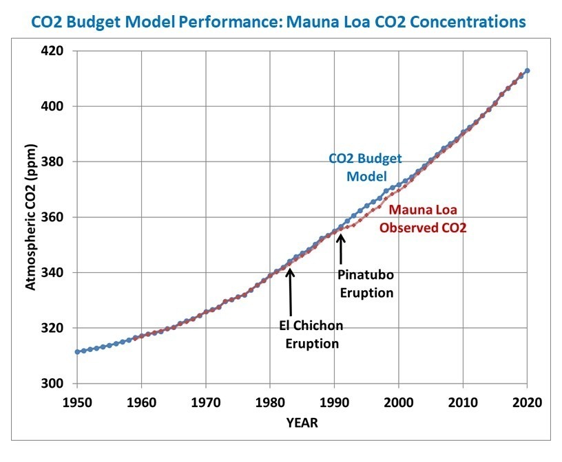
My previous post from a few days ago showed the performance of a simple CO2 budget model that, when forced with estimates of yearly anthropogenic emissions, very closely matches the yearly average Mauna Loa CO2 observations during 1959-2019. I assume that a comparable level of agreement is a necessary condition of any model that is relied upon to predict future levels of atmospheric CO2 if it is have any hope of making useful predictions of climate change.
In that post I forced the model with EIA projections of future emissions (0.6%/yr growth until 2050) and compared it to the RCP (Representative Concentration Pathway) scenarios used for forcing the IPCC climate models. I concluded that we might never reach a doubling of atmospheric CO2 (2XCO2).
But what I did not address was the relative influence on those results of (1) assumed future anthropogenic CO2 emissions versus (2) how fast nature removes excess CO2 from the atmosphere. Most critiques of the RCP scenarios address the former, but not the latter. Both are needed to produce an RCP scenario.
I implied that the RCP scenarios from models did not remove CO2 fast enough, but I did not actually demonstrate it. That is the subject of this short article.
What Should the Atmospheric CO2 Removal Rate be Compared To?
The Earth’s surface naturally absorbs from, and emits into, the huge atmospheric reservoir of CO2 through a variety of biological and geochemical processes.
We can make the simple analogy to a giant vat of water (the atmospheric reservoir of CO2), with a faucet pouring water into the vat and a drain letting water out of the vat. Let’s assume those rates of water gain and loss are nearly equal, in which case the level of water in the vat (the CO2 content of the atmosphere) never changes very much. This was supposedly the natural state of CO2 flows in and out of the atmosphere before the Industrial Revolution, and is an assumption I will make for the purposes of this analysis.
Now let’s add another faucet that drips water into the vat very slowly, over many years, analogous to human emissions of CO2. I think you can see that there must be some change in the removal rate from the drain to offset the extra gain of water, otherwise the water level will rise at the same rate that the additional water is dripping into the vat. It is well known that atmospheric CO2 is rising at only about 50% the rate at which we produce CO2, indicating the “drain” is indeed flowing more strongly.
Note that I don’t really care if 5% or 50% of the water in the vat is exchanged every year through the actions of the main faucet and the drain; I want to know how much faster the drain will accomodate the extra water being put into the tank, limiting the rise of water in the vat. This is also why any arguments [and models] based upon atomic bomb C-14 removal rates are, in my opinion, not very relevant. Those are useful for determining the average rate at which carbon cycles through the atmospheric reservoir, but not for determining how fast the extra ‘overburden’ of CO2 will be removed. For that, we need to know how the biological and geochemical processes change in response to more atmospheric CO2 than they have been used to in centuries past.
The CO2 Removal Fraction vs. Emissions Is Not a Useful Metric
For many years I have seen reference to the average equivalent fraction of excess CO2 that is removed by nature, and I have often (incorrectly) said something similar to this: “about 50% of yearly anthropogenic CO2 emissions do not show up in the atmosphere, because they are absorbed.” I believe this was discussed in the very first IPCC report, FAR. I’ve used that 50% removal fraction myself, many times, to describe how nature removes excess CO2 from the atmosphere.
Recently I realized this is not a very useful metric, and as phrased above is factually incorrect and misleading. In fact, it’s not 50% of the yearly anthropogenic emissions that is absorbed; it’s an amount that is equivalent to 50% of emissions. You see, Mother Nature does not know how much CO2 humanity produces every year; all she knows is the total amount in the atmosphere, and that’s what the biosphere and various geochemical processes respond to.
It’s easy to demonstrate that the removal fraction, as is usually stated, is not very useful. Let’s say humanity cut its CO2 emissions by 50% in a single year, from 100 units to 50 units. If nature had previously been removing about 50 units per year (50 removed versus 100 produced is a 50% removal rate), it would continue to remove very close to 50 units because the atmospheric concentration hasn’t really changed in only one year. The result would be that the new removal fraction would shoot up from 50% to 100%.
Clearly, that change to a 100% removal fraction had nothing to do with an enhanced rate of removal of CO2; it’s entirely because we made the removal rate relative to the wrong variable: yearly anthropogenic emissions. It should be referenced instead to how much “extra” CO2 resides in the atmosphere.
The “Atmospheric Excess” CO2 Removal Rate
The CO2 budget model I described here and here removes atmospheric CO2 at a rate proportional to how high the CO2 concentration is above a background level nature is trying to “relax” to, a reasonable physical expectation that is supported by observational data.
Based upon my analysis of the Mauna Loa CO2 data versus the Boden et al. (2017) estimates of global CO2 emissions, that removal rate is 2.3%/yr of the atmospheric excess above 295 ppm. That simple relationship provides an exceedingly close match to the long-term changes in Mauna Loa yearly CO2 observations, 1959-2019 (I also include the average effects of El Nino and La Nina in the CO2 budget model).
So, the question arises, how does this CO2 removal rate compare to the RCP scenarios used as input to the IPCC climate models? The answer is shown in Fig. 1, where I have computed the yearly average CO2 removal rate from Mauna Loa data, and the simple CO2 budget model in the same way as I did from the RCP scenarios. Since the RCP data I obtained from the source has emissions and CO2 concentrations every 5 (or 10) years from 2000 onward, I computed the yearly average removal rates using those bounding years from both observations and from models.

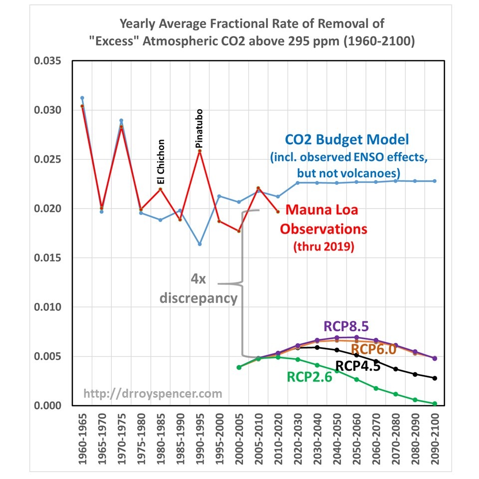
The four RCP scenarios do indeed have an increasing rate of removal as atmospheric CO2 concentrations rise during the century, but their average rates of removal are much too low. Amazingly, there appears to be about a factor of four discrepancy between the CO2 removal rate deduced from the Mauna Loa data (combined with estimates of historical CO2 emissions) versus the removal rate in the carbon cycle models used for the RCP scenarios during their overlap period, 2000-2019.
Such a large discrepancy seems scarcely believable, but I have checked and re-checked my calculations, which are rather simple: they depend only upon the atmospheric CO2 concentrations, and yearly CO2 emissions, in two bounding years. Since I am not well read in this field, if I have overlooked some basic issue or ignored some previous work on this specific subject, I apologize.
Recomputing the RCP Scenarios with the 2.3%/yr CO2 Removal Rate
This raises the question of what the RCP scenarios of future atmospheric CO2 content would look like if their assumed emissions projections were combined with the Manua Loa-corrected excess CO2 removal rate of 2.3%/yr (above an assumed background value of 295 ppm). Those results are shown in Fig. 2.

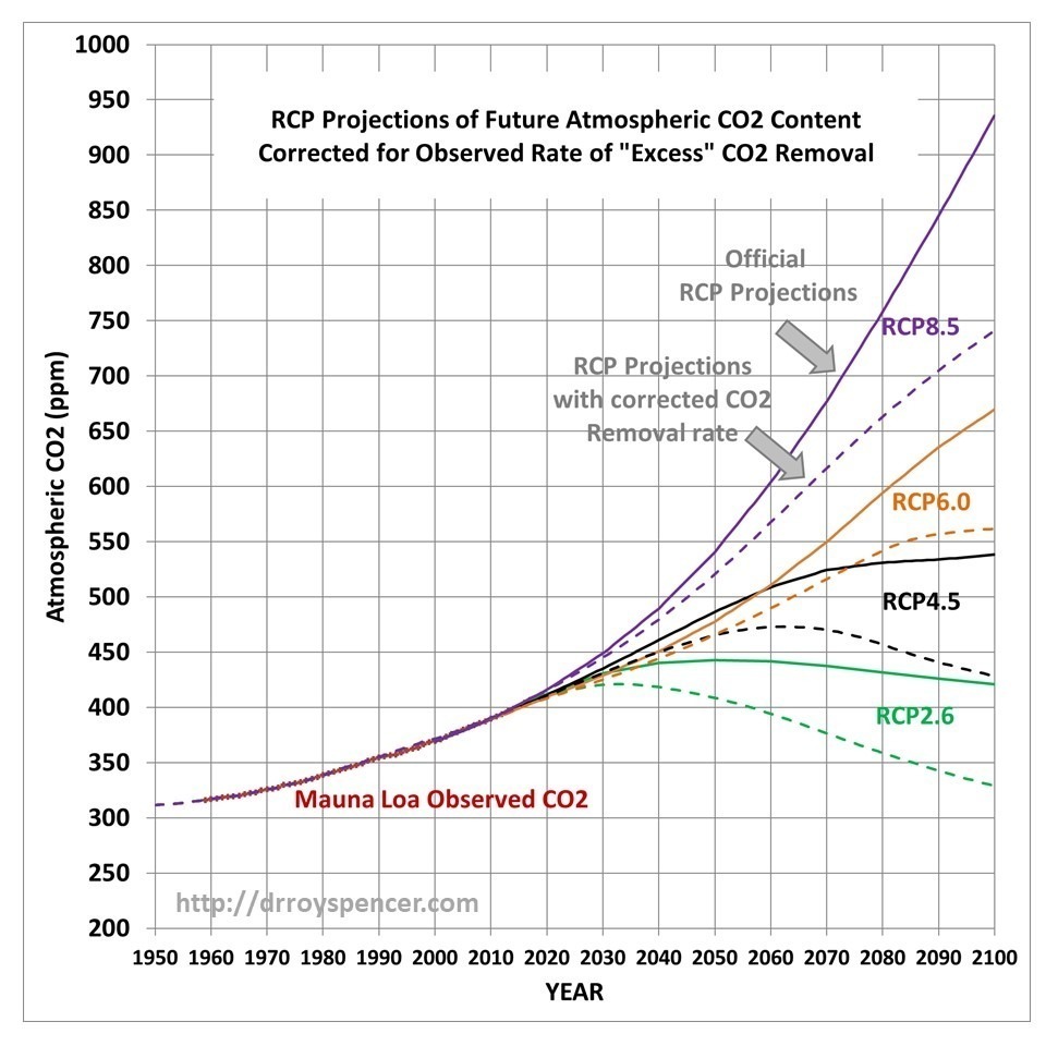
Now we can see the effect of just the differences in the carbon cycle models on the RCP scenarios: those full-blown models that try to address all of the individual components of the carbon cycle and how it changes as CO2 concentrations rise, versus my simple (but Mauna Loa data-supportive) model that only deals with the empirical observation that nature removes excess CO2 at a rate of 2.3%/yr of the atmospheric excess above 295 ppm.
This is an aspect of the RCP scenario discussion I seldom see mentioned: The realism of the RCP scenarios is not just a matter of what future CO2 emissions they assume, but also of the carbon cycle model which removes excess CO2 from the atmosphere.
Discussion
I will admit to knowing very little about the carbon cycle models used by the IPCC. I’m sure they are very complex (although I dare say not as complex as Mother Nature) and represent the state-of-the-art in trying to describe all of the various processes that control the huge natural flows of CO2 in and out of the atmosphere.
But uncertainties abound in science, especially where life (e.g. photosynthesis) is involved, and these carbon cycle models are built with the same philosophy as the climate models which use the output from the carbon cycle models: These models are built on the assumption that all of the processes (and their many approximations and parameterizations) which produce a reasonably balanced *average* carbon cycle picture (or *average* climate state) will then accurately predict what will happen when that average state changes (increasing CO2 and warming).
That is not a given.
Sometimes it is useful to step back and take a big-picture approach: What are the CO2 observations telling us about how the global average Earth system is responding to more atmospheric CO2? That is what I have done here, and it seems like a model match to such a basic metric (how fast is nature removing excess CO2 from the atmosphere, as the CO2 concentration rises) would be a basic and necessary test of those models.
According to Fig. 1, the carbon cycle models do not match what nature is telling us. And according to Fig. 2, it makes a big difference to the RCP scenarios of future CO2 concentrations in the atmosphere, which will in turn impact future projections of climate change.
I’m not entirely clear what you’ve done to arrive at Figure 1, but “4x” is close enough to the weight ratio of CO2/C that I wonder if you have a units problem.
That would an embarrassing mistake. Nope.
Where does the constant .000469 in column C of the spreadsheet come from?
I think there’s a factor of 5 error (maybe due to the number of years?). Here’s the data I got from the PIK site (I found yearly data), with which I calculate 2.6% annual sinks based on your 295 “natural baseline” (though, like Nick Stokes, I think that the “baseline” should be increasing as fossil carbon is added to the atmosphere-terrestrial-ocean system): column order is: year, CO2 concentration from PIK, CO2 fossil emissions from PIK, CO2 other emissions from PIK, calculated year-to-year increase in CO2 loading in the atmosphere transformed to GtC by multiplying by 2.12, sink calculated by the difference between emissions and atmospheric increase, CO2 concentration minus 295 times 2.12 (excess over “natural baseline”), and then sink/excess to get the percent:
year CO2conc CO2fossil CO2other CO2atmchange CO2sink CO2over295 sink%
2000 368.9 6.7 1.1 3.2 4.7 156.6 2.98%
2001 370.5 6.9 1.1 3.4 4.6 160.0 2.89%
2002 372.5 6.9 1.2 4.4 3.8 164.3 2.33%
2003 374.8 7.3 1.2 4.7 3.8 169.1 2.23%
2004 376.8 7.7 1.2 4.4 4.6 173.4 2.63%
year ppm GtC GtC GtC GtC GtC percent
Something else to look at . . .
I tried to reproduce your Figure 1 using RCP numbers and the removal rate formula removal_rate = outflow / co2_concentration which gives results consistent with figure 1 in the original post.
Checking back on the model in the spreadsheet, solving for removal rate is actually removal_rate = outflow / (co2_concentration – co2_background) where co2_background = 295 ppm.
Plugging RCP into the latter gives numbers that don’t have the “4x problem” in the 2000s because the divisor (~400 ppm – 295 ppm) is about a factor of 4 smaller. On the other hand it blows up in the early 1920s when the RCP concentrations are around 295 ppm.
This suggests the utility of the model outside of the training region is questionable as has been pointed out previously.
Dr. Spencer,
(Inquiry, not for publication)
I can’t find an update for a January global temperature anomaly. What’s happening?
Many thanks for your work.
Jim Policelli
Just posted.
Interesting. This might explain pressure changes.
https://phzoe.wordpress.com/2020/02/05/pressure-change-and-real-standard-pressure/
I had a look at the graphs on the sixth page (“Page 138”) of https://science2017.globalchange.gov/downloads/CSSR_Ch4_Climate_Models_Scenarios_Projections.pdf
I look at RCPs 2.6 and 4.5, which are nearly the same thing as each other from 2000 to 2020. (According to the upper right one of 8 graphs.)
My eyeball estimate of emissions over that time is average of 9.4 GtC per year. That times 20 years is 188 gigatonnes of carbon. That times 44/12 (the molar masses of CO2 and carbon respectively) is 689 gigatonnes of CO2 emitted into the atmosphere from 2000 to 2020 according to RCPs 2.6 and 4.5 (approximately).
Earth’s atmosphere has a mass of approx. 5,150,000 gigatonnes. 689 gigatonnes is 133.8 PPM of that by mass. The PPM normally used for atmospheric CO2 is PPMV or PPM by number of molecules. A CO2 molecule has 44/29.1 of the mass of an average air molecule, so 133.8 PPM by mass is 88.5 PPMV or PPM by number of molecules.
The lower right one of the eight graphs on “Page 138” shows atmospheric CO2 concentration projected by the RCPs. (This is PPM CO2, not the “equivalent PPM CO2” shown in a similar graph at some other sources.) My eyeball estimate is that all RCPS and especially RCPs 2.6 and 4.5 have atmospheric CO2 at about 370 PPM at 2000 and about 415 PPM at 2020. This means that during 2000-2020 when enough CO2 to raise its atmospheric concentration by 88.5 PPM was emitted into the atmosphere, the atmosphere gained 45 PPM and 43.5 PPM was removed from the atmosphere by nature.
These numbers are only approximate, I achieved them in part from eyeballing graphs. They are consistent with natural removal of CO2 from the atmosphere being equal to about half of anthropogenic emissions. And using 392.5 PPM (average of 370 and 415 PPM for average CO2 concentration over 2000-2020 which is slightly off because the increase is not linear) and average annual removal rate of 2.175 PPM per year (43.5/20), I come up with removal per year being about 2.23% of the excess over 295 PPM. This means that I see (during 2000-2020) the RCPs, especially RCPs 2.6 and 4.5, being close to agreeing with Dr. Spencer’s simple model.
Extremely minor correction: Molar mass of “average air molecules” is 29 grams per mole according to quickie Google results, not the 29.1 grams/mole that I used. I must have been remembering a figure that gave me best results sometime in the past for speed of sound and loudspeaker enclosure resonance calculations.
Since the models are tracking the observed Mauna Loa data for their overlap years, its hard to understand how they could be off by 4x, and still get a match.
Spencer’s model has CO2 changing by 2.0 ppm/year in year 2020. The RCP6 concentration changes by 2.7 ppm/year. My exponential fit for Mauna Loa CO2 changes by 2.5 ppm/year. I don’t understand the 4x factor either.
I should probably post the exact numbers I used, and the simple equation, so others can see for themselves. Maybe go through step-by-step.
I don’t know whether they do track Mauna Loa data during 1959-2019, can anyone find a plot that shows whether they do? The RCP projections are for after the year 2000, and I don’t know whether the underlying carbon cycle models replicate Mauna Loa data.
I posted a graph here:
https://drive.google.com/open?id=1RF5tRg1m7icFTbEKRbmdX_TrSq0_-KJN
In the past, there was about 5% discrepancy between Mauna Loa (ML) and RCP 6. Now they are closer. Attributable to local vs. global concentration?
Anyway, I find the following regarding goodness of fit, when comparing “models” to ML ground truth:
rms error [exp fit]: 0.738 ppm
mean error [exp fit]: 0.205 ppm
rms error [Spencer]: 1.058 ppm
mean error [Spencer]: -0.525 ppm
The exponential fit is:
t = 1959 to 2019
ML fit = 257.134528 + 57.680643 * exp(0.016301 * (t – 1959))
The “rms error” differs from the spreadsheet’s standard deviation, because the mean error is non-zero.
The exponential fit does not represent my personal view of the future, but I think it is the reason people are worried about CO2.
I got a much better match with column 3 of rcp 4.5.
Column 1 is not co2.
Hello Dr Spencer, your sinkratio comes very close to my 0.021 value of k.
Sink(y) = 2.13 * k * ([CO2](y-1)-[CO2]eq)
Virtually no carbon is “removed” from the carbon cycle other than a tiny amount that gets sequestered for a long time. Plants absorb the CO2, all plants are food and all food gets eaten by animals (and some other plants etc.). The amount of animal and plant life determines how quickly CO2 is respirated back into atmosphere to complete the carbon cycle.
The carbon in the CO2 that we emitted 100 years ago is still with us going around in a circle.
If we had never emitted any CO2 but instead had used the same amount of oil/gas to somehow introduce the carbon by making more food for animals on the planet directly – the result would be the same. The increase in animal life would cause the increase in CO2. It doesn’t matter where the carbon gets added to the cycle. (That very thing is happening in the Gulf of Mexico with bacteria eating a couple Exxon Valdez’s worth of crude oil each year that seeps up from ocean floor. Perhaps that saved life on earth from an earlier demise via CO2 starvation?)
Life appears to be responding almost immediately and in a balanced way to having more carbon in the carbon cycle. That amounts to more CO2 in the air growing food more quickly via photosynthesis – and more animals to eat that increased amount of food and them then emitting CO2 at a higher rate.
Here’s evidence of how dramatically the increase of marine CO2 has been impacting just one item in the food chain from the bottom up – https://hub.jhu.edu/2015/11/26/rapid-plankton-growth-could-signal-climate-change/
“the study details a tenfold increase in the abundance of single-cell coccolithophores between 1965 and 2010, and a particularly sharp spike since the late 1990s in the population of these pale-shelled floating phytoplankton.”
More plankton will grow more krill, more krill will feed more whales. So not only did crude oil save the whales back in the mid 1800’s by providing a cheap alternative to whale oil – our burning FF is also helping to provide whales more food. All is good.
Thanks Roy Spencer
Written so I could understand a large part of your findings.
Dr Spencer. From the previous article:
The ‘relaxation’ is not back to what it was 150 or 200 year ago, it is an attempt to balance the pCO2 in the ocean with the partial pressure of CO2 in the air above at any point in time. [ Henry’s Law ]. As the ocean “acidifies” it contains more CO2, so the supposed excess CO2 “anomaly” causes less “forcing” than the same level would have done back in 1750. The basic assumption of the model will lead to an exaggerated estimation of how much is removed in the crucial later section under consideration.
This agrees with your natural suspicion about this result.
Fitting one monotonic rise to another one is pretty easy to satisfy, it is not a great confirmation that you are correct.
The fit to MLO does not “support” the model, you have tuned it to fit MLO. In view of the illogical deviation for a significant part of the record after Mt P. The degree of confirmation is light. This is same fallacy that most CAGW pseudo-science is based on: matching two monotonic changes and taking this as proof of causation.
The result of where it levels off depends largely on the curves section in the future. Using regression on the nearly straight part, corresponding to the available data is a very uncertain way to predict the curvature of the later section, especially in view of the error in the “relaxation” pointed out above.
I share your natural skepticism about the degree of the result, though the idea of some down turn seems likely.
It is interesting that he value you use for pre-industrial atm CO2 is exactly the value I got from scaling emissions to MLO.
https://climategrog.wordpress.com/co2-log-rise/
Is that corroboration by independent calculation, or are you effectively doing the same thing ( ie it’s replication of the same result).
That model ( three separate exponential growth rates ) projected 462ppmv by 2050.
That looks pretty close to the CO2 model in your previous post and below RCP 6.0 and 4.5 to that date, though my assumption of continued exponential growth would look more like 6.0 but a little lower.
Good points, Greg.
His model has one TC, thus it works well enough with known emissions and ENSO to capture the onset of the rapid rise.
But more TC needed to deal properly with the longer term equilibration in the bulk ocean.
The discrepancy comes from the difference in the models. The Bern model has multiple time constants for multiple pools. A single constant model like Roys reacts to a change in atmospheric CO2 by a proportional change in uptake, while the behavior of the Bern model is very different. Since the Bern model has multiple adjustable parameters, it can be, and is, tuned to match history very well. The problem is that the model suffers Von Newmans draw an elephant problem of too many free variables. I give the Bern model zero credibility, but Roys model, even while almost exactly matching history, is likely too simple to provide accurate long term projections of atmospheric CO2.
. . . . but the science is settled !!!
Dr. S. finally jumping on board.
Well, it appears my mobile post earlier did not make it to the pixels of reality.
An abbreviated version relating to the potential paradigm shift relating to this info would be……
The global greening has a meaning.
This is not a scenario akin to a bucket with a drain at the bottom. It is more akin to a vast river in constant motion with us playing the part of a small child peeing into it from the banks. Our inputs are insignificant to the flow of the river.
Atmospheric CO2 concentration is proportional to temperature anomaly:
http://woodfortrees.org/plot/esrl-co2/mean:12/from:1979/derivative/plot/uah6/scale:0.18/offset:0.144
This is a transport problem. The temperature dependent throttling of CO2 flows results in variations in oceanic concentration within the upper layers. The atmosphere is the flea on the ocean elephant’s back. Per Henry’s law, atmospheric concentration necessarily tracks oceanic concentration.
I explain a model of how these dynamics can arise here:
https://tinyurl.com/ukkhf8w
Should have written: The rate of change of atmospheric concentration is proportional to temperature anomaly.
The information within the rate of change is the same as that in absolute concentration, modulo an integration constant. Integrating the relationship shows it tracks, as it must:
http://woodfortrees.org/plot/esrl-co2/mean:12/from:1979/derivative/integral/plot/uah6/scale:0.18/offset:0.144/integral
When plotting the absolute concentration, however, higher frequency variations are strongly attenuated, so all you get is low frequency content. It is not difficult to match low frequency content by happenstance. Matching the higher frequency variations in the rate of change is akin to a fingerprint that establishes the true culprit beyond a reasonable doubt.
If you plot the rate of emissions and atmospheric rate of change, you will find that they do not match in anything like the detail of the match between temperature anomaly and rate of change of CO2 concentration. The case is pretty open and shut.
Bart , looking at two monotonic rises will tell you nothing , drop the integrals.
http://woodfortrees.org/plot/esrl-co2/mean:12/from:1979/derivative/plot/uah6/scale:0.18/offset:0.144
There is a strong similarity with d/dt CO2 but don’t forget to notice the underlying rise.
Not sure what your point is here. I already included the rate of change chart in the above.
“This is a transport problem.”
To account for the surface to deep ocean equilibration via the thermohaline circulation, on multi-century scales, sure.
But to account for the annual or ENSO time scale variation, no evidence to support that. Chemical rates dominate the air-surface and air-biosphere carbon cycle.
“The temperature dependent throttling of CO2 flows results in variations in oceanic concentration within the upper layers.”
No clear mechanism for this speculation has been identified. No evidence that this accounts for ENSO-CO2 correlation.
Measurements show that the ocean outgasses LESS CO2 during El Nino events, OPPOSING the usual El Nino increase in atm CO2 concentration, that comes from land sources and sinks.
https://www.pmel.noaa.gov/pubs/outstand/feel1868/text.shtml
The evidence is that the rate of change of atmospheric CO2 is proportional to temperature anomaly. And, your source is speculation about the equatorial Pacific, while the throttling of the flows at higher temperature would occur with downwelling at the poles.
You have a very strong relationship there. In fact it is so strong that you have a positive derivative when temperatures go down. The 2nd derivative is also positive. In other words CO2 goes up all of the time, faster and faster.
IOW, it is a standard integral relationship.
No, it’s an unprecedented runaway increase.
Hardly. Such responses are ubiquitous in nature. A = dV/dt – velocity is the integral of acceleration. Doesn’t mean it increases forever. Limiting factors eventually come into play.
Your “speed” went up when temperatures went down for thirty years,
since your “acceleration” was positive.
Your “acceleration” is positive all of the time.
In fact your “acceleration” is trending up, your engine is getting stronger and stronger.
You seem to be making the point that the integral of function increases when the function is positive. I regret to inform you this is not a groundbreaking insight.
You have a great fit for short term variations.
Something else moves your derivative further and further away from zero.
Hint: the average derivative would be zero without our emissions.
Your fit would have been just as good.
The long term trend in the rate of change matches, too.
http://woodfortrees.org/plot/esrl-co2/mean:12/from:1979/derivative/plot/uah6/scale:0.18/offset:0.144/plot/esrl-co2/mean:12/from:1979/derivative/trend/plot/uah6/scale:0.18/offset:0.144/trend
Bart says:
“The long term trend in the rate of change matches, too.”
No, you are missing the long term trend by focusing on variations in it. Remember that the derivative is the change in the trend.
The long term trend is what puts the derivative above zero.
In fact it’s worse than that, the long term trend is accelerating away from zero in your diagram.
What in the world are you looking at?
I’m looking at the diagram you just linked.
Your derivate goes up from 0.1 to 0.2.
That means the increase is not linear, it accelerates exponentially.
Here’s the longer term:
https://tinyurl.com/y4z7sqkz
See the red arrow?
The bold line is a logarithmic function of CO2.
See how its derivative increases?
See how temperatures went down 1940-1970?
CO2 kept accelerating, even the ln derivative went up.
If you think temperature drives CO2 it’s a runaway situation.
So it really doesn’t matter what the temperature does.
Something else is pushing CO2 up.
It’s not a runaway situation. It’s simply that limiting factors have not yet come into play.
The trend in the rate of change of CO2 matches the trend in temperature anomaly. The rate of change of CO2 matches both the short term variations AND the long term trend.
The baseline is arbitrary. That provides the linear term in the absolute concentration of CO2 (not its rate of change but the integral of the rate of change). The linear trend in the rate of change provides the quadratic growth in the absolute quantity.
You must admit there is an excellent match of the trend and the variation in the rate of change.
Emissions also have a trend in their growth rate. If they were substantially contributing to overall concentration, you would have to arbitrarily filter out the trend due to temperature anomaly to make it all fit. There is no justification for that when it is already an excellent fit. The odds of that excellent fit coming about by happenstance are vanishingly small. Ergo, emissions CANNOT be a significant contributor.
test
“The evidence is that the rate of change of atmospheric CO2 is proportional to temperature anomaly.”
That is a well known phenomena that is related to ENSO.
But lets be clear, that is not actually evidence in support of your speculative model “the throttling of the flows at higher temperature would occur with downwelling at the poles.”
“your source is speculation about the equatorial Pacific”
Not speculation, MEASUREMENT.
They cite other measurements showing the equatorial Pacific outgassing provides 70% of the total ocean outgassing.
As noted here: https://royalsocietypublishing.org/doi/full/10.1098/rstb.2017.0301
“A large body of previous work has shown that the main contribution to larger CO2 growth rates associated with El Nio events is reduced net carbon uptake by the terrestrial biosphere [26]. This is slightly offset by increased net uptake of CO2 by the oceans due to reduced outgassing because of decreased upwelling of deep water with high carbon content [5]. ”
I think you agree with Feynman, “It doesn’t matter how beautiful your theory is, it doesn’t matter how smart you are. If it doesn’t agree with experiment, it’s wrong.”
They cite models, not measurements.
You are just throwing up random objections. The observed relationship is dispositive. You will see when temperatures next show a sustained decline.
‘The observed relationship is dispositive.’
Cmon Bart, ridiculous. The relationship is not dispositive of ocean or land origin.
‘They cite models, not measurements.’
You havent bothered to read the papers. They involve extensive measurements of fluxes. The terrestrial origin of these ENSO correlated fluxes is no longer in doubt.
Please show measurements of any kind that can ONLY be explained by your throttling model.
I read the paper you linked. More to the point, I understood it.
Oh and what did you learn about the flux measurements?
“You will see when temperatures next show a sustained decline.”
The expected flattening/decline from your 60 -70 y periodicity keeps getting delayed.
Was supposed to become apparent in 2000, then 2005, 2010, 2015, 2020, now 2025?
Makes one wonder how periodic this periodicity is.
It is apparent in the data from 2005-2015. The anomalous El Nino of 2016 interrupted it, and there have been two spikes since. What will happen when the current spike fades? We shall see.
I see, natural El Nino variation in 2015-16 interrupted and delayed the natural variation you were hoping for…
Or, natural La Nina variation in 2011-13 interrupted the ongoing upward trend, that clearly continues in the 2017-2020 ENSO neutral period.
OK, so an analysis using existing Mouna Loa data and IPCC model projections indicates “reality” shows far lower CO2 concentration. Good work!
However, what if the “existing data” is seriously flawed? For decades now I have held a mental red flag against measuring CO2 on the side of an active volcano and extrapolating this to a global mean concentration….
This alternative post seems to justify my internal red flag concern:
https://principia-scientific.org/the-great-co2-is-rising-keeling-curve-fraud/
Is it true that the “accepted data” has selectively discarded actual high quality chemically derived data in the 19th century in favor of [selective data fitting to] the existing “greenhouse” gas theory?
If there are reliable measurements or proxies(stomata) showing 150+ years ago CO2 was only 50 ppmv lower than today – the current “greenhouse gas [CO2]” theory is completely debunked! Or at least VERY embarrassing.
Aside: This Nikolov paper provides a much more compelling theory on what governs planetary climate than does the “radiative greenhouse” conjecture…
https://www.omicsonline.org/open-access-pdfs/New-Insights-on-the-Physical-Nature-of-the-Atmospheric-Greenhouse-Effect-Deduced-from-an-Empirical-Planetary-Temperature-Model.pdf
Ok then pay more attention to all the other locations that monitor co2. But they agree with Mauna Loa..
https://youtu.be/1ZQG59_z83I