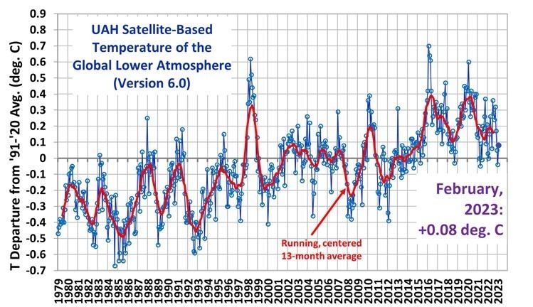
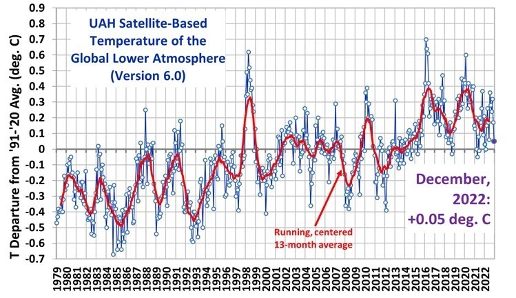
The Version 6 global average lower tropospheric temperature (LT) anomaly for February 2023 was +0.08 deg. C departure from the 1991-2020 mean. This is up from the January 2023 anomaly of -0.04 deg. C.
The linear warming trend since January, 1979 remains at +0.13 C/decade (+0.11 C/decade over the global-averaged oceans, and +0.18 C/decade over global-averaged land).
Various regional LT departures from the 30-year (1991-2020) average for the last 14 months are:
YEAR
MO
GLOBE
NHEM.
SHEM.
TROPIC
USA48
ARCTIC
AUST
2022
Jan
+0.03
+0.06
-0.00
-0.23
-0.13
+0.68
+0.10
2022
Feb
-0.00
+0.01
-0.01
-0.24
-0.04
-0.30
-0.50
2022
Mar
+0.15
+0.27
+0.03
-0.07
+0.22
+0.74
+0.02
2022
Apr
+0.26
+0.35
+0.18
-0.04
-0.26
+0.45
+0.61
2022
May
+0.17
+0.25
+0.10
+0.01
+0.59
+0.23
+0.20
2022
Jun
+0.06
+0.08
+0.05
-0.36
+0.46
+0.33
+0.11
2022
Jul
+0.36
+0.37
+0.35
+0.13
+0.84
+0.55
+0.65
2022
Aug
+0.28
+0.31
+0.24
-0.03
+0.60
+0.50
-0.00
2022
Sep
+0.24
+0.43
+0.06
+0.03
+0.88
+0.69
-0.28
2022
Oct
+0.32
+0.43
+0.21
+0.04
+0.16
+0.93
+0.04
2022
Nov
+0.17
+0.21
+0.13
-0.16
-0.51
+0.51
-0.56
2022
Dec
+0.05
+0.13
-0.03
-0.35
-0.21
+0.80
-0.38
2023
Jan
-0.04
+0.05
-0.14
-0.38
+0.12
-0.12
-0.50
2023
Feb
+0.08
+0.17
0.00
-0.11
+0.68
-0.24
-0.12
The full UAH Global Temperature Report, along with the LT global gridpoint anomaly image for February, 2023 should be available within the next several days here.
The global and regional monthly anomalies for the various atmospheric layers we monitor should be available in the next few days at the following locations:
In Part I I showed the Landsat satellite-based measurements of urbanization around the Global Historical Climate Network (GHCN) land temperature-monitoring stations. Virtually all of the GHCN stations have experienced growth in the coverage of human settlement “built-up” (BU) structures.
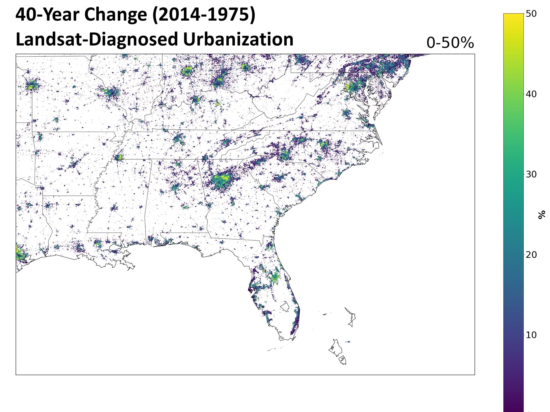
As an example of this growth, here is the 40-year change in BU values (which range from 0 to 100%) at 1 km spatial resolution over the Southeast United States.
Fig. 1. The 40-year change in urbanization over the Southeast U.S. between 1975 and 2014.
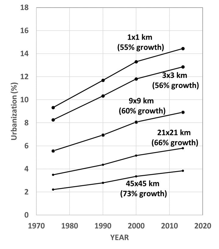
How has this change in urbanization been expressed at the GHCN stations distributed around the world? Fig. 2 shows how urbanization has increased on average across 19,885 GHCN stations from 20N to 82.5N latitude, at various spatial averaging resolutions of the data.
Fig. 2. Average forty-year change (1975 to 2014) in Landsat-based urbanization (BU) values over 19,885 GHCN stations from 20N to 82.5N at five different averaging scales of the 1 km BU data.
NONE of the 19,885 GHCN stations experienced negative growth, which is not that surprising since that would require a removal of human settlement structures over time. In all of the analysis that follows, I will be using the 21×21 km averages of BU centered on the GHCN station locations.
So, what effect does urbanization measured in this manner have on GHCN temperatures?And, especially, on temperature trends used for monitoring global warming?
While we all know that urban areas are warmer than rural areas, especially at night and during the summer, does an increase in urbanization lead to spurious warming at the GHCN stations that experienced growth (which is the majority of them)?
And, even if it did, does the homogenization procedure NOAA uses to correct for spurious temperature effects remove (even partially) urban heat island (UHI) effects on reported temperature trends?
John Christy and I have been examining these questions by comparing the GHCN temperature dataset (both unadjusted and adjusted [homogenized] versions) to these Landsat-based measurements of human settlement structures, which I will just call “urbanization”.
Here’s what I’m finding so far.
The Strongest UHI Warming with Urbanization Growth Occurs at Nearly-Rural Stations
As Oke (1973) and others have demonstrated, the urban heat island effect is strongly nonlinear, with (for example) a 2% increase in urbanization at rural sites producing much more warming than a 2% increase at an urban site. This means that a climate monitoring dataset using mostly-rural stations is not immune from spurious warming from creeping urbanization, unless there has been absolutely zero growth.
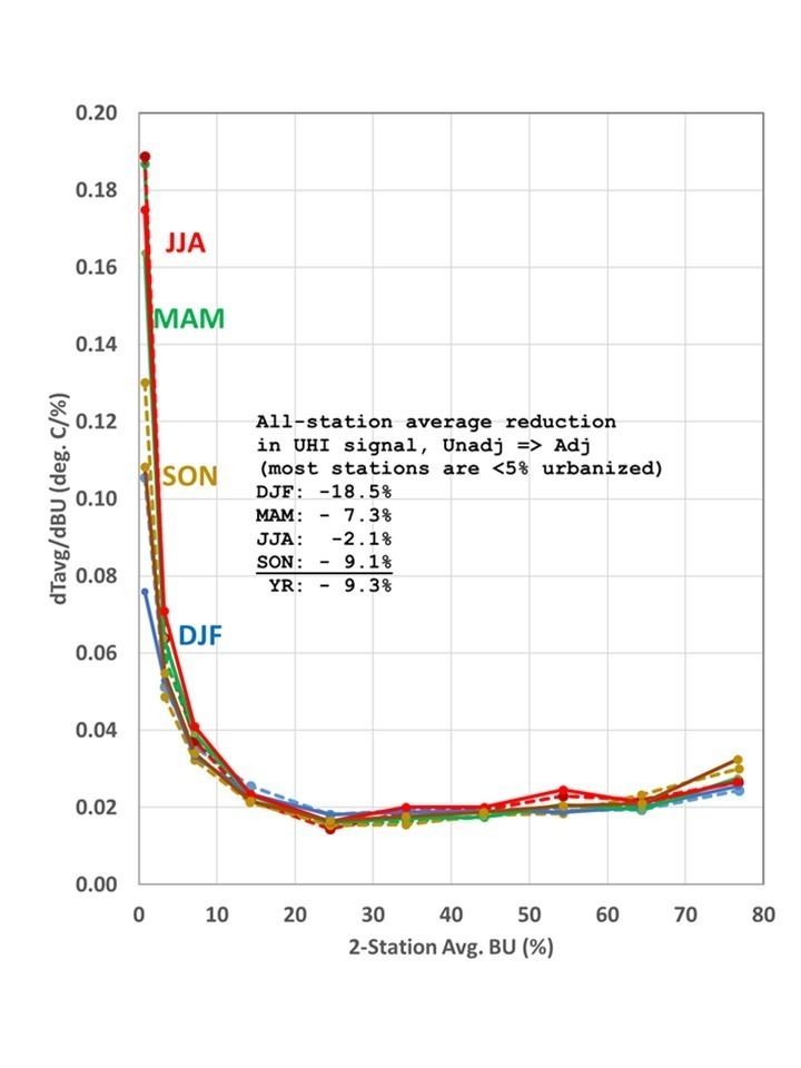
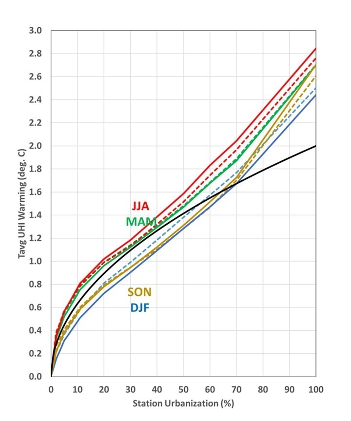
For example, Fig. 3 shows the sensitivity of GHCN (absolute) temperatures to increasing urbanization in various classes of urbanization, based upon well over 1 million station pairs separated by less than 150 km.
Fig. 3. Computed bin-average change in temperature with change in urbanization (BU), in 2-station BU average bins of 0-2%, 2-5%, 5-10%, 10-20%, 20-30%, 30-40%, 40-50%, 50-60%, 60-70%, and 70-100%, for four seasons and all GHCN stations in the 30N-70N latitude band. Solid lines are for adjusted (homogenized) GHCN data, and dashed lines are for unadjusted data.
By far the greatest sensitivity to a change in urbanization in Fig. 3 is in the 0-2% (nearly rural) category. We also see in Fig. 3 that the homogenization procedure used by NOAA reduces this effect by only 9% averaged across all seasons, and by even less (2.1%) in the summer season.
If we integrate the sensitivities in Fig. 3 from 0 to 100% urbanization, we get the total UHI effect on temperature (Fig. 4).
Fig. 4. Seasonal average UHI effects across all GHCN stations between 30N and 70N by integrating the dT/dBU values in Fig. 3 from 0% to 100%, for adjusted (homogenized) temperature data (solid) and unadjusted data (dashed). The black curve is a power law relationship with temperature increasing as the square root of urbanization.
The temperature data used here is the average of the daily maximum and minimum temperatures ([Tmax+Tmin]/2), and since almost all of the urban heat island effect is in Tmin, the temperature scale in Fig. 4 would be nearly doubled for the Tmin UHI effect.
The black curve in Fig. 4 is a square-root relationship, which seems to match the data reasonable well for most of the GHCN stations (which are generally less than 30% urbanized). But this is not nearly as non-linear as the 4th root relationship Oke (1973) calculated for some eastern Canadian stations, using population data as a measure of urbanization.
But what I have shown so far is based upon spatial information (the difference between closely-spaced stations). It does not tell us whether, or by how much, spurious warming exists in the GHCN temperature trends. To examine this question, next I looked at how the NOAA homogenization procedure changed station trends as a function of how fast the station environment has become more urbanized.
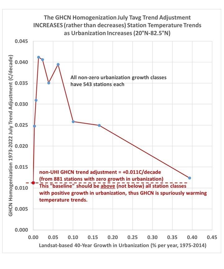
NOAA’s homogenization produces a change in most of the station temperature trends. If I compute the average homogenization-induced change in trends in various categories of station growth in urbanization, we should see a negative trend adjustment associated with positive urbanization growth, right?
But just the opposite happens.
First let’s examine what happens at stations with no growth in urbanization. In Fig. 5 we see that the 881 stations with no trend in urbanization during 1975-2014 have an average 0.011 C/decade warmer trend in the adjusted (homogenized) data than in the unadjusted data. This, by itself, is entirely possible since there are time-of-observation (“Tobs”) adjustments made to the data, adjustments for station moves, instrumentation types, etc.
Fig. 5. GHCN station temperature trend adjustments from the homogenization procedure inexplicably increase the station temperature trends as growth in urbanization occurs, rather than decrease them as would be expected if NOAA’s homogenization procedure was removing spurious warming from urban heat island effects.
So, let’s assume that value at zero growth in Fig. 5 represents what we should expect for the NON-urbanization related adjustments to GHCN trends. As we move to the right from zero urbanization growth in Fig. 5, stations with increasing growth in urbanization should have downward adjustments in their temperature trends, but instead we see, for all classes of growth in urbanization, UPWARD adjustments instead!
Thus, it appears that NOAA’s homogenization procedure is spuriously warming station temperature trends (on average) when it should be cooling them. I don’t know how to conclude any different.
Why are the NOAA adjusments going in the wrong direction? I don’t know.
To say the least, I find these results… curious.
OK, so how big is this spurious warming effect on land temperature trends in the GHCN dataset?
Before you jump to the conclusion that GHCN temperature trends have too much spurious warming to be relied upon for monitoring global warming, what I have shown does not tell us by just how much the land-average temperature trends are biased upward. I will address that in Part III.
My very preliminary calculations so far (using the UHI curves in Fig. 4 applied to the 21×21 km urbanization growth curve in Fig. 2) suggest the UHI warming averaged over all stations is about 10-20% of the GHCN trends. Small, but not insignificant. But that could change as I dig deeper into the issue.
The Version 6 global average lower tropospheric temperature (LT) anomaly for January 2023 was -0.04 deg. C departure from the 1991-2020 mean. This is down from the December 2022 anomaly of +0.05 deg. C.
The linear warming trend since January, 1979 now stands at +0.13 C/decade (+0.11 C/decade over the global-averaged oceans, and +0.18 C/decade over global-averaged land).
Various regional LT departures from the 30-year (1991-2020) average for the last 13 months are:
YEAR
MO
GLOBE
NHEM.
SHEM.
TROPIC
USA48
ARCTIC
AUST
2022
Jan
+0.03
+0.06
-0.00
-0.23
-0.13
+0.68
+0.10
2022
Feb
-0.00
+0.01
-0.01
-0.24
-0.04
-0.30
-0.50
2022
Mar
+0.15
+0.27
+0.03
-0.07
+0.22
+0.74
+0.02
2022
Apr
+0.26
+0.35
+0.18
-0.04
-0.26
+0.45
+0.61
2022
May
+0.17
+0.25
+0.10
+0.01
+0.59
+0.23
+0.20
2022
Jun
+0.06
+0.08
+0.05
-0.36
+0.46
+0.33
+0.11
2022
Jul
+0.36
+0.37
+0.35
+0.13
+0.84
+0.55
+0.65
2022
Aug
+0.28
+0.31
+0.24
-0.03
+0.60
+0.50
-0.00
2022
Sep
+0.24
+0.43
+0.06
+0.03
+0.88
+0.69
-0.28
2022
Oct
+0.32
+0.43
+0.21
+0.04
+0.16
+0.93
+0.04
2022
Nov
+0.17
+0.21
+0.13
-0.16
-0.51
+0.51
-0.56
2022
Dec
+0.05
+0.13
-0.03
-0.35
-0.21
+0.80
-0.38
2023
Jan
-0.04
+0.05
-0.14
-0.38
+0.12
-0.12
-0.50
The full UAH Global Temperature Report, along with the LT global gridpoint anomaly image for January, 2023 should be available within the next several days here.
The global and regional monthly anomalies for the various atmospheric layers we monitor should be available in the next few days at the following locations:
I’ve previously posted a variety of articles (e.g. here and here) where I address the evidence that land surface temperature trends from existing homogenized datasets have some level of spurious warming due to urban heat island (UHI) effects. While it is widely believed that homogenization techniques remove UHI effects on trends, this is unlikely because UHI effects on trends are largely indistinguishable from global warming. Current homogenization techniques can remove abrupt changes in station data, but cannot correct for any sources of slowly-increasing spurious warming.
Anthony Watts has approached this problem for the U.S. temperature monitoring stations by physically visiting the sites and documenting the exposure of the thermometers to spurious heat sources (active and passive), and comparing trends from well-sited instruments to trends from poorly sited instruments. He found that stations with good siting characteristics showed, on average, cooler temperature trends than both the poorly-sited locations and the official “adjusted” temperature data from NOAA.
I’ve taken a different approach by using global datasets of population density and, more recently, analysis of high-resolution Landsat satellite based measurements of Global Human Settlements “Built-Up” areas. I have also started analyzing weather station data (mostly from airports) which have hourly time resolution, instead of the usual daily maximum and minimum temperature data (Tmax, Tmin) measurements that make up current global land temperature datasets. The hourly data stations are, unfortunately, fewer in number but have the advantage of better maintenance since they support aviation safety and allow examination of how UHI effects vary throughout the day and night.
In this two-part series, I’m going to look at the latest official global GHCN thermometer (Tmax, Tmin) dataset (Version 4) to see if there is evidence of spurious warming from increasing urbanization effects over time. In the latest GHCN dataset version Tmax and Tmin are no longer provided separately, only their average (Tavg) is available.
Based upon what I’ve seen so far, I’m convinced that there is spurious warming remaining in the GHCN-based temperature data. The only question is, how much? That will be addressed in Part II.
The issue is important (obviously) because if observed warming trends have been overstated, then any deductions about the sensitivity of the climate system to anthropogenic greenhouse gas emissions are also overstated. (Here I am not going to go into the possibility that some portion of recent warming is due to natural effects, that’s a very different discussion for another day).
What I am going to show is based upon the global stations in the GHCN monthly dataset (downloaded January, 2023) which had sufficient data to produce at least 45 years of July data during the 50 year period, 1973-2022. The start years of 1973 is chosen for two reasons: (1) it’s when the separate dataset with hourly time resolution I’m analyzing had a large increase in the number of digitized records (remember, weather recording used to be a manual process onto paper forms, which someone has to digitize), and (2) the global Landsat-based urbanization data starts in 1975, which is close enough to 1973.
Because the Landsat measurements of urbanization are very high resolution, one must decide what spatial resolution should be used to relate to potential UHI effects. I have (somewhat arbitrarily) chosen averaging grid sizes of 3×3 km, 9×9 km, 21×21 km, and 45 x 45 km. In the global dataset I am getting the best results with the 21 x 21 km averaging of the urbanization data, and all results here will be shown for that resolution.
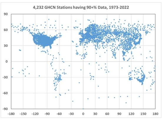
The resulting distribution of 4,232 stations (Fig. 1) shows that only a few countries have good coverage, especially the United States, Russia, Japan, and many European countries. Africa is poorly represented, as is most of South America.
Fig. 1. GHCN station locations having at least 90% data coverage for all Julys from 1973 to 2022.
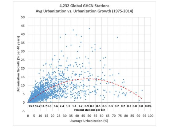
I’ve analyzed the corresponding Landsat-based urban settlement diagnoses for all of these stations, which is shown in Fig. 2. That dataset covers a 40 year period, from 1975 to 2014. Here I’ve plotted the 40-year average level of urbanization versus the 40-year trend in urbanization.
Fig. 2. For the GHCN stations in Fig. 1, the station average level of urbanization versus the growth in urbanization over 1975-2014, based upon high-resolution Landsat data.
There are a few important and interesting things to note from Fig. 2.
Few GHCN station locations are truly rural: 13.2% are less than 5% urbanized, while 68.4% are less than 10% urbanized.
Virtually all station locations have experienced an increase in building, and none have decreased (which would require a net destruction of buildings, returning the land to its natural state).
Greatest growth has been in areas not completely rural and not already heavily urbanized (see the curve fitted to the data). That is, very rural locations stay rural, and heavily urbanized locations have little room to grow anyway.
One might think that since the majority of stations are less than 10% urbanized that UHI effects should be negligible. But the seminal study by Oke (1973) showed that UHI warming is non-linear, with the most rapid warming occurring at the lowest population densities, with an eventual saturation of the warming at high population densities. I have previously showed evidence supporting this based upon updated global population density data that the greatest rate of spurious warming (comparing neighboring stations with differing populations) occurs at the lowest population densities. It remains to be seen whether this is also true of “built-up” measurements of human settlements (buildings rather than population density).
Average Urbanization or Urbanization Growth?
One interesting question is whether it is the trend in urbanization (growing amounts of infrastructure), or just the average urbanization that has the largest impact on temperature trends? Obviously, growth will have an impact. But what about towns and cities where there have been no increases in building, but still have had growth in energy use (which generates waste heat)? As people increasingly move from rural areas to cities, the population density can increase much faster than the number of buildings, as people live in smaller spaces and apartment and office buildings grow vertically without increasing their footprint on the landscape. There are also increases in wealth, automobile usage, economic productivity and consumption, air conditioning, etc., all of which can cause more waste heat production without an increase in population or urbanization.
In Part II I will examine how GHCN station temperature trends relate to station urbanization for a variety of countries, in both the raw (unadjusted) temperature data and in the homogenized (adjusted) data, and also look at how growth in urbanization compares to average urbanization.
December of 2022 finished the year with a global tropospheric temperature anomaly of +0.05 deg. C above the 1991-2020 average, which was down from the November value of +0.17 deg. C.
The average anomaly for the year was +0.174 deg. C, making 2022 the 7th warmest year of the 44+ year global satellite record, which started in late 1978. Continuing La Nina conditions in the Pacific Ocean have helped to reduce global-average temperatures for the last two years. The 10 warmest years were:
#1 2016 +0.389
#2 2020 +0.358
#3 1998 +0.347
#4 2019 +0.304
#5 2017 +0.267
#6 2010 +0.193
#7 2022 +0.174
#8 2021 +0.138
#9 2015 +0.138
#10 2018 +0.090
The linear warming trend since January, 1979 continues at +0.13 C/decade (+0.12 C/decade over the global-averaged oceans, and +0.18 C/decade over global-averaged land).
Various regional LT departures from the 30-year (1991-2020) average for the last 24 months are:
YEAR
MO
GLOBE
NHEM.
SHEM.
TROPIC
USA48
ARCTIC
AUST
2021
Jan
+0.13
+0.34
-0.09
-0.08
+0.36
+0.50
-0.52
2021
Feb
+0.20
+0.32
+0.08
-0.14
-0.65
+0.07
-0.27
2021
Mar
-0.00
+0.13
-0.13
-0.28
+0.60
-0.78
-0.79
2021
Apr
-0.05
+0.06
-0.15
-0.27
-0.01
+0.02
+0.29
2021
May
+0.08
+0.14
+0.03
+0.07
-0.41
-0.04
+0.02
2021
Jun
-0.01
+0.31
-0.32
-0.14
+1.44
+0.64
-0.76
2021
Jul
+0.20
+0.34
+0.07
+0.13
+0.58
+0.43
+0.80
2021
Aug
+0.17
+0.27
+0.08
+0.07
+0.33
+0.83
-0.02
2021
Sep
+0.26
+0.19
+0.33
+0.09
+0.67
+0.02
+0.37
2021
Oct
+0.37
+0.46
+0.28
+0.33
+0.84
+0.64
+0.07
2021
Nov
+0.09
+0.12
+0.06
+0.14
+0.50
-0.42
-0.29
2021
Dec
+0.21
+0.27
+0.15
+0.04
+1.63
+0.01
-0.06
2022
Jan
+0.03
+0.06
-0.00
-0.23
-0.13
+0.68
+0.10
2022
Feb
-0.00
+0.01
-0.02
-0.24
-0.04
-0.30
-0.50
2022
Mar
+0.15
+0.27
+0.02
-0.07
+0.22
+0.74
+0.02
2022
Apr
+0.26
+0.35
+0.18
-0.04
-0.26
+0.45
+0.61
2022
May
+0.17
+0.25
+0.10
+0.01
+0.59
+0.23
+0.19
2022
Jun
+0.06
+0.08
+0.04
-0.36
+0.46
+0.33
+0.11
2022
Jul
+0.36
+0.37
+0.35
+0.13
+0.84
+0.56
+0.65
2022
Aug
+0.28
+0.32
+0.24
-0.03
+0.60
+0.50
-0.00
2022
Sep
+0.24
+0.43
+0.06
+0.03
+0.88
+0.69
-0.28
2022
Oct
+0.32
+0.43
+0.21
+0.04
+0.16
+0.93
+0.04
2022
Nov
+0.17
+0.21
+0.12
-0.16
-0.51
+0.51
-0.56
2022
Dec
+0.05
+0.13
-0.03
-0.35
-0.21
+0.80
-0.38
The full UAH Global Temperature Report, along with the LT global gridpoint anomaly image for December, 2022 should be available within the next several days here.
The global and regional monthly anomalies for the various atmospheric layers we monitor should be available in the next few days at the following locations:

 Home/Blog