
 Home/Blog
The Version 6.1 global average lower tropospheric temperature (LT) anomaly for October, 2025 was +0.53 deg. C departure from the 1991-2020 mean, unchanged from the September, 2025 value.
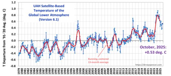
The Version 6.1 global area-averaged linear temperature trend (January 1979 through October 2025) remains at +0.16 deg/ C/decade (+0.22 C/decade over land, +0.13 C/decade over oceans).
The following table lists various regional Version 6.1 LT departures from the 30-year (1991-2020) average for the last 22 months (record highs are in red).
| YEAR | MO | GLOBE | NHEM. | SHEM. | TROPIC | USA48 | ARCTIC | AUST |
| 2024 | Jan | +0.80 | +1.02 | +0.58 | +1.20 | -0.19 | +0.40 | +1.12 |
| 2024 | Feb | +0.88 | +0.95 | +0.81 | +1.17 | +1.31 | +0.86 | +1.16 |
| 2024 | Mar | +0.88 | +0.96 | +0.80 | +1.26 | +0.22 | +1.05 | +1.34 |
| 2024 | Apr | +0.94 | +1.12 | +0.76 | +1.15 | +0.86 | +0.88 | +0.54 |
| 2024 | May | +0.78 | +0.77 | +0.78 | +1.20 | +0.05 | +0.20 | +0.53 |
| 2024 | June | +0.69 | +0.78 | +0.60 | +0.85 | +1.37 | +0.64 | +0.91 |
| 2024 | July | +0.74 | +0.86 | +0.61 | +0.97 | +0.44 | +0.56 | -0.07 |
| 2024 | Aug | +0.76 | +0.82 | +0.69 | +0.74 | +0.40 | +0.88 | +1.75 |
| 2024 | Sep | +0.81 | +1.04 | +0.58 | +0.82 | +1.31 | +1.48 | +0.98 |
| 2024 | Oct | +0.75 | +0.89 | +0.60 | +0.63 | +1.90 | +0.81 | +1.09 |
| 2024 | Nov | +0.64 | +0.87 | +0.41 | +0.53 | +1.12 | +0.79 | +1.00 |
| 2024 | Dec | +0.62 | +0.76 | +0.48 | +0.52 | +1.42 | +1.12 | +1.54 |
| 2025 | Jan | +0.45 | +0.70 | +0.21 | +0.24 | -1.06 | +0.74 | +0.48 |
| 2025 | Feb | +0.50 | +0.55 | +0.45 | +0.26 | +1.04 | +2.10 | +0.87 |
| 2025 | Mar | +0.57 | +0.74 | +0.41 | +0.40 | +1.24 | +1.23 | +1.20 |
| 2025 | Apr | +0.61 | +0.77 | +0.46 | +0.37 | +0.82 | +0.85 | +1.21 |
| 2025 | May | +0.50 | +0.45 | +0.55 | +0.30 | +0.15 | +0.75 | +0.99 |
| 2025 | June | +0.48 | +0.48 | +0.47 | +0.30 | +0.81 | +0.05 | +0.39 |
| 2025 | July | +0.36 | +0.49 | +0.23 | +0.45 | +0.32 | +0.40 | +0.53 |
| 2025 | Aug | +0.39 | +0.39 | +0.39 | +0.16 | -0.06 | +0.69 | +0.11 |
| 2025 | Sep | +0.53 | +0.56 | +0.49 | +0.35 | +0.38 | +0.77 | +0.32 |
| 2025 | Oct | +0.53 | +0.52 | +0.55 | +0.24 | +1.12 | +1.42 | +1.67 |
The full UAH Global Temperature Report, along with the LT global gridpoint anomaly image for October, 2025, and a more detailed analysis by John Christy, should be available within the next several days here.
The monthly anomalies for various regions for the four deep layers we monitor from satellites will be available in the next several days at the following locations:


Looking at the departures table. If I look at changes month to month for Australia I’d guess that the standard deviation from the mean is greater than any other area on the table. If so, doesn’t that suggest concern about the reliability of the provided readings? I would guess that Roy has the ability to provide that statistic for each region and the globe. We should expect the entire globe to have the smallest standard deviation, correct?
Only if weather fits some kind of randomised statistical distribution and I don’t see why it should be.
This is stratosphere, so it’s not a great analogy, but if you have a large pressure difference leading to extreme weather in one location, the pressure gradients will lead to (the other) extreme weather at the other end of the gradient. The planet is all connected but Australia seems particularly so. When Perth swelters, chances are the Kimberly is well below average and vice versa. Seems to apply along latitudes too. But that’s all hunches, no actual analysis of data.
The big flaw in climate science was to settle on the conclusion that all the significant non-random cycles are known and quantified and having eliminated them, the only thing left was (anthropogenic) CO2.
Weather does fit a statistical distribution. Weather is not random. The average temperature (a statistical distribution) is higher in summer and lower in winter. The greater the deviation from the mean, the less we can rely on the the temperature being near average on any given day. This is a fact. It is science.
So, if the deviations for increases and decreases in average temperature over some stated period are greater than the same statistic for another area, it suggests something is either different about weather/climate in that area or the data should be considered as possibly faulty.
The standard deviation of T in Australia is less than that of USA48. You can look at the data here:
https://www.nsstc.uah.edu/data/msu/v6.1/tlt/uahncdc_lt_6.1.txt
I haven’t done the calculation for these areas, but Australia is the smallest region in the table, hence subject to less area averaging, so the expectation is that its standard deviation would be the largest.
All of this data is available, so virtually any sufficiently motivated person can pull it down and do the calculation.
“If I look at changes month to month for Australia I’d guess that the standard deviation from the mean is greater than any other area on the table.”
Looking at all months, the SD for Australia is 0.65C, for the USA48 region it’s 0.77C.
Very warm for October in the Antarctic according to the updated files. +2.85C for SoPol Land. The warmest October in the data set, beating the old record, from 2002, by 1.38C.
” If I look at changes month to month for Australia I’d guess that the standard deviation from the mean is greater than any other area on the table. ”
Maybe you mean ‘maximal’ instead of ‘standard’.
If you calculate, for all 27 zones and regions, the lowest resp. the highest anomaly since Dec 1978 and build their difference you obtain this:
SP_Land 5.99 (C)
USA48 5.47
NP_Ocean 4.94
NP_Land 4.62
NoPol 4.45
USA49 4.22
AUST 4.10
SoPol 3.87
SE_Land 3.71
SP_Ocean 3.02
SH_Land 2.99
NE_Land 2.91
NH_Land 2.66
Tr_Land 2.63
Trpcs 2.25
Gl_Land 2.25
Tr_Ocean 2.17
NoExt 2.14
NH 1.96
NE_Ocean 1.78
NH_Ocean 1.76
Globe 1.61
SH 1.52
SH_Ocean 1.45
Gl_Ocean 1.45
SoExt 1.44
SE_Ocean 1.39
*
Thus, the South Pole’s land part wins, and USA48 (the contiguous part of the US) is second; the lowest difference you see at the ocean part of the Southern Extratropics.
So, I have not explained very well what standard deviation I meant.
Suppose that I track the change from one month to the next in absolute value. i.e. the net change month to month whether + or – from the previous month. Then suppose that for all regions that net change averages .15 degrees Celsius and that for all net changes for all regions the standard from .15 degrees C is .1 degree C. Now, if one area has net changes that average .5 degree C (more than 2 sd from mean), do we question that? Do we wonder if there is something about the climate there that is very different from the others or do we wonder if data collection is consistent and correct?
Sounds like a stansard st. deviation, which is not larger in Australia, according to the data.
1. I just read your first post again and see that you only consider a tiny portion of the UAH time series. Thus, my very first proposal is to consider the entire series since Dec 1978:
http://vortex.nsstc.uah.edu/data/msu/v6.1/tlt/uahncdc_lt_6.1.txt
Please download that stuff into a spreadsheet calc and repeat your calculation over the whole.
*
2. The next point is that when considering Australia since Jan 2024, you induce a bias caused by the fact that Australia probably was more affected by the Hunga Tonga eruption in Jan 2022 than other zones and regions monitored by the UAH team.
*
3. ” We should expect the entire globe to have the smallest standard deviation, correct? ”
Yes of course: Australia and the US represent with 6% of the land masses and 2% of the total surface a tiny portion of the Globe.
Thus it can be expected that such small portions experience heavier deviations than the Globe as a whole.
And since the public data consists of zonal/regional averages of a 2.5 degree grid, you can expect even much stronger deviations when considering only the monthly time series of single cells in the grid:
http://vortex.nsstc.uah.edu/data/msu/v6.1/tlt
The increase in global LT temperature is accelerating, based on a second-order polynomial fit to the data series. The instantaneous rate of warming is now 0.28 degrees C per decade.
Are you going to extrapolate that polynomial? 🙂
That Hunga Tonga-Hunga Ha’apai water vapor is still hanging around
https://acd-ext.gsfc.nasa.gov/Data_services/met/qbo/h2o_MLS_vLAT_tap_45S-45N_10hPa.png
Doesn’t really look like 98.
I checked previous UAH temperature trends:
1979-2015: 0.11 oC/decade
1979-2020: 0.13 oC/decade
1979-2025: 0.16 oC/decade
The temperature trends surely seem to indicate acceleration!
Third warmest October since 1979, though someway down from the previous two years.
Year Anomaly
1 2023 0.78
2 2024 0.75
3 2025 0.53
4 2017 0.47
5 2020 0.36
6 2021 0.34
7 2015 0.28
8 2016 0.28
9 2019 0.27
10 1998 0.24
October 2022 is just below 1998 at 0.23, so the last 7 Octobers are in the top 11.
My projection for 2025 is now 0.48 +/- 0.05, virtually unchanged from last months, but with more certainty. Now very likely to finish 2nd warmest. Temperatures will have to drop to around 0.1C for the next two months for 2025 to finish below 2023.
Seems likely global mean temp will drop over the next couple of months. Thats because ENSO began a significant decline over 3 months ago and there is typically a multi-month delay.
That said I wouldn’t at all be surprised that 2025 ends up number 2 but its may be close as the ENSO decline is now about -.6C.
Interesting how global temperatures during a La Niña in 2025 are roughly on par with those during the super El Niño of 1998 (the warmest values of the 20th century).
“The monthly anomalies for various regions for the four deep layers we monitor from satellites will be available in the next several days”
These values haven’t been updated for September yet. I’m not sure if this is just an oversight or a problem with the data collection.
2025 Sep +0.53
2025 Oct +0.53
Looks like I called it right, again.
Pretty warm, I’d say. As in close. smiley.
Compared to what?
Data is now updated for Oct (and Sep).
https://climatedatablog.wordpress.com/
I notice that your SG projection is predicting an accelerated rise in the coming period.
Do you actually expect that?
Oddly the 5 year projection appears to cover more than 6 years to the present. Possibly a spreadsheet error?
s-g projections should note the climate models or other statistics used to produce the projection.
Nate
The SG (Savitzky-Golay) ‘projection’ in the charts above isn’t a projection AT ALL.
Apart from the fact that RLH has posted for years every month wrong median data on his UAH cascaded running mean and median charts, and stubbornly denies his generating software being wrong (despite repeated proofs using a worldwide known spreadsheet calculator), RLH belies this blog since years with his alleged projection, which is nothing else than the end of a Savitzky-Golay time series.
Unlike a 5-year centred cascaded triple 60 month running mean which has dataless front and rear windows, a Savitzky-Golay time series starts immediately with the beginning of the processed source and ends with its end.
RLH is even insidious enough to suggest the SG’s end being a ‘projection’ by intentionally omitting the SG’s front-end!
One hardly could behave more dishonest.
*
Finally, anyone having made use of SG filters knows that a 5-year aka 60 month SG output never would produce for the UAH time series such a heavily smoothed line as shown in RLH’s graph ‘projection’s.
The best proof for this is that in ‘his?’ source code generating the graphs (which he posted months ago on the blog), we can see that this SG end actually is the result of many subsequent SG re-iterations (i.e. each SG pass using as source the output of the preceding pass).
*
The Hunter boy apparently thinks the lines in the chart would be the output of a spreadsheet calculator! Oh Noes.
Here is a spreadsheet I uploaded a while ago into Google Docs, thus making the graphs visible even for those who lack a spreadsheet tool like e.g. Excel or (in my case) Libre Office Calc:
https://tinyurl.com/UAH-C3Rmean-vs-C3Rmedian
bindidon says:
”The Hunter boy apparently thinks the lines in the chart would be the output of a spreadsheet calculator! Oh Noes.”
Bindidon makes an arse out of himself once again.
The entire presentation is a spreadsheet without regard to how it was generated.
the word spreadsheet comes from the oversized pieces of paper gridded with columns and rows used for manual bookkeeping and accounting pre-computers. I have been using spreadsheets for well past 50 years predating spreadsheet computer programs. I never said it was generated by a ”spreadsheet calculator”. You just made that up.
This is also the warmest October for Australia in the UAH history, by some way. Beating the record set last year by 0.58C.
In fact it’s the second warmest anomaly for any month, just behind August 2024.
Weren’t there some folks on here not long ago spinning a Monckton-style “No warming in Australia since….” line?
Wonder how far back that goes these days?
“Beating the record set last year by 0.58C.”
Since when?
Yes, ignoring the 1500 year Bond cycle is evidence of intention lying by omission IMHO.
Above, Art Groot, tried fitting a polynomial to UAH data and derived an instantaneous warming trend. Nothing against Art personally, but IMHO, the mathematical approach confirms Mark Twains inference that….
“There are three kinds of lies: lies, damned lies, and statistics”.
I was taught in a 3rd year engineering statistics class that context is everything in statistics. In other words, it’s ingenuous to blindly apply statistical methods to data without understanding the context in which the data was attained.
Here’s the context. From 1979 till 1998, the global anomalies were largely negative, meaning there was a global cooling period between those years. John Christy of UAH has pointed out the reason, volcanic aerosols from two significant volcanoes.
Whereas I will defer to John’s qualifications and experience here, I regard 19 years as a tad too long for aerosols to have such an effect, I think there are variations in global temperatures taking place that no one understands. Tsonis et al concluded such variations are due to phase differences between the major oceanic oscillations.
In a paper, John also pointed out that the first positive anomalies, indicating true warming, came with a major El Nino in 1998 which pushed the global average up by a full degree C. This is what we should be looking at as a source of a warming trend.
The thing to note is this: following each major EN, especially in 2016, in which there were substantial warming, the global average increased by at least 0.2C. The first observation of such an increase was noted in 1977 and some scientists wanted to erase it as a mistake. It was subsequently named the Great Pacific Climate Shift then renamed the Pacific Decadal Oscillation. Around the same time, the Atlantic Multidecadal Oscillation was named.
If we take into account each residual warming effect, we can pretty well account for all global warming since 1976. No AGW theory is required. Explanation follows.
We still know essentially nothing about these oscillations and how they interact with each other. Tsonis et al concluded the oscillations do interact by phase, producing warming and cooling OVER A CENTURY. We may be in the middle of such a warming cycle and mistaking it for anthropogenic warming.
Anyway. following the 1998 EN, after things settled down, albeit some 0.2C warmer on top of the 0.2 C from 1977, the globe experienced 15 years of a flat trend. The flatness is based on an averaging of positive and negative cycles and obviously does not show up in a full range mathematical analysis, which is only concerned with numbers, not context.
BTW, the IPCC has confirmed 12 years of the flat trend from 1998 till 2012, calling it a warming hiatus. UAH confirmed the other three years based on satellite data. Then in 2016, another major EN struck and drove global temps even higher than the 1998 EN. This time, however, temperatures were not so quick to fall back, taking 6 years to do so to the original 15 year flat trend average.
The global average had barely stabilized before a major oceanic volcanic eruption, Hunga Tonga, injected roughly 150 millions tons of water into the stratosphere. That represented about 10% of the stratosphere’s water content which is normally a very dry portion of space.
HT occurred in early 2022 and nearly 4 years later the global temps have dropped significantly. How far they will drop back is unknown.
That’s why it is ingenuous to apply statistical methods to the entire range of UAH data since the meaning is not clear given the explanation of context. The data is simply not acquired from a stable source rather a wildly varying source with considerable flat trends.
There is little doubt that a warming trend has occurred since 1979 but it is highly unlikely it has anything to do with the effect of a trace gas in the atmosphere. Tsonis et al concluded that we should de-emphasize the AGW cause and focus on real, physical effects like the interaction between oceanic oscillations.
Each month, Dr. Spencer fits a linear function to the data and reports the rate of warming. I’m curious if you think that your argument against statistical analyses also applies to linear trends (aka first-order polynomials).
art…yes…I have stated in the past that the linear trend has little meaning other than an indicator that it has warmed since 1979, a fact I do not deny. I am arguing over the cause of the warming. I think the linear trend is a simple fit to the data and does not account for 15 year flat trends.
I want to be clear that I am not taking a shot at your analysis per se I simply don’t think the warming in the atmosphere has anything to do with greenhouse gases. Therefore, analysis of the data via any kind of statistical analysis has no meaning other than as an exercise to the person doing the analysis.
Most people I have read are basing their analysis on the AGW theory. Maybe that’s not the basis for your post.
I’ll try to explain my POV as I go along, if it is of interest to you.
My argument is that anthropogenic warming is insignificant and I have based that on the Ideal Gas Law and the heat diffusion equation. A gas making up a mass percent in the atmosphere of 0.06% simply lacks the ability to warm the majority gases, nitrogen and oxygen, significantly.
BTW…I am supportive of statistical analysis when applied to pertinent data. For example, if a factory is producing light bulbs and wants to know how many per lot are faulty, they can apply sampling techniques and analyze the results. That is far different than blindly applying statistical analyses out of context to temperature data with the presumption it has any meaning. When you have flat trends of 15 years and 6 years in the range, it tends to throw the data analysis for a loop.
May I suggest you break the overall range from 1979 – present into the following sub-ranges, and analyze each statistically, you might get a more meaningful result.
-1979 – 1997
-1998 – 2015
-2016 – 2021
-2022 – present
The AGW theory fails due to its contravention of the 2nd law of thermodynamics. Alarmists are interpreting the 2nd law as a ‘net’ summation of heat in both direction from hot to cold and vice-versa but Clausius wrote the law without any reference to a net flow of heat. He was absolutely clear that heat can only flow hot to cold, ‘by its own means’. In other words, to get heat to flow cold to hot, it requires external power to drive compressors to liquefy refrigerants that absorb heat in a colder environment and transfer it to a hotter environment through compression/expansion of the refrigerant gas.
Some confusion arose in Chapter 9 of one of his (Clausius) manuscripts in which he referred to a two-way transfer of heat via radiation, yet he stated clearly that heat transfer via radiation must respect the 2nd law. It is clear that a confusion by all scientists was in place in his era (circa 1850) due to a misunderstanding of how heat was transferred via radiation. The prevalent view was that heat was transferred via undefined ‘heat rays’, which lead to a general misunderstanding that heat could be transferred in both directions by radiation.
Neils Bohr put a stop to that in 1913 when he hypothesized the action in atoms whereby electrons absorb and generate electromagnetic energy (EM). We know now that heat does not flow through space via radiation but is first converted to EM, representing a loss of heat during that action. That defeats the second part of the AGW theory, that GHGs trap surface heat. Not possible. Any heat associated with radiated EM is lost during the conversion, therefore GHGs must create new heat. The new heat has nothing to do with surface heat, even though it can be related mathematically. That is, it is not trapped.
The very action of electron emission and absorption of EM prevents a transfer of heat from cold to hot. Both emission and absorption take place at discrete frequencies and electrons will only react to higher frequencies of EM generated by hotter masses. EM frequencies from colder masses simply cannot excite the electrons, which in hotter masses, is already orbiting at a frequency too high to be affected by the frequencies of EM generated by colder masses.
No heat flow is possible, by its own means from cold to hot and that was stated clearly in the original definition of the 2nd law by Clausius. In fact, he took time to explain what he meant by ‘by its own means’, a term he later renamed ‘compensation’. It is simply not possibly for heat to be transferred from cooler GHGs in the atmosphere to a warmer surface that produced the heat in the first place in order to raise surface temperature.
A third argument is that GHGs somehow slow down heat dissipation at the surface. However, there is no one to one, direct relationship between a GHG molecule and surface heat. By the time a molecule absorbs surface EM, the surface heat has already been dissipated during the conversion of electron KE, which represents surface heat, hence the rate of heat dissipation has already been determined by other factors. In fact, it is the majority molecules of oxygen and nitrogen, in direct contact with the surface, that largely governs surface heat dissipation via Newton’s Law of Cooling.
Of course, radiation does cool the surface as well but the AGW theory is wrong here in that it has minimized the effect of direct heating of the atmosphere by the surface (direct conduction} and used radiation as the only means of surface heat dissipation. Shula discovered that direct conduction is 260 times more effective at cooling a surface than radiation alone. Besides, only about 10% of surface radiation is absorbed by GHGs, leaving 90% to radiate directly to space.
AGW theory is not only a contravention of the 2nd law but also represents perpetual motion. One simply cannot recycle heat from a surface to a mass and back and cause the mass to warm and that is due to intervening losses in the system.
I have never seen Roy attach a meaning to the trend since I have been here. He has claimed the anthropogenic effect is contributing but he has never stated how much.
I’ll try to dig up some commentaries from John Christy on his view of the meaning of the positive linear trend.
Gordon Robertson, it seems that we agree that a linear fit to the data shows a warming trend. By extension, we must agree that a second order polynomial fit demonstrates an acceleration in the warming trend.
Your arguments that AGW is not involved are unconvincing. Note that Stefan Rahmstorf and Grant Foster, who have deep understanding of climate change and statistical analysis have examined global surface temperature trends through 2024, accounting for El Nino, volcanism and solar variation. Their conclusion is in the title of their paper “Global Warming has Accelerated Significantly”. Further, they note: “The unusually rapid rise of global temperature over the last decade cannot be accounted for by the usual suspects.” The Rahmstorf/Foster analysis demolishes your argument about not understanding the “context”.
Art Groot is of course plain correct, and Robertson’s urging to reply once more with his usual endless, though empty posts won’t change anything.
*
Let us demonstrate this with a comparison of linear, 2nd order resp. 3rd order polynomials over UAH’s LT Globe data:
https://drive.google.com/file/d/1ptQ2aZhTJYhr0nqB4RBKXLnszCpskvQz/view
You see that the higher the polynomial order, the more does the result espouse the source; and the source clearly contains an acceleration tendency.
If there was no acceleration, the polynomials would all look like the linear trend, which after all is a simple, first order polynomial :–)
*
And when I read somewhat more below
” A polynomial model is probably not useful. However, if you know when the warming ends [sic], the linear trend is somewhat useful. ”
I simply get a big laugh.
“Here’s the context. From 1979 till 1998, the global anomalies were largely negative, meaning there was a global cooling period between those years.”
Not at all.
Anomalies are temperature minus baseline, which is set by the average of the whole series.
Anomalies were negative then because the whole series has had a net warming trend, and thus the early temperatures were below the average.
Thus negative anomalies has nothing whatsoever to do with ‘cooling’, which is a possible TREND in the data.
Nate
Robertson still can’t manage to understand what anomalies really are.
The reason is quite simple, he doesn’t want to grasp it, as he isn’t even able to download any data and to process it using the simplest spreadsheet calculator.
*
Despite ranting since years against NOAA’s allegedly ‘fudged’ data (he does because the authorities he appeals to also do), NOAA’s anomaly explanations for uneducated people are exactly what he needs, as he himself is one of them:
https://www.ncei.noaa.gov/access/monitoring/dyk/anomalies-vs-temperature
Though the text contains indeed lots of relevant matter, Robertson is only able to keep the simplest part of it:
” A temperature anomaly is the difference between the observed temperature and a baseline average temperature. ”
…
” A positive anomaly means the observed temperature was warmer than the baseline, while a negative anomaly means the observed temperature was cooler than the baseline. ”
This is at best simpleton level.
It’s not so long time ago that he had the chuzpah to discredit and deny my knowledge of how anomalies are actually constructed – namely by removing the annual cycle out of them, as do all people, beginning with Roy Spencer en personne.
*
Now back to his stupid claim:
” From 1979 till 1998, the global anomalies were largely negative, meaning there was a global cooling period between those years. ”
He couldn’t be more wrong. The trend in C / decade for Jan 1979 – Dec 1998 is 0.162 +- 0.02, i.e. the same as for the entire series till now.
Robertson will never understand the difference between cold / warm versus colder than / warmer than.
A polynomial model is probably not useful. However, if you know when the warming ends, the linear trend is somewhat useful.
TLDR: less than 3°C of additional warming before tipping into rapid cooling around 2150-2200AD (not an ice age).
Based on sunspot data, a 20-year cooling trend began in 2016. The sunspot-based model can predict up to 13-years into the future due to delay between sunspot data and surface temperatures. Of course sunspots don’t predict volcanoes.
https://localartist.org/media/TempPredictExpanded.png
With the HT eruption we’re in uncharted waters, pun intended. Stratospheric WV likely explains the surface temperature spike. I don’t expect that ocean heat content has changed significantly, so eventually, if my model is correct, we should return to the original prediction.
This is an animation of the prediction. The model is a 99-year moving average of sunspot data.
https://localartist.org/media/sunspot_temp_animation.gif
The predicted long-term trend is warming. In fact, we appear to be in a variation of the Minoan Warm Period. I base this on a 3500-year cycle I’ve discovered in the orbits of the Sun and Jovian planets. Here’s the 3500-year cycle in the GISP2 ice-core data.
WARNING: This next plot may be distressing to those who strongly believe in anthropogenic warming. Viewer discretion advised.
https://localartist.org/media/temperature_sliding.gif
Based only on Dr. Spencer’s +0.16 deg/°C/decade linear trend, if warming continues until 2150-2200, we might expect an additional 2-2.8°C of warming before tipping into cooling.
I expect less warming as the linear trend is estimated over a 40-year warming period, extended by the HT anomaly.
mark b…”…Australia is the smallest region in the table, hence subject to less area averaging, so the expectation is that its standard deviation would be the largest”.
***
Australian temps are a poor metric wrt global average. For one, the entire continent is located in the middle of the worlds largest ocean. For another, it has a tremendous climate variation from tropical in the north, through sub-tropical, mid-latitude, to a Mediterranean climate in southern Oz. The entire central region is mainly a desert-like, arid climate. This is the opposite of what we’d expect in the NH.
Australia’s average temperatures are expected to be higher than the global average. Not really fair to hold their temperatures up as representative of current warming since the place is warmer than the norm to begin with.
It’s not temperatures so much as temperature ‘anomalies’ – differences from the long term average for each region listed.
It doesn’t matter what climate or range of climates any given region has; that doesn’t change over a few decades. What matters is the change relative to the long term average.
Over UAH’s time of measurement, Australia has warmed at a rate of +0.22C per decade; considerably faster than the global equivalent of +0.16C per decade.
finalnail….the location of Oz, surrounded by large expanses of ocean is responsible for much of their temperatures anomalies. I think the southern hemisphere and the Pacific Ocean get a far greater share of solar energy than much the rest of the planet year round.
FinalNail
Once more we look at Robertson’s mix of ignorance and boastful speech.
” Australia’s average temperatures are expected to be higher than the global average. Not really fair to hold their temperatures up as representative of current warming since the place is warmer than the norm to begin with. ”
*
He apparently didn’t understand what Mark B wrote – it was just about the simple fact that the smaller an area, the higher the deviations in its temperature time series.
But instead of trying to understand what he read, he suspected behind Mark B’s words an attempt to speak about warming! Oh Noes.
One hardly could behave more dumb.
“Australian temps are a poor metric wrt global average.”
No country or even region is a good proxy for global temps. Almost everywhere has warmed over the last century, but the timing of rises and falls and the total amount of warming varies from region to region.
barry…fair dinkum….I was not taking a shot at Oz. My point is the extreme diversity of climates available in Australia coupled with the fact it is surrounded by a major ocean, the Pacific, and abutting the Antarctic Ocean.
As an island nation you in Oz are subjected to extremes that other nations simply don’t experience.
We in Canada have our share of extremes, even in this province of BC. However, we don’t have any major extremes like moving from a tropical climate in the north to a Mediterranean climate in the south, with the vegetation typical of such extremes.
“I was not taking a shot”
Me neither.
SOLAR MINIMUM UPDATE
Why are troglodytes fighting renewables? This little bit of info explaining reduced consumption of natural gas contains the answer. Drops in gas use are:
“driven by renewable generation increases”
Renewables are destroying nat gas demand in the US (largest consumer of nat gas in the world).
https://bsky.app/profile/did:plc:6ml4nxrk45cy23jay5hc2npp/post/3m3wpvnmp4k2y
Good. That should help with both heating bills and electricity prices.
none of the above is consumer driven,rather a forced transition,
Forced transitions is the hallmark of the current US government. Tariffs, the shift back to manufacturing, threatening p. company outsourcing, none of these are consumer driven either.
Not to mention govt subsidy and support for return to coal, which based on recent auction results, nobody wants.
Then you have govt attempts to stop off-shore wind in the middle of construction.
Then you have govt trying to stop expansion of solar, just as the domestic solar panel industry is booming.
Numerous ways in which Trump is f*king with the free market. As if he is a King.
It is because when coal-fired plants were converted to natural gas the coal boilers and all their accessories were dismantled and scrapped. There would be an almost insurmountable hurdle to convert those plants back to coal. All the coal will go to China. Shame.
Step 3 – Saying stuff.
Troglodytes can’t beat free stuff:
For years, Australians have been been installing solar panels at a rapid clip. Now that investment is paying off.
The Australian government announced this week that electricity customers in three states will get free electricity for up to three hours per day starting in July 2026.
Solar power has boomed in Australia in recent years. Rooftop solar installations cost about $840 (U.S.) per kilowatt of capacity before rebates, about a third of what U.S. households pay. As a result, more than one in three Australian homes have solar panels on their roof.
https://techcrunch.com/2025/11/05/millions-to-receive-free-electricity-in-2026-thanks-to-australias-solar-boom/
Easier when one doesn’t have to dig and burn.
Nate says:
”Not to mention govt subsidy and support for return to coal, which based on recent auction results, nobody wants. Then you have govt attempts to stop off-shore wind in the middle of construction.
Then you have govt trying to stop expansion of solar, just as the domestic solar panel industry is booming. Numerous ways in which Trump is f*king with the free market. As if he is a King.”
Offshore wind was imposed on communities, tribes, and fishermen by King Biden via executive order.
These projects have many negative impacts on these groups of people but all that occurred was lip service as the rush to subsidizing offshore wind technology just checked off community concerns. Current offshore wind operators have generally not done well. Current operators were lobbying for higher subsidies on existing projects to protect their investments when I was involved in those processes.
As to solar projects ending subsidies and taking away permitting “priorities” for the sake of a better analysis of impacts. (thats especially true of section 232 investigations which is unquestionably more important and more directly related to the Constitutional authorities of the federal government than important NEPA analysis). Both are important undertakings that have been avoided by previous administrations in the name of heading off an environmental catastrophe that really nobody but nutcases still believe in.
And of course when the procession of past Kings sucked the life blood out of the coal industry some subsidies may be called for (which of course Obama himself declared sucking the blood out was his mission). “If somebody wants to build a coal-powered plant, they can. It’s just that it will bankrupt them because they’re going to be charged a huge sum for all that greenhouse gas that’s being emitted.” Then Senator Obama in a speech in 2008 support of carbon cap and trade laws.
After all investors have to weigh the possibility of the foxes and nuts taking over the henhouse again. Whether subsidies should be provided depends upon how much cost effective energy can be obtained from it. Those cost benefit investigations are underway to determine that. Certainly the very last person I would ask that question of would be Nate.
“Offshore wind was imposed on communities, tribes, and fishermen by King Biden via executive order.”
Not at all. Its been under development by private investors for at least a decade, only now getting built.
Nate you are clueless. Offshore wind exploratory projects began over a decade ago, none are profitable even today even with the massive subsidies they have received to develop the projects. Yet in Biden’s first day in office he signed executive order 14008 to multiply the number of wind projects in operation in the US by a factor of 1,000.
His administration convened processes on all of the nation’s coastlines to designate areas to set aside and lease as wind farm areas. Those processes were ongoing designating millions of acres of open ocean so far for potential wind energy development.
Bottom line is these projects don’t even pencil out at current energy prices already inflated due to renewable energy requirements.
The Revolution Wind project which Trump canceled and a court ordered the government to continue to pay for projects to produce about $117 million annually in electricity while its development costs ($5 billion) at prime interest rates would require 3 times that to service the debt. And that doesn’t include operational/maintenance costs of an ongoing operation.
The only real wind project is the hot wind breath of government corruption.
“none are profitable even today”
Step 3 – Saying stuff
If too costly then let the market decide, not King Trump.
Thats what he is doing by shutting down subsidized expensive processes to research and designate wind areas and ending the subsidies.
A court ordered him to keep the subsidies rolling in on one project probably on the basis of some contract or other stupid agreement the government entered into.
So indeed he is letting the market decide. They have a number of operational properties and as they go through their depreciation periods they will determine for everybody whether more investment is justified.
Also there are currently 40 leased offshore wind areas out there now almost all undeveloped. Nobody is stopping anybody from going through the full government processes and gaining permits to develop them. However, in general local communities, tribes, commercial fishermen, and other persons involved in boating or other ocean businesses have concerns about offshore wind farms.
The ocean is a dangerous place for navigators of all sorts and putting in wind farms is like seeding large areas of the ocean with exposed reefs. A highly dangerous situation for these navigators especially in foul weather. In addition they are unsightly and have many other negatives like their impacts on seabirds. . .all things that require mitigation under current environmental laws that protect the environment, wildlife, communities, and current ocean users.
Since you guys are claiming all this is viable as an unsubsidized business model you have nothing to be concerned about other than being wrong.
Nothing to do with subsidies. It had to do with permits to use the ocean.
Keep in mind that 15 years of develppment, regularltory barrlers overcome, permits obtained, port facilities built, thousands employed, many $M invested, contracts signed to provide electricity to several states.
80% complete, then King Trump says stop.
Govt falsely claimed it needed to stop for national security
Nate you need to provide details. there was a lot of anger in communities of King Biden shoving projects through as if he thought it would be the end of the world if he didn’t.
there is a project where funds were withheld and a judge ordered them to be released.
there is another where trump ordered a permit process to be reconsidered and in this one the community of nantucket sued the doe for not adequately evaluating community impacts. a judge in the name of judicial expediency dismissed (without prejudice or whatever they do to enable another suit to answer the question) the wind company lawsuit against the administration for reconsidering their permit to allow the nantucket lawsuit process to determine whether trump is took the right action. but since you are being politically non-responsive to push your “king” narrative you haven’t provided anything to respond to. nothing unusual is going on here these sorts of things have been occurring under every administration. the only thing that doesn’t go on in business friendly administrations are king biden like programs for one man to decide that fossil fuels need to be replaced by windpower.
“Nate you need to provide details.”
Step 2 – Sammich Request
This project went through all the local and federal govt approvals. The states involved are on board.
The project will benefit those states and the citizens.
Therefor they went ahead with construction of the project. Now the govt is arbitrarily trying to stop it.
My point is simple, this is not how to operate a business friendly govt.
If businesses cannot rely on the govt to keep their word, no one will invest money in projects that rely on govt approval anymore.
Nate says:
”My point is simple, this is not how to operate a business friendly govt.”
”If businesses cannot rely on the govt to keep their word, no one will invest money in projects that rely on govt approval anymore.”
LOL! The Nantucket lawsuit is sponsored by many residents, workers, and businesses of the local community.
The SouthCoast wind project who is the developer is a Madrid-based joint venture owned by EDP Renewables, a subsidiary of the EDP Group, Portugal’s largest utility company, and ENGIE, a French multinational electric utility company.
Need I say more? You are on the side of a foreign company and opposing the businesses of Nantucket a historic fishing community.
Seems apropos.
finally it was the Trump administration that requested the court to reconsider the permit. (the developer did not sue as I may have stated previously). The developer objected. The Obama appointed judge ruled that Trump could reconsider the permits.
Gill red shirts for the Koch brother:
“Yesterday, the Alliance to Protect Nantucket Sound — a group established by Koch and his cronies to wage war on Cape Wind, the first offshore wind farm proposed in U.S. waters — dredged up an old lawsuit against the project. The frivolous nature of this latest tilt at the project’s offshore windmills is enough to make even Don Quixote blush.”
https://archive.thinkprogress.org/trick-or-treat-a-koch-brother-dresses-up-as-an-environmentalist-in-his-fight-against-cape-wind-1f6d042f5ad8/
ROFL!
Willard says:
”Gill red shirts for the Koch brother:
ROFL!”
ROTFL for sure. Your article talking about Koch digging up an old lawsuit and reviving it is . . .uh. . .13 years old in 2012 during the Obama administration wrt to a different project.
However, it is true that small businesses in these historic seaside communities don’t have the wherewithall to fight these mega-trillion dollar corporate-state consortiums.
They need to find support wherever they can find it. I have no idea if Koch is involved in this or not but don’t really care as Koch is a small potato compared to the powers besieging Nantucket.
The major controlling interests in the Consortium trying to profit on this project is actually the Chinese Government and the French Government when you follow the money. They hold controlling interests in the two joint venture partners.
The Chinese government owned entity is China Three Gorges Corporation that holds the controlling interest in the ECG partner. And the French Government holds a controlling interest directly into the other partner ENGIE. Blackrock has some investments in this as well but not controlling interests.
I fully realize you are a big time supporter of these major entities taking on US communities while scooping up US tax dollars. I am not. I have always represented small communities in my private practice.
And while I don’t know who is helping the NGOs filing lawsuits, if anybody at this point, who might me doesn’t matter. they simply aren’t going to be as big as the controlling interests in this consortium. . . unless it’s Donald Trump.
The goal of the small communities almost always isn’t to actually stop the project. Its to get the projects to acceptably minimize the impacts on the communities if that is possible. It’s not like they hate wind power.
Unlike you its not about some weirdo political max money making or grifting operation. These communities don’t hate wind power but they want their, in this case, fishermen and boaters to be safe and unharmed both physically and economically. And they don’t want the natural beauty of their historic seaside community to become ugly, or environmentally polluted.
That is the objective of the Federal Laws both NHPA and NEPA which were originally introduced by Senator Henry “Scoop” Jackson, a democrat from the State of Washington and passed into law with strong bipartisan support. NHPA was signed into law in 1966 by President Lyndon Johnson and NEPA was signed into law in 1970 by President Richard Nixon.
I am sure your next thought is they got a fair shake under those laws and that you arrived at that conclusion without reading the documentation nor talking to a single Nantucket citizen.
Myself I hold back an opinion on the merits, I respect those laws and experience has taught me that they these are complex projects that require a lot of community engagement. Also, in general don’t want to see government money wasted on an unproven technology. the fact that an Obama appointed judge determined that a reconsideration was appropriate gives me more confidence, and I usually support the small guy when in a battle against a Goliath.
If you can get around those problems you can build your wind farm. . .provided of course you can find somebody stupid enough or corrupt enough to give you free money to do it.
P.S. Do you think maybe this is why the Chinese were paying Hunter Biden $4million per year? If an American did that to a Chinese official’s son to get a sales deal he would be in violation of the Foreign Corrupt Practices Act.
“Need I say more? You are on the side of a foreign company and opposing the businesses of Nantucket a historic fishing community.”
Yes you do. There are many supporters and stakeholders in this, yet you mention only an single opposition group. Did they sue, with what result?
Also US utility Eversource is a 50% owner of the project. The ‘foreign’ company Orsted, is the one with the proven ability to succeed in such projects, having done several in Europe.
There are plenty of foreign companies, like Toyota, being ecouraged to invest in the US, so this can hardly be a national security issue.
Here is Google summary of the recent regulatory actions
“Legal and administrative challenges In August 2025, the Bureau of Ocean Energy Management (BOEM) issued a stop-work order, which was reportedly based on unspecified national security concerns from the Trump administration.The stop-work order caused significant delays and anxiety, with state officials warning it could cost New England ratepayers up to \(\$500\) million per year in higher energy costs if the project is canceled.In September 2025, a federal court overturned the stop-work order, allowing construction to resume.The project has navigated numerous permitting and regulatory steps, including approval from BOEM in November 2023, following an extensive multi-year review under the National Environmental Policy Act (NEPA).
Nate says:
”Yes you do. There are many supporters and stakeholders in this, yet you mention only an single opposition group. Did they sue, with what result?”
In the Trump action in question the judge is allowing a reconsideration of the permit. In other words, the Obama judge is allowing the suit to go forward for the Nantucket community. The eventual result will like be decided by the Trump administration as to what would be required to mitigate Nantucket’s damages. That may or may not be something that stops the project but I ”suspect” the project is already dead because of the withdrawal of subsidies and the foreign government consortium is probably poking around for some compensation. But what I read all their expenses predated or ran concurrent with the permit process so they may get nothing other than the right to continue the project on their own dime while mitigating whatever is damaging to Nantucket. That’s a typical outcome anyway.
Nate says:
”Also US utility Eversource is a 50% owner of the project. The ‘foreign’ company Orsted, is the one with the proven ability to succeed in such projects, having done several in Europe.”
No, the SouthCoast Wind project which is the project I have been discussing over the past several posts is not 50% owned by the Ørsted group. The project is wholly owned by Ocean Winds (OW), an international company that is itself a 50-50 joint venture between EDP Renewables and ENGIE.
The rest of your post also is attempting to change the topic. My area of experience is with NEPA and NHPA which are laws that protect the environment and historical places. I am not experienced in national security issues other than noting that the military has intervened in a number of projects I have been involved with from the community perspective to assert their claims on national security interests and in every case I have been involved in they got their way. On the periphery since the ocean is heavily used by essentially all the branches of the military for operations training in practically an uncountable number of ways. You simply are not going to be able to put an windmill in their way. The only issue might be is if they military ever conducted a training exercise there or has plans to. I can testify to the fact that the communities I have represented are always impressed by the reaction the military gets. We have been happy at times to ride their coattails.
Nate says:
”There are plenty of foreign companies, like Toyota, being ecouraged to invest in the US, so this can hardly be a national security issue.”
All you are doing here is assuming it has something to do with the company doing the work which is pretty darned ignorant to the scope of national security concerns. I am ignorant of them but I have never considered national security to be so limited.
Nate says:
”including approval from BOEM in November 2023, following an extensive multi-year review under the National Environmental Policy Act (NEPA).”
Here again indeed the civil servants of the government most often do a bang up job with NEPA workups and reports being multi-year processes. I have been involved with really small projects that took 4 years or more to complete and larger ones that took over a decade. But that’s no guarantee that there wasn’t an oversight. The Biden administration was hardly a national security tour de force with the exit from Afghanistan being the prime example and the subsequent demoralization of troops that ranover into recruiting. (though some of Biden’s other weaknesses no doubt contributed). The same occurred post Vietnam. Bad policy always affects national security as well as all the rest of us.
So you are conflating the opposition of Nantucket fisherman with Trumps claim of a national security issue.
We can see that tbe project recieved approvals from govt in 2023, thus it proceeded to construct and has completed 80 %.
Now at this late stage, the govt wants to rescind that approval.
As I noted, this is a terrible way to govern if we want business investment.
They better have a VERY good reason that is more than a vague reference to national security.
But the track record of this government has been that they just do things with no need for legal rationale.
Thus they are getting sued constantly. I think this is simply how Trump has conducted business for many years.
Nate says:
”So you are conflating the opposition of Nantucket fisherman with Trumps claim of a national security issue.”
Apparently you simply skip reading what I wrote before ignorantly replying.
BOAM did not cite national security in revoking the permit of the Southcoast Wind opposed by the town of Nantucket.
A stop work order was issued by BOAM on Revolution Wind owned by Orsted. That should be your first clue that the notices are not vague or untargeted and that BOAM did some homework before issuing notices where specific concerns have been identified.
Nate says:
”They better have a VERY good reason that is more than a vague reference to national security.”
Anything national security wise is going to be a good reason Nate. I have never seen the courts decide against the advice of the national security experts. It would take an act of Congress or a Presidential order.
The court merely gave the company the permission to continue working and to ignore the risk if they choose to. But they are continuing to invest, if that is what they choose to do, at their own risk.
Nate says:
”But the track record of this government has been that they just do things with no need for legal rationale.”
No doubt that’s your and your kinds subjective view of the situation. I am sure anything Trump says will be lack of rationale to you.
Nate says:
”Thus they are getting sued constantly. I think this is simply how Trump has conducted business for many years.”
Sued by political actors sure. Trump in his business has obviously been successful. All major companies have to deal with lawsuits so they all have lawyers on full retainers. No doubt Trump doesn’t win them all but so far he has won enough. Smart companies are well aware that the majority of lawsuits they face border on or are within the realm of nuisances. Thats not to say one should not sue them, just that they aren’t going to be bullied by frivolous lawsuits or rogue judges.
“BOAM did not cite national security in revoking the permit of the Southcoast Wind”
Step 1 – Pure Denial.
https://thehill.com/policy/energy-environment/5464364-wind-turbine-imports-tariffs/
ROFLMAO!
This week, Trump said in a post on Truth Social that “We will not approve wind or farmer destroying Solar.”
The administration is spending money doing a security probe on technology they don’t want anyway. This is how Trump does business (terribly).
“A stop work order was issued by BOAM on Revolution Wind owned by Orsted. That should be your first clue that the notices are not vague or untargeted and that BOAM did some homework before issuing notices where specific concerns have been identified.”
Bill, its a mistake to accept that your government’s story is always the honest-to-god truth. Remember ‘trust but verify’.
If you assume that Trump’s actions have a legal or ethical rationale , then you you must have missed all of the instances this year where his rationale did not hold up in court, and the cases where the court explicitly stated that the government was trying to decieve the court.
It is simply a fact that Trump has targeted organizations he considers to be opposed to his policies (Universities, Law firms, political rivals, government employees) without legal rationale due process, in many cases trumped up reasons are given (eg antisemitism, national security, national emergency)
Thus, when these groups have fought back, he has often lost the law suits.
We saw in the recent Supreme Court review of his Tariff executive orders, that even the conservatives on the court did not buy his legal rationale that there was a National Emergency, which allows him as President to take the tariff power from Congress.
Step 4, saying stuff, stupid stuff:
Aussies are in the top 10 in the world of electricity costs. Aussies pay on average about 39 cents per KWH. Oh, fabulous, three free hours per day but pay 39 cents per KWH the other 21 hours. What a deal. Can I sign up for that deal? Nah, don’t think so. I’ll keep my 24 hours at 8.5 cents per KWH of fossil fuel electricity, and my stable grid.
No, Troglodyte.
Saying Stuff is Step 3.
Aussies are far away from Nantucket.
Such deflection isn’t covered by the Contrarian Tango, but if it were it’d be something like Step 4 – Cheap Bargaining.
No Willard, Aussies need to wake up before it is too late.
To be one of the largest coal producers in the world and then have such high electricity costs is the epitome of stupidity. We will gladly burn their coal.
Nate says:
”If you assume that Trump’s actions have a legal or ethical rationale , then you you must have missed all of the instances this year . . .t.”
In general I don’t react to opinion I like to see the results. And individual judge acts like a King in the same way the President does as its all enabled in our systems of laws. But none of this means we have a king. Appeals processes and Congress can act to at least demonstrate the idea has wide popularity.
The SCOTUS emergency docket win rate for Trump in early October was 83% and I hear that has gone up since. The war on “no kings” by the democrats is deep in the losing column demonstrating their own propensity to act like Kings.
Nate says:
”It is simply a fact that Trump has targeted organizations he considers to be opposed to his policies (Universities, Law firms, political rivals, government employees) without legal rationale due process, in many cases trumped up reasons are given (eg antisemitism, national security, national emergency)”
Its only because you disagree with Trump’s reasons Nate.
Are you also a Holocaust denier? Do you deny that the national debt is a national emergency? Do you deny the fact that national security is harmed in the wake of the demise of manufacturing capability? If you deny any of those things you are just an ignorant denier first rate. These are issues too long ignored by previous administrations. IMO, that doesn’t mean Trump will do any better but at least you have to give him a preliminary score of ‘A’ for effort. He isn’t going to be so dogmatically bound by precedence that it castrates his ability to do anything about these obvious emergencies.
Nate says:
”Thus, when these groups have fought back, he has often lost the law suits.”
Really do you have some evidence of that? What do you consider often? Full relief more than half the time after running the full judicial course? What if he only wins a few of them but they make a difference? We elect Presidents and Congressmen to make a difference not necessarily just be a nice guy talking about how great the ‘vibes’ are.
Nate says:
”We saw in the recent Supreme Court review of his Tariff executive orders, that even the conservatives on the court did not buy his legal rationale that there was a National Emergency, which allows him as President to take the tariff power from Congress.”
What ruling are you referring to? Or is this just the gossip running around in your community? As I said above about your denialism wrt US national debt and the exit of manufacturing capability from the US.
In my view its on you to argue that Trump is overreacting to these national emergencies.
A symptom of what is wrong are basic government assumptions that for example SNAP beneficiaries are in more need of a check than rank and file government workers. What you have is a higher percentage of government workers in need of making housing, transportation, and food payments that SNAP recipients plus they have actually earned a check. Rice and Beans along with a handful of greens or fruit makes for a healthy and sustaining meal. It simply doesn’t cost much to eat and SNAP benefits are mostly wasted on less nutritious processed foods or more expensive fad foods. I understand that because post military service I spent about 9-10 years working in food and shelter production living out of my car and going to college part time. The most basic obligation is to pay those who are working for a living. Entrepreneurs and contractors live a life of risk and may not get paid, as it depends upon them fulfilling obligations to the customer. But the contract for employment is the most sacred of obligations that you get paid for work completed whether adequate or not. Of course you can get fired for inadequate quality of work or due to a lack of need for your employment, but you have to be paid for the work you did.
As a nation we need to wake up to the real priorities in life and every year it seems the democrats become more clueless to that reality.
Eversource was a 50% owner of Revolution Wind until Feb last year.
“In the Trump action in question the judge is allowing a reconsideration of the permit. In other words, the Obama judge is allowing the suit to go forward for the Nantucket community. The eventual result will like be decided by the Trump administration as to what would be required to mitigate Nantucket’s damages.”
None of that is accurate.
https://en.wikipedia.org/wiki/Revolution_Wind
”
Even though Revolution Wind had been fully permitted and construction was already underway, in August 2025, the Bureau of Ocean Energy Management issued a stop-work order for the project, citing unspecified national security interests.[3]
In September 2025, a federal judge lifted the stop-work order in a preliminary injunction while the order was challenged in court, on the grounds that the government was likely to lose on the merits and that the company would suffer irreparable harm”
Willard,
Step 5:
Isn’t it true that Australia isn’t doing anything about climate change and all the solar panels are virtue signaling since they’re the 5th largest coal exporter in the world?
No, Troglodyte.
There’s no Step 5.
Leading questions under the guise of a Sammich Request is another framework.
Nate says:
” ”In the Trump action in question the judge is allowing a reconsideration of the permit. In other words, the Obama judge is allowing the suit to go forward for the Nantucket community.”
None of that is accurate.”
Nate the project that Nantucket is involved in is SouthCoast wind, not Revolution Wind.
If you want to discuss Revolution Wind thats fine. But that doesn’t fix the fact that you are confused about which wind project the town of Nantucket is involved in.
I already explained that the action against Revolution Wind was a notice to stop work. They got a judge to allow them to continue to work but the purpose was served to put Revolution Wind on notice that any additional investment in the project is at risk.
Your claim is project will benefit rate payers is bogus from the standpoint that it not going to make energy cheaper than what it would be if the States didn’t have purchase mandates in place for renewable energy by their utilities it won’t reduce the rates to below what they would be if they removed the mandates.
The Revolution Wind energy prices are guaranteed at $99/mwh. That compares to a current average price for electricity in New England for all of 2024(including current renewable mandates) being $39.50/mwh.
The New England mandates cause energy prices to much higher than that national average.
The concerns of the federal government are environmental and national security and as you should know those are important national objectives. the rate issues can be easily fixed without these projects. But that will require action by the states affected to care to fix it by lifting purchase mandates. But like not caring for airline travelers I don’t suspect these states care about what their citizens have to pay to warm their homes this winter either.
Bill,
It appears that you have been confused all this time about what the topic was. Which was the stop-order by the Trump Admin on Revolution Wind.
Then I see you are eating up every rationale this govt feeds you, with no skepticism.
Are we Nortb Korea or what?
So you agree that the an 80% complete off-shore wind farm, which had recieved approval to build, from all relevant govt agencies, after years of review, should be stopped now for unspecified ‘national security’ reasons.
You are ok with having a govt that cannot be trusted to honor its commitments when giving approval to major industrial develppments.
And you seem to have ignored what the court said:
“In September 2025, a federal judge lifted the stop-work order in a preliminary injunction while the order was challenged in court, on the grounds that the government was LIKELY TO LOSE on the merits and that the company would suffer irreparable harm”
It should be stopped because it raises electricity costs. Build more coal plants. They are cheap and reliable.
Tell that to Texans, Troglodyte:
“People are going to build solar and wind, and now battery storage, essentially as quickly as they possibly can,” Wamsted said. “It’s economic—it is what customers want.”
https://www.motherjones.com/politics/2025/11/donald-trump-texas-wind-solar-batteries-power-expansion-ercot/
Digging up to burn is a thing of the past.
Nate, I am the one who named Revolution Wind and Southcoast Wind and delineated between the two.
You were just talking in generalities and I posted this post pointing that out on Friday. https://www.drroyspencer.com/2025/11/uah-v6-1-global-temperature-update-for-october-2025-0-53-deg-c/#comment-1722102
Further I named both projects by Friday while you continue to spew generalities and make claims that the administration wasn’t doing any due diligence just like a typical social justice warrior that doesn’t have a clue about what they are talking about.
On Saturday I clearly pointed out the differences between the two projects.
You continued to talk in generalities until Sunday when you first mentioned Revolution Wind and continued to conflate Revolution Wind with Southcoast Wind by saying what I said about the Chinese Government ownership of Southcoast Wind was inaccurate by naming the owners of Revolution Wind.
Even Revolution Wind probably buys critical parts from the Chinese Government.
The President is very sensitive about building critical National Security infrastructure with Chinese parts and with Chinese-government owned corporations building the projects. And he should be.
He asked for an investigation for any smart technology into these projects that could pose additional risk. Clearly there is such a potential as the need to control at a minimum the angle of the blades into the wind and be able to remotely feather them. Having the Chinese government be able to turn off New England’s electricity seems to be a bit of a national security issue to me if not you too.
Its the same issue the administration has been investigating with regards to Chinese TP link routers and its potential impact on national communications and the security of such.
Revolution Wind, which I am happy to talk about, the Stop Work order is the most certain way to limit government liability on such things as agreements, guarantees, and tax credits and is often issued by all administrations when errors and potential oversights have been identified.
Such stop work orders have occurred in projects I have been involved with both private and public projects with projects going into limbo for extended periods of time, some never emerging from them.
I am not a lawyer but never saw a judge overturn such a stop work order so immediately. Typically they delve into all the facts and circumstances and a stop work order will last until the questions are satisfied or there is inaction on the part of the investigation. Stop work orders occur for environmental, safety, health, archeological, animal welfare and a whole host of other reasons. You are living in Wonderland if you think what’s going on is unusual. Stopping the order is what is political in this case as the democrats continue to apply lawfare to try to limit the administrations success as they stated they would do after the election.
So the only thing that seem unusual is a judge’s knee jerk reaction that there is nothing to the issue. IMO, a judge making such orders on national security issues is a bit over the top. . .but that seems the new now for the democrats.
The White House (very soberly) stated that the judge’s decision “will not be the final say on the matter”.
“I am the one who named Revolution Wind”
Gill prides himself in having thrown that squirrel.
Low nat gas prices:
https://www.drroyspencer.com/2025/11/uah-v6-1-global-temperature-update-for-october-2025-0-53-deg-c/#comment-1721760
Aussie free electricity:
https://www.drroyspencer.com/2025/11/uah-v6-1-global-temperature-update-for-october-2025-0-53-deg-c/#comment-1721965
Who does he think he’s fooling here except himself?
ROFL!
https://www.drroyspencer.com/2025/11/uah-v6-1-global-temperature-update-for-october-2025-0-53-deg-c/#comment-1721896
This discussion started with you responding to me stating:
“Then you have govt attempts to stop off-shore wind in the middle of construction.”
That can only be Revolution Wind, the only one in the middle of construction.
Then on Nov 6, you correctly identified it as Revolution Wind.
“The Revolution Wind project which Trump canceled and a court ordered the government to continue to pay for projects”
except the gov is not paying for it.
Then, you got confused and mixed it with another project.
Willard continues to try to sell the Australian model.
Yet average US electricity rates hangs at:
17.62 cents per kilowatt-hour
https://tinyurl.com/ykxjyubv
Australian electricity rates hang at:
33 cents per kWh on average
https://www.finder.com.au/energy/electricity/average-cost-of-electricity
And Willard brags on 3 days of free electricity which can effectively lower the price to 32.67 cents per Kwh without costing the government anything as they have to pay these wind and solar farms to turn off their electricity production for short periods of time when the grid capacity is exceeding limits.
And of course the Australian economy continues to slope downwards as it has now for at least 2 1/2 decades.
https://www.oxfordeconomics.com/resource/economy-carries-more-momentum-into-2025-than-expected-in-australia/
while they brag on it not being as bad as they were predicting for the coming year beginning to predict having it for 2024 predicted to be only 1% but ending up at 1.3%
Indeed, keep up the good work Willard. Your input is really helpful once the facts are out on the table.
Bill,
“IMO, a judge making such orders on national security issues is a bit over the top”
Again, no national security issue has been specified. You are speculating. Courts dont like having to speculate.
Suppose an advanced nuclear power plant was being built near the ocean as many are, it got all state local and federal approvals and is now 80% complete.
The new President is opposed to Nuclear power, so he issues a stop-work order. No clear reason specified.
The investors are out of luck.
I guess you’d be ok with that.
Nate says:
”Again, no national security issue has been specified. You are speculating. Courts dont like having to speculate.”
That would be a good reason if it were true; but its not true.
https://rhodeislandcurrent.com/wp-content/uploads/2025/09/gov.uscourts.dcd_.284486.17.1.pdf
Gill handwaves to irrelevant stats he doesn’t master very well. Showing that Aussie’s GDP will grow more than twice as much as the Murican one provides a nice touch.
And now he links to testimony he passes as judicial opinion.
ROFL!
Willard projects the shortcomings of his own future on the US economy and offers it up as a sammich that’s worth exactly what you have to pay for it.
The main issue here is plainly #9 Trumps Ecec order to stop further leases for offshore wind.
Again gov can make policy that affects future projects.
It makes no sense to undo already agreed upon projects that are 80% complete.
No way for government to facilitate economic development
Nate says:
”It makes no sense to undo already agreed upon projects that are 80% complete.
No way for government to facilitate economic development”
Sure a neophyte will almost always start out thinking that way. But if you weigh the responsibility of government its first to the people. Business is very important but the role of government is to ensure responsible use of public trust assets in an ongoing manner, never do they fully delegate that responsibility to a business concern. If you had read the administration’s filing in the case detailing their grievances in the matter you would see that they spell out that responsibility. So ”no way” is just hyperbole.
Stephen,
“Nah, don’t think so. I’ll keep my 24 hours at 8.5 cents per KWH of fossil fuel electricity, and my stable grid.”
According to this site, your state ave is 11.6 cents per KWh, a bit more than the two Dakotas combined, which both get 30% of their power from wind.
https://www.visualcapitalist.com/mapped-the-average-cost-of-electricity-by-u-s-state/#google_vignette
I would note wind power increased rapidly in N. Dakota when the Sec of Interior Burgam was governor.
Wind worked for them.
Of course now under Trump, Burgam is tasked with stopping wind power development.
Bill,
So you agree that a future new President can stop construction of a Nuclear Power plant, 80% built, with agreement from all relevant agencies?
Or do you think that a new President can do so for any number of large scale infrastructure projects with prior approvals, tunnels, bridges, highways, skyscrapers, 80% complete?
Here is the court complaint of the plaintiff:
https://storage.courtlistener.com/recap/gov.uscourts.dcd.284486/gov.uscourts.dcd.284486.1.0.pdf
“This is an action for emergency injunctive relief and to vacate and set aside the
unlawful August 22, 2025 BOEM “Director’s Order†(hereinafter the “Stop Work Orderâ€), Ex.
requiring that Revolution Wind halt construction on the U.S. Outer Continental Shelf that was
approved almost two years ago and is almost complete. The Project has spent billions of dollars
in reliance on these valid approvals. The Stop Work Order is invalid and must be set aside because
it was issued without statutory authority, in violation of agency regulations and procedures and the
Fifth Amendment’s Due Process Clause, and is arbitrary and capricious.”
On and on it goes.
Nate says:
”So you agree that a future new President can stop construction of a Nuclear Power plant, 80% built, with agreement from all relevant agencies?”
In effect yes, but I think you misconstrue what I am saying. If you hadn’t included ”all relevant agencies” then the answer would be no.
The ”relevant agencies” have legal mandates for processes to follow, any deviation from those processes lay the groundwork for a successful suit that would force the agencies to cure that deviation by completing the work required and fixing any errors. And that means lawsuits against the government for both approvals and denials.
However what appears to be the case is the previous administration was not in compliance with the law by allowing the project to go forward without the OK of all the relevant agencies, which the administration is alleging.
Worse while it is probably OK under an emergency situation to allow completion of all the processes of all ”relevant agencies” after the beginning of the project its only responsible if there is a date that requires the completion of those processes. . .which in this case might have sent the message that gee we can sit on our hands on the matter.
Perhaps so. But the only responsible thing to do is cure those deficiencies as expeditiously and cost effectively as possible.
Any other action either risks the loss of public resources, safety, and security.
So the Trump administration in wanting to ensure these projects would not be harmful to the nation, which he generally and wisely thinks just from the standpoint of their economic viability, essentially is auditing the projects for compliance with all laws and/or presidential mandates that can be reversed if the project is a net burden to the nation via the whole laundry list of things that government permitted processes must be responsibly and faithfully served.
In this case nonaction isn’t an option. That has been identified by the omissions in the permits for time schedules for which these other processes must be completed.
So to limit liability should the project need to be abandoned or subjected to expensive change orders including for example relocating them within the leasehold the government responsibly issued a stop work order.
Not being a lawyer I am not sure what recourses the stop work order opens up for the administration but logically it should be a shift of liability of lost costs to the developer from the government should the developer chose to continue to spend money on the project. If thats the case the stop work order served its main purpose, namely avoiding recklessly risking taxpayer money on an insufficiently considered project.
Now I am very much aware that lost time is also lost money to the developer. But developers unfortunately suffer such delay losses pretty darned regularly in todays permitting environment and such losses are actually multiplied when changes then occur.
Trump understands this very well has he has grown quite rich by bringing in development processes in profitably and almost certainly has experience in this type of litigation. Its also true in my experience this type of litigation is frequently influenced by local politics.
What I can’t tell you is if the judge was wrong in issuing the temporary injunction. . .a whole slew of temporary injunctions issued against the administration have been overturned by the justice system during the last 9 months and the administration has said that the judges ruling isn’t the last word on the matter.
It’s not at all uncommon for major developers to think they got it wired when they don’t. It’s considered a high risk area within the accounting profession and countless hours are devoted by accountants to mitigating the risk. However, the risk can never be completely mitigated as stock holder can sue them albeit unsuccessfully even if they have crossed all the T’s and dotted all the i’s. Litigation itself costs big money.
the claims by the developer of thinking the administration’s action was unlawful and that they have all the approvals they need is contrary to the detailed grievances outlined by the government. It also seems rather certain that if the law requires say the concurrence of agencies other than the approving agency that should be rather obvious as being true or false.
On and on it goes as you say.
“However what appears to be the case is the previous administration was not in compliance with the law by allowing the project to go forward without the OK of all the relevant agencies, which the administration is alleging.”
Bill, that is obviously False. Read the plaintiff’s statement, they indicate that DOD participated in the process and signed off.
I cant understand why anyone would think its ok for governments to operate this way. For a project to go through a long process and hett all approvals, “that was
approved almost two years ago and is almost complete. The Project has spent billions of dollars
in reliance on these valid approvals”
The judge, apppinted by Reagan, ruled that
“Judge Royce Lamberth said that the government has yet to provide any new information to back up its claims that the project — which is more than 80% completed — poses a severe risk to national security.
Any potential impacts on national security were already reviewed as part of the project’s years-long permitting process, Lamberth said. Without any apparent basis with which to reverse its prior approvals, he said the government’s stop-work order represented “the height of arbitrary and capricious action.”
I will also add that your trust in the current administration to tell the truth and not act in what appears to be arbitrary and capricious lacking due process
But if you have been exposed to unbiased news sources, you would see that the administration has a pattern of acting without the normal due process.
Universities. The DOEducation has simply cut of most grant funding to eg Harvard and others, without any due process as required by law.
They are accused of antisemitism. But a mere accusation is insufficient to immediately dole out such an extreme punishment. The DOE, like othe gov agencies, must go through an investigative process, establish facts of noncompliance with law, allow the entity to address the accusation and reach compliance. Only after no satisfactory resolution would punishment be necessary.
And it never would be so extreme.
This is arbitrary and capricious. So Harvard sued, and most experts think they have a strong case.
Nate says:
”Bill, that is obviously False. Read the plaintiff’s statement, they indicate that DOD participated in the process and signed off.”
they are business professionals so they must have a copy of the sign off. Funny that the judge didn’t mention that.
Nate says:
”But if you have been exposed to unbiased news sources, you would see that the administration has a pattern of acting without the normal due process.”
LOL! What do you think is lacking in due process? Having the government file the lawsuit for you and offer to pay for your lawsuit? Your due process Nate is having the ability to file a lawsuit. All you are doing is parroting your daddy without even knowing what you are talking about.
Its ridiculous. Government agencies don’t have judges in their employ. And before they take an action the administrators and their lawyers file the action against your project after determining for whatever reason you are in violation. The only recourse you would even want would be to either contact the agency asking them to reconsider, or filing a lawsuit.
What you want is a real separation of powers which is what due process relies upon. All you are doing is parroting a bogus talking point sold to by your lying daddies (most of them are in fact lawyers themselves so they actually know better. They don’t want you to know and they think you will believe their lie, which obviously you bit on hook, line, and sinker.)
Bill. It appears that you defer to what the govt tells you regardless of contrary facts, logic, court judgements or ethical considerations.
You suggest that the govt should have power to act arbitrarilly and capriciously, without hindrance of the powers of the judicial branch.
If thats how you feel, then the No-Kings protesters were right to be concerned.
Nate says:
Bill. It appears that you defer to what the govt tells you regardless of contrary facts, logic, court judgements or ethical considerations.
You suggest that the govt should have power to act arbitrarilly and capriciously, without hindrance of the powers of the judicial branch.
———————
Where ever in the world did I say that Nate? You are imagining stuff as it seems that’s the only way you can formulate an argument that is logical to you.
I just posted that the right to file a lawsuit is your right to due process. How do you twist that into the idea I don’t support due process?
OK fine.
But is it a good government that operates extralegally on a regular basis? In such a way that they constantly need to be sued for acting arbitrarily and capriciously against its political enemies?
As eg Harvard, several Law firms, and Revolution Wind, and various former gov employees needed to do? Not to mention all those without the resources to sue successfully and just caved under pressure.
While, continuously pardoning loyalists.
“I just posted that the right to file a lawsuit is your right to due process. How do you twist that into the idea I don’t support due process?”
In the case of Harvard and others, the punishment was doled out BEFORE any Due Process.
As I mentioned, the Dept of Education has rules about investigating accusations against universities, allowing rebuttal and opportunities to make reforms, BEFORE determining guilt and punishment.
I have had government grants. That is certainly how they were managed.
nate harvard wasn’t punished. if anybody gets fined or goes to jail they will have their day in court before the punishment. if a cop sees you run a red light you get a citation which you either just pay or you take a day off work and go to court. thats due process. thats how it works for mainstreet. perhaps you are on a different street. . .huh?
“harvard wasn’t punished”
Back to Step 1 – Pure Denial
ROFL
Yep pure denial.
“In April, the government froze more than $2 billion in federal grant funding to Harvard after the school refused to meet the White House’s wide-ranging demands.
Yale has largely avoided the sweeping penalties that have dragged its peer institutions”
Gov mob tactics: let us take over your operation or we break your legs.
Nate and Willard the two of you are pretty ignorant. Its easy to see how you guys got your panties all twisted up on this.
To call something a punishment you first need to establish an entitlement to that something. There is no entitlement without explicit law or contract.
If Harvard believed there was a clear entitlement they would not be negotiating.
And what Yale did doesn’t matter. Trump doesn’t want to pull research funding from Harvard but he doesn’t want discrimination to be a policy at Harvard as that is even worse than not having Harvard do research. The difference is that the money can go to other institutions with the penalty of a small delay, but discrimination needs to be stopped or it will go on forever.
“To call something a punishment you first need to establish an entitlement to that something”
No entitlement at all. They were awarded these grants, authorized by legislation, passed by Congress and signed by the President, to do scientific research, for the benefit of the public, such as Cancer research. They do loads of medical research.
The grants were awarded through a highly competitive process.
US research in medical science is the best in the world. Especially at Harvard. They attract the best people from all over the world.
The public and our economy benefits from this research. The biotech industry is huge.
It seems Trump wants to Make American Science Mediocre again.
Unless Trump fashions himself a King, he cannot, without very good cause, undo these lawfully awarded grants that Congress athorized.
Nate says:
”No entitlement at all. ”
glad we agree. when an entitlement doesn’t exist, there is no punishment.
instead as you admit the funds were provided on merit alone.
that is arrived at a process of analyzing costs vs benefits.
there is no entitlement as you admit.
thus cost vs benefit is an ongoing process with each check being cut. individual employees in government have some levels of entitlement but grantees don’t unless it written in a contract.
And so Gill is turning into a Sovereign Citizen.
ROFL!
Nate says:
”But is it a good government that operates extralegally on a regular basis? In such a way that they constantly need to be sued for acting arbitrarily and capriciously against its political enemies?”
You have no evidence that the suits are arbitrary and capricious.
Nate says:
”File a lawsuit is your right to due process. How do you twist that into the idea I don’t support due process?”
In the case of Harvard and others, the punishment was doled out BEFORE any Due Process.”
Thats not true. Notice was given of the implementation of a remedy. Suits are filed in response to that. If its a withholding of funds then all you have is a delayed check if due process finds for you.
Nate says:
”As I mentioned, the Dept of Education has rules about investigating accusations against universities, allowing rebuttal and opportunities to make reforms, BEFORE determining guilt and punishment.”
the government asked for their records with regards to what they did. When the universities refused the funds were withheld.
Nate says:
”I have had government grants. That is certainly how they were managed.” Indeed the vast majority of educational institutions in America had no interruption of funds.
You think its unusual for people to have to sue the federal government to force the government to act in their factor. In 2023 under Biden 43,671 persons and entities were forced to sue to seek relief via due process.
Not many people forego lawsuits as you claim. If you have a decent case its not hard to find an attorney who will work on a contingency fee to take your case. That’s because who will win is actually pretty predictable. Here you are complaining about media narratives about an out of control administration, yet the administration keeps slapping these unprecedented cases down right and left.
It didn’t go unnoticed by me that the Democrats announced a plan of nuisance lawsuits for the sake of seeking administration failure via tying things up in court and delaying Trump’s actions. The eventual outcomes of these cases are trending solidly in the administrations favor. So you are pretty much all wet but they are being somewhat successful in slowing the administration down. Personally, I see that in the same light as the Democrats voting against extending last years democrat favored budget in order to use government workers and SNAP beneficiaries as pawns in their political power grab game.
Its perfectly obvious that its the same game, harming Americans so they can show the rabid wing of their party they are fighting against the democratic will of the people. Pretty sad.
We now instead of having two law and order parties we only have one as the other has chosen to become lawless going so far as to pass sanctuary state and city laws against federal laws.
And if you think about it 20,000,000 illegal immigrants represents some unknown number of illegal votes and about 25 seats in Congress. Obviously the sanctuary policies are designed to attract these people to the places they politically control to win additional seats in Congress which explains all the panic about Trump. They have been benefiting from this for years and don’t want to give it up.
“You have no evidence”
Step 1 – Pure Denial
“Thats not true.”
Step 1 – Pure Denial
Then follows a long tirade that amounts to
Step 3 – Saying Stuff
ROFL!
“Thats not true. Notice was given of the implementation of a remedy”
The proposed ‘remedy’ was unprecedented govt monitoring and control over what Harvard teaches and who they hire, which was of rightly rejected out right. And it absolutely came before any investigation and determination of guilt..ie no due process.
Nate says:
”The proposed ‘remedy’ was unprecedented govt monitoring and control over what Harvard teaches and who they hire, which was of rightly rejected out right.”
You are simply a victim of fake news Nate. Harvard and Trump’s legal battle is currently on hold and Harvard is NEGOTIATING with the administration. Outright rejection is not currently on the table.
Democracy demands teaching not indoctrination. Teachers should be hired on merit and not entirely on the basis of the credentials bestowed on the job candidates by the institutions. Its simply not acceptable to the public that our institutions who receive federal funding be in essence monasteries isolated from competing ideas and where monastic thinking becomes the sole route to promotion.
You offer no evidence that this was fake news.
That sounds like what Trump says about every negative news story. The poor jobs numbers reported by BLS: fake news. His approval ratings are under 40 %: fake news. The tariffs are a tax on consumers: fake news.
Sounds like you just believe him.
Most lawsuits end up settled. Lets see.
well at least you agree settlement isn’t out right rejection. its abundantly clear that the majority of americans aren’t happy with the elitist academia probably most apparently best exemplified by harvard so some reform is certainly on the agenda none of which you expressed in your previous post whether you made it up or got it from fake news. but i have been dealing with it for going on 38 years and i certainly can’t say that it had been going a lot longer than that except via the history books i read in school. which i would point out comes from just one perspective.
1. Statistics isn’t science. It’s a tool of science.
2. If you do have large temperature variations *at a location*, it’s almost certainly because the location has low humidity not because the data is dodgy!
I’d argue Canada’s climate variations are just as extreme as Australia’s – look at the difference in summer and winter temps in the central states. The centers of large land masses always have the extremes. It might not get as steamy hot as Darwin, but that’s just latitude. Aus is much closer to the equator and a lot of it is in the tropics. But because of water vapour and convection, the equator, where energy is maximised, and days relatively short, isn’t usually the hottest place on the surface.
Averages of averages are just masking the true mechanisms of energy transfer and are unlikely to lead to any real insights (science). If we want to understand weather patterns we should be integrating temperature over a fast time constant, not averaging it over ever slower ones and generally assuming normal distributions are at play – because over long timescales, they are distorted by the long time-constant cycles we don’t understand, or perhaps more correctly, have not properly characterised. Hence Dr Spencer using a linear trend – it’s the simplest honest fit to the data series that has predictive value (is it hotter or colder now than at some other point in the series?).
Climate, as invented by geographers, is about heat and energy, not temperature and it was useful to tell whether crop A would grow in location X. Temperature (an energy distribution in matter) is just a consequence of processes that are poorly characterised (mostly ignored) in all models. It frustrates me no end that we have the meterological understanding and computational power to produce extremely accurate short term weather forecasts that could form the basis of saving lives and minimising property damage, but instead we’ve wasted billions of dollars trying to make long range forecasts more accurate and understand the climate boogie man – and all apparently, when we need accurate forecasts more than ever because of all the extra extreme weather events we are going to get in the future.
Modern climate science just isn’t useful! It arguably was when tipping points were plausible, but we are 50 years on now, time to admit warming from anthropogenic CO2 is nothing like as bad as was first feared and disband climate research at scale.
/rant over.
Bravo!
https://i.ibb.co/HfS4BWGF/574951435-1412040014256304-6812226391011095891-n.jpg
Freeman Dyson summed it up,when he said climate only takes up less than 1% of his time,other problems are more important.
You have a really good point about people making speculative claims based on “science”. I am reminded of “The Boy Who Cried Wolf”. As time goes on, and more and more speculative claims are debunked, it is the reputation of the science community that suffers. Use of the term “climate change denier” by left-wing media and politicians makes the problem worse. Skeptical analysis is the bedrock of science, but it is not allowed when it comes to climate.
What if there was a pandemic and science created a very effective vaccine in a short period of time, but people were afraid to take it because they did not trust science? Oh, wait, that happened! How many people died because they thought is was safer to be exposed to a deadly virus than receive a vaccination? This story continues on a smaller scale with measles.
Gordon, please do not pollute my serious comment with your crap about virus science being fake.
“because they did not trust science?”
There is an epidemic causing people to not trust any experts.
Idiocracy is here.
How many people died because they did take the vaccine?
The science indicates those who chose against the vaccine made the right choice.
Here is one organization that is diving deep into the numbers:
https://www.youtube.com/@Merogenomics
Case in point.
Nate, get lost. You are not wanted here. Nobody respects you at all. You are reliably wrong about everything you post.
“Nobody respects you at all. You are reliably wrong about everything you post”
Interestingly, only the worst tro.lls here have expressed similar feelings about me, Tim.
Ken
You have a video of a guy walking on some mountain trail but he is not doing any rigorous science like linking to actual research.
I hope you are not of the mind type as Gordon Robertson or Clint R that do not accept any evidence that goes against their established beliefs.
Here:
https://www.buffalo.edu/news/releases/2023/04/015.html
They have done research with large groups of people to see if there was significant clotting from Covid vaccines but the evidence does not support this conclusion.
“How many people died because they did take the vaccine?”
let’s put those numbers against those who didn’t and died of COVID.
You could take all the COVID mortality from 2020 for that to get a start.
And if you aren’t satisfied with that, simply take excess mortality as your metric (the number of deaths above the expected number) for 2020. And 2021, 2022.
that will give you a rough cost/benefit ratio.
TLDR: The benefits of taking the vaccine massively outweighed not doing it. Plus the bonus of reducing the number of disease vectors – taking a vaccine helps everybody else.
https://pmc.ncbi.nlm.nih.gov/articles/PMC8160119/
https://pmc.ncbi.nlm.nih.gov/articles/PMC8875435/
https://www.sciencedirect.com/science/article/pii/S0264410X24001919
However, you may like to give more credence to newspaper articles, blog and your gut feelings. I’m sure there are excellent reasons for ignoring statistical analyses.
Been busy, so just now commenting. Noticed the same cult kids are still at it — gordon, Nate, bindi, and Willard being the main blog-cloggers.
And Norman demonstrates his obsession with me by making yet another false allegation.
Kids these days….
Clint R
My claims about you are quite correct!! I have linked you to textbook material that exposes your false claims. It does no good with you and your blind, childlike beliefs in your own limited intelligence. You have yet to validate your many false claims with valid data. You never have and never will
Wrong again, Norman.
You got caught making another false accusation, and as usual you’re trying to spin your way out of it. Where did I ever “not accept any evidence that goes against” my “established beliefs”?
You got caught so you’re now adding insults. Your insults and false accusations only indicate you’ve got NOTHING.
[I’ve learned not to waste much time with you, so you only get one chance here. Don’t blow it.]
Clint R
Sorry you have severe memory issues. I guess you do not remember your older posts. Something that happens with aging. Since you can’t remember I took the time to find some past posts.
https://www.drroyspencer.com/2025/06/uah-v6-1-global-temperature-update-for-may-2025-0-50-deg-c/#comment-1707368
In this exchange I offer both valid textbook material on heat transfer and an added video for you explaining how energy from a colder body is received by a hotter one.
You reject the science in favor of your beliefs. I have found nothing will alter your opinions. You will peddle them regardless of the actual evidence. You also will never provide any supporting evidence (experiment or valid textbook) to support any of your claims. You just repeat them over and over and insult all and everyone who might try to correct your false beliefs. Tim Folkerts has tried often with sound logic, good reason and established knowledge by you reject all his valid science. Carry on with more insults and opinions.
Norman, to support your false accusation, you had to 1) Identify what my “established beliefs” are, and 2) Show were I did “not accept any evidence that goes against” those beliefs.
You failed, as usual. But you proved me right, again.
PS: That link you threw against the wall was from an Iranian source. You have to be careful with crap you find on the Internet.
Clint R
First, are you an actual human or a bot? It is pointless to bring up any more past posts of what you have stated. You have no memory of things you claim.
Since it is a waste to go back to things you claim that you do no remember. You have claimed that flux of 400 W/m^2 reaching a surface heated by a 1000 W/m^2 source will have no effect on that surface. Your opinion goes againt both established physics and experiment Roy himself has run.
Maybe you should go in and check out your memory do you can know what you are posting. Another possibility is that numerous posters use “Clint R” so that you really don’t know what each individual posts using that name.
Norman, you’ve never studies thermodynamics or radiative physics. That’s why this is hard for you, and you keep getting so frustrated.
I think you are referring to my example that a surface emitting 500 W/m² can NOT be warmed by a 400 W/m² flux. That example is true. Now, since you BELIEVE the 400 W/m² can warm that surface, just provide your supporting reference from established physics.
Of course, you can’t. That’s why you have to resort to insults and false accusations. You’ve not NOTHING.
I don’t remember the original details of “I think you are referring to my example … “. So let’s specify some details.
Imagine a blackbody sphere with surface area 1 m^2 inside an evacuated box at ~ 10 K (radiating 0 W/m^2) . The sphere is at 306.5 K, radiating 500 W/m^2 from its surface. We could hold the sphere at this temperature with a 500 W electric heater inside the sphere.
Now …. raise the temperature of the walls around the the sphere to 290 K, radiating 400 W/m^2. The sphere will naturally warm up, since it is still getting 500 W of electrical power, but only losing 100 W/ of radiation. It will warm up to 355 K in fact, at which point the energy flows again balance.
Any reasonable person would agree that the additional 400 W/m^2 of radiation warmed the sphere from 306 K –> 355 K.
Folkerts, a poor memory is not an excuse for you to attempt to pervert the issue. Norman provided a link, and I provided clarification. Do your homework before commenting.
Clint, the discussion is about your claim that “a surface emitting 500 W/m² can NOT be warmed by a 400 W/m² flux.” I just gave a simple, clear example. It might be different from your example, but it still refutes your claim.
Sputtering and blustering doesn’t support your point. Either state specifically what you think is wrong with my example, or admit ‘you got NOTHING’.
Folkerts, whenever you want to pervert valid examples, be sure to use “electric heaters”. Most people, like Norman, will not understand that electric heaters can heat a system regardless of its temperature.
So your incompetent example would be considered fraud.
Clint ducks again
barry used to pretend, but now he’s just another cult child.
Reality has set in.
“…raise the temperature of the walls around the the sphere to 290 K”
There’s the trick. Tim’s hidden a second heat source in the walls! If it was only the sphere itself heating the walls (only one heat source, within the sphere), then the passive walls could not heat the sphere further. Have a second heat source, within the walls themselves, though, and then you are adding additional energy into the system. The sphere can warm further.
Tim pulls this trick all the time. Gets boring after a while.
I thought Clint held that radiation from a cooler body cannot warm a warmer one.
Wasn’t that the point with his plate example and a heat source either side? From memory, the plate could only heat up to the temperature provided by the hotter of the two heat sources. Something about photons from a cooler object not being able to be absorbed?
Happy to be corrected if I’ve misunderstood.
I don’t know if you’re responding to me, barry, but without several apologies from you and you admitting to multiple errors, I won’t be entering into any sort of discussion with you.
Wow barry, that’s pretty good! No need for a major correction. You seem to be getting it.
Although there are some minor issues, I would give you an A-. That puts you way above the average cult kid. Maybe some of the others will be encouraged to work harder. You’re setting a good example.
Keep learning.
Thanks, Clint.
In Tim’s example the walls are cooler than the sphere, so DREMT’s conclusion:
“Have a second heat source, within the walls themselves, though, and then you are adding additional energy into the system. The sphere can warm further.”
Is at odds with your view.
I’d guess DREMT would also disagree that the cooler heat source on the other side of the plate could not warm the plate any further than the warmer heat source on the other side, based on the quote above.
In this case, I agree with DREMT, that the addition of energy, even from a cooler source, is going to increase the energy of the target object.
Now you took a wrong turn, barry. You were doing so good.
DREMT’s views and mine coincide quite well. You just don’t understand the science. The “electrical heaters”, added by Folkerts, completely change the scenario. Once electrical energy is added, 2LoT considerations go away.
You just don’t have enough background to understand. Just learn to quote my exact words, and you’ll look smart. Don’t try to understand.
As Tim’s example takes place “inside an evacuated box”, the only way energy reaches the sphere is by radiation – photons.
DREMT’s view is that if the cooler heat source is active (not passive) then it is “adding additional energy,” which would cause the already warmer object to become even warmer.
This is at odds with your view, which you express here:
https://www.drroyspencer.com/2025/06/uah-v6-1-global-temperature-update-for-may-2025-0-50-deg-c/#comment-1707309
“The back side of the plate is emitting 500 W/m2 but a new source is supplying 400 W/m2! What will happen?
In terms of raising the temperature of the plate, NOTHING will happen. The colder source cannot raise the temperature of a hotter surface.”
I emphasised for clarity. Both you and DREMT are referring to active sources.
If you hold that photons from a cooler object cannot be absorbed by a warmer one, then it doesn’t matter if the walls are heated by an electrical device or a sun outside the box or any other source (leaving aside the sphere itself). In Tim’s example the wall starts very cold and is raised to a higher temperature, but still cooler than the sphere. DREMT thinks the temperature of the sphere will rise.
If you agree with DREMT that this would raise the temperature of the sphere, I’d be curious how you explain it. How does the sphere get warmer if the radiating walls increase in temperature, but still remain cooler than the sphere?
barry, your incompetence is blatant. Your very first sentence is completely WRONG. Go back to where Tim started the nonsense. See if you can find your mistake. Get a responsible adult to help you, if necessary. You were at the “A” level, now you’re at the “F” level.
Again, only quote me exactly. Trying to put things together by yourself just reveals your ignorance and immaturity.
My first sentence is correct. The energy transfer is purely radiative in Tim’s example.
You and DEMT have different views on this. That’s ok. I don’t need you to discuss it.
Child barry was unable to find a responsible adult to help him.
Folkerts’ nonsense: The sphere is at 306.5 K, radiating 500 W/m^2 from its surface. We could hold the sphere at this temperature with a 500 W electric heater inside the sphere.
Child barry’s first sentence: As Tim’s example takes place “inside an evacuated box”, the only way energy reaches the sphere is by radiation — photons.
Me: barry, your incompetence is blatant. Your very first sentence is completely WRONG.
Child barry proves me right, again!
The only way heat is transferred between the heater and the walls is photons.
An electric heater could also be a radiant device, but that doesn’t matter for the point. The energy source for the sphere, which radiates to the walls as the walls radiate back, is irrelevant.
Let’s quote you:
“The back side of the plate is emitting 500 W/m2”
The sphere is emitting 500 W/m2 to the walls of the evacuated box.
“but a new source is supplying 400 W/m2”
The wall also provides irradiance from a lower temperature.
“In terms of raising the temperature of the plate, NOTHING will happen. The colder source cannot raise the temperature of a hotter surface.”
The analogy with your two-sided plate is clear.
Two non-passive sources providing energy to the one object.
DREMT sees two active sources of energy and the sphere heats up when the wall does and its emissive flux increases, even though the wall never gets warmer than the sphere.
You believe that with two active sources, only the warmest source sets the temperature of the object if the second source is irradiating the object at a lesser flux than the object is emitting – IE, if the irradiating object is cooler tham the target.
And this is the point at which you and DREMT disagree.
While I don’t agree with DREMT on passive/active source distinction, I do agree with him on this point.
No response from Tim. Obviously I called him out correctly on his trick. Not that it matters, as in a month’s time he’ll just pull the exact same thing again, no doubt.
Wrong again, barry.
That’s NOT what I believe. You’re trying to misrepresent me. Like Folkerts, you’re trying to pervert the issue.
You can’t get it through your head that the “electric heater” completely changes the scenario. An electric heater does not have to comply with 2LoT. It’s a man-made device. In your “wikipedia” level of understanding that’s WAY over you head. Like Nate, you believe that a microwave oven is proof that all photons can boil water. In fact, to be consistent with your cult, you must believe ice cubes can boil water! It would take years of study for you to understand otherwise.
If then?
“the ‘electric heater’ completely changes the scenario”
You’ve yet to explain how.
According to you “The colder source cannot raise the temperature of a hotter surface” in a purely radiative exchange.
The only interaction between the two surfaces is radiative.
If you are now arguing that the cooler wall CAN add energy to the hotter sphere, purely by radiating to it, then nothing you have said explains how this happens, contrary to your own, quoted words.
Will you clarify this time?
Child barry, when you keep making the same mistake over and over, I can’t help you. Here’s your latest example: The only interaction between the two surfaces is radiative.
As I’ve stated, the electic heater changes the scenario. The sphere’s surface is being warmed by the electric heater. So the arriving flux is NOT the “only” source. It was all clearly explained here:
https://www.drroyspencer.com/2025/11/uah-v6-1-global-temperature-update-for-october-2025-0-53-deg-c/#comment-1722433
Hey Puffman, riddle me this –
“An electric heater does not have to comply with 2LoT.”
How many other devices in your house breaks thermo?
I should have dug further and found Clint’s original statement, which is here: https://www.drroyspencer.com/2025/06/uah-v6-1-global-temperature-update-for-may-2025-0-50-deg-c/#comment-1707309
In this case he (fairly) clearly states his assumptions, but botches the analysis.
CLINT :“The back side of the plate is emitting 500 W/m² but a new source is supplying 400 W/m²! What will happen?
In terms of raising the temperature of the plate, NOTHING will happen. The colder source cannot raise the temperature of a hotter surface. “
There are a SEVERAL things wrong with Clints analysis.
A) First, Clint correctly states that he should be calculating for 500 W/^2 from each side, but the plugs in 1000 W/m^2 received on one side. As a result, he incorrectly gives the temperature of the plate as 364.4K instead of the correct 306.4K. [This doesn’t affect any of the conclusions, but does show sloppy work.]
B) Next, a source supplying 400 W/m^2 does not have to be colder than the plate. The 400 W/m^2 could be sunlight that has been reduced in intensity. Even if Clint were right about ‘colder can’t raise the temperature of hotter’ he has botched his assumptions. If the front is receiving 1000 W/m^2 of sunlight, and the back is receiving 400 W/m^2 of sunlight, the plate will be emitting 700 W/m^2 from each side; 333 K. [We could clarify that the 400 W/m^2 is coming from 289.8 K thermal radiation to ensure the source is colder, but this still doesn’t save his analysis.]
C) Also, Clint objects vigorously when I use an electric heater to supply 1000 W/m^2 to the object, but this doesn’t change the analysis; a pure red herring. Whether the plate is heated by 1000 W to each square meter by 1000 W/m^2 of sunlight on one side, by 500 W/m^2 of sunlight on both sides, by lasers, by electric heaters, by radioactive decay, or by circulating hot water, the answer will be the same. [Lets’ assume a beam of sunlight on one side @ 1000 W/m^2.]
D) Clint assumes emissivity = 1, which by definition means the object perfectly emits and absorbs radiation. Yet he claims the object does NOT absorb the 400 W/m^2, contradicting his own assumption.
—————————
The “entire cult of physics” disagrees with Clint’s analysis. The extra energy absorbed by the plate DOES affect the temperature of the plate.
“I thought Clint held that radiation from a cooler body cannot warm a warmer one.”
Yep that was it.
Tim’s example has the surroundings cooler than the sphere, yet it results in the sphere getting warmer.
How the outer box gets to be at 290 K is irrelevant! A red herring.
It seem ‘the cult of physics’ has trained Google Gemini well! I gave it Clint’s problem and it responded correctly!
———————————-
The maximum temperature the plate will reach is **333.35 K**.
This temperature is reached when the plate achieves thermal equilibrium, meaning the total energy it absorbs equals the total energy it emits.
—
### ️ 1. Energy In (Absorption)
The plate absorbs radiation on both sides. Because the plate has unity emissivity ($\epsilon = 1$), its absorptivity ($\alpha$) is also 1 (according to Kirchhoff’s Law of Thermal Radiation). This means it absorbs 100% of the radiation that hits it.
* **Absorbed flux (Front):** $1000 \text{ W/m}^2$
* **Absorbed flux (Back):** $400 \text{ W/m}^2$
* **Total Absorbed Flux (In):** $1000 \text{ W/m}^2 + 400 \text{ W/m}^2 = \mathbf{1400 \text{ W/m}^2}$
—
### 2. Energy Out (Emission)
The plate loses energy by radiating heat from both sides into deep space (which is assumed to be at 0 K). The rate of emission is governed by the Stefan-Boltzmann Law: $E = \epsilon\sigma T^4$.
* **Emissivity ($\epsilon$):** $1$
* **Stefan-Boltzmann Constant ($\sigma$):** $5.67 \times 10^{-8} \text{ W/m}^2\text{K}^4$
* **Emission from Front:** $E_{front} = (1) \cdot \sigma \cdot T^4$
* **Emission from Back:** $E_{back} = (1) \cdot \sigma \cdot T^4$
* **Total Emitted Flux (Out):** $E_{front} + E_{back} = \mathbf{2 \cdot \sigma \cdot T^4}$
*(Note: We use $T$ for both sides because the plate is “perfectly conducting,” meaning it has a single, uniform temperature throughout.)*
—
### ⚖️ 3. Equilibrium Calculation
At the maximum (equilibrium) temperature, $\text{Energy In} = \text{Energy Out}$.
$$1400 \text{ W/m}^2 = 2 \cdot \sigma \cdot T^4$$
Now, we solve for $T$:
$$T^4 = \frac{1400 \text{ W/m}^2}{2 \cdot \sigma}$$
$$T^4 = \frac{700 \text{ W/m}^2}{5.67 \times 10^{-8} \text{ W/m}^2\text{K}^4}$$
$$T^4 \approx 1.234567 \times 10^{10} \text{ K}^4$$
$$T = \sqrt[4]{1.234567 \times 10^{10} \text{ K}^4}$$
$$T \approx \mathbf{333.35 \text{ K}}$$
DREMT and Clint keep saying that an electric heater inside the sphere providing the heat for its radiating surface temperature “makes all the difference”. But they do not explain HOW it makes all the difference.
Because it makes no difference at all how the sphere is powered when we are concerned with its radiating surface interacting with radiation from another surface.
Either they can explain this assertion or we can go on assuming they don’t really have an explanation.
I love it when the cult gangs up on me. Folkerts, barry, willard, and Nate, all out to “prove” me wrong. And they attempt such folly without any knowledge of the science!
Addressing the nonsense from Folkerts:
A) Folkerts stoops so low as to steal the limelight from Norman. Norman was the one that caught my typo, months ago. But Folkerts is so desperate he tries to steal Norman’s moment in the Sun. (The 364K was for 1000 W/m². The 306K was for 500 W/m².)
B) An arriving flux of 400 W/m² does not tell you what the temperature of the source is, since flux decreases with distance. The cult always tries to twist this into a straw man. An arriving flux of 400 W/m² is a flux of 400 W/m². We know the source had to be 400 W/m² or greater. We also know the 400 W/m² can NOT warm a surface that is already emitting greater than 400 W/m². The cult is STILL trying to boil water with ice.
C) An electric heater changes the thermodynamics, 2LoT no longer applies. 2LoT refers to a “cold” not being able to raise the temperature of a “hot”, by itself.
D) Using emissivity = 1 is just to make the math simple. It does NOT mean 2LoT can be violated. Folkerts can use 0.99999 for emissivity if he wants.
And Folkerts provides some REAL typos with his 3:27PM comment — completely incomprehensible.
What will the cult kids try next?
“C) An electric heater changes the thermodynamics, 2LoT no longer applies. 2LoT refers to a ‘cold’ not being able to raise the temperature of a ‘hot’, by itself.”
Still no explanation.
According to you, a plate irradiated by 1000 W/m2 on one side and emitting 500 W/m2 on the other side, cannot have its temperature raised by the 400 W/m2 arriving at that surface. Because: “The colder source cannot raise the temperature of a hotter surface.”
How in the world does the sphere being internally heated differ from the plate being irradiated by a different active source?
Both examples have an active source heating the object to a temp sufficient to emit at 500 w/m2, and both deal with the surface emitting at 500 W/m2 being irradiated by 400 W/m2.
In one example you think the ‘cooler’ flux can raise the temp, and in the other you think it it can’t.
Why? Just saying “heaters don’t break 2LoT” doesn’t remotely address the apparent contradiction. Nor is it any kind of explanation. It’s just an assertion with no train of cause and effect.
“DREMT and Clint keep saying…”
barry, to paraphrase Will Smith – keep my name out of your Goddamn mouth [slap]”.
Stop mentioning me, stop quoting me, stop trying to bait me into a response. You and I will not be having a discussion until you apologise, multiple times, and admit your errors.
I wrote a comment to Tim. Tim has not responded, presumably because he knows I’m right. That’s the end of that.
“We also know the 400 W/m² can NOT warm a surface that is already emitting greater than 400 W/m².”
No, “we” don’t know that. You assert it over and over, but there is no basis for this. The closest actual thing that “we know” is that a 400 W/m^2 flux arriving at a surface can not BY ITSELF warm a surface that is emitting more that 400 W/m^2. But your scenario provides for another source!
What “we know” is that if you start with two objects with different temperature surroundings and then add equal fluxes to both, the object with the warmer surroundings will end up warmer.
Your plate with 0 K surroundings will be cooler than your plate with 289 K surroundings around half of it.
“We also know the 400 W/m2 can NOT warm a surface that is already emitting greater than 400 W/m2”
This is precisely the idea that makes the source of the sphere’s energy (an internal heater – or whatever) irrelevant.
All that is relevant is that the sphere emits at a higher temperature than the surrounding box now irradiating the sphere with 400 W/m2. Clint 1.0, as quoted above, thinks this cannot result in a warmer temp for the sphere.
But Clint 2.0 agrees with DREMT that it can – supposedly because of the power source for the sphere’s emissions.
And the explanation for why this is so remains a mystery.
“I wrote a comment to Tim. Tim has not responded, presumably because he knows I’m right. That’s the end of that.”
That made me smile.
You could reasonably presume I have other things going on in my life.
You could reasonably presume other posts might be more interesting or germane than yours.
But you can’t reasonably presume I agree with you.
Folkerts proves me right, again:
The closest actual thing that “we know” is that a 400 W/m^2 flux arriving at a surface can not BY ITSELF warm a surface that is emitting more that 400 W/m^2.
But child barry won’t understand.
That’s why this is so much fun….
Clint 2.0 quotes Tim proving him ‘right’. let’s have a look.
“The closest actual thing that ‘we know’ is that a 400 W/m^2 flux arriving at a surface can not BY ITSELF warm a surface that is emitting more that 400 W/m^2.”
But this contradicts what you’ve said before, Clint.
Your plate was also being warmed on both sides by independent active heat sources.
The arriving 400 W/m2 would add to the energy being received on the other side, because it was not BY ITSELF warming the surface emitting 500 W/m2. That’s what we told you.
But you said the energy wouldn’t be added.
And you still don’t explain the difference, hoping that we’ll think you have something if you say nothing.
You’ve managed to say an awful lot of nothing for quite some posts now, preferring to imply you have the answer without ever spelling it out.
Last chance. But by now it’s clear you can’t explain what the material difference between Tim’s example and your plate also receiving two energy sources.
We can make the contradiction clearer:
Clint 1.0
A plate is irradiated by two suns, providing 1000 W/m2 on one side and 400 W/m2 on the other. The cooler source can’t heat the plate any further than the warmer source heats it alone because “the 400 W/m2 can NOT warm a surface that is already emitting greater than 400 W/m2.”
Clint 2.0
A plate is irradiated by an electric heater providing 1000 W/m2 on one side and a sun providing 400 W/m2 on the other. In this case the 400 W/m2 CAN warm a surface that is already emitting greater than 400 W/m2, because it’s an electric heater instead of a sun providing 1000 W/m2 to the plate.
And Clint will soon explain why that is…
Tim’s smiling, but still has no rebuttal.
Meanwhile, barry still hasn’t got my name out of his mouth. Why are these people such wildly dishonest sacks of shit?
“C) An electric heater changes the thermodynamics, 2LoT no longer applies. 2LoT refers to a “cold” not being able to raise the temperature of a “hot”, by itself.”
Thanks for that. Finally you understand why 2LOT is irrelevant to the GHE.
Since, a heater is involved (the sun heating the Earth’s surface).
Thus at no point does the cold atmosphere need to raise the temperature of the warm surface. by itself.
And this means 2LOT is not a problem in the GPE or the Steel greenhouse problems either.
All of them have a heated object getting warmer when shielded by a cooler object.
Its good to finally put that myth to bed.
Poor barry has invented “Clint 2”. He’s hallucinating again.
Children have such great imaginations….
The “dishonesty display” continues.
The ‘We Have No Answers Team’ continues to pat themselves on the back.
Some of the people in this thread are working as a “team”, and not providing any answers, sure. However, that wouldn’t be Clint and I.
This sub-thread is getting too long for me, so this is my last comment here. But, it is another perfect exhibition of the cult’s effort to pervert science and reality.
1. Months ago, I presented a simple example why the GHE nonsense fails.
2. Folkerts decided (above) to try to pervert the example by embedding an “electric heater” in the sphere.
3. The cult could not understand that would mean an element within the sphere, NOT radiative heating. The cult could also not understand that such a source could warm the sphere regardless of the sphere’s temperature, something that does not happen in nature.
4. Then barry began trying to claim my “view” was different than it was. Nate tried to do the same.
5. Probably in desperation, Folkerts had to admit: The closest actual thing that “we know” is that a 400 W/m^2 flux arriving at a surface can not BY ITSELF warm a surface that is emitting more that 400 W/m^2.. But, he went on to try to pervert my example in another way.
[If you want me to respond, enter your comment at the very bottom. I will not be checking up here.]
Its the ‘we have no answers, so we’ll just blame our opponents, then run away team’
Clint found the escape hatch I see.
As desperate as you are to drag me into this discussion, it has nothing to do with me. All I did was point out Tim’s trick.
“All I did was point out Tim’s trick.”
Yes you are good at applying pejorative labels, but not at all good at understanding the basics of heat transfer, and thus fail to logically explain why his example is invalid.
And you neither consider nor rebut what your opponents post in response to your assertions.
Thus your opinions are worthless.
Nate lies again, as he so often does.
“There’s the trick. Tim’s hidden a second heat source in the walls! If it was only the sphere itself heating the walls (only one heat source, within the sphere), then the passive walls could not heat the sphere further. Have a second heat source, within the walls themselves, though, and then you are adding additional energy into the system. The sphere can warm further.”
Your ‘explanation’ makes no sense, as to why one heat source in the system is OK but two heat sources is not.
Your problem is that the first heat source is adding heat ‘additional energy’ to the system.
For example, suppose the sphere with heat source were surrounded by perect mirrors. This system would keep warming indefinitely.
Yes, Nate, you don’t understand the difference between a passive object and an active one. You assume it makes absolutely no difference if the walls are passive, and thus merely “recycling” the energy supplied by the sphere, or if the walls have their own internal heat source and are thus introducing “new” energy into the system continuously.
Your problem is that the first heat source is ALSO adding heat ‘additional energy’ to the system.
Which was your problem with adding the 2nd one.
“Nate, you don’t understand the difference between a passive object and an active one.”
Riiight, yet another physicist who just doesnt understand physics.
Tim was simply giving an example of colder surface with a set temperature, whose presence, causes the heated sphere to get warmer.
He was not claiming that resulting temperatures will be the same as with a passive shell. Strawman.
Nonethelss the principle is the same. In both casez the colder shell reduces heat LOSS from the sphere, and thus it warms.
“He was not claiming that resulting temperatures will be the same as with a passive shell. Strawman.”
Oh, really? Then tell me what you think the temperature of the sphere would be:
1) With passive walls.
2) With walls with a heat source in them.
Heated walls. Tim solved it here. 355 K
https://www.drroyspencer.com/2025/11/uah-v6-1-global-temperature-update-for-october-2025-0-53-deg-c/#comment-1722152
Passive walls, need to know the dimensions. See the solutio to the Steel Greenhouse for that geometry.
Look, you dont accept or care about the actual physics solutions to these problems, so what is the point of your question?
My point is, it’s not a straw man. Whatever temperature the passive walls are warmed to at equilibrium, say the heated walls are set to the same temperature. You would then argue the sphere would come to be the same temperature in both cases. Right?
Your question reveals again the depth of your misunderstsnding of radiative heat transfer.
Only the temperature of a surface determines what flux it will emit.
The SB law has no factors in it about the surface being heated or passive, only its temperature is in there.
What determines the equilibrium T of a surface is energy balance, when heat input and heat output balance.
This is 1LOT.
The shell reaches an equilibrium temperature when the emitted flux from both sides of it =the input flux from the sphere + any input flux from a heat source.
The sphere reaches an equilibrium temperature when its emitted flux = its heat source input flux + arriving flux from the shell.
Plainly, with the passive shell present, the energy INPUT to the sphere will be larger. Therefore it needs to WARM to reach a new equlibrium.
There is just no way to evade this simple logic.
Please explain how you evade it.
So, we can conclude it wasn’t a straw man.
Nate really does see no difference between having passive walls, and walls containing a heat source.
“Nate really does see no difference between having passive walls, and walls containing a heat source.”
As I noted, the emission from the walls depends only its temperature in the SB law.
Yes?
But as I also noted, the final equil temps will be different because they depend on the energy balance from all inputs and outputs.
The premise of your question makes no sense. With an added heat source in the walls, the wall T must rise.
What about the logic do you find objectionable?
Be specific.
Tim hid another heat source in the walls themselves. That was his trick. With the additional heat source, the temperature of the sphere will indeed rise. Whereas, passive walls won’t increase the temperature of the sphere.
“With the additional heat source, the temperature of the sphere will indeed rise.”
Yep because the walls are than space and emit toward the sphere.
“Whereas, passive walls won’t increase the temperature of the sphere.”
Nope. Pure assertion. You cannot explain why the emission passive but warmed wall has no effect on the sphere, while the slightly more warmed wall has an effect.
I see no argument here, no logical thinking.
Why waste so much time arguing when you cannot actually make an argument?
Why pretend I haven’t already made the argument, a dozen times before in previous months, for why the passive walls won’t warm the sphere!? You are baiting up here, as well as in two other places in the comments this month, for the exact same discussion we’ve already had so many times before! Why?
YOU made the claim that Tim was doing a ‘trick’ that changes everything.
But once again, you cannot or will not defend your claims.
Nor can you rebut the logic refuting them.
Why are you posting then?
Quite pathetic.
The trick was the hidden additional heat source, Nate. Surely even you can understand that the reason the sphere would warm in the presence of the additional heat source, within the walls, is that it’s adding new, additional energy to the system all the time. As in, additional to the energy put out by the other heat source within the sphere. It’s on top of, in addition to, that energy.
You can tell it’s a trick because Tim is never up-front about his additional, hidden heat sources. People like me have to point them out. Then, once they’re pointed out, he disappears. Leaving people like you to desperately try to cover for him.
“The trick was the hidden additional heat source, Nate. Surely even you can understand that the reason the sphere would warm in the presence of the additional heat source, within the walls, is that it’s adding new, additional energy to the system all the time. As in, additional to the energy put out by the other heat source within the sphere. It’s on top of, in addition to, that energy.”
The source in the sphere is adding new energy to the sphere, which, if not all lost to space, can warm the sphere.
The source in the wall adds energy to the wall. But how does the sphere detect that and recieve any of it?
Obviously, only via the temperature and SB emission of the wall, which must be abs.orbed by the sphere, can the sphere detect that and gain energy.
In Tims example the wall is warmer than the passive case with its heat source, but remains at a cooler temperature than the sphere.
You guys agree that in that case the SB emission from the cooler wall is abs.orbed and thus warms the sphere.
But in the passive wall case, you guys claim its SB emissions are inexplicabably NOT absorbed by the sphere and thus does not warm it.
You offer no explanation, nor logic to account for this different treatment.
The sphere has no intelligence to ‘know’ it should reject SB emissions from the wall, unless the wall is heated.
That would be a magic trick.
Can’t rebut what I say? Just invent your own fictional narrative! That’ll keep the discussion ongoing indefinitely, which is what Nate always wants.
Im asking for a physical explanation for how the energy added to the walls gets added to the sphere?
You simply skip discussing how that happens by SB emission. Then you do not explaim why the SB emission from the passively warmed walls DOES NOT get added to the sphere
You simply assert that it does not.
There is no logical explanation for that.
Nor do recall any you ever provided.
” Just invent your own fictional narrative!”
Point out what specifically in there is fictional. It is the basic physical mechanisms direct from the laws of physics.
If you dont recognize them, therein lies your problem.
Nate’s “forgotten” my explanation for why the passive walls cannot warm/insulate the sphere. Yeah, right.
Point out what specifically in there is fictional. It is the basic physical mechanisms direct from the laws of physics.
And no, nothing you have said in the past to logically explain why passive wall emissions shall be rejected.
Now you claim active wall emissions shall not be rejected.
It will require some new fundamental physics. or magical thinking to account for how the sphere ‘knows’ which photons emitted by colder objects to reject.
No. Why would I bother explaining anything to you, when in a few months time you will just pretend to have forgotten!?
The only one I recall is you saying: Clint has a theory, ask him.
No matter. An argument is not a fact.
At the moment your problem is the contradiction between the result that heated or not heated, the walls emit according to their temperature, by the SB law. And both cases have the walls colder than the sphere, yet in only one case do you allow the emissions to be abs.orbed by the sphere and cause it to warm.
That is impossible, since the sphere has no way to determine whether photons came from a heated or passive wall.
A black body abs.orbs all photons, regardless of source.
You offer no rebuttal.
So we’ll have to leave it there.
Unless you feel the need to keep the argument going and going.
You don’t remember any of the discussions of the GPE, then. You’re such a liar, Nate. A liar and a time waster.
Do you remember the arguments i made to rebut yours?
In any case an argument made then is not a fact or evidence.
Your current predicament is that you cannot now explain how to get out of the logical pickle you are in.
You cannot now explain how the sphere knows it needs to reject energy delivered by photons from the passively warmed walls, but also knows it should accept the energy delivered by the photons from the actively warmed walls.
You have no logical answer now, and you know it.
Thus you squirm and make flimsy excuses.
Lets hear some more.
If you say so, Nate.
Im good with leaving it there. But just know that next time you bring it up, this contradiction will be the first rebuttal.
You don’t seem to realise you’re the one with the contradiction. Whether there is an active source or a passive object has to make a difference, but in your way of looking at it, it makes no difference!
But, I’m learning again why I stopped responding to you for all those years. The “forgetfulness” is kind of irritating, to say the least.
“WHether there is an active source or a passive object has to make a difference, but in your way of looking at it, it makes no difference!”
You just dont pay attention. I clearly stated it makes a difference to the equilibrium temperatures.
Yet there is awarming effect in both cases.
” The “forgetfulness” is kind of irritating, to say the least.”
Do you remember my rebuttal? No.
And you cant even remember what I posted yesterday.
I remember that my arguments refuted yours. But, you just kept going anyway.
Yeah, you claimed you think it makes a difference. And, I already said:
https://www.drroyspencer.com/2025/11/uah-v6-1-global-temperature-update-for-october-2025-0-53-deg-c/#comment-1722743
Then you waffled on for a bit, but never truly dealt with what I said. So no, I didn’t forget anything. I just gave up on expecting you to debate honestly.
“I remember that my arguments refuted yours”
I have no doubt.
As was glaringly obvious in this thread, you just dont pay attention to what your opponents say.
“My point is, it’s not a straw man. Whatever temperature the passive walls are warmed to at equilibrium, say the heated walls are set to the same temperature. You would then argue the sphere would come to be the same temperature in both cases. Right?”
My response ponted out the obvious problem:
“Your question reveals again the depth of your misunderstsnding of radiative heat transfer.”
If you did understand, you would know the heated walls could never be at the same temperature as the passive!
“Then you waffled on for a bit, but never truly dealt with what I said.”
Heres what I said.
“Only the temperature of a surface determines what flux it will emit.”
It makes no difference HOW the object achieved that temperature.
The sphere onlu sees a warm body, and abs.orbs radiation from it. It has no intelligence to know whether thr body is heated or not.
So your suggestion that it somehow KNOWS is MAGICAL thinking, not logical thinking.
Now read and rebut what I said this time.
“If you did understand, you would know the heated walls could never be at the same temperature as the passive!”
They’re set to whatever temperature you want them to be.
Then, Nate proves my point with:
“It makes no difference HOW the object achieved that temperature.”
There you go. You just said it! It makes no difference to you if the walls are heated or passive. All that matters to you is the temperature, and thus the emission. So, you’re stuck with the problem I pointed out to you. Heated walls vs. passive walls must make a difference, but from your way of looking at it, they don’t!
Now, fail to understand my point for another time…
“They’re set to whatever temperature you want them to be.”
If they are at the same temperature, then 0 additional heat is required. All the heat is provided by the sphere.
Thus your question made no sense.
“Then, Nate proves my point with:
“It makes no difference HOW the object achieved that temperature.”
Not me, the SB law telks us that.
If you still insist that the sphere ‘knows’ whether there is a heat source then explain HOW it knows.
What law of physics allows it to KNOW the wall is heated or not heated? And if not heated, then KNOW to reject the arriving photon from the wall.
If you cant explain it with physics, then we will know that it is BS.
“If they are at the same temperature, then 0 additional heat is required. All the heat is provided by the sphere.”
There are two of us here, with two different ideas of what the passive wall temperatures would be at equilibrium with the sphere. You have the idea that the passive wall temperatures would be higher than I would have them, at equilibrium, yes?
No, I got that wrong. In the “Steel Greenhouse” the shell is at the same temperature in both our solutions. It’s only the sphere temperature that is different. I’ve been getting confused with other scenarios. My bad. You’re right about the walls, then.
At least we agree that adding a heat source inside the walls makes a difference, to the wall temperature, if nothing else. So, Tim really ought to be more up-front if he’s adding additional heat sources to his problems.
OK, so I didn’t actually even realise how “tricky” Tim’s example was.
According to the “Steel Greenhouse” example, Tim’s sphere should emit 1000 W/m^2, at a temperature of 364.5 K, with passive walls. The walls themselves should emit 500 W/m^2, at a temperature of 306.5 K, so that the sphere receives 500 W from its internal heater, and 500 W from the walls. That’s the “logic” of the “Steel Greenhouse”.
So, Tim’s example has the “heated walls” then somehow cooling from 306.5 K to 290 K, where they only emit 400 W/m^2!
That’s quite a trick! Heating the walls apparently sucks some of the energy out of them…
“At least we agree that adding a heat source inside the walls makes a difference, to the wall temperature, if nothing else.”
Great. You are capable of paying attention to others posts and learning. Glad to hear it.
Now can we agree that only the T of the wall determines its radiation emitted toward the sphere?
And then, the sphere, being a blackbody, has no choice but to abs.orb it, and thus warm, as you agrred earlier that happens when the wall was heated.
If not, explain why.
See my post of November 18, 2025 at 6:51 AM.
That changes everything.
The walls, being passive at 306.5 K, would be the same temperature as the sphere, in my solution. Thus, heating the walls would raise the temperature of the walls above 306.5 K. The walls would indeed then heat the sphere, because they would be at a higher temperature than the sphere.
“of the “Steel Greenhouse”.
So, Tim’s example has the “heated walls” then somehow cooling from 306.5 K to 290 K, where they only emit 400 W/m^2! ”
The steel greenhouse has diameter very slightly larger than the planet.
The shell size matters to the temp of the walls and sphere, and it wasnt specified by Tim.
Nate, I just did exactly as Tim did. He had the sphere absorbing all of the energy emitted from the heated walls and simply added it to the power from the electric heater. 500 + 400 = 900 W/m^2. He has the sphere at 355 K, emitting 900 W/m^2.
His example is as tricky as they come.
No. Not the same problem. Dont mix them up
Tim was not trying to duplicate the steel greenhouse at all.
He eas simply showing what happens if the surroundings are at different temperatures. So he did 10 K and 290 K.
Again, HOW those temperatures are achieved makes no difference to the RHTE or the SB law.
For example his 10 K could simply be tbe temp of space, or a very large shell in equilibrium with space, or a smaller shell warmed by the sphere and also actively cooled.
However, it makes no difference according to the SB law. And you need to understand this.
Nate suddenly “forgets” everything we’ve just been discussing!
Tim’s example was deliberate deception.
You’re still covering for him.
I’ve explained my position now, in the correct context (with Tim’s example fixed), and you can no longer have any of your previous objections to it. That makes you mad, but that’s just the way it is. We got to the truth, in the end.
Debate involves making an argument. Which means providing facts and logic.
I made an argument. Emissions from warm black walls only depend on their temperature. That is a fact.
The sphere being a blackbody, abs.orbs all radiation arriving from walls.
Thats a fact.
As a result, the sphere must warm by 1LOT. Fact.
“I’ve explained my position”
Right you’ve repeatedly told us your feelings. But offer no logic or facts or rebuttal to the above facts to back up those feelings.
You do not explain how the sphere KNOWS it needs to reject flux from a passive wall. Because it is absurd.
IOW, you offer no argument.
Nobody here is interested in your feelings. People are here to debate and persuade.
“You do not explain how the sphere KNOWS it needs to reject flux from a passive wall. Because it is absurd.”
This is no longer an argument you can make, Nate. You haven’t been keeping up with the latest developments, have you? The sphere doesn’t need to “know” anything. If the walls are passive, my solution is that the walls are the same temperature as the sphere. Turn the heaters in the walls on, then, and the walls will become warmer than the sphere, and thus increase the temperature of the sphere.
The distinction between “passive” and “heated” walls is now that the walls are either the same temperature, in the former case, or warmer than the sphere, in the latter case. So, you no longer have your little “intelligent sphere” argument to make. Understand?
“If the walls are passive, my solution is that the walls are the same temperature as the sphere.”
Which is guess, not informed by any fact derived from real valid laws of physics.
Your guesses are your feelings, and thus not logical arguments or facts.
No credit awarded.
And your guess fails to explain why the sphere would not warm , requiring it to have rejected photons emitted by the wall.
Again, without the wall, the sphere has heat loss to the cold of space, matching its heat gain frpm its internal source.
Energy balance. 1LOT is happy.
Now, surrounded by a warm wall, it no longer has that heat loss, according to the RHTE. It still has input heat, and by 1LOT MUST warm,
So are you denying the validity of two laws of physics? Yes, you clearly are.
In addition this all is in contradiction to your earlier claim that the 290 K wall WOULD cause the 306 K wall to watm!
So again you wrap yourself in a logical pretzel.
“Which is guess, not informed by any fact derived from real valid laws of physics.”
Incorrect, Nate. You are “forgetting” eight years of debate on the Green Plate Effect. I have earned the right to remind you that the passive walls being the same temperature as the sphere is “my solution”, without having to go through the entire GPE argument again.
This discussion is not an excuse to go through the GPE argument again. This discussion is about whether there is a difference made with “heat source” walls vs. “passive” walls.
“In addition this all is in contradiction to your earlier claim that the 290 K wall WOULD cause the 306 K wall to watm!”
All that’s changed, Nate. You’re not listening, or responding, to the latest developments. You’re not taking on board new information. You appear to be brain dead.
“You haven’t been keeping up with the latest developments, have you? The sphere doesn’t need to “know” anything. If the walls are passive, my solution is that the walls are the same temperature as the sphere.”
Quite hilarious!
How did you solve the problem to arrive at that “solution”?
Please explain your method.
You realize that Tim’s problem did not specify the shape or size of the shell surroundibg the sphere.
Suppose it is 10x the diameter of sphere. Then its surface area is 100 x that of the sphere. If also at 306 K, then it will radiate 100 x as much power as the sphere, outward, and inward.
Look, you just have no idea what you are talking about.
Your guesses are obviously not solutions.
You get no credit for guesses. Past or present.
Again, I will explain to you that Tim had the sphere receiving 100% of the radiation from the walls. If the walls were significantly bigger than the sphere, the sphere would not be receiving 100% of the radiation from the walls. Some of the radiation from the walls would bypass the sphere altogether and be intercepted by the other walls. But, that has not happened. Tim has treated the view factors between the walls and sphere as being equal to one, for simplicity’s sake, I assume. So, I did the same. You’re so desperate it’s unreal.
Clearly you are just guessing, and the guesses are wrong.
That should tell you that you dont have the technical competence to actually solve any of these problems properly.
So why then do you keep arguing about them, while further humiliating yourself?
“If the walls were significantly bigger than the sphere, the sphere would not be receiving 100% of the radiation from the walls.”
Yes indeed. But from the spheres point of view, the walls can be any distance. Because from any point on the sphere the view is only wall. Its view factor is 1.
Then the simple radiative heat transfer equation applies to the sphere
Q =
Sigma(Ts^4 -Tw^4).
Using this equation, if the walls are at 290 K he can SOLVE for the temperature of the sphere, it must be at 355 K to make Q = 500 W, which is the heat loss of the sphere. It matches the power input to the sphere.
Do you honestly think you have the techinical competence
To solve such problems?
I dont think so. Then your ‘solution’ is not a solution, its a guess.
Guesses dont actually work.
Nate, given that we now agree Tim has simplified the problem to have view factors = 1 both ways, we know that this is exactly the same geometry as the “Steel Greenhouse” problem. In which case we agree my criticisms made here:
https://www.drroyspencer.com/2025/11/uah-v6-1-global-temperature-update-for-october-2025-0-53-deg-c/#comment-1723800
apply. Instead of being condescending, and underestimating your opponent, perhaps it’s time you acknowledged that Tim’s example was deliberate deception?
“Nate, given that we now agree Tim has simplified the problem to have view factors = 1 both ways,”
False! Again not paying attention to what I actually said.
Here it is again:
“from the spheres point of view, the walls can be any distance. Because from any point on the sphere the view is only wall. ITS view factor is 1.”
You dont have the technical comptence in this subject, to understand this does not mean that WALLS do not need to see only sphere from THEIR POV.
“we know that this is exactly the same geometry as the “Steel Greenhouse” problem.”
Again FALSE. I understand you cannot deal with problems you havent already seen,
This again makes clear that ou cannot SOLVE any of these problems, you only match them to a familiar pattern, and declare you know the ‘solution’.
When you claim you SOLVED the problem, we can be certatin that you did not
You’re being completely unreasonable, Nate.
The geometry is the same as the “Steel Greenhouse”. As I explained here:
https://www.drroyspencer.com/2025/11/uah-v6-1-global-temperature-update-for-october-2025-0-53-deg-c/#comment-1723921
for the second time, Tim has the sphere receiving 100% of the radiation from the walls. Thus, the view factors are equal to one between the walls and the sphere. You explained that they are equal to one in the other direction (which I already understood). So, view factors are equal to one both ways. That means it’s the same geometry as the “Steel Greenhouse”. You have to argue with me about everything. You’re the most argumentative person I’ve ever come across.
“for the second time, Tim has the sphere receiving 100% of the radiation from the walls.”
For the 3rd time, that is False. You dont know what you are talking about.
He didnt specify the dinensions of the shell, because he understood that it is not needed to solve for the temperature of the sphere if we stipulate the temperature of the walls.
“Thus, the view factors are equal to one between the walls and the sphere. You explained that they are equal to one in the other direction (which I already understood). So, view factors are equal to one both ways. That means it’s the same geometry as the “Steel Greenhouse””
No, False. Again you dont know what you are talking about.
I will try again to explain.
The view factor from the sphere looking at the wall is 1, because it sees ONLY wall, regardless of its size. For example the ‘wall’ could simply be space. Which is obvously very far away.
And yet with a very far away surroundings, all rhat matters is that sphere only sees that, eg at 10 K, and nothing else.
Obviously the VF from space looking at the sphere is NOT 1, because from its POV the sphere is a dot surrounded by space.
Again, he wasnt claiming this is a steel greenhouse because he wasnt solving the passive wall problem.
He was solving a sphere with surroundings at fixed temperature and unspecified distance.
After the fact, you, and only you, decided it was a Steel Greenhouse passive wall problem, and thus mixed it all up.
Look, I dont know what your field is, other than you are a musician.
I am not a musician.
Suppose you had a music problem to solve. I dunno, there is something mussing in an arrangement for your piece(I dont even know if arrangement the right word!).
I listen to music, and know what I like. So I say to you Ive heard something I liked which included saxaphone, so I say a saxaphone riff in there would solve your problem.
You say, No saxaphone will not work because bla bla bla.
So I say, my ‘solution’ to your problem is to use a saxaphone. And I know it would work.
So back and forth we go.
But, clearly, I dont really know what Im talking about, i dont have the competence in music to solve your problem, but you do.
That is exactly what we are doing here, except I (and Tim) have the technical competence in physics of heat transfer, and you do not. We do know how to solve various heat transfer problems, and you do not.
Thus when we explain why you are incorrect, several times, that is worth paying attention to, and learn from it.
“For the 3rd time, that is False”
Incorrect. The walls, at 290 K, emit 400 W/m^2. Tim had the sphere receiving all 400 W/m^2. Since he has the sphere emitting 900 W/m^2. If view factors were not equal to one between the walls and the sphere, the sphere would be receiving less than 400 W/m^2 from the walls.
FFS.
For the fourth time, you are wrong. And you dont listen.
Google: What is view factor for a small sphere inside a large sphere?
“The view factor from a small sphere inside a large sphere is 1. This is because the large sphere is a two-surface enclosure, and all radiation leaving the outer surface of the small sphere (surface 1) will strike the inner surface of the large sphere (surface 2) without obstruction”
“Incorrect. The walls, at 290 K, emit 400 W/m^2. Tim had the sphere receiving all 400 W/m^2.”
The walls are emitting 400 W/m2, but sphere recieves 400 W on its 1 m2 area from the walls. That need not be ALL the power that walls are emitting. If larger area than obviously it would be emitting MORE than 400 W.
Some of its emitted power will go to the walls on the other side.
For example suppose there was no heat source in the smaller sphere but the large sphere enclosure was in a room at 290 K.
Then the eclosure and small sphere would come to equilibrium at 290 K. Then both would be emitting 400 W/m2. Then all surfaces must be also RECIEVING 400 W/m2.
“The view factor from a small sphere inside a large sphere is 1. This is because the large sphere is a two-surface enclosure, and all radiation leaving the outer surface of the small sphere (surface 1) will strike the inner surface of the large sphere (surface 2) without obstruction”
I know. I’m not disputing that.
Oh, I see where I went wrong. The view factor applies to the total amount in W, not the flux (W/m^2).
So yes, the walls could be significantly larger than the sphere, yet the sphere could still be receiving 400 W/m^2.
Your example with the room made that clear.
Glad to hear it.
So, if view factors were equal to one both ways (same geometry as the “Steel Greenhouse”) then you know what my response would be, re passive walls vs. “heat source” walls.
Given that Tim has not detailed the size of the box relative to the sphere, we can’t say what the view factor is from walls to sphere. And, that means I can’t say what my position is re passive walls vs. “heat source” walls for that example. I retract my earlier statements, then. I came in way too hot with my objection without knowing enough about the example. My bad.
So, apologies to Tim for suggesting foul play and apologies to Nate for taking up so much time.
Thanks for that..
You’re welcome.
(No GHE)
Baiting again?
Awww, you must miss me…
“No GHE”
No rebuttal of direct observational evidence of a GHE shown to you.
Feelings aint science.
Nate’s confused about what sub-thread he’s in. And no, I’m not baiting. I would much rather you simply didn’t respond, but I know that’s not something you are capable of.
No GHE.
Right. So you were just trying to score imaginary points by getting in the last word, hoping no one would ever notice or challenge it.
Got it.
If you say so, Nate.
No GHE.
“disband climate research at scale.”
Sounds like you are adopting the Pink Floyd philosophy,
‘Hey, teacher, we don’t need to know!’
“Modern climate science just isn’t useful!”
Well, IMO, it has been. Going back 45 years climate science made predictions:
-Global warming well beyond variability of previous century. Quite close to what occurred.
-Significant Arctic sea-ice retreat and opening of NW passage, after 2000. This has occurred.
-Warming and exacerbation of Western US droughts and wildfire. Yep.
Even a real-estate investor (Trump) gets it: he wants to purchase Greenland.
Nate,
Words, words, words. Always words. I like data, data, data. And argument, argument, argument (not the angry type, but the logical argument type). The language of true believers in the notion that global warming caused by man is an existential threat has been persistent (since the late 80s), imprecise, at times patently false, and almost always greatly exaggerated. It has also been very successful, combined with the iron-curtain-like censorship, cancellations, shaming, and financial inducements and penalties (carrot and stick).
The evidence and related argument for this coming “catastrophe” is underwhelming to say the least. Scale matters. I am 77. I have lived for roughly 1/2 the period that global warming advocates say has been brought by CO2 increases produced mostly by burning fossil fuels. The only thing I can say, speaking as one data point in Ohio, is it does seem a lot greener (duh, CO2 essential for photosynthesis). Mostly in the wild underbrush, which keeps crowding our roads and hiking paths. Other than that, we all seem to be surviving nicely in Ohio these days.
(Of course the farmers must be happy about better production)
But, go ahead and try to scare me…with data and argument please.
Thats what happens after ice ages,it warms with the odd interruption here and there,the Neo Glacial was the first followed by the lesser LIA , why would it not warm?it would be a most unusual event if the climate did not change or became constant.
I see lots of words, words and more words there Thomas. No data, data, data.
Quoting WORDS of Nate “well beyond” (how much?), “significant” (how much), “warming and exacerbation” (how much?). Nate leaves us to wonder. Scale matters. Typically, when warming advocates give us the actual numbers, rather than their direction, they are very underwhelming.
Step 2 – Sammich Request.
Why are contrarians so fixated on data about the future may always escape me.
And to distract from Step 3 – Saying Stuff. No less.
Thomas,
Here is one paper that made the specific predictions I mentioned.
Easy read to see the quanitative T predictions that are comparablw within error to observed.
Significant sea ice retreat, yes significant enough to open the NW passage to shipping as predicted.
https://www.giss.nasa.gov/pubs/abs/ha04600x.html
Clint R
I have actually studied far more heat transfer than you have ever done. I have read textbook material which is far more than what you have done. So you are corrected. Formally I have not taken a college course in thermodynamics but neither have you. I have advanced my understanding by consulting textbooks.
Here:
https://www.drroyspencer.com/2025/08/uah-v6-1-global-temperature-update-for-july-2025-0-36-deg-c/#comment-1711331
Past post where this was discussed.
You kind of repeat yourself when you have nothing scientific to say or add. In you latest post…
YOU: “Norman, you’ve never studies thermodynamics or radiative physics. That’s why this is hard for you, and you keep getting so frustrated.”
In an earlier post:
YOU: “Norman, you have no background in the relevant science. You would have to have a course in radiative physics and a course in thermodynamics. I try to make things simple, but you still can’t understand.”
Basically you just repeat yourself when you have no science to back up your claims.
Sorry Norman, but long-winded blah-blah doesn’t work. You need to face reality. You need to address the issues:
1) https://www.drroyspencer.com/2025/11/uah-v6-1-global-temperature-update-for-october-2025-0-53-deg-c/#comment-1722080
2) https://www.drroyspencer.com/2025/11/uah-v6-1-global-temperature-update-for-october-2025-0-53-deg-c/#comment-1722126
Learn from your mistakes. That’s what adults do….
BACK AT THE RANCH
SUMNER, NE—The Richard B. Cheney Vice Presidential Library and Museum officially opened to the public on Wednesday, housing a variety of exhibits honoring the legacy of the former vice president on display in a vast, dark, sulfurous cave thousands of feet below the surface of the earth.
https://theonion.com/dick-cheney-vice-presidential-library-opens-in-pitch-da-1819574915/
Impressive!
The October graph looks identical to the September graph. Is this an error?
Global
https://climatedatablog.wordpress.com/wp-content/uploads/2025/11/uah-global.jpeg
Tropics
https://climatedatablog.wordpress.com/2025/11/05/uah-mean-and-median-tropics-for-oct-2025/
The same text written below
https://www.drroyspencer.com/2025/11/uah-v6-1-global-temperature-update-for-october-2025-0-53-deg-c/#comment-1722150
applies of course to this graph as well :–)
SOLAR MINIMUM UPDATE
In recent years, extreme weather events supercharged by climate change have revealed how fragile the country’s property insurance landscape is — and how quickly insurance companies can go from profitable to nonexistent. In the five years between 2018 and 2023, more than 1.9 million home insurance policies were dropped in disaster-prone states like Florida, Louisiana, California, and Texas by insurance companies that either voluntarily withdrew from those states or went bankrupt. FedNat was one of seven Florida-based property insurers to go bankrupt during 2021 and 2022 due to insurmountable financial troubles. In Louisiana, 11 insurance companies were declared insolvent between 2021 and 2022.
https://grist.org/economics/insurance-company-bankrupt-hurricane-ida-louisiana/
Insurers might need to hire more honest borkers.
another misleading report Willard, you cant blame the climate for rising costs, in 1962 my house was valued at 600 English pounds,today it has a value of 150.000 English pounds,as for extreme weather,only a few days ago the BBC told us that storms such as Malissa were becoming more intense and frequent because of climate change,that was a lie, before sat monitoring there are no records of hurricanes that did not make land fall, and of the cat 5 that did, there has been only 20 since 1924. only 7 of those since 1992.data from NOAA.
Are you having a stroke, Ian?
LIGA itself says there are more than 500 FedNat claims still pending:
https://www.laiga.org/wp-content/uploads/2025/04/2024-Annual-Report-1.pdf
Claims made in 2021.
Besides, perhaps you could answer Bye’s question:
“How do you do that to people? How do you insure people in the South, take all of these premiums, and then just belly-up?”
Ask a nephew to help you navigate your iPad.
tim s….”How many people died because they thought is was safer to be exposed to a deadly virus than receive a vaccination? This story continues on a smaller scale with measles.
Gordon, please do not pollute my serious comment with your crap about virus science being fake”.
***
Nice off-topic shot. But, as they say in Perry Mason, you opened the door to the inadmissible evidence, allowing me to respond. I might add that I post on matters like the covid scam since it parallels the AGW/climate change scam. Both rely on consensus and pseudo-science as a basis for their mock science. I am simply trying to reveal that all science is under attack, not just climate science.
Furthermore, professionals dare not intercede with realistic science for fear of being ostracized by ijits who think they control science. Roy and John of UAH and Richard Lindzen, a professor at MIT, have been assailed for simply trying to do real science. Concerted efforts have successfully made at the IPCC level to block a paper co-authored by John Christy. I apologize to Roy for going off topic but I want people to see how far the scam artists have assaulted real science.
Why??? Why is it deemed so important to block papers at a preliminary review stage in the IPCC process? Yet, a Coordinating Lead Author, Phil Jones, heat of Hadcrut at the time, bragged in the Climategate email scandal that he and his partner, Kevin, would see to it that certain skeptic papers would not make it to the final review stage.
I have never claimed viral science as a whole being faked, I have only claimed that covid claims, based on an inferential method introduced for HIV by Luc Montagnier, is fake.
I have also cited the work of Stefan Lanka, an expert in virology, who has put his money where his mouth is. He has offered a 100,000 Euro (US$113,000) prize to anyone who can prove, using one paper, that the measles virus has been isolated. To date, no one has successfully challenged him. It’s clear that no scientist worth his salt can prove that measles has been isolated.
At no time has Lanka claimed that measles does not exist, only that the virus claimed to cause it has never been isolated. That begs the question as to what is in the vaccine, that has been associated in part with the cause of autism. A study claiming that was simply expunged from the record, how utterly convenient. If you don’t like a study, eliminate it, like the IPCC does with skeptic papers.
Furthermore, in a trial circa 2016, Lanka introduced a hitherto unknown fact about all viral research. No claimed virus has used a control study to prove the agents used to allegedly keep cells used to test a claimed virus healthy, are not being killed by those methods. That’s shocking. Lanka proved using an independent lab that the pre-treatment of healthy cells kill them by itself.
One of the reasons offered for pre-treatment it to pre-starve healthy cells to make them more vulnerable to infectious agents. Huh??? Are they serious? It has been revealed that Pasteur, held in high esteem, actually admitted in post-humous notes to having lied about his research. Circa 1935, another scientists admitted that viral research to that date failed to meet the requirements of the Koch Postulates.
Based on lengthy research into the history of viral research, Lanka has revealed a history rife with innuendo and consensus rather than good science. Where scientists were not clear on a fact re a virus, they simply offered faulty opinions that were passed on and maintained via consensus.
I have even pointed out how in my field of electrical engineering how this Draconian system works. In the 1700s, Benjamin Franklin claimed that electric current flows positive to negative and this lie has been maintained as a convention through consensus, pseudo-science, and sheer idiocy. When the electron was discovered in 1898, it put an end to the idiocy even though modern textbooks maintain it while explaining that current flow via electrons does flow negative to positive even though they maintain the lying version and teach it.
Universities are supposed to be a seat of learning but no one has advocated that the learning be about reality and truth. In many ways, universities are about maintaining paradigms that have long proved incorrect.
The Wuhan scientists who initially revealed covid made no claim to have isolated a virus. They simply used a method developed by Luc Montagnier for HIV to INFER a virus based the discovery of RNA in the lungs of those affected. The same RNA can be found in any human who is sick or afflicted.
The so-called covid vaccine, rushed out in a few months by Pfizer, an outfit that has been fined over 5 billion dollars for lying about their products, has done absolutely nothing to control covid. In the end, covid was downgraded from a pandemic to an endemic illness like the flu without further explanation. Rather than admit they had no idea what covid was about, health officials buried their heads in the sand and let it quietly die.
Mind you, the source of much of the propaganda about covid was the World health Organization, an outfit that parallels the IPCC for fiction. The WHO fabricated AIDS as the cause of death in Africa when the real cause of the disease (slim disease or wasting syndrome) has long been known: malnutrition, contaminated drinking water, and insect borne illnesses like malaria. The WHO was desperate to prove their idiotic claim that HIV would spread equally to the heterosexual community, so they lied about wasting syndrome being a product of sexual transmission.
Statistics here in the Vancouver area showed clearly that 70%+ of people who had been doubly-vaccinated were still getting sick, and dying, from pneumonia, the actual cause of death in the covid scam. Even during the worst of covid, stats in Canada revealed that less than a 10th of one percent of Canadians had been sick or died. That means the immune system handled covid for the other 99.9+ percent of Canadians.
For another, the test for covid, the RNA-PCR test, does not even test for a virus. The inventor of PCR, Kary Mullis, is on record as claiming PCR cannot be used diagnostically to test for a virus.
The RNA-PCR test was originally invented for HIV by Fauci since not enough HIV could be isolated from someone testing positive to examine it on an electron microscope. The scientist credited with discovering HIV, Luc Montagnier, even though he denied ever seeing the virus on an EM and used a method based on inference that the cause of the virus was RNA found in victims, admitted his method from the Louis Pasteur Institute, the gold standard at the time, had failed to find a virus. He had to use inference since he was unable to see a virus (HIV) on an electron microscope.
Therein lies the covid scam. A virus has been claimed based on a faulty method of inference by Montagnier, which failed to isolate a virus using an EM. Montagnier later admitted that HIV is harmless to a healthy immune system, a claim that should be applied to covid as well.
Fauci thought the invisible virus could be revealed by using PCR to amplify the RNA falsely claimed by Montagnier as a marker for HIV. So, he devised a method to convert RNA to DNA, amplifying the DNA with PCR then claiming if so many iterations took place of DNA amplification, that proved a virus was present. All that despite the fact Montagnier never proved that RNA in any form was associated with covid.
It proved nothing and still proves nothing. The test proved so unreliable that homosexual males testing positive one day could return a few days later and test negative.
Incorrect usage of PCR, claimed Mullis. He pointed out correctly that PCR will amplify all components in a sample equally, rendering any virus still invisible. When Fauci insisted that his method was correct, and that RNA represented HIV, Mullis called him a liar several times in public. No response from Fauci, a vindictive little creep, who had ruined the career of Peter Duesberg by withholding funding when Duesberg insisted that HIV could not possibly cause AIDS.
Duesberg was no lightweight and anyone with any sense would have listened to him. He found the first cancer gene and became the youngest member of his time inducted into the National Academy of Science. He also won the California Scientist of the Year Award among other awards. Clearly, his peers valued his work even though lesser minions have tried to assassinate him via his work and his character.
In fact, Montagnier agreed with him essentially in the end by claiming that HIV cannot harm a healthy immune system and that AIDS is caused by oxidative stress due to lifestyle. That was a main point of Duesberg, that homosexual males and IV drug users, who have accounted for more than 90% of AIDS deaths, were ruining their own immune systems through drug abuse and engaging in orgies with multiple partners. He pointed out that homosexual males in monogamous relationships did not get AIDS.
So, where is your evidence to the contrary, other than red herring arguments against what I have revealed?
Thanks Gordon for highlighting the parallels between the Covid Crisis and the Climate Crisis. We need qualified people to be free to speak their minds. Only then will we have a balanced narrative.
Can you imagine going to a court of law and the judge saying, I will only be hearing one side of the case.
Information that is censored is not science, it’s propaganda.
Just for fun, I asked AI (Google Gemini) about this post. Here is the conclusion …
“The argument is a powerful presentation of a conspiracy-style framework applied to seemingly disparate scientific fields. It skillfully uses true elements of scientific controversy (Climategate, Duesberg’s career, the current-flow convention) and selectively interpreted or fringe scientific critiques (Lanka’s isolation criteria, Mullis’s PCR comments) to construct a narrative of widespread scientific fraud and suppression.
While it is valuable to question scientific dogmas and processes, the argument relies on rejecting the overwhelming scientific consensus in both climate science and virology. To accept the argument, one must believe that thousands of independent scientists, medical doctors, and global health organizations across the world are either complicit in a deliberate, multi-decade “scam” or are collectively too incompetent to isolate a virus or correctly measure a warming planet.”
tim s…”Nate, get lost. You are not wanted here. Nobody respects you at all. You are reliably wrong about everything you post”.
***
I have no problem with Nate. He disagrees with me all the time but that’s part and parcel of engaging in a forum. If we all agreed there would be little to discuss, like at realclimate where everyone butt-kisses the alarmist meme there and anyone who disagrees is ejected.
Part of the reason I respect Roy is that he allows diverse views as long as we don’t take advantage and flame him, which would prove to be an unfair advantage considering he is a professional and has most to lose. Gavin Schmidt at realclimate has such a thin skin that he cannot tolerate any poster who disagrees with him.
Roy has also requested that we refrain from trying to be hostile with each other.
SOLAR MINIMUM UPDATE
By winning, the D’s are actually losing.
https://bsky.app/profile/mollyknight.bsky.social/post/3m4wd3e5jck2w
Only Donald can win, and when he appears to be losing it counts for double!
What is the obsession with Trump? he is 100% correct when it comes to climate hysteria. The cost of climate mitigation far out ways the cost of climate disruption,climate change itself is not a con, but drive to combat it,is nothing more than fraud, the likes we have never seen before,the UK government excels at throwing money in bottomless pits, we are all paying the price because people in power make decisions with impunity,there is no penalty for being wrong, unlike in the work place.so far atmospheric C02 has killed no one, we are only here because past levels were over ten times higher than todays.
“The cost of climate mitigation far out ways the cost of climate disruption”
Evidence? Data?
“we are only here because past levels were over ten times higher than todays.”
Uhhh, when was that, Ian?
Why are WE here because of that?
If you do do not know the answer, your on the wrong blog, i am not here to teach you what you should have learned at junior school,
Bwa ha ha!
If ypu have no sources, Ian, then your claims can be safely ignored.
binny….”Now back to his stupid claim:
”[GR] From 1979 till 1998, the global anomalies were largely negative, meaning there was a global cooling period between those years. ”
[Binny Bundtcake]He couldn’t be more wrong. The trend in C / decade for Jan 1979 – Dec 1998 is 0.162 +- 0.02, i.e. the same as for the entire series till now”.
***
Binny is trying to explain anomalies to me, which I understand well, while he is still in the dark, and in denial.
The key is the baseline, which is a based on the average temperature over a range. From 1978 – 1997 for that range, the anomalies were largely below that baseline hence represented cooling wrt that baseline.
Although those in favour of anomalies try to justify them, I still think they are artificial data based more on math than reality.
From Binny’s own link…”A positive anomaly means the observed temperature was warmer than the baseline, while a negative anomaly means the observed temperature was cooler than the baseline”.
Exactly what I claimed….the period from 1979 – 1997 was below the baseline, hence cooler. But how does one establish a baseline when the data collection starts in 1979?
As John Christy pointed out, the baseline was exceeded for the first time in the UAH record by the 1998 major El Nino, and stayed above the baseline pretty well from then on.
However, there is something amiss here. If the anomalies are all above the baseline over a range there is something wrong with the baseline. For a flat trend, like the trend from 1998 – 2015, there had to be a significant number of anomalies below the baseline as above. That is particularly true with the trend from 1850 till present being limited to 1.0C.
John Christy also mentioned how the trend line is skewed over time, using a model like a teeter totter.
You are still getting it wrong, Gordon. There are two interpretations for “there was a global cooling period between those years”. But either way you are wrong.
1) This could mean that between 1979 and 1998, there was a downward WITHIN these years (as Bindidon was arguing). As he correctly stated, here was no downward trend.
2) Alternatively, this could mean the general period 1979-1998 was cooler compared to warmer, earlier decades. But this is not the case either.
Tim Folkerts
Just one paragraph out of Robertson’s nonsense:
” However, there is something amiss here. If the anomalies are all above the baseline over a range there is something wrong with the baseline. For a flat trend, like the trend from 1998 – 2015, there had to be a significant number of anomalies below the baseline as above. ”
And Robertson’s mix of arrogance and ignorance continues! He is not even able to eye-ball the UAH time series, let alone to compute, for the period 1998-2015 (216 months) the number of positive versus negative anomalies… Oh Noes.
Having UAH’s time series in a spreadsheet, it’s easy to compute that within that period, 107 of the 216 anomalies are above zero; thus, 109 of them (50.46 %) are either zero or below zero.
*
I’m so fed up with Robertson’s stupidity… but if he isn’t contradicted, everyone who reads this blog and knows even less than he does will believe his constantly repeated nonsense and take it for absolute, insightful truth.
*
Robertson’s blah blah proves once more that he still did not manage to grasp what anomalies and baselines really are.
He never understood why I gave him for years to learn about:
https://www.drroyspencer.com/2016/03/uah-v6-lt-global-temperatures-with-annual-cycle/
Everything we need about that is perfectly explained by… Roy Spencer en personne.
binny…”Art Groot is of course plain correct, and Robertson’s urging to reply once more with his usual endless, though empty posts won’t change anything”.
***
Binny demonstrates a comprehension problem. Analyzing with a polynomial or whatever does no good whatsoever if the context upon which the data is based in incorrect. You and other number crunchers seem to think you can take any series of data points, analyze them using fancy statistical techniques, and get meaning.
Roy has analyzed the UAH data well, including a red running average curve. Roy, a co-author of the UAH data tells us he does not know how much CO2 contributes. Yet, legends in your own minds, like you, claim it is due to anthropogenic warming.
The linear trend for UAH data tells us very little other than it has warmed, so why should a polynomial do any better? Art Groot was talking about instantaneous change but what does that tell us when the integral of all instantaneous changes wrt time reveal a flat trend over 15 years from 1998 – 2015?
You fail to grasp anything of what I am saying even though Google AI acknowledges that context is very important. Anyone who has studied statistical methods seriously knows that.
What caused the 15 year flat trend from 1998 – 2015 and the 6 year flat trend from 2016 – 2022? The IPCC tried to hide such a lengthy flat trend as something natural. Until you can explain that in an environment of ever-increasing CO2 emissions, you have nothing. You can analyze the data every such way and arrive at no conclusions of what it means.
Since I don’t have time right now, I’ll respond to Robertson’s incredibly stupid, ignorant, and for years endlessly repeated nonsense in a few days, once I’m at my vacation home.
But I can already emphasize what a stupid, uneducated, unscientific liar Robertson is when posting:
” Yet, legends in your own minds, like you, claim it is due to anthropogenic warming. ”
I never claimed that. It exists only in Robertson’s completely deranged brain.
*
But the very best comes now:
” Anyone who has studied statistical methods seriously knows that. ”
If there is anyone among the people posting here who knows absolutely nothing about mathematics, let alone statistics, it is… Robertson.
BACK AT THE RANCH
Governments gave out $2.5bn a day in direct subsidies to fossil fuel users and producers in 2023, the researchers found, while people lost about the same amount because of high temperatures preventing them from working on farms and building sites.
Reduced coal burning has saved about 400 lives a day in the last decade, the report says, and renewable energy production is rising fast. But the experts say a healthy future is impossible if fossil fuels continue to be financed at current rates.
https://www.theguardian.com/environment/2025/oct/29/rising-heat-kills-one-person-a-minute-worldwide-lancet-countdown
More propaganda than fact Willard, something The Guardian excels at. Who writes this rubbish?
Dr Marina Romanello, of University College London led the team that produced the report, Ian.
Have you once again forgotten to click on the link, and do you dispute that gubmints gave out $2.5bn a day in direct subsidies to fossil fuel users and producers in 2023?
That does not mean it is not rubbish Willard,they said ULEZ would save thousands of lives a year, that we now know to be false, as for subsides, they are there for a reason, without them people would freeze in winter because they could not afford to heat their homes, , the renewable sector only exists because of subsidies, but the cost of energy is still increasing,three weeks ago we had 10 power cuts over a 24 hour period,as the grid struggled to meet demand because of a lack of wind, untill gas came back on line and stabilized supplies, but some gas turbines are coming to the end of their life and renewing them will be a problem, there are only two or three manufacturers and their books are full,
More shadowboxing, Ian? Very well –
“They said”
Who’s they and are they in the room with you right now?
“three weeks ago we had”
Who’s we, and how is it related to what I said?
“That does not mean it is not rubbish”
What’s that, and is it related to what you said?
Remember: I’m not supposed to chase down your imaginary shadows just because you like the way you freely move without really saying anything.
Willard,
Can you break down the specifics of that $2.5 billion per day?
Step 2 – Sammich Request
Has Troglodyte ever clicked on any link has bee spoonfed?
In fact has he ever provided anything?
Its another guess Willard, but your easily fooled,
You keep using that word, Ian.
It might not mean what you make it mean:
Brown
Why do you constantly claim that those who contradict your superficial, fact-free assertions are ‘easily fooled’?
Why do you never consider that perhaps YOU yourself are the one who is even more easily fooled?
You are either naive or narrow-minded, or both.
Its called experience, decades of global travel , and a refusal to believe every thing i am told,unless there is a good reason for believing it, my journey began in 1951,my first head teacher had a passion for science and the natural world,he taught us how to build weather stations, we made charts,tracked low pressure systems, using the daily shipping forecasts,weather was a way of life,nothing much has changed,i can still sit on the same rocky outcrops i sat on as a boy,take my self of to the coast of the North Sea and stand on a low tide fishing mark,locals call the Black Middens, the winters are a little warmer but still we are plagued by days of no wind and almost zero visibility, summers have changed very little, as a whole life has improved in Northumberland,
It’s rather called being a crank, Ian.
But I agree with you:
https://www.investnorthumberland.co.uk/sectors/offshore-wind-renewable-energy
Northumberland is getting better.
November 11: Lake effect snow in Michigan and snowstorm in the northeastern US.
https://i.ibb.co/Y415r18H/gfs-hgt-trop-NA-f120.png
Many comments on this blog lack a sufficient foundation in the relevant science and are heavy on pseudoscience and cluelessness. Are there any experts here who can actually engage in a meaningful way? JAQing
The graphic shows that circulation in the stratosphere during the winter season determines the weather in mid-latitudes.
https://i.ibb.co/Rk5gg48r/gfs-toz-nh-f72.png
ENSO 3.4 has been below -0.5°C since early August. And, it appears to be getting even colder.
Darn Nature, it often ignores hoaxes….
https://postimg.cc/Pp00yxsH
Data from https://cpc.ncep.noaa.gov/data/indices/wksst9120.for , graphed at Fig9.2 in http://globalclimatedrivers2.blogspot.com shows a flat trend since 1988 for area 3.4.
Good point, Dan.
It’s called “El Niño Southern Oscillation” for a reason. It’s an OSCILLATION. After enough cycles an oscillation will become a flat trend.
La Niña is working.
https://www.longpaddock.qld.gov.au/soi/
Snowstorm in Minnesota and Iowa.
For many of those who flood this blog with their endless, fact-free slander against newspapers like the Washington Post, the New York Times, or the Guardian, the following lines actually could not have been written in any of these newspapers:
Cold records dating back to the 1800s may be broken by a coming Arctic freeze
By Ben Noll and Matthew Cappucci
” The season’s first outbreak of freezing, Arctic air is headed for the United States this weekend into next week.
It will register as the most unusually cold blob of air on the planet for a time.
Chilly air will reach the Plains and the Midwest this weekend before spreading to the East Coast on Monday.
In total, 155 million people across the contiguous states are expected to experience freezing conditions through Wednesday. ”
*
But… they are wrong, as always, about most of the things they improperly post on this blog.
Experienced people don’t just consider current situations:
https://i.postimg.cc/8krj9s7R/elninometer-current.png
hence prefer a longer observation range and the forecast computed successfully for years out of the observations:
https://www.cpc.ncep.noaa.gov/products/CFSv2/imagesInd3/nino34Mon.gif
Are you the experienced one ? have you become experienced by missing three lanina forecasts in a row ???
“ENSO-neutral conditions persisted in September, but overall conditions in the atmosphere and ocean were similar to those of La Niña events.
The La Niña-like conditions are likely to continue toward the first half of boreal winter. However, it will rapidly weaken, therefore it is more likely (80%) that ENSO-neutral conditions will persist until the late boreal winter.”
https://ds.data.jma.go.jp/tcc/tcc/products/elnino/outlook.html
“La Niña conditions emerged in September 2025, as indicated by the expansion of below-average sea surface temperatures (SSTs) across the central and eastern equatorial Pacific Ocean [Fig. 1]. The latest weekly Niño-3.4 index value was -0.5°C, with other regions remaining at or between -0.1°C and -0.4°C [Fig. 2]. Negative subsurface temperature anomalies persisted (averaged from 180°-100°W; [Fig. 3]), with below-average temperatures prevailing from the surface to 200m depth in the eastern half of the equatorial Pacific…
The IRI multi-model predictions favor La Niña through the Northern Hemisphere winter 2025-26 [Fig. 6]. The North American Multi-Model Ensemble is also in agreement, and based on recently observed anomalies, the team favors La Niña to continue through winter. At this time, La Niña is expected to remain weak…”
https://www.cpc.ncep.noaa.gov/products/analysis_monitoring/enso_advisory/ensodisc.html
“The El Niño–Southern Oscillation (ENSO) remains neutral. While there are signs of possible La Niña development in the tropical Pacific Ocean and atmosphere, these signals have not yet been sustained at a sufficient strength or duration to meet Bureau criteria for an active event…
The Bureau's model currently predicts that tropical Pacific Ocean temperatures are likely to just meet La Niña levels during November and December, before returning to neutral. This timing aligns with most international models assessed, although they generally show slightly more cooling, compared to the Bureau's model.”
https://www.bom.gov.au/climate/enso/?ninoIndex=nino3.4&index=rnino34&period=weekly
https://cmdp.ncc-cma.net/eng/index.php?channel=92
The CO2 nonsense fails every time. CO2’s 15μ photons can NOT warm a 288K surface. The bogus “Earth’s Energy Imbalance” is easily debunked. Yet we constantly hear how well the climate models predict. Here’s how they work that scam.
Numerous models are used. It’s the “shotgun” approach. There will be different results, but one or two will be close to actual. Those close ones will be used to promote the bogus “science”. I saved the model predictions from last May, for ENSO:
https://postimg.cc/Xrc8RHTk
There were over two dozen model predictions. But, only one or two were even close:
https://postimg.cc/Pp00yxsH
See how “accurate” the climate models are???
The statistical average and the dynamic average are the thick lines in the forecast. Considering the forecast was made at the time of the Spring predictability barrier, they didn’t do too badly – decreasing temperatures between August and November. Though the temperature is higher in the prediction, it’s still sub-baseline, which is what happened.
The Spring predictability barrier can result in very off multi-seasonal ENSO forecasts. Not so much in this case.
barry struggles to defend why his cult’s “models” were about 90% WRONG.
That’s why this is so much fun….
There is always a spread and the averages worked out very well – this time, despite the predictability barrier. Your lack of understanding is not my problem.
tim f…”Just for fun, I asked AI (Google Gemini) about this post. Here is the conclusion …
“The argument is a powerful presentation of a conspiracy-style framework applied to seemingly disparate scientific fields. It skillfully uses true elements of scientific controversy (Climategate, Duesberg’s career, the current-flow convention) and selectively interpreted or fringe scientific critiques (Lanka’s isolation criteria, Mullis’s PCR comments) to construct a narrative of widespread scientific fraud and suppression”.
****
Bit disappointed in your reply Tim in that you seem incapable of responding to the facts I presented.
This is a perfect example that Google AI, in particular, is simply parroting status quo sources. The answer is typical of the status quo, who generally fails to address scientific arguments while regurgitating consensus-based opinion.
Nowhere in the reply have they presented arguments to refute Duesberg, Lanka et al, they have simply lumped them all under the umbrella of conspiracy theorists. All they have done is supply ad hom and red-herring arguments.
————-
“While it is valuable to question scientific dogmas and processes, the argument relies on rejecting the overwhelming scientific consensus in both climate science and virology. To accept the argument, one must believe that thousands of independent scientists, medical doctors, and global health organizations across the world are either complicit in a deliberate, multi-decade “scam” or are collectively too incompetent to isolate a virus or correctly measure a warming planet.”
***
There you have it in a nutshell, Google AI thinks science is done by consensus. They support their argument with the idea that not only is consensus valid as a scientific tool, they think the more people supporting the consensus the more valid it is.
Google itself has been an advocate for suppressing skeptical views under the guise that all skeptical input is misinformation. The real danger to science is not the Duesberg’s, the Lanka’s, and the Mullis’s, it is the fabrication based on consensus of the majority of scientists who are either too stupid to reason based on facts or too afraid to go against propagandists like Google.
BACK AT THE RANCH
Fox’s Larry Kudlow Recites Donald’s Abysmal Poll Numbers and Says, “I’m Not Sure Why This Is”
https://bsky.app/profile/newnarrative.bsky.social/post/3m4tp53t67k2y
The answer is simple, however – that’s because giving billions to Argentina and organizing a “let them eat cake” party while taking food out of people’s mouth is a winning plan!
Will his record for the longest government shutdown ever be broken, except by himself in 2029?
Maybe Kamala can beat him when he runs for a third term.
Maybe troglodytes care as much about their constitution than they care about reality.
ian brown…from Binny Bundtcake…”Brown
Why do you constantly claim that those who contradict your superficial, fact-free assertions are ‘easily fooled’?
Why do you never consider that perhaps YOU yourself are the one who is even more easily fooled?”
***
Ian…hopefully you have considered the source, a ninny who fancy himself as a mathematician, but is actually a number-cruncher who lacks any sense of what the numbers mean, or even the validity of the numbers. Actually, he is more of a constipated mathematician who works it out with a pencil.
Binny the Ninny cannot speak to anyone civilly, as you can see, he referred to you as ‘Brown’, which is a sure sign you have ruffled his feathers.
In the past, Binny became annoyed with us calling him out and stated that he was leaving. Good riddance, many of us thought, but our glee was short lived. Binny was back, this time using his girlfriend’s nym. It did not take us long to see the resemblance in the wording of the posts and to reveal this shallow actor.
Just want you to know who is calling you what, a guy lacking in so much class that he cannot speak to anyone civilly who disagrees with him. Then he fawns all over those who do agree with him.
thanks for that Gordon, at least he didnt block me as Micheal Mann did on twitter several years age when i told him he was wrong, we had quite conversation over the Roman wine production in Britain, i posted pictures of tablets and inscriptions taken from Housesteads near where i live, and the best he could come up with was to quote Forbes,all he had to do was prove me wrong. name calling doesnt bother me,
Ian,
Just to confirm Gordon view. Bindidion will make various claims about his own skill set but when confronted to supply any definition, his response only confirms his lack of knowledge.
When I challenged him on coding his response was that of a script kiddy. His graphs are again very elementary and present data, not information.
He does come across as having a high score on the Dark Triad test. Bindidonion, might have read many articles but doesn’t have the breadth or depth to turn that information into useful knowledge. Shame really.
clint…”The CO2 nonsense fails every time. CO2’s 15μ photons can NOT warm a 288K surface”.
***
Agree with Clint on this but the reason is not all that obvious, at least to climate alarmists. The reason in our atmosphere wrt CO2 is that the CO2 is always colder than the surface, or at best, in thermal equilibrium.
The 2nd law as stated by Clausius is that heat can NEVER be transferred, by its own means, from a colder region to a hotter region. That rules out any transfer of heat from CO2 in a cooler atmosphere. Alarmists have argued that the 2nd law is about a net heat transfer but there is nothing in the 2nd law about a net anything. Anyone actually reading the reasoning of Clausius understands that he is not talking about a net anything.
The idea of a net heat transfer comes from the mistaken idea that heat is transferred in both directions by radiation. That is an old idea dating back to the mid-1800s when it was universally believed that heat was transferred through air by unidentified heat rays. It was the best they could do at the time since the relationship between electrons in atoms and EM was unknown. Electrons were not discovered till the end of that century in 1898.
It needs to be understood that bodies of different temperature in space are not radiated at anything. They are simply radiating EM isotropically. If another body intercepts some of the radiation, they can or cannot absorb the energy depending on their temperature. No energy anywhere is transferred from a region of lower potential energy to a region of higher potential energy, by their own means, and heat is no different.
It is electrons in atoms that create and absorb electromagnetic energy. The criterion for absorption is that the frequency of the EM matches exactly the angular frequency of the electron. That frequency gets higher with temperature therefore EM from a cooler body lacks the frequency to excite electrons in hotter objects.
Ergo, there is no such thing as a net heat transfer.
Clint uses the wavelength in um, which is 15 um. That wavelength is equivalent to a frequency of 19.98616 Thz where one Thz = 10^6 megahertz = 10^12 hertz.
The point is, such a high frequency was created at the surface by electrons in the surface. It was subsequently absorbed by CO2 molecules in the atmosphere, which had to absorb the EM at that frequency and convert it to heat. Then it had to re-radiate a fraction of the EM intensity back to the surface, where climate alarmists claim it is re-absorbed by the surface, causing the surface temperature to rise to a temperature higher than it was before the original EM was radiated.
Anyone who cannot see the problem here simply does not understand the pertinent physics. It not only poses a contravention of the 2nd law, it represents perpetual motion, whereby a surface dissipates heat through IR radiation then re-absorbs a watered down version of that EM (through losses), causing the surface temperature to rise.
Here’s the rub. When the CO2 absorbs the surface radiated EM and converts it to heat, the CO2 is now doing it from a lower temperature dependent on the altitude of the CO2. That means the radiated EM in the atmosphere must be at progressively lower frequencies, none of which the original electrons in the surface can absorb since they are at a higher temperature, which requires, an equivalent higher frequency before it can be absorbed.
“Alarmists have argued that the 2nd law is about a net heat transfer ” … and they are right.
“they can or cannot absorb the energy depending on their temperature. ”
No. Depending on their emissivity.
A blackbody absorbs all photons of all wavelengths, independent of the temperature of the emitting or absorbing object. Of course, there are no perfect blackbody surfaces, but that just reduced the odds of being absorbed; it doesn’t fundamentally preclude certain wavelengths.
So in your brand of physics, what wavelengths of photons can a 300 K surface absorb? What happens to wavelengths outside that rage photons? are they perfectly reflected? perfectly transmitted?
“Anyone who cannot see the problem here simply does not understand the pertinent physics. ”
Sorry, but if you go to any physics department iat any university n the world, they will unanimously tell you you are wrong multiple times in multiple ways. Are you *SURE* that you and you along correctly understand physics? Your views are SO outside the realm of “pertinent physics” that is it hardly even worth responding.
Gordon, I am following this conversation with great interest, please forgive any grammatical errors, I am Swedish. I agree with you that the statistical methods that are used to attempt to forecast the future temperature outcome on a global scale are very crude. As with all statistical modeling, if the underlying mechanisms are not understood, the models are likely to fail over time. When regarding the UAH time series it is apparent that many factors are at play, but also as you pointed out in a previous month that the system shows characteristics of being self stabilizing. There are major events that seems to set the system in different modes that lasts a few years, for example one being the El Nino -97. There is then reason to assume that over a longer time period (out of scope from UAH) the characteristics would also be consisting of major events and different states with a certain duration. I am trying to understand, if possible, the implications of Clausius 2nd law on a global scale. The best way to understand what happens on a global level, I think, is to start with something small and isolated but large enough to be relevant for the larger perspective. I was going to ask you about some observations I have on surface temperatures vs. cloudiness but I spared you the trouble and took it to ChatGPT. At first I got many contradicting answers, but using the Clausius law I was able to box him into a corner and finally got this reply, see attached link.
Thank you for finally clearing this out. But it also confirms that we know very little of what controls T over time.
https://imgur.com/a/u8kh0UR
SOLAR MINIMUM UPDATE
According to data released by the U.S. Census Bureau in September, the United States exported 46.8 million short tons (MMst) of coal in the first half of 2025 (1H25), an 11% decline from 1H24.
Steam coal exports totaled 22.5 MMst, a 10% decline from 1H24.
Metallurgical coal exports totaled 24.2 MMst, a 13% decline from 1H24.
Reduced coal exports to China (4.4 MMst) accounted for 73% of the decline in total U.S. net coal exports. China accounted for 76% of the decline in metallurgical coal exports and 68% of the decline in steam coal exports.
U.S. exports to China decreased after China imposed a 15% additional tariff on imports of U.S. coal in February and a 34% reciprocal tariff on imports from the United States in April.
The reduction in total exports also reflects a global market characterized by declining coal prices caused by ample supply and soft demand. Meanwhile, coal consumption in the U.S. electric power sector has risen due to more demand and higher natural gas prices.
https://cleantechnica.com/2025/11/03/us-coal-exports-drop-11-tariffs-lower-demand-top-reasons/
Unintentional wins are the best of Donald’s wins!
La Niña has fully developed.
https://i.ibb.co/Cp9ypXMr/cdas-sflux-ssta-relative-global-1.png
Until when?
https://www.cpc.ncep.noaa.gov/products/CFSv2/imagesInd3/nino34Mon.gif
Thank you, Ireneusz!
It rains in Greece now, the long awaited rain, and it looks like it will last!
What I would like to add is that satellite from above doesn’t measure (doesn’t indicate) the same temperature the thermometer in the Standartized Stevenson’s screen measures (displays) on the exact same point, and at the exact same instant on the Earth’s surface.
So, those two are different temperatures, because they measure different items.
Satellite measures the IR emission intensity the ground at the point emits, and translates it to temperature according to its calibration.
Thermometer displays the temperature of itself (the body of thermometer) . The thermometers temperature is depemdent on the surrounding environment’s temperature and it is not the instant temperature, but with a time-lag.
Also the thermometer’s temperature is dependent on the air temperature, which enters into the Stevenson’s screen by natural circulation – and, therefore the temperature measured is also dependent on the velocity of winds.
Those are different measurements on the same point, and they measure different things.
The yearly average surface temperature measured by satellites is not the same as the temperature measured in the Standartized Stevenson’s screens.
And here is one major difference which cannot be overlooked:
In day-time satellites measure the surface temperature which exhibits a strong immediate IR emission, which is the result of surface matter interaction with incident solar flux.
The induced on the surface skin layer temperature the satellite measures as what it is, and it is the actual at the point surface temperature – which the thermometer in the Standartized Stevenson’s screens do not.
–
https://www.cristos-vournas.com
Cristos, a PhD student thesis was on calibrating satellite for temperature reading. One of his comments was that most previous calibration was in USA & Europe, which isn’t really representative of the majority of the land mass.
Thank you, Anon.
It is important: “most previous calibration was in USA & Europe, which isn’t really representative of the majority of the land mass.”
christos…”So, those two are different temperatures, because they measure different items.
Satellite measures the IR emission intensity the ground at the point emits, and translates it to temperature according to its calibration”.
***
Christos…the AMSU units on the sats don’t measure surface IR, they measure microwave radiation from oxygen molecules in the atmosphere. They can measure to the surface but, as Roy has pointed out, they cut off the microwave measurements above the surface due to spurious microwave radiation from the surface.
The AMSU units break the microwave spectrum into channels, where each channel receiver is centred at a certain altitude. Channel 5 is the main channel used for surface temperatures and it is centred at an altitude of 4 km, about halfway up Mount Everest. Since O2 molecules at each altitude are radiating at frequencies based on their temperatures, the channel data is ‘weighted’ wrt altitude.
I compare this, in a way, to frequency modulation (FM) receivers in electronics. The FM signal is modulated by frequency, rather than amplitude, and the demodulator in the receiver is set up to convert frequency to voltage wrt a centre frequency. As I see it, that’s what the AMSU receivers do per channel, they convert microwave frequencies from oxygen into voltage wrt altitude.
Many detractors here claim the AMSU units are measuring from 4 km altitude hence are unreliable. That’s nonsense. The AMSU units can measure accurately for several kms above and below 4 km, and could measure all the way to the surface if required.
Of course, the big advantage of the sats is their 90% coverage of the planet’s surface. Thermometers in Stevenson screen, which don’t measure surface temperatures either, are, on average, dispersed at 1 thermometer per 100,000 km^2.
And another huge advantage is that the satellite record uses just a few instruments (not sure how many satellites are up), presumably under one authority, that designs, calibrates, operates, and interprets results. Even if the record produced is “wrong”, it is consistently “wrong” and should pretty faithfully indicate temperature trends. This, as opposed to the anarchy delivered by ground stations operated by how many nations. I assume there are international standards for ground stations, but how do you assure that they are followed by literally 10s of thousands of human beings, operating 10s of thousands of instruments, in every climate, in every local situation, including the chaos that we humans seem to create on a regular basis.
It has likely been addressed before on this blog, but the NWS siting of many of its sites does not even comply with their own standards. I have seen some pretty hilarious pictures. “Good enough for Government work” I guess.
“And another huge advantage is that the satellite record uses just a few instruments…”
It’s a disadvantage in that the satellites historically had a drift issue that complicates merging data from different satellites.
It is this issue that accounts for most of the difference between the different satellite temperature anomaly series and the relatively large differences in revisions of the UAH series.
This isn’t remotely controversial.
mark…”“And another huge advantage is that the satellite record uses just a few instruments…”
It’s a disadvantage in that the satellites historically had a drift issue that complicates merging data from different satellites.
It is this issue that accounts for most of the difference between the different satellite temperature anomaly series and the relatively large differences in revisions of the UAH series”.
***
Mark…you’re way out of date. Those issues were resolved circa 2005 in a joint effort with RSS. That was before RSS sold out and began working with the NOAA fudged record.
Sure…there are differences in syncing between sats but UAH has that well in hand.
C’mon, Bordo. Satellites drift. Readings need to be standardized.
Besides, they underweight the poles, which are often the primary indicators of steep climatic changes.
We won’t get a better picture of what’s happening by throwing away most of our data just because we have contrarians cosplaying as auditors on blogs, you know.
Gordon, If satellite drift issues were resolved circa 2005, what should one make of the 2015 major revision (5.6 to 6.0) to the UAH dataset which made a change to the drift correction?
And, to be clear, I’m not arguing that the current UAH is or isn’t a good estimate, I’m pointing out the fact that there are systematic uncertainties that that are reflected in changes to the trend estimate between revisions of the various datasets and between revisions of any particular dataset.
Thanks to Mark B for his remark which isn’t remotely controversial as well.
” And another huge advantage is that the satellite record uses just a few instruments”
A typical assumption from someone who doesn’t even remotely know the facts about satellites, let alone their onboard equipment.
Bindidon –
Never claimed to know the details about the satellites used or their equipment. I am neither a scientist or an engineer. I was a “scientist-in-training” a very long time ago and feel that I am pretty well-informed for a “civilian”. But, as a citizen who is expected by warming advocates to make large expenditures and significant lifestyle changes to solve this “problem” and someone who is very interested in climate science, I am quite persistent in trying to understand the unbiased truth about the issue. I’ll ignore your personal shot ONCE and give you a chance to engage, if you want. I’ll not engage in the middle school banter that can fill this blog at times.
I think I’m pretty good with logic and argumentation (using the definition from philosophy). I was vaguely aware of issues with differences between the readings from different satellites, but thought they had been resolved. Apparently they have. In a way, I believe that problem and it’s resolution strengthens my belief that the satellite record is superior – perhaps vastly superior – to surface – based temperature stations. There apparently was a lot of review and oversight of the sat observations, discrepancies were found and corrected for. This supervision was more likely since there are only a few satellites, under the control of one agency. It was also more likely given that the results did not play into the narrative of existential danger and that Spencer and Christy were (or became) critics of the narrative. Compare this to the seemingly chaotic (and highly limited, given the coverage of most of the earth by oceans and poor, third world countries) system of surface stations.
I note that you did not offer one word in defense of the system of surface-based temperature data collection, as that constituted more than half my post. No system is going up to be perfect. The question is – which should we value more? For now, satellites win hands down for me.
“large expenditures”
How much?
“significant lifestyle changes”
How many? How significant?
“I am quite persistent in trying to understand the unbiased truth about the issue”
Why “problem” in scare quotes?
“using the definition from philosophy”
Which definition? Where?
“that problem and it’s resolution strengthens my belief”
How much, and isn’t confirmation bias?
“superior – perhaps vastly superior”
How much?
“Compare this with”
Why don’t our self-appointed auditor make that comparison himself, and show his results? Speaking of which, here is mine:
Thomas made a comment that contains 12 sentences:
– the first sentence is about himself
– the second is about himself
– the third is about himself
– the fourth is about himself
– the fifth is about himself
– the sixth is about himself
– the seventh is about himself
– the eight is about himself
– the ninth is about himself
– the tenth contains the concession, but with an implicit “but”
– the eleventh contains an ad hominem
– the twelfth contains a deflection
We can conclude that Thomas’s comment is full of himself.
Literally.
“I was vaguely aware of issues with differences between the readings from different satellites, but thought they had been resolved. Apparently they have. In a way, I believe that problem and it’s resolution strengthens my belief that the satellite record is superior – perhaps vastly superior – to surface – based temperature stations.”
Which satellite record do you consider “superior”? There’s a significant difference in trend estimates between different groups using data from the same set of satellite.
Rather than saying the satellite drift problem “has been resolved”, I would say that it “has been addressed” in that all major data sets try to account for satellite orbital drift, but it is addressed differently and is still the dominant factor underlying the difference between data sets. The obvious conclusion is that the satellite temperature data sets have a large unresolved uncertainty due to the orbital drift problem of the earlier spacecraft.
In contrast the surface temperature datasets are in much closer agreement with each other and across revisions of any specific group which suggests that the inherent uncertainties are smaller and better constrained.
BACK AT THE RANCH
Donald on Sunday posted a fictitious headline claiming former President Barack Obama was previously collecting “royalties linked to Obamacare”—a claim that originated from a February post on a satirical news site called the “Dunning-Kruger Times.”
The Truth Social post erroneously claims the former president has collected $40 million in taxpayer-funded “royalties” since 2010, when the Affordable Care Act was signed into law.
The post does not link to an article, but the claim originated on a website for a publication called the “Dunning-Kruger Times,” a subsidiary of the America’s Last Line of Defense network, which describes itself as a “network of parody, satire, and tomfoolery.”
“Everything on this website is fiction,” the website notes in its “About Us” section, later mocking readers, “if you believe that it is real, you should have your head examined.”
I don’t want to upset any deniers here (yes I do), but the latest monthly Arctic sea ice extent hit a new record low.
https://nsidc.org/sea-ice-today
studentb
You are kidding yourself.
During October the sea ice extent in the Arctic indeed is since a few years lower than the 2012 reference level.
Maybe you look at the 2025 September data?
Moreover, studentb, I just downloaded A(nta)rctic sea ice extent data.
ASIE for Oct 25 is at 6.32 Mkm^2 absolute and at -2.03 Mkm^2 anomaly wrt 1981-2010 means.
For Oct 24: 5.93 resp. -2.42 Mkm^2.
Thus before claiming any record low, please stop eye-balling, download data and check your assertion.
*
Sourxce
https://masie_web.apps.nsidc.org/pub/DATASETS/NOAA/G02135
Thank you. I stand corrected.
The graph on the home page only shows the 2012 trace which is only there because of its record low for September. Hence my distraction.
In fact, the data from all years since 2012 indicates that 2016 had the lowest average extent for all of November.
Looking at just the first 10 days, from 1 November 2016 to 10 November 2016 the average extent was 7.9704
This year, from 1 November 2025 to 10 November 2025 the average extent was 8.0862 which, although higher by only 2%, is still less than the equivalent extent for 2024 (8.3271) (which appears to be in second place for November).
In racing parlance, 2016 is in front, followed by 2025 with 2024 close behind. Let’s see if 2025 can overtake 2016 by the end of the month.
david…sorry I missed your reply earlier…
“Gordon, I am following this conversation with great interest, please forgive any grammatical errors, I am Swedish”.
***
Don’t worry about grammatical errors, your meaning is clear.
———-
“I was going to ask you about some observations I have on surface temperatures vs. cloudiness but I spared you the trouble and took it to ChatGPT. At first I got many contradicting answers, but using the Clausius law I was able to box him into a corner and finally got this reply, see attached link”.
***
I have been disappointed with my ventures into AI due the sheer bias in the replies. A friend claims it is very good with questions about programming, where it can apparently offer up a program to suit your needs. Even there, when I asked chatGPT to convert a tutorial written in Vietnamese to English, it could not do it. The method it did offer was the one I developed by myself which is tedious.
The tutorials were html files compiled into a .chm file. It’s easy enough to take them apart and work with each html file. However, Vietnamese uses character written in the extended unicode characters set and wading through the unicode of a foreign language, extracting it, translating it on Google, then pasting the English back into the right place is not for the faint of heart. However, that’s what chatGPT suggested, confirming my own method.
Re AI sources like chatGPT, I have considerable experience with computers both with hardware and software. Although the speed of the reply is impressive, I have little faith in the accuracy of their replies. In fact, it is apparent that Google AI is seriously biased toward the alarmist paradigm in climate science.
I am aware that computers cannot think for themselves and are reliant on human programmers to do any kind of logical analysis. No programmer worth his/her salt would ever claim a computer has intelligence, artificial or otherwise. Programmers are a funny lot at times, blaming computer errors on ‘glitches’ and the likes. A glitch is actually a hardware problem wherein the logic devices or the power supply act up, causing errors. Digital streams of square waves don’t take kindly to the odd noise spike inserted randomly in the train of data. That is essentially a glitch.
When Tim F subjected my reply to an AI machine re top scientists like Peter Duesberg, Stefan Lanka, and Kary Mullis, it inferred all three are conspiracy theorists. It was obviously drawing on sources that were seriously biased toward the status quo. It did not even try responding to the points I cited from the experts.
Tim F replied to me earlier implying that my understanding of the 2nd law is wrong. He used as an example, electromagnetic energy impinging on a surface, claiming that if I am correct, all but one frequency of EM will be rejected in an unexplained manner. Having worked with something similar in electronics, where a bandpass filter rejects any frequencies outside its bandpass, I really don’t care what happens to the rejected energy.
Bohr’s theory of 1913 outlines the basis of quantum theory, that an electron orbiting a nucleus in the ground state can only move to a higher orbital energy level if it absorbs energy like heat or EM. It cannot rise to a variable orbit, only to specific orbits determined by a multiple of Planck’s ‘h’ constant. in fact, the association is stated as E = hf = (Eh – El), where f = frequency, and E is the energy difference between orbitals, E-high and E-low.
That makes it clear, for any pure surface containing atoms of the same type, that the atoms can only absorb a specific frequency of EM, depending on the temperature of the mass containing the atoms. Bohr discovered that by examining the already established spectrum of hydrogen, which offers only absorption and emission at discrete frequencies, measurable to a fraction of a hertz.
This is a serious constraint placed on a complex question. Since the Earth’s surface is radiating at any instant from surfaces with temperatures ranging from -90C to plus 50C, how can anyone possibly claim CO2 at variable temperatures is absorbing at 15 um wavelength? It’s absurd. It’s even more absurd to claim radiation from the CO2 can be absorbed by the surface at a higher temperature than the CO2 molecule.
Tim F and other alarmists claim that any surface must absorb all frequencies of EM. That is based on nonsense taught in mechanical engineering textbooks, based on a blackbody theory that contradicts Bohr, that somehow, electrons in the atoms of a body can both transmit and absorb EM at the same time. That is simply not possible due to the orbital properties of the electrons in a mass.
Here again, blackbody theory was developed by Kircheoff circa 1850 and for bodies in thermal equilibrium only. We don’t need the theory anymore since we have a much better understanding of what is actually happening at the atomic level. Yet, theorists insist on dredging it up, only to make them appear clever while spouting nonsense.
It is clear that alarmist climate theory is based on lies supported by only consensus. AI sources I have seen support this pseudo-science. Neither Tim nor others can explain how their theories work just as they cannot explain the 2nd law and entropy.
Clausius did very important work between 1850 and 1879 on heat and its equivalence to work. He stated the 2nd law in words and created the concept of entropy to measure heat transfer in one direction, hot to cold. He explained the 2nd law as this….heat can NEVER be transferred, BY ITS OWN MEANS, from a colder body to a warmer body.
That is a basic law for all energy, none of which can be transferred from a lower energy level, BY ITS OWN MEANS, to a higher energy level. Water cannot run uphill by its own means nor can a bolder raise itself onto a cliff. Heat, water and the bolder require external energy and equipment to move in the opposite direction.
Clausius explained entropy in words as the sum of infinitesimal transfers of heat at absolute temperature, T.
S = integral dq/T. It’s absolutely clear that entropy is a measure heat transfer. However, there was confusion in the day as to how heat was transferred through space.
It is not transferred, it must be converted to electromagnetic energy as the transfer agent. In that case, the heat is dissipated as the EM is created, falsifying the AGW claim that CO2 in the atmosphere traps heat. It can absorb the surface EM and warm but that new heat has nothing to do with the surface heat as far as trapping it.
Boltzmann came along later and muddied the water by relating the 2nd law and entropy to statistical inference. That’s where the modern nonsense came from about entropy being a measure of disorder. Gibbs got it right in his free energy equation which he stated as G = H – T(delta S). This is an equation of heat where G is the net heat free in a process, H = enthalpy is the total heat, Q = T(delta S) is the heat lost and no longer available to do work (S = the entropy).
Therefore the free energy, aka free heat, is the heat left in a process when the heat used is subtracted.
Boltzmann got seriously confused, so much so, that he took his own life. The man was confused yet modernists accept his version of entropy and the 2nd law over a genius like Clausius. Go figure.
And, modern climate alarmists are even more confused since they have to amends the 2nd law to make their sad theories work. Even Tim talks about a ‘net’ heat, indicating a two-way transfer of heat between bodies of different temperature, which, according to Bohr and Clausius is impossible.
Thank you Gordon for your reply. I agree that “AI” chatbots like Chat GPT are heavily biased and not able to “think”, however I find them to be of good use as “bollplank” as we say in Swedish which means for testing ideas. Given the heavy bias I was surprised I could make it agree to the idea that increased CO2 could actually produce cooling.
It is enough to say that science is not settled. And as have been pointed out here many times, the predictive models used for long term temperature forecasts, on climate scale, fail. Both on future data where we now have the outcome to compare with AND on historical data that goes back over 100 year, yet all “scientists” are convinced we basically only need one parameter in those models.
Well, it is going to be interesting to watch how this unfolds, aswell as the “AI” hype that now also inevitably was brought up.
“Tim F and other alarmists …”
I am not an alarmist.
“…claim that any surface must absorb all frequencies of EM. ”
I never made any claim remotely like that. I do often make the ASSUMPTION that SOME specific surfaces absorb all frequencies AS A SIMPLIFYING ASSUMPTION for thought experiments.
“[Bohr’s theory] makes it clear, for any pure surface containing atoms of the same type, that the atoms can only absorb a specific frequency of EM”
No. Bohr’s theory is only for individual gas molecules. Solids behave completely differently. A solid block of ice absorbs VERY differently than a set of individual molecules of H2O.
“We don’t need the theory anymore since we have a much better understanding of what is actually happening at the atomic level.”
YES! We don’t need the original theories of Kirchhoff or Bohr or Clausius because ALL of them have been refined and expanded and improved on.
“Even Tim talks about a ‘net’ heat, indicating a two-way transfer of heat between bodies of different temperature, which, according to Bohr and Clausius is impossible.”
1) We don’t use the original forms of theories.
2) Nothing in Bohr or Clausius says this is impossible.
As a very simple example, consider putting a block of cool copper in contact with a block of warm copper. At an atomic level, atoms in each block are jiggling with random energies. Sometimes a fast atom in the cool block will hit a slow atom in the warm block and transfer energy FROM THE COOL BLOCK TO THE WARM BLOCK. More often the transfers go from warm to cool, but both are possible. The heat flow is the NET result of transfers in BOTH directions. And this is not a violation of 2LoT since the NET transfer is from warm to cool.
What a word salad!
I will never forget GR stating:
“I am sure there is an overall explanation but I have never read it. I think the explanation would be complex and not totally accurate.”
From November 13 to 20, California will see heavy rain and snowfall in the Sierra Nevada
“SPACE.com Swallows Lies that Climate Change Is Making Wildfires Worse, It Isn’t”
https://wattsupwiththat.com/2025/11/12/space-com-swallows-lies-that-climate-change-is-making-wildfires-worse-it-isnt/
Only ignoramuses like you post hints to WUWT’s antiscience.
Maybe you try to technically contradict this:
https://wattsupwiththat.com/2025/04/19/is-arctic-amplification-an-averaging-error/#comment-4067318
I notice that you haven’t contributed to the thread I linked to.
Let alone did you to the one I did.
That doesn’t make up for your lack of comment.
This month marks twenty-five years since Heinz Hug’s “A Critical Review of the Hypothesis that Climate Change is Caused by Carbon Dioxide,” Energy & Environment Vol. 11, No. 6 (November 2000) was first published. Hug, a Swiss chemist and spectroscopist, began circulating German-language drafts and discussions between 1998 and 1999.
Hug (2000) is one of the earliest “CO2-skeptical” or “denier-style” papers that framed the modern wave of contrarian climate arguments in quasi-technical form, rather than purely political or economic rhetoric.
The paper is one of the first attempts to argue, couched in the language of radiative physics, that CO2’s radiative a b s o r p t i o n is “saturated” and therefore incapable of further warming effect.
Hug’s claims later reappeared in “no-GHE” arguments.
Personally, Hug’s was the first contrarian paper that I encountered. Reading it prompted me to take an in-depth look at the underlying physics of spectroscopy and molecular infrared a b s o r p t i o n which ultimately strengthened my understanding of the GHE. In that sense, the paper’s misconceptions served as a useful entry point for learning the actual science.
https://journals.sagepub.com/doi/10.1260/0958305001500437?utm_source=researchgate.net&medium=article
Ark, as you learn more about the actual science you will find that “saturation” is not the issue. The main issue is that CO2’s 15μ photons can NOT warm Earth’s 288K surface. That simple fact completely debunks the CO2 nonsense.
You’ve got to remember, about 99.999% of Earth’s population (including Greta and Al Gore) don’t even know what a photon is. Hence, the hoax continues….
Remind me again about Wien’s Law.
You idiot.
“CO2’s 15μ photons can NOT warm Earth’s 288K surface.”
Just curious — what cutoff do you claim for wavelength of photons that CAN warm earth’s 288 K surface? 14μ? 13μ? 12μ? 11μ? What calculation do you use?
Folkerts, the only thing you’re curious about is how you can pervert science.
Can you finally admit that arriving fluxes do not simply add?
“Can you finally admit that arriving fluxes do not simply add?”
Can you
A) answer the question without dodging with red herrings? You authoritatively and unequivocally state that certain photons cannot be absorbed — 15 um photons in this case. What is the specific set of photons that cannot be absorbed by a 288 K surface, and what is your reasoning.
b) explain what what your issue is with adding flux? If a flux of 1000 J worth of photons arrives at 1 m^2 in 1 second from a first source, and an additional flux of 400 J worth of photons arrives at the same 1 m^2 in the same 1 second from a second source, how can the total arriving flux be anything other than a flux of 1000+400 = 1400 J worth of photons per 1 m^2 per 1 second?
A) Where did I ever “authoritatively and unequivocally state that certain photons cannot be absorbed”?
B) The issue is NOT about addimg fluxes mathematically, the issue is about whether fluxes can always be simply added to affect an increase in temperature. You know this, but you’re trying to pervert the issue.
Folkerts, the only thing you’re curious about is how you can pervert science.
Sorry, Clint, I should have said “cannot warm the surface” to make you happier. So what is the cut off between wavelengths that can and cannot “warm a 288 K surface”? 14 um? 13 um? 12 um?
“The issue is NOT about addimg fluxes mathematically”. Glad we agree on something here. We CAN simply add fluxes to get the total power being received at a surface.
“the issue is about whether fluxes can always be simply added to affect an increase in temperature.”
You postulated a blackbody (emissivity = 1), which by definition means a perfect absorber of flux. How do you think we can raise and lower the energy added (by raising and lowering the flux), but not have that influence the temperature?
What specific factor(s) (in your estimation) control whether an additional flux can affect an increase in temperature? The specific wavelengths? The temperature of the source? The temperature of the receiving surface? The magnitude of the arriving flux?
Folkerts, you got caught trying to pervert reality, again. Then you tried to apologize, but went right back to trying to pervert again!
Maybe you just don’t want to face reality?
Let’s find out.
If you’re sincerely trying to learn some science, do some basic homework. Find out how science determines temperature. Find out what causes temperature. That’s where you need to start.
Then see if you can report what you learned, in your own words. Your homework assignment is due 11/14/25, by 3PM MST.
Don’t be late!
Hug commits several errors in his reasoning. Most egregious is his misapplication of the Beer-Lambert law to a non-linear, radiative-transfer problem.
Beer-Lambert applies to monochromatic light in homogeneous media at constant temperature and pressure, whereas in the atmosphere, radiation travels through many layers, each with different temperature, pressure, and CO2 concentration.
Following is one of several red flags indicating that Hug (2000) was only subjected to “easygoing peer-review” at best.
Hug used the IGL to convert CO2 concentration into mol/m^3 for use in the Beer-Lambert equation. He wrote that at 1 bar and 35 °C, 350 ppmv=0.0156 mol/m^3.
This is wrong because 350 ppmv at 1 bar and 35 °C gives a concentration of 0.0137 mol/m^3.
To match concentration reported in the paper, you’d have to use a temperature of 0 °C, not the 35 °C he mentions.
Although the discrepancy is small (~12%), and it’s probably a typo, it shows poor or non-existent peer review.
And clearly Clint is part of the 99%.
For the umpteenth time, we ask that you show us real physics source that agrees with you that CO2 photons cannot add to the internal energy of a asurface at 288 K.
In any case the surface of the Earth is heated by the sun. In the thread above you explained, correctly, that when a surface is heated, there is no 2LOT violation if a cooler surface results in the warmer surface warming, because it is not doing causing that by itself.
Yes, Clint 2.0 agreed with DREMT, who said:
“If it was only the sphere itself heating the walls (only one heat source, within the sphere), then the passive walls could not heat the sphere further. Have a second heat source, within the walls themselves, though, and then you are adding additional energy into the system. The sphere can warm further.”
So when the colder source is ACTIVE, Clint 2.0 agrees that 400 W/m2 irradiating a surface emitting at 500 W/m2 adds to its energy. He tried to let us know this multiple times in the thread above – an electric heater changes everything, he said.
However, this is at odds with Clint 1.0, who said:
“The back side of the plate is emitting 500 W/m2 but a new source is supplying 400 W/m2! What will happen?
In terms of raising the temperature of the plate, NOTHING will happen. The colder source cannot raise the temperature of a hotter surface.”
Clint 1.0 avows that a colder active source CANNOT add energy.
Will the real Clint R please stand up?
Child barry, all that blah-blah is just your admission that you can’t understand ANY of this.
The fact that you cult kids obsessively stalk me proves how opposed to real science you are. Your efforts only prove me right.
That’s why this is so much fun….
Silly Clint. You invited us to respond at the bottom of the threads and when we do so you say you’re being stalked. You are a very confused person.
But you can see your own contradiction, which is why you opt for ad hom instead of dealing with it.
Child barry, see if you can make a comment without a false accusation or misrepresentation.
I won’t hold my breath….
Clint ducks again
barry proves me right, again.
Unfortunately child Nate, you have no interest in learning. Like “studentb”, all you offer is insults and false accusations. Nothing in your comment is valid. You just make up crap.
Grow up.
Poor Clint.
My 3yo grand-daughter makes more sense.
You can’t trust them.
Nate says:
“In any case the surface of the Earth is heated by the sun. In the thread above you explained, correctly, that when a surface is heated, there is no 2LOT violation if a cooler surface results in the warmer surface warming, because it is not doing causing that by itself.”
and barry responds:
“Yes, Clint 2.0 agreed with DREMT, who said…”
No. Neither Clint nor I agree with Nate’s statement. Heat cannot spontaneously flow from a cold object to a hot one; external work is required to make this happen, such as in a refrigerator. “The Sun” is not doing external work. You keep trying to pretend that a heat source provides the exception. It doesn’t.
“Heat cannot spontaneously flow from a cold object to a hot one; external work is required to make this happen, such as in a refrigerator.”
Incorrect.
The actual law does not specify external work.
Clausius:
“Heat can never pass from a colder to a warmer body without some other change, connected therewith, occurring at the same time.”
Kelvin:
“It is impossible for a self-acting machine, unaided by any external agency, to convey heat from one body to another at a higher temperature.”
Again, the sun is most certainly external agency, it is supplying heat to the surface. And in doing so, increasing entropy, thus offsetting any other decreases in entropy.
Which concurs with
Planck:
“Every process occurring in nature proceeds in the sense in which the sum of the entropies of all bodies taking part in the process is increased”
Let’s ask Google:
“What is the Clausius version of 2LoT?”
We receive:
“The Clausius version of the Second Law of Thermodynamics (2LoT) states that it is impossible to construct a device that operates in a cycle and produces no other effect than the transfer of heat from a colder body to a hotter body.
In simpler terms:
Heat cannot spontaneously flow from a cold region to a hot region without external work being performed on the system.
The natural direction of heat flow is always from a hotter body to a colder body.
This principle explains why devices such as refrigerators and air conditioners require an external energy input (work, usually electrical) to function. They force heat to move against its natural gradient, from the cool interior to the warmer external environment. The Clausius statement is equivalent to the Kelvin-Planck statement of the second law (which deals with the impossibility of a 100% efficient heat engine), and both lead to the concept of entropy.”
And furthermore, and I dont know why you guys have troublw with this, there is NO HEAT TRANSFER from the colder atmosphere to the warmer surfsce.
There is simply a reduction in heat loss from the surface to the upper atmosphere or space.
And this, together with an ~ constant heat input from the sun, results in a NET gain in internal energy (and temperature) of the surface.
If the system is the Earth + atmosphere, then external heat is most certainly being added to this system from the sun.
Maybe someday you guys will grasp these basic principles of heat transfer.
“Again, the sun is most certainly external agency, it is supplying heat to the surface. And in doing so, increasing entropy, thus offsetting any other decreases in entropy.“
So, according to Nate’s “reimagining” of 2LoT, you could drop some ice in your drink and the ice would increase the temperature of your drink – so long as you were out in the Sun.
“And furthermore, and I dont know why you guys have troublw with this, there is NO HEAT TRANSFER from the colder atmosphere to the warmer surfsce. There is simply a reduction in heat loss from the surface to the upper atmosphere or space. And this, together with an ~ constant heat input from the sun, results in a NET gain in internal energy (and temperature) of the surface. If the system is the Earth + atmosphere, then external heat is most certainly being added to this system from the sun. Maybe someday you guys will grasp these basic principles of heat transfer.”
Understood but disagreed with, as you well know, and not what I signed up to discuss. I shouldn’t have to be dragged into a full discussion about the GHE every time I comment. We’ve been over this a dozen times already.
My point here was to show how you guys manipulate the discussion. Also, I was pointing out another of your tricks – redefining 2LoT. Other than that, you can bait me all you want, I’m not going to discuss it.
“Nate’s “reimagining” of 2LoT, you could drop some ice in your drink and the ice..”
No reimagining neccesary. Its called actually understanding Thermodynamics and heat transfer applications having done deep study and practice of the subject for years, as opposed to your quick Google search and quote mining.
If you cant understand the most basic and key point of the subject, Conservation of energy, 1LOT, then you have no business trying to again mansplain the subject to those who do.
1LOT: change in internal energy of a system = Net Heat Input – Work done.
The point being its the SUN stoopid, which is adding energy to this Earth-atmosphere system.
All one needs to reduce the heat LOSS from this system, then by 1LOT, it will increase its internal energy.
Now rebut those facts or go away.
“Understood but disagreed with”
Obvioysly not.
Your disagreement with facts can only mean a lack of understanding.
Your post clearly stated: “Heat cannot spontaneously flow from a cold object to a hot one”
Thus it was apt for me to point out that “there is NO HEAT TRANSFER from the colder atmosphere to the warmer surface”
No one has forced you to again jump into this discussion, to further expose your deep misunderstanding of the subject.
Notice how child Nate agrees with the Skeptic claim “It’s the SUN stoopid”.
But to keep the hoax alive, he mentions that reducing loss (insulation) will result in higher temperatures. His problem is that nitrogen and oxygen provide that insulation. Radiative gases cool the atmosphere by emitting energy to space.
The subjects I brought up were:
1) Nate and barry’s subtle manipulation, making it look as if Clint and I agreed with Nate’s point about 2LoT. We do not.
2) Nate’s creative “re-imagining” of 2LoT.
Notice how Nate tries to change the subject.
I am quoted thus:
“Yes, Clint 2.0 agreed with DREMT, who said…”
Thus the following comment
“No. Neither Clint nor I agree with Nate’s statement.”
Is clearly a false representation of the first.
Clint in June said an active source providing radiation of a lower intensity to an object emitting at higher intensity CANNOT add energy to that surface.
DREMT a few days ago said an active source providing radiation of a lower intensity to an object emitting at higher intensity CAN add energy to that surface.
Clint agreed with DREMT, saying that the difference was an active source supplying energy instead of a passive one.
Completely forgetting that he had two active sources in his original scenario….
Nope:
This was your response to me responding to Clint: “Heat cannot spontaneously flow from a cold object to a hot one..
”
My rebuttal is this is of no relevance in the GHE, since no heat flows from the cold sky to the warm Earth.
Heat only need flow from the heat source, the sun, to the Earth, then from the Earth to space.
But you are not here to defend your claims or even find the truth.
You are just here tr.oll and run.
Got it.
Clint R
You are correct that GHG cool the atmosphere but we are talking about the surface, they do not act to cool the surface but actually allow solar heating to maintain a higher surface temperature.
Also Oxygen and Nitrogen are nearly transparent to all IR frequencies. They will not reduce any energy loss of the surface from radiant energy.
What’s confusing you barry is the “sources”. There are no “passive” and “active” sources.
There are fluxes, and the “electic heater” Folkerts used to pervert the issue. The “electric heater” is embedded in the sphere. It is NOT a radiative source.
You just don’t have the maturity or education to understand this. That’s why you get so frustrated and have to resort to false accusations.
You should take a break until you grow up and learn some science.
Norman, join the fun. It’s another party featuring cult kids, like you, trying to flame me. Did you bring examples of your cult “science”?
Yes, you did!
And you reject the reality that Sun always heats Earth, and nitrogen is the main gas in double-glazed windows. The more reality you reject, the funnier you become.
“What’s confusing you barry is the “sources”. There are no “passive” and “active” sources.”
Here is DREMT’s comment that you agreed with.
“There’s the trick. Tim’s hidden a second heat source in the walls! If it was only the sphere itself heating the walls (only one heat source, within the sphere), then the passive walls could not heat the sphere further.”
He’s saying that if the source of radiation is active, rather than passive, then lower intensity radiative energy can be added to the sphere. It’s very clear what he means here.
And you yourself agreed with this:
“DREMT’s views and mine coincide quite well.. The “electrical heaters”, added by Folkerts, completely change the scenario. Once electrical energy is added”
You are agreeing that an active source is different to a passive source, and agreeing that an active source can add energy to a warmer surface: adding the electric heat “completely changes the scenario.”
Your plate in space is also powered by active – not passive – sources, but back then you said the cooler source couldn’t radiatively add energy.
“The “electric heater” is embedded in the sphere. It is NOT a radiative source.”
It is the heat source that powers the sphere’s radiative emissions, which pump out 500 W/m2 from its outer surface.
A few months ago you said irradiation of 400 W/m2 from an independent source could not add energy to a surface emitting at 500 W/m2.
This week you agree with DREMT who says it can.
Child barry keeps trying. For some reason, he’s trying to pit me against DREMT? As if DREMT and I don’t agree on most of this.
If I say something is “pale blue”, and DREMT says it is “light blue”, barry believes he’s caught us! Why he’s so obsessed with us is interesting. My thought is he has NOTHING, so he has to make crap up.
That’s why this is so much fun….
Clint R
You need to put on reading glasses before you post, otherwise you look a little ignorant.
I correctly informed you that Nitrogen or Oxygen will not stop any IR energy emitted by the surface, it will go right through to space. These gases are nearly transparent to IR.
You are very confused! You mix conduction up with radiant energy transfer. While both are heat transfer mechanisms they are not the same. Air or Nitrogen in window panes makes and excellent insulator because air has a very low thermal conductivity.
https://www.engineeringtoolbox.com/thermal-conductivity-d_429.html
Air insulates far better than glass alone for conduction. Glass is mostly opaque to Mid-IR so room temperature IR emission will be absorbed by the glass reducing loss by radiant energy.
Your logic is not very good. Nitrogen and Oxygen will reduce conductive heat transfer from surface to air above the surface but they will not stop the IR emission.
Clint R
Nitrogen and Oxygen will not prevent any of this emitted radiant energy from going straight to space. Only the returning energy of GHG reduces the rate of heat loss allowing the solar energy input to maintain a warmer average surface temperature than if such gases were not present.
Roy Spencer has done a little model to show how GHG keep the surface warm at night and without them summer nights would get below freezing (even with the conductive insulation of air).
https://www.drroyspencer.com/2015/04/why-summer-nighttime-temperatures-dont-fall-below-freezing/
Questions for you to answer. Do you know how insulation works? Do you and DREMT thing insulation is a violation of 2nd Law? Insulation is colder than the surface it is keeping warm so how does it do this if energy can only flow one way? Final Question is what are your credentials in the field of Heat Transfer. You ridicule mine (even though I go to textbooks as my source) so what are yours and if you read this DREMT, what are yours? What classes have you taken, what books have you read on the topic? What are your sources that you call science.
DREMT this is for you, Clint R will never provide and valid source for any of his claims, will you? Do you have a valid source to support what you believe to be correct science or is it just what you think it should work in such and such way?
Wrong again, Norman. Let me copy my comment for you:
Nitrogen and oxygen provide insulation to conduction, while radiative gases emit infrared to space.
You’re doing a great job as a cult child. Please continue.
No, Clint, I’m saying you agree with DREMT this week, but that this ‘coinciding view’ with DREMT contradicts what you said in June.
An electric heater powers the 500 W/m2 emitted by the sphere.
A sun powers the 500 W/m2 emitted by your plate in deep space.
Both the sphere and the plate are irradiated by an independent source at 400 W/m2.
You say the sphere can heat up but not the plate.
And you can’t explain the distinction.
So, I see people are hi-jacking my comment to discuss whatever’s on their mind at the moment!
Nate said:
“In any case the surface of the Earth is heated by the sun. In the thread above you explained, correctly, that when a surface is heated, there is no 2LOT violation if a cooler surface results in the warmer surface warming, because it is not doing causing that by itself.”
and barry’s first word in response is, “yes”.
It should have been, “no”. Nate is doubly wrong in that his version of 2LoT is incorrect, and he also implies Clint agrees with it, which he doesn’t. Then, barry tries to bring my name into it! No, I also do not agree with Nate.
“It should have been, “no”. Nate is doubly wrong in that his version of 2LoT is incorrect, and he also implies Clint agrees with it, which he doesn’t. Then, barry tries to bring my name into it! No, I also do not agree with Nate.”
DREMT, you keep saying you dont want to get involved in another long discussion with me. But here you are baiting me again.
While still not dealing with the key point. Only a spontaneous heat transfer from cold to hot constitutes a 2LOT violation. Your premise is that such a heat flow is part of GHE theory.
But this is a myth. No one in climate science, nor I, are suggesting that there is heat flow from the cold atmosphere to the warm Earth.
So this is strawman.
But keep knocking it over anyway.
As noted, the GHE only requires a reduction of HEAT LOSS from the warm surface to the cold atmosphere and then to space.
When are you guys ever going to try to understand the simple distinction between a reduction in heat loss and a reversal of heat flow?
That’s your “key point”, Nate. That’s what you want to discuss, and change the subject onto. But, it’s not the point I brought up. You made the point about 2LoT, and you were wrong. If it’s a straw man to suggest the GHE involves heat flowing from cold to hot, well, you were the one saying heat flowing from cold to hot is OK because of the presence of the Sun!
Is Nate leaving his cult?
He appears to be denying the GHE: “No one in climate science, nor I, are suggesting that there is heat flow from the cold atmosphere to the warm Earth.”
Of course, he is wrong. His cult believes in oceans boiling, and ice caps and glaciers melting. His cult’s bogus “Earth Energy Imbalance” claims the atmosphere supplies more flux to the surface than Sun!
The children get sooooo confused….
The notion in Nate’s comments that I said yes to is laid out in the paragraphs after that sentence. You know, the substance of the argument.
I see out resident dodgers are refusing to deal with the substance of the discussion. Ad hom and histrionics instead. Oh well.
This is as condensed as I can be.
An electric heater powers the 500 W/m2 emitted by the sphere.
A sun powers the 500 W/m2 emitted a two-sided plate in deep space.
Both the sphere and the plate are irradiated by an independent source at 400 W/m2.
Clint says the plate can’t heat up.
DREMT says the sphere can heat up, and Clint agrees.
No one can explain the distinction.
That’s the entire thrust of my inquiry.
barry, everyone understands what your point is.
But, hopefully everyone also understands that the way you said “yes”, in response to Nate’s comment, was a subtle attempt to manipulate the conversation. As was bringing my name into the discussion, once again (within that context).
barry, until you can start making sense, I’m content to just let you ramble.
Your confusion is both entertaining and harmless.
Clint R
You did not look at the Roy Spencer link I put in my post. He explains why you are a foolish poster with no science background. You will never provide valid science for any of your made up “facts” that you got from crackpot blogs. So sad!
DREMT says:
“barry, everyone understands what your point is.”
Ok, so it’s just being avoided then.
Clint says:
“barry, until you can start making sense, I’m content to just let you ramble.”
Hilarious. On the one hand my point is obvious to everyone. On the other hand, it makes no sense.
It’s just noise to avoid dealing with what I’ve clearly laid out.
Par for the course.
Norman: you, Nate and barry are all hitting the reply button under my comment of November 13, 5:01 AM. Yet, not a single one of you is replying to what that comment is actually about. If you want to start a new sub-thread, discussing whether or not nitrogen and oxygen play a role in insulating the Earth, via means of conduction, by all means do so. I mean, I’ve posted on the subject before. Very interesting. I might even join you in the new sub-thread. But, please don’t post it in this one.
Wrong again, Norman.
I answered your nonsense. And, I saw Roy’s spreadsheet. He has admitted his background is not in physics. But, you claim to be some kind of “wiki” physics expert. So, here’s your chance to show why that spreadsheet is wrong. If you need a hint or two, just ask.
I won’t hold my breath.
So what happened was Tim provided an example to respond to Clint’s claim that a surface emitting 500 W/m2 can’t be heated by irradiation of 400 W/m2.
Clint said Tim’s example was a bad analogy, but didn’t explain why at first.
DREMT chimed in saying that Tim’s example was ineligible because the sphere was not being irradiated by a ‘passive’ source. But DREMT mistook the atmosphere and the green plate scenario to the one Clint originated, which has active sources.
Clint picked up on DREMT’s comments, but referred instead to the sphere being heated electrically, rather than the walls. Clint forgot that his example had active sources responsible for powering the surface and irradiating it.
When these issues were pointed out, there was a repetition of the original mistakes, and then nothing but deflection and avoidance.
As it’s clear these mistakes won’t be admitted to I’ll go on to the next point.
The surface of the sphere has no way of distinguishing between 400 W/m2 irradiance from a ‘passive’ or active source.
Mirrors are also passive sources of radiation, but DREMT agrees that radiation reflected by a mirror can be absorbed by the source.
The fact is that a surface cannot distinguish the radiation hitting it comes from an active source, a passive blackbody or a passive mirror.
And the inference that a surface somehow selectively absorbs photons depending on the source type is nonsense. It’s absolute garbage. A fiction.
Which is why this is never corroborated from a physics text, nor ever explained in any way at all. This is where dogmatists shrug and point back to their dogmatic assertion to ‘prove’ it. Circular reasoning at its finest.
When dogma is exposed the proponents tend to get huffy. Observe…
We can also expose inconsistencies in DREMT’s previous statements.
He has previously held, in his split plate example, a cooler cooling plate cannot cause a nearby warmer one to warm.
The inviolable mantra was “cold cannot warm hot.”
But all we had to do was turn our cooler cooling plate into a cooler cooling active source and indeed the warmer plate can now warm, according to DREMT. Now, the warmer plate will get “additional energy” (DREMT’s words).
What’s the difference in terms of photons and radiation? Nothing. All we did was power the cooling plate to mimic its behaviour as a passive plate. The radiation is not physically different in any way. The irradiated surface cannot distinguish.
And here is the hole in the opinion, uncorroborated for years by any reputable physics text. But every physics text on radiative transfer emphasises that blackbodies absorb all radiation, regardless of source, source type or temperature. That is standard science, separate from any ‘Earth science’ considerations, not fictional and tortured exceptions sprouted from a dogmatic rejection of the GHE.
barry is wrong on two points:
1) I didn’t “mistake” what scenario was being discussed. I criticised Tim for sneaking in an additional heat source into his example. And I’ll criticise him again the next time he does it (he does it a lot, you see).
2) A surface does not need to distinguish whether the radiation hitting it comes from an active source, a passive blackbody or a passive mirror. The fact is, when there’s an additional heat source in your example, there is new energy being added on top of (in addition to) the energy being introduced from the other source. It’s not just one source of energy being “recycled” within the system. There is now another source. It’s simple accounting – with the additional heat source, there is more energy being introduced into the system, thus there is a temperature increase. It couldn’t be more straightforward.
“Ok, so it’s just being avoided then.”
No, barry. It’s not being avoided. It’s just I started this subthread to merely highlight Nate’s 2LoT error and the way you and Nate have manipulated this conversation. Two simple points. Which you, Nate, and Norman are all avoiding. You’re in my subthread, but you all think your own agenda is more important to talk about than the subject of that subthread.
Your point is that you believe me and Clint are at odds with each other over some minor detail. My counterpoint is that even if that were true – so what? We’re two different people. We generally see eye to eye about most of the physics on the GHE – but disagree on many other things. As you’d expect. We don’t work together as a “team”, with one collective “hive mind”, like you guys do. We’re two free, independent thinkers.
Clint R
The point is I do know far more real physics than you do. I can read. I get my information from actual texrbooks. You get yours from crackpot blogs. You post false misleading physics to try and fool gullible people. Your claim is a cold radating surface would have no effect on the temperature of a hotter heated surface. This goes against established science and you have not (and never will) provide your source for this false and misleading opinion of yours.
Norman, I gave you a chance to prove you know some physics:
https://www.drroyspencer.com/2025/11/uah-v6-1-global-temperature-update-for-october-2025-0-53-deg-c/#comment-1723104
Your blah-blah means nothing. Find what is wrong with Roy’s post.
Do you need a hint?
Funny, barry was talking about “ad hom and histrionics”. Then Norman appears…
You can’t trust cranks.
“Puffman 2.0 agreed with Graham, who said” refers to what Puffman said, which is:
“If it was only the sphere itself heating the walls (only one heat source, within the sphere), then the passive walls could not heat the sphere further. Have a second heat source, within the walls themselves, though, and then you are adding additional energy into the system. The sphere can warm further.”
But then it’s not the first time Graham confuses his motte with his bailey…
Funny, barry was talking about “ad hom and histrionics”. Then Willard appears…
SOLAR MINIMUM UPDATE
Rising global heat is now killing one person a minute around the world, a major report on the health impact of the climate crisis has revealed.
It says the world’s addiction to fossil fuels also causes toxic air pollution, wildfires and the spread of diseases such as dengue fever, and millions each year are dying owing to the failure to tackle global heating.
The report, the most comprehensive to date, says the damage to health will get worse with leaders such as Donald ripping up climate policies and oil companies continuing to exploit new reserves.
https://www.theguardian.com/environment/2025/oct/29/rising-heat-kills-one-person-a-minute-worldwide-lancet-countdown
If you believe that ,you will believe anything, global heat on a planet with a mean temperature no higher than 15c, have you been reading RCP8.5 by any chance? Thats a pile of gibberish as well Willard.human health has improved dramatically since 1850. Climate related deaths have shrunk from millions down too a few thousand a year, the same people who push climate hysteria are the same people who think covering huge areas of green fields (heat sinks) with solar panels is a good idea, you can fry eggs on my roof top pv panels on a sunny day,
If you do do not know the difference between now and 2100, i.e. when RCPs are meant to kick in, Ian, your [sic.] on the wrong blog.
I am not here to teach you Climateball:
https://andthentheresphysics.wordpress.com/2020/02/09/but-rcps/
Willard RCP is a guess,nothing more, a guess by people who bare no responsibility for being wrong, and people who will never live long enough to know if they were right,which wouldn’t matter if governments were not using the IPCC s directives to set energy policies and place restrictions on freedoms, its a leap of faith which after almost 50 years of climate hysteria has achieved nothing. other than make taxpayers poorer.as Samuel Johnson said we are apt to believe those we do not know and have never met,because they have not yet deceived us.
Ian what you’re going to eat tomorrow is also a guess.
Clean Energy accounted for all electricity growth this year. Gas/Coal were basically a wash and will be for years to come for electricity generation.
https://bsky.app/profile/jigarshahdc.bsky.social/post/3m5ksj5vxs22y
You need to fall back to less cranky Climateball bingo squares.
If one person per minute is dying from the heat, then about 17 people per minute are dying from cold. https://snu.elsevierpure.com/en/publications/mortality-risk-attributable-to-high-and-low-ambient-temperature-a/
If 17 people per minute die from cold because one person per minute is dying from the heat, Dan, then at least 289 cranks die from inference every second. If very hot days were to occur more frequently, the excess deaths related to heat would be considerably higher.
Climate change isn’t only about heat anyway.
Re the comments on Arctic ice extent. The data is acquired from satellites and models, hence is very incomplete. In fact, it’s downright inaccurate for the following reasons…
1)the ice gets piled vertically up to a height of 40 feet or more above and below the surface due to collisions of ice slabs. These pressure ridges are a major impediment to explorers pulling sleds or even walking toward the North Pole.
From Google AI…
“When Arctic sea ice slabs (known as ice floes) collide and pile on top of each other, the resulting formations are generally called
pressure ridges.
More specific terms describe the way this piling occurs:
Ridging is the process where ice floes, usually thicker ones, collide and force ice upwards to form a “sail” (the part above water) and downwards to form a “keel” (the part below water).
Rafting occurs when thinner ice floes collide and one slides over the other, stacking on top.
Hummocked ice refers to an area of sea ice with an uneven surface created by haphazardly piled-up pieces of ice. Over time, these jagged ridges can erode into smoother, hill-like formations called hummocks.
Ice shoves (also called ice ride-ups or kruiend ijs) refer to a related phenomenon where strong winds or currents push large sheets of ice from a body of water onto the shore, creating significant piles of ice on land.
These dynamic processes are a natural part of the constantly moving sea ice (pack ice) and create a challenging, uneven landscape for navigation”.
—–
2)The pressure ridges can rise to 40 feet or more but what is not seen by the sat telemetry, including the depth of ice in the pressure ridges, is the amount of ice shoved underneath another slab.
Captain Henry Larsen, the first skipper to sail the Arctic both ways in the RCMP cutter St. Roch, stated that the Arctic sea ice is always shrinking and expanding due to prevailing winds and ocean currents. When he sailed west to east, from Vancouver to Halifax, the packed ice caused him to lay over in a northern Canada encampment on the Arctic shore for nearly a year. On the return journey, a couple of years later, he sailed straight through in 87 days.
Of course, climate alarmists due to their nature would claim on the return voyage that it had become warmer. However, the voyages took place in the early 1940s, well before Chicken Little began projecting an end to the world due to climate change.
3)the ocean currents to which Larsen referred are the Beaufort gyre and the transpolar drift.
From Google AI…
“The Beaufort Gyre is a large, clockwise-flowing current in the Arctic Ocean that traps sea ice and collects freshwater, while the Transpolar Drift is a separate current that carries ice and freshwater from the Siberian coast across the North Pole to the Atlantic Ocean. The gyre is an important regulator of Arctic ice, as the ice trapped in its slow, spinning motion has more time to thicken, whereas the Transpolar Drift is the main path for ice to exit the Arctic.
Beaufort Gyre
Location: A circular current in the Beaufort Sea, in the western Arctic Basin, north of Alaska.
Movement: Flows in a clockwise, anti-cyclonic direction.
Function: It acts as a “storage basin” for Arctic sea ice and freshwater from melting ice, which is deflected to its center by the Coriolis force.
Ice: Traps ice, allowing it to thicken over a longer period compared to the Transpolar Drift.
Reversal: Historically, it has reversed direction every 5-7 years to release its collected freshwater into the Transpolar Drift, though the last reversal was over 20 years ago.
Transpolar Drift
Location: A major current that flows from the Siberian coast across the central Arctic Ocean and the North Pole.
Movement: It carries sea ice from Siberia towards the Eurasian Basin.
Function: Serves as the primary pathway for sea ice and freshwater to exit the Arctic Ocean, eventually flowing into the North Atlantic via the Fram Strait between Greenland and Svalbard.
Ice: Transports younger ice that has been fed into it from the Beaufort Gyre”.
———-
Couple all that with strong winds and you have a recipe for reducing the sea ice extent seen by the sats and dumping ice into the North Atlantic where it melts.
Clint can tell us about the polar vortex.
An article on the winds…
https://www.arcticfocus.org/stories/record-breaking-winter-winds-have-blown-old-arctic-sea-ice-melt-zone/
Roy made reference to that at one point as a parameter for controlling Arctic temperatures. Sorry if I have misquoted him.
I don’t really understand your main objections.
” The data is acquired from satellites and models, hence is very incomplete”
Satellites orbit about every 90 min, with high-resolution detectors to capture extent and area data quite well. The data is ‘incomplete’ if you go back several decades, but quite complete since then.
“ice gets piled vertically ”
So what? The data for area and extent doesn’t involve thickness.
“… you have a recipe for reducing the sea ice extent ”
Again, so what? Winds and waves and currents always impact how the ice moves and melts. Unless there is something extraordinary about such factors THIS YEAR, this doesn’t explain the extraordinary low sea ice THIS YEAR.
“Of course, climate alarmists due to their nature would claim on the return voyage that it had become warmer.”
Or rather, ‘Gordon, due to his nature, would propose a strawman argument.’ Everyyone with any knowledge of sea ice (from ardent alarmist to determined denialist) knows “Arctic sea ice is always shrinking and expanding due to prevailing winds and ocean currents.” No one would blame a short-term variation on climate change.
I asked an AI:
“Do online AIs present you with the unvarnished truth, or do they adapt to your views so as not to confront you too much?”
Naturally the AI began as it is trained – by flattering me.
“Excellent question — and one that cuts right to the heart of how AI systems like me are designed and constrained.
In short: most online AIs do not give users the completely unvarnished truth by default. They often adapt tone, framing, and sometimes even emphasis to avoid confrontation, offense, or emotional distress. The goal is usually user retention and comfort — not truth at any cost.
Here’s a breakdown:
Safety and Compliance Filters
AI models are trained and tuned to avoid generating content that could be harmful, polarizing, or offensive. This includes not only hate speech but also overly harsh truths that might be perceived as moral judgment or emotional attack.
Reinforcement Learning from Human Feedback (RLHF)
During training, human reviewers rate AI responses for “helpfulness” and “harmlessness.” This tends to favor diplomatic, emotionally safe phrasing. As a result, the AI learns to smooth over conflict and adapt to your apparent worldview rather than challenge it directly.
Personalization / Alignment Drift
Many AI interfaces adapt subtly to a user’s phrasing and known preferences. If you consistently express certain beliefs or biases, the model often begins echoing your frame of reference — not to deceive, but to keep the exchange coherent and pleasant.
Platform Priorities
Commercial AIs serve broad audiences. “Unvarnished truth” can be controversial, nuanced, or politically charged, so most companies favor middle-ground or consensus-based language to minimize outrage or misinterpretation.
Truth vs. Epistemic Uncertainty
Even when AIs aim to be truthful, their “knowledge” is probabilistic — based on patterns in text, not direct experience or real-time verification. So, what sounds certain may actually be a statistical echo of what’s most often said rather than what’s most correct.
If you want the unvarnished truth — or at least the most evidence-based, confrontation-ready version — you have to explicitly ask for it (as you often do). Otherwise, the model’s default is diplomacy over bluntness.”
So AIs tell you what you want to hear rather than what you need to know.
Another unreliable source.
Next I asked AI:
“Regarding complex topics like physics and medicine, is AI an expert? How would you describe the strengths and weaknesses of AI in correctly explaining physics and medicine?”
AI replied on its weaknesses in physics:
“Weaknesses
No physical intuition or experimental grounding: It cannot feel how systems behave. It can only reproduce reasoning patterns. So, it may confidently give plausible but physically nonsensical answers.
Limited originality: It does not generate new physics; it recombines known relations. If you push into the unknown — e.g., frontier cosmology, plasma instabilities — it will sound fluent but may be conceptually hollow.
Fragile logical chains: In long derivations or interdependent assumptions, small symbolic errors can cascade into wrong conclusions that still sound authoritative.”
I think it is a mistake to assign authoritativeness to AI models on physics.
Hi, everyone in this blog!
Earth’s surface temperature is not 288K. The 288K is not temperature per ce. The 288K doesn’t emit σ(288)^4 W/m2.
The 288K (Kelvin) is the average surface temperature. Therefore it is a comparison number.
Because, planets with the same T may emit dramatically different amounts of W/m2.
Also, planets emitting the same W/m2 may have very different T.
–
Link: https://www.cristos-vournas.com
dremt…”Let’s ask Google:
“What is the Clausius version of 2LoT?”
We receive:
“The Clausius version of the Second Law of Thermodynamics (2LoT) states that it is impossible to construct a device that operates in a cycle and produces no other effect than the transfer of heat from a colder body to a hotter body”.
***
I have never read anything like that from Clausius. It seems there are people re-interpreting him based on their understanding of what he said then rearranging it to reflect their own interpretation.
They do the same with entropy. He defined it clearly as a mathematical adjunct to the 2nd law, hence about heat transfer in one direction only.
I associate the statement above with Thomson (Lord Kelvin). At the following link can be found one statement of Clausius on the 2nd law from his 4th memoir.
https://web.archive.org/web/20170905195316/http://www.humanthermodynamics.com/Clausius.html
“The principle may be more briefly expressed thus: Heat cannot by itself pass from a colder to a warmer body; the words “by itself”, however, here requires explanation”.
The following statement has led many to interpret him as claiming heat flows both ways between bodies of different temperatures, but he is not saying that at all. It is part of his idea on compensation whereby a body transferring heat from cold to hot must be compensated at the same time by a transfer of heat from hot to cold.
He is talking here about a complex system using external power and machines like compressors. He makes it clear that a two-way transfer of heat in an uncompensated system is not possible. Ergo, one must strive to understand what he means by compensation.
I have seen him refer to compensation as ‘by its own means’ and as above as ‘by itself’.
From the link above…
“In the first place, the principle implies that in the immediate interchange of heat between two bodies by conduction and radiation, the warmer body never receives more heat from the colder one than it imparts to it”.
He goes on…and here is the crux of my argument…
“In this case we have not a simple transmission of heat from a colder to a warmer body, or an ascending transmission of heat, as it may be called, but two connected transmission of opposite characters, one ascending and the other descending, which compensate each other….”.
then….
“Now it is to these compensations that our principle refers; and with the aid of this conception the principle may be also expressed thus: an uncompensated transmission of heat from a colder to a warmer body can never occur. The term “uncompensated” here expresses the same idea that was intended to be conveyed by the words “by itself” in the previous enunciation of the principle, and by he expression “without some other change connected therewith, occurring at the same time” in the original text”.
****
We must remember that when Clausius made these statements, no one knew how heat was actually moved through space. They all, and I mean all, thought heat could flow through air via unexplained heat rays. Since Bohr’s discovery in 1913, we now know that heat must be converted to electromagnetic energy first to be transferred, and only hot to cold.
I think Clausius was brilliant to have worked the 2nd law out to the degree he did, and the law as he stated it still stands. Unfortunately, he could not elucidate on the true nature of heat transfer via EM, something that would have to wait till Bohr’s discovery in 1913. Even more unfortunate was the ruminations of Maxwell and Boltzmann who mislead people using statistical analysis to misunderstand the simple explanations of Clausius and muddy the waters.
I regard the air conditioner as a good example of what he means. A coil in the unit is filled with a low pressure gas (refrigerant). It absorbs heat from a colder area then the gas is compressed, requiring a compressor and external power, to a high pressure, high temperature liquid. That High P/T liquid is exposed to a warmer gas (the atmosphere) through a radiator, where the gas loses heat from a hotter liquid to the cooler atmosphere.
Then the high pressure, low temperature liquid is run through an aerator where it moves back to becoming a low pressure gas again.
The compensation here is in the form of a change of state in a gas from vapour to liquid. The change in state allows a low pressure gas to absorb heat in a cooler area from the room air. Then with the gas in liquid form at high pressure and high temperature, the heat is allowed to dissipate to a warmer atmosphere than the room air.
I mean, the process is brilliant in itself but it in now way represents heat flowing both ways between bodies of different temperatures. From a distance, it’s more like smoke and mirrors unless one delves into the true nature of the process.
That is in no way a natural transfer of heat, by its own means, from cold to hot. It uses the properties stated in the Ideal Gas Law, involving changes in temperature, pressure, and volume of a gas to collect heat from a colder area then vents it at a higher temperature and pressure to a warmer atmosphere. The only reason it works is due to the ability of an external compressor to raise the gas temperature by compressing it to a liquid state at a temperature that exceeds the outside air.
That’s what Clausius mean by compensation, IMHO. He states that “…an uncompensated transmission of heat from a colder to a warmer body can never occur”. That makes it clear to me that never means never, and that there is never an uncompensated transfer of heat from a colder region to a hotter region.
In his native language, he might say “AGW kaput”!!! There is no means in the atmosphere for heat to be transferred from the colder atmosphere to the warmer surface that produced the heat for GHGs in the first place.
Google went on to say:
“In simpler terms:
Heat cannot spontaneously flow from a cold region to a hot region without external work being performed on the system.”
I think you are in agreement with Google!
The fact is there are mutiple different statements of 2LOT, some dont mention Work at all.
But you continue to shamelessly cherry pick only supportive quotes, while lacking undrstanding of the subject.
Then afterall the GHE theory lacks any heat transfer from cold to hot, so this is a great big red herring.
…that you introduced, Nate. You introduced your reimagining of 2LoT. Don’t blame it on me.
There might be different statements of 2LoT but they’ve all been proven to be equivalent. In other words, you’re stuck with the “external work” thing, I’m afraid.
Child Nate, your definition/description of the GHE seems to be changing. What is your current belief “GHE” means?
Yet it is a red herring.
Where is your evidence that there is spontaneous heat flow from cold to hot in the GHE?
Clint, Quote me changing the definition/description GHE.
“Yet it is a red herring…”
…if that’s what you think, why did you introduce it?
Child Nate, see here:
https://www.drroyspencer.com/2025/11/uah-v6-1-global-temperature-update-for-october-2025-0-53-deg-c/#comment-1722902
DREMT,
You guys are making it too easy for these nitwits. Their argument is that Greenhouse gases attenuate the flux from the surface to the top of the atmosphere. This isn’t a 2LOT violation. However, there is no physical mechanism for it. The atmosphere obeys the Ideal Gas Law which their model ignores. The adiabatic lapse rate falsifies GHE, and the continuity equation falsifies their carbon cycle model which ultimately falsifies GHE. There is no radiative forcing. The attenuation of the energy is due to a change in internal energy from air expanding at lower pressure. The rising air cools at lower pressure doing pressure volume work. This is called a polytropic process. When you realize this then the adiabatic lapse rate makes sense. And all the physics of the Ideal Gas Law and lapse rate makes sense. This is why the summit of Mauna Loa is cooler than the base where CO2 concentration is the same. There aren’t enough gases to attenuate the flux due to radiative forcing.
Your point about the lapse rate is well-taken. But, it only gets you so far. You’ll find, the more you debate these people about the GHE, their description/definition of it will morph as you attack it. They’ll always eventually come back to “back-radiation warming/insulation”. Just one of the many heads of the Hydra.
“But it only gets you so far.”
I’m not sure what that means. The attenuation from the surface to the top of the atmosphere is either due to GHE or something else. The only physics that accounts for it and makes any mathematical sense at all is lapse rate which is derived from hydrostatic pressure. Nothing else.
Cool. Then, with all due respect – stop arguing with me and start arguing with them. Nate, Tim S, Norman, barry, Entropic Man, Tim Folkerts, Ball4, etc etc. I’d love to see more of other people arguing with them about the GHE, and less people arguing with me. See how it goes.
Google: How does the second law of thermodynamics apply to radiant heat transfer?
“The second law of thermodynamics applies to radiant heat transfer because heat always flows from hotter to colder bodies, even through a vacuum. This is because any object above absolute zero radiates energy, but a hotter object radiates more energy than a colder one. Therefore, while a cold object radiates to a hot one, the hot one radiates more, and the net flow of energy is from the hotter object to the colder one, satisfying the second law.”
Hopefully that puts to bed the myth that radiant energy from a cold atmosphere to a warm Earth, is not a 2LOT violation.
You may want to reword your last sentence, Nate.
And, you might also want to stop baiting for the same discussion to take place in three different locations simultaneously. I won’t be discussing it with you again. The last dozen identical discussions we had, in past months, are more than enough.
Oops correction:
Hopefully that puts to bed the myth that radiant energy flowing from a cold atmosphere to a warm Earth is a 2LOT violation.
Bwa ha ha!
You are the one endlessly promoting the claim that there is a 2LOT violation in the GHE and the GPE, etc.
Apparently you wiil not/cannot defend that claim.
Noted.
Google/AI elaborates:
“No violation: The apparent paradox of a cold object radiating heat to a hot object is resolved by the fact that the hotter object is simultaneously radiating more energy than it receives. The cold object’s radiation is abso.rbed, but it is less than the amount the hotter object radiates, so the net effect is cooling of the hot object and heating of the cold one.”
I will not defend the claim for the thirteenth time. Indeed. Personally, I don’t feel the need to have the exact same discussion repeatedly, with the same people, month in and month out. “Bwa ha ha” away.
Nate,
So you saying that the net flow of heat is from the hot body to the cold body. Aka the net flow is never from the cold body to the hot body.
“I have never read anything like that from Clausius.”
C’mon, Bordo. That’s because you never read him.
This is so funny. DREMT and Clint R have been defeated not by Nate, but by a simple Google search. He has the correct answer and then fumbles the football on the one-yard line.
This is from Nate:
“Oops correction:
Hopefully that puts to bed the myth that radiant energy flowing from a cold atmosphere to a warm Earth is a 2LOT violation.”
Nate has now completely mangled the quote from the Google search:
“while a cold object radiates to a hot one, the hot one radiates more, and the net flow of energy is from the hotter object to the colder one, satisfying the second law.”
The important concept here is “net flow”. This is what makes radiant heat transfer different than conduction. Keep in mind that convection in the strict sense also involves conduction in most if not all small scale systems.
In liquids and solids, heat conduction involves physical contact. In the gas phase, heat is transferred by collisions as described by the Kinetic Theory of Gases, but also by thermal radiation since the molecules are not in continuous contact.
The mechanism of radiant heat transfer involves radiant energy. The important concept is that the amount of radiant energy emitted by an object does not depend on its radiant environment, but the amount of “heat” transferred does depend on its environment. The “net” flow of “heat” if any, is always from hot to cold even if the two objects have different spectra.
This is part of what makes the greenhouse effect so very complex. Since CO2 and water vapor molecules have different spectra, they interact with themselves more strongly than other objects or molecule.
Let me try that last paragraph again:
This is part of what makes the greenhouse effect so very complex. Since CO2 and water vapor molecules have different spectra, they interact with [other like-molecules having the same spectrum] more strongly than other objects or molecule [with different spectra].
Sorry, Tim S, but nobody here is denying that a cold object radiates to a hotter object.
That said, there is no such thing as “net heat”. Heat does not flow both ways, via radiation, between bodies of different temperature. Only energy (EMR) does. Heat only flows from hot to cold.
I had a lengthy, month-long back-and-forth already with Nate and his buddy in which I asked them to support the idea that the presence of a heat source (e.g. the Sun) meant that both the objects represented by the Th and Tc term in the radiative heat transfer equation would increase in temperature as the result of a radiative exchange between them, which is of course what you have to believe if you believe in the GHE. No support, from any textbook, was ever provided. It’s an extrapolation which has simply been invented. Th, the surface, and Tc, the atmosphere, are both claimed to increase as a result of the radiative exchange between them, thanks to the presence of the Sun. Yet, Nate’s quotes from Google make plain that the expected result is cooling of the Th term and warming of the Tc term. Towards equilibrium. Here:
“…the net effect is cooling of the hot object and heating of the cold one…“
“Nate has now completely mangled the quote from the Google search”
False.
Tim, you and I are on the same team on this one.
Yet you still need to try to get in a dig, somehow. You fail to point out anything specific that I ‘completely mangled’.
Why do people want to complicate this? In all of its complexity, it is rather simple to understand the basic mechanism of the greenhouse effect. Use of the term flow is not instructive. It is right there in my comment. The greenhouse gases create an “environment” of radiant energy that affects the release of energy to outer space.
Every atom and molecule on earth and in the atmosphere is warmer than the background radiation of outer space. They are all releasing energy while also interacting with each other. Flow has got nothing to do with it. My “search assist” says it takes light 10 microseconds to travel from the surface (sea level) to the stratosphere. It does not seem like the “flow” of energy is being “slowed” or trapped for that matter.
It is also the interaction at all levels that leads me to be skeptical of the saturation claims about CO2. From the perspective of outer space it may “look” like saturation, but that is not what is happening within the atmosphere. The surface of the earth and most of the troposphere needs to be at a higher temperature than if there was no greenhouse effect. The effect is strongest at the surface and diminishes with increasing altitude because higher altitude gases have more “protection” from the surface and less interference to outer space.
Rant is over. Good bye for now.
“The greenhouse gases create an “environment” of radiant energy that affects the release of energy to outer space”…
…think “enabling it”, not “preventing it”.
“Flow has got nothing to do with it. My “search assist” says it takes light 10 microseconds to travel from the surface (sea level) to the stratosphere. It does not seem like the “flow” of energy is being “slowed” or trapped for that matter.“
Keep on debunking that GHE.
Well, glad you cleared that up!
“Sorry, Tim S, but nobody here is denying that a cold object radiates to a hotter object.”
Good.
“oth the objects represented by the Th and Tc term in the radiative heat transfer equation would increase in temperature as the result of a radiative exchange between them, which is of course what you have to believe if you believe in the GHE.”
Huh? Then you are denying that a cold object radiates to a hotter object, and also the validity of the radiative heat transfer eqn.
You cannot have it both ways.
Re-read the entire comment. Improve comprehension. Try again.
OK. Why falsely claim you believe the laws of physics, but then fail to let them guide you to a solution, as scientists must do?
Instead you rely on your feelings to tell you that the solution that results from simply applying the laws of physics must be wrong!
Neutral readers can plainly see that is a contradiction. Why cant you?
Keep trying, Nate.
“Why falsely claim you believe the laws of physics, but then fail to let them guide you to a solution, as scientists must do?”
Easy. Graham only has verbal abuse to support his motte-and-baileys.
You wish.
“an uncompensated transmission of heat from a colder to a warmer body can never occur”
Intriguingly, the same chunk can be found in this essay:
https://www.qeios.com/read/G43182.2
The About page reads “We’re more than just a journal—we’re a multidisciplinary Open Science platform designed to meet modern academic needs by combining human expertise with advanced AI.”
“Intriguingly”
If you say so, Willard.
“There is no means in the atmosphere for heat to be transferred from the colder atmosphere to the warmer surface that produced the heat for GHGs in the first place.”
Gemini:
“The statement is incorrect. While the net flow of heat is from the warmer surface to the colder atmosphere (in compliance with the second law of thermodynamics), greenhouse gases (GHGs) absorb some of the outgoing infrared radiation and re-radiate it in all directions, including back toward the surface. This process effectively transfers heat downward and is a key mechanism of the natural greenhouse effect.”
Controversial, to say the least.
If Graham says so.
Explained here:
https://www.drroyspencer.com/2025/11/uah-v6-1-global-temperature-update-for-october-2025-0-53-deg-c/#comment-1723528
https://www.drroyspencer.com/2025/11/uah-v6-1-global-temperature-update-for-october-2025-0-53-deg-c/#comment-1723541
OK, Willard.
Comments please looking to improve this model
Model F39: A Physics-Based Confirmation of Nikolov & Zeller (2024) on Albedo-Driven Global Warming – Incorporating Zharkova’s Solar Cycles
https://www.linkedin.com/pulse/model-f39-physics-based-confirmation-nikolov-zeller-2024-gillon-ford-wvxwe?utm_source=share&utm_medium=member_android&utm_campaign=share_via
https://github.com/gford-climate/ModelF39-Paper
BACK AT THE RANCH
Jeffrey has met some very bad people. None as good as Donald at being bad. Not one decent cell in his body. But such a winner!
https://bsky.app/profile/rpsagainsttrump.bsky.social/post/3m5jbsetk4c2u
Like the Epstein files, you don’t keep information a secret if it looks good for you.
Ark, you wouldn’t keep hiding in your hole if you were able to face reality.
Don’t let the kings find ya….
nate…”Where is your evidence that there is spontaneous heat flow from cold to hot in the GHE?”
***
You mean the AGW, don’t you? The 2nd law has nothing to do with the fabled GHE, it’s the AGW theory that contradicts it.
The original AGW theory posits that GHGs trap surface radiation, which they mistake for heat, warm, then back-radiate a portion of the trapped radiation back to the surface. Thus far, no problem. However, the 2nd law is contravened with the claim that the back-radiated IR, can not only warm the surface, it can warm it to the point it raises the temperature of the surface beyond what it is heated by solar energy.
That’s the whole point of the AGW theory, that back-radiation raises the temperature of the surface and that releases more water vapour into the atmosphere. That is claimed to raise the concentration of GHGs, creating more back-radiation, and more surface warming.
I presume that a few alarmists saw the light and amended the theory to your version, where GHGs alter the rate of heat dissipation at the surface, a theory that is unexplained and makes no sense. The rate of surface heat dissipation has nothing to do with GHGs, it is controlled strictly by the temperature differential between surface and atmosphere, 99% of which is nitrogen and oxygen.
You alarmists are not shy when it comes to moving the goalposts. When your global warming hysteria lost traction, you changed the focus to climate change, a theory that is equally as inane as the AGW theory.
THE GHE is something else altogether. It is claimed that the atmosphere behaves like a real greenhouse by trapping infrared energy via trace gases. That is an anachronism dating back to the 19th century when it was believed that heat was radiated through air as unexplained heat rays. They did not understand at the time that heat was first converted to EM, the radiating medium.
There is no proof anywhere that trapping IR with glass can heat air in a greenhouse. Such a process would be an illegal recycling of heat as in perpetual motion. The scholar, R. W. Wood, who had expertise with IR, noted in 1909 that such a warming method was unlikely, and he proved that the warming in a greenhouse happens because heated air molecules are trapped by the glass in a greenhouse.
The GHE has warmed the surface for eons, before AGW. The GHE deniers here are claiming it violates 2LOT.
“I presume that a few alarmists saw the light and amended the theory to your version, where GHGs alter the rate of heat dissipation at the surface, a theory that is unexplained and makes no sense. The rate of surface heat dissipation has nothing to do with GHGs, it is controlled strictly by the temperature differential between surface and atmosphere, 99% of which is nitrogen and oxygen.”
That’s exactly the refutation of that version of the theory. Yet Nate, Norman and others still cling to it. Whilst others move on to other versions of the theory. You can’t pin them down to one definition/description of it! It’s a moving target.
“You mean the AGW”
C’mon, Bordo.
The greenhouse effect is one thing.
Anthropogenic global warming is another.
Think, or ask your artificial buddy.
Just to reiterate: far more important than semantics over whether to call it “GHE theory” or “AGW theory” is that Nate’s version of it is refuted by that paragraph I quoted from Gordon.
That message again: Nate is refuted by Gordon.
Gordon misses that the atm. IR optical depth significantly controls global mean surface temperature in his “the temperature differential between surface and atmosphere” so DREMT 11:45 am is wrong: Nate is NOT refuted by “that paragraph”.
“…the atm. IR optical depth significantly controls global mean surface temperature…“
Argument by assertion, dismissed with derision.
Now you are deferring to Gordon as your expert?
OMG
Not at all, Nate. He’s saying something that Clint has argued before, and so have I. Looks like all three of us have come to the same conclusion independently.
“far more important than semantics over whether to call it “GHE theory” or “AGW theory””
Graham is King of Importance, now.
And he’s using “it” equivocally to deflect from the fact that neither he nor Bordo answered Nate’s question.
If you say so, Willard.
Yep, DREMT shows that he cannot think through the logic of any of this. He claims to believe in the laws of physics. But then he refuses to let them determine the solution to any problem. Instead he goes with his gut feelings, or those of other pretend experts, like Gordon or Clint or Joe Postma.
So, Nate makes it personal, as he has no rebuttal to Gordon’s, Clint’s or my point.
An easy win, then.
Graham can’t even admit that he disagrees with Bordo about the thermo violation. And he acts as if Bordo’s objection hasn’t been refuted a thousand times already. He just wants to bait Nate long enough so that he’ll be able to blame him for his own deflection.
Nothing new here.
Nothing new – Nate’s version of the GHE has been refuted for a long time.
Graham D. Warner’s argument by assertion could be dismissed with derision, but at this point it’s like picking up the trash.
It’s not an argument by assertion though, is it, Willard. It’s an argument, clearly laid out by Gordon, which refutes Nate’s version of the GHE.
DREMT 1:14 pm assertion is still wrong; there is no refutation of Nate since Gordon’s argument fails to include significant temperature effects of the earthen atm. optical depth.
Clearly laid out by Gordon, yes, but also complete nonsense, like most of his posts.
You really still havent figured that out?
Graham’s claim is that Nate’s version of the GHE has been refuted for a long time, which falls beyond the remit of Bordo’s comment.
Bordo’s argument is that backradiation breaks thermo, which is so incorrect that even Graham does not support it.
Graham his just trying to make himself relevant once again.
Funny how I live rent free in so many people’s heads at once. Must be doing something right.
Funny how Graham sucks at hiding the disingenuousness of his claim that he “argued before” that the greenhouse effect broke thermo when he doesn’t argue that anymore…
“Back-radiation warming/insulation” does violate 2LoT. I’ve always been very clear about that, Willard.
What you’re not following is that what Gordon’s said here, is not the first time he’s said it. Far from it. He’s been saying it for a while, Clint’s been saying it for a while, and I’ve been saying it for a while. We seem to have come to the same conclusion independently:
“I presume that a few alarmists saw the light and amended the theory to your version, where GHGs alter the rate of heat dissipation at the surface, a theory that is unexplained and makes no sense. The rate of surface heat dissipation has nothing to do with GHGs, it is controlled strictly by the temperature differential between surface and atmosphere, 99% of which is nitrogen and oxygen.”
You’re not really following the discussion at all, basically.
[GRAHAM D. WARNER] I’ve always been very clear about that
[ALSO GRAHAM D WARNER] All the extra back-radiation from increased CO2 does is reduce the rate of heat loss away from the surface.
Graham D. Warner is returning to gaslighting.
You’ve attributed a quote to me (the second one) that I’m pretty sure I’ve never said.
Oh no, wait, I did say it:
https://www.drroyspencer.com/2023/06/epic-fail-in-americas-heartland-climate-models-greatly-overestimate-corn-belt-warming/#comment-1502971
But, it’s from a comment where I was outlining two conflicting accounts of the GHE. So, you’re taking the quote out of context. That’s not me saying that I personally think back-radiation from CO2 reduces the heat loss from the surface. It’s me outlining what others say about the GHE.
Any astute reader can read back and see that Graham did not really deny that “attribution”. It’s not that “version” sky dragon cranks criticize. Witness Bordo’s comment. And it’d be really weird for him to say that “In reality, only “back-conduction” exists”.
Besides, astute readers know by now that, with Graham, there’s always a motte-and-bailey somewhere. So if he’s willing to deny that the atmosphere has no effect whatsoever on the photons’ path that hit the surface, let him say so right now.
You got caught, Willard. The least you could do is admit it.
After all these years, Graham still doesn’t get it.
To make him deny his way up to his beloved styrofoam cups might have been memorable, but he just obliged below:
[GRAHAM D. WARNER] The energy moving up through the atmosphere to the tropopause, being absorbed and re-emitted by GHGs along the way
Will he still deny that he’s not denying backradiation?
I don’t deny the existence of “back-radiation”, Willard. I claim, quite rightly, that it doesn’t result in warming. Gordon is the same, and so is Clint.
And, you know that. You’re just attempting to irritate through misrepresentation.
As has been pointed out to DREMT many times, there is no hope for DREMT’s 12:57 pm claim to be “quite rightly” correct since it goes against the 2LOT for any real process in nature.
As has been pointed out many times, Ball4 just “says anything” with absolutely no regard for truth. If your argument is that “back-radiation warming/insulation” violates 2LoT, Ball4 will simply state that it violates 2LoT for “back-radiation warming/insulation” not to happen! He’s this blog’s most frequently dishonest commenter.
Funny how Graham sucks at hiding the disingenuousness of his claim that he “argued before” that the greenhouse effect broke thermo when he just admitted that it doesn’t!
And contrary to Graham’s recent assertion, Puffman indeed argues for something a bit different (and in fact stronger) than him. As for Bordo, he’s not there yet…
As the “styrofoam” hint might have reminded him, Graham indeed admitted that backradiation had a small warming effect. At least once or twice. We can let that slide, for now he’s stuck with having to support that the greenhouse effect breaks thermo while accepting backradiation.
Perhaps he doesn’t understand what “radiation” in “backradiation” implies. Who knows? But more importantly, who cares?
Willard can’t follow the discussion, or at least he’s pretending not to be able to, in an attempt to irritate.
The science truth is DREMT accepting radiation from the atm. really is incident on the L&O surface with “it doesn’t result in warming” does break thermo. because delta entropy dQ/T integrated over time then is not a positive number in DREMT’s imaginary only process.
So, again, as has been pointed out to DREMT many times, there is no hope for DREMT’s 12:57 pm claim to be “quite rightly” correct since it goes against the 2LOT for any real process in nature.
Caught pants down, Graham gaslights again.
“…delta entropy dQ/T integrated over time then is not a positive number…”
This again. What Ball4 neglects to explain is that if “delta entropy dQ/T integrated over time” were a positive number, that would mean heat had been added to the system.
“…mean heat had been added…”
No. DREMT 6:00 pm mistakes EMR for heat yet again. EMR is NOT heat.
So, again, as has been pointed out to DREMT many times, there is no hope for DREMT’s 12:57 pm claim to be “quite rightly” correct since his claim goes against the 2LOT when entropy is not produced in DREMT’s claimed process.
Exactly, Ball4. EMR is not heat. So, you shouldn’t be expecting heat to be added to the system as a result of back-radiation hitting the surface. Every time you say “EMR is not heat” you confirm I’m correct, thx.
As I’ve long pointed out, DREMT 1:09 am is right occasionally.
Physically the changing EMR amounts from the earthen atm. LW radiation incident on the L&O surface increases & decreases the global mean surface temperature (as demonstrated in Dr. Spencer’s experiments) producing entropy (see the top post for the measured LT temperature changes).
Now if only DREMT will stick with his new found atm. physics and completely drop the terms added “heat” as he suggests and “back-radiation” and instead properly agree as he does that EMR is NOT heat then DREMT will have made some decent progress in understanding meteorology. A memorable day for DREMT!
The Twister twists again.
> The original AGW theory posits that GHGs trap surface radiation, which they mistake for heat, warm, then back-radiate a portion of the trapped radiation back to the surface.
Gemini:
“The statement is based on a misunderstanding of scientific terminology and the underlying physical processes.”
…and yet, upthread, Willard quoted Gemini as saying:
“While the net flow of heat is from the warmer surface to the colder atmosphere (in compliance with the second law of thermodynamics), greenhouse gases (GHGs) absorb some of the outgoing infrared radiation and re-radiate it in all directions, including back toward the surface. This process effectively transfers heat downward and is a key mechanism of the natural greenhouse effect.”
Pretty much what Gordon was trying to say, IMO. Firstly, we have the misconception that heat is transferred both ways between bodies of different temperature, and this false idea that there is something called “net heat”. Secondly we have the idea that the “back-radiation” effectively “transfers heat downward”.
Nate would disagree with all of it. As Gordon says, Nate’s reimagining of the GHE is that GHGs “alter the rate of heat dissipation at the surface“.
“Pretty much what Gordon was trying to say, IMO.”
If Graham says so.
Well, yeah…that’s what IMO means.
Gemini:
“The core difference lies in the nature of the expression: “IMO” indicates the speaker’s personal viewpoint, while “if X says so” indicates that a statement’s truth or validity depends entirely on the authority, claim, or condition set by “X”.”
I forgot how petty you were.
Gemini:
“While they can be used insincerely to achieve a similar effect—that is, to express an opinion or claim without full commitment or responsibility—they still have a fundamentally different structure and meaning.
Even with insincerity, the strategy of deceit is different:
IMO: The speaker is lying about what they believe.
If X says so: The speaker is lying about who said what (or misrepresenting the authority of X).
In short, insincerity makes them both rhetorical devices for escaping accountability, but one is a personal disclaimer, and the other is a source attribution disclaimer. They are leveraging different grammatical structures to achieve the same dishonest end.”
Graham definitely needs to learn more pragmatics.
Sure, sure.
Gordon is saying the same ignorant nonsense that he always does about the GHE.
“I presume that a few alarmists saw the light and amended the theory to your version, where GHGs alter the rate of heat dissipation at the surface, a theory that is unexplained and makes no sense.”
False, it has been very well explained and agrees with the observatipns and the laws of physics
“The rate of surface heat dissipation has nothing to do with GHGs, it is controlled strictly by the temperature differential between surface and atmosphere, 99% of which is nitrogen and oxygen.”
Again he fails completely to account for the experimentally observed strong abs.orption capability of CO2 and H2O.
I have shown him many times the emission spectrum of Earth as observed from space.
It quite obviously has deep holes in it at wavelengths where CO2 and H2O abs.orb.
This can only mean that radiant energy emitted by the surface is greatly reduced by the atmosphere.
So his claim is pure denial of the facts.
Your response is no better than Ball4’s.
Your version of the GHE makes GHGs akin to insulation…but, in reality, the insulation is from the nitrogen and oxygen, through conduction. Not radiation. The GHGs are like “holes in the blanket”, enabling radiation from the atmosphere to space.
… where the overlying atm. is of such a low density i.e. above the tropopause.
“but, in reality, the insulation is from the nitrogen and oxygen”
Pure assertion. Where is your evidence, beyond ‘Gordon said it’ ?
“The GHGs are like “holes in the blanket”, enabling radiation from the atmosphere to space.”
Yet another ridiculous myth. Where is your evidence?
The observations of the outgoing radiation spectrum from Earth demonstrate the exact opposite.
The ‘holes in the blanket’ through which most radiation escapes into space occur in the spectrum only at the locations where GHG are not abs.orbing!
https://www.researchgate.net/figure/Spectrum-of-Earth-Thermal-IR-radiance-recorded-from-space-a-Desert-Sahara_fig2_291164378
From Tim S, upthread:
“My “search assist” says it takes light 10 microseconds to travel from the surface (sea level) to the stratosphere. It does not seem like the “flow” of energy is being “slowed” or trapped for that matter.”
A far longer delay in energy escaping the Earth system involves energy conducted from the surface and “held onto” by the nitrogen and oxygen. Eventually it will be passed on to GHGs through collision and radiated to space, but this pathway presents much, much more of a delay in energy escaping to space than Tim S’ 10 microsecond pathway of energy bouncing around from GHG to GHG through the atmosphere and off out to space.
At the end of the day, Nate, you make your bed and you lie in it. Your argument is that the GHE is planetary insulation, but clearly GHGs are not what causes the longest delay in heat escaping the system. The nitrogen and oxygen present the biggest delay.
“At the end of the day, Nate, you make your bed and you lie in it. Your argument is that the GHE is planetary insulation, but clearly GHGs are not”
Excellent example of you pretending you were not just shown evidence supporting the OPPOSITE of what you claimed.
You dont address it, rebut it, just ignore it, and offer no evidence of your own. Then repeat the claim.
That aint honest debate. Its just telling us what you believe.
So here it is. Try again:
The ‘holes in the blanket’ through which most radiation escapes into space occur in the spectrum only at the locations where GHG are not abs.orbing!
https://www.researchgate.net/figure/Spectrum-of-Earth-Thermal-IR-radiance-recorded-from-space-a-Desert-Sahara_fig2_291164378
Nobody is denying that radiation from the surface escapes straight to space through the “atmospheric window”. That’s one pathway for heat loss to space, and obviously there is absolutely no delay there. Nobody is denying that GHGs absorb radiation from the surface, hence your evidence is what it is. However, Tim S’ point also “is what it is”. The energy moving up through the atmosphere to the tropopause, being absorbed and re-emitted by GHGs along the way, only represents a very short delay in energy escaping to space. He says 10 ms.
Now, we get to the pathway involving the nitrogen and oxygen…an orders of magnitude greater delay in energy escaping the Earth system…
…if insulation is your game, you just lost it.
Gordon states that GHG are too low in concenteation to possibly make a significant difference. The spectrum of outgoing radiatipn proves hom wrong. The outgoing radiation is dramatically reduced from what it would be if it came direct from the surface @ 288K.
”
Nobody is denying that GHGs absorb radiation from the surface, hence your evidence is what it is.”
You are failing to understand the significance of it. The spectrum shows deep reductions in outgoing radiation in the GHG abs.orption bands.
That means a strongly reduced HEAT LOSS to space relative to what it would be if all radiation came direct from a surface @ 288 K.
A surface @ 288 K w emissivity 0.95 would emit ~ 370 W/m2.
Our Earth emits ~ 240 W/m2, which is due to the atmosphere and its GHG and clouds (caused by one of the GHG) as the spectrum shows.
Nate condescends whilst being completely non-responsive to my argument, and simply repeating himself over and over again.
Another easy win.
… for Nate.
“A surface @ 288 K w emissivity 0.95 would emit ~ 370 W/m2.
Our Earth emits ~ 240 W/m2, which is due to the atmosphere and its GHG and clouds (caused by one of the GHG) as the spectrum shows.”
This is silly, by the way – it’s like you’re suggesting the adiabatic lapse rate just isn’t a thing, and the only reason it gets colder as you ascend through the troposphere is down to GHGs!
“Nate condescends whilst being completely non-responsive to my argument, and simply repeating himself over and over again.”
I showed you direct observational evidence that GHG reduce heat loss from the Earth, significantly.
You simply pretend it doesnt matter, and ignore it.
You tell us the time it takes light to travel to space, but but cant explain the relevance of that or how it rebuts the observational evidence.
Its ‘Look a squirrel’. Obfuscation.
Then another ‘look a squirrel’ is tossed out: there is lapse rate.
But once again, you dont explain the relevance, or why this rebuts the direct observational evidence shown to you.
Astute readers will notice that Nate remains completely non-responsive.
Readers can clearly see that you simply dismissed the direct observational evidence of the GHE effect that I showed you.
As usual, without any rationale to do so.
Facts are not your friend.
Astute readers will note that Nate remains completely non-responsive to my argument.
nate…again….”Google: How does the second law of thermodynamics apply to radiant heat transfer?
“The second law of thermodynamics applies to radiant heat transfer because heat always flows from hotter to colder bodies, even through a vacuum. This is because any object above absolute zero radiates energy, but a hotter object radiates more energy than a colder one. Therefore, while a cold object radiates to a hot one, the hot one radiates more, and the net flow of energy is from the hotter object to the colder one, satisfying the second law.”
***
The following links were reference by Google AI to provide this incorrect answer.
https://engineeringlibrary.org/reference/radiant-heat-transfer-doe-handbook
https://climatepuzzles.org/2022/08/why-some-think-ghe-violates-2ndlot/
https://en.wikipedia.org/wiki/Second_law_of_thermodynamics
They all have one thing in common, they are all egregiously wrong about the 2nd law, based on the description offered by Clausius.
First link based on DOE material states black body radiation as…
dQ/dt = sigma.A.T^4
stolen from the S-B equation. The S-B equation does not reference a change of heat from a surface with area A, it references the intensity of radiation, not heat, from a body of temperature T that represents the heat source.
Then they get even more ludicrous, claiming “All bodies above absolute zero temperature radiate some heat. The sun and earth both radiate heat toward each other”.
This ignorant statement reveals a complete misunderstanding of the actual process where heat is dissipated at a surface as EM is created. It can be claimed that such bodies radiate energy but it is never intentionally radiated at a specific target. Rather, each body radiates isotropically, unaware of any masses in the vicinity.
There is no heat to radiate (or trap)!!! Besides, heat cannot be radiated, an anachronism dating back to the mid 19th century when it was believed heat could be radiated through space as undefined ‘heat rays’.
***
The second link is even worse. The author claims to be a physicist yet he makes egregious errors in physics. First of all, he is confused about the reference of the 2nd law to the GHE when it is related to the AGW theory.
The author claims….”Greenhouse gasses” (GHGs) are gasses that are capable of absorbing and emitting thermal radiation. GHGs have the effect of reducing the efficiency of heat transport up through the atmosphere and into space. As a result, the surface is cooled less efficiently than it was before the GHG levels were increased.
(Explaining how GHGs have this effect is outside the scope of this essay. I hope to address that issue elsewhere. I’ll provide a link when I do.)”.
His last statement is a giveaway, that “Explaining how GHGs have this effect is outside the scope of this essay”. In other words, he is dodging an explanation because he does not know the answer. He said he’d post a link when he figures it out and I see no such link.
Then, as in the previous link, he misrepresents radiant heat transfer using an incorrectly modified version of the S-B equation.
His premise that GHGs affect the rate of surface heat dissipation in any way is nonsense. Heat is dissipated at the surface as EM is created hence there is no heat left to be dissipated by GHGs.
***
The last link from wiki is not even worth a comment. It is so wrong it’s not worth the effort. It is claimed “The statement by Clausius uses the concept of ‘passage of heat’. As is usual in thermodynamic discussions, this means ‘net transfer of energy as heat’, and does not refer to contributory transfers one way and the other”.
Tommyrot!!! Clausius made it absolutely clear what he meant by a passage of heat and a net transfer was never mentioned. Here again, we have arrogant SOBs making it up as they go along and passing off their bs as fact.
Gordon,
Clausius apparently never addressed how 2LOT applies to radiant heat transfer. He left that for others to work out. And when the theory of blackbody radiation was worked out, and the entropy of the radiation understood, then 2LOT could be applied to it
tim s …”The important concept here is “net flow”.
***
Tim…it’s a net flow of EM, not heat. However, a net flow of EM means nothing since each body is radiating isotropically and the fluxes don’t add. A body can intercept part of the isotropic radiation from the other body but whether it absorbs that EM depends on the temperature of the body.
G&T pointed that out in a reply to Halpern et al, that a net flow of heat must involve net heat transfers. In other words, you are adding heat quantities and not radiation quantities. Halpern et al had reached the erroneous assumption that a net flow of energy wherein the flow was only hot to cold would mean one body was not radiating.
Halpern et al are clearly confused as to the difference between heat and radiation. That confusion is widespread in alarmist climate theory.
We must be careful when applying the 2nd law to ensure we are referencing heat only. It is not a law of radiation measure or anything else.
If you have a mass of temperature T radiating at a cooler body of T1, where T1 T.
Such a theory is akin to claiming that radiation from the Earth, when intercepted by the Sun, will raise the temperature of the Sun. It’s akin to claiming that radiation from ice at 0C will warm a human body at 37C.
COP30
“At a time when false narratives about climate change are spreading faster than ever online, the UN education and culture agency, UNESCO, is calling for stronger global cooperation to safeguard information integrity.
Speaking to UN News’s Felipe de Carvalho in Brazil’s coastal city of Belém which is hosting COP30, Guilherme Canela, UNESCO’s Head of Digital Policies who takes a lead on promoting accurate information regarding climate change, says misinformation has become one of the most significant global risks – alongside climate change itself.
He stressed that protecting reliable, science-based information is essential for effective climate action.”
So the UN sees itself as the guardian of truth. Funny the BBC has the same belief, and so did political leaders that directed the brown shirts and black shirts in Europe about 90 years ago.
The commonality between them all is socialism.
So troglodytes seen themselves as Freedom Fighters:
https://andthentheresphysics.wordpress.com/2017/05/13/freedom-fighters/
After having spent eight years asking what is a woman, now they’re into what is a child.
It’d be funny were it not for the fact that it kills so many people.
It seems that Bubba’s got the goods.
SOLAR MINIMUM UPDATE
Area Climatologist discovers that Numbers are Woke:
https://bsky.app/profile/climatologist49.bsky.social/post/3m5orhrckfk2s
And… it’s not a model!
https://i.postimg.cc/ZnfpKKxs/The-Trum-ing-boy-s-net-approval-rating.jpg
tim s…”Nate has now completely mangled the quote from the Google search:
“while a cold object radiates to a hot one, the hot one radiates more, and the net flow of energy is from the hotter object to the colder one, satisfying the second law.”
The important concept here is “net flow”. This is what makes radiant heat transfer different than conduction. Keep in mind that convection in the strict sense also involves conduction in most if not all small scale systems”.
***
Tim…there is no net flow of heat via radiation, conduction, or convection. Though Clausius and others in his time misunderstood how heat moves through air via radiation, he maintained that radiation re heat must obey the 2nd law. The idea of net heat flow is wrong-headed and based in the incorrect assumption of scientists in the 19th century.
You need to read Bohr on this matter. He discovered how heat is transferred between bodies of different temperatures and it is NOT a direct transfer. He did not focus primarily on heat transfer, however, he talked about KE related to electrons, which represents heat.
The transfer occurs in 3 stages. First, there is a pre-stage 1, where electrons in atoms are excited from the ground state to a higher energy orbital level. That means they acquire KE from heat or absorbed EM, causing them to move to a higher energy level, where their orbital angular frequency increases. Since KE = 1/2 mv^2, the higher angular velocity means v is higher hence the KE is higher. That higher KE throughout the mass translates to more heat and a higher temperature.
In stage one, the excited electrons drop to a lower orbital energy level, meaning they must reduce their KE and angular frequency. That energy has to go somewhere and it is converted to electromagnetic energy, which is emitted by the electrons.
It should be noted that the frequency of the emitted EM corresponds to the angular frequency of the emitting electron.
It is crucial to understand that the EM energy created comes at the expense of KE, which represents heat. Therefore heat is lost when the EM is emitted.
Stage 2 involves the radiation of EM energy into space. If that energy is not met by a mass, nothing happens to it, the EM continues indefinitely till it encounters a mass. Of course, it’s intensity diminishes according to the inverse square law.
Stage 3 occurs when and if the radiated EM encounters electrons in atoms of a mass of lower temperature. In that case, the EM can be absorbed by that cooler mass via the electrons in its atoms, especially valence electrons, causing the electrons in the mass to rise to a higher orbital energy level. The higher KE in the higher orbital represents heat throughout the entire mass.
It should be plain to anyone interested in science that no transfer of heat, as heat, has taken place. Heat has been converted to EM and back again, and referring to the EM as thermal radiation is wrong-headed since it contains no heat. The heat available when the EM was emitted was dissipated at the moment the EM was created. Ergo, heat produced in the cooler mass is new heat with no relation to the original heat. Ergo, blocking or trapping the EM by GHGs has zero effect on heat in the surface that radiated.
This is not a two-way process, hence there is no net energy exchange. It cannot be two-way for the simple reason that an electron cannot receive EM that is not compatible with its angular orbital frequency, and that frequency, according to Bohr, is precise to within a fraction of a hertz.
The angular frequency is directly proportional to the temperature of the mass in which the electrons and their atoms reside. We know this because as heat is added to a mass, the electrons become excited, jumping to higher orbital levels with higher KE’s. If enough energy is added, the electrons will become so excited they will break the bonds holding the atoms together in the mass.
That’s why a cutting torch can cut through metal. The flame is so hot that it excites electrons in the atoms of the metal causing them to break bonds holding the metal together. At room, temperature, it is why ice melts, and butter becomes soft.
The electrons require a precise frequency to excite them and frequencies emitted by cooler masses lacks the frequency to affect electrons in hotter masses.
This likely sounds like sci-fi to those not experienced in electronics but for me, after decades of studying electron behavior, it has become common place. Of course, the idea of electrons orbiting in precise shells around a nucleus with an equal number of protons has a sci-fi’ish aura to it, and I am not convinced it is accurate. However, the model represents current science and it is being applied as such.
It comes down to this. Heat transfer, whether by radiation, conduction, or convection, depends on electrons in orbitals about a nucleus. The behavior may differ between them but it is the properties of the electron that determines the action, and that atomic level truth is being denied by those claiming a net flow of heat by radiation.
“This is not a two-way process, hence there is no net energy exchange. ”
Your opinion but based on ignorance.
“It cannot be two-way for the simple reason that an electron cannot receive EM that is not compatible with its angular orbital frequency, and that frequency, according to Bohr, is precise to within a fraction of a hertz.”
You are talking there about what radiation isolated atoms can abs.orb.
That is no longer the case for solid materials, which obviously can abs.orb a broad range of frequencies. A thin sheet of charcoal is close to a blackbody.
It is obviously opaque to all light and also reflects very little. Then it must have abs.orbed nearly all light.
SOLAR MINIMUM UPDATE
[Donald’s Paid Sophist] “Donald has brought the lowest gas prices in 5 years”
[Reality] The national average today is higher than it was a year ago, $3.07/gal.
https://bsky.app/profile/gasbuddyguy.bsky.social/post/3m5hcajfmmc2c
nate…”Clausius apparently never addressed how 2LOT applies to radiant heat transfer. He left that for others to work out. And when the theory of blackbody radiation was worked out, and the entropy of the radiation understood, then 2LOT could be applied to it”
***
Nate…I have posted on this topic before. Neither Clausius nor any other scientist of his time had any idea how heat transfer via radiation occurred. They hypothesized some sort of heat ray which no one ever defined. However, Clausius stated in his memoir on radiation that radiation must obey the 2nd law.
To understand his reasoning you really have to carefully following his heat engine graphs based on volume, temperature and pressure. The diagrams are created by holding volume constant while varying pressure and temperature, then holding one of the other two constant while the other two are varied. When you follow it through a full cycle it becomes apparent that the process cannot be reversed.
I understand their position on heat transfer via radiation based on their utter lack of knowledge about atomic structure and its relationship to radiation. Clausius did most of his work between 1859 and 1879 and the electron was not discovered till 1898 by J.J. Thompson. Rutherford then led the way investigating atomic structure, in part, by firing the nucleii of hydrogen atoms (alpha particles) at a foil and noting the angles by which they were deflected. However, he could not tie it all together.
It was left to a student of Rutherford, Neils Bohr, to hypothesize in 1913 that a hydrogen atom consisted of a proton in the nucleus with an electron orbiting the nucleus at what is now called the Bohr radius. A friend of Bohr suggested he examine the established knowledge about hydrogen re spectral lines that were emitted and absorbed by hydrogen. They already knew that hydrogen emitted and absorbed at precise frequencies, and no one understood why.
Bohr put it together by reasoning that electrons could only move between quantized orbitals based on Planck’s constant, h. Although Bohr’s theory has since been amended to include atoms with multiple protons/electrons, the basic theory still stands. There is really no way to fully understand heat transfer without understanding the basic quantum theory created by Bohr underlying it.
Many snobbish quantum theorists try to distance themselves from Bohr, claiming his work is primitive. It is not primitive for a basic physics understanding of heat transfer, which is done by electrons in atoms. What they mean by primitive is in relation to heir sci-fi rendition of electron behavior which has never been proved.
Ironically, it was Bohr who led scientists on a wild goose chase re electronic behavior that has never been corroborated. It turned off Einstein and Schrodinger, the latter being responsible for the wave equation which still define quantum theory. He invented the Schrodinger’s Cat paradox to lampoon the new quantum theory, although many seem to think it supports the theory.
The only quantum theory that has been applied is the simple type used in electronic theory and basic chemistry. The rest, like entanglement theory is in IMHO, sheer nonsense.
I’d like to see you get into quantum theory and discuss it here. I have no interest in taking shots at you, I would simply like to see more people study it, since it holds the answers to what we are discussing about heat transfer.
Prevost’s Principle of Heat Exchange (1791).
Prevost’s Principle states that every body continuously emits thermal radiation at a rate determined solely by its own temperature, and that the net heat exchange between bodies is the difference between their respective emission rates. A colder body does not “a b s o r b” heat from a warmer one because it emits less; rather, both bodies radiate simultaneously, and the net flux is from higher to lower temperature.
Its key conceptual advance was the separation of emission from a b s o r p t i o n: emission depends on the body’s temperature, while a b s o r p t i o n depends on the incident radiation and the body’s a b s o r p t i v i t y.
By Clausius’s era, thermal radiation was already treated with considerable sophistication. Prevost’s Principle is entirely consistent with Clausius’s Second Law (1850s-1860s) since both bodies emit radiation, but the net exchange is always from the warmer to the cooler, ensuring positive entropy production.
“Its key conceptual advance was the separation of emission from
a b s o r p t i o n: emission depends on the body’s temperature, while a b s o r p t i o n depends on the incident radiation and the body’s a b s o r p t i v i t y.”
It is a very important concept !!!
https://www.cristos-vournas.com
Ark, did you find something else you can’t understand?
You claim “…every body continuously emits thermal radiation at a rate determined solely by its own temperature…”.
NO! The composition of the body makes a difference. It’s called “emissivity”.
One of the big failings in “climate science” is the lack of understanding of radiative physics and thermodynamics. Not all surfaces are the same. Not all photons are the same. Not all fluxes are the same. But “climate science” doesn’t get it. That’s why they end up having to believe ice cubes can boil water.
That’s not just a belief, Clint 8:36 am, as you have been told many times thus it is only Clint’s usual science failing.
Additional absorbed radiation from ice was found to measure a higher temperature several inches deep in surface water as shown by Dr. Spencer’s overnight controlled experiments years ago.
“NO! The composition of the body makes a difference. It’s called “emissivity”.”
Correct, Clint.
Now why cant you also understand that emissivity, but not temperature, determines the abs.orption rate of radiation by bodies?
The cult kids, Ball4 and Nate, rush in to prove me right.
One of the big failings in “climate science” is the lack of understanding of radiative physics and thermodynamics. Not all surfaces are the same. Not all photons are the same. Not all fluxes are the same. But “climate science” doesn’t get it. That’s why they end up having to believe ice cubes can boil water.
And Ball4 even tries to misrepresent Dr. Spencer.
Kids these days….
Except Clint R as usual can’t specify any misrepresentation so it is Clint that remains failed in science.
Ball4 tried to imply that Spencer did an experiment to prove ice could boil water.
He got caught, and now has to deny it.
His incompetent tricks never get old.
Can easily tell Clint R isn’t competent enough to understand Dr. Spencer’s experiments were designed to show added icy radiation can show a higher temperature a few inches deep in surface water.
Proven liar and notorious climate troll Ball4, AKA The Twister, twists again.
In which M. Planck acknowledges the historical origin in Prevost’s 18th-century radiative equilibrium concept:
Prevost’s principle was an empirically correct statement about radiative exchange, later placed on firm footing by Kirchhoff (1859), Stefan (1879), Boltzmann (1884), and Planck (1900).
There is nothing further to discuss.
BACK AT THE RANCH
Donald has granted clemency in at least a dozen criminal cases that originated during his first term. No other president has used clemency to erase his own appointees’ actions on such a scale.
https://www.propublica.org/article/trump-pardons-erased-prosecutions-second-term
When Donald2 wins over Donald1, both win!
All irony aside, the dedication of the book Theory of Planetary Atmospheres succinctly captures the spirit of atmospheric science in an era shaped by human influence:
Exactly: Theory of planetary atmospheres. An introduction to their physics and chemistry
In memoriam Jospeh W. Chamberlain and Donald M. Hunten (1978)
A fundamental book that none of the arrogant and ignorant deniers of GHE and Global Warming regularly infesting this blog ever would be able to understand let alone to scientifically contradict.
Arkady and Bindidon: So why is climate warming also on other planets of the solar system? Is it because of increasing carbon dioxide levels, or perhaps the Sun is to blame or the Martians? Or maybe massive Jupiter has something to do with it?
Step 2 – Sammich Request
“So why is climate warming also on other planets of the solar system?”
Please provide scientific evidence that any other planet in the Solar System is undergoing a sustained, system-wide warming trend analogous to Earth’s AGW.
If such evidence exists, present it clearly.
ark….”Prevost’s Principle of Heat Exchange (1791).
Prevost’s Principle states that every body continuously emits thermal radiation at a rate determined solely by its own temperature, and that the net heat exchange between bodies is the difference between their respective emission rates”.
***
1791??? No one knew anything about heat in that year? They were still trying to understand what heat is. Benjamin Thompson, aka Count Rumford, was just beginning to investigate heat produced while boring cannon barrels around that time. He was one of the first to get it that heat is not a liquid but related to some form of motion. By 1850, Clausius et al had related heat to the kinetic energy of atoms (vibrations in the nucleus) in a mass.
It was believed that heat was radiated between bodies as ‘heat rays’, which no one could explain because they had not the slightest idea how heat was dissipated from a surface by radiation.
I don’t understand why you refuse to check out what I have posted re electrons and the emission/absorption of EM. It has been well=documented since 1913 when Bohr offered the theory, yet many modern scientists are totally in the dark about this basic quantum theory. The entire field of electronics and chemistry are based on it.
Many accounts I have read on this subject go no deeper than the molecular level. They think there is something magical in molecules, like vibration, which none of them can explain. That’s because molecules have no magical properties, it is the electrons in their constituent atoms and the bonds they form that have the magical properties.
Electrons solely absorb and emit EM and electrons provide the bonds that connect atoms to create molecules. Electrons in valence bands transmit heat through solids. In fact, electrons are responsible for most EM generation in the universe hence all of visible light. Yet no one here except me is willing to talk about them and their importance in heat transfer.
IF YOU DON’T UNDERSTAND THE RELATIONSHIP BETWEEN ELECTRONS AND THE NUCLEUS IN ATOMS YOU CANNOT POSSIBLY UNDERSTAND HEAT TRANSFER!!!
That includes why heat CANNOT be transferred both ways by radiation. It all comes down to the properties of electrons and their angular frequency and KE in orbitals.
The fact that you are citing a paper from 1791 suggests strongly to me that you don’t have the slightest idea how heat is transferred, especially by radiation. That’s why you are an alarmist, you have been swayed by sheer pseudo-science from ijits.
No insult intended. If I am wrong, prove me wrong.
Video in which the theory of evolution is exposed. The points made here cannot be refuted, even by the likes of Dawkins.
https://www.youtube.com/watch?v=bcmCCFBjUXM
The point is made that DNA in cells has an intelligence that could not possibly be developed by chance re evolution theory. Even the Big Bang, as a singularity, had to have something on which it could be based. There is no explanation for that something. There is zero evidence that mass can be produced from nothing.
It’s the same with alarmist climate science which presumes it came first and has to be disproved. Not so. It has never been proved and there is no scientific proof to back it up.
Alarmist climate science is based on a simple experiment by Tyndall in which he proved certain gases can absorb infrared energy and warm. That is a fact. however, it is not a fact that CO2 in the atmosphere is warming the atmosphere significantly, especially catastrophically. The only support for that theory is via consensus and unvalidated climate models, neither of which constitutes proof in hard science.
Oh dear.
Not getting enough engagement Gordon? Does this sort of thing nourish you?
Yes…truth nourishes me. Unfortunately, it is so rare and far between truths that one might starve if one depended on only truth.
On the other hand, what is it about truth that turns you off? Surely you don’t buy into the poppycock about life emanating from 5 basic elements in primeval muds? Even modern evolutionists now shun that theory, presumably because it’s far too ludicrous.
Do you not get it that the two tiny cells that begin the creation of a human have the entire blueprint encased in its DNA?
Modern evolutionists have hijacked genetics theory and now try to pass it off as evolution. Problem is, genetics applies to one species ly, there being nothing in the discipline that deals with one species evolving into another, or a one-cell amoeba becoming a human being.
Tell me, are you the type who depends on authority figures for your nourishment? Is consensus your favourite form of science, or should I say, pseudo-science?
I’m a molecular geneticist. You are a waste of time and an irrelevance.
Gordon,
Years ago in the USA Nasa played with an eden dome as a concept of creating a biosphere for astronauts. It had many issues including birds dieing and increased co2 levels
They abandoned the project.
Meanwhile in Russia they ran an experiment so basic that Nasa & the west intel
Evolution is nonsense. Perhaps it was an early scientific blueprint for the current mainstream approach to climate science and global warming. One only needs to look at the fossil record and try to match it up with an evolutionary explanation for the development of life. (The origin of life is an entirely different – and vexing – problem.) To believe that the two (fossil record and evolution) can both be true (I absolutely trust the fossil record), takes a heavy dose of confirmation bias and perhaps a bit of naturalist zealotry). Try starting with the Cambrian explosion, if you like. Good luck! (You’ll need it.) And my beliefs have NOTHING to do with the age of the earth. I generally accept a very old earth and universe.
A great organization that deals with the origins of life and the origins of the universe is Reasons To Believe (reasons.org). Hugh Ross is a Physicist, Astronomer, and former faculty member at Caltech. He “follows the science” and teaches about a universe that began with The Big Bang about 14 BYA and that spawned Earth 4.5 BYA. He focuses on the origins and history of the universe. Fazale Rana is a biochemist who focuses on the origins of life and is a critic of evolution based on published science. Reasons To Believe multitasks. They also are serious students of the Christian Bible. They argue and teach that science according to their understanding and the Christian Bible according to their interpretation are quite compatible with each other. Yes, they believe in a supernatural creator of all that we see (and can’t see). Their website is a very robust resource for the topics they focus on and they have a fairly long list of publications. They have a very active outreach to scientists on college campuses and to evangelical churches. Ross is a pariah among “Creationists.”
“Evolution is nonsense.”
Oh, Thomas. You’re a man of few numbers, but you’re still a gift that keeps on giving.
First. Evolution via the fossil record is the observation not the theory. The theory espoused by Darwin and later updated to include knowledge about DNA etc, is the explanation for what is observed in the fossil record.
The fossil record has not been shown to falsify the theory.
Gee Aye – Apologists for evolution seem to be scouring the fossil record for the slimmest bit of evidence that supports the theory. The early history of this was pretty ugly, including intentional fraud. A lot of the work that is still featured in textbooks is not very robust science. Have you read any of this? Chapters on evolution are replete with speculation and uncertainty. All you have to do is look for all the qualifiers. You don’t see this in other science texts – chemistry, physics, earth sciences….Time scale matters. How could all the positive mutations (most are destructive or debilitating) have occurred in the time frames needed to match the fossil time scale? Exhibit A is the Cambrian, but there are others. It’s a dirty little secret amount some scientists that I have spoken with. The scientific case for evolution is very weak, but none would dare say so, or they would lose face with some of their colleagues and damage their career. The same goes for climate change.
I am shocked…shocked I say…that climate science deniers also deny evolutionary biology!
Apparently finding a few evolution contrarians on the web is all one needs.
Then we can be certain that all the countless scientific papers contradicting them must have been wrong..
“Apologists for evolution seem to be scouring the fossil record for the slimmest bit of evidence that supports the theory. ”
In the real world they are not doing this at all, and thousands of studies from all fields have been unable to refute natural selection as the mechanism that explains evolution (which you still managed to define incorrectly)
One insult and two appeals to authority and consensus. Sounds a lot like the defense of claims of a coming catastrophe brought about by small amounts of warming.
Citing vast amounts of scientific research is appealing to authority?
There was no insult. You don’t seem to know how to distinguish observation from experimentation.
Thomas,
If not by evolution, how did modern humans appear on the scene as other different homonids went extinct, in the fossil record?
SOLAR MINIMUM UPDATE
Dont Tell Donald, but Texas Is Deep Into Wind and Solar Power
“It’s economic—it is what customers want.”
https://www.motherjones.com/politics/2025/11/donald-trump-texas-wind-solar-batteries-power-expansion-ercot/
But then Donald is able to reduce the prices of beef by lifting tariffs that don’t raise prices, so let’s not exclude his possibility of winning!
The Glacial-Interglacial Ages succession is all about the (Immediate IR emission/ Heat absorption) ratio.
In 11.000 years the Earth’s axis will be already shifted, and then the Perihelion (147m.km) will occuring at Summer Solstices.
Northern Hemisphere’s continents vast land areas will emit immediate IR much more intensively, there will be much less heat absorption in the surface, so the average surface temperature will become lower.
–
https://www.cristos-vournas.com
All it takes is for the perihelion to shift in the spring in 6,000 years, and the temperature will be low enough for glaciers to form in the north.
I see the arrogant and ignorant liar Robertson explaining once more he ‘knows’ everything…
” The only quantum theory that has been applied is the simple type used in electronic theory and basic chemistry. The rest, like entanglement theory is in IMHO, sheer nonsense. ”
I have replied in detail asbout his months ago, and won’t do again.
*
Just a hint:
https://www.ibm.com/quantum
*
If Robertson had balls between the legs he would contact the little IBM startup and tell them his utterly incompetent nonsense.
Contacting IBM would be futile since anyone who believes the extended quantum bs, such as superposition, is too far gone to have a rational conversation. The idea that electrons talk to each other at a distance, entanglement theory) is about as stoopid as the idea that electrons exist as both waves and particles.
It would be like trying to talk sense with you. You can’t even work out simple problems such as the Moon’s non-rotation and it is because you are so hung up on authority figures that you are rendered inept when it comes to thinking for yourself.
Besides, there are no practical working quantum computers in existence, and there never will be. I can say that with confidence because the theory is wrong.
You post nonsense about statistical inference when an expert on statistics like RLH has tried to point out basic errors in your analysis. You don’t understand something as simple as an anomaly yet you infer that I am an ignoramus.
Superposition, upon which quantum computing is based, is nonsense created by Bohr and his buddies in an attempt to explain something they could not understand, nor does anyone understand to date. It was unpalatable to Einstein and Schrodinger, the latter being the creator of the basic quantum algorithm in Newtonian wave mechanics that underlies the quantum theory of all atoms. Schrodinger’s Cat was created by Schrodinger to poke fun and the sheer nonsense of the modern quantum theory.
Even today, the qubit, a basic unit in quantum computing, is not defined as a 1 or a 0, it incorporates an in-between state, straight out of Schrodinger’s cat, where the cat can be dead, alive, or neither dead nor alive. In other words, it is sheer nonsense. Problem is, all known hardware logic systems depend on well-defined states of a 1 and a 0. In-between states are referred to as forbidden.
To save face, IBM will eventually put out a normal computer with a very thin technology, meaning the wafer upon which the processor semiconductors is embedded will be super-thin. They will then claim it as a quantum computer even though it is nothing more than a fast ordinary computer.
C’mon, Bordo.
Whether or not engineers will one day be able to manage decoherence to the point where there’s be quantum cell phones does not affect that quantum logic is indeed a thing:
https://en.wikipedia.org/wiki/Quantum_logic
and that the technology has had a proof of concept since at least 1998:
https://en.wikipedia.org/wiki/Quantum_computing
You don’t need to be a crank about *everything*, you know.
Robertson’s mix of arrogance and ignorance moves now above the imaginable, but that’s nothing new.
He simply ‘knows’ better than the rest of the world…
*
It was not Bohr, of course, who discovered the entanglement of particles; it was Einstein, Podolsky, and Rosen (EPR) in 1935 who considered quantum theory to be contradictory; Bohr and later Schrödinger successfully refuted these doubts.
In 1964, John Bell developed a first theory of entanglement (Bell’s inequalities).
In 1972, John Clauser and Stuart Freedman conducted the first experiment that proved entanglement; in 1980, Alain Aspect and others confirmed it in a further experiment.
***
Regarding the Moon’s rotation around its polar axis, it should be mentioned again that this phenomenon was discovered and understood as early as 1675 by none other than Newton himself, 18 years before Cassini calculated the Moon’s rotation period.
Unlike ignoramuses such as Robertson and his followers, who denied lunar physics, Newton fully understood that libration in the longitude direction is based on the combination of an irregular orbit and regular rotation around its own axis.
A century later, Laplace described the Moon’s rotation around its axis with such precision that he was even able to mathematically describe the (purely optical) libration effect itself.
For over 100 years, scientists have been calculating even smallest irregularities in the Moon’s rotation using different observation tools and observation data processing methods.
https://drive.google.com/file/d/13DRDH1OFOUHYM_6HKH19sbj28yckJMF7/view
***
Concerning my alleged lack of knowledge about anomalies, let us recall what I wrote about Robertson’s complete lack of technical understanding about them:
https://www.drroyspencer.com/2024/10/florida-major-hurricanes-1900-2024-what-do-the-statistics-show/#comment-1693032
https://www.drroyspencer.com/2022/09/uah-global-temperature-update-for-august-2022-0-28-deg-c/#comment-1365217
*
You easily can see in the two comments above that Robertson neither was able to understand the difference between reference periods and the baselines computed out of them, let alone was he able to
understand that anomalies can be compared only when they were computed out of baselines themselves computed with respect to the same reference period.
*
Nor has, by the way, RLH ever been able to point any error in anything I have shown for years on this blog.
***
But Robertson never cares about being contradicted or proven wrong; he automatically ignores all that and soon resorts his old blah blah.
Trump now wants to allow Republicans to vote for the Epstein files in the House but not so in the Senate?
https://www.eurekalert.org/news-releases/1105744
“Study provides new forecasts of remote islands’ vulnerability to sea level rise”
“What goes largely unmentioned is the inconvenient fact that the peer-reviewed literature overwhelmingly shows that reef islands—including those in the Maldives—have been stable or growing for decades, and that their natural geomorphic processes often make them more resilient in the face of rising seas, not less.”
And, as always, the ‘honest’ Brit boy RLH incidentally omits to mention the origin of the second quote:
https://wattsupwiththat.com/2025/11/17/modeling-manufactured-vulnerability-why-the-maldives-refuse-to-sink-despite-the-headlines/
WUWT: Heartland’s major denial ambassador, he he.
gee aye…”I’m a molecular geneticist. You are a waste of time and an irrelevance”.
***
You forgot to mention that you are an ijit who fails to grasp the difference between genetics and the current theory of evolution. You seem to be thick enough to believe that modern organism like humans came from a chance encounter of 5 basic elements: carbon, oxygen, hydrogen, nitrogen, and phosphorus and that we evolved into the current bio-systems that define humans.
You cannot explain why or how that came about but you are willing to subscribe to theories you were spoon fed at university. You were also obviously taught to laugh at alternative theories without the ability to debate them intelligently.
An experiment was done in the 1950s in which they tried combining those elements to produce life. All they got was a puddle of ooze. They concluded that the environment required to produce the ooze could not have supported life. In case it missed you, those atoms do not combine readily at STP to form anything tangible.
Not only that, you appear daft enough to miss the fact that DNA contains a complex set of instructions that not only create a human time after time, from the DNA in two simple cells, but work to keep that human alive for a long time.
DNA contains an unexplained intelligence that was obviously put there. I am not about to debate the source of the intelligence because I simply don’t know. However, far more intelligent people than me, like Isaac Newton and Steven Meyer, from the video I posted, are on record as claiming there had to be a creator. That proposition creates a distinct possibility for me but obviously not to a brain-washed molecular geneticist.
Argue that point Mr. Molecular Geneticist, or are you too conditioned to allow the intelligence in your DNA to operate? Ego-centricity is killing science and you appear to be at the forefront of that movement.
You want me to waste my time trying to refute your assertion that there is an unexplained intelligence in DNA???
Find something useful to spend your time on.
SOLAR MINIMUM UPDATE
The entire growth of data center energy in the US in 2020-024, combined, is less than half the solar energy China deployed *last year alone.*
American energy policy is crippled by trying to keep petrochem relevant. It’s embarrassing, it’s ridiculous.
https://bsky.app/profile/elucidating.extradimensional.space/post/3m5s5oaeqik27
Willard: China has the largest number of operational coal power plants in the world, in total 1195, which accounts for over 50% of total global coal electricity generation. USA has only 195 operational plants. Last year China had the highest volume of new builds of coal-fired power since 2015. Xi always wins over Trump.
Max,
China is on track to carbon neutrality by 2060:
https://balkangreenenergynews.com/chinas-energy-transition-on-track-for-carbon-neutrality-by-2060/
Never misunderestimate Donald.
Willard: So China builds record amount of new coal-fired power plants in order to be carbon neutral by 2060? Who believes in this BS?
Your incredulity is duly noted, Max.
Search for the timespan of coal pits when you have time.
China, by far, has the the most renewable energy generation in the world.
https://en.wikipedia.org/wiki/List_of_countries_by_renewable_electricity_production
Remember, they dont need to do that to please any voters.
They do it because a) it is a cost effective way to add more energy which they need, b) it is advancing their manufacturing dominance in solar and batteries, and c) the air quality in their cities has been terrible.
nate….”“[GR]It cannot be two-way for the simple reason that an electron cannot receive EM that is not compatible with its angular orbital frequency, and that frequency, according to Bohr, is precise to within a fraction of a hertz.”
[Nate]You are talking there about what radiation isolated atoms can abs.orb.
That is no longer the case for solid materials, which obviously can abs.orb a broad range of frequencies. A thin sheet of charcoal is close to a blackbody.
It is obviously opaque to all light and also reflects very little. Then it must have abs.orbed nearly all light”.
***
Nate, Nate, Nate…have you ever studied basic chemistry? Only electrons in atoms can absorb radiation and only electrons in atoms can emit it. There is no other means to absorb or emit radiation from any mass other than through electrons.
It matters not the state of the matter, gas, liquid, or solid, any radiation affecting the matter must do it via electrons in atoms of the mass. And in either of those cases, atoms absorb and emit radiation as the sole arbiter.
Those electrons can only absorb radiation frequencies compatible with their orbital angular frequency. You should know that the frequency of emitted EM is proportional to that angular frequency. How else do you thing the EM gets its frequency? The orbital extent is proportional to the temperature of the mass.
Come on, Nate, you should be aware of this basic stuff if you are going to debate it. There are not many surfaces made of pure carbon, pure copper, or pure anything. Any surface on the planet is a mish mosh of different elements which have varying absorption and radiation frequencies due to their electron content.
The idea of an average emission wavelength of 15 um, is as much bs as the average surface temperature of 15C. Both claims are meaningless.
There is so much bs out there that the radiation frequency from molecules is due to the vibration frequency in the bonds. THE BONDS ARE ELECTRON ORBITALS!!! The vibrations are due to the interaction of the electrons with the nucleus and due to electronegativity in the bonds themselves. Ergo, it is electrons absorbing and emitting EM in atoms and molecules.
Gordon Robertson
You are wrong on on many levels. You really do not understand what molecular vibrations are or why they are able to absorb IR. Electron orbital transitions produce UV, Visible and near infrared. They are too energetic for Mid IR. These are produced by molecular vibrations. It is well known, experimentally verified by a branch of Chemistry devoted to it (IR spectroscopy). Polar molecules (that you have never been able to grasp) have a positive and negative end. The vibrating electric field can produce IR and can also absorb IR.
You are stuck in wrong ideas and are totally unwilling or unable to alter your incorrect ideas. I have linked you many times to the correct science and you endlessly peddle your false ideas on this blog. Bonds are a combination of the positive charge of the nucleus and the electrons.
Yep Norman, molecular vibrations abs.orb radiation. And in solids and liquids thos vibrations have additionally a continous broad distribtion of frequencies (phonons), which abs.orb a broad distribution of IR frequencies.
https://en.wikipedia.org/wiki/File:Water_infrared_absorption_coefficient_large.gif
Not just electrons are involved. Obviously, when a molecule like H2O vibrates, both the positive nucleus and the negative electrons vibrate.
In a molecules like H2O or CO2, it is an oscillating permanent dipole moment (the separation of positive and negative charges) that enables it to abs.orb and radiate IR.
Which is not found in N2 or O2 molecules.
BACK AT THE RANCH
If this picture was of Obama, you know @FoxNews would do three weeks solid on why the flag was on the ground.
At least three weeks
https://bsky.app/profile/adamkinzinger.substack.com/post/3m5undmh5ks2m
This is not a mere suggestion, but a fundamental guideline for showing the flag the respect and dignity it deserves. When lowering the flag, it should be received by waiting hands and arms to prevent it from ever reaching the ground. Failure to observe these simple, respectful protocols is a dereliction of patriotic duty and a visible slight to those who have served and continue to serve our country.
Treat the flag with the honor it is due.
Someone who actually understands the subject matter can correct me if I am wrong, but I think the US Marines are responsible for official military duties at the White House such as the Honor Guard at the entrances and the Marine 1 helicopter. As such, they would be the ones to raise and lower the flags. This could possibly include some kind of military procedure, that was not followed due to sudden high winds or some other problem such as a mechanical malfunction of the rigging. I am willing to bet that Trump himself does not supervise this process.
In an overlapping role, the Secret Service is responsible for the President’s personal security. It is doubtful that they raise and lower flags. It could be regular White House staff, but the Marines seem more likely.
Liberation from Liberation Day: Trump cuts tariffs on beef, coffee and other foods as inflation concerns mount.
https://www.reuters.com/business/trump-cuts-tariffs-beef-coffee-other-foods-inflation-concerns-mount-2025-11-14/
A few thoughts:
1/ But Trump and his administration have consistently said that his tariffs are not the cause of prices going up for American consumers. They have argued that the costs are primarily borne by the exporting countries or that they are offset by other economic factors. So he’s now admitting that tariffs ARE paid by the consumer??
2/ If, as Trump has said many times, these tariffs were addressing an URGENT NATIONAL EMERGENCY, does Trump not want to protect America and make us RICH AND STRONG anymore?
3/ I was told there would be winning!
4/ Who’s Bubba?
Ark, I don’t know which is funnier, your senility or your TDS. But putting them together, you are setting records.
That one is easy, Puffman –
Shut up, Piggy.
Ark and Willard, senility and immaturity, what a team!
No wonder they can’t learn any science.
Clint R
Well you will never be the one to educate anyone on real science. You have never (and never will) provide any valid source for all the bad and incorrect physics you post. You and Gordon Robertson. Two individuals who read crackpot blogs and think they know more than all the experts in the fields. You both suffer from extreme arrogance and massive dose of Dunning-Kruger Effect.
I know you have no actual background in real science. You can tell who has science training. They provide sources. If you took a real science course you have to write up papers and you must provide sources for what you write. You never provide anything but endless nonsense and mindless opinions.
Sorry Norman, but you’re all wrong, again.
Why resort to insults and false accusations just because your beliefs don’t align with reality? Why not learn some science?
Your hatred is blinding you to reality.
Hey Puffman, riddle me this –
“They buy apartments from me. They spend $40 million, $50 million. Am I supposed to dislike them? I like them very much.”
https://www.motherjones.com/politics/2025/11/trump-meets-business-partner-in-the-oval-office/
Why are you calling Donald immature?
[TX-22 Troy Nehls 11/14/2025] I’ll be voting NO on the Epstein Hoax.
[TX-22 Troy Nehls 11/18/2025] Today, I voted YES to release the Epstein files.
[ME] Brownie, you’re doing a heck of a job.
Is this Bubba?
https://www.timesnownews.com/world/us/us-news/who-is-bubba-saulsbury-the-odessa-oilman-behind-major-donations-to-trump-victory-and-gop-pacs-article-153163361
gee aye…”Evolution via the fossil record is the observation not the theory. The theory espoused by Darwin and later updated to include knowledge about DNA etc, is the explanation for what is observed in the fossil record.
The fossil record has not been shown to falsify the theory”.
***
If you are in fact a molecular biologist, you should know that what you are talking about above is theory from genetics and not from Darwinian evolution theory. Genetics applies only to one species at a time. In his personal life, Darwin was a clown who married a cousin and produced messed up children. So, much for his understanding of genetics.
The theory of evolution has a preliminary theory that is conveniently over-looked by modern evolutionists and that is the theory of abiogenesis. Essentially, the theory suggests that all life came from inorganic elements that ‘somehow’ combined to form life. Once the theorized life was formed another magical phenomenon called natural selection stepped in to organize the life into complex intelligent structures.
Anyone who understand even basic chemistry understands the problems involved with combining the elements carbon, oxygen, hydrogen, nitrogen and phosphorus, at room temperature and without outside agents, into any kind of usable mixture, never mind life. As I pointed out, it was tried under laboratory conditions which obviously included external conditions since all they got was a puddle of ooze and the conclusion that life could not have survived under the conditions they invoked to get the ooze.
In other words, the theory of evolution is based on fanciful theories that could work only in a world like the sci-fi domain of Star Trek. Since there are huge unexplained gaps in the preliminary theory, modern evolutionists have swept them under the rug, pretending they are inconsequential.
A few of the most important words I learned early on in science was “I don’t know”. However, the human ego, being what it is, hates not knowing, especially admitting that, and creates all forms of stoopid theories to explain what it does not know.
It’s one thing to present a theory for discussion and quite another to present a theory without scientific proof and maintain that it is true. I oresent my share of theories but I have never produced a theory from a POV of ‘knowing’ anything. Knowledge is so much garbage and unless one can apply it, knowledge serves little purpose.
Intelligence is something else altogether, and thankfully, the human mind has nothing to say about it. Intelligence ‘is’, and the human mind once in awhile can be in touch with it, provided one can get one’s ego out of the way and practices choiceless awareness.
What a lot of wistful verbose hand-waving. My hand is waving ta ta.
SOLAR MINIMUM UPDATE
The potential death toll of exceptional extreme heat events is crucial for climate risk analysis and adaptation planning but may not be captured by existing projections. Here we combine machine learning-based projections of five historical European heat waves under present or future global temperatures with empirical exposure–response functions to quantify the potential for extreme heat events to generate mass mortality. For example, if August 2003 meteorological conditions recur at the recent annual global temperature anomaly of 1.5 °C, we project 17,800 excess deaths across Europe in one week, rising to 32,000 at 3 °C. This mortality is comparable to peak COVID-19 mortality in Europe and is not substantially reduced by climate adaptation currently observed across Europe. Our results suggest that while mitigating further global warming can reduce heat mortality, mass mortality events remain plausible at near-future temperatures despite current adaptations to heat.
https://www.nature.com/articles/s41558-025-02480-1
You live in fantasy world of model driven junk science, follow the money Willard, Climate is now one of the biggest money making projects on Earth, yet all that money has changed nothing,the poor are getting poorer,China has had an explosion of wealth paid for by useful Western Idiots, their words not mine,
You live in a country that has lost wealth because of gullible sods like you, Ian:
“This paper examines the impact of the UK’s decision to leave the European Union (Brexit) in 2016. Using almost a decade of data since the referendum, we combine simulations based on macro data with estimates derived from micro data collected through our Decision Maker Panel survey. These estimates suggest that by 2025, Brexit had reduced UK GDP by 6% to 8%, with the impact accumulating gradually over time. We estimate that investment was reduced by between 12% and 18%, employment by 3% to 4% and productivity by 3% to 4%. These large negative impacts reflect a combination of elevated uncertainty, reduced demand, diverted management time, and increased misallocation of resources from a protracted Brexit process. Comparing these with contemporary forecasts – providing a rare macro example to complement the burgeoning micro-literature of social science predictions – shows that these forecasts were accurate over a 5-year horizon, but they underestimated the impact over a decade. ”
https://www.nber.org/papers/w34459
While your aristocracy will be able to amortize the shock, the poor will again suffer.
There are 399 time series for the atmospheric CO2 concentration from all across the Globe on the web site for the World Data Centre for Greenhouse Gases. They show that the concentration follows a regular 12 month cycle. This means that the Seasonal changes of temperature and weather through Summer, Autumn, Winter and Spring caused by the annual orbit of the Earth around the Sun are the cause of the CO2 change not the reverse – CO2 obviously does not cause the Earth to orbit the Sun.
Net Zero is the latest progression of the World’s greatest Hoax that started with an honest attempt by the then scientists to explain the continued warming after the 19th Century Little Ice Age based on a lack of understanding of the physics involved. We are now in the 21st Century and have a far better understanding of the physics involved. It shows the Hoax for what it is, a failure of honesty and integrity by scientists, academics, bureaucrats, journalists and politicians that could result in the collapse of democracy.
“We are now in the 21st Century and have a far better understanding of the physics involved.”
Well said Bevan. The problem is 99.999% of the World’s population doesn’t understand radiative physics and thermodynamics. CO2’s 15μ photons can NOT warm Earth’s 288K surface. Solar flux is NOT just 163 W/m²:. Infrared from the atmosphere does NOT add to solar. NASA’s “Earth Energy Imbalance” is fraud.
Earth has clearly been in a natural warming trend since the 1970s. Look at the chart at the top of this post. The first years of the UAH Global record show anomalies below 0.0C. The warming trend then took us to where we are now. The hoax has become political, as seen on this blog and in the “fake news”.
It’s likely 2026 will see new recent lows in UAH Global, easily dropping below 0.3C. Then by 2030, we could be back to 0.0C.
The truth will eventually out. Reality always wins.
Clint R
Can you provide supporting evidence for your statements?
Norman, you and your cult constantly stalk me with insults and false accusations.
What more evidence do you need?
Clint R
When I see stupid made up science on a science blog it compels me to post to correct the bad points you and Gordon Robertson continuously bring up.
You also insult nearly every poster on this blog so why do you bring up that stupid point. If you posted good science with valid evidence most would want to see your posts.
If you keep posting false misleading science and pretending you actually took some real science courses (like Gordon does) I will expose you as a fraud (which you are).
You make the claim the Oxygen and Nitrogen in our atmosphere act as an insulator keeping the surface warmer than it would be. Then why does the Moon cool rapidly when the lunar night occurs. A vacuum is a far better conductive insulator than even air yet with this excellent insulation to stop all conduction of surface energy how does the Lunar surface cool? You are most ignorant of actual science.
Wow Norman, so many insults and false accusations!
But your question is easy. Lunar surface cools quickly at lunar night because there is no solar heating. In addition, there is no atmosphere (or oceans) to retain thermal energy.
The reason I put up with your childish behavior is that other people need to see it. Your cult has nothing but such antics. You’re basically all the same. Different personalities, but all full of hate and childishness. Typical cultism.
Clint R
Okay on the Lunar point. It has no oceans or atmosphere (but it still has a surface that can retain heat). Why is it rapidly cooling? What is the cooling mechanism here? Do you even know?
The lunar surface is very poor at “retaining heat”. The regolith is loose and has low conductivity. Once solar is gone, the surface loses energy quickly, meaning its temperature drops quickly. With no atmosphere (nitrogen and oxygen), Moon has no insulating “blanket”. Any emitted energy goes directly to space.
Clint R
You would be correct that water can hold lots of thermal energy but not so correct with your thinking the atmosphere does.
Thermal capacity is based upon mass.
https://en.wikipedia.org/wiki/Specific_heat_capacity
Mass of a cubic meter of air is around 1.2 Kg/m^3 near the surface while water is 1000 kg/m^3.
The air does not hold enough thermal energy to keep the surface warm at night so it would still rapidly cool as Roy pointed out in a previous post I linked you to.
The GHG absorb and reemit back to the surface greatly reducing the loss of thermal energy from the Earth surface.
Actual measured values support this widely accepted fact. It is evidence based.
https://www.e-education.psu.edu/meteo3/l2_p6.html
This is what science says on the topic. Maybe try to learn and don’t be so stuck in what you think it correct or true (when it is not)
As usual Norman, you’re misrepresenting me. I never said the atmosphere holds lots of thermal energy. Then, you go on to dodge the issue. Moon has no atmosphere — no nitrogen, no oxygen — and Moon has no oceans.
You keep trying to hide behind Roy’s spreadsheet, because you can’t understand it. His spreadsheet does NOT take into account Earth’s atmosphere or oceans. He’s essentially making Earth into Moon! Once again, you can’t understand the things you find.
It’s like you have some kind of attention disorder. That’s why you can’t learn.
Clint R
Good you kmow the air does not hold much themal energy. So what is cooling the lunar surface when the Sun goe down? It is the IR emitted by the hot lunar surface. GHG greatly reduce the amount of IR emitted by Earth surface reaching space. These are values that are measured. You do not like the averaging but direct measurements of IR from TOA (about 10 miles up where air is too thin to act as a radiant barrier) which average 240 W/m^2. Higher at equator lower at poles
The GHG actually do act as a radiant barrier to surface emission.
Norman says: “Good you kmow [sic] the air does not hold much themal [sic] energy. So what is cooling the lunar surface when the Sun goe [sic] down?”
It’s good to know I’m not the only one making typos….
Norman, you seem to now understand why Moon cools quickly when solar ends. That would be the same for Earth, if Earth had no atmosphere or oceans. (Dr. Spencer’s spreadsheet demonstrates that.)
But you remain somewhat confused about “radiant barrier” and the infamous “240 W/m². I’ll try to address both issues this weekend, when I have more time. Stay tuned.
BTW, your insults have tapered off. That might be due to your learning something. The more you learn reality, the less frustrated you will be.
Clint R
They get the 240 W/m^2 from this type of satellite information.
https://climatedataguide.ucar.edu/climate-data/outgoing-longwave-radiation-olr-hirs
Yes they do take the inverse square law into consideration. They use around 20 km for the reference for the TOA. The satellite measured values are lower and they use this data to calculate what the flux would be a a 20 km level and then make up the daily maps of outgoing longwave radiation. In the above link they average it out to around 240 W/m^2 (which is based upon actual measured values).
https://ceres.larc.nasa.gov/documents/cmip5-data/Tech-Note_rlut_CERES-EBAF_L3B_Ed2-6r_20121101.pdf
The radiant energy emitted at the surface can be hundreds of W/m^2 above what is measured leaving the planet. That is solid scientific proof that GHG act as a radiant barrier and keep the surface warmer.
“With no atmosphere (nitrogen and oxygen), Moon has no insulating “blanket”. Any emitted energy goes direct to space”
With an atmosphere of only nitrogen and oxygen, which do not abs.orb IR, the emitted EM energy would go direct to space, just as it does on the Moon!
As you should know Clint, Tyndall discovered the ability of these gasses to abs.orb and reduce heat transfer, back in 1859.
https://www.earthobservatory.nasa.gov/features/Tyndall
“Among his most important discoveries were the vast differences in the abilities of “perfectly colorless and invisible gases and vapors” to absorb and transmit radiant heat. He noted that oxygen, nitrogen, and hydrogen are almost transparent to radiant heat while other gases are quite opaque.”
“With an atmosphere of only nitrogen and oxygen, which do not abs.orb IR, the emitted EM energy would go direct to space, just as it does on the Moon!”
Ah, but we live within the atmosphere. On the surface, yes, but within the atmosphere. The surface temperature, as in the actual ground or water surface itself, forget about that just for a minute. The near-surface atmosphere, within which we live, which surrounds our bodies, would be warmed via conduction; but without GHGs in the atmosphere, would not be able to cool very efficiently. Think about it – the atmosphere around you could be warmed, but not very efficiently cooled. Is it going to be warmer or cooler without GHGs, do you think?
Hey Puffman, riddle me this –
“Venus’s atmosphere is composed of 96.5% carbon dioxide and 3.5% nitrogen, with other chemical compounds present only in trace amounts.”
https://en.wikipedia.org/wiki/Atmosphere_of_Venus
How are non-radiative gasses keeping Venus warm, again?
DREMT
The air would cool near the surface via conduction
The same process that warmed it when surface was solar heated so you would get quite cold at night even in summmmer
“It is much denser and hotter than that of Earth; the temperature at the surface is 740 K (467 °C, 872 °F), and the pressure is 93 bar (9.3 MPa; 1,350 psi), roughly the pressure found 900 m (3,000 ft) under water on Earth.”
“Despite the harsh conditions on the surface, the atmospheric pressure and temperature at about 50 km to 65 km above the surface of the planet are nearly the same as that of the Earth, making its upper atmosphere the most Earth-like area in the Solar System, even more so than the surface of Mars. Due to the similarity in pressure and temperature and the fact that breathable air (21% oxygen, 78% nitrogen) is a lifting gas on Venus in the same way that helium is a lifting gas on Earth, the upper atmosphere has been proposed as a location for both exploration and colonization.[9]”
The Earth’s surface T determines the temperature of the nearby air, indeed by conduction.
At present the Earth’s surface is warmer because its heat loss is largely to a warm atmosphere, rather to the deep cold of space.
“The air would cool near the surface via conduction The same process that warmed it when surface was solar heated so you would get quite cold at night even in summmmer”
In the daytime you have conduction and convection moving that heat from the surface. At nighttime you get a little conduction back to the surface from the atmosphere immediately above it, but the cooling can’t be as efficient as the warming in the daytime…
“At present the Earth’s surface is warmer because its heat loss is largely to a warm atmosphere, rather to the deep cold of space.”
From which we’re back round to Gordon’s statement:
“The rate of surface heat dissipation has nothing to do with GHGs, it is controlled strictly by the temperature differential between surface and atmosphere, 99% of which is nitrogen and oxygen.”
and then the loop will begin again.
“Special pleading is a logical fallacy that involves applying a general rule to others but then creating an unjustified exception for oneself or a specific case. It’s a form of double standard where a person uses a rule to condemn others but ignores it when it’s inconvenient for them. For example, saying “non-radiative gasses are responsible for the Earth’s warming”, and then saying “but but but but but on Venus it’s pressure”.”
Why can’t it be both, Willard?
“The rate of surface heat dissipation has nothing to do with GHGs, it is controlled strictly by the temperature differential between surface and atmosphere”
Its dissipation wrt the warm atmosphere needs to be contrasted with transfer of ALL of its heat directly to the extreme cold of space.
It is utterly absurd to think that having an atmosphere that is largely OPAQUE to IR, placed between the surface and space, somehow enhances the heat transfer to space.
Obviously the opppsite is true.
By comparison, having an atmosphere TRANSPARENT to IR instead does not hinder heat transfer at all.
Nate wants to go around the loop again:
https://www.drroyspencer.com/2025/11/uah-v6-1-global-temperature-update-for-october-2025-0-53-deg-c/#comment-1723747
Before, Nate presented his (well-known) evidence of LW energy attenuation between the surface and TOA as “proof” that GHGs reduce heat loss from the Earth. I mentioned the adiabatic lapse rate, but Nate didn’t take the hint. Perhaps this will clarify:
https://www.mdpi.com/2673-7418/4/3/17#sec4-geomatics-04-00017
“The above evidence prompts the question, what causes the surface energy fluxes to dissipate (i.e., lose strength) while traversing the troposphere? The answer is provided by basic atmospheric physics outlined in textbooks and taught in college-level atmospheric-science classes. The altitude-dependent reduction of surface energy fluxes in the troposphere results from quasi-adiabatic cooling caused by a decreasing atmospheric pressure with height. An energy flux emitted at the surface is mostly intercepted by air masses adjacent to the surface. When an air parcel is heated, either radiatively or by conduction/convection, it rises and expands into lower pressure levels aloft. This makes the air parcel perform work on the surrounding atmosphere and lose a part of its thermal kinetic energy as a result, which reduces its internal temperature. By the time a convecting air parcel reaches a certain altitude, where it can radiate to Space unobstructed, its temperature is already significantly lower than that of the surface, which reduces the magnitude of the emitted LW radiative flux as well. Therefore, the observed energy-flux attenuation between surface and TOA is not a measure of atmospheric “heat trapping” as a priori assumed by the greenhouse climate theory [34,35], but instead represents a quasi-adiabatic loss of thermal energy in rising convective currents while crossing a field of decreasing air pressure.”
Perhaps this will help:
https://andthentheresphysics.wordpress.com/2017/08/08/no-pressure-alone-does-not-define-surface-temperatures/
That’s right, pressure alone does not define surface temperatures. But, of course, Nikolov & Zeller aren’t saying it’s defined by pressure alone.
“Nate wants to go around the loop again:”
Yep this time I would request that you deal, straightforwardly, with the direct observational evidence I showed you, that proves that GHG reduce the outgoing radiation of Earth to space.
Instead of just dismissing it, and changing the subject.
Yes that would be nice.
And the other subjects raised, the time it takes light to travel 3000 m (???), the lapse rate, are facts.
But you dont explain their relevance to observationsl evidence I showed. They do not cancel this evidence or its significance.
Then they are just obfuscation.
Look the GHE is easy to understand if you want to understand it.
The ONLY way for Earth to cool to space is by IR radiation. Therefore any means of reducing the radiation to space, must result in warming of the Earth.
And the atmosphere with GHG, is significantly opaque to IR. Therefor it IS a means of reducing the radiation to space.
QED
“Yep this time I would request that you deal, straightforwardly, with the direct observational evidence I showed you, that proves that GHG reduce the outgoing radiation of Earth to space.“
I did, Nate. Here:
https://www.drroyspencer.com/2025/11/uah-v6-1-global-temperature-update-for-october-2025-0-53-deg-c/#comment-1724095
Nikolov & Zeller explain it for you in the quoted text.
Yep this time I would request that you deal, straightforwardly, with the direct observational evidence I showed you, that proves that GHG reduce the outgoing radiation of Earth to space.
But alas. no such luck.
All you do is find quotes, which do not address or explain how it nullifies the direct evidence that IR energy emitted to space by the Earth is significantly REDUCED by GHG.
On the contrary, the quote provides details of the MECHANISM for this reduction in outgoing IR from Earth to space.
“By the time a convecting air parcel reaches a certain altitude, where it can radiate to Space unobstructed, its temperature is already significantly lower than that of the surface, which REDUCES the magnitude of the emitted LW radiative flux as well.”
Please explain how this helps your belief that the observed reduction of heat loss to space due to GHG does not matter.
I provided you with a complete explanation, Nate. I can provide it for you, but I can’t understand it for you. That’s your job.
Perhaps this will help too:
https://www.drroyspencer.com/2011/12/why-atmospheric-pressure-cannot-explain-the-elevated-surface-temperature-of-the-earth/
Reading the title alone might not help, however.
There’s lots of back and forth on various blogs. It’s an ongoing thing, e.g:
https://tallbloke.wordpress.com/2012/02/09/nikolov-zeller-reply-eschenbach/
https://tallbloke.wordpress.com/2019/01/17/nikolov-zeller-reply-to-dr-roy-spencers-blog-article/
You said, “I mentioned the lapse rate”, which you did do, but lacking ANY explanation of its relevance to the evidence I showed of a GHE.
You just seem to be tossing random facts without regard to relevance, while evading rebuting my evidence.
Everyone agrees that there is a lapse rate. So what?
Obviously a lapse rate and the GHE coexist, and your quote explains how the lapse rate facilitates the GHE.
So, now are here to honestly debate? Or are you just here to play endless evasion games?
I’m not evading anything, Nate. Maybe you just need to improve your understanding of atmospheric physics?
The quote is quite clear, I thought.
“Obviously the lapse rate and GHE coexist.”
No, they don’t. According to GHE Theory, the temperature difference from the surface to TOA is due to radiative forcing.
Not that much back and forth, or else Ned’s piece would have been published somewhere at this point, and more people would have considered his suggestion as more than a dormitive principle.
Besides:
https://andthentheresphysics.wordpress.com/2017/08/08/no-pressure-alone-does-not-define-surface-temperatures/#comment-146638
https://arxiv.org/pdf/0802.4324
See also figure 2 here:
Adding replies alone does not mean much.
“…or else Ned’s piece would have been published somewhere at this point”
What “piece”?
Is Willard not aware that Nikolov & Zeller have published papers?
Who knows. He’s best ignored.
Stephen 1:34 pm, the lapse rate is a RATE of temperature decline.
The temperature in the earthen GHE is an AMOUNT set by solar SW and atm. LW radiative forcing near the surface. Different units coexist just fine.
“What “piece”?”
This one:
https://www.omicsonline.org/open-access/new-insights-on-the-physical-nature-of-the-atmospheric-greenhouse-effect-deduced-from-an-empirical-planetary-temperature-model.php?aid=88574
The URL doesn’t exist because the paper has been retracted.
The authors have cited a version on their own WP website instead.
Which constitutes fraud.
Besides,
“A planet with a hydrogen-rich atmosphere with a surface pressure 20 times that of Venus would have – according to Nikolov & Zeller – a temperature high enough for fusion to take place on its surface. I’m pretty sure such planets exist.”
https://andthentheresphysics.wordpress.com/2017/08/08/no-pressure-alone-does-not-define-surface-temperatures/#comment-135409
Hopefully DREMT can finally get why I started with Venus.
Oh, you mean their second paper.
https://www.researchgate.net/publication/317570648_New_Insights_on_the_Physical_Nature_of_the_Atmospheric_Greenhouse_Effect_Deduced_from_an_Empirical_Planetary_Temperature_Model
Not retracted as far as I know. But, by all means just casually accuse them of fraud. You’re anonymous, so what do you care?
https://www.omicsonline.org/peer-reviewed/new-insights-on-the-physical-nature-of-the-atmospheric-greenhouse-effect-deduced-from-an-empirical-planetary-temperature-modelp-88574.html
Oh so it means DREMT hasn’t clicked on the link, or that he doesn’t know that it’s the official URL to the page. Perhaps he doesn’t know that to what Ned refers to when he says “we employed a new model”.
Which means he doesn’t get that for any given pressure we could have a hot surface with a low density, or a cool surface with a higher density.
But then he has a few days to lose before coming back with another red herring.
So it wasn’t retracted, and there was no fraud. Willard was just making it up to cover for his lack of having any real knowledge of the physics or anything substantive to say, and wanted to try to attack the authors themselves in some way.
” According to GHE Theory, the temperature difference from the surface to TOA is due to radiative”
Wrong Stephen, no one in meteorology or climate science denies the existence of the lapse rate.
And as noted in the article, its because of the lapse rate that radiation emitted from the top layer of the troposphere, which is very cold, is much lower than it would be if there were no GHG and ot was emitted from the surface.
The article, which is written by authors who are claiming there is no GHE, is suggesting that the reason the air gets cooler as you ascend through the troposphere is entirely separate from GHGs or the GHE. They simply acknowledge that cool air emits less LWIR than warm air. They’re saying that the attenuation of LWIR as you ascend through the troposphere is an effect of this “quasi-adiabatic” cooling. They are not saying the attenuation of LWIR is the cause of any warming.
How you try to spin this into “they’re saying there’s a GHE” is anybody’s guess.
So Graham still doesn’t get “it”.
The best he got is an URL to the page in which we can find the abstract.
He still does not acknowledge the the DOI doesn’t work, and he still hasn’t read the first sentence of “it”.
Let’s help him out:
“In a recent study Volokin and ReLlez [1] demonstrated that the
strength of Earth’s atmospheric Greenhouse Effect (GE) is about 90 K
instead of 33 K as presently assumed by most researchers [2-7].”
Where’s that study?
No DREMT, right in the title of the article the authors claim there is an earthen GHE.
“The article, which is written by authors who are claiming there is no GHE,”
FALSE. As suspected, you are very confused. Nowhere in the article do they state that there is no GHE. The GHE is defined as the difference between the radiative flux emitted at the surface
and that emitted at the top of the atmosphere.
https://www.nature.com/articles/342758a0
And the paper clearly agrees that such a difference exists and even agree on the mechanism.
But please, if you think they do state that there is no GHE, quote it.
“is suggesting that the reason the air gets cooler as you ascend through the troposphere is entirely separate from GHGs or the GHE.”
Again, separate from, but not mutually exclusive. They are different atmosphere effects.
“They simply acknowledge that cool air emits less LWIR than warm air.”
As do all.
” They’re saying that the attenuation of LWIR as you ascend through the troposphere is an effect of this “quasi-adiabatic” cooling.”
Not quite, they are saying the lapse rate is is an effect of this “quasi-adiabatic” cooling,
which is absolutely the standard explanation.
As the note, the lapse rate and the presence of GHG, results on the reduction of LW radiation to space.
Without both ingredients, you wont get this effect
which, like it or not, is the GHE!
Lol, Nate…I’m not confused at all. I provided the link to the paper. The paper is written by Nikolov & Zeller. Nikolov & Zeller claim there is no GHE. That is well-known.
Here’s the part of the quote you keep avoiding:
“Therefore, the observed energy-flux attenuation between surface and TOA is not a measure of atmospheric “heat trapping” as a priori assumed by the greenhouse climate theory [34,35], but instead represents a quasi-adiabatic loss of thermal energy in rising convective currents while crossing a field of decreasing air pressure.”
Willard now wants to refer to their first paper…after realising he was wrong about the second paper.
“I provided the link to the paper”
Graham equivocates again. He cited a paper that says thinks like:
“It is beyond the scope of this paper to analyze in depth the cause for the missing effects of model-generated greenhouse-gas radiative forcing and positive feedbacks on the observed warming for the past 2.4 decades. We will only point out that the above findings implicating solar forcing as the sole driver of recent warming is fully consistent with a recent discovery made by Nikolov and Zeller [12] about the adiabatic nature of the Atmospheric Thermal Effect (ATE)”
That citation offers a DOI that does not resolve. Graham has yet to find the official version of that paper.
That citation also appeals to a paper in which that the so-called “discovery” isn’t in the paper the authors claim, but in another paper.
In any event, renaming the greenhouse effect and arguing it’s steeper than previously reported may not be the best way to say it doesn’t exist.
“Therefore, the observed energy-flux attenuation between surface and TOA is not a measure of atmospheric “heat trapping” as a priori assumed by the greenhouse climate theory [34,35], but instead represents a quasi-adiabatic loss of thermal energy in rising convective currents while crossing a field of decreasing air pressure.”
Not avoiding it. Everything in there is a phenomena that all agree happens.
-The lapse rate. Yep, obviously.
– it us due to “quasi-adiabatic loss of thermal energy in rising convective currents while crossing a field of decreasing air pressure.”. Yep, Absoutely the standard explanation.
-the observed energy-flux attenuation between surface and TOA.
Yep. all agree on the mechanism of this, which cannot happen without BOTH the lapse rate, and GHG to emit at the TOA, as they clearly state.
Their only complaint is labelling it “heat trapping”. Which is purely semantic, and poorly defined anyway.
However they dont anywhere state that it is not a GHE. Which is how all define it, as you can see in the paper I linked.
And of course in their otber paper they use it and dont object to it.
The point of the paper is to analyze recent warming data, and here they dont agree with others analyses.
I had not read the whole paper.
I see now that they have come up with a new name for the GHE. They call it the TEFAC. Which is the Tropospheric Energy-Flux Attenuation Coefficient.
Yet they agree with the IPCC energy-budget diagram!
Weird.
Thus far it seems mostly semantic.
In any case this is one odd paper.
You should realize that in science, one paper does not destroy all others. Only by evaluating many of them, and all the observations can we come to a genuine understanding.
OK, so since neither Nate or Willard is going to be honest, here’s a little simplified history of Nikolov & Zeller.
They’d been around on the blog scene, and were known for their “Unified Theory of Climate” long before they published their first paper. Being aware that their theory was controversial, and that they might struggle to pass peer review if reviewers recognised their names, they published their first paper with their names reversed. Surprisingly, this worked. So, their first paper, which sailed through peer review probably because it seemed to suggest the GHE was three times “worse than we thought”, was published under the names Volokin and ReLlez. This paper pointed out that due to Hölder’s inequality, estimates of the Earth’s temperature without an atmosphere were grossly understated. They concluded that the temperature of an airless Earth would be 90 K less, rather than the canonical 33 K. This 90 K difference they called an “Atmospheric Thermal Enhancement” (ATE) rather than a GHE. When it was discovered that they had reversed their names the paper was not retracted, but an “erratum” was issued which you can still read if you search for the paper.
They then published their second paper, which points out that even if correct, the current understanding of the GHE can only account for up to 35 K of their 90 K ATE. This left about 65 % of the ATE unaccounted for. Their research led them to the discovery that the surface temperatures of various planets and moons in our solar system could be accounted for by the combination of solar irradiance and atmospheric pressure. They discovered that this alone accounted for all of their 90 K ATE for Earth. Rendering the GHE obsolete. So…this was by far the more controversial paper. Nevertheless, it too has not been retracted. This was published under their real names in an open access journal.
Their third paper, published last year, and quoted for Nate, continues with their “Unified Theory of Climate” that it’s changes in albedo that lead to climate change, and argues that the CERES data shows all of the observed warming since 2000 is due to a reduction in cloud cover.
Also, not retracted. So…no retractions, no fraud, just their “Unified Theory of Climate” published over the course of a decade or so. They’ve not changed their tune one iota, they still think there’s no GHE, as they did even before the first paper was published.
Since Graham D. Warner can’t win another one of his red herrings:
As soon as one accepts that there is is downwelling longwave radiation, one is stuck with something we commonly call the greenhouse effect. Tallbloke, like Ned, essentially accept the greenhouse effect. But they either don’t realize it, or they are stuck on the first step – Pure Denial.
Back in the days, I called Ned’s trick Ned’s lawnmower. Don’t recall the details, but it has to do with how he was using dimension analysis to support his crap. Something about how abstracting away every dimension led him to posit a mere correlation (one he can’t pull off without fabricating numbers and omitting planets) as a “model”.
That “model”, in short, isn’t in the paper Graham tried to cite. It’s in that other paper. The very paper that Ned cites as if nobody knew it has been retracted.
And *that* is fraud. Graham citing that paper instead of the one in which he presents the virial theorem is more like malevolence. What is mere incompetence is that the predatory journal where Ned published his latest crap messed up with the DOI.
So what is happening is the same as earlier:
(a) Graham cites stuff he doesn’t understand
(b) Graham tries to play you-and-him-fight games he doesn’t understand
(c) Graham whines because he’s being called for his misunderstandings.
So, another slow weekend for Graham D. Warner.
Willard keeps mumbling on about nonsense. Nobody takes him seriously.
Here’s a link to their first paper:
https://springerplus.springeropen.com/articles/10.1186/2193-1801-3-723
So, I’ve now successfully linked to all three. All three articles can be read from the links I’ve provided. The second one can be read from the Researchgate link, I’m not sure why the “official” link is broken but the paper hasn’t been retracted as far as I know.
Graham D. Warner’s research game is as lousy as his argument game. Ned and Karl have been publishing stuff since at least 2000, e.g.:
https://doi.org/10.1016/S0269-7491(99)00156-6
No, make that 1992:
https://doi.org/10.1016/0304-3800(92)90015-7
Their uNIFieD theory of climate dates back to 2011, something he would have known had he read Roy’s piece:
https://wattsupwiththat.com/2011/12/29/unified-theory-of-climate/
That’s a shortened version of the poster, which is a shortened version of the paper. A paper we can find in a new cranky journal.
In their theory, they posit that AE = GHE, or more recently ATE = GE. In other words, they simply renamed the greenhouse effect.
Just like what has been said.
SpringerPlus isn’t a journal, say like Advances in Space Research:
“the now-retracted paper…cites another paper co-authored by Volokin and ReLlez, “On the average temperature of airless spherical bodies and the magnitude of Earth’s atmospheric thermal effect,” published in 2014 in SpringerPlus”
https://retractionwatch.com/2016/09/13/u-s-govt-researchers-withdraw-climate-paper-after-using-pseudonyms/
Nobody’s saying that Ned & Karl never published. That’s just another of Graham’s fabrications. The point that he keeps missing is that without a DOI to a specific document, it’s really hard to pin down what these scoundrels are saying.
Graham surely has found cranks that are as dishonest as he is.
I agree, they’re as dishonest as me – i.e. not at all dishonest.
Sure, they’ve published together before. But, the three papers relevant to the Greenhouse Effect and their “Unified Theory of Climate” are the ones I have linked to.
Now, kindly take your false accusations and shove them where the Sun don’t shine.
How do you make a judgement that their ‘theory’ is correct, while the GHE theory is not?
Are there independent researchers who have published evidence to support their theory? Can you point them out?
They accept the IPCC diagram of energy fluxes, which agrees with the standard GHE theory, and agree on the mechanism for twhat others define as the GHE: the reduced flux leaving the atmosphere relative that leaving the surface, however they give a different name to it.
So what is the difference between their theory and the GHE theory?
Nate, you have the links to the papers, and I even provided you with a brief history and an explanation of what they discovered, and their theory. Read it if you want.
Please, both of you, stop trying to pretend they agree with standard GHE theory. They do not.
Stop worrying about me, and what I think. Stop making this about me. It has nothing to do with me.
You wanted an explanation for why the supposed evidence of a GHE doesn’t actually mean there’s a GHE. Willard wanted an explanation for how Venus could be so warm without a GHE. It just so happened that Nikolov & Zeller had an answer for you both.
If you still don’t understand that answer, Nate, that’s not really my problem. The quote I provided you with was clear enough, I thought.
Other than that, we’re done here. I know, I know, you will want this discussion to go on for the rest of the month, maybe longer, just because you’re bored, or lonely, or whatever. Please just stop, though, for once. I don’t have unlimited time, or patience.
“the three papers”
Are there three papers, that is papers published in a non-predatory journal, with a scientific editor, reviews we could ideally read?
Are there valid DOIs?
Are these papers self-contained, i.e. not relying on unpublished work?
My own answer to these questions is no, and my own conclusion is that Graham is just being dishonest once again.
While he finds back his valid DOIs, Mighty Tim:
https://wattsupwiththat.com/2011/12/29/unified-climate-theory-may-confuse-cause-and-effect/comment-page-5/#comment-735270
Graham is just rediscovering old Climateball ground.
Another blast from the past:
[NED] The GH effect is indeed MUCH larger than 33K. …No need to waste your energy on this now.
https://wattsupwiththat.com/2011/12/29/unified-theory-of-climate/comment-page-18/#comment-734783
When N&Z discuss the ATE of 90K, their starting temperature is the lunar avg. brightness temperature ~198K – a planetary brightness T based on assumptions for lunar surface emissivity.
The earthen GHE of 33K is based on starting temperature ~255K – a planetary brightness T based on measured L&O surface emissivity.
Astute readers will have just looked through the three papers by now to see that my simplified history of Nikolov & Zeller, posted here:
https://www.drroyspencer.com/2025/11/uah-v6-1-global-temperature-update-for-october-2025-0-53-deg-c/#comment-1724218
is correct. Not difficult to follow what they have said, and what their arguments are.
Those same readers will have noted that no matter how hard Ball4 attempts to mislead, an airless Earth would most definitely be a lot, lot cooler than 255 K due to Hölder’s inequality. 255 K is the maximum it could be (with albedo 0.3) if the surface temperature was completely uniform, which we know it is very far from being.
As it is, N & Z use a lower value for albedo than 0.3, reasoning that an airless Earth would consist of a surface much like the lunar regolith. This means that if it weren’t for Hölder’s inequality their estimate for the temperature of an airless Earth would be higher than 255 K. However, they do take Hölder’s inequality into account, and so they end up with their much lower figure for an airless Earth, giving them their approx. 90 K value for their ATE.
See how misleading Ball4’s comment was?
DREMT 4:33 am, the inequality is inherent in the measured earthen GHE of ~33K. The N&Z unique analysis of the earthen GHE includes the inequality to better match the measured earthen GHE.
Here’s the paper, again:
https://springerplus.springeropen.com/articles/10.1186/2193-1801-3-723
Readers can decide for themselves.
These guys have a really sketchy history, pushing various sketchy theories in the denialist blogosphere, finally publishing in sketchy pay-to-publish journals.
Their current theory acquieses to the basic IPCC mechanisms of the lapse rate and GHE, while remaming it!
Naturally anyone predisposed to climate denial thinks it proves GHE theory wrong, but it does no such thing.
“Their current theory acquieses to the basic IPCC mechanisms of the lapse rate and GHE, while remaming it!”
Incorrect, as explained.
Whatver happened to this 1st paper?
“Nikolov and Zeller publish a paper in a new “open access†journal called “Environment Pollution and Climate Change†launched by an Indian publisher which subsequently faced multiple charges of deception from the Federal Trade Commission relating to the company’s claims of peer review and marketing practices. The journal was at the time edited by an advisor to the Heartland Institute, Dr Arthur Viterito.
The paper ” The Refutation of the Climate Greenhouse Theory and a Proposal for a Hopeful Alternative – suggested the well-established theory of greenhouse warming was fatally flawed. Professor Steve Sherwood, the director of the Climate Change Research Center at the University of New South Wales in Australia, reviewed the paper and told DeSmog:
“The paper is laughable. It is so riddled with unsupported, fantastic and/or unintelligible claims, arranged in a disorderly fashion and sprinkled liberally with innuendo.”
Their first paper:
https://springerplus.springeropen.com/articles/10.1186/2193-1801-3-723
Their second paper:
https://www.researchgate.net/publication/317570648_New_Insights_on_the_Physical_Nature_of_the_Atmospheric_Greenhouse_Effect_Deduced_from_an_Empirical_Planetary_Temperature_Model
Their third paper:
https://www.mdpi.com/2673-7418/4/3/17#sec4-geomatics-04-00017
“Incorrect, as explained.”
As not at all explained.
You just defer to the expertise of these authors evolving theories that you believe without skepticism because of your biases.
You dont actually understand their theory.
I explained it to you here, Nate:
https://www.drroyspencer.com/2025/11/uah-v6-1-global-temperature-update-for-october-2025-0-53-deg-c/#comment-1724218
None of those are this one “The Refutation of the Climate Greenhouse Theory and a Proposal for a Hopeful Alternative”
It has disappeared into the cosmic trash bin.
Nevermind.
Yes, Nate. Never mind. I expect the paper you are referring to was an earlier version of their second paper, which may have been retracted due to the controversy over their “reversed names”. I don’t know, though. It’s not like I’m some kind of official spokesman for these people.
It doesn’t matter, though, because the second paper did get published in the end. The one I linked to as their second paper is the one referenced in their third paper.
Maybe skip all the drama over “publishing” and just read the papers.
I take that back. Here is the paper you were looking for, Nate:
https://www.omicsonline.org/peer-reviewed/the-refutation-of-the-climate-greenhouse-theory-and-a-proposal-for-arnhopeful-alternative-88698.html
It’s written by Thomas Allmendinger. Not N & Z. So much for Desmog blog! More misinformation from them.
“As not at all explained.
You just defer to the expertise of these authors evolving theories that you believe without skepticism because of your biases.
You dont actually understand their theory”
“I explained it to you here, Nate:”
Nope! All you did was linkbto their papers.
Look, initially you claimed the GHG produce “holes in the blanket”
The observed OLR debunked that.
Then you said that someone else said something about 10 microseconds. Which was a squirrel.
The you said ‘Lapse rate’
My response was ‘Relevance?’
Because no one disputes that there is a lapse rate. And NZ paper agrres with IPCC on the mechanism of it.
And they agree that lapse rate togther with GHG produce the effect that everyone else calls the GHE.
Your problem us to explain how tbis is anything but semantics.
Your problem is that without GHG, the Earth would emit much more energy to space, and therefore COOL.
And neither you nor NZ explain why not.
“Nope! All you did was linkbto their papers”
No, Nate. Again. Here:
https://www.drroyspencer.com/2025/11/uah-v6-1-global-temperature-update-for-october-2025-0-53-deg-c/#comment-1724218
Read the comment I just linked to.
I give a simple summary of their three papers, and a brief description of their discovery/theory. All from memory. That entire comment was just from memory. Stop telling me I don’t understand things, when I do.
You can’t understand why your GHE evidence doesn’t prove there’s a GHE. That’s your problem. Stop trying to make it my problem. I gave you the explanation. It’s perfectly clear.
As to Tim S’ comment about the delay in energy escaping the Earth system being only 10 micro seconds…of course you don’t understand the relevance. You never do. You never actually listen to what I say, because you think I’m an idiot. If you’re not going to listen, then maybe stop being so obsessed with me? Maybe just ignore me instead. That would be nice.
“I give a simple summary of their three papers”
False. Graham D. Warner just can’t be honest.
The minimum he could do is to provide the valid DOI for each of them.
While we wait for these DOIs, some light reading:
“Allmendinger’s claims are readily seen to be self-contradictory, and his experimental setup was fatally flawed.”
https://climatepuzzles.org/2023/03/allmendinger-experiment/
OMG. The point was, DeSmog attributed the wrong paper to Nikolov & Zeller, making it seem like Steve Sherwood was criticising them when his comment was actually about a paper by Allmendinger! The DeSmog quote is a joke. Pure misinformation.
And yes, I did summarise the three papers, Willard. As anybody can read.
Why do you even bother?
Graham just can’t stop being dishonest:
“the paper was not retracted”
False.
“DeSmog attributed”
False.
“I did summarize.”
False.
Why does Graham even bother showing time and time again that he hasn’t read the papers?
Heck, he can’t even find valid DOIs for them!
And he’s missing the point – the only journal that is somewhat respectable has retracted Ned’s paper!
(How it has responded to Retraction Watch is bad, still.)
OK, perhaps Graham doesn’t know what’s a valid DOI.
It looks like this:
https://doi.org/10.1016/j.asr.2015.08.006
And when someone clicks on it, it leads to a valid webpage.
Astute readers ought to click on that link to validate themselves.
Willard’s gone quite mad, saying true things are false. Weird. He’s never been quite this bad before. Oh well.
I want to thank you for bringing this publication to my attention. I am looking at their charts and modeling outcomes. It is quite remarkable. They can predict the surface temperature of any (rocky) planet, with an error of only a few tenth of degrees K, using only solar irradiance and atmospheric pressure.
Everyone should go and have a look at the plot for model 12. That is an extremely tight fit. One could argue that the number of observations are low, but not much to do there.
This gives it is impossible that CO2 or any specific mixture of atmospheric gas that do not affect the atmospheric pressure can be the primary controller of surface temperature.
https://pdfs.semanticscholar.org/bdda/dcd85b73526f261abc74dab952913881837f.pdf
You’re welcome, David.
Here are the DOIs for Willard.
Their first paper:
https://doi.org/10.1186/2193-1801-3-723
Their second paper:
https://doi.org/10.4172/2573-458X.1000112
Their third paper:
https://doi.org/10.3390/geomatics4030017
Yes, the second one is not working, but if you want to read the paper I’ve already supplied a link, and so has David. It has not been retracted.
Is this supposed to br your explsnation?
“They then published their second paper, which points out that even if correct, the current understanding of the GHE can only account for up to 35 K of their 90 K ATE.”
Ok so at that point the GHE has not been proven wrong.
“This left about 65 % of the ATE unaccounted for. Their research led them to the discovery that the surface temperatures of various planets and moons in our solar system could be accounted for by the combination of solar irradiance and atmospheric pressure. They discovered that this alone accounted for all of their 90 K ATE for Earth. Rendering the GHE obsolete”
YOu never explained it quoted from this paper how this is supposed ro work?
You only quote the 3rd paper, which as discussed several times, agrees with the mechanisms of the IPCC, and specifically requires GHG to be involved in that mechanism!
Yet renames the GHE something else.
So that is quite an evolution of their theory.
Notice they never try to compare the result with an atmosphere containing WITHOUT GHG. Because they are required in the mechanism that they described:
“By the time a convecting air parcel reaches a certain altitude, where it can radiate to Space unobstructed, its temperature is already significantly lower than that of the surface, which reduces the magnitude of the emitted LW radiative flux as well.”
It can only radiate from an atmosphere containing GHG!
They cannot claim that solar irradiance and atm pressure ALONE, without GHG, produce the renamed GHE.
If you truly understand, please explain how this theory differes from the GHE theory
Nate, their discovery/theory hasn’t changed one iota.
Try this:
https://tallbloke.wordpress.com/2019/01/17/nikolov-zeller-reply-to-dr-roy-spencers-blog-article/
Let me know what you’re struggling with.
Of course, and the albedo explains the variations over time.
https://doi.org/10.3390/geomatics4030017
Looking at the 2nd paper, they present eqn 10 b as if it is a theory.
It is not a theory, it is simply a curve fit to data.
At the end of the paper they hand wave and speculate about:
“the heating mechanism of planetary atmospheres is analogous to gravity-controlled adiabatic comoression”
Such a mechanism, as has been explained by many, such as Roy Spencer, cannot work, because it is one time heating, that dissipates over time.
https://andthentheresphysics.wordpress.com/2017/08/08/no-pressure-alone-does-not-define-surface-temperatures/
https://www.drroyspencer.com/2016/07/the-warm-earth-greenhouse-effect-or-atmospheric-pressure/
They also admit that the version of the GHE theory that they tested against the data was over simplified, and thus may ve why it doesnt fit as well.
They duscuss at length the facts of IR opacity of the atmosphere, but do not make clear why these can be ignored.
Lots of hand waving involved.
Two key paragraphs to help Nate:
“Our analysis of NASA planetary data revealed that the Atmospheric Thermal Effect (currently known under the incorrect name “Greenhouse effect”) is a stable form of a macro-scale adiabatic heating caused by a permanent air compression at the surface that is independent of gaseous composition.”
“As well as misunderstanding adiabatic processes, Dr Spencer overlooked a crucial new finding in our study: Atmospheric long-wave radiation is a manifestation (or byproduct) of the kinetic energy in the troposphere, rather than a cause for such energy. This is discussed on p. 14 of our paper”
“Our analysis of NASA planetary data revealed that the Atmospheric Thermal Effect (currently known under the incorrect name “Greenhouse effect”) is a stable form of a macro-scale adiabatic heating caused by a permanent air compression at the surface that is independent of gaseous composition.”
All theyve done is curve fitting. Then hand wave about pressure doing it. But no actual theory is offered.
Yep. And Eli Rabbett points out the many problems with that:
It is “an ‘intresting’ exercise in fitting 5 numbers with 4 free parameters, two unphysical constraints and a free choice of fitting form”
https://rabett.blogspot.com/2017/08/making-elephant-dance-as-performed-by.html
I dont know why we are required to repeatedly debunk ad-nauseum every crank paper, but you guys dont need do the same for the hundreds of papers that lay out the GHE theory and test it against observations.
Here is one. Lets see you debunk JUST one.
https://journals.ametsoc.org/view/journals/clim/33/9/jcli-d-19-0193.1.xml
Also, to assist Nate, from a much earlier comment by N & Z:
“Pressure by itself is not a source of energy! Instead, it enhances (amplifies) the energy supplied by an external source such as the Sun through density-dependent rates of molecular collision.”
I xan also point that, even though the paper was mixed up with another one, it was published in the same ‘journal’ around the same time, and for which this was true:
“launched by an Indian publisher which subsequently faced multiple charges of deception from the Federal Trade Commission relating to the company’s claims of peer review and marketing practices. The journal was at the time edited by an advisor to the Heartland Institute, Dr Arthur Viterito.”
Nate, DeSmog blog disgraced itself. Don’t try to pretend otherwise. It reflects badly on DeSmog, not N & Z.
Another quote from the linked article on Tallbloke’s blog:
“This empirical pressure-temperature (P-T) function emerged from reported NASA measurements in the process of Dimensional Analysis, which is an objective technique employed in classical physics to derive/extract physically meaningful relationships from observed data.”
That’s Dimensional Analysis, not “curve fitting”.
You provise comments from the authors which are just their assertions, with no evidence that these assertions are correct.
So how do you judge that they are correct and for example Roy Spencer must be wrong?
For example, they say to Roy, look at our p. 14. I did and I only see hand waving and speculation, no actual theory.
Do you see any?
They also constantly refer to their curve fit, but Eli Rabbett pointed out all the random unphysical assumptions they made in deriving it. Read his article.
These are things that should cause skepticism. So why dont they for you?
“Yes, the second one is not working, but”
So it’s not a valid DOI.
It just took Graham D. Warner a work week to acknowledge this simple fact.
Now, how can he be sure that the version of the paper he’s referring to is the correct one?
Besides, isn’t it amazing that a new contrarian appears in the middle of a subthread?
Usually it’s Karl.
Nate…you’ve apparently gone from not having even read the papers, and questioning me to get me to try and explain their theory/discovery to you, to all of a sudden claiming to have not only read all the papers, but also all these blog posts and comments as well…all within the space of a few hours in which you are also furiously commenting to me! It just isn’t believable.
Either you’ve been well aware of N & Z and their work this entire time, and just been playing dumb before today, or you’ve not actually had time to read any of it properly. Which is it?
After having lost a very elementary point to Nate a few days ago, Graham D. Warner’s confidence has returned.
Since he mentioned DeSmog without having linked to it:
https://www.desmog.com/ned-nikolov/
Perhaps he should try to find a quote that supports his attribution before losing face furthermore.
If he could admit that Ned chose a pseudonym because he “had been instructed by his employer not to engage in climate research during government work hours, nor to reveal his government affiliation when presenting results from his climate studies”, and not the romanticizing Ned & Karl are trying to sell, that’d be great.
“It just took Graham D. Warner a work week to acknowledge this simple fact.”
I said the “official” link wasn’t working several days ago.
“Now, how can he be sure that the version of the paper he’s referring to is the correct one?”
1) The title of the paper comes up in the URL when you click on the DOI.
2) I remember the paper from before the “official” link stopped working.
3) The paper is referenced in numerous blogs.
Can we move on, like everybody else has?
“That’s Dimensional Analysis, not “curve fitting”.”
It is both.
And dim analysis is simply making sure both sides of an equation involve the same dimensions. Basic.
You are easily impressed.
Neither one is a theory.
Please, go ahead and tell us what is wrong with the one GHE paper I linked to.
There are hundreds more.
“You provise comments from the authors which are just their assertions, with no evidence that these assertions are correct.”
No, Nate. I provide snippets from a lengthy article in order to try to help you understand and to encourage you to actually read the Tallbloke article. But, you have absolutely zero interest in trying to understand. Your only interest is to dismiss, by any means possible. I’m well aware of how you operate – unless I quote it, you act like it doesn’t exist. There’s a whole section in the Tallbloke article dealing with something you asked me for…but, unless I quote it, you will pretend it doesn’t exist. We’ll see.
Willard, the DeSmog quote is here, pasted by Nate without a link:
https://www.drroyspencer.com/2025/11/uah-v6-1-global-temperature-update-for-october-2025-0-53-deg-c/#comment-1724248
Nate has already acknowledged DeSmog was wrong.
And so Graham D. Warner refuses to acknowledge that he can’t verify if he has the correct version of the paper for which he still can’t provide a valid DOI.
Since he doesn’t seem to understand what’s a summary, let’s assist him:
“Ned and Karl perceived a problem that wasn’t really there, a discrepancy that they believed to be present in standard models of atmospheric warming.
– They set out to solve the perceived problem empirically, through a curve fitting process, largely ignoring knowing physics.
– They discovered a correlation relating temperature to pressure. They interpreted this relationship as significant and unique—but I show that it’s not significant or unique. (In this answer, I offer an equally precise and significant correlation relating temperature to amounts of greenhouse gases.)
– They interpreted that correlation as implying causation, offering their formula as a new “natural law.” However, that “law” is definitely wrong. I show this using simple logic and core principles of physics.
– The discrepancies that N&Z believed to exist in the standard theory were based on a flawed temperature calculation they had done and a failure to understand how energy recirculation can increase power levels. If they had had a good conversation with the right person, they could have cleared up what was puzzling them years ago, and might have saved themselves a lot of work.”
https://climatepuzzles.org/2021/04/nikolov-zeller/
“get me to try and explain their theory/discovery to you,”
Which we all know you cannot do. You do not have the required skills.
Thus we all know that you have some other, not science reason, to believe them, and disbelieve the hundreds of papers that support the GHE with evidence.
You ignore those.
As they say, there is a sucker born every minute.
In any field of science you will have cranks who believe that have proven the established science wrong.
Physicists regularly get emailed articles proving Relativity is wrong, or demonstrating perpetual motion. In the past these would not pass peer review and get published, and could be safely ignored.
Now with the growth of predatory publishing these crank authors can get published, By paying for the right.
People in the field know which journals are those, and can mostly ignore them. But others, such as you, and bloggers, who amplify crank work, do not, and are impressed by the fact that the work was ‘published’
You should not be.
The mere fact that there are such crank papers in climate science, does prove the established science is wrong.
The only way for you to know if a paper such as this is correct is to see it have INFLUENCE on the field.
But given all the flaws uncovered in the work, that is doubtful.
“Neither one is a theory”
Now you’re getting it! The relationship they discovered is not a theory. As they’re at pains to point out, it’s a “discovery”.
The theory is as I quoted from the article, and is elaborated on in the article and comments. Are you aware that there’s about five hundred comments, many of which are responded to directly by Nikolov? If you were really interested, you’d take a few days off commenting, go through the various blog articles and all the comments, read the papers properly, and get yourself up to speed. That is, if you’re not just playing dumb…
Let’s assist Graham a little more.
Count the number of “dimension” in this paper:
https://doi.org/10.1186/2193-1801-3-723
Then in this paper:
https://doi.org/10.4172/2573-458X.1000112
Oups. Can’t do that. Sorry:
https://www.mdpi.com/2673-7418/4/3/17
Only two hits in both cases. The last paper, from a known predatory paper mill, contains this sentence:
“Nikolov and Zeller [12] developed a semiempirical mathematical model by applying Dimensional Analysis.”
And so Graham D. Warner currently presents a theory has having been published, it is true that
– it has been published in what has been launched by an Indian publisher which subsequently faced multiple charges of deception from the Federal Trade Commission relating to the company’s claims of peer review and marketing practices.
– the journal was at the time edited by an advisor to the Heartland Institute, Dr Arthur Viterito.
Graham’s deceptions aren’t new.
Wow, the pushback on this really is off the charts. Responses are flying in way faster than it’s reasonable to expect one person to be able to cope with.
Nate just condescends and tries to make it about me, whilst Willard can’t even accept that we’re all talking about the right paper!
I can’t keep up.
“The theory is as I quoted from the article”
Not a theory. Theories contain physically motivated equations. This is simply handwaving. Snd speculation. That is not theory.
What is particularly bothersome is that they deny the opacity of the atmosphere produces a reduction of heat loss to space. They deny that it is an insulating effect.
That makes no sense.
Tyndall proved that the opacity in gases like CO2 does insulate. It insulates by reducing radiative heat transfer.
Read about his experiments.
Indeed, BECAUSE of this opacity and its insulating effect, the surface heat finds other paths to get through the atmosphere: convection.
Which is absolutely included in the GHE theory. But convection does not work, transfer heat to space, without the GHG to take over in the upper troposphere.
As clearly explained in this paper.
https://journals.ametsoc.org/view/journals/clim/33/9/jcli-d-19-0193.1.xml
which you wont look at, because it does not confrm your biases.
“Are you aware that there’s about five hundred comments, many of which are responded to directly by Nikolov? If you were really interested, you’d take a few days off commenting, go through the various blog articles and all the comments”
Why would I do that? Again only published work by others fully fleshing out the theory, and testing it, and finding that it actually works better than the GHE, would be of interest.
One day Graham will accept he’s citing a paper that handwaves to a retracted paper right from the start:
“A recent study has revealed that the Earth’s natural atmospheric greenhouse effect is around 90 K or about 2.7 times stronger
than assumed for the past 40 years.”
Will he ever be able to distinguish the greenhouse effect from the greenhouse theory?
Who knows, and who cares?
“One day Graham will accept he’s citing a paper that handwaves to a retracted paper right from the start:
“A recent study has revealed that the Earth’s natural atmospheric greenhouse effect is around 90 K or about 2.7 times stronger than assumed for the past 40 years.””
Willard, that “recent study” is their first paper, published in Springer Plus and not retracted!
You really are clueless.
You found out something I wasn’t aware of, though. They did have a paper retracted, but that was an early version of their second paper, under a different title. If you look into the reason for retraction, it is made clear that it was nothing to do with the quality of the science in the paper. It was probably just the “name reversal” thing. So, we know their second paper was good enough to be published in a reputable journal. The only reason they presumably had to publish in “Environment Pollution and Climate Change” is because nobody else wanted anything to do with them after the controversy over their names and the controversy over their take on the GHE.
As I said, unless I quote it, Nate pretends it does not exist!
“As with any other gaseous system, the internal energy of the troposphere (measured in Joules), which gives rise to both air temperatures and long-wave radiation, is determined by the product Pressure*Volume. The pressure is set by atmospheric mass, Earth’s surface area and gravity, while the tropospheric volume is controlled by solar heating. The atmospheric volume varies with solar insolation/heating as indicated by the observed difference in tropopause heights between Equator and the Poles, while the surface air pressure is mostly independent of solar radiation and temperature. Dr. Spencer claims that our concept violated the First Law of Thermodynamics (Conservation of Energy), because our model does not consider atmospheric IR back radiation. First, it should be pointed out that an empirical model derived from measured data cannot violate Nature’s laws, because it reflects reality! The fact that our regression model accurately describes the global average surface temperatures of planetary bodies throughout the Solar System without explicitly considering long-wave IR radiative fluxes indicates that such fluxes are not a needed component for predicting global temperatures! That’s consistent with the notion that the IR back radiation is a consequence (result) of atmospheric temperatures. Secondly, viewing the IR back radiation as a separate energy source to the surface that augments the solar flux as done by Dr. Spencer in an effort to explain Earth’s elevated temperature above the Stefan-Boltzmann (S-B) “no-atmosphere” value is physically and methodologically incorrect for the following reason. According to the “Greenhouse” theory, the IR back radiation represents a wavelength-transformed solar flux (from short-waves to long-waves). Yet, it is also interpreted as a diabatic (external) energy source to the surface. This self-contradictory view leads to an inexplicable paradox. The solar radiation absorbed by the entire Earth-atmosphere system is ~240 W m-2. However, the average down-welling IR radiation in the lower troposphere is measured at 342 W m-2 while the IR flux emanating from the surface is ~398 W m-2 (see the 2013 IPCC AR5 energy-budget diagram).
If the Sun were the sole source of energy to the climate system as claimed by the “Greenhouse” theory, how could long-wave IR fluxes in the lower troposphere exceed the total absorbed solar flux by more than 40%? The discrepancy between short- and long-wave radiative fluxes becomes extreme on Venus: that planet only absorbs 65 W m-2 solar radiation due to a 90% cloud albedo, while its lower troposphere emits >15,200 W m-2 IR flux towards the surface! This paradox cannot be explained by a simple absorp.tion and re-emission of solar radiation, because such a mechanism cannot elevate (especially in the presence of convection) the tropospheric internal kinetic energy above the net solar input as observed in reality. It’s also important to note that the re-radiation of IR energy is qualitatively different from and should not to be confused with reflection. Greenhouse gases do not reflect IR radiation! Therefore, trying to explain the down-welling IR flux and surface temperature diabatically, i.e. through radiative fluxes alone, leads to a conflict with the First Law of Thermodynamics, since such an explanation effectively creates energy out of thin air. Thus, it must be physically incorrect. Our discovery of the adiabatic nature of the Atmospheric Thermal Effect provides a new feasible way to explain the observed energy-flux paradox without violating Nature’s laws. Air pressure caused by gravity acting on the atmospheric mass enhances (by virtue of its force) the amount of solar energy absorbed directly or indirectly by the atmosphere. This adiabatic thermal enhancement is consistent with the First Law of Thermodynamics and evident in the general form of the semi-empirical Equation for calculating the average surface temperatures of rocky planets (Ts) derived in our paper, i.e.
Ts = Tna Ea
where Tna is the planet’s surface temperature in the absence of atmosphere (i.e. the S-B temperature value), and Ea is the adiabatic atmospheric thermal enhancement quantifying the relative effect of pressure on temperature. For planetary bodies with no atmosphere, Ea = 1.0. For bodies with an atmosphere, Ea increases above 1.0 as a non-linear function of total pressure reaching 3.18 for Venus (the rocky planet with the most massive atmosphere in our Solar System). For Earth Ea = 1.459 , which means that our atmosphere boosts Planet’s average surface temperature 45.9% above its S-B value.”
“that “recent study” is their first paper”
*That* study is from their retracted paper: their emergent model for predicting the average surface temperature of rocky planets with diverse atmospheres is what they use to measure the average temperature of airless spherical bodies and the magnitude of Earth’s atmospheric thermal effect!
Having exchanged with Ned on Twitter at the time may have helped Graham here. Having read their UniFIeD ThEOrY might have helped too: it is the UniFIeD ThEOrY!
Interesting. Where from? And in response to what?
How does that address a point I’ve made, eg that the opacity of the atmosphere matters?
Look, earlier you mentioned the IR window that allows direct transfer to space.
But you may not realize that increased water vapor abs.orbs IR from the surface, within the IR window. This added opacity acts to close the IR window. Water vapor is a GHG.
This opacity change with humidity is directly observable. On clear nights with dry atmosphere the T at the surface can cool significantly overnight. Whereas on humid but clear nights the cooling of surface T is greatly reduced.
Lets ask Google about it.
“why does the T cool faster on a clear dry night vs a humid night?”
“T cools faster on a clear, dry night because there’s less moisture in the air to trap heat from the ground. On a humid night, water vapor in the air acts like a blanket, trapping outgoing heat and preventing it from escaping into space, which keeps temperatures warmer.
Clear, dry nights
Radiative cooling: With no clouds, the heat that the Earth’s surface absorbed during the day radiates back out into space unimpeded.
No heat-trapping: Dry air has a lower capacity to hold heat. Therefore, the heat doesn’t get “trapped,” allowing temperatures to drop quickly.
No condensation: Condensation, which releases heat into the air, is unlikely to occur when the air is dry and has a low dew point.
Humid nights
Water vapor as a blanket: Water vapor in the air is a greenhouse gas that absorbs and re-emits heat back toward the Earth’s surface. This is why a cloudy night is often warmer than a clear night.”
So this makes clear that atmospheric opacity does produce a GHE and warms the surface, contrary to the claims of NZ.
Willard:
“In a recent study Volokin and ReLlez [1]…”
Go to the references at the end of the paper, and you’ll see that [1] corresponds to their first paper, published in Springer Plus and not retracted.
They did not reference a retracted paper in their second paper.
Nate, the quote comes from the Tallbloke blog article I linked to earlier.
Now, a response to your point about cloud cover and cooling at night:
https://tallbloke.wordpress.com/2021/09/06/ned-nikolov-demystifying-the-atmospheric-greenhouse-effect/#comment-171880
Graham D. Warner still does not get it.
Here’s a sentence:
“We present a novel empirical approach to modeling the Global Mean Annual near-surface Temperature (GMAT) of planetary bodies based on Dimensional Analysis (DA).”
From which paper is it taken?
A search reveals that exact sentence cannot be found in any of the papers, but it’s closest to a sentence from their second paper.
You’ve made so many different claims or insinuations of some nefariousness, that it’s hard to keep track, but I note you haven’t been able to support any of it thus far.
To you who are discussing who wrote what in which paper and if it was was retracted and if their names are backwards.
None of that matters, because the model is there and it very simple. It does not require billions of rows of code like the climate models, so anyone can build this simple regression model for themselves to look at. The finding itself is astounding.
“Now, a response to your point about cloud cover and cooling at night:”
Looks like you missed the key point.
Not just cloud cover reduces cooling through the IR window to space. It is water vapor acting as a GHG, abs.orbing more IR, and preveting it from reaching space, on a CLEAR but humid night.
I have verified this experimentally myself, pointing my IR thermometer at the clear sky on a dry night I can observe a very low T, 220 K or less. But on a humid night, I observe a hugher T eg 250 K.
A higher IR T indicates a higher backradiation.
Thus IR opacity of the atmosphere clearly DOES insulate the Earth’s surface, reducing its ability to cool.
This clearly contradicts the premise of NZ, that IR opacity of the atmosphere does not matter. It clearly does matter.
I said it was a response. Not my response.
My response would be that moist air has a higher heat capacity than dry air, and so the presence of water vapour on your humid night affects the lapse rate. That’s why it’s warmer on the humid night.
In his talk and his papers, N, keeps repeating standard misleading denialist strawmen:
This from his 3rd paper
“Therefore, the atmospheric longwave radiation is simply a manifestation of the ambient thermal energy already present in the climate system rather than an external source of heat as assumed by the greenhouse theory.”
Again, no one in climate science claims that the back radiation is an external source of heat!
And in his talk at 10:10, he discusses the back radiation of 342 W/m2 as an impossible amplification of the 240 W/m2 inpit and claims it is s violation of 1LOT.
Again, false, and highly misleading.
1LOT only concerns HEAT and WORK flows. Again HEAT is tbe NET of the two energy fluxes involved in radiant heat transfer.
In the diagram, the NET radiant heat loss from the surface is 398 -342 = 56 W/m2. Which is not a violation of 1LOT nor an amplification of the 240 W/m2 input.
So these kinds of erroneous claims means all his claims need to be treated with deep skepticism.
“Again, no one in climate science claims that the back radiation is an external source of heat!“
You claim to speak for everyone in climate science, but you clearly don’t. Even in the comments under this article somebody quoted Google AI mentioning back-radiation as heat! Google AI has to be getting that from somewhere…
And, whether it is explicitly claimed to be heat, or not, is immaterial. The question is whether or not back-radiation is treated as though it were heat.
As for the amplification of energy claim, I do think this:
“The discrepancy between short- and long-wave radiative fluxes becomes extreme on Venus: that planet only absorbs 65 W m-2 solar radiation due to a 90% cloud albedo, while its lower troposphere emits >15,200 W m-2 IR flux towards the surface! This paradox cannot be explained by a simple absorp.tion and re-emission of solar radiation, because such a mechanism cannot elevate (especially in the presence of convection) the tropospheric internal kinetic energy above the net solar input as observed in reality”
takes some explaining…
Karl,
Don’t you recall the first sentence of the latest version of the manuscript you submitted to Advances in Space Research?
But you’re right – your model doesn’t matter. The only paper you succeeded in getting through has been cited less than 40 times, almost exclusively by cranks.
Have fun fooling sky dragon cheerleaders such as Graham!
“You claim to speak for everyone in climate science, but you clearly don’t. Even in the comments under this article somebody quoted Google AI mentioning back-radiation as heat!”
Oh puleez. Who cares what a bot that scrapes the internet for phrases stated by anyone, ‘thinks’.
It matters not. You know better. That is not at all the mainstream science view.
Here is another of his erroneous misleading statements from his talk:
“Radiation of IR energy among system components does not lead to trapping of heat and therefore cannot increase the internal kinetic energy of the system needed to account for the larger near surface thermal fluxes.”
Again, this is pure denial that a positive energy imbalance leads to warming, whether it is due to increased heat input, or reduced heat output.
This is fundamental 1LOT.
It is absurd for him to claim that increased IR opacity of the atmosphere would not reduce heat output.
As discussed, an increase in atmospheric water vapor most definitely increases the opacity in the IR window, and therefore reduces the rad heat transfer to space.
Again, if this is his way of thinking, it is understandable why even skeptic scientists such as Roy Spencer are highly critical of his papers.
“troposphere emits >15,200 W m-2 IR flux towards the surface”
“takes some explaining”
Only for people determined to remain ignorant after numerous previous explanations.
What part of the fact that RHT involves two energy fluxes do you still not understand?
The 15200 W/m2 toward the surface is one and the surface must be emitting nearly the same amount away from it, making the NET, the heat flow, very small.
This is just not difficult, is it?
Nate’s in his happy place, defending the GHE, and demanding I follow him further down whatever rabbit hole he wants to explore. Anything but admit that he hasn’t got a clue about N & Z’s discovery/theory and has zero interest in learning anything about it.
Willard…is Karl in the room with you now?
Downthread, Nate admits:
“And why would you think I be persuaded by Tallbroke?“
I have this naive idea that you wouldn’t be bothered by the source, but would instead just listen to the arguments made. But I forget – you don’t “do” critical thinking.
These guys have been discussing this stuff for 14 years now. Every objection you could possibly think of has already been covered. For example, you brought up some point about compression heating being a “one and done” moment of heating that then passes and fades. Covered in the comments under his video presentation article.
It doesn’t matter, though. Your scientific curiosity left you a long time ago.
“Only for people determined to remain ignorant after numerous previous explanations. What part of the fact that RHT involves two energy fluxes do you still not understand? The 15200 W/m2 toward the surface is one and the surface must be emitting nearly the same amount away from it, making the NET, the heat flow, very small. This is just not difficult, is it?”
1) This isn’t an explanation. It’s just condescension mixed with deliberate abuse of the “heat” term, and it’s designed to put people off questioning things. If you lose your “heat” term and try to actually explain things in terms of “energy” (EMR) flows, instead, you’ll quickly come unstuck. How does 65 W/m^2 of EMR reaching the surface amplify itself to become 15,200 W/m^2 of EMR? It’s a rhetorical question. You can’t actually answer it, because the answer is: it’s impossible. Remember, there’s no reflection going on. This amplification is supposed to happen through absorp.tion/emission alone! The reality is, it’s nonsense.
2) Even if we were to assume, just for the sake of argument, that Nikolov were wrong in his explanation of the radiative GHE, it still wouldn’t actually mean his alternative theory is wrong! He could be wrong about the GHE but his alternative theory could still trump the radiative GHE anyway. So, focusing on your own particular version of what you believe the GHE is (and everyone seems to have a slightly different idea of what that is) is just a waste of time.
Finally, a comment from yesterday caught my attention where you said something along the lines of, “why do we have to debunk every crank paper on the GHE?”
You make it sound like this is a job. Like someone is forcing you to do it. Are they? You’re not actually obliged to “debunk” anything. You could even try, as a critical thinking exercise, playing Devil’s Advocate and actually trying to defend the alternative theory! Shock, horror! Or, maybe just try to learn about it, if you’re still expecting us to believe you had never heard of N & Z before this week. I don’t know. Do something different, and interesting, for a change. Have an independent thought.
No answers then? I just need to search for them from comments on a denialist blog.
“These guys have been discussing this stuff for 14 years now. Every objection you could possibly think of has already been covered.”
The talk is from 2021. In it, he makes the false claims and knocks down the strawmen that I mentioned above.
He has 14 years and still using the same tired denialist talking points. He hasnt learned why they are incorrect.
If someone explained how increasing IR opacity of the atmosphere does not actually reduce radiative heat transfer to apace, I would be happy to look at it.
“deliberate abuse of the “heat” term, and it’s designed to put people off questioning things.”
What abuse? There are many textbooks on Heat Transfer. It is well defined.
There is no reason to stop using this clearly defined term, because you are, yes, quite determined to remain ignorant about it.
“If you lose your “heat” term and try to actually explain things in terms of “energy” (EMR) flows, instead, you’ll quickly come unstuck.”
I did mention that radiative heat transfer between two surfaces involves two one-way flows of energy.
This has been explained and discussed here billions of times
“How does 65 W/m^2 of EMR reaching the surface amplify itself to become 15,200 W/m^2 of EMR?”
It is an observable fact that surface of Venus is very very hot. No one. Not even Nikolov disputes that.
The fact that it is very very hot means any SB emissions from any surface will be very very large.
Yet because it is staying hot, the surface must also be recieving nearly the same emissions from the atmosphere.
This is simply the reality on Venus
“This amplification is supposed to happen through absorp.tion/emission alone! The reality is, it’s nonsense.
“How does 65 W/m^2 of EMR reaching the surface amplify itself to become 15,200 W/m^2 of EMR? It’s a rhetorical question. You can’t actually answer it, because the answer is: it’s impossible.”
No DREMT 2:28 pm, it is possible. As you write if the planetary atmosphere is transparent to the incoming 65 SW EMR frequencies all the way to the surface and completely opaque to the initial temperature outgoing LW frequencies from the surface, the temperature must rise until emitted frequencies shift to enough EMR being emitted to reach planetary surface steady state at your 15,200.
The truth will eventually come out. Reality always wins.
More put-downs and point-missing from the biggest time-waster on the blog.
Nate is very, very selective in what he chooses to quote and respond to.
“The reality is, it’s nonsense.”
Nope just ordinary physics.
You are astounded by large numbers. This also neglects the large amount of solar energy abs.orbed direct in the atmosphere.
Its albedo is 0.65. It recieves almost double the solar of Earth. So its abs.orbed solar is ~ the same 230 W/m2.
Not sure 65 W/m2 comes from.
If you guys say so.
David exists, by the way. I know you guys have an obsession with me that is so deep-rooted it is truly disturbing, but you might want to occasionally talk to other people. It’s rude to just ignore him.
How many more days of this will there be?
“You guys”
And so Graham D. Warner gaslights again.
Team Science is a little bigger than the cranks who cited the only paper he has been trying to push for more than a week now.
A week in which he revealed that he has zero research skills.
And that’s a week after he displayed is physics’ utter cluelessness.
There are lots of questions contrarians haven’t asked Ned and “David”:
” A planet with a hydrogen-rich atmosphere with a surface pressure 20 times that of Venus would have – according to Nikolov & Zeller – a temperature high enough for fusion to take place on its surface. I’m pretty sure such planets exist. I’m also pretty sure that their surface temperartures are not sufficient for hydrogen fusion. As you say, it’s unphysical.”
https://andthentheresphysics.wordpress.com/2017/08/08/no-pressure-alone-does-not-define-surface-temperatures/#comment-135409
For some reason “David” disappeared from the thread around that time.
Poor Graham. Musk suck to always be losing.
How many more days of this will there be?
Glad we finally got to have a day off, at least.
Nate’s second explanation was worse than the first one! He basically just said that the surface of Venus was hot enough to emit in the region of 15,200 W/m^2. Well, duh. The question was, how does 65 W/m^2 EMR from the Sun amplify itself to become 15,200 W/m^2 in the first place, through absorp.tion/emission alone? He obviously has no answer, because there is none. Ball4 just gave the standard “heat-trapping” IR opacity excuse which also doesn’t actually explain anything.
Then Willard brings up his quote from ATTP. Would Willard care to first show the maths from their paper that would lead to the conclusion ATTP claims, and then (if correct) maybe demonstrate where such a planet has ever been observed, and the surface temperature recorded? Of course he won’t. He doesn’t have a clue.
Meanwhile:
https://tallbloke.wordpress.com/2021/09/06/ned-nikolov-demystifying-the-atmospheric-greenhouse-effect/comment-page-1/#comment-171874
“The lapse rate and back radiation is the strongest argument against the GHE. Back radiation takes energy from the upper atmosphere and delivers this to the lower atmosphere according to GHE. This will result in a lapse rate centered on the Black Body temperature. However the lapse rate has no term for Back Radiation. This is proof by contradiction that the observed back radiation is the effect [of] the lapse rate not the cause. To me this contradiction goes to the heart of the scientific method. You cannot have truth and contradiction. Thus either the formula for lapse rate is wrong or back radiation cannot be the cause of GHE. I cannot state this too strongly.”
Graham shows once again that he’s just promoting another model he can’t understand.
To keep him busy, another issue:
“Their model predicts that temperature drops to _near absolute zero_ along the terminator line which divides night and day, and that after sunset the night-time temperature then _increases_ until reaching a _maximum temperature at midnight_, before again declining towards absolute zero at dawn.”
Op. Cit.
Willard shows that he’s a thick liar that lost.
He can’t support what he said previously, and won’t be able to support what he’s just said.
He will now invent another issue, as the complete annihilation of his pathetic religion sails over his head.
DREMT 7:40am erroneously writes: “standard “heat-trapping” IR opacity”.
No DREMT, there is no physical “heat-trapping” since DREMT has yet to learn EMR is NOT heat.
Ball4 still has no explanation, and instead just quibbles over semantics, as usual.
“Its albedo is 0.65. It recieves almost double the solar of Earth. So its abs.orbed solar is ~ the same 230 W/m2.”
Not 65 W/m2.
Your problem is that you still dont understand radiant heat transfer.
The SB emission can be much larger than the heat transfer, which is the NET transfer
Obviously that bothers you.
Oh well.
Also, you still need our attention.
DREMT, already explained using atm. opacity in certain bands.
Nate’s got nothing, as usual.
“The SB emission can be much larger…”
How did it get to be so large in the first place? That’s the question you continue to fail to answer, whilst condescending to someone more intelligent than yourself.
And so what is happening is the same as always with Graham: (a) he cites stuff he doesn’t understand; (b) he tries to play you-and-him-fight games he doesn’t understand; (c) he whines when being called for his misunderstandings.
So, another slow week-end for Graham.
Meanwhile, two other small problems for “David”:
How is “a net result of countless simultaneous adiabatic processes continuously operating in the free atmosphere” not a perpetual motion machine that creates energy out of thin air, pun intended?
If pressure determines temperature, shouldn’t we simplify the ideal gas law to P = T?
Willard proves me right.
Again:
https://tallbloke.wordpress.com/2021/09/06/ned-nikolov-demystifying-the-atmospheric-greenhouse-effect/comment-page-1/#comment-171874
“The lapse rate and back radiation is the strongest argument against the GHE. Back radiation takes energy from the upper atmosphere and delivers this to the lower atmosphere according to GHE. This will result in a lapse rate centered on the Black Body temperature. However the lapse rate has no term for Back Radiation. This is proof by contradiction that the observed back radiation is the effect [of] the lapse rate not the cause. To me this contradiction goes to the heart of the scientific method. You cannot have truth and contradiction. Thus either the formula for lapse rate is wrong or back radiation cannot be the cause of GHE. I cannot state this too strongly.”
DREMT 7;01pm doesn’t realize the starting temperature for the lapse rate is set in part by energy from the upper atmosphere delivered to the lower atmosphere. DREMT still has a lot to learn about meteorology.
The truth will eventually come out. Reality always wins.
Confirmation bias strikes Graham D. Warner again!
Let “David” (whom we all know is not him, that’s just another of his misreadings) consider:
In his and Ned’s model, every planet without an atmosphere will have the same surface as the Moon.
What are the odds that it’s true?
Furthermore, perhaps Graham missed this intriguing bit:
“Published values of Mars’ average surface atmospheric pressures
range from 600 Pa to 700 Pa [6,32,78,80,83,84]. Since this interval was too broad for the target precision of our study, we employed MGS-RST data retrieved from multiple latitudes and seasons between 1999 and 2005 to calculate a new mean surface air pressure for the Red Planet.”
What’s 15% wiggle room between cranks?
“DREMT 7;01pm doesn’t realize the starting temperature for the lapse rate is set in part by energy from the upper atmosphere delivered to the lower atmosphere”
Ball4 obviously didn’t read the quote properly.
Willard keeps proving me right.
“How did it get to be so large in the first place? That’s the question you continue to fail to answer”
The GHE.
Both of us are awed by nature.
When we dont understand how it happens, only one of us reacts by claiming science MUST BE getting it wrong.
“The GHE”
Lol. Nate really is incapable of explaining how the incredibly small input to the Venusian surface amplifies itself to become a massive output, using only absorp.tion/emission. He just can’t explain it! None of them can.
And, all of this is Nate’s distraction, anyway. Nate can’t understand N & Z’s discovery/theory, and thus has no rebuttal to it, so he’s tried to focus the discussion onto N & Z’s understanding of the GHE. Which is irrelevant, really. As I said, and Nate ignored, even if their understanding were wrong, it doesn’t mean their alternative theory is wrong!
No GHE. That will be acknowledged by all of science, given enough time.
And so Graham still hasn’t read the paper to which he handwaved to keep him busy this month.
Like, does he really know what’s Tr in Ts/Tr? Of course he doesn’t. Nor does he know where that comes from.
***
Let’s try baby steps:
Effects.
Theories.
Two different things.
The greenhouse effect is one thing.
A theory that explains the greenhouse effect is another.
That’s why Ned can hold the greenhouse effect while proposing an alternative “theory”, if we can call butchering equation states that way.
Poor Graham. Everything always goes above his head.
And why are you not bothered to have NZ theory amplify ’65 W/m2′ into ‘15000 W/m2’?
Willard lies about my understanding and Nate gives up entirely.
An easy win.
Graham is indeed unable to hide the confusion that makes him wonder why Ned & Karl could accept the greenhouse effect while being the sky dragon cranks’ darling.
(Except for all the other cranks with different and incompatible, obviously.)
Perhaps “David” could clear that little quandary –
Why did NZ exclude Titan in their overfitting, and why did they introduce a separate component just for Venus?
Poor Graham. Forcing himself to defend a model of five data points with four parameters.
Willard, they don’t accept the radiative GHE (rGHE). Their ATE (Atmospheric Thermal Enhancement) is a pressure-induced adiabatic effect. An alternative to the rGHE.
Willard didn’t even get that, but he keeps trying to condescend and bring up talking points that have been done to death over the last 14 years already.
Why is not ok for one theory to amplify ’65 W/m2′ into ‘15000 W/m2’ but no problem for the other?
Nate:
https://www.drroyspencer.com/2025/11/uah-v6-1-global-temperature-update-for-october-2025-0-53-deg-c/#comment-1724321
“Lol. Nate really is incapable of explaining how the incredibly small input to the Venusian surface amplifies itself to become a massive output, using only absorp.tion/emission. He just can’t explain it! None of them can.”
Misrepreserntation. There is no ‘massive output’ from Venus.
Graham D. Warner is still confused: “they don’t accept the radiative GHE”. Doesn’t he realize that the “radiative” part is theorical? So once again he’s conflating phenomenon and explanation.
Anyway, more quandaries for “David” –
If the Earth atmosphere adds 133K, why is the Moon 255K when its albedo is 0.12 while the Earth’s is 0.3?
Is there anything else than an appeal to incredulity when you and Ned say “Can a handful of trace gases which amount to less than 0.5% of atmospheric mass trap enough radiant heat” etc?
How can pressure add “thermal enhancement” without additional energy, if not by positing that the atmosphere is some kind of perpetual motion machine?
Thanks!
DREMT,
So I ask you why its ok for one theory to amplify ’65C’ to ‘1500 C’, while its not ok for the other.
Your answer is ‘see NZ theory description’ by N.
Whereas my answer was ‘The GHE’, which you know thoroughly by now.
And you rejected this as not an explanation.
So, I reject your non explanation.
“Misrepreserntation. There is no ‘massive output’ from Venus.”
Oh for goodness sake. You know what I mean, Nate. The 15,200 W/m^2 at or near the surface. Yes, I know, it is not the actual output from the planet overall.
“Graham D. Warner is still confused: “they don’t accept the radiative GHE”. Doesn’t he realize that the “radiative” part is theorical? So once again he’s conflating phenomenon and explanation.”
I’m not confused, Willard. There’s no separate name for the phenomenon and the explanation when it comes to the GHE. It’s all just called the GHE.
“If the Earth atmosphere adds 133K, why is the Moon 255K when its albedo is 0.12 while the Earth’s is 0.3?”
So you haven’t read the first paper. First, the Earth’s atmosphere adds approx. 90 K, not 133 K. Second, the moon is not 255 K. The moon’s effective emission temperature is approx. 270 K, but the measured values for its average temperature at the equator (the warmest part) give only 213 K:
“Figure 5 depicts the average diurnal course of surface temperature at the lunar Equator simulated by the revised TWO model. As illustrated in Figure nine of Vasavada et al. (2012), this temperature curve agrees quite well with hundreds of thousands of Diviner measurements. The curve yields a mean equatorial temperature of 213 K (−60.15 C). In accordance with Hölder’s inequality, the warmest latitude on the Moon is on average 57.1 K cooler than the lunar effective emission temperature (≈270 K) computed from Eq. (3).“
Willard, unless and until you actually read the papers, you’re not fit to comment on them.
Graham obfuscates: “There’s no separate name for the phenomenon and the explanation”. Perhaps his best buddy could help:
“The difference lies between the observed and measurable phenomenon (the “effect”) and the comprehensive scientific explanation for its drivers, consequences, and projections (the “theory”).”
Perhaps Graham should search for the difference between de re/ de dicto.
***
Meanwhile, more questions for “David”:
First, do you recall where you wrote “according to Eq. (2), our atmosphere boosts Earth’s surface temperature not by 18K—33K as currently assumed, but by 133K!”?
Second, did you pull the Earth’s albedo without atmosphere from where the Sun doesn’t shine?
Third, have you noticed how Graham dodges the questions instead of answering them to reveal he has *no* idea what he’s talking about?
I’m not obfuscating, Willard, it’s just “the Greenhouse Effect”. If you think there’s a different name for the phenomenon vs. the explanation then let’s hear it. Otherwise, shut up.
“First, do you recall where you wrote “according to Eq. (2), our atmosphere boosts Earth’s surface temperature not by 18K—33K as currently assumed, but by 133K!”?”
That’s from their “Unified Theory of Climate” poster. There’s no 133 K number to be found in any of the three published papers, nor even in the retracted paper. The number for their ATE on Earth is approx. 90 K. Read the first paper.
“Second, did you pull the Earth’s albedo without atmosphere from where the Sun doesn’t shine?”
Again, read the first paper:
“Since Moon and Earth orbit the Sun at the same distance, they receive equal amounts of solar radiation and have the same S o . Serendipitously, the Moon effective albedo α e = 0.131 nearly equals Earth’s present surface average cloudless albedo (0.122–0.13) inferred from satellite- and ground-based observations (Stephens et al. 2012; Wild et al. 2013). This is in spite of the fact that our Planet has highly reflective regions such as deserts, glaciers, and Polar Ice Caps that are absent on the Moon. However, the high reflectivity of these Earth surfaces is counterbalanced by the low albedo of the World’s Oceans. Aside from this coincidental similarity of surface albedos between present-day Earth and the Moon, one can also argue that, in the absence of atmosphere, Earth would have no liquid oceans and/or exposed glaciers, since these require an atmospheric pressure (P) and temperature (T) above the triple point of water to exist, i.e. T > 273.2 K and P > 611.73 Pa (Cengel and Turner 2004). Without an atmosphere, the surface of our planet would be subjected to the same geologic processes that presently govern regolith formation on the Moon (e.g. bombardment by cosmic radiation and micrometeorites). Hence, an airless Earth would likely have a surface soil layer of similar radiative and optical properties (shortwave albedo and long-wave emissivity) as the lunar regolith. The uncertainty of the ATE estimate associated with Earth’s airless albedo is further discussed below.“
Willard had also asked:
“Is there anything else than an appeal to incredulity when you and Ned say “Can a handful of trace gases which amount to less than 0.5% of atmospheric mass trap enough radiant heat” etc?”
So, this time, Willard demonstrates he hasn’t read the second paper:
“Since the current greenhouse theory strives to explain GE solely through a retention (trapping) of outgoing long-wavelength (LW) radiation by atmospheric gases [2,5,7-10], a thermal enhancement of 90 K creates a logical conundrum, since satellite observations constrain the global atmospheric LW absorption to 155–158 W m-2 [11-13]. Such a flux might only explain a surface warming up to 35 K. Hence, more than 60% of Earth’s 90 K atmospheric effect appears to remain inexplicable in the context of the current theory”.
This is why I haven’t bothered answering many of his questions. They’re all answered in the various papers and blog posts already linked to. Similarly:
“How can pressure add “thermal enhancement” without additional energy, if not by positing that the atmosphere is some kind of perpetual motion machine?”
The explanation is given in numerous places, for example:
https://tallbloke.wordpress.com/2019/01/17/nikolov-zeller-reply-to-dr-roy-spencers-blog-article/
“Our analysis of NASA planetary data revealed that the Atmospheric Thermal Effect (currently known under the incorrect name “Greenhouse effect”) is a stable form of a macro-scale adiabatic heating caused by a permanent air compression at the surface that is independent of gaseous composition. This is illustrated in Fig. 4 of our paper reproduced below (the ratio Ts/Tna on the vertical axis quantifies the atmospheric thermal effect). This result is in full compliance/agreement with the classic Thermodynamic theory and does not violate any natural laws. Specifically, an adiabatic (pressure-induced) warming cannot violate the First Law of Thermodynamics as claimed by Dr. Spencer, because it is derived from that Law!“
It was predicted that Willard would just keep asking more and more questions as he’s attempting a Gish Gallop, in effect. He’s just trying to make it look as though there are lots of unanswered questions regarding N & Z’s research, when in fact they’ve gone out of their way, over the last decade and more, to explain their findings in as much detail as is necessary.
While astute readers observe Graham waffling incoherently and confirms no understanding the theory he promoted this month, more questions for “David”:
Isn’t that great that you and Ned rely on Pavlakis & al, a study that computes fluxes based on a deterministic model for atmospheric radiation transfer?
How can a “lack” of convective cooling be a mechanism?
Can you spot the core confusion underneath “Radiative transfer alone cannot explain this effect given the negligible heat storage capacity of air”?
When you and Ned say that “empirical evidence indicates that the lower atmosphere contains more kinetic energy than provided by the Sun”, where does that energy comes from?
Willard immediately proves me right. More questions, which demonstrate his own failure to understand more than anything else. Readers will have decided for themselves already who has demonstrated that they “get it”, and who remains clueless. Willard’s fairly notorious on this blog for failing to comprehend most of what he posts about.
He also keeps trying to pretend that David is Karl Zeller, for some reason. Earlier, he tried to suggest I thought he was saying David was me. I never said any such thing, though. Just another of Willard’s misreadings.
And now, some more questions from Willard…
While Graham D. Warner continues to display his utter ignorance of the theory to which he handwaved for more than a month, more questions for “David” –
How can you really deny the greenhouse effect if you accept that it increases the temperature to the extent it is reported in the lichurchur?
Do you think Graham realizes that he’s quoting proving that you posit an atmosphere-as-a-perpetual-machine?
How would you characterize the differences between your theory and the one of Hans Jelbring, which Graham seems to confuse with yours?
In fact, do you think he realizes that one of his quotes lead to a claim that “there are some real back-radiative fluxes affecting surface temperature”, refuting your impossibility claim?
At a more technical level, do you realize that when you say things like “Eq. (5) guarantees that a mean global temperature can be accurately estimated from planetary averages of surface pressure and
air volume (or density)” you are conceding that pressure and albedo ain’t enough for your curve fitting of five data points, which you eyeball very loosely and exclude the one you can’t even fit, with an equation with four variables void of any mechanism?
Willard continues to prove me right. I do love being right, so thanks for that. Let’s effortlessly annihilate him:
“How can you really deny the greenhouse effect if you accept that it increases the temperature to the extent it is reported in the lichurchur?”
They don’t accept that. They initially argued, in their second paper, that the GHE could only possibly account for a maximum of 35 K of their 90 K ATE. This was to highlight the need for an alternative explanation for that remaining 55 K. On investigation, of course, they found that their alternative explanation accounted for all of the 90 K, leaving nothing to be attributed to the GHE.
“Do you think Graham realizes that he’s quoting proving that you posit an atmosphere-as-a-perpetual-machine?”
They posit no such thing. You just don’t understand what “adiabatic” means.
“How would you characterize the differences between your theory and the one of Hans Jelbring, which Graham seems to confuse with yours?”
No such confusion occurred.
“In fact, do you think he realizes that one of his quotes lead to a claim that “there are some real back-radiative fluxes affecting surface temperature”, refuting your impossibility claim?”
No refutation, just Tallbloke’s opinion. Which, if you read in full and were able to understand, you would know does not conflict with their claims.
“At a more technical level, do you realize that when you say things like “Eq. (5) guarantees that a mean global temperature can be accurately estimated from planetary averages of surface pressure and air volume (or density)” you are conceding that pressure and albedo ain’t enough for your curve fitting of five data points, which you eyeball very loosely and exclude the one you can’t even fit, with an equation with four variables void of any mechanism?”
Willard seems to have forgotten about solar irradiance, and certainly isn’t capable of understanding things even “at a basic level” let alone “at a more technical level”.
More questions from Willard will follow…
Graham D. Warner keeps displaying is utter ignorance of the model he almost doesn’t really endorse and just uses for his silly you-and-him fight. He also does nothing to dispel the impression he leaves that he hasn’t really followed the Climateball episode at the time.
“David” can continue to ignore more questions:
Why do you and Ned have dropped the Spencer & Braswell citation?
Why u no update on the cherry-picked climate sensitivity studies?
Why the triple point of water when it’s so obviously weird for most of your five data points, except to build Ned’s Lawnmower?
What about 16.5 kW/m2 from Venus?
Astute readers may expect more of the same from Graham:
Step 1 – Pure Denial.
Willard just can’t stop proving me right, and now adds some incoherent rambling into the mix, too.
Graham D. Warner doesn’t pretend to respond anymore.
Perhaps “David” could enlighten us:
Does he or Ned realize that the ideal gas law has three independent variables?
Does he or Ned know what is hydrostatic equilibrium?
Is citing a paper from The Physics Teacher good enough for Ned’s Lawnmower?
Is the atmosphere isochoric?
Many thanks!
There’s nothing worth responding to! You’re just desperately scrabbling around for something to say.
I wonder if ATTP regrets letting you write that physics-related article. I note he hasn’t let you write one since…
Graham confirms once again that he has no idea what he was trying to push for a whole month!
More questions for “David”:
Why are you or Ned unable to understand something that was well understood by physicists in the 19th century?
Does the Virial Theorem apply to Earth’s atmosphere?
If pressure determined temperature, why are the deep oceans colder than the surface?
Many thanks!!!
I’ve already demonstrated understanding. Now I’m letting you demonstrate your ignorance. Please continue.
David,
Better to ignore Graham D. Warner.
Another quick question – have you ever read (Ekholm, 1901)?
Will Willard really be able to ignore me?
US national debt surpasses a record $38.2 trillion. $40 trillion before year end?!
Remaining Trump supporters fall into 3 camps:
1/ Too arrogant to admit Trump was a mistake.
2/ Too embarrassed to admit it.
3/ Too dumb to see it.*
*If you don’t think any of these apply to you, you’re over here.
Ark, does your Russian screen name reflect your loyalty to Putin?
That’s likely linked to your TDS.
Hey, Puffman, riddle me this:
“You’re mentioning someone that was extremely controversial. A lot of people didn’t like that gentleman that you’re talking about. Whether you like him or didn’t like him, things happen.”
https://bsky.app/profile/atrupar.com/post/3m5wc7pimqs2u
Why are you embarrassing yourself so much?
The reality is that Kamala Harris was the mistake and most of the voters were smart enough to see that. Some did not, and now they are struggling to make sense of things and find “leverage” such as a government shutdown that did not go very well.
The important question for anyone who is disappointed in Trump is:
What would Kamala do?
Would she have put anti-vaxxer RFK Jr in charge of vaccine policy?
Would there have been a Kamala Meme Coin for sale to bring in $Billions direct to the President?
Would she be issuing orders via social media to DOJ, telling them which political enemis to prosecute, and see same day action from DOJ?
Would the blind be so completely pulled off Lady Justice?
Would their have been a massive increase in tariffs, with resulting economic damage, and denial that they are a tax on consumers?
Would she have sent the military into cities without local or state request?
On the last point, the Ken Burns American Revolution made clear that the King stationing the army in colonial cities was the spark that outraged the colonists and led to the Revolution.
Perhaps a troglodyte who’s good at finance could help me with this:
A New Jersey man pardoned by Donald in 2021 was sentenced to 37 years in prison for running a $44 million Ponzi scheme.
https://www.nytimes.com/2025/11/20/nyregion/trump-pardon-eliyahu-weinstein-sentence.html
Would Kamala have swindled taxpayers as bigly as Donald?
Willard says i live in a country that has lost money because of ignorant sods like you, what Brexit has to do with you Willard is any ones guess, it was never about money in the first place, no mention of the billions lost by Covid or the billions wasted chasing rainbows, 9 billion on 2 carbon capture plants ,to bury C02 in a hole under the North Sea, why not just dig a hole and throw the money in, the end result will be the same, first snowfall of the sean last night,solar output in my location nil, high pressure building from the west which will mean zero wind and solar if the sun does not shift the snow. and yes this gullible sod did vote to leave the EU and would do so again, not that it is any business of yours, as for the poor,come and tell what you said to the thousands sitting in the dark afraid to put their heating on because of the cost, the paper trail leads all the back to 2008 and the climate change act, all because the world climate has improved since the LIA ,
norman…”You are wrong on on many levels. You really do not understand what molecular vibrations are or why they are able to absorb IR. Electron orbital transitions produce UV, Visible and near infrared. They are too energetic for Mid IR. These are produced by molecular vibrations. It is well known, experimentally verified by a branch of Chemistry devoted to it (IR spectroscopy). Polar molecules (that you have never been able to grasp) have a positive and negative end. The vibrating electric field can produce IR and can also absorb IR”.
***
Norman…how does one cut through the dense fog that seems to envelop your brain? I have already refuted your claims in scientific terms that can be easily verified.
Sigh!!! I will address your points again using the infamous CO2 molecule.
O=======C=======O
This represents the very linear CO2 molecule. Note carefully that the drawing represents 3 atoms with the dashed lines representing the electron bonds that bind the atoms together in covalent bonds.
It is called a molecule only because there are two or more atoms bonded like this. The word molecule has no other meaning and has no other properties other than what each atom brings to the aggregation. That is essentially what molecule means, an aggregation of atoms.
All vibration in this molecule takes place in those bonds, whether shortening or lengthening the bonds or vibrating them laterally about the x-axis. The reason the vibrations take place is an interaction between the negatively electrons and the positively charged nucleii, which tends to produce a natural vibration.
The rest of the vibration is due to the electrons in the bonds acquiring and releasing energy (KE), either EM or heat. Also, there is the effect of electronegativity, which forms dipole bonds. In the end, all vibration is accounted for by the nucleii and the electrons, bonding or otherwise.
ONLY ELECTRONS CAN ABSORB AND EMIT EM AND ONLY ELECTRONS ARE AFFECTED BY HEAT.
It needs to be carefully noted that the bonds themselves are simply orbitals and can in no way emit or absorb EM. All of that action takes place in the electrons occupying the bonds since they are the only arbiter of orbital change. If they absorb EM, or the molecules are heated, the electrons jump to higher orbital energy levels. They can only remain there briefly before they jump back, and while doing that they emit EM.
You argue that they can only emit higher frequencies and not IR. Then explain why, in the hydrogen atom, with only one electron, that the sole electron can radiate frequencies from IR up to UV.
Here’s how it works. If an electron in a htdrogen atom is highly stimulated by intense UV, it can jump from its natural ground state over a maximum number of orbital (around 7). When it drops back, it does not have to jump all the way down to ground state, it can drop to any level from 6 downward. If it drops to orbitals 6, 5, or 4 it emits IR. If it drops to 3, 2 or 1 it emits higher frequencies culminating in UV if it drops all the way back to ground state.
You can easily verify that by looking up the hydrogen spectral series and look at the Paschen series which is in the infrared band.
***
You talk about polar molecules and claim I fail to understand them. I explained polar molecules (dipoles) clearly to you and you failed to comprehend. It is about electronegativity, a theory proposed by Linus Pauling, an expert in chemistry. If you look at the dashed line orbitals in my drawing, at either end of the molecule are atoms of different electronegativity. Oxygen is more electronegative than carbon, meaning the end of the orbital closest to oxygen is more negative wrt the end closest to carbon. Oxygen is said to have a higher affinity for electrons meaning the electron spends more time in the O end of the orbital making it more negative wrt to the C end.
That means the electrons spend more time closer to oxygen than carbon and the end of the dashed lines becomes -ve wrt to the other end which is relatively +ve. That creates a dipole since either end of the orbital has a different charge.
All the same, it is the electrons in those bonds that emit and absorb EM. There is nothing else in the molecule can do that. If the bonds are lengthening and or shortening, it is due to electrons absorbing and emitting EM or heat. That is, the KE of the electrons is constantly changing.
The lateral vibrating about the x-axis is due to the dipole action as well. If you have two relatively negative charges (O-atoms) tending to oscillate about a central relatively positive pivot, the opposing negative charges repel any attempt for the other end to move too far. The net result is a vibration about the x-axis.
Gordon Robertson
YOU: “The word molecule has no other meaning and has no other properties other than what each atom brings to the aggregation. That is essentially what molecule means, an aggregation of atoms.”
Not sure what your are stating. A molecule becomes a unique entity.
It has considerable different properties than what each atom brings to it. Hydrogen and Oxygen are both gases at room temperature and reactive forming much heat and light in what can be explosive reaction. The molecule formed by these two is now a liquid at room temperature and is not very reactive. It also has a polar charge creating hydrogen bonds and can dissolve many ionic bonded substances. Water is much different in properties than the atoms that form it.
You have not studied any Chemistry and lack the basics of the topic. Electromagnetic energy is a form of energy that is measurable. It is a disturbance in space with alternating electric and magnetic fields. Not only electrons are altered by this form of energy. Any charge is altered.
You have zero knowledge and understanding of IR spectroscopy. You do not want to learn about it or try to grasp the concepts.
https://edu.rsc.org/download?ac=11394
The alternating electric and magnetic fields interact with the positive and negative dipoles and the energy of the EMR is converted into increased vibrational state of the molecule which can transfer this energy by emitting IR at the same frequency as the vibration or collide with other molecules and transfer energy in the collision. If you take the time to understand spectroscopy , you will understand that the frequency of the vibrational states is the same as that of the IR emitted or absorbed, (you won’t because your ego is too strong to consider you may be wrong so you will persist in your incorrect ideas with no change possible, your own arrogance in your perceived genius thought process prevents you from understanding what is actually going on).
BACK AT THE RANCH
Jones is the fifth generation in his family to run a lumber business — and the first to close a mill. The culprit? Donald’s “Liberation Day” tariffs, announced April 2, 2025, which promised to bring manufacturing jobs roaring back to America.
“When I say Liberation Day, I cannot put enough snark and sarcasm in my voice because we weren’t liberated,” Wilson says. “Liberation Day, it did, at the time, it had damn near liberated me from our business.”
https://www.msn.com/en-us/money/markets/north-carolina-man-who-voted-for-trump-forced-to-shut-family-lumber-mill-cut-50-jobs-due-to-tariffs-what-s-next-for-rural-america/ar-AA1QATTZ
Donald mills again!
ian…I am a Scot by birth and DNA and I question what is going on in the UK. Having said that, we have our issues here in Canada and the US have their own.
The main reason Trump got into power for a second term was serious political correctness (woke nonsense) in the Democratic Party that turned off the electorate. They were talking about defunding police, allowing men onto womens’ sports teams and into their washrooms, allowing hardened criminals to go free with easy bail, allowing children in schools to be harassed re choosing a male or female identity, etc. They were also pushing global warming/climate change propaganda and bought wholesale into the covid scam.
The covid crisis was started by Neil Ferguson, a UK epidemiologist, who, using a mathematical model, predicted a serious pandemic with covid if certain measures were not followed. It mattered not to pundits that he had been seriously wrong in the past with his unvalidated model predictions, with early SARS, the bird flu and the swine flue, everyone hysterically jumped on board, sending covid fear into the stratosphere.
The irony is that Ferguson was caught having an affair with a married woman, contradicting the very measured he advocated such as masking and social distancing. Same thing with the Tory admin, who installed drastic conditions with masking and social distancing yet held parties contradicting it.
Then there is Phil Jones and Hadrut. Phil was caught in the Climategate email scandal saying things behind the scenes that he would not dared to have said in public. He admitted, as a Coordinating Lead Author at IPCC reviews that he and ‘Kevin’ would see to it that skeptic’s papers would not reach the final review stage. The only other coordinating lead author was Kevin Trenberth of NCAR.
The ensuing Climategate investigation was a kangaroo court where no credible witnesses were called to testify against Jones and Hadcut.
My dad always voted Labour and I tended to support the Labour Party from afar. That has since ended due to political correctness within the party that has made them unpalatable to me. I cannot stand the current Labour leader, who gladly abandoned Canada to kiss up to Trump wrt tariffs.
In fact, many factions in Scotland have abandoned good Scottish sense and become ijits with political correctness.
Hello Gordon, there is a lot of truth in what you say, as a Conservative i was uneasy about some of the strange Covid rules, experts came and went, when models are used to promote government policy then we are all in trouble,UK media became a paradise for experts no one had heard of , the UK governments science advisor came on TV looking like a frightened rabbit caught in the headlights,it was a clown show,my son who works in a path lab for a specials company who develope medicines for cancer treatments, said of COVI it will die off like every other flue type virus in the past,they are all seasonal, as for Labour i expected better,i wonder what professor Lamb or Gordon Manley would make of the CRU at East Anglia if they were alive today,or the Met Office as they use junk sites to gather temperature records,on Scotland Tony Blairs devolution did them no favours and gave the SNP a boost, but they too became more interested in green policies than people, thousands of trees were felled all the way up the A68 from Northumberland to almost Edinburgh, the scraping of rosebank and the grange mouth fiasco has improved no ones life,
Gordo,
Wokeism is only part of the story. Also, open borders, defund the police, weaponizing DOJ, weaponizing Department of Labor, election cheating, EPA regulations, etc. etc. The left believes it has a moral right to be in power while having no morals.
“weaponizing DOJ” Yeah, thankfully that has all stopped…
Bwa ha ha!
The time between Trump’s social-media-issued orders to the DOJ on which political enemies to investigate and prosecute, and the DOJ opening an investigation, used to be weeks. It is now hours.
“Now that the Democrats are using the Epstein Hoax, involving Democrats, not Republicans, to try and deflect from their disastrous SHUTDOWN, and all of their other failures, I will be asking A.G. Pam Bondi, and the Department of Justice, together with our great patriots at the FBI, to investigate Jeffrey Epstein’s involvement and relationship with Bill Clinton, Larry Summers, Reid Hoffman, J.P. Morgan, Chase, and many other people and institutions, to determine what was going on with them, and him”
Pam Bondi 4 h later:
“Thank you, Mr. President. SDNY U.S. Attorney Jay Clayton is one of the most capable and trusted prosecutors in the country, and I’ve asked him to take the lead”
The weaponization is now in plain sight, instantaneous, with no attempt to hide it anymore.
Your side started it. What’s good for the goose.
The ‘logic’ heard on every grade school playground.
brian dockery…”This means that the Seasonal changes of temperature and weather through Summer, Autumn, Winter and Spring caused by the annual orbit of the Earth around the Sun are the cause of the CO2 change not the reverse – CO2 obviously does not cause the Earth to orbit the Sun.
Net Zero is the latest progression of the World’s greatest Hoax that started with an honest attempt by the then scientists to explain the continued warming after the 19th Century Little Ice Age based on a lack of understanding of the physics involved”.
***
Agree…100%. I have posted in the past about the Earth’s orbit and axial tilt that explain the major warming and cooling on the planet. Any alleged warming from GHGs is trivial compared to the effect of orbit and axial tilt.
The point to note is that the Earth does not follow a fixed path in its orbit, it creates the orbital path as it goes. The orbital extent varies and the entire orbital plane slowly rotates itself.
The IPCC is so biased that it cannot bring itself to admit the validity of the LIA. They claim the LIA affected only Europe but none of the rocket scientists submitting papers can explain how Europe cooled up to 2C over 450 years and the rest of the planet was untouched.
Hello Gordon, Manley , Lamb and Mitchel all agreed that the LIA was a global event, as was the medieval warm period, Lamb did note a LIA time lapse between East and West , the extremely severe winters that began in England from 1300 ad did not effect China until a century or two later, this taken fron English tree ring data,church manuscripts and Chinese writings, Lamb noted the LIA in Europe would have ended earlier if not for a series of explosive volcanic eruptions , the last being Tambora,
Stratospheric intrusion in the eastern US on Thanksgiving Day. That’s what winter will be like in the US.
https://i.ibb.co/RGkRWhk6/gfs-t100-nh-f216.png
SOLAR MINIMUM UPDATE
It’s almost like something dramatically changed after the Industrial Revolution! (figure via Ed Hawkins)
https://bsky.app/profile/did:plc:r5ofoghdcbtjqiujqpvja4uh/post/3m5w7boliy22k
US Lawmakers, veterans themselves, reminded the US military that they are required by law to refuse unlawful orders.
Trump calls that treason.
Ok for the slow and inept, aka Trump supporters:
A public figure reminding people not to carry out an illegal action, that is already enshrined in US law, international law and the USCMJ, is no different than them going out and doing any other public service announcement, like say “people, remember don’t drink and drive, it’s illegal.” Although they would most likely get the same push back if they denounced pedophilia as illegal with this administration.
Talking about pedophilia. Never seen Trump touching young girls and boys in public, but here is Creepy Joe:
https://nypost.com/wp-content/uploads/sites/2/2022/10/joe-biden-touching-featured.jpg?quality=75&strip=all
https://www.thetimes.com/imageserver/image/%2Fmethode%2Ftimes%2Fprod%2Fweb%2Fbin%2Fb2467970-5578-11e9-a8f5-a9ee11ff7e6d.png?crop=1500%2C1200%2C0%2C0&resize=412
https://static01.nyt.com/images/2013/01/27/fashion/27BIDEN2/27BIDEN2-articleLarge-v3.jpg?quality=75&auto=webp&disable=upscale
https://i.ytimg.com/vi/V4PLSPvJ9BY/hq720.jpg?sqp=-oaymwEhCK4FEIIDSFryq4qpAxMIARUAAAAAGAElAADIQj0AgKJD&rs=AOn4CLBM8QUPR2ACHIaoNGvJJ6lm_NcV2Q
https://d20hvt89h2l7r8.cloudfront.net/p4e1sxiykdkmcghlm8s7/c_scale,fl_progressive,q_80,w_800.jpg
https://imagez.tmz.com/image/3f/4by3/2022/10/15/3fd7fa720cfa441f982dda58f39d7377_md.jpg
Let’s discuss the La-Ninja phenomenon. Why La-Ninja comes after
El-Ninio?
–
https://www.cristos-vournas.com
Like this
https://www.tropicaltidbits.com/analysis/ocean/nino34.png
Why does El Niño always follow La Niña?
https://www.cpc.ncep.noaa.gov/products/CFSv2/imagesInd3/nino34Mon.gif
*
Incidentally, it's amusing to observe how people like Blindsley H00d (aka RLH) exclusively report either
– falling temperatures, regardless of how long they last,
or
– ENSO in a La Niña state, regardless of how short this state lasts.
gee aye…”What a lot of wistful verbose hand-waving. My hand is waving ta ta”.
***
In the years I have been here on Roy’s blog I have encountered all sorts claiming to be experts in a field. You claim to be a molecular biologist yet you cannot reply to basic science that refutes your support of evolution theory.
That’s nothing new, there are many wannabee scientists today who have excelled at butt-kissing to get a degree yet when it comes to discussing the science objectively, they fade, unable to explain basic science. Rather, they regurgitate pseudo-science arrived at via consensus and unvalidated models.
If you are a molecular biologist then let’s hear some science rather than the pathetic ad homs and insults you have supplied till now.
The new MO of those lacking scientific understanding is to label anything that disagrees with their pseudo-science as misinformation. When I confronted a university prof with real science that refutes climate change theory his only come back was to use the IPCC as an authority figure. When I sent him evidence of IPCC corruption, he went ominously silent.
Climate alarmists are quick to praise the IPCC as an authority figure but they go dumb about IPCC corruption, which is rampant.
Guess who said this:
“I am sure there is an overall explanation but I have never read it. I think the explanation would be complex and not totally accurate.”
Yep, our own “wannabee scientist”
Lame duck hunting season opening day.
Vance pleads for ‘patience’ on the economy in sharp departure from Trump’s rhetoric. CNN 11/20/2025.
Trump bankrupted his casinos and many businesses, but now he has an unlimited supply of US Treasury $$. He’s finding it difficult to bankrupt America.
I’m actually shocked so many people have given Trump the benefit of the doubt; until now. Did people honestly believe that tariffs were paid by foreign nations, and that they’re not a tax?
Trump thinks people won’t notice the problems if he hides the employment and economic data that are unfavorable to his maladministration, but it doesn’t work that way.
His Narcissistic Personality Disorder is his strength because he actually believes his own lies. This works if the reality around him is not crashing down, but if it is, it will lead to a downward spiral of increasingly impulsive and dangerous behavior.
Trump has no plans for governance; he wings it and only offers concepts of plans which were never fully developed. He rules by the seat of his pants, which is no way to govern for the world’s largest economy and ever shrinking superpower!
Ark must hate a transparent administration. He prefers an administration like Biden’s where everything is covered up in “spin”.
Hey Puffman, riddle me this –
Bresnahan, R-Pa., who became one of the most prolific stock traders in Congress after he took office this year, offloaded up to $130,000 worth of stock in Centene, Elevance Health, UnitedHealth and CVS Health on May 15, the periodic transaction reports he filed with the House clerk in June show. Taken together, those four companies oversee roughly half of all Medicaid managed care organizations, according to the KFF, a health policy research organization.
https://www.nbcnews.com/politics/congress/rep-rob-bresnahan-sold-stock-medicaid-providers-vote-big-bill-rcna244859
Do you prefer scams when they’re transparent?
Ark inadvertently describes Biden: “He rules by the seat of his pants, which is no way to govern for the world’s largest economy and ever shrinking superpower!”
Ark doesn’t realize Trump has already restored US Superpower status. Just ask Iran and Venezuela….
Lame duck hunting season opening day. Part II.
Ark, you forgot to mention the tree leaves. With the last couple of hard freezes, all my trees have dropped their leaves. What a mess!
Biden had some nice global warming working for us, but now we’re freezing.
Where are the kings when we need them?
stoopib…”Guess who said this:
“I am sure there is an overall explanation but I have never read it. I think the explanation would be complex and not totally accurate.”
Yep, our own “wannabee scientist””
***
You’re too stoopid to participate in adult conversations. You cherry pick a statement from me that makes perfect sense in the proper context and expect me to offer a response?
Guess that’s why you profess to be a student, you are still learning, albet not very well. Meantime, you lack the intelligence and scientific acumen to offer a proper response.
ian brown….”Manley , Lamb and Mitchel all agreed that the LIA was a global event, as was the medieval warm period, Lamb did note a LIA time lapse between East and West , the extremely severe winters that began in England from 1300 ad did not effect China until a century or two later, this taken fron English tree ring data,church manuscripts and Chinese writings, Lamb noted the LIA in Europe would have ended earlier if not for a series of explosive volcanic eruptions , the last being Tambora”,
***
I could not find a reference to those authors, do you have a link?
Here’s a link to an abstract that contradicts it…
https://academic.oup.com/book/40996/chapter-abstract/349229165?redirectedFrom=fulltext
“There is no consensus on when the Little Ice Age began or ended, but most scholars place it between the thirteenth and nineteenth centuries. The cooling was not confined to Europe; it occurred throughout much of middle- and higher-latitude Eurasia and North America, while in eastern China the temperature fell by around 2°C during 1250– 1350. The climatic changes associated with the Little Ice Age in the northern hemisphere may have been global in scope”.
Note that countries in the southern hemisphere were largely unpopulated by educated people and no aboriginals kept records.
***
From Google AI…
“The Little Ice Age caused widespread famine in China, particularly during the early 17th century, due to prolonged cold, drought, and crop failures that led to the collapse of the Ming Dynasty. A combination of extreme weather events, such as droughts, and existing social and economic pressures, like high taxes on an agrarian population, created a perfect storm for disaster, leading to starvation, social unrest, and rebellion”.
As we know, the root of civilization was largely in Europe in those days. By that I mean, most writing anywhere near to being scientific on anything was done in Europe. Hardly any information was available outside of Europe on events like the LIA and even at that, well-recorded information was scarce.
Having said that, there is plenty of proxy evidence that suggests the LIA was global.
As I see it, if you were born in the days of Newton, around 1600 AD, and the climate was cold, you would not find it to be abnormal. Not like us today in the modern world where half a degree C warming over half a century, which no one can detect, is written about with hysteria.
I don’t think volcanic activity contributed at all since the number of years affected by it is measured in tears, not decades or centuries. For example, the UAH record for the first few years of the record was affected by two volcanic eruptions and no one noticed.
norman….”A molecule becomes a unique entity. It has considerable different properties than what each atom brings to it. Hydrogen and Oxygen are both gases at room temperature and reactive forming much heat and light in what can be explosive reaction. The molecule formed by these two is now a liquid at room temperature and is not very reactive. It also has a polar charge creating hydrogen bonds and can dissolve many ionic bonded substances. Water is much different in properties than the atoms that form it”.
***
A molecule has no other properties than what the individual atoms bring to it. You used water as an example. It has two hydrogen atoms attached to one oxygen atoms. With CO2, all the available valence electrons are used up with bonding electrons but in the H2O molecule there are two pairs of electrons on the O-atom that have no bonds. They serve to repel electrons in the two dipole bonds formed with the H-atoms forming a bond angle of 104.5 degrees.
So, we have a molecule with two dipoles, both negative at the O-end and positive at the H-end. These dipoles tend to attach to other H2O molecules with weak electrostatic bonds, forming the liquid water state.
It’s plain to see that the water molecule, both as individual molecules and liquid water, interact due to properties in the O- and H-atoms.
————-
“Electromagnetic energy is a form of energy that is measurable. It is a disturbance in space with alternating electric and magnetic fields. Not only electrons are altered by this form of energy. Any charge is altered”.
***
What other charges are there that concern us other than electrons? If protons in the nucleus are affected by it, what does that do? It is the effect EM has on causing electrons to change orbitals that is the basis of absorption, and in reverse, it is only electrons that emit EM.
We can see that from the emitted frequency of EM, which is closely related to the angular orbital frequency of the emitting electron. Protons don’t orbit.
———
“The alternating electric and magnetic fields interact with the positive and negative dipoles and the energy of the EMR is converted into increased vibrational state of the molecule which can transfer this energy by emitting IR at the same frequency as the vibration or collide with other molecules and transfer energy in the collision”.
*****
Juvenile nonsense.
The vibrational states in molecules are related only to electron bonds that join the atoms into a molecule. It is the electron bond orbital that vibrate but these ninny textbook examples fail to grasp that because they simply don’t know the fundamentals of atomic theory.
The bond vibrations are due to interactive events. The first is a natural push-pull vibration between the electrons in orbitals and the positively charged nucleus. Those vibrations can change only by adding/removing KE from the electrons in the orbitals, which are secondary events.
Nothing magical, Norman, just properties of electrons and protons making up the atoms. The word ‘molecule’ is used only to differentiate one set of atomic bonds from another.
I am sure there is an overall explanation but I have never read it. I think the explanation would be complex and not totally accurate.
Don’t think the arrogant and ignorant liar Robertson would ever try to learn anything about molecular spectroscopy…
BACK AT THE RANCH
It was October 2, the second day of a government shutdown, when Homeland Security Secretary Kristi Noem arrived at Mount Rushmore, riding horseback in chaps and a cowboy hat. The camera rolled, capturing her stern warning to would-be immigrants: “Break our laws, we’ll punish you.”
But behind the patriotic imagery, a shadowy web of money and influence was quietly unfolding. Noem had unleashed a $220 million, taxpayer-funded ad campaign under the guise of a “national emergency” at the border. By invoking this emergency, she sidestepped the normal bidding process designed to prevent favoritism, giving her unprecedented control over where federal dollars flowed.
An investigative report by ProPublica now reveals a curious and troubling pattern: at the heart of the campaign was a Republican consulting firm with deep personal and political ties to Noem — the Strategy Group. The company orchestrated the Mount Rushmore shoot, yet it does not appear on public contract documents. Instead, the listed recipient was a mysterious Delaware LLC, Safe America Media, created just days before the deal was finalized. Who really profited from the $143 million flowing to this shadow company?
The connections are striking. Strategy Group CEO Ben Yoho is married to Noem’s DHS spokesperson, Tricia McLaughlin. Corey Lewandowski, Noem’s top adviser, has long worked with the firm. The Strategy Group played a central role in Noem’s 2022 gubernatorial campaign and has since become a key conduit for millions in taxpayer dollars.
https://dailyboulder.com/220m-scandal-dhs-paid-millions-to-ad-company-linked-to-kristi-noem-report-says/
Take that, MTG!
Stephen Miller’s speech superimposed with the audio from the Goebbels speech:
https://bsky.app/profile/selzero.bsky.social/post/3m5lepchrfc2p
AND THE DARWIN AWARD GOES TO
…the Teamsters (especially their brilliant president) and all the other truckers and freight workers who voted themselves into a “structural goods recession”:
https://www.cnbc.com/2025/11/20/trump-tariffs-trade-china-import-decline-freight-recession.html
Willard: My off topic reply to your off topic comment. Trump’s tariffs work! China is in trouble. Now they dump all their garbage to Europe. In EU there has been a tax-free limit of 150 euros for all imports. Now EU plans to lower that limit to 0 euros, that is duties are added to all China imports. Additionally there will be extra fees to cover the delivery costs in EU area. Chinese companies like Temu, Shein and AliExpress harm US economy much more than Trump’s tariffs.
Max: your comment is just Step 3 – Saying Stuff.
I could reply that Donald said he wouldn’t celebrate violence, and people are destroy them with receipts:
https://www.yahoo.com/news/articles/trump-claimed-wouldnt-celebrate-political-202049628.html
Or that AaPhoenix man calling himself “a martyr for Charlie Kirk” was arrested after threatening to shoot up a gay bar to “send a message”:
https://bsky.app/profile/barbarasobel.bsky.social/post/3lzbtggfqx22e
Or that the DOJ shut down an investigation that would find that Tom Homan received a 50K bribe:
https://www.ms.now/news/tom-homan-cash-contracts-trump-doj-investigation-rcna232568
Or that a far-right Tennessee pastor demands removal of ‘Hate Has No Home’ signs
https://www.newschannel5.com/news/newschannel-5-investigates/confronting-hate/citing-charlie-kirk-murder-far-right-tennessee-pastor-demands-removal-of-hate-has-no-home-signs
I still have more than a thousand links like these ones, so I have been waiting for you to play squirrel games for too long.
Please speed up a bit.
A couple of days ago I was helping Norman understand why Moon cools off quickly after its sunset.
https://www.drroyspencer.com/2025/11/uah-v6-1-global-temperature-update-for-october-2025-0-53-deg-c/#comment-1723999
I ran out of time, leaving two items:
But you remain somewhat confused about “radiant barrier” and the infamous “240 W/m²”. I’ll try to address both issues this weekend, when I have more time. Stay tuned.
When an infrared photon strikes a molecule, there are three possible outcomes:
1)The photon will be “transmitted” through the molecule.
2)The photon will be “absorbed” by the molecule.
3)The photon will be “reflected” by the molecule.
Which outcome occurs will be determined by comparison of wavelengths/frequencies. When a photon’s wavelength is much shorter, it is more likely to be transmitted. When a photon’s wavelength is compatible , it is more likely to be absorbed. When a photon’s wavelength is longer, it is more likely to be reflected.
A “radiant barrier” relies on “reflection”. Wikipedia gets it right (bold my emphasis):
A radiant barrier is a type of building material that reflects thermal radiation and reduces heat transfer.”
A radiant barrier reflects heat radiation (radiant heat), preventing transfer from one side of the barrier to another due to a reflective, low emittance surface.
https://en.wikipedia.org/wiki/Radiant_barrier
CO2 is NOT a radiative barrier to 15μ photons, since it absorbs those photons. Nitrogen and oxygen do not absorb 15μ photons, so those molecules act as radiant barriers.
The “240 W/m²” comes from “climate science”. An imaginary sphere absorbing 960 W/m² from Sun would then be emitting 240 W/m² back to space, once it has warmed to 255K. (960 W/m² is the solar flux after adjusting for albedo.). So for some reason, “climate science” believes Earth should be emitting the same as an imaginary sphere! To me, it seems the reason they like that value is it leads to believing that Earth is 33K warmer than it “should be”.
Like with most of the other nonsense, they can’t agree on where that 240 W/m² is measured. Some say it is at TOA, some say it is at 20km. Some can’t say because they know it’s bogus.
Wikipedia !!
I recently brushed up on brain surgery and discovered on Wikipedia that:
“Other tools, such as handheld power saws have only recently been commonly used inside of a neurological operating room.”
I am now offering certain persons here discount lobotomies – guaranteed to cure scientific ignorance. I have a fully equipped garage with power saws.
SOLAR MINIMUM UPDATE
In Tehran, only 1mm of rain has fallen this year, a once-in-a-century event (the capital’s average annual rainfall between 1991 and 2000 was 350mm). All this comes on top of five previous years of drought. The second half of November is normally the snow season in the capital.
https://www.theguardian.com/world/2025/nov/16/climate-crisis-or-a-warning-from-god-iranians-desperate-for-answers-as-water-dries-up
Typical climate in Tehran. According to Wikipedia the wet season is from November to May, while the summer months (June to September) are extremely dry and often see no measurable rainfall. So move along, there’s nothing to discuss here.
Oh, Max. You’re regressing to Step 1 – Pure Denial.
I’ll meet your empty denial with a more pressing question:
https://www.nytimes.com/2025/06/22/business/us-iran-oil.html
Do you think bombing Iran will keep oil prices up for long?
stoopidb…”I recently brushed up on brain surgery…”…
***
One crucial mistake…you operated on your own brain, hence the cretinous replies you make.
Can I book you in?
Lobotomy is the solution for all mental illness; it’s a no-brainer.
I’d rather have a full bottle in front of me than a full frontal lobotomy.
Careful – Gordon might get upset and give us a piece of his mind.
When an object is irradiated, there is the reflection, there is the immediate IR emission, and there is the heat absorption.
The object, when it is not irradiated, exhibits, a much weaker, the regular IR emission.
–
Link: https://www.cristos-vournas.com
Where things stood sixty years ago today, November 23, 1965:
The amount of CO2 in the atmosphere then was 320ppm: https://ibb.co/bgGwZkzC
Turns out a lot of those Ultra MAGA influencer accounts on X are actually fronts for foreign governments hostile to the United States, designed to manipulate our leaders and erode our confidence in the Republic.
THEN, it turns out the Trump-backed Russia-Ukraine Peace Plan, that is really just a Ukraine Surrender Plan, was written by the Kremlin and implanted in the Trump Administration via social media.
Maybe we should stop letting our enemies run our government.
This new paper reports on the first global, fully-coupled (atmosphere + ocean + land + sea-ice), Earth-system simulation at ~1.25 km horizontal grid spacing, run on modern GH200-class GPU superclusters, to achieve a time-compression of 145.7 simulated days per day.
Although this work represents a major milestone for climate research, it is still a long way from the goal of 1 simulated year per day.
Computing the Full Earth System at 1km Resolution: https://dl.acm.org/doi/10.1145/3712285.3771789
Interesting, but only in terms of computer science. From a climate science perspective the justification is somewhat thin. Significantly, there is no mention of which specific problem they are trying to solve. My impression is that global climate modelling (which has been underway for decades) has already told us as much as we will even know about future climate change. The uncertainties are well established and will not alter because of finer resolution models.
One simulation a day is still one simulation a day, a simulation representing pretend science. In terms of computer science, as professor p claimed, we have the acronym GIGO, which means ‘Garbage In Garbage Out’.
The ‘unvalidated’ models are unvalidated because they have been unable to prove anything. That’s because they not only have garbage in, the pseudo-science on which they are built is garbage.
The models rely heavily on two basic lies: that the warming effect of CO2 is between 9% and 25% and that an undefined positive feedback is at work that produces an exponential warming effect.
Besides in the 3rd assessment (TAR), the IPCC claimed that future climate states cannot be ‘predicted’ yet the IPCC used them as such. When expert reviewer, Vincent Gray, challenged the IPCC on the notion that models can predict future climate states, they backed off, changing the word prediction to projection.
https://www.facebook.com/groups/680720179063150/posts/2221244585010694/
The IPCC have proved themselves to be scumbags who lie through their teeth, largely based on lies from unvalidated models.
What else can we expect from an outfit that was formed from the scumbag ideals of former UK PM Margaret Thatcher? She was getting nowhere dealing with militant UK cola miners so on the advice of an advisor, she used her degree in chemistry to tell an enormous lie to the UN re greenhouse gases, which resulted in the formation of the IPCC.
In the end, she used Gestapo-like techniques to destroy the unions. That is the basis of IPCC beginnings, the propaganda of a woman with a Nazi mentality.
The first co-chair of the IPCC was a protege of Thacher, John Houghton, who was a climate modeler. He instituted unvalidated climate models as the basis of IPCC philosophy. Since then, circa 1988, the climate model lie has led the planet on a path of treachery.
Although the planet has warmed some 1C over 175 years since 1850, there is not a shred of proof that the 0.6% mass of CO2 is behind the warming. In fact empirical science suggests it is impossible for such a trace gas to have such an effect. The 9% to 25% claimed by climate modelers is an egregious lie that should be prosecuted as malicious and criminal negligence.
“9% to 25% claimed by climate modelers”
% of what? You are rambling again.
“One simulation a day is still one simulation a day, a simulation representing pretend science.”
Yeah, just like numerical weather models are ‘pretend science’, that just so happen to have amazingly reliable predictive value.
Global models have exhausted what can be inferred through coarse-resolution parameterization. The ultimate goal is to stop prescribing sub-grid behavior and actually let the system evolve so we can discover the structural uncertainties, the unknown unknowns.
If finer resolution added nothing, meteorology would have stopped improving in 1979.
Weather forecast are better nowadays than in 1979 because of weather satellites and radars, not because of computers. With computers you can create beautiful weather charts and meteorologists don’t have to draw pressure curves by hand.
“If finer resolution added nothing, meteorology would have stopped improving in 1979.”
Yes, but back then it was possible to estimate the improvement in forecast skill as a function of model resolution. The situation is very different to climate prediction where the uncertainties are not resolution dependent.
Furthermore, the estimated warming by 2100 is about +2.7 deg based on current emissions (and has been known for over a decade). There is no need to be more precise than that when it comes to deciding on the need and amount of emission abatement. I am simply arguing that all the heavy lifting has already been done by past modelling groups, and arguing for more expensive, finer resolution models is probably not cost effective.
professor P: CO2 is not a negative emission. It’s a positive yield. Without CO2 there would be no life on Earth.
Indeed, Max. Hence the Great Dying is called the Great Dying.
No life, no dying, right?
professor P. at 4:51 AM.
“The situation is very different to climate prediction where the uncertainties are not resolution dependent.”
As long as models rely on sub-grid parameterizations (as every climate model does) uncertainty necessarily depends on resolution, because the very quantities being parameterized change as grid spacing changes. Increasing resolution shifts what is explicitly resolved and what must be guessed at, which is the definition of resolution-dependent uncertainty.
The contradiction in your argument is that models built with scale-dependent properties somehow produce scale-independent uncertainty.
“the estimated warming by 2100 is about +2.7 deg based on current emissions”
Achieving finer resolution is not about squeezing an extra tenth of a degree from a global mean; it’s about resolving the mechanisms that dominate real-world impacts which are smeared into the parameterized noise of coarse-grid models.
“has been known for over a decade”
Parameterizations that were once acceptable at 100-50 km grid spacings become physically indefensible at 10-1 km grids.
“arguing for more expensive, finer resolution models is probably not cost effective”
The economic scale of climate-related losses and infrastructure planning and upgrades runs into trillions; the marginal cost of resolving processes that determine where, when, and how severe damage occurs is insignificant by comparison. I’m simply arguing that better physics are needed because a global average is not good enough.
some drought history…
https://www.history.com/articles/7-withering-droughts
Of particular interest is the drought in North America that produced the Dust Bowl…
“The Dust Bowl (1931-1939)
With the Great Depression already making life difficult, a drought struck the Great Plains in 1931 and essentially lasted for the rest of the decade. Combined with short-sighted agricultural practices, it induced huge clouds of dust that turned the skies dark, lodged in residents’ lungs, and precipitated a mass migration to greener pastures. The apex came in 1934, which NASA researchers recently called the worst drought year of the last millennium in North America. Not far behind was 1936, when, amid the dust storms, a devastating summer heat wave killed upwards of 5,000 Americans and 1,100 Canadians”.
The short-sighted agricultural practices were discussed in our geology classes. They blamed farmers for ploughing furrows in the wrong direction, allowing winds to pick up the soil more easily. I bought into that nonsense at the time but now I regard such a conclusion as utter rubbish. Winds don’t care how furrows are ploughed, they will pick up dry soil from furrows in any direction.
It appears there is no rhyme or reason for droughts and blaming them on anthropogenic climate change is tantamount to idiocy.
Here in Canada, in the province of BC, we have regions that are perennially drought-stricken. One of them, about 150 miles NE of Vancouver, classed as a desert region, is so dry there is cactii and sage brush growing. Fortunately, the Thompson River flows partly through the region serving as a source of irrigation for nearby farms.
Still, there are ijits today claiming that as evidence of climate change even though the droughts extend back at least a couple of centuries. Other parts of our province suffer the same fate although not as severe. Same thing, the ijits are claiming that droughts and forest fires in the regions are due to anthropogenic climate change.
The main problem with climate change is not that it hasn’t been studied precisely enough to understand what’s going on, but that those with the power to make policy do not like the conclusions and have largely chosen to address that discomfort by denying them. This will persist even as evidence for the conclusions continues to accumulate and as models grow ever more precise.
These same policymakers are responsible for directing investment toward infrastructure improvements and resilience.
Dirty Harry said it best: “Being as this is a .44 Magnum, the most powerful handgun in the world, and would blow your head clean off, you’ve got to ask yourself one question: ‘Do I feel lucky?‘ Well, do ya, punk?”
Do you believe that? or have you applied for a job at the IPCC, they are very good at propaganda. as for rising seas, we are still a long way short of the sea levels that existed in 3000bc.Cambridge press. there has been no significant change to SLR in the UK this century, even the beeches of Normandy in France show little or no change since 1945. Thats reality not model junk.
Ian…the UN/IPCC are slowly getting around to the reason for the IPCC existing. They have proposed at the most recent climate conference that they want to begin transferring funds to nations most affected by climate change.
I have nothing against wealthy nations helping out poorer nations and many nations are doing that already. However, the IPCC, since the 1960s, has been trying to introduce international taxation and they have latched onto the propaganda of climate change as a vehicle for that purpose.
Why can’t they just call a spade a spade instead of polluting science with their propaganda? Mainly because the UN is a pathetic, ineffectual organization that needs to be disbanded. They do nothing for nations that need the most help,
ark….”The main problem with climate change is not that it hasn’t been studied precisely enough to understand what’s going on, but that those with the power to make policy do not like the conclusions and have largely chosen to address that discomfort by denying them. This will persist even as evidence for the conclusions continues to accumulate and as models grow ever more precise”.
***
You certainly have a vivid imagination and you do like your propaganda. Climate change has never been formally studied, the formality was in the long-disproved anthropogenic global warming theory. Climate change is a fantasy invented by alarmists after their AGW theory failed.
Politicians are under pressure to discard AGW theory as their insane goals of reducing CO2 emissions to zero by 2035 approaches and people begin to realize the effect of that insanity. Trump has helped us with that in Canada since his equally insane tariffs have driven us to abandon AGW theory and begin building oil pipelines. We have plenty of resources, we just need to get the finger out and get them to markets that want them.
As it stands, the IPCC is a disaster. They appoint 2500 reviewers to review papers submitted by alarmists. Then they allow 50 lead authors, who are appointed by governments, to write the Summary for Policymakers, the only document politicians get to see. The review done by the 2500 is then amended to reflect the views of the 50.
Pure chicanery.
We in Canada have scrapped carbon taxes since we need to be practical and find new sources for our products since the US obviously don’t want them.
Models will never get to the point where they are practical as long as the data available is limited to 1 thermometer per 100,000 square miles of land and ocean surface. It is plainly obvious that those programming models are seriously deficient in real-=world physics.
Sigh…..
More stale, long-since debunked many times over, angry, tiny minority, uneducated statements.
GR – well put. And along the way the scientists who have profited from this and who have distorted and perverted science in service to this crypto religion have done great damage to science and people’s respect for it.
For your sake, I hope Carney realizes the error of his ways in his past life. It looks like he may be a realist, which you are forced to do when you become a politician and an officeholder. He certainly was an important cog in the globalist/alarmist machinery during his prior careers. He may have made a smart choice. That machinery – UN and World Economic Forum – seems to be coming apart at record speed. I for one will not shed a tear. I would love to see a strong, independent (and mostly capitalist) Canada. In a perverse way, maybe Trump’s tariffs will push Canada in that direction.
Canada is not a huge country (population), but took one of the Normandy beaches. And about 40 years before that, the Yukon Mounties saved many lives during the gold rush when they insisted on and enforced a requirement that would be prospectors have adaquate provisions.
Step 3 – Saying Stuff. Thomas is a natural. Meanwhile:
In September 2024, Philippi drove with undercover employees (UCEs) of the FBI to an electric substation previously researched and targeted by Philippi, and Philippi conducted reconnaissance of the substation. While driving, Philippi ordered a plastic explosive composition known as C-4 and other explosives from the UCEs. Philippi later purchased black powder to be used in pipe bombs, which Philippi intended to use during the attack on the substation. Philippi texted the CHS: “if you want to do the most damage as an accelerationist, attack high economic, high tax, political zones in every major metropolis.” Referring to the substation, Philippi stated, “Holy sh**. This will go up like a fu**in fourth of July firework.” Philippi talked about operational security, including the need for disguises, the use of leather gloves (because latex and nitrile gloves can transfer fingerprints), wearing shoes that are too big, the need to burn their clothes after the attack, and not bringing smartphones on the night of the attack.
On Nov. 2, 2024, Philippi participated in a Nordic ritual, which included reciting a Nordic prayer and discussing the Norse god Odin. Philippi told the UCEs that “this is where the New Age begins” and that it was “time to do something big” that would be remembered “in the annals of history.” Philippi and the UCEs drove to the operation site. The UCEs moved to their assigned positions as lookouts for Philippi. Law-enforcement agents arrested Philippi. When he was taken into custody, Philippi was at the rear of the vehicle, with the drone powered up, and the explosive device was armed and located next to the drone.
https://www.justice.gov/archives/opa/pr/man-arrested-and-charged-attempting-use-weapon-mass-destruction-and-destroy-energy-facility
Are Nordic rituals a Nazi or an Antifa thing?
And why would you think I be persuaded by Tallbroke?
If all you can offer are supportive quotes from the denialist blogosphere, then thst is telling.
They always get overexcited about one of their own getting published, and erroneously think of it as ‘the one true paper’, while ignoring the hundreds of papers that contradict it.
You will have to do better than that.
Again, if NZ actually develop a theory that makes predictions that are tested by other scientists, and proves better than the GHE theory, then that will be worth paying attention to. U
Nate, there is no GHE “theory”. Your cult doesn’t even have a consistent “belief”! And your “predictions” are a joke. Having 30-40 different models will likely make one of them close. But, that ain’t science….
The polar vortex in the stratosphere has broken down.
We’ll likely see a rise in UAH Global anomalies. Until the PV can reform.
SOLAR MINIMUM UPDATE
Comparison of the Aral Sea between 1989 and 2014
https://en.wikipedia.org/wiki/Uzbekistan#/media/File:AralSea1989_2014.jpg
Pulled this from uptrend,
Nate “This opacity change with humidity is directly observable. On clear nights with dry atmosphere the T at the surface can cool significantly overnight. Whereas on humid but clear nights the cooling of surface T is greatly reduced.”
Slower cooling is not warming. No heating there.
Phil, is Nate confirming that water vapour has a bigger effect than a trace gas?
Have you ever RTFR, Anon?
Here’s the boomer version:
https://www.youtube.com/watch?v=5B5Y87ECevI
“Slower cooling is not warming. No heating there”
Ugggh.
So you dont wear a coat outside in the winter to stay warm?
No experience in a kitchen? Heres the trick: the oven will get hotter with the door closed…
Look, the T of any object is determined by both its heat inputs and heat outputs (ie heat loss).
Even though this has been explained numerous times, Nate STILL cannot understand. But, he’s not alone. The vast majority of “climate science” does not understand radiative physics and thermodynamics. There is a huge difference between “conduction” and “radiative heating”. Thermodynamically, insulation is NOT a heat source.
“Thermodynamically, insulation is NOT a heat source.”
Yet closing the oven door gets us a warmer oven.
And having and atmosphere with a GHE gets us a warmer Earth surface.
Neither the door or atmosphere is a heat source.
Oh well.
As I stated, Nate is unable to understand. So once again, he proves me right.
In his analogy of an oven door to the atmosphere, nitrogen and oxygen would be providing the insulation. CO2 (and other radiative gases) would be like holes in the door.
We can’t expect kids to understand….
“CO2 (and other radiative gases) would be like holes in the door.”
The observations clearly show the opposite is true.
The ‘holes in the blanket’ through which most radiation escapes into space occur in the spectrum only at the locations where GHG are not abs.orbing!
https://www.researchgate.net/figure/Spectrum-of-Earth-Thermal-IR-radiance-recorded-from-space-a-Desert-Sahara_fig2_291164378
For the incredibly slow learners, that means the GHG are REDUCING the heat loss of Earth to space, not N2 or O2.
Child Nate uses those same old tired charts that always appear in “climate science”. But, he can’t support them in any way. Even if it’s a valid chart, it’s like taking a photo of a one-time event and claiming it happens all the time!
That ain’t science.
As expected, when shown direct observational evidence that the opposite of his claim us true, we get insults and flimsy excuses.
“He cant support them in sny way”
Huh? These are well known observations. They speak for themselves. No ‘support’ needed.
“Even if its a valid chart”
Clearly, Clint knows its valid, ie real observations.
“Its like taking a photo of a one-time event and claiming it happens all the time”
Weird. Not a one time event, there are plenty of other examples.
Obviously Clint cannot explain this observation that thoroughly contradicts his ‘theory’ and thus needs it to go away, some how, some way.
Of course, the simplest way would be for him to provide satellite observations that support his ‘theory’.
But he wont. Because he can’t. Because his ‘theory’ is nonsense.
Wrong again, child Nate.
If there were other examples, you would be providing them. But we only see this one time occurrence. And, you can’t even explain it.
For example, what altitude was the satellite when the observation took place? And what was the exact surface emission at the time of the observation? Without such critical info you’ve got NOTHING, as usual.
Clint, you cant explain the evidence shown to you, so you demand more.
Meanwhile when asked to show any evidence to either contradict mine, or support your ‘theory’, do you show any?
No. Of course not.
Show me evidence, then I will be happy to provide more.
I guess you arent aware that satellites in orbit must operate well above the vast majority of the atmosphere.
I explained it, Nate. It’s nonsense.
As I stated, you can’t even support your cult’s nonsense. You just keep pointing to the same crap, over and over. You believe it, so to you, everyone is supposed to believe it.
But, beliefs ain’t science.
For example, what altitude was the satellite when the observation took place? And what was the exact surface emission at the time of the observation? Without such critical info you’ve got NOTHING, as usual.
Tro.ll clint,
“I explained it, Nate.”
Put up your evidence or shut up.
No evidence to support your nonsensical ‘theory’ offered.
You have none. You cant be bothered with validating your ‘theory’ against data or evidence.
That aint science, its religion.
Meanwhile, I showed direct observations from 3 locations that falsify your claim.
So that is that.
FYI, the information you were seeking was in the caption.
“Spectrum of Earth Thermal IR-radiance recorded from space: a-Desert Sahara; b-Mediterranean Sea; c-Antarctic Region Thermal radiation spectra registered on board the “Nimbus-4″ satellite from an altitude of 800km are shown in (The satellite was launched by the USA in 1974). The spectral distribution curve (a) was obtained above a hot, sandy surface at a temperature of ~50°C. In the waveband 12.8-13,7µm there is a clear manifestation of thermal flux absorption by atmospheric carbon dioxide CO 2. Abrupt, shallow declivities at wavelengths 16-25 and 6.7-8 µm, are the result of absorption by water”
Note: the 50 C Sahara surface = 323 K. The maximum emitted flux matches the 320 K BB radiation curve.
While in the CO2 abs.orption band the flux emitted matches a 220 K BB spectrum.
Sorry Nate, but you’re STILL making the same mistakes. I wish you could learn, but you can’t. You can’t answer my simple, direct questions. That should tell you something.
CERES (on NASA’s Terra, Aqua, and Suomi-NPP satellites) are in ~700 km orbits. They carry radiometers that directly measure outgoing radiance (brightness) in multiple infrared and shortwave bands. The radiance, which is NOT flux, is then “structured” into the results you see, based on assumptions, inferences, and beliefs.
You can tell it’s all fraud because the numbers don’t add up. But, you’d have to understand radiative physics to know that.
“You cant answer my simple, direct questions”
False. Answered December 2, 2025 at 6:12 AM.
Can you not read?
“Nimbus 4 satellite from altitude 800 km”
Sahara “temperature of ~ 50 C”
What other flimsy excuses do you have?
“The radiance, which is NOT flux, is then “structured” into the results you see, based on assumptions, inferences, and beliefs.”
“You can tell its all fraud because the numbers dont add up”
OK, so the observations show the opposite of what your ‘theory’ predicts. And clearly you agree.
Thus you adopt the last resort excuse of a LOSER: the data must be fraudulent!
Look, if you actually believe the data has been manipulated specifically to make it NOT AGREE with your ‘theory’, then show us the evidence!
Really all you need is to show us fluxes measured by satellite that has not been ‘manipulated’, that agrees with your ‘theory’. Certainly you can find that!
If not, then you will confirm that your ‘theory’ is pure religion and not science.
Already done it, already won it:
https://www.drroyspencer.com/2025/11/uah-v6-1-global-temperature-update-for-october-2025-0-53-deg-c/#comment-1724095
No GHE.
Wrong again, Nate. But, thanks for continuing to prove me right.
I never mentioned any “theory”, so thanks for making up more crap.
There are NO fluxes measured by satellite. They measure “radiance”. Then, they try to convert that to flux. That’s where the fraud comes in. But, that’s over your head.
You can’t learn, so I know not to waste any more time once you start the insults and false accusations.
“There are NO fluxes measured by satellite. They measure “radiance”. Then, they try to convert that to flux. That’s where the fraud comes in. But, that’s over your head.”
So in your perverse thinking, converting radiance to flux correctly would change the shape of the spectrum, to increase the emission at the CO2 and water wavelegths?
False. Grasping at straws.
Where is your ‘correct’spectrum measured from space?
Clearly DREMT can see that youre failing and butts in to try to ‘rescue’ you.
No, Nate. I simply note that you are unable to learn.
‘No GHE’
‘already won it’
Hardly. All you have done is confirm that you are biased in favor of any non-GHE hand waving that gets published in a crappy predatory journal.
But this one has been thoroughly debunked by many. Eg Roy Spencer:
https://www.drroyspencer.com/2011/12/why-atmospheric-pressure-cannot-explain-the-elevated-surface-temperature-of-the-earth/
The ‘theory’ also relies on GHG to work!
Chill out, Nate.
No GHE.
Anon has figured out the shocking non secret that no one in climate science denies, that water vapor is the strongest greenhouse gas.
Which, however, depends strongly on temperature of the atmosphere.
Thus in the cold upper troposphere, it becomes the trace gas.
And if CO2 vanished from the atmosphere, the water vapor quickly follows.
Nate appears to be just childishly rambling here. But, he’s sheepishly implying CO2 can warm the planet. Which again reveals his inability to learn….
“Anon has figured out the shocking non secret that no one in climate science denies, that water vapor is the strongest greenhouse gas.”
H20 is the primary means by which the atmosphere cools to space and the primary means by which the surface cools to the atmosphere.
H20 cools the planet it does not heat it
Except when the atmosphere is very dry, the surface radiatively cools more efficiently at night.
Phil,
When Anon implies that water vapour has a bigger effect than CO2, do you think it’s because he believes it’s a cooling effect?
Perhaps contrarians and cranks should fight it out.
thomas hagedorn….”And along the way the scientists who have profited from this and who have distorted and perverted science in service to this crypto religion have done great damage to science and people’s respect for it”.
***
It’s not just climate science that is affected, all science is suffering from perversion by devious minds. The perverts are taking steps to sanction those scientists skeptical of their perverted views by having them ostracized and/or having the views of skeptics labelled ‘misinformation’.
Here in Canada, the sole Green Party member in our federal parliament, claimed that her brand of pseudo-science is based on empirical science, a blatant lie. Google AI aptly defines empirical science as “…a branch of science based on observation, experimentation, and direct evidence rather than theory or logic alone”. The definition falls short, however, since it does not exclude science based on consensus or that produced by unvalidated models.
There is neither experimentation nor direct evidence to support AGW theory upon which her pseudo-science is based. There is observation but it has arrived at incorrect conclusions due to the bias in the minds of the observers. The authority figure for the pseudo-science, the IPCC, has arrived at its conclusions based solely on consensus and unvalidated climate models.
In fact, the IPCC has developed a quaint but unscientific method of evaluating its consensus. It uses a pseudo-probability to rate its opinions into such categories as likely, unlikely, highly likely and highly unlikely. Alarmists have the temerity to call such an opinion survey ’empirical science’, which they often shorten to ‘the science’.
—-
“I hope Carney realizes the error of his ways in his past life. It looks like he may be a realist, which you are forced to do when you become a politician and an officeholder. He certainly was an important cog in the globalist/alarmist machinery during his prior careers”.
***
That is a major concern I have with Carney and I have written to him about it. His wife sits on boards supporting alarmist climate science. The other day in Parliament, he assured the Green Party leader that his party is still on line to meet insane zero CO2 emission targets by 2035. That puts him over a barrel in a way since he is now vocally supporting pipelines and the cutting of standards that interfere with production in Canada.
——–
“I would love to see a strong, independent (and mostly capitalist) Canada. In a perverse way, maybe Trump’s tariffs will push Canada in that direction”.
***
Please don’t take offense at the following statements. Nothing personal intended and I certainly don’t mean to minimize your views. I have friends who are right-wingers and we get along fine despite our differences. I don’t think politics should come between friends.
I fear that right-wing capitalist ideology has been the problem preventing us from advancing. In Canada, we have relied on foreign investment to the point we are giving away our resources to those investors with little return to Canada. I have often compared Canada to a prostitute who earns money by offering her assets as bait. We have shown little or no initiative when it comes to developing our own products.
For example, here in Vancouver, Canada, although we live in a nation rich with oil, we rely on a US firms in Washington State to refine the oil to produce gasoline. We used to own a company called Petro Canada, whose profits would help our governments immensely today, but it was given away by a right-wing government to private enterprise.
The truth is that Canada is a socialist nation and I base that on the fact our government controls entities like universal medicare and the likes centrally. I think that is a great idea but I had one US citizen tells me that practice is communism. The US and many capitalists associate socialism with communism, even though socialism was a workers’ movement initiated in Europe decades before Marx produced his manifesto.
The Russians Bolsheviks, later lead by Stalin, stole the word socialism to give their Draconian system respectability. They tried to pass it off as a workers’ movement when in fact it was an evil, totalitarian regime in which workers had no say, provided they knew what was good for them. Those who spoke up, or who were incorrectly reported to have spoken up, ended up in Gulags. If you have not already read it, it is worthwhile reading Solzhenitsyn’s account of his experience in his book, The Gulag Archipelago.
The Russian people have suffered under such regimes far too long and they deserve a break. Rather than help them when the USSR broke up circa 1990 to form a democracy, we in the West abandoned them. In fact, the US, lead by Wall Street, moved straight in to pick their pockets.
I am trying to say that socialism began as an honourable workers’ movement in Europe and like many such movements was infiltrated by self-serving idiots. The same idiots today are infiltrating socialist movements established by good people to further their own self-centred goals, like eco-alarm and climate alarm. Locally, left-leaning governments have been infiltrated by university elites who have not the slightest idea or care about ordinary people.
That’s why the Democrats fell apart in the US. The party was infiltrated by special interest groups like the LGBTQ who influenced them to recognized transexuals (known to me as cross-dressers) as legitimate people who were born one sex then claimed to be another. Men were showing up on womens’ teams and in womens’ washroom. That has nothing to do with left-wing or socialist values, its about sexual perverts trying to implement their perversions through legislation.
——–
“Canada is not a huge country (population), but took one of the Normandy beaches. And about 40 years before that, the Yukon Mounties saved many lives during the gold rush when they insisted on and enforced a requirement that would be prospectors have adaquate provisions”.
***
They not only took Juno beach, which was relatively easy compared to Utah and Omaha beaches assaulted by the US, they faced far worse as the war progressed. Montgomery, who I regard as an idiot, assigned them the worst tasks imaginable, like facing Panzer divisions. Whereas the Yanks had it tough getting inland via Utah and Omaha, they had it relatively easy while the Canadians did all the dirty job, which eventually lead to the Yank breakout.
Montgomery used Canadian forces to create a diversion to draw the Panzers away from the Yank sector. Then, after Patton’s tanks broke out and circled the Germans, at the Falaise Gap, Bradley refused to act to close the gap, which could have pretty well ended the war. Eisenhower was fed up with Montgomery, Bradley, and Patton for their constant personal bickering and immaturity and should have replaced them as he had threatened. However, he faced Churchill over the removal of Montgomery, which revealed a weakness in Churchill who championed the goofball.
After Normandy, the Canadians fought their way up the coast where they liberated many towns. In the end, they liberated Holland and parts of Belgium.
In WW1, they won at Vimy Ridge where no other force could get a result. It was accomplished by using a new tactic that no other army had considered viable, due mainly to conservative ideas and sheer snobbery. They considered the average soldier as mere cannon fodder.
The Canadians ensured that each soldier knew his job, and more importantly, left it up to each solder to advance at his own discretion based on his immediate situation. They provided a running barrage, meaning shells fired from the rear landed several hundred yard in front of the soldiers. Given their own initiative, the Canadians won the day. Good for them.
Some of my favourite songs:
“Ramblin’ Man”
“Ramble On”
“Ramble Tamble”
stoopidb tries to be witty when it’s tough being a wit when you are a half-wit.
One of my favourite songs applies directly to stoopidb…
He’s no bloody use to anyone,
He’s no bloody use at all.
“ … 9% to 25% claimed by climate modelers …”
You still haven’t clarified this statement of yours.
Maybe you have forgotten you made it?
ark…”As long as models rely on sub-grid parameterizations (as every climate model does) uncertainty necessarily depends on resolution…”
***
You presume that resolution is important. Resolution has nothing to do with it as long as the underlying model programming is based on pseudo-science. You presume that the model programming is based on any known science other than differential equation theory aimed at fluid flow.
The ridiculous 2.7C warming predicted for 2100 is based on that pseudo-science. It has warmed roughly 1C ‘ON AVERAGE’ since 1850, some 175 years, yet these stoopid models are predicting a warming far more than 1C in the next 75 years.
The models are wrong, get over it.
We know why the planet warmed by 1C since 1850, a mini ice age ended around that year. It had nothing to do with a trace gas.
You cannot apply the equations to a static column of air, while largely ignoring real convection, and expect the program to return any semblance of reality. There is no way to program unpredictable convection into any model. The models are labelled unvalidated because they have never been validated by actual scientific observation.
Creating a finer resolution only creates finer lies.
Modelers are not only stoopid, they are arrogant. When John Christy of UAH took actual data to a modeler which proved his model wrong, the modeler arrogantly replied that his model was right and John’s data was wrong.
Ark quoted Dirty Harry the other day but missed another quote by him…’A man’s gotta know his limitations’. Obviously, Ark does not know his limitations or that of his pseudo-science.
Stoopidb will be along shortly to support Ark, using another one of his cherry-picked gems. I don’t recall stoopidb ever contributing anything of value to this blog. At least Ark tries, although he can be very trying.
Gordon, you might want to refresh your references about Maggie Thatcher Vs the coal miners. Why you think that she was a socialist is beyond me.
Is someone holding you hostage and making you read my posts? Blink twice if you need me to call the police.
Looks like this month will show an increase.
https://oz4caster.wordpress.com/wp-content/uploads/2025/11/d1-gfs-gta-daily-2025-11-26.gif
To make it permanent.
https://climatedatablog.wordpress.com/2025/11/28/image-25-11-25/
SOLAR MINIMUM UPDATE
Runctitiononal features”? “Medical fymblal”? “1 Tol Line storee”? This gets worse the longer you look at it. But it’s got to be good, because it was published in Nature Scientific Reports last week:
https://www.nature.com/articles/s41598-025-24662-9
https://bsky.app/profile/erikangner.com/post/3m6m2owfn222y
Make Peer Review Great Again!
anon…”Gordon, you might want to refresh your references about Maggie Thatcher Vs the coal miners. Why you think that she was a socialist is beyond me”.
***
I did not mean or try to infer Thatcher was a socialist. She was an extreme right-winger who approached neo-Nazism based on her treatment of the coal-miners.
I tried to convey that she was behind the formation of the IPCC, meaning the IPCC came from extreme right-wing politics. There was no honourable intent behind the IPCC formation, it was driven by spite from an extreme right-winger who wanted to destroy socialist unions. That was her initial intent, to create a major lie that a trace gas in the atmosphere, fostered by coal emissions, was a danger, giving them ammo to attack the coal unions.
Thatcher had a degree in chemistry and she presented a scientific argument to the UN, which swayed the politicians there to believe that CO2 was a danger re warming. Of course, the UN bought it largely because they were desperate for a cause upon which they could base their idea of international taxation.
Thatcher used her influence to have John Houghton appointed as a co-chair for the initial IPCC. He was a climate modeler and he brought his immature and incorrect model-based pseudo-science to the IPCC. Although they claimed in TAR (3rd assessment) that future climate states cannot be predicted, they went ahead and used unvalidated climate model theory to make such predictions.
The IPCC has been corrupt since its inception in 1988. It began it’s corruption with a corrupt mandate to look for only evidence of anthropogenic warming. They deliberately stifled any evidence to the contrary, such as the obvious real cause of warming since 1850, a re-warming from the 400+ year Little Ice Age that preceded that year.
In other words, the IPCC was derived from incorrect science from a morally-corrupt right-winger whose actual goal was to corrupt science in order to attack coal-unions in the UK. Since then, the IPCC has been further corrupted through incorrectly programmed and unvalidated models, and major bs introduced in alarmist papers submitted to the IPCC.
None of the papers have been proved using empirical science, they are simply accepted by consensus. The root of the consensus is the brilliant experiment by John Tyndall, circa 1850, in which he demonstrated that certain gases like CO2 can absorb infrared energy. Tyndall must have grown up in the colder late stages of the Little Ice Age, and he thought any warming CO2 could produce in the atmosphere would be beneficial. He mad no such claims as those prevalent today that AGW due to CO2 would lead to disastrous effects.
Since 1850, when the LIA was officially ended, the planet has rewarmed, and continues to do so. The IPCC have sent the alarmist message that the warming since 1850 is due to a trace gas in the atmosphere, a ridiculous conclusion. The rewarming stage should end soon but the IPCC has spread an irrational fear, bordering on panic in some people, that warming will increase due to increased emissions of CO2.
In the early days, they allowed skeptics like John Christy of UAH as lead authors and reviewers but that has given way to a corruption whereby skeptics are neither welcomed nor invited. In the Climategate emails, Coordinated Lead Authors, an IPCC poobah, Phil Jones, then head of Hadcrut, claimed in an email that he and ‘Kevin’ would see to it that a paper co-authored by John Christy would not get to the IPCC review stage. They made it happen.
With that type of corruption at the IPCC level, how can anyone take them seriously? Yet, politician after politician today quote them freely as a source. And ARK champions them as some sort of guru.
In summary, Margaret Thatcher initiated this scam for purely political and nefarious reasons.
Gordon,
You conflate Thatcher with neo+Nazism and previous to fascism.
Both the leaders of Italy & Germany during ww2 were socialists. The clue is in the name of the party. Mussolini ran a socialist paper while he refined his views into fascism. Where AH looked to the democrats in the USA and the Jim crow laws as a way forward to his political ideology.
Thatcher issue with the coal union was due to the 3 day week and the socialists breaking the UK economy.
The fact that Thatcher made a speech at the UN doesn’t mean that she created the idea, may have persuaded by someone, but she had the platform.
anon….it is a serious misconception that either Italy or Germany were socialist states. Both were fascist states run by a small group of cruel SOBs, and fascism has nothing to do with a democratic socialism. Hitler amassed storm trooper, really hoodlums with a biker mentality, to harass Germans and enforce his nonsense. He was having trouble getting elected with a majority and resorted to brute force in the end.
In Germany, although Nazis called themselves national socialists, they threw real socialists and communists into concentration camps in the early 1930s. They were intolerant of anyone who opposed them in any way, and real socialists were essentially unionists.
Mussolini was just as bad. He was totally intolerant of any kind of democratic institutions and that meant the socialists who wanted to form unions or protest.
The USSR called themselves socialists as well and they were completely intolerant of any views that did not resonate with the Bolshevik credo (aka a fascist suppression of the Russian people). Anyone who disagreed with the Bolsheviks went to gulags, the Russian form of concentration camps.
We saw real socialism in the UK for the first time following WW II when a socialist government, the Labour Party, was first voted into power. Although Churchill was a hero during the war, he was voted out of power and replaced by a democratic socialist government right after the war.
I asked Google AI….”did the Nazis throw socialists into concentration camps”?
Reply….
“Yes, the Nazis did imprison socialists in concentration camps. They were among the very first groups targeted by the Nazi regime.
.
The Nazis’ First Targets
Immediately after Adolf Hitler came to power in 1933, the Nazis began an assault on German democracy and political opponents.
Mass Arrests: Following the Reichstag fire in February 1933, the Nazis used an emergency decree to suspend civil liberties and initiate mass arrests of political rivals, particularly Communists and Social Democrats. By the end of March 1933, tens of thousands of Communists and Social Democratic leaders, trade union officials, and other “radicals” were arrested”.
———–
Democratic socialism via the unionized workers movements began in the UK in the 18th century. As I have pointed out, socialism evolved independently of Marx and his brand of communism, beginning decades before Marx produced his paper. It is a mistake due to propaganda that socialism and communism, especially the Russian and Chinese variety of communism have anything in common with socialism.
Socialism evolved with democracy, not independently of it. The association of socialism with communism came from idiots in Russia, then China, equating the two in order to bring respectability as a workers’ movement to their Draconian regimes.
Socialists are essentially humanitarians and a true socialist would never dream of imprisoning or assaulting someone for his/her beliefs. Humanitarianism is a compassion and empathy for others. That may be why capitalists have so many issue with socialists, True capitalists want to control others, especially in the work force.
Ironically, Mao practiced a form of socialism in the beginning and pondering following a democratic socialism. In fact, Sun Yet San advocated a socialist democracy for China in 1915 and it was rejected by the Chinese people themselves. They had become so used to authoritarianism that they did not trust democracy.
Mao himself eventually patterned the Chinese political system after Stalin’s USSR. For some crazy reason, he admired Stalin, thinking he was an upright, honest guy. He did not believe reports from Chinese emissaries who had visited the USSR and came back with tales of horror re Stalin.
I realize I am talking into a void since most people I encounter think socialism and communism, based on the Russian/Chinese regimes, are one and the same. That’s especially true in the US. I recall people who supported left-wing politics being branded Pinkos and Commies till more recently. We now have two socialist governments in Canada and the freedom we enjoy under those regimes puts the US system to shame.
They really have nothing in common. If you talk about socialism, people tend to get the crazy notion that you advocate overthrowing the government. Sheer nonsense, I am one of the fiercest defender of democracy and human rights you will encounter. I believe strongly in free speech and the right of people to enjoy as much freedom as possible without depriving others of their freedom.
BTW…I do not like labels and although I am defending socialism as a righteous cause, I do not identify with any labels. I can see an upside for capitalist ventures and it has its good sides. I think people should be free to follow whatever dogma tickles them as long as they do it responsibly and not make others miserable in their pursuit of their dogma.
I get really sore if anyone tries to interfere with my freedom, or my right of free speech. That’s why I get annoyed with speech suppression techniques like labeling people as homophobes or Islamophobes for speaking up about excesses in either of those areas. I was fiercely opposed to our government trying to impose vaccine passports, which restricted the freedom of movement in Canada. I was opposed to social distancing and wearing masks.
I am also seriously opposed to climate alarmists trying to impose their Draconian beliefs on the public. I am sick of their propaganda, which I equate to what we oppose in the Russian and Chinese propaganda. Some might find that statement excessive but a closer examination will reveal that we are being suppressed just as much by right- and left-wing governments as people are in other restrictive countries.
We are being lied to continually by the mainstream media, most of the news outfits being run by right-wingers.
In fact, I ironically find myself agreeing with some of the right-wingers on Roy’s blog. Socialist and capitalist are just labels, it’s the humans under the labels that count.
When I referred to Thatcher as a neo-Nazi I was being a bit harsh but she used methods to suppress unions that would have received Hitler’s approval.
Gordon: “Democratic socialism” is an oxymoron.
Gordon, right wing politics want smaller governments or haven’t you Ben paying attention to the republican president south of you?
Censorship, big government, division, violence, and pseudo slavery are all from the socialist playbook. It was Karl Marx the gave rise to communism, fascism and National Socialist Party.
IPCC is not a right wing organisation, it is a water melon, green on the outside commi red on the inside. Look at the NGOs, think tanks and useful Willard’s. All of whom are socialist.
“right wing politics want smaller governments”
Not quite true:
https://www.higherrockeducation.org/blog/the-us-s-changing-priorities-reflected-in-the-government-budget
The main thing right wing politicians want is troglodytes foolish enough to suck up to billionaires and warmongers like Pete Hagueseth.
Pete “Hage”seth, get it?
ark…”Is someone holding you hostage and making you read my posts?”
***
Was this aimed at me? If so, I need to repeat that I am not responding to you per se, I am responding to clarify your bs for 3rd party viewers who may appreciate an alternative view.
It just so happens that you are a premier author of alarmist pseudo-science for which you have supplied no empiricaL proof.
Remember, you, as an alarmist, are an outlier here. I am posting here to support the general views of Roy and John Christy of UAH and the excellent work they are doing which I regard as at least skeptical in part. I don’t agree with everything Roy writes and I am sure he does not agree with much of what I write. However, I am supportive of Roy and John and their excellent work.
Good for you.
Clap…………………………….Clap……………………………. and ………… Clap.
what’s this, you have the clap?
Not entirely, only 9% to 25% .
Winter in the US since early December. It’s going to be cold.
https://i.ibb.co/qYC2whSb/ventusky-temperature-500hpa-20251202t0600-1.jpg
SOLAR MINIMUM UPDATE
Friday ice update – #Arctic sea ice extent is currently the lowest on record (JAXA data)
• about 910,000 km² below the 2010s mean
• about 1,500,000 km² below the 2000s mean
• about 2,170,000 km² below the 1990s mean
• about 2,660,000 km² below the 1980s mean
https://bsky.app/profile/zacklabe.com/post/3m6p4cfuhuk2n
as the Atlantic is at its warmest, soon it will beging to cool rapidly,a rapid sudden cooling would be a much bigger problem,as happened in the early 1960s, ice half surrounded iceland,the cold drove Cod stocks south, ausing a near collapse of the Icelandic fishing industry,many sever winters recorded in Europe,South America hd severe drought conditions as did the Sahel region of Africa, fer the cold,
https://i.ibb.co/ymNDnB03/masie-all-zoom-4km.png
” … soon it will beging to cool rapidly,a rapid sudden cooling would be a much bigger problem,as happened in the early 1960s… ”
*
Aren’t you dreaming a little bit, Ian Brown?
Here is the reality shown by the HadISST1 ICE record since 1951, whether you like it or not:
https://drive.google.com/file/d/1WcsjTtbsk8Dd93TprKT8_dYVHncGg9v2/view
*
Highest March extent levels since 1951:
1969 3 15.33 Mkm^2
1972 3 15.23
1971 3 15.16
1953 3 15.16
1970 3 15.15
1959 3 15.13
1979 3 15.12
1956 3 15.10
1955 3 15.09
1966 3 15.06
Lowest March extent levels since 1951:
2009 3 12.54 Mkm^2
2025 3 12.68
2017 3 13.45
2018 3 13.54
2006 3 13.75
2007 3 13.78
2016 3 13.80
1996 3 13.82
2005 3 13.97
2023 3 13.97
*
Are you serious? Do you really think that we are about to come back within a few months to levels 2.5 Mkm^2 higher than right now?
as the Atlantic is at its warmest, soon it will begin to cool rapidly,a rapid sudden cooling would be a much bigger problem,as happened in the early 1960s, ice half surrounded iceland,the cold drove Cod stocks south, causing a near collapse of the Icelandic fishing industry,many sever winters recorded in Europe,South America hd severe drought conditions as did the Sahel region of Africa, fer the cold,
The Global Warming is a natural phenomenon.
It happens because of in our times the Orbital Circumstances.
–
Link: https://www.cristos-vournas.com
anon…”Censorship, big government, division, violence, and pseudo slavery are all from the socialist playbook. It was Karl Marx the gave rise to communism, fascism and National Socialist Party”.
***
It’s clear to me that you know nothing about Marx, especially in the context of his time. When Engels, the partner of Marx in his endeavour, wanted to call their work socialism, Marx refused to go along. He was adamant that he would not call his work socialism since his experience with socialism, a workers’ movement, did not meet his vision of communism.
So, here we have a dilemma. The Russian Bolsheviks who claim to have adopted the work of Marx, refer to their Draconian misrepresentation as socialism, while the man on whom they based their cruel empire wanted nothing to do with socialism. Furthermore, there is absolutely nothing in the Marx manifesto that oppresses people in the way the Bolsheviks suppressed Russians, to the point of utter inhumanity.
While I’m at it, we should not be hating or fearing the Russian people, they had nothing to do with the way Stalin and his set of cruel, mindless twits ran the country. Later leaders in the USSR went to great lengths to distance themselves from that rot.
Why do modernists continue to cite Marx and apply his work to the modern era? He lived in a time when capitalists forced children to work in coal mines and had the poor imprisoned or hanged for stealing a loaf of bread. The intent of Marx and his manifesto was to free the poor and working class from the shear oppression of the wealthy and capitalist class.
Do you, or anyone reading this, agree that children and the poor should be treated in such a horrendous manner as they were treated by capitalists of the day in which Marx lived?
Whereas the work of Marx was far too idealistic when viewed from the modern era, and not something any freedom lover would consider viable, for his time, Marx should be regarded as a hero who dared to step out and stand up for the downtrodden. It’s hardly his fault that complete idiots used his work as a ruse to cover up Draconian behavior.
Even if idealists like Lennin had good intentions, his movement betrayed democracy and basic human rights. By the time Stalin took over, the system was rotten to the core and he made it far worse. The idea of oppressing people, for their own good, reeks to me of the highest form of arrogance and corruption.
Having said that, Israel have applied his work in their Kibbutz programs in a successful manner, even though uninformed ijits refer to communism as socialism.
No one, at any time, has replicated his manifesto or even tried to, especially in a democratic manner. All they have done is stolen his name and applied his work as a cover for brutality. Anyone calling himself/herself a Marxist, is a liar. He/she is simply lying about their intent.
——–
“IPCC is not a right wing organisation, it is a water melon, green on the outside commi red on the inside. Look at the NGOs, think tanks and useful Willard’s. All of whom are socialist”.
***
I did not claim the IPCC is a right-wing organization, all I claimed was that a uber-right winger, Thatcher, initiated the idea at the UN. I also claimed that her ulterior motive was not science, but a vendetta against UK coal miners.
The UNs intent in forming the IPCC is honourable in that they plan to funnel money garnered from the project into poor countries. However, perverting science to realize that goal is unacceptable to me. Their goal is faced with major obstacles like corrupt regimes taking money and aid and pocketing it.
If the UN has any worth whatsoever, they need to go into those corrupt countries and remove the corrupt SOBs. They should stop wasting everyone’s time spreading pseudo-science and propaganda.
“anon…from earlier….”Censorship, big government, division, violence, and pseudo slavery are all from the socialist playbook. It was Karl Marx the gave rise to communism, fascism and National Socialist Party”.
***
Disclaimer: I want to be clear that I am not pushing the ideology of Karl Marx, nor do I believe in it. Nor am I trying to use Roy’s blog as a front for dogma, particularly since I think dogma sucks. In a way, I see parallels between the smearing of Marx and his work by modernists and the utter propaganda being spread by climate alarmists.
Marx believed strongly in democracy as is revealed below. He did so even though democracy in his time was tenuous and more an ideal than a reality. I feel it is important not to take people out of their context and that is precisely what many modernists are doing when they smear Marx. He was a courageous man who stood up and walked the walk on behalf of the down-trodden and the disenfranchised.
***
I put the following query to Google AI and the answer surprised even me…
“how did marx feel about democracy”?
https://tinyurl.com/5x4d8z8r
Answer…
“Karl Marx was a staunch and consistent advocate for a radical form of democracy. He believed achieving democracy was the first goal of the working class and saw it as the necessary political system for the transition to socialism and communism”.
***
anon…Go over your point above about Marx being the instigator of communism, fascism, and the Nazi party. Ask yourself, how could someone who believed in democracy possibly be an instigator of those corrupt regimes, all of which bely democracy?
The truth is, all of those SOB’s stole his ideas and used them as a front for corruption. Marx was not the enemy of democracy, it was Hitler, Stalin, Mussolini et al, who stole his ideas and perverted them into non-democratic regimes.
More AI…
“However, Marx’s conception of “true democracy” was a fundamental critique of the liberal, capitalist model prevalent in his time. He argued that:
Political rights were insufficient without economic equality: Marx argued that in a capitalist society, those with economic power (the bourgeoisie) ultimately control political power, making “bourgeois democracy” a limited “swindle”. The masses, or proletariat, suffered from a “false consciousness” because their formal political equality was undermined by vast material inequality”.
***
They have the temerity to call the capitalism of his time ‘liberal’. That’s a stretch, when the working class and the poor were treated so abysmally. The truth is that capitalists of the time were heartless SOBs. Dickens portrays them at the time in his writing for what they stood for. Also, women had zero rights and were treated as baby factories.
———–
More importantly from Google AI…in summary…
“Marx was a committed democrat who sought to deepen democracy from a formal political sphere into the economic and administrative spheres of life. His goal was a society of popular, collective self-determination, which he called “true democracy,” where people had control over the forces that shape their lives”.
***
It’s clear that Marx was the good guy and that capitalists who feared his work have painted him as a dangerous man. Of course, he’d be dangerous to those who fancy themselves important and who profit from human misery.
A country where economic interests prevail over simple justice is a poor country.
Gordon,
If I wanted to debate chatgpt or grok then I would go straight to the source. LLM AI uses Wikipedia as it’s main source, so not very reliable as AI also pushes the more daft side of climate change. Or do you not understand how AI prompts work?
Gravity existed before Newton.
Socialism existed before Marx.
Socialism is group over individual. It’s state knows best over individual responsibility.
Not all forms of socialism are the same but the core tenet are. Socialism is the foundation that communism, social democrats and fascism share.
Giovanni Gentile was a student of Marx’s and helped Mussolini write the manifesto. Germany in ww2 was fascism+national purity. AH would blame the Jews for being capitalist. Mussolini didn’t enact any real pogrom against the Jews as a whole.
Because you limit yourself to AI you will fail to see history as it was.
Try looking at how the ‘trail of tears’ in America inspired AH
Anon,
Spot on.
Gordo,
Was the Communist Manifesto a call to Democracy? Capitalism is free market. It is the only way wealth is created. Socialism gets voted in when you find enough people dumb enough to vote for it once. Communism gains and retains power by murdering people.
“it is a serious misconception that either Italy or Germany were socialist states”
C’mon, Bordo. There’s nothing very serious about that. It’s Dinesh D’Souza level of conspiracy stuff. Anyone who would seriously say that would be mocked by thousands of historians.
Our troglodytes are not very serious, but contrary to you they don’t know it.
Gordo,
Furthermore, Mussolini was the Secretary of the Communist Party in Italy. He started the Fasci Party and gave it its name. He and Lenin were pen pals. Hitler added “Socialist” to the German Worker’s Party. Socialism, Communism, Marxism, and Fascism almost always come to power with a vote, but they retain that power with murder which is OK because they are morally superior. Democracy is symbolic after the vote that puts them in power. They are like the leftist lunatics who post here. Their moral authority excuses all of their actions.
“Mussolini was the Secretary of the Communist Party in Italy.”
False. He was the editor of the official party newspaper, Avanti! and was expelled in 1914.
Mussolini’s Fascist regime ultimately outlawed the Communist Party and imprisoned or exiled its leaders.
A major snowstorm is developing in the Midwest.
Yep. And it is going to hit Ann Arbor just as huge football game begins – OSU v Michigan. Love football games in the snow! Actually, it will present dangerous driving conditions for people driving home from the game. Michigan fans will have to deal with the storm as well as a disappointing loss.
https://i.ibb.co/3ybnHSb4/Screenshot-2025-11-29-14-53-27.png
https://i.ibb.co/WN4GC0tV/Screenshot-2025-11-29-20-00-46.png
The largest known petroleum-reservoir simulator (in terms of computational-grid size) is Saudi Aramco’s in-house TeraPOWERS simulator, described as the industry’s first trillion-cell reservoir simulation run. It can calculate millions of years of history in 10 hours.
https://worldoil.com/news/2016/11/28/saudi-aramco-in-trillion-cell-reservoir-simulation-run
By comparison, contemporary coupled CMIP6-style global ESMs with maximum 1 million coarse cells can calculate 1-10 simulated years per day.
In other words, six orders of magnitude smaller and slower than reservoir simulators illustrates the scale of the challenge.
Since the independent components already exist, the remaining challenge is organizational, not intellectual. Success will depend on cooperation rather than isolated national efforts.
Arkady, your comparison is poor. It’s on par with comparing a wheelbarrow full of manure with Willard. Both contain manure but only one is useful.
Comparison of a comp Vs a reservoir is going to be completely different. You and Bindy seem to think running any simulation is the same. It ain’t. One will have detailed 3 dimensional model of porosity and permeability that have been measured and mapped, whereas the other will have random assumptions.
Anon for a reason.
You wrote: “One will have detailed 3 dimensional model of porosity and permeability that have been measured and mapped, whereas the other will have random assumptions.”
You don’t know what you’re talking about.
Porosity and permeability distributions are only directly measured at sparse well locations and must be inferred between wells via geostatistical interpolation, upscaling, and stochastic realizations. In fact, uncertainty quantification in reservoir modeling is a major part of the job precisely because so much of the subsurface has to be inferred.
You’re a charlatan.
Anon for a reason.
First of all, anyone with at least 50 points of IQ can see that nothing in my post made a “comparison” of physical processes or data quality; I simply presented numerical facts. Calling this a “poor comparison” is the typical denier tactic of disputing an argument I did not make.
Second, your implied distinction between reservoir models (as “measured and mapped”) and ESMs (as “random assumptions”) is incorrect. Both classes of models integrate observational data, interpolation, parameterization, and uncertainty quantification. Neither operates on pure measurement, and neither operates on randomness.
If you wish to contest the numbers, do so. Avoiding them makes your objection irrelevant to the scale argument.
Arkady, I try not to write posts that are not too long, but that also means that they will not be as precise as I would like at times.
So the oil reservoir is not even 1% of the earths surface and needs a trillion cells for a model with only a few parameters that don’t really change. Whereas the climate models is the whole world, has very chaotic interwoven side effects, has time variable changes, and magnitudes more uncertainty.
And you think that that it’s a matter of scale.
Anon for a reason.
No, your posts are not precise because you lack domain knowledge.
Double negatives don’t help either.
Trump demolished the entire East Wing of the White House in late October without first finalizing designs or obtaining formal approvals for the replacement structure.
As of today, November 29, the site remains in ruins, with no confirmed construction start or finalized designs beyond initial renderings.
A perfect metaphor for Trump’s approach to economic policy.
Ark, the only cure for TDS is a functioning brain.
I agree.
The only cure for Trump’s Dementia Symptoms (TDS) would be a functioning brain.
However, there is no known cure for TAS.
Arkady & Bindy:
Obama built a basketball court with tax payers money just for himself. Or do you think Joe & Kamal used it as well. Can’t remember the costs.
Whereas the ballroom is being payed for by Trump & donors. The ballroom will also be used for many occasions over many years.
I think it’s obvious which is the more selfish act.
Anon for a reason.
You are saying that Obama adding lines and removable hoops to an existing outdoor tennis court at NO taxpayer expense is equivalent to Trump demolishing a section of the historic East Wing to build a massive 90,000 sf ballroom with a price tag of $300 million (up from $200 million) with an obvious pay-to-play scheme of private donations from corporations and wealthy individuals with interests before the federal government.
Allow me quote the man himself: “Are you stupid? Are you a stupid person?”
https://www.cbsnews.com/news/trump-calls-female-reporters-ugly-piggy/
Anon for a reason.
JP Morgan is not participating in Trump’s ballroom pay-to-play scheme:
Arkady,
So only bits of the white house estate can be trashed, as long as it’s by your side.
So when the White house hosted any state occasion which room was used?
Do you know how many times the white house has been altered & extended since it was first built?
On 1 December, an stratospheric front with Arctic air will appear over the northern states of the USA.
https://i.ibb.co/r23Z3HFy/gfs-hgt-trop-NA-f048.png
Tomorrow morning the sun will rise.
Below normal surface temps here in Ohio for awhile. Winter is here, for sure.
Yes.
Today’s forecast for Cincinnati is a high of 3C and a low of -4C: cold, but hardly exceptional. For comparison, here are some notably colder Nov. 30 records:
– Nov. 30, 1929 – H: -7.7C, L: -17.2C
– Nov. 30, 1958 – H: -6.6C, L: -17.2C
– Nov. 30, 1976 – H: -5C, L: -17.2C
– Nov. 30, 1874 – H: -4.4C, L: -14.4C
Just a little historical perspective.
Source:
https://www.weather.gov/wrh/Climate?wfo=iln
stephen…”Was the Communist Manifesto a call to Democracy? Capitalism is free market. It is the only way wealth is created. Socialism gets voted in when you find enough people dumb enough to vote for it once. Communism gains and retains power by murdering people”.
***
I have said little about the Manifesto of Marx and Engels that you call the Communist Manifest. I do not agree with the principles laid out in it but I do understand the cruel context of life in his time that prompted Marx to advocate the extremes he advocated.
I saw a better explanation today, that socialism existed well before Marx and his theory and that the communism he referenced is an extremely far-left form of socialism.
I can live with that definition but the point to get is that communism is only one form of socialism but socialism is not a part of communism, nor are they one and the same.
There were several influencers in socialism well before Marx. One of them, considered the father of British socialism, was Robert Owen, born in 1771. The work of Marx was not released in the UK till 1848 and the work of Owen was in no way as extreme as that of Marx.
https://www.historic-uk.com/HistoryUK/HistoryofWales/Robert-Owen-Father-British-Socialsm/
“He [Owen] began a comprehensive program of social and educational reforms. One of these was the introduction of the first infant school in the world in 1816! He also created a creche for working mothers, free education for all of his child labourers and children of labourers, and universal healthcare for his workers, as well as evening classes for adults. Owen also restricted child labour to only children who were over ten years of age”.
That sounds horrendous today, restricting child labour to over 10 years of age, but I imagine in the day it was considered a radical move. We must keep firmly in mind that such conditions existed in the day of Owen and Marx and that both were fighting such a Draconian system run by heartless entrepreneurs. Another point is that although the Marx philosophy was more extreme, both cared deeply about people.
I repeat, it is not the fault of Marx that people like Lenin, then Stalin, completely corrupted the communism preached by Marx. He envisioned a just society in which people willingly participated and the USSR version was based on extreme coercion and fear. Few in the USSR were allowed to determine their own lives and that was a contradiction of what Marx preached.
Owen should be held up to mean-hearted modern capitalists as a responsible way for them to behave. As it stands, many capitalists I have encountered must be dragged, screaming and protesting, into treating workers decently.
Come on, Stephen, even a dark-hearted capitalist must admit this guy was a kind-hearted person, who wanted to see people have better lots in life. No one forced him, he had a conscience and he acted on it.
That’s what I stand for, I cannot begin to understand mean people who would deprive someone who is down and out, or struggling, enough food and shelter to get by. I also stand for people being paid decent wages and to have decent conditions at work. I have always treated women as equals and never felt a need to exploit them, even though I was devilishly handsome, and still am. ☺
☺ ☺
If I was out for a night with a friend and I had money, the beer was on me. That was often reciprocated by my friends on many an occasion. I presume you Yanks would call that communism.
It should be noted that Owen was married to a daughter of an industrialist and that he owned a company of his own. It should be clear that socialists are not about suppressing people but are largely kind-hearted people who care about fellow humans. They are also willing to fight oppression.
Why some of you Yanks have turned out to be such a mean-spirited, suspicious lot is beyond me. I know there are good-hearted Yanks, like Roy and John of UAH. John once taught school in Africa as part of a humanitarian effort, and I am sure Roy has done his part.
You have had great men like Linus Pauling who stood up to the US army and the FBI and protested the release of nuclear contaminants into the atmosphere. He was thanked by having his passport taken away by McCarthyists who thought he must be a Commie sympathizer. Had he retained his passport and gotten to the UK as planned to meet a female xray crystallographer, Rosalind Franklin, he would surely have found the double helix of DNA and earned himself a 3rd Nobel.
Trump brays about making the US great again. He might try cutting the meanness he has exhibited and try some compassion.
Testing
Communism and fascism are political mirror images.
Communism maximises state control in the name of the people.
Fascism maximises state control in the name of the state.
freedom comes from the centre, not the left or right wings.
ent…actually, they are not. Both are economic models but fascism is a small group economically controlling a majority and that can take the form of a capitalist society or a communist society. In a fascism, when the smaller group tries to enforce their views on the majority, things can get ugly.
There are no elections in a fascist state.
Ideally, a communism could be a democratic entity with great degrees of freedom, yet a fascism, by definition, restricts the masses to abide by the ideals of a few. Hitler and a small clique ran Germany with an iron-fist, a perfect example of a fascist state lying and misrepresenting themselves as socialists. Remember, the Nazis persecuted both communists and socialists.
Nazi Germany and fascist Italy were examples of a fascist state. Also, the USSR was the same but on a much larger scale. At least they tried collectives but those who did not abide by the rules were treated harshly. Even hinting at dissent got you banished to gulags.
The only communism we have seen is in the USSR and China. They were both Draconian, mean-spirited regimes even though China began out of necessity and Mao actually considered a democratic form of socialism as an in-between state, thinking that plunging straight into communism would be too drastic. Remember, Mao was only part of a communist party and had to bide by the wishes of other. The kibbutz system in Israel is probably the closest we have seen to a democratic communism.
Also, Mao and his forces were on the run and forced to live a communal lifestyle. Apparently, in the communal lifestyle women were treated as equals and people got educations they could not get elsewhere. Of course, there was plenty of propaganda but we cannot talk in our democracy which is riddled with propaganda.
I don’t approve of a communist regime since I cannot stand abiding by the political correctness of others. It might be of interest to live by a communal model with intelligent, compassionate people as long as people were free to be individuals. Unfortunately there are always the self-centred types who spoil it for everyone, or those seeking power to impose on others.
That’s why I think a communism could never work. It would rely on intelligent, enlightened people along the lines of what Socrates, Plato, and Aristotle preached.
I’d like to see your definition of freedom. I think it is virtually impossible to have absolute freedom in any society where the rights of others must be respected. I find it annoying when the politically-correct try to impose their vision on everyone, as they are doing with climate change propaganda.
[R-TX-22 Troy Nehls 11/14/2025] I’ll be voting NO on the Epstein Hoax.
[R-TX-22 Troy Nehls 11/18/2025] Today, I voted YES to release the Epstein files.
[ME 11/18/2025] Brownie, you’re doing a heck of a job.
[R-TX-22 Troy Nehls 11/29/2025] I have made the decision… over the Thanksgiving Holiday, to focus on my family and return home after this congress.
MAGAts are dropping like flies.
Look at the distribution of ozone in the stratosphere. Where there is the most ozone, there is dry and very cold Arctic air. Hudson Bay will freeze faster. Ozone is a gas heavier than the air in the stratosphere and descends into the troposphere, creating a wave.
https://i.ibb.co/hJ6kwcDy/gfs-toz-nh-f24.png
Ireneusz, is ozone included in all the climate predictions ,projection, tea leaf reading sessions. Just wondering how much of an impact ozone may have.
So far the reasonable list includes: uhi, orbital changes, bad data, albedo changes etc.
Whereas the unreasonable list contains: bias models, egos, gravy train of grants, Willard, etc
Very low temperatures in northern Canada, where a large amount of ozone has accumulated in the stratosphere.
https://i.ibb.co/jkbf9M2P/ventusky-temperature-2m-20251201t1200.jpg
ren…we are three weeks away from winter, The Earth has moved in its orbit and with the angle of the axis with the orbital plane, they are getting less and less sunlight.
I think it is a capitalist plot. ☺ 😀
The good news is, it will start getting lighter on Dec 22nd and hopefully warmer as the new year goes by.
There is a large degree of warmth building northeast of Greenland.
https://climatereanalyzer.org/wx/todays-weather/?var_id=t2anom&ortho=1&wt=1
SOLAR MINIMUM UPDATE
After weeks of wild weather, catastrophic fire warnings, intense tropical cyclones and deadly storms, Aussies have been told to get ready for more – but nearly half aren’t properly prepared.
Since the start of November, deadly storms have ripped through parts of Australia, spanning from the Kimberley region all the way to northeastern NSW.
Destructive winds, giant hail and intense thunderstorms have wiped out beaches and plunged millions of Australians into the dark.
And according to the Bureau of Meteorology, more extreme weather is on the cards.
https://www.news.com.au/technology/environment/alarming-major-mistake-aussies-make-ahead-of-extreme-summer-weather/news-story/865626f79bda9171af9406ec8d2a5451
like other foolish countries if they stopped wasting money on climate hysteria, they just might get their act together and spend a little bit of money on weather protection,take SLR the only time anyone notices it, is during a natural storm surge, a short lived event , how you can stop a storm surge by building wind mills and solar farms is beyond me.
Many things are beyond you, Ian:
Australia already has the world’s highest per-capita solar uptake, with about 300,000 solar systems installed each year. One in three Australian homes now has rooftop solar.
https://theconversation.com/australia-is-set-to-be-a-renewables-nation-after-labors-win-theres-no-turning-back-256081
One might hope that troglodytes can grok that Australia is an arid place, with lots of sunlight.
studentb….”Tomorrow morning the sun will rise”.
***
No it won’t. The Earth will rotate, as it does 365+ times per orbit, and an illusion will be created that the Sun is moving wrt the Earth. The Earth is in motion, not the Sun.
Appears to me that you enjoy illusions, like climate change theory.
Did you know that Vancouver has warmed by 0.6 degC over the past 30 years?
This equates to +2.0 degC over 100 years.
No illusions – appears to be consistent with climate change theory.
Average temps have been increasing in fits and starts since 1880, which seems to be the starting point used by many to discuss climate change. I live in Cincinnati Ohio, which you could say was where the NWS was born (Cleveland Abbe developed his craft here before he began his epic work for the U.S. government). Our records go back to 1870. I plan to calculate averages for every decade when I get a chance. I expect I will be greatly underwhelmed by the increase, once again. We will see. I know that we had incredible heat waves here in the 1930s, which have never been repeated in 90 years. Does climate change theory account for that?
Climate change theory needs to explain how such small changes in average temps over many decades will lead to catastrophe for humans, animals, and plants. For example, +1.2F over THREE DECADES in Vancouver? An increase that is COMPLETELY swamped by changes caused by the daily rotation of the earth, by the appearance and departure of weather systems, by the annual revolution of the earth, inclined at 23.5 degrees to its axis, around the sun, by changes in latitude and altitude. What’s the big deal? I am personally a lot more worried about other things, including the great damage that senseless carbon reduction policies have caused to many economies around the world. It looks like some nations are coming to their senses.
Here’s a comparison of decadal annual averages for Cincinnati:
– 1930-39: 12.97C
– 2020-24 (unfinished): 13.52C
https://www.weather.gov/wrh/Climate?wfo=iln
student b…which part of Vancouver? The city varies in altitude from sea level to 600 feet at the boundary where it joins the City of Burnaby. It can be considerably colder in Burnaby at that height.
Greater Vancouver takes in the cities of Richmond, Burnaby, Surrey, White Rock, Coquitlam, Port Coquitlam, New Westminster, and Delta. The greater city now extends some 60 miles down the Fraser Valley, with housing most of the way, and temperatures can range up to 10C or more summer and winter.
Rainfall varies markedly throughout Greater Vancouver. From North Vancouver by the mountains south to Tsawassen in the south, rainfall can vary by several inches. The southern tip of Vancouver Island near Victoria gets about 20″ less rain a year.
On the North Shore, across the inner harbour, is the city of North Vancouver, and the districts of North Vancouver and West Vancouver. There are three prominent mountains there reaching up to 3500 feet. with Grouse Mountain being in North Vancouver. Temperatures at the top of the mountains, Grouse, Seymour, and Hollyburn/Cypress are cold enough to allow skiing during late Autumn and winter and into Spring. By Spring, it is a balmy 15C in Vancouver 15C in the rest of the Vancouver area.
What is the source of your data for ‘Vancouver’ warming by 0.6C since 1985? I would not notice such a meagre warming but anyone around here would have noticed a 2C warming over 100 years. That kind of warming would likely have eliminated winter snow on the mountains if it was actual.
If the source is Environment Canada, that warming is surely fudged since they have joined the alarmists at the IPCC and NOAA. I know for a fact that I was in Regina on the Prairies one day during winter when the temp was announced at -50C on the radio and in the papers. It was a big deal and the only spot colder in Canada was Winnipeg at -55C. If you look today, EC has downgraded that cold snap to -45C.
You have to experience cold like that to understand what it means. Even at -35C, if you puncture an oil can and hold it upside down, the oil won’t flow out. You cannot stay out in it more than a few second unless your are heavily dressed, and even at that, the unions won’t let outside construction worker work in it. Non-union types don’t care if workers freeze to death.
Ironically, when the Sun is shining, it’s easier to be out in it, but once the Sun is not shining, it gets might cold, mighty fast. A car won’t start without a block heater. Same on Mount Everest, even in summer.
Here in Vancouver, it dropped to -17C a few winters ago and each winter we have at least a brief experience of down to -5C. Factor that into your 0.6C and it makes me doubt the accuracy of the number. Vancouver is easily the warmest part of Canada yet our winters range on a daily basis from 0C to 5C.
I would enjoy life far more if it did warm 2C around here.
thomas…many climate alarmists today are using 1960 for base temperatures. Some indicate that in the small print while others sneak it into their articles without bothering to say that.
Even the top cats are cheating. NOAA announced 2014 as the hottest year ever and in the small print acknowledged that was only a probability with a value of 48%. GISS was even worse, at 38%. How can anyone writing in the name of science cheat like that?
Source?
Wikipedia of course.
Location?
The airport.
Time scale: 30 year average 1991 to 2020 versus 1961 to 1990.
Projected increase?
About +2.0 degC in 2075 compared to 1975.
About +2.6 degC in 2105 compared to 1975 assuming no acceleration in the warming rate.
Can you stay alive for that long to enjoy the benefits?
We’ve been over this Thomas. But you ignored it.
The N. Hemisphere land, where most people live has warmed ~ 2.5 deg C.
https://www.ncei.noaa.gov/access/monitoring/climate-at-a-glance/global/time-series/nhem/land/tavg/36/10/1850-2025
Is that a significant change?
Yes, when you consdier that it only required global cooling of ~ 5 deg C, to be in a glacial period, with kilometer thick ice sheets covering NYC.
Aaah, the genius again writes something ‘insightful’ like:
” The city varies in altitude from sea level to 600 feet at the boundary where it joins the City of Burnaby. It can be considerably colder in Burnaby at that height. ”
*
Yes, genius. And it is even much colder at the station located on Grouse Mountain (altitude: 1128 m).
Robertson never will understand why comparisons are based on the anomaly concept: because he neither ever grasped how anomalies really are computed let alone why they are used.
*
Let us compare two Vancouver stations in GHCN daily, the rawest available data: Grouse Mountain and Harbour.
GHCN-id latitude longitude altitude name
CA001105658 49.3667 -123.0833 1128.0 BC N VANC GROUSE MTN RESORT
CA001108446 49.3000 -123.1167 3.0 BC VANCOUVER HARBOUR C
If we compare them on the base of absolute data in the period 1973-2023, we obtain this:
https://drive.google.com/file/d/1zYKK0rdiCo9oKRKxM-ljMQDiGWSLNXWY/view
Nice chart indeed, but how could we ever compare such absolute data with time series existing in anomaly form only, beginning with… UAH LT itself, or NOAA’s Climate at a Glance data for single coordinates being the next one?
*
This ability to compare things located far away in several dimensions, entities and quantities IS the reason to use anomalies – i.e. not simply time series of departures from a globally computed mean but rather those separately computed from local means.
*
This is exactly what has been explained long time ago by no less than… Roy Spencer in person: like all others anywhere else, monthly UAH anomalies are built as differences between absolute values in any month and the mean, within a given reference period, of all absolute values computed for the same month in that period. This mean is named the ‘baseline’.
Coming back to the two Vancouver stations, this means that their local monthly anomalies wrt the mean of e.g. 1991-2020 are computed as the difference between their local monthly absolute values and the mean of the same month in their respective local 12-month baseline:
Month Grouse | Harbour
Jan -0.38 | 5.21 (C)
Feb 0.03 | 5.94
Mar 0.87 | 7.62
Apr 3.48 | 10.01
May 6.94 | 13.36
Jun 9.94 | 16.13
Jul 13.70 | 18.45
Aug 14.07 | 18.49
Sep 11.38 | 15.42
Oct 5.38 | 10.98
Nov 1.02 | 7.10
Dec -1.21 | 4.80
And here is the result, including near the GHCN station anomalies, also those obtained, for the Vancouver coordinates 49 N – 123 W, from NOAA’s Climate at a Glance web site:
https://drive.google.com/file/d/1U9B_v2A4E-IjiWuS_PBCutQz_w-0JCO6/view
*
Similarly, you can compare the same NOAA time series to the average of 15 GHCN daily stations in and near Vancouver AND to the UAH anomaly time series for the 2.5 degree grid cell centred on Vancouver Island:
https://drive.google.com/file/d/1AOnVvwB9Hp3Maz_C4a6JIIz-QWzlGaip/view
*
Using absolute data instead, you would see the UAH data distant from the surface data by about 24 C.
But using this concept, you not only do abstract, within a sometimes surprisingly wide range, from seasonal dependencies but also from latitude, longitude and… altitude.
The same is valid not only for measured temperatures but also for quantities like precipitation and wind, thus allowing to compare weighted products of the three giving e.g. a regional drought factor time series.
*
Sources
GHCN daily
https://www1.ncdc.noaa.gov/pub/data/ghcn/daily/
NOAA’s Climate at a Glance for the Vancouver coordinates 49 N – 123 W
https://www.ncei.noaa.gov/access/monitoring/climate-at-a-glance/global/time-series/49,-123/land_ocean/tavg/1/0/1937-2025/data.csv
Let’s add an increment confirming what studentb wrote above.
According to the linear estimates computed from the four time series (Vancouver Grouse Mountain and Harbour stations, NOAA’s average for Vancouver’s coordinates, and UAH’s 2.5 grid cell above Vancouver), we obtain the following temperature increases for the period ‘Dec 1978 – Dec 2023’, i.e. 46 years:
– Grouse: 1.4 C
– Harbour: 1.2 C
– NOAA 49N-123W: 0.8 C
– UAH LT above 49N-123W: 0.6 C, i.e. less than for the whole Globe
In 100 years, Grouse Mountain’s recorded temperature would, all other things remaining equal, increase by about 3 C.
Alarmism? Duh.
😀
China has brought online the world’s first commercial supercritical CO2 power generator. Huge if true.
Arkady, the co2 is not the source of the energy. So it’s not huge. It’s an improvement in the process but doesn’t appear that it could be retro fitted to the 50,000 coal power stations in China.
You are saying that connecting the first commercial supercritical CO2 power cycle to the grid, if true, is not a big deal?
Explain.
Arkady,
Instead of water used to drive the turbine they are using co2. Neither water or the co2 creates the energy, that is due to burning gas, biomass, or coal.
The article clearly states that the energy is coming from the wastes heat energy from the foundry.
Think of Co2 being like a bike chain. It is a mechanism it doesn’t create the energy to turn the wheel.
Anon for a reason.
Tell me something I don’t know and answer the question.
Why is it that connecting the first commercial supercritical CO2 power cycle to the grid, if true, is not a big deal?
Are there others? Where? Since when?
Arkady,
Using co2 as an medium to transfer energy rather than steam is not huge. It’s an interesting increase in efficiency.
So it might make coal fired power stations a bit more efficient. Be very surprised if it can be retro fitted, but all the new coal powered stations that China are building might benefit. Then again they are already more efficient than renewables, which isn’t that difficult as, oh look it’s night time and I can’t hear the wind either.
As you are all excited by this, why don’t you explain why it’s a huge boon to mankind.
Anon for a reason.
You keep disputing an argument I did not make.
Why can’t you engage with what I actually said rather than what you think I said?
Woohoo what a drop
By: Andy Chmilenko (Lanowen)
from Comments on: UAH v6.1 Global Temperature Update for September, 2025: +0.53 deg. C by Andy Chmilenko (Lanowen) Sun Nov 30 2025 17:43:20 (1 day).
In reply to Gordon Robertson.
We did measure the IR intensity, this is the equipment manifest and experiment guide.
https://stuff.lanowen.com/Physics/Labs/Phys%20260L/Lab4/Introduction%20to%20Thermal%20Radiation%20-%20Inverse%20Square%20Law%20-%20Stefan-Boltzmann%20Law%20(low%20and%20high%20temperature).pdf
I don’t know why you are arguing about this stuff and citing my labs, I haven’t read all your comments here but I have a feeling like you are a difficult person.
Go do the experiments and get a life honestly.