Home/Blog
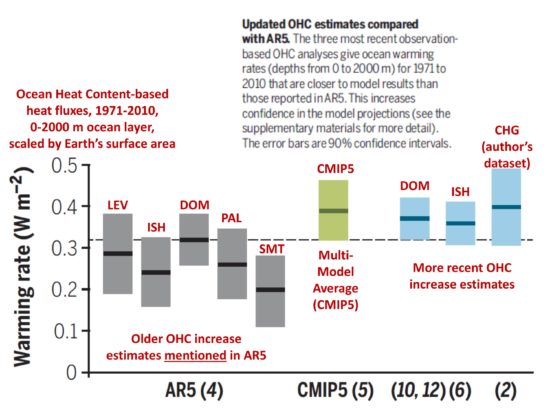
I wanted to expand upon something that was mentioned in yesterday’s blog post about the recent Cheng et al. paper which was widely reported with headlines suggesting a newer estimate of the rate of ocean warming is 40% higher than old estimates from the IPCC AR5 report in 2013. I demonstrated that the new dataset was only only 11% warmer when compared to the AR5 best estimate of ocean warming during 1971-2010.
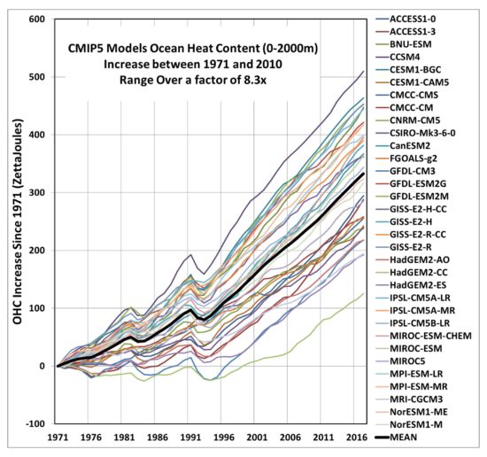
The point I want to reemphasize today is the huge range in ocean warming between the 33 models included in that study. Here’s a plot based upon data from Cheng’s website which, for the period in question (1971-2010) shows a factor of 8 range between the model with the least ocean warming and the model with the most warming, based upon linear trends fitted to the model curves:
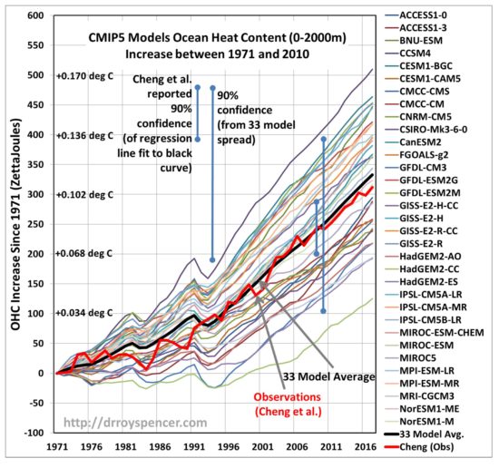
I have also included Cheng’s reanalysis of ocean heat content (OHC) data over the same period of time, showing how well it fits the *average* of all 33 models included in the study. Cheng’s OHC dataset is now the warmest of all reanalyzed OHC datasets, which means (mark my words) it will gain the greatest favor in the next IPCC report.
Mark. My. Words.
What is disconcerting is the huge (8x) range in ocean warming between models for the period 1971-2010. This is partly due to continuing uncertainty in climate sensitivity (ranging over a factor of ~3 according to the IPCC), but also due to uncertainties in how much aerosol forcing has occurred, especially in the first half of the period in question. The amount of climate system warming in models or in nature is a function of both forcing and the system response to that forcing.
If models are based upon fundamental physical principles, as we are often told, how can they give such a wide range of results? The answer, of course, is that there are some physical processes which are not well known, for example how clouds and upper tropospheric water vapor change with warming. The devil is in the details.
Dodgy Statistics
One of the problems with the results in the Cheng et al. study is how the 90% confidence intervals are computed. Most people will simply assume they are related to how well the stated numbers are known. That is, how good the various observational and model estimates of ocean warming are.
But they would be wrong.
The confidence intervals given in the paper (we are told at the end of the Supplementary Materials section) simply refer to how well each time series of OHC (whether observations or models) is fit by a regression line.
They have nothing to do with how good a certain OHC dataset is. In fact, they assume (as John Christy pointed out to me) each dataset is perfect!
In the above plot I show the difference between the quoted 90% confidence interval in the paper for the models, and the 90% confidence interval I computed which represents the variability between the models warming trends, which is much more informative to most readers. The difference is huge.
What Cheng et al. provided for confidence intervals isn’t “wrong”. It’s simply misleading for most readers who are trying to figure out how good these various observational OHC trends are, or how uncertain the climate model OHC trends are.
Is the Average of the Climate Models Better than the Individual Models?
Cheng et al. only deal with the 33-model average, and don’t mention the huge inter-model differences. One might claim that the average of the 33 models is probably better than the individual models, anyway.
But I’m not so sure one can make such an argument.
The various climate models cannot be viewed as some sort of “truth model” about which the various modeling groups around the world have added noise. If that were the case then, yes, the average of all the models would give the best result.
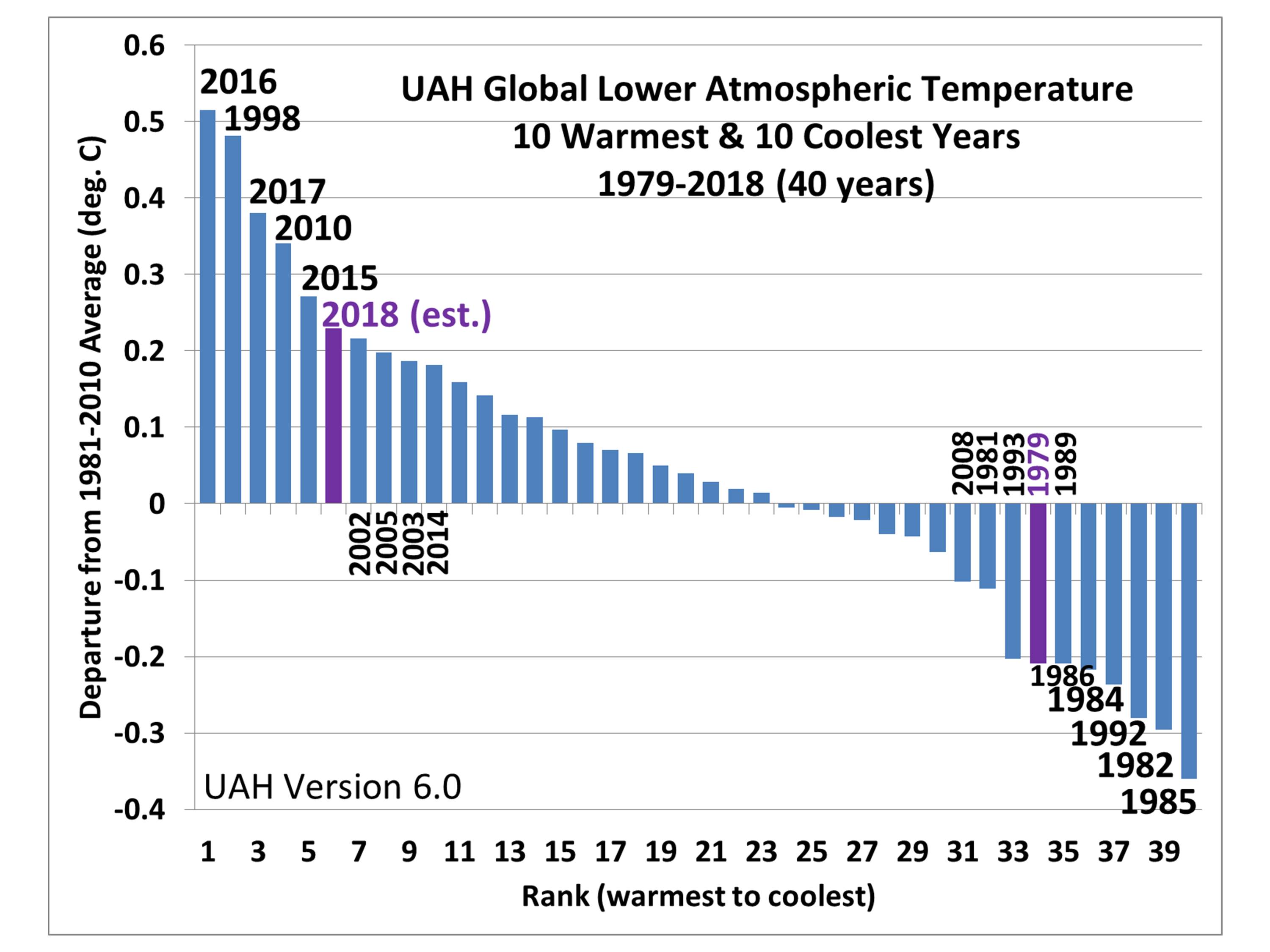
Instead, each modeling group makes their own best estimate of a wide variety of forcings and physical processes in the models, and they get a wide variety of results. It is not clear which of them is closest to the truth. It could be an outlier model is best. For example, the model with the closest agreement with our (UAH) satellite tropospheric temperatures since 1979 is the Russian model, which wasn’t even included in the new study. That model has the lowest rate of tropospheric warming since 1979 out of over 100 models we have checked.
The new OHC dataset might reduce uncertainty somewhat (although we still don’t know how accurate it is), but one also has to evaluate surface temperature trends, tropospheric temperature trends (which I believe are telling us water vapor feedback isn’t as strong as in the models), as well as uncertainties in forcings which, even if the models contained perfect physics, would still lead to different projected rates of warming.
Given all of the uncertianties, I think we are still far from understanding just how much future warming will occur from increasing CO2 concentrations in the atmosphere.