
 Home/Blog
I’ve been spending recent months applying our novel methodology of quantifying the urban heat island (UHI) effect on surface air temperature, now using Landsat-based Impervious Surface (IS) cover fraction as a proxy for urbanization. This is an adaptation of our published research using population density (PD) as a proxy for urbanization, in which we showed that about 60% of the U.S. warming trend since the late 1800s in urban and suburban areas could be attributed to increases in population density. We used non-homogenized (raw) GHCN temperature data in that study; it remains unknown to what extent homogenization procedures implemented by NOAA, Berkeley BEST, et al. have removed this spurious warming effect.
One important aspect of the population density-based research was that the UHI effect on U.S. warming trends largely disappeared after about 1960. We used population density for that study because there are global gridpoint datasets of PD at approximately 10 km spatial resolution going back centuries. So, it was a data availability choice.
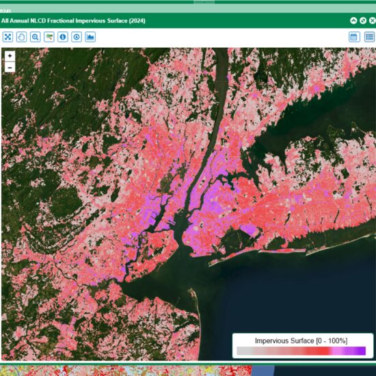
But the more physically direct proxy for urbanization in the context of the UHI effect is how much of the surface is covered by impervious surfaces (mainly roads, parking lots, buildings, etc). There are now Landsat-based datasets of IS coverage over the U.S. at high spatial resolution (~30 m) but only since 1985 when Landsat data quality was sufficient for such retrievals. This post addresses some results using those IS data. Here’s an example of IS data for the NYC area in 2024:
Specifically, I’m going through the top major Metropolitan Statistical Areas (MSAs) ranked by total population to quantify the average summertime (JJA) UHI impact on daily maximum temperature (Tmax) and minimum temperature (Tmin). I’m computing these effects separately for excessively hot days (~97th percentile) versus non-excessively hot days, which is yielding some interesting results. The analyses are based upon all available GHCN daily data during the summers of 1985 through 2025 within 40 to 100 km of the approximate centroidal location of the major metropolitan areas.
The Surprising (to me) Impact of Elevation, Nighttime Watering, and Daytime Ocean- and Lake-Breezes
Elevation
One thing I enjoy about analyzing large datasets is when I find something that surprises me… even when it shouldn’t have surprised me. The first effect was elevation. We all know that temperature decreases with height in the troposphere. This is why other UHI studies have required urban thermometer locations to be at elevations not very different from the rural locations. The “gold standard” requirement has been no more than 10 m or 30 m difference in elevation.
The problem with this standard is that it greatly restricts the number of available GHCN stations being analyzed. Since the UHI effect is often not much more different from station-specific biases due to other factors, one needs as many stations as possible to beat down the noise and extract the UHI signal. I have been using a rather loose 100 m to 250 m, but I gradually realized this was causing a bias in the results.
Why a bias, rather than just elevation difference-related noise? As I went down the list of the top U.S. metropolitan areas I realized that virtually all of them have something in common: they are at average elevations lower than the surrounding rural areas. This makes sense historically since major cities were originally developed next to major water bodies to factilitate transportation: the ocean, major rivers, and large lakes, which are all at lower elevations than their surroundings. This means that a portion of what we perceive to be the urban heat island effect is often due to differences in elevation. Sometimes there isn’t a major water body (e.g. Las Vegas), but for several practical reasons cities are seldom built in the mountains; they are instead in the low-lands.
So, I implemented a multiple regression procedure to separate out the impact of elevation from impervious surface cover in my calculations. This allows me to use all available stations, no matter their elevation, which helps to beat down the noise from other, non-UHI effects on measured air temperatures.
Nighttime Watering
I also found that most of the western U.S. cities have curious UHI effects, expecially during excessively hot days. Most of the U.S. West is characterized by summertime drought as a persistent feature of the weather there. I am now pretty sure that in many of these cases the curious results are due to nighttime watering of vegetation, which increases during excessively hot days.
Ocean and Lake Breezes
Several major cities experience significant daytime ocean breezes (e.g. Los Angeles) or lake breezes (e.g. Chicago). This acts against the urban heat island warming. As we will see, in the case of Los Angeles the cooling sea breeze almost totally dominates over any UHI warming.
Some Major Metropolitan Area Results
My methodology uses all available GHCN station pairs available on each summer day for the years 1985 through 2025. For each station pair, I compute the temperature differences (Tmax and Tmin, separately), as well as the differences in 1×1 km average impervious surface coverage centered on those station locations (I also looked at 2×2, 5×5, and 10×10 km results). This is done for all station pairs within 40 km to 100 km (city-dependent) of the approximate centroid of the MSA being considered (in the case of NYC, I chose Central Park). I then group all of these station-paired data into 7 classes of 2-station average IS coverage, which allows me to examine any nonlinearities in the UHI-vs-IS relationships. For each class, I regress the temperature differences against the IS differences to get an average dT/dIS (regression slope) value. These 7 slopes are then integrated across IS to arrive at curves of UHI temperature impact versus IS.
An important feature of the method is that I don’t have to categorize a station as “rural” or “urban”, as most other UHI studies have done. As seen in Fig. 1 (above) there is a continuum of urbanization as quantified by IS coverage from 0% (wilderness) to 100% (complete coverage by roads, parking lots, buildings, etc.)
New York City-Newark-Jersey City MSA
The New York-Newark-Jersey City MSA is the most populous in the U.S., with 6% of the U.S. population residing there. Fig. 2 shows the resulting average UHI effects across this MSA on Tmax and Tmin, and for excessively-hot days vs. not excessively hot days.
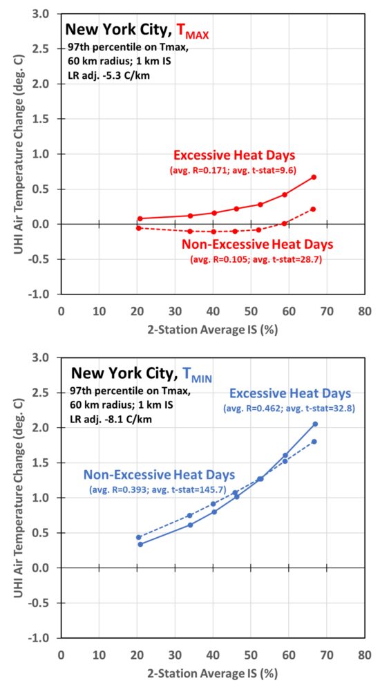
(It is important to point out that these results should not be interpreted as necessarily representing inner-city NYC vs. surrounding rural areas. They are the average results for all available station pairs found within 60 km of Central Park, thus are for stations generally not in downtown NYC. Instead, they provide an average picture of how urbanization affects air temperatures, on average, across the entire metropolitan region.)
The first thing we see in Fig. 2 is that the UHI warming effects are much larger on Tmin than on Tmax, which many others have found.
Secondly, we see that excessively hot days have a somewhat stronger UHI warming effect at the most urbanized locations (largest IS values). But for Tmax on non-excessively hot days there is evidence of the “urban cool island” effect, which others have studied and published results on. This is a natural consequence of impervious surfaces conducting heat down into the sub-surface compared to natural land (and vegetation) surfaces, which causes a time lag in the diurnal temperature response.
Los Angeles-Long Beach-Anaheim MSA
We need only go to the 2nd most populous MSA (Los Angeles) to see that the temperature changes in urban areas are not always due to warming from urbanization. This is shown in Fig. 3.
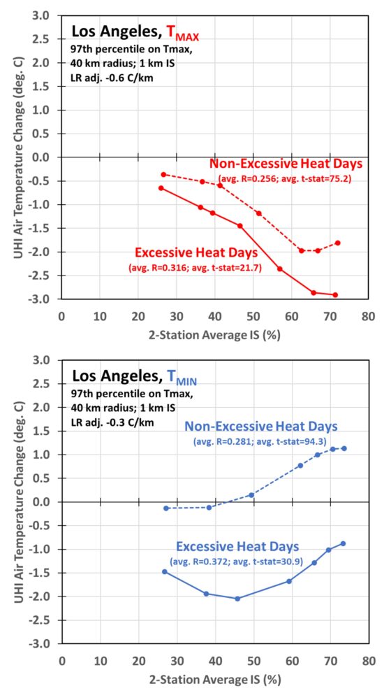
In this case we see a huge daytime cooling effect on Tmax in urban areas, which I assume is due to the persistent daytime sea breeze in the LA basin during summer. The effect is also seen to a lesser extent in Tmin for excessively hot days. I don’t know whether this is due to stronger and more persistent sea breezes on excessively hot days, or due to more nighttime watering of vegetation during those days, or some combination of both.
At this point you might be wondering, how can the hottest days have cooler urban temperatures? This is where I have to explain how I classify “excessively hot days”. Because there are so many GHCN stations within 40 km of downtown LA, there are days when some stations exceed their 97th percentile hottest temperature and other stations do not. So how do we decide which days are “excessively hot” for the metropolitan region as a whole? I calculate for each date in the summers of 1985-2025 how many stations exceed their 97th percentile threshold. I then compute the average daily temperature across those stations. For LA, it turns out at least 12 stations exceeding their 97th percentile temperature threshold are required in order for approximately 3% of the dates to be categorized as “excessively hot”, thus providing a 97th percentile threshold for the whole MSA region. I then use that 12-station minimum, applied to Tmax (not Tmin), to decide which dates are “excessively hot”.
I am finding that most of the major cities in the western U.S. have reduced UHI heating (and like LA, even cooling) during daytime and nighttime on excessively hot days. In many cases I believe this is due to watering of vegetation, which for every city I have checked, Grok says that city has more water usage during the nighttime hours on excessively hot days. For example, here are the results for Portland-Vancouver-Hillsboro, the 24th most populous MSA in the U.S; note how the fairly strong UHI warming effect on Tmax and Tmin is reduced on the hottest days, especially at night when most watering occurs:
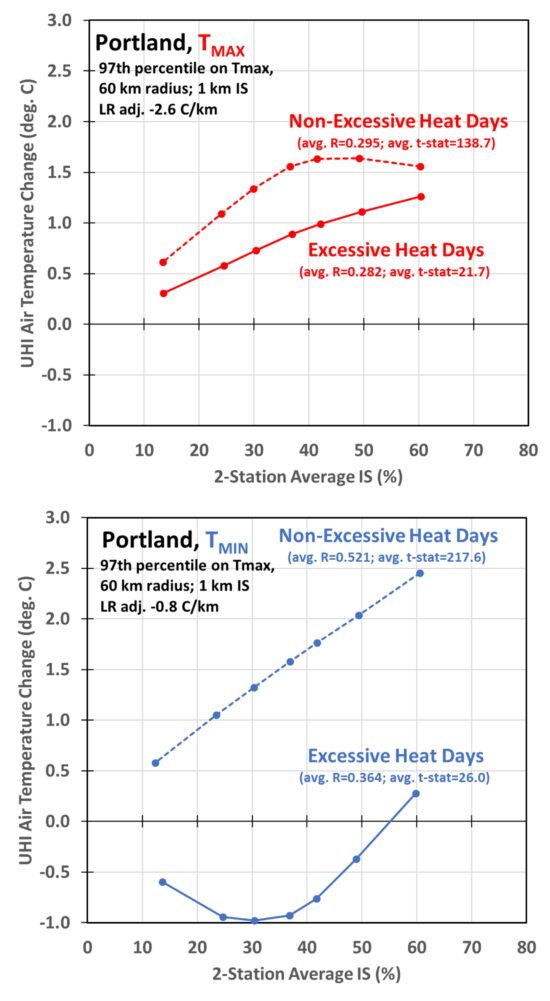
For the bottom curve in Fig. 4 (nighttime Portland temperatures on excessively hot dates), one might even imagine the maximum cooling effect from more watering is in the suburbs (IS less than 20-30%), but then switching to warming in the most urban areas (IS over 50%), presumably due to differences in areal coverage by vegetation being watered.
I am through about two dozen of the 50 most populous metropolitan areas I want to include results for as part of a paper we are preparing for submission to the journal Urban Climate. Since those 50 MSAs include over 50% of the U.S. population, chances are good your city or town will also be included.


We’ve had very red sunsets in Northern Ireland this last couple of evenings. Last time it happened it was due to wildfire smoke from Canada.
Are you having a wildfire problem?
Georgia has had record-breaking wildfires. It seems quite a stretch, but perhaps recent circulation patterns have sent that smoke north.
Bing…. the previous Canadian wildfires (eh?) affected air quality and visibility as far south as Virginia and North Carolina… so it is no small leap that the massive fires in both the carolinas and Georgia will impact air quality in Ireland. especially given the standard air current is to the ocean and then northward.
Northern Ireland is getting very red sunsets. Do you guys have another wildfire problem?
Red sky at night, sailor’s delight.
The Mournes and the Sperrins are both currently ablaze.
Maybe the problem lies closer to home?
Wetter weather ahead.
Elevation – those observations are very interesting to me. Until one year ago we lived at about 800 ft ASL in a near suburb of Cincinnati Ohio USA. A general aviation airport – Lunken – sits at 483 ft ASL near the intersection of two major river valleys – the Ohio and the Little Miami, which used to be a previous path for the Ohio. I had a good quality automated weather station sited in a field (my yard). Lunken was no more than 3 or 4 miles from my home. Both stations are shown on an extensive private network (Ambient Weather Network). Under subsiding air conditions, especially in the late summer and fall, Lunken could easily sometimes get 5, 7, even 10 degrees F cooler by sunrise! My skies would 100% clear and Lunken would be in dense fog (brilliant choice for Cincinnati’s first – 1920s – commercial airport, huh?). This happen a lot. All that cooling air flowing down the many smaller valleys down into the lower river valley.
In my misspent youth I went up in helicopters and fixed wing aircraft taking indirect measurements of particulates (using a photometer) and the views were striking. Very well delineated fog over the river valleys, confined by the hills that rose 300 to 400 ft above the rivers.
It is above my pay grade to figure out how to square this phenomenon with arriving at reliable average global temperatures, much less averages for a metro area. I will leave that to Dr Roy and others.
(BTW, Cincinnati’s commercial airport (CVG) is located on one of those hilltops 300 ft ABOVE the Ohio River in Northern Kentucky, which can cause some consternation and confusion for first time travelers)
Thomas,
Inversion is the term that springs to mind. Been in fog/cloud then the higher I get the clearer it has become. It certainly needs the topography to be correct, can’t remember if wind helps or hinders this phenomenon. And I have seen this occuring where urban influence would be non existent.
Thomas,
By age 12, I was fascinated by weather, lived on one of the Indian Hills, and was aware that nearby Milford on the Little Miami often had morning fog and lower temperatures than our hilltop location a few miles away. Now 70 years later, I see the same phenomena most still mornings, especially in autumn, when my hilltop location here in upstate SC is warmer than areas just a mile away where the denser, cooler air has accumulated, often bringing the temperature to the dew point and creating fog. This local temperature inversion does not occur on windy days when the warmer and cooler air is mixed. On both hilltop or valley, you will often see the results of very local temperature inversions, dew or frost on the grass of your yard, while the temperature on your porch or deck only a few feet higher, is warmer,and above the dew point.
Dr Spencer,
You wrote : “it remains unknown to what extent homogenization procedures implemented by NOAA, Berkeley BEST, et al. have removed this spurious warming effect.”
These homogenizations add warming; I thought that was common knowledge. Here’s an example of quantifying this artificial warming for GHCN V3 : https://www.zupimages.net/up/19/47/dyn5.png
Dr Roy Spencer,
The extra cooling could be due to lack of cloud cover and lack of water vapour.
In the Middle East they used to make ice in shallow ponds surrounded by high walls. At first light the servants/slaves would collect the ice and store it below ground in special rooms. The areas where this worked had very dry climates aka very low absolute humidity.
Could these cities have less humidity due to less plants & hose pipe band etc. Is there any correlation between these cool islands and cloud cover of humidty?
ent…there have been no significant fires here on the West Coast of Canada. There has been considerable flooding in eastern Canada due to the extra large amount of snow they had in winter. The Prairies are still under snow and recently had a a cold snap with much snow. Not conducive to fires.
There was a guy on the local news talking about wildfires in Canada recently. Unfortunately I did not get his name. He claimed that the number of fires has decreased recently but that the average extent of each fire has increased. It is apparently the media pushing the propaganda about wild fires.
There has been discussion in Canada re forest practices whereby the federal government are failing to remove dead wood from national parks. The dead wood acts as a fuel for fires. The town of Jasper recently had a serious fire and a local ranger claimed the Feds had been warned about the build up of dead wood and had failed to act. Subsequently, Jasper was largely burned out.
Thanks, Gordon.
The last time I saw it this red was the Canadian fires, and before that the Icelandic volcano.
Perhaps there’s something burning in the US.
Dr Roy’s research – The final results should be fascinating…and very important. These SMSAs are where the vast % of Americans experience weather and climate. I have been intrigued for a very long time on microclimate and local topographical effects on weather. In Metro Cleveland you can basically choose to avoid (my choice) or “enjoy” huge amounts of Lake Effect snow, based upon where you live. In Metro Honolulu you can choose to live in a sunny desert near the southern coast during most of the year (my choice) or in nearby neighborhoods for a decent amount of cloud protection and light misty rain for lots of the year. Then there is the San Francisco Bay Area with riotous differences within 15-20 miles of each other.
Urban effects on rainfall – Over 50 years ago, my colleagues and I were all convinced of a “rainshadow effect downwind from a major city. There was a study done of La Porte Indiana, downwind from the huge metro of Chicago and massive steel plants (and I think refineries) in nw Indiana. I believe that was later debunked, but I am not sure I believe the “debunking”. Rising air from city heat, even being forced up by the man-made topography (high rise buildings), condensation nuclei injected into the air from smokestacks…strictly from intuition, it makes sense that this would produce more rain. Are there extensive recent studies that anyone can point me to?
Thanks, gentlemen.
There’s high pressure over England so the airflow over the Eastern Atlantic is from the Southwest. Smoke from fires in Georgia would come over Ireland.
Here’s the latest on the fires:
https://www.yahoo.com/news/articles/georgia-wildfire-doubles-size-mandatory-155458543.html
Thanks, Stephen. 🙂
UHI is increasingly present everywhere, and by far not only in big cities – nothing new.
But… maybe Roy Spencer explains us better what he exactly means with:
” … it remains unknown to what extent homogenization procedures implemented by NOAA, Berkeley BEST, et al. have removed this spurious warming effect. ”
*
Like does Mr Spencer, I use GHCN daily too, and can easily compare its station data (after a considerable amount of processing with own software, however), e.g. with available time series from NOAA’s Climate at a Glance or Berkeley Earth, together with UAH 6.1 LT’s “USA48” or “USA49”:
https://drive.google.com/file/d/140u-HiL47xltk5to-ealX8i1EbHlASAc/view
Linear trends in °C / decade for consecutive periods till 2026
1900
GHCN: 0.08 ± 0.01
CaaG: 0.10 ± 0.01
1979
GHCN: 0.30 ± 0.03
CaaG: 0.30 ± 0.04
UAH: 0.20 ± 0.02
2000
GHCN: 0.37 ± 0.08
CaaG: 0.32 ± 0.07
UAH: 0.27 ± 0.06
{ UAH LT trends are always lower than those of the surface: because its anomaly series start higher and end lower. }
*
Berkeley Earth has data for CONUS+AK, but only till May 2017:
https://drive.google.com/file/d/1n-OAcvmyfDVl85_4ABZNeKjZH_TLPzQn/view
Similar trends as above
*
When looking at longer time series, I see no greater difference between GHCN daily and NOAA resp. Berkeley Earth, exactly as I recently saw no difference at all between the CONUS data of 10,000 GHCN daily stations and that of 133 pristine USCRN stations.
My question therefore is: What exactly did NOAA and Berkeley Earth remove where?
Sources
1. GHCN daily
https://www.ncei.noaa.gov/pub/data/ghcn/daily/
(Never click on ‘all/’; this results in the display of over 120,000 filenames.)
2. NOAA Climate at a Glance for CONUS
https://www.ncei.noaa.gov/access/monitoring/climate-at-a-glance/national/time-series/110/tavg/1/0/1900-2026/data.csv
3. Berkeley Earth for the region ‘United States’
https://berkeley-earth-temperature.s3.us-west-1.amazonaws.com/Regional/TAVG/united-states-TAVG-Trend.txt
4. UAH 6.1 LT
https://vortex.nsstc.uah.edu/data/msu/v6.1/tlt/
Bindy,
Back to your usual oafness.
It’s not Mr Spencer it’s Doctor Spencer, as he is discussing an area of his expertise. If he was talking about the mating habits of the duct billed platypus then sure using Doctor would be misleading.
Whereas you “claim” to have expertise in everything including data analytics. So far you haven’t produced anything to indicate that you understand data, but instead only reinforce the image of being a Walter Mitty,
Btw. This is toned down, if this was face to face I wouldn’t be being this kind. In other words – take the hint!
Open areas have Φ=0,47 whereas dense urban areas have Φ=1.
–
https://www.cristos-vournas.com
Hi All
Would someone help me. I have a friend who I have always tried to discuss climate with. Last night he sent me this https://www.bbc.co.uk/news/articles/c9w15nggj58o and I could do with finding answers.
I particularly take issue with the graph but I am no expert and I find it hard to work through the ERA5 website to try to establish what the graph is supposed to be.
Being British I have aways loved the BBC but over the years I have had less and less faith in what they tell us and now, sadly, I am joining the ranks of those who want to abolish it, they have gone way too far.
Comments please?
It will be interesting to see how somewhere tropical, like Honolulu, compares with the cooler places.
Being on permanent moderation let’s me know that you’re still worried about what I’ve got to say.
UAH satellite data will capture all changes in UHI year over year but 84.5% of earth’s surface is uninhabited and therefore has new UHI
Richard,
That is true, but can heat islands just be ignored?
In my book the answer it is a clear No. Heat islands will have a corrupting influence on the data. The UK has a majority of their temperature gauges out by 2C and a sizable number out by 5C. This is according to Freedom of Information requests to the UK Met Office. That’s is due to siting not heat island corruption.
Recent work has highlighted influences of a few degrees tailing off at 10km away from data centers. Overlap multiple heat islands and is the temperature rise due to Climate change or man-made effects,?
I don’t believe for one minute that heat islands will explain away all temperature rises but it does explain some. Only people who only want a simplistic answer will dismiss heat island as a contributing factor.
I believe Dr Roy Spencer suggested 50% under certain circumstances.
Richard Greene
I know you are aware of a lot of things related to surface temperature measurements.
*
What do you think of a comparison of three time series, for UK (the United Kingdom) plus EI (Ireland), respectively generated out of
– a set of 170 GHCN daily stations with data obtained from Met Office;
– a set of 480 stations monitored / evaluated by Berkeley Earth, 100 % disjunct from the GHCN set above;
– the average of all UAH 6.1 2.5 degree grid cells encompassing UK+EI’s land ?
Berkeley Earth’s data for UK is available unfortunately till Dec 2020 only.
*
1. 1900 – 2020/26
https://drive.google.com/file/d/1R68exw6QiPMdxildCCPbq0MGNTvh30WK/view
2. 1978 / 2020/26
https://drive.google.com/file/d/1Q8KYVf7WCUa1fEvjHJ9fkF8Vy7NEcdNL/view
*
If Met Office’s stations were as bad as claimed by a poster discrediting on this blog, ‘for unknown reasons’, anything he dislikes: why then are the moving averages aka running means of the GHCN daily and the Berkeley time series so similar, and – except the usual ‘starting high and ending low’ – even that of UAH LT?
Bindy Goebbels,
Didn’t take you long to let your mask slip with you particular nastiness. You denigrade Dr Roy to a Non expert with your propaganda to make your comment seem to have merit.
By the way, I was only repeating the dire straits of the Net Office that was obtained by a legal process. In the UK it’s called Freedom of Information Request and is used to hold government organisations account. As to don’t understand what Freedom or Information or even accountability are then you best do you research as you rest you club foot.
> can heat islands just be ignored?
Just Asking Questions, Anon for Q-related reasons?
They’re not, e.g.:
https://scholar.google.com/scholar?as_ylo=2026&q=uhi+effect&hl=fr&as_sdt=0,5
Troglodytes keep ignoring science.
Science reciprocates.
I don’t think you know much about MET office stations,we have them alongside car parks, airport runways, built up areas such as KEw in Cambridge, urban sprawl surrounds many of the older sites, I am not saying they are dishonest but a recent post by them claimed record days of temperatures over 30c , they must have forgot 1976 recorded 19 days of temperatures over 30c,before Manleys CET we know very little of actual temperatures apart from proxies and hand written accounts in parish records , many going back to 6th century. so it’s a leap of faith .
Brown
You can’t draw any meaningful conclusion from my comment above, can you?
Instead, you’re getting bogged down in unproven, useless polemics about individual weather stations.
Bindi Goebbels,
You are making Willard look like a genius with your ineptness with logic.
Badly placed temperature sensors corrupt the data. Even a craven club footed authoritarian like you ought to understand that. As the majority of temperature sensors in the UK are junk, then it means the temperature record is junk! Only you would try and use propaganda of the climate cult to persuade others that the data is reliable.
Btw looks like the IPCC are downgrading their worst case scenarios. Would it be that even the IPCC recognises that it’s unrealistic and basically fraud to push corrupt data.
Did I touch a nerve? I repeat, when it comes to MET office sites you don’t have a clue what you are taking about,
Bindi Goebbels?
Now, filthy QAnon, you reach the bottommost level of digusting behavior, and blatantly misuse freedom of speech.
And your typical endlessly discrediting and denigrating blah blah based on nothing else than conspirationist lies won’t change the fact that you are unable to technically contradict what I show, namely that 170 weather stations monitored by Met Office can’t be junk when showing data similar to 480 stations monitored by Berkeley Earth.
You are and keep a disgusting, incompetent polemicist.
Bindi Goebbels,
You use the same flawed logic and propaganda tricks as your old mentor used to convince people to believe in try hd lies rather than physical evidence.
Do you honestly believe that all those data sources you quote come from different networks of weather stations? That’s a typical bit of you nasty propaganda you use by suggesting that they are independent when in fact they are the identical.
Oh by the way why are you quoting 170 weather stations when the UK Met Office claims to have more? Have you seen any of those locations that you use to push the nazty climate cult lies? Funny how the ones I know are poorly sited.
It is interesting to see some commenters in this thread arguing that UHI has significantly corrupted surface temperature trends, all while citing Roy Spencer’s work on the topic as if he is the ultimate authority.
Even if that were true, his work does not actually support their claims.
Dr. Spencer notes above that the UHI contribution to US warming trends largely diminished after about 1960:
[“One important aspect of the population density-based research was that the UHI effect on U.S. warming trends largely disappeared after about 1960.”]
Meanwhile, observations from NASA GISS show that global warming from 1880–1960 was relatively modest (+0.03C/decade), especially compared to the much faster warming observed from 1961–2025 (+0.18 C/decade).
https://data.giss.nasa.gov/gistemp/data_v4.html
A similar pattern is evident in US temperature records, where warming rates are considerably lower prior to 1960 than in the decades that follow.
Given that there was barely any warming during the period Dr. Spencer’s research suggests UHI was a significant factor, it is hard to argue that UHI had a substantial impact on the warming trend, since there was so little warming to begin with.
Kynqora,
I respect Dr Roy Spencer s research and his Urban Heat Island research as he has been independently validated by others research. Heat Island affects due to data centres has been well researched recently that doesn’t reference Dr Roys work. Other research about India’s urban heat islands are again a totally different research path that don’t share the same references. Add in people’s experience of travelling from rural to urban is yet again another independent source of information.
So where is the hole in my logic?
Unlike Dr Roy Spencer who is bound by professional conduct, I’m not, so I can call out the UK Met Office and a lot of the fake research.
The hole in your logic is trying to posit that other effects aren’t influencing the temperature record.
There is a minor critique I have of Dr Roy urban Heat Island research. Can you work out what it is?
There is no hole in your logic. Rather, you are conflating two different concepts: the UHI effect and UHI bias.
The UHI effect, which you are describing, is indeed widespread and well documented. UHI bias, however, is more conditional and far less pervasive, and the specifics of that were outlined in a previous reply to you:
https://www.drroyspencer.com/2026/04/uah-v6-1-global-temperature-update-for-march-2026-0-38-deg-c/#comment-1741403
I don’t think the surface temperature record is free of influence from artificial sources but I do think that problem is reasonably handled by the homogenization algorithm NOAA et al. employ.
Kynqora,
UHI is well documented but not well understood as the research is still ongoing.
In 2025 would you be able to point to any publication that said that data centers would be able to disrupt the temperature readings up to 5 miles away? Foundries, industrial sites, and power stations would cause the same effect, but to my knowledge nothing was published.
I don’t believe that NOAA has the correct view. Simply because they would have to know how the energy distribution increase over time for that area. Do you believe they do?
[“I don’t believe that NOAA has the correct view. Simply because they would have to know how the energy distribution increase over time for that area. Do you believe they do?”]
I don’t know whether NOAA has specifically quantified energy distribution from data centers, though they certainly have the capability to investigate that if needed.
Unless these influences affect a substantial fraction of the network in a consistent way over time, they will not translate into a meaningful bias in the overall trend. They remain mostly localized effects that can be identified and corrected.
Worst comes to worst, NOAA can just rely on high quality reference networks like the US Climate Reference Network for climate monitoring.
Kynqoura,
Tell me how NOAA could analyse the historic energy and heat dissipation from a heat island when the land use,energy use and local weather changes from hour to hour? And please don’t descend to some airy fairy statistical tricks.
The data centre study is interesting from the point that it was a short study where external changes were minimal as clear boundaries of construction were easily identifiable.
Whereas most places I have been would show a chaotic collection of changes, sporadic influences and unreliable data history if any existed in the first place.
I believe the term is a one way trap. So multiply 2 prime numbers together is easy, working backwards from the product is far from easy. Now scale that up to when you the interaction of variables are not linear or consistent over time and at best you have a wild guess.
You seem to be of the mind set that you can always process the data into an answer. Whereas I have seen the opposite all too often with others suffering from hubris when they finally realise not all problems can be resolved reliably.
The goal is not to reconstruct every source of heat or energy input over time.
You can compute a difference times between between a thermometer in question and nearby stations, analyze how that difference evolves over time, and correct periods where consistent divergence appears. It is a fundamentally data driven comparison.
You don’t need to solve a backward problem and identify every heat source behind an anomalous reading.
The relevant question is whether a thermometer’s measurements diverge systematically from nearby stations that share the same regional weather.
That is why I have been asking how widespread you believe this effect to be.
Unless it affects a substantial fraction of thermometers in a consistent way (such that comparisons with neighboring thermometers break down), it can be identified and accounted for.
compute a difference time series
Kynqora,
“That is why I have been asking how widespread you believe this effect to be.”
Used to think it was milder, now from the data center research I think it’s quite prolific. A difference I hold Vs Dr Roy Spencer is that I don’t use the term Urban UHI and just refer to it as Heat Island.
A farm with 500 head of cows will generate a lot of heat, 1kw of heat plus per cow. A power station, an airport, an industrial park. All of these will produce heat with zero population. I can fully understand why Dr Roy Spencer uses population for a comparison. Heat Islands may overlap. I know one place where a very busy airport is not too far from a thermal power station and industrial parks. So how many heat islands are there, What’s the cumulative effect?
In the UK heat islands will be prolific, Canada not so much. There can never be a simplistic answer to this complex issue.
UHI is not corrected but amplified in the indices. The reason for this is that it is quite difficult to detect a divergence in measurements that would correspond to a slow increase in UHI. On the other hand, sudden shifts in measurements, particularly those caused by instrument move, are easily detectable and are corrected. Statistically, these sudden moves are mostly cooling. Numerous references in the literature can be found to these corrections, which cause artificial warming on the order of a tenth of a degree Celsius per decade.
Therefore, no, no one corrects the temperatures to account for UHI and it’s even worse than that.
> Numerous references in the literature can be found to these corrections, which cause artificial warming on the order of a tenth of a degree Celsius per decade.
Should be easy to find a few, then!
Willard,
One of the so called trusted UK met office sites is at Heathrow Airport, another at Teddington, another at Kew Gardens.
So you going to tell us what the urban heat island effect is for these places. And before you make your usual rash comment consider this. Heathrow used to be a field, so can you point to any article that describes the urban heat island effect over the decades.
My bet is you can’t, because no one can. Not all effects can be reversed. From the little hints you have have given about yourself you already know this.
Which part of “Numerous references in the literature” you do not get, Anon for Q-related reasons?
I bet you can’t even produce two.
Willard,
So what logic and reasoning have I used that you are disagreeing with?
Anon for Q-related reasons,
Except for your presumption that Team Science does not know about Heathrow, how your Puffman-like quizzes reverses the burden of proof, and your question-begging intimations, there is nothing to be said about your comment.
In case you are too old for Climateball, a citation looks like this:
https://rmets.onlinelibrary.wiley.com/doi/abs/10.1002/wea.4022
I’ll let you read its abstract.
It is my understanding that the USCRN data set, which runs since January 2005, only uses data from sites that are not affected by UHI.
NOAA’s nClimDiv data uses far more sites but applies adjustments for non-climate related influences such as UHI.
Up to and including March 2026, the linear warming trend in USCRN is +0.53 C per decade. Over the same period (Jan 2005 – Mar 2026) the linear warming trend in nClimDiv is +0.45 C per decade.
More than 21-years of data to compare between USCRN and ClimDiv and it appears that the adjusted data set is warming slightly less quickly than than the UHI, though the difference is probably not statistically significant.
Even so, it suggests that, if anything, the adjustments made by nClimDiv are imposing an artificial cooling bias to US surface temperature data.
TheFinalNail
Thanks for posting this: it perfectly confirms what I wrote recently about a comparison I made in the previous thread (April 21, 2026 at 3:35 PM) for CONUS between
– 113 USCRN stations
– over 10,000 GHCN daily stations.
https://drive.google.com/file/d/1JYw7j4tSFRP-fBj6Gm6SeNTaO4OvcVCI/view
Linear trends in °C / decade for 2005-2025
– USCRN: 0.51 ± 0.10
– GHCN daily: 0.44 ± 0.09
– UAH: 0.36 ± 0.04
*
The reaction of people discrediting, denigrating and even insulting me by name calling me ‘Goebbels’ was typical:
” A Walter Mitty like you would never understand the issues of the built environment has on sensors. Nor do you understand data analytics. Using excel doesn’t mean you have analysed the data correctly. ”
*
Wow! Using Excel… That tells you everything about the technical incompetence of such people who really think that one can process about 20,000 US GHCN daily stations and generate anomalies out of them in a spreadsheet!
*
For such people, all weather stations are by definition ‘junk’, though they would never be able to technically let alone scientifically prove such a dirty claim.
I’m just struck by the fact that Dr Spencer appears to disregard USCRN in his US surface temperature analysis.
Possibly he does acknowledge it and I’ve just missed it?
USCRN refutes Roy’s argument that poorly-handled UHI adjustments are unduly warming NOAA’s official US surface temperature record (if that is indeed his argument).
Data from the ‘pristine’ USCRN sites are warming at the same pace, possibly faster, than those from the sites where adjustments are required.
Again, it seems that the adjustments applied by NOAA to US surface station data are, if anything, imposing a cool bias on the data.
Did I touch a nerve? I repeat, when it comes to MET office sites you don’t have a clue what you are taking about,
No, Brown: you didn#t touch any nerve anywhere.
I never claimed to have a clue about anywhat.
I just did what YOU let alone the filthy QAnon (who insults me with the name of one of the worst Nazis together with Hitler and Himmler) would never be able to do: to compare Met Office data for UK with Berkeley Earth data for… UK!
Come back to us when you become able to disprove my results, Brown.
Empty vessels make the loudest noise, Plato,
So, your still using MET office data from sites with junk status. Instead of wasting money on a new computer, it would have been more prudent for them to have invested in new sites far away from built up areas, they have been challenged many times about this, and always use the same excuse that it is difficult to find the right locations on a crowded island, which is strange when less than 20 percent is built on. even their new sites are junk by world standards.
And you, Brown, keep the very same level of crude dishonesty when deliberately ignoring the fact that
– two compeletely different instances
– using compeletly different data sources
and
– processing these sources using completely different software techniques, language and tools
nevertheless offer nearly identical results!
What’s the difference between you and Clint R / Robertson & Co denying centuries of astronomical science?
” So, your still using MET office data from sites with junk status. ”
Why do you endlessly post such allegations without showing any valuable source proving them?
{ Again one of these QAnon’s repeatedly insulting posts with hateful speech – reminding me the behavior of German Neonazis: those who publicly aggressively threaten contradictors, promise in encrypted Telegram chats to take toughest action should they come to power, and even murdered democratic politicians, as did the NSU group, luckily in jail for years. }
*
Apart from that, I find it incredible that people still deliberately ignore the fact that two completely different evaluations of completely different station sets gave nearly the same result.
What the two, replacing experience and technical skills by polemic attacks never will understand, is that even if many stations indeed do not comply to requirements wrt quality and siting, their processing nevertheless gives us valuable information; and this is mainly due to anomaly-based evaluations, within which station data is locally evaluated and either accepted or rejected relatively to own, longer history.
Bindy Goebells,
Rather than complaining about a lack of references why don’t you do something honest and find out where the Freedom of Information data is. I know you have a fundamental problem with all of that, you being a book burner and a brown shirt supporter of the eco-nazty cult. You don’t trust our sources and we don’t trust your cults propaganda.
The UK met office is not reliable or trustworthy
Two things you have in common with them.
TheFinalNail’s comment above (May 1, 2026 at 4:06 AM) is for me a wonderful confirmation of my own layman work done when processing with a rather complex obect oriented software very different data sources like GHCN daily, (earlier: USHCn, GHCN V3), USCRN, the German DWD etc, and even PSMSL’s tide gauge data together with SONEL’s GPS information.
*
I don’t feel any need to care about people woefully discrediting me as ‘script kiddy’: such people never were able to technically contradict me.
*
Here is an anomaly-based comparison wrt 2011-2020 for CONUS from 2005 till 2025 of
– 113 USCRN stations
with
– over 10,000 GHCN daily stations:
https://drive.google.com/file/d/1JYw7j4tSFRP-fBj6Gm6SeNTaO4OvcVCI/view
*
Linear trends in °C / decade for 2005-2025
– USCRN: 0.51 ± 0.10
– GHCN daily: 0.44 ± 0.09
– UAH: 0.36 ± 0.04
*
Linear trends in °C / decade for 2018-2025
– USCRN: 1.39 ± 0.38
– GHCN daily: 1.24 ± 0.34
– UAH: 0.83 ± 0.17
Naturally, linear estimates for such a short period must be viewed with caution and perspective.
However, they give us a clear hint that even in the most recent period, the UHI-weak station set still shows on average a higher trend than the very certainly much more UHI-affected GHCN daily station set.
And the trend for UAH LT in CONUS (USA48) for 2018-2025 speaks for itself.
*
Just a hint: my USCRN data is NOT based on NOAA’s own evaluation, but on my evaluation of NOAA’s low level hourly USCRN data:
https://www.ncei.noaa.gov/pub/data/uscrn/products/hourly02/
NOAA provide a link to the monthly USCRN vrs nClimDiv data here:
https://www.ncei.noaa.gov/access/monitoring/national-temperature-index/time-series/anom-tavg/1/0
The monthly data are consistent with Bindidon’s results from the hourly data.
USCRN is warming faster that nClimDiv over their joint period of reference (from Jan 2005; over 21-years, now).
This was not the expected outcome amongst the ‘skeptical’ community; but there it is.
Since we are interested not in the absolute level of temperatures but in their evolution, it is the evolution of the environment that matters, not its quality at a given moment.
It is generally observed that the less urbanized a station’s environment is, the more significant the progression of UHI.
This confusion between level and evolution is by no means limited to the world of skeptics.
TheFinalNail
Apparently, the Frenchie did not understand that with the comparison, within CONUS, of a good hundred USCRN stations to about 10,000 GHCN daily stations, I did no more than to show that the evolution, within the last 25 years, of the two series does not show any valuable hint on any influence on the heat produced by huge data centers.
It is also worth noting that the propagation on the Web of this influence is mainly due to a single source:
The data heat island effect: quantifying the impact of AI data
centers in a warming world
Marinoni & al.
https://www.researchgate.net/publication/403073048_The_data_heat_island_effect_quantifying_the_impact_of_AI_data_centers_in_a_warming_world/fulltext/69c21ebcac3812287560e46e/The-data-heat-island-effect-quantifying-the-impact-of-AI-data-centers-in-a-warming-world.pdf
*
Although I 100% agree with this study regarding its excellent explanation of the ecological and social consequences of uncontrolled, exponentially growing data center development, I see that some people (including one person who constantly insults me on this blog) are deliberately misusing this information to discredit global temperature measurements.
Since this paper was published, the Web is full of hints like:
” Analyzing over 6,000 sites via satellite, researchers found that AI infrastructure significantly raises surrounding surface temperatures, with impacts detectable up to 10 kilometers (6.2 miles) away. ”
But nearly no source referring to the article above mentions one of the major pictures in it:
i.postimg.cc/BvCbRQZx/Temperature-increase-wrt-distance-from-a-huge-data-centre.png
*
No wonder then that with a little search, you discover another voice concerning the effects of data centers:
Data centers’ heat exhaust is not raising the land temperature around where they’re built
Andy Masley
https://blog.andymasley.com/p/data-centers-heat-exhaust-is-not
*
No: I don’t believe Masley more than Marinoni & al.
I simply want to point out that this is further evidence that if the warming effect of this exponential increase in huge data centers in the continental US were indeed so extreme, we would inevitably see it in this picture:
https://drive.google.com/file/d/1NimYjMbA_Vw-nbpF8ws2fy8hoj66LJtI/view
“Since we are interested not in the absolute level of temperatures but in their evolution, it is the evolution of the environment that matters, not its quality at a given moment.”
The temperature in all cases is given as an anomaly, not an absolute. Their ‘evolution’, in all cases, is warming.
Poor little Bindy Goebells,
Do you really believe that there are no heat islands,? You are supposed to read books to add to your comprehension of a subject, you are not supposed to burn books.
Heat islands exists as the numerous separate stands if research show. You also need to include thermal energy sources as well, as you seem to be unaware that data centers run 24×7.
> the numerous separate stands if research
Citing a few would be nice.
Dirty, filthy QAnon
Last sentence of:
https://www.drroyspencer.com/2026/04/the-urban-heat-island-and-urban-cool-island-a-few-examples-for-u-s-major-metrolopitan-areas/#comment-1743043
describes you better than thousand words.
Bindidonc falls into a series of successive traps that lead him to believe he can say something relevant about surface temperature measurements based solely on numerical analysis. He is not the first to have this illusion. Determining a parameter like surface temperature with an accuracy of one-tenth of a degree over regional and global areas is a significant challenge that requires much more than the numerical analysis of thermometer readings.
Overall, Bindidonc replicates the methodological errors of the skeptics who, in the 2000s, confirmed the main official indices through numerical analysis of raw data without bothering to understand what that data represented. He makes a second, unfortunately widespread, error: confusing a temperature level with its evolution.
Indices such as CRUTEM are very strongly affected by anthropogenic disturbances, including the UHI. The evidence is abundant and consistent, and the mechanisms are understood.
Three important points:
1. The sensible heat production of an urbanized area is roughly double that of a rural area due to the effects of evaporation deficit and energy consumption.
2. A heat source influences the temperature at a given point in inverse proportion to the square of the distance.
3. What matters most is not the degree of urbanization of a station’s environment, but rather the evolution of that environment.
Consequently, it is not surprising that USCRN shows stronger trends than GHCN for the USA.
The temperature of the lower troposphere, for reasons that are well understood, amplifies global warming. In the specific case of the USA, this amplification is probably negligible, and the actual trend in regional temperature is very likely close to the values for the lower troposphere.
An assessment of the evolution of summer temperatures in the continents of the Northern Hemisphere:
https://zupimages.net/up/19/47/ilvv.png
” Determining a parameter like surface temperature with an accuracy of one-tenth of a degree over regional and global areas is a significant challenge that requires much more than the numerical analysis of thermometer readings. ”
This is the typical discourse of a good-for-nothing who can only elevate himself by putting others down.
This Frenchie braggart attacked me years ago in the same way about one of my evaluations of climate data. No sooner had I asked him to refute my data technically instead of smugly criticizing me, than he disappeared.
*
It’s too boring to reply in detail to this arrogant blah blah which just superficially replicates what is written on this blog since a while.
But to two claims I do very well because they are based on mere guessing.
1. ” He makes a second, unfortunately widespread, error: confusing a temperature level with its evolution. ”
That is pure nonsense. We compare here USCRN to GHCN daily, and not Pages2K to HadCRUT and UAH LT, for example:
https://drive.google.com/file/d/1QNmA5_rTVCHEOCo87TcPvmuB2GO_jiSV/view
https://drive.google.com/file/d/1H3mDVGgtHXG4Nct8LM9qcB85jnM1U_v1/view
2. ” Consequently, it is not surprising that USCRN shows stronger trends than GHCN for the USA. ”
This is pure nonsense again, and actually comes from someone who has no idea about a crucial difference between USCRN and GHCN daily, namely the surface area fraction of CONUS captured by both station sets: for USCRN, 93 2.5 degree grid cells compared to the 170 by GHCN daily, thus showing that USCRN covers only 55 % of GHCN daily.
This effect is furthermore amplified by the fact that even when starting in 2005 instead of the historical start of the series in late 2000, the maximal station / grid cell coverage is not reached before 2008.
*
While GHCN daily is a Climate Network, USCRN is a Climate Reference Network. Even if it’s nice to see a correlation between the two, the difference still remains.
Bindy Goebells,
Do you not read you own comments??
“This is the typical discourse of a good-for-nothing who can only elevate himself by putting others down.” In your reply to phi.
You post this without any apparent irony. Pure hypocritical comment from you. It’s little surprise to me as I recognise your type of argument and rhetoric as the same as National Socialist Workers Party used to try and corrupt decent people. Being English there were books published to help recognise and counter those techniques. Although dated it’s still very relevant with the Eco-Nazty using same playbook as the Goebells used.
” It’s little surprise to me as I recognise your type of argument and rhetoric as the same as National Socialist Workers Party used to try and corrupt decent people ”
*
Ultra far right Q Anon
You continue insulting me with your disgusting references to the Nazis.
Even the Anderson boy finally stopped doing that years ago.
*
Your brutal insults have nothing at all to do with how I replied to the French guy.
Apparently, you can’t stop filling the blog with your mental feces and I think there is no way to stop you because you know you can freely misuse on this blog the freedom of speech to any extent you wish.
You behave exactly as the German and French Ultra far right people.
There is no other way for me to describe you as to write: You are a filthy asshole.
Roger Pielke Jr. Wrote
“What matters today is that the group with official responsibility for developing climate scenarios for the IPCC and broader research community has now admitted that the scenarios that have dominated climate research, assessment and policy during the past two cycles of the IPCC assessment process are implausible. They describe impossible futures.”
So even the IPCC has realised that their scenarios where basically fraudulent. Add in Heat Island effects, orbital drift due to the orbits of the large planets, changes in land use, solar cycles, reduction in pollution. Doesn’t really leave much after natural climate change.
Wonder how the eco-nazty cult is going to try and ignore this, especially after years of demanding that the IPCC is beyond any form of criticism.
Anon,
All anyone has to do is look at the lapse rate and if they have any mathematical ability, immediately understand that the Greenhouse Gas Effect is a fraudulent science built on smoke and mirrors. But, the purveyors of this fraudulence, will continue claiming they are the keepers of truth, and all others are its deniers. The keepers snidely post their arrogant insults ignoring the overwhelming evidence of the Earth’s physics. Their souls are so twisted in their ideology that they would rather it all burn down than submit to the truth if they could ever recognize the truth.
Stephen,
Totally agree, but they try to hide behind the skirts of the IPCC like frightened children. So when the IPCC removes the extremes the cult goes in to total denial.
It’s so obvious that eco-nazty cult overplayed their hand as a lot of people are turning their backs on the cults madness.
Societies like the sierra club Fabians , Frankfurt etc have too much influence and use a lot of propaganda to push their brand of authoritarian socialism. They failed in 1940s, so now they try an eco path which is totally corrupting environmentalism.
The truth has no defense against a fool determined to believe a lie…..Mark Twain.
Anon, they will continue to ignore it as they always have, the environmental damage from green ideology is destroying eco systems on both land and sea, in the UK ,the government line is ,use less energy,but we will soon be producing more energy than we will ever use ,and as prices continue to increase the poor become poorer,it will take generations to clear up all the mess they are creating, and for what?
Ian,
Looks like my post disappeared.
Anyhow, if you look at CO2 per capita then it looks as if Germany is worse to than the UK with all their renewables and eco-nazty cult attacking anyone who laughs as their fantasies.
UK now seems to have less than the Global average, so should stop the mad long rush into Eco Armageddon.
“… the Greenhouse Gas Effect is a fraudulent science built on smoke and mirrors. ”
What a dumb statement, at the same mental level as what absolutely incompetent people destillate on this blog about the spin of our Moon.
*
I don’t know exactly how often commenters uploaded for years on this blog information collected about solar and terrestrial radiation – for example in the US by the seven SURFRAD stations – which are all equipped since decades, among other devices, with downward/upward pyranometers measuring solar (0.3 to 3 µ), and downward/upward pyrgeometers measuring terrestrial (4 to 50 µ) radiation.
These devices collect data every 3 minutes.
*
Once more: here are four graphs showing this data on four different season days, measured at the SURFRAD station Fort Peck, Montana:
July 1, 2025
https://drive.google.com/file/d/10oZEK21bfTnPIFCdLf-4OTAeSQR7UOGh/view
Oct 1, 2025
https://drive.google.com/file/d/1EM0m17_lGyBJX2hpYU33fgaoltEn4AOt/view
Jan 1, 2026
https://drive.google.com/file/d/1EE33HVduZx0EHMXhQOsgzGjEe60oJJeu/view
Apr 1, 2026
https://drive.google.com/file/d/18KuC6GDaCPo8bX24MglGvhSxqVJK0jHj/view
*
Looking at the graphs, the first thing that stands out is that, contrary to a widespread but unproven allegation badly misused to discredit the energy balance equations, the upwelling longwave radiation (the green line) is by no means limited to the time of solar activity: it is present day and night, regardless of the season.
By the way, this green line gives you a pretty hint on how ridiculous the intentional misuse of the Pirani gauge by Schula in reality is.
*
The brown line encompasses all terrestrial radiation re-emitted in all directions by absorbing gas molecules (H2O, CO2, CH4, N2O, SF6 etc.): it shows how much of the terrestrial longwave radiation did not reach outer space: that is the not so luckily named ‘GreenHouse Effect’.
Note that the major constituents of the atmosphere (N2: 78%; O2: 21%) do by no means absorb/emit longwave radiation in relevant quantities (N2: 1 million times, O2: 10,000 times less than e.g. H2O – under consideration of the respectivre abundances).
*
I have the impression that it is not so much GHE itself that worries so many people, but rather the idea that it is a tool that serves solely to loudly condemn and banish CO2.
Now, the downwelling infrared measured by pyrgeometers is the sum of all wavelengths reaching these devices: they don’t distinguish between wavelenghts originating from H2O, CO2 or what ever else.
To obtain such info, you need devices analyzing the spectral radiance of what they measure, e.g. Atmospheric Emitted Radiance Interferometers.
And one earlier result of such analysis is that CO2 was, during 2000-2010, responsible for no more than roughly 10 (TEN) % of the whole downwelling longwave radiation!
**
I fully understand that an overwhelming majority of people are extremely dissatisfied with the way we handle the CO₂-intensive use of fossil fuels. This also applies to us at home, as we simply cannot afford to forgo gas as our primary heating source (we have no car).
However, to demonize the greenhouse effect (which is still and for a longer while primarily caused by H₂O) solely on the basis of CO₂ emissions: that’s pointless and contradictory.
Bindidon,
You wrote :
“The brown line encompasses all terrestrial radiation re-emitted in all directions by absorbing gas molecules (H2O, CO2, CH4, N2O, SF6 etc.): it shows how much of the terrestrial longwave radiation did not reach outer space: that is the not so luckily named ‘GreenHouse Effect’.”
Ouch!
1. No, the brown curve represents atmospheric irradiance as seen from the surface.
2. Irradiance is, of course, not related to absorption but to the emission capacity of molecules.
3. Irradiance does not show the portion of Earth’s radiation that has not reached space; it is a property of the atmosphere that depends on its temperature and composition.
Heat transfer from the surface to the atmosphere occurs primarily through latent heat of water vapor. However, we don’t know how to calculate this flux. The greenhouse effect certainly exists, but we don’t know how to calculate it.
To get out of this impasse, climatologists have invented a pataphysics of climate that popularizes absurd conceptions of the greenhouse effect, as your paragraph so aptly illustrates.
> pataphysics
Paraphrasing Richard Hanania, cranks just don’t understand what science is.
When should we expect gloating on Simpson’s paradox?
phi is so preoccupied with himself and so intent on appearing omniscient that he didn’t bother to read exactly what I meant with the paragraph
” The brown line encompasses all terrestrial radiation re-emitted in all directions by absorbing gas molecules (H2O, CO2, CH4, N2O, SF6 etc.): it shows how much of the terrestrial longwave radiation did not reach outer space: that is the not so luckily named ‘GreenHouse Effect’. ”
It’s so simple to grasp: the brown line is the downwelling infrared radiation, measured by pyrgeometers at the ground; what else than ‘atmospheric irradiance as seen from the surface’ could that line then represent?
*
And finally, the Frenchie boy teaches us – of course as usual without any link to any valuable scientific source – that ‘climatologists have invented a pataphysics of climate that popularizes absurd conceptions of the greenhouse effect, as your paragraph so aptly illustrate[s]’.
He isn’t even willing to grasp how pyrgeometers, radiance interferometers, Fourier-transporm spectrometers etc, really work.
*
Mon Dieu…
Bindidon,
1. “all terrestrial radiation”
No. Atmospheric irradiance depends on atmospheric temperature, which is maintained by the latent heat flux of water vapor, not by IR radiation from the surface.
2. “re-emitted in all directions by absorbing gas molecules”
Nonsense (see 1). IR absorption is marginal and decreases as the greenhouse effect intensifies. Irradiance is linked to emission capacity.
3. “it shows how much of the terrestrial longwave radiation did not reach outer space”
False. The calculation is incorrect; you are missing the residual 20 W/m² absorbed by the atmosphere.
And, for your information, the instruments you mention measure heat loss. Atmospheric irradiance is calculated from this, taking into account the cell temperature.
Irradiance is a virtual quantity that would only be directly detectable by a sensor at 0 K.
Given your limited knowledge of climate science, I suggest you temper your arrogance.
A. Show us valuable proofs for your claims in (1) and (2).
B. (3) is correct but is not a predominant factor compared to the 300 W/m² on average shown at e.g. the FPK station
C. ” And, for your information, the instruments you mention measure heat loss. ”
That’s a wonderful strawman.
What matters here is that all these devices are perfectly calibrated and measure thermal radiation in the range from 4 to 50 µ.
*
” Given your limited knowledge of climate science, I suggest you temper your arrogance. ”
Well when I read such incredible things like
” … climatologists have invented a pataphysics of climate that popularizes absurd conceptions of the greenhouse effect… ”
I understand that
– you must be by dimensions more arrogant than I ever might be, and that
– you knowledge re. climate science is at least as limited as mine (which I never claimed to be impressive).
*
I’ve read Dufresne/Treiner over 10 years ago, and sorry: compared to them you behave on this blog like… a clever but opinionated pseudoskeptic.
As far as I understand, over 80% of the downwelling infrared radiation is due to downward reemission of absorbed upward radiation.
The rest is
– emission of IR-active gas molecules excited by latent heat or sensible heat transfers from the surface
– downward IR emission from clouds.
*
Anyone contradicting the above should provide for valuable information coming from somewhere else than e.g. Master Heartland’s Voice WUWT!
1.
Surface-atmosphere heat fluxes rounded:
20 W/m² Sensible heat convection
20 W/m² IR
80 W/m² Latent heat convection
… and not the other way around as you wrote.
The temperature of the atmosphere is therefore essentially maintained by non-radiative fluxes. Therefore, the image you suggest of photons from the surface being absorbed by greenhouse gases and re-emitted in all directions is incorrect.
2.
The greenhouse effect, from the surface perspective, is nothing more than the transfer of its radiative cooling to convective cooling.
3.
For example, the concept of radiative forcing has no thermodynamic meaning because it purports to eliminate entropy from the resolution of a thermodynamic system.
I also suggest you read the long and enjoyable discussion I had with Jacques Treiner on this subject:
https://www.climato-realistes.fr/temperatures-satellitaires-versus-temperatures-de-surface/
> The temperature of the atmosphere is therefore essentially maintained by non-radiative fluxes.
Nobody should ever claim that Sky Dragon cranks have no poetry in them! Their sel de la langue might be a tad too salty at times.
Perhaps they should patent their non-radiative flux machines?
The Sun at low entropy warms the surface of the Earth at higher entropy as Varnos has described to 288K. The land and ocean have a higher heat capacity than the atmosphere. The temperature difference from the surface to TOA is approximately 33K and is determined by pressure and described by the lapse rate. The surface temperature at 288K is regulated by conduction and convection as warm air rises adiabatically it expands against lower pressure and loses internal energy through pV work. It is a polytropic process. As Varnos has described the Greenhouse gases are 0.4% of the atmosphere and have no discernible influence on temperature. According to GHT, the Greenhouse gases cause the 33K warming. Therefore, by definition if you removed the Greenhouse gases the troposphere would be isothermal. Then, why is the moist lapse rate more isothermal than the dry rate? Why is the lapse rate determined solely by pressure? Why is there no radiative function in the lapse rate? Is it your claim that the temperature at the base of Mauna Loa is higher than the summit due to radiative forcing? Is it your contention that pressure has no role in atmospheric temperature and at odds with several Laws of Physics (Pascal, Ideal Gas Law, etc.)? All of the physical evidence indicates little to no influence on Earth’s temperature from Greenhouse gases.
phi
https://scienceofdoom.com/wp-content/uploads/2010/07/dlr-spectrum-wisconsin-ellingson-1996.png
You might be interested in this downwelling radiation data measured in Winsconsin and published in Ellington 1996.
If the DLR was thermal radiation then you would see a conventional bell curve. Instead you see very low DLR between 750 and 1300cm-1 due to the low absor*tion of surface radiation in the atmospheric window and very high DLR in the CO2 absor*tion/reradiation band around 650cm-1
Photons with greater wavelength than about 14μ can not raise the temperature of a 288K surface.
So that graph, if it really represents DWIR, shows why CO2 cannot warm the planet.
Ent,
Why does the down welling radiation not warm the summit of Mauna Loa to the same temperature as its base? There is a bunch of CO2 being emitted from Mauna Loa.
phi, I admire your patience in dealing with Bindi. He’s a hard-core cultist with no knowledge of science, so don’t expect him to ever learn anything. He clogs the blog with rambling insults and false accusations. Like all of his cult, he uses tactics to avoid reality. In one of his comments above, using SURFRAD info, he tried to imply the GHE was “proved” by the atmosphere absorbing infrared. That only means the surface warms the air with transformed solar energy, a purely natural occurrence!
The cult STILL cannot show how CO2’s 15μ photons can raise a 288 K surface temperature.
Blow me down! After all this time poor CR is still persisting with the fantasy of:
“CO2’s 15μ photons”
Try this:
Here is an arbitrary 15μ photon travelling though space.
Please tell us how you can discern the temperature of its source?
I look forward to your non-answer.
It’s sometimes hard to figure out what the F-student is talking about. That’s because he knows so little about the issues here. In this case, he seems to be confusing photon emission from a gas molecule with Wien’s Displacement Law (WDL). So, we get to have another “teachable moment”.
WDL allows for the calculation of the photon’s wavelength at the highest energy peak emitted from a SURFACE, at a known temperature. But a gas molecule does NOT fit that situation. A gas molecule emits quantum randomly, but typically in LINE spectra of the specific molecule, as opposed to a full continuous spectrum from a surface.
So an “arbitrary” 15μ photon would tell us NOTHING about the temperature of its “source”. It may not even have been emitted from CO2. As many different surfaces could also emit a 15mu; photon.
But since we know the frequency of a 15μ photon, we know CO2’s 15μ photon could not raise the temperature of a 288K surface.
[This is for adults only. Don’t expect cult kids to understand any of it.]
Student Duh
are you assuming that the photon is still maintaining it’s frequency after travelling 14 billion light years across the universe?
As expected.
You still don’t understand WDL.
Here is your problem:
Since you can’t tell the temperature of its source, what happens if the 15μ photon was emitted by the sun?
(the sun does emit these if you didn’t know).
Are you saying that all 15μ photons are rejected by objects that are warmer than 288K?
And don’t try and tell us that the photon knows if it came from CO2 or not.
Everyone with half a brain can see you are talking rubbish.
Anon: What the hell are you blabbing about?
Just a quick note: the photon model is incompatible with classical thermodynamics, which deals with heat fluxes. In fact, the greenhouse effect is such a complex phenomenon that we are far from being able to model it. The purely radiative part of the phenomenon is fairly well understood, as Manabe (1964) demonstrated, but the crucial convective part remains unsolved.
There are two symmetrical errors regarding atmospheric CO2 photons:
The pataphysical error consists of adhering to the first law of thermodynamics at the expense of the second, and the inverse error consists of adhering to the second law at the expense of the first. Both errors stem from the same source: applying macroscopic laws to a microscopic physical model.
Since we are interested in temperature, a macroscopic concept, we cannot use a microscopic (photon) model to draw any conclusions. Atmospheric CO2 photons certainly have an effect on surface temperatures, but it is equally certain that this effect differs from that of solar photons. Therefore, the theory of climatologists based on the notion of radiative forcing is indeed a pataphysics of climate.
This pataphysical error is, of course, the most serious because the scientific community as a whole refrains from denouncing it publicly, and it justifies deadly political measures.
Student Duh,
So on one hand you saying that 15μ photons exists and then you say that the sun doesn’t enit those photons.
Make your mind up. Do photons exist at a certain frequency or don’t they according to you?
Weins displacement law says that a body emissions will peak at a certain frequency for a temperature. It also adds that other frequency are emitted as well. So the sun emits a wide range of frequencies including at 15μ all the way to x-rays and beyond.
Get your head wrapped around this. A photon created shortly after the big bang will still be traveling while maintaining the same frequency. And it will continue to travel for ever at the edge of the expanding universe. Neat trick which isn’t really explained by your school of thought.
You failed again, F-student.
You can’t learn, and it frustrates you. That’s why you resort to insults, false accusations, and throwing crap at the wall.
If you want me to teach you, clean up your act.
phi, you may be confusing “philosophy” with “physics”.
“Philosophy” can involve a lot of undefined, disjointed rambling, but in physics, exactness and conciseness are preferred. For example, note that “Manabe 1964” has no scientific definition of the illusive GHE. In fact, you will find no scientific definition of the GHE in all of “climate science”.
It’s not really science, kind of like philosophy….
Hey Puffman, riddle me this –
https://www.drroyspencer.com/2026/05/uah-v6-1-global-temperature-update-for-april-2026-0-39-deg-c/#comment-1743359
This rant is full of basic mistakes and fraudulent reasoning. I bet you can’t identify any.
Prove me wrong, Puffman. Show Team Science that it should listen to Sky Dragon cranks.
Child Willard stalks me to prove me right, again.
I like being right….
Anon:
“So on one hand you saying that 15μ photons exists and then you say that the sun doesn’t enit those photons.”
Me:
“Since you can’t tell the temperature of its source, what happens if the 15μ photon was emitted by the sun?
“…THE SUN DOES EMIT THESE if you didn’t know..”
Obviously you can’t read. That may be the source of your problems.
CR, as expected, still cannot answer a simple question. I repeat, everyone with half a brain can see you are talking rubbish.
Again, if you want me to teach you physics, clean up your act. Stop insulting and falsely accusing.
Science is not for kids….
Puffman proves Team Science again.
Tean Science would like to proven wrong.
Sky Dragon cranks are just too weak.
CR:
“But since we know the frequency of a 15μ photon, we know CO2’s 15μ photon could not raise the temperature of a 288K surface.”
Have you ever read such rubbish?
This guy believes there are things called “CO2 15μ photons” that are, somehow, different to other 15μ photons. i.e.they must carry little tags around declaring:
“Look at me, I come from CO2 !”.
As I mentioned earlier, photons are a microscopic model of physical reality. The greenhouse effect is a macroscopic phenomenon that cannot be addressed using the photonic model.
Consider a photon from greenhouse gases (GHGs) absorbed by the surface. The entropy production dS will be dQ/Tsurface – dQ/Tges. With Tges < Tsurface, dS 0, which is permitted by thermodynamics.
Therefore, unlike the solar photon, the CO2 photon cannot transfer heat to the surface.
How can we respect the first law of thermodynamics?
Simply by abandoning microscopic models and considering only heat fluxes, which, by definition, respect the principles of thermodynamics.
Greenhouse gases have an effect because they reduce the radiative cooling of the surface, and this effect is different in nature from the effect of increased solar radiation because the associated entropy changes are different.
The greenhouse effect certainly exists, but radiative forcing is a pataphysical concept.
“Therefore, unlike the solar photon, the CO2 photon cannot transfer heat to the surface.”
Now we have “solar photons” competing with “CO2 photons”. !!
Therefore there must be “Mercury photons”, “Venus photons”, “Mars photons” etc. … all apparently distinguished from one another by tiny passports in their tiny pockets indicating where they departed from.
Honestly, this gets more and more bizarre.
studentb,
Bizarre because you’re trying to demonstrate a macroscopic property, a thermodynamic equivalence of irradiances, using the microscopic model of photons.
That’s not possible, and you can see that you’re facing a dilemma. Either you respect the first law at the expense of the second, or the second at the expense of the first.
I also see that my comment was poorly reproduced due to the font used and is therefore incomprehensible. I am reproducing it again in the hope that it works :
As I mentioned earlier, photons are a microscopic model of physical reality. The greenhouse effect is a macroscopic phenomenon that cannot be addressed using the photonic model.
Consider a photon from greenhouse gases (GHGs) absorbed by the surface. The entropy production dS will be dQ/Tsurface – dQ/Tges. With Tges < Tsurface, dS < 0, which thermodynamics forbids.
For the solar photon, dS = dQ/Tsurface – dQ/Tsun > 0, which is permitted by thermodynamics.
Therefore, unlike the solar photon, the CO2 photon cannot transfer heat to the surface.
How can we respect the first law of thermodynamics?
Simply by abandoning microscopic models and considering only heat fluxes, which, by definition, respect the principles of thermodynamics.
Greenhouse gases have an effect because they reduce the radiative cooling of the surface, and this effect is different in nature from the effect of increased solar radiation because the associated entropy changes are different.
The greenhouse effect certainly exists, but radiative forcing is a pataphysical concept.
Wrong
Wrong
Wrong
You are confused by your lack of comprehension about the role of GHGs. Lets try and put you straight:
The Earth as a planet (i.e. surface and atmosphere) has an equilbrium temperature of 255K.
This is THE SAME whatever the amount of CO2 in the atmosphere.
All CO2 does is to alter the temperature of BOTH the surface AND the atmosphere.
More CO2, the warmer the surface and the cooler the atmosphere.
Less CO2, the cooler the surface and the warmer the atmosphere.
All the while, the AVERAGE equilibrium planetary temperature remains the same: 255K.
CO2 acts as an insulator for the surface, like a nice warm rug.
No violations of any thermodynamic laws.
Wrong? But what’s wrong with that? You don’t say.
You have a reading comprehension problem and a problem with thermodynamics.
An obstruction to the outward flow cannot be calculated as an increase in the inward flow. This is one of the fundamental principles of thermodynamics. Making the mistake of using radiative forcing to model an obstruction to the outward flow can only produce incorrect results. It’s annoying, but that’s the way it is.
I think you know you are wrong.
Try this:
Explain how a rug warms a body.
The only heat source to the skin is the body.
Better still, write down the equations which describe what happens. It is not difficult but avoids all your hand waving.
I think you know you are wrong.
Try this:
Explain how a rug warms a body.
The only heat source to the skin is the body.
Better still, write down the equations which describe what happens. It is not difficult but avoids all your hand waving.
Since I have not denied the existence of the greenhouse effect, your request is moot.
You claimed that I wrote wrong things. Please specify what is wrong and explain why.
Elevation (and cloud cover effects) – I don’t have a clue whether this plays into long term temps, location of surface stations, etc, but I am never ceased to be amazed at dramatic local weather differences (which might play into – and distort – long term records).
We are less than one hour after sunrise here in Cincinnati, Ohio, USA and in Blue Ash Ohio I am seeing a private weather station at 70F and Lunken Airport, 11 miles away, recording 61F. Lunken is about 300-350ft lower, in a broad river valley and currently in fog. That valley lies to my south. Another deep valley lies directly to my west. It is likely also in fog, is closer, and may have a similar temperature difference.