
 Home/Blog
Sixteen days ago I had back surgery to have a bone spur removed at L3-L4, a ruptured disc shaved at L2-L3, and a rogue piece of bone hanging out around my spinal cord deported. I had gone many years living with chronic pain, especially when standing, that was the worst in my right leg. Since it went away with bed rest, I could live with it, but I finally decided I couldn’t go through life living on my back as my symptoms were only getting worse with age (I am 63).
The post surgical pain was worse than I expected. The pain meds they give you these days are almost worthless, so it’s a good thing post-op pain is severe for only a few days.
Then five days after surgery, I developed nausea with cold sweats and near-fainting. I started throwing up. For the first time in my life I called 911. I’ve never been hospitalized for anything (no prior surgeries), but decided that dying from stubbornness would not be in my family’s best interest. I lost a sister due to stubbornness a few years ago.
While in the ambulance the paramedic gave me nitroglycerin, just it case it was a heart attack. That brought on all of the worst symptoms again. I started cold sweats, my blood pressure plummeted and I started to lose my eyesight. I said something like, “OK, you’re losing me…reverse that last thing you just did.” I was wondering if this was what the death experience was like for some people.
At the hospital the first concern was that a blood clot from the surgery reached my chest. After a number of tests, including a CT scan of my chest with contrast and lots of blood tests, it was decided my heart, lungs, kidneys, and liver were all in great shape. I was sent home.
Still feeling like death, I started monitoring my blood pressure and heart rate every 20 minutes or so, and plotting everything in Excel, which at least gave me something to do. My systolic pressure and heart rate correlated very well with how badly I felt. The lower the numbers the lower I felt. After day 3 my numbers finally started to rise (systolic had gone below 100 several times and my HR struggled to stay above 60). I finally started feeling human again about 10 days after surgery.
Then, while my body injury repair personnel were off working on my lower back stab wound and my still-inflamed leg nerve, some bacteria decided it was the perfect time to invade my lungs and sinuses. I’ve gone close to two weeks now with little to no appetite.
I saw the surgeon yesterday for my first post-op checkup, and he passed it all off with, “Surgery is a major jolt to the body. You are getting better now, right?” I asked him about why I felt like I was dying when my BP and HR were very low, and he answered, “Well, when you die, they go to zero, right? You were just somewhere in between.” Funny guy.
He asked if I needed any more pain meds. I said, “I quit using the ones you gave me (Norco 7.5s) because they didn’t seem to do anything.” He smiled and said something like, “Yeah, we mostly count on a placebo effect with those.”
Watch Your Back
Before surgery I categorized some published data on the pressures put on your spine during normal activities and made a chart, which I gave the surgeon. He loves it. The reason I did it was because I read that sitting up straight after surgery is important because it puts less pressure on the spine. But I’m a sloucher, and I didn’t believe it. I needed to see some numbers.
It turns out that for many years no one really knew what kinds of activities cause what kinds of strain on the spine because there were no in vivo measurements of these pressures. Doctors just told you things they had no quantitative evidence for. So, some enterprising and inquisitive orthopedists drew straws and the loser had a pressure sensor implanted in the lowest disc on the spine and they took pressure measurements for various daily activities.
Here I’ve converted their pressure units to PSI and logically organized the activities into groups that put increasing pressure on the spine.
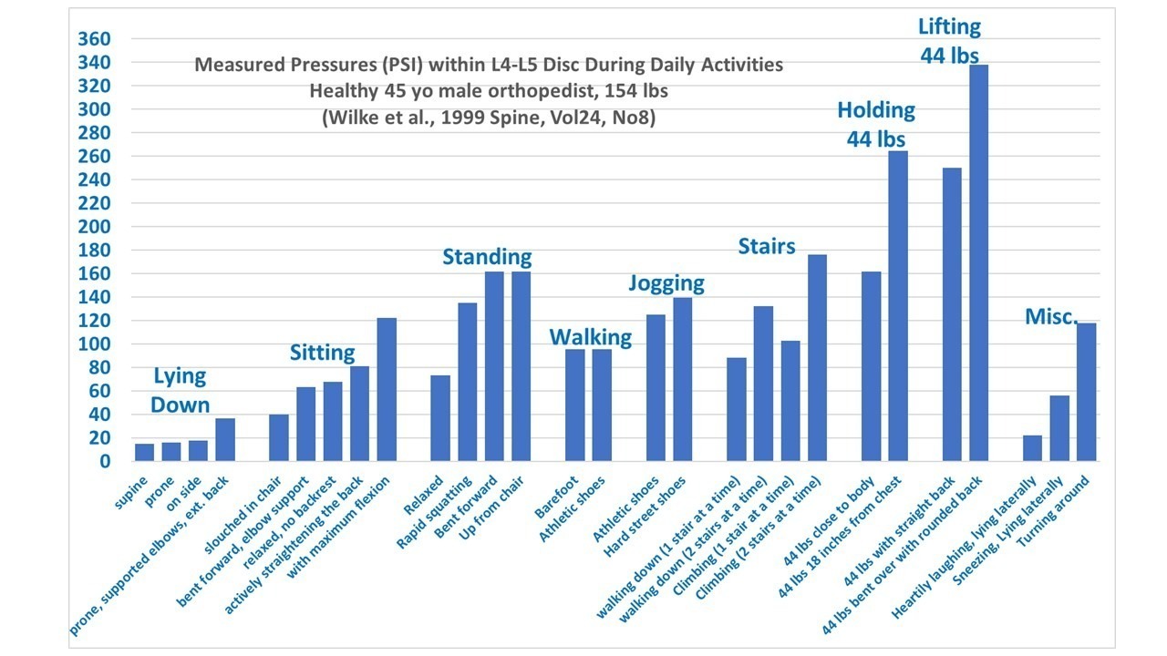
Other that verifying my suspicion that slouching puts much less pressure on your lower spine that sitting up straight, what the chart really shows is why you should avoid bending over for up to six weeks after having a disc shaved. Bending over (especially if you are pick up any amount of weight) puts a huge amount of pressure on your lower spine, and can put you right back into surgery if you don’t follow doctors orders.
In fact, it looks to me like there should be a lifetime ban on lifting anything while bending over. There should be a government regulations and an agency, with back enforcement police going around and cracking young mothers on the ankles with a baton if they see them picking up their toddler without using their legs rather than back.
Just kidding, of course.
Anyway, I am on the mend and will be back to causing trouble here again very soon. I’ve been following the other blogs and news and see that the field of climate change lunacy and hypocrisy continues to be a target-rich environment.


