Several meteorologists over the years have questioned the plausibility of the 134 deg. F world record hottest temperature recorded at Greenland Ranch, California, on July 10, 1913, but quantitative evidence has been lacking. We used 100 years of temperatures recorded at higher-elevation (and thus cooler) locations to find a range of temperatures that most likely occurred on that date.
The answer was 120 (+/-2) deg. F, typical for Death Valley in July, and well below the world record value of 134 deg. F. I have previously blogged on the evidence against this value and how and why it might have been recorded.
While I remain a skeptic of anthropogenic climate change being a net threat to human health and welfare, unlike some other skeptics I have never considered a temperature on a single day (especially over 100 years ago) as being any kind of evidence related to climate change. We follow the data, which is what we did in this new study.
NOTE: If you are commenting here for the first time, your first comment will need to be approved by me before it appears. That might take a day or a week, depending upon how busy I am, so be patient.
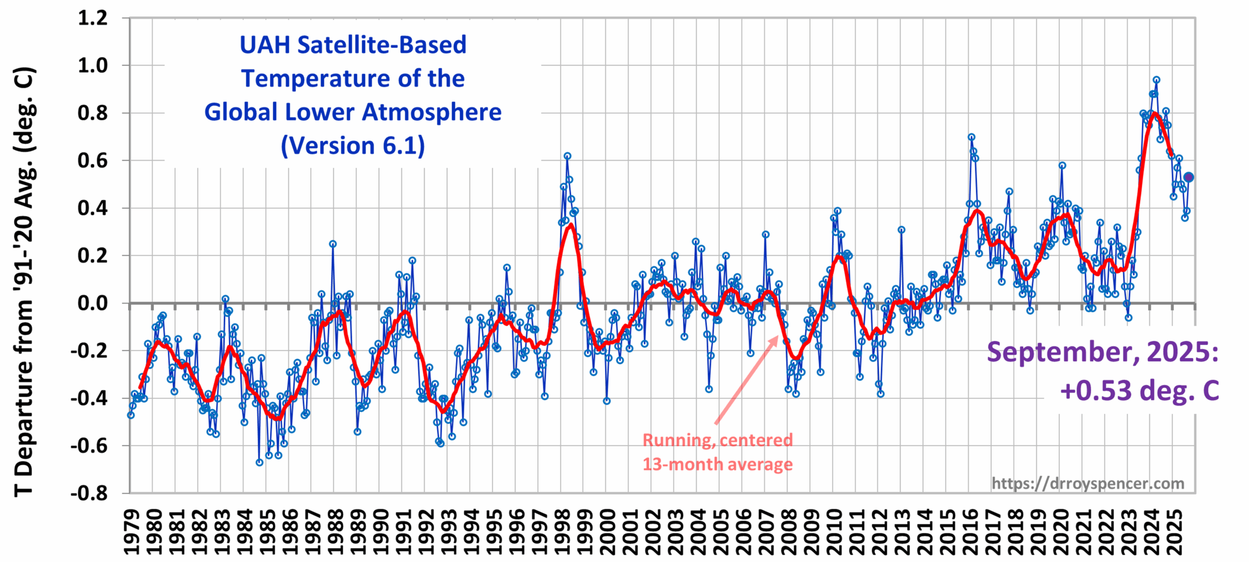
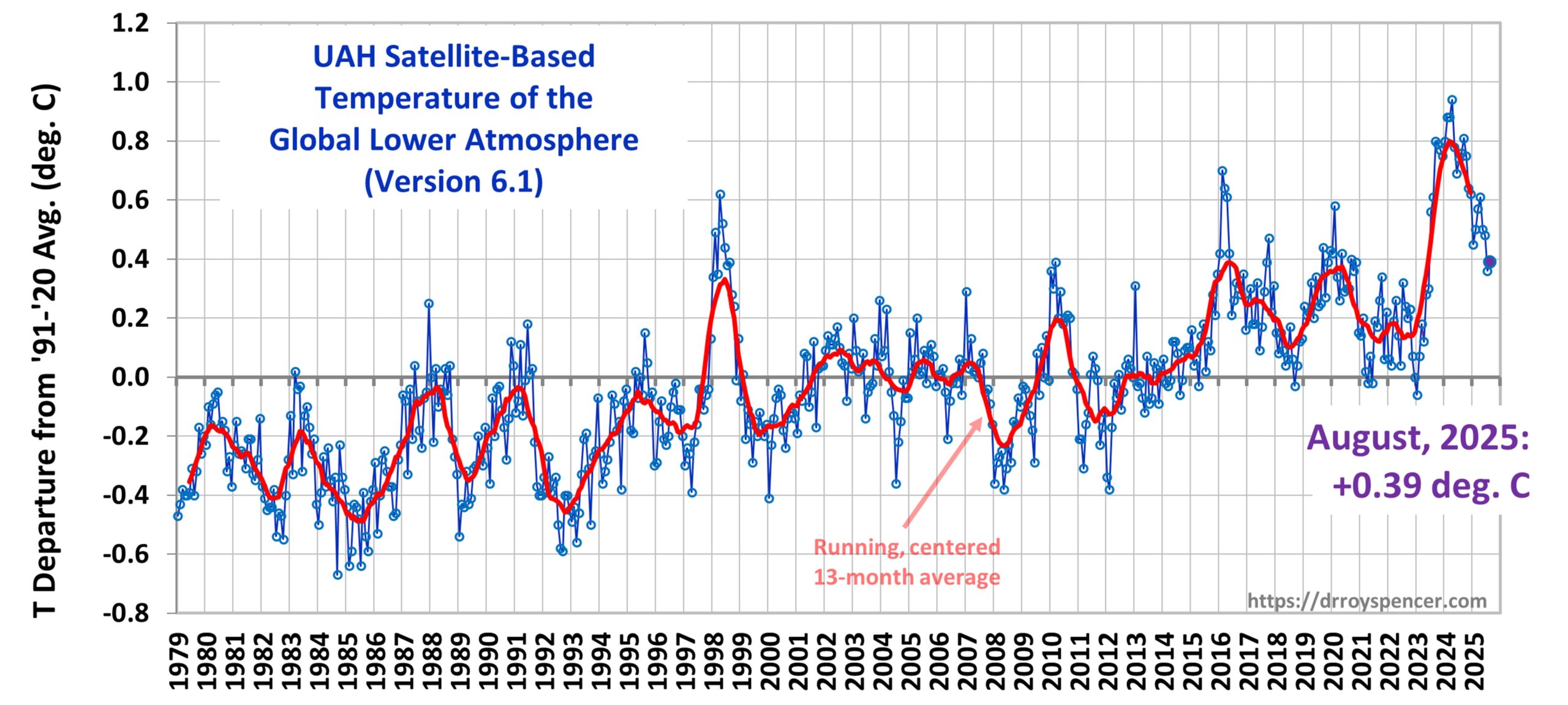
The Version 6.1 global average lower tropospheric temperature (LT) anomaly for September, 2025 was +0.53 deg. C departure from the 1991-2020 mean, up from the August, 2025 anomaly of +0.39 deg. C.
The Version 6.1 global area-averaged linear temperature trend (January 1979 through September 2025) remains at +0.16 deg/ C/decade (+0.22 C/decade over land, +0.13 C/decade over oceans).
The following table lists various regional Version 6.1 LT departures from the 30-year (1991-2020) average for the last 21 months (record highs are in red).
YEAR
MO
GLOBE
NHEM.
SHEM.
TROPIC
USA48
ARCTIC
AUST
2024
Jan
+0.80
+1.02
+0.58
+1.20
-0.19
+0.40
+1.12
2024
Feb
+0.88
+0.95
+0.81
+1.17
+1.31
+0.86
+1.16
2024
Mar
+0.88
+0.96
+0.80
+1.26
+0.22
+1.05
+1.34
2024
Apr
+0.94
+1.12
+0.76
+1.15
+0.86
+0.88
+0.54
2024
May
+0.78
+0.77
+0.78
+1.20
+0.05
+0.20
+0.53
2024
June
+0.69
+0.78
+0.60
+0.85
+1.37
+0.64
+0.91
2024
July
+0.74
+0.86
+0.61
+0.97
+0.44
+0.56
-0.07
2024
Aug
+0.76
+0.82
+0.69
+0.74
+0.40
+0.88
+1.75
2024
Sep
+0.81
+1.04
+0.58
+0.82
+1.31
+1.48
+0.98
2024
Oct
+0.75
+0.89
+0.60
+0.63
+1.90
+0.81
+1.09
2024
Nov
+0.64
+0.87
+0.41
+0.53
+1.12
+0.79
+1.00
2024
Dec
+0.62
+0.76
+0.48
+0.52
+1.42
+1.12
+1.54
2025
Jan
+0.45
+0.70
+0.21
+0.24
-1.06
+0.74
+0.48
2025
Feb
+0.50
+0.55
+0.45
+0.26
+1.04
+2.10
+0.87
2025
Mar
+0.57
+0.74
+0.41
+0.40
+1.24
+1.23
+1.20
2025
Apr
+0.61
+0.77
+0.46
+0.37
+0.82
+0.85
+1.21
2025
May
+0.50
+0.45
+0.55
+0.30
+0.15
+0.75
+0.99
2025
June
+0.48
+0.48
+0.47
+0.30
+0.81
+0.05
+0.39
2025
July
+0.36
+0.49
+0.23
+0.45
+0.32
+0.40
+0.53
2025
Aug
+0.39
+0.39
+0.39
+0.16
-0.06
+0.69
+0.11
2025
Sep
+0.53
+0.56
+0.49
+0.35
+0.38
+0.77
+0.32
The full UAH Global Temperature Report, along with the LT global gridpoint anomaly image for September, 2025, and a more detailed analysis by John Christy, should be available within the next several days here.
The monthly anomalies for various regions for the four deep layers we monitor from satellites will be available in the next several days at the following locations:
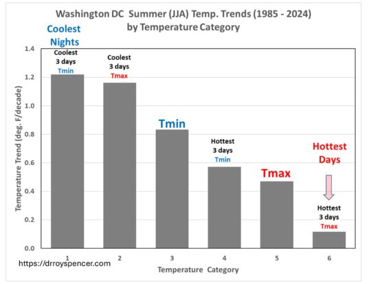
The total warming of the hottest 3 days in each summer month averaged across 400 mostly-airport weather stations is only 1.2 deg. F over 40 years.
I recently posted about the weather observations from Reagan National Airport that showed the warmest days of summer have experienced no statistically significant warming in the last 40 years, despite this being the period of maximum radiative forcing from increasing atmospheric CO2.
Of course, you would never know this based upon media reports… in fact, most people are probably under the impression that our hottest days are rapidly getting hotter.
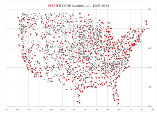
One commenter on my post (correctly) pointed out that what I presented was just one weather station. Well, now I have processed ~400 mostly-airport (WBAN) weather stations and over 2,000 cooperative observer (COOP) stations across the U.S.
Here’s a plot of those station locations.
The period I’m addressing is the last 40 years (1985-2024) because we have Landsat-based Impervious Surface (IS) cover data at high spatial resolution (30 m) for those years, and I’m looking at how recent warming trends are impacted by the urban heat island (UHI) effect. IS is a percentage cover of Landsat pixels by roads, parking lots, buildings, and other human development impervious surfaces.
Daily High Temperature (Tmax) Results
I don’t like “heat waves” as a statistical quantity. It is “binary”, which means it has an arbitrarily chosen threshold of temperature and number of days of duration, and those can be manipulated to give very different results for heat wave trends.
Instead, I computed a statistic which has no threshold, is always the same number of days, and occurs every month: the average of the 3 warmest (and 3 coolest) days in each summer month (June, July, August) during 1985-2024.
I can then compute trends in those, just like is usually done for the average of all daily Tmax (or Tmin). I did this separately for the mostly-airport (WBAN) stations which are well maintained for aviation safety reasons, and for the COOP stations which have varying and mostly unknown levels of quality control, siting, etc.
Since people are used to looking at time series, we will start with the multi-station average summer temperatures for 3 of the 9 U.S. climate regions as defined by NOAA/NWS. From top to bottom, these are the Upper Midwest, the Northeast, and the Southeast; I have offset the warmest-3 and coolest-3 day results for legibility:
Note how much more slowly the warmest 3 days per month are warming compared to the coolest 3 days. As an example, for the Northeast U.S. climate region (PA/MD and northeastward), the hottest summer days have been warming at an average rate of 0.10 C/decade, which equates to 0.7 deg. F over 40 years. All 9 climate regions exhibited this feature, by varying amounts. Again, these results are all for daily maximum temperatures, Tmax.
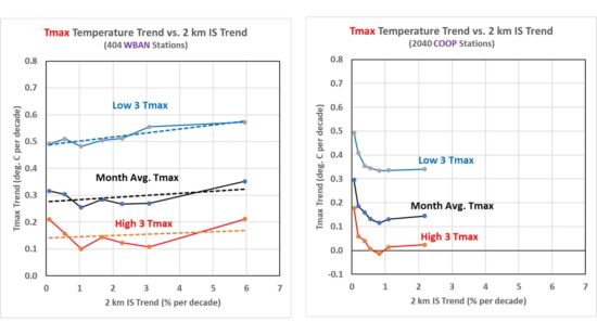
Next, I took all of the stations in the U.S., and split them into 7 equal-size groups of increasing IS growth which I am using as a proxy for urbanization for the purposes of temperature impacts of the urban environment. These plots are different: The temperature trend is on the vertical axis, while the category of urbanization growth is on the horizontal axis. Again, these results are for Tmax; the results for WBAN stations are on the left, and for COOP stations are on the right:
There is little dependence of the 40-year temperature trends on the rate of growth in urbanization (IS trend), maybe just slight upward slope with the most rapidly urbanizing stations experiencing a little higher warming trend. The generally higher trends at low values of IS growth (especially in the COOP data) are because most of those stations are in the western U.S., where warming trends have been greater. I wouldn’t put too much faith in the absolute values of the COOP trends because no time-of-observation (TOBS) adjustment has been made. But that should not affect the spread between warmest and coolest days.
What really stands out is the fact that the coolest summer days are warming much faster than the warmest summer days. The difference in warming trends is about 0.35 C/decade in the WBAN data, a little less in the COOP stations. This suggests a moderation of summer temperatures, with less variability.
Averaged over all 400 WBAN stations, the warming trend equates to only 1.2 deg. F of warming in 40 years. I would wager this weak upward trend in the warmest summer days is much less than what most people would expect, given media coverage of “heat waves”.
And if you are wondering how the trend in the average of all Tmax temperatures in the month compares to NOAA’s official homogenized, area-averaged dataset, they are about the same, to within 0.01 or 0.02 deg. C/decade
Daily Low Temperature (Tmin) Results
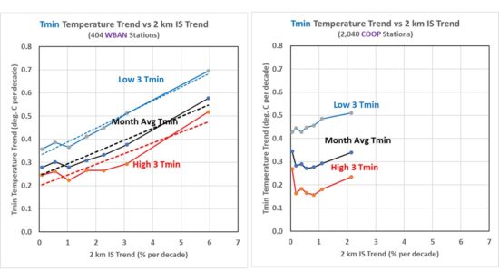
As seen in the next plot, the effects of increasing urbanization are much more pronounced in daily minimum (Tmin) than daily maximum (Tmax) temperatures, with the greatest warming trends occurring at stations with the fastest growth in impervious surfaces.
Note that these plots allow one to estimate what the station average warming trends would be in the absence of urbanization by just looking at where the regression lines intersect the vertical axis (IS trend = 0). Remember, the 7 IS trend groups have equal numbers of stations. If those values are used for the “climate signal” (as opposed to the increasing urbanization signal), the trends are not too different from those in Tmax
Conclusion
My main takeaway is that, contrary to what we have been told, there has been very little warming of the hottest summer days averaged across the U.S. in the last 40 years. The second takeaway is that nighttime (Tmin) temperatures are warming rapidly with urbanization, but when those statistics are extrapolated to no growth in urbanization, the average Tmin warming trend is greatly reduced, especially for rapidly growing locations.
…but the coolest summer nights have warmed by 5 deg. F.
John Christy and I continue to examine U.S. air temperature trends, especially those in summer, and John has recently been looking at “heat wave” statistics.
My interest is in determining how much the urban heat island (UHI) effect has impacted reported warming trends. Last year we published a paper using population density as a proxy for urbanization, and found that about 60% of U.S. urban and suburban warming trends in Tavg (the average of the daily maximum [Tmax] and minimum [Tmin] temperatures) since 1895 in the “raw” (non-adjusted) temperature data could be accounted for by urbanization.
But we also found that relationship largely disappeared by the 1970s, with little warming since then being accounted for by increases in population density.
Landsat Impervious Surface Data
We used population density in that study because the datasets are global and extend back to the 1800s (and even earlier). But the most direct physical relationship to UHI warming would be the coverage of the area around the thermometer by impervious surfaces (IS). Those data are now available at 30 meter resolution from Landsat for each year between 1985 and 2024 (40 years). IS might well reveal UHI effects in cases where population density is no longer increasing but wealth has increased (more air conditioning, Dollar Generals, etc.)
But I’m not going to show IS data today, that’s for another time. I’m only explaining how I got here.
D.C. Urban Warming Trends: The Difference is Like Day and Night
For now I’m examining metro areas (which is what the EPA Heat Wave papers also do), using airport ASOS measurements which is what the National Weather Service and FAA mostly rely upon. These systems are well-maintained since their primary purpose is to support air traffic safety.
I started with the center of America’s universe, Washington D.C. And I also decided that something better than a “heat wave” index was needed.
The heat wave (like pornography) is difficult to define, but you know it when you see it. How many days in a row constitute a heat wave? And how hot do those days have to get? Above the 85th percentile? 90th percentile? Those questions do not have definitive answers.
Also, by choosing a binary variable, there is no gray area available for days that are almost a heat wave (oh, sorry, there were only three days above 100 deg. F, so you didn’t meet the 4-day threshold). Such definitions lead to dodgy statistics, such as computed trends in heat waves,
So, I decided (as a meteorologist) that the hottest days in each month make more sense to keep track of for climate trends. I decided on the average of the 3 hottest daily maximum temperatures in each summer month (June, July, and August) as a potentially useful metric, which is approximately the hottest 10% of the days in the month. This metric always exists, every month, every year, and it always has 3 days. This is good for statistical analysis.
But then I thought, why stop there? What about the 3 coolest Tmax days each month?
Which then led to, “What about the warmest and coolest 3 days minimum temperature (Tmin) measurements?”
So, I started with Washington D.C., Reagan National Airport, which is used by your favorite congresspersons and presidents (as well as the public) to keep track of how hot it’s getting.
The results surprised me. Here are the temperature trends in those different categories. What is amazing is that the coolest summer nights in DC have warmed 10 times faster than the hottest summer days:
In fact, the trend in the hottest days’ temperatures is not even statistically significant, at only +0.12 deg. F per decade, which is just under a total of 0.5 deg. F warming in the last 40 years. No Boomer would notice that in their lifetime.
But look at those nighttime temperatures! The coolest nights have warmed by almost 5 deg. F in the last 40 years. This is clearly dominated by the UHI effect, since climate models tell us that days and nights should be warming at much closer to the same rate.
Now, Washington D.C. might be an outlier for urban areas. I’m just starting down this road, so we shall see. But I’ll bet most people would not have expected these results if they have been watching the local D.C. TV stations’ weather and news coverage.
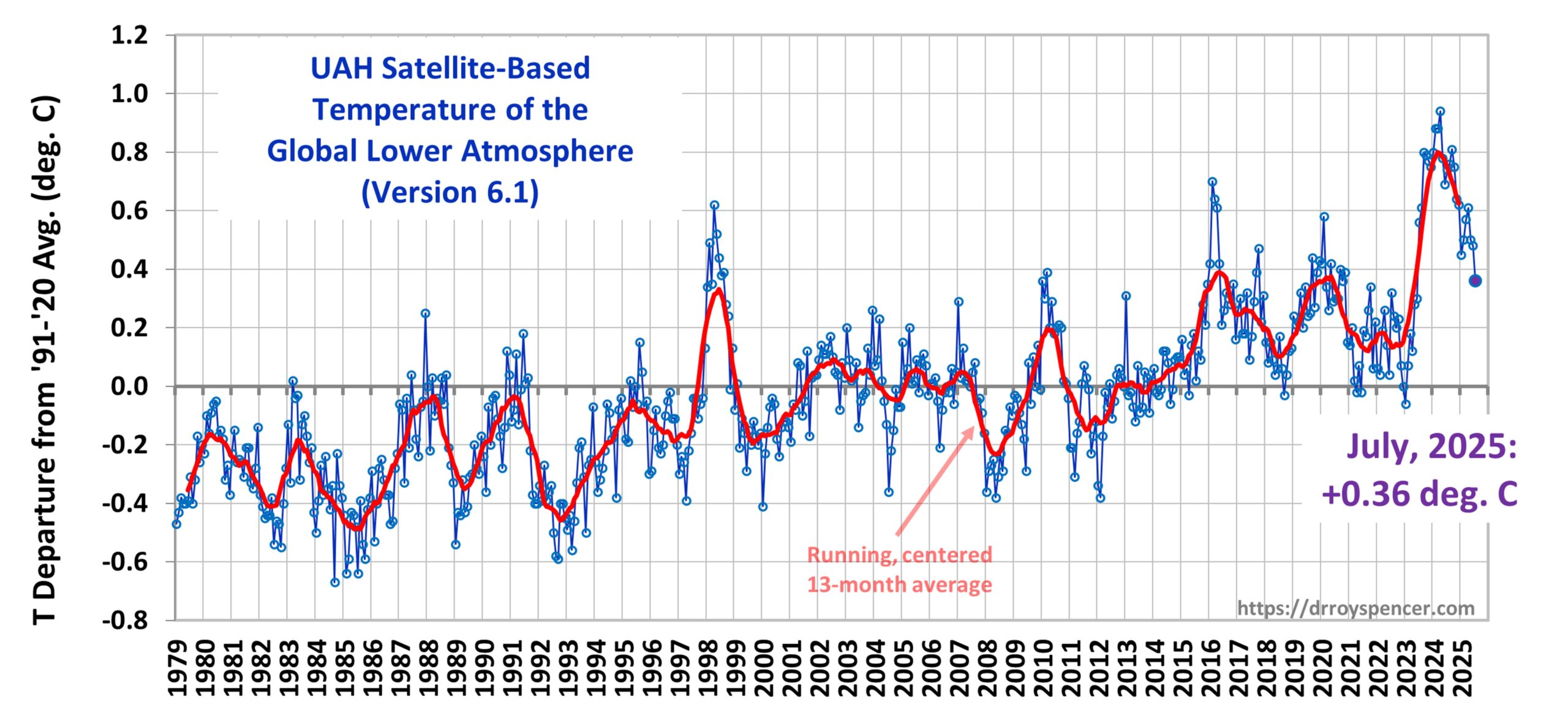
The Version 6.1 global average lower tropospheric temperature (LT) anomaly for August, 2025 was +0.39 deg. C departure from the 1991-2020 mean, up a little from the July, 2025 anomaly of +0.36 deg. C.
The Version 6.1 global area-averaged linear temperature trend (January 1979 through August 2025) remains at +0.16 deg/ C/decade (+0.22 C/decade over land, +0.13 C/decade over oceans).
The following table lists various regional Version 6.1 LT departures from the 30-year (1991-2020) average for the last 20 months (record highs are in red).
YEAR
MO
GLOBE
NHEM.
SHEM.
TROPIC
USA48
ARCTIC
AUST
2024
Jan
+0.80
+1.02
+0.58
+1.20
-0.19
+0.40
+1.12
2024
Feb
+0.88
+0.95
+0.81
+1.17
+1.31
+0.86
+1.16
2024
Mar
+0.88
+0.96
+0.80
+1.26
+0.22
+1.05
+1.34
2024
Apr
+0.94
+1.12
+0.76
+1.15
+0.86
+0.88
+0.54
2024
May
+0.78
+0.77
+0.78
+1.20
+0.05
+0.20
+0.53
2024
June
+0.69
+0.78
+0.60
+0.85
+1.37
+0.64
+0.91
2024
July
+0.74
+0.86
+0.61
+0.97
+0.44
+0.56
-0.07
2024
Aug
+0.76
+0.82
+0.69
+0.74
+0.40
+0.88
+1.75
2024
Sep
+0.81
+1.04
+0.58
+0.82
+1.31
+1.48
+0.98
2024
Oct
+0.75
+0.89
+0.60
+0.63
+1.90
+0.81
+1.09
2024
Nov
+0.64
+0.87
+0.41
+0.53
+1.12
+0.79
+1.00
2024
Dec
+0.62
+0.76
+0.48
+0.52
+1.42
+1.12
+1.54
2025
Jan
+0.45
+0.70
+0.21
+0.24
-1.06
+0.74
+0.48
2025
Feb
+0.50
+0.55
+0.45
+0.26
+1.04
+2.10
+0.87
2025
Mar
+0.57
+0.74
+0.41
+0.40
+1.24
+1.23
+1.20
2025
Apr
+0.61
+0.77
+0.46
+0.37
+0.82
+0.85
+1.21
2025
May
+0.50
+0.45
+0.55
+0.30
+0.15
+0.75
+0.99
2025
June
+0.48
+0.48
+0.47
+0.30
+0.81
+0.05
+0.39
2025
July
+0.36
+0.49
+0.23
+0.45
+0.32
+0.40
+0.53
2025
Aug
+0.39
+0.39
+0.39
+0.16
-0.06
+0.69
+0.11
The full UAH Global Temperature Report, along with the LT global gridpoint anomaly image for August, 2025, and a more detailed analysis by John Christy, should be available within the next several days here.
The anomaly in the tropics (20N – 20S) has dropped considerably, to +0.16 deg. C. The U.S. was below the 30-year average in August.
The monthly anomalies for various regions for the four deep layers we monitor from satellites will be available in the next several days at the following locations:
The comment portal at the Federal Register is now open for comments relating to our DOE report. If you think we weren’t alarmist enough, post your comment and explain why. If you think we were too alarmist, post your comment and explain why. I believe the comment period is open for 30 days.
The Version 6.1 global average lower tropospheric temperature (LT) anomaly for July, 2025 was +0.36 deg. C departure from the 1991-2020 mean, down from the June, 2025 anomaly of +0.48 deg. C.
The Version 6.1 global area-averaged linear temperature trend (January 1979 through July 2025) remains at +0.16 deg/ C/decade (+0.22 C/decade over land, +0.13 C/decade over oceans).
The 0.12 deg. C drop in global average temperature anomaly since last month was dominated by the extra-tropical Southern Hemisphere, which fell from +0.55 deg. C in June to +0.10 deg. C in July.
The following table lists various regional Version 6.1 LT departures from the 30-year (1991-2020) average for the last 19 months (record highs are in red).
YEAR
MO
GLOBE
NHEM.
SHEM.
TROPIC
USA48
ARCTIC
AUST
2024
Jan
+0.80
+1.02
+0.58
+1.20
-0.19
+0.40
+1.12
2024
Feb
+0.88
+0.95
+0.81
+1.17
+1.31
+0.86
+1.16
2024
Mar
+0.88
+0.96
+0.80
+1.26
+0.22
+1.05
+1.34
2024
Apr
+0.94
+1.12
+0.76
+1.15
+0.86
+0.88
+0.54
2024
May
+0.78
+0.77
+0.78
+1.20
+0.05
+0.20
+0.53
2024
June
+0.69
+0.78
+0.60
+0.85
+1.37
+0.64
+0.91
2024
July
+0.74
+0.86
+0.61
+0.97
+0.44
+0.56
-0.07
2024
Aug
+0.76
+0.82
+0.69
+0.74
+0.40
+0.88
+1.75
2024
Sep
+0.81
+1.04
+0.58
+0.82
+1.31
+1.48
+0.98
2024
Oct
+0.75
+0.89
+0.60
+0.63
+1.90
+0.81
+1.09
2024
Nov
+0.64
+0.87
+0.41
+0.53
+1.12
+0.79
+1.00
2024
Dec
+0.62
+0.76
+0.48
+0.52
+1.42
+1.12
+1.54
2025
Jan
+0.45
+0.70
+0.21
+0.24
-1.06
+0.74
+0.48
2025
Feb
+0.50
+0.55
+0.45
+0.26
+1.04
+2.10
+0.87
2025
Mar
+0.57
+0.74
+0.41
+0.40
+1.24
+1.23
+1.20
2025
Apr
+0.61
+0.77
+0.46
+0.37
+0.82
+0.85
+1.21
2025
May
+0.50
+0.45
+0.55
+0.30
+0.15
+0.75
+0.99
2025
June
+0.48
+0.48
+0.47
+0.30
+0.81
+0.05
+0.39
2025
July
+0.36
+0.49
+0.23
+0.45
+0.32
+0.40
+0.53
The full UAH Global Temperature Report, along with the LT global gridpoint anomaly image for July, 2025, and a more detailed analysis by John Christy, should be available within the next several days here.
The monthly anomalies for various regions for the four deep layers we monitor from satellites will be available in the next several days at the following locations:
…we are the “Red Team”; the “Blue Team” has had their say since the late 1980s.
PREFACE:What follows are my own opinions, not seen by my four co-authors of the Dept. of Energy report just released, entitled A Critical Review of Impacts of Greenhouse Gas Emissions on the U.S. Climate. Starting sometime tomorrow, the comment docket at DOE will be open for anyone to post comments regarding the contents of that report. We authors will read all comments, and for those which are substantiative and serious, we will respond in a serious manner. Where we have made mistakes in the report, we will correct them.That is the formal process for adjudicating these issues. Regarding the informal process, tomorrow I expect we will agree on how to handle media requests to respond to objections from the few “climate alarmist” scientists that journalists usually turn to for such comments. To those journalists I would say: read our report, as journalists used to do; you might be surprised to learn a lot of the published science does not support what the public has been led (by you) to believe.
Yes, Increasing CO2 Causes a Warming Tendency in the Climate System… So What?
In my experience, much of the public has splintered into tribal positions on climate change: We either believe increasing CO2 (mainly from fossil fuel burning) has no effect, or we believe it is causing an existential crisis. There are a smaller number of individuals somewhere in the center (climate independents?)
But there is a lot of room between those two extremes for the truth to reside. Among other things, our report presents the evidence supporting the view that (1) long-term warming has been weaker than expected; (2) it’s not even known how much of that warming is due to human greenhouse gas (GHG) emissions; (3) there are good reasons to believe the warming and increasing CO2 effects on agriculture have so far been more beneficial than harmful to humanity; (4) there have been no long-term changes in severe weather events than can be tied to human GHG emissions; and (5) the few dozen climate models now being used to inform policymakers regarding energy policy are not fit for purpose.
Those models, even after decades of improvement, still produce up to a factor of 3 disagreement between those with the least warming and with the most warming (and ALL produce more summertime warming in the critically-important U.S. Corn Belt than has been observed). How can models that are advertised to be based upon “basic physical principles” cause such a wide range of responses to increasing CO2?
And there are many more than those 5 elements contained in our report; those are just my favorites as I sit here thinking at 4:30 a.m.
One of the things we did not delve into was costs versus benefits of energy policies. Clearly, the politically popular switch to energy sources from only wind and solar involves large tradeoffs. If it were not so, there would already be a rapid transition underway from fossil fuels to wind and solar. Yes, those “renewable” sources are growing, and becoming less expensive. Yet, global energy demand is growing apace. But there are practical problems which make ideas such as “Net Zero emissions” essentially impossible to achieve. Maybe that will change in the distant future, who knows? I personally don’t really care where our energy comes from as long as it is abundant, available where it is needed, and is cost-effective. But I won’t buy an EV until it can transport me 920 miles in 14 hours during winter.
But I digress. Yes, recent warming is likely mostly due to increasing CO2 in the atmosphere. But is this necessarily a bad thing, in the net? Cold weather kills far more people than hot weather. Increasing CO2 is causing global greening and contributing to increased agricultural yields. These are things that need to be part of the national conversation, and things our Report begins to address.
Virtually everyone on Earth endures huge changes in weather throughout the year, with as much as 130 deg. F swings in temperature. Can we really not adapt to 2 or 3 degrees more in the yearly average?
Sure, if we can “fix” the “problem” without sending us back to the Stone Age, then do it. But the public has been grossly misled about what that would entail in terms of human suffering (energy is required for literally everything we do), and they have been grossly misled about how much climate change has actually occurred. Read the report.
Why Would Climate Science Be Biased Toward a Specific Outcome?
I’m old enough to remember when climate change meant the global cooling resulting from particulate pollution in the atmosphere. And there was a lot of that pollution as late as the 1970s. In the 1960s during my family’s car trips between Iowa and Pennsylvania, every pass through Gary, Indiana was dreaded. You could see maybe one or two blocks away, because there was so much industrial pollution. I could not understand how anyone could live in those conditions.
Then the EPA was formed in 1970. Messes were cleaned up, on land, in the air, and in our waterways. We came to believe any environmental problem we created could be fixed.
Then we had the ozone depletion scare. With the Montreal Protocol signed in 1987 the countries of the world agreed to gradually phase out production of chlorinated compounds that are believed to cause destruction of the protective ozone layer in the stratosphere.
Finally came the Big Kahuna of manmade pollution: Carbon Dioxide, and fears of global warming. By the late 1980s the U.N. formed the Intergovernmental Panel on Climate Change (IPCC) to evaluate the science of greenhouse gases and how they affect the climate system. Large amounts of federal funds went into this new area of science.
In the early 1990s I visited Robert (Bob) Watson at the White House who was Al Gore’s science advisor on environmental matters. Bob, a stratospheric chemist, was instrumental in getting the 1987 Montreal Protocol established. In that meeting, Bob remarked on the formation of the IPCC something to the effect of, “We are now regulating ozone-depleting chemicals, and carbon dioxide is next”.
I was astounded that the policy goal had already been decided, and now all we needed to do was to fund enough science to support that goal. That was how I interpreted his statement.
In the early years the IPCC was relatively unbiased in its assessments, and conclusions were tentative. All scientists, whether climate alarmists or skeptics, were allowed to participate. But as the years went by, those with skeptical viewpoints (e.g. John Christy) were no longer invited to participate as lead authors of IPCC report chapters.
Other scientists simply chose to stop participating because their science was being misrepresented (e.g. Chris Landsea from the National Hurricane Center, who thought the hurricane data did not support any human influences.)
Today, global warming is big business. According to Grok, since 1990 the U.S. Government has spent $120-$160 Billion on climate change research. As one of the NASA instrument lead scientists on “Mission to Planet Earth”, I was also a beneficiary of that funding, and most of my funding over the years has come from climate-related appropriations.
So, why is climate science biased? First, when we decided that essentially 100% of research funding would come from the government, we put politicians (and thus policy goals) either directly or indirectly in charge of that funding.
Second, Congress only funds problems to be studied… not non-problems. As President Eisenhower warned us in his 1961 farewell address, these forces could lead to a situation where “public policy could itself become the captive of a scientific-technological elite”.
That has now happened. We now have a marching army of scientists (myself included) whose careers depend upon that climate funding, and possibly trillions of dollars in renewable energy infrastructure in the private sector dependent upon the whims of government regulation and mandates. If the climate change threat were to disappear, so would the government grants and regulations and private investments.
As they say, follow the money.
I used to say there are two kinds of scientists in the world: male and female. (Now I’m probably not even allowed to say that). My point was that scientists are regular people. They have their own opinions and worldviews. I went into a science field because I thought science had answers. How naive of me. I should have been an engineer, instead. In the field of climate science (and many other sciences) two researchers can look at the same data and come to totally opposite conclusions. Your data can be perfect, but what the data mean in terms of cause and effect is often not obvious. With engineering, either it works or it doesn’t.
We proved this cause-vs-effect conundrum in the context of climate feedbacks (positive feedbacks amplify climate warming, negative feedbacks reduce it) back in 2011 in this paper. We showed that natural variations in clouds, if not accounted for, can make the climate system seem very sensitive (lots of warming) when in fact it is insensitive (little warming).
The morning that (peer-reviewed) paper appeared in the journal Remote Sensing, the journal editor publicly apologized for letting it be published and was (we believe) forced to resign. Who forced him? Well, from the Climategate emails we get a hint: as it was revealed by one of the “gatekeepers” of climate publications, “[name redacted by me] and I will keep them out somehow — even if we have to redefine what the peer-review literature is!”
That same morning I was called by a particle physicist who heard all of this news and said something to the effect of, “What’s wrong with you climate guys? We have people who believe in string theory and those who don’t, but we still work together”. We both laughed over the divisive nature of climate science compared to other sciences.
Which tells you there is more than science — and even more than money — involved in the disagreement. Every environmental scientist I have ever met believes Nature is fragile. That is not a scientific view, but it is a view that colors how they interpret data, and then what they tell environmental news reporters as it is passed on to the public.
Finally, wouldn’t everyone like to work on something that can make a difference in the world? And what higher calling could there be than to Save the Earth™?
…and for floods across the U.S. and the world, the “scientific consensus” agrees.
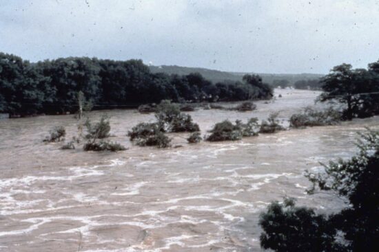
This photo provided by the National Weather Service shows flooding in the Guadalupe River in Texas on July 17, 1987. (NWS via AP)
The catastrophic flooding of July 4, 2025 in the Texas hill country has left at least 130 dead. Many news outlets (predictably) have invoked climate change as a contributing cause, for example CNN, NPR, ABC News, The Texas Tribune, et al. As others have documented, there were more than adequate flash flood watches and warnings from the National Weather Service, and there was no shortage of either NWS staff or weather data.
It has long been known that this region is considered “Flash Flood Alley“, where the local topography and little soil covering the rock underneath leads to large amounts of runoff into the Guadeloupe and other nearby rivers in the event of heavy thunderstorms.
Clearly, one weather event is not evidence of climate change. We need to examine long-term weather statistics to evaluate claims that severe weather, of any type, is getting worse. This is especially true of heavy rainfall events, which are notoriously sporadic, with long-term statistics which are not well-behaved.
Flash floods require more than just heavy rainfall; they also require (1) rain to accumulate over a very short period of time, (2) the storms need to stay over the same area, and (3) the geography and hydrology features (little soil, sloping terrain) need to rapidly funnel most of the water into streams and rivers. The Flash Flood Alley region of Texas can deal with, say, 5 inches of rain if it falls steadily over 2 days. But if it falls in only 6 hours, flash flooding is much more likely. As is the case with tornadoes, a catastrophic flash flood requires specific ingredients that seldom occur all at the same time and location. There is a large element of randomness involved.
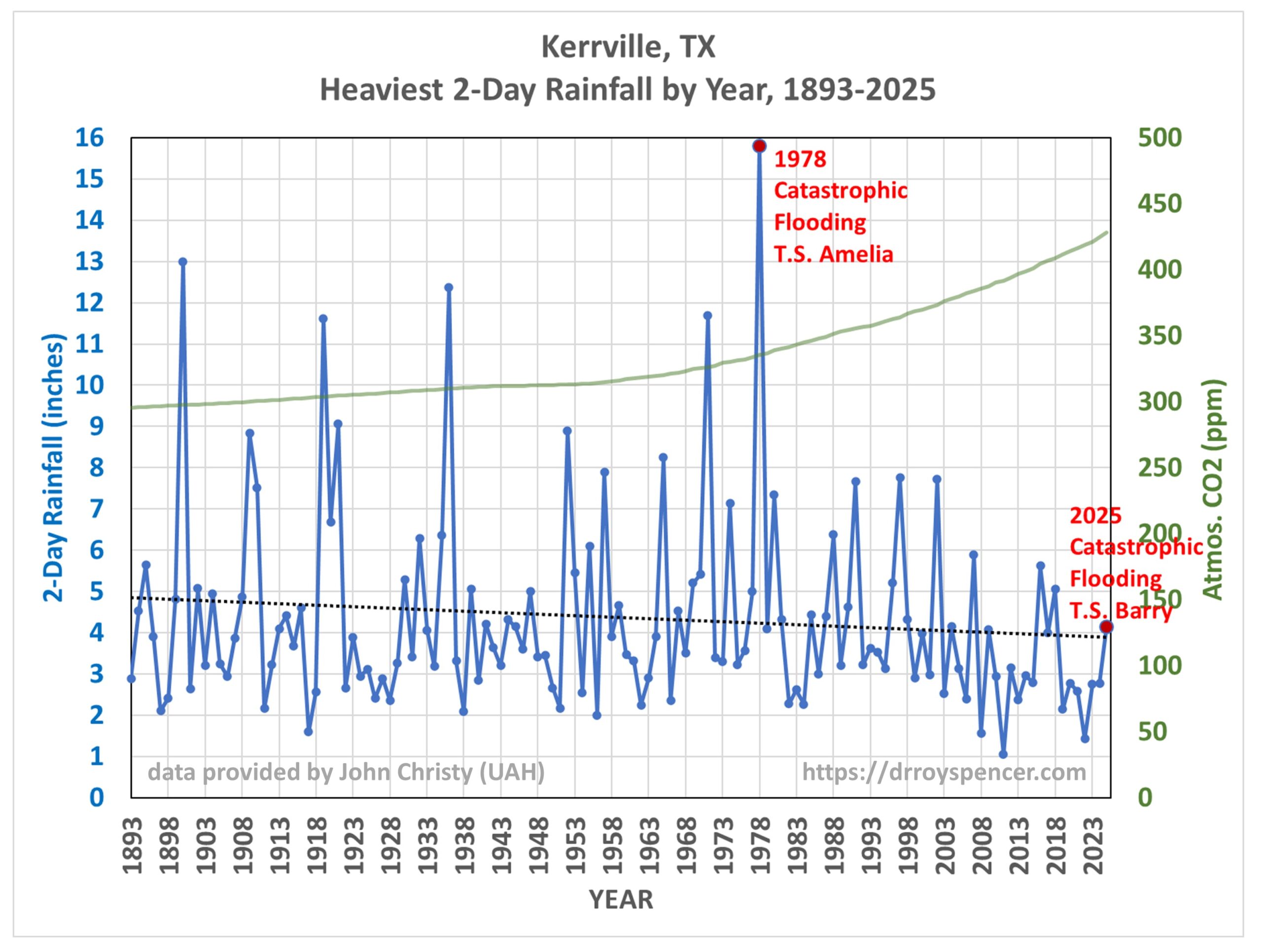
The Catastrophic Floods of 1978
While the 1987 flood (pictured above) was also severe, it has been nearly 50 years since a flood of similar magnitude to the July 4th flood occurred, and that was in 1978. This San Antonio Express-News article is a fascinating read regarding that event. Like this year’s disaster, the cause was a dissipating tropical storm (Amelia in 1978, T.S. Barry this year). That flood killed 25 people in the Hill Country. What I find especially interesting is that the flood uprooted ancient cypress trees, up to 6 ft. in diameter, estimated to be several hundred years old.
133 Years of Heavy Rainfall Events in the Texas Hill Country
John Christy (UAH) provided me some heavy rainfall statistics for several stations in the Kerrville, TX area. For years John has been going through old daily weather summary forms that were never digitized, extending observational records back into the late 1800s. This is tedious and time-consuming work, but necessary if one has any hope of examining long-term trends in heavy rainfall events.
From those data, here are the last 133 years of the heaviest 2-day rainfall events in each year at Kerrville, TX (since 1893).
Clearly, there has been no long-term change in heavy rain events at Kerrville, Texas in spite of increasing atmospheric CO2 concentrations (also shown in the above plot). Even the EPA shows maps for the 50-year period 1965-2015 that indicate slight downward trends in river flooding magnitude and frequency over most of Texas, as well as the rest of the U.S.
From the Kerrville plot above you might wonder, why did the 2025 flood have so little rainfall at Kerrville? This is because most of the rain occurred upstream of Kerrville. Flash floods can occur at locations where no rain has fallen, as the water flows downstream from where the heavy rainfall occurred. Because of this effect, not all of the heavy rainfall peaks shown in the above plot produced serious flooding, and some of the documented flood events at Kerrville had only modest rainfall amounts.
Instead, the rainfall statistics at Kerrville should be viewed as evidence to address the question, are heavy rainfall events in Texas Hill Country getting worse? At Kerrville, at least, the answer is “no”.
But that’s just one station. John Christy also provided me data for 3 other nearby stations: Boerne, Fredericksburg, and Hondo Texas (not shown). For the same period (1893-2025) the trend lines for those stations are all essentially flat to slightly downward.
Climate Change, Heavy Rainfall, and Flooding: What Is The “Scientific Consensus”?
As we document in our Department of Energy report released yesterday entitled, A Critical Review of Impacts of Greenhouse Gas Emissions on the U.S. Climate, when one looks at rainfall statistics across the U.S. extending back to the mid- to late-1800s, there is little evidence for anything that might be considered related to human-caused climate change.
And don’t take just our word for it.
For flooding, the most recent IPCC report (AR6) said there is “low confidence for observed changes in the magnitude or frequency of floods at the global scale.”
For the U.S., the 4th National Climate Assessment stated that “trends in extreme high values of streamflow are mixed” with both increases and decreases, and there is no “robust evidence” that any trends are attributable to human influences.
So, for the usual suspects trashing our report to the media (Michael Mann, Andy Dessler, and Zeke Hausfather), maybe they should look at what we actually wrote, and the “consensus” sources we relied upon.
The public has been misled on climate science, and we are trying to set the record straight.
A Note to Journalists:Please take few minutes to read some of this so that maybe you can skip asking me for an interview.
Around 3 p.m. ET today, 29 July 2025, a Department of Energy report entitled “A Critical Review of Impacts of Greenhouse Gas Emissions on the U.S. Climate” will be made available here. This is the report providing the scientific basis for today’s announced decision by EPA Administrator Lee Zeldin to reconsider the 2009 CO2 Endangerment Finding.
The report has 5 authors: John Christy, Judith Curry, Steve Koonin, Ross McKitrick, and myself.
We were asked by DOE Secretary Wright a few months ago to produce this report. As the first few pages of the report will explain, we had no pressure to come to any conclusions; we asked for complete autonomy.
Also, we had no knowledge through the whole process of what the decision-makers at the EPA were going to do regarding energy policy. We suspected the Endangerment Finding would be the topic of greatest interest, but we also knew that the EPA’s strategy for rescinding that could take a mostly legal approach, with little need for science arguments… for now.
Even today, I have no idea how much recent court rulings vs. updated (and less biased) science figured into the EPA’s decision.
Why a DOE Report to Support an EPA Decision?
My understanding is that the Trump Administration and all of its Executive Branch agencies have been very busy on myriad issues. Only one of the executive-level appointees in the Administration had the background knowledge and interest to invest in making this science report happen: Energy Secretary Chris Wright. I suspect (this is my reading between the lines) that it was agreed between the White House, EPA, and DOE that Sec. Wright would take the lead on the science document.
Chris called me at home and asked me if I would participate, and he asked who I would recommend for other authors of the report. He had been following my research for many years. He also had on his list of potential contributors the others who now appear on the report with me.
During preparation of the report we decided to avoid any engagement with the press on what we were doing. It would have only been a distraction, and we had little time to accomplish what the Obama Administration spent years and millions of dollars to produce as the original Technical Support Document (TSD) for the 2009 Endangerment Finding.
Our report has 141 pages, 350 references (most if not all peer-reviewed), 6.6% of which were studies we authored or co-authored. The report could not address every claim made in the 2009 Endangerment Finding’s Technical Support Document. Instead, we focused on some of the central claims, the science underpinning them, and especially on the National Climate Assessments, especially NCA4 and NCA5 (the latest), which are relied upon by the U.S. Congress to assist in the making of laws and apportioning research funds.
One thing I learned through this process is how prolific and smart a researcher Ross McKitrick (U. of Guelph, Ontario) is. He was indispensable to our effort. But everyone brought their own experiences and opinions to the process, and we often had disagreements… but none that could not be quickly resolved.
Another thing I learned was just how poorly the science of climate change has been communicated to the public. For example, if you follow Roger Pielke, Jr’s research you will know that most of what the public has been told about climate change and severe weather has been a lie — and Roger still considers human climate change to be an issue worth addressing. It’s just not a “crisis”, and nothing we see in severe weather has been tied to human greenhouse gas emissions.
And that’s not a skeptical talking point, it’s according to the IPCC (!)

 Home/Blog