
 Home/Blog
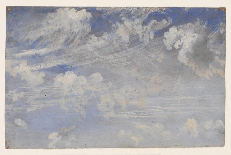
Fig. 1. “Study of Cirrus Clouds”, painting by John Constable, circa 1822. Cirrus as a cloud type was first defined by Luke Howard in 1802.
2025 isn’t just the current year, or a Heritage Foundation project of conservative principles for political action for the new Republican President. In the 1990s it was also the result of an Air Force directive to “examine the concepts, capabilities, and technologies the United States will require to remain the dominant air and space force in the future“.
As a partial response to that directive, several students at the Air War College in 1996 produced a document, largely theoretical in content, entitled Weather As a Force Multiplier: Owning the Weather in 2025. That document, which was declassified in 1998, seems to have provided sufficient evidence some people needed to claim that our government has been secretly modifying the weather, altering the atmosphere, poisoning us with chemicals, or whatever else you can think of.
Now, as a general rule, I’m not against conspiracy theories. For example, it has become clear that experts knew early on that the COVID-19 virus likely did indeed come from a lab leak in Wuhan, China, and one might reasonably conclude there was a conspiracy to hide such evidence. Even the New York Times says we were misled. Conspiracies exist.
But not everything we see in the world that we perceive as a threat is the result of a conspiracy, and some people are just easily triggered by what they see. Many years ago I attended a local town hall meeting where a congressional candidate was speaking. During the Q&A period, an appropriately-attired biker dude got up and wanted to know what the candidate was going to do about all of the “chemtrails” the biker saw in the skies above him as he traveled around the country. The candidate provided a an appropriately vague and soothing response.
So, how did this “chemtrail” theory arise?
It seems to be a combination of peoples’ misunderstanding of the clouds they see in the sky combined with increasing distrust in our government, fueled by the 2025 Air Force study alluded to above. It also seems to be exacerbated by lesser standards of math and science education in recent decades, leading to a new generation of adults who can not critically examine claims made by others.
Contrail Production by Jet Aircraft is Well Understood
For those of us who know meteorology, those visible cloud streaks left behind travelling jets are “contrails” (condensation trails), produced during the combustion of jet fuel. The chemistry of jet fuel combustion is well understood, which includes the by-products of that combustion. During combustion, 1 kg of jet fuel produces about 1.3 kg of water (hydrogen in the fuel combines with oxygen from the atmosphere to produce H2O, water). That water exits the jet engine as water vapor in such high concentrations at extremely cold temperatures (around generally -30 to -50 deg. F) that there is much more water than the atmosphere can hold without condensation (cloud formation) occurring.
As a result, trails of cirrus clouds (contrails) are produced. Depending upon the relative humidity (RH) of the surrounding environmental air, those contrails can either rapidly evaporate (if RH is very low), leaving essentially no visible evidence, or can persist and even expand in coverage for many hours if the RH is high. In a high RH environment, jet-produced cirrus can actually scavenge water vapor from the surrounding atmosphere, causing continued growth of the contrails.
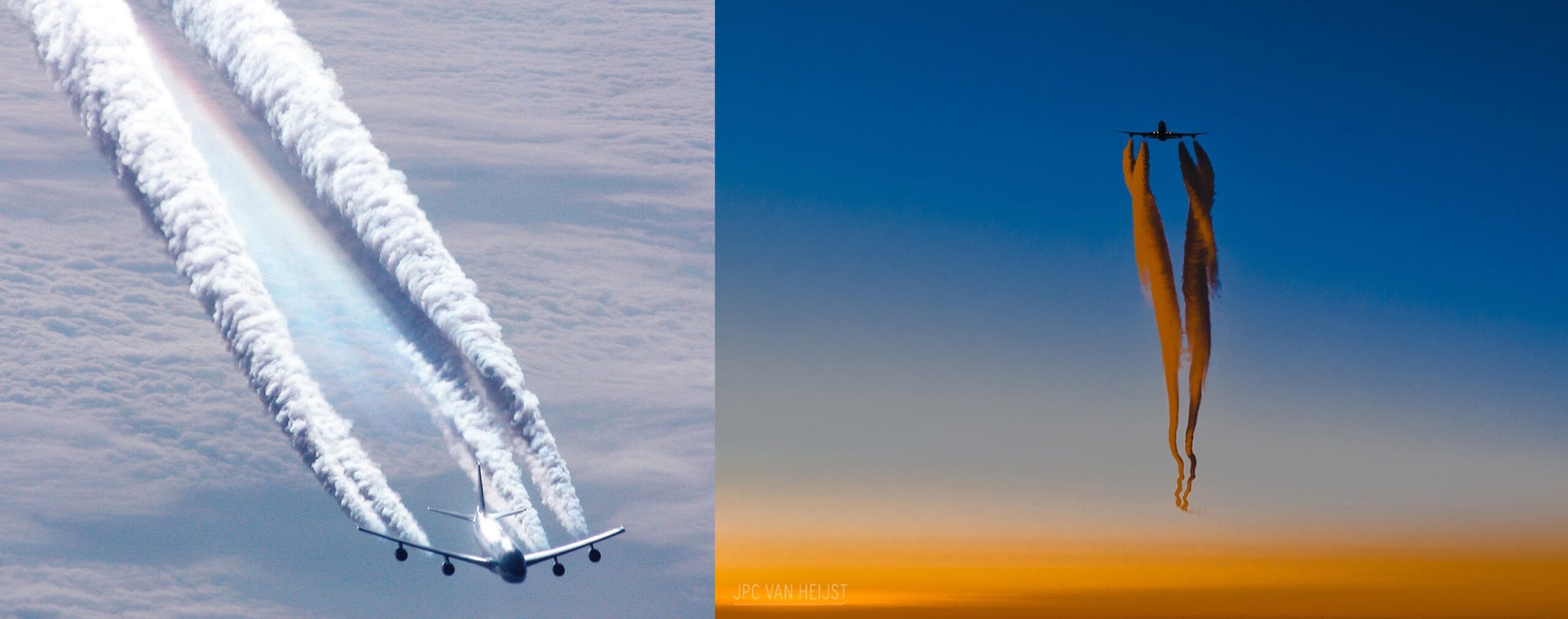
Fig. 2. Four-engine contrails produced by jet aircraft. Different illumination situations can change the contrail appearance, just as is the case with natural cirrus clouds (source).
The presence of wind shear (changing wind direction or speed with height) can cause distortion of the resulting clouds into myriad shapes. Often, the resulting jet-produced cirrus clouds are not easily distinguishable from natural cirrus clouds produced by weather systems; other times they are easily distinguishable. Literally as I was writing this, I took a picture out my office window showing both natural and jet-produced cirrus clouds.
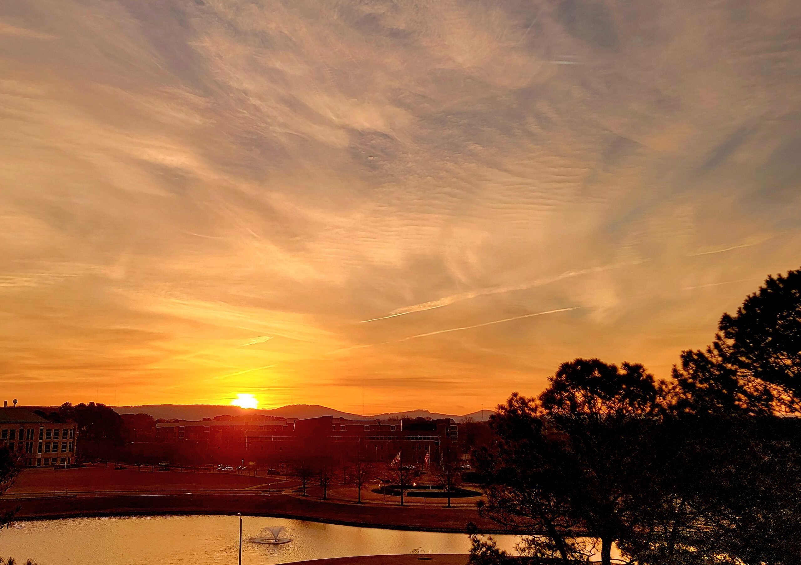
Fig. 3. Natural and jet-produced cirrus clouds at sunrise, Huntsville, Alabama, 19 March 2025.
But when, and why, did the “chemtrail” conspiracy theory theory gain traction? And why does it persist today? The theory posits that the visual trails of condensed water vapor seen behind jet aircraft operating at high altitudes in reality represent the spraying of chemicals for some nefarious purpose(s). I routinely see comments on X and Facebook from people alarmed at the “chemtrails” they see. Those evil purposes of chemtrail production range from geoengineering (purposely changing the climate) to mind control and the spread of sickness that can be treated by pharmaceutical companies to increase their profits. Many weather experts have tried to debunk these ideas, for example Cliff Mass, professor of atmospheric science at the University of Washington.
Weather as a Force Multiplier: Owning the Weather in 2025
So, does the U.S. Air Force now own the weather in 2025, as predicted in the 1996 report? Of course not. Most of the theoretically possible technologies in that report for either clearing clouds, or creating clouds, in the battlefield did not exist in the 1990s. The report is full of pie-in-the-sky concepts, including cloud seeding to produce precipitation (the subject of much civilian research in recent decades), but admits “artificial weather technologies do not currently exist. But as they are developed, the importance of their potential applications rises rapidly.”
Yes, there have been experiments (mainly civilian) extending back to the 1950s involving seeding clouds to get them to precipitate. This involved dropping a chemical, such as dry ice or silver iodide crystals, to help convert super-cooled water droplets into precipitation. Project Stormfury, started in the 1960s, researched seeding hurricanes in the periphery to reduce the intensity of the central part of the cyclone, which is where most of the damaging winds and storm surge occur. But the idea was abandoned when it was realized hurricanes already convert almost all of the condensed cloud into precipitation anyway, without any help from humans.
This isn’t to say that it is impossible to seed clouds and produce precipitation, at least on a very localized basis in specific weather situations. But the research results have been mixed, and generally speaking, unless a cloud is getting ready to precipitate anyway, seeding doesn’t do much to the cloud, except make it precipitate sooner rather than later. People have a greatly exaggerated perception of what humans can do to purposely impact weather processes.
Now, I’m not privy to any weather modification technologies that DoD might have in the works. But after nearly a half-century of working in weather and climate, I can tell you there is little we can do to affect weather, either intentionally or unintentionally.
Let’s examine the AF report example of creating or clearing clouds in the battlefield. Imagine a wartime situation where the AF wants to clear a cloud (or fog) to allow precision visual identification of a target for bombing. Theoretically, this could be done with a powerful microwave directed-beam energy source (maybe from a special aircraft flying just ahead of a missile-carrying aircraft) to temporarily evaporate the cloud water. To give some idea of the energy that would be required to do that, we can compute how much energy is required to evaporate a path of fog having dimensions of 100x100x100 meters having a liquid water content of 0.1 grams water per kg of air. Assuming maybe 25% or so of the directed microwave beam energy will go into heating air and evaporating the liquid water, one can estimate the energy required of such a directed-beam device would be around 1 billion Watts (1 billion Joules of energy produced for 1 second). This is indeed in the realm of the estimated power output of DoD directed beam energy sources, at least from the ground. I have no idea whether such a large energy source could be produced by an aircraft.
But, even if the Air Force could, would they even want to? I’m pretty sure smart weapons now exist which have passive microwave technology allowing a target to be seen through relatively modest cloud cover.
So, What About Chemtrails? And Geoengineering?
As far as I can tell, the AF report cited above does not mention technologies that would disperse chemicals through jet exhaust (or other aircraft orifices). Besides, if such chemtrails exist, they are spreading their “chemicals” over everyone, including the families of the people conspiring to cause chemtrails.
Why would anyone do that?
Isolated photos do exist of jets dumping fuel, which comes out of different special wing ports, away from the engines. Sometimes this is cited as evidence of chemicals being spread for nefarious purposes. But this “fuel jettisoning” is a rare occurrence, usually in emergency situations, and is estimated to occur less than once per 100,000 commercial flights.
But there has been lots of research into whether jet contrails inadvertently affect climate, which would be a case of accidental geoengineering. Contrails reduce the amount of sunlight reaching the surface (a cooling effect), but that is more than offset by their reduction in the infrared (IR) cooling of the climate system, leading to a net heating. The best estimates are that global jet traffic produces less than 0.1 Watt per sq. meter of net radiative heating of the climate system, which is in the noise level (by comparison, natural solar heating and infrared cooling of the global-average climate system is ~240 Watts per sq. meter). Locally, where there is lots of air traffic, that value goes up to possibly 0.5 Watts per sq. meter, which is probably still not detectable in the presence of natural variations in temperature. An early study of the temperature effects of a jet traffic shutdown after 9/11 were later debunked by a subsequent study.
Now, what IS being discussed is the possibility of carrying large quantities of sulfur into the upper atmosphere (the stratosphere) to produce sulfur dioxide aerosols in an attempt to slightly reduce incoming sunlight and so partially offset global warming. This is an example of what “geoengineering” usually refers to. This would require huge amounts of sulfur compounds and many jet flights to even come close to the natural cooling effects of a major volcanic eruption, the most recent example of which was the 1991 eruption of Mt. Pinatubo in the Philippines. That eruption injected an estimated 15-20 million tons of SO2 into the stratosphere, which resulted in cool-ish summers over Northern Hemisphere land areas in 1992. Personally, I don’t ever see this happening because there would be too much public resistance to the idea.
But no one bats an eye when Mother Nature does it.
And the few news reports you see where supposed experiments involving the ground-level release of a few kg of sulfur compounds to test the idea of altering clouds are laughable. The EPA estimates that in 2023, 1.7 million tons of SO2 were released in the U.S. from anthropogenic sources. That is over 9 million pounds per day. Compare that to the “experimental” release of a few pounds by some headline-grabbing “researchers”. As I said… laughable.
A Major Reason for the Hysteria: Jet Contrails are Visible
Chemtrail hysteria would not exist if not for the fact that jet contrails are visible. Cars and trucks also produce huge amounts of water vapor, which is sometimes seen as condensed water in cold or high-RH conditions. The reason they don’t persist is that at the temperatures and air pressures present at ground level, the air can hold orders of magnitude more water vapor without cloud formation than jet-altitude air can hold.
But no one accuses car drivers (or car manufacturers) of purposely poisoning our air with chemicals, do they?
Yes, cars produce some chemicals as a by-product of combustion (all invisible), and through EPA regulations some of those chemicals have been greatly reduced with new fuel formulations, engine design changes, and catalytic converters. But cars are never blamed for producing chemtrails because, generally speaking, we never see those emissions (including the water vapor emissions). But we DO see jet contrails.
Finally, one part of the problem is that our public education system has produced too many science-illiterate adults. They are susceptible to crazy ideas spread by attention- (and money-) seeking charlatans, some of whom might be convinced that a chemtrail conspiracy exists. Too many people today seem to be incapable of independent, critical thought.
After all, who would doubt evidence such as this?:


