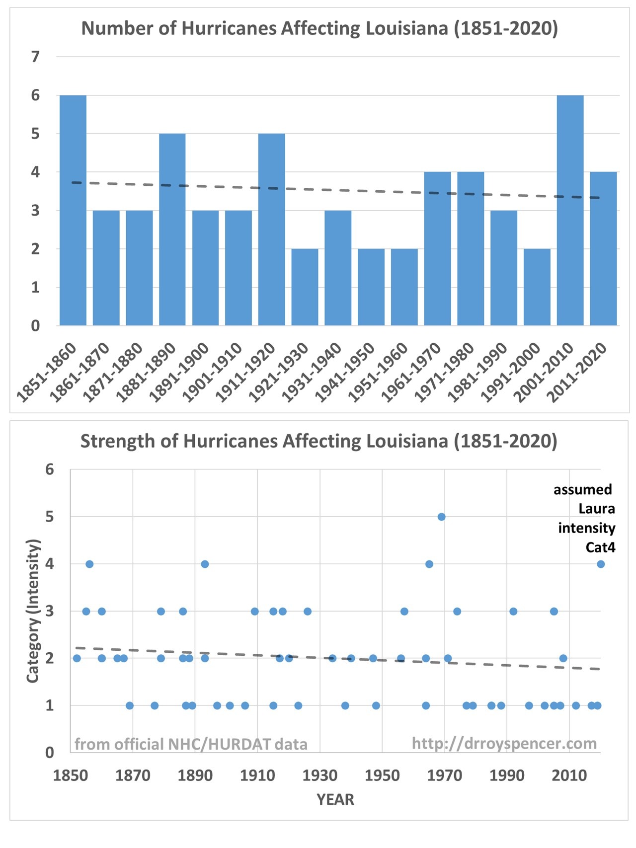
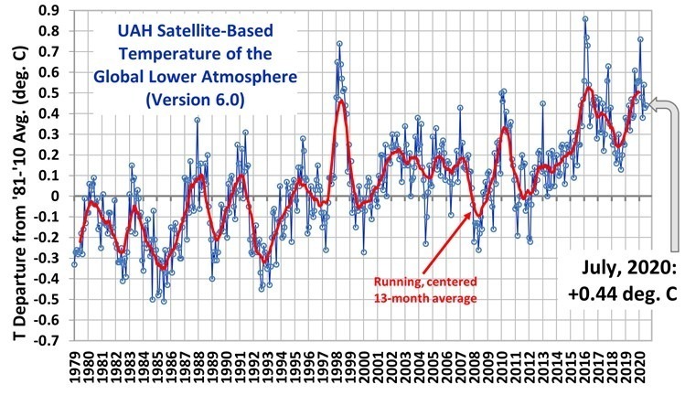
Home/Blog
SUMMARY: Examination of vote totals across ~6,000 Florida precincts during the 2016 presidential election shows that a 1st digit Benford’s type analysis can seem to suggest fraud when precinct vote totals have both normal and log-normal distribution components. Without prior knowledge of what the precinct-level vote total frequency distribution would be in the absence of fraud, I see no way to apply 1st digit Benford’s Law analysis to deduce fraud. Any similar analysis would have the same problem, because it depends upon the expected frequency distribution of vote totals, which is difficult to estimate because it is tantamount to knowing a vote outcome absent fraud. Instead, it might be more useful to simply examine the precinct-level vote distributions, rather than Benford-type analysis of those data, and compare one candidate’s distribution to that of other candidates.
It has been only one week since someone introduced me to Benford’s Law as a possible way to identify fraud in elections. The method looks at the first digit of all vote totals reported across many (say, thousands) of precincts. If the vote totals in the absence of fraudulently inflated values can be assumed to have either a log-normal distribution or a 1/X distribution, then the relative frequency of the 1st digits (1 through 9) have very specific values, deviations from which might suggest fraud.
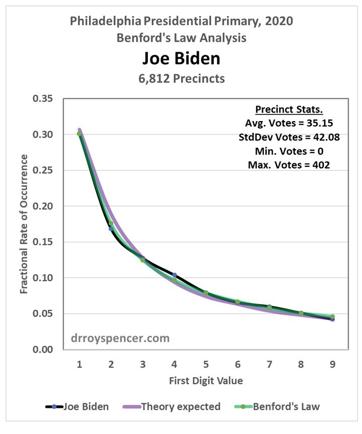
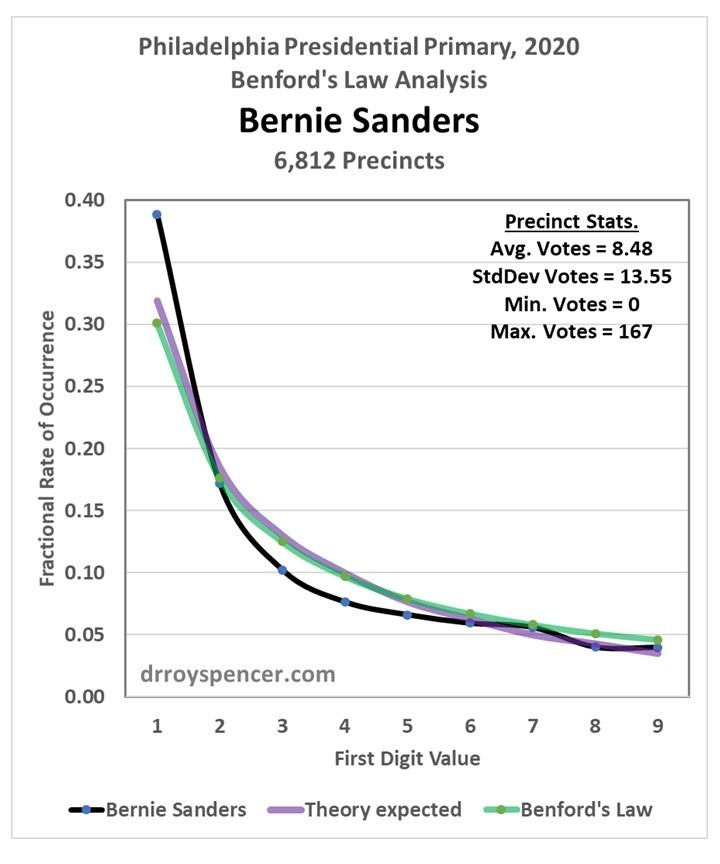
After a weekend examining vote totals from Philadelphia during the 2020 presidential primary, my results were mixed. Next, I decided to examine Florida precinct level data from the 2016 election (data from the 2020 general election are difficult to find). My intent was to determine whether Benford’s Law can really be applied to vote totals when there was no evidence of widespread fraud. In the case of Trump votes in the 2020 primary in Philadelphia, the answer was yes, the data closely followed Benford. But that was just one election, one candidate, and one city.
When I analyzed the Florida 2016 general election data, I saw departures from Benford’s Law in both Trump and Clinton vote totals:
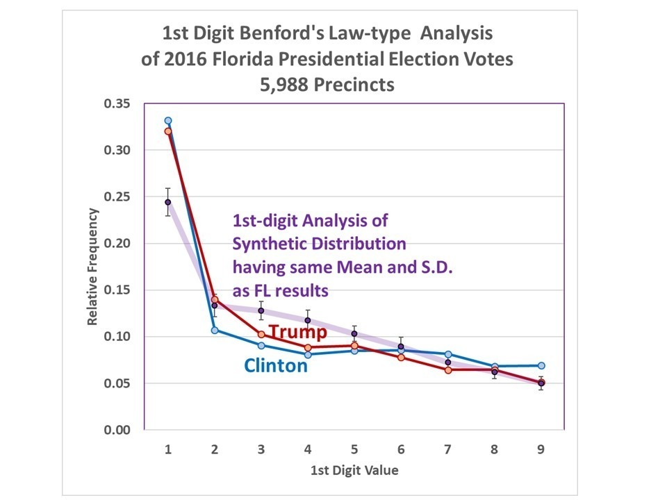
Fig. 1. First-digit Benford’s Law-type analysis of 2016 presidential vote totals for Trump and Clinton in Florida, compared to that of a synthetic log-normal distribution having the same mean and standard deviations as the actual vote data, with 99% confidence level of 100 log-normal distributions with the same sample size.
For at least the “3” and “4” first digit values, the results are far outside what would be expected if the underlying vote frequency distribution really was log-normal.
This caused me to examine the original frequency distributions of the votes, and then I saw the reason why: Both the Trump and Clinton frequency distributions exhibit elements of both log-normal and normal distribution shapes.
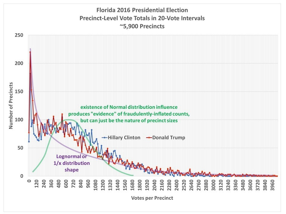
Fig. 2. Frequency distributions of the precinct-level vote totals in Florida during the 2016 general election. Both Trump and Clinton distributions show evidence of log-normal and normal distribution behavior. Benford’s Law analysis only applies to log-normal (or 1/x) distributions.
And this is contrary to the basis for Bendford’s Law-type analysis of voting data: It assumes that vote totals follow a specific frequency distribution (lognormal or 1/x), and if votes are fraudulently added (AND those fake additions are approximately normally distributed!), then the 1st-digit analysis will depart from Benford’s Law.
Since Benford’s Law analysis depends upon the underlying distribution being pure lognormal (or 1/x power law shape), it seems that understanding the results of any Benford’s Law analysis depends upon the expected shape of these voting distributions… and that is not a simple task. Is the expected distribution of vote totals really log-normal?
Why Should Precinct Vote Distributions have a Log-normal Shape?
Benford’s Law analyses of voting data depend upon the expectation that there will be many more precincts with low numbers of votes cast than precincts with high numbers of votes. Voting locations in rural areas and small towns will obviously not have as many voters as do polling places in large cities, and presumably there will be more of them.
As a result, precinct-level vote totals will tend to have a frequency distribution with more low-vote totals, and fewer high vote totals. In order to produce Benford’s Law type results, the distribution must have either a log-normal or a power law (1/x) shape.
But there are reasons why we might expect vote totals to also exhibit more of a normal-type (rather than log-normal) distribution.
Why Might Precinct-Level Vote Totals Depart from Log-Normal?
While I don’t know the details, I would expect that the number of voting locations would be scaled in such a way that each location can handle a reasonable level of voter traffic, right?
For the sake of illustration of my point, one might imagine a system where ALL voting locations, whether urban or rural, were optimally designed to handle roughly 1,000 voters at expected levels of voter turnout.
In the cities maybe these would be located every few blocks. In rural Montana, some voters might have to travel 100 miles to vote. In this imaginary system, I think you can see that the precinct-level vote totals would then be more normally distributed, with an average of around 1,000 votes and just as many 500-vote precincts as 1,500 vote precincts (instead of far more low-vote precincts than high-vote precincts, as is currently the case).
But, we wouldn’t want rural voters to have to drive 100 miles to vote, right? And there might not be enough public space to have voting locations every 2 blocks in a city, and as a results some VERY high vote totals can be expected from crowded urban voting locations.
So, we instead have a combination of the two distributions: log-normal (because there are many rural locations with few voters, and some urban voting places that are over-crowded) and normal (because cities will tend to have precinct locations optimized to handle a certain number of voters, as best they can).
Benford-Type Analysis of Synthetic Normal and Log-normal Distributions
If I create two sets of synthetic data, 100,000 values in each, one with a normal distribution and one with a log-normal distribution, this is what the relative frequencies of the 1st digit of those vote totals looks like:
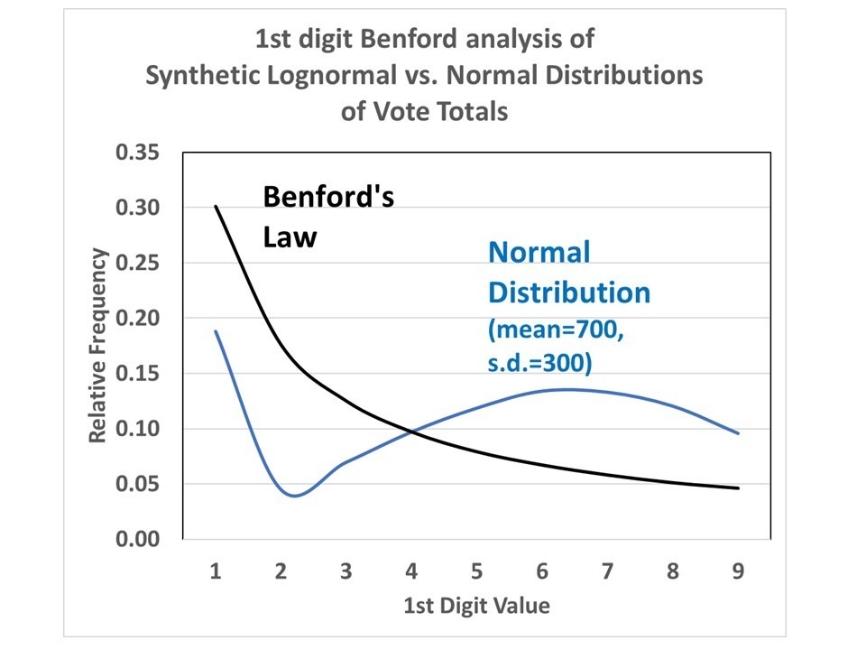
Fig. 3. 1st-digit analysis of a normal frequency distribution versus a long-normal distribution (Benford’s Law).
The results for a normal distribution move around quite a lot, depending upon the assumed mean and standard deviation of that distribution.
I believe that what is going on in the Florida precinct data is simply a combination of normal and log-normal distributions of the vote totals. So, for a variety of reasons, the vote totals do not follow a log-normal distribution and so cannot be interpreted with Benford’s Law-type analyses.
One can easily imagine other reasons for the frequency distribution of precinct-level votes to depart from log-normal.
What one would need is convincing evidence of that the frequency distribution should look like in the absence of fraud. But I don’t see how that is possible, unless one candidate’s vote distribution is extremely skewed relative to another candidate’s vote totals, or compared to primary voting totals.
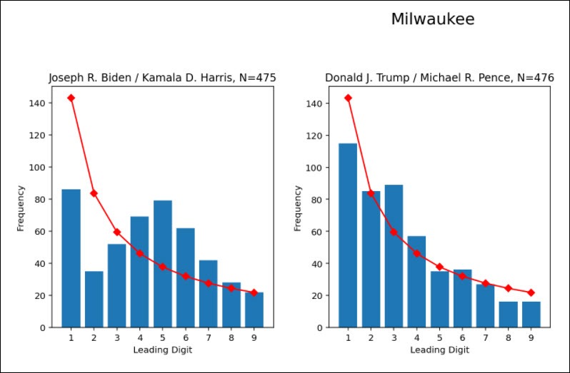
And this is what happened in Milwaukee (and other cities) in the most recent elections: The Benford Law analysis suggested very different frequency distributions for Trump than for Biden.
I would think it is more useful to just look at the raw precinct-level vote distributions (e.g. like Fig. 2) rather than a Benford analysis of those data. The Benford analysis technique suggests some sort of magical, universal relationship, but it is simply the result of a log-normal distribution of the data. Any departure from the Benford percentages is simply a reflection of the underlying frequency distribution departing from log-normal, and not necessarily indicative of fraud.