Home/Blog
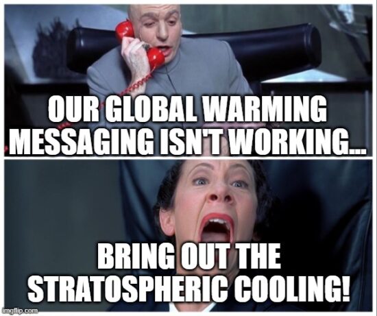
A new paper by Santer et al. provocatively entitled “Exceptional stratospheric contribution to human fingerprints on atmospheric temperature” goes where no serious climate scientist should go: it has conflated stratospheric cooling with global warming.
The paper starts out summarizing the supposed importance of their work, which is worth quoting in its entirety (bold emphasis added):
“Differences between tropospheric and lower stratospheric temperature trends have long been recognized as a “fingerprint” of human effects on climate. This fingerprint, however, neglected information from the mid to upper stratosphere, 25 to 50 km above the Earth’s surface. Including this information improves the detectability of a human fingerprint by a factor of five. Enhanced detectability occurs because the mid to upper stratosphere has a large cooling signal from human-caused CO2 increases, small noise levels of natural internal variability, and differing signal and noise patterns. Extending fingerprinting to the upper stratosphere with long temperature records and improved climate models means that it is now virtually impossible for natural causes to explain satellite-measured trends in the thermal structure of the Earth’s atmosphere.“
The authors are taking advantage of the public’s lack of knowledge concerning the temperature effect of increasing CO2 in the atmosphere, making it sound like stratospheric cooling is part of the fingerprint of global warming.
It isn’t. Cooling is not warming.
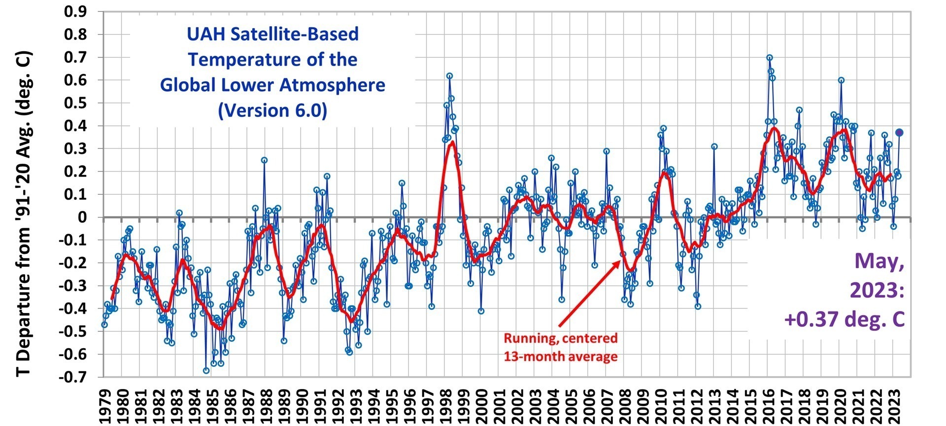
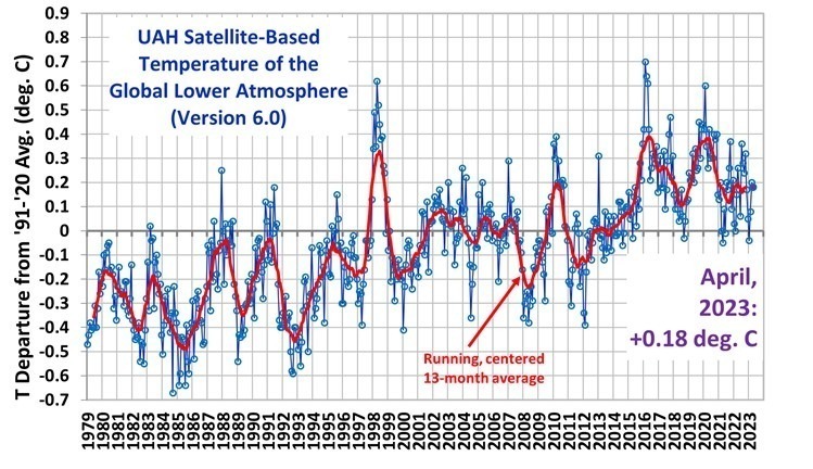
The researchers’ first mistake is to claim they are reporting something new. They aren’t. Observed stratospheric cooling, even in the middle and upper stratosphere, has been reported on for many years (e.g. here). Lower stratospheric cooling has been evident in our Lower Stratosphere (LS) temperature product for over 30 years (first published here). Dr. Richard Lindzen tells me he had references to stratospheric cooling in his 1964 PhD dissertation. So why haven’t we heard about this before in the news? Because it has virtually nothing to do with the subject of global warming and associated climate change.
So, why mention stratospheric cooling in the context of climate change?
Climate researchers have been searching for “human fingerprints” of climate change for decades, something measurable that cannot be reasonably explained by natural variations in the climate system.
I will agree with the authors that stratospheric cooling (especially in the mid- to upper-stratosphere) is probably the best evidence we have of a human fingerprint on global temperatures, at least up where there is very little air, where no one lives, and where there are no observable resulting impacts on weather down here where life exists. Water vapor remains an uncertainty here, because more water vapor would also cause cooling, and our understanding of natural variations in stratospheric water vapor is quite poor. But for the sake of argument, I will give the authors the benefit of the doubt and agree that most of the observed cooling is probably due to increasing CO2, which in turn is likely mostly due to burning of fossil fuels.
Infrared radiative cooling by water vapor and carbon dioxide has long been known to be the primary way the stratosphere (and even higher altitudes) lose heat energy (gained from sunlight absorption by ozone) to outer space. This cooling mechanism is part of the so-called greenhouse effect: greenhouse gases warm the lower altitudes of planetary atmospheres, and cool the higher altitudes. In fact, without the greenhouse effect, weather as we know it would not exist. The greenhouse effect is energetically analogous to adding insulation to a heated house in winter: for a given rate of energy input, the inside of the house becomes warmer, and the outside of the house becomes colder.
The stratospheric cooling effects of CO2 and water vapor was first described theoretically by Manabe and Strickler (1964). Adding more CO2 to the atmosphere enhances upper atmospheric cooling, lowering temperatures. The temperature effect up there is large, several degrees C, meaning it is easier to measure with current satellite methods, as the authors of the new study correctly point out.
But what then happens in the troposphere (where we live) in response to more CO2 is vastly more complex. Theoretically, adding more CO2 should warm the lower troposphere radiatively. This warming then gets mixed throughout the depth of the troposphere from convective overturning (basically, “weather”).
But just how much tropospheric warming will be caused by increasing CO2?
After 30 years and billions of dollars expended on the effort in research centers around the world, the latest crop of climate models (CMIP6) now disagree on the expected amount of tropospheric warming more than ever before. This is mostly because of the insufficiently understood effects of water, especially the response of clouds (the climate system’s sunshade) and precipitation processes (which limit the most abundant greenhouse gas, water vapor) to warming.
I consider it irresponsible to conflate stratospheric cooling with the global warming issue. Yes, strong cooling in the upper stratosphere is likely a fingerprint of increasing atmospheric CO2 (putatively due to fossil fuel burning), but for a variety of reasons, that is not reason to believe climate models in their predictions of tropospheric (and thus surface) warming trends. That is a very different matter, and the models themselves demonstrate they are not yet up to the task, now disagreeing with each other by a factor of three or more.
So now you hopefully understand why entitling such a paper “Exceptional stratospheric contribution to human fingerprints on atmospheric temperature” is essentially a non sequitur on the issue of global warming.