Archive for 2013

Century-old photos discovered in Antarctica hut

Tuesday, December 31st, 2013

It wasn’t the continuing public interest in the Akademik Shokalskiy “climate research” ship (aka HMS Ironic) getting stuck in summer Antarctic ice that led me to find out about this relatively recent discovery.

I’ve been following the story a little, like most people. Debra Saunders (San Francisco Chronicle) interviewed me yesterday about the fiasco.

I was instead perusing photography websites when I stumbled upon a recent article about a pile of old photo negatives found in a hut in Antarctica. They were from Captain Scott’s 1911 expedition base, Cape Evans, Antarctica, discovered by Antarctic Heritage Trust (New Zealand) researchers.

What is kind of surprising is the number of photos with lots of open water. I’m not very familiar with the various coastal regions of Antarctica, but the weather in some of the photos looks almost balmy…here’s one example:
Alexander-Stevens-on-Aurora-deck

The other restored photos can be viewed at the Antarctic Heritage Trust website (just keep clicking on their play/pause button to view the photo gallery…it’s a little clumsy).

AMSU Surface Air Temperature Retrievals of the Coldest Place on Earth

Friday, December 13th, 2013

Slight warming over Dome A for the last 15 years. (updated)

The recent announcement of a new low temperature “record” for Earth on Dome A (Argus) in Antarctica of -93 deg. C (on August 10, 2010) was based upon satellite infrared measurements from the MODIS instrument on NASA’s Aqua satellite.

The temperature record is unofficial since it was made by satellite, not ground-based thermometers, and it represents the skin temperature of the ice sheet surface, not the air temperature. Assuming it was made under relatively calm wind conditions, the surface skin temperature could easily be several degrees C colder than the air temperature at traditional shelter height (2 meters).

Since we are always interested in new ways of analyzing the satellite AMSU microwave temperature sounder data, I thought I would take a look at how well this instrument might retrieve air temperature over the higher elevations of the Antarctic ice sheet.

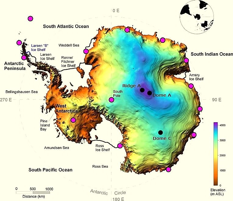
The highest elevation reported for Dome A is 4,091 m, located near 80 deg. S, 77 deg. E. Here’s an elevation image of Antarctica produced by the University of New South Wales, which has investigated Dome A as an ideal astronomical observing location from the standpoint of having extremely clear skies:
Antarctica-elevation-map

AMSU (now flying on at least 5 satellites) carries several channels which are sensitive to thermal emission by the surface and atmospheric oxygen near the surface: Channels 1 (23.8 GHz), 2 (31.4 GHz), 3 (50.3 GHz), 4 (52.8 GHz) and 15 (89 GHz). Using these channels to retrieve near-surface air temperature is generally difficult due to the wide variations in surface microwave emissivity over land and ocean, which is why infrared methods are better since variations in the IR emissivity of those surfaces are so much less.

The wide variation in microwave emissivity as a function of frequency and polarization is why we use instruments (like AMSR-E, AMSR2, SSM/I, SSMIS) to measure surface characteristics such as snow depth, vegetation, sea ice. But if we just focus on the upper reaches of the Antarctic ice sheet, it could be that the microwave emissivity of the ice surface remains fairly constant, which would allow more accurate temperature retrievals. The temperature there is well below freezing year-round, and there is very little fresh snow that falls. This should limit variations in ice sheet microphysical characteristics which affect microwave emissivity.

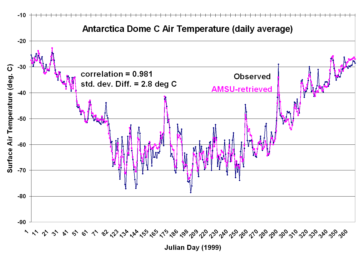
I used linear regression between the 5 AMSU channels mentioned above versus one year of daily air average temperature measurements at Dome C, which has an elevation of 3250 m. Even though the retrieval method is trained with observed air temperatures, it must be kept in mind that most of what these channels measure is thermal emission by the surface and sub-surface, with somewhat less contribution by oxygen emission from the air in the lowest km or so of the atmosphere.

The following plot shows the resulting match between the AMSU retrievals and surface air temperature at Dome C:
Fig. 1. Daily average surface air temperature at Dome C during 1999, as observed versus as retrieved from AMSU channels 1,2,3,4, & 15.

I then applied this algorithm to the NOAA-15 AMSU data within 50 km of the center of Dome A, the highest (and coldest) location on the Antarctic ice sheet. I restricted the analysis to just NOAA-15 since it carries the AMSU with the longest period of record (since 1998).

The resulting daily surface air temperature retrievals since August 1998 are shown in the following plot:
Dome-A-daily-Tsfc-AMSU-retrieved

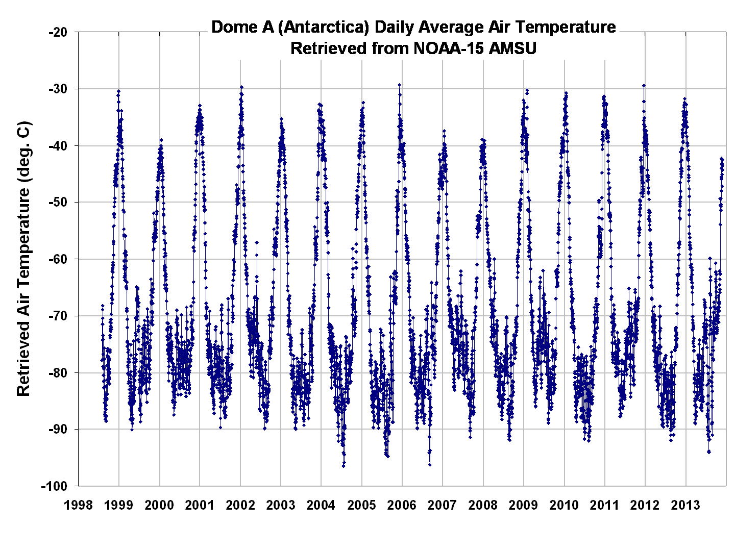
As can be seen, every year experiences temperatures below -80 deg. C, consistent with the claims from the Wikipedia entry on Dome A.

The corresponding temperature anomalies are shown next (the linear trend is +0.05 deg C/yr.):
Dome-A-daily-Tsfc-AMSU-retrieved-anomaly

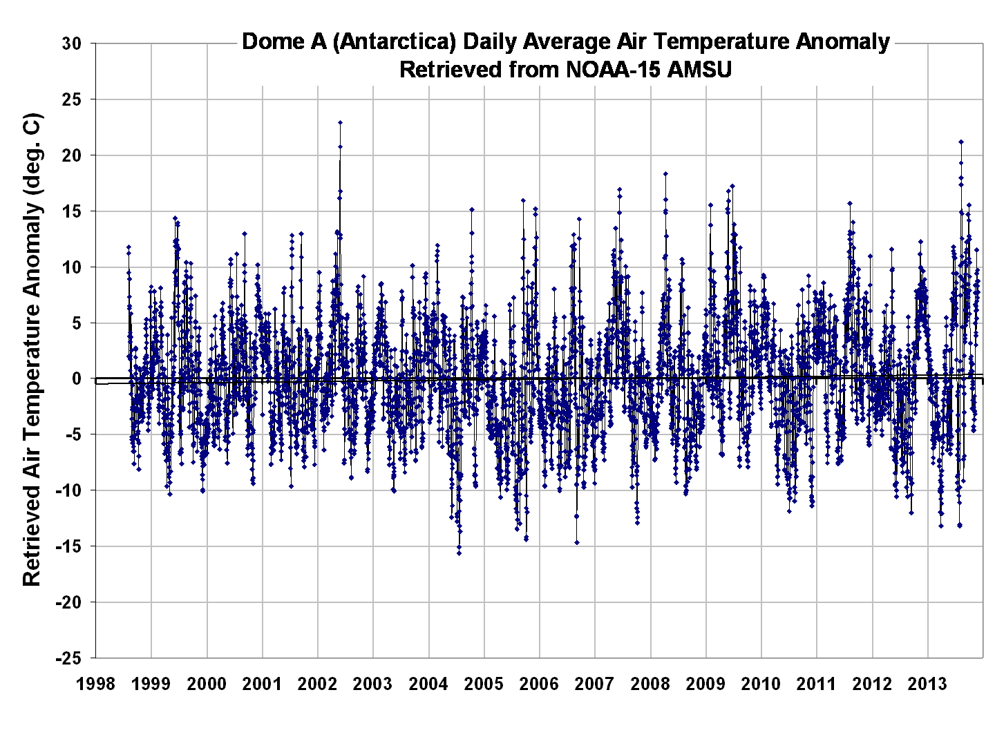
The reported record low temperature dates from MODIS in 2010, and Landsat 8 in 2013, are not obviously reflected in the AMSU retrievals (the lowest AMSU temperatures in 2010 are about a month before MODIS made its record low temperature measurement). But I wouldn’t read too much into disagreements between AMSU and the infrared measurements, for at least a couple of reasons:

1) The AMSU measurements are averaged over an area of about 100 x 100 km, whereas the infrared reports for “record” lowest temperatures are very localized (MODIS has a horizontal resolution of about 0.25 km, AMSU of 50 km).

2) IR measurements under clear conditions should provide a somewhat closer measurement to the air temperature than a microwave method can provide, due to the more variable microwave surface emissivity.

One thing I discovered is that AMSU channel 15 (89 GHz) data for this location has a signature of snowfall events, which I adjusted for in the above retrievals. That snowfall signature looks like this:
Dome-A-daily-AMSU-89GHz-snow-effect
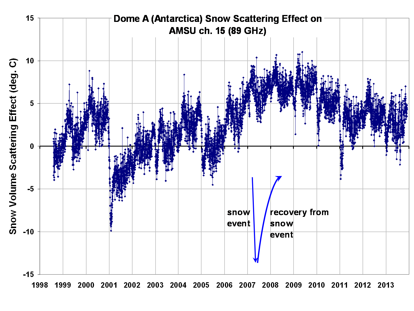
This plot was obtained by taking the 89 GHz brightness temperatures and subtracting off a regression estimate of those 89 GHz Tb based upon the other 4 AMSU channels. The characteristics of these “regression residuals” are consistent with our AMSR-E Team’s measurements of snow depth, which show sudden Tb depressions after a snow event, then gradual recovery as the snow pack particles change over time.

This was more of an experiment to get some idea of how well several AMSU channels can retrieve near-surface temperatures over the Antarctic ice sheet. I would say the data appear to be usable, especially considering the fact that there are very few actual thermometer measurements in this remote location.

Also, a comparison with climate model predictions for warming over the ice sheet would probably be an interesting comparison to make. At least over the last 15 years, the linear warming trend averages 0.05 deg. C/year (+/-0.015 deg. C/year). Given the huge variability that occurs at this location, it is difficult to know how physically significant this is.

UAH v5.6 Global Temperature Update for Nov. 2013: +0.19 deg. C

Tuesday, December 3rd, 2013

The Version 5.6 global average lower tropospheric temperature (LT) anomaly for November, 2013 is +0.19 deg. C, down from +0.29 deg. C in October (click for full size version):
UAH_LT_1979_thru_November_2013_v5.6

The global, hemispheric, and tropical LT anomalies from the 30-year (1981-2010) average for the last 11 months are:

YR MON GLOBAL NH SH TROPICS
2013 01 +0.496 +0.512 +0.481 +0.387
2013 02 +0.203 +0.372 +0.033 +0.195
2013 03 +0.200 +0.333 +0.067 +0.243
2013 04 +0.114 +0.128 +0.101 +0.165
2013 05 +0.082 +0.180 -0.015 +0.112
2013 06 +0.295 +0.335 +0.255 +0.220
2013 07 +0.173 +0.134 +0.211 +0.074
2013 08 +0.158 +0.111 +0.206 +0.009
2013 09 +0.365 +0.339 +0.390 +0.189
2013 10 +0.290 +0.331 +0.250 +0.031
2013 11 +0.193 +0.159 +0.227 +0.018

Popular monthly data files (these might take a few extra days to update):

uahncdc_lt_5.6.txt (Lower Troposphere)
uahncdc_mt_5.6.txt (Mid-Troposphere)
uahncdc_ls_5.6.txt (Lower Stratosphere)

Remnants of Comet ISON fading fast

Saturday, November 30th, 2013

As I surmised yesterday, it appears that the nucleus of Comet ISON was mostly destroyed during its close approach to the sun, and what remains is fading fast, now estimated to be magnitude 5 in brightness:

According to Karl Battams’ recent blog post,

“…during its passage through the Sun’s million-degree corona, its dusty/gassy coma got very much burned away, though clearly some fine dust survived (which is the fine cloudy stuff you see being pushed away from the Sun).”

(His post also has a couple of very cool animations from the STEREO spacecraft, so I encourage you to take a look.)

Why does the comet appear the way it does now, after perihelion? Here’s a semi-technical explanation…what I’ve surmised based upon my knowledge from atmospheric science.

Basically, the material being flung out sideways from the comet’s normal orbital path is very fine, whereas the particles in the “head” are larger. Although the reasons for this are not discussed in other blogs posts about the comet, I suspect it is the same reason why tiny particles of rock can float in the air as aerosols, whereas large particles would fall to the Earth. Or, why fine sediment particles are suspended in a river, while large particles fall to the bottom.

Gravitational forces act on the mass of an object, whereas atmospheric or liquid viscous pressure forces act on the physical size (cross-sectional area) of the object. Because mass increases as the 3rd power of the particle radius, and physical size (or cross-sectional area) increases as only the 2nd power, the larger a particle is, the greater the gravitational effects are relative to pressure forces.

In the case of the comet, the pressure forces are from radiation pressure and the solar wind. As the nucleus of Comet ISON got pulverized during perihelion, the tiniest particles were more affected by the radiation pressure and solar wind than by gravity, and they got “blown away” from the normal orbital path. As I mentioned in my last post, they appear to be “flung outward”, away from the normal gravitationally-dominated orbital path of the comet nucleus.

If you watch the above video, you will see this fine material being blown in the solar wind, away from the nucleus. Presumably, what is left in the nucleus are somewhat larger particles whose path is still dominated by gravity, but there is so little left that there is not much there to reflect sunlight that we can see.

I suspect that in the coming days only the better telescopes will be able to see what is left of the comet. Astrophotographers like me will see very little if anything at all.

A Comparison Between Comets ISON and Lovejoy (2011)

Friday, November 29th, 2013

The experts are still trying to figure out just how much of Comet ISON has survived during Comet ISON’s flyby of the sun yesterday.

I’m not a comet expert, but I’m going to venture a guess based upon the following comparison to another comet (Lovejoy) that also surprised astronomers when it survived perihelion in December, 2011.

Here’s a time lapse video of imagery from the SOHO LASCO C3 instrument when Lovejoy flew around the sun on 16 December 2011. Note three things:

(1) the horizontal flaring (sensor overdriving), which indicates a very bright object, both before and after perihelion;
(2) how compact the comet nucleus remains after perihelion,
(3) how the comet gradually grows a new tail pointing away from the sun after perihelion.

Now let’s look at Comet ISON. Compared to Comet Lovejoy, note:

(1) there is not as much flaring before perihelion, and NO flaring (yet) after perihelion (ISON is not as bright as Lovejoy),
(2) the nucleus is much more diffuse (larger, but dimmer) after perihelion,
(3) there appears to be comet material “flung outward” after perihelion, even before a new tail grows.

Now for some wild speculation by a rank amateur. I think the nucleus mostly broke up during perihelion, and what we now see is diffuse material that will rapidly dim in brightness over the coming days and weeks. I hope I’m wrong, of course…I would love to do more time lapse video of a brilliant pre-dawn comet. But at this point, I’m not hopeful.

Comet ISON, RIP…or Zombie ISON?

Thursday, November 28th, 2013

Is Comet ISON just a a residual pile of cosmic dust? Or did it survive?

Shortly after passing perihelion, it looked like little was left. This SOHO LASCO C2 (narrow field) time lapse video shows what was believed to be the dusty remnants of ISON, without a bright nucleus, emerging from its close encounter with the sun:

But now, a few hours later, whatever is left is gradually getting brighter in the LASCO C3 (widefield) imager. From what I’ve read, the experts are totally confused (click image for the latest):
SOHO-LASCO-C3-11-29-2013-0018

UPDATE: At 8:46 p.m. CST, Karl Battams Tweeted that he and his associates now believe ISON has survived with some portion of its nucleus intact.

Comet ISON Hours Away from Perihelion

Thursday, November 28th, 2013

Here’s the latest SOHO spacecraft time lapse video of ISON approaching the sun, with perihelion expected today at 1:44 pm EST:

…and a more recent SOHO image, from 10:37 a.m. EST:
SOHO-ISON-11-28-2013-1537

The following is from Karl Battam’s blog this morning, where he discusses the tremendous variations in brightness ISON has been undergoing..the rapid dimming in just the last few hours, and what it might (or might not) mean:

Last night I was optimistic that comet ISON would continue its dramatic brightening trend, and soar into the negative magnitudes. This morning it is indeed with a heavy heart that I show you the image opposite, in which we clearly see that ISON has faded rather dramatically in the past few hours. It is still likely around -1 magnitude, but this number is falling fast.

The question on everyone’s lips is “will it survive perihelion?”, and now I’m reluctantly thinking it seems very unlikely to survive at this point. I do think it will reach perihelion, and reach the NASA SDO field of view, but based on what I see it doing right now, I will be very surprised to see something of any consequence come out the other side.

BUT… at every single opportunity it can find, comet ISON has done completely the opposite of what we expect, and it certainly wouldn’t be out of character for this dynamic object to again do something remarkable. Read more.

Blow-by-blow tweets by Karl are posted at @SungrazerComets.

Here’s the NASA Solar Dynamics Observatory near-real time coverage SDO website.

Here’s the Solar and Heliospheric Observatory latest imagery from the SOHO website.

And here’s the Comet ISON News Twitter blog I also follow to get the updates from others who are watching all of the various ISON news and data outlets.

Comet ISON, if it survives perihelion intact, should become visible again the the Northern Hemisphere pre-dawn sky, near the eastern horizon, around December 3. How visible it will be is, at this point, unknown.

Here’s a photo I took the morning of Nov. 20 (I used a Canon 6D, Canon 200mm f/2.8 (at f/5.6), ISO 1600, stack of 70 15-sec exposures for a total of 17.5 min exposure time):
ISON-Nov-20-2013-stack

The Magical Mystery Climate Index: Luis Salas nails it.

Monday, November 25th, 2013

In my post from earlier today, I showed the following mystery climate index plot with the challenge to readers to figure out what modes of variability it contained:
magical-mystery-climate-index

Several commenters were actually very close in their explanation…but Luis Salas gave the actual equation to explain the above plot (and it looks like an “honorable mention” for CatJ). It’s the sum of 3 terms: a linear trend, an annual cycle, and a 6.5 year cycle:
magical-mystery-climate-index-components

Why did I do this? As a couple of people already guessed, it was mostly to show how a linear trend superimposed upon a cycle can yield periods of rapid change, followed by no change, then rapid change once again. In other words, a linear trend combined with a sinusoidal cycle can lead to plateaus.

Is that what is going on in today’s globally averaged temperature? A warming trend with a natural cycle producing our current warming plateau? I don’t know…but I don’t think we can rule it out. If that is what’s happening, then when warming returns it should be about as strong as before. But….

…but a couple people also alluded to another possibility: that what I have shown as a linear trend is (in nature today) just part of lower frequency oscillation…say the ~60 year cycle in ENSO strength, related to the Pacific Decadal Oscillation (PDO). In that case, it would be possible for there to be a long period of downward trend in temperatures in our future.

I’m really not advocating what the forcing mechanisms are: solar, internal variability, etc. I’m just trying to get people to think in terms of these superimposed signals. (Which, of course, are just mathematical simplifications of what could be the net effect of very complex physical processes).

Only time will tell which is closer to the truth, or whether the real situation might be even more complicated that the possibilities listed above…which would not surprise me at all.

The Magical Mystery Climate Index – What does it show?

Monday, November 25th, 2013

I’ve been having discussions with a physicist-friend about how to analyze time series data: what kinds of smoothing or filtering should be used, etc. The blogosphere is filled with discussions of various climate datasets and what people think they “see” in them.

Time series analysis is nothing new, and has a rich history. But it is easy to be fooled by data. So, as a learning exercise, I would like readers to examine the following 20-year plot of monthly data…I’ll call it the Magical Mystery Climate Index. I would like you to tell me what you see.
magical-mystery-climate-index

For those so inclined to do some data analysis, here are the data in an Excel spreadsheet: Magical-mystery-climate-index

I suppose what I am asking is this: What modes of variability do you see in the data? I happen to know the answer, because I’m the one who defined those modes of variability. I just want to see what other people come up with. I’ll post the real answer when I stop getting new ideas from readers.

A White Thanksgiving for New York City?

Friday, November 22nd, 2013

[UPDATED with 12Z Nov. 22 model plots, now putting the storm just offshore.]

I’ve been watching the setup for what could turn into a white Thanksgiving for much of the Northeast..and maybe a travel nightmare for the day before Thanksgiving.

From what I can tell, the last white Thanksgiving in NYC was about a quarter century ago (in 1989), and before that was a half-century prior to ’89. Maybe my friend Joe Bastardi will correct me.

Predicted cold air outbreaks for the Northeast and mid-Atlantic in the coming days, combined with a low pressure system moving across the northern Gulf of Mexico, are consistently combining in the GFS model to produce an early-season nor’easter, with significant snow from the mid-Atlantic up through New England.

From last night’s this-morning’s GFS run, here’s the sea level pressure and 12-hr precip plots for Thanksgiving eve and morning:
gfs_pres_5e_11-28-2013-00Z
gfs_pres_6d_11-28-2013-12Z

And here are the corresponding 850 mb forecast plots, which also show the cold air mass associated with the system:
gfs_850_5e_11-28-2013-00Z
gfs_850_6d_11-28-2013-12Z

Now, for nor’easters to form and impact the East Coast, timing of the cold air arrival versus the low pressure approach from the southwest is everything.

If cold air arrives a little early, the system remains off the East Coast, with only windy and colder weather for the East. If the cold air is late, the storm moves inland with rain for the East, and snow for the Ohio Valley and eastern Great Lakes. Given this is all a week away, things could change significantly by then.

But those planning on travel to the East Coast for Thanksgiving should keep an eye on this situation in the coming days.

Oh, and if NYC does get hit with significant snow for Thanksgiving….let me be the first to blame global warming for it. 😉