Archive for 2018

Make Agriculture Great Again: Record corn yield and soybean production predicted for 2018

Friday, August 10th, 2018


Today the USDA released its forecast for corn and soybean yields and production for the 2018 growing season. It is expected that corn yields (bushels per acre) in the U.S. will experience their third consecutive record year, with an average of 178.4 bu/ac:

The last time there were three consecutive record high yield years was over 30 years ago: 1985-86-87.

Soybean production is expected to be at a record high, and with a near-record in yield:

Clearly, the widely expected decline in U.S. agricultural production due to global warming has yet to materialize, as improved varieties and farming practices continue to push yields ever higher. Not only are the trends upward (as seen in the above charts), it appears both corn and soybean yields will have actually experienced 5 consecutive years over and above those upward trends.

Make Agriculture Great Again.

Fake Climate News from Reuters

Friday, August 10th, 2018

Will Google down-rank Reuters for spreading fake climate news?

I spoke at Heartland’s America First Energy Conference, held in New Orleans on Tuesday, August 7, 2018. A young Reuters reporter was there, who asked me before I spoke to tell him what I was going to say.

I simply replied, why don’t you come and listen to my talk to find out?

The result was a news story with this headline: Sea level rise ‘overblown,’ solar energy ‘dumb,’ climate change deniers tell forum

Climate change deniers“? Really? This is what passes for responsible journalism today?

As readers here know, I don’t deny climate change. I doubt any in attendance deny climate change.

I don’t even deny recent warming could be mostly human-caused.

The following photo of me speaking had the caption (emphasis added):

Roy Spencer, principal research scientist at the University of Alabama, said the presence of Trump administration officials at the conference gave a boost to climate change deniers. (Edmund D. Fountain/Reuters)

I have no idea what I said that led the reporter to write: “Spencer said…the presence of Trump administration officials at the conference gave a boost to climate change deniers”. Where did that come from?

The mainstream news media (MSM) is treading on dangerous ground as Google is now deciding what web content is climate-denying and what isn’t. They don’t even understand the arguments. There are crappy science arguments being routinely published on the web on both sides of the debate.

About the only climate-related statements I might characterize as unsupported scientific claims would be, “the climate has cooled in recent decades”, or “there is no such thing as a greenhouse effect”.

But even though I consider those to be demonstrably wrong, I would not support censoring or putting disclaimers on such content. Even the most ridiculous claims (the Earth is flat, the Moon landings were a hoax) should be allowed to be heard and subjected to questioning, and maybe even ridicule.

If such censorship and search engine down-ranking is implemented, will they do the same for the recent “hothouse Earth” claims, which are little more than speculative sci-fi climate porn, with no new science, and totally ignore the most recent evidence that global warming of the oceans and atmosphere over the last century indicate the climate system is twice as resistant to warming as the IPCC claims?

Such hypocrisy is part of the reason why Americans (Canadians, Australians, et al.) are increasingly distrustful of the MSM.

UAH Global Temperature Update for July, 2018: +0.32 deg. C

Wednesday, August 1st, 2018

The Version 6.0 global average lower tropospheric temperature (LT) anomaly for July, 2018 was +0.32 deg. C, up from the June value of +0.21 deg. C:

Global area-averaged lower tropospheric temperature anomalies (departures from 30-year calendar monthly means, 1981-2010). The 13-month centered average is meant to give an indication of the lower frequency variations in the data; the choice of 13 months is somewhat arbitrary… an odd number of months allows centered plotting on months with no time lag between the two plotted time series. The inclusion of two of the same calendar months on the ends of the 13 month averaging period causes no issues with interpretation because the seasonal temperature cycle has been removed, and so has the distinction between calendar months.

Some regional LT departures from the 30-year (1981-2010) average for the last 19 months are:

YEAR MO GLOBE NHEM. SHEM. TROPIC USA48 ARCTIC AUST
2017 01 +0.33 +0.31 +0.34 +0.10 +0.27 +0.95 +1.22
2017 02 +0.38 +0.57 +0.20 +0.08 +2.16 +1.33 +0.21
2017 03 +0.23 +0.36 +0.09 +0.06 +1.21 +1.24 +0.98
2017 04 +0.27 +0.29 +0.26 +0.21 +0.89 +0.23 +0.40
2017 05 +0.44 +0.39 +0.49 +0.41 +0.10 +0.21 +0.06
2017 06 +0.22 +0.33 +0.10 +0.39 +0.51 +0.10 +0.34
2017 07 +0.29 +0.30 +0.27 +0.51 +0.61 -0.27 +1.03
2017 08 +0.41 +0.40 +0.42 +0.46 -0.54 +0.49 +0.77
2017 09 +0.54 +0.51 +0.57 +0.54 +0.29 +1.06 +0.60
2017 10 +0.63 +0.67 +0.59 +0.47 +1.21 +0.83 +0.86
2017 11 +0.36 +0.33 +0.38 +0.27 +1.35 +0.68 -0.12
2017 12 +0.41 +0.50 +0.33 +0.26 +0.44 +1.37 +0.36
2018 01 +0.26 +0.46 +0.06 -0.11 +0.58 +1.36 +0.42
2018 02 +0.20 +0.24 +0.16 +0.03 +0.92 +1.19 +0.18
2018 03 +0.25 +0.40 +0.10 +0.07 -0.32 -0.33 +0.59
2018 04 +0.21 +0.31 +0.10 -0.13 -0.01 +1.02 +0.68
2018 05 +0.18 +0.41 -0.05 +0.03 +1.93 +0.18 -0.40
2018 06 +0.21 +0.38 +0.04 +0.12 +1.19 +0.83 -0.55
2018 07 +0.32 +0.42 +0.21 +0.29 +0.50 +0.29 +1.37

The linear temperature trend of the global average lower tropospheric temperature anomalies from January 1979 through July 2018 remains at +0.13 C/decade.

The UAH LT global anomaly image for July, 2018 should be available in the next few days here.

The new Version 6 files should also be updated in the coming days, and are located here:

Lower Troposphere: http://vortex.nsstc.uah.edu/data/msu/v6.0/tlt/uahncdc_lt_6.0.txt
Mid-Troposphere: http://vortex.nsstc.uah.edu/data/msu/v6.0/tmt/uahncdc_mt_6.0.txt
Tropopause: http://vortex.nsstc.uah.edu/data/msu/v6.0/ttp/uahncdc_tp_6.0.txt
Lower Stratosphere: http://vortex.nsstc.uah.edu/data/msu/v6.0/tls/uahncdc_ls_6.0.txt

Sexy “Miss Climate” Competition to Combat Climate Change Apathy

Friday, July 27th, 2018

I’m not making this up.

The president of our university forwarded some flashy brochures he received from Virendra Rawat, Indian founder and director of the global “Green Schools” concept. They are auditioning for young females to compete to become “Miss Climate – 2018”.

As the letter states, “winners of this beauty pageant will serve as Global Ambassador of Climate Change”:

Hmm. There is so much to say, and the letter raises so many questions, one hardly knows where to begin…

First, the overt sexism: A “beauty pageant”? Has Mr. Rawat not heard that even the future Miss America will not be judged on physical appearance?

The letter is addressed to “Dear Sir” (I suspect many universities are run by females);

The qualifications are young females 18-25 years old, with a minimum height of 5′ 5″, unmarried.

QUESTIONS:

1) Can contestants self-identify as female, 18-25, and of minimum height 5’5″ tall?

2) Is the former IPCC director Rajendra Pachauri involved in this in any way? It sounds like something he’d have some interest in.

3) Will the contestants’ knowledge of global environmental concerns be up to the standards of, say, the world peace concerns of the Miss America contestants?

4) Given the global warming theme, will there be a — ahem — heat level requirement of some type for contestants?

5) Will Anthony Watts enter his dog Kenji in the competition? (At least Kenji is a card-carrying member of the Union of Concerned Scientists).

I’m sure others can think of additional questions which naturally arise from this announced beauty pageant. For now, my jaw is still rising up from the floor.

“End of days” black sky in Siberia due to “perfect storm” of smoke and clouds

Wednesday, July 25th, 2018

The UK tabloid newspaper The Sun is known for carrying National Enquirer-style sensationalist news, such as UFOs seen from the Space Station (usually window reflections).

A recent story entitled END OF DAYS Mystery as sky turns black in the middle of DAY in remote Russian towns with locals blaming secret weapons test, aliens or the DEVIL was meteorologically interesting as it described a region in northern Siberia that went almost dark for several hours last Friday, July 20, as seen in this Siberian Times photo:

Since we have several polar orbiting satellites that see everywhere on Earth a few times a day, it was natural to check out this event using NASA’s WorldView website. Here’s the VIIRS image from NASA’s Suomi/NPP satellite from around mid-day on July 20, 2018:

VIIRS image from NASA’s Suomi/NPP satellite on July 20, 2018, showing IR-identified wildfires (red dots) in central Siberia feeding smoke into a frontal cloud system that resulted in nearly nighttime conditions in the marked oval region in north-central Siberia.

Persistent wildfires, marked by the red dots, had been burning for days in central Siberia, which were producing smoke plumes travelling northeastward. A cool frontal system with clouds apparently entrained this smoke, and the combination made for extremely dark conditions on the ground. It is now known that wildfire smoke can enhance liquid cloud formation, and so a “perfect storm” of conditions resulted: (1) a natural cloud system, (2) enhanced cloud formation from smoke aerosols, and (3) the smoke layer itself (brown in the above color imagery).

This led to an almost opaque blanket that prevented sunlight from reaching the surface.

Whether UFOs or the devil were also involved, one can only speculate.

The “Temperature Circle” Deception

Tuesday, July 24th, 2018

About a year ago, Finnish climate researcher Antti Lipponen posted a new way to visualize global warming, an animation he called the “temperature circle”. It displays the GISS land temperature data as colored bars for each country in the world radiating from a circle. As the temperature in a country goes up, the colored bar changes from a blue bar to a red bar, and gets longer…and wider:

Temperature anomalies arranged by country 1900 - 2016.

I didn’t pay much attention to the ‘temperature circle’ at the time as it seemed rather gimmicky. But yesterday I was asked on social media about it, and I watched it again. The video has about 163,000 views on Twitter and 175,000 views on Youtube, and its impact on people’s perception is evidenced by some of the recent Youtube comments:

“Excellent presentation of a large mass of data. But the denialists will invent reasons to ignore it.”

“We’re toast.”

“This is among the scariest presentations I have ever seen. Yes, I have kids.”

After thinking about the animation for a minute, it quickly became apparent why warming displayed this way looks so dramatic… and is so misleading. The best way to describe the issue is with an example.

Assume all the countries in the world were 2 deg. C below normal, and then at some later time all of them warmed to 2 deg. C above normal. Here’s the way the ‘temperature circle’ plotting technique would display them (ignore the displayed year and ‘real’ data, just focus on the blue and red segments I have superimposed):

Fig. 1. The “temperature circle” animation exaggerates the perception of warming by non-linearly increasing the area of a colored annulus, even if warming progresses linearly.

Note that the coldest temperatures will have the smallest area covered by blue, and the warmest temperatures will have the largest area covered by red, even though the absolute sizes of -2 deg and +2 deg departures from average are the same.

I consider this very deceptive.

What this display technique does is cause a linear rate of warming to appear like it is non-linearly increasing, or accelerating. The perceived warming goes as the square of the actual temperature increase.

In fact, even if warming was slowly decelerating, it would still look like it was accelerating.

If this was a graphics artist playing around with data in various kinds of display software, I might be able to excuse it as artistic license.

But the fact that a climate researcher would do this is, well, surprising to say the least.

Summer Causes Climate Change Hysteria

Tuesday, July 3rd, 2018

Summers in the U.S. are hot. They always have been. Some are hotter than others.

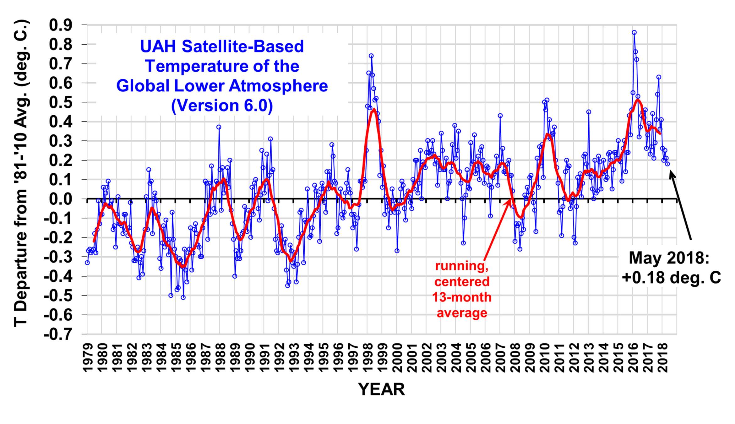
Speaking as a PhD meteorologist with 40 years experience, this week’s heat wave is nothing special.

But judging from the memo released on June 22 by Public Citizen (a $17 million per year liberal/progressive consumer rights advocacy group originally formed by Ralph Nader in 1971 and heavily funded by Leftwing billionaire George Soros’s Open Society Foundations), every heat wave must now be viewed as a reminder of human-caused climate change. The memo opines that (believe it or not) the news media have not been very good about linking weather events to climate change, which is leading to complacency among the public.

The June 22 memo focus was on the excessive heat in New York state, so let’s begin our journey down Hysteria Lane there. The official NOAA average maximum temperatures for every June since 1895 in New York looks like this:

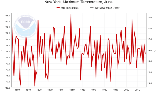
Fig. 1. Average June maximum temperatures in New York state for every year from 1895 through 2017 (Source: NOAA)

The long term trend is not statistically different from zero. June 2018 is not yet available at the NOAA website, but from what I’ve seen for the global June Climate Forecast System map at WeatherBell.com, it looks like it was near the long-term (20th Century) average.

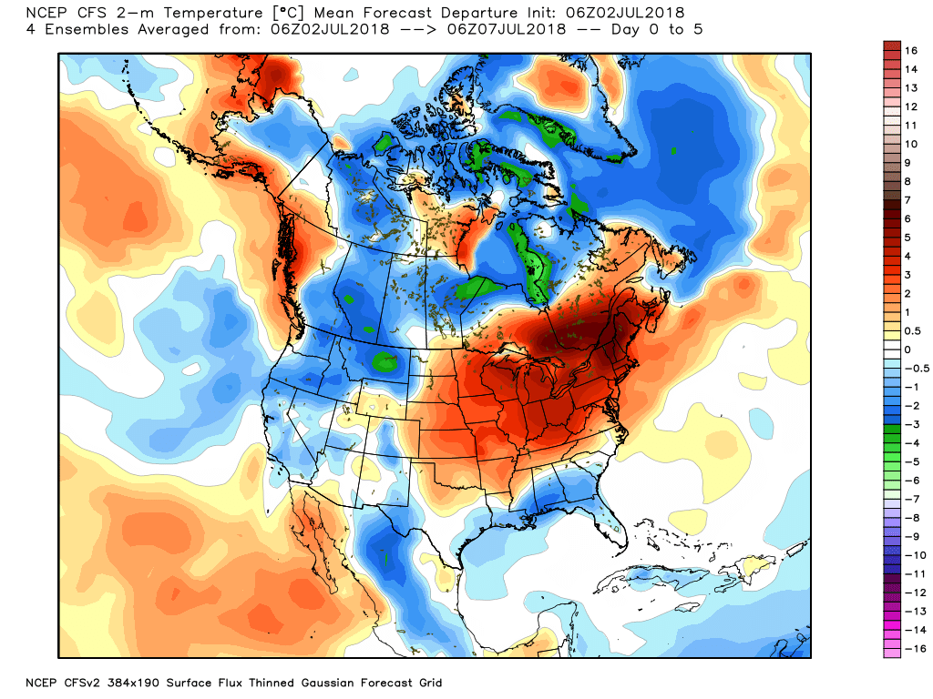
The memo also made mention of the widespread record warmth the U.S. experienced in May, 2018. New York had it’s 7th warmest May on record this year, and the long-term linear warming trend there since 1895 is weak (0.22 F/decade) and not statistically different from zero at the 95% confidence level. The May warmth in the U.S. was regional, as expected for weather variations, with much of Canada being exceedingly cold:

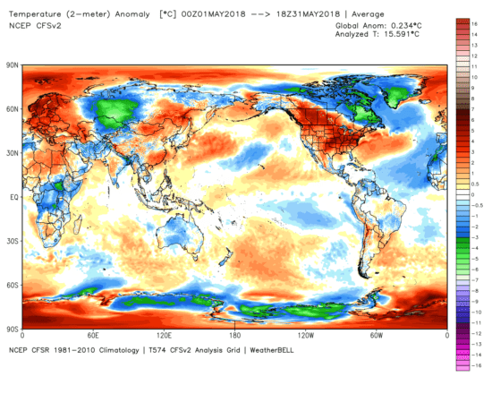
Fig. 2. NOAA CFS model-diagnosed surface temperature departures from normal for May, 2018, showing the regional nature of the record U.S. warmth that month (graphic courtesy of WeatherBell.com).

When do you suppose the hottest temperature ever recorded in New York was? Clearly, with global warming, it must be in the last 20 or 30 years, right?

Wrong.

It was 109 deg. F. on July 22, 1926 in Troy, New York. In contrast, the state record for the coldest temperature was much more recent: -52 deg. F on Feb 18, 1979, at Old Forge, New York.

What about this week’s heat wave? Let’s look at NOAA’s GFS forecast model 5-day average temperatures for this week (Monday through Friday, July 2-6, 2018, graphic from WeatherBell.com):

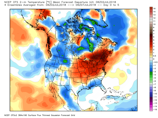
Fig. 3. 5-day forecast average temperature departures from average over North America from the GFS model (graphic courtesy of WeatherBell.com).

As you can see, the excessive heat is (again) regionally isolated, which is exactly what we expect for weather… not for climate change. See those colder than average areas? Why aren’t those being blamed on climate change, too? They look like they approximately cancel out the warm area over the Northeast U.S., which is often the case for weather (not climate change) variations.

That was a 5-day forecast for this week. Next let’s look at what was actually observed over the last couple days (July 1-2), which were very hot in the Great Lakes and Northeast:

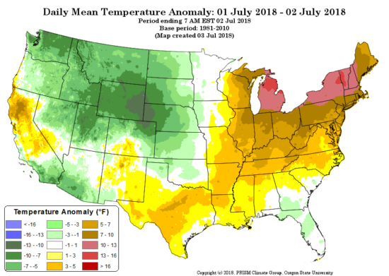
Fig. 4. Oregon State University Prism temperature analysis for July 1-2, 2018, as departures from the 1981-2010 average.

What we see is that there were unseasonably cool temperatures in the western U.S., again an indication of a temporary and localized weather pattern… not “global warming”, which would be warm everywhere.

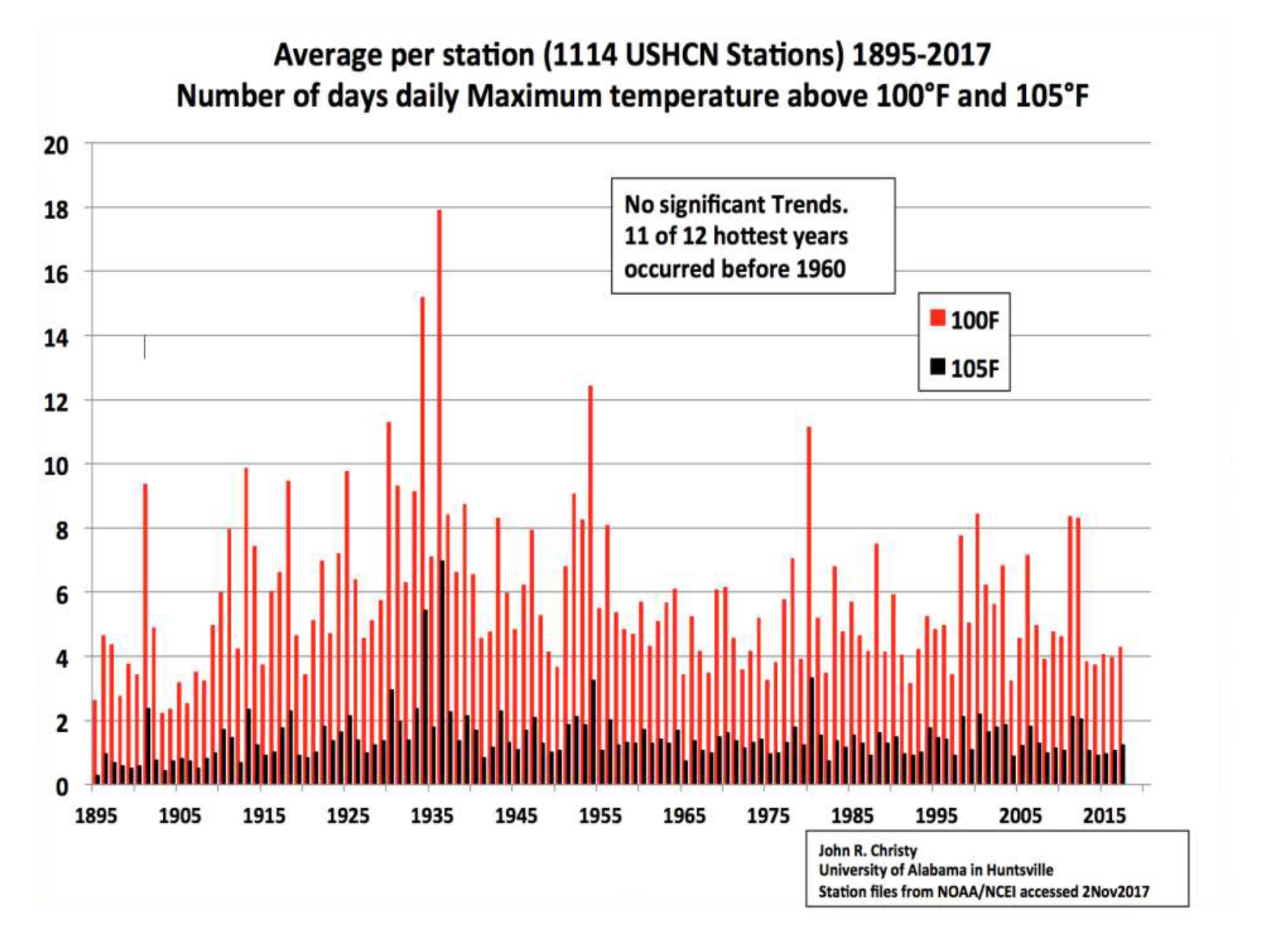
How about extreme high temperatures in the U.S in general? Here are the yearly total number of days above 100 and 105 deg. F, again for the years 1895 through 2017, based upon official NOAA data:

Fig. 5. Yearly average number of days per U.S. station having at least 100 or 105 deg. high temperatures, 1895 through 2017.

We see no trend in the number of days with excessive heat.

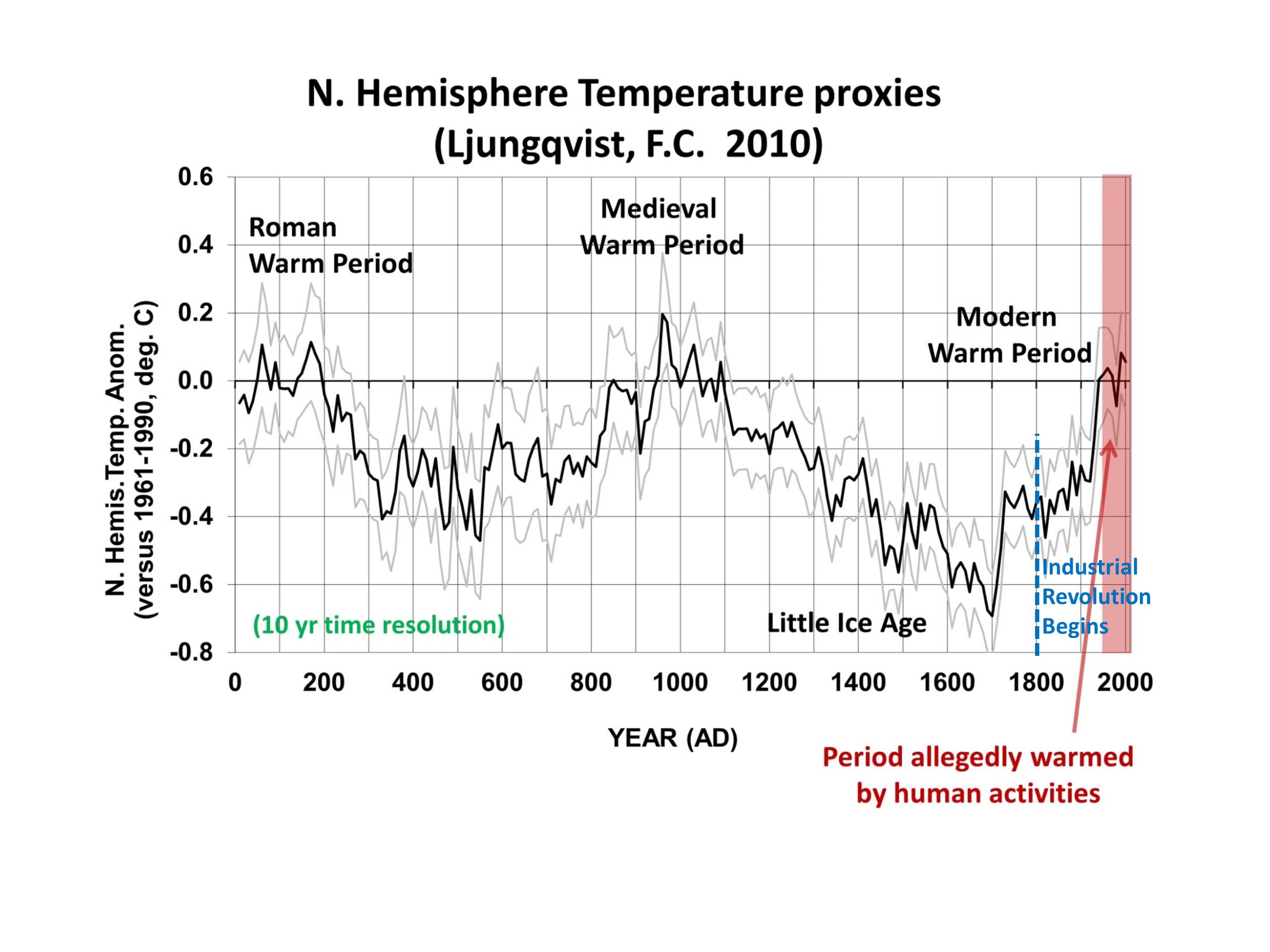
So, what do we make of the claims in the Public Citizen memo? Well, they mention that we have seen 1.1 deg. C of warming since the Industrial Revolution. Think about that. Less than 2 deg. F warming in about 200 years, part of which is likely to be natural, based upon temperature proxy estimates over the last 2,000 years for the Northern Hemisphere:

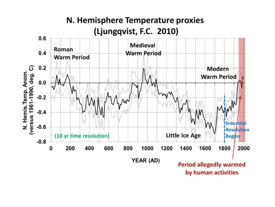
Fig. 6. 2,000 years of Northern Hemisphere temperature variations from an average of a number of temperature proxies. The period of substantial human-caused warming is generally agreed to be only since 1950 (U.N. IPCC AR5).

Am I claiming that there is no such thing as human-caused warming? No. I’m claiming that it is overblown. The Public Citizen memo makes much of recent record warm years clustering together, which sounds alarming — if one doesn’t mention the small fractions of a degree involved. If there was no natural year-to-year variability, and the temperature was increasing at 0.01 or 0.02 deg. F every year, then every successive year would be a record warm year…but who would care? The rate of ‘global warming’ is too weak for any one person to notice in their lifetime.

Furthermore, we already know the climate models (which are the basis for proposed changes in energy policy to get us away from fossil fuels) are producing generally twice as much warming of the atmosphere-ocean system as has been observed. The most recent energy budget analysis of surface and deep-ocean warming suggests that the climate system is only half as sensitive to our CO2 emissions as you are being told…. maybe 1.5 deg. C of eventual warming from a doubling of atmospheric CO2. At 410 ppm, We are currently half way to doubling.

And even THAT reduced estimate of future warming assumes ALL of the warming is human-caused! If a portion of recent warming is natural, the less the human-caused global warming problem becomes.

Finally, the Public Citizen memo claims that today’s technology would already allow 80% to 100% of our energy to come from renewable sources. This is patently false. Solar and wind are relatively diffuse (and thus expensive) sources of energy which are intermittent, requiring fossil fuel (or nuclear) backup. It would be exceedingly expensive to get even 50% of our energy from such sources. Maybe someday we will have such technologies, but until that day arrives, the massive amount of money that would be required to achieve such a goal would worsen poverty, which historically has been the leading cause of premature death in the world.

UAH Global Temperature Update for June, 2018: +0.21 deg. C

Monday, July 2nd, 2018

The Version 6.0 global average lower tropospheric temperature (LT) anomaly for June, 2018 was +0.21 deg. C, up a little from the May value of +0.18 deg. C:

Global area-averaged lower tropospheric temperature anomalies (departures from 30-year calendar monthly means, 1981-2010). The 13-month centered average is meant to give an indication of the lower frequency variations in the data; the choice of 13 months is somewhat arbitrary… an odd number of months allows centered plotting on months with no time lag between the two plotted time series. The inclusion of two of the same calendar months on the ends of the 13 month averaging period causes no issues with interpretation because the seasonal temperature cycle has been removed, and so has the distinction between calendar months.

Some regional LT departures from the 30-year (1981-2010) average for the last 18 months are:

YEAR MO GLOBE NHEM. SHEM. TROPIC USA48 ARCTIC AUST
2017 01 +0.33 +0.31 +0.34 +0.10 +0.27 +0.95 +1.22
2017 02 +0.38 +0.57 +0.20 +0.08 +2.16 +1.33 +0.21
2017 03 +0.23 +0.36 +0.09 +0.06 +1.21 +1.24 +0.98
2017 04 +0.27 +0.29 +0.26 +0.21 +0.89 +0.23 +0.40
2017 05 +0.44 +0.39 +0.49 +0.41 +0.10 +0.21 +0.06
2017 06 +0.22 +0.33 +0.10 +0.39 +0.51 +0.10 +0.34
2017 07 +0.29 +0.30 +0.27 +0.51 +0.61 -0.27 +1.03
2017 08 +0.41 +0.40 +0.42 +0.46 -0.54 +0.49 +0.77
2017 09 +0.54 +0.51 +0.57 +0.54 +0.29 +1.06 +0.60
2017 10 +0.63 +0.67 +0.59 +0.47 +1.21 +0.83 +0.86
2017 11 +0.36 +0.33 +0.38 +0.27 +1.35 +0.68 -0.12
2017 12 +0.41 +0.50 +0.33 +0.26 +0.44 +1.37 +0.36
2018 01 +0.26 +0.46 +0.06 -0.11 +0.58 +1.36 +0.42
2018 02 +0.20 +0.24 +0.16 +0.03 +0.92 +1.19 +0.18
2018 03 +0.25 +0.40 +0.10 +0.06 -0.32 -0.33 +0.59
2018 04 +0.21 +0.31 +0.10 -0.13 -0.01 +1.02 +0.68
2018 05 +0.18 +0.40 -0.05 +0.03 +1.93 +0.18 -0.40
2018 06 +0.21 +0.38 +0.04 +0.12 +1.19 +0.83 -0.55

The linear temperature trend of the global average lower tropospheric temperature anomalies from January 1979 through June 2018 remains at +0.13 C/decade.

The UAH LT global anomaly image for June, 2018 should be available in the next few days here.

The new Version 6 files should also be updated in the coming days, and are located here:

Lower Troposphere: http://vortex.nsstc.uah.edu/data/msu/v6.0/tlt/uahncdc_lt_6.0.txt
Mid-Troposphere: http://vortex.nsstc.uah.edu/data/msu/v6.0/tmt/uahncdc_mt_6.0.txt
Tropopause: http://vortex.nsstc.uah.edu/data/msu/v6.0/ttp/uahncdc_tp_6.0.txt
Lower Stratosphere: http://vortex.nsstc.uah.edu/data/msu/v6.0/tls/uahncdc_ls_6.0.txt

Antarctic Ice Sheet Collapses, Nobel Prizes, and the Psychology of Catastrophism

Sunday, June 17th, 2018

John Christy examines one of the seven bullet holes in our NSSTC building, fired on the weekend of the 2017 March for Science.

Last week I had the privilege of being invited to present a talk at a small conference of world experts in a variety of disciplines. The venue was spectacular, on the French Riviera, and we had an entire late-1800s hotel to ourselves, right on the Mediterranean. For me, it was a once-in-a-lifetime experience. I had the feeling that the organizers wanted the event to have a low profile, and so I won’t mention names.

I had about 12 minutes to lay out the case for climate skepticism. My talk was generally well-received and led to many follow-up discussions over the following days.

One of the attendees was an elderly particle physicist who was also a Nobel Prize winner. During Q&A, he mentioned how he had been teaching a climate class at his university for several years, and that he thought my skepticism was unwarranted. He was convinced that the Antarctic ice sheet was headed for collapse and we would have to deal with a 30 m rise in sea level as a result.

What was more than a little disturbing was that he openly declared that climate policy would not be able to move forward like it needs to until old skeptics like me die out. Part of my talk was about the fact that credentialed and published skeptical climate researchers are indeed slowly dying out, with an average age of around 70 now, and that governmental bias in climate funding will basically kill off skeptical research if things don’t change.

I approached him afterward and politely said I didn’t think either one of us was going to change our minds, and hoped we could just enjoy the nice dinner that was planned for us. He politely smiled and agreed to that.

I guess what was interesting to me is that the “belief” (his word) in catastrophic climate change, like religion, exists at all education levels. One also can’t help but notice how Nobel Prize winners tend to also be experts in all disciplines after they win their prize. Stephen Hawking comes to mind.

The whole experience was quite fascinating.

UPDATE: It has been pointed out to me that Hawking never received a Nobel Prize. The fact is that I can’t account for the lack of Hawking’s Nobel Prize at the moment, and it is a travesty that I can’t.

UAH Global Temperature Update for May, 2018: +0.18 deg. C

Friday, June 1st, 2018

The Version 6.0 global average lower tropospheric temperature (LT) anomaly for May, 2018 was +0.18 deg. C, down a little from the April value of +0.21 deg. C:

Global area-averaged lower tropospheric temperature anomalies (departures from 30-year calendar monthly means, 1981-2010). The 13-month centered average is meant to give an indication of the lower frequency variations in the data; the choice of 13 months is somewhat arbitrary… an odd number of months allows centered plotting on months with no time lag between the two plotted time series. The inclusion of two of the same calendar months on the ends of the 13 month averaging period causes no issues with interpretation because the seasonal temperature cycle has been removed, and so has the distinction between calendar months.

Some regional LT departures from the 30-year (1981-2010) average for the last 17 months are:

YEAR MO GLOBE NHEM. SHEM. TROPIC USA48 ARCTIC AUST
2017 01 +0.33 +0.31 +0.34 +0.10 +0.27 +0.95 +1.22
2017 02 +0.38 +0.57 +0.20 +0.08 +2.16 +1.33 +0.21
2017 03 +0.23 +0.36 +0.09 +0.06 +1.21 +1.24 +0.98
2017 04 +0.27 +0.29 +0.26 +0.21 +0.89 +0.22 +0.40
2017 05 +0.44 +0.39 +0.49 +0.41 +0.10 +0.21 +0.06
2017 06 +0.22 +0.33 +0.10 +0.39 +0.50 +0.10 +0.34
2017 07 +0.29 +0.30 +0.27 +0.51 +0.60 -0.27 +1.03
2017 08 +0.41 +0.40 +0.42 +0.46 -0.55 +0.49 +0.77
2017 09 +0.54 +0.51 +0.57 +0.54 +0.29 +1.06 +0.60
2017 10 +0.63 +0.67 +0.59 +0.47 +1.21 +0.83 +0.86
2017 11 +0.36 +0.33 +0.38 +0.27 +1.35 +0.68 -0.12
2017 12 +0.41 +0.50 +0.33 +0.26 +0.44 +1.37 +0.36
2018 01 +0.26 +0.46 +0.06 -0.11 +0.58 +1.36 +0.42
2018 02 +0.20 +0.24 +0.16 +0.03 +0.92 +1.19 +0.18
2018 03 +0.25 +0.40 +0.10 +0.06 -0.32 -0.33 +0.59
2018 04 +0.21 +0.31 +0.10 -0.13 -0.01 +1.02 +0.68
2018 05 +0.18 +0.40 -0.05 +0.03 +1.93 +0.18 -0.40

The linear temperature trend of the global average lower tropospheric temperature anomalies from January 1979 through May 2018 remains at +0.13 C/decade.

The UAH LT global anomaly image for May, 2018 should be available in the next few days here.

The new Version 6 files should also be updated in the coming days, and are located here:

Lower Troposphere: http://vortex.nsstc.uah.edu/data/msu/v6.0/tlt/uahncdc_lt_6.0.txt
Mid-Troposphere: http://vortex.nsstc.uah.edu/data/msu/v6.0/tmt/uahncdc_mt_6.0.txt
Tropopause: http://vortex.nsstc.uah.edu/data/msu/v6.0/ttp/uahncdc_tp_6.0.txt
Lower Stratosphere: http://vortex.nsstc.uah.edu/data/msu/v6.0/tls/uahncdc_ls_6.0.txt